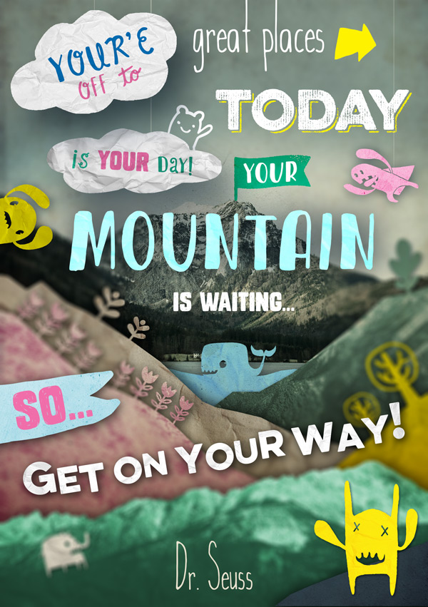
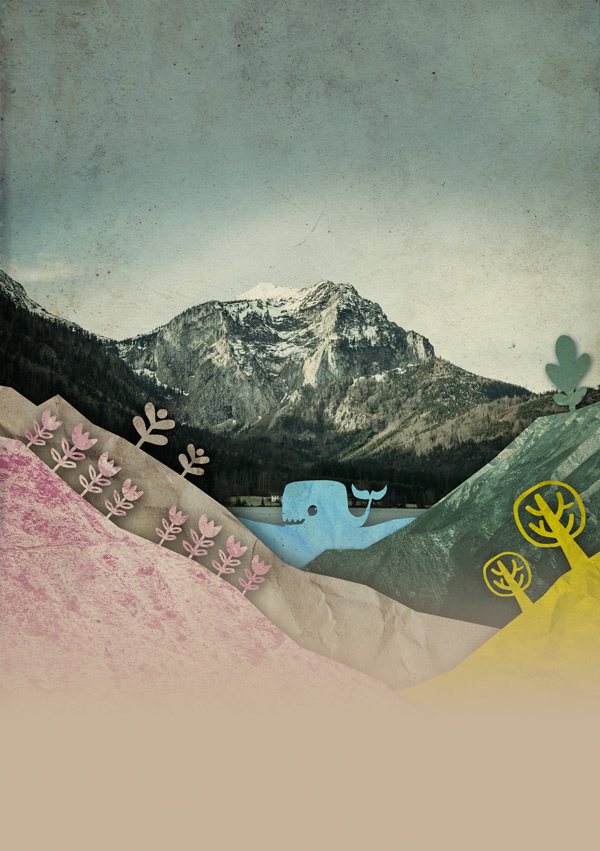
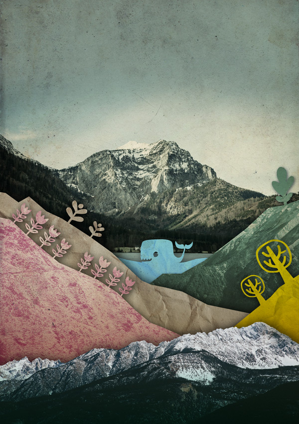
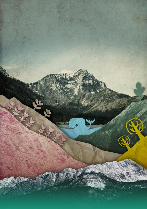
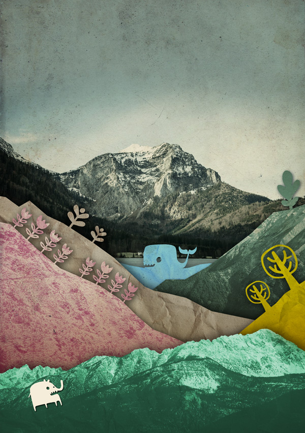
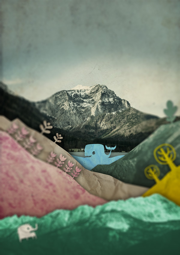
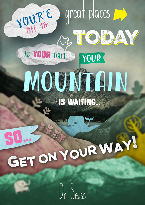
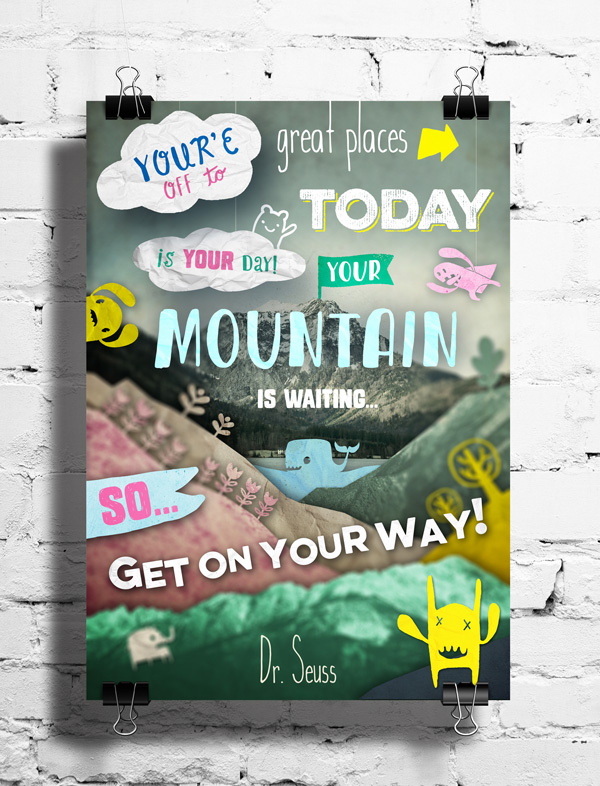
WHAT WE’RE CREATING:
Hello Design Cutters!
Jo here, with a tutorial that will hopefully bring out your playful side!
We’ll be using a selection of fonts from the current deal to create a fun, cut paper effect postcard featuring a quote from Dr. Seuss, which also features some little friends that have come along for the ride ;)
We’ll be looking at how to use some of the glyphs and extras in the bundle to create some creative effects, type layout and using filters to create a cool diorama effect.
Your tutorial is waiting, so let’s get on our way!
Follow along with this tutorial: Download the freebies
Today we have another great freebie for you to enjoy in the form of the Blueshift More font family from Pintassilgo Prints!
Remember, this freebie is just a tiny (albeit very cute) sample taken from this huge bundle: Massive Artistic Font Bundle (Including Web Fonts) at just $29 (93% Off).
This bundle is something really special, bringing you 14 best-selling, creative font families, complete with web fonts, extended licensing and tons of extras. These fonts are thorough, meticulous in their detail, and just scream professionalism, yet creativity all at the same time.
Enter your email below to download the Blueshift More free fonts, so you can follow along with this tutorial easily.
Step 1:
Open up a new 1748px width x 2480px height document in Photoshop.
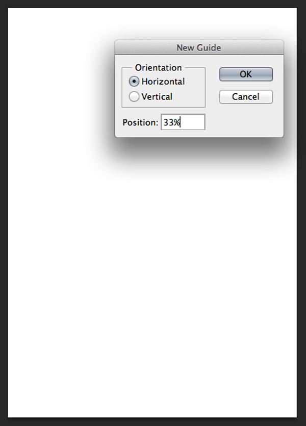
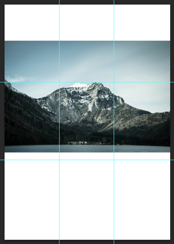
To help us with the composition we’ll set up some guides using the rule of thirds. View > New Guide, select horizontal and set the position as 33%:
Repeat this process to set up the following guides:
Horizontal: 33%, 66% ,99%
Vertical: 33%, 66%, 99%
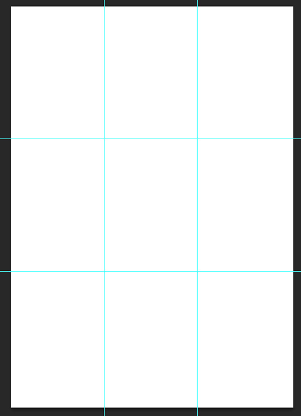
Make sure you lock the guides in place (View > Lock Guides) as you don’t want to undo all that work! You now have a useful grid to refer back to during the design process.
Step 2:
Now let’s set up the background, for which we’ll need to download a few free resources.
If you did my previous tutorial you’ll recognise this paper texture :)
Paper texture by Jerry Jones
I’ve gone for texture 4, as we want something that’s not overly textured but gives a nice, natural base to build up from. The slightly rough texture also fits in with the mountain imagery and sense of outdoors adventure.
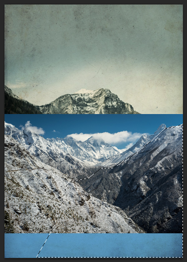
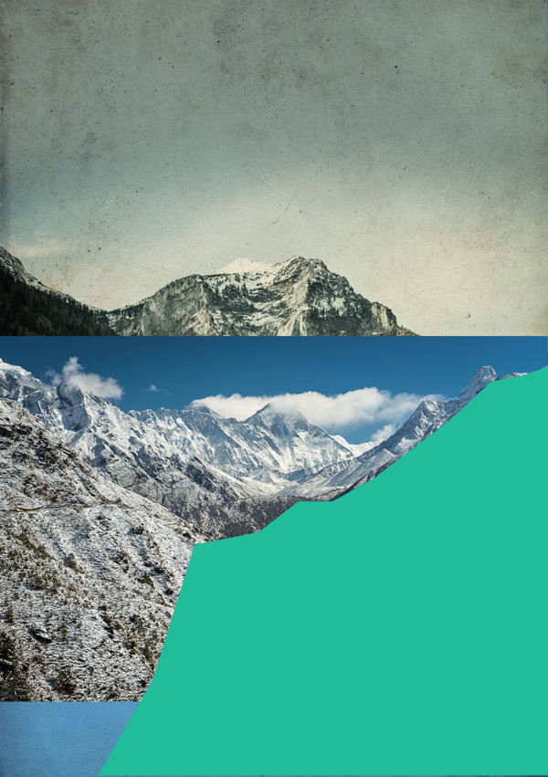
Since the quote features mountains, that’s a nice visual reference to run with. Here are a few we’ll be using for this tutorial, but feel free to search for your own:
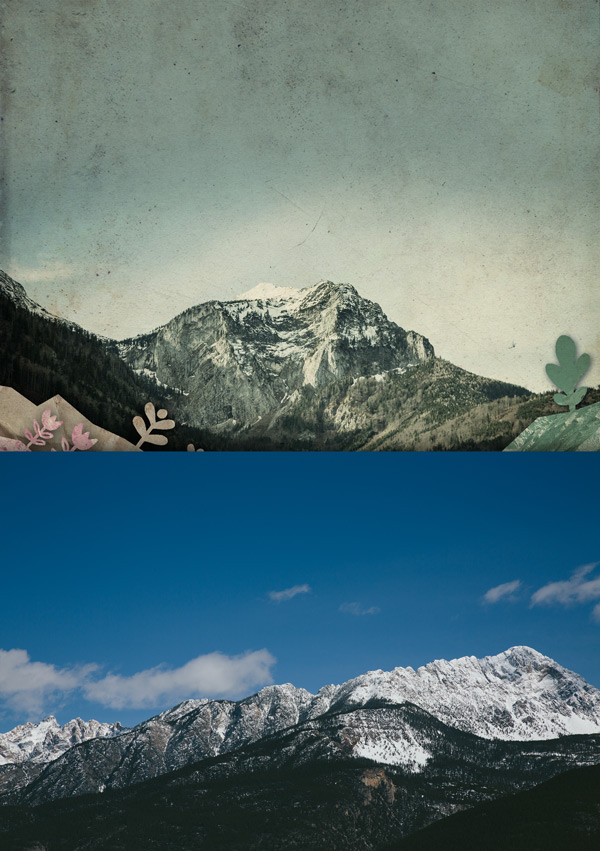
Mountain 1
This will be our main background image, which is a great composition to work around and already has a nice, muted tone helping to give a sense of distance.
Mountain 2
This has some lovely shapes and textures which we’ll be borrowing for use in the foreground.
Mountain 3
Again, some great shapes and textures we’ll be using to build up the foreground with.
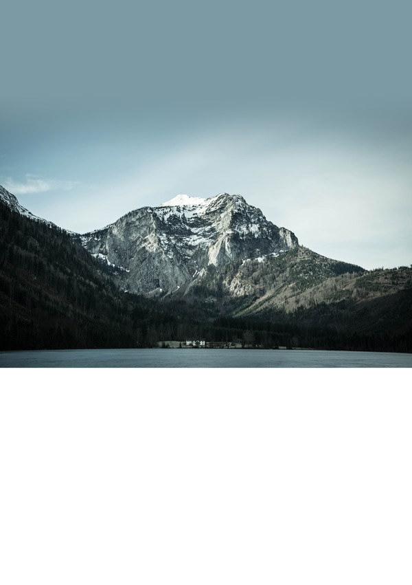
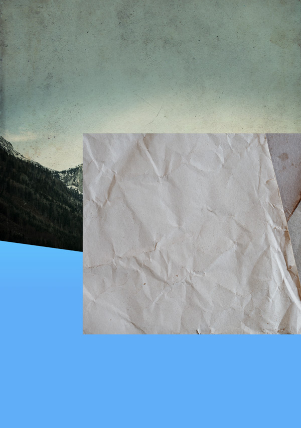
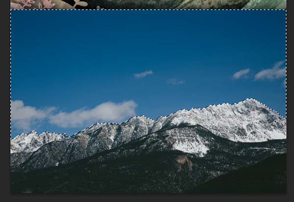
Place the ‘Mountains 1’ image on to your canvas so the that the tip of the mountain aligns to the first horizontal guideline:
To fill in the gap above the photo, we’ll use the Eyedropper Tool to select a mid-dark blue tone from the sky (in this case #7C9AA4) and use that to create a gradient to fade into the image.
On a new layer, select the Gradient Tool, making sure it’s set to ‘Foreground to Transparent’. Click slightly below the top of the picture as the gradient start point to make the solid colour fills the white area. Then, hold down the shift key to keep the gradient straight and drag down to slightly above the mountain to create a nice colour fade-in:
You may need to experiment a bit to get the right colour/fade combination but don’t worry too much about getting it absolutely perfect at this stage. Once the textures and effects have been applied it’ll help everything blend together and you can always come back to tweak the hue/saturation at a later stage if needed.
Place the Old Paper 4 image on to your canvas, scaling to fit. Set the blend mode to Multiply, then reduce the Opacity to 80%:

You can see that’s already helped to blend in the filler gradient.
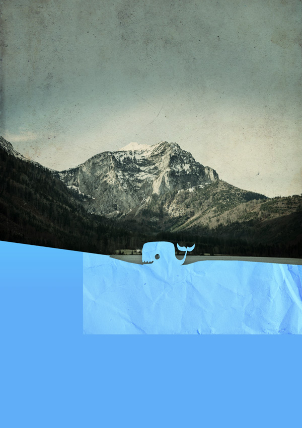
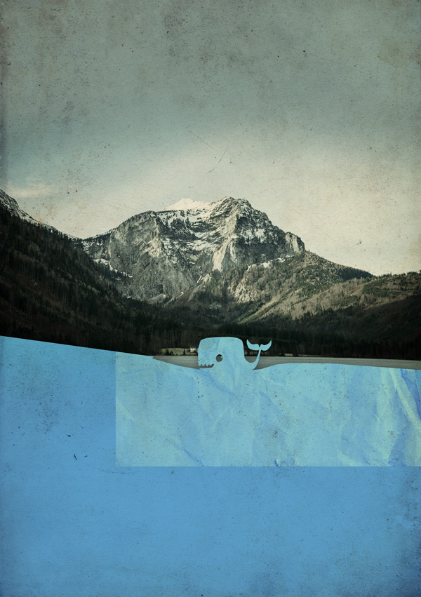
Finally for this step, we’ll brighten up the image using a Curves adjustment layer:

There aren’t any settings you can specify here, but you can see from the screenshot the type of curve we’re going for. Use your artistic judgement here and remember you can always come back to tweak it if needed.
Select all the layers we’ve just created and put them in to a new group (Layer > Group Layers) called “Bkg: Mountain + Sky” to keep things easy to find.
Note: It’s well worth remembering the keyboard shortcut for grouping selected layers (Cmnd + G / Alt + G). It will help keep your workflow super-smooth and organised!
Step 3:
Next up is building up the various paper layers. We’ll be working from the background to the foreground to create the correct layered effect.
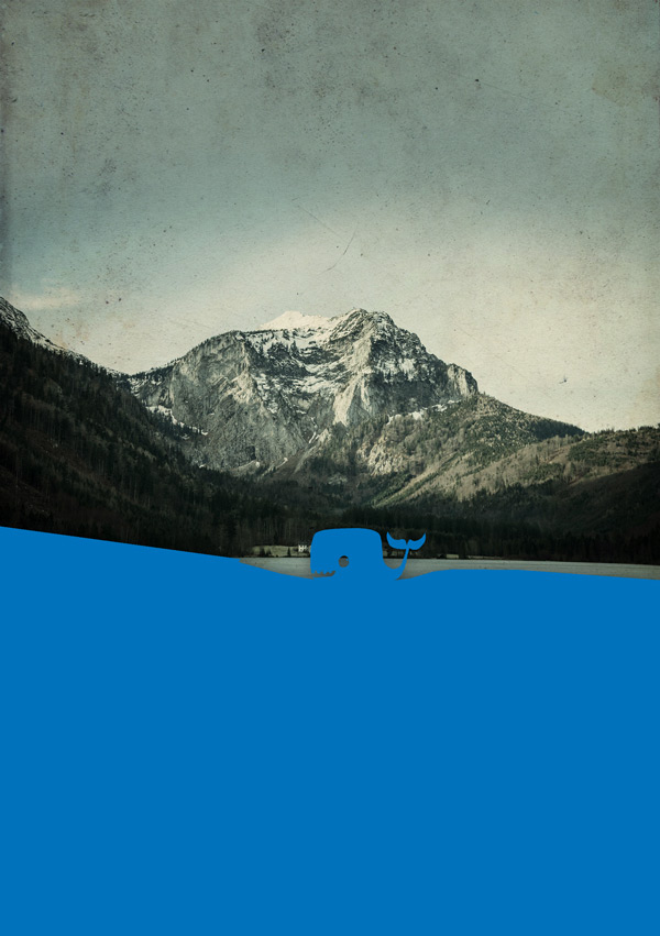
Start by setting #0072BC as the background colour.
Then using the Polygonal Lasoo tool, draw a large block with a small dip in the middle, like in the image below:
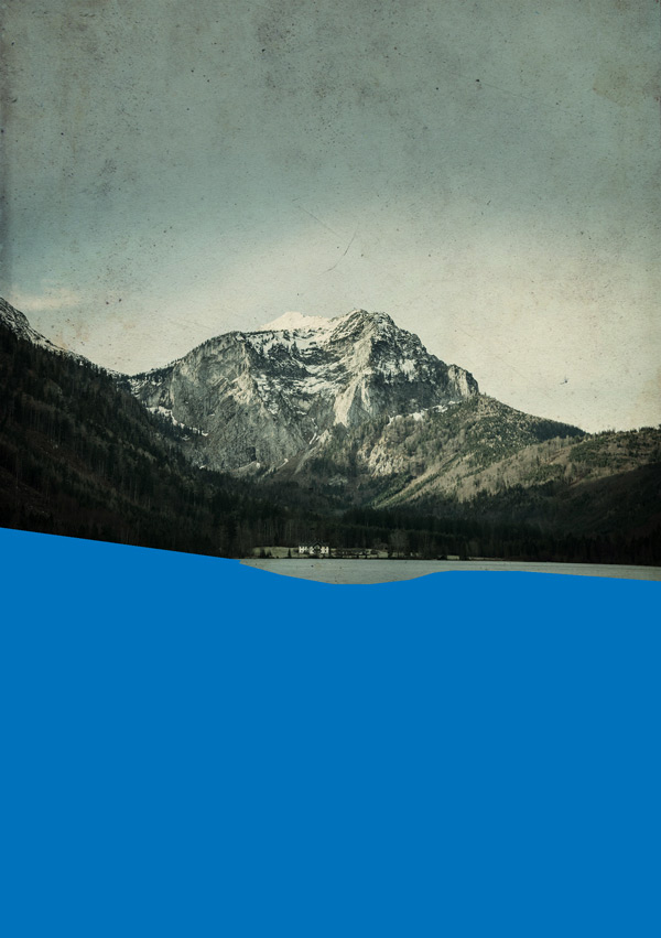
The reason we’re using the Polygonal Lasoo Tool to create the shapes is to mimic the effect of using a craft-knife to cut out paper shapes. We want to give the image a loose, fun feel and the straight edges gives a nice, simple paper cut effect. You can create a curved illusion by reducing the distance between points.
With the selection still active, press Cmnd + Delete (Alt + Backspace on windows) to fill with the background colour.
Now it’s time to get some fonts involved!
Using the same blue as the shape we’ve just created, select Monstrinhos as the font, set the size to 80pt and type a lowercase ‘o’:
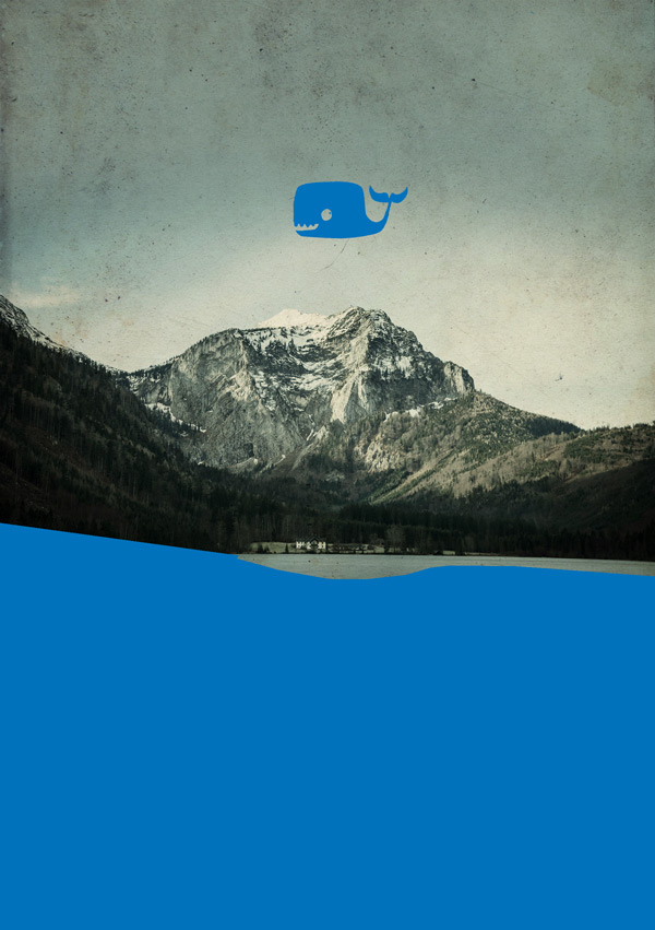
It’s a whale! He’s up in the sky so you can see the font more clearly, but let’s move him back down to the water where I’m sure he’ll be happier ;)

Making sure there isn’t a gap between the whale and water, merge the two layers together.
To create a layered 3D effect, we’ll be adding a drop shadow with the following settings:
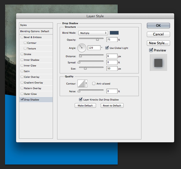
Drop Shadow Settings
Blend Mode: Multiply (default)
Color: #344960
Opacity: 75% (default)
Angle: 129
Distance: 6px (default)
Spread: 0% (default)
Size: 50px
Note: The angle and opacity will be the same on all the Drop Shadow effects we will create in this tutorial.
On a new layer create a Foreground to Transparent gradient using the colour #6dcff7 and clip it to the layer below by pressing Alt on your keyboard whilst hovering your cursor between the two layers. When you see the cursor icon change to a square with a downwards arrow, click. This makes the effect only apply to the layer directly below, effectively creating a clipping mask.
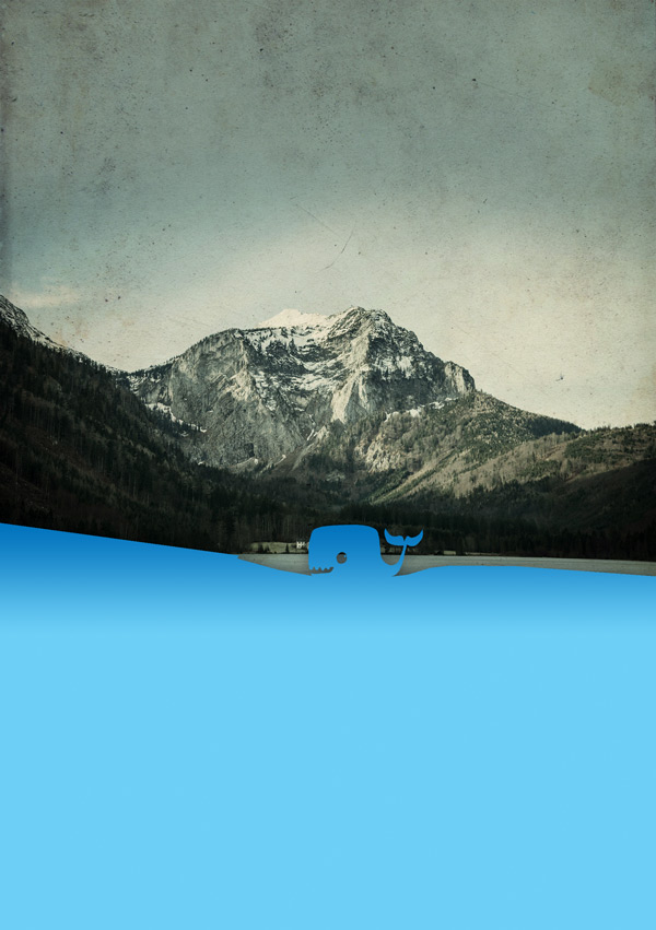
Change the blend mode to Multiply to create a subtle gradient shadow. The gradient transition is concentrated towards the top of the image because that’s the portion that’ll be visible below the other layers we’re going to build up, and helps add an authentic layered effect.

Create a clipped Hue/Saturation adjustment layer with the following settings:
Hue/Saturation
Colorize: No
Hue: 0
Saturation: +40
Lightness: +50
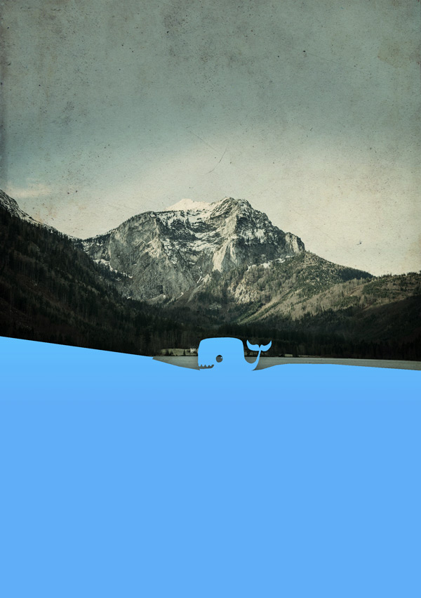
Now we’re going to apply a paper-texture overlay. As a serious Design Cutter, I’ve no doubt you have a few favourite paper textures in your collection ;)
You can either take a pick from your own resources, or to copy the tutorial exactly, download this freebie from Design Cuts and place Paper and Cardboard_019 on to your canvas.
NOTE: This paper texture pack is a free sample pack, taken from our new 100 Grungy Paper and Card Textures Pack, currently available at Creative Market.
I’ve scaled and positioned the texture so a nice creased bit sits over the whale:
Don’t worry about the space to the left – we’ll be covering that up as we build up the foreground.
Change the blend mode to Overlay and clip the layer. You can see how it really adds authenticity to our papercut style:
Finally for this step, duplicate the Old Paper 4 texture we used in the background, and move to the top of the layers stack. Reduce the Opacity to 65% and clip the layer to add a nice grungy feel to the texture and tie it in with the background.
Woop! Even with just one font we’ve already got a cool little image building up :)
Let’s finish off with some housekeeping and put all these layers in to a folder called “1 Paper Mt”. With the ‘paper’ layers, we’ll go from 1 as the furthest in the background getting closer as the number increases. Use a naming system that’ll make things easiest to find for you.
Step 4:
From the Mountain images we downloaded earlier, paste Mountain 3 on to your canvas to use as a reference for creating the foreground shapes. Duplicate and hide the layer for now – we’ll be using this as a ‘master layer’ to create more duplicates from later.
On a new layer, use the Polygonal Lasoo Tool to loosely trace the shape of the far right mountain, taking it down to the bottom of the canvas:
Select #20BC9A as the foreground colour and with the selection still active, use the Paint Bucket Tool to fill the selection:
Hide the photo we’ve just used for reference so we can see how this fits with our image so far.

We’ll now dig in to our freebie of the Blueshift More – a super fun collection of glyphs.
With the same colour selected and the font size approximately 70pt, type “;” (semicolon) and position so that it sits towards the upper right of our shape, like a quirky tree:
As before, merge the two layers and add a Drop Shadow with the following settings:
Drop Shadow Settings
Blend Mode: Multiply (default)
Color: #344960
Opacity: 75% (default)
Angle: 129
Distance: 6px (default)
Spread: 8%
Size: 20px
The smaller shadow makes the layer look like it’s closer to the one below, as if it was sitting directly on top of it.
We want to add a bit of extra interest to this layer by giving it a collaged effect. Duplicate the Mountain 3 image and clip it to the shape below:

As before, create a Foreground to Transparent gradient on a new clipped layer to add some depth:

Then set the blend mode to Multiply:

Create a new clipped Hue/Saturation Adjustment layer with the following settings:
Hue/Saturation
Colorize: Yes
Hue: 167
Saturation: 18
Lightness: +17

Then to add some texture, duplicate the Old Paper 4 layer from the previous group, keeping the same settings:
You can now start to see the layered effect take shape and hopefully get an idea of how the fonts and glyphs can be used to create some really nice, tactile effects.
Pop these layers in to a group called “2 Paper Mt” to keep everything tidy :)
Step 5:
To create the rest of the foreground layers, the steps are essentially the same:
1. Draw your shape with the Polygonal Lasoo Tool
2. Fill with colour
3. Add glyph shapes from fonts
4. Merge
5. Add drop shadow
6. Clip images/texture layers
7. Adjust hue/saturation (optional)
8. Add clipped, same colour to transparent gradient for depth (multiply)
Rather than repeat the same steps over and over, I’ll provide an overview for the remainder of the foreground layers below, specifying the fonts and settings used.
This should hopefully mean you won’t get bored reading the same thing and also give you some creative freedom to play around.
With the paper textures, feel free to delve in to your own collection! I’ve used a combination of the Design Cuts sample from earlier and this fantastic selection of 10 Crumpled Paper Textures from Outside the Fray.
Ok, let’s do this!
Beige layer (3 Paper Mt)
Fill Color: #F5EDD9
Font/Glyph: Blueshift More, lowercase “o”
Texture 1: Paper and Cardboard_020 (Design Cuts), Multiply,
Texture 2: Old Paper 4, Overlay, Opacity 30%
Drop Shadow Settings
Blend Mode: Multiply (default)
Color: #000000
Opacity: 75% (default)
Angle: 129
Distance: 6px (default)
Spread: 20%
Size: 70px
Yellow layer (4 Paper Mt)
Fill Color: #F7E800
Font/Glyph: Blueshift More, uppercase “F”
Texture 1: Old Paper 4, Multiply, Opacity 65%
Texture 2: OTF_Crumpled_Paper_04, Multiply
Drop Shadow Settings
Blend Mode: Multiply (default)
Color: #000000
Opacity: 75% (default)
Angle: 129
Distance: 6px (default)
Spread: 3%
Size: 55px
Pink layer (5 Paper Mt)
Fill Color: #BD4D66
Font/Glyph: Blueshift More, uppercase “I”
Texture 1: Mountain 3, Normal
Texture 2: OTF_Crumpled_Paper_02, Soft Light, 100%
Texture 3: Old Paper 4, Multiply, Opacity 69%
Hue/Saturation
Colorize: Yes
Hue: 324
Saturation: +40
Lightness: +50
Drop Shadow Settings
Blend Mode: Multiply (default)
Color: #000000
Opacity: 75% (default)
Angle: 129
Distance: 10px
Spread: 3%
Size: 50px
Once you’ve created your cutout layers, we’ll all a #C7B299 gradient above them on a new layer to add some depth:
Change the blend mode to multiply:
Step 6:
We’re following a similar approach for the next papercut layer, but rather than draw our own shape as we have been doing, we’ll use the Magic Wand tool to get a detailed, ragged edge which also looks a bit like torn paper.
From the mountain images we downloaded earlier, paste Mountain 2 on to your canvas and position towards at the bottom:
Select the Magic Wand Tool and set the tolerance to 50. Click on a blue area of the sky, holding down the Shift key to make multiple selections. For the clouds, reduce the tolerance to 30 and click on them whilst still holding down Shift
With the selection still active, press Cmnd + I (Alt + I) to invert the selection. Then making sure the layer with the image is activated, create a Layer Mask:
We need to fill in the upper part of the Layer Mask, that was outside of the original image.
The quickest way to to this is to hold down Alt on the keyboard and click on the Layer Mask to view it directly. Then, use the Paint Bucket Tool to fill the upper part with black.
Click anywhere on the visibility column to return to your image.
Now let’s add a Drop Shadow:
Drop Shadow Settings
Blend Mode: Multiply (default)
Color: #000000
Opacity: 75% (default)
Angle: 129
Distance: 16px
Spread: 26%
Size: 81px
As with the previous layers, we’ll add a clipped #1AA083 gradient to add a bit more depth:
Then set the blend mode to Multiply:

For the textures and saturation, add the following as individual clipped layers:
Texture 1: Paper and Cardboard_020 (Design Cuts), Overlay
Texture 2: Old Paper 4, Multiply, Opacity 65%
Hue/Saturation
Colorize: Yes
Hue: 153
Saturation: +40
Lightness: +15

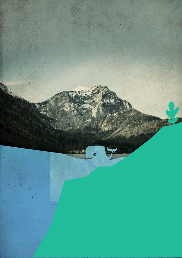
We’ve now created a fun, layered set of mountains to give the image a sense of depth. It’s still a bit plain at the moment though, so let’s add another little creature :)
Step 7:
Create a new group called “Elephant” to put the following layers in, so that things are easy to find.
With Monstrinhos as the font and #F5EDD9 as the colour, type an uppercase ‘L’ to get our elephant monster.
We’ll add a small Drop Shadow to make it look like he’s sitting just on top of the paper:
Drop Shadow Settings
Blend Mode: Multiply (default)
Color: #000000
Opacity: 75% (default)
Angle: 129
Distance: 6px (default)
Spread: 0% (default)
Size: 6px (default)
Create a new clipped layer using OTF_Crumpled_Paper_02 to add a crumpled paper texture. You can see in the screenshot below I’ve reduced the image size to concentrate as much texture in the space as possible:

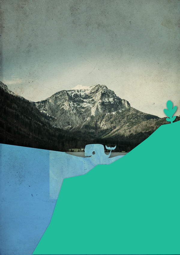
We’ve now completed our backdrop! Before moving on to the next step where we’ll create a cool diorama effect, take a quick break to rest your eyes and grab a glass of water to stay refreshed :)
Step 8:
Welcome back!
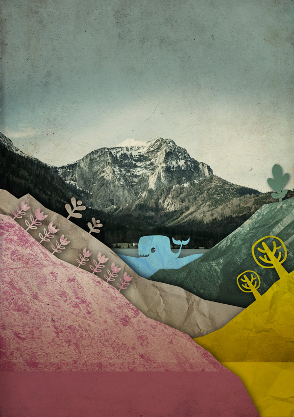
Next up, select all the layers and groups we’ve just made, except for our ‘master’ layers to create texture copies from (move these to the top so they’re outside of the group we’re about to make). Create a new group for the selected layers called ‘Background to fade”.
Note: Make a duplicate of the group and hide it – this is just so we have a safety net should you want to come back and change anything later.
Activate the original group and merge together.
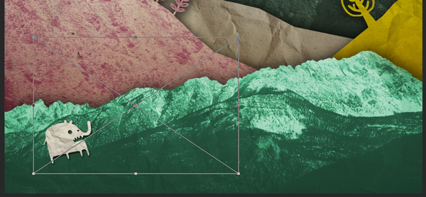
Using the Elliptical Marquee Tool, draw an oval about centrally to the image. This will be our area of focus, and the areas outside this will be blurred.
With the selection still visible, go to Select >Modify > Feather and set the value to a generous 50px. Click ‘Ok’.

Invert the selection by pressing Shift + Cmnd + I (Shift + Alt + I) on your keyboard.

With the selection still active go to Filter > Blur > Lens Blur. This will switch to a new window where you can see the effect:
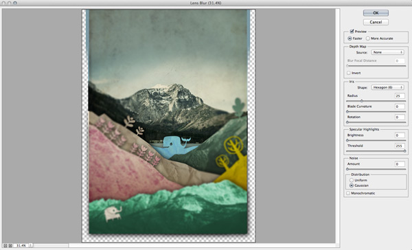
Leave all the settings as default, but make sure the radius is set to 25. Click ‘OK’ to return to our working document.
The blur surrounding blur works at tricking the eye in to thinking the object has a greater depth of field, creating the ‘diorama effect’.
Step 9:
Right, now it’s time to play with some fonts!
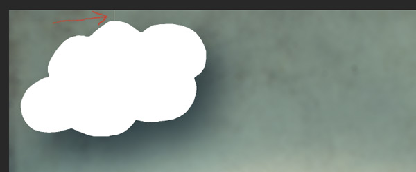
On a new layer, select Blueshift More as the font, set the colour to #ffffff and size to about 200pt.
Type a lowercase “a” to get a big, fluffy cloud:
Rotate it anticlockwise slightly and moved it further in to the left corner. We’ll then add a big, soft drop shadow to give it the impression of hovering considerably far in front of the background:
Drop Shadow Settings
Blend Mode: Multiply (default)
Color: #344960
Opacity: 75% (default)
Angle: 129
Distance: 100px
Spread: 0% (default)
Size: 150px
Create a new layer behind the cloud. To give the impression it’s hanging from above, we’ll draw a thin line to mimic some thread.
Select a simple, solid round brush set to 1px and colour to #F5EDD9. Hold down the Shift key on your keyboard whilst drawing a line from behind the cloud up to just over the top of the canvas. Holding the Shift key will ensure you get a perfectly straight line.

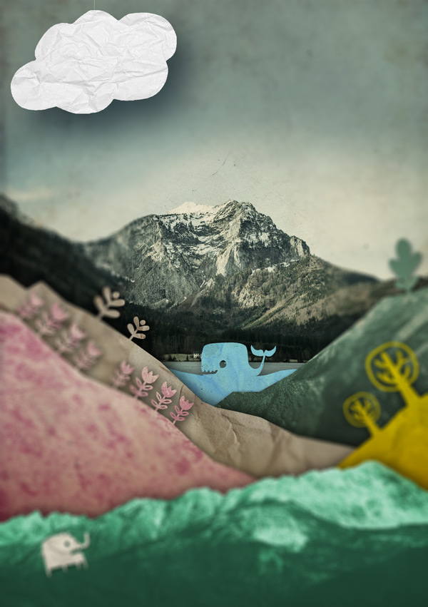
As with the other steps, let’s add a paper texture for extra authenticity.
I’ve used OTF_Crumpled_Paper_07 and clipped the layer. As we want a white paper cloud, we don’t need to make any changes to the blend mode or opacity – it’s good to go ‘as is’ :)
Step 10:
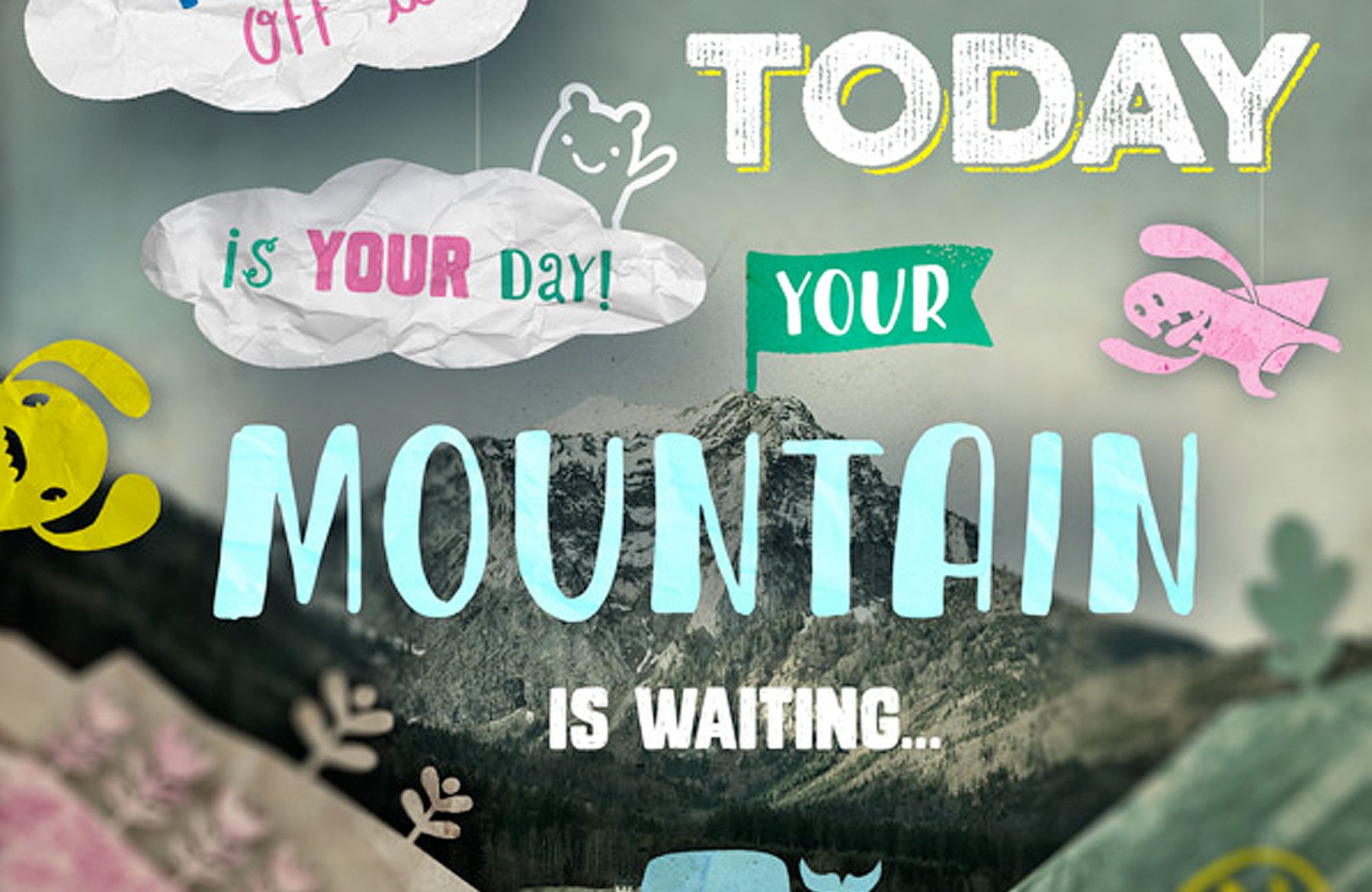
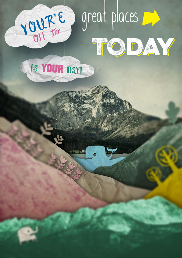
Time to start writing our quote to feed the sense of adventure!
Using Blueshift as the font type “You’re off U”. Then, go back and highlight the “U” and change the font family to Blueshift More. This gives us a nice handwritten “to”.
We’ll tweak the formatting a bit to get it to fit in the cloud. Here’s a quick checklist:
– Set the layer blend mode to Multiply
– Centrally justify the text
– Start a new line after “You’re”
– “You’re” is 45pt in size, colour #0072BC
– “Off to” is approx 30pt in size, colour #F06EAA
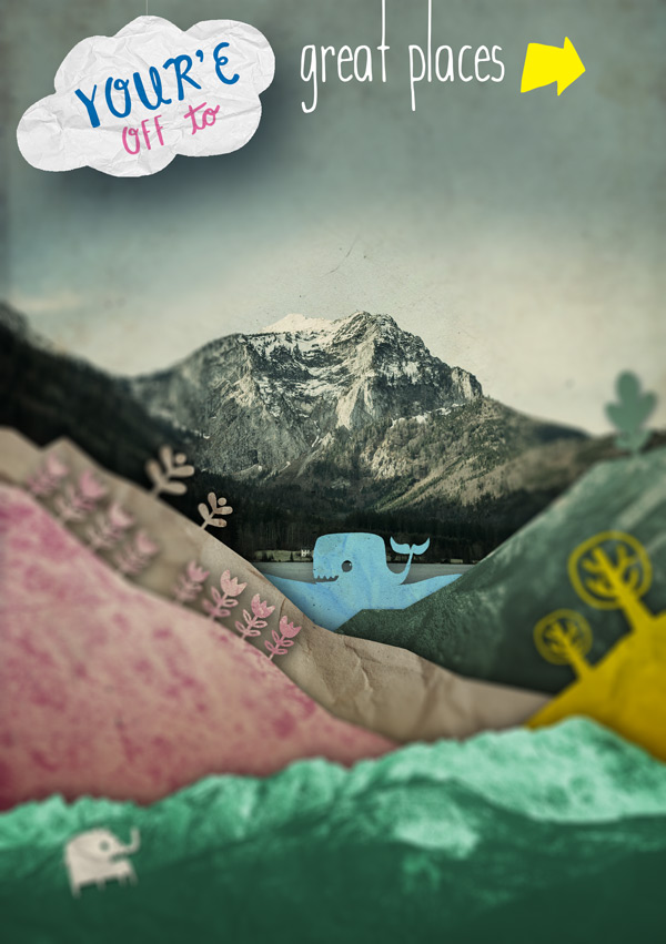
Tilt and align so that it sits nicely in the cloud, similar to the image below:

We can now start piecing together the rest of the quote.
Step 11:
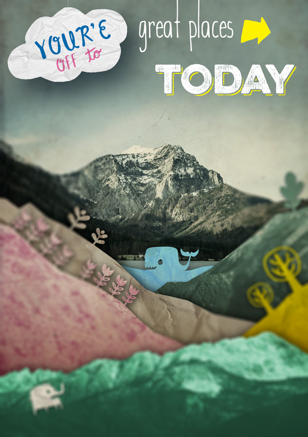
Select Wanderlust as the font, size at 80pt and colour as #FFFFFF and type “great places”.
Position the text so that the tops of the “t” and “l” go off the top of the canvas to mimic the effect of the hanging thread of the cloud.
For the arrow, select Monstrinhos as the font, 80pt as the size and #FFF200 as the colour. Then, type “-” (hyphen) to get the arrow. This adds a nice stylistic element, enhancing the meaning of the phrase and adding some fun dynamism.
On a new layer, select Eveleth Regular as the font, size at 50pt and #FFFFFF as the colour and type “Today”. Duplicate the layer and change the font to Eveleth Shadow and colour to #FFF200.
Position so it’s similar to below:
Step 12:
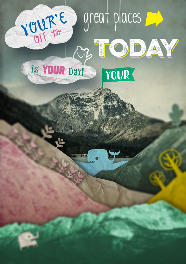
Next, we want to duplicate the group of layers that we created for our opening cloud and move it below the original group. This is because we want this layer to appear as though it is behind the original layer.
Having the opening statement as the top, furthest forward layer helps guide the viewer as to where they need to start reading, and the order of the text.
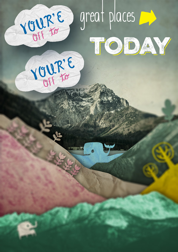
I’ve flipped the cloud shape horizontally and stretched it out so that it doesn’t look like an exact copy. This’ll also allow us to include a longer line of text. You can also move and transform the thread it’s hanging from so that it stretches up beyond the top of the canvas:
Can you see how the drop shadow from the top cloud really adds to the sense of depth here?
For the text, type “is your day” using Blueshift Regular, size 25pt and colour #1AA083, positioning to fit in the cloud.
Select the “your” portion of the text and change the font to Monstro and set the colour to #F06EAA to keep it looking eclectic and playful:
Make sure the layer blend mode is set to Multiply so that the paper texture comes through.
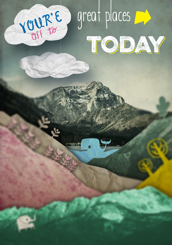
To keep things fun and to act as a guide to bring the eye from “Today” to the next part of the text, we’ll add this friendly little fellow:

You can get him by selecting Blueshift More as the font, size at 55pt and colour as #FFFFFF. Place his layer to the bottom of the group so that it looks like he’s peeking out from behind the cloud, and adjust the angle as necessary.
Step 13:
This font bundle includes so many playful glyphs, it’s great fun finding creative ways of incorporating them in to the image.
In this instance, we’re going to add a flag to the top of the mountain for the word “your” – really making it clear who the mountain belongs to ;)
To get the flag, select Eveleth Icons as the font, set the size to 62pt and colour as #20BC9A. Set the blend mode to Color Burn and type “£” (pound sign) to get the flag icon. Position so that it sits nicely on top of the mountain peak.
For “Your”, you’ll need Blueshift Stick as the font, 33pt as the size and #FFFFFF as the colour.
Place the text so that it sits in the middle of the flag, tweaking the angle slightly:
Step 14:
We now need to add a big, bold MOUNTAIN.
To get this, select Blueshift Stick as the font, set the size to 95pt and set the colour to #A4FEFE. Position it so that the end of the central letter “N” sits below the flag, helping the words flow in to one another.
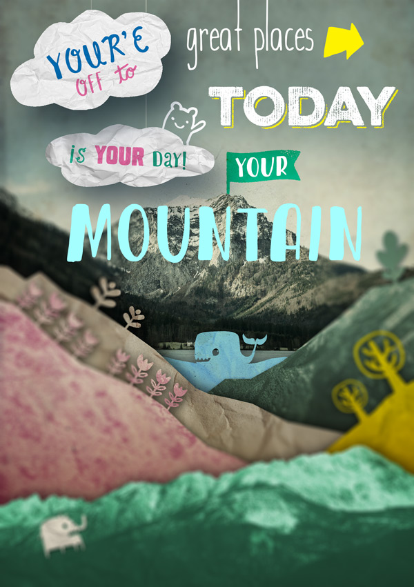
It’s a bit tricky to see at this stage, so we’ll add a soft drop shadow just to bring it forwards a bit.
Drop Shadow Settings
Blend Mode: Multiply (default)
Color: #344960
Opacity: 75% (default)
Angle: 129
Distance: 5px
Spread: 10%
Size: 150px
You can see that makes the text stand out a lot more:

Finally, add a clipped paper texture layer (I’ve gone for Paper and Cardboard_020 from Design Cuts) and set the blend mode to Overlay:

Step 15:
The process remains pretty similar for the remainder of the text, with just the specific settings that need editing.

To keep this from getting too long, I’ll provide an overview of the settings for the rest of the text to help you whizz through!
Text: “Is Waiting…”
Font: Monstro
Size: 25pt
Colour: #FFFFFF
Layer: Normal
Text: “Banner (So…)”
Font: Blueshift More
Size: 180pt
Colour: #FFFFFF
Layer: Normal
Clipped Texture: Old Paper 4
Hue/Saturation
Colorize: Yes
Hue: 190
Saturation: 55
Lightness: +35
Drop Shadow Settings
Blend Mode: Multiply (default)
Color: #000000
Opacity: 75% (default)
Angle: 129
Distance: 10px
Spread: 0% (default)
Size: 50px
Text: “So…”
Font: Monstro
Size: 50pt
Colour: #F06EAA
Layer: Normal
Text: “Dr. Seuss”
Font: Wanderlust Regular
Size: 60pt
Colour: #F5EDD9
Layer: Normal, Opacity 90%
Text: “Get on your way!”
Font: Eveleth Clean Regular
Size: 33pt – 45pt
Colour: #FFFFFF
Layer: Normal, Opacity 90%
Clipped Texture: OTF_Crumpled_Paper_07
On the “Get on your way” text, I’ve adjusted the size and shifted the baseline on random letters to give it a playful, jiggly look which also reflects the jagged edge of the mountain.
You can adjust these settings by selecting the individual letter and going to the Character panel:
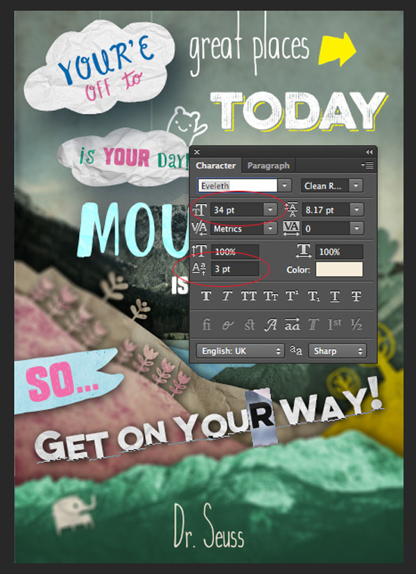
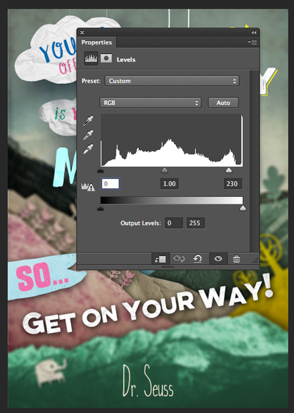
Finally, add a new clipped Levels adjustment layer to brighten up the text, setting the highlights to 230:
Step 16:
Finally, to fill up the spaces around the text, we’ll add a few more creatures from the Monstrinhos set to finish off the foreground.
The techniques are exactly the same as before, using clipped paper textures and drop shadows to create an authentic, layered papercut effect.
Pick some of your favourites to decorate the image :)
And we’re done!
I hope you had fun completing this tutorial and are dreaming up new and creative ways to play with your fonts!
If you’ve got any comments or questions, do leave them below and I’ll keep an eye out. Also, feel free to get in touch with me on twitter @rockportraits and I’ll do my best to answer any questions.
Remember to share your designs on the Facebook page as we’d love to see which creatures you send on their own little adventures :)
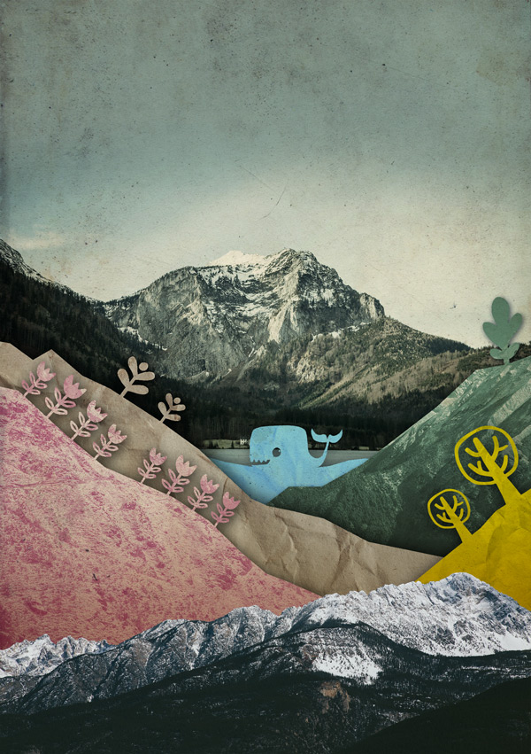
Hopefully this tutorial showed you just some of the many ways you can use our current font bundle. With hundreds of creative options for all your projects, you can still get this bundle for a whopping 93% off this week. Grab it below, while you still can:
Massive Artistic Font Bundle (Including Web Fonts)
Be the first to comment