Hey Design Cutters, Simon here! I have to say that, like many of you, I’m super excited to get started creating things with Design Cuts’ latest collection of typefaces. I mean, c’mon, multiple layered type systems, cool extras?
Today I’ll be showing you how to create a bold typography based poster. You’ll learn how to work with the awesome type systems in this week’s deal, as well as the various creative extras. This lesson includes plenty of pro tips about composition, layout and properly planning your images.
Let’s get started shall we?
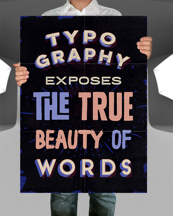
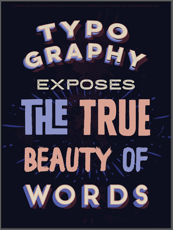
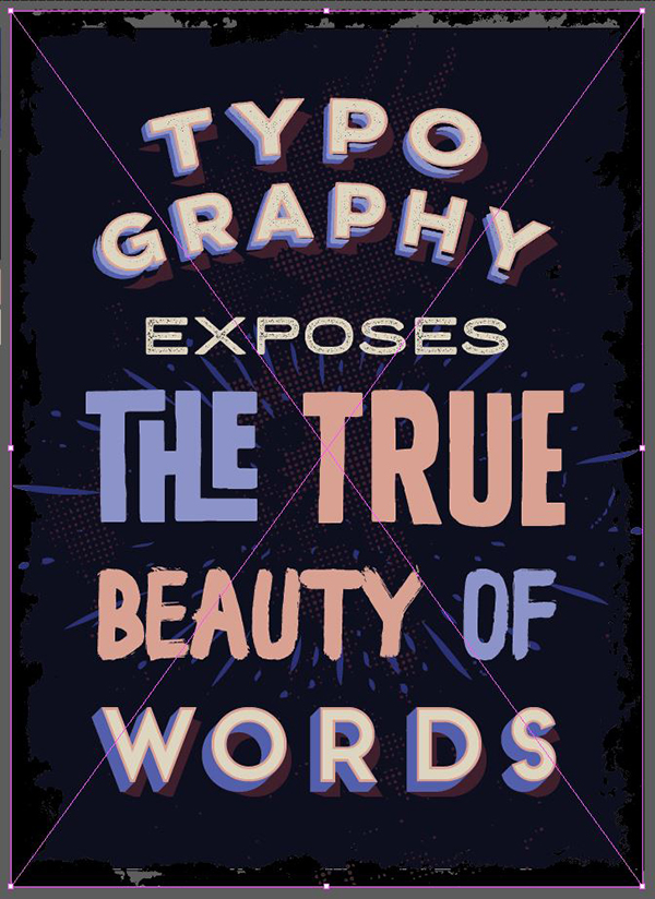
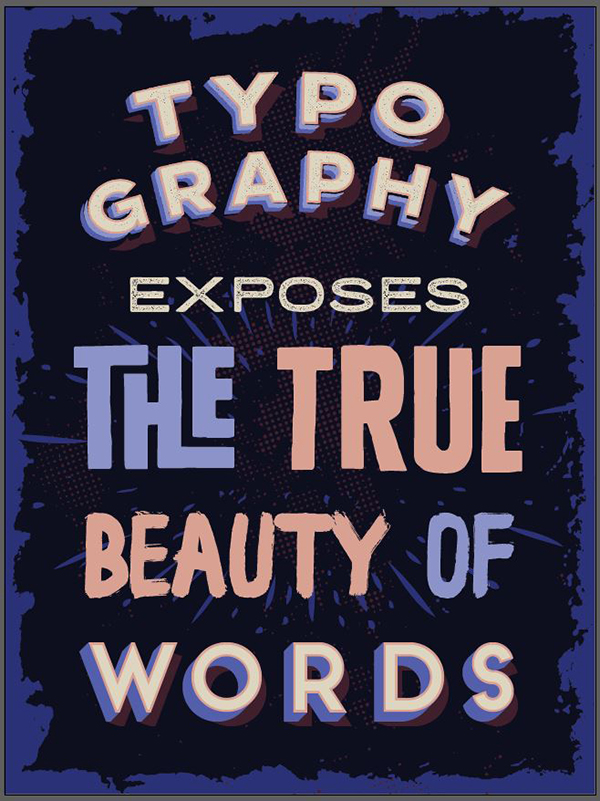
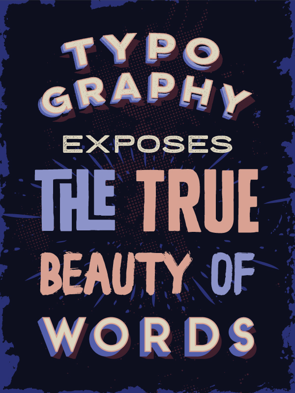
WHAT WE’RE CREATING:
A BUNDLE OF VERSATILITY
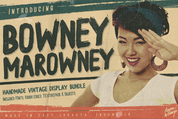
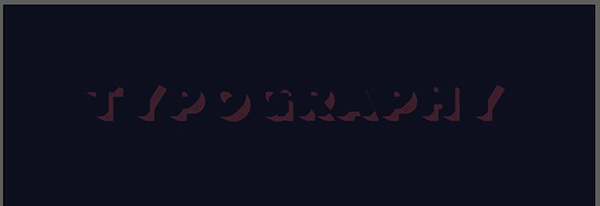
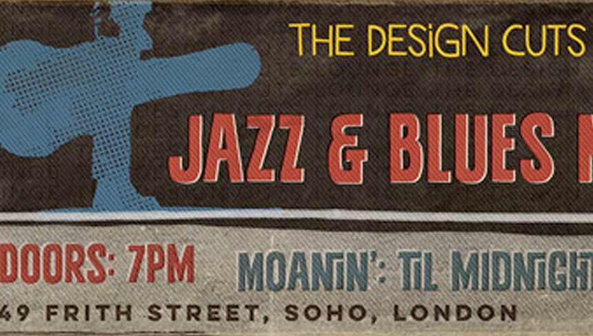
Before we get started, take a look at one of the 12 fonts from our current bundle. You’re about to learn how to combine your fonts in this multi-layered, 3D way. It’s going to be fun! :)

STEP 1: THE CONCEPT
Robin Williams’ death came as a shock to me, as to many around the world. At first, I wanted to make a piece in tribute to him, but copyright issues foiled that plan (I still made the piece, but it won’t be the basis for this tutorial).
I still wanted to pay homage to him in a way or another. One of my favorite roles by Williams is the Genie in Disney’s Aladdin (1992). I was looking at a lot of Aladdin video clips, gifs, and trivia, when something clicked.
One of Genie’s main “feature” is his distinctive blue hues. His lamp has also an interesting color scheme. I sampled my color scheme from two stills of the movie. This would be my small tribute to Williams.
The colors I’ve sampled from the lamp are the following (from dark to light):
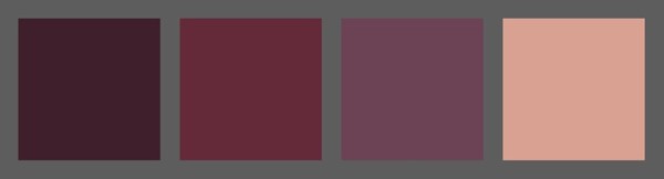
- #401E2C
- #632A38
- #6C4154
- #D8A091
The colors I’ve sampled from Genie are the following (from dark to light):
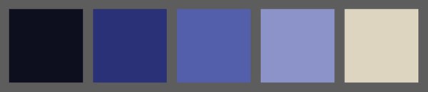
- #0E0E1F
- #2B3075
- #545FAB
- #8C93C8
- #DDD5BE
Mixing these two color palettes will help us to emulate the color palette of the movie (to an extent). Sampling the lamp will also give us the option to use its red/brown tones as counterpoints to Genie’s blue hues.
The subject of the poster
Once again, the piece can’t feature a character like Genie. As designers we always have to be aware of copyrights and respecting the work of others. After brainstorming quite a lot with the Design Cuts team, we came up with a quote about type:
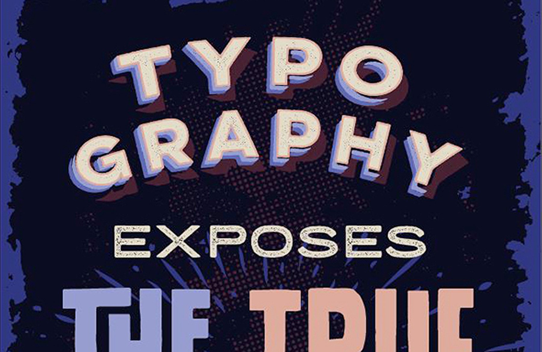
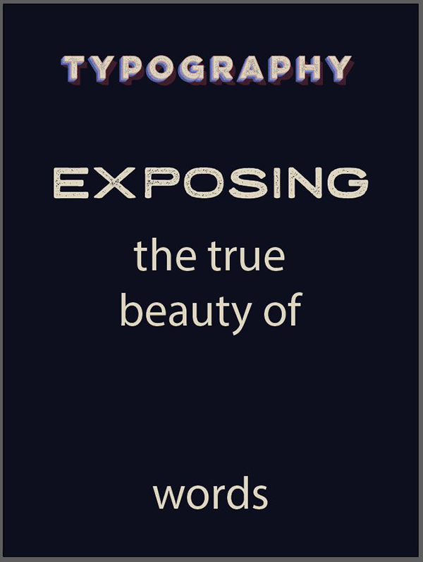
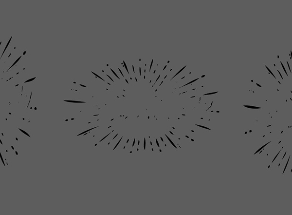
“Typography, exposing the true beauty of words”
This seemed fitting, as the deal at hand is a type collection. We had a bunch of other good ones, but once again, potential copyright issues stopped us from using them. There was this one from Ellen Lupton (the designer and author behind books such as Thinking with Type) that struck a chord with us:
“Typochondria: A persistent anxiety that one has selected the wrong typeface.”
Anyways. We’ve got our color palette, our quote. Let’s get to work!
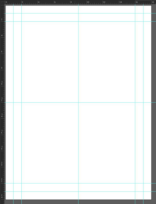
STEP 2: DOCUMENT SETUP
Because we’ll primarily be manipulating type elements, I chose to work with Illustrator. Type manipulation is much easier and refined in Illustrator than in Photoshop in my opinion, and working in a vector format has advantages of its own when thinking about scalability for later applications.
I’m using an 18″x24″ canvas.

I’ve also added a few guides (vertically: 1″, 2″, 9″, 16″, and 17″, and horizontally: 1″, 2″, 12″, 22″, and 23″).
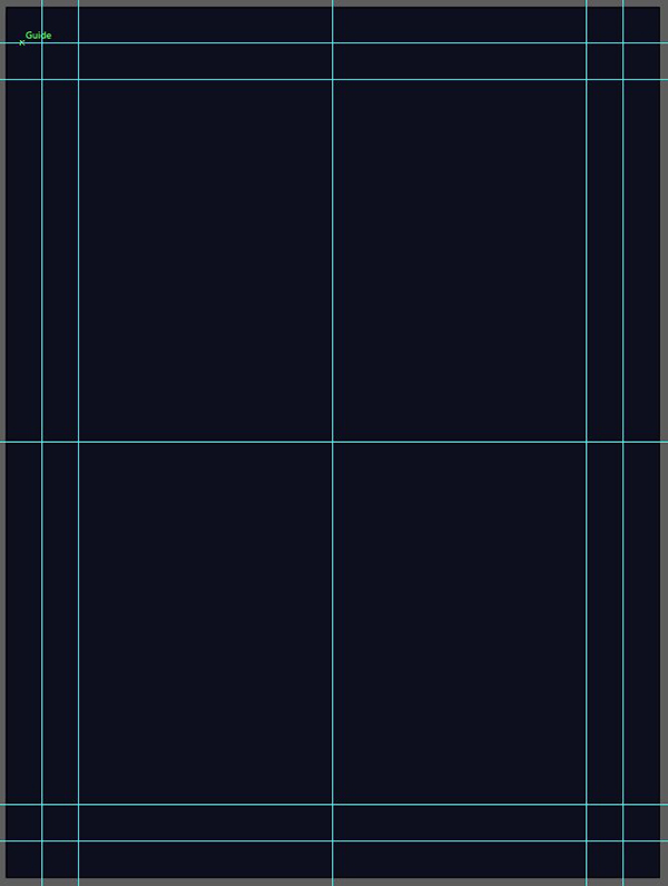
STEP 3: THE BACKGROUND
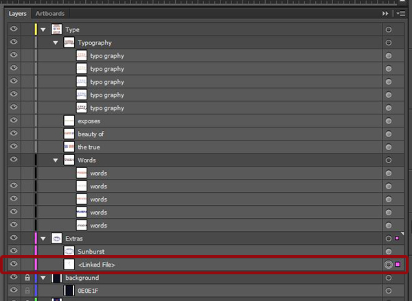
I decided early on that my design would be with a dark background, featuring light elements. So let’s organize our layers a hair, and add a dark blue rectangle (#0E0E1F) that fills the whole canvas.
I’ve created a layer dedicated to the guides, one dedicated to the reference material and color palettes, and now one dedicated to the background elements.

STEP 4: BREAKING DOWN THE QUOTE
This step is where I’m deciding of the line breaks I’ll follow. Each segment will feature a different type.
Typography / exposing / the true / beauty of / words
Prepare the individual text elements. Typeface, color, and size don’t matter at this point.

We will make use of Yellow Design’s Lulo and its rich layers to draw attention.

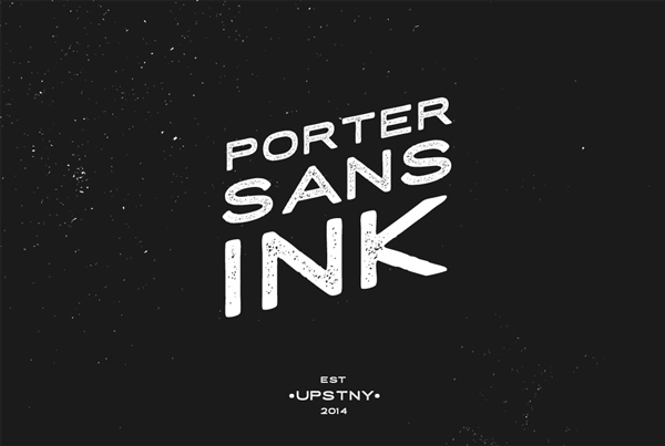
We’ll use Tyler Finck’s Porter Sans Ink for its neat shapes.
We’ll use Juri Zaech’s Frontage for its retro touch.
We’ll use Ian Irwanwismoyo’s Bowney for its rough presence.
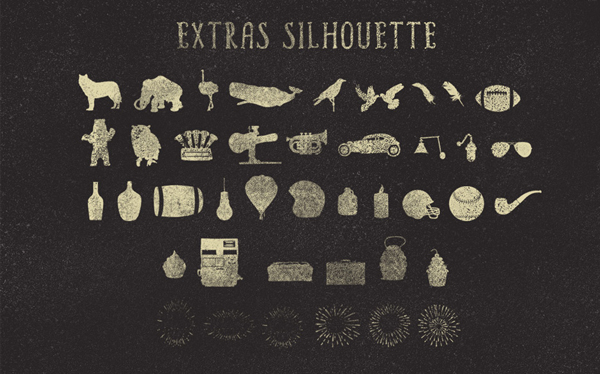
Finally, we’ll use some of Maghrib’s Alpha Extras (namely the sun bursts), to highlight key elements of the poster we’ll be creating.
There’ll also be some other elements peppered in (poster edge, halftone texture…), but if you have all of these at hand, you should be all set to replicate my design.
A note of caution: the creative process for this piece wasn’t as linear as it is in this process writeup. It took a lot of trial and error to figure out the most satisfying color combos, or the most visually enticing size relationships between each line of text.
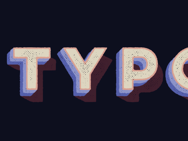
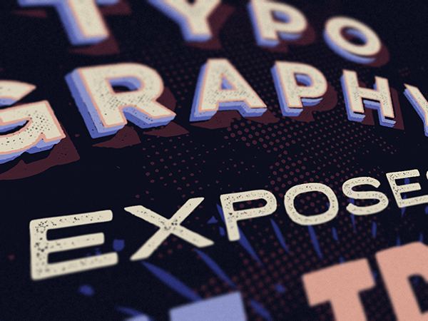
STEP 5: USING LULO
This one is probably the most complicated set of steps, and I promise it’s actually an easy one. The way Lulo actually works is actually based on layers. The various typefaces of the family are actually drawn to work in relationship with each other.
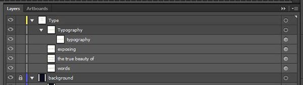
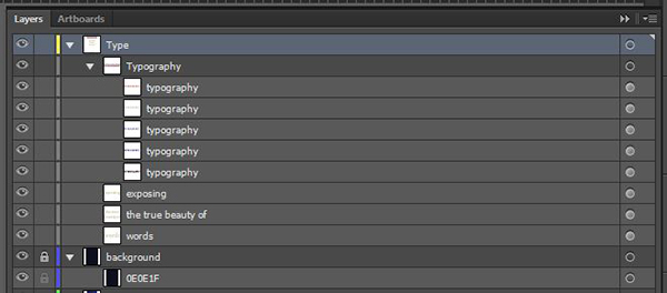
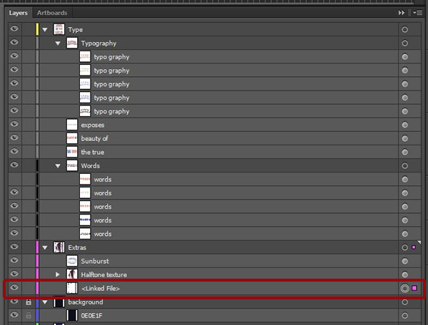
Create a new sub-layer within the type layer, name it Typography, and add the typography type element within it.
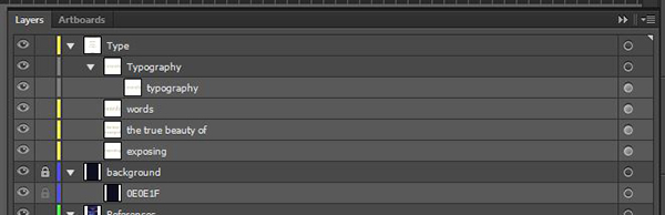
You can also push the layer organization obsession a bit further, and order the type blocks by order of appearance.
From there, change the type to Lulo Four Bold, change the color to our dark red (#401E2C), and the size to 90 points.
Duplicate the layer (CTRL/CMD+C), paste it in front (CTRL/CMD+F), change the typeface to Lulo Three Bold, and change its color of the copy to our lighter blue (#545FAB).

Duplicate the newest layer again, paste it in front, change its color to our lightest blue (#8C93C8), and the typeface to Lulo Two Bold.

Repeat the process, changing the color of the new layer to our off-white (#DDD5BE), and the typeface to Lola One Bold.

Finally, repeat the process one last time, changing the color to the lightest red (#D8A091), and the typeface to Lola Outline Bold.
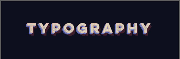
We know have ourselves a pretty neat “headline” piece, simply by stacking type elements and switching colors according to our color palettes.
There will be additional tweaks, but we’ll get to these later.
STEP 6: OTHER TYPE ELEMENTS
Type element: “exposing”
Exposing is set in Porter Sans Ink Regular, colored in our off-white (#DDD5BE), and sized at 120 points.
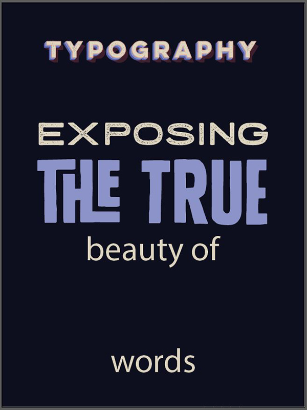
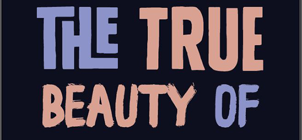
Type element: “the true”
The true is set in Rather loud. It’s sized pretty big to match the width of our previous elements (414 points). We also take advantage of the various OpenType features of the typeface (alternates and ligatures). Finally, it’s color will be our lightest blue (#8C93C8).
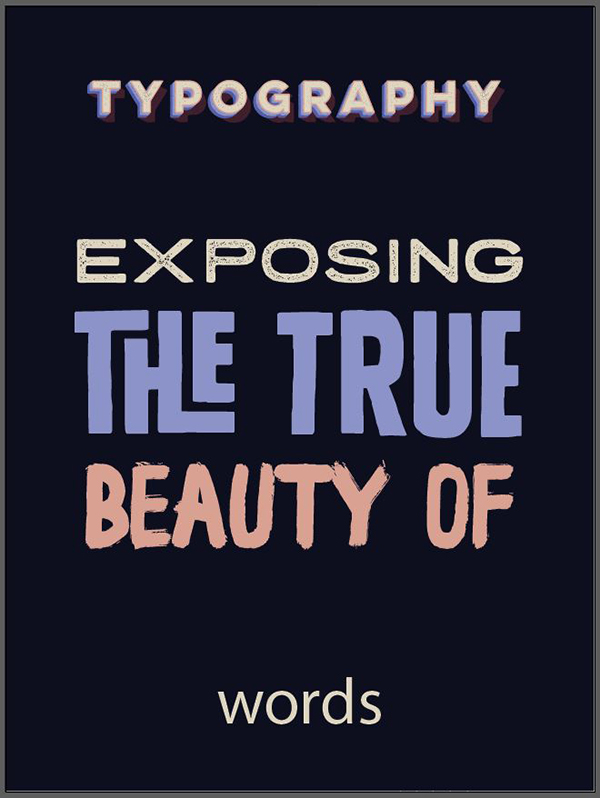
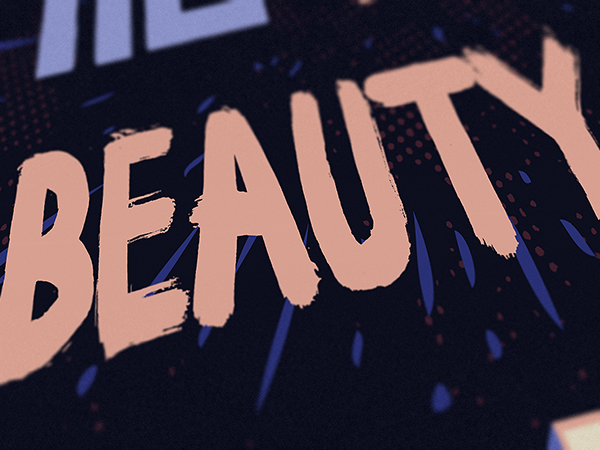
Type element: “beauty of”
Beauty of is set in Bowney. It’s sized at 234 points, and its color is our lightest red (#D8A091).
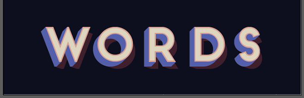
Type element: “words”
Finally, we’ll be taking advantage of the awesome Frontage type system for words. The process is the same than for “typography” (layer stacking). The order of layer goes as follows (bottom to top):
- Frontage shadow – #401E2C
- Frontage 3D – #545FAB
- Frontage bold – #D8A091
- Frontage regular – #DDD5BE
The elements are sized at 180 points.


STEP 7: TYPE TWEAKS
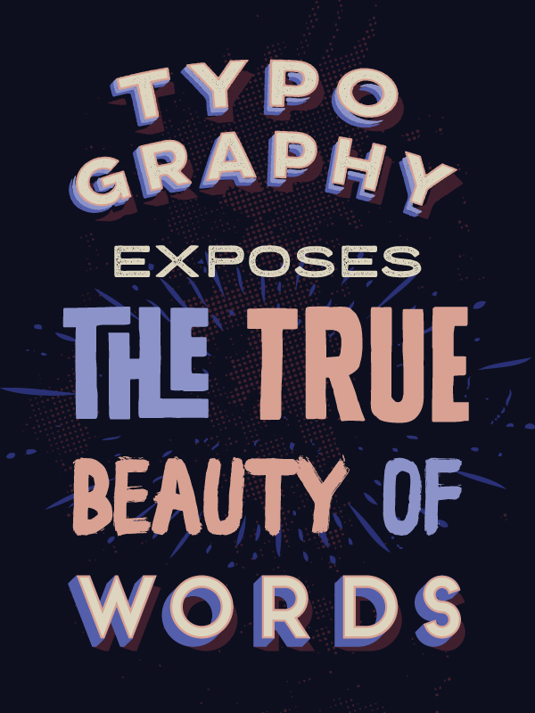
While we have most of our elements ready, the composition is boring in its current state. Its lines are purely horizontal, and lack a bit of the “punch” the typeface themselves display. I’m going to suggest a few things to solve this issue.
Tweaking “typography”
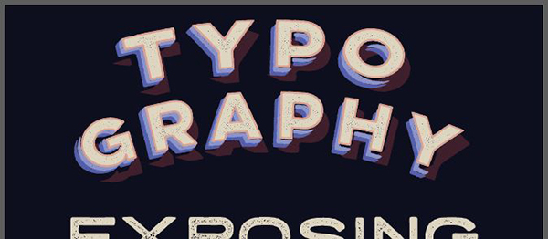
For starters, the word “typography” is a bit small compared to the rest of the type elements. In order to increase its size, let’s break it on two lines: “typo/graphy.” Tackle each of the text elements one after the other. Don’t hesitate to either lock or hide the ones that you’re not working on, to make the task easier.

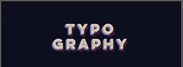
Now that it occupies a more vertical shape, we can increase the size from 90 points to 144 points. No need to touch the line spacing value, as the default one takes well into account the various layers.

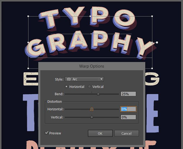
Next, to add some dynamism in the overall piece, we’ll add an arc effect (Effect > Warp > Arc). I’m using a 25% bend value.
Tweaking “exposing”
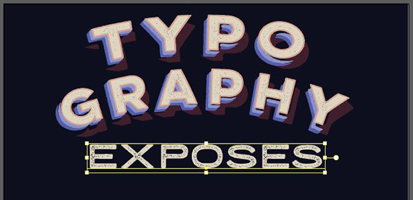
The first tweak we could do here is to change “exposing” to “exposes.” This will make more sense grammatically.
Next, we should reduce its size a bit, so it can be visually nested under the arches of “typography.” This brings its size down to 96 points.
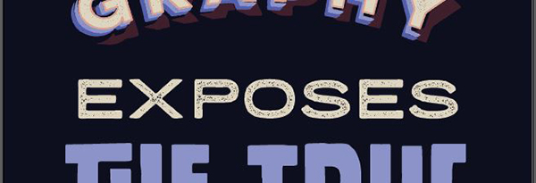
Tweaking “the true/beauty of”
This one is a bit trickier. In order to insist on the significant words, and make the two lines work better as a unit, we’re going to shift colors a bit. We’ll put “the” and “of” in our blue, while “true” and “beauty” will be in our light red.

Tweaking “words”
Finally, to tweak “words,” we’re going to increase its size to 204 points.
TWeaking the overall feel
Now that the ensemble of the type objects have been tweaked independently of each other, we need to work on them as a whole. I’d like the type to be confined within my most inner guides (a column of 14″ wide and 20″ tall).
With the guides back on, it’s pretty clear that we’re not there yet.
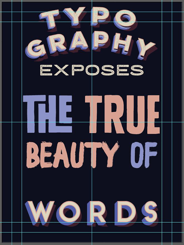
Let’s move the elements around a bit, so everything fits in the desired space. While the result is better, the spacing between “exposes,” “the true,” “beauty of,” and “words” still needs to be fine tuned.
Since the placement of “typo/graphy” and “words” is fixed, we can turn off the guides, and visually refine things.


Once the spacing issues are solved, it’s time to pepper the piece with a few subtle extras, like the sun bursts and textures.
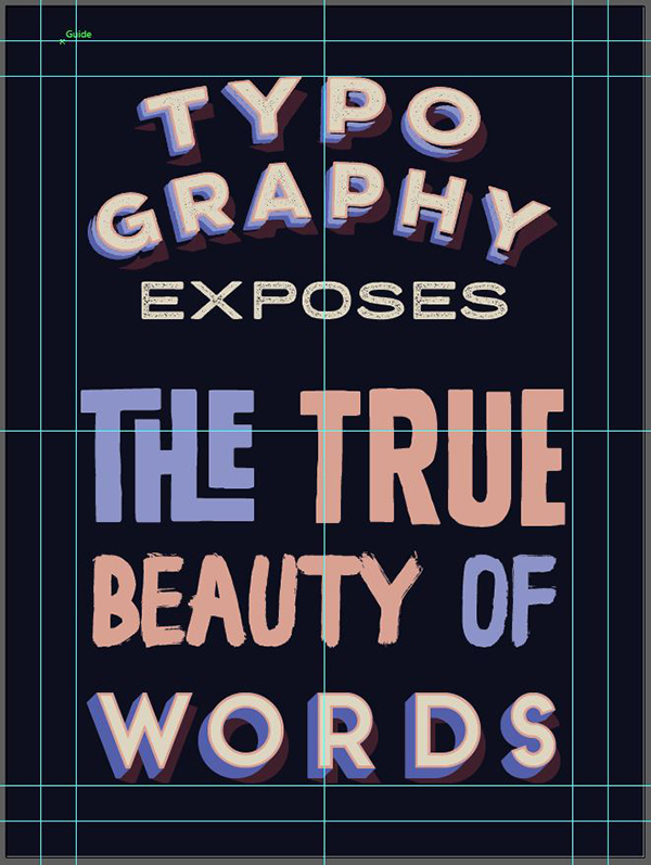
STEP 8: THE LITTLE EXTRAS
There are three extra elements that I’d like to add to this piece before calling it complete:
- A sun burst behind “the true / beauty of” to highlight that part
- One of Ian Irwanwismoyo’s bonus halftone texture
- Finally, one of Ian’s rebel frame
Start by creating a new layer for your extra elements just above your background layer.
The sun burst
This one is easy. Open \Maghrib\alpha rough & Extras\extra\extra.ai.

We’re going to grab this wider one, as it’ll fit the text block a bit better.
Copy and paste it into your Extras layer, change its color to our darker blue (#2B3075), and center it behind the text block. Don’t be afraid to make it as wide as the canvas.
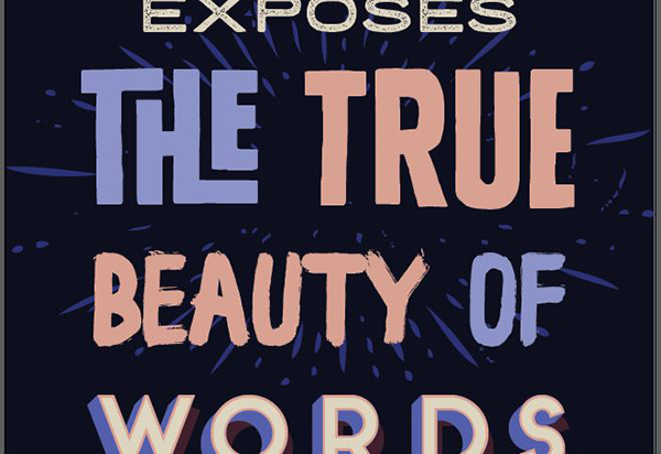
The halftone goodness
Next is Ian Irwanwismoyo’s texture. Place \Ian-Irwanwismoyo\Bowney Marowney\Rebel Edges\Texture Bonus\Bloody Halftoner.png in your design. Make sure its within your extra layer, but below the sun bursts.
I’ve centered it in the canvas, and size it at 24″ tall for now.

Trace it to change it into vector elements.

Change its color to our darkest red (#401E2C).
I’m not a huge fan of the line at the top of the texture.

The solution? Simple: increase the texture’s height to approximately 25″, and the line will be out of the canvas.

The last touch: the frame
We’re close! We’re going to add a frame around the piece. Ian’s Rebel edges are perfect for the job. Since his stuff is a bit on the intense side, we’re going to distort thing a bit so only a little bit of it will show.
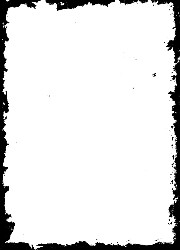
Start by placing 04.png in your piece, below the halftone texture.
Trace it to make it a vector asset.

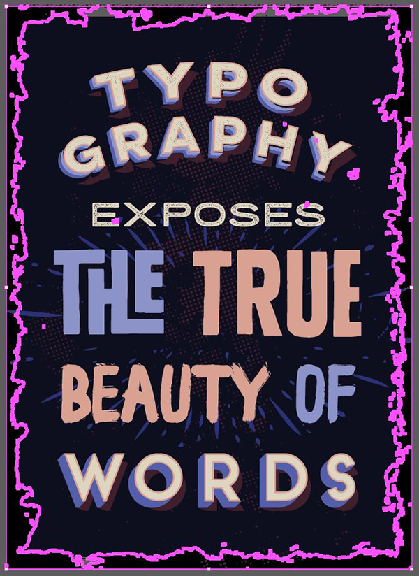
Change its color to the darker blue (#2B3075).
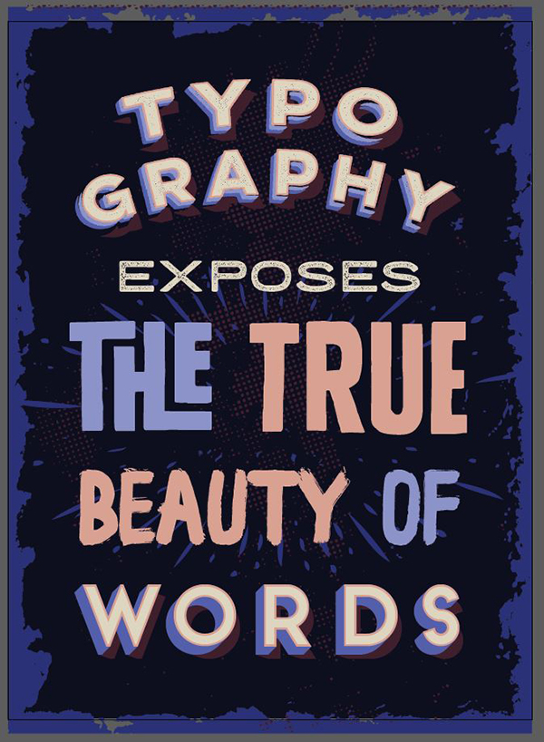
As you can see, the result isn’t entirely satisfying: the frame doesn’t have the proper aspect ratio. To “fix” this, you can simply size by hand, dragging the frame’s edges so they’re matching the frame for our piece.
If like me you think that the frame is too intense, simply increase its height to 25″, and the excess will be clipped out of the frame.
And with that last tweak, we’re done!
CONCLUDING THOUGHTS
I hope you had as much fun going through the tutorial as I had writing it.
If you’ve followed it, and/or created other tributes to Robin Williams, I’d love to see the outcomes. Share them on the Design Cuts Facebook page, or tweet at us: @DesignCutsDeals and @simonhartmann.
And obviously, if you haven’t seen it yet, we highly recommend the the Inspirational Creative Font Collection. It’s the only way to grab all of these best-selling creative fonts at such a substantial discount.
Until next time, cheers!
Just reading through this great tutorial as my next bundle downloads!!!!
I think I may be going bonkers – I can’t work out how (or where) you got the ‘T’ and ‘H’ for “the true” bit of the poster. Please can you advise….?
Thanks in advance.
Mary
Hey Mary,
Thanks for commenting! What an awesome way to spend your time whilst your bundle downloads :)
I can definitely help you out with this! I have attached our tutorial on how to use alterante characters which should help you get the ‘T’ and ‘H” in this tutorial.
https://www.designcuts.com/design-cuts-deals/using-font-swashes/
I hope that helps :). I would love to see your finished design!