
Today we will be creating a fun vintage Summer Movie Preview Poster in Photoshop. We will be using various elements from The Ultimate Creative Design Bundle including the highly anticipated Marquee Light Bulbs sample pack from TVartworks, as well as supporting elements from Feingold Shop and MixPixBox to complete our design. From here we will place our poster into a realistic mockup to create a more polished and professional presentation. If you are ready to kick off the hottest season for movies then let’s fire up Photoshop and get started on our poster!
HAVE YOU SEEN OUR YOUTUBE CHANNEL?
Watch the video tutorial below and subscribe to our YouTube channel for regular updates direct to your inbox.
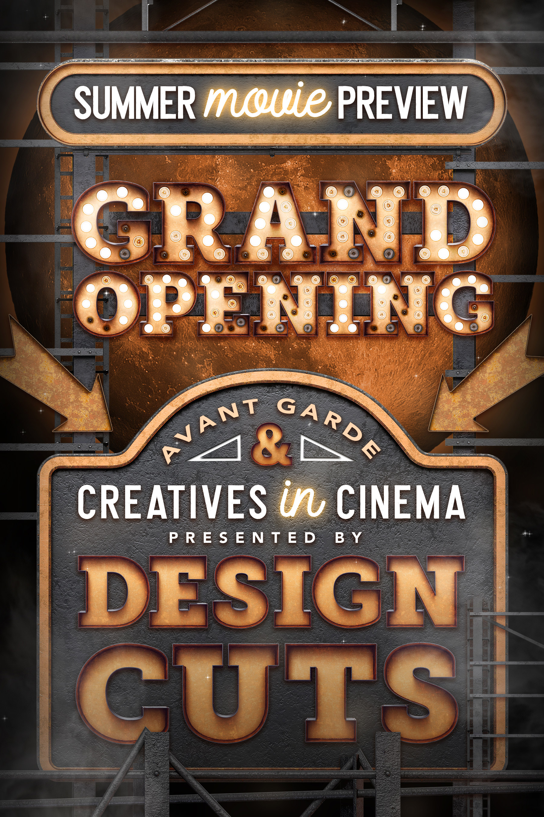
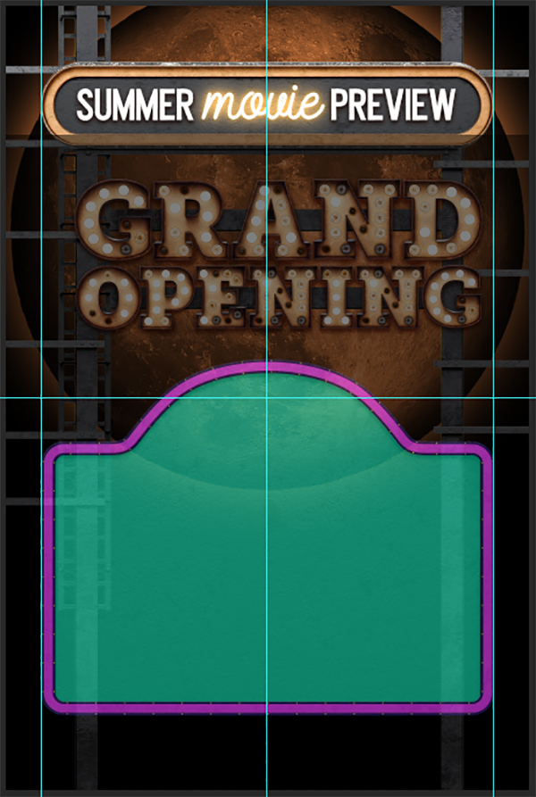
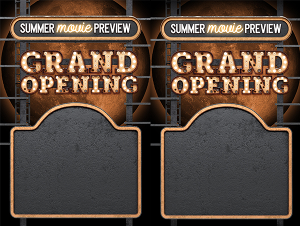
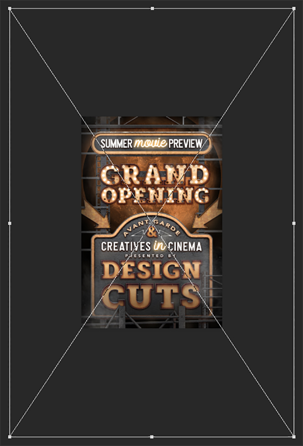
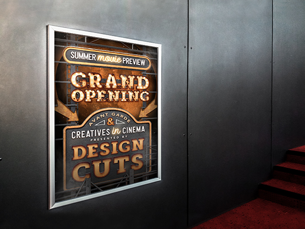
Here’s a look at what we’ll be creating:
Follow along with this tutorial: Download the freebie files
This freebie pack includes freebies from Feingold Shop, MixPixBox, and TVartworks!
The freebie pack is just a small sample of the resources available in The Ultimate Creative Design Bundle for just $29 (that’s 99% off). This bundle features a massive collection of incredible fonts, gorgeous watercolors, stunning effects packs and so much more!

Step 1: Summer Movie Preview Poster
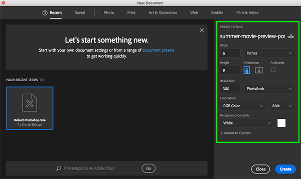
Let’s start by creating a new document and make it ‘6’ inches wide by ‘9’ inches tall. We also want to be sure that the document is ‘300’ ppi, and the ‘Color Mode’ can be set to ‘RGB’ for now. Lastly, make sure that the ‘Background Contents’ is set to white. It is worth noting that if we were creating a print-ready poster the only difference would be that our document should be set up as a ‘CMYK’ file rather than ‘RGB’ as that is the standard for printing, but for the purposes of this tutorial since we will mostly be viewing our design on screen and in a mockup, we can leave it set to ‘RGB’ instead. Once you have set up the parameters, go ahead and click ‘Create’ from the lower right corner to make your new document.
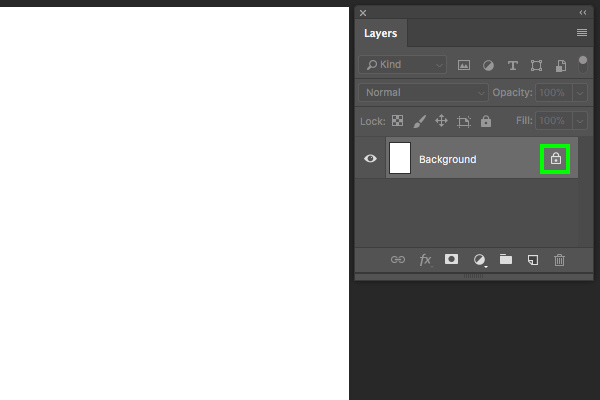
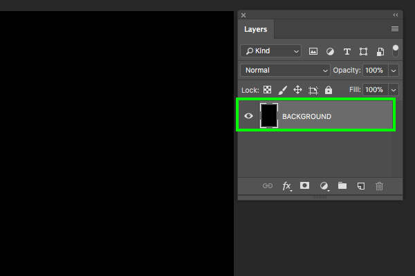
Once you have created your document, the first thing we are going to do is double click on the ‘Background’ layer which currently has a small lock icon next to it.
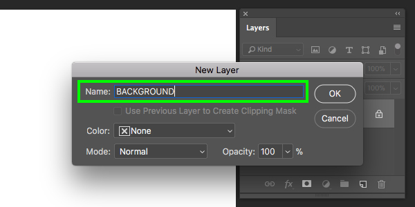
You should now see the ‘New Layer’ dialog box where we will enter the name ‘BACKGROUND’ in all caps and then press ‘OK’.
From here, press the letter ‘D’ on the keyboard and make sure your foreground color is solid black. Then, press Alt/Option+Delete on the keyboard to fill your newly unlocked ‘BACKGROUND’ layer with black.
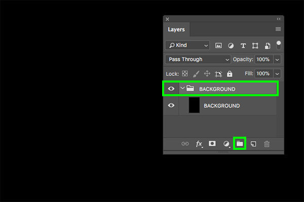
Now that we have our unlocked layer fill with the color we want, let’s double click on the ‘BACKGROUND’ text of the layer and then press Command/Ctrl+C to copy it. Next, click on the small folder icon at the bottom of the Layers Palette to put the layer into a new folder. We can now double click on the ‘Group 1’ text which is the default folder name and then press Command/Ctrl+V on the keyboard to paste the name ‘BACKGROUND’. You should now have your layer inside of a folder with the same name which will serve as a backdrop for our design.
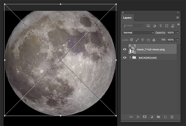
Step 2: Full Moon
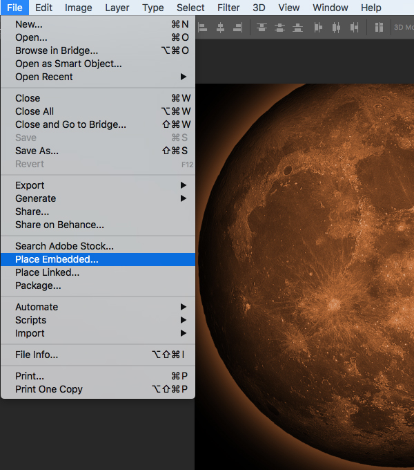
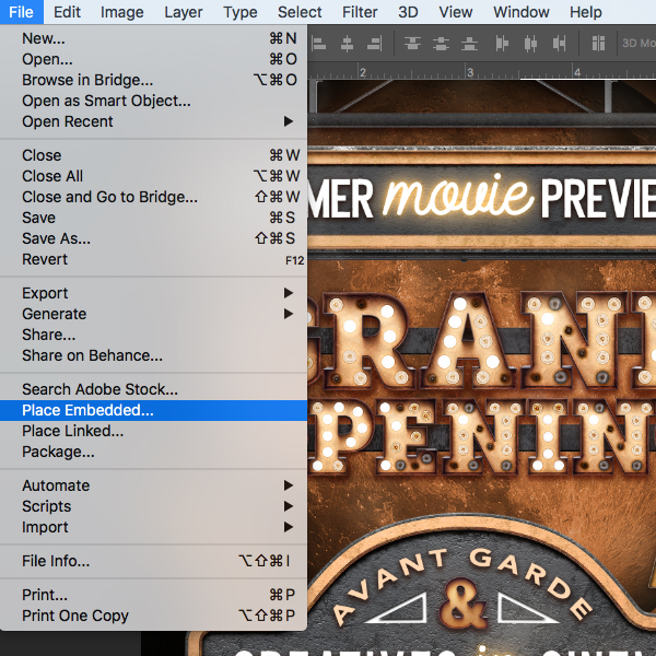
Go to the File menu and choose ‘Place Embedded…’ as shown below:
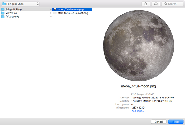
Navigate to the ‘moon_7-full-moon.png’ file in the freebies folder and then choose ‘Place’ from the lower right corner.
Please note that we have been unable to include the full moon graphic in the freebie pack and we have replaced this with the moon_4.png instead. We apologise for any inconvenience this might cause. Alternatively though, you can use any full moon graphic from your own resource collection or search for royalty free moon graphics.
The moon will now appear in your file as a Smart Object and will automatically have the same name as the file with a bounding box around the object. Hold the Alt/Option keys and drag outwards from any of the four corners of the bounding box to scale it up until the width just about matches the width of the canvas and then we also want to move it up so the top is slightly cropped off. After positioning the moon accordingly, press ‘Return’ on the keyboard to apply the changes.
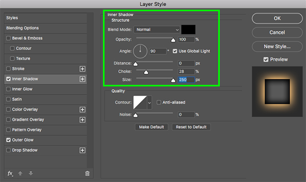
Step 3: Shadows and Glows
Double click on the moon layer to open the Layer Style panel and check off the ‘Inner Shadow’ option. As for the settings, make sure the ‘Blend Mode’ is set to ‘Normal’ with a solid black fill at full opacity. We can leave the distance set to ‘0’, the choke set to ’28’, and the size should be all the way up at ‘250’ as shown in the image below:
Before applying the changes we will also check off the ‘Outer Glow’ option and this time change the ‘Blend Mode’ so that it’s set to ‘Linear Dodge (Add)’ at about ‘73%’ opacity. For now we can leave the spread set to ‘0’ and the size can also be cranked up to ‘250’.
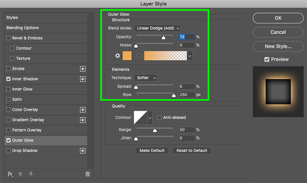
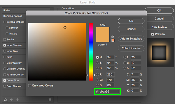
For the ‘Outer Glow’ we will also want to change the color to the hex value ‘#EBAA56’ and then press ‘OK’ twice on the keyboard to close out of both panels and apply the changes.
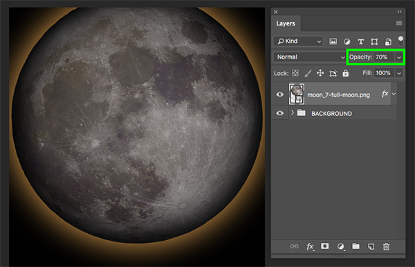
You will now see the effects on the moon and from here we are just going to lower the opacity of the layer to about ‘70%’ which you can do by manually moving the ‘Opacity’ slider or by pressing the number ‘7’ on your keyboard. Your image should now look something like this:
Step 4: Adjustment Layers
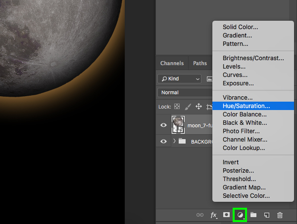
With the moon Smart Object layer selected, go to the Adjustment Layer icon at the bottom of the Layers Palette and then choose ‘Hue/Saturation…’ from the list as shown below:
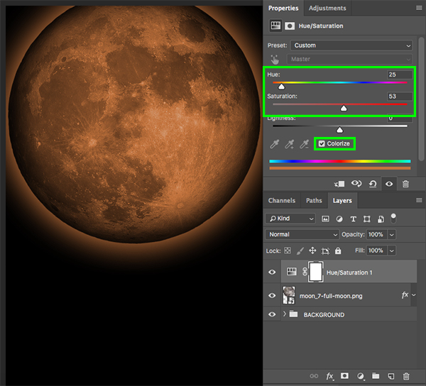
In the properties panel let’s first check off the ‘Colorize’ box and then move the ‘Hue’ slider to ’25’ and the ‘Saturation’ slider to ’53’.
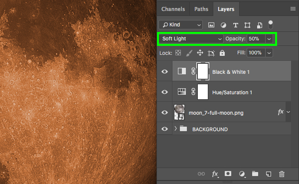
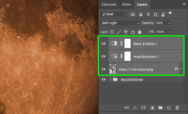
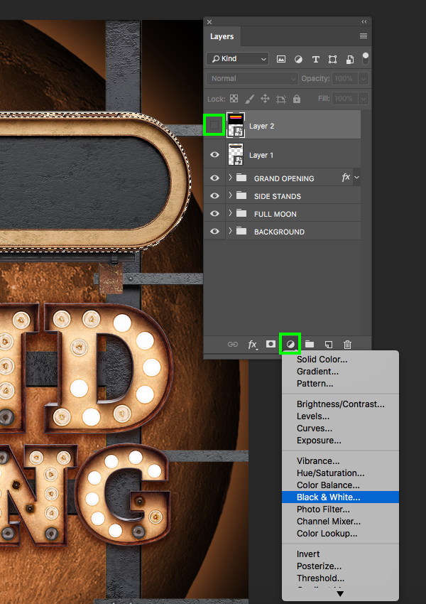
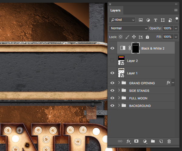
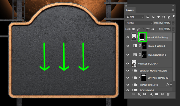
Return to the Adjustment Layer icon and this time we want to choose ‘Black & White…’ from the list.

After applying the new Adjustment Layer, change the ‘Blend Mode’ to ‘Soft Light’ and reduce the opacity of the layer to about ‘50%’ as shown in the image below:
Step 5: Moon Group
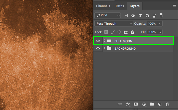
Select the top Adjustment Layer in the Layers Palette and then hold the Shift key and select the moon Smart Object layer.
With these three layers selected, press Command/Ctrl+G to place them into a new folder. Double click on the ‘Group 1’ text and change the name of the folder to ‘FULL MOON’ as shown here:
Step 6: Scaffolding
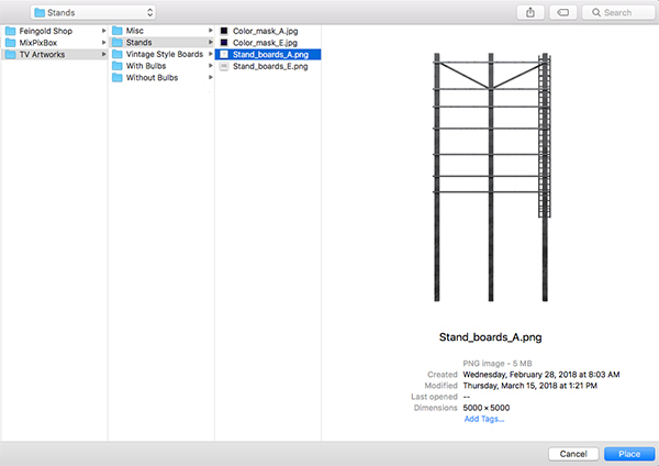
Go to the File menu and choose ‘Place Embedded…’ from the dropdown menu.
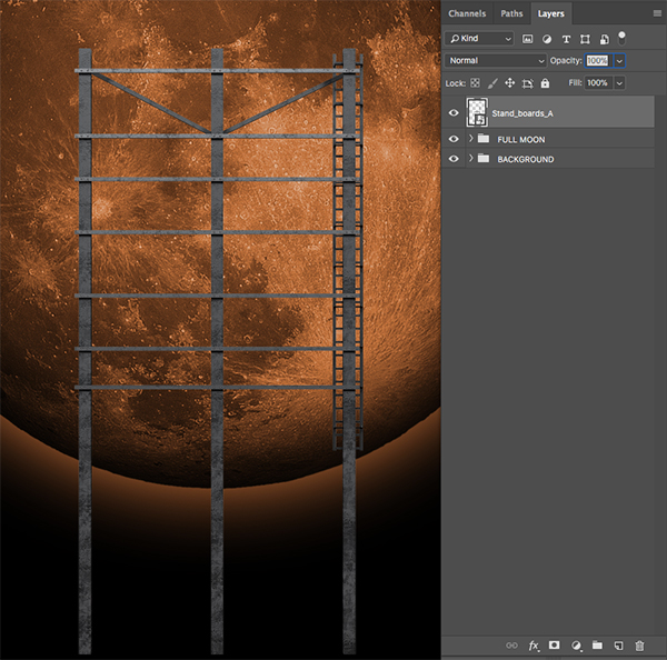
Navigate to the ‘Stand_boards_A.png’ file from the TV Artworks freebies folder and then choose ‘Place’ to import the image as a Smart Object.
You will now have your stand imported and can press ‘Return’ to apply the changes once the image has been placed at the top of your Layers Palette as shown here:
Return to the same menu and choose ‘Place Embedded…’ once again, this time navigating to the ‘Color_mask_A.jpg’ file and placing that image.
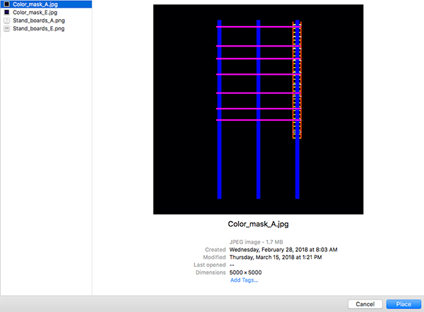
Next, line up the color mask image on top of the regular stand. These should already be the same size if not close to the same size so just make sure to modify them accordingly so they line up. Once you have placed the mask on top, select that layer and reduce the opacity to somewhere around ‘30%’ as shown below:
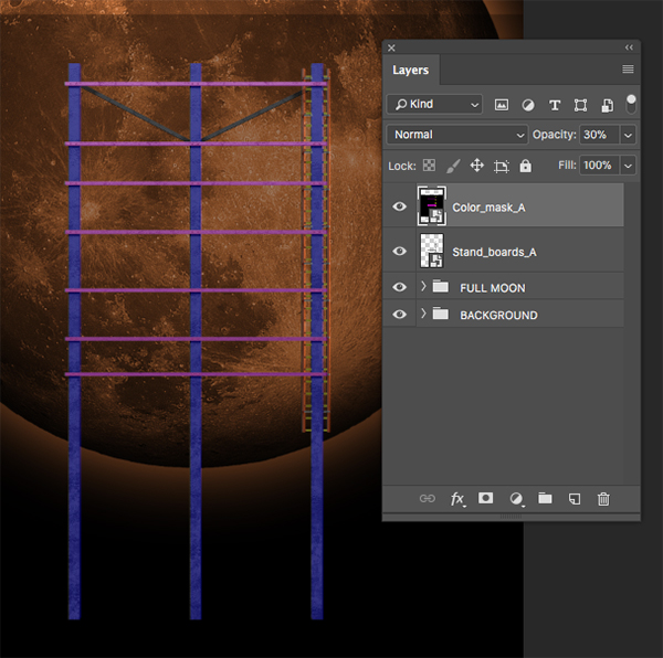
Select the mask layer, hold the Shift key, and then select the regular stand layer just below it so they are selected at the same time. From here, press Command/Ctrl+T to initiate a Free Transform and then hold the Alt/Option+Shift keys and drag outwards from any of the four corners of the bounding box to scale them up together until only the left side is visible on the right side of the canvas. Use the image below as reference for the size and placement of the stand. Once you have done that, press ‘Enter’ or ‘Return’ to apply the changes.
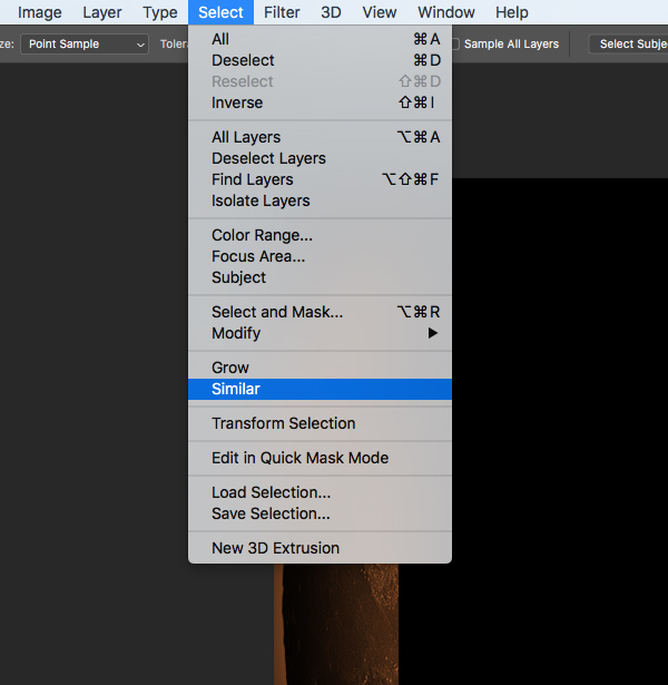
Step 7: Scaffold Selections
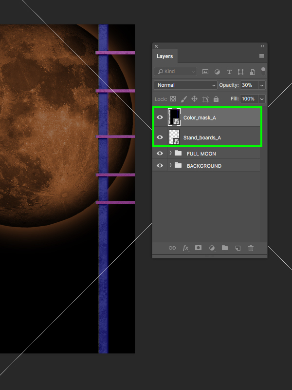
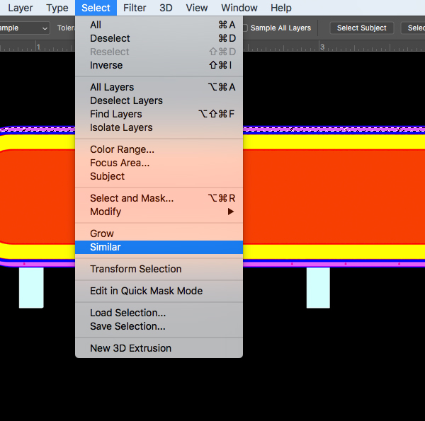
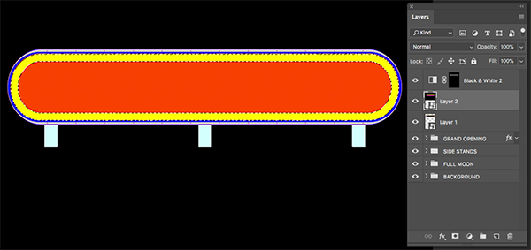
Let’s bring the opacity of the color mask back up to full opacity for a moment. Next, press ‘W’ on the keyboard to get the Magic Wand Tool and then click on any of the solid blue bars shown below:

After selecting one of the solid blue shapes, go to the ‘Select’ menu and choose ‘Similar’ to select all of the other visible shapes filled with that same color.
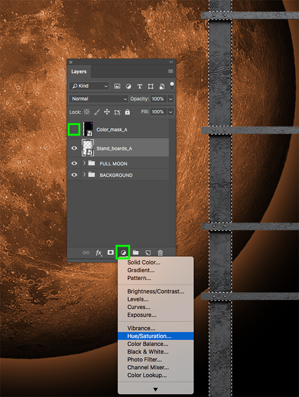
You will now have a selection around the main vertical bar on the left, excluding the horizontal parts that intersect. We can now poke out the eyeball of the color mask layer to turn the visibility for that layer off since we no longer need it. While the selection is still active, let’s go to the Adjustment Layer icon at the bottom of the Layers Palette and then choose ‘Hue/Saturation…’ from the list.
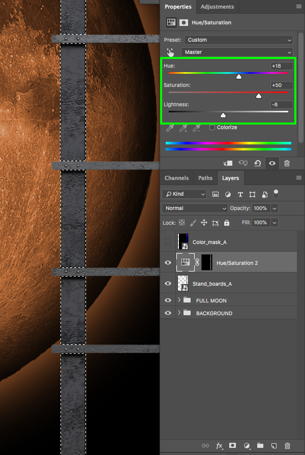
For the properties let’s set the ‘Hue’ to ‘+18’, the ‘Saturation’ to ‘+50’, and the ‘Lightness’ to about ‘-8’ as shown in the image below:
Step 8: Scaffold Adjustments
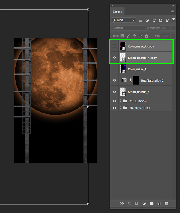
Next, select the top ‘Color_mask_A’ layer, hold the Shift key and then select the main ‘Stand_boards_A’ Smart Object layer.
Press Command/Ctrl+J to duplicate the layers and then press Command/Ctrl+T to do a Free Transform. From here, hold the Shift key and slide these layers over to the opposite side of the canvas so that only the right side of the stand is visible, on the left portion of the canvas. Once you are happy with the size and placement of the stands, press ‘Return’ on the keyboard to apply the changes and then go ahead and delete the Adjustment Layer.
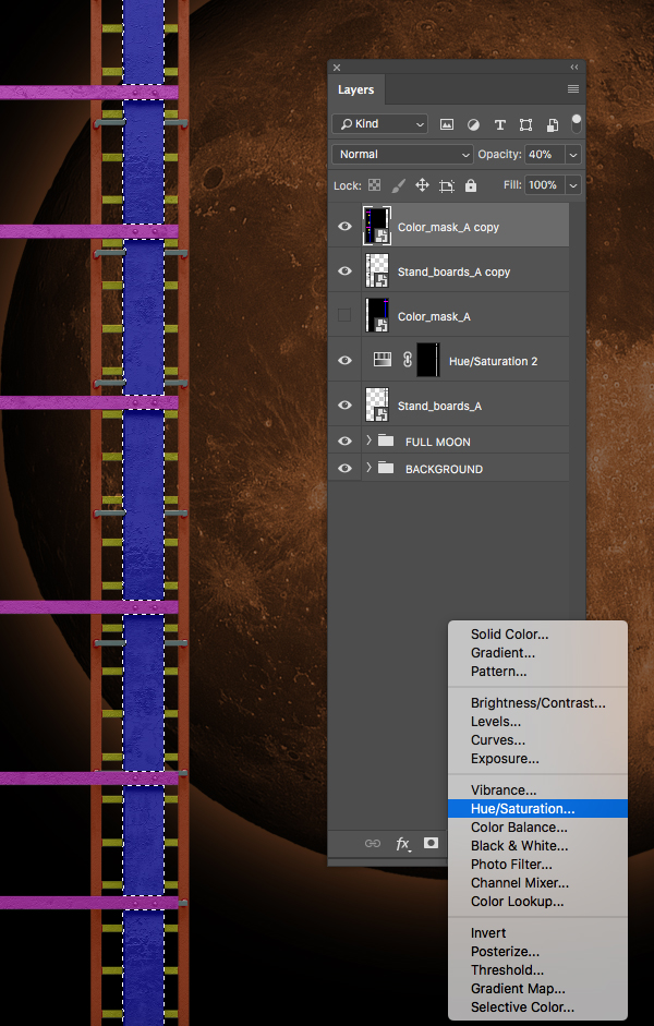
Let’s now turn the visibility of the color mask layer back on and drop the opacity down so we can see the main stand through it. Use the Magic Wand (W) once again to select any of the blue vertical bars and then go to the ‘Select’ menu and choose ‘Similar’ from the list to select all of the other blue sections. Once you have done that, return to the Adjustment Layer icon at the bottom of the Layers Palette and choose ‘Hue/Saturation…’ once again.
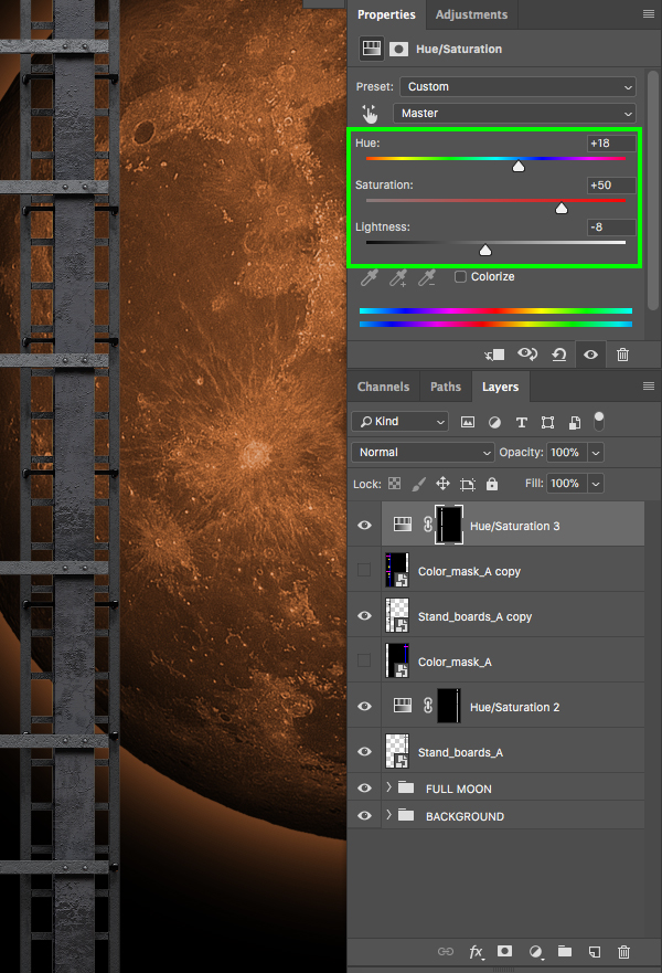
For the properties let’s set the ‘Hue’ to ‘+18’, the ‘Saturation’ to ‘+50’, and the ‘Lightness’ to about ‘-8’ so that it matches our first copy as shown below:
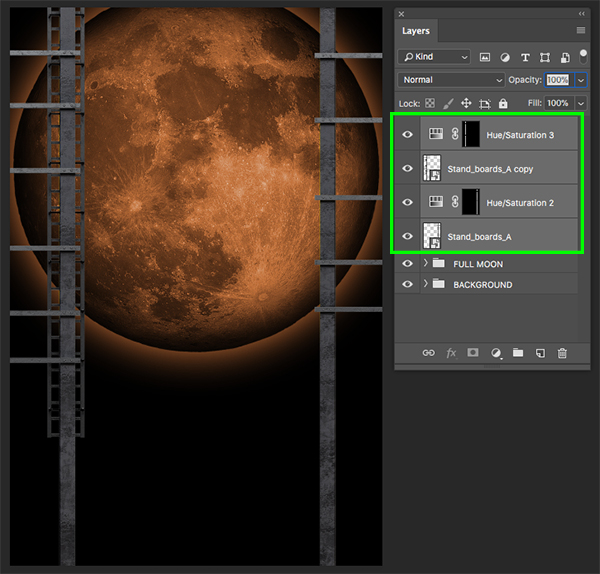
Step 9: Taking a Stand
Now that we have seen how to use the color masks to create selections so that we can modify them, we can delete the masks from the Layers Palette. Next, select the top ‘Hue/Saturation’ layer, hold the Shift key and then select the original ‘Stand_boards_A’ Smart Object layer so they are all selected at the same time.
Press Command/Ctrl+G to put these layers into a new folder and double click the ‘Group 1’ text to rename it ‘SIDE STANDS’ as shown below:

Step 10: Grand Opening
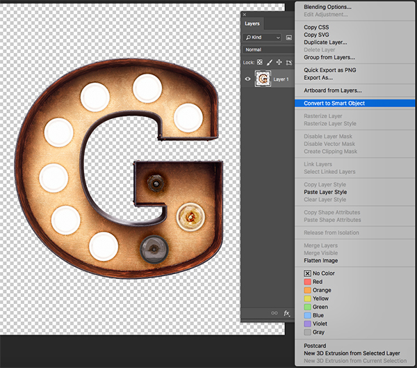
Grab the ‘HFF_G.png’ file from the ‘With Bulbs’ subfolder in the freebies for the tutorial and open it in Photoshop. Once the letter has opened in a new window, hold the Control key and click on the layer before choosing ‘Convert to Smart Object’ from the menu as shown here:
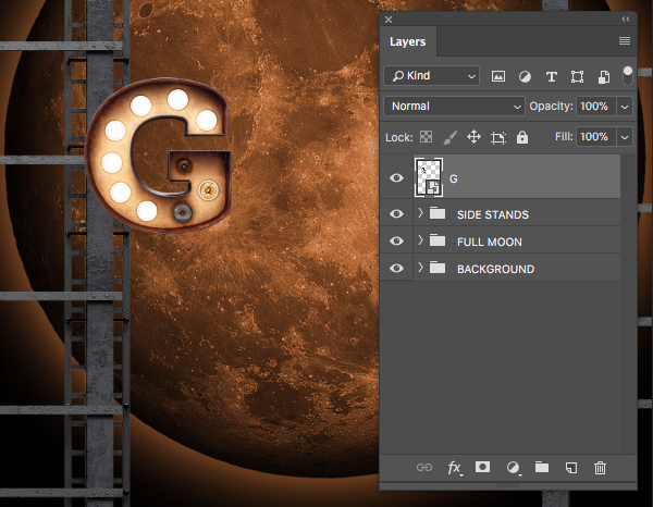
Click and drag the letter into your main document and then press Command/Ctrl+T to do a Free Transform and scale it down by holding the Shift key and dragging inwards from any of the four corners of the bounding box. We want this letter to be placed so that it is slightly overlapping the bars on the left side of the canvas.
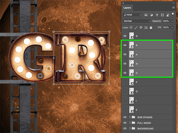
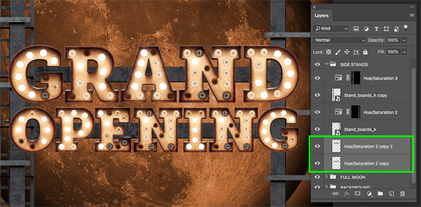
Open the remaining letters in the ‘With Bulbs’ folder, convert them each into Smart Objects, and drag them into your main document. Once you have all of your letters we want to place them individually so that they spell out the word ‘GRAND’. The way that I like to manually typeset these is to select all of the letters so the tops and bottoms are aligned and then I will slide them over to the right of the previous letter to make sure they line up.
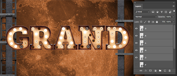
After manually typesetting the first word your image should look like this:
We will now repeat this process to spell out the word ‘OPENING’ just below the first line. For these letters we will want to get them in place and then scale them down by selecting the first letter (‘O’) and then holding the Shift key and selecting the last letter (‘G’) before applying a Free Transform. Once you do that you will want to drag inwards from any of the four corners of the bounding box and make it so that the left and right sides line up with the left and right sides of the word ‘GRAND’ on the line above. You should wind up with something like this:
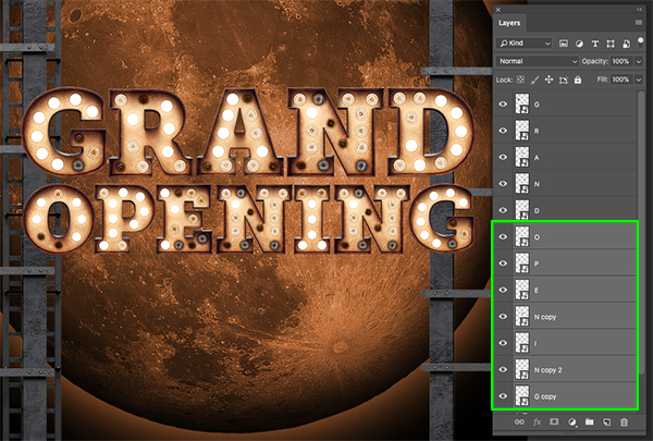
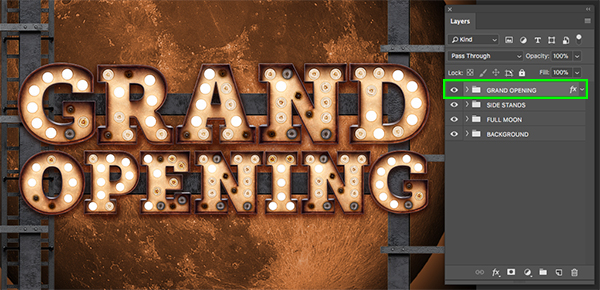
After setting up our main bulb text, select the very first letter, hold the Shift key, and select the last letter in your Layers Palette. Once all of your individual bulb letters are selected in the Layers Palette press Command/Ctrl+G to put them all into a single folder. From here, double click on the ‘Group 1’ text and rename the folder ‘GRAND OPENING’.
Step 11: Cross Bars
Let’s now go inside of the ‘SIDE STANDS’ folder and select the bottom ‘Stand_boards_A’ layer, hold the Shift key, and then select the ‘Hue/Saturation’ layer just above it. From here, press Command/Ctrl+J to duplicate these two layers and they will appear just above the original two.
Press Command/Ctrl+E to merge these two layers together. After that, press the letter ‘M’ to get your Rectangular Marquee Tool and then click and drag a rectangle around the long vertical piece of the bar on the bottom like this:
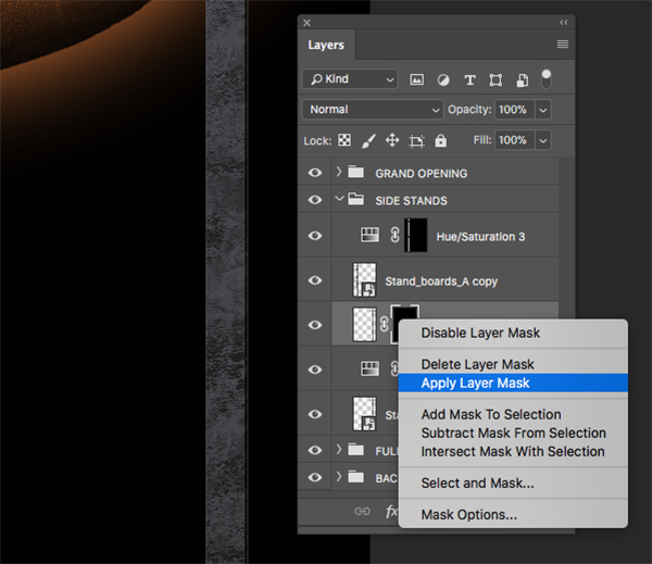
Once you have made your selection, click on the ‘Add layer mask’ icon at the bottom of the Layers Palette to apply a mask around it.
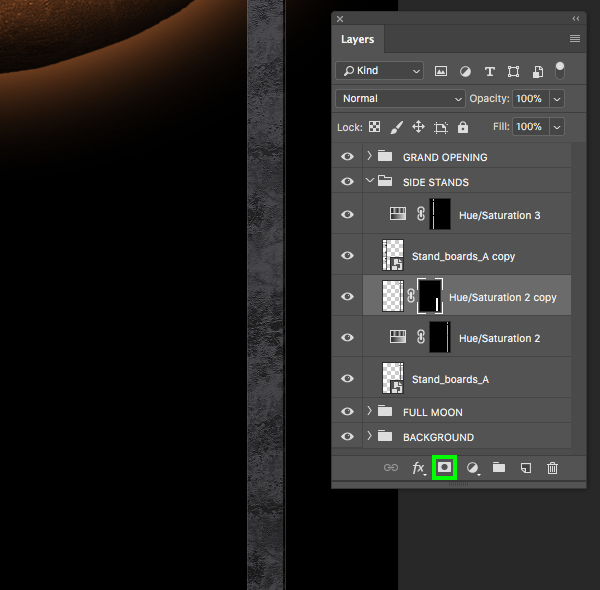
Next, hold the Control key and click on the Layer Mask before choosing ‘Apply Layer Mask’ from the list.
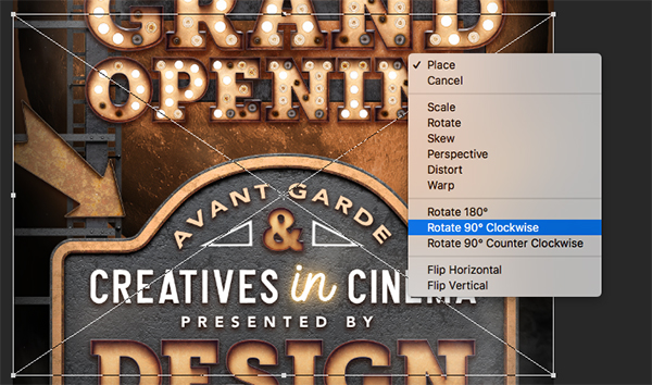
Now we want to select the merged layer, press Command/Ctrl+T to do a Free Transform, and then hold the Control key and click on the section of the bar that we’ve applied our mask to in order to reveal a dropdown menu. From the list that appears we want to then select the ‘Rotate 90º Clockwise’ option as shown below:
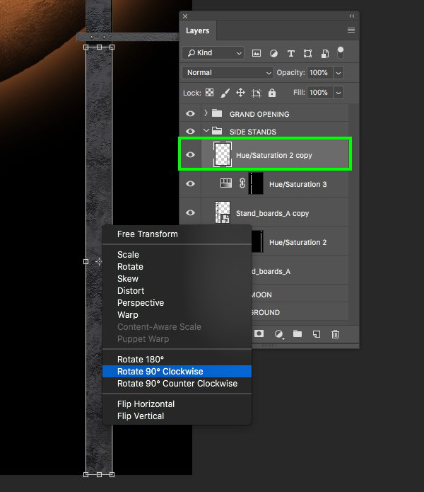
After flipping the bar it should now run across the image horizontally. Let’s place the first bar behind the word ‘GRAND’ so that our text isn’t just floating in the air. Once you have done that, press Command/Ctrl+J to duplicate the bar and then hold the Shift key and tap it down so that the second bar sits nicely behind the ‘OPENING’ text. You should now have one horizontal bar running behind each of the two words.
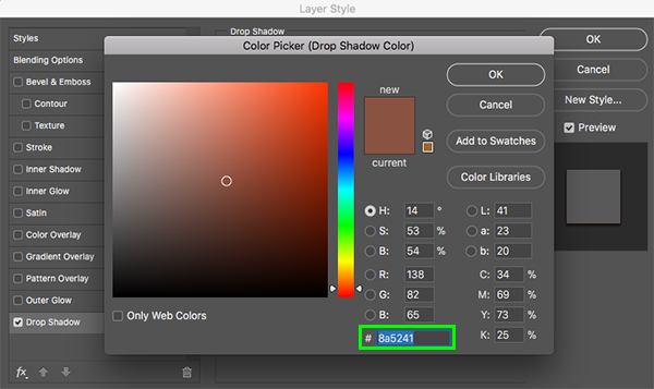
Step 12: Bulb Text Shadows
Double click on the ‘GRAND OPENING’ folder to bring up the Layer Style panel and then check off the ‘Drop Shadow’ effect. Change the ‘Blend Mode’ to ‘Multiply’ and then make the ‘Distance’ about ‘7’, the ‘Spread’ about ’19’, and the ‘Size’ can be set to ’18’.
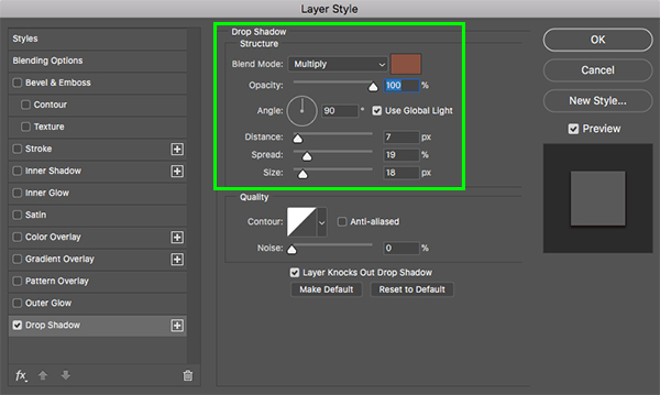
For the fill color, enter the hex value ‘#8A5241’ before pressing ‘OK’ two times to apply the changes and close out of both of the dialog boxes.
After applying the shadow effect your text should now stand off of the background more while also appearing as though it is attached to the bars running behind it.
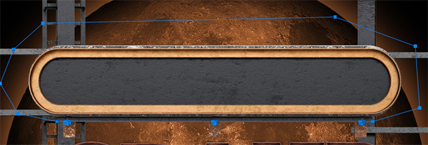
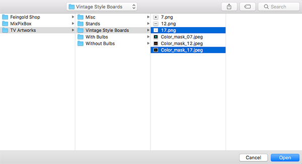
Step 13: Vintage Board
Next let’s open the ‘Vintage Style Boards’ folder in the resources and locate ’12.png’. Hold the Command/Ctrl key and also select the accompanying color mask layer as shown here:
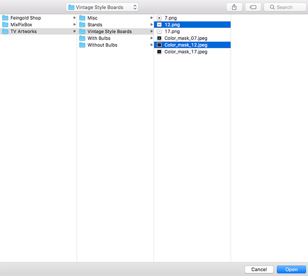
What we want to do is open both of these files and place them next to each other before selecting the color mask file, holding the Shift key, and then dragging it over into the main vintage sign document.
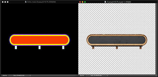
By holding the Shift key while we do this it should place the color mask layer directly on top of the sign. What we want to do next is hold the Control key and click on each of the two layers separately and convert each one into a Smart Object so that we can resize it in our main file without any loss in quality. Typically, if you attempt to resize a rasterized image a few times you will notice that it starts to become blurry, so that is one of the biggest advantages of making it a Smart Object first.
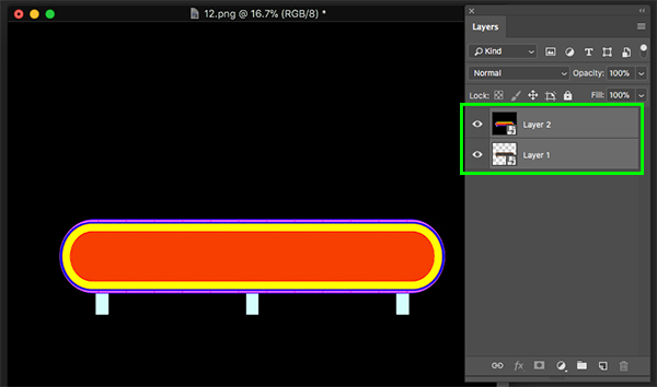
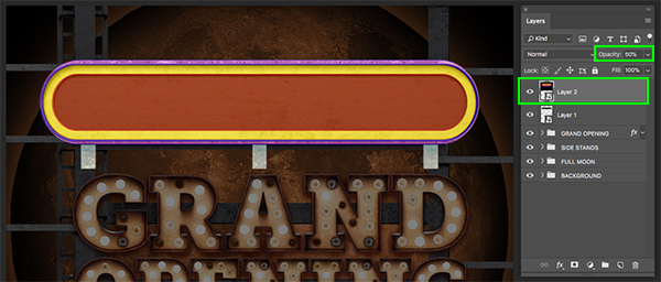
Now we can select the top color mask layer, hold the Shift key, and select the sign below so both are selected together. Now we will drop both of these into our main document and apply a Free Transform (Command/Ctrl+T). From here we can scale it down a bit by holding Alt/Option+Shift and dragging inwards from any of the four corners of the bounding box. The goal here is to visually center the sign above our main ‘GRAND OPENING’ text. Once you’ve positioned the sign where you want it, lower the opacity of the color mask just to make sure things are looking good.
Step 14: Modifying the Board
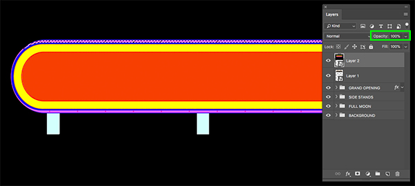
Bring the opacity of the color mask back up to full opacity, grab your Magic Wand Tool (W) and select an area of purple on the outside edge.
Go to the Select menu and choose ‘Similar’ from the dropdown list to select all of the remaining purple from the color mask Smart Object layer.
Now we can turn off the visibility of the color mask layer once we have the selection we need. After that, go to the Adjustment Layer icon at the bottom and choose ‘Black & White…’ as shown below:
You will now have a layer mask applied to the Adjustment Layer and it will result in a black and white edge all the way around the outside of the sign like this:
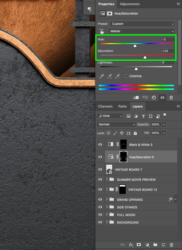
Step 15: Saturated Board
Let’s go ahead and make another adjustment using our color mask layer. Turn the layer back on and this time use your Magic Wand Tool (W) to select the yellow part.
After making the selection turn the visibility of the color mask off once again and return to the Adjustment Layer icon at the bottom. This time we want to choose ‘Hue/Saturation…’ from the list.
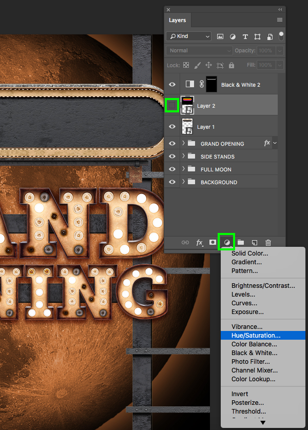
Once again we will automatically have a mask applied to our Adjustment Layer because of our selection. Now let’s change the properties of the Adjustment Layer by moving the ‘Hue’ slider to ‘-3’ and the ‘Saturation’ to about ‘+24’.
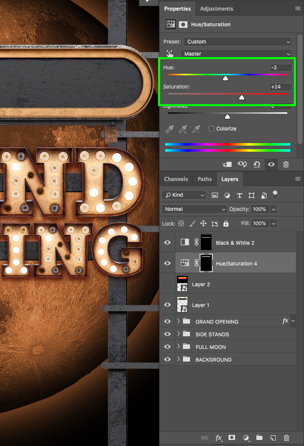
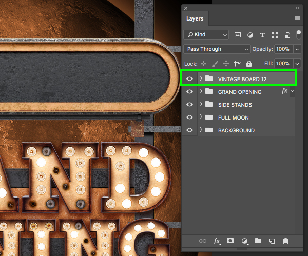
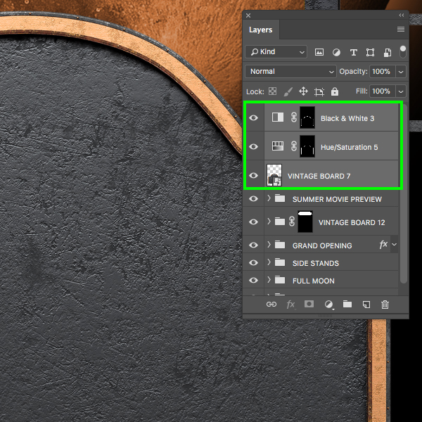
Step 16: Board Group
Now that we have customized our first board a bit we no longer need the color mask layer so we can get rid of that. Let’s then select the top Adjustment Layer, hold the Shift key, and then select the main board Smart Object.
With the three layers selected, press Command/Ctrl+G to put them into a new folder and double click the ‘Group 1’ text to change it to ‘VINTAGE BOARD 12’.
Step 17: Trimming the Board
Let’s zoom in a bit by pressing Command/Ctrl and the ‘+’ key on the keyboard. Use the Hand Tool (spacebar) to click and drag around the document until you are over the lower left bracket of the vintage sign. We now want to grab our Pen Tool (P) and begin tracing the bottom so we go around the dark gray piping and continue this all the way across the bottom.
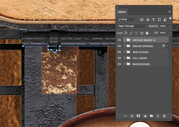
Once you have finished tracing along the bottom part of the sign, go around the rest of it and close the shape.
After closing the shape press Command/Ctrl+Return on the keyboard to turn the path into an active selection.
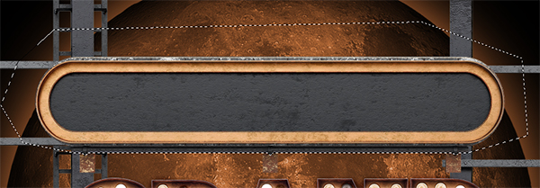
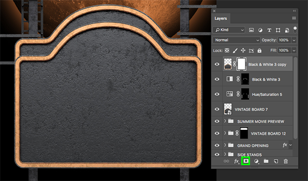
With our active selection let’s now make sure that we still have our ‘VINTAGE BOARD 12’ folder selected and then click on the Layer Mask icon at the bottom of the Layers Palette. Doing this will mask out the bronze/copper brackets that were at the bottom of the vintage style board.
Step 18: Summer Preview
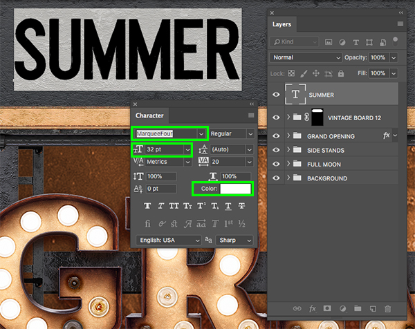
Create a new layer at the top of your Layers Palette by either selecting the ‘New Layer’ icon at the bottom of the panel or by using the keyboard shortcut Command/Ctrl+Alt/Option+Shift+N. After that, switch to your Type Tool (T) and type out the word ‘SUMMER’ on top of the vintage sign. If you don’t have the Character Panel available let’s open that by going to the Window menu and choosing ‘Character’ from the list. Once you have that panel open let’s make a few adjustments to our text. Here I am using ‘MarqueeFour’ which is one of the fonts that comes in the full bundle. If you guys don’t have access to this font I would recommend trying out another bold, condensed, sans serif typeface such as ‘Bebas’ or ‘Franchise’ as well as good old ‘Helvetica Condensed’ as an alternative. From there, let’s go ahead and change the size of our text to about ’32’ point and give it a solid white fill.
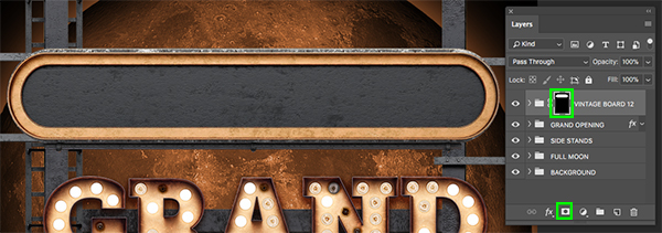
Next, hold the Alt/Option key and click and drag the small ‘fx’ icon from the ‘GRAND OPENING’ folder onto the text. Doing this will duplicate the effects that we applied earlier onto our ‘SUMMER’ text so we end up with a nice shadow to help give the text a bit of depth.
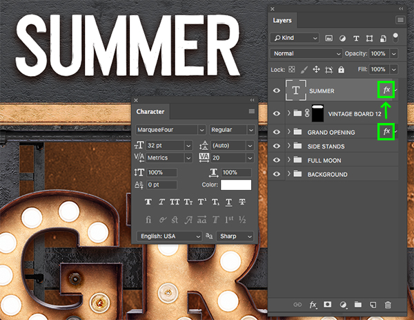
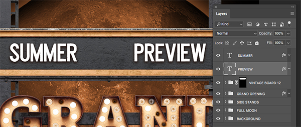
Select the ‘SUMMER’ text layer and press Command/Ctrl+J to duplicate it, and then Command/Ctrl and the left bracket key to move the layer down one position in the Layers Palette. Once you have done that, hold the Shift key and tap it over to the right side of the sign before using the Type Tool (T) to change the text to read ‘PREVIEW’ as shown below:
Step 19: Movie Text
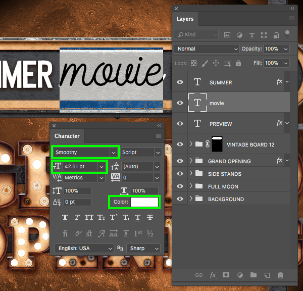
Add another new layer in between our two previous text layers and then use the Type Tool (T) to type out the word ‘movie’ in all lowercase letters. Here I am using the typeface ‘Smoothly’ which is a premium typeface, but there are several good free alternatives that you guys can use here such as ‘Birds of Paradise’, ‘Sign Painter’, or ‘Back to Black’ which are all available on DaFont.com. Let’s now set our type to be about ‘42.5’ points in size with a solid white fill color.
Double click on the ‘movie’ text layer to open the Layer Style panel and check off the ‘Stroke’ option. Here we are going to simply add stroke of about ‘2’ pixels and make sure that it’s ‘Position’ is set to ‘Outside’. This is a good and easy way to make the text a bit bolder so it will read better from a distance.
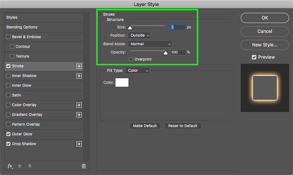
Next, let’s check off the ‘Outer Glow’ option and change the ‘Blend Mode’ to ‘Linear Dodge (Add)’, the ‘Opacity’ all the way up at ‘100’, and then change the ‘Size’ to about ’70’.
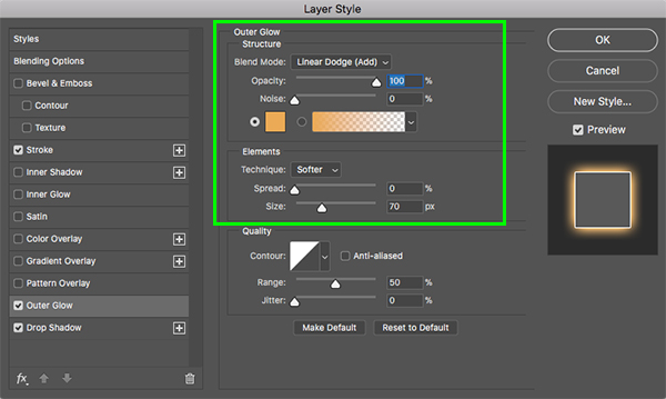
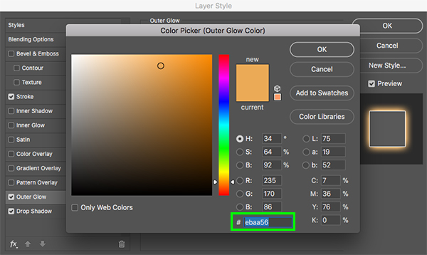
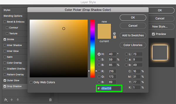
For the glow color, let’s use the hex value ‘#EBAA56’ as shown below. After entering the color value go ahead and click ‘OK’ to close out but we are now going to apply an additional effect before closing out of the Layer Style panel completely.
Once the glow is set up let’s check off the ‘Drop Shadow’ option here as well. For the settings we want the ‘Blend Mode’ set to ‘Overlay’, the ‘Distance’ can stay at ‘0’ and then make the ‘Spread’ about ’30’ and the ‘Size’ about ’18’ pixels.
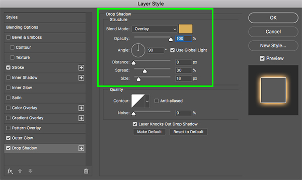
For our shadow fill, let’s enter the hex value ‘#D8AD59’ and then click ‘OK’ or press ‘Return’ on the keyboard two times to apply the changes and close out of both dialog boxes.
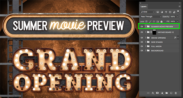
Select the top ‘SUMMER’ text layer, hold the Shift key, and then select the bottom ‘PREVIEW’ text so all three of our new text layers are selected at once. After that, press Command/Ctrl+G to put them all into a folder and double click on the ‘Group 1’ text before changing the name to ‘SUMMER MOVIEW PREVIEW’.
Step 20: Cinema Style
Next, let’s open the ‘7.png’ file and hold the Command/Ctrl key to also select the accompanying ‘Color_mask_07.jpg’ file.
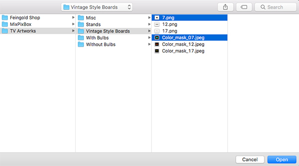
Once the files have opened in Photoshop, place them next to each other and then hold the Shift key and drag the color mask into the main sign file so they are on top of each other. Hold the Control Key and click on each layer individually before converting them into Smart Objects just like we did earlier with our first vintage sign.
Select both of the two Smart Object layers and drag them into your main working document. Once you’ve brought them in together, make sure both layers are still selected and press ‘5’ on the keyboard to lower the opacity of both layer to ‘50%’. Now you can see through the signs so we can focus on placement. What we want to do here is drag out a couple of guides using our rulers which you can access by pressing Command/Ctrl+R. Let’s drag out a guide to the left and right edges of our first sign so we can line the new one up at the same width. You may also have to apply a Free Transform (Command/Ctrl+T) in order to resize the two new sign layers accordingly until they are in position.
After placing the sign and color mask layer where we want, press ‘0’ on the keyboard to return both layers to their full opacity. Now we can zoom in and use our Magic Wand Tool (W) to select the dark blue border around the outside of our color mask layer.
Once the selection is made, turn off the visibility of the color mask layer and then click on the Adjustment Layer icon at the bottom of the Layers Palette and choose ‘Black & White…’ as we did with our first sign to desaturate the edges.
Now turn the visibility of the color mask layer back on and this time select the purple/magenta section.
We can now turn the visibility of the color mask layer off once again and then return to the Adjustment Layer icon and add a ‘Hue/Saturation…’ layer. We will then apply the same settings that we used for the previous Hue/Saturation Adjustment Layer by moving the ‘Hue’ slider to ‘-3’ and the ‘Saturation’ to about ’24’ as shown below:
Step 21: Extending the Sign
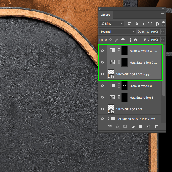
You may notice that I’ve renamed the main sign layer which you can do easily by double clicking the ‘Layer 1’ text and renaming it. Here I have just called it ‘VINTAGE BOARD 7’. We can also now delete our color mask layer as we no longer need it. Next, select the top Adjustment Layer, hold the Shift Key, and then select our main sign Smart Object layer so all three layers are selected together.
With your three layers selected, press Command/Ctrl+J to duplicate them.
Press Command/Ctrl+E to merge the three duplicate layers together into one, and then hold the Shift Key and tap the sign down a few times. From here, apply a Layer Mask by selecting the ‘Add layer mask’ icon from the bottom of the Layers Palette as shown below:
Press ‘G’ on the keyboard to get your Gradient Tool and check the toolbar settings up top to make sure that you have a Linear Gradient that fades from solid black to transparent like this:

Return to your merged sign layer and make sure that the Layer Mask is selected. From here we will just click and drag downwards from about the middle of the sign to fade it out so you are left with only the bottom of the merged sign layer.
Now we can select the top merged layer, hold the Shift key, and select the bottom copy before pressing Command/Ctrl+G to put them all into a new folder. After that, double click the ‘Group 1’ text of the folder name and change it to ‘VINTAGE BOARD 7’ as shown here:
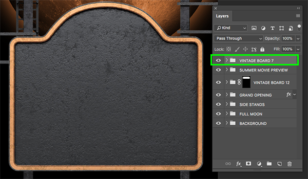
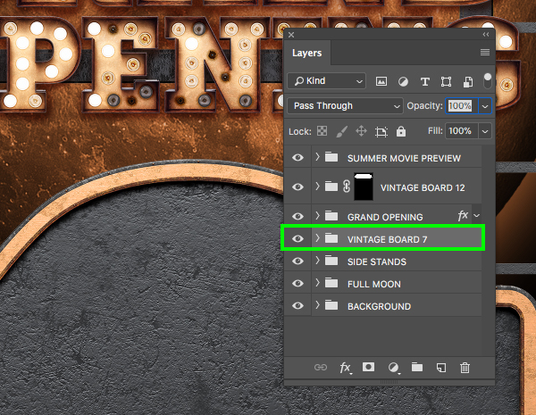
This part isn’t absolutely necessary but just to keep things organized I am going to move this folder down so it’s below the ‘GRAND OPENING’ folder just so that the layers correspond with the order in which our objects appear. Doing this is an easy way to quickly find and identify the layers or folders you need if you have to make any revisions or edits down the line.
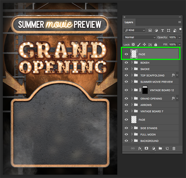
Step 22: Faded
Let’s grab our Gradient Tool (G) once again and use the same settings that we had from before – a solid black to transparent Linear Gradient. Create a new layer just below the ‘VINTAGE BOARD 7’ layer and click from the very top of the image and drag down while holding the Shift key to create a dark fade from the top.
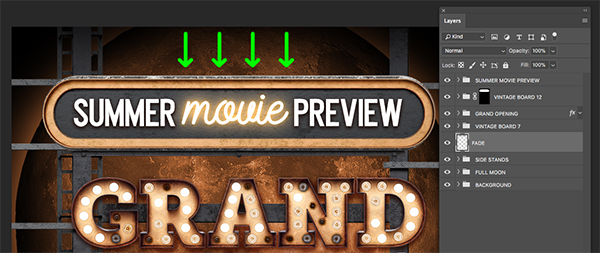
Let’s also click and drag upwards from the very bottom to create another fade there as well. As we begin to add more elements we will want to keep the focus on the central part of the design so by fading the edges a bit we begin to create a nice vignette effect. The image below shows the before and after with and without the gradients.
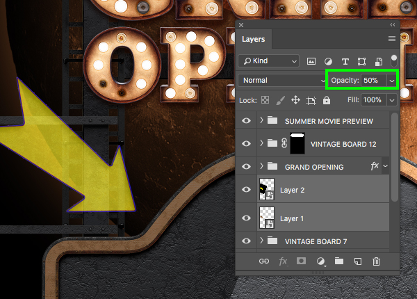
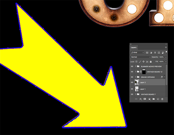
Step 23: Vintage Arrows
Let’s go to ‘File’ and choose ‘Open’ before navigating to the ’17.png’ file. Hold the Command/Ctrl key and click on the corresponding color mask and then choose ‘Open’.
Once again we will place the color mask on top of the actual sign in the ’17.png’ file and change each layer to a Smart Object as shown below:
Drag both layers into your working document and place them just below the ‘GRAND OPENING’ folder and then press the number ‘5’ on your keyboard to reduce the opacity of both layers to ‘50%’. From here, press Command/Ctrl+T and scale both Smart Object layers down by dragging inwards from any of the four bounding boxes while holding the Alt/Option keys. We will then place the arrow above and to the left of our tall vintage sign and we will also rotate it so it’s pointing down as shown here:
Once the arrows are in place, bring the opacity back up to ‘100%’ and then use the Magic Wand Tool (W) to select the inner yellow part of the color mask.
Turn the visibility of the color mask layer off and then select the Adjustment Layer icon at the bottom of the Layers Palette before choosing ‘Hue/Saturation…’ from the list.
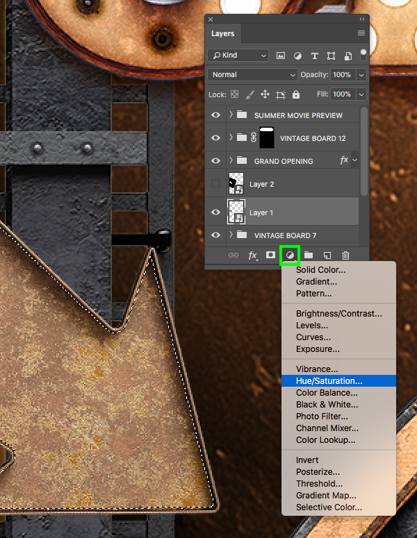
Let’s now apply the same properties that we used earlier by bringing the ‘Hue’ slider to ‘-3’ and the ‘Saturation’ to ‘+24’. Once you have done that, delete the color mask layer and then select the Adjustment Layer, hold the Shift key and select the vintage sign Smart Object below.
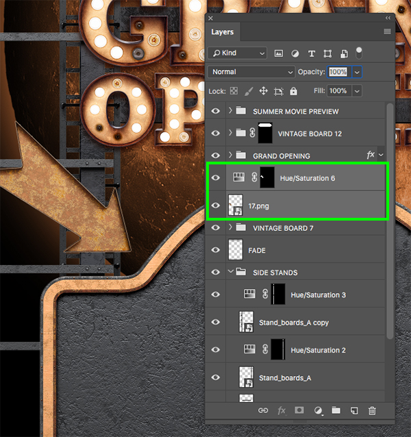
Press Command/Ctrl+G to place the two layers into a new folder and double click the ‘Group 1’ text and change the name of the folder to ‘ARROW’. After that, hold the Alt/Option key and click and drag the small ‘fx’ icon from the ‘GRAND OPENING’ folder onto the ‘ARROW’ folder to apply the same effect.
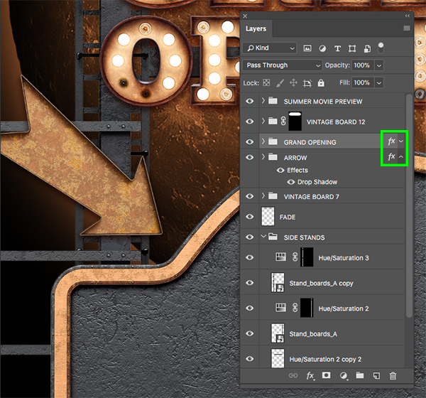
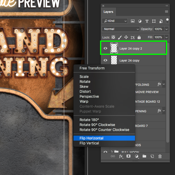
Select the ‘ARROW’ folder and duplicate it by pressing Command/Ctrl+J on the keyboard. After that, hold the Control key and click on the arrow before choosing ‘Flip Horizontal’ from the dropdown menu that appears.
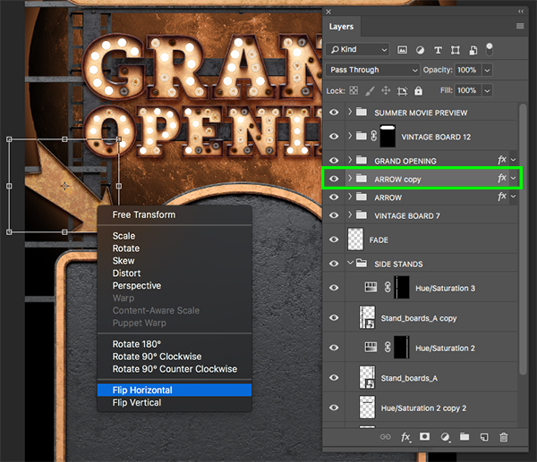
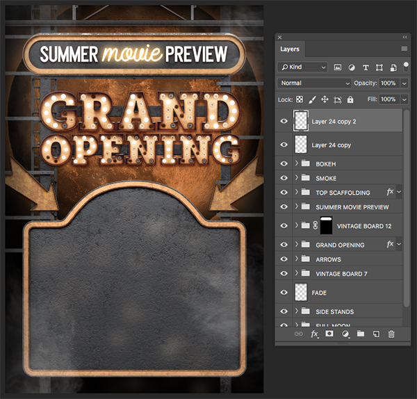
Hold the Shift key and slide the duplicate arrow to the opposite side. Once you’ve placed the arrow on the opposite side, select the top copy, hold the Shift key and then select the original folder below so you have them both selected simultaneously.
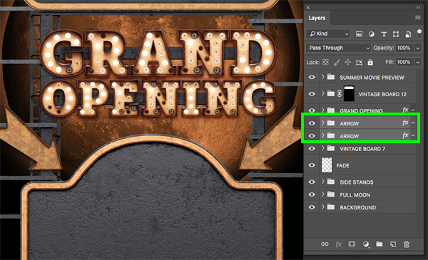
With both folders still selected, press Command/Ctrl+G and put them into a new folder. Double click the ‘Group 1’ text and change the name of the folder to ‘ARROWS’ so we can keep them together.

Step 24: Top Scaffolding
Let’s go to ‘File’ and choose ‘Open’ and find the ‘Top_Scaffold_from_Scene02.psd’ file inside of the ‘Misc’ folder.

Drag the Smart Object into your main document and scale it up using the Free Transform command (Command/Ctrl+T) and dragging outwards from any of the four corners of the bounding box while holding the Alt/Option+Shift keys. Place the scaffolding at the very top of the image so you see a bit of the bottom bar as shown below:

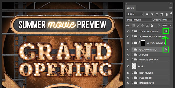
Place the top scaffolding layer into a new folder and name it ‘TOP SCAFFOLDING’. After that, click and drag the small ‘fx’ icon again from the ‘GRAND OPENING’ folder onto the new ‘TOP SCAFFOLDING’ folder.
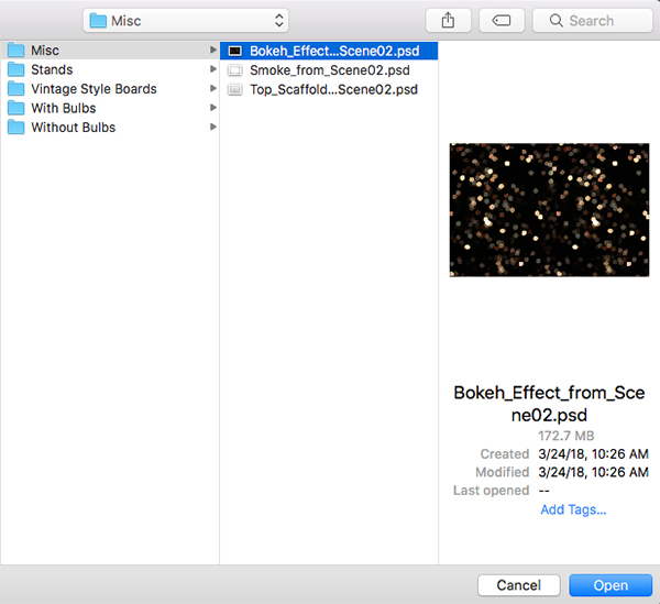
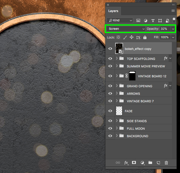
Step 25: Bokeh Dots
Let’s go to ‘File’ and choose ‘Open’ and locate the ‘Bokeh_Effect_from_Scene02.psd’ file inside of the ‘Misc’ folder.
Drag the Smart Object into your document and change the Blend Mode to ‘Screen’ before reducing the opacity of the layer to ‘32%’ as shown here:
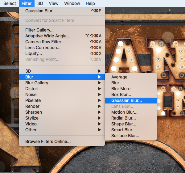
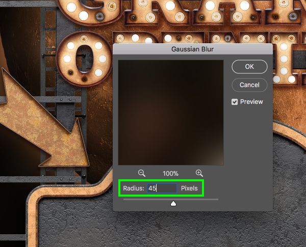
Go to the Filter menu and choose ‘Blur > Gaussian Blur’.
We will now apply a blur with a ‘Radius’ of about ’45’ pixels and then press ‘OK’ to apply the effect.
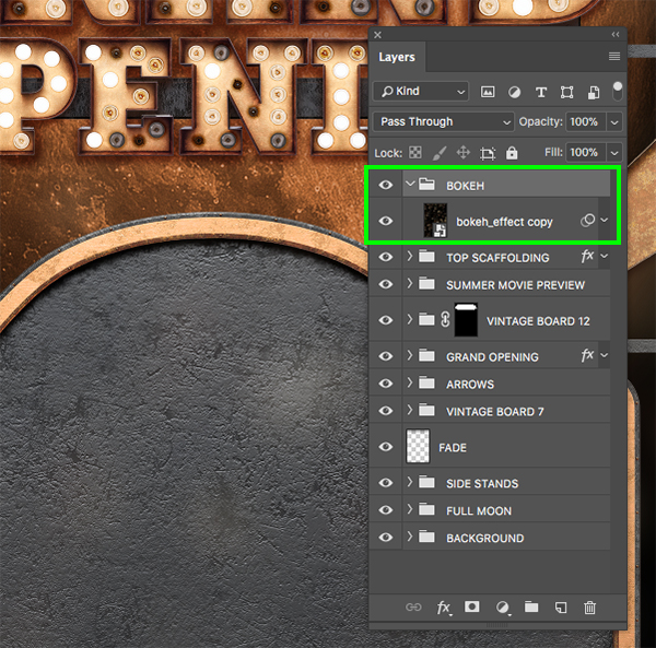
Let’s now select the ‘bokeh_effect copy’ layer and press Command/Ctrl+G to put it into a folder. Double click on the ‘Group 1’ text and rename the folder ‘BOKEH’ as shown here:
Step 26: Smoke and Mirrors
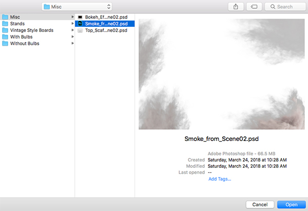
Let’s go to ‘File’ and choose ‘Open’ and locate the ‘Smoke_from_Scene02.psd’ file inside of the ‘Misc’ folder.
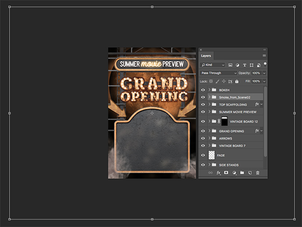
Click and drag the whole folder from the smoke file into your main document and place it just below the ‘BOKEH’ folder from the previous step. After that, press Command/Ctrl+T to do a Free Transform.
Hold the Control key and click anywhere and then choose ‘Rotate 90º Counter Clockwise’ from the menu that appears and then press ‘Return’ on the keyboard to apply the changes.

Step 27: Extra Contrast
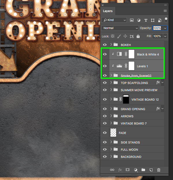
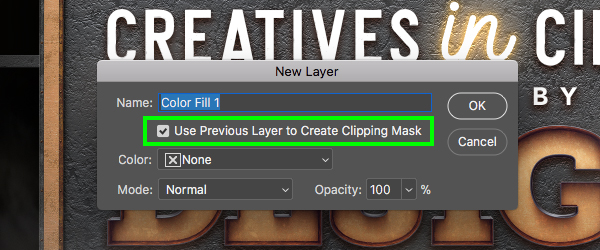
Select the ‘Smoke_from_Scene02’ folder and then press ‘5’ to reduce the opacity of the folder to ‘50%’. Next, click on the Adjustment Layer icon at the bottom of the Layers Palette while holding the Alt/Option key. From here, choose the ‘Black & White…’ Adjustment Layer.
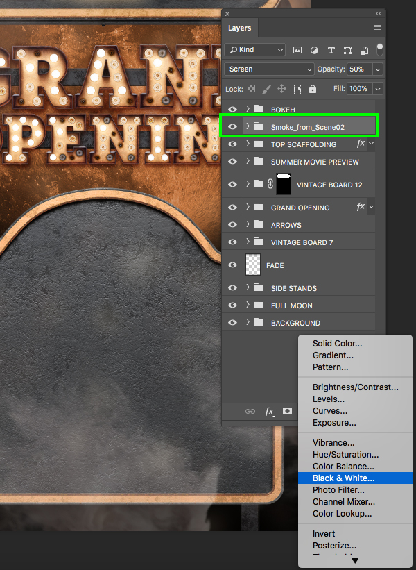
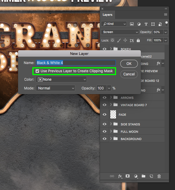
You will now be prompted with a dialog box where we want to check off the option that says ‘Use Previous Layer to Create Clipping Mask’ before clicking ‘OK’ to proceed.
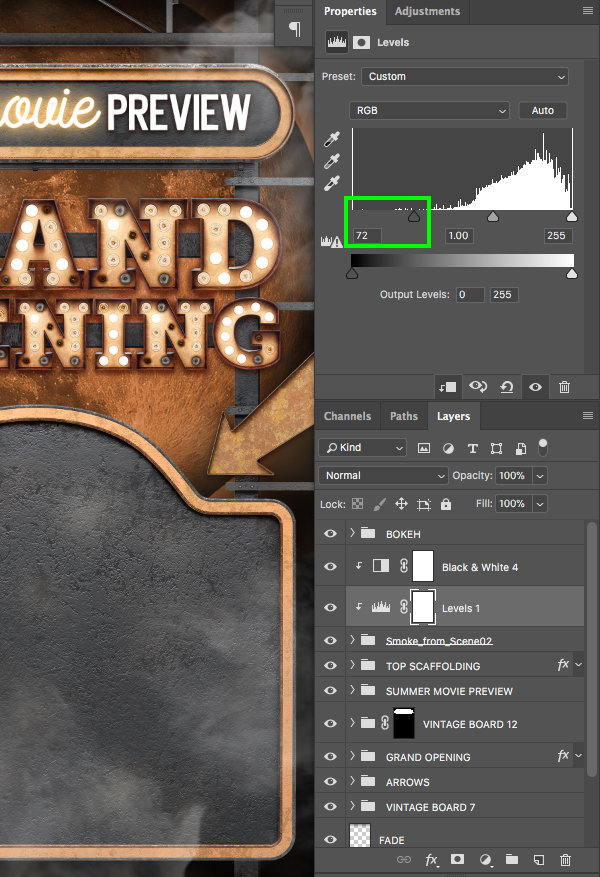
You should now have a Black & White Adjustment Layer with a Clipping Mask applied to it so that it only affects the contents of the folder it’s attached to. From here, select the folder again and return to the Adjustment Layer icon, only this time we will instead choose ‘Levels…’ from the menu. This should be added between the folder and the Black & White Adjustment Layer and will automatically be clipped to the folder.
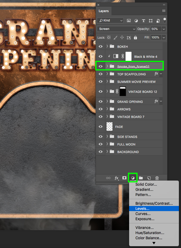
Let’s now move the left slider of our Levels panel in towards the right until it’s set to about ’72’ as shown here:
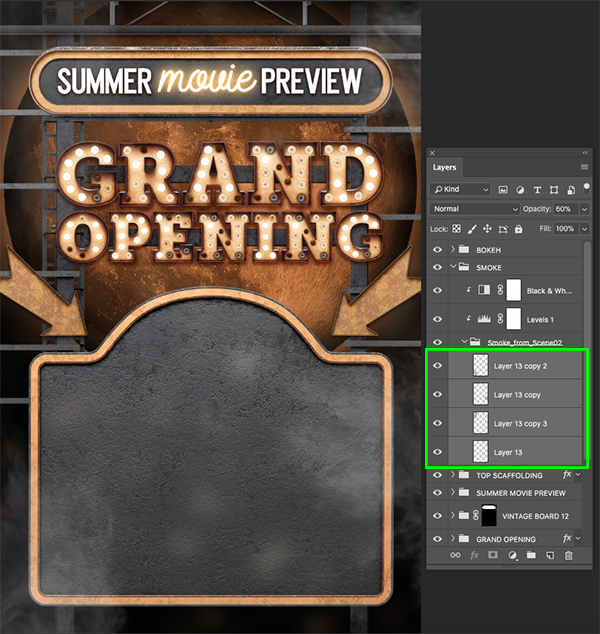
Step 28: Smokey Folders
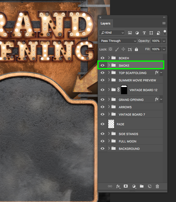
Select the ‘Smoke_from_Scene02’ folder and then hold the Shift key and select the top Black & White Adjustment Layer.
Press Command/Ctrl+G to put these three layers into a new folder and rename it ‘SMOKE’ as shown below:
Let’s now open the ‘SMOKE’ folder and expand the contents of the ‘Smoke_from_Scene02’ folder inside. From here we can select each of the smoke layers inside and position them on the outer edges of the composition. You can also use the Free Transform option to rotate each of the layers to mix things up.
Step 29: Side Fades
Select the Gradient Tool (G) and check to make sure you have a Linear Gradient that fades from solid black to transparent like the one we used earlier.

Next, add a new layer to the top of your Layers Palette and then click and drag from the far right side of the canvas in towards the left to create a linear fade.
Select the gradient layer and press Command/Ctrl+J to duplicate it and then hold the Control key and click on the layer. From here, select the ‘Flip Horizontal’ option to flip the copy the other way. Hold the Shift Key and click and drag this layer to the opposite side.
You should now have a fade on both the left and right edges of the document.
Select the top fade and then press Command/Ctrl+E to merge it down with the copy below. From here, double click the layer name and change it to ‘FADE’ as shown below:
Step 30: Typesetting Part Two
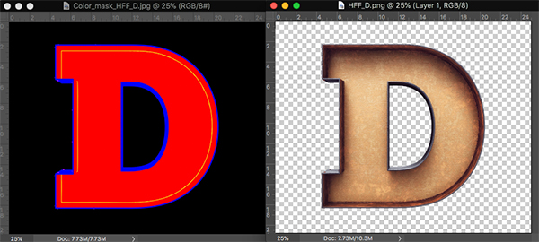
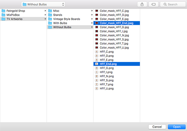
Navigate to the ‘HFF_D.png’ file and the ‘Color_mask_HFF_D.jpg’ files inside of the ‘Without Bulbs’ section in the freebies folder and open them both in Photoshop.
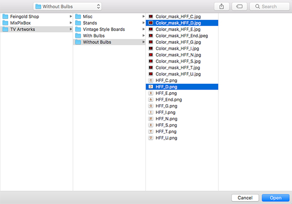
Place the two next to each other like we have been doing with the color mask layers throughout the tutorial.
Next, drag the color mask layer on top of the letter and convert each of them into a Smart Object.
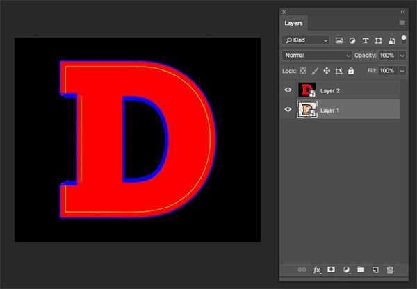
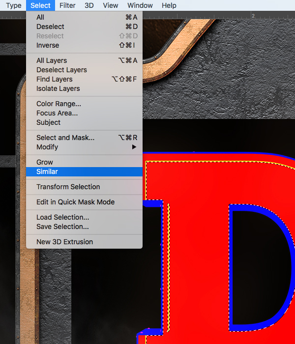
Drag both of the layers into your working document and scale them down a bit using a Free Transform. After that, use the Magic Wand Tool (W) to select some of the red area inside of the color mask layer and then go to the Select menu and choose ‘Similar’ as shown below:
Once your selection is active, go to the Adjustment Layer icon at the bottom of the Layers Palette and choose ‘Hue/Saturation…’ from the menu.
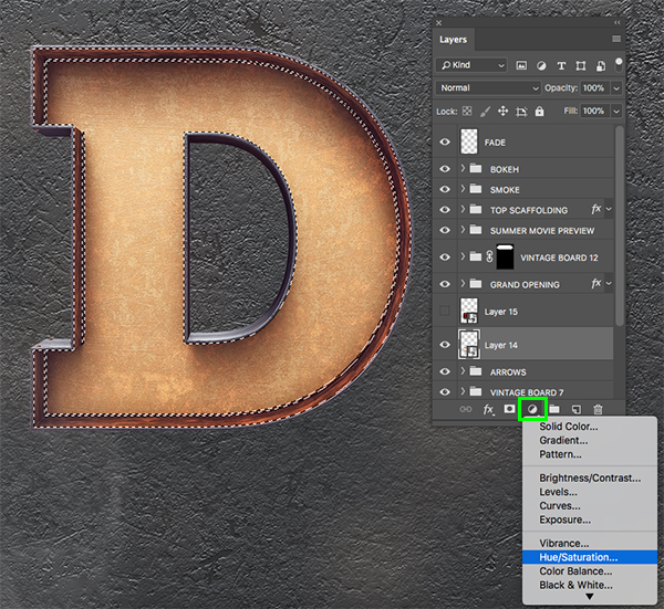
In the ‘Properties’ area let’s now move the ‘Saturation’ slider up to about ‘+15’ to increase the intensity of the color inside of the letter.

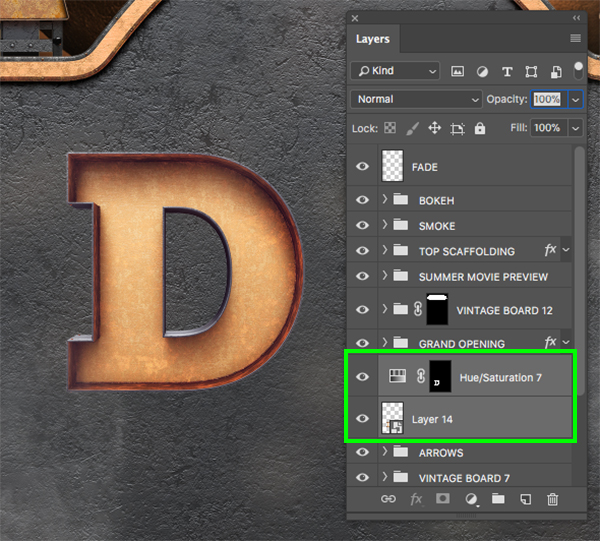
Remove the color mask layer and select the letter Smart Object layer, hold the Shift key, and then click on the Hue/Saturation Adjustment Layer.
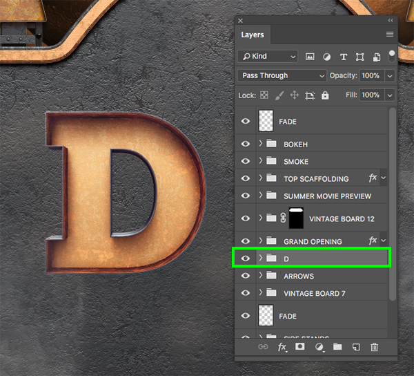
Press Command/Ctrl+G to put the letter and Adjustment Layer into a new folder and double click the folder name to change the name to ‘D’ as shown in the image below:
Step 31: Remaining Letters
Return to the same folder from the freebies and repeat the previous step for the remaining letters to spell out the word ‘DESIGN’.
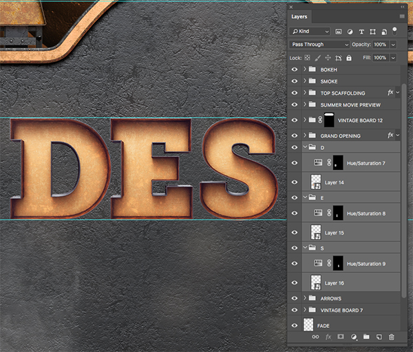
Once you have placed the remaining letters try to space them out evenly and line them up so they are all the same height. For this you may want to use the guides or rulers but once you are happy with the size and alignment select the first letter, hold the Shift key and then select the bottom letter so they are all selected together.
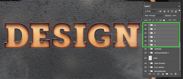
Press Command/Ctrl+G to put the letters into a new folder and change the folder name to ‘DESIGN’. After that, click and drag the small ‘fx’ icon from the ‘GRAND OPENING’ folder onto the newly created ‘DESIGN’ folder to replicate the shadow effects.
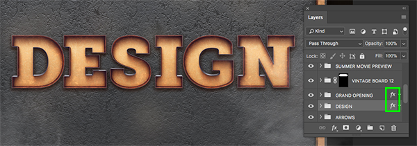
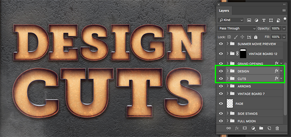
Repeat this once again to spell out the word ‘CUTS’ below the first line and make the width of the second line match the width of the first. From there, put the word ‘CUTS’ into a new folder and drag the ‘fx’ icon onto it so it has the same effects as the ‘DESIGN’ folder. You should now have something like this:
Step 32: Presented By
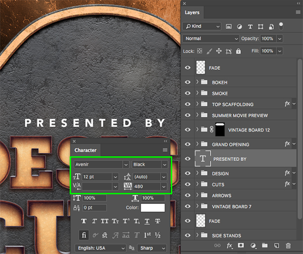
Create a new layer above the ‘DESIGN’ folder and use your Type Tool (T) to type out the words ‘PRESENTED BY’ in all caps. Open the Character Panel and use a bold, sans serif font such as ‘Avenir’ in the ‘Black’ style. Let’s also make the text have a solid white fill color, a point size of about ’12’ and change the ‘Tracking’ to ‘480’ as shown below:
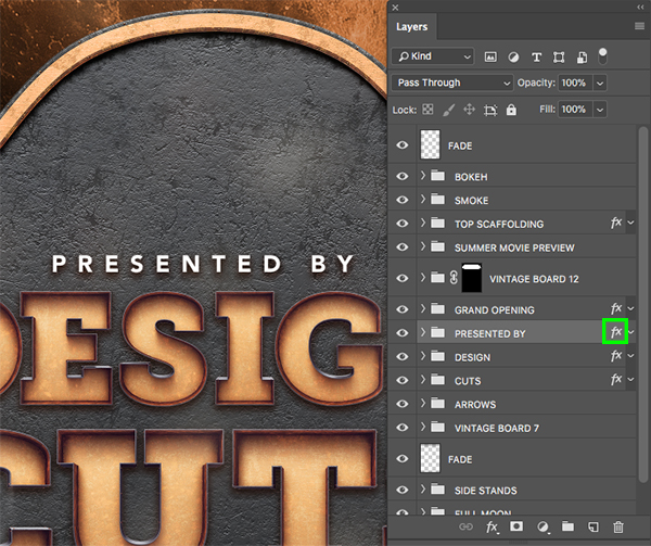
Place the text layer into a new folder and rename it ‘PRESENTED BY’ before applying the ‘fx’ from one of the other folders.
Add another new layer and type out the words ‘AVANT GARDE’ in all caps using ‘Avenir’ in the same ‘Black’ style as the previous text layer. This time however, we will change the size to about ‘15.96’ and reduce the ‘Tracking’ so it’s set to ‘200’.
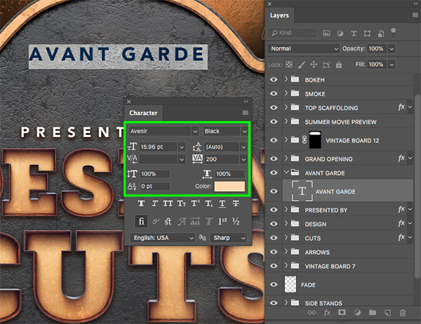
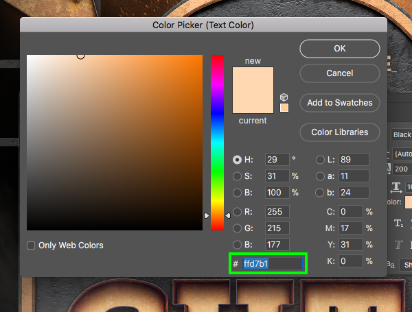
For the fill color let’s enter the hex value ‘#FFD7B1’ to pick up some of the lighter orange tones from the vintage sign.
Step 33: Type Warp
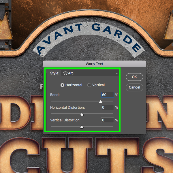
Click inside of the text box of the ‘AVANT GARDE’ text to highlight it and then click on the ‘T’ icon with the curved line under it to ‘Create warped text’.
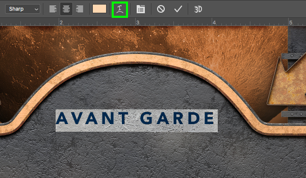
In the dialog box let’s change the ‘Style’ to ‘Arc’ and then make sure you are using a horizontal bend of about ’60’ and then press ‘OK’ to apply the changes to warp the text.
Place the warped text into a new folder named ‘AVANT GARDE’ and apply the ‘fx’ from one of the other folders. Your text should now look like the image shown here:
Step 34: Creatives in Cinema
Select the ‘SUMMER MOVIE PREVIEW’ folder and press Command/Ctrl+J to duplicate it. Move this new copy just above the ‘PRESENTED BY’ text.
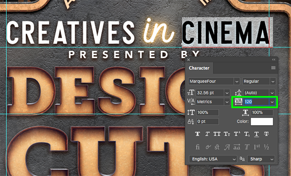
Click inside of the word ‘SUMMER’ with your Type Tool (T) and change it to say ‘CREATIVES’. Click inside of the word ‘movies’ and change that to say ‘in’, and then lastly click inside of the word ‘PREVIEW’ and change it to read ‘CINEMA’. Once you have updated the words, use the Character Panel to increase the tracking of the words ‘CREATIVES’ and ‘CINEMA’ to ‘120’ to space the letters out. After modifying the text layers, use a Free Transform to resize it so the width matches the width of the ‘DESIGN CUTS’ text below it.
Step 35: The End?
Open the ‘HFF_End.png’ file along with the ‘Color_mask_HFF_End.jpeg’ file in Photoshop.
Use the same process we have been using throughout the tutorial to select the inner part of the ampersand and then place it into a folder and add the shadow effect so you end up with this:

Step 36: There’s More!
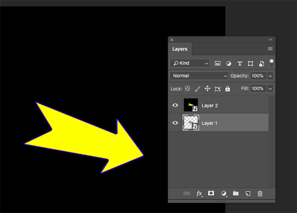
Create a new layer and then press the letter ‘U’ on the keyboard to get your Shape Tool. Hold the Shift key and tap the ‘U’ key a few more times until you have the Polygon Tool selected. From there, take a look at the settings along the top toolbar and change the ‘Stroke’ to ’12’ and the ‘Sides’ to ‘3’. After that, hold the Shift key and drag out a triangle to the left of the ampersand.
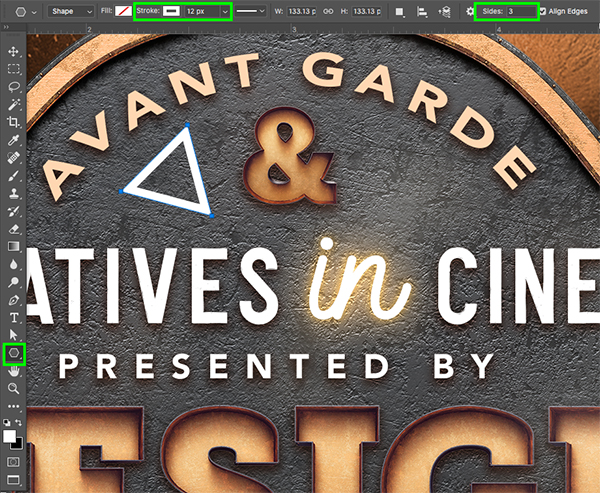
Select the Direct Selection Tool by pressing ‘A’ while holding the Shift key. You should have the white arrow instead of the black version. Use this tool to click on one of the three points of our new triangle and drag it over to the left so that the bottom edge is flat like this:
Let’s use the same tool to make the right edge flat as well so you wind up with the following:

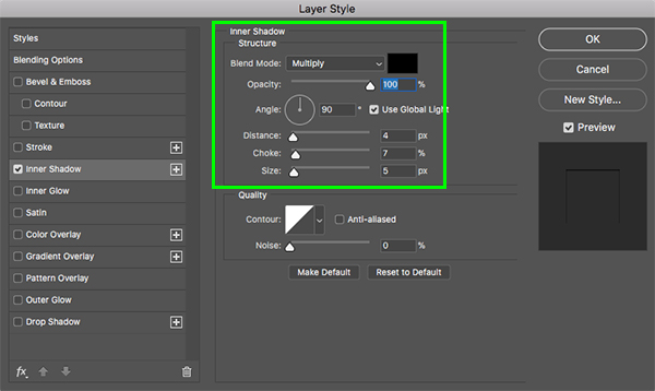
Double click on the triangle to open the Layer Style panel and apply an ‘Inner Shadow’ effect. For the settings, change the Blend Mode to ‘Multiply’ at full opacity. Let’s then change the ‘Distance’ to ‘4’ pixels, the ‘Choke’ to ‘7’, and the ‘Size’ to about ‘5’ pixels. Once you’ve done that go ahead and click ‘OK’ to apply the effect.
Select the triangle layer and press Command/Ctrl+J to duplicate it. Then, press Command/Ctrl+T to apply a Free Transform. From here, hold the Control Key and click on the shape before choosing ‘Flip Horizontal’ from the dropdown menu.
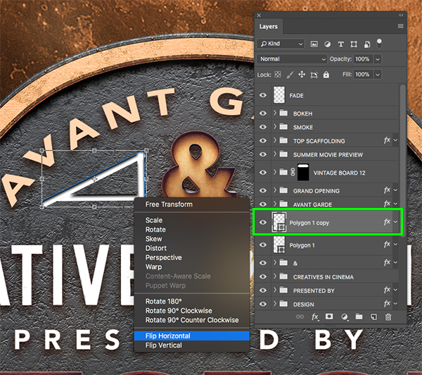
Hold the Shift Key and the right arrow to move the shape over to the opposite side of the ampersand. After you have positioned the two triangles, hold the Command/Ctrl key and select both of them at the same time.
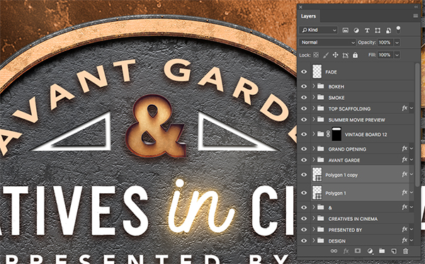
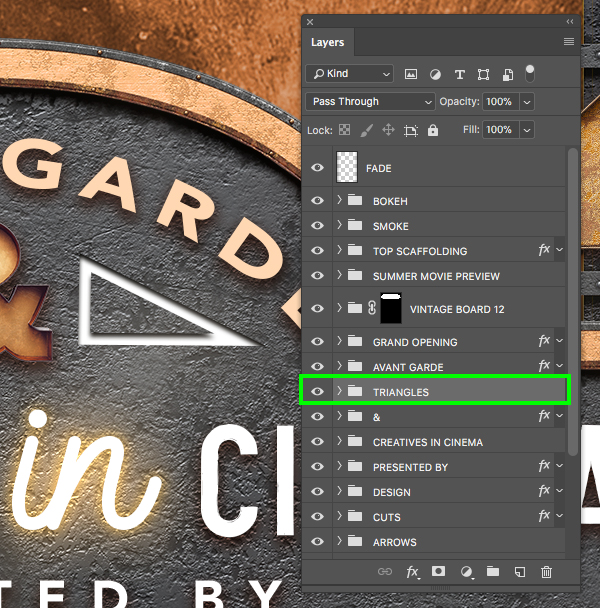
With both shapes selected we will once again press Command/Ctrl+G to put them into a new folder and rename it ‘TRIANGLES’ as shown here:
Step 37: Shady Signage
Let’s expand the ‘VINTAGE BOARD 7’ folder to reveal the layer inside and then hold the Command+Shift keys and click on the layer thumbnail icon for both of the sign layers inside. Doing this will activate a selection around the entire, extended sign like this:

Create a new layer and then while your selection is still active use the Gradient Tool (G) with a solid black to transparent fill to make a Linear Gradient that fades up from the bottom. Once you have done that press Command/Ctrl+D to deselect everything and then press ‘5’ on the keyboard to reduce the opacity to ‘50%’. Lastly, move this gradient layer above the ‘DESIGN’ folder and rename the layer ‘FADE’ as shown below:
Step 38: Bottom Scaffolding
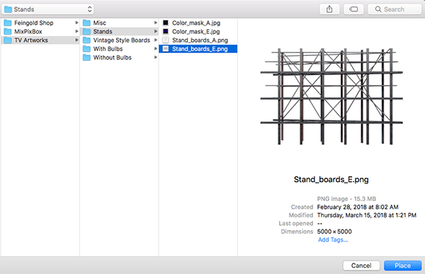
Open the ‘Stand_boards_E.png’ file from the freebies folder for the tutorial.
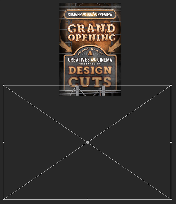
Drag the scaffolding into your working file and use a Free Transform to scale it up proportionally by holding the Alt/Option+Shift keys and dragging outwards from any of the four corners of the bounding box. For this scaffolding we want to make it pretty large so that it’s mostly off of the canvas, leaving only some of the top bars visible along the bottom portion of our design. Use the image below as a reference for the size and placement:
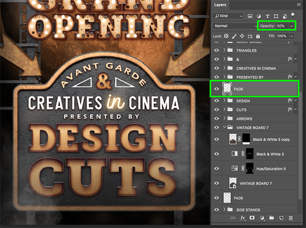
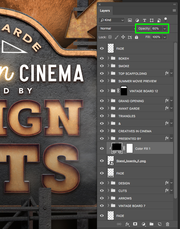
Let’s place this layer above the ‘FADE’ layer that we created in the previous step. After that, hold the Alt/Option key and click on the Adjustment Layer icon at the bottom of the Layers Palette and choose ‘Solid Color…’ as shown here:
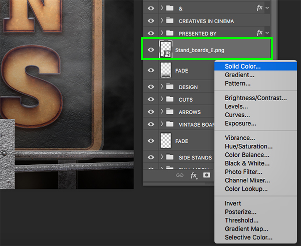
In the next panel, make sure to check off the box that says ‘Use Previous Layer to Create Clipping Mask’ and then press ‘Return’ or click ‘OK’ to proceed.
Let’s make sure our Solid Color layer is filled with solid black and then reduce the opacity to ‘60%’ as shown here:
Place the scaffolding into a new folder called ‘BOTTOM SCAFFOLDING’ and click and drag the small ‘fx’ icon from one of the other folders onto this one to copy the shadow effects.
Step 39: Extra Scaffolding
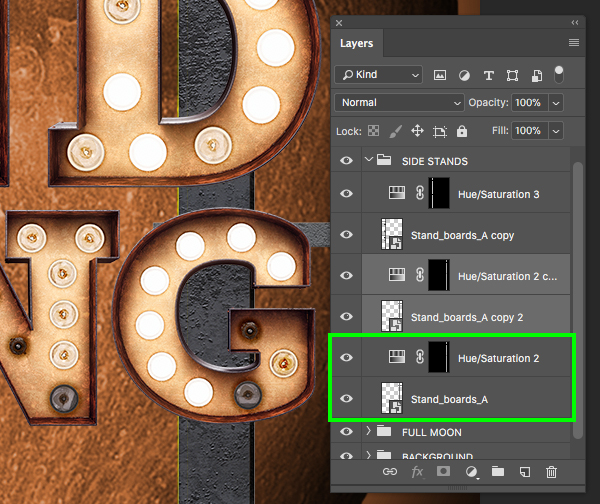
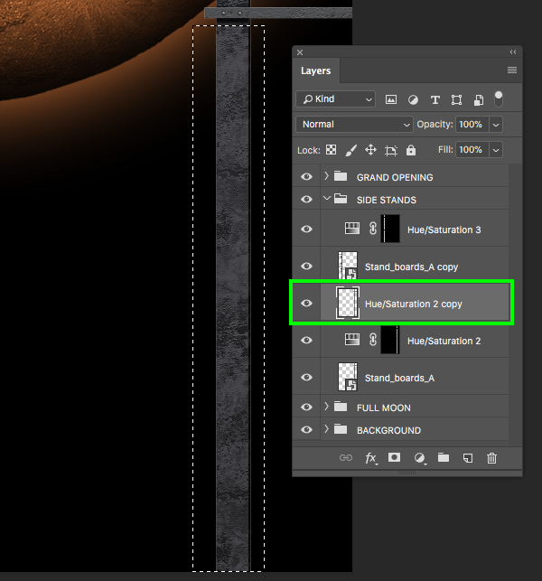
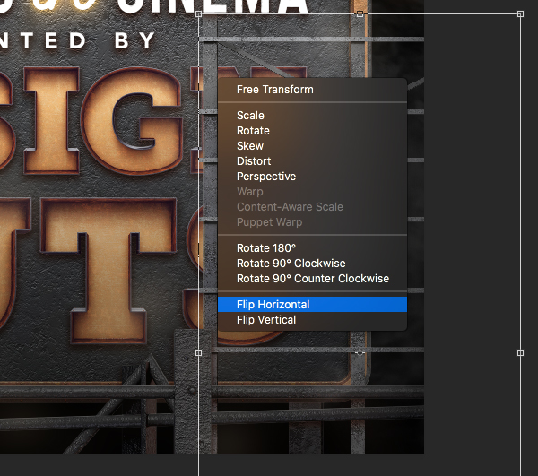
Expand the ‘SIDE STANDS’ folder and hold the Command/Ctrl key before selecting both the ‘Stand_boards_A’ layer along with the Hue/Saturation Adjustment Layer above it.
Press Command/Ctrl+J to duplicate both layers and then press Command/Ctrl+T to scale them down while holding the Shift key to constrain the proportions. Here we will want to place them towards the bottom of the ‘DESIGN’ and ‘CUTS’ text and then when you are happy with the size and placement of the layers hold the Control Key and click on them to reveal a dropdown menu. From the menu appears we will select the ‘Flip Horizontal’ option and then press ‘Return’ on the keyboard to apply the transformations.
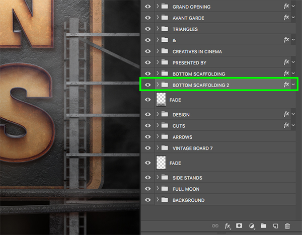
Press Command/Ctrl+G to put these two copies into a new folder and rename it ‘BOTTOM SCAFFOLDING 2’ before placing it just below the original ‘BOTTOM SCAFFOLDING’ folder. From here, click and drag the small ‘fx’ icon onto the new folder to apply the shadow.
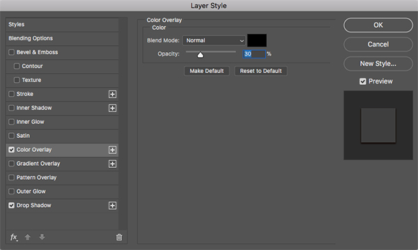
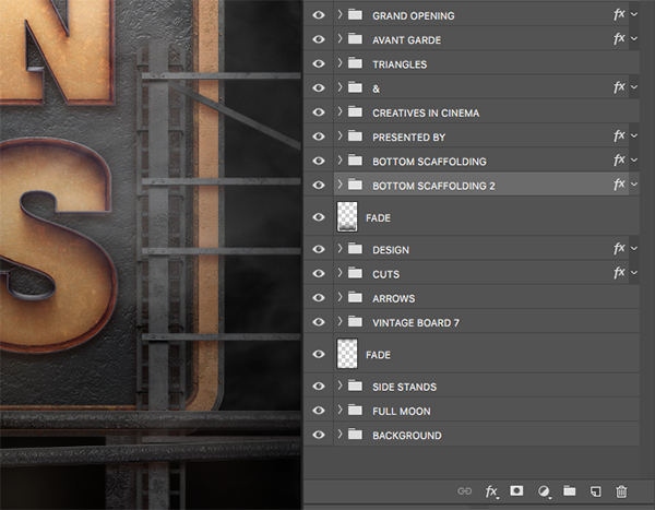
Double click on the ‘BOTTOM SCAFFOLDING 2’ folder to open the Layer Style panel and check off the ‘Color Overlay’ option. Give your fill a solid black and then reduce the opacity to about ‘30%’ before pressing ‘OK’ to apply the changes.
Your bottom scaffolding should now appear a bit darker as shown here:
Step 40: All the Stars
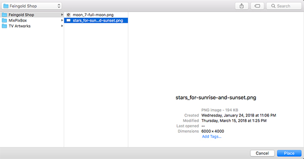
Go to the File menu and choose ‘Place Embedded…’ from the menu.
Navigate to the ‘stars_for-sunrise-and-sunset.png’ file from Feingold Shop in the freebies folder and then choose ‘Place’.
After placing the image into your document, hold the Control key and click on the image and then choose ‘Rotate 90º Clockwise’ from the list.
After rotating the stars hold the Alt/Option+Shift keys and drag outwards from any of the four corners to scale it up until it’s about the same size as the image shown here:
Once you have placed the stars press ‘Return’ to apply the changes. From here, press Command/Ctrl+J to duplicate the layer once again. Select the top copy, hold the Shift key, and then select the original copy below so they are both selected together.
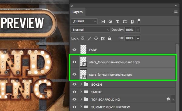
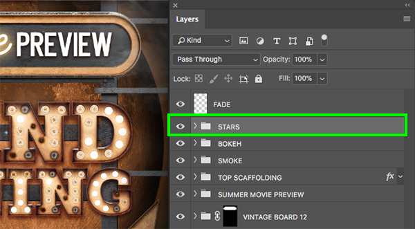
With both layers still selected, press Command/Ctrl+G to put them into a new folder and rename it ‘STARS’.
Step 41: Highlights
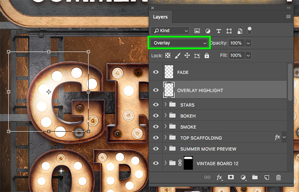
Press ‘G’ to grab your Gradient Tool and select a Radial Gradient that fades from solid white to transparent as shown below:

Add a new layer at the very top of your Layers Palette just below the top ‘FADE’ layer and then click over the ‘G’ in the word ‘GRAND’ and drag outwards to create your gradient. After that, change the Blend Mode of the layer to ‘Overlay’ to create a nice highlight over the lightbulbs.
Press Command/Ctrl+J to duplicate the highlight and try placing it over one of the other letters to see how it looks. This part is completely experimental and is up to you to decide where the bright spots look the best, just make sure they are over the letters! After you’ve placed 5-10 copies of them, select the top copy, hold the Shift key, and then select the original copy.
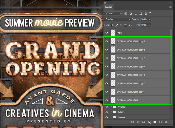
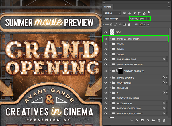
Press Command/Ctrl+G to put these into a new folder and rename it ‘OVERLAY HIGHLIGHTS’ and then reduce the opacity of the entire folder to about ‘50%’.
Step 42: Color Boost
Select the ‘OVERLAY HIGHLIGHTS’ folder in the Layers Palette and then click on the Adjustment Layer icon at the bottom before choosing ‘Hue/Saturation…’ from the list.
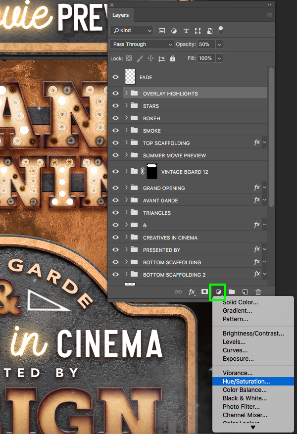
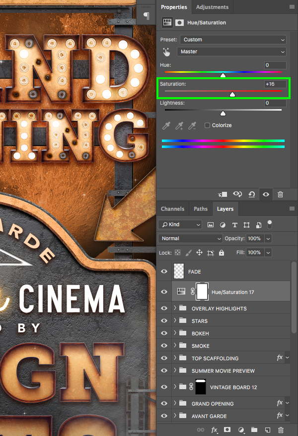
Next, move the ‘Saturation’ slider to about ‘+16’ to increase the overall saturation in the image.
Step 43: Final Merge
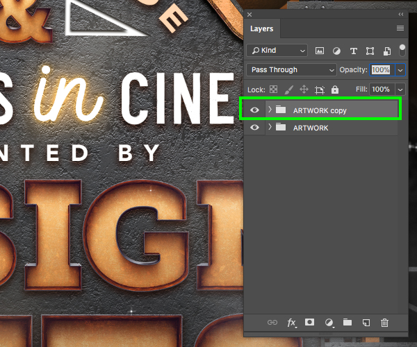
Select the very top layer in your Layers Palette and then hold the Shift key and select the very bottom layer so all of the layers are selected together.
Press Command/Ctrl+G to put all of the layers into a folder and call it ‘ARTWORK’. After that, press Command/Ctrl+J to duplicate the entire folder.
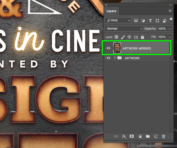
With your newly duplicated ‘ARTWORK’ folder selected, press Command/Ctrl+E to merge it into a single layer and rename it ‘ARTWORK MERGED’ as shown below:
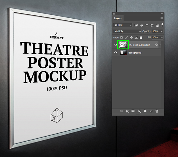
Step 44: Poster Mockup
Now that we have finished our poster design let’s drop it into a realistic poster mockup to push it just a bit further. Open the Theatre Billboard Mockup file which can be downloaded for free by visiting the following link at Mockupworld. Once you have downloaded the file, open it in Photoshop and double click on the Smart Object layer labeled ‘YOUR DESIGN HERE’ to open a new window.
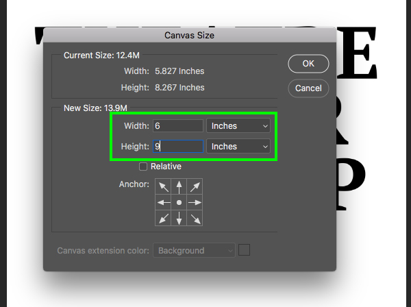
Once you are inside of the Smart Object go to the Image menu and choose ‘Canvas Size…’ from the menu.
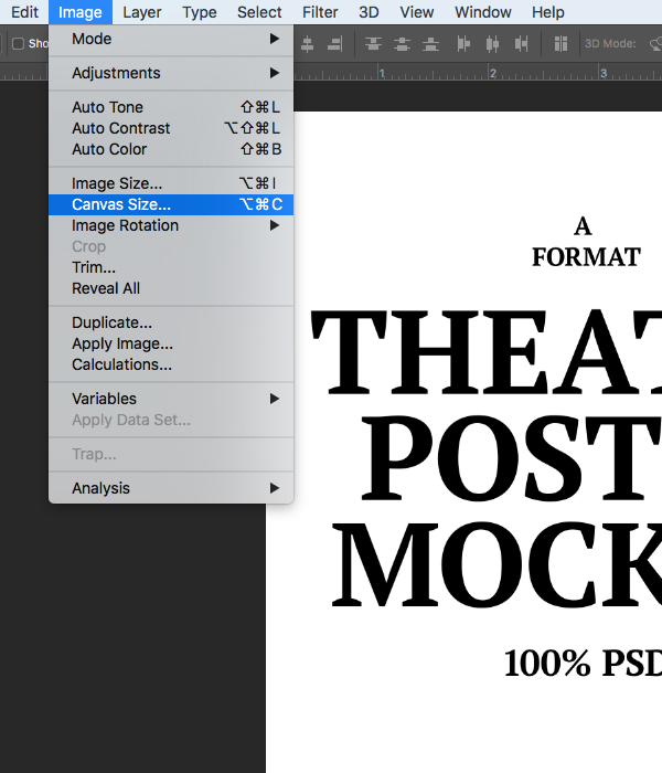
In the dialog box that appears let’s change the dimensions to be ‘6’ inches wide by ‘9’ inches tall and then press ‘OK’ to make the changes.
We can now take our ‘ARTWORK MERGED’ layer containing the merged poster and drag it into this document. If you drag it into the file while holding the Shift key it should land right in place, perfectly! After dropping in the artwork all we need to do is press Command/Ctrl+S to save the file and then Command/Ctrl+W to close the window. When you return to your main mockup file you should now see our poster design sitting nicely in the frame.
Step 45: In the Spotlight
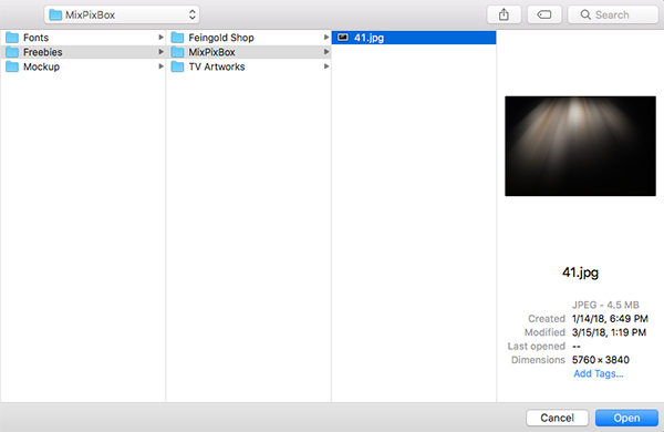
Open the ’41.jpg’ file from MixPixBox in the freebies folder in Photoshop.
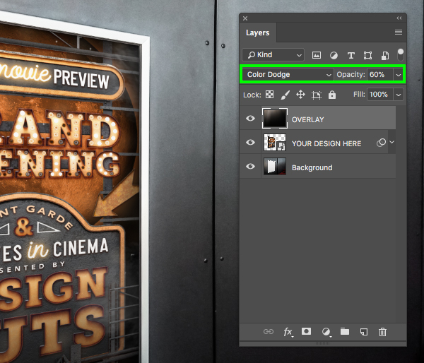
As a finishing touch let’s drag this overlay image into our mockup PSD file and place it on top to create a nice spotlight effect that will brighten up the left side of our image. Here we will just need to change the Blend Mode of the light layer to ‘Color Dodge’ and reduce the opacity to about ’60%’. Feel free to experiment with the size and placement of the highlight to see what looks best.
This now completes our Summer Movie Preview Poster! I hope that you have enjoyed this tutorial and found some useful tips and tricks along the way. We designed our cinematic movie preview poster using some of the awesome resources from the latest bundle along with a free mockup to present our finished product. In addition to the assets that we have used to create our poster design, there are so many more valuable resources available in the full bundle that will equip you with quality tools for years to come. We can’t wait to see what you come up with using these assets and the techniques we have covered in the tutorial!
Remember that whether it’s your outcome for this tutorial or something new you’ve made, we’d love to see your designs on our Facebook page.
Please leave a comment if you have any questions or suggestions. I always look forward to hearing from you!
There’s still time to check out The Ultimate Creative Design Bundle that will be your one-stop shop for creative assets all for a massive 99% discount!
This was my favorite tutorial! I have learnt so much – thank you :)
Aww that’s so lovely to hear Andrea!
You are so welcome, thank you for letting us know :)
Another great tutorial!
Thank you so much Andrea, we really appreciate the lovely feedback!
This was an excellent tutorial, I learned a lot of new things! Thanks so much!
Thank you so much for the awesome feedback!
It’s fantastic news to hear that you learned lots of new tips and tricks too :D
As always NON PLUS UTRA.
Gracias !!!
De nada Ulbel! We hope you really enjoyed this one.
Amazing tutorial, and fantastic result!
Thanks so much Cathy! We hope you had great fun with this one