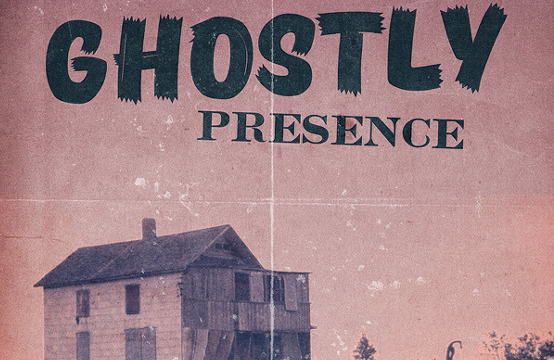
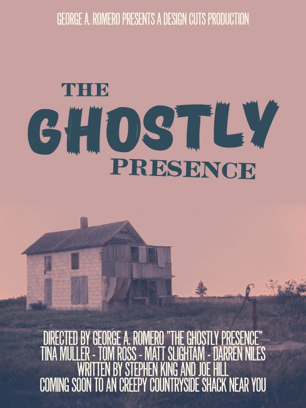
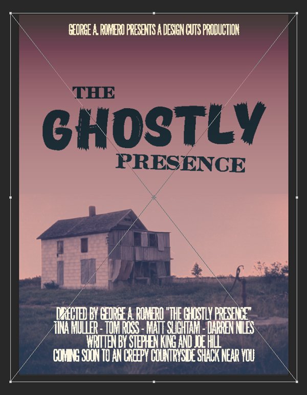
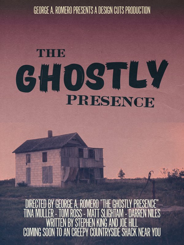
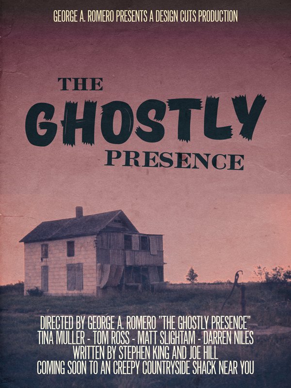
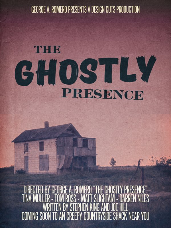
WHAT WE’RE CREATING:
Hello dear Design Cuts community! Simon here for this week’s second tutorial, live from under the heat wave that’s currently crushing France. Our mission this time is to create a poster for a (fake) ghost/horror movie, The Ghostly Presence. We’ll have plenty of great typefaces within the 24 exceptional quality fonts bundle to play and experiment with.

STEP ZERO: THE CONCEPT
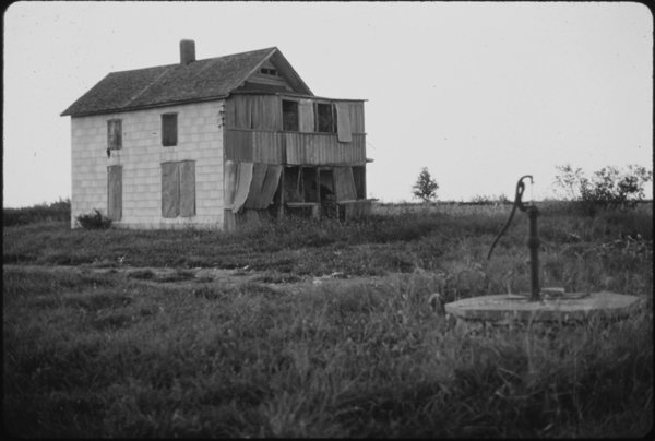
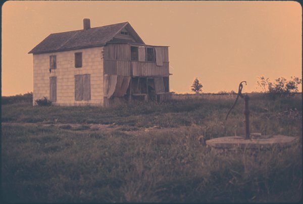
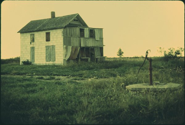
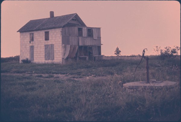
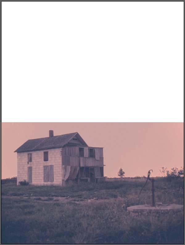
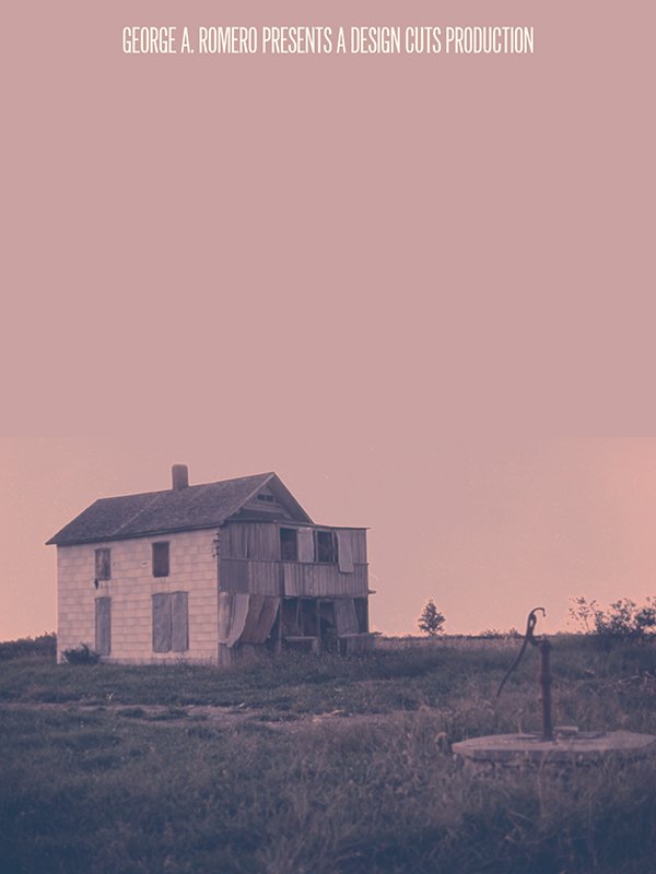
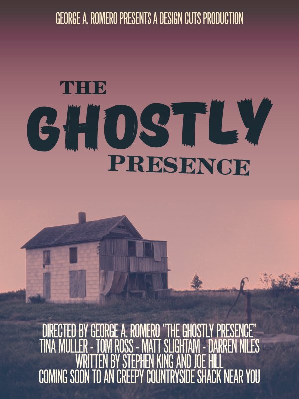
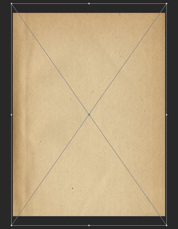
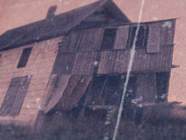
The idea behind the poster layout came from this great photo of an abandoned house in Kansas. The image is from the US National Archives, which means it’s copyright free. It dates back to the 1970s, and was part of a neat documentary project called DOCUMERICA.
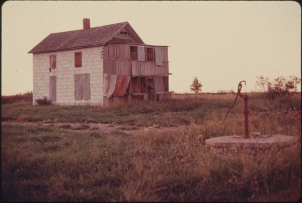
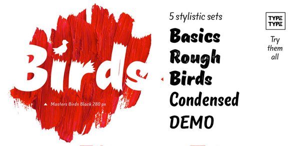
After chatting extensively with the Design Geeks, we decided the image would be perfect to illustrate the ultimate scary, creepy, countryside shack no one wants to go into. From there, a quick look at the typeface list, and the puzzle was solving itself. A typeface like TT Masters Birds is a solid take on the brush scripts found in old horror B-movie posters.
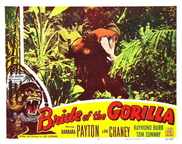
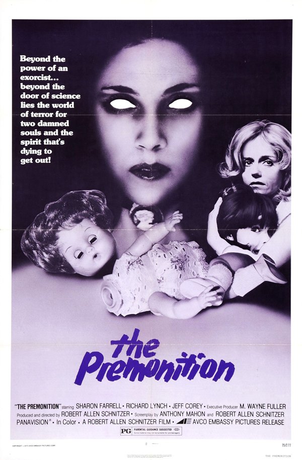
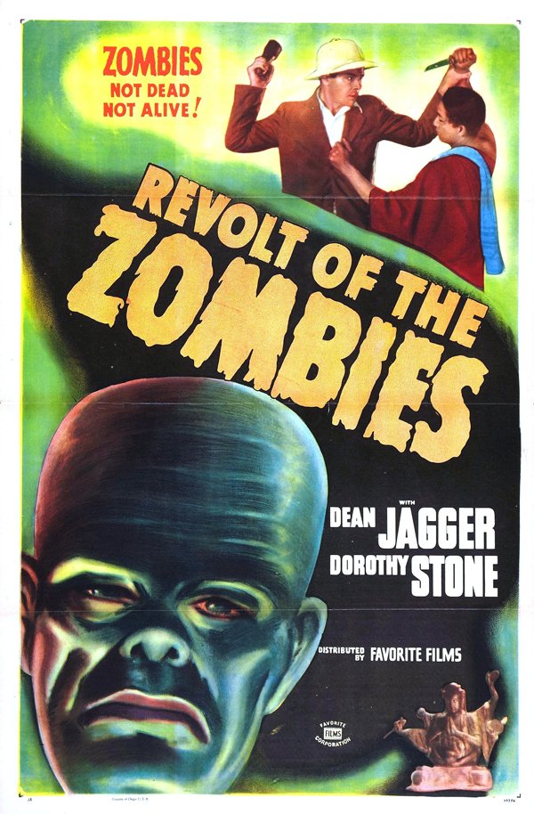
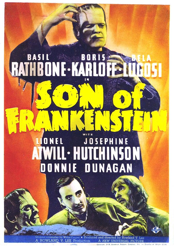
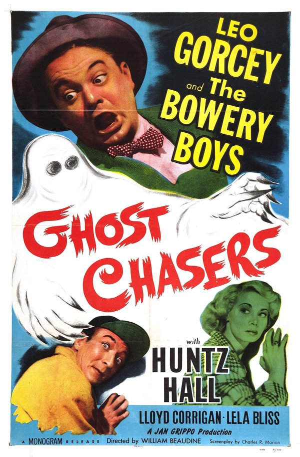
Have a look at these amazing old posters. There are variations of course, but the vibe of the lettering is the same.
Bride of the Gorilla (1951, USA) (#)
The Premonition (1976, USA) (#)
Revolt of the Zombies (1936, USA) (#)
Son of Frankenstein (1939, USA) (#)
Ghost Chasers (1951, USA) (#)
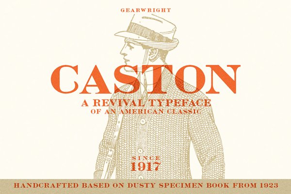
Gearwright’s Caston typeface is a solid pendant to the spontaneous and dynamic nature of the brush lettering.
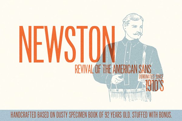
Finally, Gearwright’s Newston will be a good fit for the credits area of the poster, with its tall and thin letters.
Our roadmap is ready.
SOME TECHNICAL CONSIDERATIONS
Since we’ll be working with type, we are going to build the poster’s layout using Adobe Illustrator.
That being said, we’ll need to manipulate our base image some, and to add textures to polish the piece. This means that we will also make use of Adobe Photoshop.
Talking about textures, keep the usual rules and processes in mind:
- Don’t know what a clipped layer is? Glad you asked! This means that the layer is only visible/applies to the layer directly below it. You can very quickly do this by holding ALT down on your keyboard and clicking between the two layers. Here’s a quick demonstration.
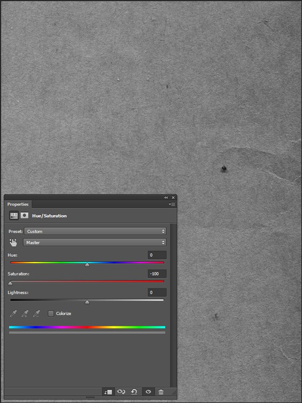
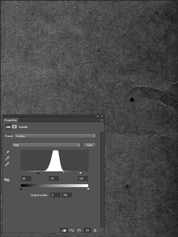
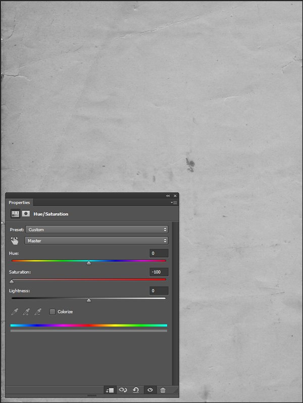
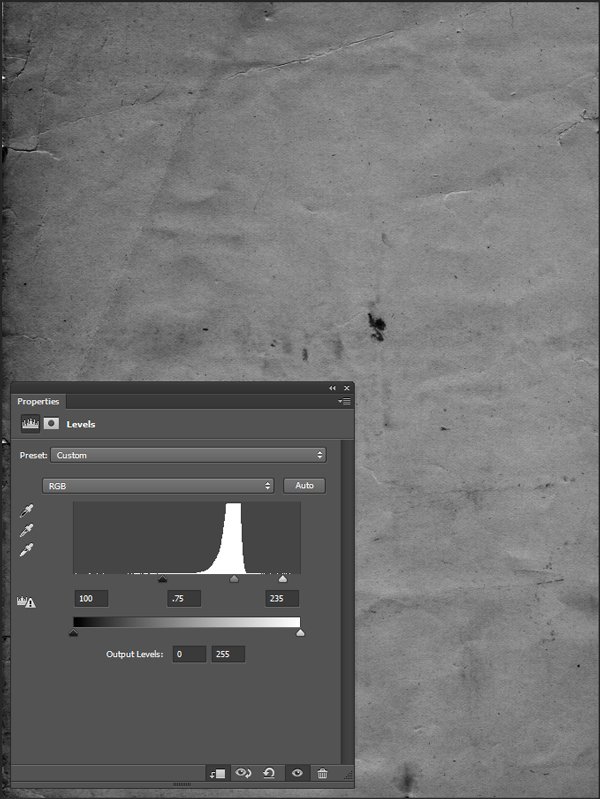
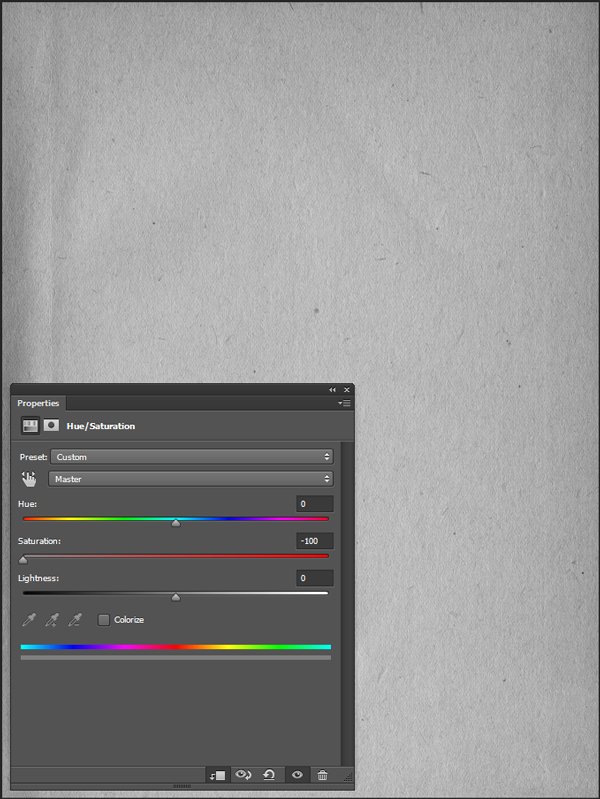
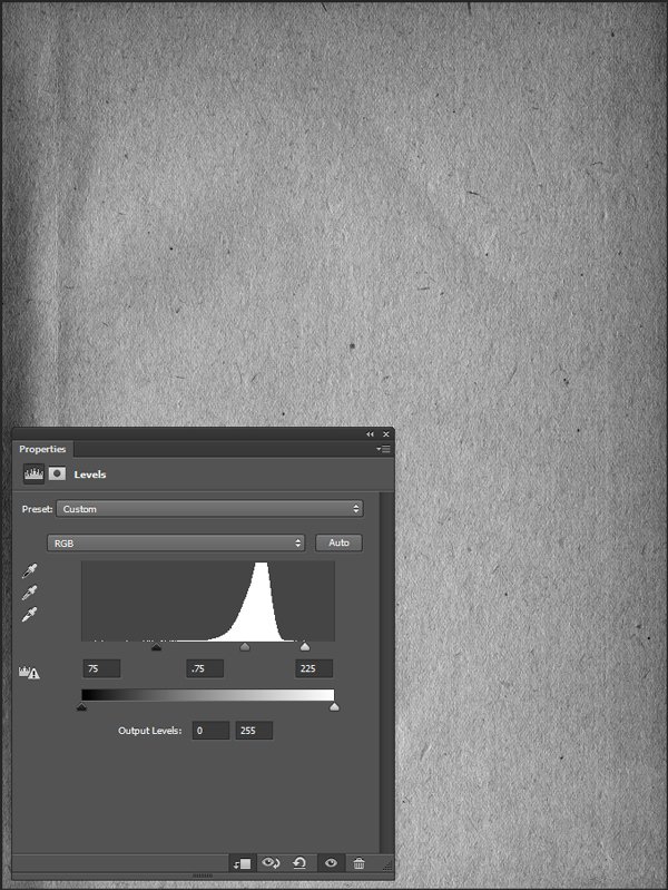
- Every time we’ll work with textures, we’ll follow this simple process: place as smart object, sharpen1, desaturate, enhance contrast with levels, and modify the blending mode.
- Placing the textures as smart objects, and using adjustment layers to tweak them, allows us to stick to a non-destructive workflow. We’ve explored in depth the numerous pros and few cons of such a workflow in this past tutorial: “How to Use Textures The Right Way.”
Notes: 1 – accessed through the Filter > Sharpen > Sharpen menu.
With these out of the way, let’s dive in!
STEP ONE: BASE IMAGE MODIFICATON
Let’s have another look at our base image. It’s a slightly unsettling abandoned building. The creepy factor is there, but could be stronger. Our fake movie is called “The ghostly presence,” which doesn’t fit well with the fact that the image has been taken during the day.
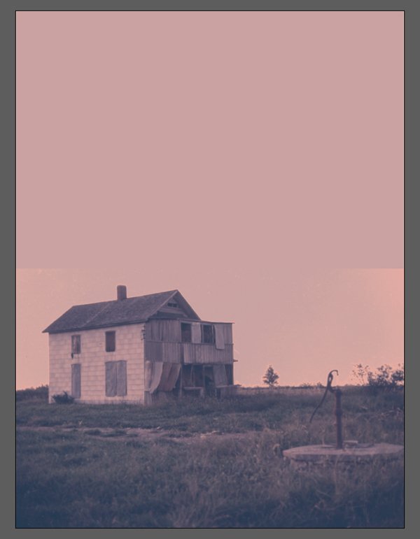
We are going to make the image stranger by manipulating its colours. Altered colours can make an object or scene seem foreign and frightening rather quickly, which we are going to use to our advantage. Let’s head to Flickr to download the high resolution version of the image. Once it’s in our possession, it’s time to open it in Photoshop.
We are going to leverage three different adjustment layers to achieve our desired effect:
- A gradient map – to transform the colours of the whole image, while preserving the original brightness
- Some curves – for a subtle cross-processing effect
- A photo filter – to “cool” the image some
But first thing first, we need to double click on the image layer to unlock it.
The gradient map
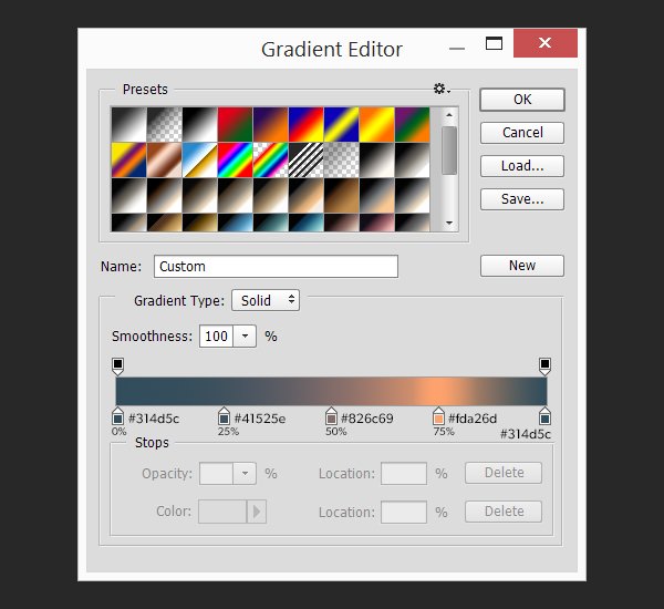
The gradient map adjustment layer applies a customizable gradient to the document, according to the brightness of each of its pixels. Let’s apply one to our image.
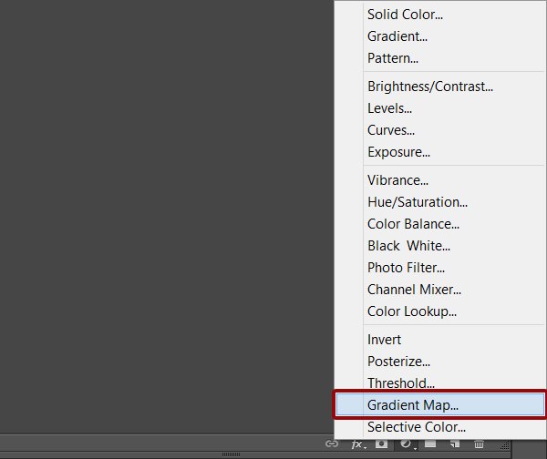
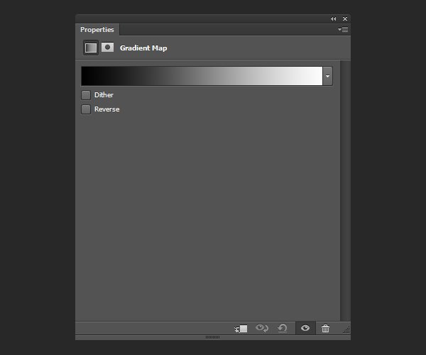
The default gradient is usually from black to white, which results in a grayscale version of our image.
Here’s a look at the gradient we are going to transform our image with.
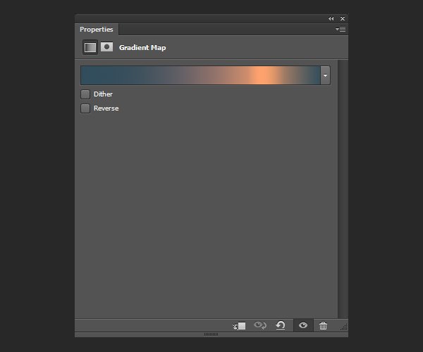
The five colours are all 100% opaque, and placed at “equal distance” from each other (0%, 25%, 50%, 75%, and 100%). This results in an even split in presence in the image. The trick we’re using here is to assign the darkest colour to the lightest area of the gradient as well as to its darkest. This will colour the light background of the image in the darker hue. The result is a “night feel” for the image.
The colours we are using in the gradient are, from left to right (from dark to “light”):
- #314d5c
- #41525e
- #826c69
- #fda26d
- And #314d5c again
We just have to click on the gradient in the properties screen to access the gradient editor.
The result is below.
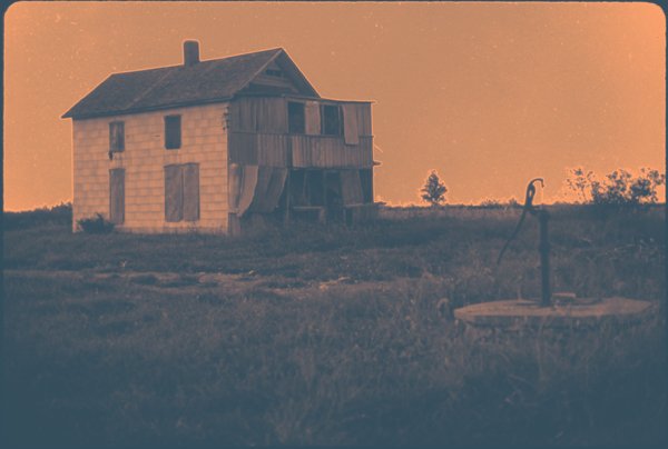
It’s too strong, which we can address by lowing the opacity of the adjustment layer down to 65%.
The curves
The next step is to add a curves adjustment layer for some subtle cross-processing action. Cross-processing is a colour alteration process with roots in analog photography. Luckily for us, Photoshop has a quick way to emulate it.
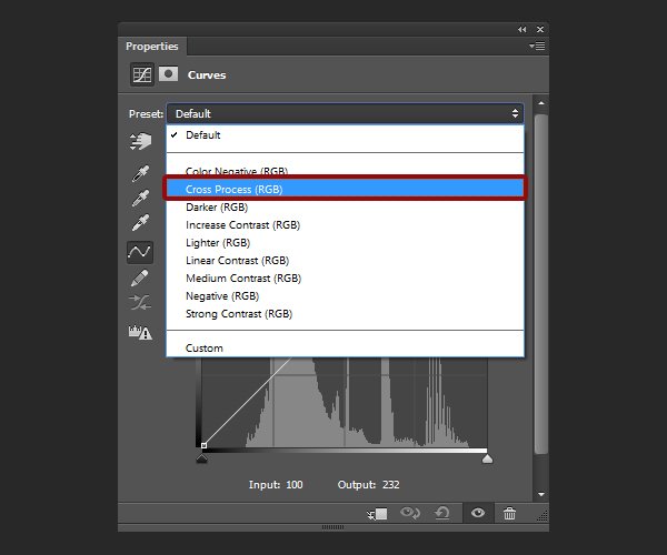
The result is definitely accomplishing the goal of making the image unsettling, but it’s too strong.
Once again, lowering the opacity of the adjustment layer down (to 10%) brings everything back towards reasonable territories.

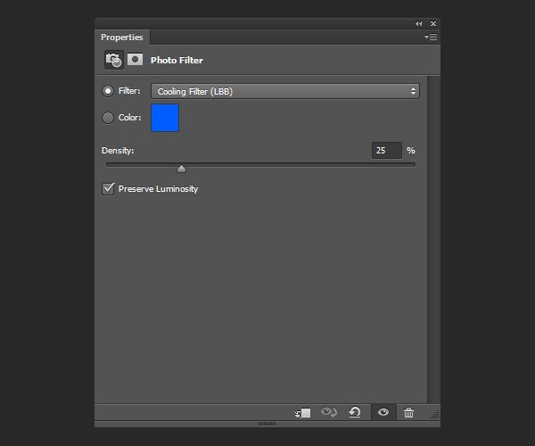
The photo filter
The last of the adjustment layer we need is a cold photo filter.
The result
And for now, our Photoshop work is done. After saving the results of our manipulation in a dedicated PSD file, it’s time to put this poster layout together in Illustrator.
STEP TWO: ILLUSTRATOR WORK
The layout in itself isn’t complex: the image, an extended background, and five text elements (producers, title elements, and credits block). A few tricks that we will cover today: how to extend the background seamlessly (clipping masks, transparency masks), using the appearance panel to non-destructively rotate type, and how to use gradients to further tweak the colours of the piece.
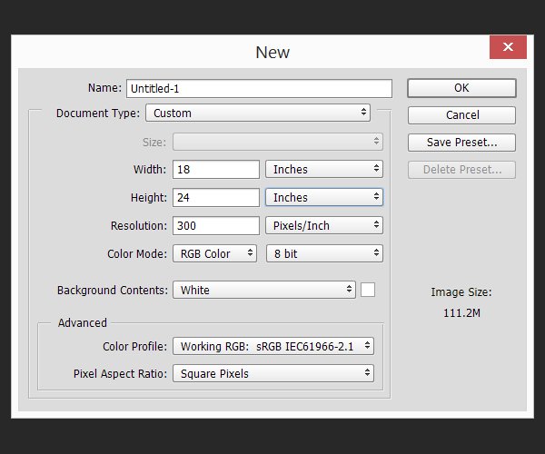
Document setup
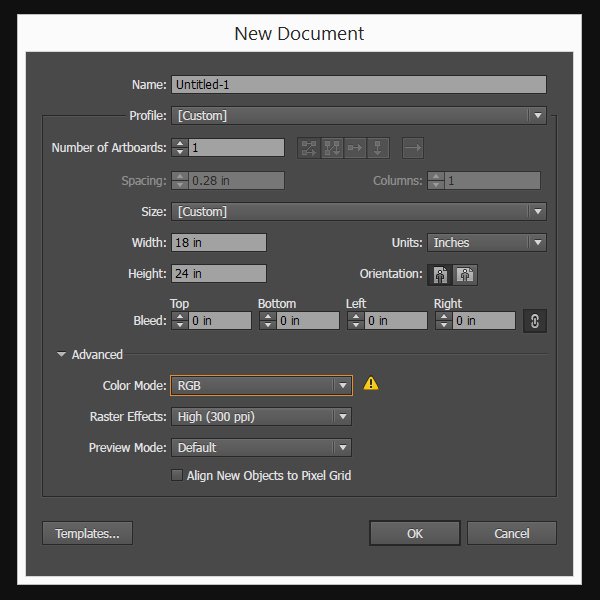
We are using our standard 18″x24″ canvas this time. Changing the colour mode from CMYK to RGB isn’t mandatory, but will ensure a better colour consistency between Photoshop and Illustrator.
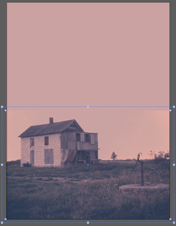
Putting the background in place
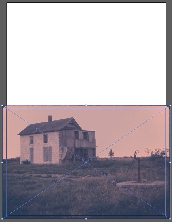
Let’s start with the background. We are going to place the PSD of the edited photo so it covers the lower part of the poster. Its centre point is located at X: 9″, and Y:18″. The image is scaled up so it reaches a width of 18″.


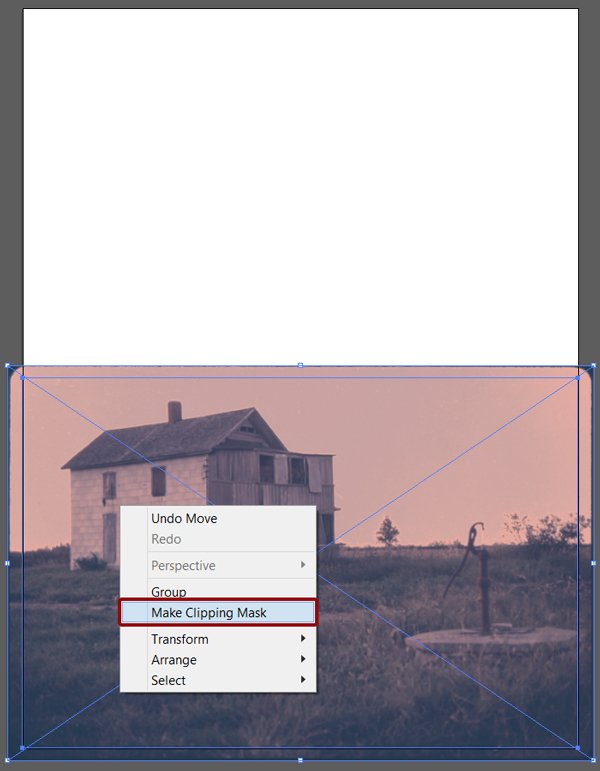
Next, we need to hide the frame around the image. We are going to use a clipping mask for that.
In Illustrator, there are no direct equivalent to layer masks as in Photoshop. There are opacity masks, and clipping masks.
In my opinion, opacity masks are the closest in functionality to Photoshop’s layer masks. Bittbox has a good writeup on these, but here’s the gist of it:
“An “Opacity Mask” refers to a mask in Illustrator that you place over an existing shape that controls its transparency based on the values of black and white in the mask. White being visible, black being transparent, and all shades of gray are in between on the opacity scale.”
Clipping masks, on the other hand, don’t allow you to control transparency, only if something is visible or hidden. Here’s what Illustrator’s official documentation tells us:
“A clipping mask is an object whose shape masks other artwork so that only areas that lie within the shape are visible—in effect, clipping the artwork to the shape of the mask. The clipping mask and the objects that are masked are called a clipping set. You can make a clipping set from a selection of two or more objects or from all objects in a group or layer.”
We’ll have to use both of these to extend our background. Let’s start with the clipping mask. We need to create a rectangle responding to the following constrains:
- 18″x12″
- Centrepoint located at X:9″, and Y:18″
- Transparent (no fill, no stroke)


From there, we simply have to select the future clipping mask, and the photo.
Finally, we can use Right click menu > Make clipping mask, or Object > Clipping mask > Make. The result is exactly what we needed.
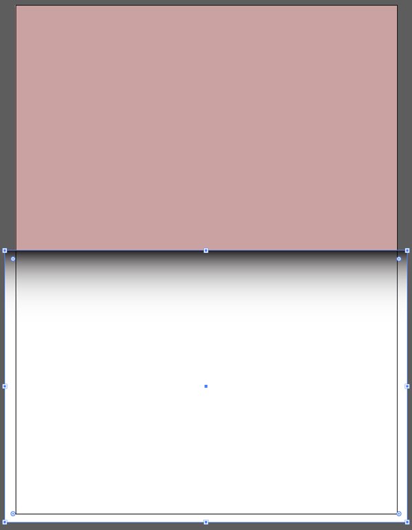
We can now extend the background. The principle is the same than when applying this technique in Photoshop: create a rectangle covering the whole canvas, place it behind the image to extend, sample a colour to fill the background rectangle with, and make the seams as invisible as possible.
Let’s start by creating a rectangle without any fills nor stroke, and placed behind the photo clip group.
Next, we need to sample a colour close to the edge of the picture, and that will be suitable to make the transition between the image and the background. That colour will fill the background rectangle. Suggestion: #c9a2a1.
Now in order to soften the edges highlighted below, we need to create a transparency mask.

We need to create a transparent rectangle that will cover the image, including what is hidden by the clipping mask. The rectangle answers to these constrains:
- 19″x12.806″
- Centrepoint located at X:9″, and Y:18″
- Transparent (no fill, no stroke)
Next, we need to fill the rectangle with a gradient from black to white, like so:
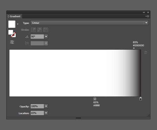
And now, the party trick. With both the gradient-filled rectangle and the photo clip group selected, we can head to the transparency panel. It will give us the option to create a transparency mask.
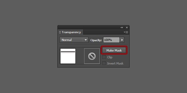
Which results in a smooth transition.

Note the dashed line below the name of the clipping group.
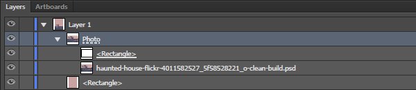
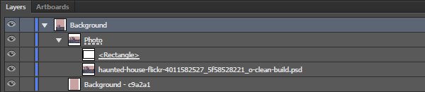
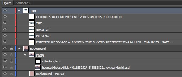
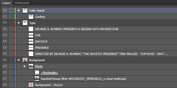
Here’s what the layer stack looks like after some basic layer renaming.
Type stuff
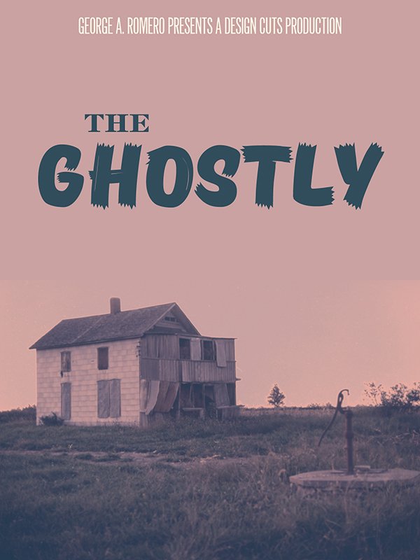
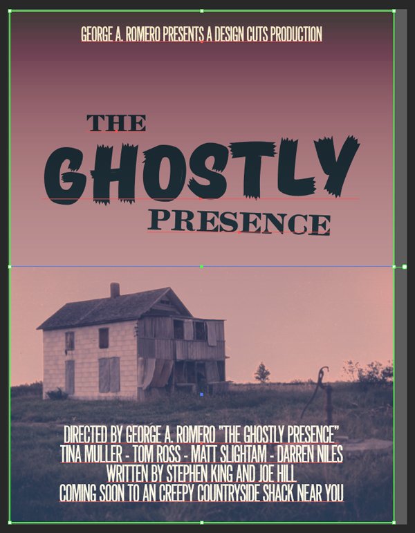
It’s finally time to take care of type! The copy on the poster is simple. It includes the producers’ names, the title block (three elements), and the credit block.
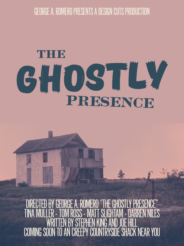
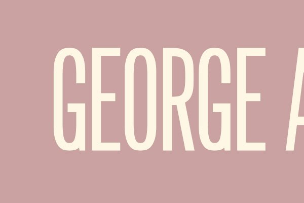
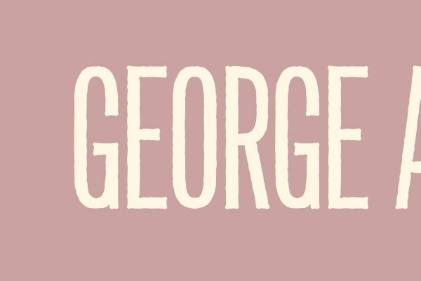
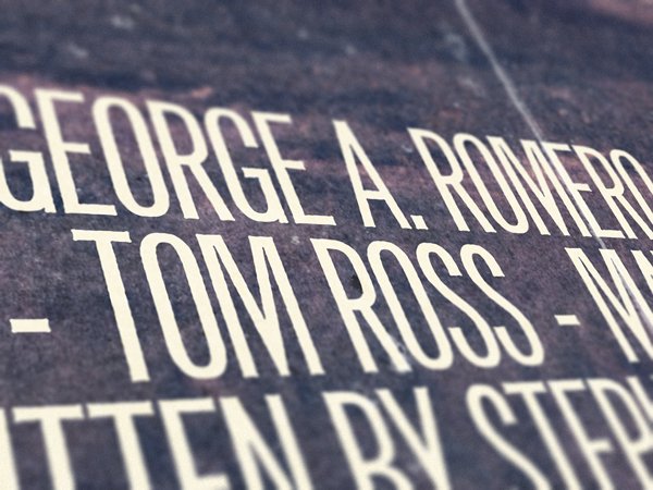
“GEORGE A. ROMERO PRESENTS A DESIGN CUTS PRODUCTION” This needs to be a great movie. Design Cuts will co-produce alongside horror movie legend George Romero.
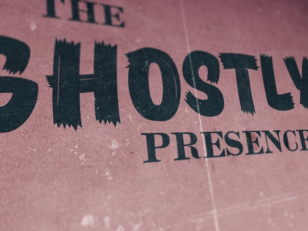
THE / GHOSTLY / PRESENCE” “I ain’t afraid a no ghost”
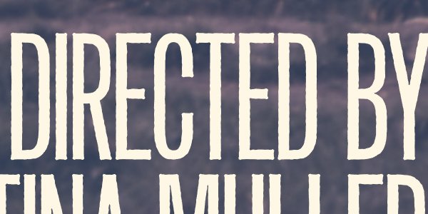
“DIRECTED BY GEORGE A. ROMERO “THE GHOSTLY PRESENCE” /
TINA MULLER – TOM ROSS – MATT SLIGHTAM – DARREN NILES /
WRITTEN BY STEPHEN KING AND JOE HILL /
COMING SOON TO AN CREEPY COUNTRYSIDE SHACK NEAR YOU” George Romero will also direct. The Design Geeks will be the main dish for our zombies/ghosts/spirits. The story is from Stephen King and his son, Joe Hill. Finally, a teaser instead of a precise date.
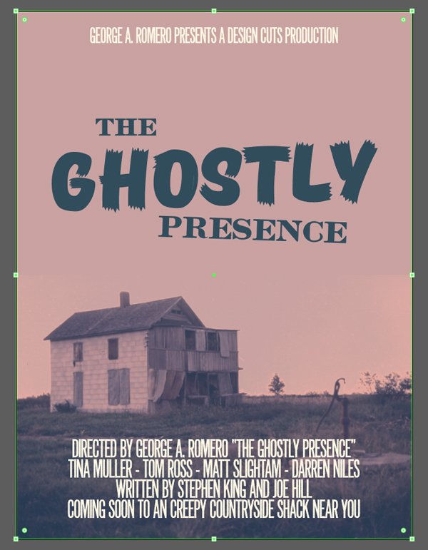
The producer block is set in Newston that is centred, 72 points tall, with a kerning set to optical, and tracking set to 5. It’s positioned at X:9″, and Y:1.4″. Also, its colour is #fdf7e4.
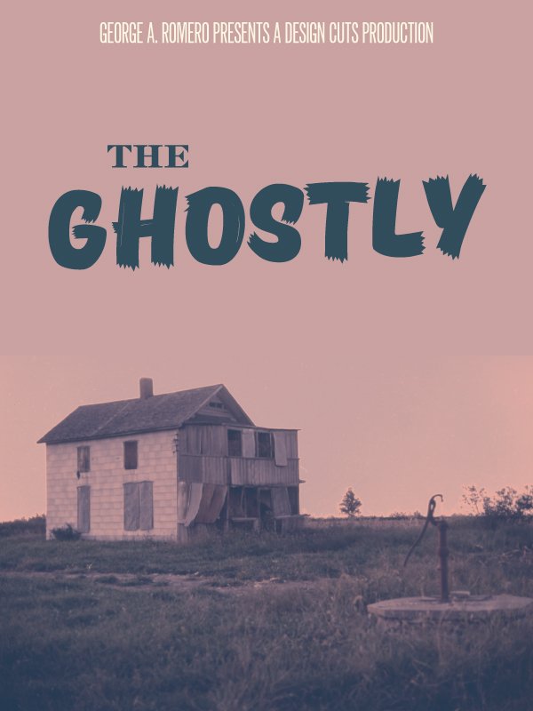
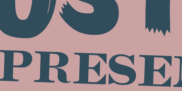
The “THE” is set in Caston Regular, that’s centred, 78 points tall, with a kerning set to metrics, and coloured in #314d5c. It’s positioned at X:5″, and Y:5.25″.

“GHOSTLY” is set in TT Masters Birds Black, that’s centred, 260 points tall, with a kerning set to metrics, and coloured in #314d5c. It’s positioned at X:9″, and Y:7.75″.
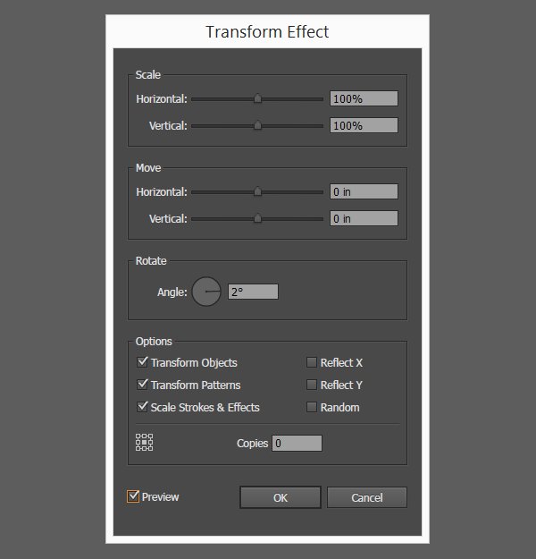
We are going to use the appearance panel to slightly rotate the type piece.

We need to use the Distort and transform > transform functionality.
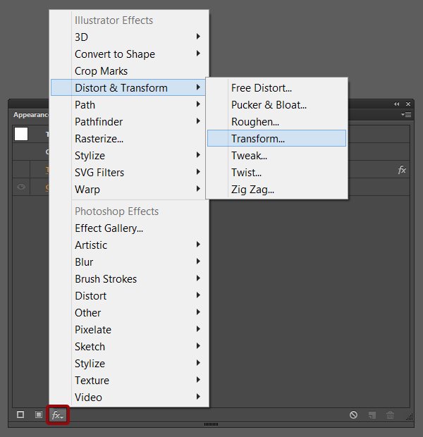
Angle value: 2°.
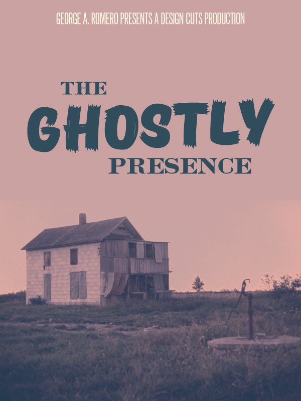
“PRESENCE” is set in Caston Regular, that’s centred, 96 points tall, with a kerning set to metrics, and coloured in #314d5c. It’s positioned at X:10.75″, and Y:9.9″.
Using the appearance panel once more, we’ll give it an angle of -2°.

The credit block is set in Newton Regular, that’s centred, 84 points tall, a leading set to 66 points tall, with a kerning set to optical, a tracking set to 5, and coloured in #314d5c. It’s positioned at X:9″, and Y:21.2″.
Here’s what the layer stack is looking like after some organization.
Type dressing
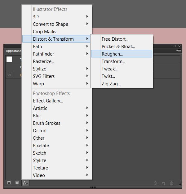
We are going to add a little effect to soften the type. Currently, it’s very sharp and clean. We need it to be less so.
The magic bullet is called Roughen. We will apply it by using the appearance panel as well.
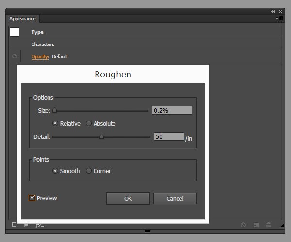
“THE,” “PRESENCE” – size: 0.1%, detail: 35/in.


Credit block – size: 0.2%, detail: 50/in (identical settings to the producers block).
This concludes the type dressing.
ColoUr tweaks
The last thing we will do to the piece in Illustrator is to darken the top some. This will reinforce the nightly atmosphere of the piece. The trick we’ll use for this is simple: a gradient from the dark blue hue used for the text (#314d5c) to transparent.
First, we need a transparent rectangle that covers the entire canvas.
Next, we need to assign it the following gradient: #314d5c to transparent, rotated of 90°.
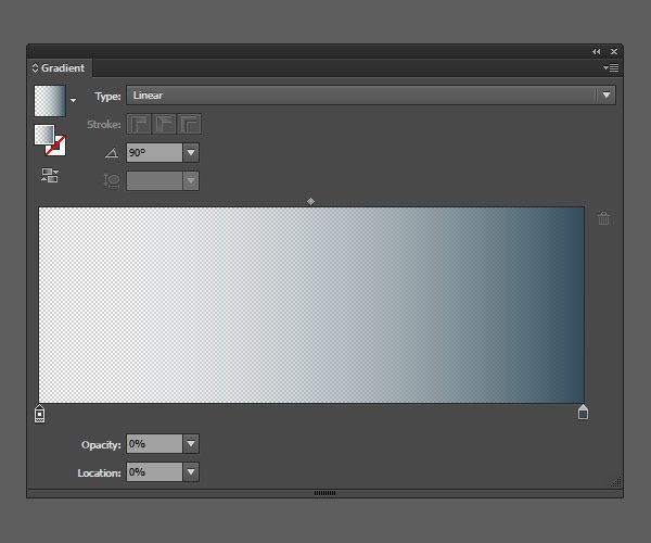
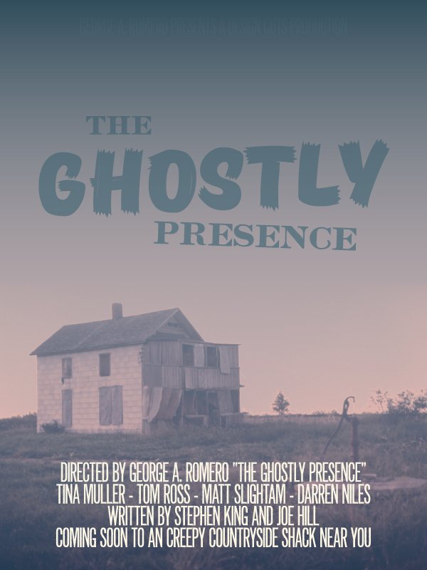
Next, we just have to change the blending mode of the gradient to Colour burn @ 65% opacity for a dark purple night sky above the haunted shack.
Here’s a look at the layer stack so far.
Time to open up Photoshop again, and to add a few textures to this bad boy.
STEP THREE: PHOTOSHOP WORK
Transferring the design to Photoshop
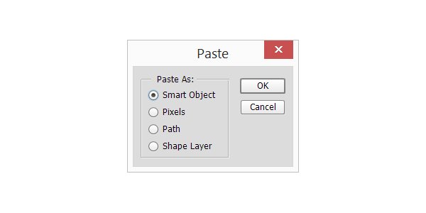
There are multiple ways to transfer a design to Photoshop from Illustrator (exporting a PSD file, copying and pasting individual elements, …), but today we can let ourselves take the easy one.
Start by preparing a matching Photoshop document.
Then, we can simply copy and paste the complete design in the new Photoshop document, as a smart object. It’s important to do so, should we want to change something on the vector side of things.
Assembling our resources
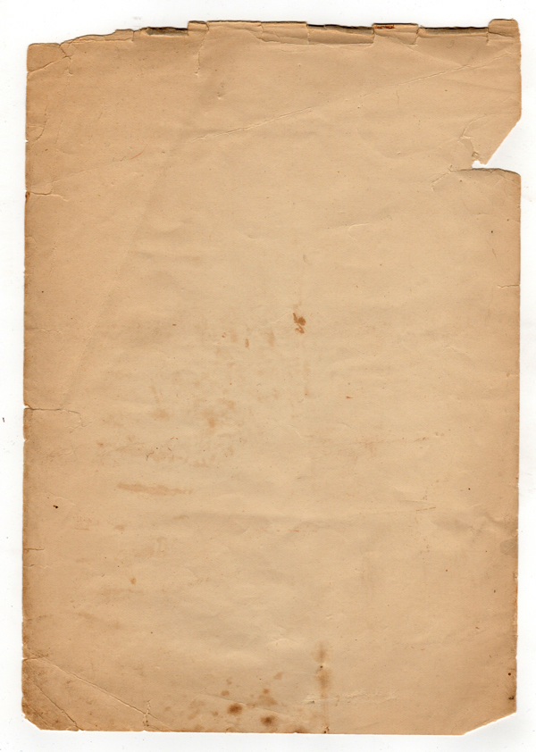
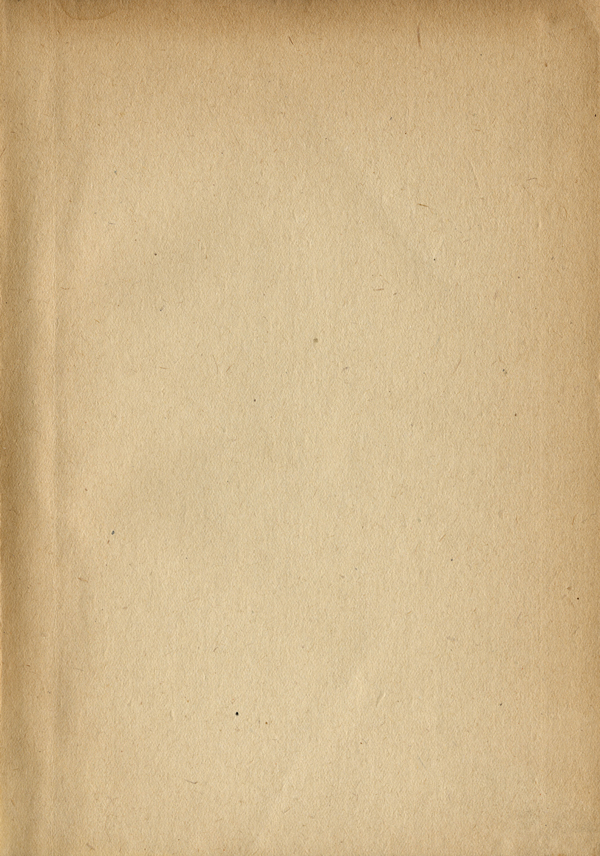
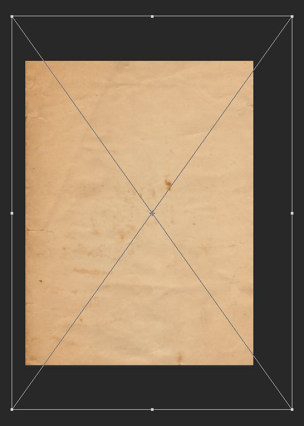
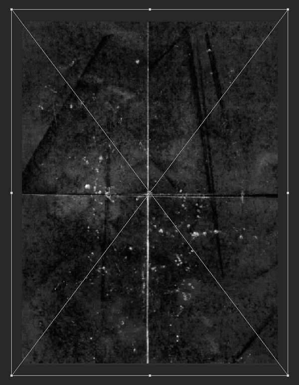
For this piece, we are going to dive deep back into the texture archives, just to shuffle things a bit. Here are the four textures we are going to use:
BB_AntiqueEnvelope_04.jpg by Dustin Schmieding

Found paper #6 by Lost and Taken
This old heavy paper texture by u_l33
The free sample texture of this old folded paper texture pack, folded_scratched_2_001.jpg
Adding textures to the piece
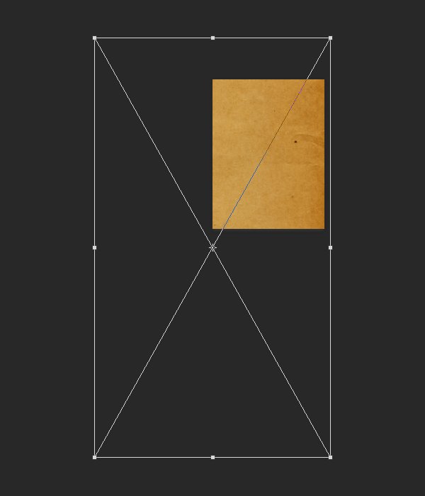
The first texture to add is BB_AntiqueEnvelope_04. It’s placed rotated 90°, scaled up to 1200%, and so its centre is positioned at X:0″, and Y:27″. It will help us to add some subtle paper grain, as well as some creases and speckles, to the piece.
Blending mode: Soft light @ 50% opacity.
The next texture is foundpaper6.jpg. It’s placed scaled up to 300%, and so its centre is positioned at X:10″, and Y:12″. It will help us to add additional paper grain, as well some soft staining.
Blending mode: Soft light @ 75% opacity.
The next to last texture is 593038_70513966.jpg. It’s placed scaled up to 180%, and its centre is positioned at X:9″, and Y:12″. It will help us to add a vignette effect, as well as somne additional paper grain and speckling.
Blending mode: Overlay @ 35% opacity.
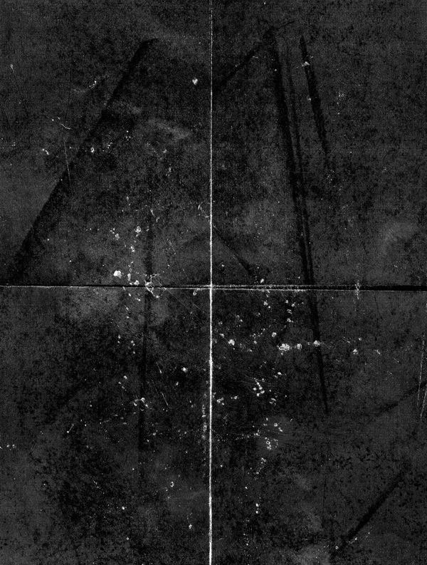
The last texture we’ll add is folded_scratched_2_001.jpg. We’re using it to bring the fake folds to the poster, as if it sat forgotten somewhere for a few decades. It also bring some interesting noise artefacts to the piece. It’s placed scaled up to 250%, and its centre is positioned at X:9″, and Y:12″.
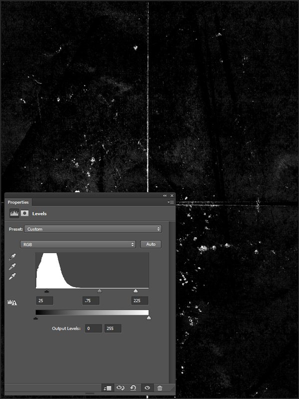
Blending mode: Screen @ 50% opacity.
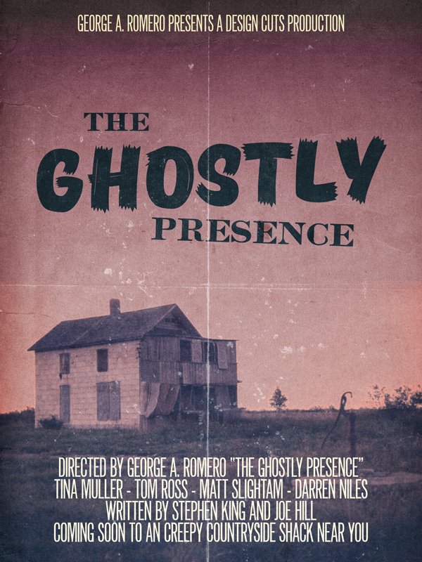
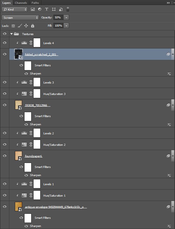
And our poster is done. Here’s a look at the final layer stack in Photoshop.
WRAPPING THINGS UP
Congratulations on finishing the tutorial! I hope your outcome matches your goals.
Did I leave questions unanswered? Please ask in the comments below. The Design Geeks and myself will do our best and help out.
We’d love to see your tutorial outcomes! Please share them with us on the Design Cuts Facebook page. We’ll share the best ones with the whole community.
There is less than a week left to grab the 24 exceptional font families bundle for 98% the regular price (saving you over $1,200 in the process)! If you purchased the bundle already, I hope that you enjoy it, and that this tutorial gave you a sense of what you can accomplish with these great typefaces.
That’s it for me today! Until next time, cheers, and have a wonderful weekend!

This was great! So well explained, it´s keeps you interested.I was just looking for tutorials on how to aply fold paper texture and all this came up :) super
I’m so pleased to hear you enjoyed this one, Mar :) Thank you so much for taking the time to try it out!
Hi I use this tutorials for learning photoshop
at the end of the tutorial you show the photoshop layer stack
under each of your smart objects (the imported paper textures) you have a smart filter of “sharpen” but this isn’t mentioned in the tutorial (unless i overlooked or didn’t understand something)
what is the smart filter for, how does it benefit the image, and how should we used them?
thanks
Hello Helen,
My apologies it took me so long to answer. Well, the sharpening step is mentioned in the texturing process PSAs: “Every time we’ll work with textures, we’ll follow this simple process: place as smart object, sharpen, desaturate, enhance contrast with levels, and modify the blending mode. (…) Notes: accessed through the Filter > Sharpen > Sharpen menu.”
Sharpening helps to maintain the crispness of the textures throughout the process, especially when we’re stretching them bigger than what they are originally to fit the piece we’re working on. It gives some punch to the texture’s artifacts that we want to use in our pieces, which in turns gives us a visually more striking piece. And because it’s smart filter, you get extensive control over the intensity and impact of the filter to the smart object.
I strongly recommend reading/going through the “Using textures the right way” tutorial we published here a while back: https://www.designcuts.com/design-cuts-deals/how-to-use-textures-the-right-way
Don’t hesitate to reach out if you have more questions!
Great tutorial. Explains well, sufficient screencaps and links to additional information for additional learning.
Hey SC,
I’m really pleased to hear you enjoyed the tutorial. Simon always does a great job in putting them together :)
Thank you for your kind words! Don’t hesitate to reach out if there’s anything I’ve left unclear, or if you have ideas to make things even better.
Nice fun tutorial!
I think there is a small type error. Poster should read “Coming Soon to A (instead of an) Creepy Countryside Shack Near You” right?
Cheers!
Hey Samia,
I’m really pleased to hear you enjoyed Simon’s tutorial! :) If you ever felt like sharing your designs from this we would love to take a look!
Whoops! I guess this one *crept* past us! Apologies Samia!
Thank you for your kind words, Samia.
That is indeed a beautiful typo that you noticed. That’s what happens when you work late, and don’t re-read one last time. I promise I’ll be more careful in the future :-)
I hope that you enjoyed the tutorial regardless! Don’t hesitate to share your outcome.