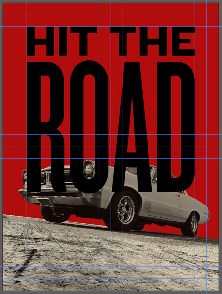
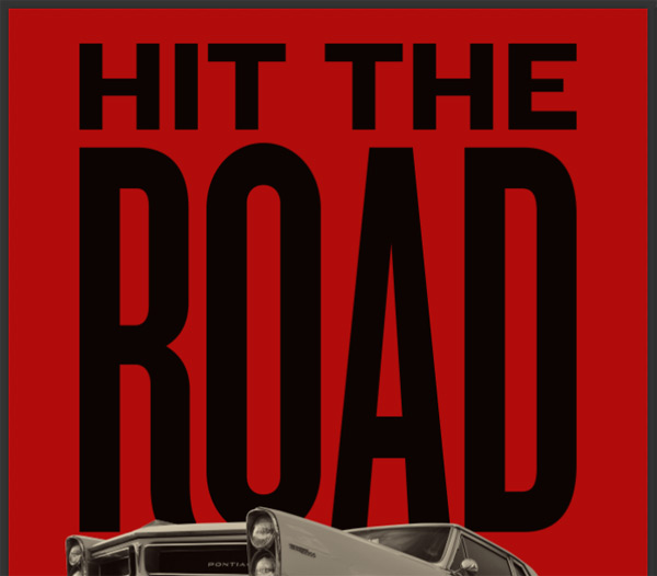
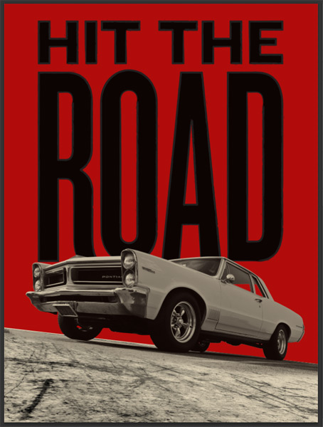
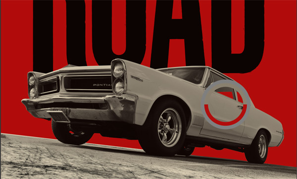
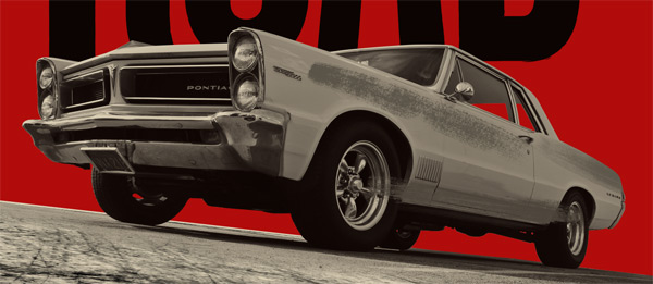
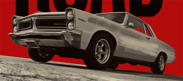
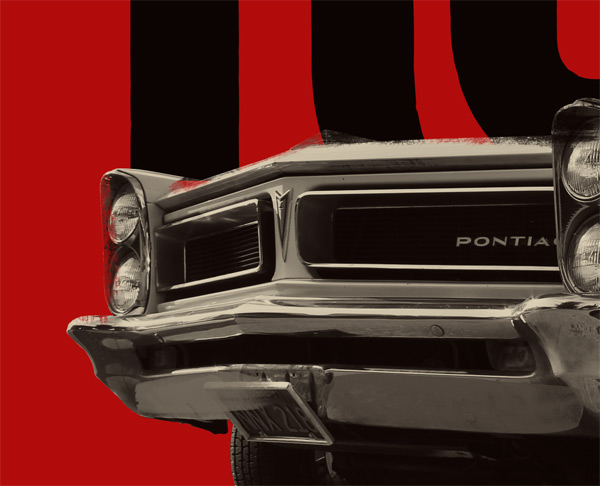
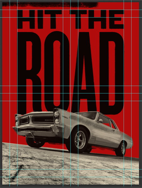
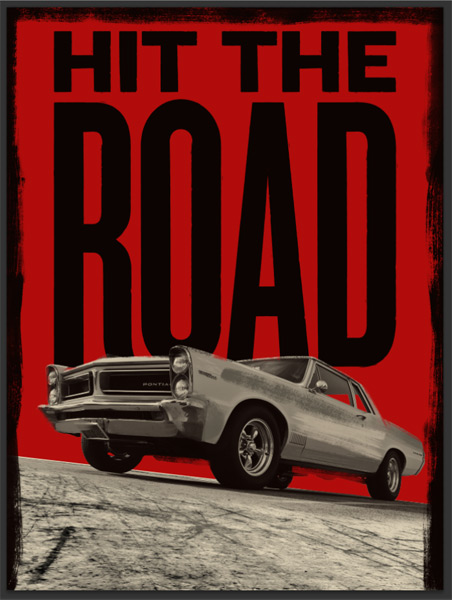
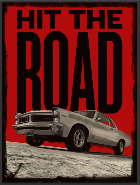
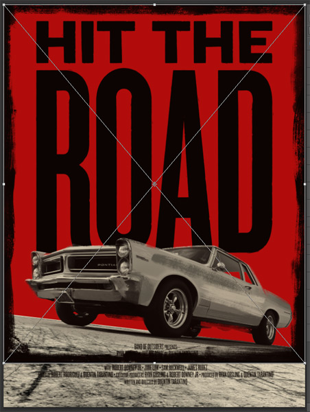
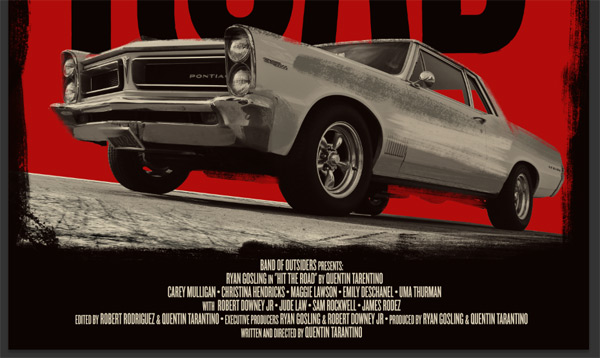
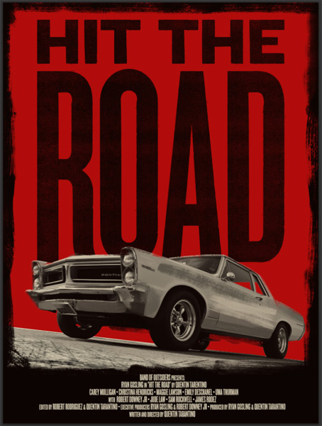
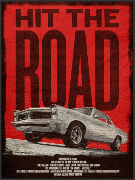
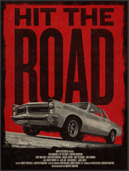
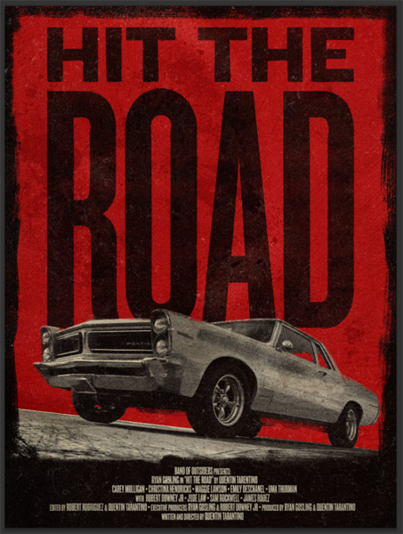
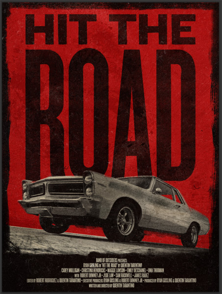
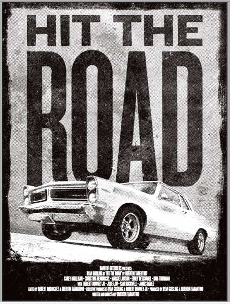
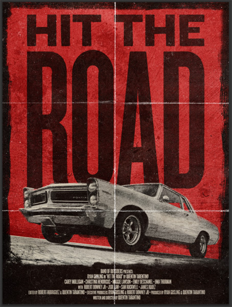
WHAT WE’RE CREATING:
Hello all! Simon from Studio Ace of Spade here again. Today, we’ll be working on a fake movie poster with a grindhouse-vibe.
After looking through the amazing brushes from this week’s deal, it was clear that we would need to explore a piece with a similarly ‘painted’ feel.
I got the perfect excuse right there to make a Grindhouse-style poster.
I’ll walk you quickly through my research phase, and then we’ll proceed to the execution of the poster.
Beware that due to its length, this tutorial might seem harder than usual. It won’t be, but painting with brushes is a very organic process, and requires many steps. If you stick with the tutorial and are patient, then I promise the end result will be worth it.
STEP 1: RESEARCH
After setting our minds on the type of posters we were going to create, I went ahead and googled Grindhouse posters. The results led me to the following links, and got me these amazing finds:
- Grindhouse posters @ Wrong side of the art!
- Carsploitation posters @ Wrong side of the art!
- A pinterest board of grindhouse posters
- A tumblr dedicated to the subject
- 25 of the Coolest Grindhouse Posters Ever @ IGN
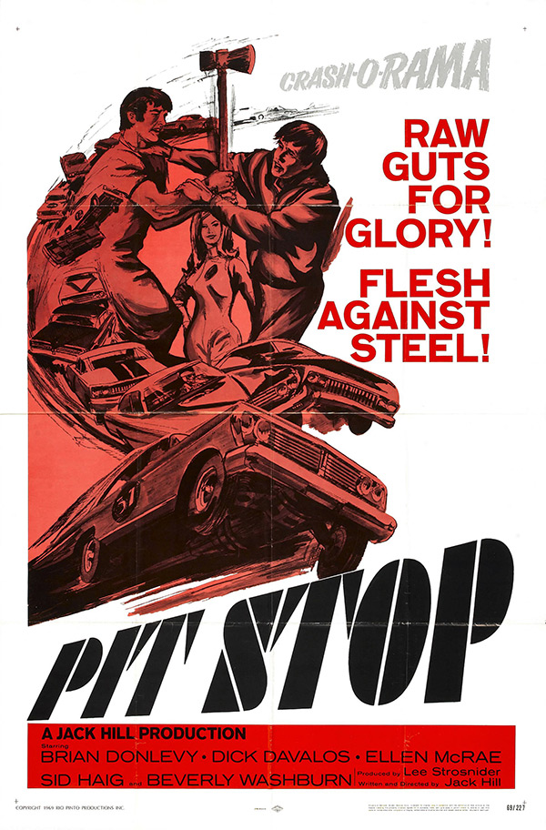
Pit Stop (1969, USA) #
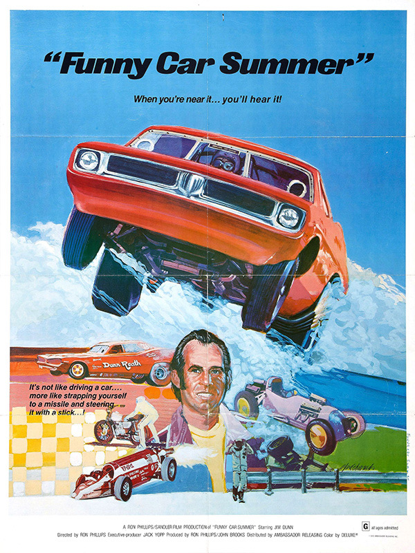
Funny Car Summer (1974, USA) #
Daredevil Drivers (1978, Japan / USA) #

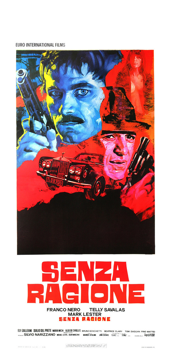
Senza Ragione (1973) #
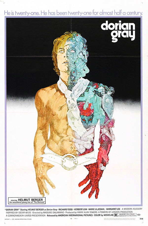
Dorian Gray (1970, Italy, Germany, UK) #
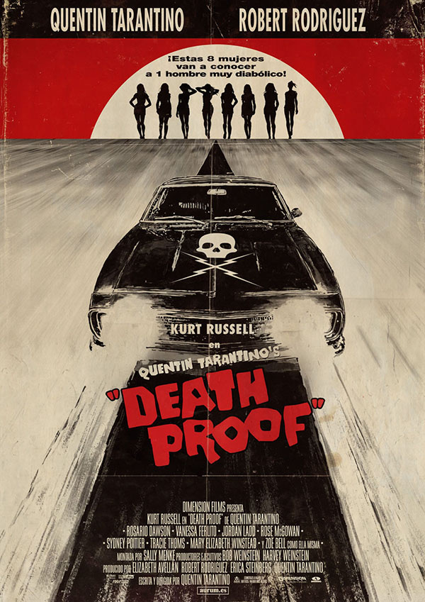
And then, there’s the obviously amazing poster for Quentin Tarantino’s Death Proof:
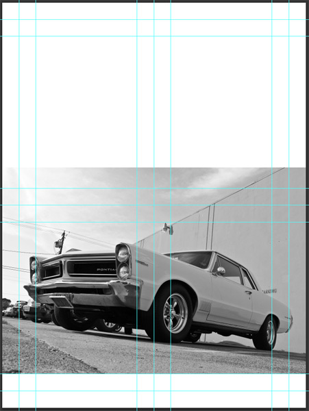
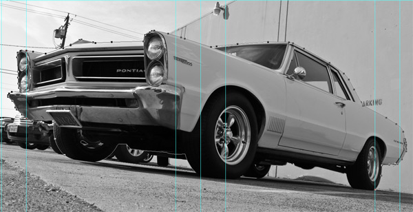
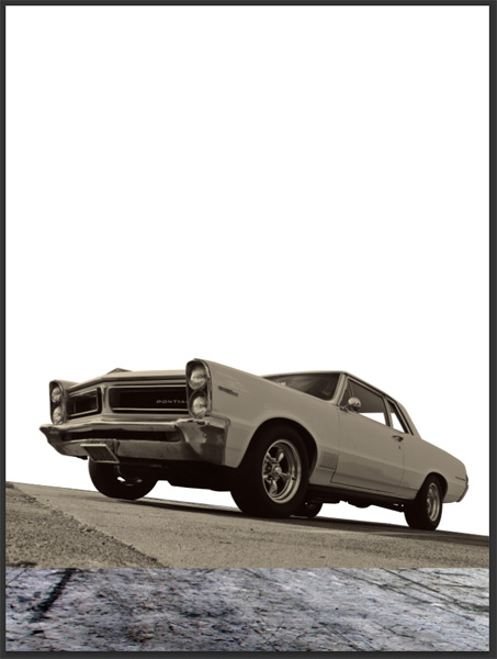
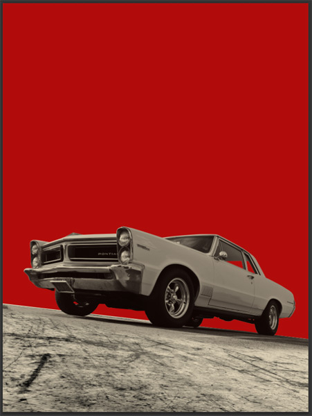
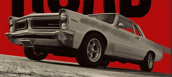
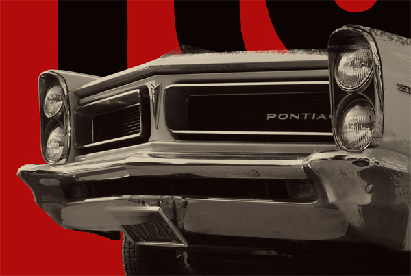
From there, I started looking for iconography, and found this great stock photo on Flickr, by Nick Ares:

It looks like it’s a Pontiac Tempest, from 1964-1967.
From the image, I opened up the sketchbook, and started sketching ideas.

You can see the other ideas I played with, along with the images that inspired them, over at Dribbble.
The layout is simple, and prominently features the car. Here’s what the execution of the poster will look like:
- Photographic element extraction
- Completing the scene with stock resources
- Brush work in Photoshop
- Typographic elements and Illustrator brush work
- Texture effects
Ready? Set, go!
SET 2: DOCUMENT SETUP
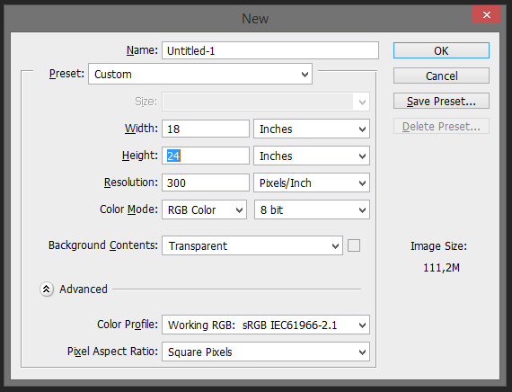
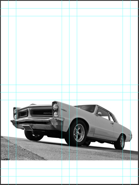
This is going to be the easy part. I’m working in Photoshop, with an 18″x24″ canvas @ 300 dpi. Note that I’m starting with a transparent background, but that I’ll quickly fill it in white so some of my steps are easier to be seen and understood.
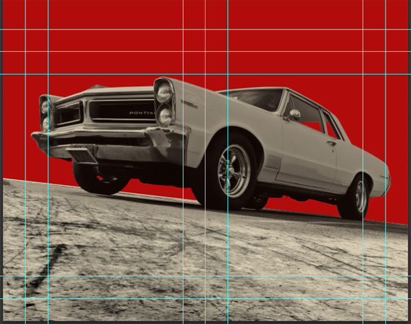
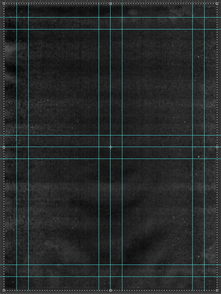
The next step is to put a few guides in place. Vertically at 1, 2, 8, 9, 10, 16, and 17 inches. Horizontally, at 1, 2, 11, 12, 13, 22, and 23 inches.

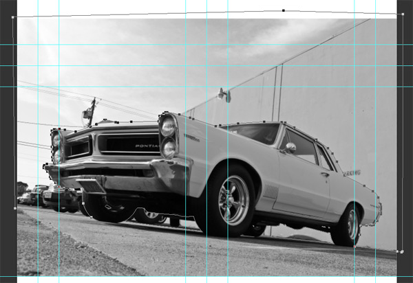
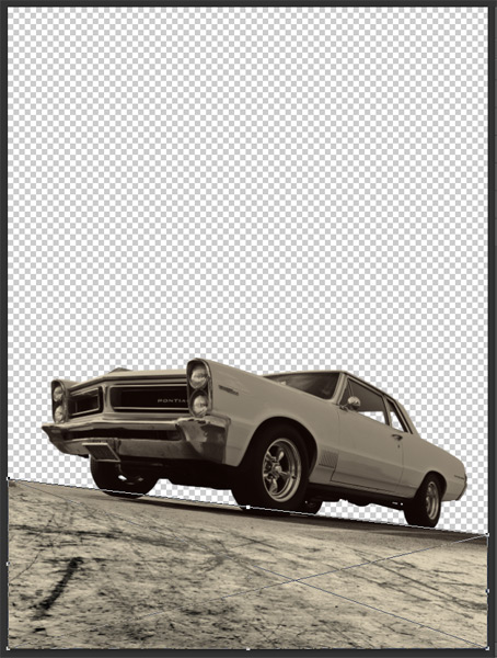
STEP 3: EXTRACTING THE CAR FROM ITS BACKGROUND
This step isn’t hard in itself, but definitely tedious. We’ll be using the Pen tool (P) to draw a precise path around the car, that we’ll then transform into a selection.
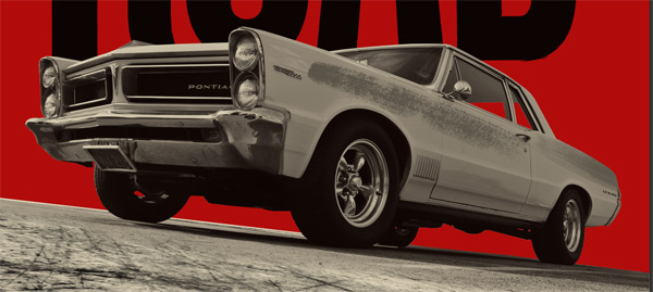
Start by placing the car into your canvas (keep it as a smart object), and size it big.
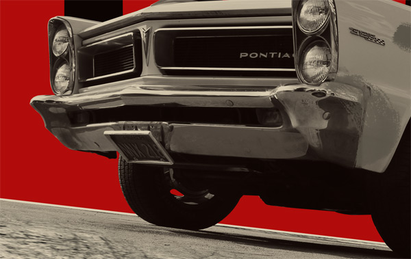
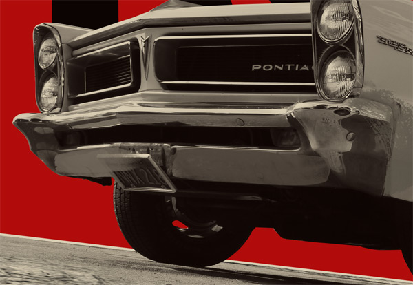
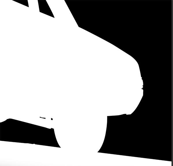
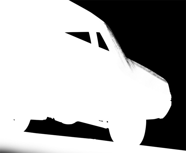
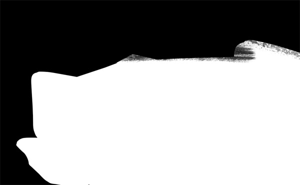
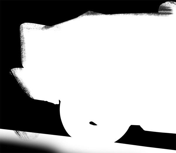
We’re looking to hide all of the stuff I’ve highlighted in red below:
At this stage, if you’re unfamiliar with using the Pen tool, I’m going to urge you to read this great tutorial by Melissa Evans, and to practice the exercises she came up with. She details how the tool works, and how you can leverage it for various applications in Photoshop.
The Pen tool works just like in Illustrator, but there are a few more subtleties in what the outcome of your work with it will be in Photoshop. You can create paths, shapes, and more. What we want to focus on in our case are paths, because these are the ones we’ll be able to turn effortlessly into a selection later on.
Select the Pen tool, and make sure its mode is set to paths.


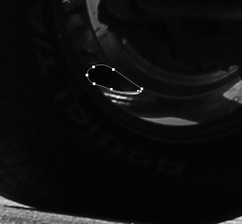
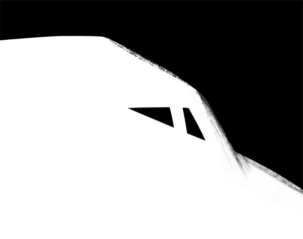
Let’s have a look at the car windows, so I can share a few tips. I usually start with putting my main points in place first.

I then choose the Convert point tool to refine the points’ handles and curves (just stay pressed on the Pen tool icon, or use the ALT/OPTION modifier key while the pen tool is active to activate it).

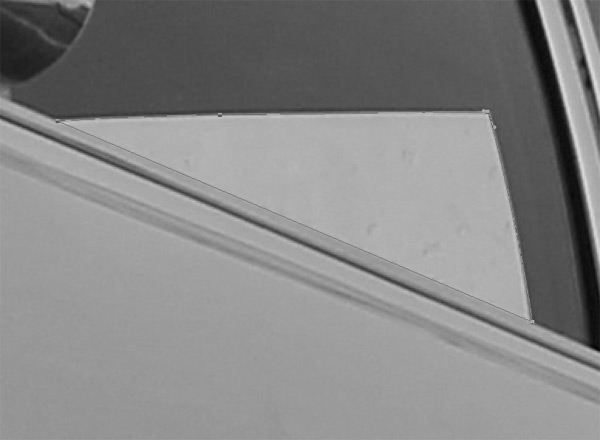
From there, let’s move on to the next window.

After the windows are taken care of, time to move to underneath the car. The process is the same: place your points, refine your curves afterwards. It just takes time and a bit of patience.
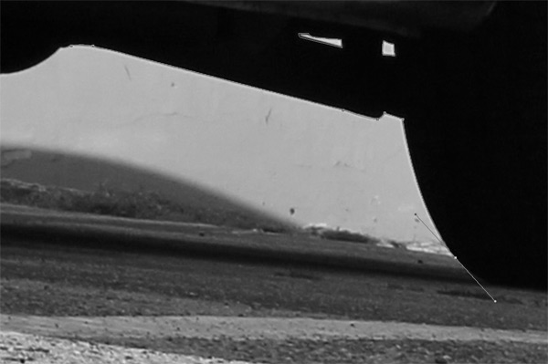


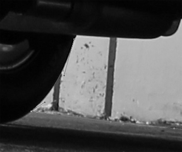


Apply the same logic to the car outline.
And we’re done! Note how loose I can be with the path once it gets outside of the canvas’ limits.
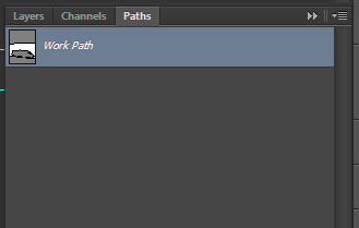
Once we’re done with our path, it’s time to turn it into a selection. Let’s access the Path panel through the icon below in your toolbox (or by going through the Window > Paths menu if it isn’t visible).

The panel looks something like this. The Work path is the path we just created.
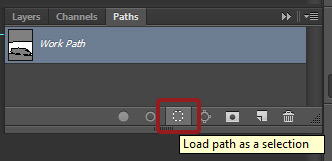
Make sure the path is highlighted, and click the Load path as a selection button.
This will make a selection around all the area that’s white in your path thumbnail.
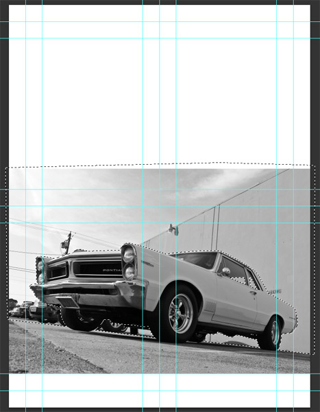
Since we don’t want to hide the car, invert the selection (CTRL/CMD+SHIFT+I).

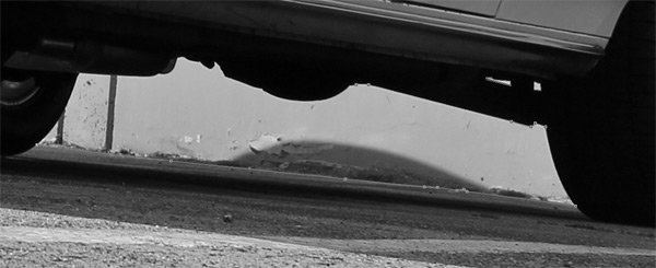
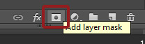
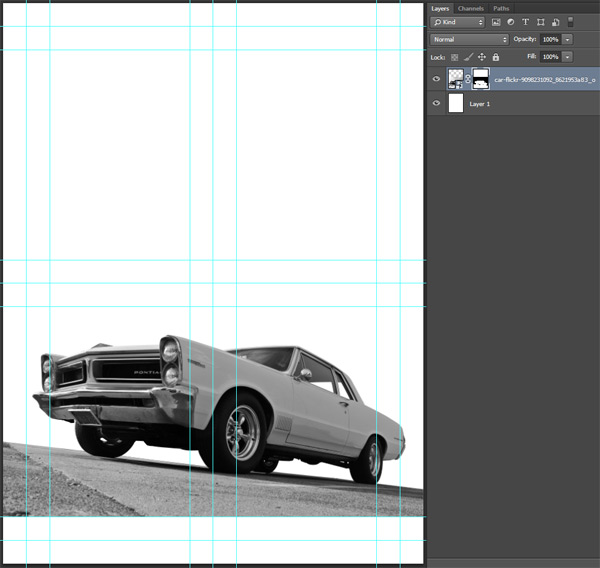
Once you have the proper area selected, simply head back to your Layer palette, and press the Add layer mask button at the bottom, with the car layer highlighted. This will create a layer mask that hides all of the things we want hidden, leaving only the car and some of the ground visible.
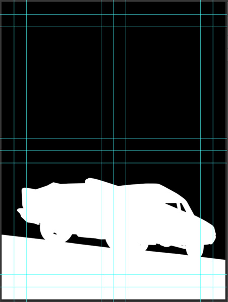
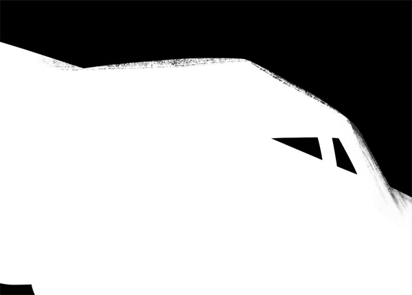
Below is a look at our layer mask (ALT/OPTION+CLICK the layer mask thumbnail to get access to its content. Click the layer thumbnail to get back in “normal” mode).

Take a big brush or the paint bucket, and paint that top section black. It’s not necessary, but my OCD will feel better.
Oh, and I actually quickly moved the car up and left a bit.
STEP 3: COLORIZING THE CAR
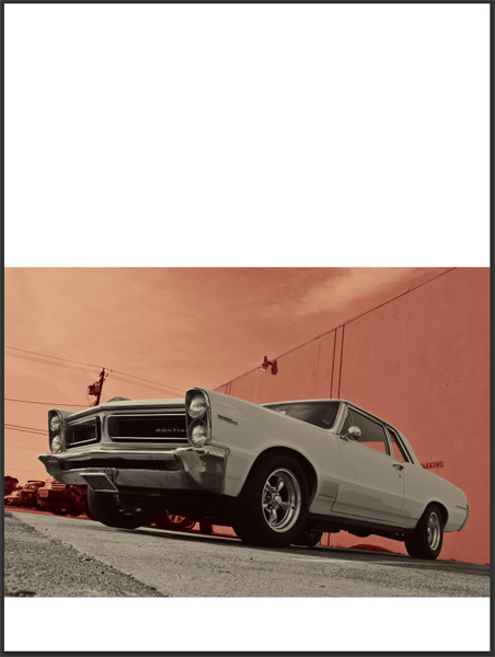
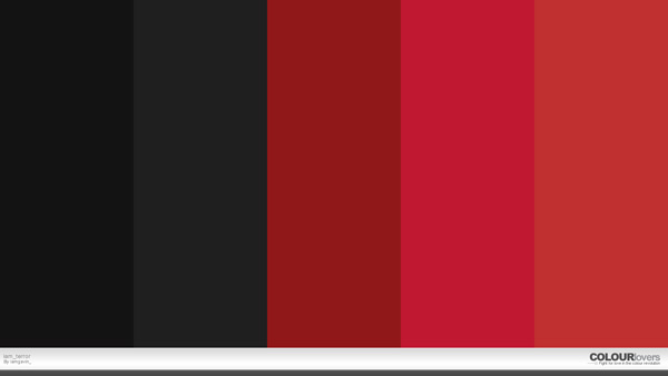
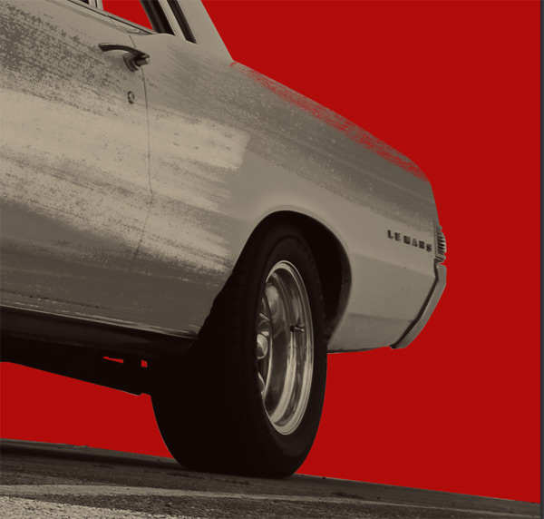
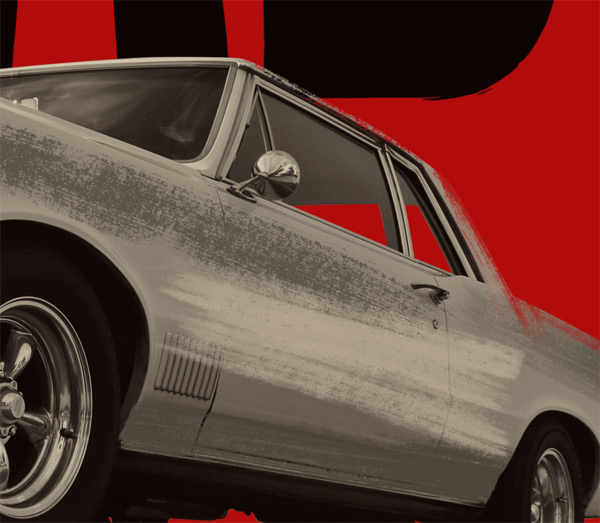
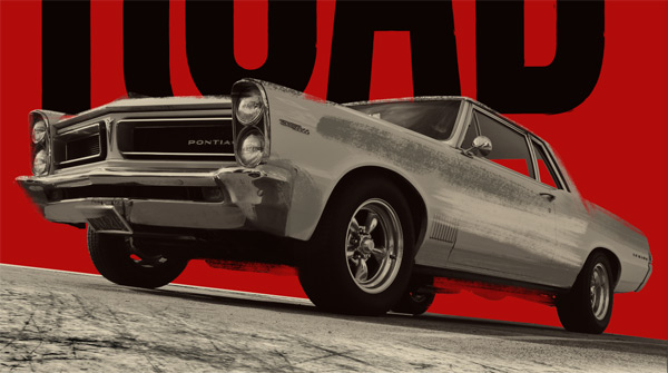
When looking for potential color palettes for this poster, I went to Colour Lovers and types “Grindhouse” in the search field. Some of the results were quite cool, but none had the strong impact the Death proof poster has. This print only uses three colors (very dark gray/black, blood red, and tan), which makes it very bold.
So I went ahead, and decided to mix the color palette that was the closest to that poster, and to create one of my own.
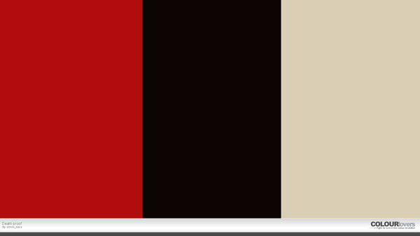
Ultimately, we’ll use the colors from the second palette, along with a few darker and lighter variations.
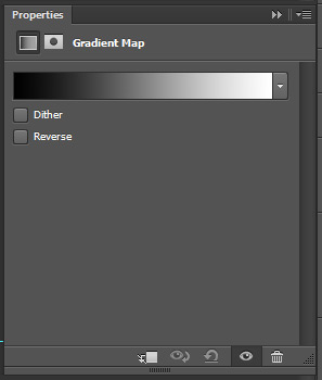
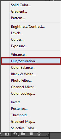
In order to colorize the car, we’ll use a gradient map adjustment layer. Go ahead and create one above your car layer.
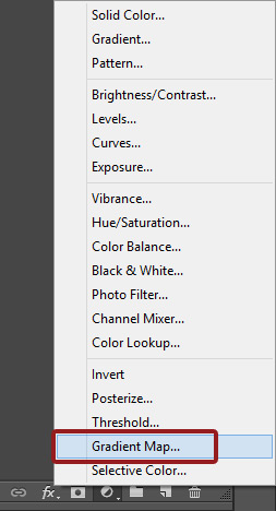

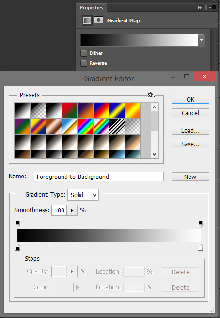
Once the layer is created, double click on its thumbnail to pull its properties. The panel looks like the one you’d get when editing a gradient.
Double click on the gradient to edit its colors.
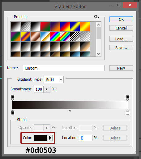
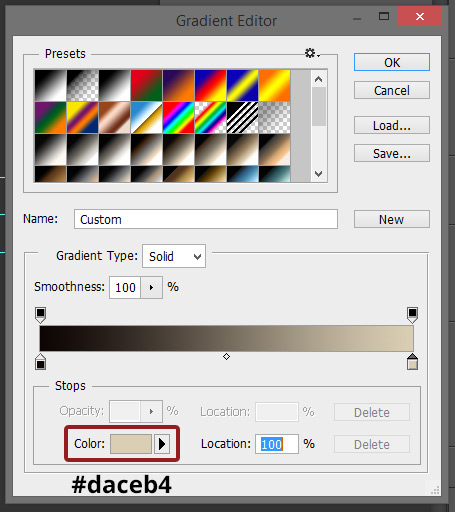
Use #0d0503 for the dark value, and #daceb4 as the light value.
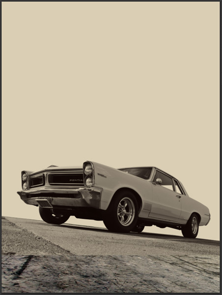
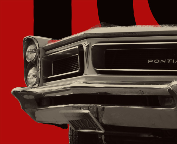
Once you’re done, this is what you’ll see. The adjustment layer is applied to the whole canvas, also filling the background.
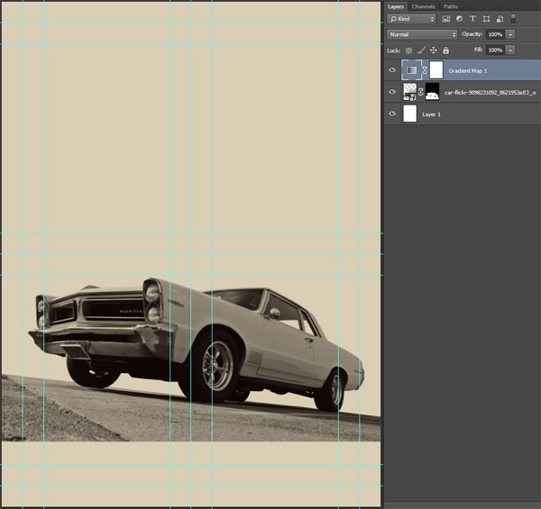
We do want the background we painfully cut out to stay transparent, so we’ll simply go ahead and clip the adjustment layer to the car layer (CTRL/CMD+SHIFT+G). This will apply the adjustment layer to the car layer only, leaving the rest of the canvas untouched.

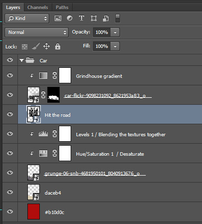
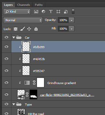
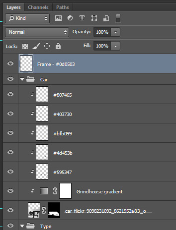
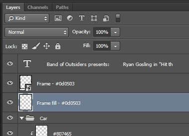
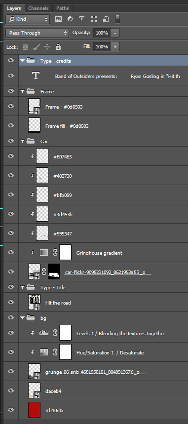
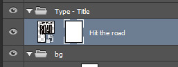
And once we’re done with all of that, a little bit of layer housekeeping is in order. Rename and label your layers properly, or else (see #1 and #2 for more information)!
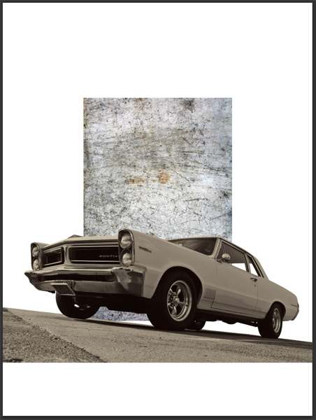
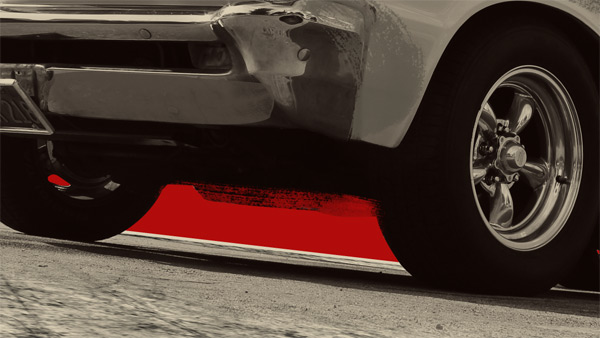
STEP 4: COMPLETING THE GROUND
This step will make us “finish” the bottom of the poster. We could simply fade the bottom edge of the car layer into a solid tan block. This would also leave us room for the credits (remember this is a movie poster). But I’m not convinced about that solution, as it’ll probably look a little unnatural. We could also stick the bottom of the car layer to the bottom of our canvas, but we would then not have room at all for credits. I know that the hypothetical printed size of this poster would be 18″x24″, I still don’t want my type to be too small.
First, let’s track down some grunge cement texture. This one below by Startextures on Flickr will be perfect.
Technically, any other ones from the set would work. I just like this one better at first glance. ANd it features lines that you could line well with the lines in the cement under the car.
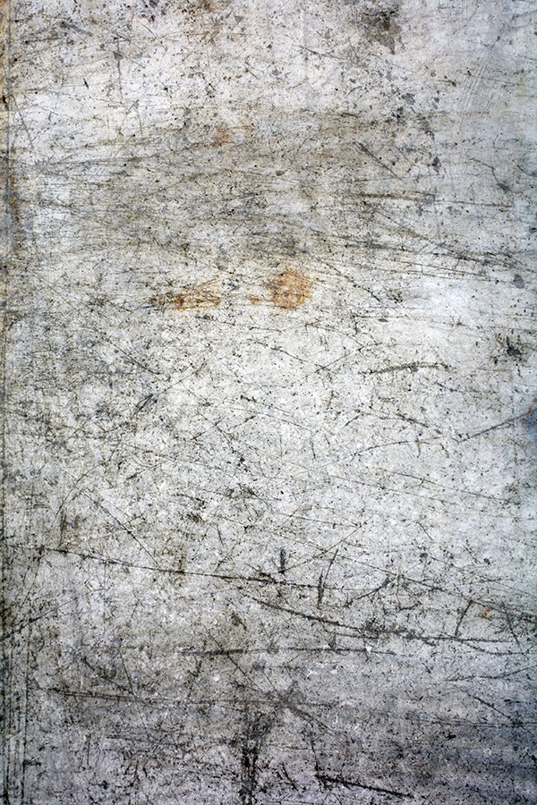
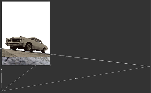
Start by importing it into your canvas. Note that it’s placed below the car layer.
Rotate it by 90°, but leave the Free transform mode active.

This is where the magic happens. With Free transform active (CTRL/CMD+T), right-click the layer. The following menu will appear. Select Distort.
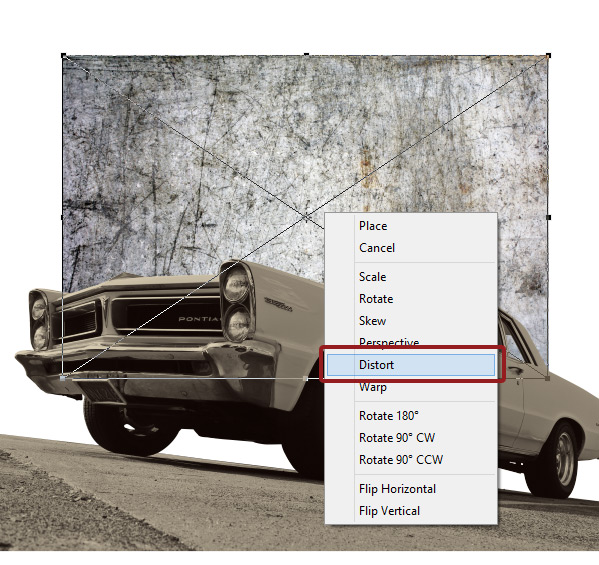
This functionality will give you the ability to pull on the layers corners, and to distort the textures as if it were seen in perspective. Match the angle of the ground below the car as well as you can, corner by corner.
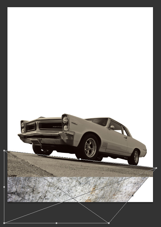
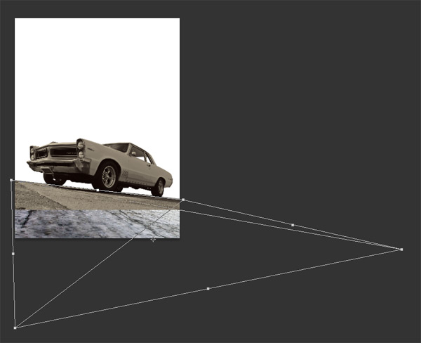
Don’t hesitate to validate the transformation to check the result, and to transform further if needed.
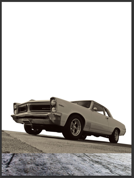
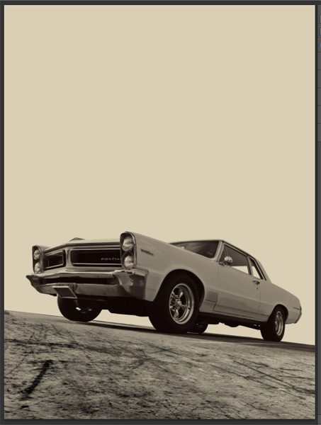
Next, we need to colorize that bottom piece of texture. Start by creating a new layer underneath the texture, and fill it with our tan color (#daceb4).
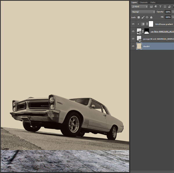
Place the texture layer’s blending mode on multiply.
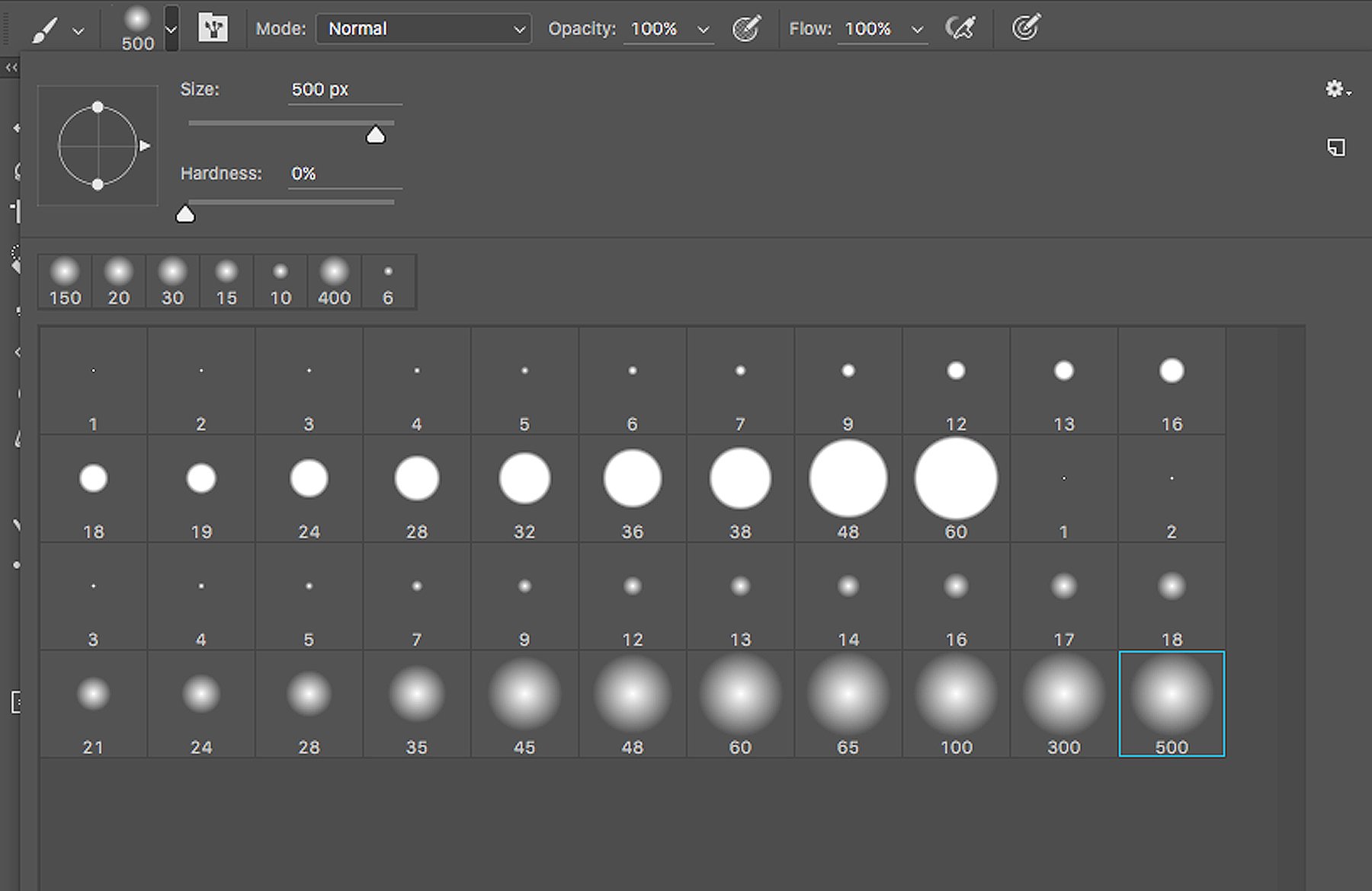
Next, we’re going to take a medium, soft brush to paint in the car layer mask, and create a transition between the car layer and the texture layer. My brush is the basic round brush, 350 pixels wide, with the hardness at 0%. Below is a view of the layer mask, and of the result.


To further the integration between the two, we’re going to edit the texture just a bit more. Start by adding a clipped Hue/Saturation adjustment layer on top of it, and reduce the saturation to -100.
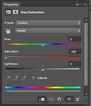
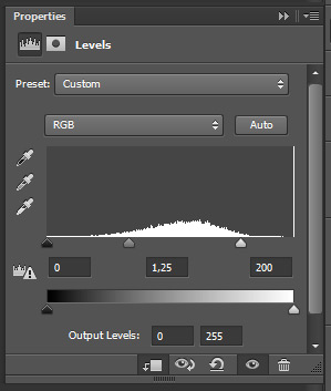
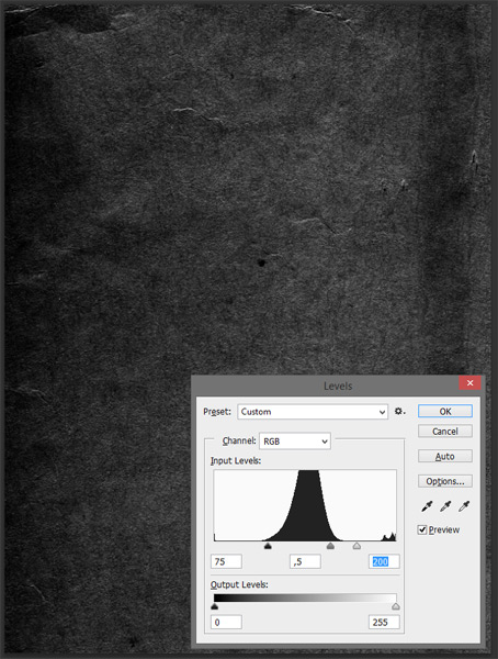
The two already feel better blended, but some of the cement scratches are still a bit too strong and too dark compared to the rest. Let’s soften things up with a Levels adjustment layer. Don’t forget to clip it as well. Note that the values used will greatly depend of the cement texture you’re using, and of its distortion pattern.

Once you’re happy with how the textures blend together, you can transform the tan layer so the transparent background is visible again. Don’t be afraid to use the Free transform > Distort trick again.
You could even make that layer a smart object (Filter > Convert for smart filters in Photoshop CC, Filter > Convert to smart object in versions below), so just in case, you could always come back to the original layer.

STEP 5: TYPE (PART I)
And actually, right before we start talking type, let’s do something else: let’s add the red background to our piece. Add a new layer at the bottom of your layer stack, and fill it with our blood red #b10d0c.
Once you’re done with, let’s do some layer housekeeping, as our file is only going to get messier.

Now, let’s talk type, for real this time. We’re actually going to create our type object in Illustrator. This will allow us to leverage the super sweet vector chalk brushes that Leonard Posavec created.
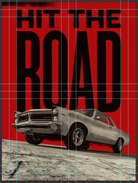
Start by creating an 18″x24″ document in Illustrator. It should mimic your Photoshop canvas (RGB color mode, guides), so the transition between the two will be as seamless as possible.

A little trip: I leaves the guides unlocked in Illustrator, but place them on their own locked layer. This way, I can move them around quite easily, and they don’t pollute my layer stacks.

If we look back at our Photoshop document, the top of the car sits right under our 13″ horizontal guide. This is something to keep in mind while we design our type element.
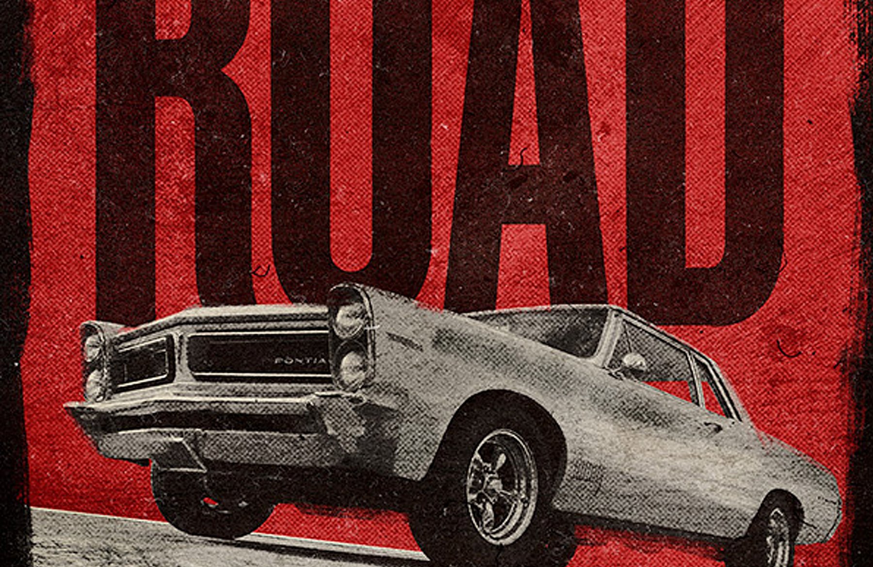
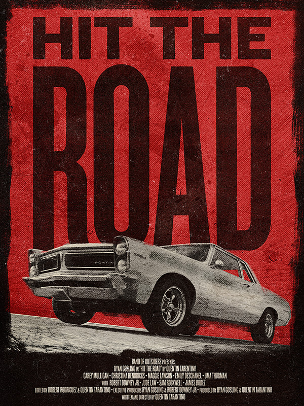
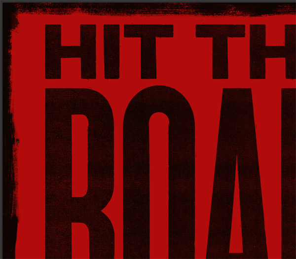
All set up? Good. The title we chose is “Hit the road.” Probably a weird homage to some movie with intense chase scenes in it.
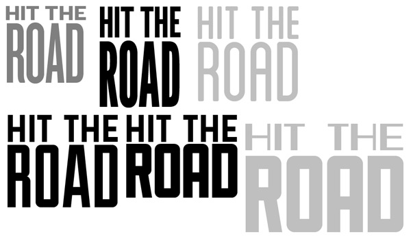
Here are some of the type combos I came up with.
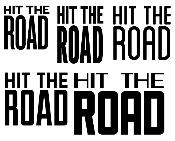
My favorite is the one at the top left. It’s made using the amazing type family Knockout by Hoefler & Frere-Jones Co.
The problem is that Knockout is expensive (the full family is licensed at $799 for one computer plus a web license).
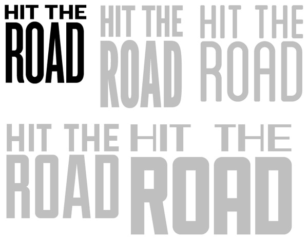
In order to circumvent the issue, I came up with a few alternate type pairings that shouldn’t get you broke in the process. There are three I’m happy with. The idea is to have a top line that’s slightly extended, while the word “Road” is written in a condensed sans-serif, in order for it to be very tall.
- The top option is constructed with League Gothic Regular and League Gothic Condensed, from the League of Movaeable Type
- The bottom left option is constructed with Mission Gothic Bold and Duke Fill from the Lost Type Co-op
- The bottom right option is composed of Mission Gothic Bold and Sullivan Fill, from Lost Type Co-op as well
League Gothic is a great typeface. It could seem a bit too soft for this application though. I’d tend to prefer the squareness and rugged feel of Duke or Sullivan.
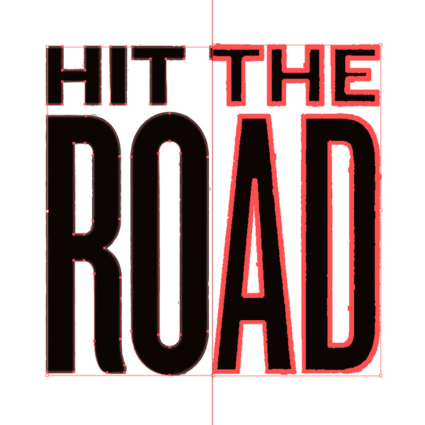
I’ll keep going with my Knockout combo for the rest of the tutorial. Let’s start by fine-tuning the text block. In order to do that, let’s change our text object to regular vector elements, by using the right click menu “Create outlines.”

Next, make sure both lines of copy have the same width.

Once that’s done, tweak the spacing between each line. I’ve used the width of the gap between the “R” and the “O” of “Road” as my spacing unit.

Once you’re happy with the result, it’s time to size the type to the size it’ll have on the poster. Remember where the car comes up to. I actually saved a quick comp of the Photoshop document and placed in Illustrator to help with sizing the type.
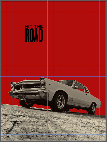
14″ wide is what seems to be the happy number.
My goal is to hide the type behind the car. Let’s copy and paste the block as a smart object in Photoshop, and see what happens. Mind your layer order to achieve the masking.
The type is well masked by the car, but slightly unreadable. Too much of the bottom of the letters is hidden for them to be properly interpreted.
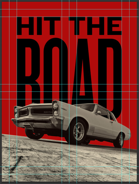
The solution? Simply to slide them up until they become decipherable. I put the top of the letters flush with the 1″ horizontal guide, and I can now read what’s written.

Another option you could explore would be to nudge the car, texture, and color layers down. It’s up to you. In this shot, the top of the car’s headlight is at the 14″ mark instad of 13″ before.
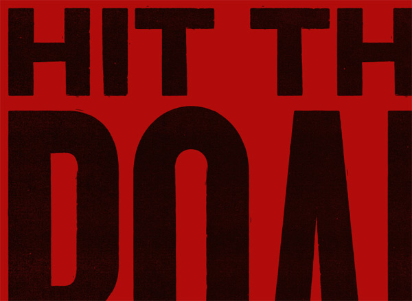
Oh, and let’s not forget to change the color of the type to our dark gray (#0d0503). Simply double-click on the smart object’s thumbnail to be brought back to Illustrator. Change the color, save your changes, and head back to Photoshop to find the changes transferred over.
Now is also a good time to play with the Illustrator brushes, to add a bit of grunginess to our main text block. Double click on the smart object’s thumbnail again, to be brought back to Illustrator once more.

Add a one point stroke to the type, of the same dark gray color (#0d0503).
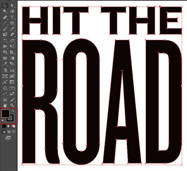
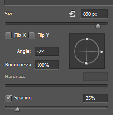
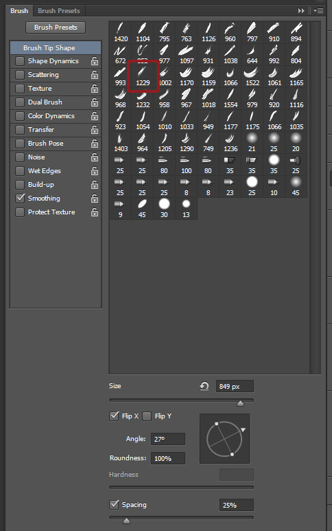
After, it’s time to start visualizing what the brushes are doing to our art. Pull your Brushes panel out (Windows > Brushes), and start loading the various brushes created by Leonard. Note that I’m only pulling the grunge brushes. Set #1 is more for linework, and #6 is to create ornamental borders.
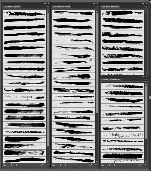
After having all the brushes in front of us, it’s time to experiment. We’re looking for a painterly feel, like if the letter had been hand-painted, and not necessarily too well.
Below are a few of the best results, along with their settings.
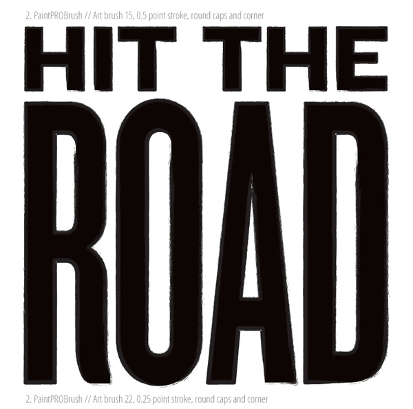
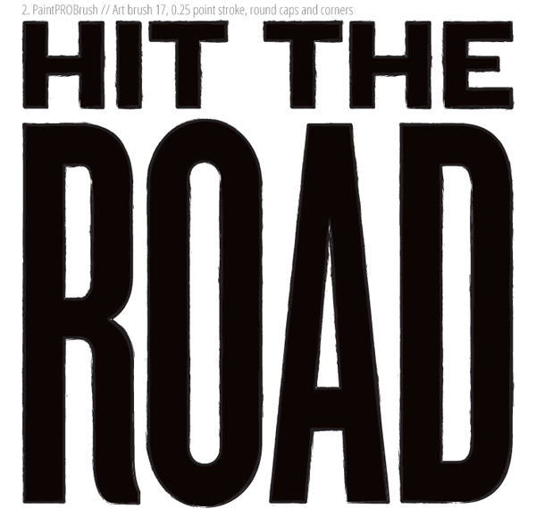
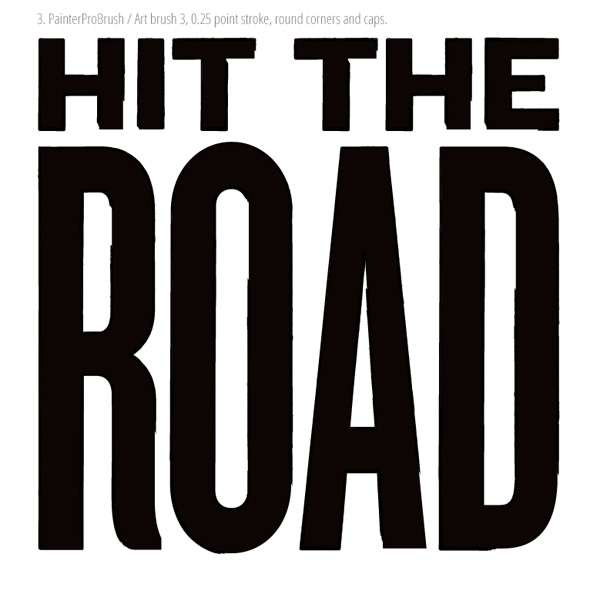
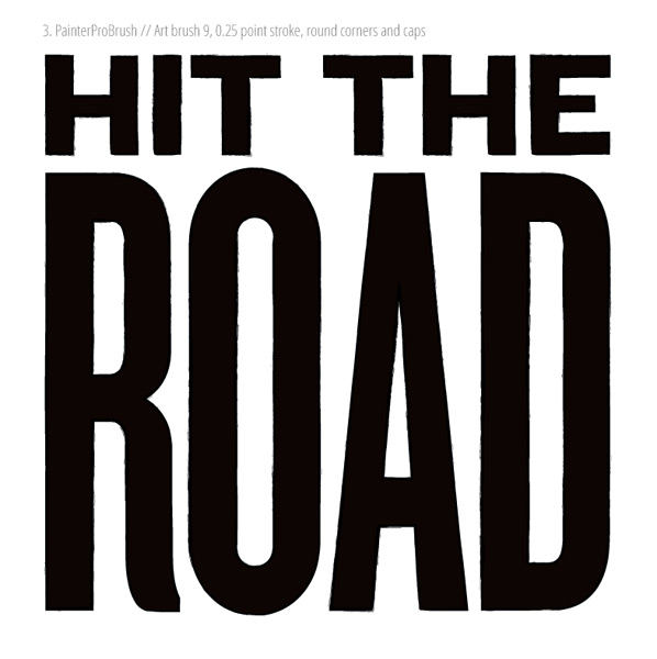
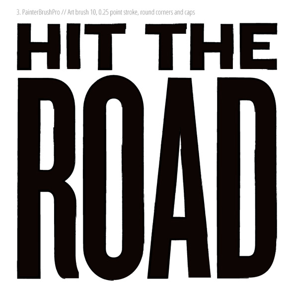


I choose to settle on the next to last option, using the ChalkProBrush > Art brush 16, @ 0.25 point stroke with round corners and caps.

Save your changes, and let’s quickly have a glance at Photoshop to admire the result. As you can see, there’s something wrong: the color of the stroke doesn’t exactly match the color of the main letter shapes. There’s also an annoying visual tension between the bottom of the “R” in “Road” and the top of the cap.
Let’s fix the stroke color problem first. Head back to Illustrator, and simply expand the type object (Object > Expand appearance).
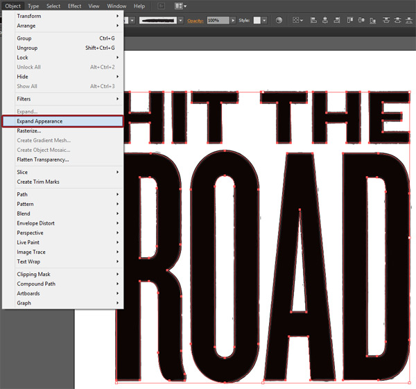
The main visual difference is that now, you’ll see a lot more points on your type.
The next step is to simply apply the same color, our dark gray (#0d0503), to everything.

The result is more than satisfying.

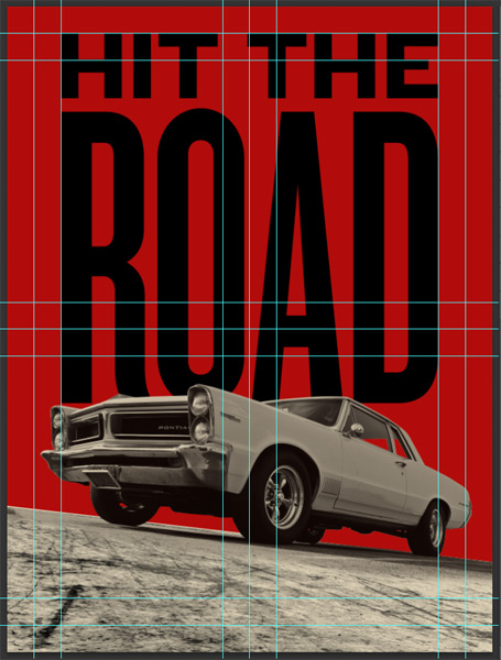
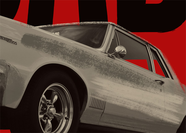
I also moved the car up a hair to fix that weird visual tension at the bottom of the “R.”
I did a bit of layer reorganization, in prevision of what’s next.
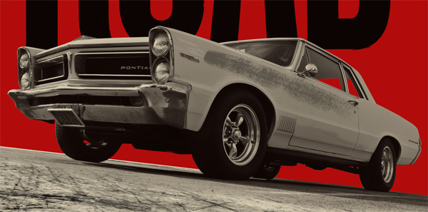
STEP 6: BRUSH WORK (PART I)
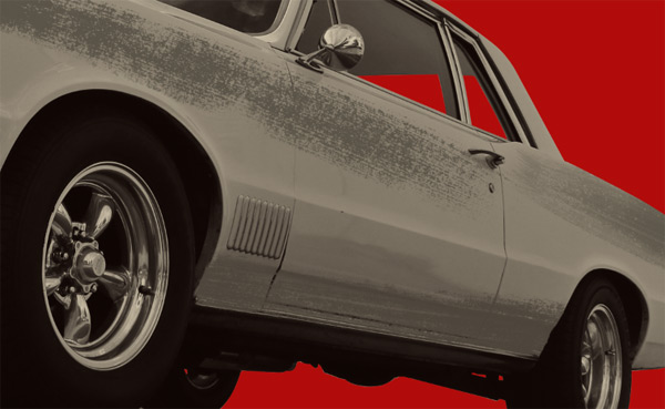
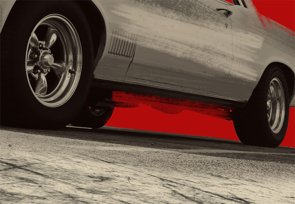
The car right now still looks pretty much like a photograph. Not that there’s anything wrong with that, but most of the posters we were looking at as references are actually illustrations more than photos. So we’re going to make use of the amazing sets of watercolor or other painterly brushes that are present in the set to make it look like an illustrations.
The concept is simple:
- Look at your brush options
- Look at the areas you’d like to texture
- Sample that area’s color, and transform it to either a slightly darker or brighter hue, depending on the effect you’re looking for
- Create a new layer (one per additional color)
- Use the brush to fill the area, on the new layer (adjust size and angle as necessary)
- Repeat
You might discover that you’ll have to create masks and precise selections with the pen tool again, depending on how pronounced you want the effect to be.
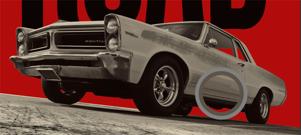
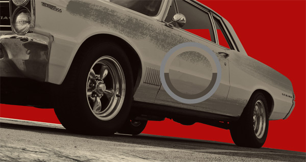
Let me show you a step-by-step example on the car’s side panels.
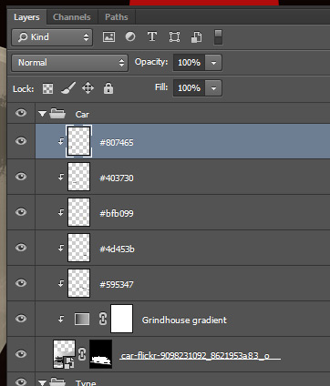
Color sampling (#8a806f)
New layer for the darker version of that color (#595347)

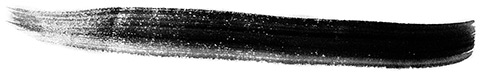
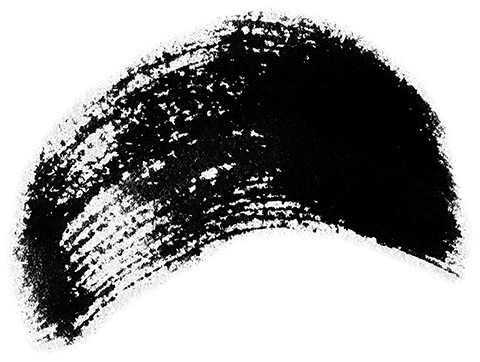
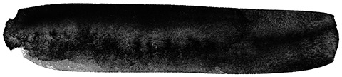
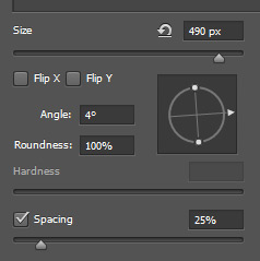
Brush consideration. Use the Brush panel (Windows > Brushes) in order to look at them closely, and to be able to edit them on the fly for angle and size. I’m starting with Robyn Gough’s dry brushes from the Watercolor Arsenal series.
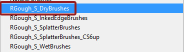
I’m starting with RGough_S_Dry02.

I’m painting one or two strokes, after having angled the brush to match the car’s perspective (-21°), and sized it down to 2000 pixels.
Next, I’m going to paint a little bit on the tail of the car, with the same color (and on the same layer), but with a different brush from the same set. I’ll be using RGough_S_Dry10 this time. I’ve angled the brush -25°, and sized it down to 1250 pixels.
Note how I went beyond the car’s edge. That’s no big deal.
Simply clip the brush work layer to the car layer, and you’ll be good to go (CTRL/CMD+G).
I want now to move to the darker area below. I have to sample the color again (#5c5347).
I’m creating a slightly darker hue of that color (#4d453b), and a new, clipped layer for it.

From there, I’m choosing to work with RGough_S_Dry12.
I’ve angled the brush -9°, sized it 1735 pixels, and also flipped it on its Y axis.

See how I went over the wheels a little bit?
Simply take your eraser tool (E) with a very small brush (100 pixels or so), and carefully remove the excess.
Next, using RGough_S_Dry11 I’ll be adding a bit to the middle section of the side.

This time, I’m going to use a brighter version of the sampled color. I sampled #8d8271, but will use #bfb099 to paint.
And here’s the result:

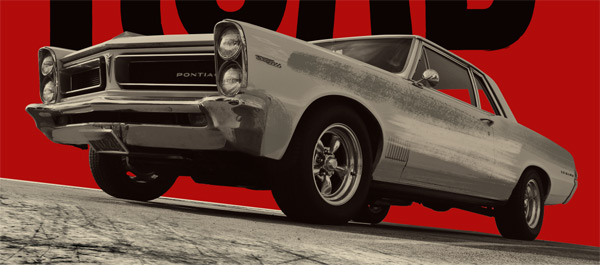
Here’s a view of the car so far.
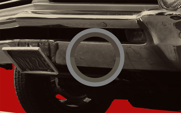
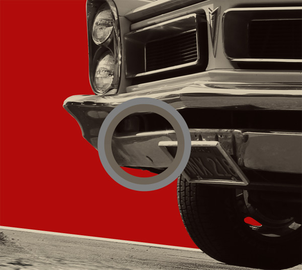
I’m going to use RGough_S_Dry05 at the bottom front of the side. It’ll bleed softly into the bumper.
The brush is sized at 630 pixels, and angled at -80°.
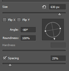
Color wise, I’ll be painting in the same color and on the same layer than our first brush stroke (#595347).

Got the process down? From there, I moved to use Robyn’s wet watercolor brushes to work a bit on the bumper. I won’t detail the process as much, but I followed the same steps.


And here are the wheels so far. Feel free to add more brushwork if you feel it’ll bring more depth to the piece and to the effect. Just remember to not overdo it. You want the original car to still be legible under the brush layers. And if you feel than one of the brush stroke is too strong? Don’t hesitate to lower the opacity of its layer.
Next, we’re going to use brushes to actually erase some of the car’s outline. This effect will increase the painterly vibe. Rather than use the eraser, we’ll directly paint into the layer mask we created to outline the car from its background. That way, we only have to paint in black to hide a bit more of the car than what’s currently visible.
I’ll be using Layerform’s 51 watercolor brushes pack to begin with. What we need is a brush that has a some transparency (completely opaque wouldn’t give too subtle of an effect), and a very grungy edge.
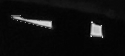
The twentieth brush from the top left is a good candidate. Look at the settings below:
And look at the result when I paint in black in the layer mask.
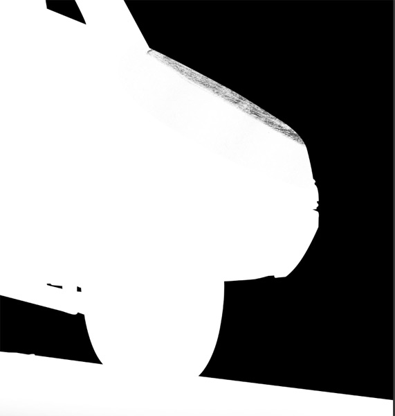
By following that technique along the edges of the car, we’ll give it an neatly grunge border that will marry perfectly with our earlier brush work. I’ve been cycling between the Layerform brushes and Robn’s dry brushes to accomplish my effect.


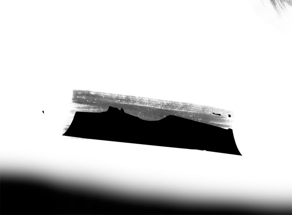
And here’s the result. Kinda neat what you can do with brushes, huh?
STEP 7: BRUSH WORK (PART II)
Our next step will be to leverage Robyn’s dry watercolor brushes again, in order to create a worn frame around our piece. I’ll create it in dark gray (#0d0503).
First step, let’s create a dedicated layer for the frame.
Then, simply equip yourself with the brushes, and paint a frame around the piece. Shuffle through the brushes, and paint away. You might have to change the angles of the brushes to match the direction of your lines. Remember that each brush has two sides you can paint with, too.

Easy as pie, right? Not that I’ve tried to give each side a somewhat consistent width (around ½ an inch).
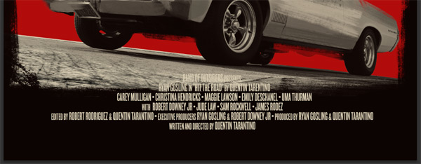
STEP 8: TYPE (PART II)
While the title greatly helps to pose this piece as a movie poster, what will make it more credible is to add credits. We need a director, a producer, a cast, and all these things. Just look at this detail of the Death Proof poster:
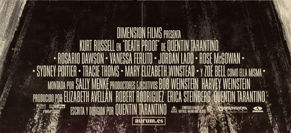
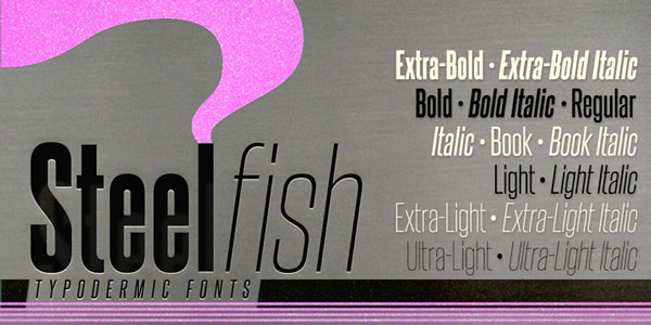
What makes credits look like credits is that highly condensed sans-serif. Luckily for us, either you’ve been using Knockout, which features many options in terms of condensed weights, or you’ve been playing with League Gothic, which also offers a condensed option, or you’ve found the Steelfish typeface.
Whatever option you choose, the goal will be to replicate the above type of layout: names in big and all caps, function and/or title in small caps, if not smaller.
Ladies and gentlemen, let me introduce you to the cast and crew behind “Hit the road!”
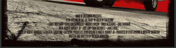
- Band of Outsiders presents:
- Ryan Gosling in “Hit the road” by Quentin Tarentino
- With
- Carey Mulligan
- Christina Hendricks
- Maggie Lawson
- Emily Deschanel
- Uma Thurman
- Robert Downey Jr
- Jude Law
- Sam Rockwell
- James Rodez
- Edited by Robert Rodriguez & Quentin Tarantino
- Executive Producers Ryan Gosling & Robert Downey Jr
- Produced by Ryan Gosling & Quentin Tarantino
- Written and directed by Quentin Tarantino
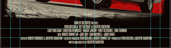
Now, time to actually put all of this in place at the bottom of our poster. We could use Illustrator again to format all of this, but it’ll be faster to do it straight in Photoshop. First step, create a big enough text block at the bottom of the poster.

Next, copy and paste all these names in there, and start formatting away! I’m using Knockout 46 Flyweight for my arrangement. It’s set in 36 points tall, with a 30 points leading. Note how I’m using the “•” character to separate the names.
Let’s implement the size variations. I’ve reduced the small type elements to 30 points tall.

Next step: center the copy between the car and the poster frame.

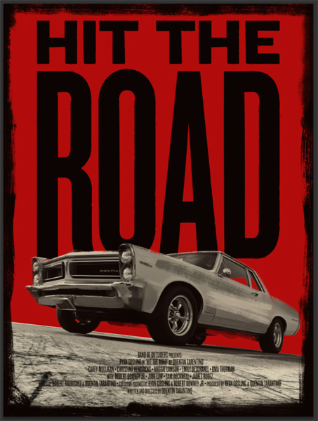
Pretty solid, although a hair unreadable. The solution? Let’s hack the frame a bit.
First, convert the frame layer to a smart object. Then simply transform it so its bottom edge goes higher.
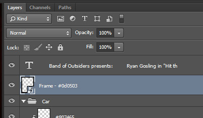
Then, create a new layer underneath the frame’s layer (call it something like Frame fill – #0d0503), and paint the void left under the frame edge in dark gray (#0d0503).
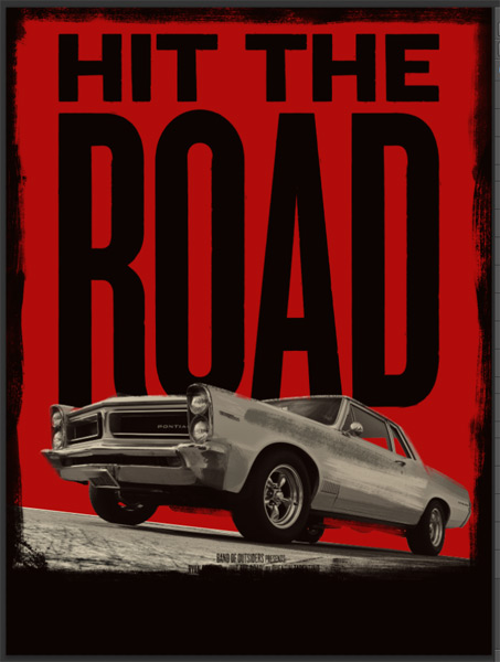
Then, simply change the text color to our tan (#daceb4).
Adjust the placement of the block of text so it fits harmoniously.
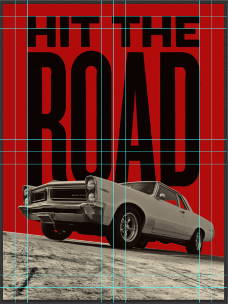
Here’s a view of the guides, so you can get a sense of how things are placed.
Time for some layer housekeeping.
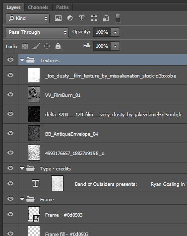
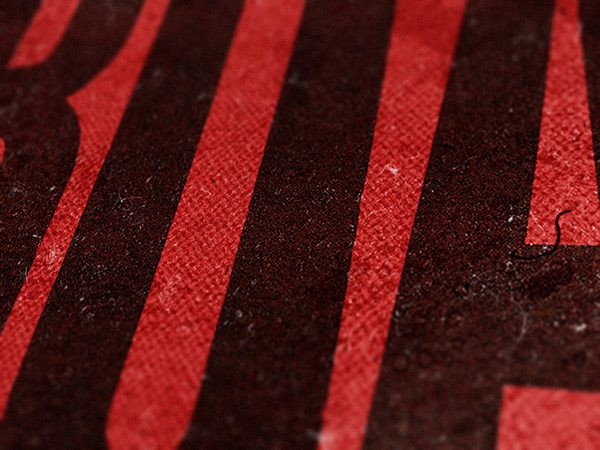
STEP 9: TEXTURES AND WEATHERING
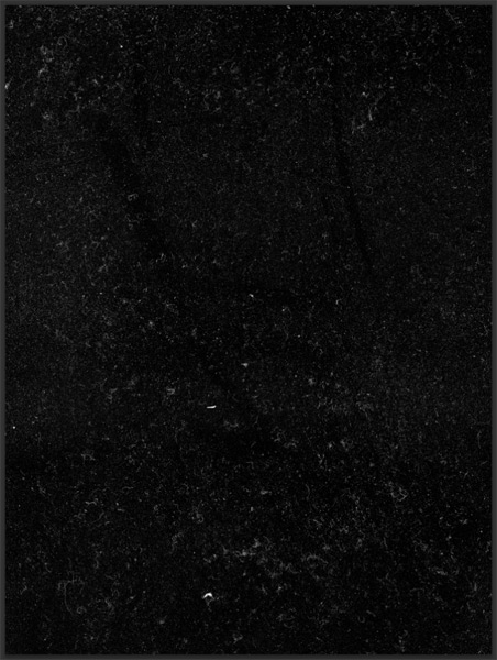
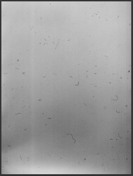
Time to have some fun with textures. The first order of business is to weather the text in the poster. I’m going to grab one of my trusty photocopy noise textures, but any subtle grunge textures would do. Simply remember that you’re looking to be subtle, and to emulate printing screw-ups. Not to blast the text with an H-bomb.
Here’s a demonstration. Little a), open your texture. Here’s photocopy-noise-textures-sbh-002.jpg.
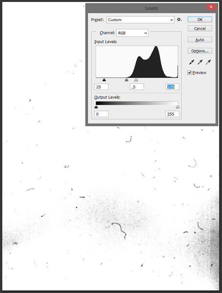
Go back to your original document. Add a layer mask (Layer > Layer mask > Reveal all) to your title layer. Make sure to click the chainlink between the mask and the layer. This will allow us to move the texture around in the mask.

Use the ALT/OPTION+CLICK shortcut to access the content of the layer, and simply paste your texture in there. Resize it so it covers the whole canvas.
Invert the texture (CTRL/CMD+I), and sharpen it a couple of times to bring its details out (Filter > Sharpen > Sharpen).

From there, let’s go admire the result. Already very neat, but I think we can do a bit better.

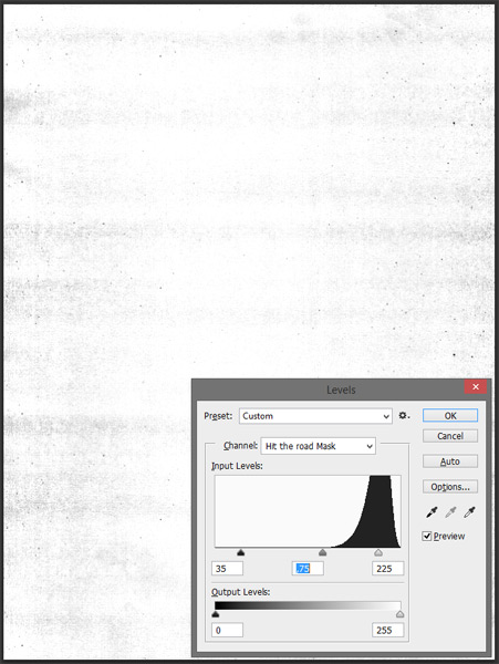
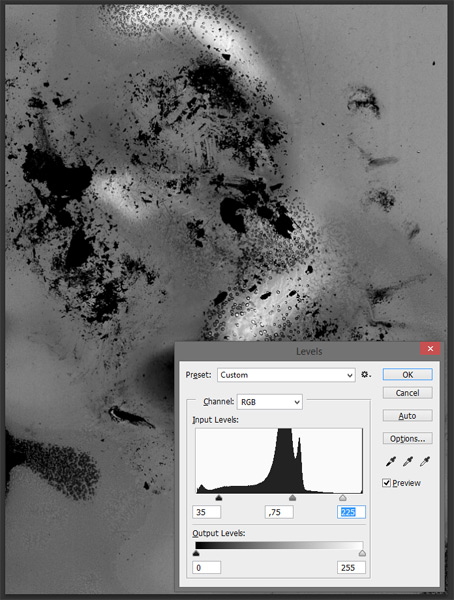
Let’s go back to our layer mask. We’re going to use the Levels palette to tweak the contrast of the texture.
Levels are going to be your best buddies when it comes down to tweaking textures. If you’ve read my previous tutorials, you already know that. If you haven’t had a chance to do so, by all means, be my guest.
Anyways. Back to the layer mask’s content. Bring up the Levels panel, and increase the contrast by boosting the dark and mid-tones, and by lowering the highlights. Once you’re happy with your settings, apply them. Given how big the texture is, you might have to apply them multiple times.

Much better!
And feel free to use the same trick to apply some weathering to the credit. I simply copied and pasted the content of the main title over to a new layer mask created for the credit layer.

Now that the introduction has been taken care of, it’s time to switch to the real thing. It’s time to texture the whole piece.
The first texture we’re going to apply is a brush stroke texture. We’re keeping true to the theme here. It’ll increase the painterly vibe of the poster. Start by grabbing the texture, and place it into your document. Remember to grab the highest quality version available.
Size it so it covers the whole canvas.

Rasterize the layer, and desaturate the texture (CTRL/CMD+SHIFT+U).
After sharpening the texture a few times (Filter > Sharpen > Sharpen), it’s time to use the levels to get the best out of that texture.

Once you’ve applied the levels, change the texture’s blending mode to Soft light.
Finally, lower the layer’s opacity to 35%. This will make for a much softer effect.
Next up, we’re going to add some paper grain. Grab this beautiful scan of an old envelope.
Place it and size it so the center seam isn’t visible. Make sure to have a few folds and creases in the frame.
Rasterize, desaturate, and sharpen the texture.
The levels bring it home.
Change the blending mode to Soft light @ 75% opacity to wrap that one up.

The next texture is a film noise texture, by JakezDaniel from DeviantArt. Place and size it so it covers the whole canvas, and that the numbers and other inscriptions are hidden.
Switch the blending mode to Screen @ 50% opacity, after having rasterized and sharpened the texture.
The following texture is a burnt negative texture Size it and place so the holes in the film aren’t visible.
Desaturate, sharpen, and tweak the texture.
Finish by putting its blending mode to Soft light @ 50% opacity.
Finally, last but not least, is another dust/film texture from DeviantArt. Place and size it so it covers the whole canvas.
Rasterize, desaturate, and sharpen the texture. The levels on this one will be particularly aggressive.
The winning combo for the blending mode is Multiply @ 100% opacity.
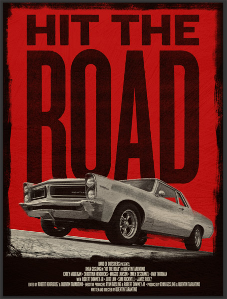
STEP 10: MINOR ADJUSTMENTS
First things first, it’s time to clean things up a little.
Next,bring the opacity of the brush stroke texture layer up to 50%. This brings the painterly effect back to the piece.
Finally, tweak the levels once more on the main title layer mask, so the weathering is stronger.


STEP 11: FINAL TOUCH
We’re so close to be done, I promise. The last thing I’d like to add to this piece is a halftone effect.
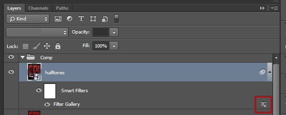
First, highlight your top layer, and create a merged copy of all of your content below. There’s a shortcut for that: CTRL/CMD+SHIFT+ALT/OPTION+E. I right away renamed the layer Comp, and gave it its own layer group.

Create a copy of that layer, rename it to halftones, and convert it into a smart object.
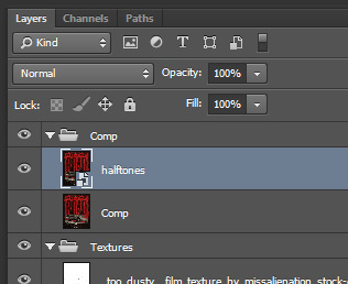
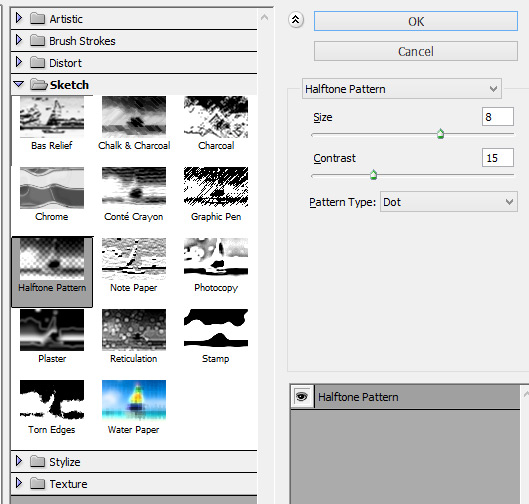
From there, go to Filter > Filter gallery. Choose Halftone pattern. Use dots as your pattern type. The size should be set at 8, and the contrast lowered to 15.
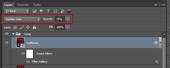
Once you’ve applied the effect, let’s make the magic happen. Because the layer you’ve applied the effect on is a smart object, we can change two blending modes. The one of the effect itself, and the one assigned to the layer.
First, let’s change the effect’s blending mode to Soft light @ 100% opacity. Double-click on the little symbol on the right side of the layer thumbnail to find it.

Once that’s done, change the layer’s blending mode to Lighter color @ 75% opacity.
And we’re done! Since this is an old movie poster, you could add a few folds to it too.
I hope you guys had as much fun following the tutorial than I had writing it. Don’t hesitate to comment below or tweet at me (@simonhartmann) if you have any questions.
Remember, the brushes used in this tutorial are just a tiny selection from the huge brushes bundle that we’re currently running. You can grab over 1000 best-selling, professional quality Photoshop and Illustrator brushes for 90% off. Hurry though, this deal is expiring soon:
Beautifully Artistic Brushes Bundle – Just $27 (90% Discount)


Absolutely loved this tutorial, im a VCE student in Melbourne, Australia. I just wanted to know if there is any alternative ways to reconstruct a poster (such as yours) by only using Photoshop and other free alternative websites to create the text, in your case “hit the road”. What are the alternatives to using illustrator to execute your designs?
Much appreciated,
Kurk.
Hey Kurk,
Thank you for your comment. It’s fantastic to hear you enjoyed this tutorial :) In regards to reconstructing this poster solely in Photoshop, there are some awesome new additions to Photoshop CC that make working with text a lot easier but Illustrator is always a go-to when it comes to working with type so I’m afraid I wouldn’t know of any alternative softwares I’m afraid!
I apologise for any inconvenience but if you could let me know what design software you are working in, I’d be more than happy to offer some tutorial suggestions for working with text elements that should help you :) please do let me know and I will happily arrange this for you!
I hope this helps, Kurk, and please don’t hesitate to contact me should you have any other questions. I’m always happy to lend a hand!
This was great, thanks so much.
I’ve been using brushes and water colors.
I really enjoyed this.
I created a Grindhouse poster titled
” ALIEN PROCREATION “
Hey Mike,
Thank you so much for your incredibly kind words! We’re so pleased to hear you really enjoyed this tutorial and got to work with your brushes and watercolour items :)
Rockin tutorial! I combined some these techniques with my own photographs and created a Poster for our college Film Fest! I added some cross hares and some bullet shot texture to my main headline to give it extra drama! It was chosen out of 15 posters to advertise for the campus event! Thanks for the lesson!!
That sounds awesome, Hannah. I’d love to see that poster, if possible at all. :)
This was one fun tutorial! Fun Indeed! I do not recall exactly how I came across DesignCuts, but I saw a bundle I liked & picked it up. Such a great program for folks on a tight budget. Then I discovered the tutorials. I am so impressed on the ease and clarity. I have never been much of a Photoshop user. These tutorials have really opened my eyes to better techniques and understanding.
I thank you DesignCuts team!!!
Hi-5!
Chris
Thank you so much for your kind words, Chris. :) I’m so pleased t hear you’re enjoying our tutorials. Please feel free to send us some of your outcomes. I’d really love to check them out.
Ha, thank you for your kind words Chris! this one stays one of my favorites so far :-)
Enjoyed this one a lot. Thanks very much for the enjoyable and thoughtfully planned learning experience.
You’re very welcome! I’d love to see your outcome. If you want you can send it to hello@designcuts.com
Thanks for the kind words!