WHAT WE’RE CREATING:
Hello Design Cutters! This is Renee back with a new tutorial for the new year! We’ll be creating a Photoshop-based poster promoting a photo class. We’ll be applying pattern fills, masking, creating custom shadows and using basic Photoshop techniques. We’ll use lots of beautiful hand drawn freebies from this week’s bundle including florals, a vintage camera, a pattern and paint brushes.
HAVE YOU SEEN OUR NEW YOUTUBE VIDEO CHANNEL?
We hope that you enjoy the video version of this tutorial below.
If you’re interested in getting these videos direct to your inbox, please do subscribe to our YouTube channel.
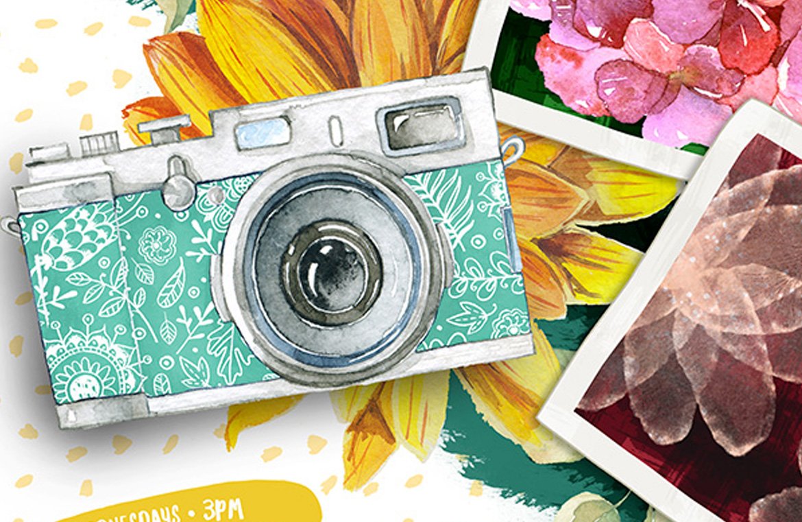
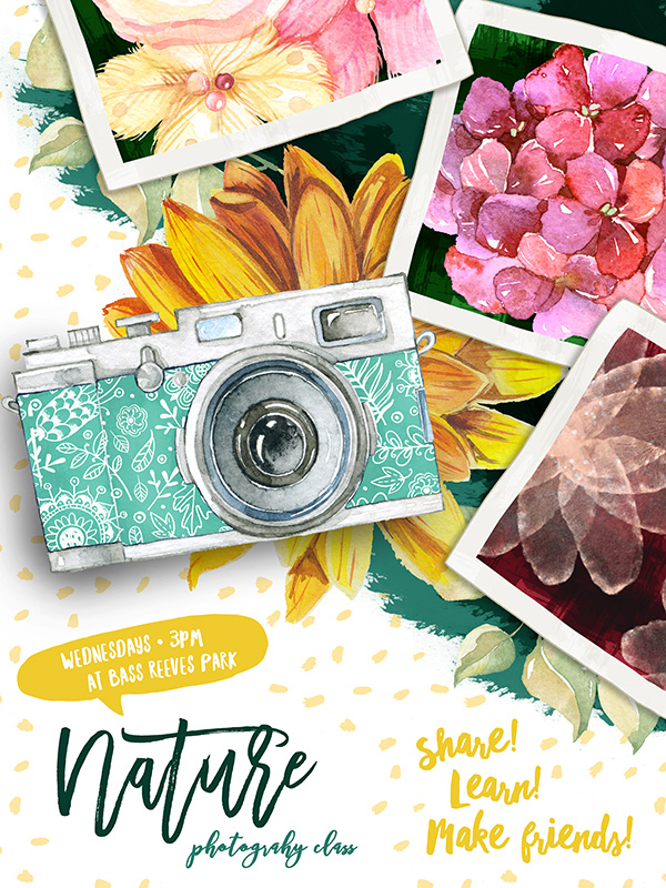
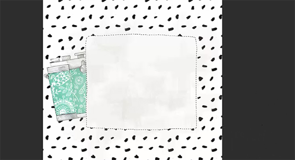
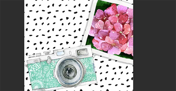
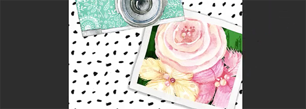
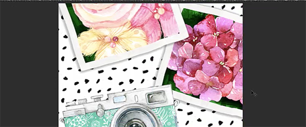
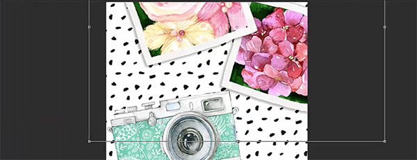
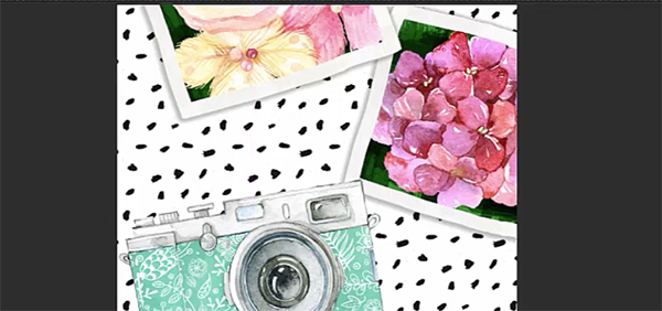
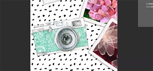
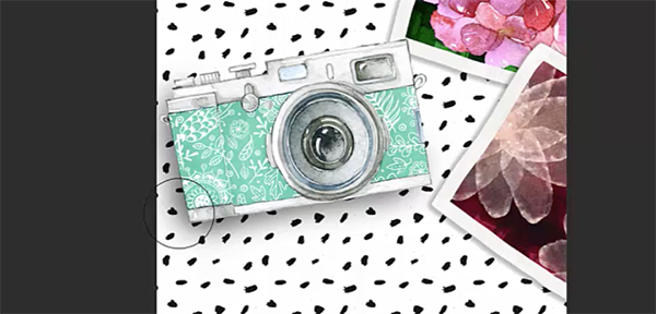
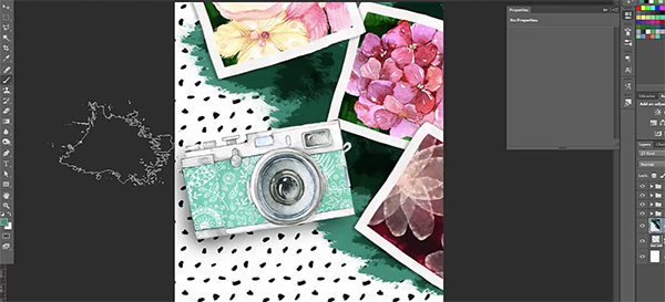
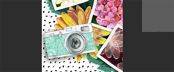
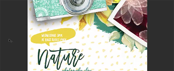
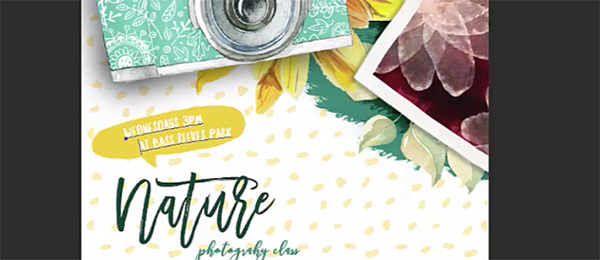
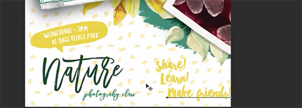
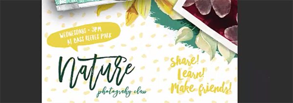
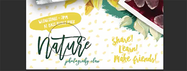
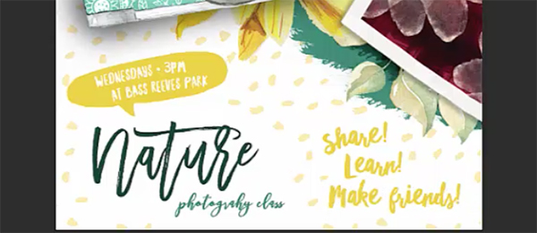
FINAL OUTCOME:
Here’s a look at the final outcome we’ll be creating:
Follow along with this tutorial: Download the freebies
This freebie pack includes beautiful illustrations from Creators Couture, Milka and Octopus Artis. You also get illustrated speech bubbles and a pattern from Vitek Graphic and brushes from Vintage Design Co.
This freebie pack is a small sample of the resources available in The Digital Designer’s Artistic Toolkit for just $29 (that’s 93% off). This bundle is packed full of beautifully illustrated elements and fonts that will help you nail the hot artistic and hand lettered design trend.
TECHNICAL NOTES
We’ll be using the fonts Northern Soul from Vintage Design Co, Bougenville by Get Studio and Madina by Set Sail Studios. These are not part of the freebie pack that accompanies this tutorial. However, they are included in the main bundle. If you don’t have these, I recommend searching for a similar hand written or brush font on your favourite free font site.
Step 1: Background and Camera
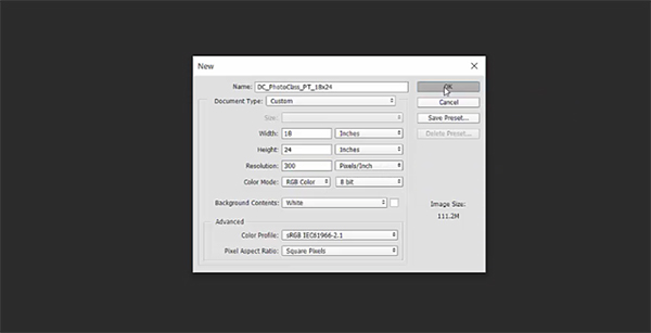
Open Photoshop and go to File > New. In the New Document dialog box, enter a width of 18 inches, a height of 24 inches and a resolution of 300 ppi. Click OK to create the document.
Save your file.
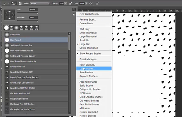
Go to Layer > New Fill Layer and select Pattern.
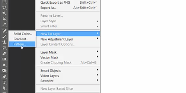
In the New Layer dialog box, name the layer Rough Dots and click OK. In the Pattern Fill dialog box that opens, go to the settings flyout menu and choose Load Patterns.
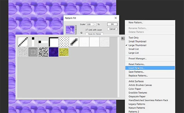
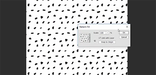
Navigate to the Vitek pattern file (.PAT extension) in the freebies folder and click Load. Select the rough dots pattern (it will be the last in your list of patterns).

Click OK to apply the fill pattern.
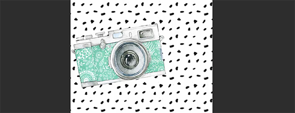
Now we’re going to add our centerpiece – a vintage camera illustration. Go to File > Place Linked and navigate to VintageCameras_08.png in the freebies folder. Click Place.

Use the corner handles to rotate the camera slightly to the left. Hold shift while dragging out on the corner handles to proportionally enlarge the camera a bit and position it in the middle left of the artboard. Press enter to complete the transformation when you’re done.
Step 2: First Photo
Go to File > Place Linked and navigate to the square speech bubble, fill-04.png, in the freebies folder. Click Place.
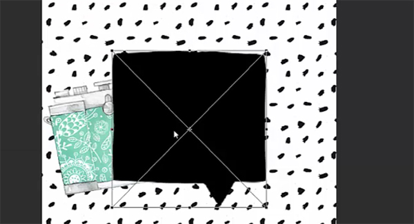
Use the corner handles while holding shift to proportionally enlarge the speech bubble a small amount, between 10 and 20%. Press enter when you’re done.
We’re going to edit the shape, so go to Layer > Rasterize > Smart Object.
Now select your Eraser (e). At the top of the artboard, click on the arrow to the right of the brush thumbnail to choose a different brush. Select the Hard Round brush and make sure the Opacity is set to 100%.

Drag the Eraser along the bottom of the speech bubble to delete the bottom shape that sticks out, effectively turning this into a roughly drawn square.
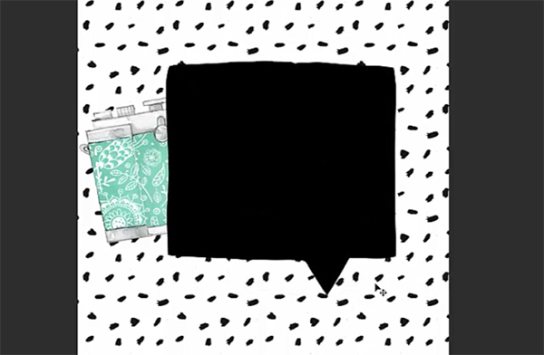
At the bottom of your Layers palette (Window > Layers), hit the Create A New Group icon. Double click the name of the new group in the Layers palette and change the name to Photo 1. Drag the layer with the square, fill 04, into the new group.
Press d to change your foreground color to black and background color to white, then press x to toggle so that white is your foreground color.
With white as your foreground color, press shift + opt/alt + delete/backspace to fill the shape with white.
Create a new layer by clicking the Create New Layer icon at the bottom of the Layers palette. Name this new layer Photo Grunge.
At the bottom of your tool bar, click on your foreground color swatch. In the Color Picker popup, change the color to CMYK 26/21/35/0.

Select your Brush (b) tool and in the top left of the screen, open your Brush palette. Open the settings flyout menu and choose Load Brushes.
Navigate to Vintage Design Co’s paint brush file (.ABR extension) and click Load. In your brush palette, scroll down to select Brush 20.
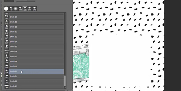
At the top left of your screen, change the Mode to Multiply and the Opacity to about 10%.
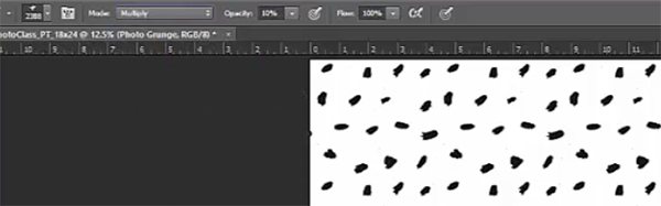
Click and drag your brush across the white square. Occasionally let go of your mouse button and start again to create a layered effect.
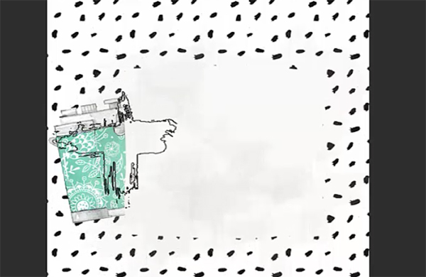
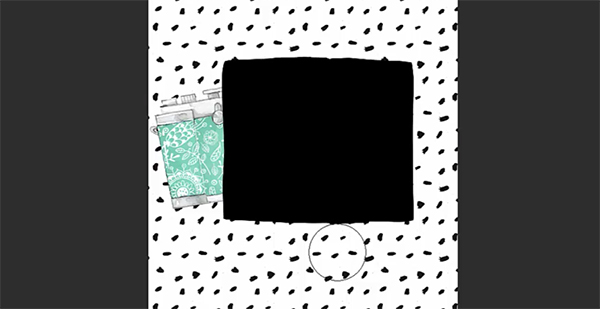
Hold down cmd/ctrl and in your Layers palette, click on the thumbnail for the fill-04 layer to create a selection around it. Go to Select > Inverse, then press delete/backspace to delete the painted areas outside the square.
In your Layers palette, create a new layer and name it Inner Square. We should still have the selection on our artboard. Go to Select > Inverse. Then, go to Select > Modify > Contract. In the dialog box, enter 200 pixels.
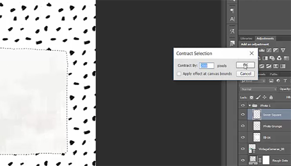
Then click OK to see the new, smaller selection.
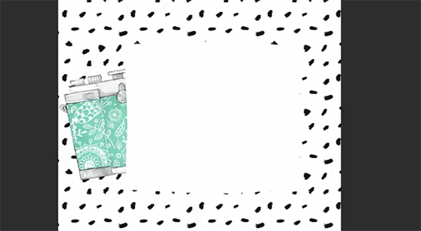
Press d, then x to change your foreground color to white, then press opt/alt + delete/backspace to fill the selection with white. When done, press cmd/ctrl + d to deselect.
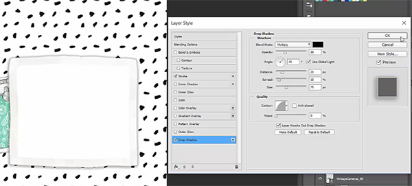
To have our photo edges blend more realistically with the watercolor style art, we’ll add a slight stroke. Select the fill-04 layer and at the bottom of the Layers palette, click the FX icon and choose Stroke. In the popup dialog box, enter a size of 10. Click on the color swatch and change the color to the tan we used earlier – CMYK 26/21/35/0.
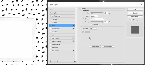
On the left side of the popup dialog box, choose Drop Shadow. Your color swatch should already be black, with a Blend Mode of Multiply. Change Opacity to 30%. Make the angle 45 degrees and give it a distance of about 20, Spread of 10 and Size of 75. Click OK.
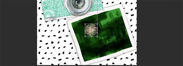
Now we’ll add some content to our photo. Inside the Photo 1 folder in the Layers palette, create a new group and name it Photo Content.
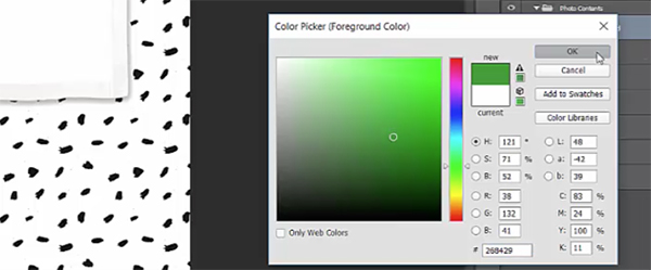
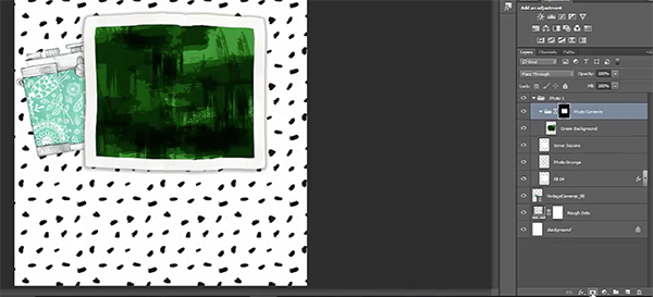
Create a new layer in Photo Content and name it Green Background.
At the bottom of your tool bar, click on your foreground color and in the Color Picker popup, select a mid-to-dark foliage green.
Select your Brush (b) tool. We’ll use the currently selected brush, Brush 20, but at the top of the artboard, change the Opacity to 100%. Drag the brush over the inner square area to create a layered green background, similar to our grunge layer earlier.
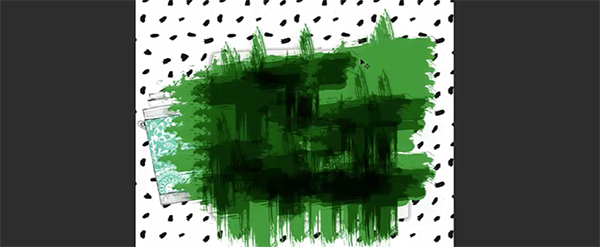
To keep the color contained within the inner square area, hold cmd/ctrl and in the Layers palette, click on the thumbnail for Inner Square. With this selection in place, select the Photo Contents folder and click the Add Layer Mask icon at the bottom of the Layers palette.
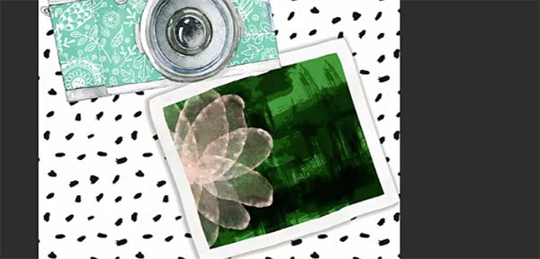
Go to File > Place Linked and navigate to SweetDreamsElements_14.png in the freebies folder. Click Place.
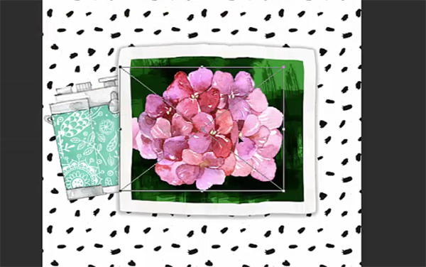
Use the corner handles while holding shift to proportionally enlarge the image to almost fill the inner square of the photo. Press enter to complete the transformation. Make sure this layer is inside the Photo Contents folder in the Layers palette.
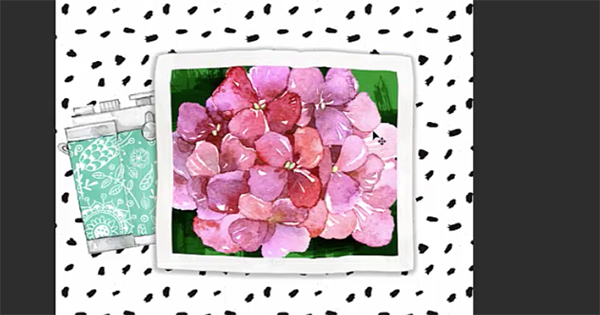
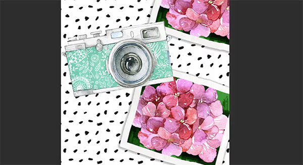
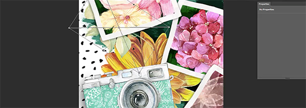
In the Layers palette, select the Photo 1 folder. Go to Edit > Free Transform and use the corner handles to rotate the photo slightly to the right. Place it in the top right of the artboard so that it bleeds off the right side.
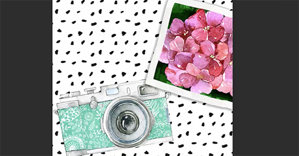
Lastly for this first photo, drag the entire Photo 1 folder below the VintageCamera_08 layer in the Layers palette.
Step 3: Derivative Photos
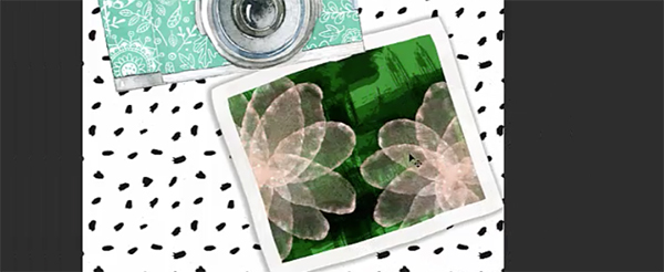
Now that we’ve done all the setup for our initial photo, we’ll be able to copy the original and easily edit the contents.
In the Layers palette, drag the Photo 1 group down to the Create a New Layer icon to create a duplicate. Name the new group Photo 2. I dragged the entire group down the artboard a little so I could see it better.
In the Layers palette, open the group and go into the Photo Contents folder. Delete SweetDreamsElements14.
Go to File > Place Linked and navigate to Lace&FlowersElements_30.png in the freebies folder. Click Place.
Use your Move (v) tool to drag the image into the photo area and use the corner handles to enlarge and rotate slightly to the left until the photo content area is filled with the flowers. Press Enter when done.
In the Layers palette, select the Photo 2 group and go to Edit > Free Transform. Use the corner handles to rotate the entire photo group to the left and place at the top left of the artboard.
Now that I see these together in place, I want to make them a little smaller and leave a little breathing room on the left side. So, in your Layers palette, select the Photo 1 folder, then hold shift and select the Photo 2 folder.
With both groups selected, go to Edit > Free Transform and use the corner handles (while holding shift to maintain aspect ratio) to reduce the size of the photos a bit.
I also used this opportunity to slightly reposition Photo 2 until I was happy with the placement. Remember – it’s a work in progress right to the end. I make little adjustments throughout the entire process as elements are added.
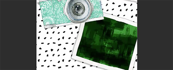
We’ll create one more photo. Duplicate the Photo 2 group by dragging the Photo 2 folder in the Layers palette down to the Create a New Layer icon. Name the new group Photo 3.
On the artboard, drag the group down so you can see it better. Open the Photo Contents folder and delete Lace&FlowersElements_30.
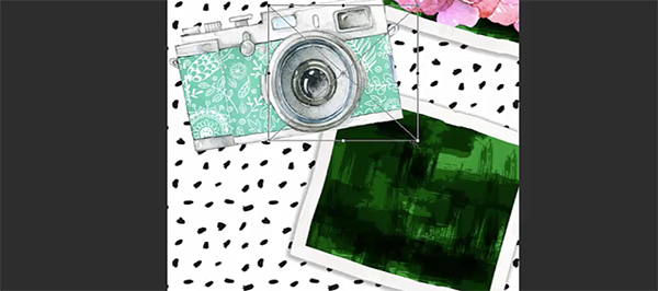
Go to File > Place Linked, navigate to 3.png in the freebies folder and click Place.
Hold shift while dragging out on the corner handles to enlarge the flower. Position on the left side of the photo.
In the Layers palette, drag the flower, 3, into the Create a New Layer icon to duplicate it. On the artboard, drag the duplicate flower to the bottom right of the photo area.
These don’t look very good on green, so we’ll change our photo background color. In the Photo 3 folder in the Layers palette, click on the Green Background layer. Open your Adjustments palette (Window > Adjustments). Click on the far left icon in the middle row to create a Hue/Saturation adjustment layer. In the Properties dialog that opens, change the settings until you get a deep red color. I went with Hue of -129, Saturation of +28 and Lightness of about +8.
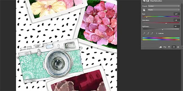
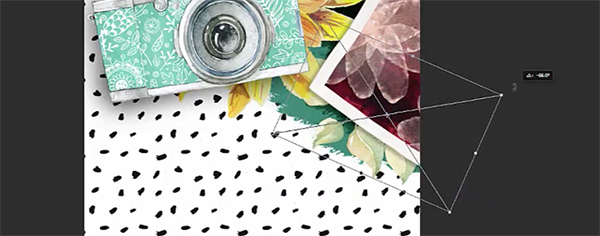
Go to Edit > Free Transform and use the corner handles to rotate the image to the right and then position it to the right of the camera so that it bleeds off the artboard.
Step 4: Floral Elements
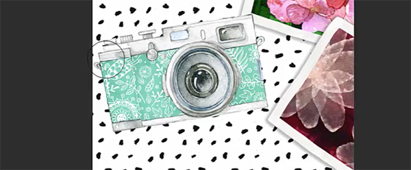
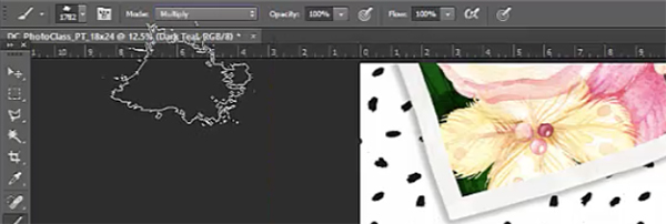
In your Layers palette, create a new group and name it Camera. Drag the new group to the top of the Layers palette and drag the VintageCamera_08 layer into it.
Next, create a new layer inside the Camera folder. Name it Camera Shadow and drag it below VintageCamera_08.
Press d to change your foreground color to black. Select your Brush (b) tool. Choose a Soft Round brush. Change the Mode to Normal and the Opacity to 20%.
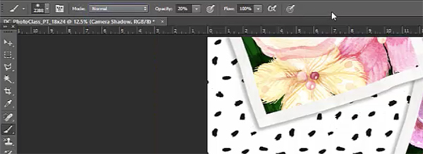
I’m using a brush size of about 1000 px. You can easily change your brush size on the fly by pressing the left bracket [ key to reduce the size and right bracket ] key to enlarge the brush size.
Drag your brush along the bottom and left edge of the camera. Do this 3 or 4 times to build up a believable shadow area. Move a little closer to the edge of the camera with every pass – it’s always darker closer to the object.
Don’t worry if you went a little shadow crazy! You can always lighten it by selecting your Eraser (e) tool and using a Soft Round brush with a very low opacity (10% to 20%) to brush over areas that are too dark.
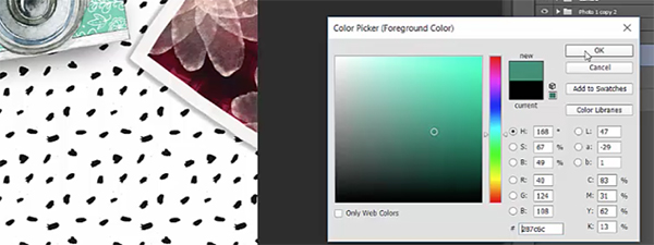
In the Layers palette, create a new layer and name it Dark Teal. Drag it just above the Rough Dots layer.
At the bottom of your tool bar, click your foreground color swatch to bring up the Color Picker. In the Color Picker, use the eyedropper to sample the teal color in the camera. With that color selected, drag down and to the right to find a darker version of that color. I’m using 83/31/62/13. Click OK.
Select your Brush (b) tool and choose Brush 19. At the top of the artboard, change the Mode to Multiply and Opacity to 100%.
Press the right bracket on your keyboard a few times to enlarge the brush size. Mine is around 3000 px.
Now we’ll brush around and behind the photos and camera using the same technique we’ve been using – pick up the brush occasionally so you get a layered color effect. Do this all along the top right section of the artboard.
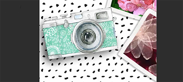
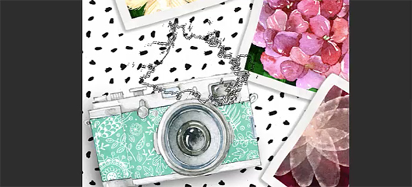
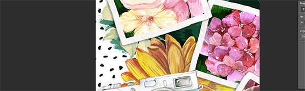
Next, we’ll go to File > Place Linked and navigate to f7.png in the freebies folder. We’ll keep this one at the exact same size and just position it behind the top right side of the camera. Press enter when done.
To stay organized, we’ll create a new group in our Layers palette and name it Florals. Drag the layer below Photo 1 and above Dark Teal. Drag the f7 layer into the new group.
Go to File > Place Linked and navigate to SweetDreamsElements_15.png in the freebies folder. Press Place. Use the corner handles to rotate it to the right. Hold shift while dragging out the corner handles to increase the size slightly, then position behind the top left photo.
Drag this layer below the f7 sunflower layer.
In the Layers palette, drag the leaf layer into the Create a New Layer icon to duplicate it. Drag the new group to the bottom right of the artboard behind the red photo and use Edit > Free Transform to rotate slightly to the left. Press enter when done.
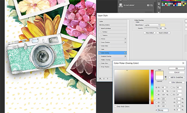
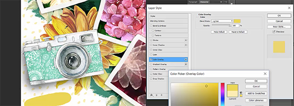
For the last part of this step, we’ll change our dot pattern to yellow by sampling one of our floral photos.
Select the Rough Dots layer. At the bottom of the layers palette, click on the FX icon and choose Color Overlay. In the dialog box, choose a Blend Mode of Lighten. Click on the color swatch to bring up the Color Picker. From here, use the eyedropper to sample a soft yellow color in the top left photo. Click OK when you’re done.
Step 5: Text
Create a new group and name it Class Name. Drag the new group to the top of your Layers palette.
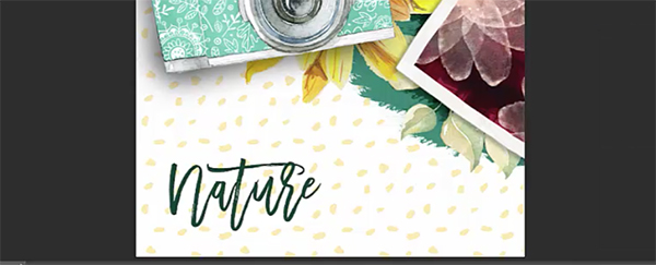
Select your Text (t) tool and click once on the artboard in the bottom left. Type Nature. Open your Character palette (Window > Character) and change the font to Medina Script Regular at 200 pt.
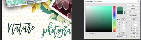
In the Character palette, click the color swatch, then use the eyedropper in the Color Picker to sample the darkest teal in the background paint we created earlier. Click OK.
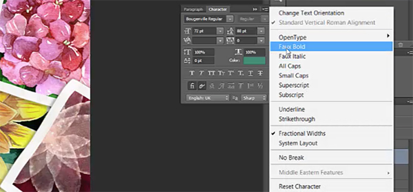
Select your Move tool (at the top of the tool bar) to deselect your text. Then, select the Text tool again and click on the artboard. Type photography class. Select the text with your text tool and in the Character palette, click on the color swatch. Use the eyedropper in the Color Picker to sample the primary teal color in the background and press OK.
Then, change the font to Bougenville Regular at 72 pt. In the flyout menu at the top right of the Character palette, choose Faux Bold.
Position below and to the right of Nature.

Create a new group above Class Name and name it Speech Bubble.
Go to File > Place Linked and navigate to fill-15 in the freebies file. Press Place.
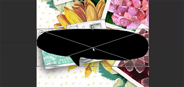
Hold down shift while dragging the corner handles in towards the middle of the element to reduce the size proportionally. Then use the corner handles to rotate slightly to the left and position above and to the left of Nature.
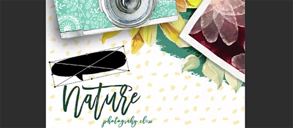
In the Layers palette, click on the FX icon and go to Color Overlay. For Blend Mode, select Lighten. Click the color swatch and use the eyedropper to sample a strong yellow from the sunflower. Press OK.
Select your Text (t) tool, click on the artboard and type:
Wednesday 3pm
At Bass Reeves Park
In your Character palette, change the font to Northern Soul Caps at about 48 pt with 48 pt leading (the top right option in the Character palette that determines the space between lines). Change the color to white. Make sure the Faux Bold option in the flyout menu is turned off.
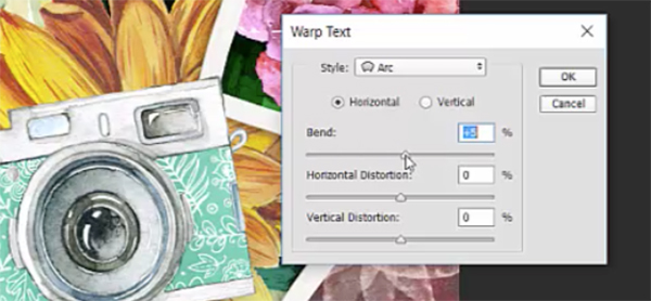
Next, go to Type > Warp Text. For Style, choose Arc and reduce the Bend to +5. Press OK.
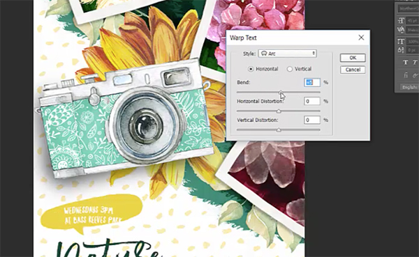
Go to Edit > Free Transform and use the corner handles to rotate to the left until the text fits comfortably on the speech bubble. Adjust size if needed.
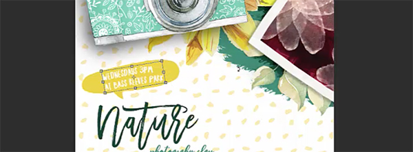
Select your Type (t) tool and click in front of At Bass Reeves Park, then add 2-3 spaces. I think this helps fill the bubble area better and adds to the hand drawn look.
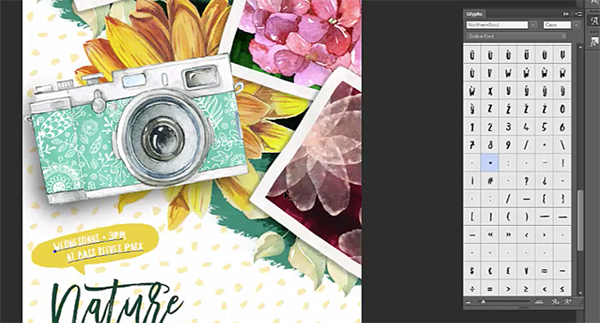
Let’s add a bullet point between Wednesdays and 3pm. Use your Type tool to place your cursor where we want to add the bullet. On a Mac, press opt + 8 to create a bullet. On a PC, open your Glyphs palette (Window > Glyphs) and double click the bullet point.
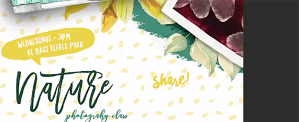
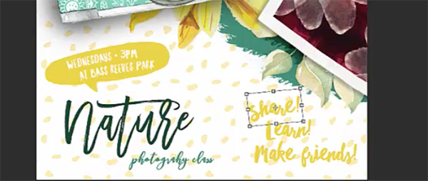
In the Layers palette, create a new group and name it Touts. Select your Type tool and click once on the artboard. Type Share! Our font should already be set to Northern Soul Caps, so all we need to do is change the font size to 110 pt and change the color to the same strong yellow we used for our speech bubble.
In the Layers palette, drag the Share! layer into the new layer icon to duplicate it. Use your Type tool to change it to Learn! and place it below Share!
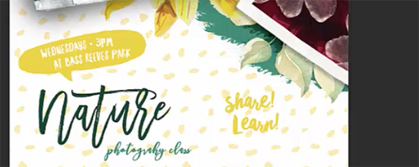
Now copy Learn! Change the text to Make friends! and position it below Learn!
Adjust the positioning of the three lines so they flow together nicely.
To add a little more of the hand drawn look, select the Share! layer and go to Type > Warp Text. Again, we’ll choose Arc and change Bend to +5.
Go to Edit > Free Transform and rotate the word a little to the left.
For our final step, we’ll hide some of the yellow background dot texture to help our text stand out more.
In the Layers palette, click on the Rough Dots layer. At the bottom of the Layers palette, click the Add Layer Mask icon. Select the layer mask by clicking the layer mask thumbnail on the Rough Dots layer.
Select your Brush tool and choose a Hard Round brush at 100% Opacity and make sure your Mode is set to Normal. Press d to make your foreground color black – anything drawn over in black on a layer mask will not be visible.
Use your brush to drag over the yellow dots directly behind and in close proximity to Nature Photography Class. Make sure to brush over whole dots and not leave partial pieces behind.
Lastly, reduce the size of your brush by pressing your left bracket on your keyboard several times, then brush over the dots directly behind and close to Share! Learn! Make friends!
We’re done!
We have a poster that looks like we spent weeks painting and hand lettering! I won’t tell if you don’t!
Remember that whether it’s your outcome of this tutorial or something new you’ve made, we’d love to see your designs on our Facebook page.
Please leave a comment if you have any questions or suggestions. As always, I look forward to hearing from you!
There’s still time to check out The Digital Designer’s Artistic Toolkit. Wow your clients with trendy, illustrated designs, beautiful watercolors and chic hand lettering!
I love that everytime I complete a Designcuts tutorial I learn something new. I am not a Photoshop user, I much prefer Illustrator, however I enjoy these tutorial because they get me out of my comfort zone and gain confidence all due to the way you guys explain the process so well. Thanks again.
Thank you so much for your kind words, Bobbi!
I’m so pleased to hear you enjoyed this tutorial and it’s great that you were able to learn more tips and tricks in Photoshop!
Thanks again for trying this tutorial out, if you have any questions or if there is ever anything I could assist you with please do get in touch. I’m always happy to help!
Great job on the tutorial! I like the arc effects on the handwritten text – subtle, fitting, and pulls it all together.
Thank you so much for your kind words, Scott! I’m really pleased you enjoyed this tutorial :)
Big fan of DC asking forgiveness in advance for nit-picky point.
If you’re using Photoshop in RGB, the most natural output device is an inkjet, yes? For best prints your resolution should be 360—or 180 if file size is a consideration. (Got this info directly from one of Epson’s Print Masters.)
I’ve had a similar conversation with Brenda Sutherland, Illustrator’s product manager, asking for an Inkjet Print option in the New Document dialog box with RGB 180/360ppi settings. She’s sick of my voice as I’ve raised the issue each of the past three summers at Adobe—and will again this July (one of the perks of being in their Edu-Leader program).
The 300ppi setting is correct for CMYK as it’s evenly divisible into the max resolution of 4-color process printers. The same is true of 360 into the 1440 or 2880 max for inkjets.
For my next act, a tirade against multiple spaces after punctuation. :)
Forever your fan,
Skocko
Hey Mike,
Thank you so much for getting in touch with your feedback, I really appreciate you taking the time :) It’s great to hear how passionate (and knowledgable!) you are about this subject. I will certainly pass your comments on to Renee and we’ll be sure to keep this in mind when producing our upcoming tutorials!
Thanks again for your feedback, Mike, if you had any more suggestions for our tutorials or if there is ever anything I could assist you with please do get in touch. I’m always happy to help!
Is it just me or is the freebie link not working? I keep getting asked to subscribe even though I have subscribed and have an account.
Hey Bobbi,
Thanks for getting in touch, I am so sorry for this inconvenience! Rest assured, I am on the case!
I have sent you a quick email to investigate this and help get you up and running with your freebies. I hope it helps!
Hey Bobbi, this is all fixed now. We do apologise for any inconvenience. I hope that you enjoy the freebies pack :).
Excellent, thank you so much. I’m off to create!
Great to hear, Bobbi!
Happy Designing :)
A great collection of tricks when creating the pictures, their frames, and their backgrounds. Thank you for sharing them.
Thanks Simon – you’re the best!