WHAT WE’RE CREATING:
In today’s tutorial you’ll learn how to create a professional typographic band poster, using some of the awesome fonts from this week’s deal:
The Ultimate Creative Font Bundle – 13 Fonts, 94% Off.
You’ll learn how to correctly blend various elements to construct a cool space scene. Then we’ll create some interesting light effects, learn how to properly apply poster text and finally layer up some grungy effects for a worn appearance.
Let’s get started!
Step 1:
Create a new Photoshop document that is 2480px X 3508px, and 300 DPI resolution.
Fill your canvas with a dark, deep purple color (#19181b).

Step 2:
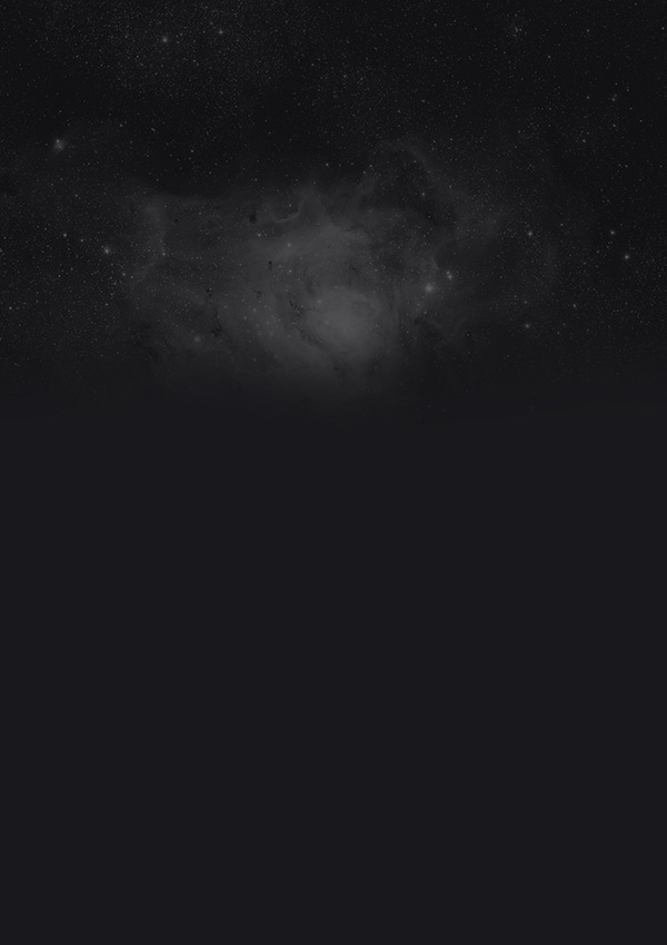
Download this fantastic image of a space nebula:
Paste the nebula into your canvas and set this layer’s opacity at 30%. Mask off the bottom of the nebula using a soft black paintbrush, so that it blends smoothly into your main background:
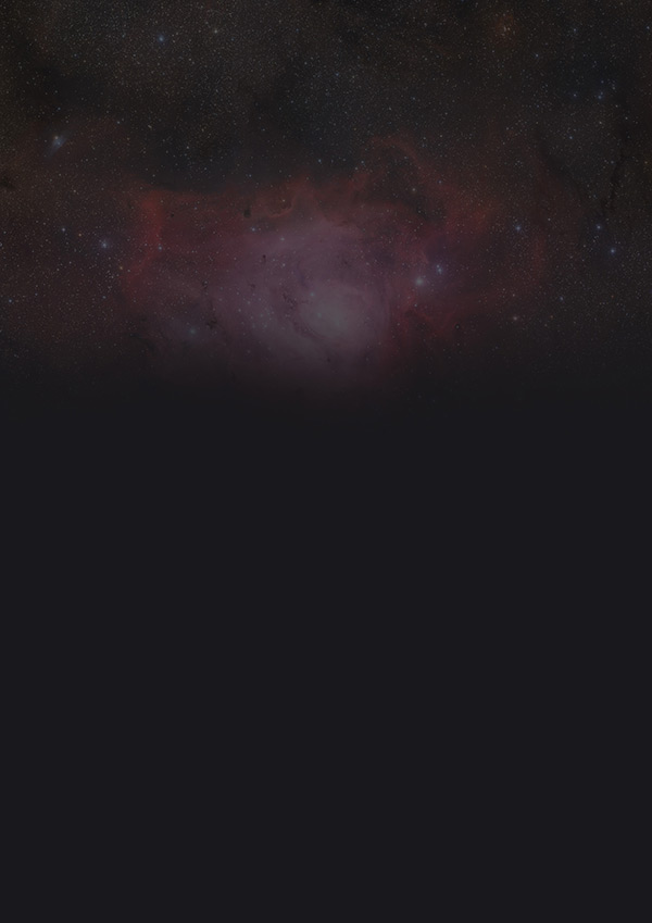
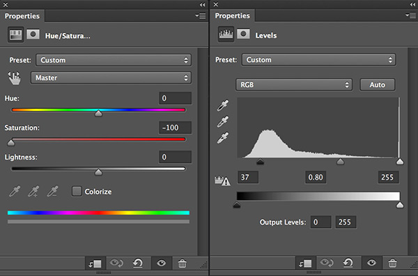
Apple a hue/saturation and levels adjustment layer to your nebula layer using a clipping mask:
Here’s the outcome of these adjustments:
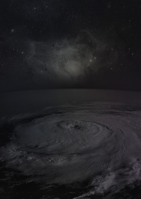
Step 3:
Download this image of a hurricane, taken from space:
Paste it into your canvas, and mask off the top part of the image, blending it smoothly into your canvas.
Also reduce this layer’s opacity to around 60%:
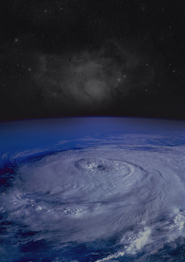
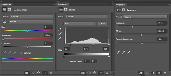
Apply hue/saturation, levels and exposure adjustment layers to your hurricane layer:
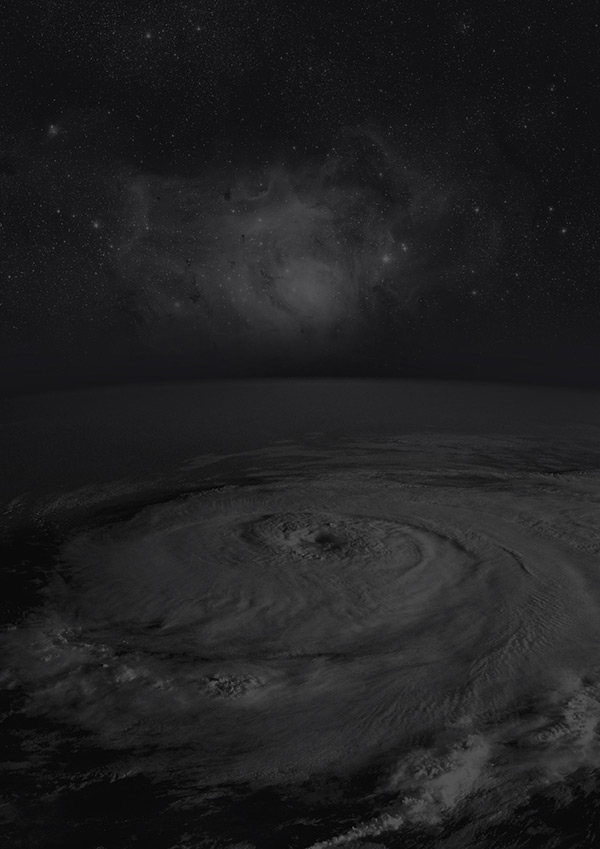
This is the result of these adjustments:
Step 4:
Create 3 new layers, called ‘purple’ ‘yellow’ and ‘blue’. On each layer, apply a soft paintbrush mark of the respective colour.
Try to think where each colour would look best on your composition:
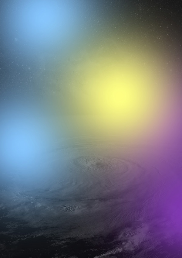
Change each layer’s blend mode to ‘overlay’ and reduce the opacities to between 10% and 30% until you’re happy with the result.
This gives a subtle lighting effect of your background:
Step 5:
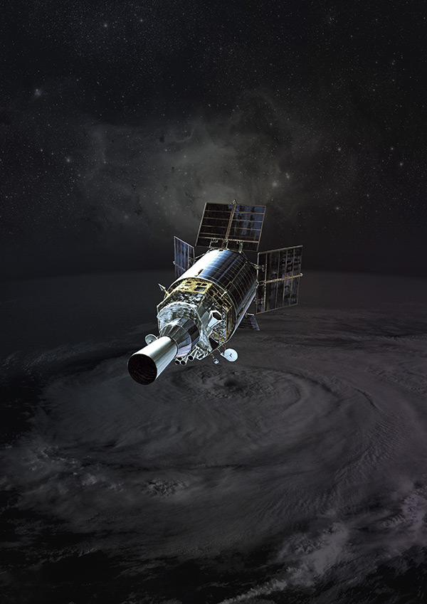
Download this image of a satellite in space:
Extract the satellite from it’s background using the pen tool.
Then paste the extracted image into the center of your poster design:
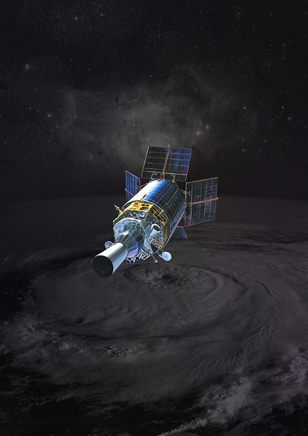
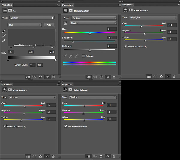
Apply levels, hue/saturation and color balance adjustment layers:
Here’s the result:
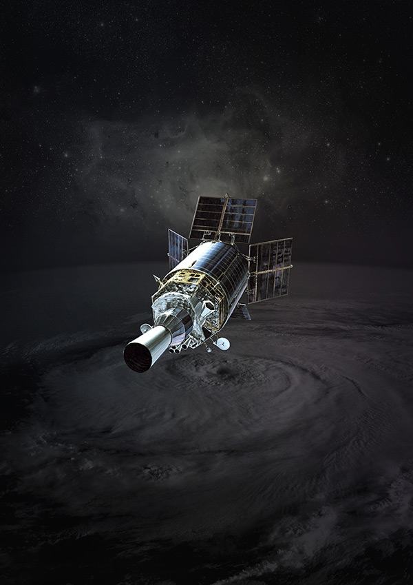
Step 6:
Let’s apply some universal lighting over our piece.
Start by creating a layer called ‘vignette’.
Use a large, soft black paintbrush to paint around the corners and edges of your canvas.
Then reduce this layer’s opacity to 40%.
Create another new called called ‘center highlight’ and use a soft white paintbrush to paint a highlight in the center of your canvas.
Change this layer’s blend mode to ‘overlay’ and reduce it’s opacity to around 20%.
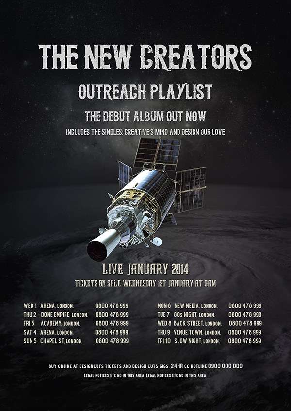
Here is the result:
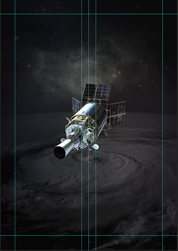
Step 7:
Before we start adding our type to this poster we need to lay out some basic guides for positioning the poster text.
Set guides to fall in 200px from the edges of your canvas. Then set a central vertical guide, and two more vertical guides set 100px either side of this central guide:
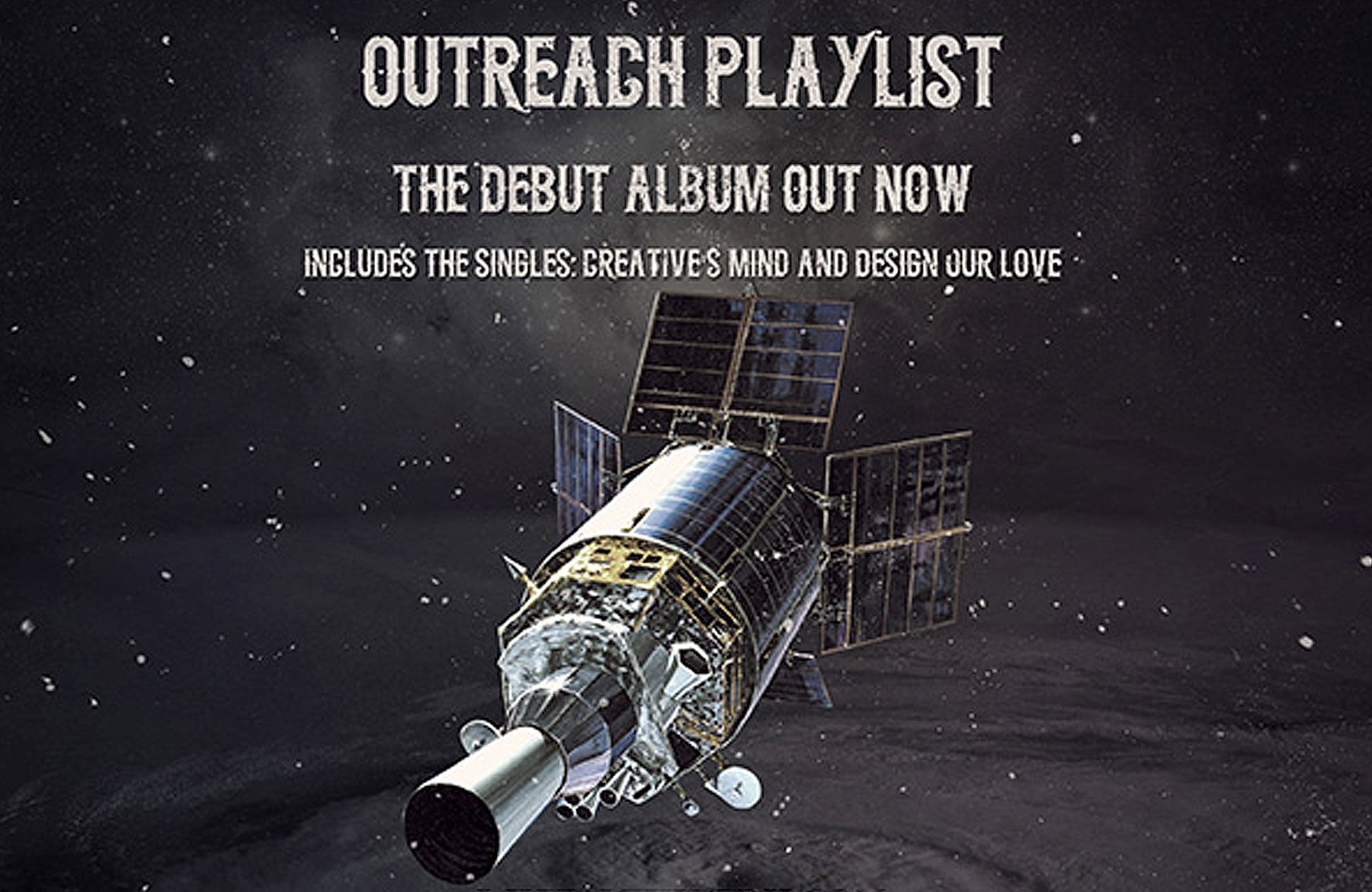
Step 8:
Download the beautiful font ‘Midnight Show’ from our current huge font deal:
The Ultimate Creative Font Bundle – 13 Fonts, 94% Off.
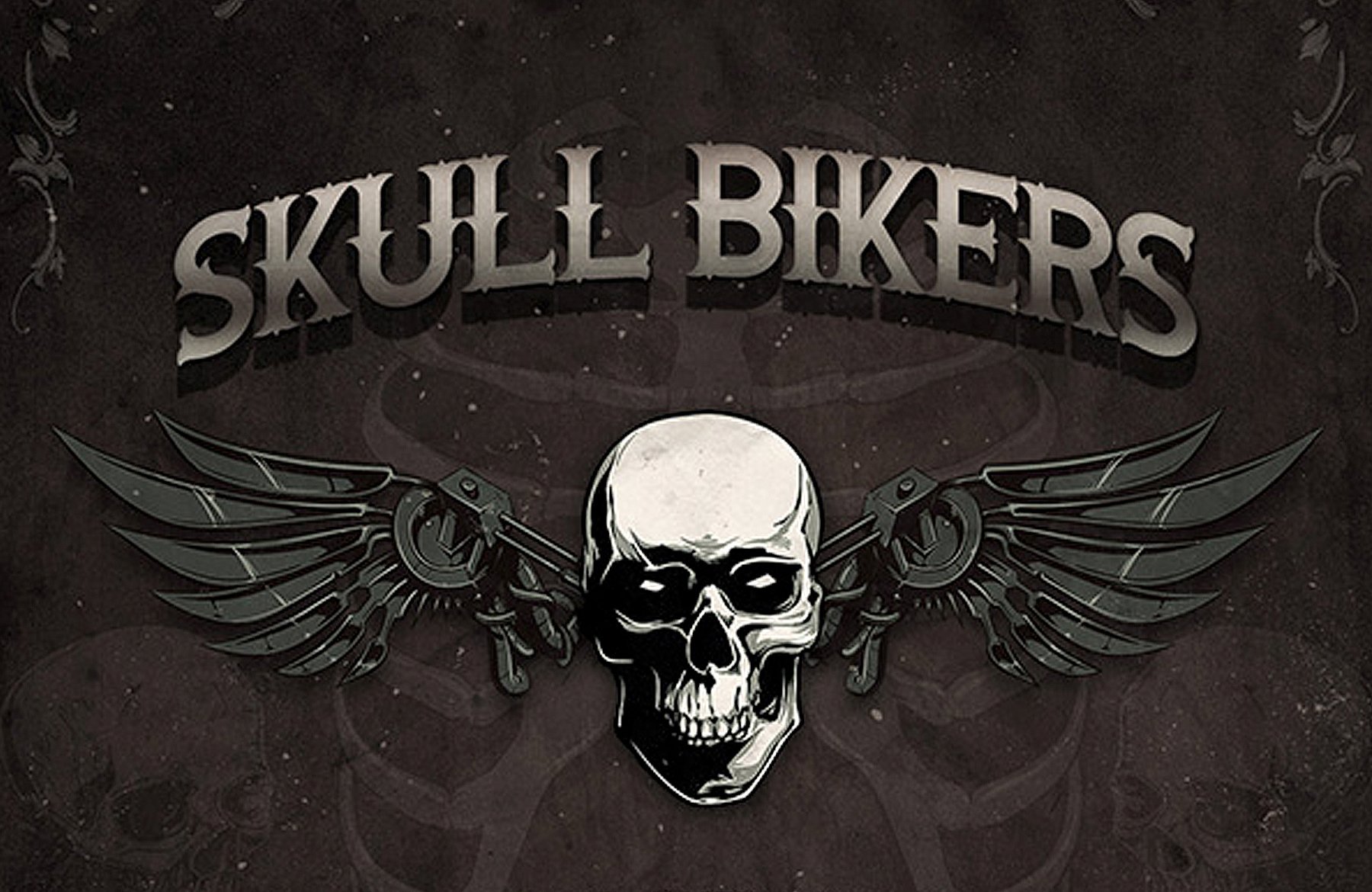
Apply the font (center aligned) to construct the band name, album name and some further details.
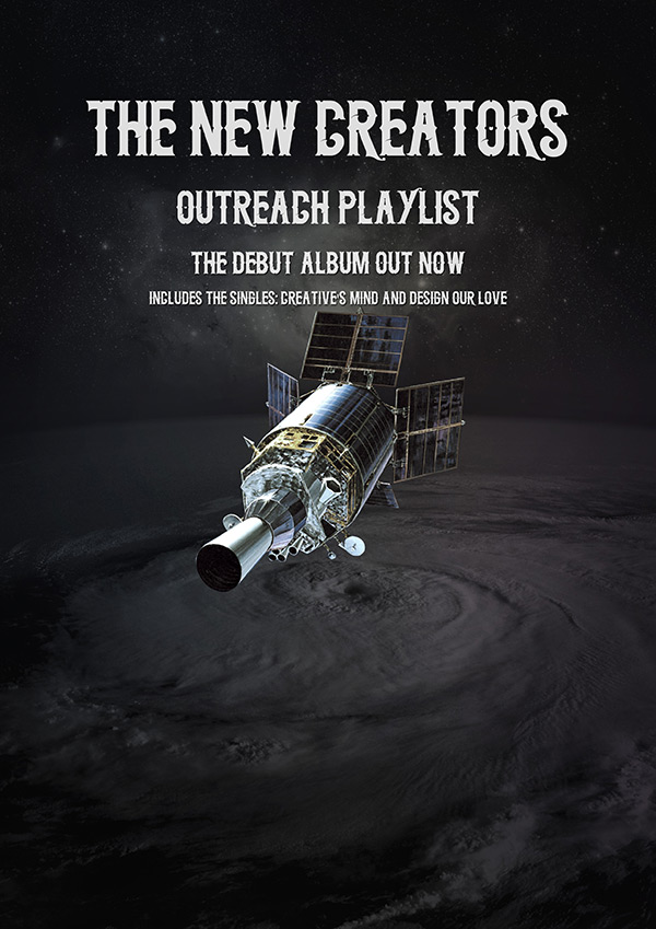
Now download the fantastic ‘Long March’ font from this same bundle.
Apply some further poster text:
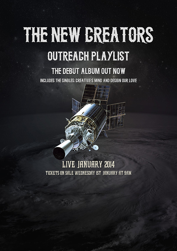
Finally, download the ‘Station’ font from the font bundle, and use version 1 of 7 to apply some finer details to your poster:
Step 9:
Time to add some cool grungy effects to our typography!
Download this noise textures set from our good friend Chris Spooner at SpoonGraphics:
Gritty Noise Textures from SpoonGraphics.
Paste one of the busier textures into your canvas:
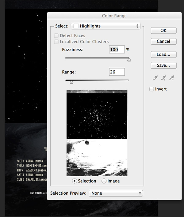
Go to select>color range and choose the following settings, to select the highlights parts of your canvas, including the grainy texture aspects:
Hit ‘ok, and with your selection active, go to select>inverse.
Then select one of your text layers, and with this inverted selection active, hit ‘layer mask’ in your layers palette.
This will apply a nice gritty effect to your text.
Here’s a look at the kind of selection you want:
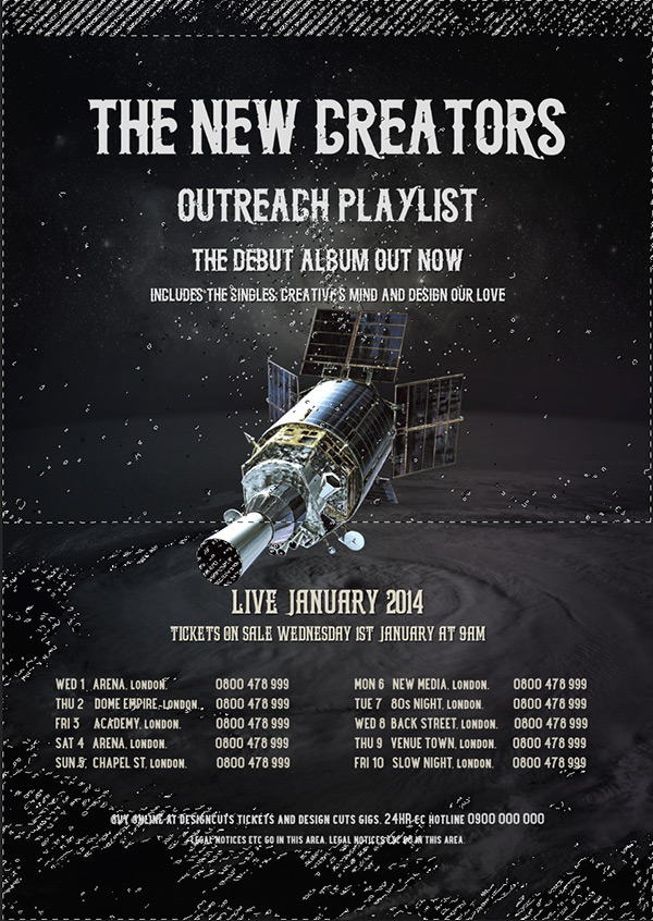
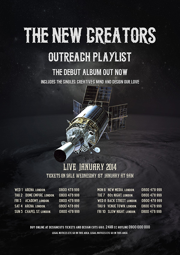
And here is the effect on your text, when repeated several times over for each respective text layer:
Step 10:
Now paste in several more of the noise textures from the pack that you just downloaded.
Set each of these layer’s blend mode’s to ‘screen’, hiding the black background of each noise texture, and only leaving the gritty noise details remaining:

Step 11:
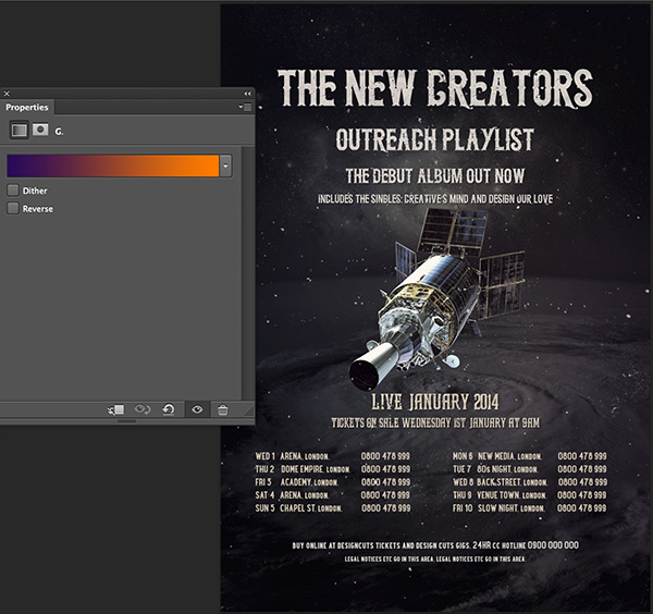
Now apply a gradient overlay adjustment layer (without a clipping mask, so that it effects your entire canvas):
Choose the default purple-orange gradient, and reduce this adjustment layer’s opacity to 6.
This will give a subtle colored tint to your poster:
Step 12:
Download this wonderful crumpled paper texture:
Free Crumpled Paper Texture Image.
Paste the image into your canvas, and desaturate it:
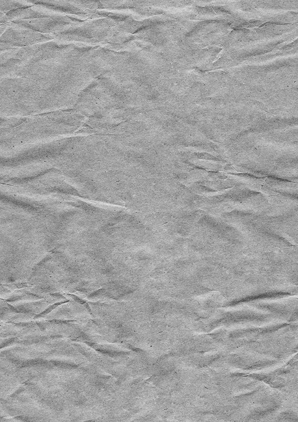
Change this layer’s blend mode to ‘hard light’ and reduce it’s opacity to around 5%:
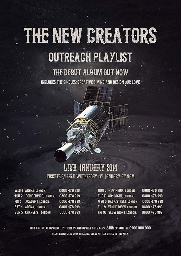
AND WE’RE DONE
I really hope that you enjoyed this tutorial. We’d love to hear your feedback if you leave a comment below. If you create your own version and send it in then we’d love to feature your work.

I LOVE THIS TUTORIAL AND ENJOY IT, THANK YOU FOR THIS TUTORIAL I HAVE LEARN SO MUCH WITH THEM.
Wow Liz, thanks so much for your awesome comment, reading this really made our day!
I hope that all of the new tips and tricks that you have learned in this tutorial come in super handy for your own creative projects :).