In this design tutorial you will learn how to create a vintage gig poster for a design-themed concert in Photoshop. We will be using a lot of hand drawn elements, textures, and playful font treatments to create this colourful and fun design!
HAVE YOU SEEN OUR YOUTUBE CHANNEL?
Watch the video tutorial below and subscribe to our YouTube channel for regular updates direct to your inbox.
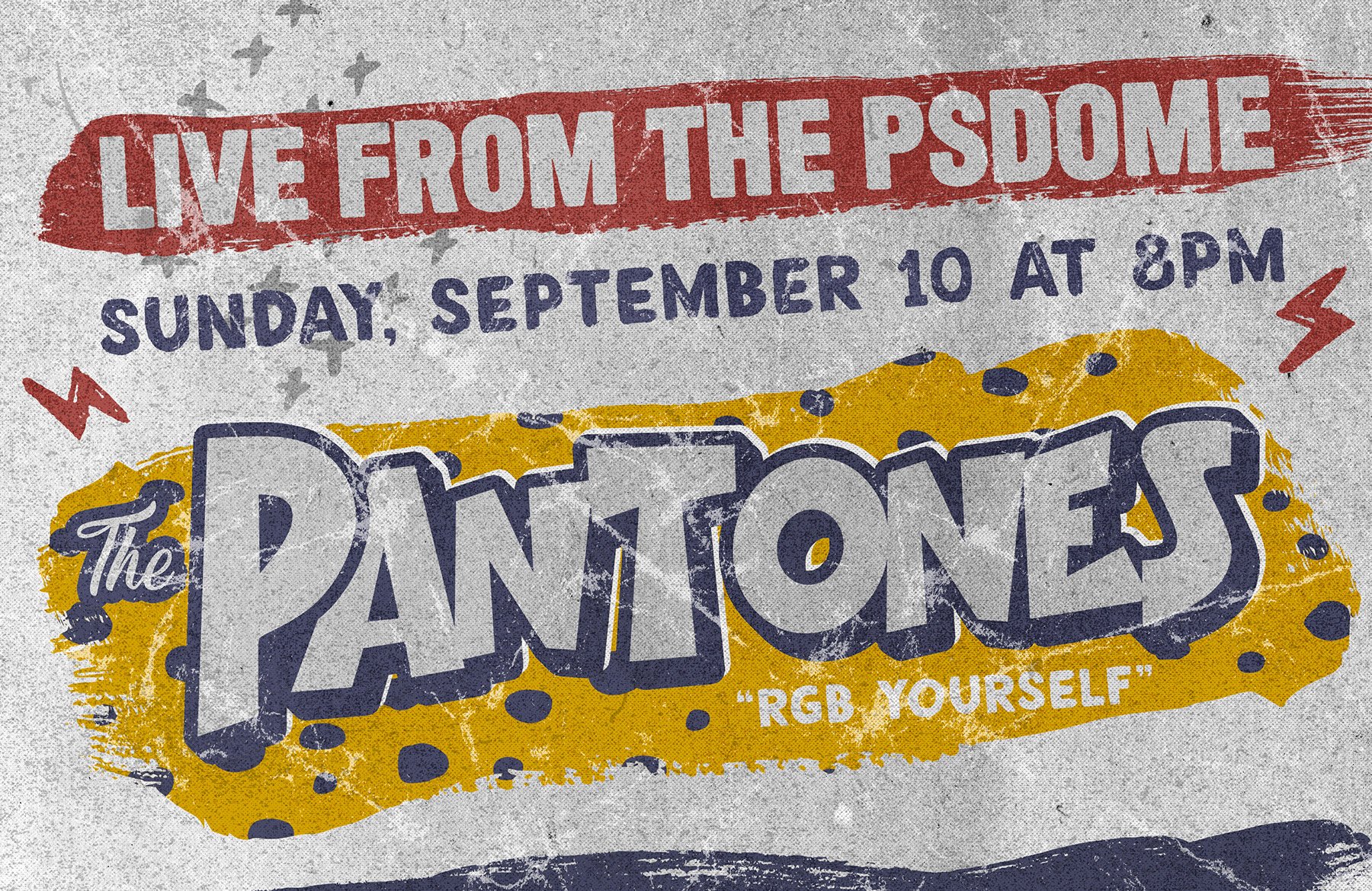
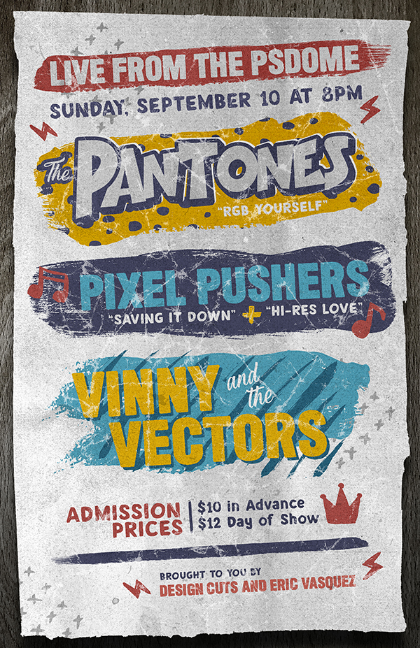
Here’s a look at what we’ll be creating:
Follow along with this tutorial: Download the freebie files
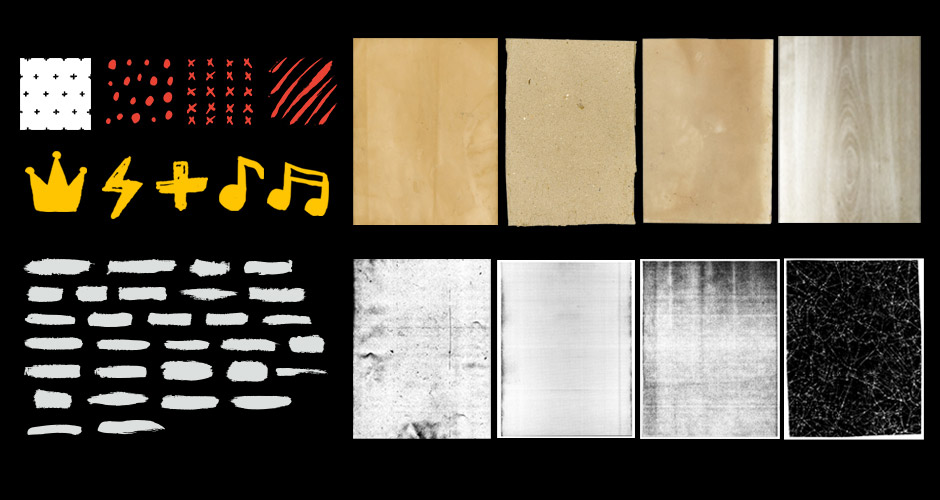
This freebie pack includes a range of high-res textures, hand-drawn graphics, patterns, and vector brush strokes.
The freebie pack is just a sample of what you will find in the The Essential Textures and Patterns Bundle for just $29 (that’s 99% off). This bundle is a complete library of 1000’s of high quality, incredibly useful textures and patterns. This is the ultimate time-saver for having access to thousands of hand-curated, super high quality textures and patterns to make your projects look better than ever!
Step 1: Vintage Gig Poster
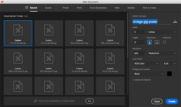
Let’s begin by opening Photoshop and creating a New Document. Let’s make sure that our document size is set to 11” wide by 17” tall with a resolution of 300, Color Mode of RGB, and set the Background Contents to ‘Black’ and give your file a name – here I am using the name ‘vintage-gig-poster’. Once you have set the parameters go ahead and click ‘Create’ to make your document.
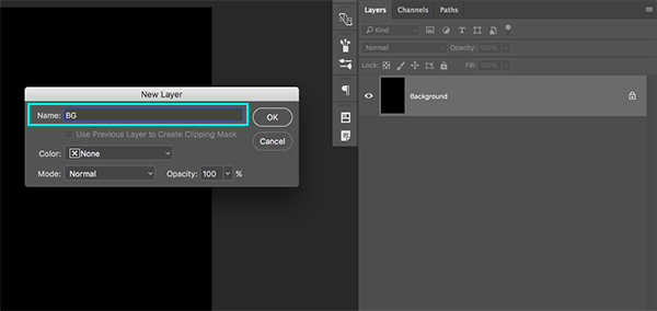
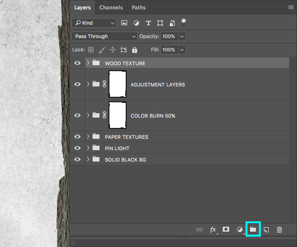
Once we create our new document we should have one single layer named ‘Background’ that appears with a small lock icon next to it. Double click on the layer and when you are prompted with a dialog box asking you to name the layer we will change it to ‘BG’ and then click ‘OK’ to apply the changes and unlock the layer.
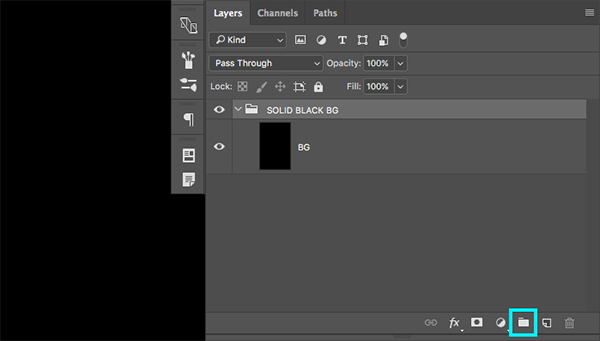
Once you have unlocked and renamed the layer, select the ‘BG’ layer in your Layers Palette and then click the small Group Folder icon at the bottom of the Layers Palette as indicated by the highlighted box in the image below:
Step 2: Rock Paper Scissor
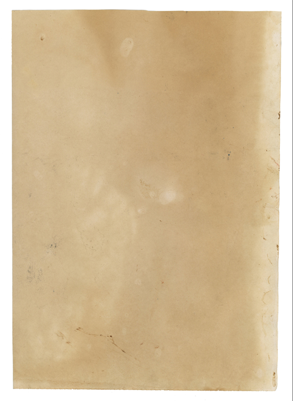
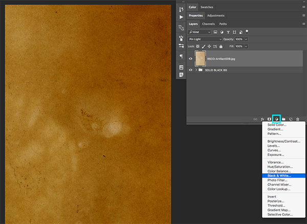
Next, open up the ‘RSCO-Artifact009.jpg’ image from the freebies folder for this tutorial.
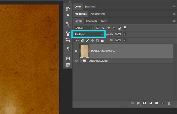
Hold the Shift Key and then drag this image over into your document. Once the texture appears in your working file, change the Blending Mode of the paper texture layer to ‘Pin Light’ as shown here:
Hold the Alt/Option Key and click on the Adjustment Layer icon at the bottom of the Layers Palette and then choose ‘Black & White…’ as shown here:
When the ‘New Layer’ dialog box appears, make sure to check off the option that says ‘Use Previous Layer to Create Clipping Mask’ as highlighted in the image below:
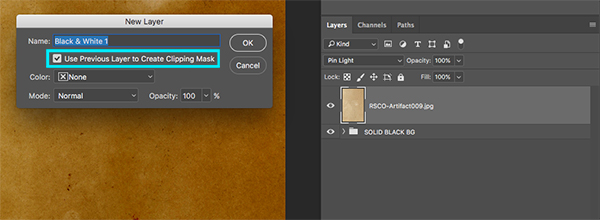
You should now have a Black & White Adjustment Layer with a Clipping Mask applied to it, ensuring that this will only affect the paper texture layer directly below. Notice the small downward facing arrow on the Adjustment Layer indicating that the Clipping Mask has been applied.
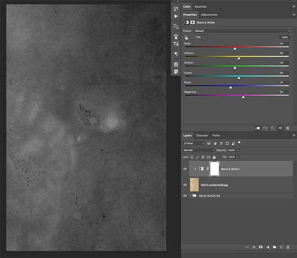
Select the Adjustment Layer, and then hold the Shift Key and select the texture layer below so that both layers are selected at the same time.

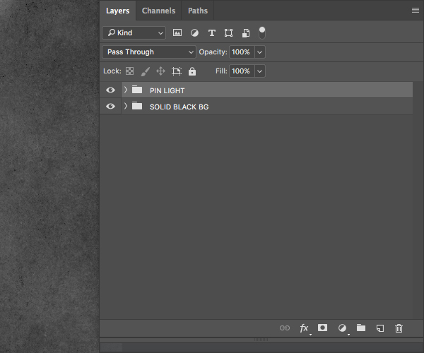
With both layers selected, press Command/Ctrl+G to put them into a Group Folder. Double click the folder name to rename it and change it to ‘Pin Light’ to help us keep track of our layers as we begin to build our composition.
Step 3: Cutting Corners
Next, open up the ‘RSCO-Artifact002.jpg’ image from the freebies folder for this tutorial.
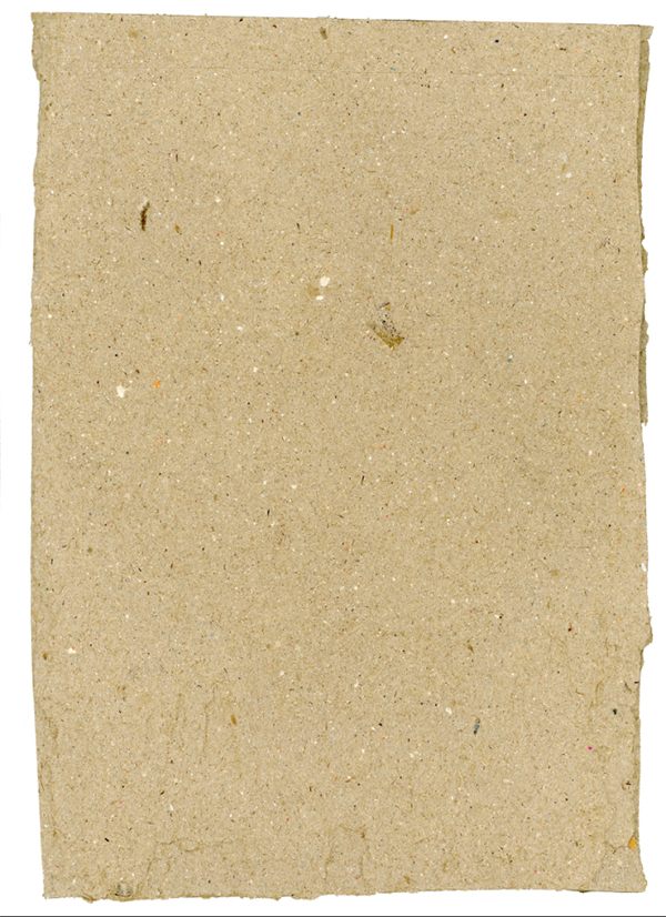
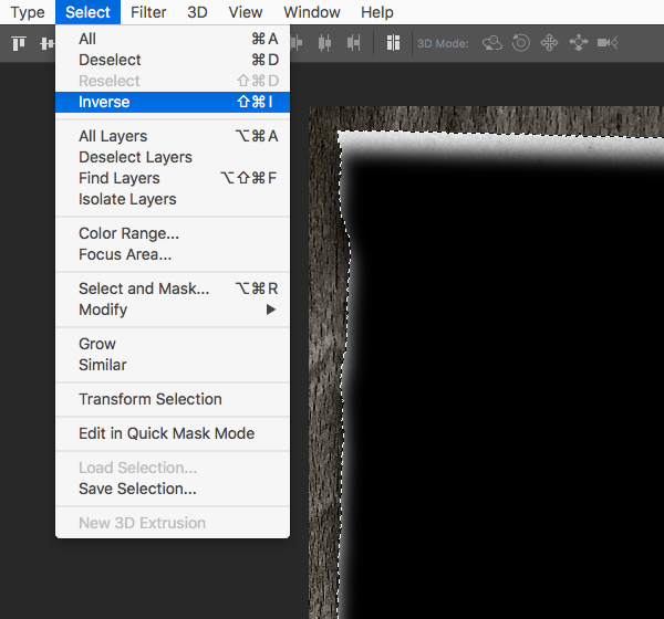
Once you’ve opened the image, press ‘W’ on the keyboard to switch to your Magic Wand Tool and then click anywhere outside of the actual piece of paper in the white area around it to make a selection. You should see the marching ants around the paper texture to indicate the active selection as shown here:
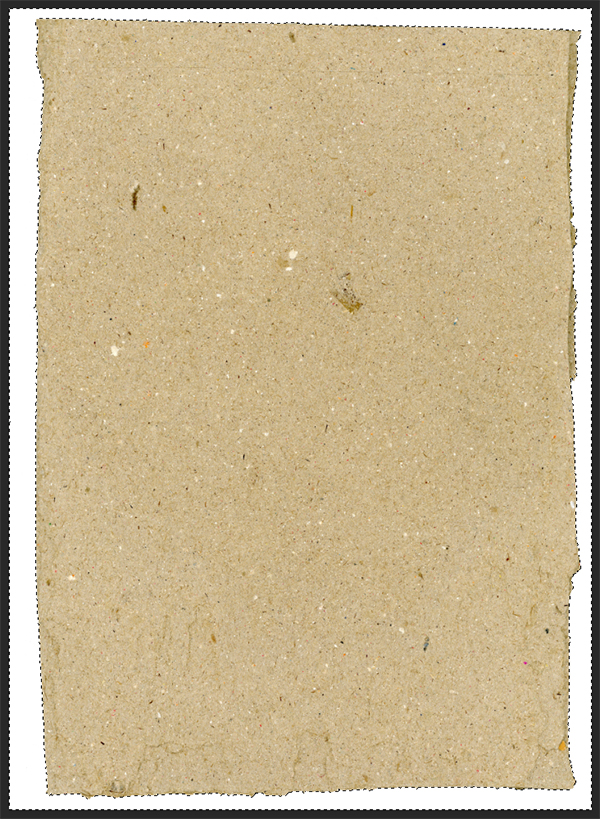
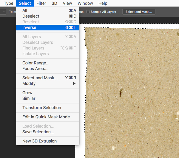
From here, go to the ‘Select’ menu and choose the option that says ‘Inverse’ from the dropdown menu.
You will now notice that the marching ants are only around the paper itself, and no longer appear around the outer bounds of the window.

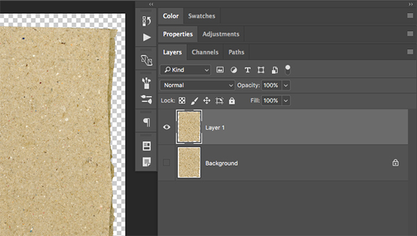
While your inverted selection is active, press Command/Ctrl+J on the keyboard to copy your selection onto a new layer.
Step 4: Stretch it Out
Click and drag the isolated paper texture into your Photoshop document while holding the Shift Key. After placing the texture at the top of your Layers Palette, hold the Control Key and click on the layer. From here, choose the ‘Convert to Smart Object’ option that appears on the dropdown menu as shown below:
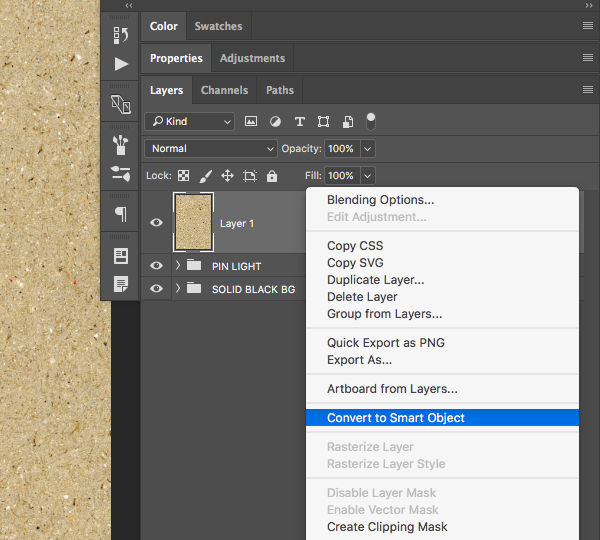
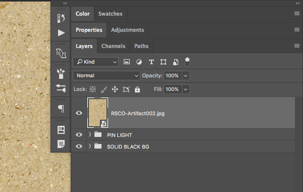
After converting your layer, double click on the layer name and rename it, giving it a specific name – in this case I have just used the actual file name. Notice the small page icon in the lower right indicating that the layer has been changed into a Smart Object.
Select the Smart Object Layer and press Command/Ctrl+T to initiate a Free Transform Command. Next, press Command/Ctrl+0 on the keyboard to fit the image to your window and you should see the bounding box around your image as shown in the image below:
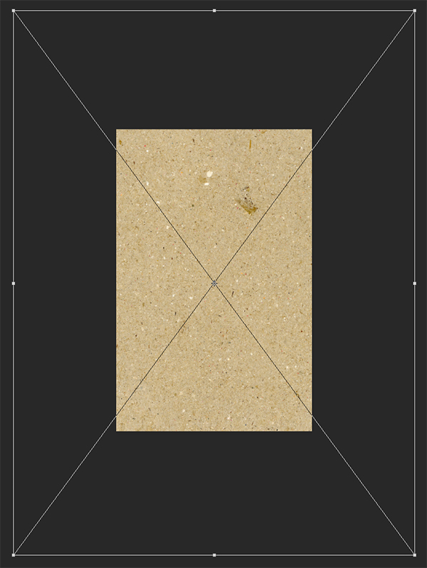
Move your cursor over any of the four corners of the bounding box and drag inwards while holding the Alt/Option+Shift keys to scale the image down from the center until the width of the paper texture spans across the canvas with a bit of breathing room on the top and side as shown here:
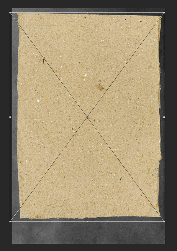
You will notice that even though the paper fits nicely on the top and sides that it’s a bit short on the bottom. In this case we will move our cursor over the bottom middle of the bounding box while holding Alt/Option on the keyboard and drag downwards until there is an even amount of space on the bottom that closely matches the other sides. Your document should now look something like this:

Step 5: Paper Mask
Open the ‘RSCO-Artifact008.jpg’ from the freebies folder for the tutorial.
Hold the Shift Key and drag this image over into your working document and make sure that it’s at the top of your Layers Palette. From here, hold the Control Key and click on the image to once again reveal a dropdown menu where you will want to select the option that says ‘Convert to Smart Object’ as shown below:

Once you’ve changed your texture to a Smart Object double click on the layer name and change the name of the layer to either the name of the file or something that will make it easy for you to identify.

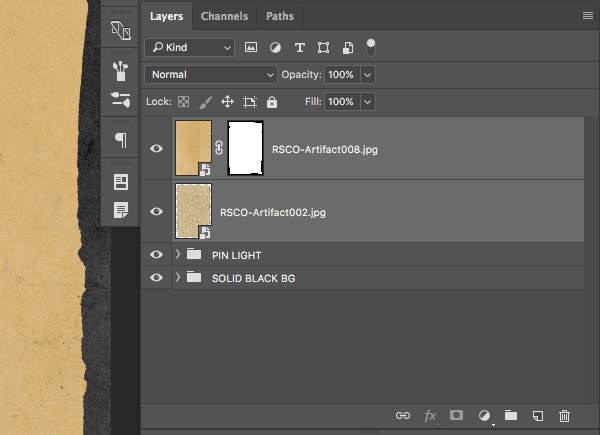
While your top layer is still selected in the Layers Palette, hold the Command/Ctrl Key and click on the Smart Object Thumbnail of the layer below, indicated by the blue box in the following image:
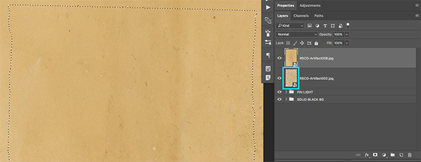
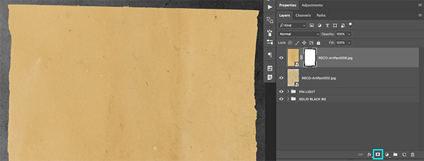
You should now have an active selection that follow the shape of the ripped paper layer from the previous step while your top layer is selected. From here, click on the ‘Add Layer Mask’ icon at the bottom of the Layers Palette to mask the top texture layer to the shape of the layer below it.
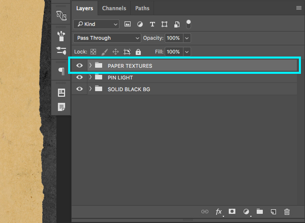
Select the top layer and then hold the Shift Key and select the layer below so that both of the top two layers are selected simultaneously as shown here:
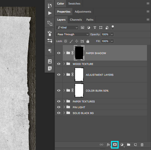
While both of the top layers are selected, press Command/Ctrl+G to place them into a Group Folder and change the name of the folder to ‘Paper Textures’ as shown in the image below:
Step 6: Mask On
Next, select the ‘Pin Light’ folder and press Command/Ctrl+J to duplicate it. From here, move it to the top of the Layers Palette as shown below:
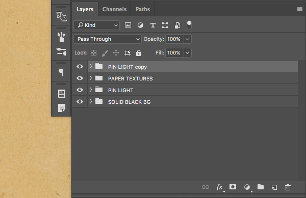
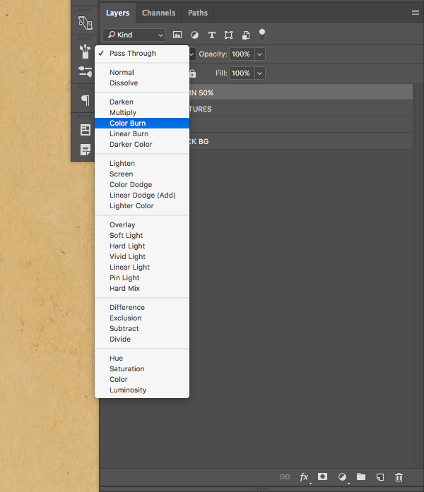
Once you have duplicated and moved the folder to the top of your palette, double click the folder name and change the name to ‘Color Burn 50%’ before changing the Blend Mode to Color Burn.
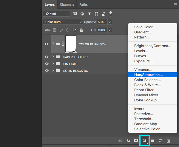
With your ‘Color Burn 50%’ folder selected, press the number ‘5’ on the keyboard to reduce the opacity of the folder to 50%. Next, hold the Command/Ctrl Key and click on the Smart Object Thumbnail of the ‘RSCO-Artifact002.jpg’ layer to activate a selection around it.

With the selection active and your top folder selected, click on the ‘Add Layer Mask’ icon at the bottom of the Layers Palette to mask the ‘Color Burn 50%’ folder as shown below:

Step 7: Adjustment Layers
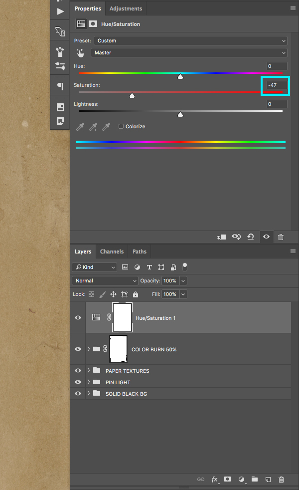
Select the ‘Color Burn 50%’ folder and then click on the Adjustment Layer Icon at the bottom of the Layers Palette. From here, choose ‘Hue/Saturation…’ from the menu as shown below:
After adding the Adjustment Layer, move the ‘Saturation’ slider to the left until it’s set to ‘-47’ as shown here:
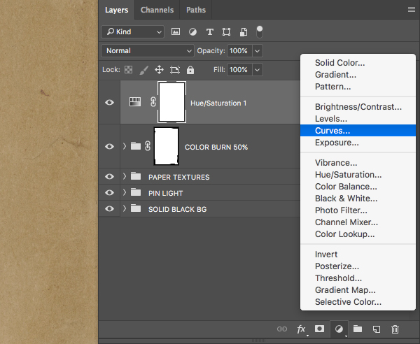
Return to the Adjustment Layer Icon and this time add a ‘Curves…’ adjustment.
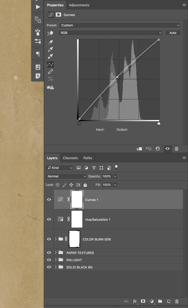
Click in the center of the grid and move it slightly upwards and to the left as shown here:
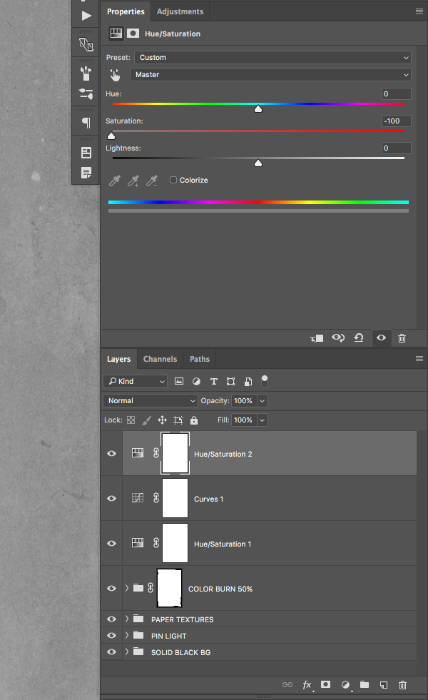
Add another ‘Hue/Saturation…’ adjustment on top of the previous two Adjustment Layers.

This time move the ‘Saturation’ slider all the way to the left so that it’s set to ‘-100’ as shown in the image below:
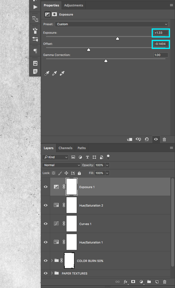
Next, click on the Adjustment Layer Icon once again and this time add an ‘Exposure…’ adjustment.
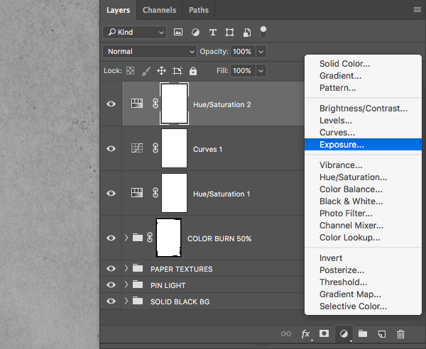
Change the ‘Exposure’ slider to ‘+1.33’ and the ‘Offset’ value to about ‘-0.1404’ as highlighted in the image below:
Step 8: Adjustment Layer Mask
Click on the ‘Exposure’ Adjustment Layer, hold the Shift Key, and then select the bottom ‘Hue/Saturation’ Adjustment Layer so that all four of the layers are selected.
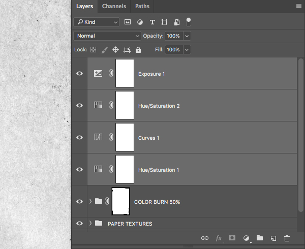
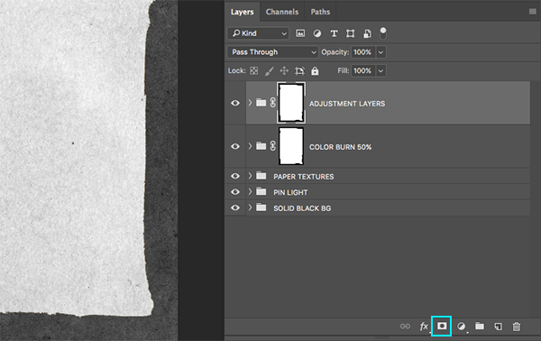
Press Command/Ctrl+G to place the four Adjustment Layers into a Group Folder and change the name of the folder to ‘Adjustment Layers’ and then hold the Command/Ctrl Key and click on the mask thumbnail indicated by the blue highlight box in the image below:
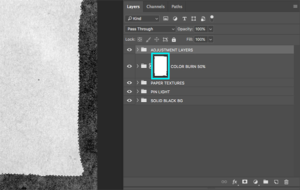
With the ‘Adjustment Layer’ folder selected, you should now see the marching ants around the ripped paper. While the selection is still active, click on the ‘Add Layer Mask’ icon shown at the bottom of the Layers Palette to apply a mask to the folder.
Step 9: Wood Grain
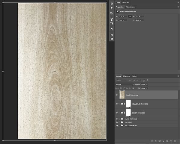
Open the ‘Wood-Walnut.jpg’ image from the freebies folder for the tutorial.
Click and drag the image into your document and place it at the top of the Layers Palette. Double click the layer name and change it to either the name of the file or something that will be easy for you to identify in the document.

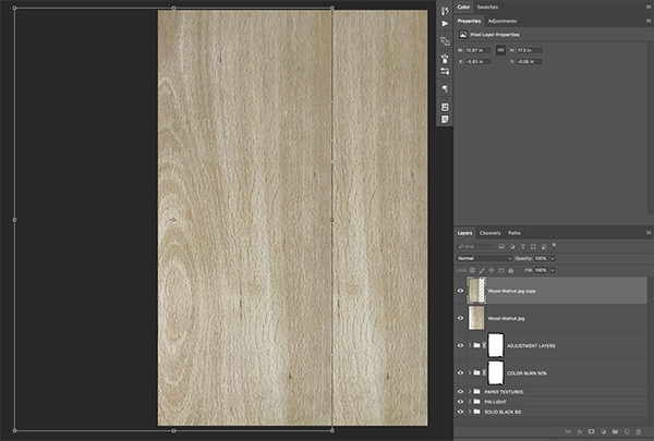
We want to rotate the image so that it’s vertical, so we will select the layer and press Command/Ctrl+T to initiate a Free Transform, and then hold the Control Key and click on the image. You should now see a dropdown menu where we will want to select the option that says ‘Rotate 90˚ Counter Clockwise’ as shown below:

After rotating the image, move your cursor over any of the four corners of the bounding box and drag outwards while holding the Alt/Option+Shift Keys until the wood texture covers the entire canvas before pressing the ‘Enter’ key to apply the changes. Your image should now look like this:
Step 10: Seamless Textures
Select the wood texture layer and press Command/Ctrl+J to duplicate it. Press Command/Ctrl+T to initiate a Free Transform, and then hold the Shift Key and move the top copy over towards the left so that you no longer see the light part of the wood texture.
With the top copy selected, click on the ‘Add Layer Mask’ icon at the bottom of the Layers Palette to apply a mask to the image.
Press ‘G’ on the keyboard to switch to your Gradient Tool and check the top toolbar to make sure that you have a black-to-transparent Linear Gradient selected as shown below:

Make sure that the top copy of the wooden texture layer is selected and with the Gradient Tool (G) click and drag from right to left to mask the right edge so that the wood appears to be seamless as shown here:
After masking the edge of the top copy, select the top layer, hold the Shift Key, and then select the first copy below.
Once both copies of the wooden textures are selected, click on the Group Folder icon at the bottom of the Layers Palette to place the layers into a new folder and name it ‘Wood Texture’ so we can keep both of these layers together and neatly labeled.
Step 11:Wood Masks
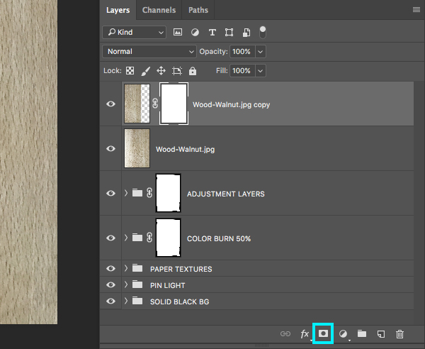
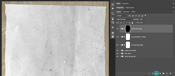
With the ‘Wood Texture’ folder selected, hold the Command/Ctrl Key and click on the mask thumbnail icon attached to the ‘Adjustment Layer’ folder below to activate a selection around it.
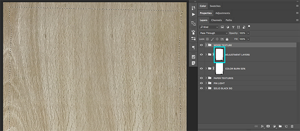
Go to the Select Menu and choose ‘Inverse’ as shown below:
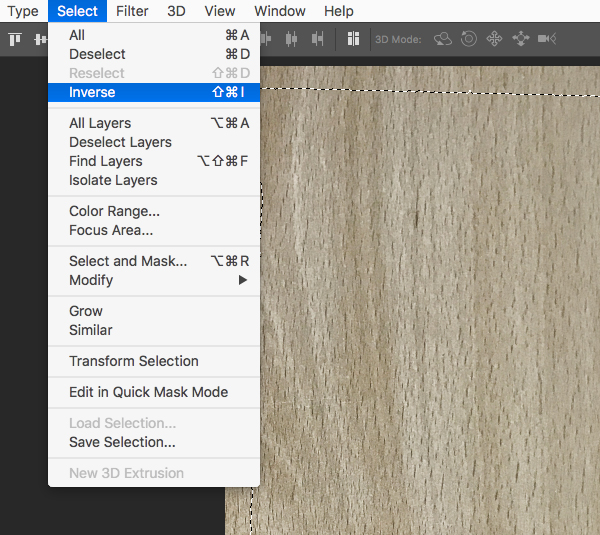
Once you have inverted the selection, click on the ‘Add Layer Mask’ icon at the bottom of the Layers Palette to apply an inverted mask to the ‘Wood Texture’ folder. Your image should now look like this:
Step 12: Wooden Folders
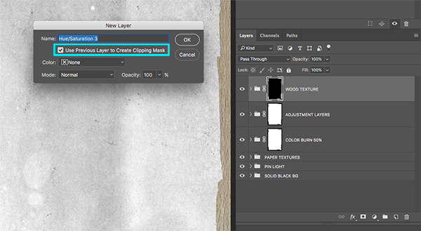
With the ‘Wood Texture’ folder selected, hold the Alt/Option Key and click on the Adjustment Layer icon at the bottom of the Layers Palette. From the menu that appears, choose ‘Hue/Saturation…’ from the list as shown below:
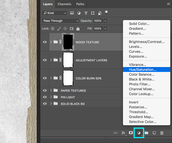
When the ‘New Layer’ dialog box appears, check off the ‘Use Previous Layer as Clipping Mask’ option before pressing ‘OK’ to apply the change.
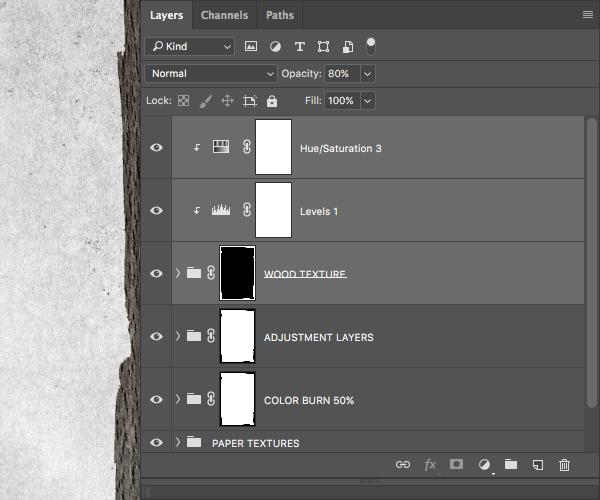
After you’ve applied the Hue/Saturation Adjustment Layer, move the ‘Saturation’ slider all the way to the left to desaturate the image, and then press the number ‘8’ on the keyboard to reduce the opacity of the Adjustment Layer to ’80%’.

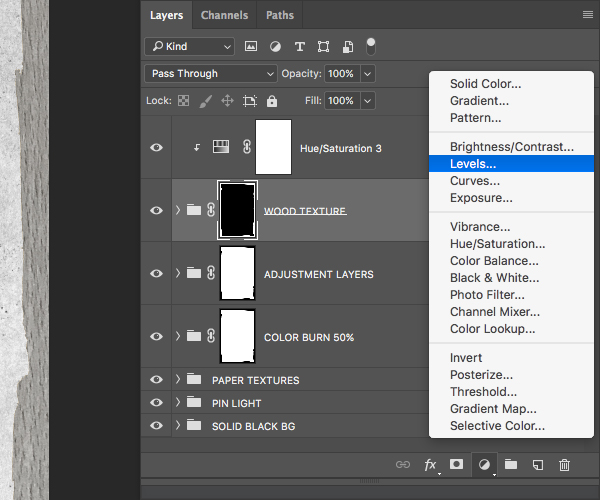
Select the ‘Wood Texture’ folder and once again click on the Adjustment Layer icon at the bottom of the Layers Palette. This time, choose ‘Levels…’ from the list and it will automatically have a Clipping Mask applied to it because it will be added between the folder and the Hue/Saturation Adjustment Layer that we applied in the previous step, which already has a Clipping Mask applied to it.
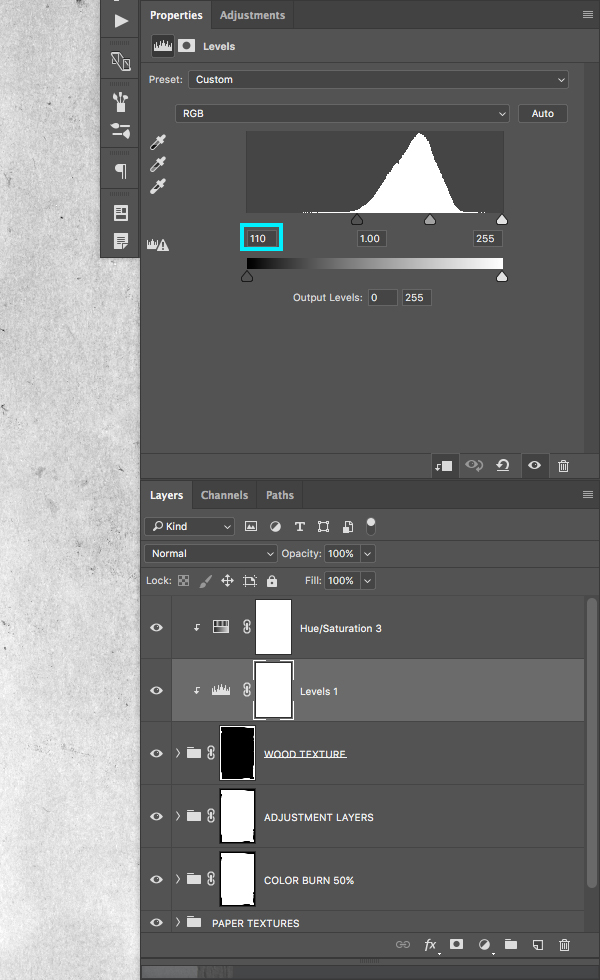
For the settings, move the left slider towards the right until it’s set to about ‘110’ as shown here:
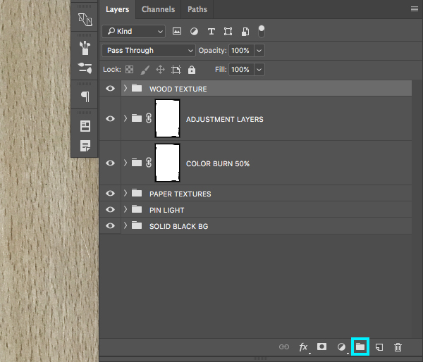
Select the top Levels Adjustment Layer and hold the Shift Key before selecting the ‘Wood Texture’ folder so that all three of your top layers are selected.
Press Command/Ctrl+G or click on the folder icon at the bottom of the Layers Palette to place these three layers inside of another Group Folder. You can give this layer the same name of ‘Wood Texture’ or feel free to give it a different name of your choosing.
Step 13: Paper Shadows
Press ‘G’ on the keyboard to go back to the Gradient Tool and you should have the same black-to-transparent Linear Gradient that we used earlier:

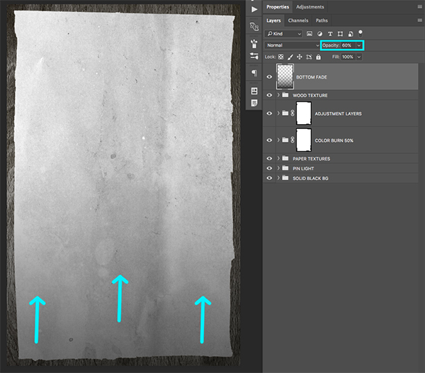
Create a New Layer at the top of your Layers Palette and name it ‘Bottom Fade’ or something similar. With your Gradient Tool (G) still selected, click just off the bottom of the canvas and drag upwards to create a shadow. From there, press the number ‘6’ on the keyboard to reduce the opacity of the fade to 60% as shown here:
Create another New Layer just above the ‘Bottom Fade’ layer and then while the new layer is selected in your Layers Palette, hold the Command/Ctrl Key and click on the layer mask thumbnail of the ‘Adjustment Layer’ folder as shown in the image below:
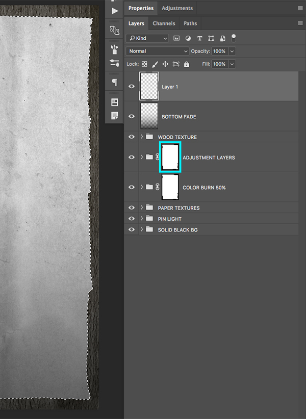
Press ‘D’ on your keyboard to reset your default colors, and make sure that your foreground color is solid black, not white. From here you should have an active selection in the shape of the ripped paper while your new layer at the top of the Layers Palette is still selected. The next thing you will want to do from here is to press Alt/Option+Delete on the keyboard to fill the layer with your foreground color (solid black).
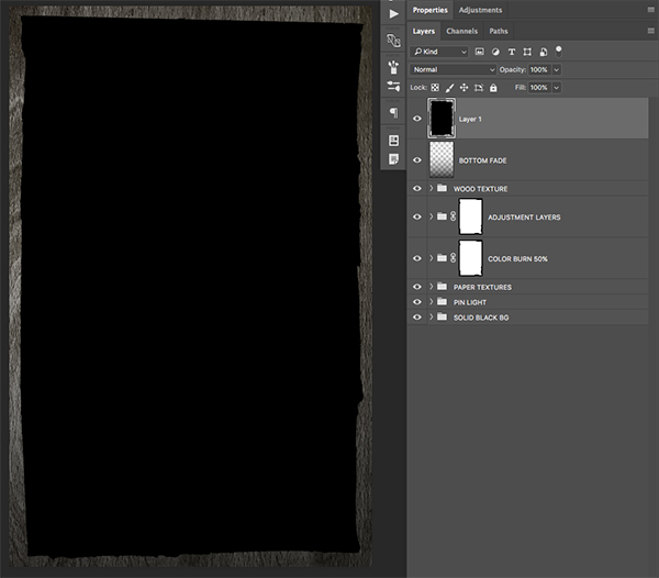
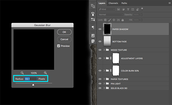
After you’ve filled the shape with black, press Command/Ctrl+D to deselect everything. Next, go to the Filter Menu and choose ‘Gaussian Blur’ from the dropdown that appears.
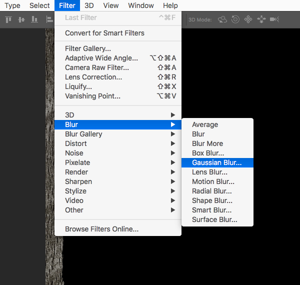
For the settings, apply a blur of ’33.1’ pixels and then press ‘Enter’ on the keyboard to apply the filter.
Step 14: Shadow Folders
Select your top layer, which I’ve decide to name ‘Paper Shadow’ and then hold the Shift Key and select the ‘Bottom Fade’ layer just below it.
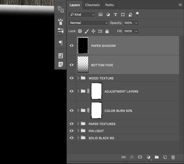
Press Command/Ctrl+G to put both layers into a new Group Folder and rename it ‘Paper Shadow’ as shown here:
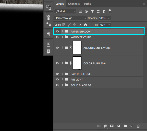
Next, with your new folder selected, hold the Command/Ctrl Key and click on the layer mask thumbnail of the ‘Adjustment Layer’ folder to once again activate a selection the shape of the ripped paper.

Go to the Select Menu and choose ‘Inverse’ as shown here:
Once you’ve inverted your selection, click on the ‘Add Layer Mask’ icon at the bottom of the Layers Palette to add a mask to your ‘Paper Shadow’ folder.
Click on the small arrow next to your ‘Paper Shadow’ folder to reveal the contents, and from there select the top ‘Paper Shadow’ layer and press the number ‘7’ on your keyboard to reduce the opacity of the layer to 70%.

Click on the top ‘Paper Shadow’ folder and then hold down the Shift Key before clicking on the very bottom ‘Solid Black BG’ folder so that all of the folders in your palette are selected together.

Press Command/Ctrl+G to put all of your folders into a new Group Folder and rename it ‘Background’ as we have now set up our complete background for the design.

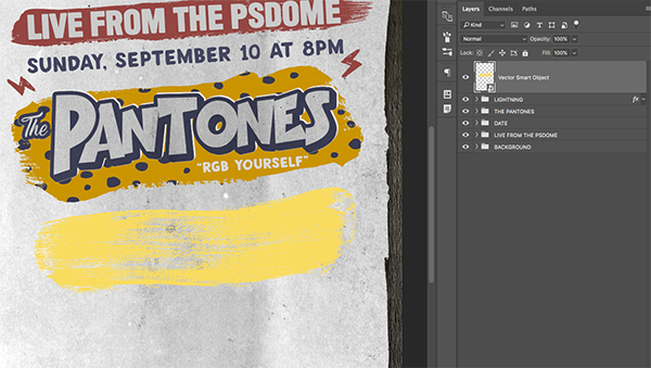
Step 15: Paint Strips
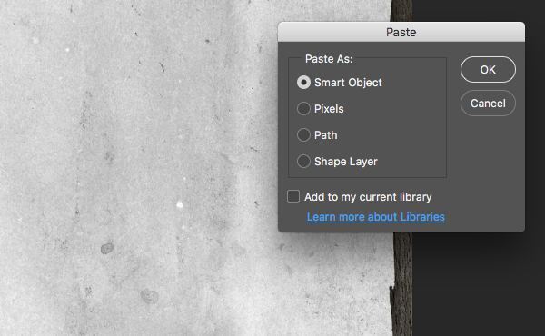
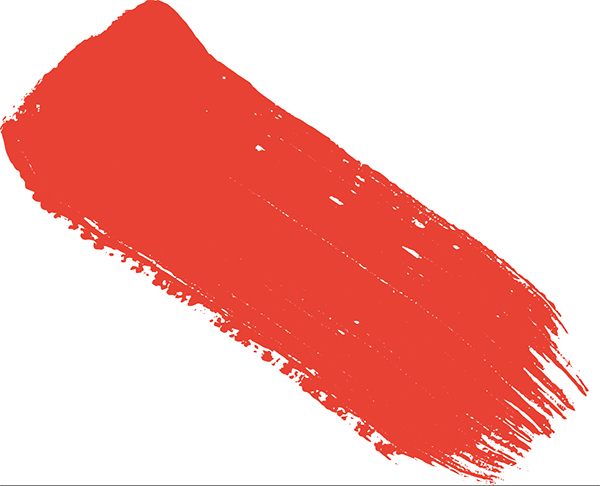
Next, open ‘color_splash_1_stroke_1.eps’ in Adobe Illustrator.
NOTE: This freebie is unfortunately not available. However, we have provided a comprehensive set of brush stroke vectors, courtesy of Chris Spooner. These should work perfectly for the creation of this poster.

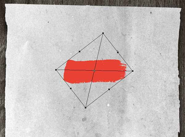
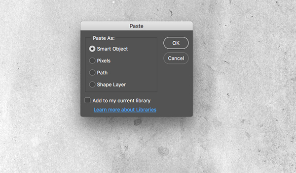
Press Command/Ctrl+C to copy the brush stroke and then return to Photoshop and press Command/Ctrl+V to paste it. You will then be prompted with a ‘Paste As’ dialog box where you will want to choose the first option that says ‘Smart Object’ as shown below:
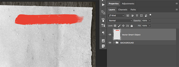
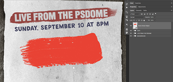
Once you’ve pasted the stroke, rotate it so that it is roughly in a straight line before pressing ‘Enter’ to apply the changes.
Hold the Control Key and click on the layer and then choose the ‘Rasterize Layer’ option from the dropdown list as shown below:

Press Command/Ctrl+T to once again initiate a Free Transform and then drag the handle on the right side of the bounding box outwards while holding the Alt/Option Key to stretch it out slightly like this:
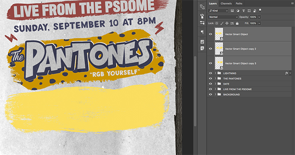
Press Command/Ctrl+J to duplicate the layer, and then hold the Shift Key and slide the top copy over to the left so that it looks like one long brush stroke.
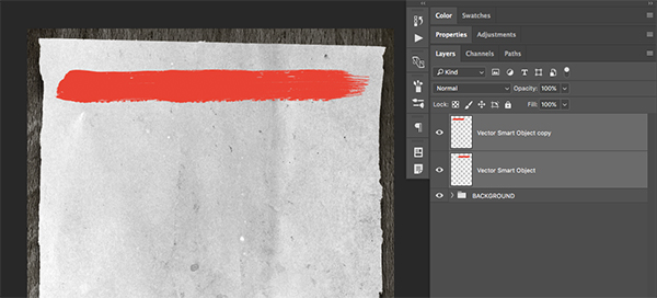
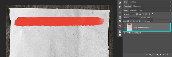
Select the top copy and then hold the Shift Key and select the copy below so that both strokes are selected at the same time. From here, press Command/Ctrl+E on the keyboard to merge the layers together. Next, double click the layer name and change it to ‘Color Splash 1 Stroke 1’ or something similar.
Step 16: Recoloring the Paint Stroke
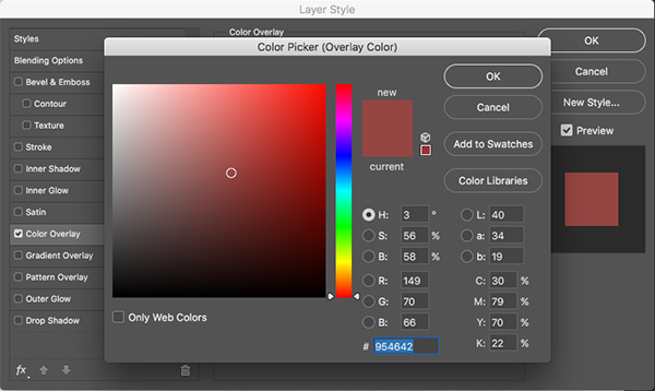
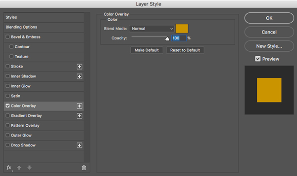
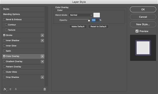
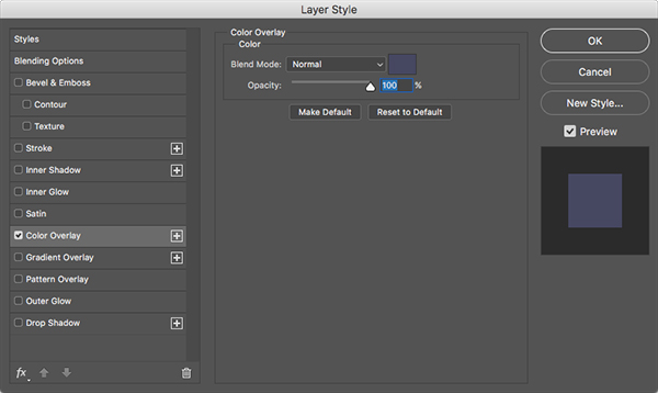
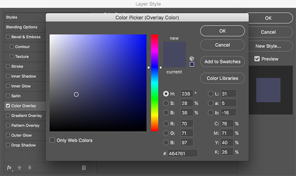
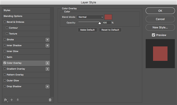
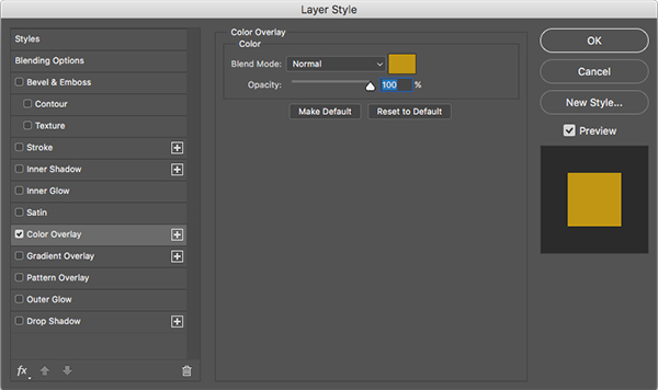
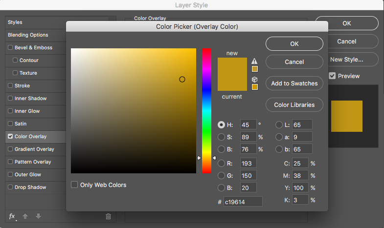
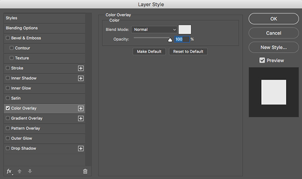
Double click on the ‘Color Splash 1 Stroke 1’ layer to bring up the Layer Style dialog box. Check off the option that says ‘Color Overlay’ as shown below:
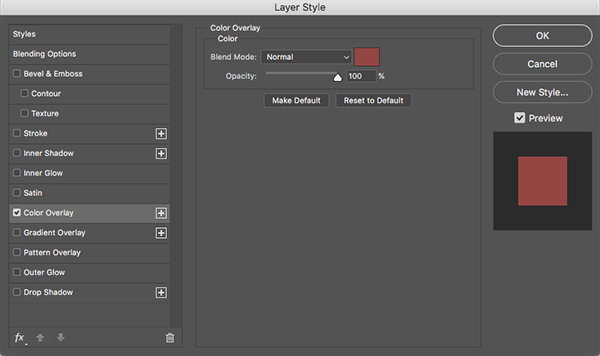
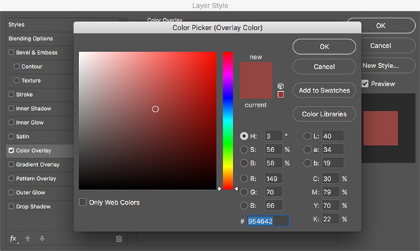
For the fill color let’s use a dark red color with a hex value of #954642 and then press ‘OK’ twice to close the dialog boxes and apply the changes.
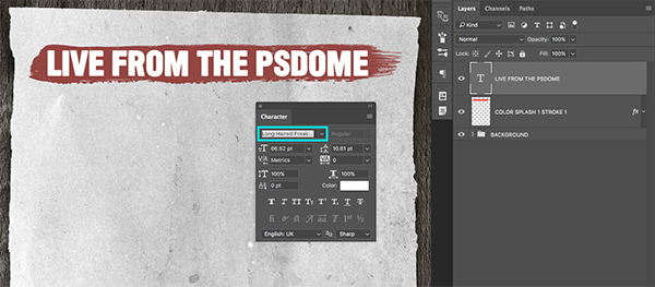
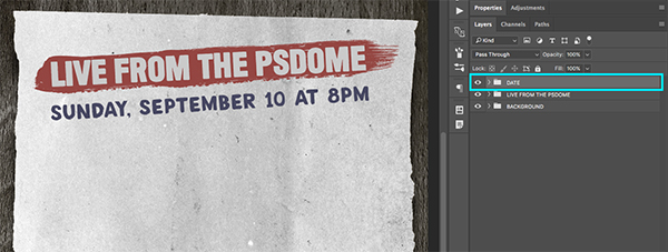
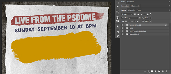
Create a new layer above the stroke layer and press ’T’ on the keyboard to switch to your Type Tool. Click inside of the stroke and type out the words ‘Live from the PSDome’ in all caps. For the typeface we will be using a free font called ‘Long Haired Freaky People’ which can be downloaded from daFont.com. You will want to make sure that the size of the text fits nicely inside of the stroke – here the size of my copy is about 66.5 pt as shown below:
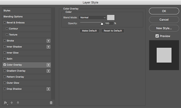
Double click on the text layer to bring up the Layer Style dialog box and check off the ‘Color Overlay’ option once again.
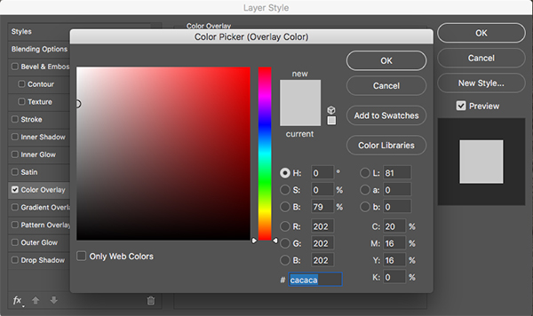
This time for the fill color we will use a medium grey color such as #CACACA before pressing ‘OK’ two more times to close out of the dialog boxes and apply the color change.
Select the text layer, hold the Shift Key, and then select the brush stroke layer below. Press Command/Ctrl+G to put them into a new Group Folder and call it ‘Live From the PSDome’ as shown here:
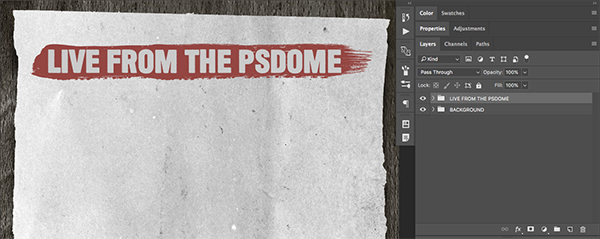
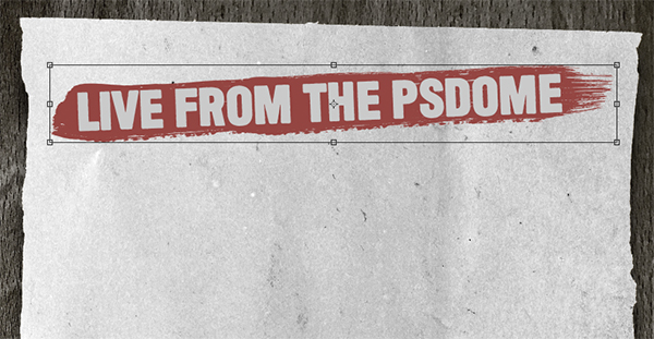
Select the ‘Live From the PSDome’ folder and press Command/Ctrl+T to initiate a Free Transform, and then move your cursor over any of the four corners of the bounding box around the shape to rotate it counter clockwise slightly. This will help make the stroke and the text appear more dynamic. Your image should look something like this:
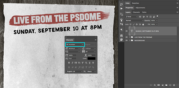
Step 17: Time and Date
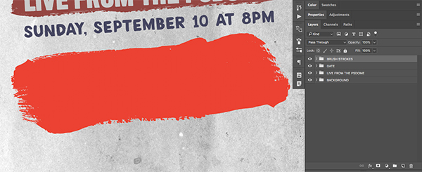
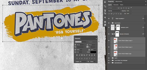
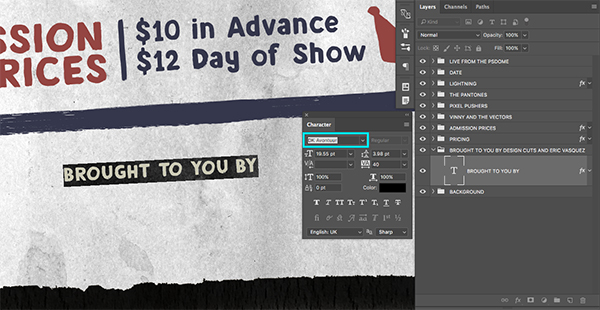
Create a new layer at the top of the Layers Palette and switch back to the Type Tool (T). Type out the words ‘Sunday, September 10 AT 8PM’ in all caps. For the typeface here we will be using another free typeface from daFont.com called ‘DK Avontuur’ with a size of about 40 pt so that it spans about the same width as the line of copy in the red stroke. Once you have typed out the time and date, press Command/Ctrl+T and rotate the text counter clockwise so that the angle is the same as the line above.
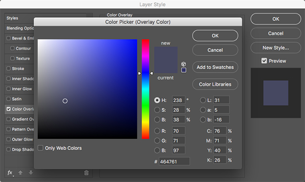
Double click on the text layer to bring up the Layer Style dialog box and check off the ‘Color Overlay’ option as shown here:

For the fill color we will use a hex value of #464761 before pressing ‘OK’ two times on the keyboard to close out of both dialog boxes and apply the color changes.
Select the new text layer and press Command/Ctrl+G to put it into a Group Folder and change the name to ‘Date’ and your image should now look like this:
Step 18: Paint Stripes
Open the ‘color_splash_1_stroke_1.eps’ file in Illustrator from the freebies folder for this tutorial.
NOTE: This freebie is unfortunately not available. However, we have provided a comprehensive set of brush stroke vectors, courtesy of Chris Spooner. These should work perfectly for the creation of this poster.
Copy the brush stroke by pressing Command/Ctrl+C and then return to Photoshop and paste it by pressing Command/Ctrl+V on the keyboard. When prompted with the ‘Paste’ dialog box, choose the first option that says ’Smart Object’ and then press ‘OK’ to paste the stroke.
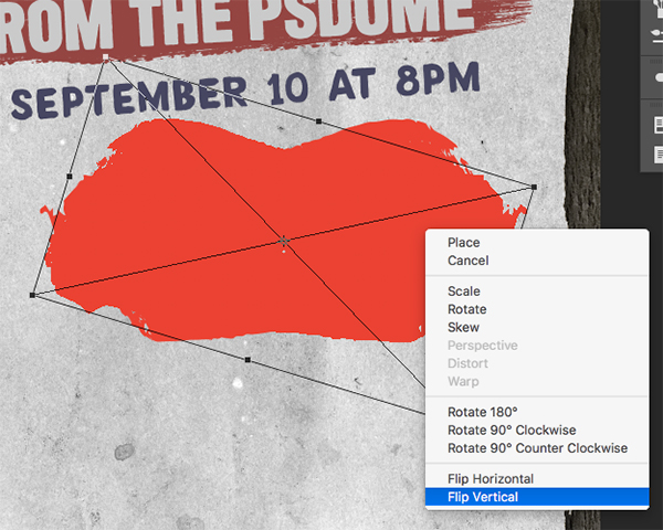
Press Command/Ctrl+T to apply a Free Transform and then scale the stroke up by dragging outwards from the corner of the bounding box while holding the Shift Key and then hold the Control Key and click on the stroke to reveal a dropdown menu. From the menu that appears, choose the ‘Flip Vertical’ option as shown below:

After you’ve flipped the stroke and scaled it up, press ‘Enter’ to apply the changes and your image should now look something like this:
Step 19: Paint Stripes
Open the ‘color_splash_2_stroke_3.eps’ file in Illustrator from the freebies folder for this tutorial and then copy it by pressing Command/Ctrl+C.
NOTE: This freebie is unfortunately not available. However, we have provided a comprehensive set of brush stroke vectors, courtesy of Chris Spooner. These should work perfectly for the creation of this poster.

Paste the stroke into Photoshop as a Smart Object just as we did in the previous step. From there, turn off the visibility of the previous stroke layer so you can see this new one by itself. Use the Free Transform to scale the stroke up so that it looks like this:

Press ‘Enter’ to apply the transformation, and then press Command/Ctrl+J to duplicate the Smart Object. From here, press Command/Ctrl+T to once again do a Free Transform, and then hold the Control Key and click on the stroke to reveal the dropdown menu. When the menu appears, choose the ‘Flip Horizontal’ option as shown below:

Hold the Control Key and click once again, and this time choose ‘Flip Vertical’ from the list.
Rotate the stroke slightly and move it over to the left before pressing ‘Enter’ on the keyboard to apply the changes. Slide this stroke over to the left and then you can now turn the visibility of the first stroke layer back on and space them out so it looks like one long brush stroke. Once you are happy with the size and positioning of the strokes, select the top brush stroke layer, and then hold the Shift Key and select the third brush stroke so that all three of the brush stroke layers are selected at the same time.

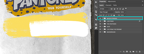
Press Command/Ctrl+G to place all three of the brush strokes into a new Group Folder and name the folder ‘Brush Strokes’ as shown below:
Step 20: Paint Color
Double click on the newly created ‘Brush Strokes’ folder to open the Layer Style dialog box and check off the ‘Color Overlay’ option.
For the fill color let’s enter the value #CA9400 as shown below:
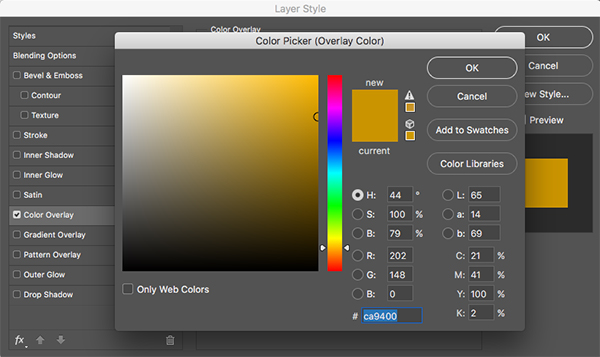
Click ‘OK’ twice to apply the changes and close out of both dialog boxes and you should now have something like this:
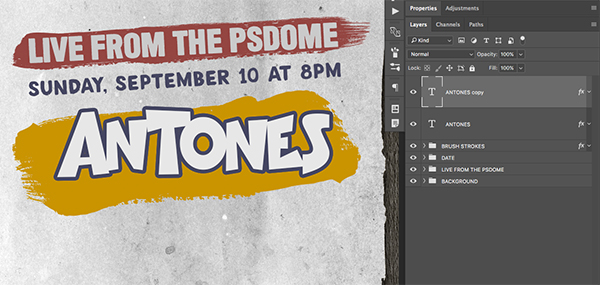
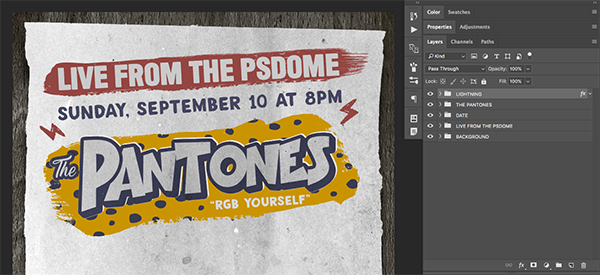
Step 21: Pantones
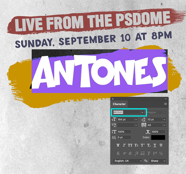
Create a new layer above the ‘Brush Strokes’ folder and switch to your Type Tool (T). From here, click on your canvas and type out the word ‘Antones’ in all caps. Here we will be using another free font from daFont.com called ‘Bromo’ with a size of about 184 points as shown below:
Double click on the text layer to bring up the Layer Style dialog box and check off the ‘Color Overlay’ option.
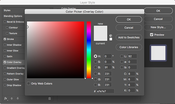
For the fill color enter a hex value of #E7E7E7 as shown below:
Press ‘OK’ to close out of the ‘Color Overlay’ color picker dialog box and then check off the ‘Stroke’ option. For the settings, make sure that the size is set to about 29-30 px and that the position is set to ‘Outside’ as shown below:
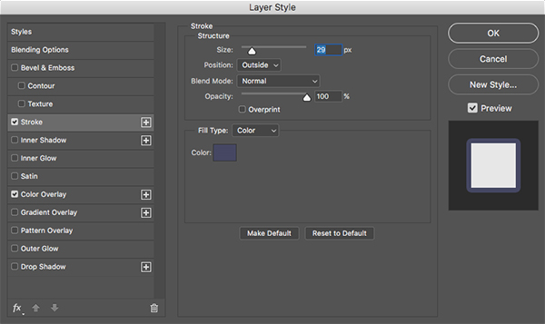
For the stroke color, enter a hex value of #454762 as shown here:

Press ‘OK’ to apply the changes and close out of both dialog boxes. Once you see your updated text layer, press Command/Ctrl+J to create a copy of it directly above the original.
Press ’T’ to switch back to your Type Tool and then click inside of the word ‘Antones’ and delete all of the letters on the duplicate layer. Here we simply want to type the letter ‘P’ so that this letter is on a layer by itself. Next, move this layer over to the left so that it overlaps the letter ‘A’ and completes the word ‘Pantones’ as shown below:
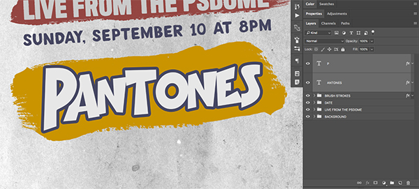
You may want to do a Free Transform (Command/Ctrl+T) and rotate the entire word slightly so that it matches up with the angle and direction of the other shapes and text layers. Once you have done that, select the ‘P’ layer and then hold the Shift Key and select the ‘Antones’ layer directly below it. Then, hold the Control Key and click on either of the two layers. You should now see a dropdown menu appear where we can choose the ‘Convert to Smart Object’ option as shown in the image below:

You should now have something like this:

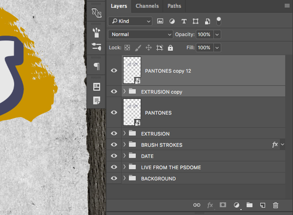
Step 22: Custom Action
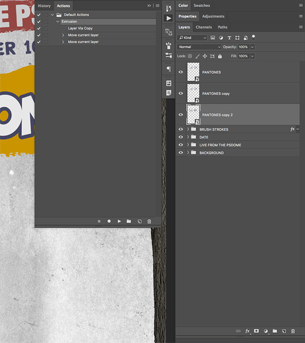
Select the ‘Pantones’ Smart Object layer and then press Command/Ctrl+J to make a copy of it. Click and drag this duplicate layer below the original and then click on the small icon that looks like a play button to open the Actions Panel. If you don’t see the icon here, go to the Window Menu and choose ‘Actions’ from the list.
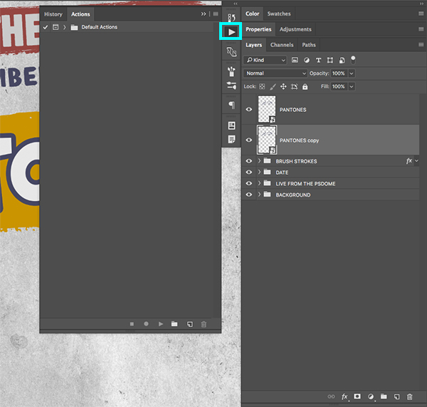
With the ‘Pantones copy’ layer selected in your Layers Palette, click on the ‘New Action’ icon at the bottom of the Actions Panel. You will then be prompted with a dialog box where you can enter a name for your action – for now let’s call this ‘Extrusion’ as shown below:

Once you have given your action a name, go ahead and hit the ‘Record’ button to begin recording your action. With the ‘Pantones copy’ layer still selected, press Command/Ctrl+J to make a copy of it, and then press Command/Ctrl+[ to move the layer down one spot so that it moves down in the layer stack. Then, press the down arrow once and the right arrow once to offset the copy one pixel in each direction. After you have done that, go ahead and click on the ‘Stop’ button to stop recording your action. You have now finished recording your custom action!
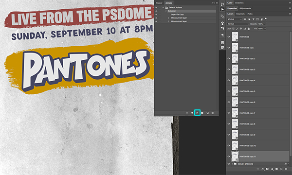
Select the bottom ‘Pantones copy 2’ layer and then press the ‘Play’ button in the Actions Panel to play your new action. Do this about nine or ten more times to create the illusion of a 3d extrusion effect. Your image should now look like this:
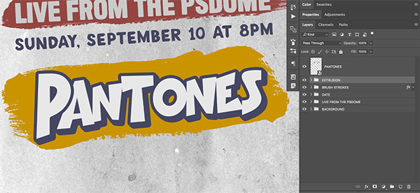
Select the first ‘Pantones copy’ layer, just below your original ‘Pantones’ Smart Object and then hold the Shift Key and select the last copy so all of the extruded layers are selected simultaneously. From here, press Command/Ctrl+G to place these layers into a Group Folder and rename the folder ‘Extrusion’ as shown below:
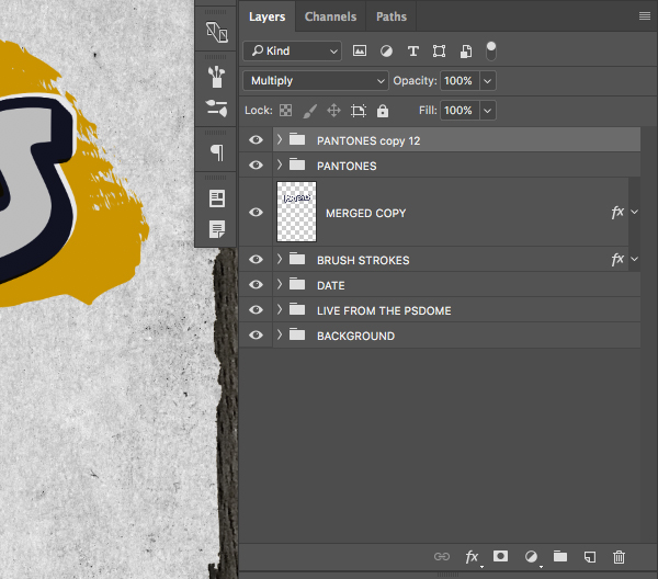
Step 23: Offset Effect
Select the top ‘Pantones’ Smart Object, hold the Shift Key, and then select the ‘Extrusion’ folder directly below it as shown here:
Press Command/Ctrl+J to duplicate both of these two layers above the originals.
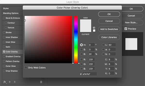
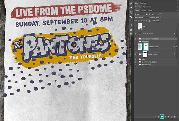
With both of the duplicate layers selected press Command/Ctrl+E to merge them together. After that, rename the layer ‘Merged Copy’ and move it below the original ‘Extrusion’ folder. Once you have done that, move the ‘Fill’ slider for the merged layer all the way to ‘0%’ so that the layer disappears.

Double click the merged layer to bring up the Layer Style dialog box and check off the ‘Color Overlay’ option.

For the fill color we will once again use the hex value #E7E7E7 and then press ‘OK’ twice to apply the changes and close out of both dialog boxes.
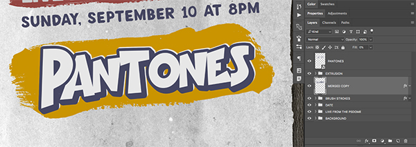
Tap the ‘Merged Copy’ layer up and to the right a few times to create an offset effect so that you end up with something like this:
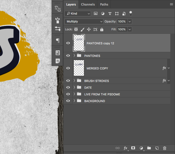
Step 24: Knockout Effect
Select the top ‘Pantones’ Smart Object, hold the Shift Key, and then select the ‘Extrusion’ folder directly below it once again as shown below:
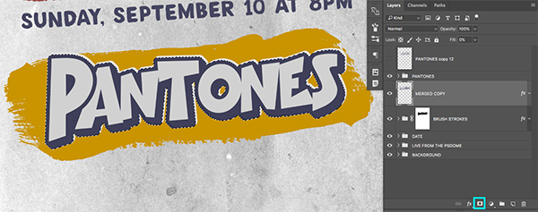
Press Command/Ctrl+G to place these two layers into a new Group Folder and change the name of the folder to ‘Pantones’ before switching the Blending Mode of the new folder from ‘Normal’ to ‘Multiply’ as shown here:

With the new ‘Pantones’ folder selected, create a copy of it by pressing Command/Ctrl+J.
Press Command/Ctrl+E to merge the whole folder into a single layer.
Poke the eyeball out to turn the visibility of this newly merged layer off, and then hold the Command/Ctrl Key and click on the layer thumbnail icon to activate a selection around the text that should include the extrusion as shown below:
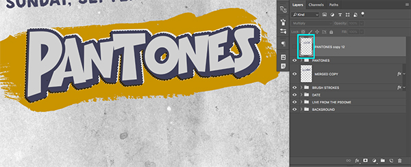
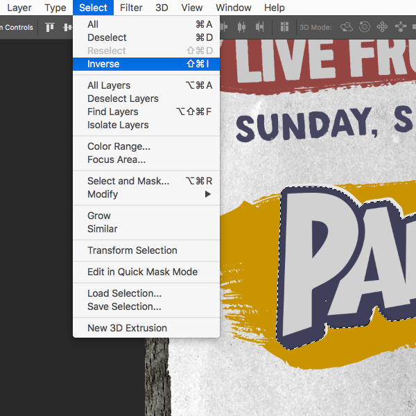
Go to the Select Menu and choose the ‘Inverse’ option to inverse the active selection.
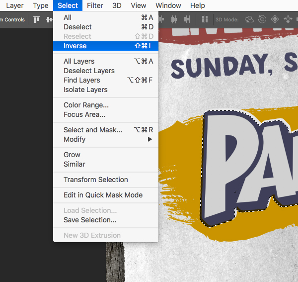
Select the ‘Brush Strokes’ folder and then click on the ‘Add Layer Mask’ icon found at the bottom of the Layers Palette. This will knock the text out of the brush strokes, but in order to see the effect we will also need to hold the Command/Ctrl Key and click on the layer thumbnail icon for the ‘Merged copy’ layer just below the ‘Pantones’ folder to activate another selection.
Return to the Select Menu and once again choose the ‘Inverse’ option.
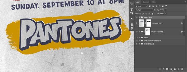
With your ‘Merged copy’ layer still selected, and your selection inverted, click on the ‘Add Layer Mask’ icon once again to apply a mask to this layer as well. You should now be able to see the grungy paper texture through the word ‘Pantones’ as shown below:

You can now select the very top merged layer and remove it. This should be the layer that we had already turned off that we were just using to create a selection. You should now just have the ‘Pantones’ folder, the ‘Merged copy’ layer below it, and the ‘Brush Strokes’ folder below that.
Step 25: Song Names
Create a new layer at the top of your Layers Palette and switch back to your Type Tool (T) before clicking just below the ‘Ones’ in the word ‘Pantones’ and typing out the words ‘RGB Yourself’ in all caps with quotation marks. For the typeface we will be using the free font ‘DK Avontuur’ that we used earlier. For the fill color we will use the same hex value that we applied to our offset text from before – #E7E7E7.
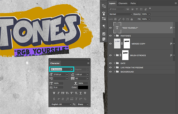
If your song title is getting cut off on the bottom like the image above, then you may need to extend the brush strokes down a bit. To do this, click the small arrow next to the ‘Brush Strokes’ folder to reveal the contents of the folder. Hold the Shift Key and select the first brush stroke shape inside the folder, and then select the third so that all three are selected together. From here, Press Command/Ctrl+T to initiate a Free Transform, hold the Alt/Option Key and drag downwards from the middle handle on the bounding box until you have extended the color enough behind the song name so you end up with something like this:
Step 26: Lovely Quotes
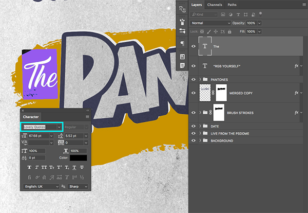
Create a new layer at the top of your Layers Palette and grab your Type Tool (T) before clicking next to the word ‘Pantones’ and typing out the word ‘The’ with an uppercase ’T’. For the typeface we will be using another nice free font called ‘Lovely Quotes’ that can be downloaded from daFont.com.
Double click the layer to open the Layer Style box and check off the ‘Color Overlay’ option.

For the fill color enter a hex value of #E7E7E7 like we have been using for the lighter offset and song titles. Then, press ‘OK’ to apply the color change.

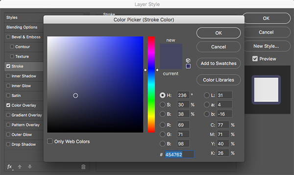
Before closing out of the Layer Style box all together, we also want to check off the ‘Stroke’ option using the same settings that we applied to our text earlier. This should have a size of ’29 px’ with a position of ‘Outside’ as shown here:

For the hex value let’s use #454762 as shown in the image below:
Step 27: Second Round KO
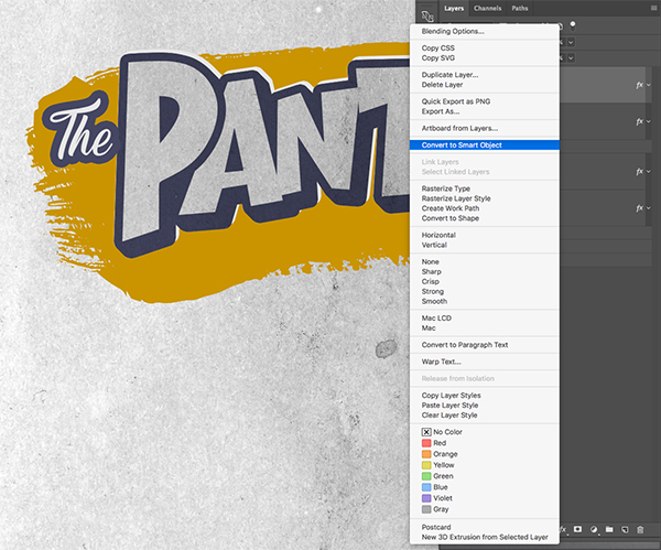
Hold the Control Key and click on the layer containing your ‘The’ text to reveal a dropdown menu. From here, choose the ‘Convert to Smart Object’ option to change your copy into a Smart Object.
Tap the word over to the left using your arrow keys so the stroke does not overlap the letter ‘P’ in ‘Pantones’ to give a bit of separation between the two words. After that, change the Blend Mode of the layer to ‘Multiply’ and then hold the Command/Ctrl Key and click on the layer thumbnail icon to activate a selection around the word as shown here:

With the selection still active, click on the Layer Mask attached to the ‘Brush Strokes’ folder and then make sure your foreground color is set to black and press Alt/Option+Delete to fill the selection with black. You should now see the paper texture through the word ‘The’ just like we did with the ‘Pantones’ text earlier on.
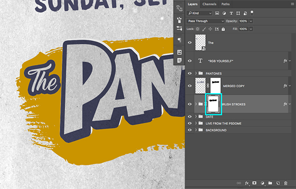
Step 28: Polka Dots
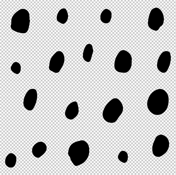
Next, open the ‘handrawn_pattern_59-01.png’ file from the freebies folder for this tutorial.
Click and drag the handrawn pattern into your document and place it just above the ‘Pantones’ folder. Press Command/Ctrl+T and rotate the image clockwise as shown here:

Press Command/Ctrl+J and create two more copies of the pattern and move each copy over towards the right so that the whole word and brush stroke is covered by the pattern.
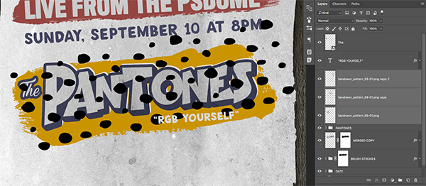
Press Command/Ctrl+J and create two more copies of the pattern and move each copy over towards the right so that the whole word and brush stroke is covered by the pattern. When you are happy with the size and placement of the dots, select the first copy, hold the Shift Key, and then click on the bottom copy so they are all selected together. From here, press Command/Ctrl+E to merge all three layers into one, and then change the name of the layer (here I am just using the name of the file).
Double click on the layer to bring up the Layer Style box and check off the ‘Color Overlay’ option.
For the fill color enter a hex value of #464761 as shown below:
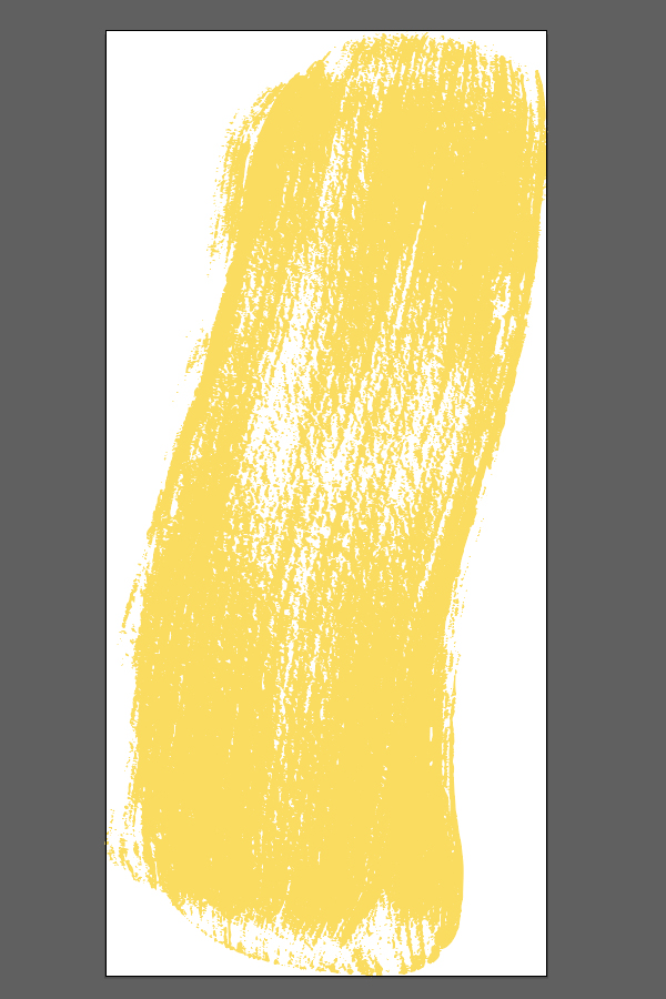
Press ‘OK’ two times to apply the color changes and close out of the dialog boxes. From here, press Command/Ctrl+J to create another two copies of the purple dot pattern and move them around to find a rough placement for the dots that you are happy with. The main thing we are looking to do here is cover areas of the orange/yellow color.

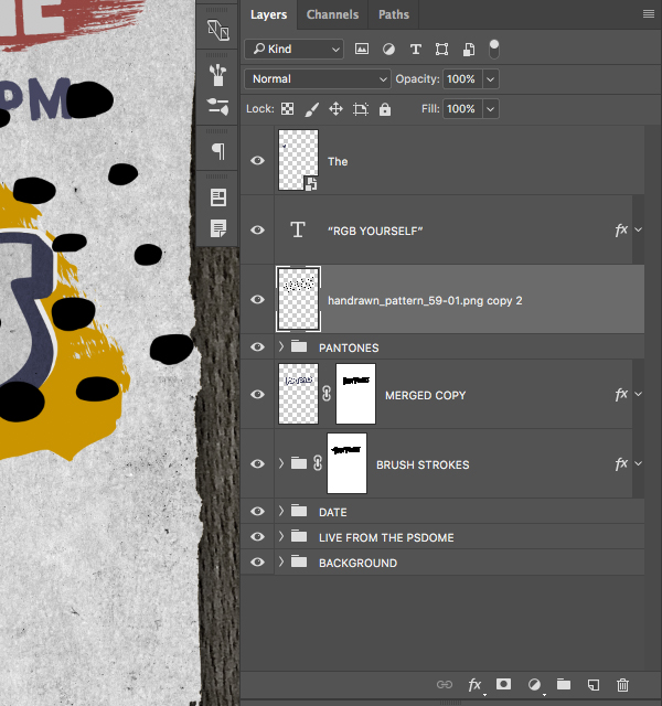
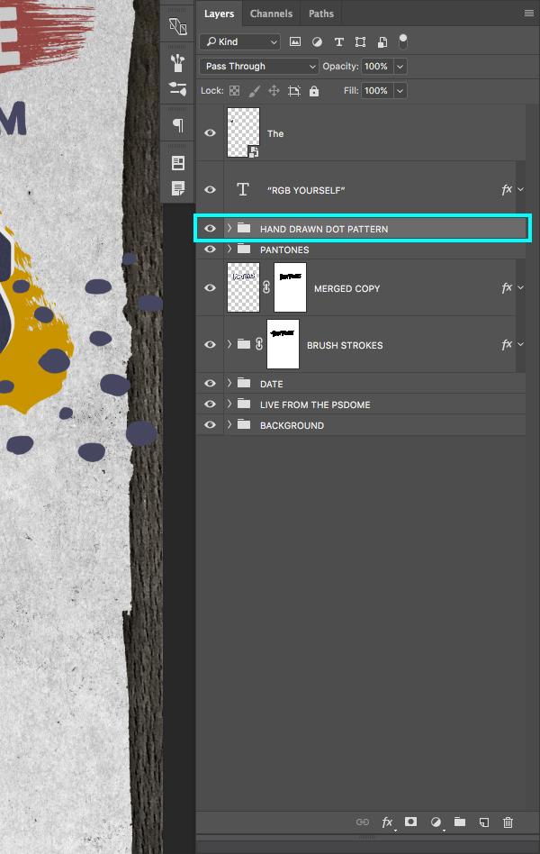
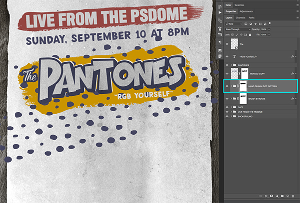
Once you are happy with the placement of all of your handrawn dots, select the first copy, hold the Shift Key, and once again select the third copy (or whatever the last copy that you have is in your Layers Palette.) After that, press Command/Ctrl+G to place all of the copies into a new Group Folder and name it ‘Hand Drawn Dot Pattern’ as shown below:
Step 29: Dot Masks
Make sure your ‘Hand Drawn Dot Pattern’ folder is selected in your Layers Palette and then hold the Command/Ctrl Key and click on the layer mask thumbnail icon of the ‘Merged copy’ layer to activate a selection around it. Next, click on the ‘Add Layer Mask’ icon at the bottom of the Layers Palette to apply a mask to the dot pattern folder.
Click and drag the ‘Hand Drawn Dot Pattern’ folder down so that it’s just above the ‘Brush Strokes’ folder as shown here:
Click the arrow next to the ‘Brush Strokes’ folder to expand the folder. Hold the Shift Key and the Command/Ctrl Key and click on the layer thumbnail icon for each of the three brush stroke shapes so that you will end up with an active selection around the entire shape.

From here, go to the Select Menu and choose ‘Inverse’ from the dropdown menu.
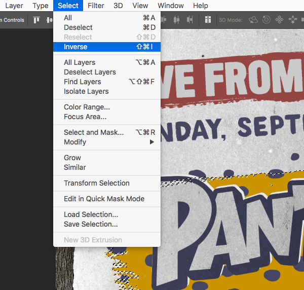
Make sure that your foreground color is set to black and then click on the layer mask icon attached to your ‘Hand Drawn Dot Pattern’ folder and press Alt/Option+Delete on the keyboard to fill everything outside of the brush stroke shape with black. You should now only see the dot pattern inside of the brush stroke shape.
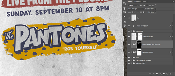
Double click on the ‘Hand Drawn Dot Pattern’ folder and check off the ‘Color Overlay’ option.

For the hex value enter #393B51 before pressing ‘OK’ to apply the changes and close out of both of the dialog boxes.
Select the top layer (should be the word ‘The’) and then hold the Shift Key and click on the ‘Brush Strokes’ folder so that all of the layers and folders associated with this group are selected at the same time.
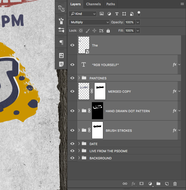
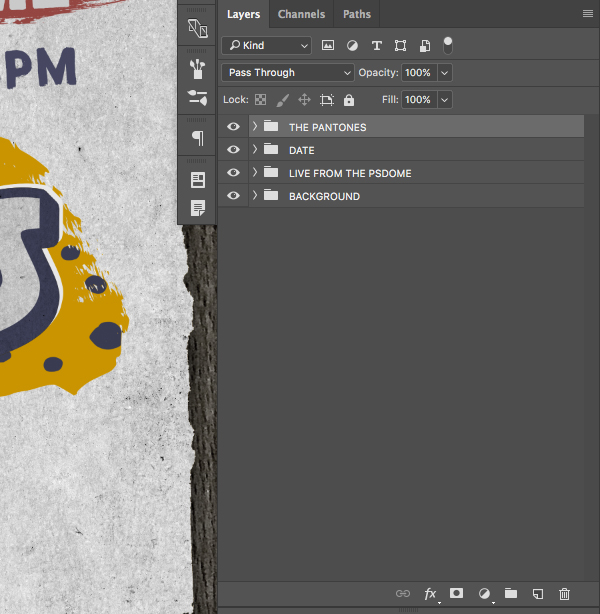
Press Command/Ctrl+G on the keyboard to place all of these layers into a new Group Folder and change the name to ‘The Pantones’ so that all of these layers and folders are together in one folder. Your layers should now look like this:
Step 30: Ride the Lightning
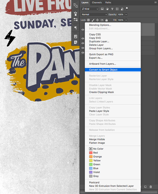
Next, open the ‘inky_doodle_lightning.png’ file from the freebies folder.

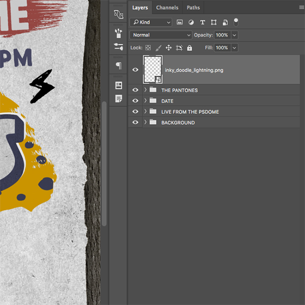
Click and drag the file into your main Photoshop document and place it at the top of the Layers Palette. Hold the Control Key and click on the layer before choosing ‘Convert to Smart Object’ from the dropdown menu that appears. After that, double click on the layer name to rename the layer and give it a name of your choosing (I am just going to use the file name).
Press Command/Ctrl+T to initiate a Free Transform and then rotate the lightning bolt and position it in between the time/date and the ‘Pantones’ lockup we created like the image below:
Press Command/Ctrl+J to make a copy of the lightning bolt and rotate and transform it before placing it over on the left side of the image as shown below:
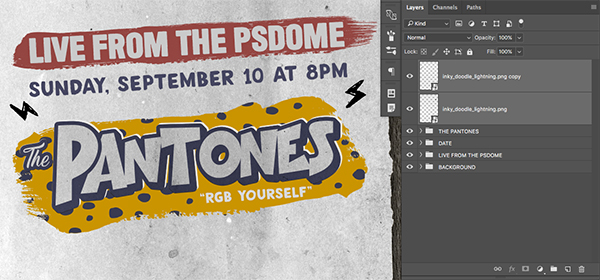
Select both layers while holding the Shift Key and press Command/Ctrl+G to put them into a new folder named ‘Lightning’ as shown here:

Double click on the ‘Lightning’ folder and check off the ‘Color Overlay’ option.
For the hex value enter #954642 before pressing ‘OK’ to apply the changes and close out of both of the dialog boxes.
At this point you may wish to move some of these elements a bit closer together so you end up with your image looking something like this:
Step 31: Color Splash
Next, open the ‘color_splash_1_stroke_3.eps’ file from the freebies folder.
NOTE: This freebie is unfortunately not available. However, we have provided a comprehensive set of brush stroke vectors, courtesy of Chris Spooner. These should work perfectly for the creation of this poster.
Copy and paste this shape from Illustrator over into Photoshop as a Smart Object and then rotate and stretch the brush stroke so that it looks like the image shown here:
Press Command/Ctrl+J two times to create two more copies of the Smart Object. Place these on top of each other to create a more solid looking shape so you end up with something like this:
Next, open the ‘color_splash_2_stroke_2.eps’ file from the freebies folder.
NOTE: This freebie is unfortunately not available. However, we have provided a comprehensive set of brush stroke vectors, courtesy of Chris Spooner. These should work perfectly for the creation of this poster.

Copy and paste this shape from Illustrator into Photoshop as a Smart Object and lay it sideways over the right side of the previously added brush stroke shapes. Then, once you are happy with the size and placement of these brush strokes, select the first shape at the top of your Layers Palette, hold the Shift Key, and then select the last of the brush stroke shapes before pressing Command/Ctrl+G to place them all into a Group Folder. From here, change the name of the folder to ‘Brush Strokes’ as shown below:
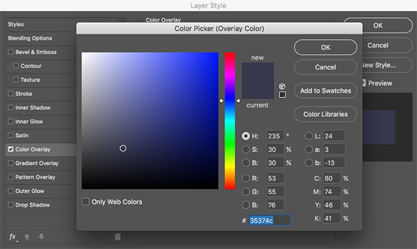
Step 32: Indigo Vibes
Double click on the newly created ‘Brush Strokes’ folder to open the Layer Style dialog box and check off the ‘Color Overlay’ option as shown below:

For the fill color enter a hex value of #35374C as shown here:
Press ‘OK’ twice to apply the changes and close out of the dialog boxes and you should now have something like this:

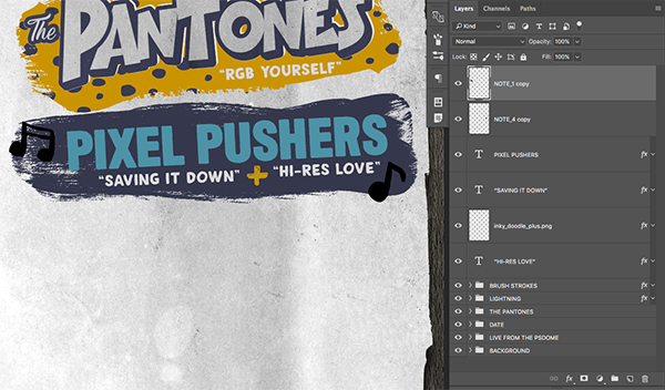
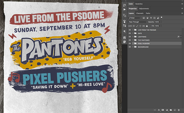
Step 33: Pixel Pushers
Create a new layer at the top of the Layers Palette and press ’T’ to switch to your Type Tool. Click on the new brush stroke shape and type out the words ‘Pixel Pushers’ in all caps using the ‘Long Haired Freaky People’ that we used earlier on. Press Command/Ctrl+T and rotate the text counter clockwise a bit so that the angle of the text matches the angle of the other shapes and the brush strokes behind it.
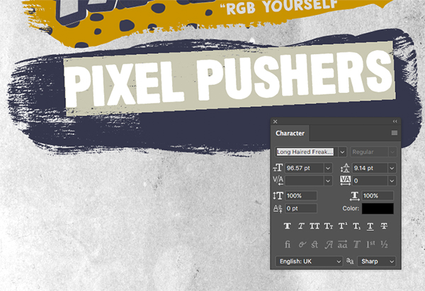
Double click on the text layer and check off the ‘Color Overlay’ option.
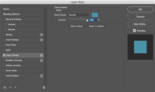
For the fill color let’s enter a hex value of #4D93A7 as shown below:

Navigate to the ‘RGB Yourself’ text from ‘The Pantones’ folder and press Command/Ctrl+J to duplicate the layer. Move this layer up in the layer stack outside of the folder so that it’s just below the ‘Pixel Pushers’ text layer. Switch to your Type Tool (T) and click inside of the text box and change the text to read ‘Saving It Down’ in all caps with quotation marks around it. Press Command/Ctrl+J to create a copy of this layer and move it over to the right before changing this text to read ‘Hi-Res Love’ again in all caps with quotation marks. Place both of these text layers just below the ‘Pixel Pushers’ type inside of the brush stroke so that it looks like this:

Step 34: Plus One
Open the ‘inky_doodle_plus.png’ file from the freebies folder.
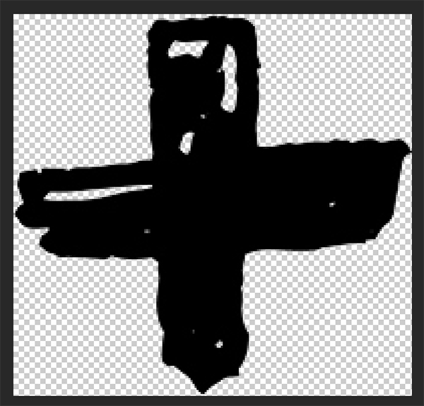
Click and drag the plus symbol into your Photoshop document and double click on the layer name to rename it.
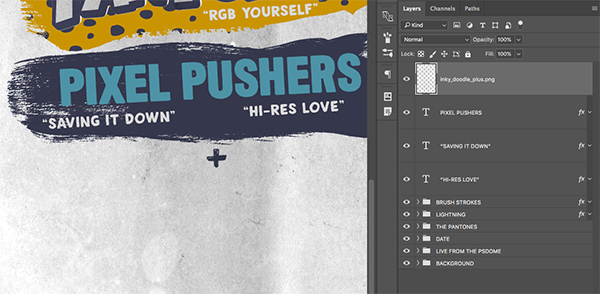
Double click on the layer to bring up the Layer Style box and apply a ‘Color Overlay’ effect.
For the fill color enter a hex value of #C19614 and then press ‘OK’ twice to apply the changes and close out of both dialog boxes. After that, move the plus symbol in between both of the song titles that we just created.
Step 35: All the Right Notes
Open the ‘NOTE_1.png’ and ‘NOTE_4.png’ files from the freebies folder for the tutorial.
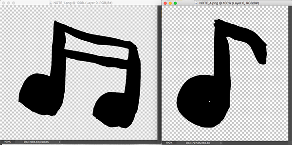
Drag both of these symbols into your document and rename each of the layers to their respective file names. Use the image below as a guide for the size and placement of each of the two music notes.
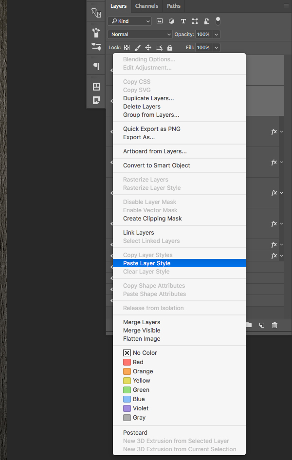
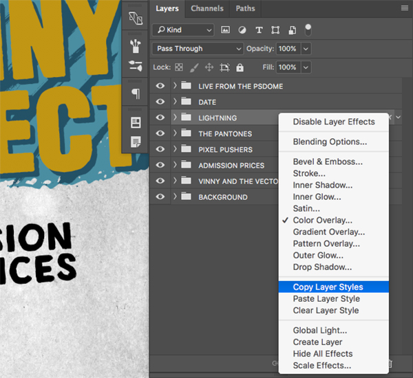
Hold the Control Key and click on the ‘Lightning’ folder to reveal a dropdown menu. From this list, choose the ‘Copy Layer Styles’ option as shown here:

Select the first note at the top of the Layers Palette, then hold the Shift Key and click on the second note symbol so they are both selected together.
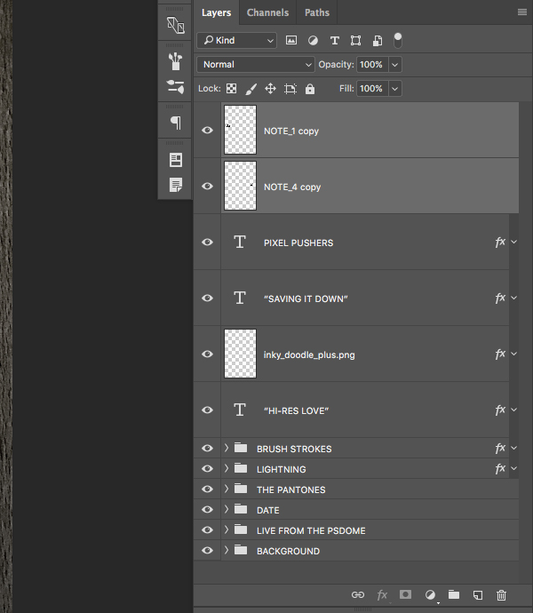
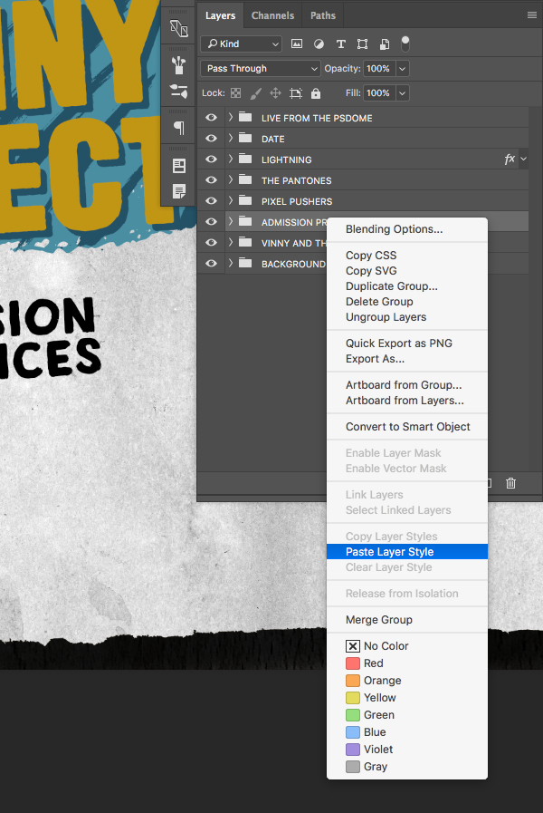
Hold the Control Key again and click on either of the two note layers to once again reveal a dropdown menu. This time, choose the ‘Paste Layer Style’ option from the list as shown below:
Both of your note symbols should now be the same red color as the lightning. Once you have done that, select the very top layer in your Layers Palette (which should be one of the two notes) and then hold the Shift Key and select the ‘Brush Strokes’ folder. From here, press Command/Ctrl+G to place all of these layers and folders into a new Group Folder and rename it ‘Pixel Pushers’.

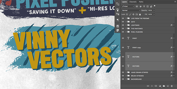
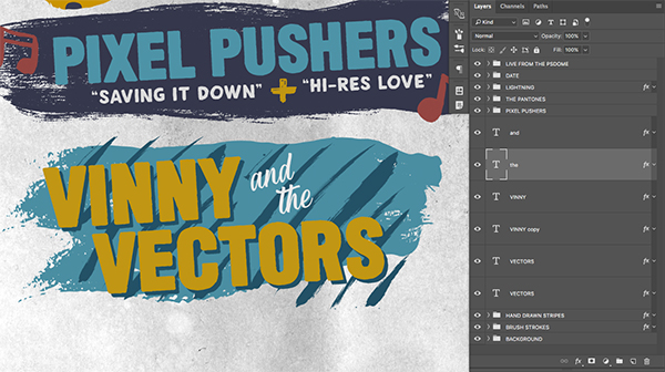
Now that we have started to build up a few nicely organized folders I am going to re-order the layers to be in the order that they appear. Here is the order that I have below:
Step 36: Adding Another Coat
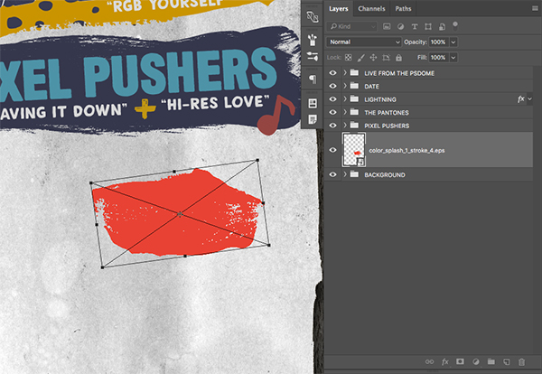
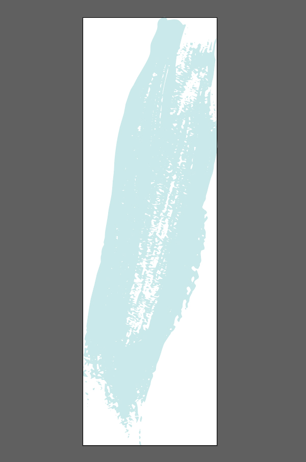
Open the ‘color_splash_1_stroke_4.eps’ file from the freebies folder.
NOTE: This freebie is unfortunately not available. However, we have provided a comprehensive set of brush stroke vectors, courtesy of Chris Spooner. These should work perfectly for the creation of this poster.
Copy and paste the shape from Illustrator over to Photoshop as a Smart Object and then scale it up and rotate it using the image below as a reference:
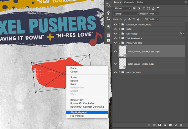
Press Command/Ctrl+J to duplicate the layer, and then press Command/Ctrl+T to initiate a Free Transform. From here, hold the Control Key and click on the shape to reveal the dropdown menu where we are going to select ‘Flip Horizontal’ from the list.
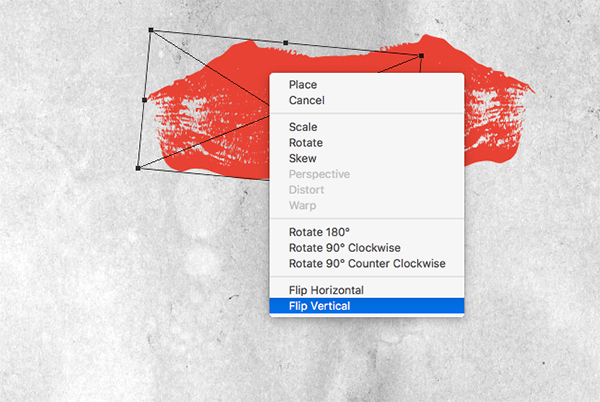
After we flip the shape horizontally, hold the Control Key and click again, this time choosing ‘Flip Vertical’ from the menu.
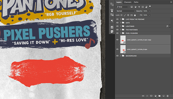
Spread the two brush stroke shapes apart so there is just a bit of overlap in the center where the two shapes join together. You should end up with something like this:
Step 37: Additional Paint
Open the ‘color_splash_2_stroke_4.eps’ file from the freebies folder.
NOTE: This freebie is unfortunately not available. However, we have provided a comprehensive set of brush stroke vectors, courtesy of Chris Spooner. These should work perfectly for the creation of this poster.
Copy and paste the shape from Illustrator over to Photoshop as a Smart Object and make it larger by dragging outwards from any corner of the bounding box while holding the Shift Key. Position the shape so that it matches the image below:
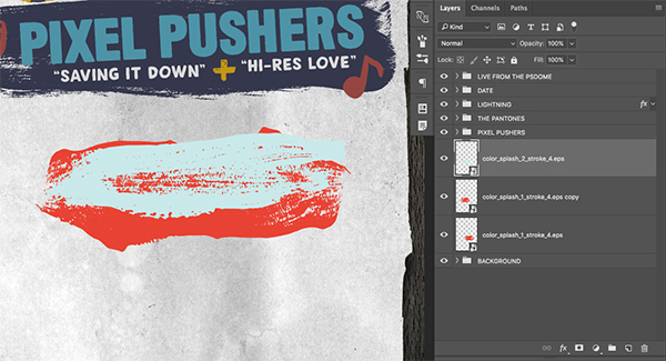
Press Command/Ctrl+J to duplicate the layer two more times and then flip and overlap the shapes to create a more solid looking brush stroke.
When you are happy with the size and placement of the strokes select the first shape, hold the Shift Key, and then select the last brush stroke shape in your Layers Palette. From here press Command/Ctrl+G to put all of the shapes into a new folder and double click the layer name to change it to ‘Brush Strokes’ as shown here:
For the fill color let’s enter a hex value of #4A8EA2 as shown here:

Press ‘OK’ twice to apply the changes and close out of the bounding boxes. The shapes in your folder should now look like one solid blue paint stroke.

Step 38: Hand Drawn Stripes
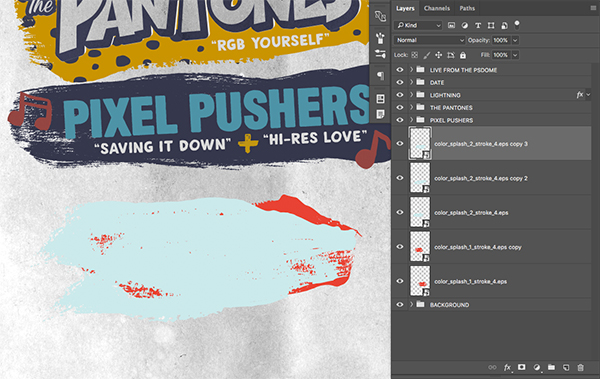
Open the ‘handrawn_pattern_41-01.png’ file from the freebies folder.
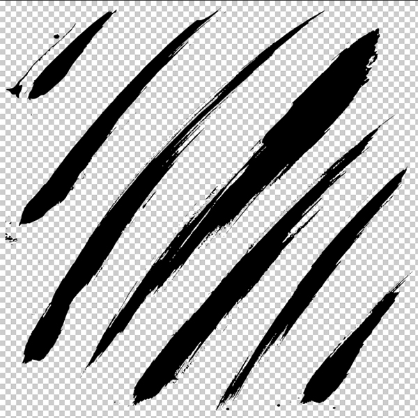
Drag the layer into your document and rename the layer with the actual file name. Here I have applied a Free Transform and scaled the stripes down by pressing Command/Ctrl+T and then dragging inwards from the corner bounding box while holding the Shift Key and placing the stripes on top of the brush strokes like this:
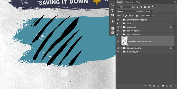
Press Command/Ctrl+J to duplicate the layer and then move it over to the right.
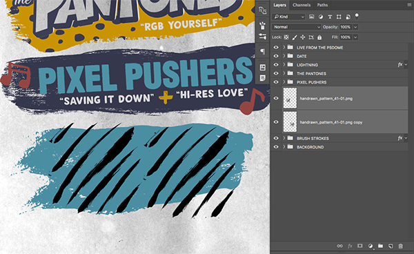
Select both layers while holding the Shift Key and then press Command/Ctrl+G to put them into a new folder. Change the name of the Group Folder to ‘Hand Drawn Stripes’ as shown here:
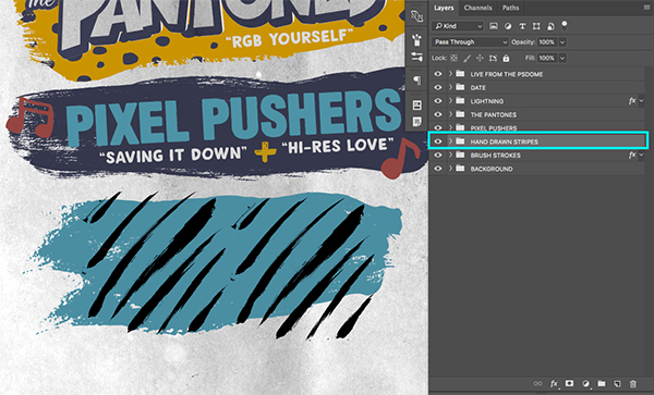
Double click on the folder to bring up the Layer Style box and check off ‘Color Overlay’ once again.
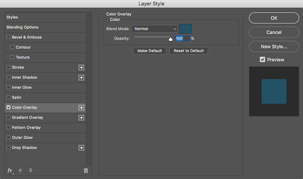
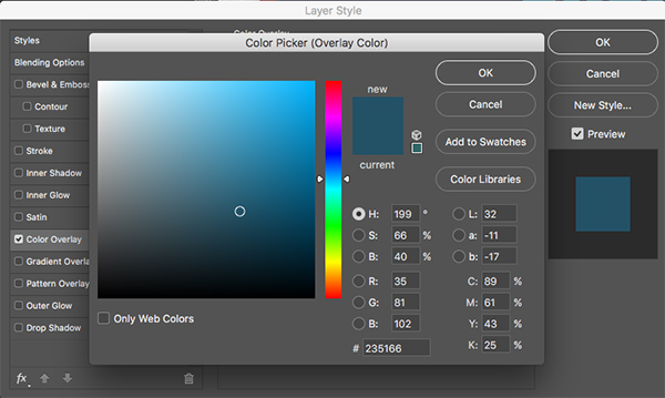
For the fill color let’s enter a hex value of #235166 and then press ‘OK’ twice to apply the changes and close out of the dialog boxes.
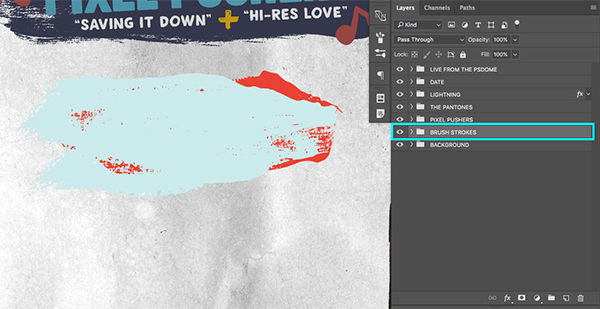
Step 39: Vinny and the Vectors
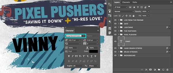
Create a new layer above the ‘Hand Drawn Stripes’ folder and switch back to your Type Tool (T). Type out the name ‘Vinny’ in all caps using the ‘Long Haired Freaky People’ typeface and rotate the text slightly so that it matches the angle of the text above it.
Double click the text layer and check off the ‘Color Overlay’ option in the Layer Style dialog box.

For the fill color let’s use the hex value #C19614 as shown below:

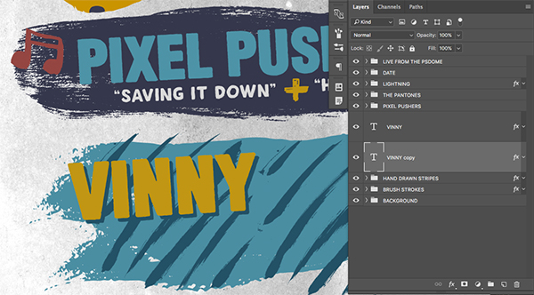
Select the ‘Vinny’ text and press Command/Ctrl+J to duplicate it. Drag the layer down so that it’s below the original copy and then double click on it to bring the Layer Style box back up. This time, change the fill color for this duplicate layer to # #235166 so that it matches the blue of the ‘Hand Drawn Stripes’ folder. Next, press ‘OK’ to apply the changes and then tap this copy of the text down and to the right a few times with your arrow keys so you end up with something like this:
Select both of these layers and press Command/Ctrl+J to duplicate them both. Click and drag them down so the copies are below the original two text layers and then change the text for both the orange and blue copies to say ‘Vectors’ in all caps. Move both of these layers down and to the right so your image looks like this:
Step 40: Catchwords
Create a new layer above the previous text layers and use your Type Tool (T) to type out the word ‘and’ in all lowercase letters. For the typeface let’s use the free ‘Lovely Quotes’ font that we used earlier.
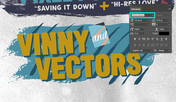
Double click the text layer and check off the ‘Color Overlay’ option in the Layer Style dialog box.
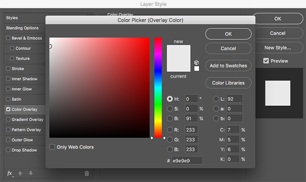
For the fill color let’s use the hex value #E9E9E9 as shown below:
After applying the changes and closing out of the dialog box, select the ‘and’ layer and press Command/Ctrl+J to duplicate it. Move the copy down below the word ‘and’ and you can also move the actual layer below the previous layer. Click inside of the text box with the Type Tool (T) and change the text to ‘the’ using all lowercase once again. From here, tap the layer down and to the right so that it appears to be offset.
Select the top ‘and’ text layer, hold the Shift Key and then select the bottom ‘Brush Strokes’ folder so that all of these layers are selected simultaneously.
With all of these layers selected, press Command/Ctrl+G to place them into a new folder. Double click the folder name and change it to ‘Vinny and the Vectors’ as it will be the easiest naming convention for us to keep track of our folders and layers.

Step 41: Get Your Tickets
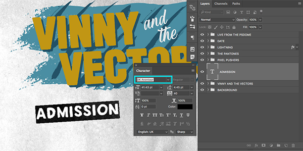
Create a new layer and use your Type Tool (T) to type out the word ‘Admissions’ in all caps using the DK Avontuur typeface from earlier. Use the Free Transform (Command/Ctrl+T) to rotate the text slightly so that it follows the same angle as the text above it.
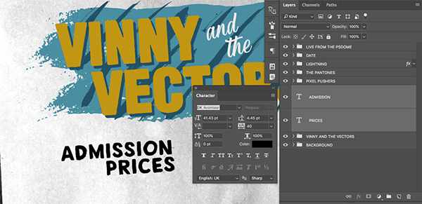
Press Command/Ctrl+J to duplicate the text layer and move it below the previous copy. Use the Type Tool (T) to click inside and change the word to ‘Prices’ again in all caps using the same font. We want this line to go below the ‘Admission’ text and roughly aligned to the right side like this:
Hold the Command/Ctrl Key and select both layers and then press Command/Ctrl+G to put them into a Group Folder. Change the name of the folder to ‘Admission Prices’ as shown here:

Hold the Control Key and click on the small ‘fx’ icon of the ‘Lightning’ folder. When the dropdown menu appears, choose the option that says ‘Copy Layer Styles’ like this:
Next, hold the Control Key and select the ‘Admission Prices’ folder and this time we want to choose ‘Paste Layer Style’ from the list to make everything inside the same red color as our lightning.
Step 42: Pre-Sale
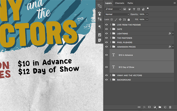
Create another new text layer and type out the words ‘$10 in Advance’ in upper and lowercase using the same typeface. Then, press Command/Ctrl+J to duplicate the layer, move it below the first line and change the text to ‘$12 Day of Show’ so you now have something like this:
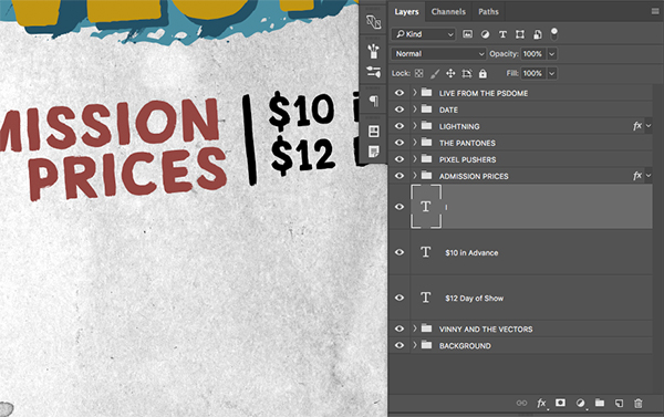
Duplicate one of these two text layer and change the text to an uppercase ‘i’ before pressing Command/Ctrl+T to do a Free Transform and stretching it out to create a tall vertical line. Place this line in between the ‘Admission Prices’ text and the pricing we just created so you end up with this:
Hold the Command/Ctrl Key and select all three of these layers and then press Command/Ctrl+G to put them into a Group Folder. Change the name of the folder to ‘Pricing’ as shown here:
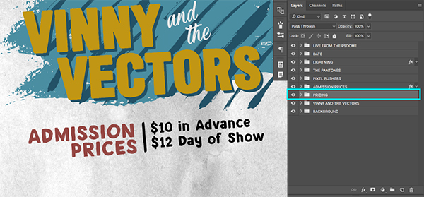
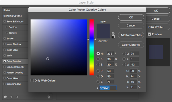
Double click on the ‘Pricing’ folder to open the Layer Style dialog box and check off the ‘Color Overlay’ option.
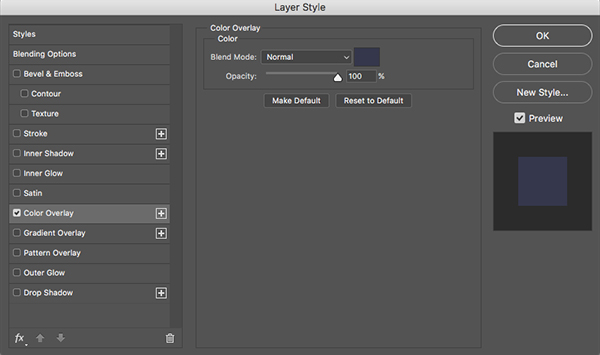
For the fill color we will use hex value #35374C as shown below.
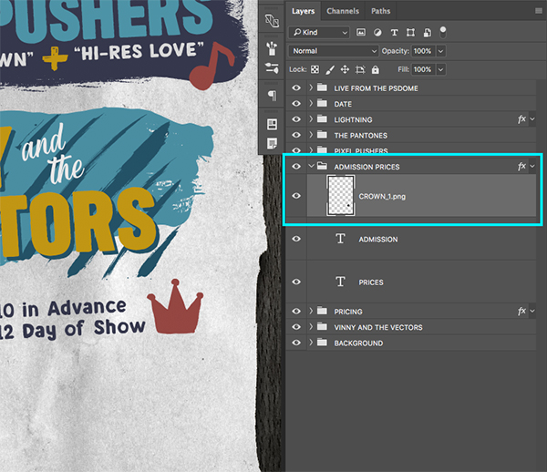
Step 43: Heavy is the Crown
Next, open the ‘CROWN_1.png’ image from the freebies folder.
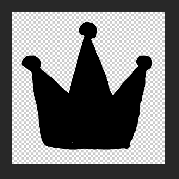
Drag and drop the crown into the ‘Admission Prices’ folder we created two steps back so that the fill color will automatically match the red of the text layers and then reduce the size of the graphic using the Free Transform option and dragging inwards from any of the four corners of the bounding box while holding the Shift Key. Place the crown over to the right, next to the pricing.
Step 44: Brush Rules
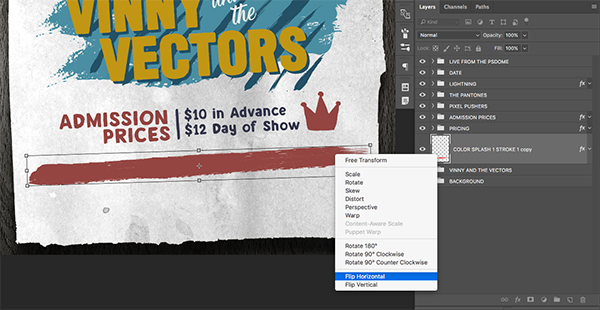
Open the ‘Live from the PSDome’ folder and select the brush stroke graphic inside. Press Command/Ctrl+J to duplicate it and then move it to the top of the layer stack, outside of the folders like this:
Move the stroke down in the Layers Palette and place it below both of our pricing folders. Press Command/Ctrl+T and flatten out the stroke a bit by moving either the top or bottom handles of the bounding box inwards, and then hold the Control Key, click on the graphic, and choose ‘Flip Horizontal’ to flip it the other way for variation.
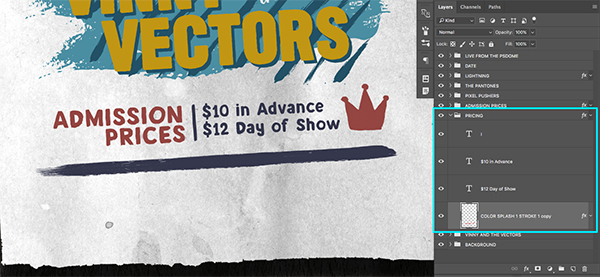
Make the stroke a bit thinner and then move it inside of the ‘Pricing’ folder so that it matches the same indigo color as our pricing. You should now have something like this:
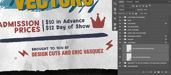
Step 45: Credits
Create a new layer and type out the words ‘Brought to you by’ in all caps using the ‘DK Avontuur’ typeface. Angle the type and then copy the layer style from the ‘Pricing’ text and paste it onto this layer so that the line of copy matches the indigo color.
Create another new layer and this time type out the words ‘Design Cuts and Eric Vasquez’ using the typeface ‘Long Haired Freaky People’ and copy and paste the layer style from either the ‘Lightning’ folder or the ‘Admission Prices’ folder so that this line becomes red. When you have done that, hold the Command/Ctrl Key and select both of these layers before pressing Command/Ctrl+G to put them into a folder. Change the name of this folder to ‘Credits’ or something similar of your choosing.

Select the ‘Lightning’ folder and press Command/Ctrl+J to duplicate it. Move the folder down below the ‘Pricing’ folder and reposition the lightning bolts so they are on opposite sides of the credits like the image below:
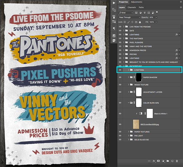
Step 46: X Marks the Spot
Open the ‘handrawn_pattern_49-01.png’ file from the freebies folder for this tutorial.
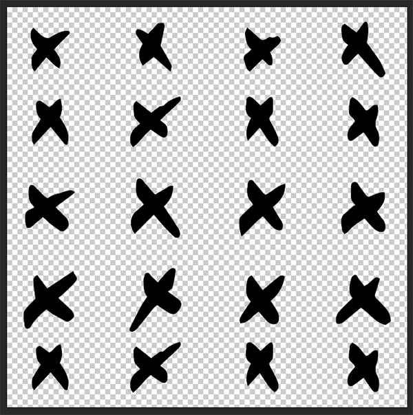
Drag the pattern into your document and reduce it’s size a bit using the Free Transform option. Rotate the pattern clockwise and move it towards the upper left corner as shown here:
Copy the pattern two more times by pressing Command/Ctrl+J twice and move one copy to the right, behind the ‘Vinny and the Vectors’ folder and another copy to the lower left like this:

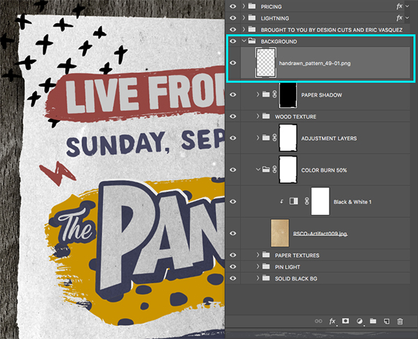
Hold the Command/Ctrl Key and select all three of the ‘X’ patterns and then press Command/Ctrl+G to put them into a Group Folder called ‘X Pattern’ before moving it to the top of the ‘Background’ folder so that it’s nested inside like the image shown here:
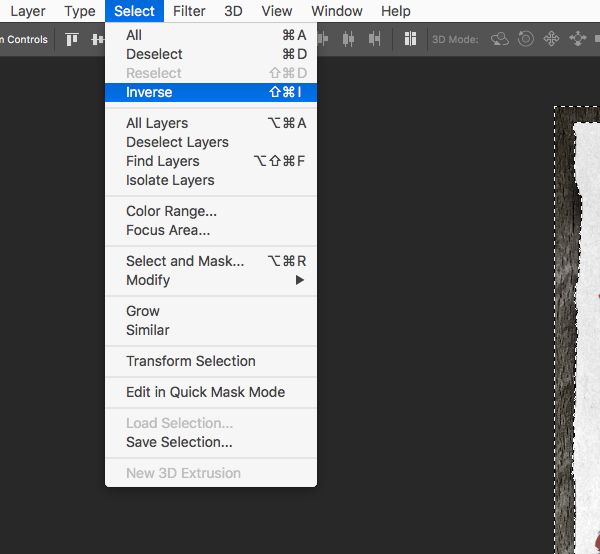
Hold the Command/Ctrl Key and click on the layer mask thumbnail icon of the ‘Paper Shadow’ folder to activate a selection around the textured paper.
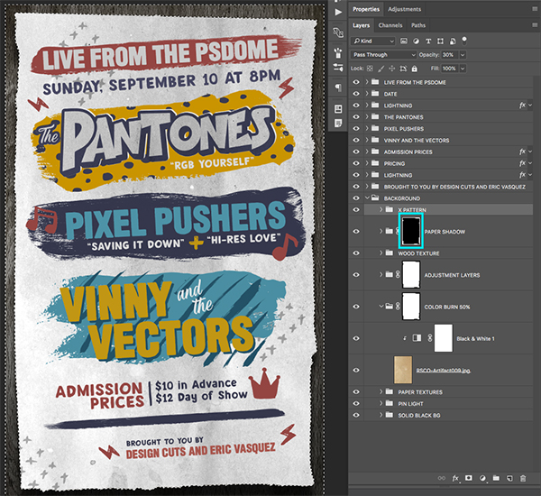
Go to the Select Menu and choose the ‘Inverse’ option like we did earlier on.
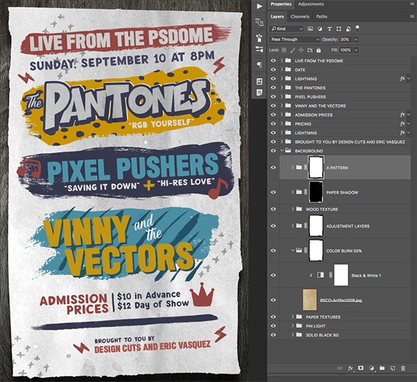
Once you have inverted the selection, make sure your ‘X Pattern’ folder is selected in the Layers Palette and click on the ‘Add Layer Mask’ icon at the bottom to apply a mask so that the patterns can only be seen on the paper and not the background behind it. Your image should now look like this:
Step 47: Global Adjustment
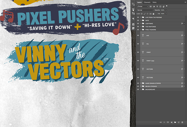
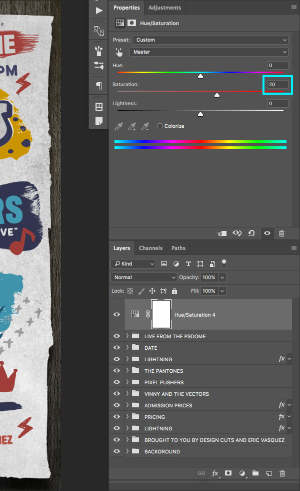
Select the very top folder in the Layers Palette – ‘Live from the PSDome’ folder. From here, click on the Adjustment Layer icon at the bottom of the Layers Palette and then choose ‘Hue/Saturation…’ from the menu as shown here:

Move the middle ‘Saturation’ slider to the right until it’s set to about ’20’ to increase the overall saturation of the image.
Step 48: Photocopy Textures
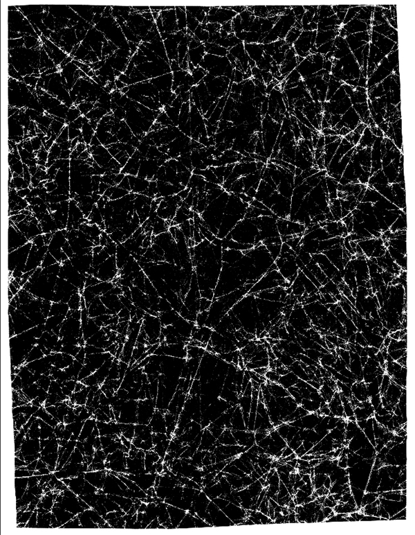
Next, open the ‘RSCO-Photocopy030.tif’ file from the freebies folder and press Command/Ctrl+A to Select All and then Command/Ctrl+C to copy it.
Return to your main document and press Command/Ctrl+V to paste the texture and move it to the top of your Layers Palette, just below the Hue/Saturation Adjustment Layer. Rename the layer, giving it the same name as the file or something that will make it easy for you to identify. Reduce the size of the texture so that it’s just a bit larger than your canvas, and then change the Blending Mode to ‘Screen’ and reduce the opacity to around ’60%’ as shown here:

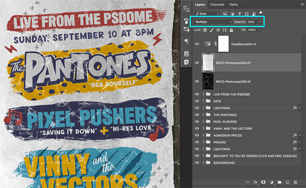
Open the ‘RSCO-Photocopy034.tif’ texture from the freebies folder. Once the image is open we will press Command/Ctrl+A to Select All and then Command/Ctrl+C to copy it.
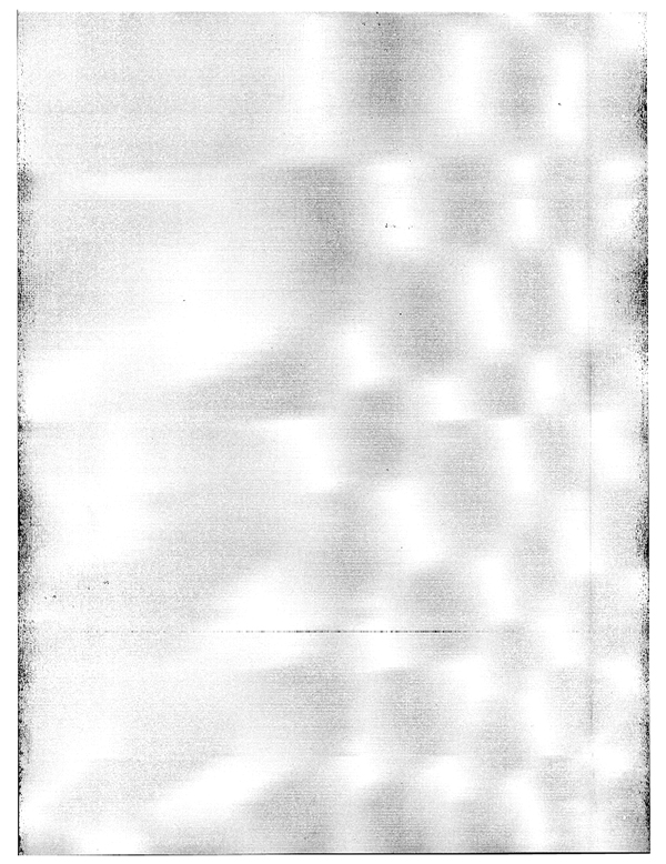
Paste the texture just above the previous photocopy texture and scale it down by once again using the Free Transform option and dragging inwards from any of the corners of the bounding box while holding the Shift Key. Change the Blend Mode of this layer to ‘Multiply’ and reduce the opacity to around ’30%’ like this:
Next, open the ‘RSCO-Photocopy036.tif’ photocopy texture. Again, Select All by pressing Command/Ctrl+A and then copy the texture.
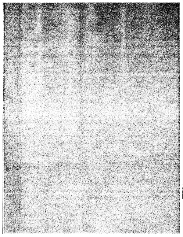
Return to your main document and paste the texture, placing it above the previous two and reducing the size of it accordingly. Change the Blend Mode of this texture layer to ‘Soft Light’ with an opacity of around ’30%’ so you now have three textures stacked like the image shown here:
We will now place in one more photocopy texture. Open the ‘RSCO-Photocopy051.tif’ image from the freebies folder and repeat the same steps to paste it into your document.
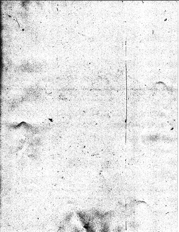
Paste this texture above the previous three and scale it down by pressing Command/Ctrl+T and dragging inwards from any of the four corners of the bounding box while holding the Shift Key. Change the Blend Mode to ‘Multiply’ and then press the number ‘2’ on your keyboard to reduce the opacity of the texture to about ’20%’ and you should now have something like this:
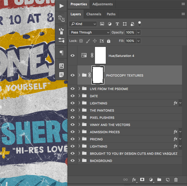
Step 49: Photocopy Folders
Hold the Command/Ctrl Key and click on each of the four photocopy textures so they are all selected at the same time. Press Command/Ctrl+G to put them into a Group Folder and change the name to ‘Photocopy Textures’ or give it a similar name of your choosing. From there, open the ‘Background’ folder to reveal all of the layers and folders inside, and then hold the Command/Ctrl Key and click on the layer mask thumbnail icon of the ‘Color Burn 50%’ layer to activate a selection around it. Then, make sure that your ‘Photocopy Texture’ folder is still selected in your Layers Palette and click on the ‘Add Layer Mask’ icon at the bottom of the Layers Palette.
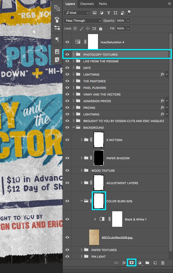
All of your photocopy textures should now be masked and confined to the paper.
We have now completed our Vintage Gig Poster Design and Mockup! After using a handful of these awesome curated textures and elements we created a fun, vintage layout for a design themed gig poster. Be sure to check out the full bundle to gain access to 1000’s more of these beautiful design elements that will help you take your work to the next level! I can’t wait to see what you guys do with it!
Remember that whether it’s your outcome for this tutorial or something new you’ve made, we’d love to see your designs on our Facebook page.
Please leave a comment if you have any questions or suggestions. I always look forward to hearing from you!
There’s still time to check out The Essential Textures and Patterns Bundle featuring a comprehensive library of textures, patterns and backgrounds for every project all for an unbelievable price of just $29!
Thank you guys so much for the wonderful responses to my latest tutorial! I know I don’t pop in too often to say thank you so I wanted to stop by and let you guys know how grateful I am for the feedback and support. It means a lot and I’m really glad you guys enjoyed it and found some helpful tips here!
You guys are the best! Awesome tutorial…
Oh thanks os much Claire!
Your fantastic feedback means so much to us all :)
Thank you for this very detailed explanation. It’s always interesting to discover how others create. I really enjoy the use of patterns.
Hey J,
Oh this is fantastic feedback, we are so glad it helped and that you enjoyed it too :D
Thank you for the video and the step by step guide. You are the best!
Hey Twinkle,
Thank you for the kind words!
You’re really welcome and we hope you enjoyed it :)
It’s great to see you layering so many textured on top of each other, it really gives the design depth and that multi-layered vintage feel. Thank for the tip and the freebie.
Hey Catherine,
Oh thank you so much for the fantastic feedback! We’re so glad that you like it as we were super excited to share this one with you all :)