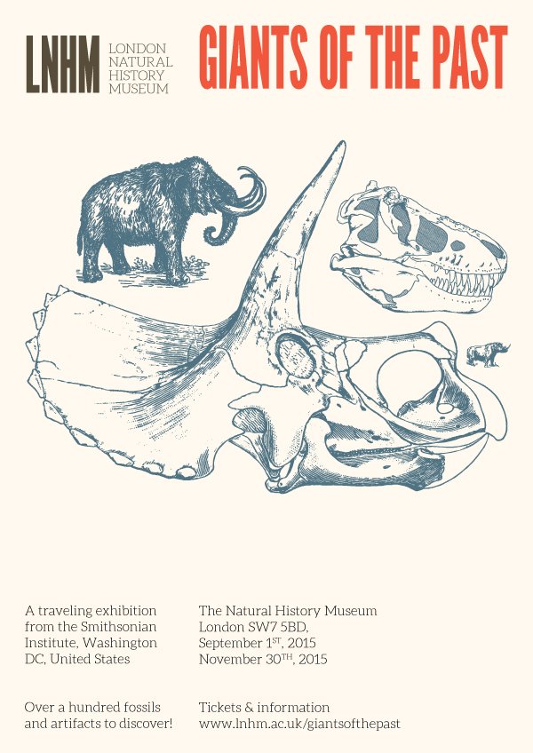
WHAT WE’RE CREATING:
Hello Design Cutters! It’s Simon here, for the second tutorial pertaining to the versatile vector collection. We are going to go way back in time for this one, around 200 million years or so.
The brief is to design a poster for a traveling exhibit about dinosaurs. This is going to be a fun one!
We’ll use quite a few helpful techniques to manipulate and adapt the assets found in the bundle to our needs:
- Offset path
- Pathfinder magic
- Blob brush
- Using brushes
- And more!
And let’s go!
TECHNICAL NOTES
We will be manipulating type, and vector assets. Thus, Illustrator will be our tool for the tutorial. Sorry, Photoshop-only users :-(
Illustrator is the to-go piece of software to use when it comes down to manipulating vector assets (even though since smart objects, Photoshop can be interesting too). Similarly, Illustrator’s type-related abilities and tools seems still more powerful than Photoshop’s (even though we now have access to the glyphs panel in Photoshop as well).
We promise to bring Photoshop back in upcoming tutorials though.
STEP ZERO: THE CONCEPT
The story
Let’s talk about the brief some more. It is alas fictional, but we’re peppering as much real-world stuff as possible in it to make it credible.
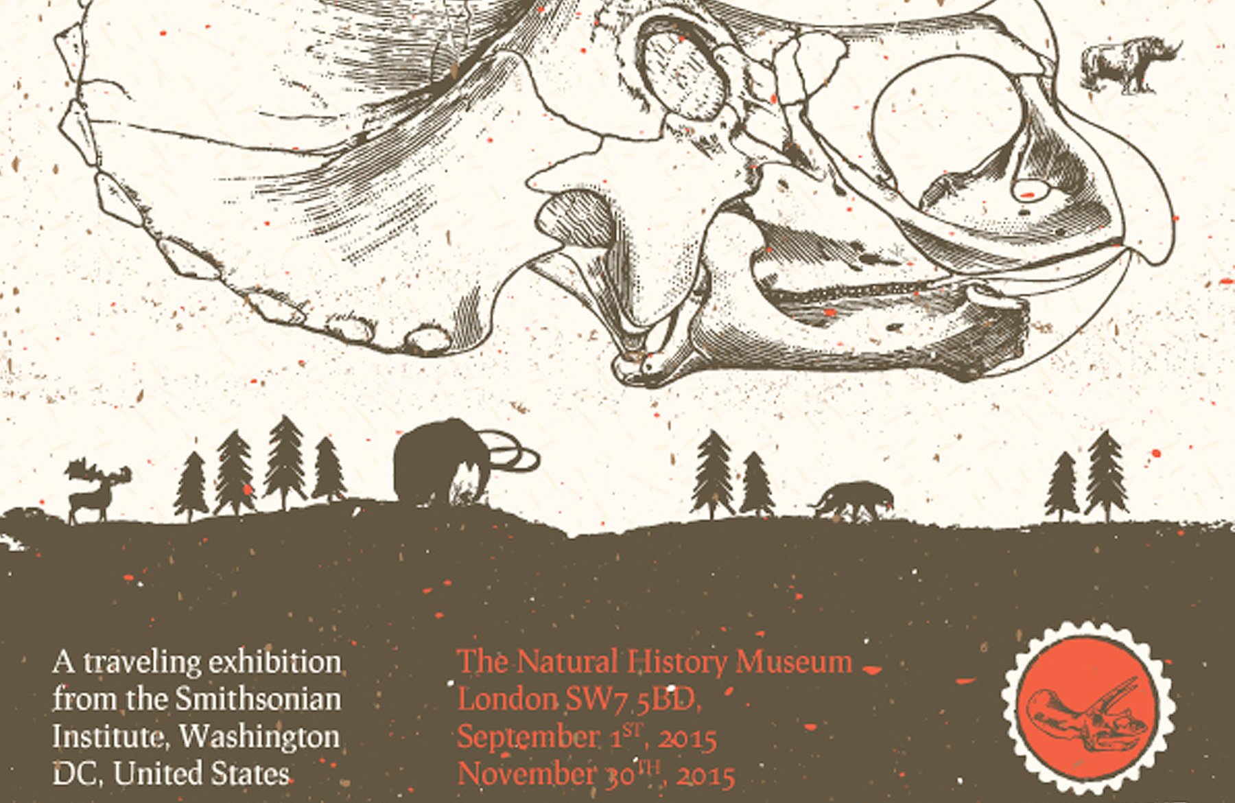
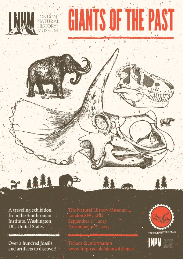
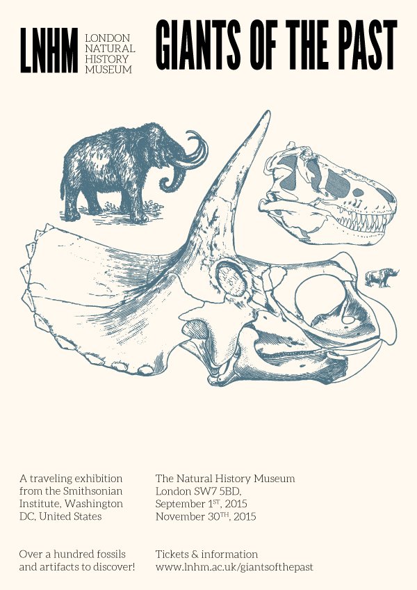
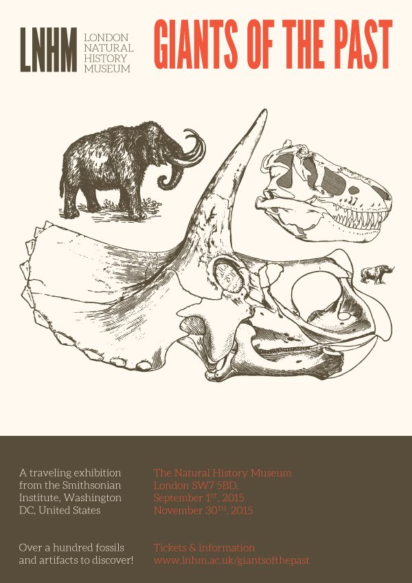
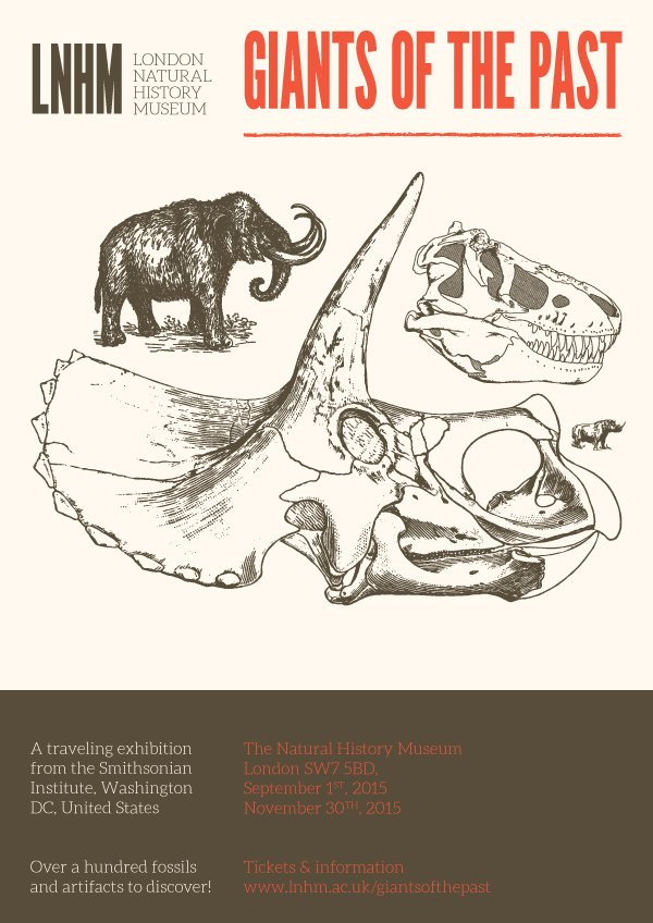
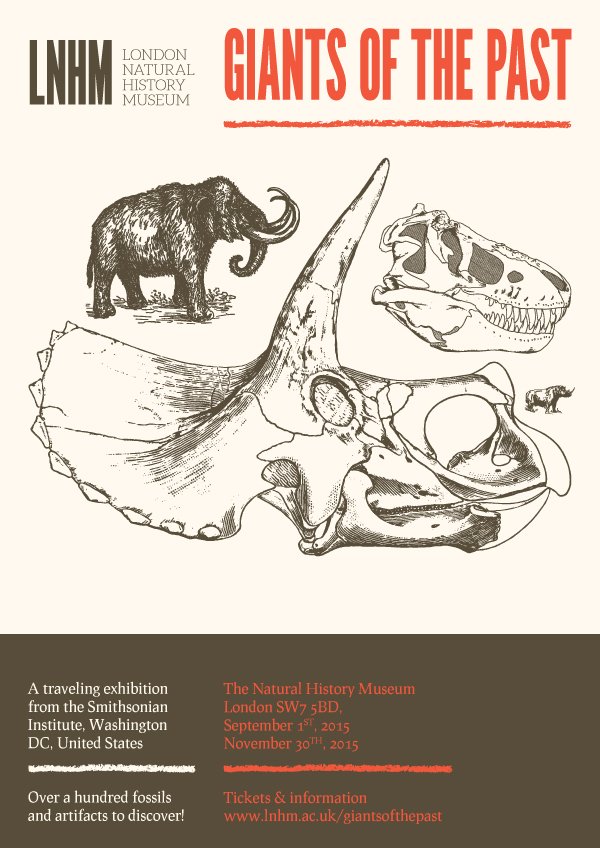
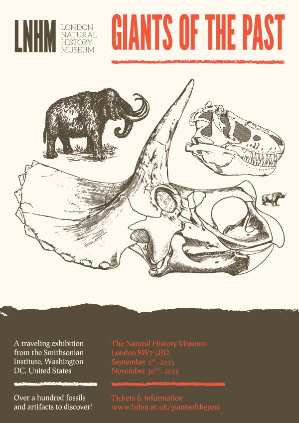
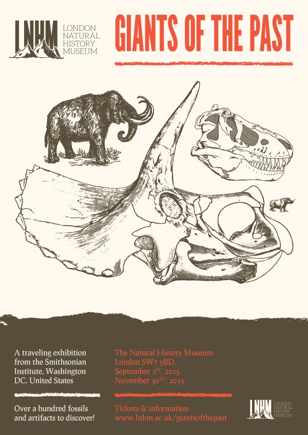
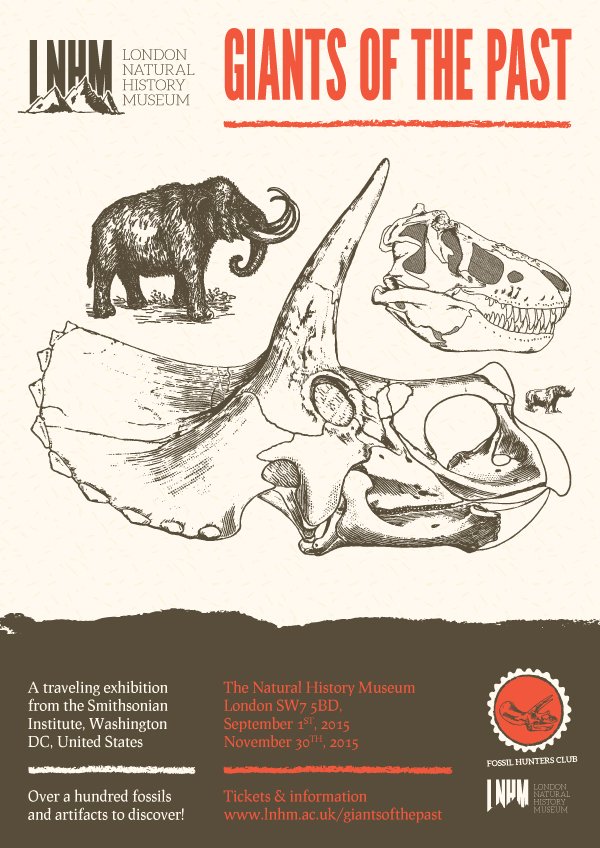
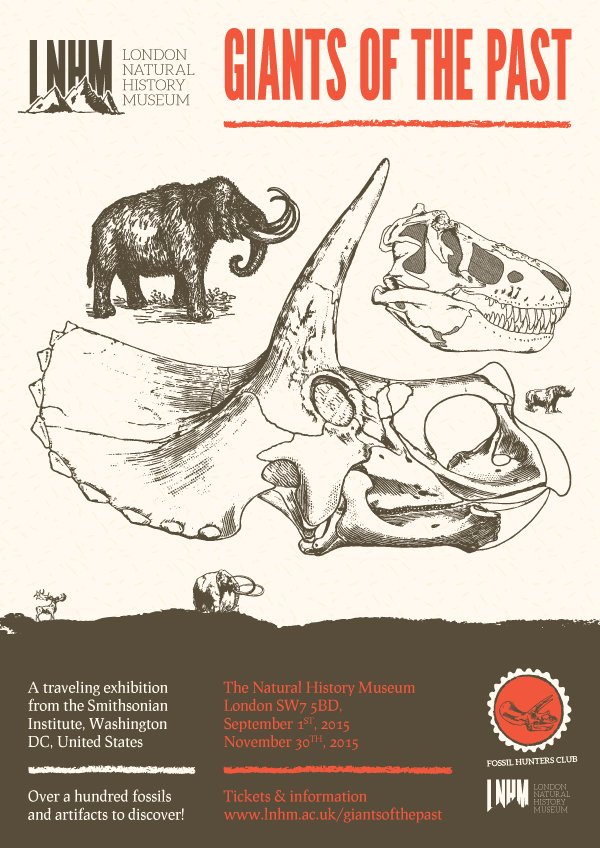
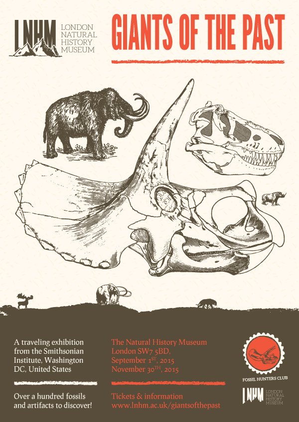
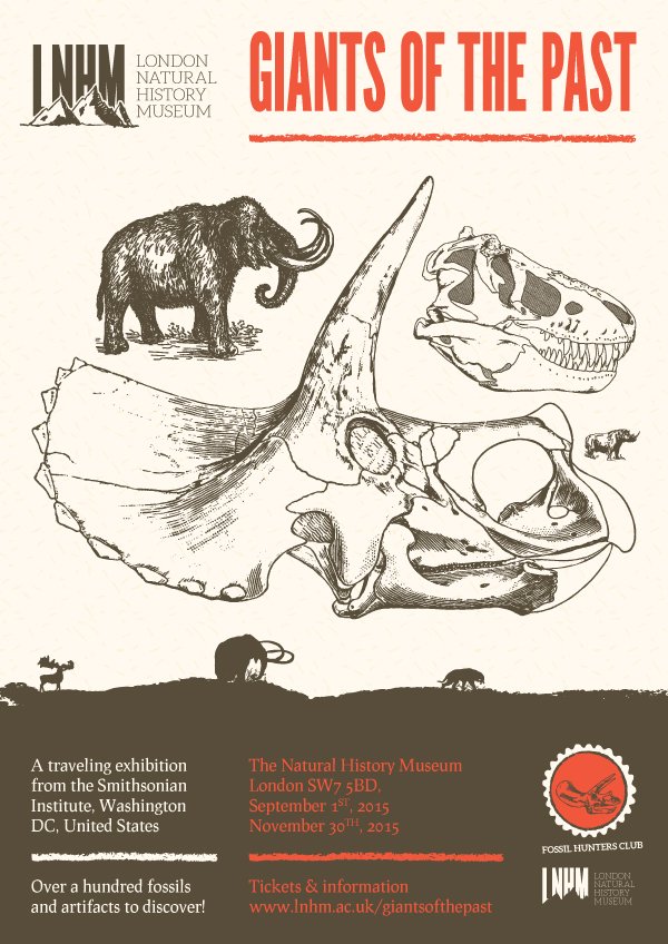
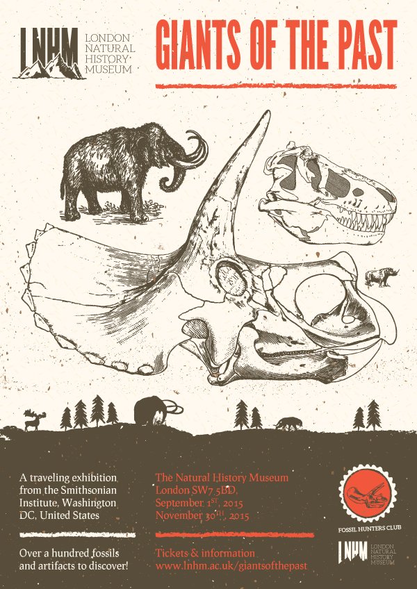
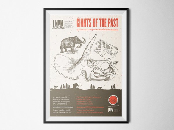
As detailed above, our job this time is to create a poster for “Giants of the Past,” a mostly dinosaur-related traveling exhibit. It’s been put together by the greatly talented folks at the Smithsonian Institute.
The exhibit will stop at the fictional London Natural History Museum, that is greatly inspired by the real-life Natural History Museum.
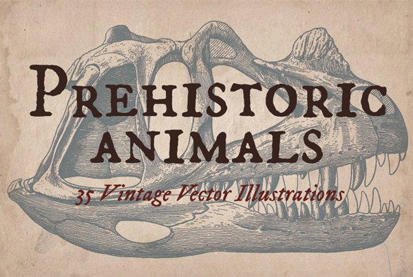
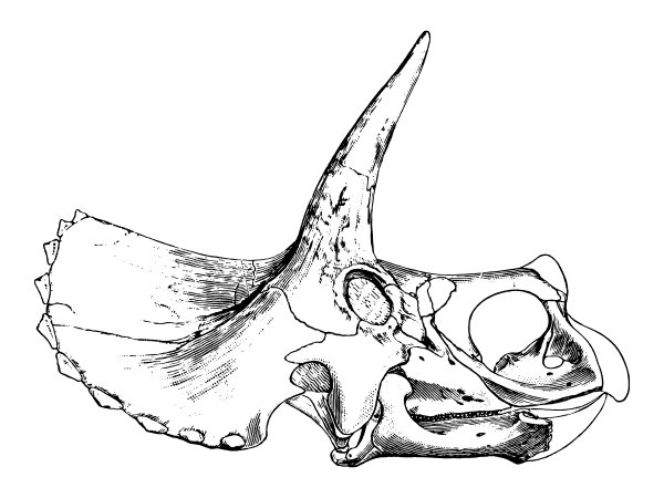
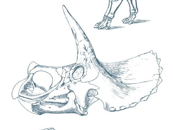
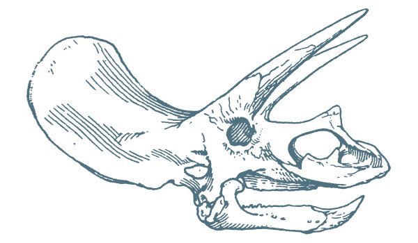
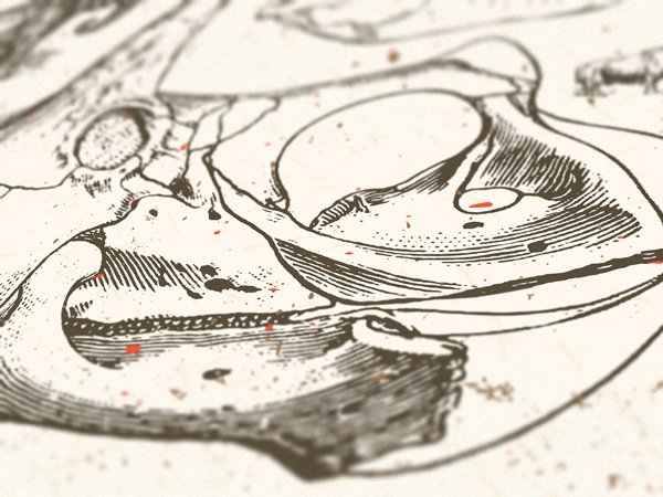
The idea behind the brief comes from Mr. Vintage’s prehistoric animal vector set, and particularly from this detailed triceratops skull illustration.
The base visual concept
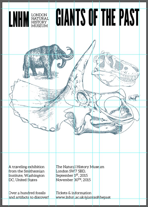
After sketching a few layout thumbnails, the one we’ve settled on is this option. It’s a poster built on a three column layout, that prominently features the triceratops skull, along with some of the other assets from the same pack.
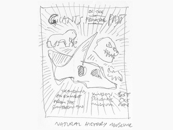
As we’ll see later on, we’ll make that concept evolve some, in order to be able to use more of the bundle’s assets in our poster. They are so neat that it would be a shame not to explore using them.
Resources round-up
Other than the prehistoric animal set, we’ll make use of the following assets. Some are from the bundle, some are freebies.
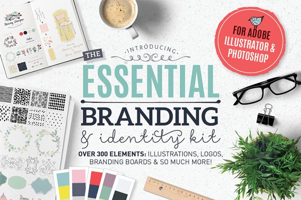
Lisa Glanz’s essential branding kit for Photoshop and Illustrator
Lisa’s set is a wonderfully flexible toolbox. It contains vector elements, patterns, textures, type pairing suggestions, and more! We’ll make use of most of the highlighted above.
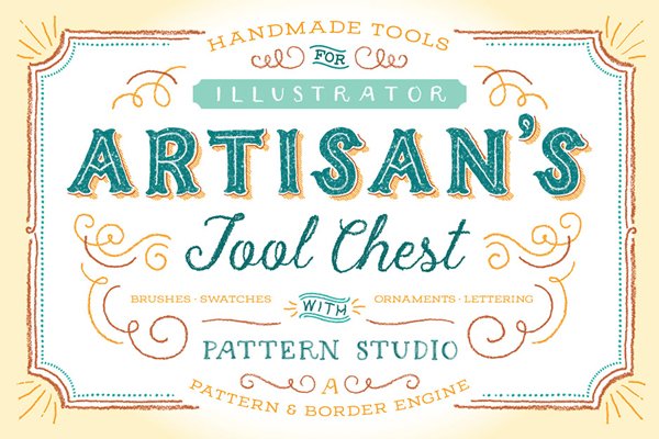
Ornaments of Grace’s Artisan’s tool chest
Beth’s toolkit is full of great elements. The ones we’ll make use of out of the collection are the extensive brushes library.
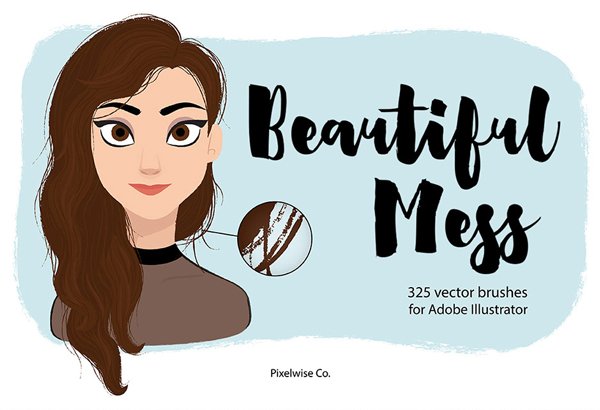
Pixelwise Co.’s beautiful mess brush set
Talking about brushes, Dina’s set will help us to pepper some organic edges in the piece.
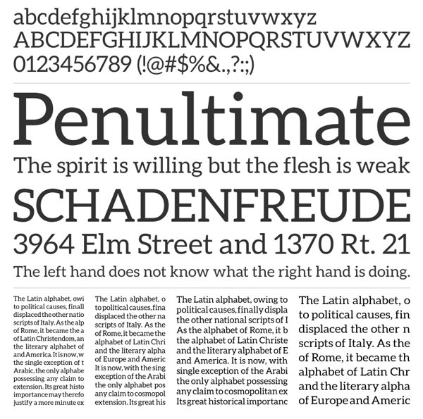
League Gothic
League Gothic will be our main typeface throughout the piece. It’s made available by the fine folks at The League of Moveable Type.
“League Gothic is a revival of an old classic, and one of our favorite typefaces, Alternate Gothic #1. It was originally designed by Morris Fuller Benton for the American Type Founders Company in 1903. The company went bankrupt in 1993, and since the original typeface was created before 1923, the typeface is in the public domain.
We decided to make our own version, and contribute it to the Open Source Type Movement.

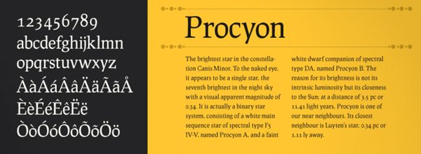
Prociono
Another League of Moveable Type typeface, Prociono is an elegant “roman serif with blackletter elements.”
Aleo
Aleo is one of the typefaces used by Lisa Glanz in her branding kit. It’s a slab serif, that contrasts well with League Gothic. Alessio Laiso, its author, made it available for free via his Behance profile.
Once everything is at hand, it’s time to dive right in.
STEP ONE: DOCUMENT SETUP
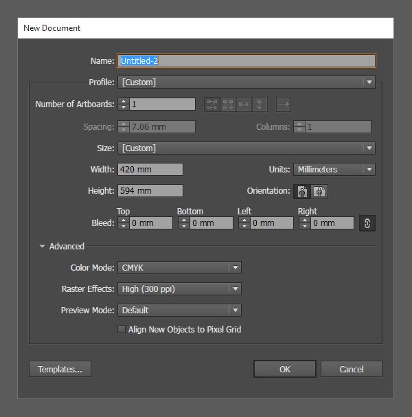
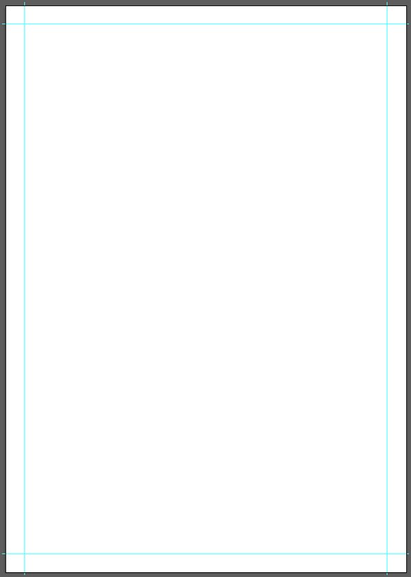
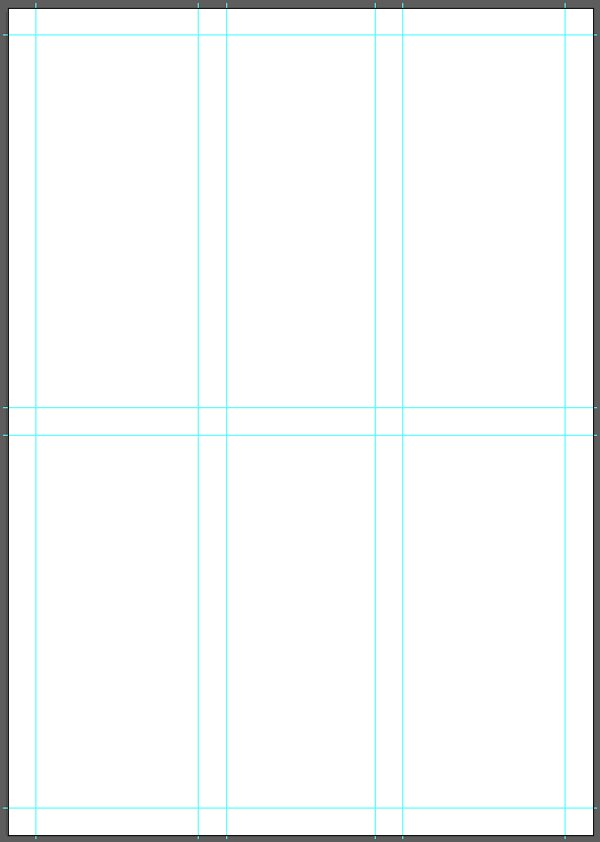
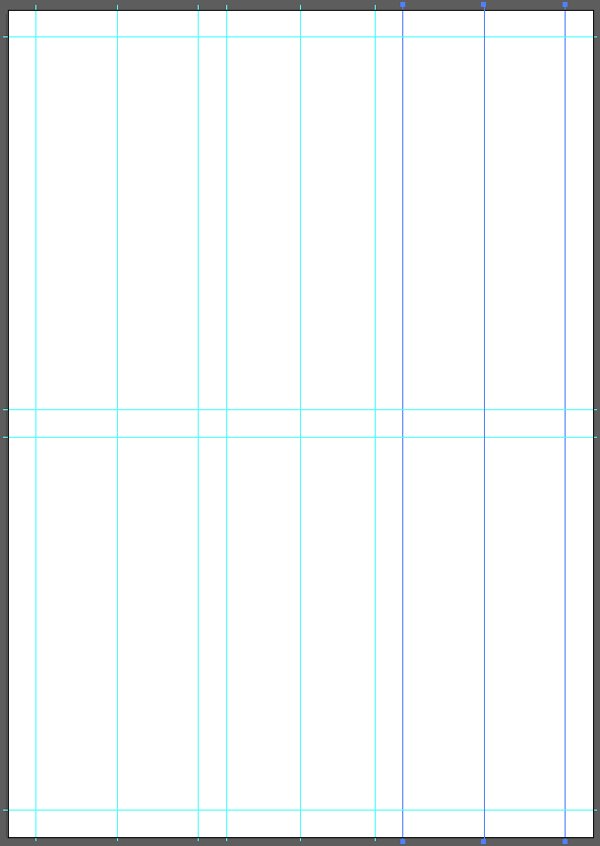
Once again, our event is happening in an European institution. This means that our starting point is an A2 canvas: 420×594 mm.
Next, we need to construct a grid. It features thre columns, and two rows. They are separated by a 20 mm gutter. The columns and rows then get a guide marking their center.
The good news is that unless guides are locked, Illustrator allows to manipulate them just like line segments. That means we can resize them to a certain length, group them, use the alignment tools on them, etc.

Let’s start by marking a 20 mm zone around the canvas. The vertical guides are 600 mm tall, and the horizontal ones are 426 mm wide.
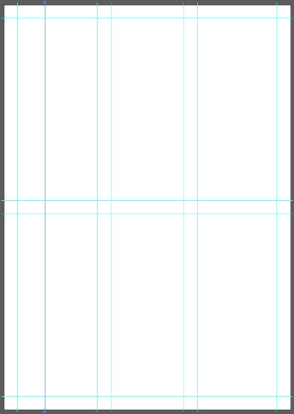
Guides should be assigned their own layer. It’ll make our life easier throughout the poster’s creation.
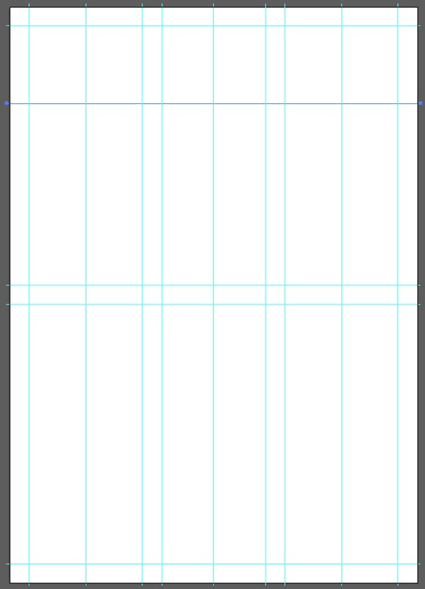
Next, we will create two new vertical guides, spaced of 20 mm. Duplicating previous vertical guides for this is perfectly fine.
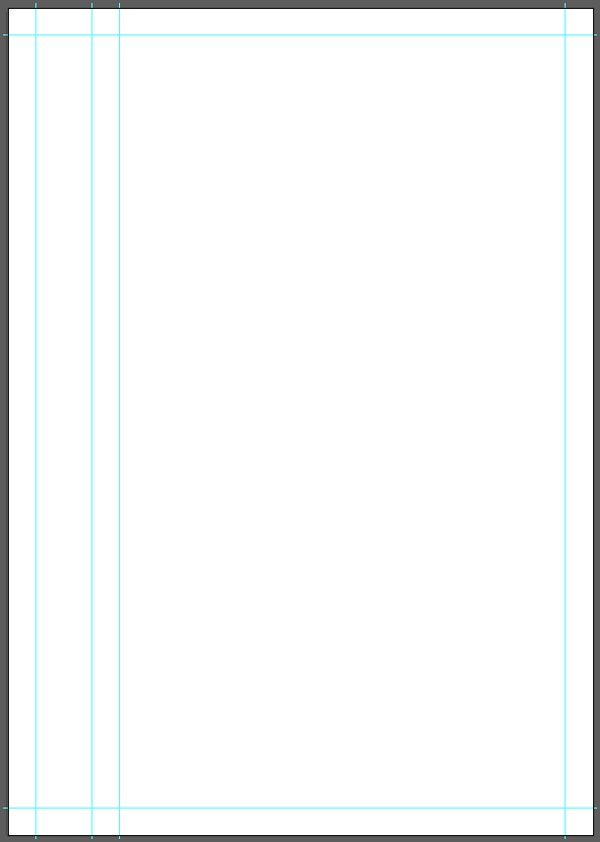
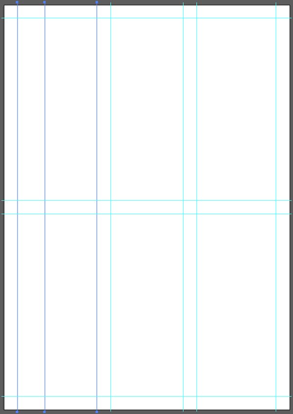
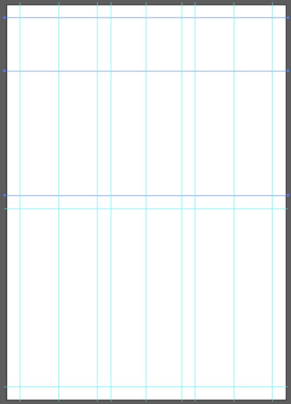
We need to repeat the process to have one more pair of 20 mm spaced guides.
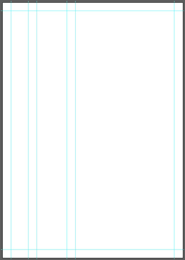
Once both pairs have been created, we need to group them.
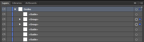
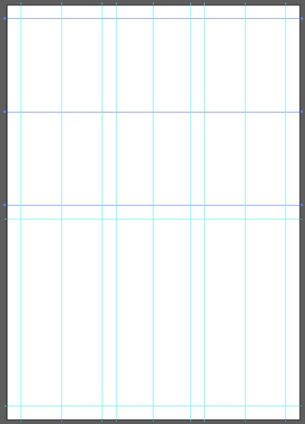
From there, we can select the two edge guides, and use the Horizontal distribute center button to evenly space our guide pairs, created our three column grid.
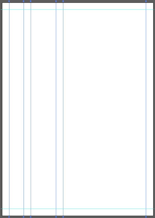

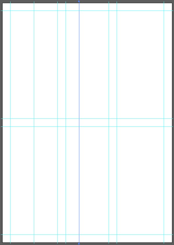
Following a similar process, we can quickly create our two rows.
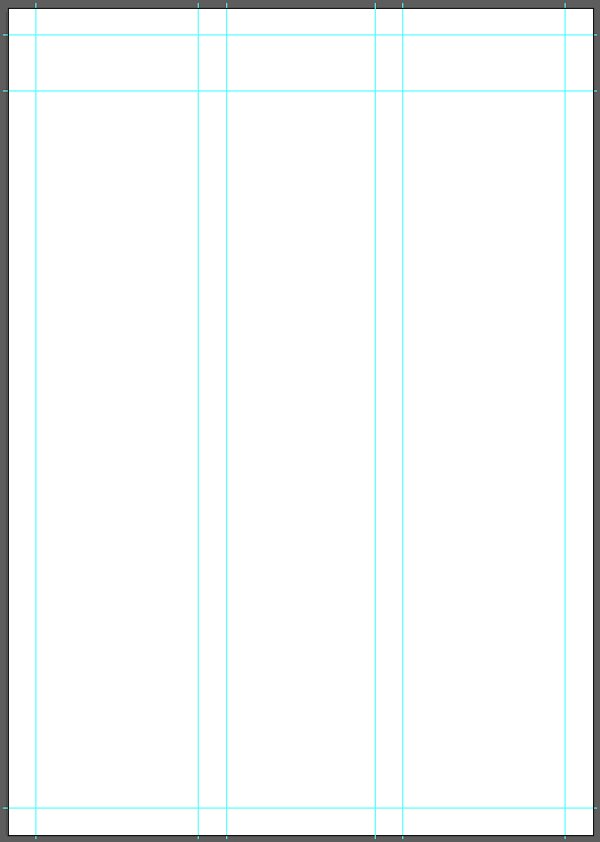

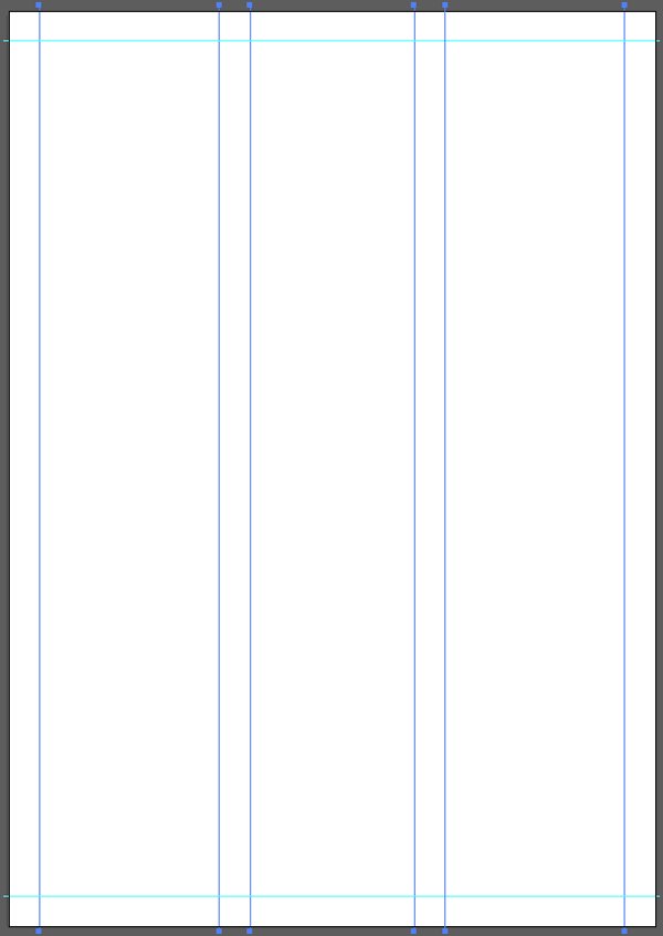
Finally, adding the colums and rows subdivisions requires to ungroup the guide pairs created so far, to add more guides, and to distribute them appropriately.
This grid building process can seem long and painful, but after putting it in practice once or twice, it will be just like breathing. And if manipulating guides is too much of a pain, one can use line segments, and use Split into grid to make things go even faster.
Once the guides layer is locked, it is finally time to put our poster together.
STEP TWO: BUILDING THE LAYOUT
We are going to build our poster in multiple passes. The first pass will see us put together the main elements. The second one, type. The third one, color. And so on.
Dinosaurs everywhere
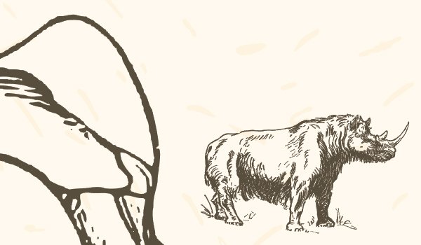
The first elements we’ll put in place are the prehistoric animals. They can be found in the \mr-vintage\Prehistoric-Animals folder of the bundle.
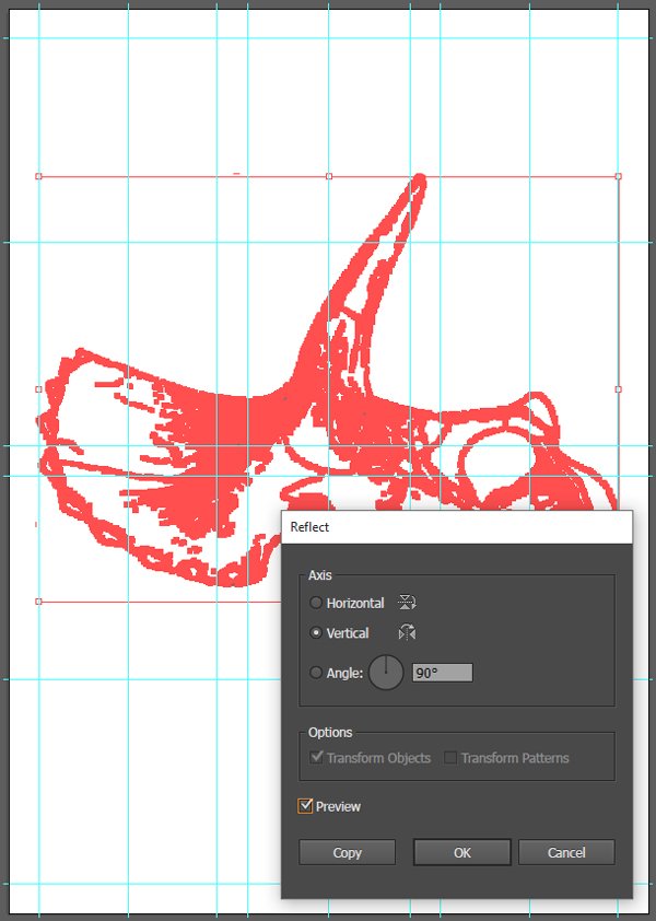
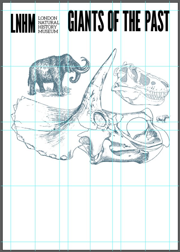
Let’s start with the triceratops skull.
It needs to be mirrored so it’s oriented from left to right, placed at X: 210 mm, and Y: 250 mm, and scaled up so it’s 380 mm wide.
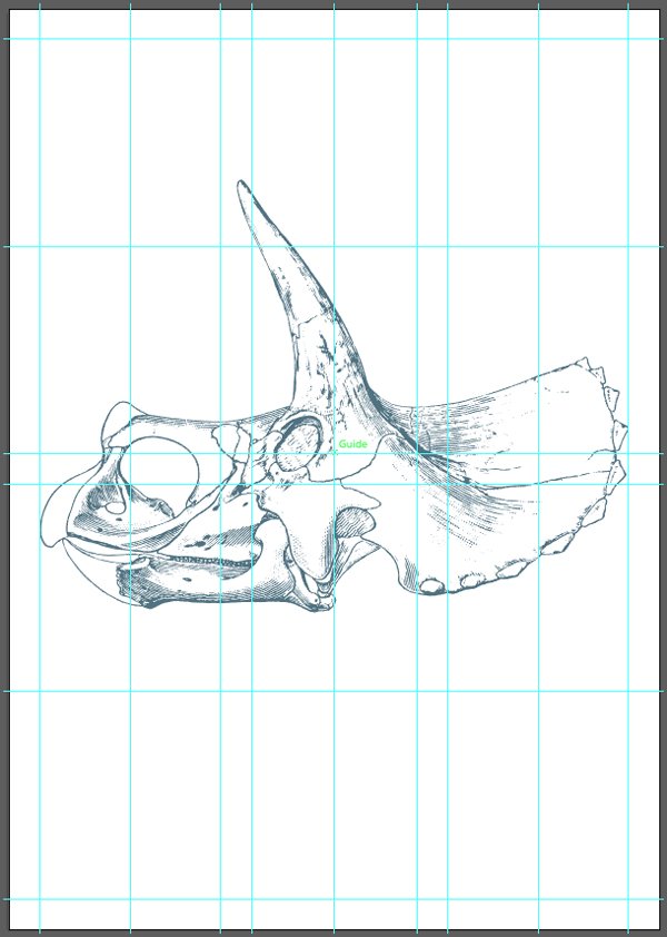
The reflect dialog box can be accessed through Right-click menu > Transform > Reflect.
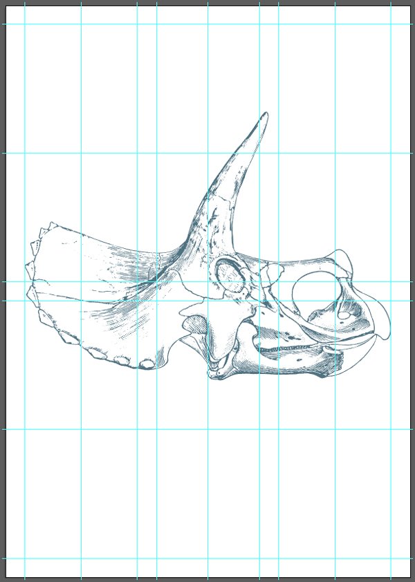
Let’s no forget to properly label elements right away, so we can figure out what is what easily.
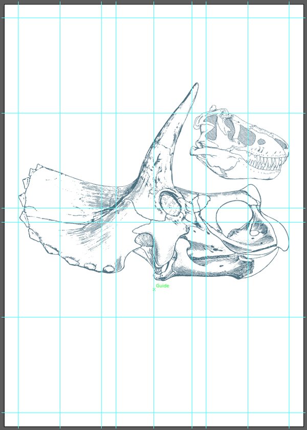
Next up is the T-Rex skull.
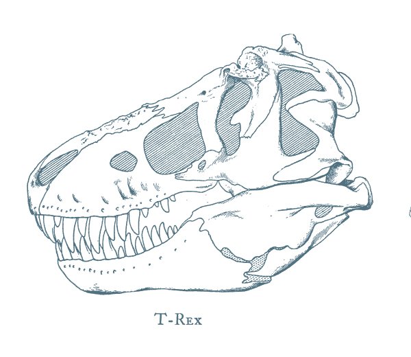
It also needs to be mirrored, placed at X: 330 mm, and Y: 195 mm, and scaled down so it’s 140 mm wide.
The next two animals aren’t skulls. The first one is the mammoth that’s near the triceratops skulls, and the iguanodon skeleton.
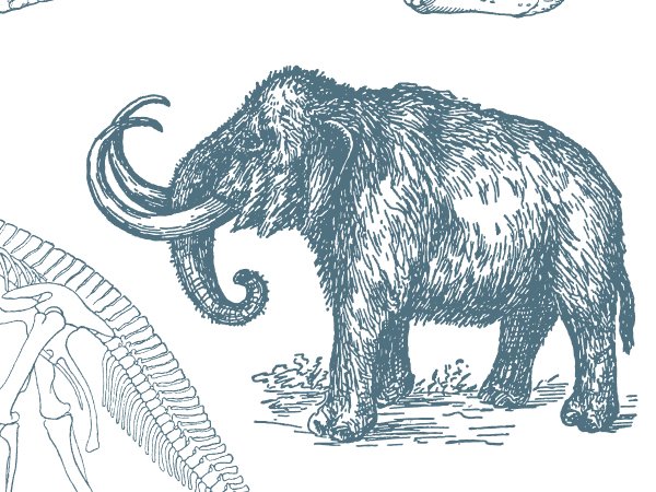
This one gets mirrored as well, placed at X: 135 mm, and Y: 175 mm, and scaled down so it’s 150 mm wide.
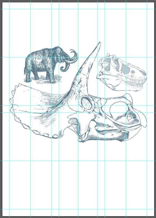
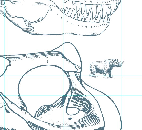
Finally, the last of the main assets is the rhinoceros, located all the way to the bottom of the artboard.
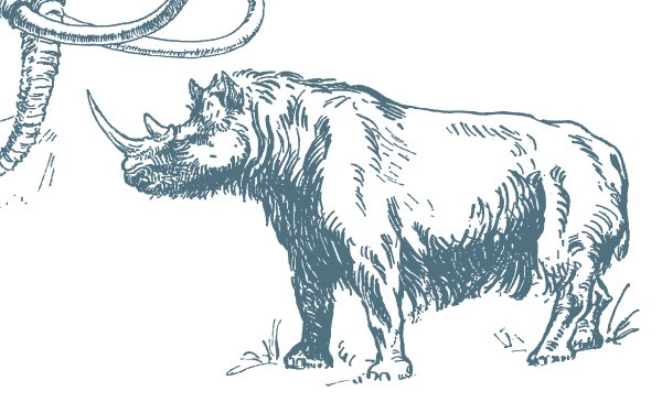
This one gets mirrored as well, placed at X: 385 mm, and Y: 280 mm, and scaled down so it’s 35 mm wide.
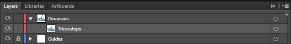
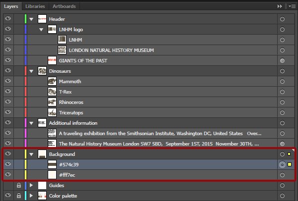
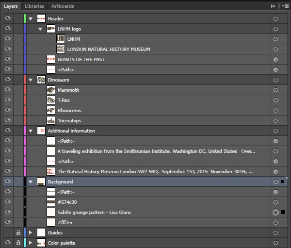
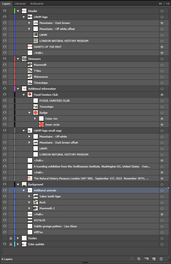
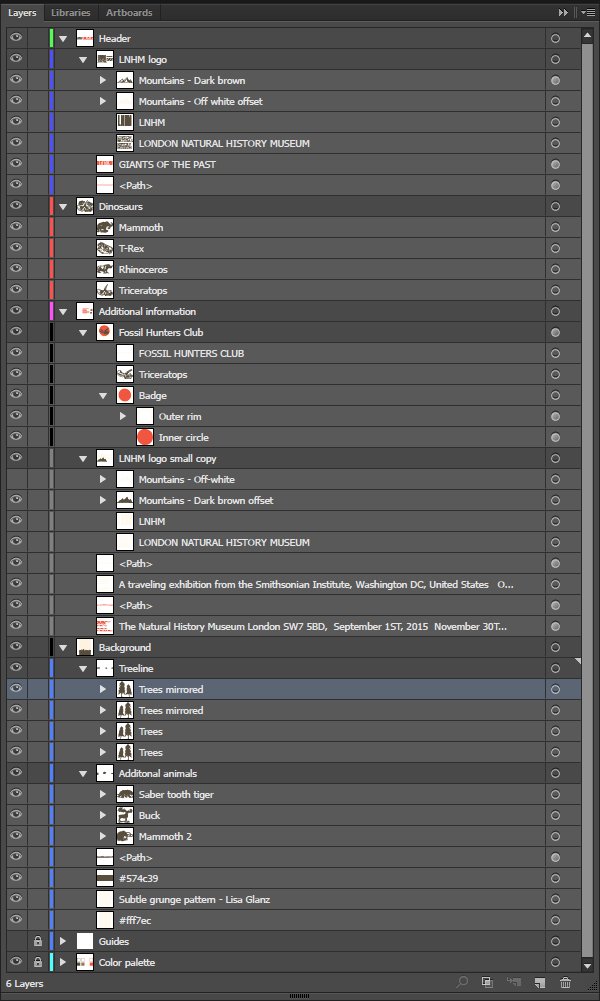
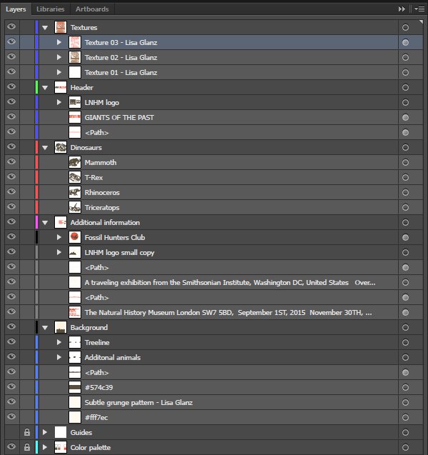
Once these are in place, our layers should look like this.
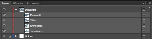
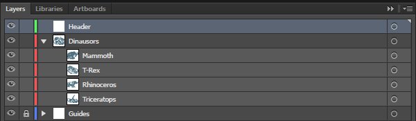
Header
We need to create a new layer for all the header content.
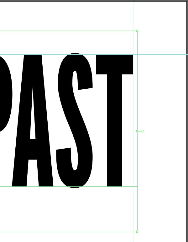
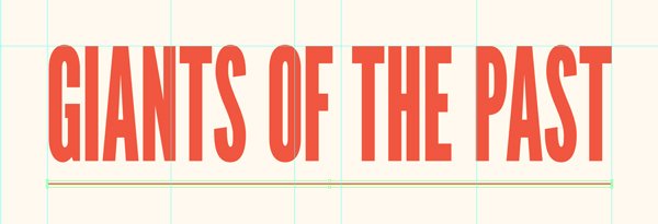
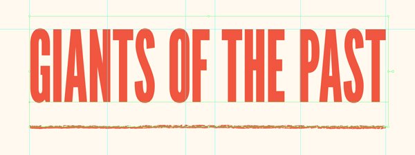
Let’s start with the exhibit title itself, “Giants of the Past.” It is set in League Gothic Condensed, written in all caps, that is 192 points tall, and with its kerning set to optical. 192 points is the perfect size to fit the width of two columns of the grid.
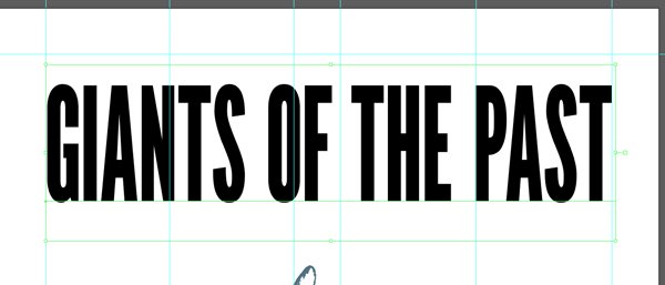
The final position of the text object is X: 279.125 mm, and Y: 49.9 mm: the top of the “A” and “T” of “PAST” have to be flush with the top guide.
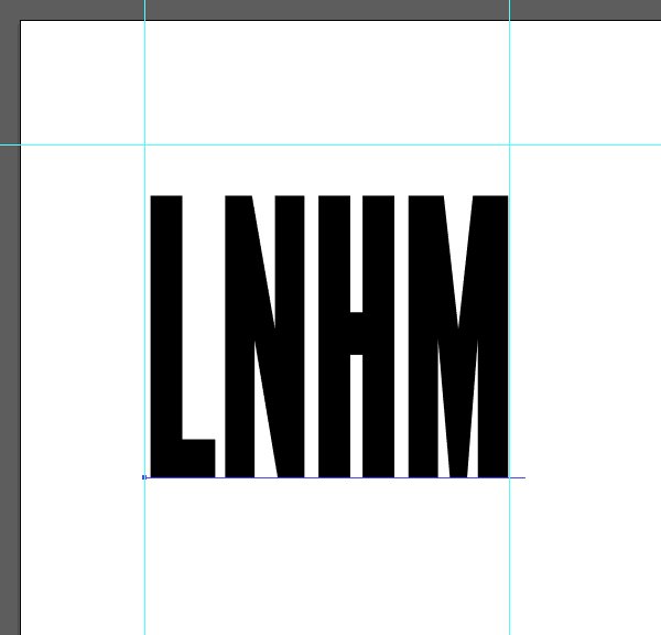
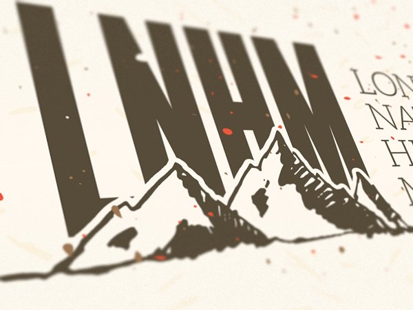
The next header element is a quick logo for our fake natural history museum. Let’s start by a block of text also set in League Gothic Condensed with kerning set to optical, but that is only 174 points tall.
That is the proper size/kerning combination for the four initials of the London Natural History Museum (LNHM) to occupy the width of a half-column of our grid.
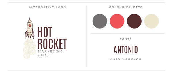
Next, we’ll add the full name of the museum in Aleo Light. That’s a type combination inspired by Lisa Glanz’s marketing group branding sheet (\lisa-glanz\Essential-Branding-Kit\AI-FILES\CC\Logos+brand-boards).
The block of text reads LONDON/NATURAL/HISTORY/MUSEUM in all caps, and is set in Aleo Light, that is 30 points tall, with kerning set to optical, and with a line spacing of 30 points.
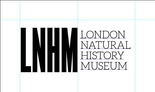
The left edge of the text block is aligned with the edge of the column.
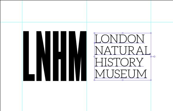
The vertical alignment is obtained by selecting both text blocks, and using the vertical align center tool.

The result is a slightly offset text block compared to the initials. This gives a visual quirk to the logo, which we are going to keep as is.
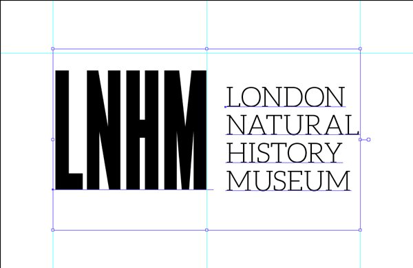
From there, we just have to realign the top of the two elements’ bounding box with the guide.
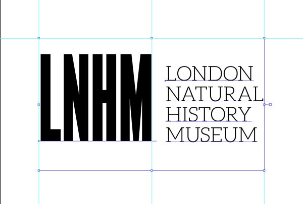
And after some layer organization, here’s where we’re at.
We’ll refine the LNHM logo later in the tutorial.
Additional information text block
The following step for us is to put in place the two blocks of copy that will share information such as where the exhibit is located at, its opening and closing dates, etc.
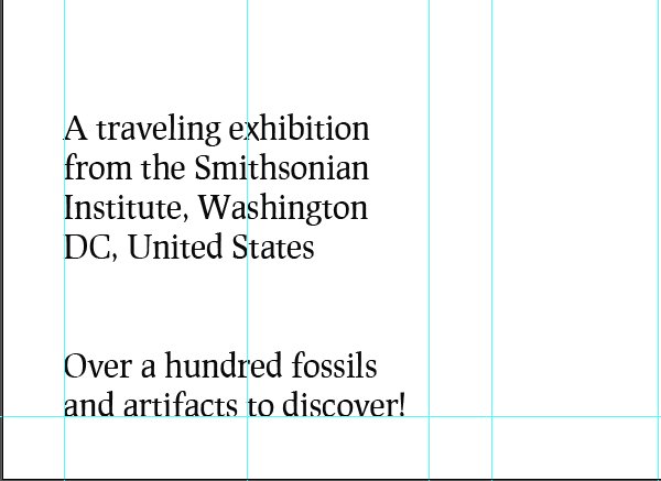
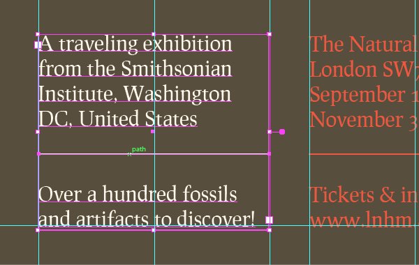
Both of these text blocks are set in Prociono, that is 30 points tall. Since we’ll be using text zones, we’ll need to make sure that hyphenation is turned off.
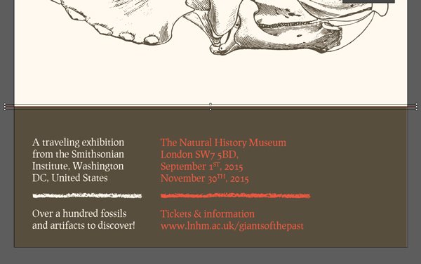
The first block of text reads “A traveling exhibition from the Smithsonian Institute, Washington DC, United States // Over a hundred fossils and artifacts to discover!”
It will be the width of a single column, and aligned with the bottom left corner (the baseline of the last line should be aligned with the bottom guide). The dual line break will allow us to add a divider later on.
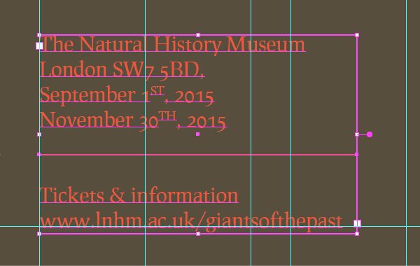
The second text block reads “The Natural History Museum/London SW7 5BD,/September 1ST, 2015/November 30TH, 2015 // Tickets & information/www.lnhm.ac.uk/giantsofthepast”
It’ll will be the width of a column and a half, and aligned with the bottom guide as well. It also features a dual line break to allow for a divider element to be added a bit later.
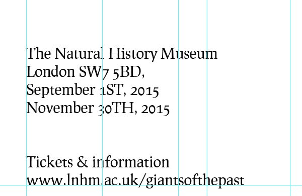
The character panel allows us to transform the “ST” and “TH” of the dates in superscript.

With these in place, we’ll be able to start assigning color to elements.
The additional information blocks should be assigned to their own layer, below the dinosaur one.
Colors!
It’s time to talk color. The color palette we’ll use is based on muted, earthy tones, that are contrasted by a saturated orange for highlights.
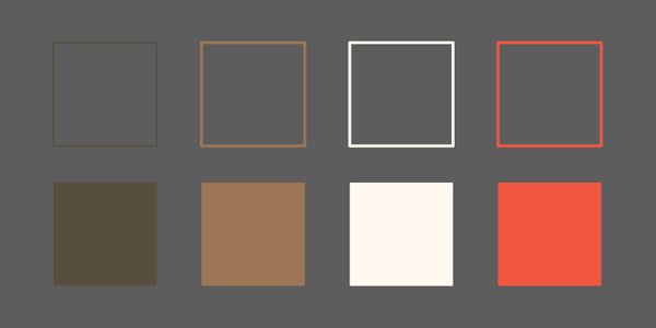
From left to right, we have:
- #574c39 – Dark brown
- #9e7753 – Light brown
- #fff7ec – Off white
- #f0583c – Orange
What we’ll do now is to assign color to the elements we have already put in place.
First, the background. After creating a dedicated layer for its elements at the bottom of our layer stack, we need to create a rectangle of the size of our canvas, that has our off white (#fff7ec) as fill color.
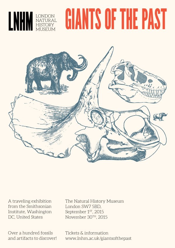
Next, the title. It should be orange (#f0583c).
The LNHM “logo” should be in our dark brown (#574c39).
Just like the dinosaurs skulls, and other animals.
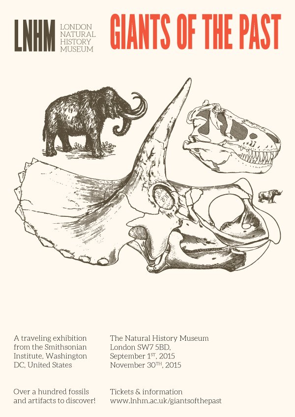
Before we can assign the colors to the additional information text block, we need to give them a solid color background. The element should be above the rectangle that gives its color to the background, and filled in dark brown #574c39. The rectangle is sized so it fits the width of the poster, and almost the height of its bottom row (420×150 mm).
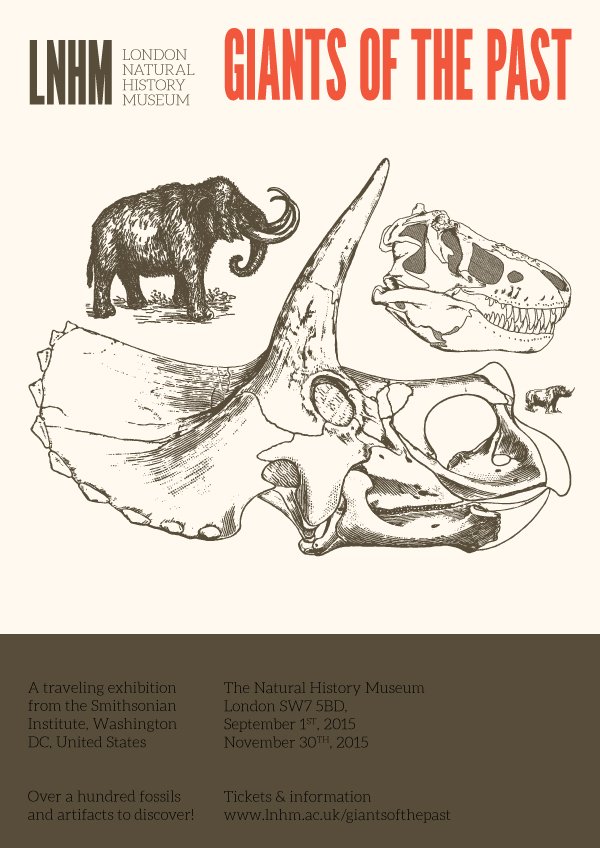
From there, the first block of text (“A traveling exhibition…“) will be in off-white (#fff7ec), and the second one (location and date) will be in orange (#f0583c).
STEP THREE: REFINEMENTS
With the major elements colored, we can start adding details.
Dividers and edges
Let’s start with dividers, and rough edges. There are three “dividers.” One is used to underline the title, and the two others are dividing the additional information blocks.
The title underline is a line segment that fits the width of two columns (just like the title). It has two point thick, orange stroke (#f0583c), with round corners and caps, and no fill color.
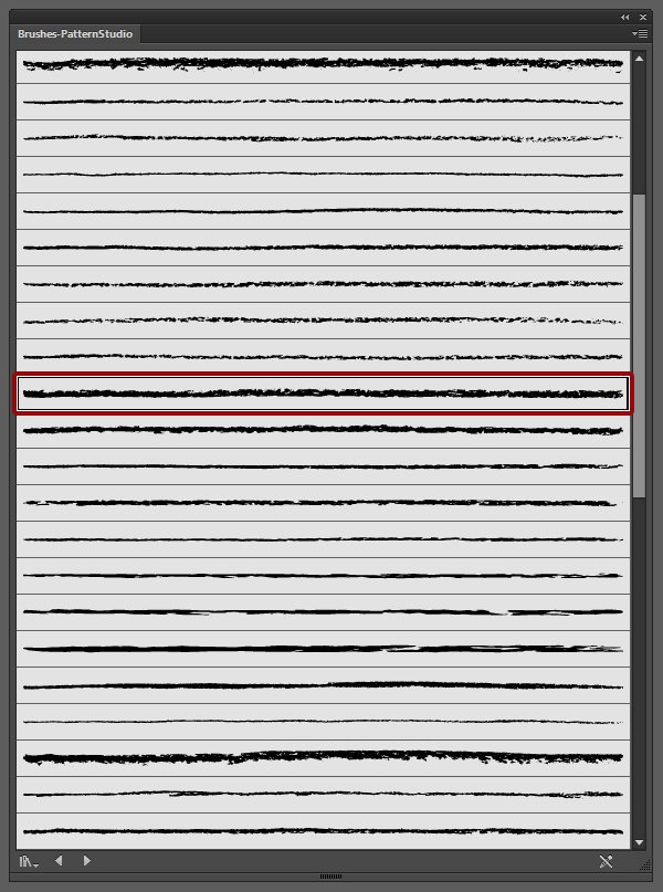
This is very clean, and not visually present enough. To fix this, we’ll use a brush from the Artisan Tool Chest by Ornaments of Grace.
The specific brush we’ll use is Artisan Charcoal – 19P, and is from the Brushes-PatternStudio.ai file (\ornaments-of-grace\Artisan’s Tool Chest\CS6+\Brushes\Add-Ons).
Once applied to the divider, it’s much more visible.
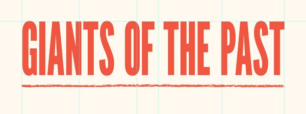
Our last adjustment there is to align the divider with the bottom of the text object.
This divider should be placed in the header layer (and appropriate sub-layer).
The two other dividers use the same brush, and are placed as to visually divide the additional information blocks. Their vertical location is Y: 539 mm. They fit the width, and color, of their respective blocks of text.
They are assigned the same brush, Artisan Charcoal – 19P, that’s two points thick, with round caps and corners.
Next, we need to give a rough edge to the dark brown block that serves as a background to the additional information. We could simply assign one of the brushes to the block, and be done with it. The problem with that approach is that it will stretch the brush along the perimeter of the whole block. This levels greatly the artifacts of the brush, as it needs to be applied to the whole shape.
The counter that, we simply have to create a line segment to apply the brush to, that is aligned with the edge of the color block. The line segment will be shorter than the perimeter of the whole shape, and reveal the artifacts of the brushes better.
The brush we’ll use for this is called 273, and comes from Pixelwise Co.’s Beautiful mess pack (Beautiful Mess Brush Pack.ai – \pixelwise-co\Beautiful-Mess-Vector-Brushes).
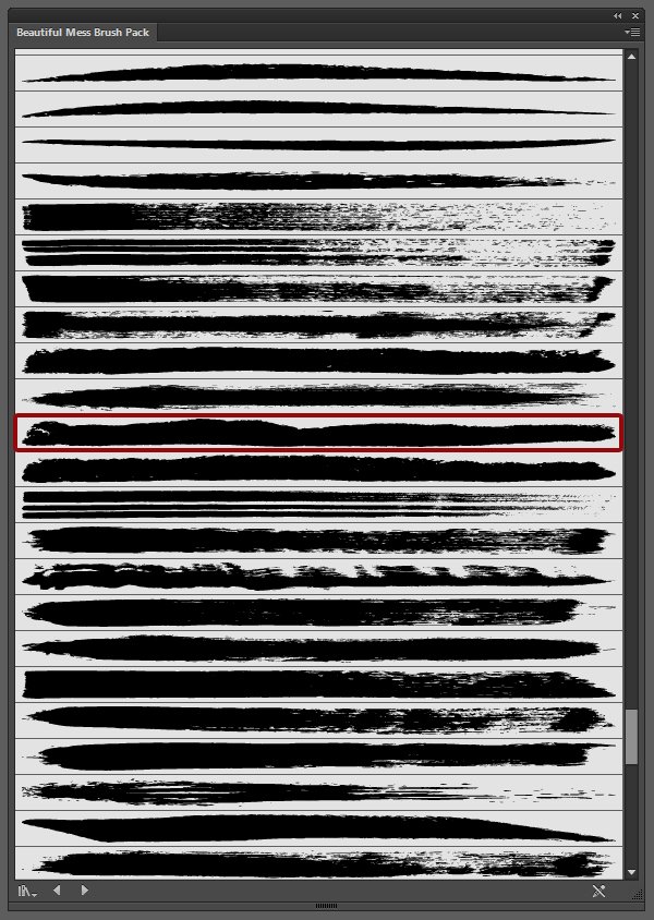
Let’s draw a line segment that is 460 mm wide, and located at X: 210, and Y: 444 mm. That position makes it flush with the top of the dark brown rectangle.
Let’s assign it the brush (n° 273), and make sure it’s dark brown as well, and two points thick, with round caps and corners. The result is a nice, organic-looking rough edge on our shape.
The overall poster is really taking shape now.
Background refinement
We are going to add more substance to the background. As a part of her branding kit, Lisa made some patterns available (\lisa-glanz\Essential-Branding-Kit\AI-FILES\CC\Patterns-master-files).
We are going to use #6, to add some subtle speckling. We need to start by pasting the pattern swatch into our document, on the side of the artboard.
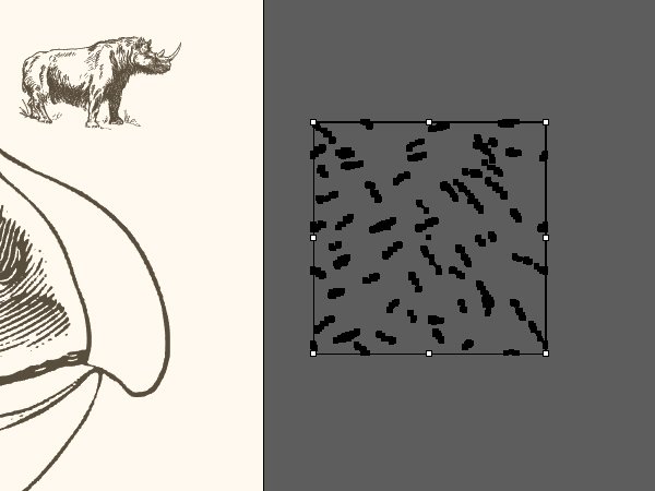
Next, we need to scale it up to 75 mm wide, to change its color to our off-white (#fff7ec), and its blending mode to multiply @ 100% opacity.
From there, we can drag it into our swatch palette. Next, we need to create a rectangle right above the solid color of our background, and assign the pattern to it.
The result is some faint speckling of the background, that’s almost not perceptible, but there enough to break its flatness.
STEP FOUR: ADDING MORE DETAILS
This next step will see us add even more details to the poster. The goal is, as always, to make it more believable, and more interesting.
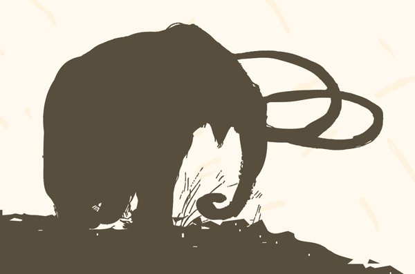
Refining the LNHM logo
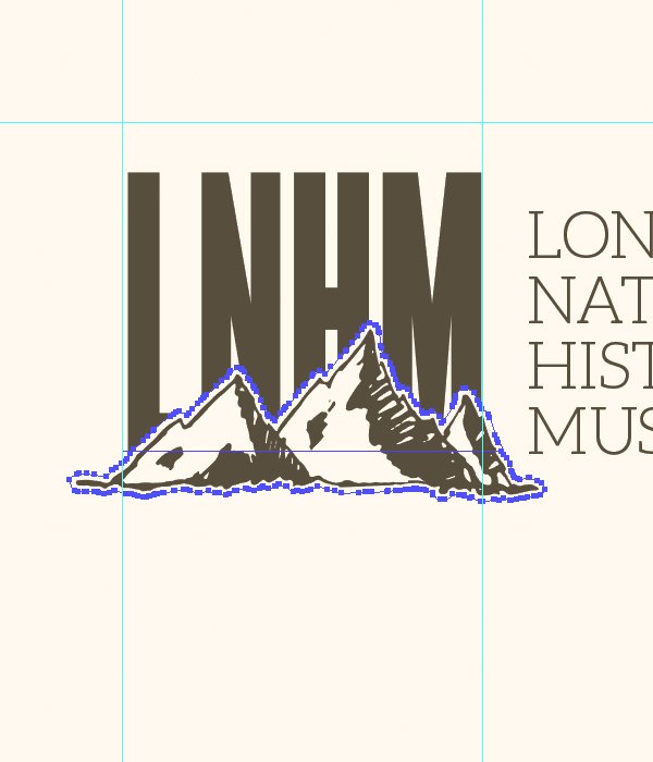
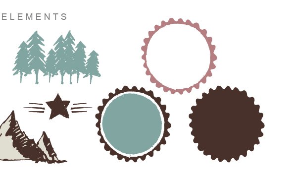
We are going to add an element to the LNHM mark, to give it more depth. That element is taken from the set Lilisa is using to assemble her branding examples (Illustrations_line-drawings-CC.ai – \lisa-glanz\Essential-Branding-Kit\AI-FILES\CC\Illustrations. The element we’ll use now is the mountain range shape.
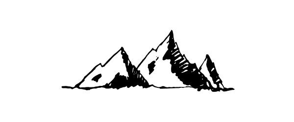
We simply need to paste it right above the letters, 75 mm wide (X: 50 mm,and Y: 67 mm).
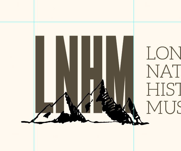
The next step is to change the color of the mountains to our dark brown (574c39).
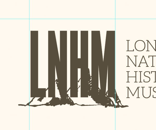
We then need to create a copy of the mountain, positioned at the same spot. We’ll use paste in front for that (CTRL/CMD+F after copying). The bottom copy needs to be colored in our off-white (#fff7ec). The copy will be used to create an off-white offset, so there will be a visual gap between the mountain and the type.
Once the copy is colored in white, we can use offset path (Object > Path > Offset path) to create the visual gap.
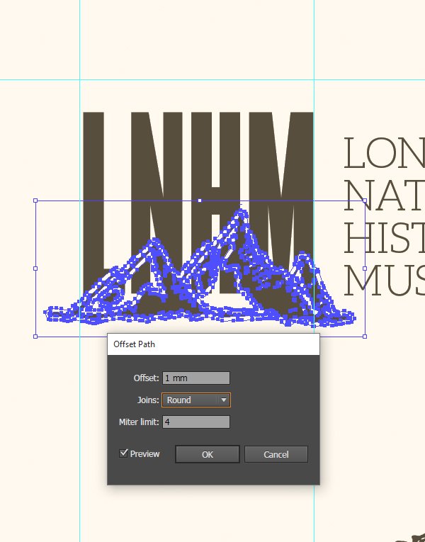
We then need to use the pathfinder to merge the copy’s inner shapes together. Unite is the option of interest here.
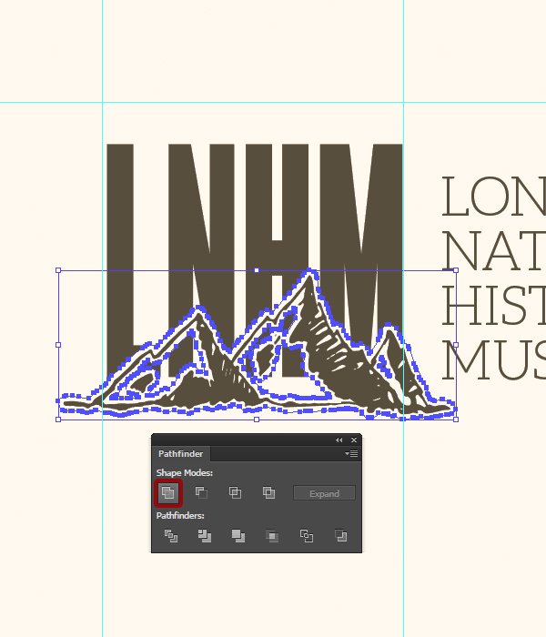
Finally, we can release the compound path (Object > Compound path > Release, or Right-click menu > Release compound path) to “kill” the transparent paths in the mountain shape.
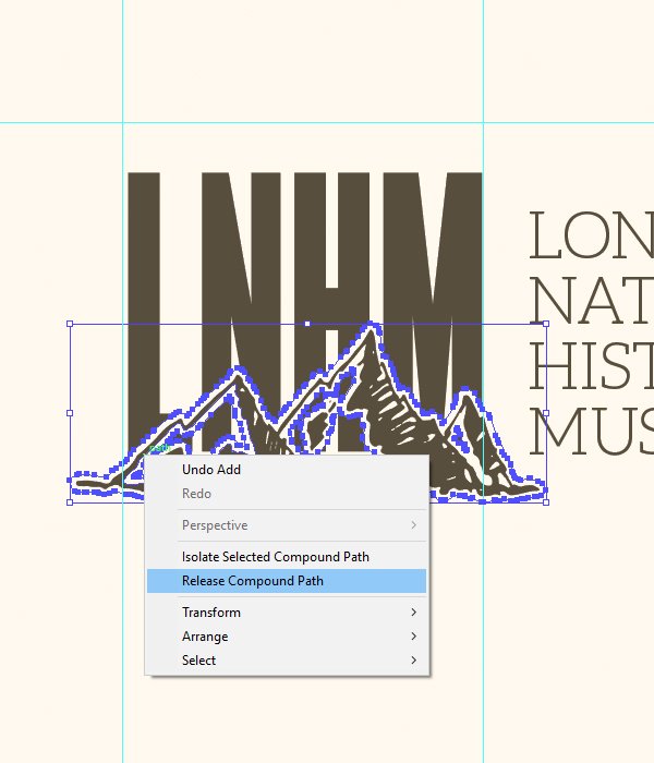
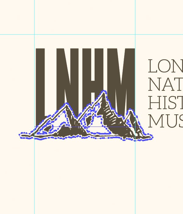
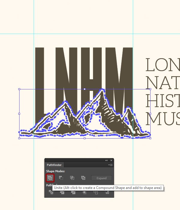
From there, one more use of the pahtfinder’s unite function will give us the clean outline of the mountain we’re after to partially hide the letters.

The LNHM mark is complete. To make the poster looking more official, we are going to paste a copy of it at the bottom right corner of the poster, in off-white (#fff7ec). That copy will have the width of the last half-column. The elements should be given their own sub-layer in the one containing the additional information text blocks.
That is equivalent to a width of 63 mm, placed at X: 3687 mm, and Y: 559 mm.
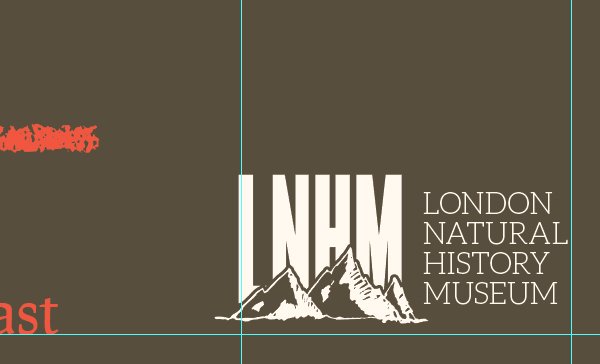
Problem: at this scale, the logo with the complex mountain range looses its legibility.
Solution: remove (or turn off) the mountain details, and just leave the letter masking shape in place.
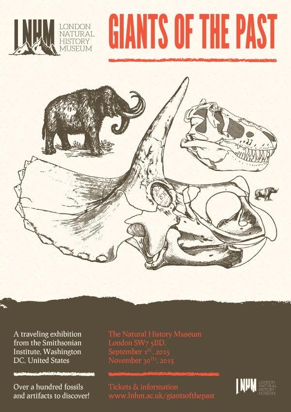
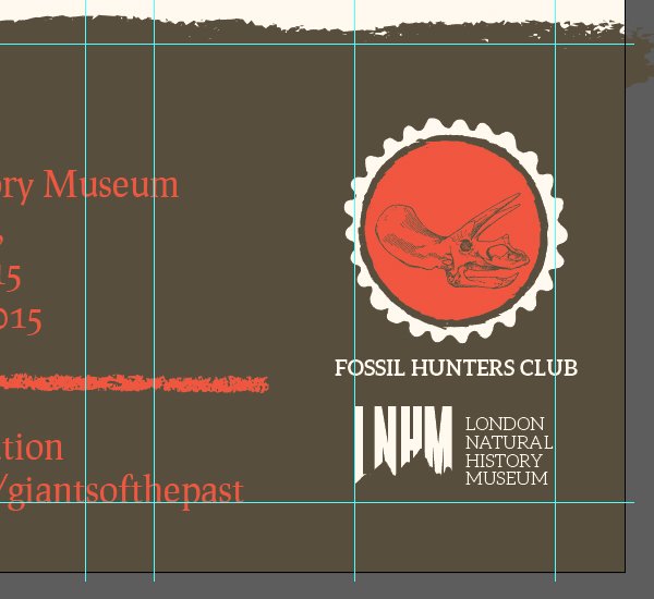
Creating and adding the “Fossil Hunters Club” logo
The next item we’ll add to the piece to make it look like it’s part of a big institution’s communication campaign is a little badge for the “Fossil Hunters Club.” We could imagine that badge to be the logo of a children program of some sort.
To create the badge, we’ll need to track one more of Lisa’s asset. It’s the badge she’s using in her trading company brand concept (Trading_company-CC.ai – \lisa-glanz\Essential-Branding-Kit\AI-FILES\CC\Logos+brand-boards.
Let’s copy the dual-color badge in its own sub-layer, within the additional information section.
For now, let’s position it at X: 475 mm, and Y: 520 mm, and make it 65 mm wide. It’s outside of our canvas, but will allow us to prepare it before putting it in place.


Let’s change the color of the inner circle to orange (#f0583c), and of the outer rim to off-white (#fff7ec). It might be necessary to ungroup and regroup elements during this process, as the isolation mode (that allows to navigate elements within groups without having to ungroup them) can be finicky.

We’ll use the simpler triceratops skull to feature on the badge.
It should be pasted in dark brown (#574c39,) 45 mm wide, and located at X: 474 mm, and Y: 523 mm.
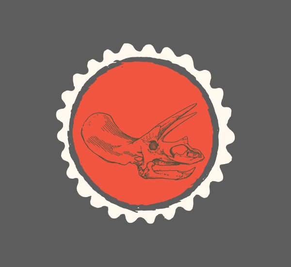
The last touch to add is a text element: “FOSSIL HUNTERS CLUB.” It’s set in Aleo Bold that is centered, 18 points tall, off-white, and positioned at X: 475 mm, and Y: 560 mm.

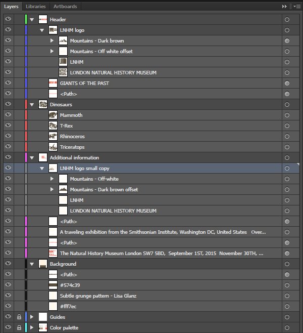
Before we put it in place, here’s a look at the layers.
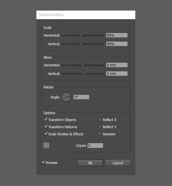
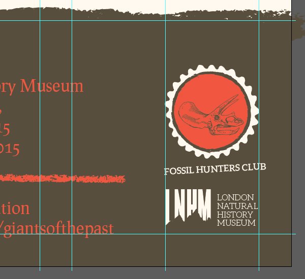
From there, we can reposition the whole badge to fit within the right half-column, above the simplified LNHM mark, positioned at X: 371 mm, and Y: 500 mm.
To refine the placement of the badge, we are going to use the transform panel (Effects > Distort and transform > Transform). We’ll use that panel to scale the badge down some (90% of its original size), slide towards the bottom of the piece (2 mm), and slightly rotate it (3°).
We’re now ready to start the penultimate lap!
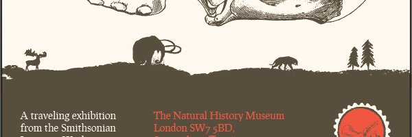
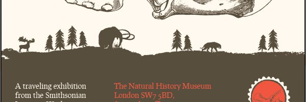
More animals
This step will see us add a few animals to the piece. We’ll use the rough edge of the additional information section as it if were the silhouette of a set of hills.
After creating a dedicated sub-layer in the background layer, we can start adding them.
The first one is the buck.
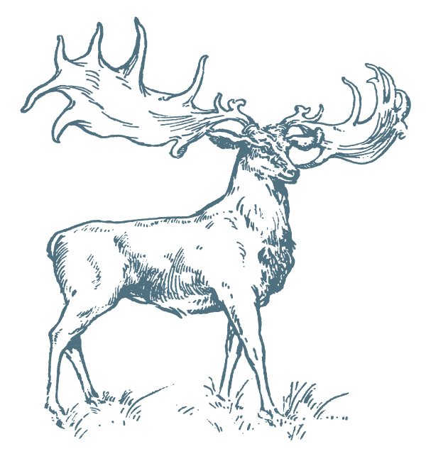
It needs to be pasted in dark brown at X: 35 mm, and Y: 425 mm, and measuring 23 mm wide.

The next animal is the other mammoth.
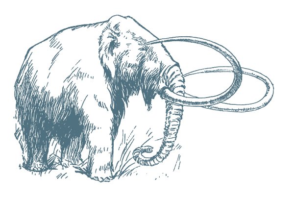
It needs to be pasted in dark brown at X: 160 mm, and Y: 415 mm, and measuring 50 mm wide.
Lastly, the saber-tooth tiger.
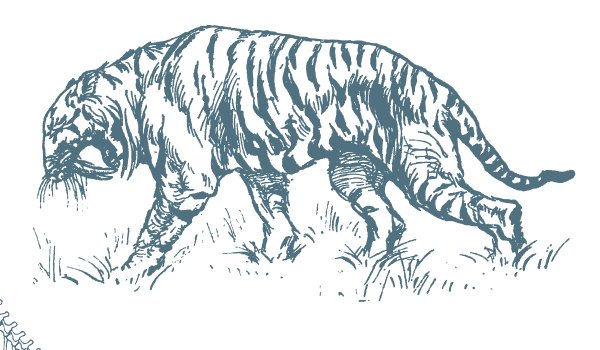
It needs to be pasted mirrored, in dark brown at X: 290 mm, and Y: 428 mm, and measuring 30 mm wide.

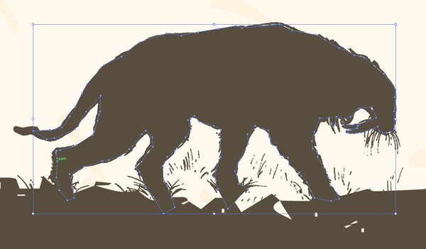
Problem: these aren’t very visible. Solution: to transform them as a silhouette. They’ll have less details, but be more legible. Renee has shared a good solution in her tutorial, based on using the blob brush (see step 3).
Given the size the silhouettes will have within our poster, we could get away with a not so precise job with the blob brush for sure (SHIFT + B). Here’s what painting the buck would give.


If that degree of precision isn’t good enough, there’s always the pen tool.
Either way is valid, as long as the end result is satisfying.
Painting with the blob brush creates either additional shapes behind the animals, or gets them merged in the animals’ paths. Some layer clean-up will be required.
Creating a tree line
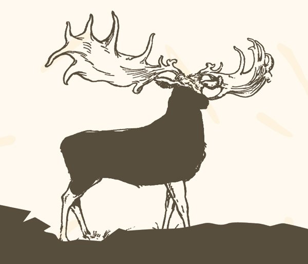
The last figurative elements we’ll add to the “hills” are trees. They will reinforce the idea of a landscape, were animals roam.
The tree assets come from Lisa Glanz’ illustrative elements (Illustrations_line-drawings-CC.ai – \lisa-glanz\Essential-Branding-Kit\AI-FILES\CC\Illustrations).
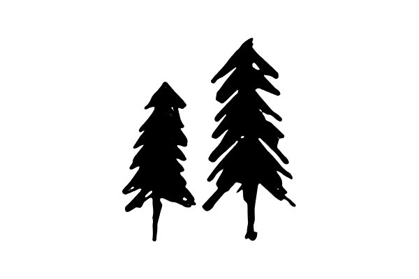
We’ll simply duplicate the group a few times, and sometimes reflect it so it doesn’t jump to the viewers’ eyes that they are the same asset over and over.
Let’s start by pasting it in dark brown at X: 370 mm, and Y: 420 mm, and measuring 29 mm wide
Let’s duplicate the group, and paste it at X: 75 mm, and Y: 420 mm.
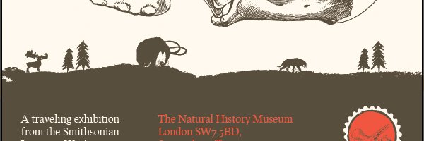
Let’s duplicate the group one more time, paste it at X: 105 mm, and Y: 415 mm, and mirror it.
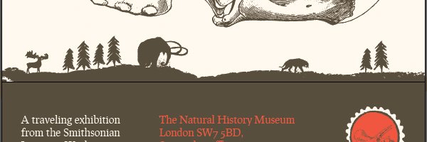

Finally, let’s duplicate the mirrored group, and paste it at X: 250 mm, and Y: 205 mm.
And that’s perfect. It’s time to start our last lap.

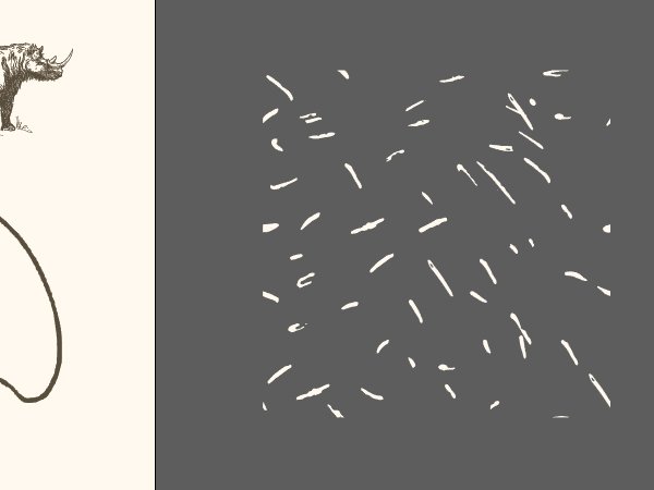
STEP FIVE: SPECKLING AND TEXTURES
Phew, we’re almost there! The last step of the tutorial is to add speckling to the piece, with the help of Lisa’s vector textures. They are included in her branding kit as well, and can be found in the \lisa-glanz\Essential-Branding-Kit\AI-FILES\CC\Textures folder.
After adding a layer to host the textures, we can start pasting them in our piece. The first one will use is Texture_1-CC.ai.

It should be pasted centered in our piece, colored in off-white (#fff7ec), and 600 mm tall.

The second texture we’ll use is Texture_2-CC.ai, in its most intense version.
It should be pasted centered in our piece, colored in light brown (#9e7753), and 600 mm tall.
Finally, we’ll finish the poster by using Texture_3-CC.ai, but with a twist.

It should be pasted centered in our piece, rotated 180° clockwise, colored in orange (#f0583c), and 610 mm tall.
And in order to diminish its impact on the piece, we’ll simply delete the big shapes at the top right of the texture.
Mission accomplished! Our poster is ready to send to the client. A last look at the layer stack.
WRAPPING THINGS UP
Phew! That was a long tutorial. Cheers on making it until the end. I hope your outcome matches the objectives you set for yourself before starting.
This tutorial is not necessarily complex in what is executed, but more because of its length, and series of repetitive actions. If anything is unclear, don’t hesitate to ask questions in the comments below! The Design Geeks and myself will be happy to help out.
We’d love to see your tutorial outcomes! Please share them with us on the Design Cuts Facebook page. We’ll share the best ones with the whole community.
The versatile vector collection is still available for a few days yet, for 94% off its regular price! Don’t miss out on this opportunity if you haven’t purchased the bundle yet.
If you got it already, I hope that you enjoy your new design assets, and that this tutorial gave you a sense of the fun things you can accomplish with these great elements.
And on that note, that’s it for me! Until next time, cheers!
Love this poster and it’s given me a lot of great ideas to try out in the software package I use. No Adobe Illustrator for me at the moment, but you never know, maybe one day! I always look forward to the tutorials arriving in my inbox and all the inspiration they give (and luckily for me I have quite a few previous tutorials to inspire me too as I’ve not had a chance to look at them all yet). Thank you for sharing :)
Hey Natasha, thank you for your kind words.
Technically, you *could* transfer that tutorial to Photoshop, minus the brush stuff. You would just have to import the vectors to Photoshop, which won’t always be practical, but eh.
I can only recommend being knowledgeable in both Photoshop and Illustrator, as they don’t have the same purpose, no are they able to accomplish the same things.
Cheers!
Another great tutorial! I’ve been using AI for more than 20 years and yet, I seem to learn at least one new thing every time I do one of these. I like the idea of using the paint brush for the landscape. Somehow, I had never thought of that. It saves a lot of time over trying to draw that hill top.
Please, keep ’em coming.
I forgot why I started my comment. If the files were supplied as eps, they could be opened in Inkscape and then placed in PhotoShop.
Hey Rick, thank you for your kind words!
As far as I know, Photoshop can also open EPS files, so there’s always that.
this is really amazing work , I’m thoroughly inspired with it. no words to express. and i learn new way of working.
Hey Rimsha,
Thank you for such a lovely comment! Simon will be so happy to hear that he inspired you :).
We would love to see your finished design if you were keen to share!
Hi Carol,
Thanks for your quick response, i am very keen to learn these kind of work and the best part is that now i am learning gradually things with the help of your site but the problem is the vector used in the work are not easy to get because my company is too small to buy me those and secondly I’m also not that rich to buy them if you don’t mind in providing the free materials used in tutorial it will be easier to practice things.
Hope you understand my point.
regards Rimsha
Ah, thank you so much for your kind words, Rimsha! I’m glad you’re enjoying the tutorial. Don’t hesitate to share your outcome with us on the Design Cuts Facebook page: https://www.facebook.com/designcuts.