WHAT WE’RE CREATING:
Hello Design Cutters! It’s Simon on this end of the keyboard, transmitting from the American Midwest. For this week’s second tutorial, I’m going to show you how to use the content of the Complete Professional Designer’s Toolkit to rapidly prototype the poster of an electronic music festival, and how to spread that identity across supporting elements.
STEP ZERO: THE ASSIGNMENT AND CONCEPTUAL ANSWER
The brief
Our mission is to showcase what could one of the visual treatments for WaveForms look like. WaveForms is an electronic music event that will take place on August 6th, 2015, and draw acts like Carpenter Brut (FR), Pertubator (FR), Power Glove (AUS), Kavinsky (FR), and Kraftwerk (DE).
The event will take place at the Tate Modern gallery in London, and more specifically in the Turbine Hall. It’s a beautiful industrial space, and hosted a Kraftwerk performance in the past. It’s perfectly fitting.
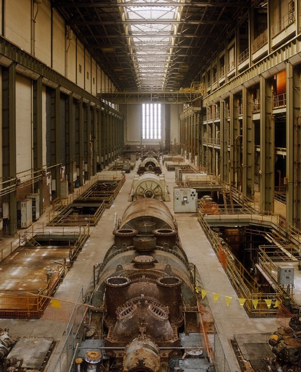
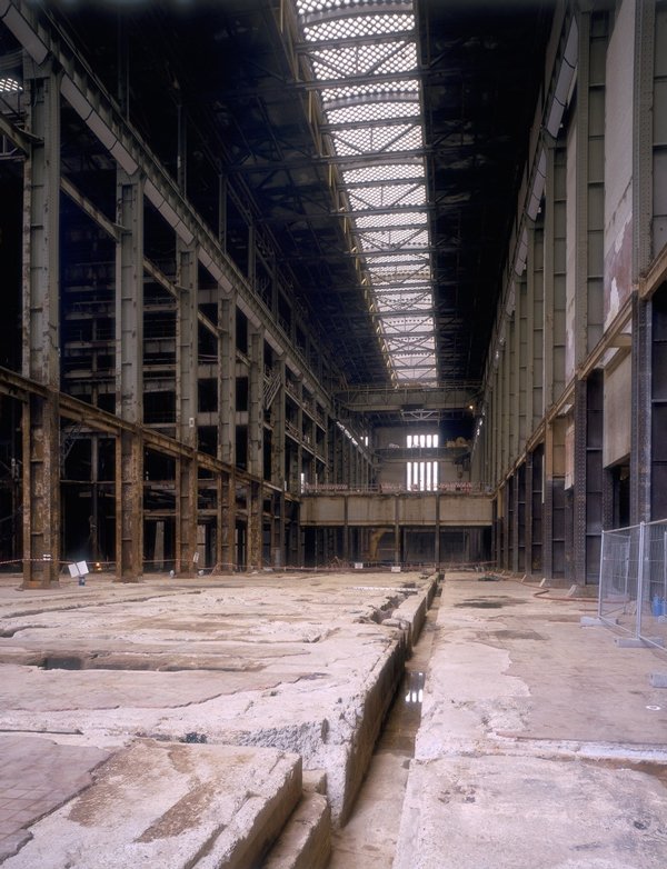
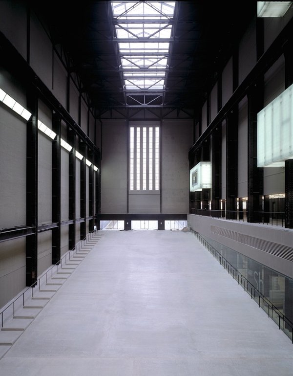
(Images via Tate.org/Marcus Leith/Tate Photography – © all rights reserved.
The music
To properly design for the event, we need to get a sense of the sound of these acts. Most of them are classed as part of the synthwave gendra. You might know Power Glove from the FarCry 3: Blood Dragon soundtrack, Kavinsky rom his appearance on the soundtrack for the movie Drive, and Kraftwerk as pioneers of electronic music.
A bit of inspiration
Now that you have the music in the background, we can have a look some visuals. Electronic music has a strange graphic culture, oscillating between minimalism, and visual explosion. Another trend to take note of is the use of visual codes pertaining to scientific diagrams, electronics, and other technical/technological-looking graphics.
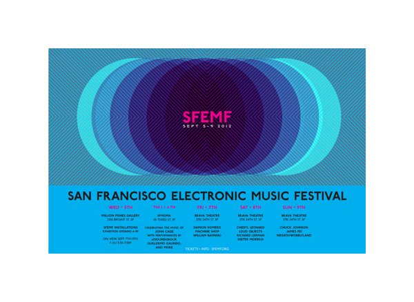
Poster for the 13th Annual San Francisco Electronic Music Festival (#).
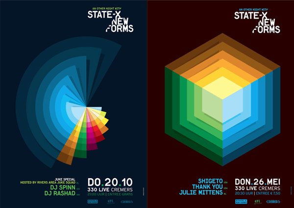
Posters for State-X/New Forms (#).
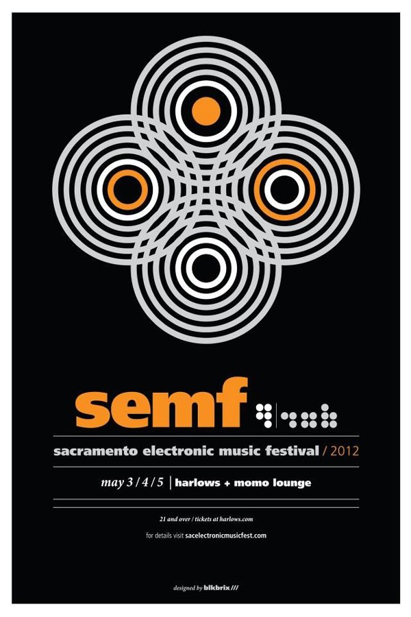
Poster for the Sacramento electronic music festival (2012) (#)
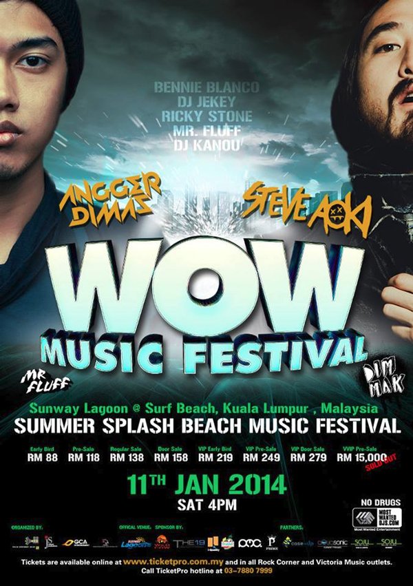
Poster for the Wow music festival (#)
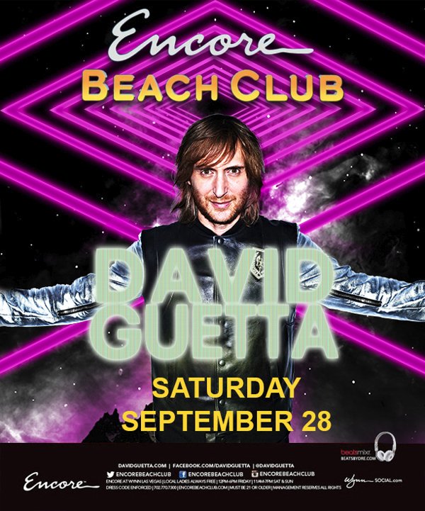
Poster for a David Guetta set at Encore, in Las Vegas (#)
A look at the bundle’s content
Our goal will be to put together something that’s tasteful, appealing, and that you can easily spread across communication channels. Let’s dive into the assets that are at our disposal.
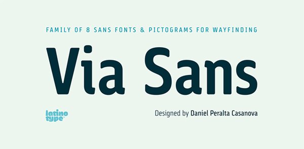
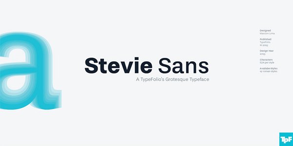
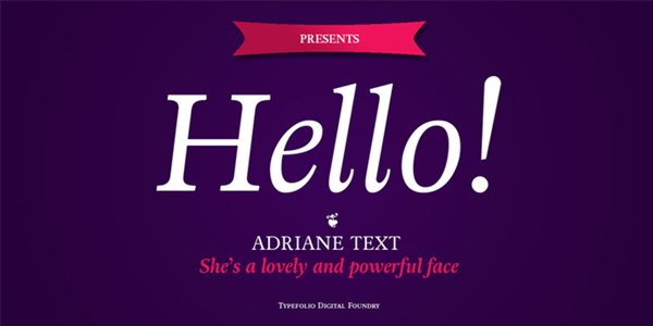
Via Sans, Stevie Sans, and Adriane Text will be the tools to shape our text.
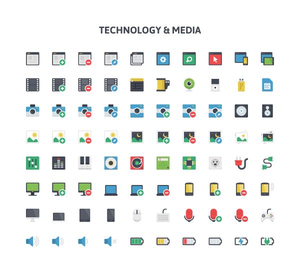
Pixel Bazaar’s Flatilicious technology and media icons will provide us with a strong illustrative element.
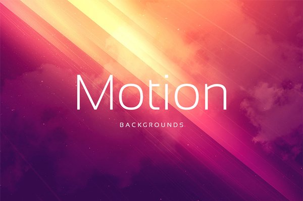
Digital ART’s motion backgrounds will provide us with the background for the piece. The vibrant colours, coupled with the light effects, will be right at home here.
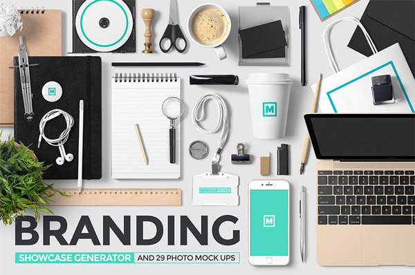
Finally, Mockup Zone’s assets will allow us to test out our prototype very quickly.
Ready? Crank the bass up to 11, and let’s go.
A FEW TECHNICAL CONSIDERATIONS
We’ll use both Photoshop and Illustrator for this tutorial. Illustrator, because manipulating type and vectors makes much more sense in Illustrator. Photoshop will help us in the mockuping phase of the project.
STEP ONE: DESIGNING THE POSTER IN ILLUSTRATOR
Document setup
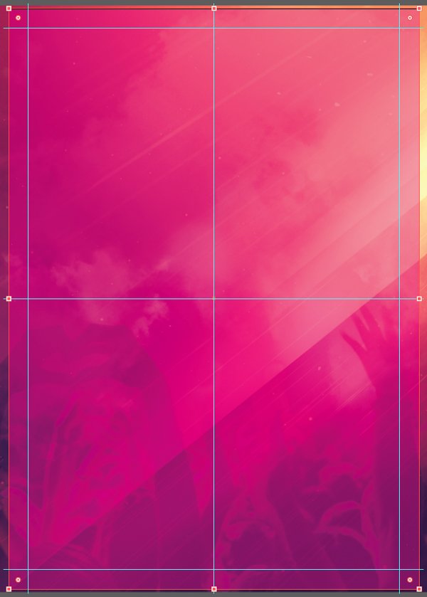
Our poster will be designed for an European event. Therefore, we are going to adopt the ISO formats for our canvas. We’ll use an A2 base format (420×594 mm), a rough equivalent to our usual 18″x24″ canvases.
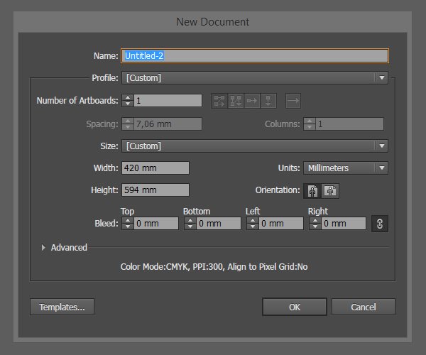
We’ll then proceed to mark its center (vertical guide at 210 mm, horizontal guide at 297 mm), as well as a 20 mm zone around its perimeter.
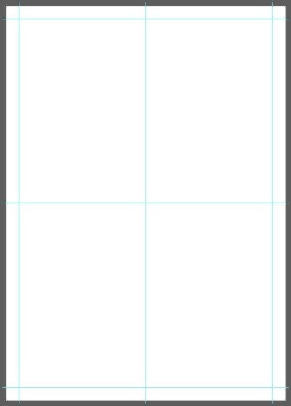
And let’s not forget to give our guides their own layer, that we’ll lock.
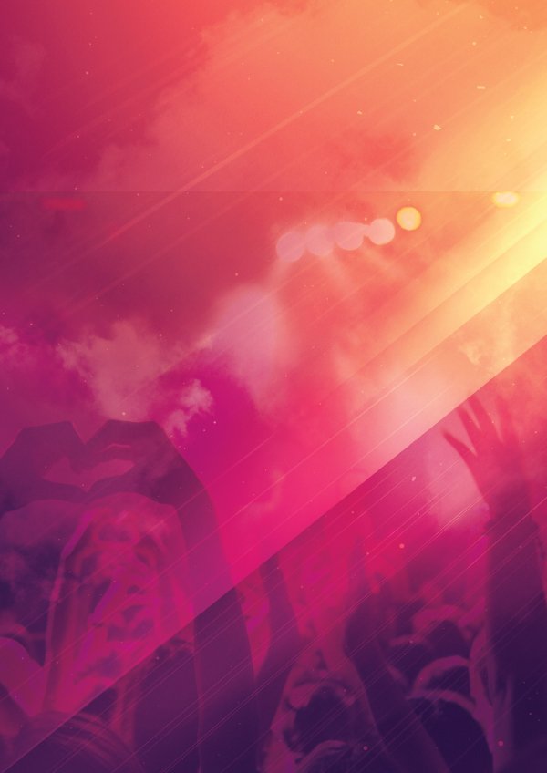
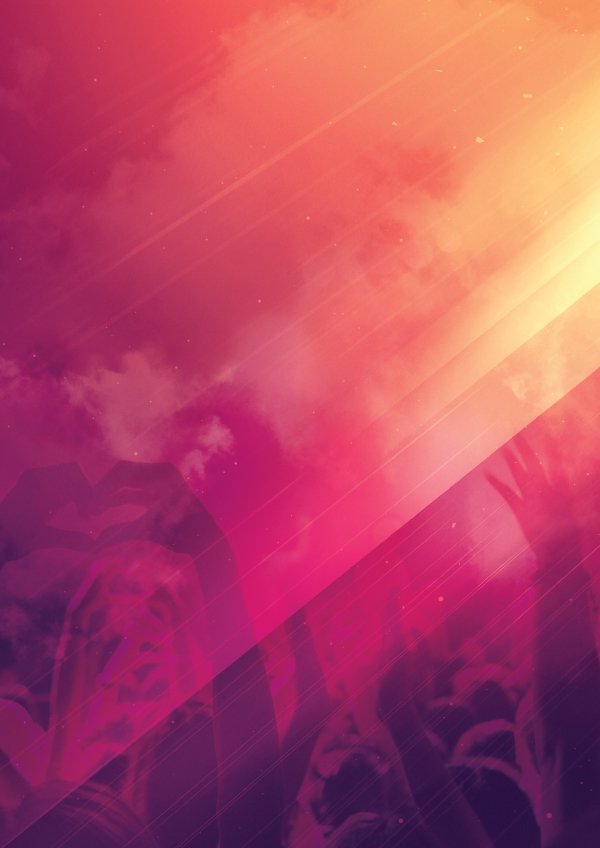
The background
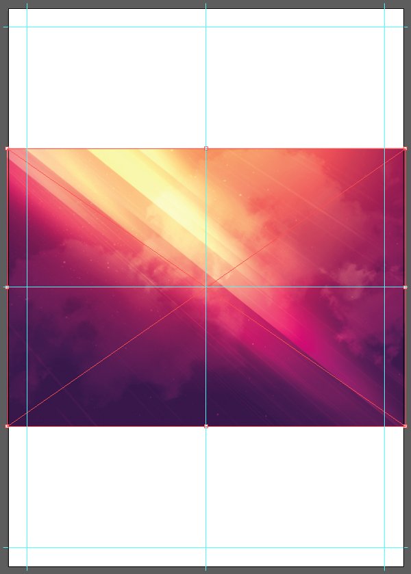
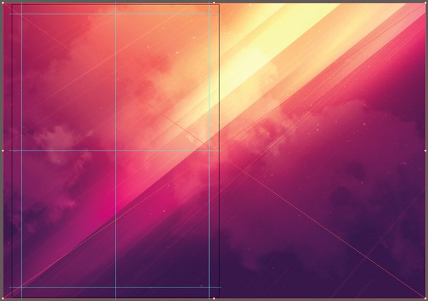
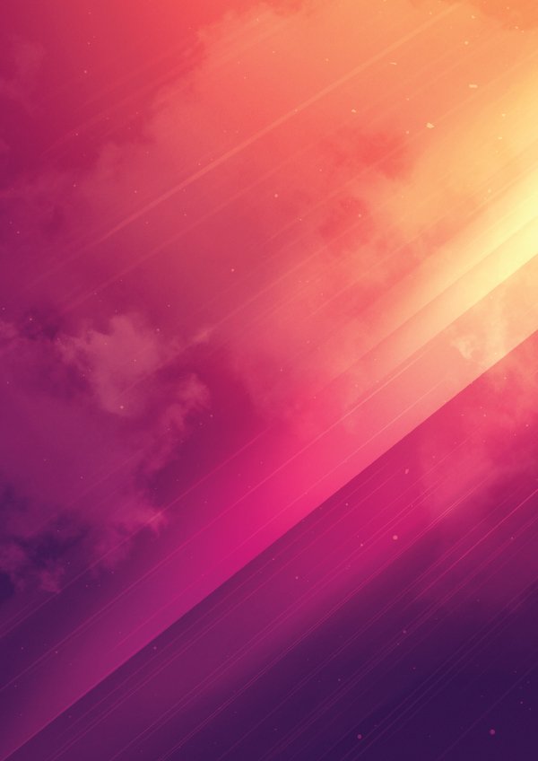
As stated earlier, Digital ART’s motion backgrounds will provide the basis for our piece. They can be found in the \digital-art\18-Motion-BackgroundsV3 folder. We’ll use 11.jpg.

After placing it in our document (File > place), we need to adjust its orientation, position and size.
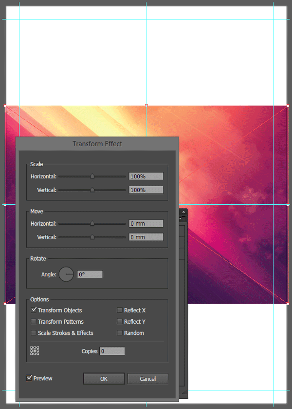
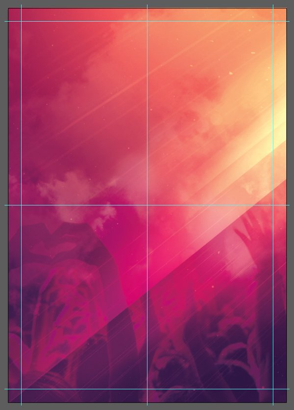
We want the motion given by the light streaks to go in our sense of reading (left to right). This will make the poster more dynamic. To accomplish this, with the image selected, go to the appearance panel (Window > Appearance) to transform it.
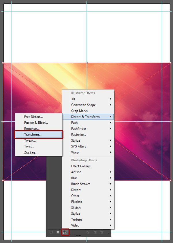
The transformation through the appearance panel is non-destructive, which means that it can be “turned off” very quickly. What we want to do here is to reflect the image along its X axis, so the light seems towards the top-right corner of the image.
From there, we can size, and position the image so it occupies the whole canvas, and provides a visually interesting crop within it.
The image should be 600 mm tall, and its centre point should be located at X: 410 mm, and Y: 297 mm. This aligns the main light streak in the image with the bottom-left corner of the canvas.

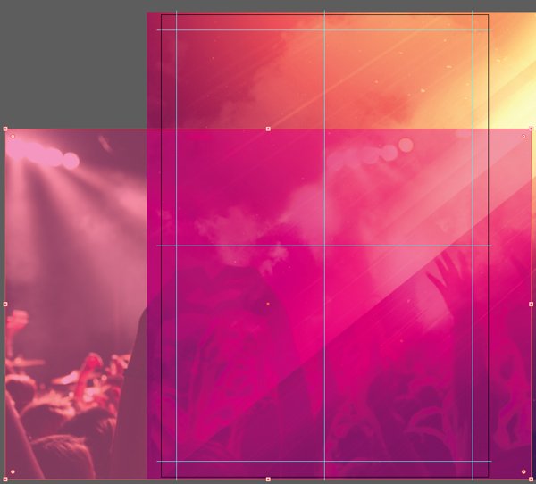
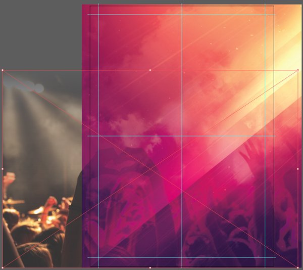
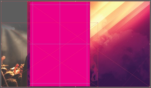
To insist on the festive side of the event, we are overlay a crowd over the background. Illustrator’s blending modes are virtually the same as in Photoshop. The concert crowd image can be found via Unsplash’s Pixabay collection. Note: you’ll need a free account to be able to download the high resolution version of the image.

We want to place the image so its bottom edge is flush with the bottom edge of the background image.
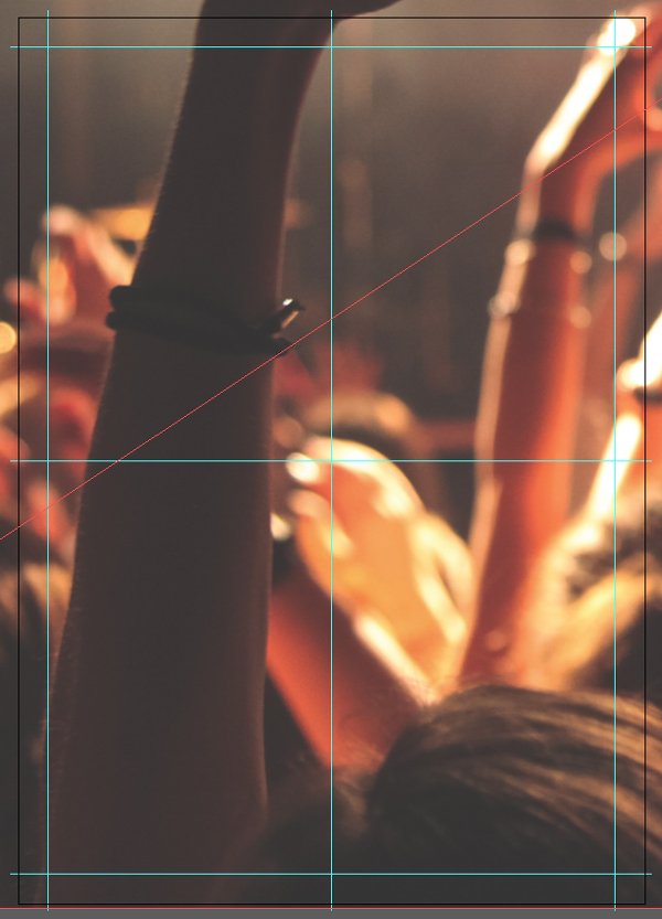
Because the image is very big, we’ll want to dramatically resize it down. Its final size should be 675×450 mm, and its centre point placed X: 137.5 mm, and Y: 372 mm.

From there, we change its blending mode to Soft light @ 100% opacity. Crowd overlay accomplished.
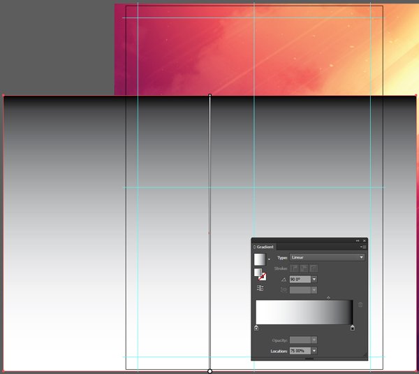
Problem: there’s a very hard edge where the top of the crowd photo meets the rest of the background. To fix this, we need to create an opacity mask containing from a gradient. We used that technique before, in our Creepy horror film poster tutorial.
In Illustrator, there are no direct equivalent to layer masks as in Photoshop. There are opacity masks, and clipping masks.
In my opinion, opacity masks are the closest in functionality to Photoshop’s layer masks. Bittbox has a good writeup on these, but here’s the gist of it:
“An “Opacity Mask” refers to a mask in Illustrator that you place over an existing shape that controls its transparency based on the values of black and white in the mask. White being visible, black being transparent, and all shades of gray are in between on the opacity scale.”
Clipping masks, on the other hand, don’t allow you to control transparency, only if something is visible or hidden. Here’s what Illustrator’s official documentation tells us:
“A clipping mask is an object whose shape masks other artwork so that only areas that lie within the shape are visible—in effect, clipping the artwork to the shape of the mask. The clipping mask and the objects that are masked are called a clipping set. You can make a clipping set from a selection of two or more objects or from all objects in a group or layer.”
What this means is that we have to create a rectangle that exactly matches the dimensions of the crowd photo, that is perfectly aligned with it, and that is fully transparent (no fill, no stroke). Mine is here in translucent magenta for better visibility.
From there, we’ll fill the rectangle with a black-to-white gradient that answers to these specifications. What will be black in the gradient will hide the image later on, and what will be white will show it. Note the shifted “centre.”
Next, with both the rectangle and the image selected, we can head to the transparency panel (Window > Transparency), and click on Make Mask to create the opacity mask.
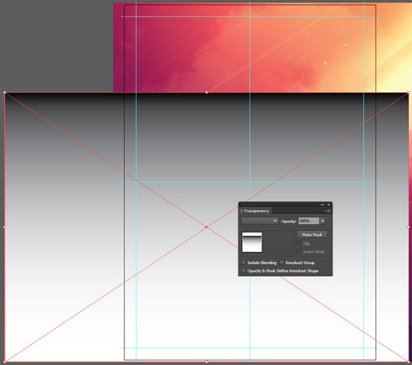
The result: no more hard edge, and a clean dancing crowd overlay.
Finally, we can add a clipping mask to the ensemble to hide away the parts of images not shown within the canvas. We just have to create a transparent rectangle of the size of the canvas (420×594 mm), that’s perfectly aligned with it (X: 210 mm, Y: 297 mm) – here shown in translucent magenta.
From there, we can select all of the images composing the background (motion background, and crowd shot), along with the rectangle.
From there, we can use the menu Object > Clipping mask > Make, and our extra image bits will be hidden.
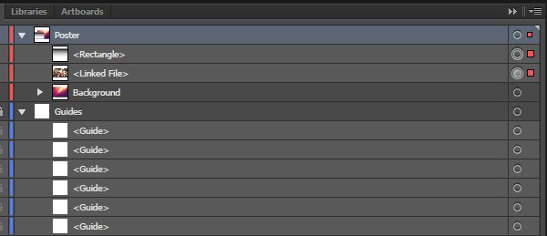
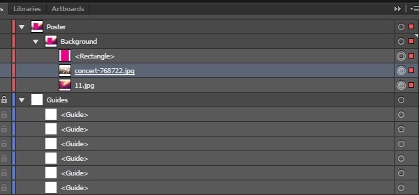
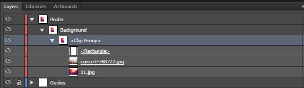
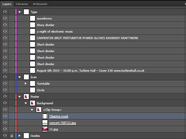
A quick word about what the layer stack is looking like so far:
- Poster is the layer we created to work within, after locking the Guides layer
- Background is a sub-layer we’re created to put all the elements pertaining to the background of the poster
- <Clip group> is the name of the object appearing when we created the clipping mask, and it contains the following:
- <Rectangle> – the rectangle used as the clipping mask
- concert-768722.jpg – the crowd shot, which name is underlined to show that it also has a transparency mask attached to it
- And 11.jpg, the actual asset used as the background for the piece
The illustrative element
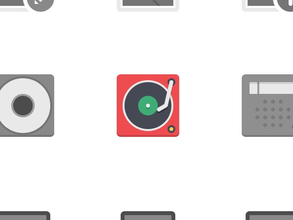
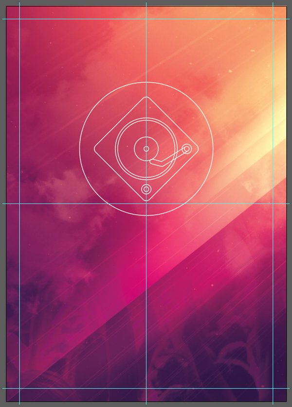
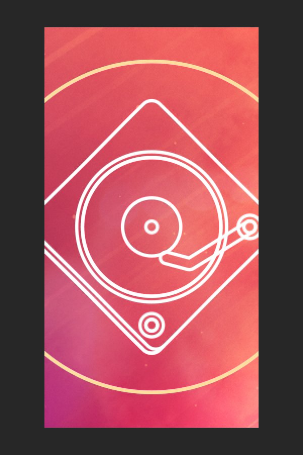
As said before, Pixel Bazaar’s Flatilicious icons will provide us with our illustrative element, but we’ll need to tweak it some. The one we want to use is hidden within the technology and media group (\pixel-bazaar\flatilicious-icons\AI\technology-media.ai). It’s the turntable icon (fifth row, fifth column).
Let’s start by copying the icon into our document, into its own sub-layer.
The icon’s current treatment doesn’t fit our piece at all, even when scaled up properly.

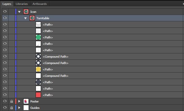
To remediate that, we’ll edit the icon a bit. First, we need to scale it up, say to let’s make it to 200 mm. Then, we need to switch it to a line illustration, killing all fill colours, and giving it a 5 points white stroke, with rounded stroke corners and caps. The result is a precise, almost blue-print ready, line art rendering of the turntable. This line work-oriented art style fits our goal much better, but there are still additional tweaks to come.
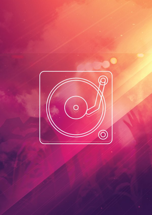
The next step is to simplify in order to amplify. The icon features shapes used at first for shading, and extra detailing. We can spot them below the centre hole of the record, along with underneath the tone arm, and the bottom of the record player’s body. Note: they are highlighted in cyan for better view below.

These are just “in the way,” so we’ll simply delete them.

Type!
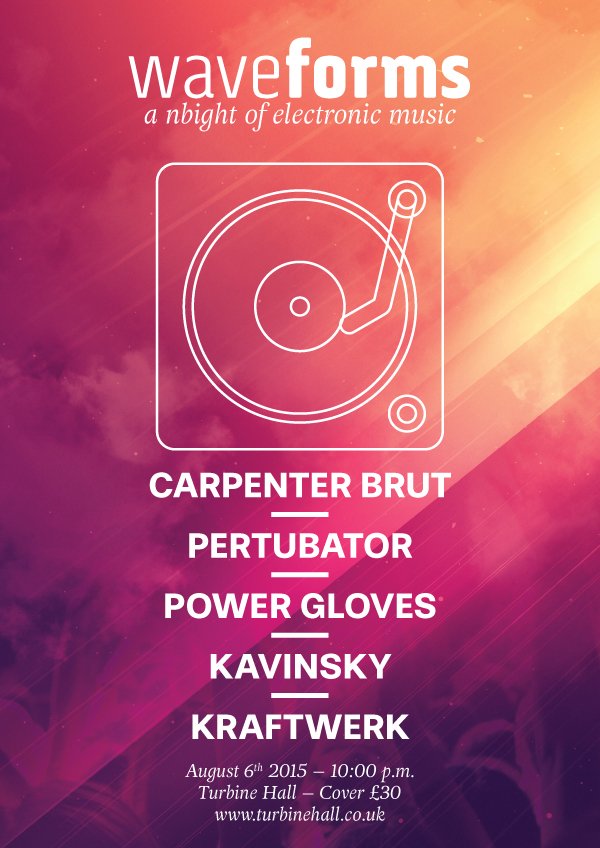
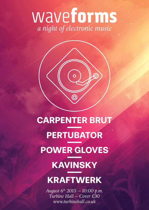
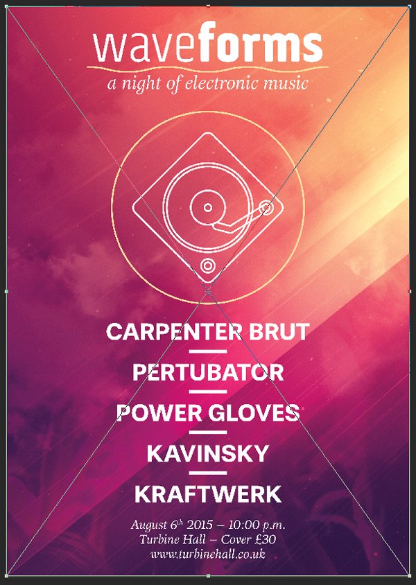
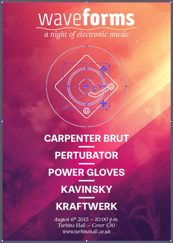
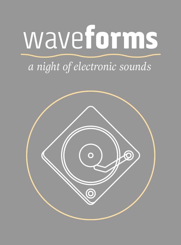
From there, it’s time to think about text. Here’s what the fill copy of the poster reads like:
- waveforms – the name of the event
- a night of electronic sounds – the sub-title
- the record player illustration
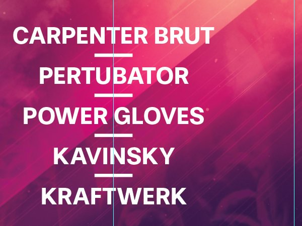
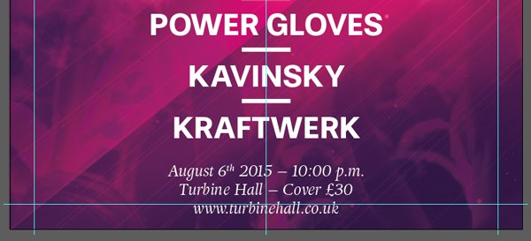
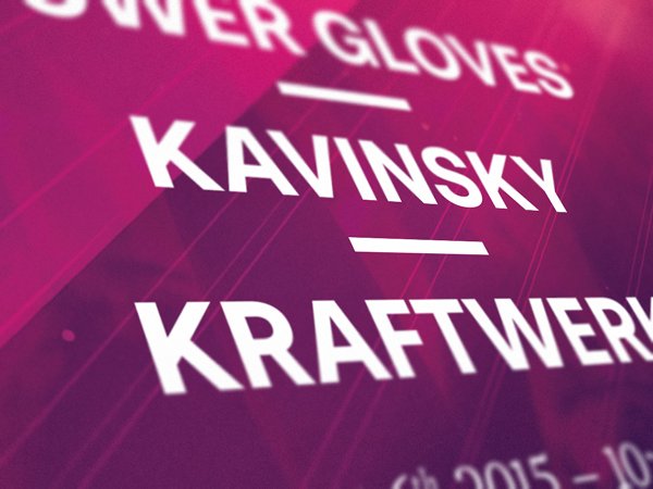
- Carpenter Brut / Pertubator / Power Gloves / Kavinsky / Kraftwerk – the performers
- August 6th 2015 – 10:00 p.m. / Turbine Hall – Cover £30 / www.turbinehall.co.uk – the additional information
The text is written in a way that fits with the ensemble. In our case, we’ll have multiple typefaces competing for attention with a line art illustration. Hierarchy will be key.
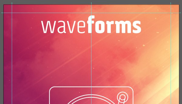
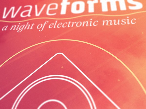
Let’s start with the event’s title, WaveForms. We will write it as one word, but use the multiple weights of Via Sans to our advantage, and visually mark the two words it’s made off.
Start by writing waveforms in Via Sans, centred on the median vertical of the poster, set at 162 points tall, with kerning set to optical, and coloured in pure white (#ffffff). It should be placed near the top of our poster, the top of the text block flush with the top of our 20 mm exclusion zone around the edge of the canvas.
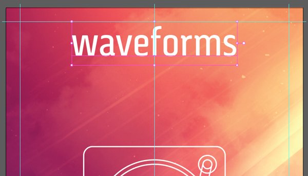
Next, we’ll change “wave” to Via Sans Light, and “forms” to Via Sans Black.
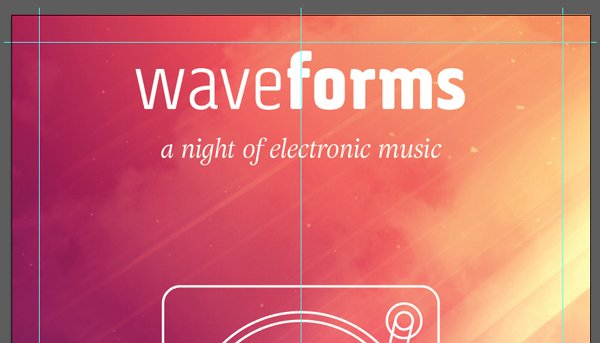
The next line, “a night of electronic sounds,” is set in Adriane Text Italic that’s also centred, also white, but only 54 points tall, and with its kerning left to automatic.
Absolute positioning doesn’t matter at the moment. We are now going to tackle the performer block, situated below the turntable icon.
The block is set in Stevie Sans Bold, that is coloured in white, 72 points tall, with a line spacing of 120 points, and kerning set to optical.
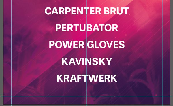
The spacing can seem odd, but it’ll allow us to slide an horizontal divider between them, to add visual structure to our composition. To do that, let’s start by creating a line segment that’s white, 40 mm wide, and given a stroke of 10 points, to match the thickness of Stevie Sans Bold.
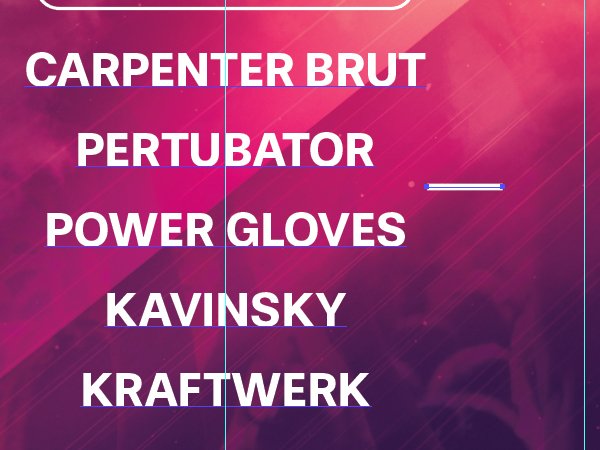
From there, it’s a matter of creating enough copies to place between the lines of the performer block (four copies in total). The lines are centred like the block of text, and also vertically centred between each line. Protip: using the alignments tools speeds that process up quite a bit.
The last block of text is the additional information one: date, location, and cover charge. It’s set in Adriane Text Italic, that centred, white, and 36 points tall. The copy is broken down on three lines: August 6th 2015 – 10:00 p.m. / Turbine Hall – Cover £30 / www.turbinehall.co.uk. Note that the “–” between elements isn’t a regular dash, but an en dash.
Let’s have a look at our poster globally so far. Most of our important elements are there, but they need some refinements.
Iconography refinements
The first set of adjustments we’ll execute are pertinent to the icon. Currently, the turntable seems to be floating in the air. We need to “ground” it some. Adding a supporting shape will work wonders. It’s also in a static posture right now. A rotation will help to address that.
First, let’s rotate the icon of 40°, clock-wise. This will re-reinforce the dynamism of the piece as a whole. You can use either the appearance panel, or apply a rotation to the icon by hand.
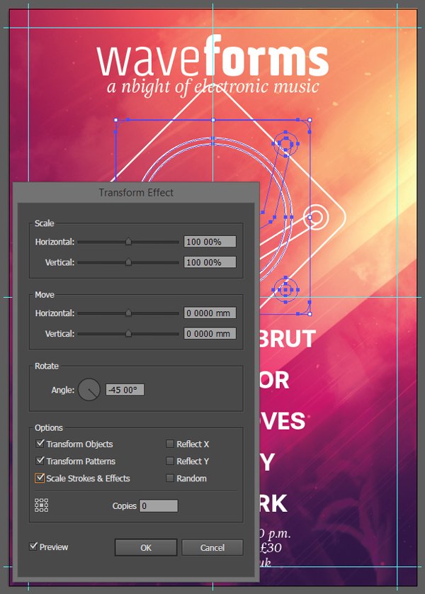
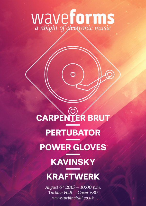
With the rotation applied, it’s time to add the supporting shape. It’ll be a white, five points stroked circle, that has a diameter of 350 mm. The type has been hidden below.
From there, we can reduce the size of the circle and turntable combo to a width of 200 mm. This will give us the room later to adjust the various text elements above and below the icon ensemble. Double checking that the strokes are still at the good, five points thickness value never hurts after a transformation.
Typography adjustments
Once the iconography has its proportions fixed, we can tackle the type elements. Top and bottom first.
“WaveForms” is placed at X:, and Y:.
“August 6th…” is placed at X: 210 mm, and Y: 555 mm.

From there, we can adjust the placement of the icon, to X: 210 mm, and Y: 210 mm.

Finally, the performers’ block, including the dividers we created for it. It’s placed at X: 210 mm, and Y: 425 mm.

Last touches
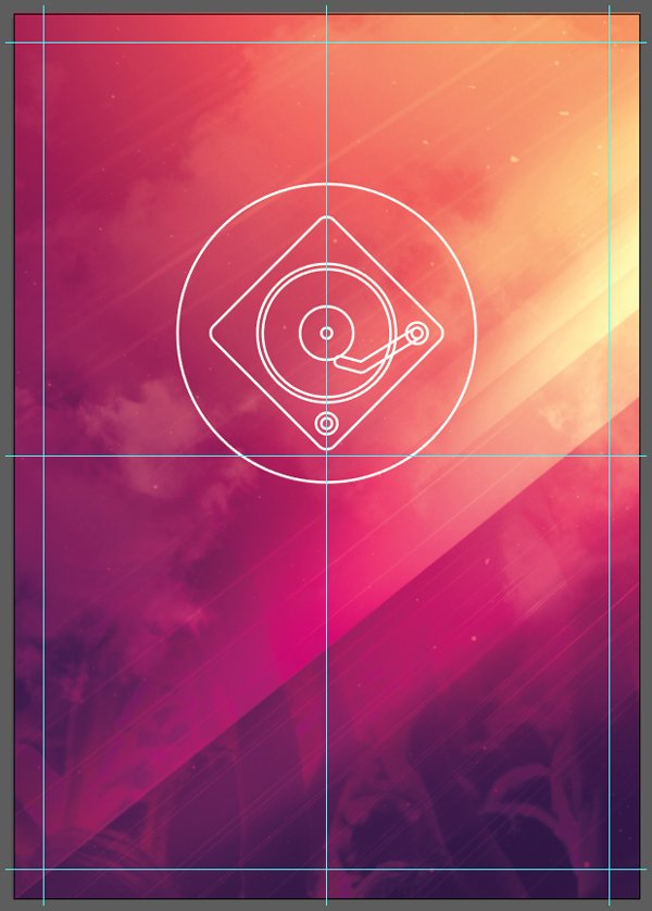
We’re almost done. We’re going to add one last visual element, and a splash of colour to it.
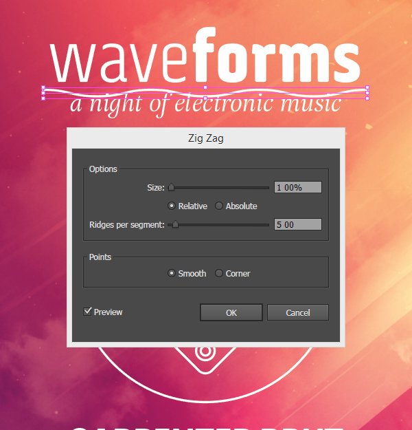
The event is named WaveForms. We should add a visual representation of that, however small. Let’s create a centred line segment between “WaveForm” and the sub-header. It should be stroked white, and 5 points thick. Its width should extend slightly beyond the title.

From there, we are going to use Illustrator’s Zig Zag filter to quickly make this line wavy. Head to Effect > Distort and tranform > Zig Zag. We’ll want a very low value for the size (1%), and for the number of ridges per segments (5 of them). This makes a line that can also function as a divider, rather than a second central visual piece.
From there, we have to slightly adjust our text elements again so they flow better together.
WaveForms gets bumped up a hair, at X: 210 mm, and Y: 40 mm.

The new wavy divider gets bumped as well, to be optically centred between the title, and the sub-header, at X: 210 mm, and Y: 66 mm.

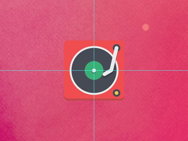
Now, we are going to give the line a warm yellow hue, sampled from the piece’s background. The section close to the right of the circle can provide you with a value of #fdde9b.
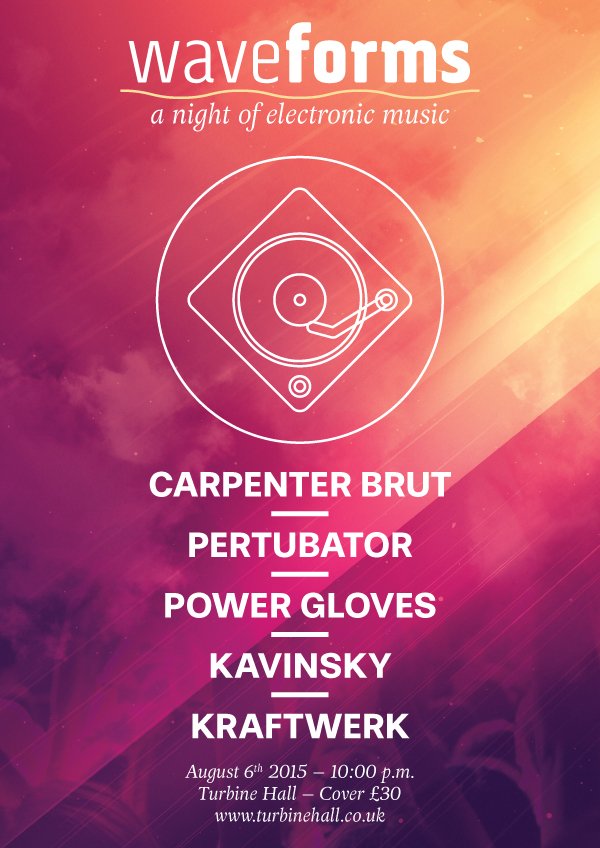
In order for the wavy line to not stand out too much by being the only yellow element, we’ll also assign that colour to the circle containing the icon. And with that, our poster prototype is done.

After a bit of clean-up, here’s what the layers, sub-layers, and objects look like.
Let’s save a high resolution copy (File > Export), and move on to mockups!
STEP TWO: SPREADING THE BRAND IDENTITY
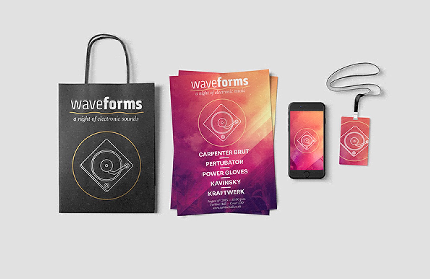
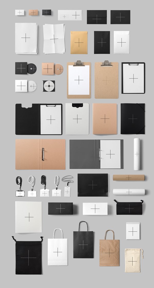
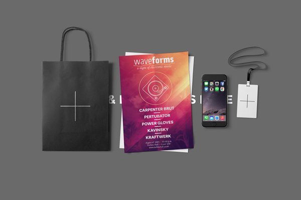
The second phase of the work can start: the transposition of the visual exploration to other communication supports. As stated earlier, we’ll use the custom scene tools by Mockup Zone to try out our identity exploration.
Deciding WHAT supports to play with
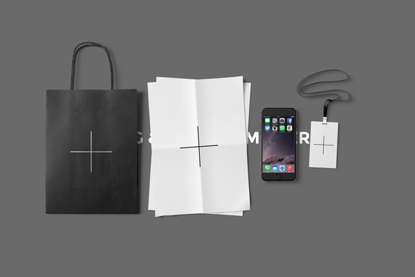
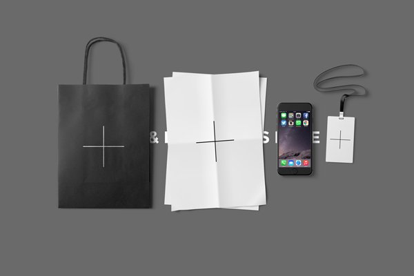
We’ll transpose our work onto four different supports, each with a varying degree of adjustments.
We’ll use the paper bag, the poster stack (even if it’s supposed to be an A4 format), a smartphone, and a festival’s most coveted possession: the VIP lanyard.
Let’s begin by locating the four assets. They are all part of Mockup Zone’s branding showcase generator (\mockup-zone\branding-showcase-generator-photos\).
The bag, stack of posters/flyers; and lanyard are available as part of the stationary items.psd file.
The phone is part of the additional items.psd file.
Composing the mockup scene
Using the mockups is simple. We start by opening the Stage Generator.psd file.

From there, we simply have to drag and drop the layer groups pertaining to the assets we’re interested in. Here’s what the stage looks like after grabbing all the elements. Note that the placeholder text hasn’t been turned off, nor the background colour customised.
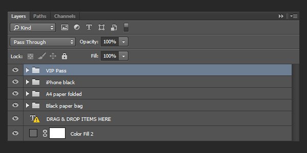
The order in which the supports are in is great: from big to small. Now it’s a matter of tweaking their spacing so it all looks good within the canvas.
SPREADING the BRAND identity
We have multiple assets at hand we can use to transpose the poster to other supports: all or part of the text, the turntable, the background, or a combination of these.
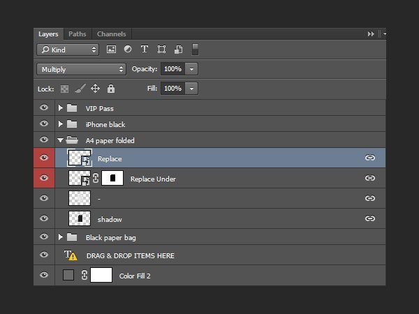
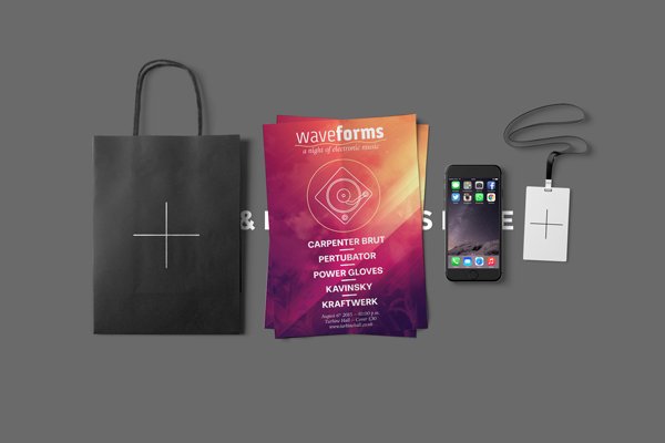
Let’s start with the easiest one: the paper stack. Placing our design in the asset is straight forward, as they are all based on well labeled smart objects. For this one, we just have to place the high resolution copy we saved earlier.
After placing the file, and saving the smart object changes, we can go back to the scene we assembled to admire the result.
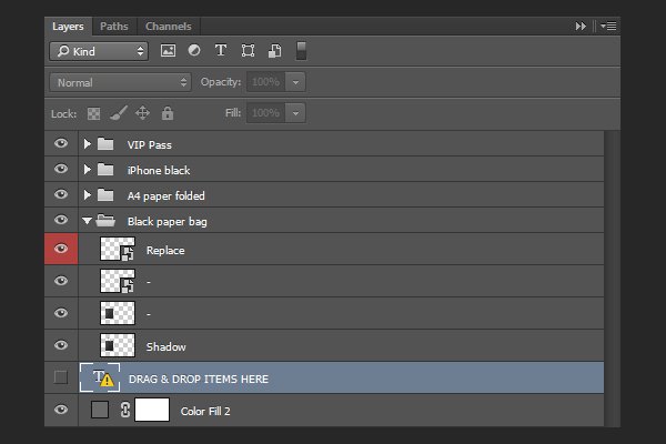
This particular stack of sheets necessitates the sheet below to be updated as well (the “Replace Under” layer).
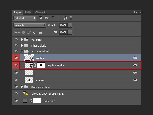
The result is a convincing stack of flyers.
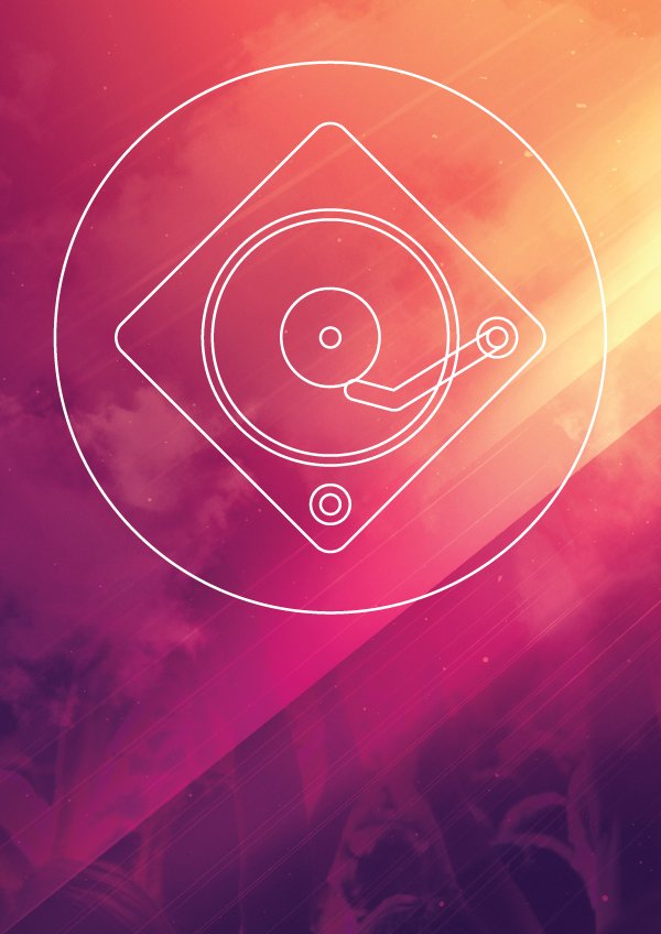
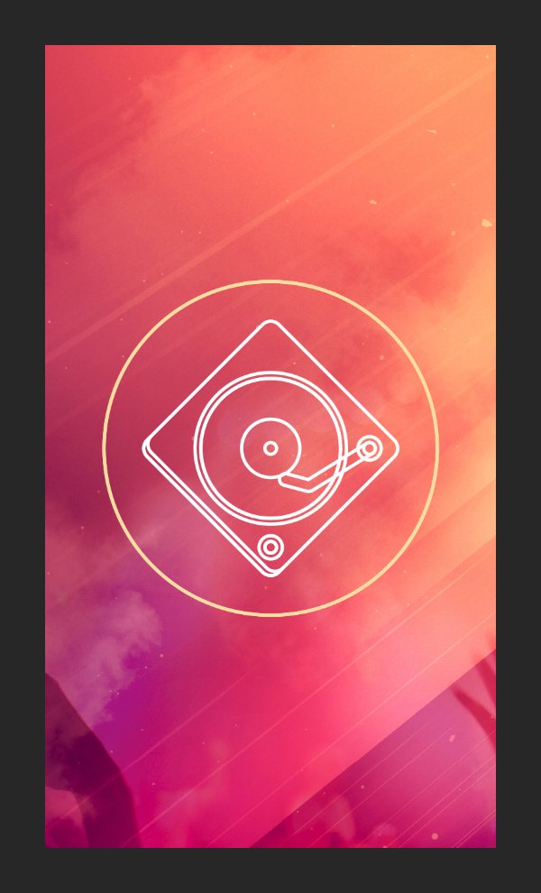
Next, we’re going to take care of the iPhone. Its smart object gives us access to the complete screen, unlayered. Rather than simulate an in-use wallpaper, we’ll simulate an app splash screen, or a lock screen wallpaper.
From our Illustrator document, we are going to copy the background elements, as well as the turntable icon, and that’s it. This will give us the opportunity to play with just the icon on its bold coloured background.
Our new vector smart object gives us a glimpse of what a smartphone wallpaper for the festival could look like. Once the asset pasted in the phone’s smart object, it’s mostly a matter of finding an interesting way to crop thing. In this specific instance, we’re featuring the icon front and centre. The visually simple line work, contrasting against the complex background, creates a visual tension that attracts the eye.
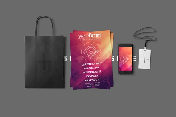
We’re going to apply a similar treatment to the VIP lanyard, except that we’ll make the cropping even more obvious this time, by cutting away parts if the icon..
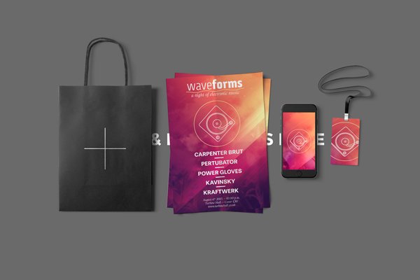
Finally, the black bag. Due to printing constrains, these bags often do not turn out well when printing full colour designs. Their very porous surface “drinks” ink in the traditional offset process, which ends up looking a very bad print. That’s why these paper bags tend to be screen printed. This means that we have to limit ourselves colour wise. The idea then is to copy over only the title, sub-header, and the icon for the design. There’s a solid colour behind the design elements copied over for clarity purposes.
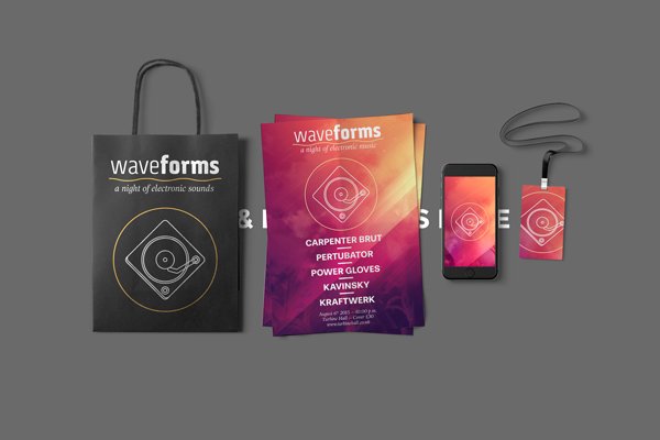
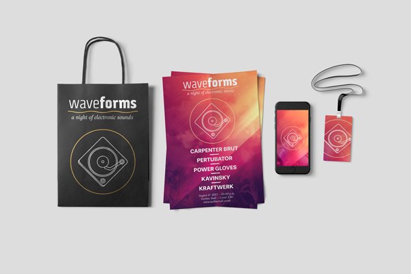
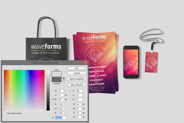
Our presentation is almost wrapped up. We need to turn off the placeholder type layer, and adjust the background colour to something lighter.

The background colour is edited through the colour fill adjustment layer that is at the bottom of the layer palette. Double clicking on it lets us adjust its colour at will. A lighter, warm grey will do nicely (#dddddd). It makes the presentation more legible, and visually attractive.
With such a neat presentation, it’ll be child’s play to score that approval from the art directors and/or the clients!
WRAPPING THINGS UP
Phew, that was a long tutorial! Congratulations for making it until the end. I hope your outcome matches your goals.
Did I leave questions unanswered? Please ask in the comments below. The Design Geeks and myself will do our best and help out.
We’d love to see your tutorial outcomes! Please share them with us on the Design Cuts Facebook page. We’ll share the best ones with the whole community.
It’s still available for a few more days at 97% off its regular price, so don’t miss out if you haven’t purchased it yet. If you purchased the bundle already, I hope that you enjoy it, and that this tutorial gave you a sense of what you can accomplish with these great assets.
That’s it for me today! Until next time, cheers, and have a wonderful weekend!
Great tutorial, great work. Fantastic to have such a close look at how you set it all up. Thanks for that!
Thank you so much for your kind words, Edgar! I’m really pleased to hear you enjoyed Simon’s tutorial :) He did an awesome job with it!
This is a really useful tutorial. I’ve been going through them in my spare time and I’m learning a lot!
I work mainly in Illustrator, but I’d like to use more mockups for the designs I create for my Etsy shop.
My question is more of a Photoshop question than a mockup question. I’d like to know, once I have placed my designs into the mockup, how would I zoom in and crop the image in order to get a close up that I could save as a jpeg? For example, say I wanted to get a close up of the tagline text on the bag. How would I enlarge and crop the file?
Hello Kori. Well, you could simply save a jpg of the complete mockup, open that new image, and use Photoshop’s crop tool on it. Most of these templates are high resolution enough that you could crop sections of it, and still end up with a good quality image.
Wow! So that’s branding! You are amazing, Simon! Thank you! Like the music!
Su
Thank you for your kind words, Su :-)