
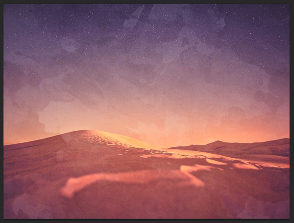
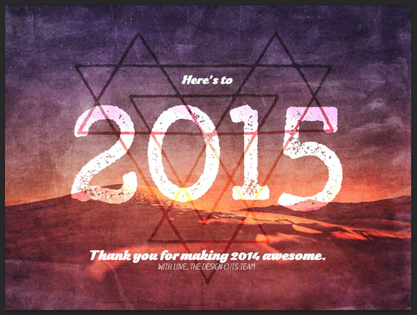
WHAT WE’RE CREATING:
Hello all! Simon here for today’s tutorial. It’s now 2015! I’d like to extend my warmest wishes to you and yours for this brand new year. May it be filled with awesomeness on all levels: professional, personal, and creative.
To celebrate this brand new year, it seemed quite fitting to Tom and myself to use the Design Cuts Free Holiday Gift Bundle to create a celebratory poster for the new year. Let me walk you through its creation!

STEP 0: BRAINSTORMING
In this specific case, I didn’t do too much sketching. Tom and I actually exchanged ideas in the form of an email conversation. This isn’t to say that sketching wouldn’t have helped the process along, but rather to say that we both got a strong sense of where to bring the piece.
My idea for the tutorial was quite simple: let’s build a 2015 poster.
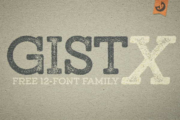
My idea would be to create a 2015 print. There are enough nice fonts to fully spell two thousand fifteen in a beautiful manner, although Gist X is my favorite. Textures wouldn’t be an issue either.
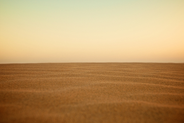
I started looking at images that look positive/dreamy, rather than dark and scary. They also would work quite nice with some of the presets in the bundle:


With that general direction agreed upon, I started looking more carefully through the various resources included in the bundle.
The ones that struck an immediate chord are Yellow Design Studio’s Gist X font, Ghostly Pixels’ tribal badges, and 2 Lil’ Owls Lightroom presets.

There are a few more assets we’ll use throughout the piece, but these are the main ones it’s articulated around. Let’s get to it, shall we?
STEP 1: PREPARING OUR BASE IMAGE
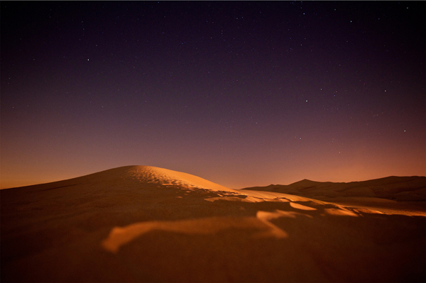
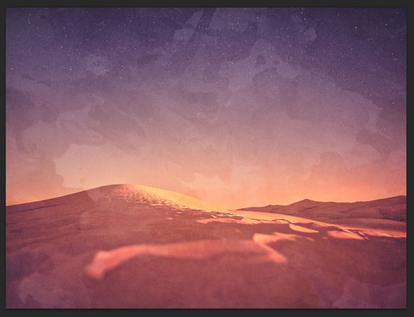
This step implies that you have access to Lightroom. We’ll use the Winter Wonderland #14 preset (\Holiday-Gift-Bundle-2-lil-owls\Winter Wonderland presets) to develop our chosen base image. The preset accentuates the eerie side of the image. It lightens the image, soften colors, and adds warmth and saturation.
The process to install presets has been detailed by the 2 Lil’ Owls team in the text file attached to each preset batch, so I won’t cover it here.

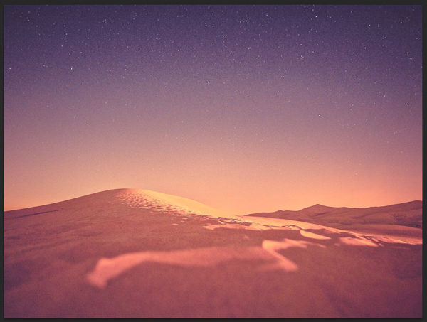
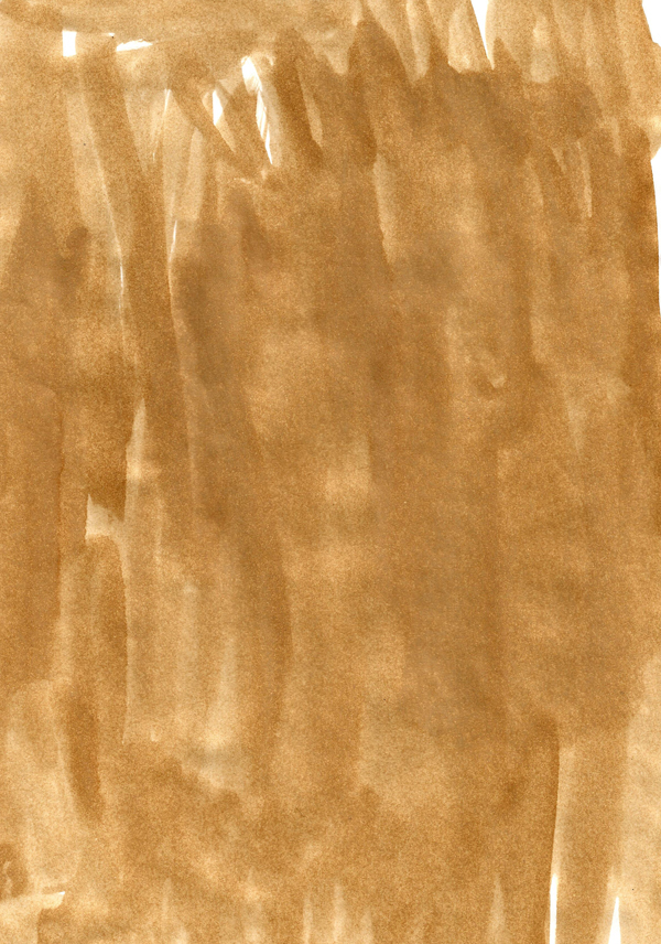
Here’s how I applied the preset to my image, though. After installing the preset, I went to Unsplash, and grabbed my base image from Tim de Groot’s set. Here’s a direct link to the image.
Next, I opened Lightroom, and imported it in my library (navigate to the image to do so).
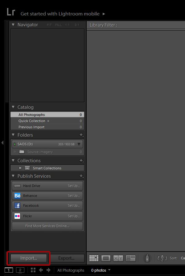
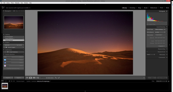
Next, head to the Develop tab to apply the preset.


With the preset applied, you can now proceed to export a copy of the modified image. Pull your right click menu up.
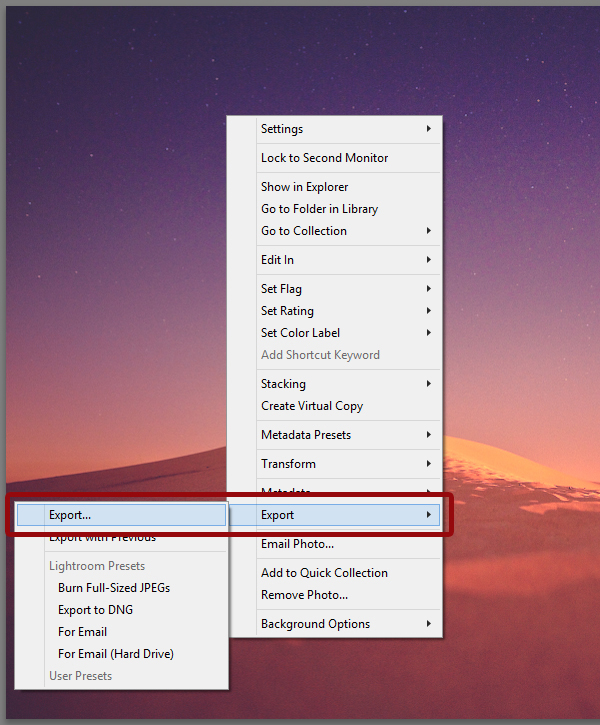
Your export settings can mostly be left to the default options. Make sure to not overwrite the original, and to export in the highest possible quality.
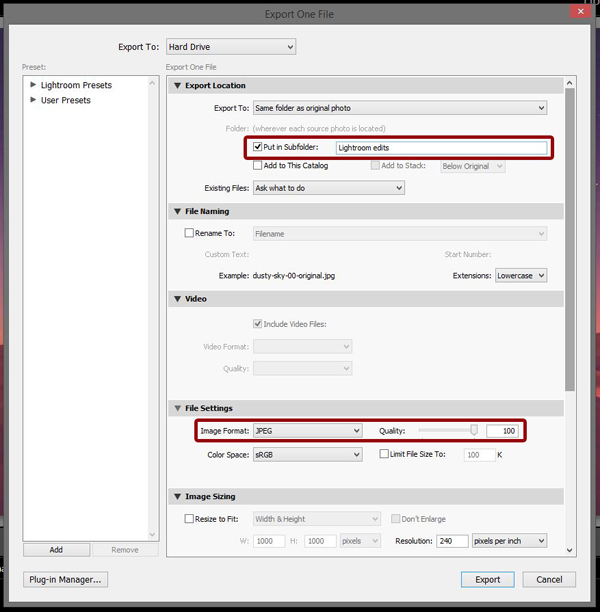
From there, we have our file. We can now start working on the actual poster!
STEP 2: DOCUMENT SETUP
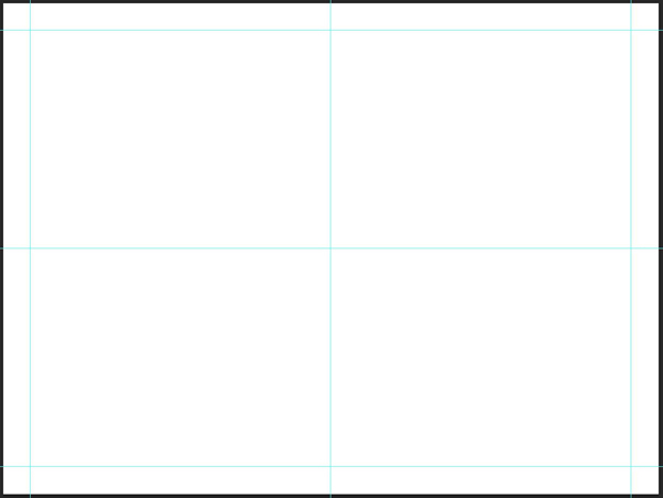
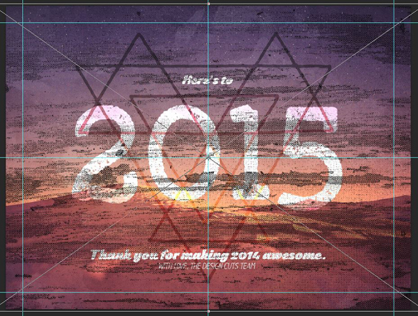
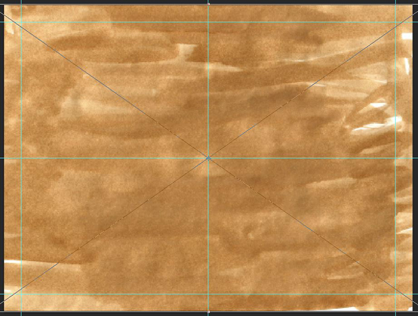
We’re going to work on a 24″x18″ canvas. The horizontal format will allow us to use some pretty big type, and also accommodates the base image nicely.
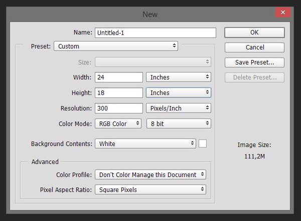
Once you have the file created, you should also add some guides to mark the center of the piece, as well as a zone of 1″ away from the canvas’ edges.
Now, let’s do the real stuff.
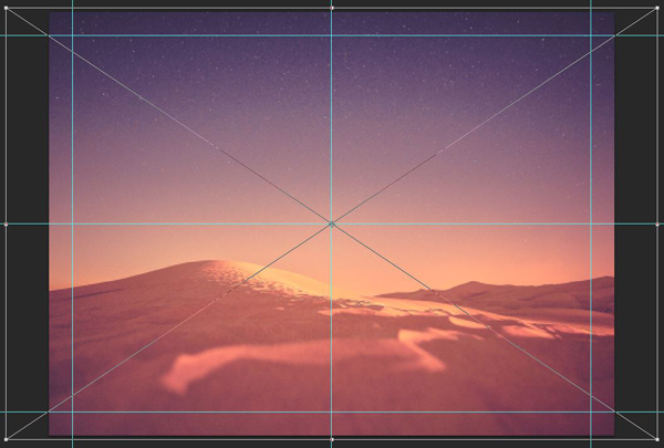
STEP 3: THE BACKGROUND
The background will be easy to build. Start by placing the edited version of the base image in there. Remember to place it as a smart object for a greater flexibility down the road. Place it big enough so it covers the whole canvas. An enlargement of 155% seems to do the trick.
Proceed to duplicate the image’s smart object, clip it to the mask below, and apply a high pass filter with a radius of 100 pixels. This will help us to sharpen the image.
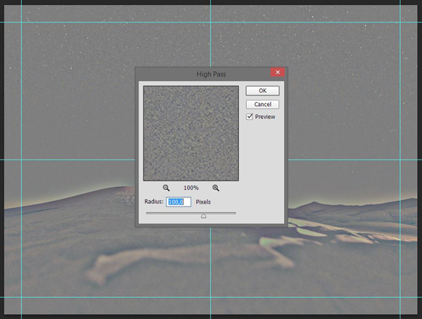
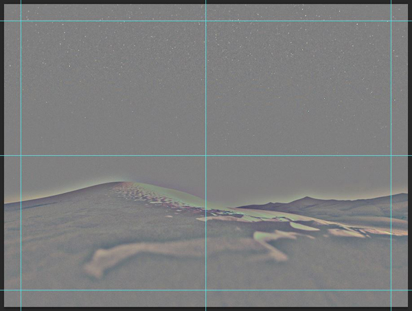
Finally, change the blending mode of the clipped layer to Soft light @ 50% opacity.
Next, we’ll use 8 Red Fish’s 8RFC-watercolor3.jpg to add depth to the image (\Holiday-Gift-Bundle-8-red-fish).
Place the texture so it covers the whole canvas.
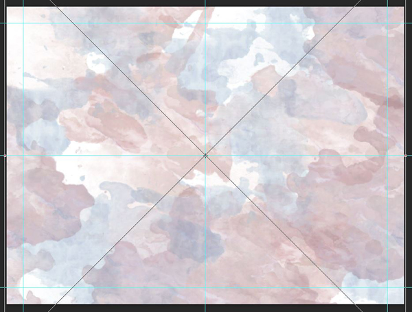
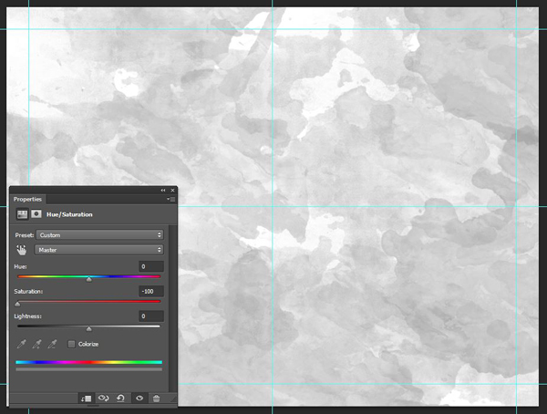
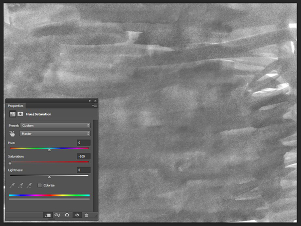
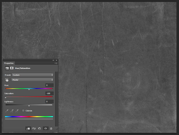
Sharpen it (Filters > Sharpen > Sharpen), and use a clipped hue/saturation adjustment layer to desaturate the image.
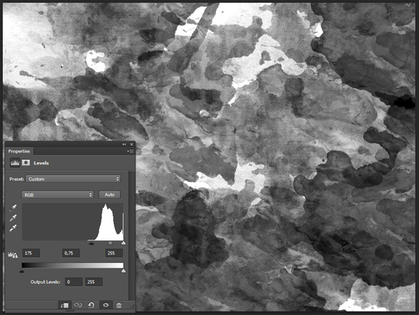
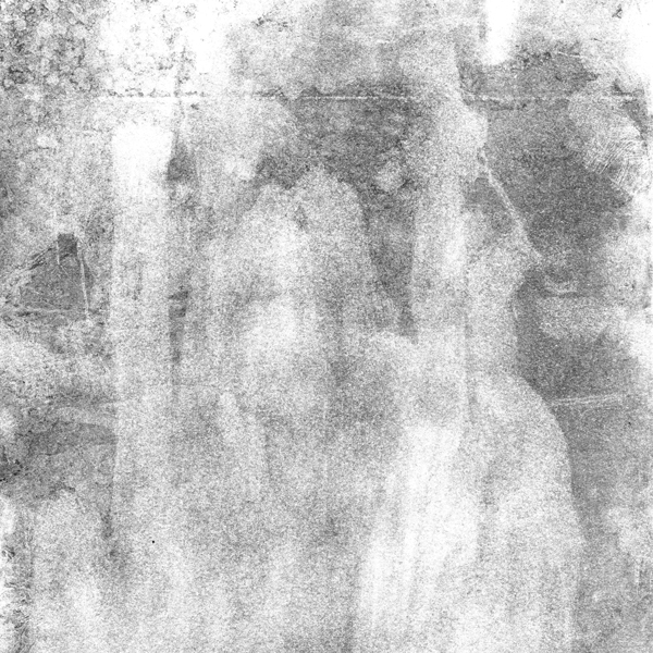
Use a clipped levels adjustment layer to increase the texture’s intensity.
Finally, change the texture’s blending mode to Soft light @ 25% opacity.
A few quick notes before we go further:
Quick note #1: in this tutorial, the term “clipping” or “clipped layer” is used a few times. This means that the layer is only visible/applies to the layer directly below it. You can very quickly do this by holding ALT/OPTION down on your keyboard and clicking between the two layers. Photoshop secrets created an handy animated gif demonstration.
Quick note #2: every time we’ll work with textures, we’ll follow this simple process: place as smart object, sharpen, desaturate, enhance contrast with levels, and modify the blending mode.
Quick note #3: placing the textures as smart objects, and using adjustment layers to tweak them, allows us to stick to a non destructive workflow. We’ve explored in depth the numerous pros and few cons of such a workflow in this past tutorial: “How to Use Textures The Right Way.”
Now that these are out of the way, let’s press on. The next texture we’ll add to the background is one of Clik Chic’s grunge overlays: RGough_O_InkpadEraserGrungeOverlay.png (\Holiday-Gift-Bundle-clik-chic\Soft-Grunge-Overlays). It will help us to create a very subtle and organic vignette effect.

Place it in your document so it fits it.

Change its blending mode to Overlay @ 100% opacity.
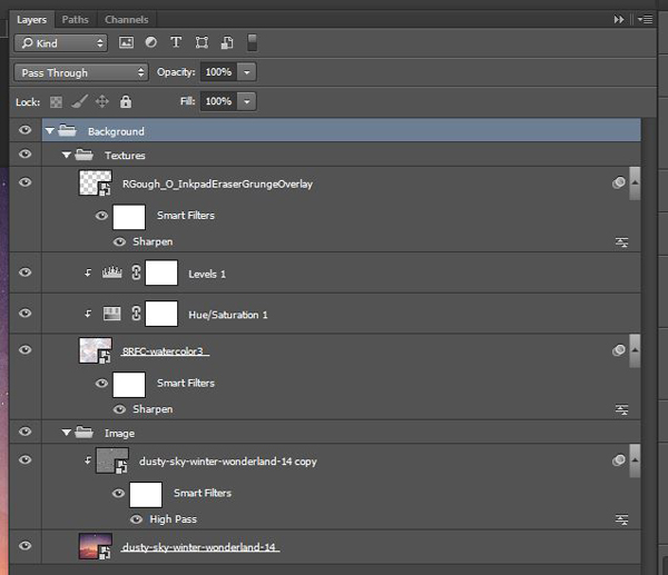
And with that, the background is completed. Let’s organize our layers a bit, to keep our document understandable.
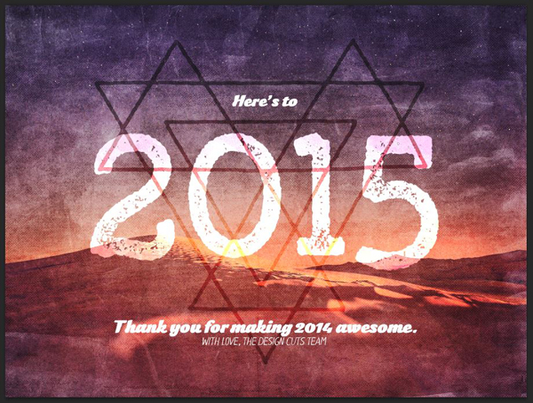
STEP 4: MAIN CONTENT
In this step, we’ll add the visual asset that will be the central element of our poster, as well as the type elements.
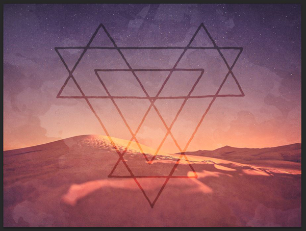
Ghostly Pixels’ polygon
11-Western-Tribal-byGhostlyPixels.png is a set of interlocking triangles. You can find it in \Holiday-Gift-Bundle-ghostly-pixels\Western-Tribal_byGhostlyPixels\Outline\PNG. You could also use the vector version, but in our case the asset’s size is sufficient to use the raster version.
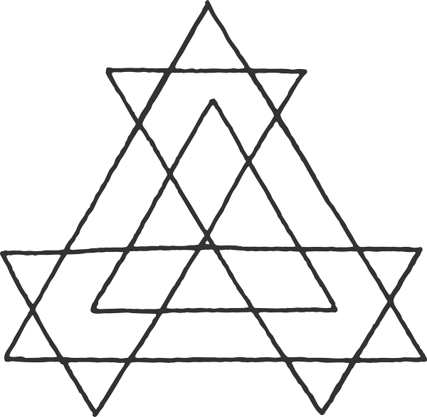
Culturally, triangles have long been associated with esoteric, spiritual, and religious meanings. This is perfect to give our piece a slightly mysterious tone.
Place the polygon at the center of your piece. I sized it down at 25% of its original size. Rotate it upside-down as well.
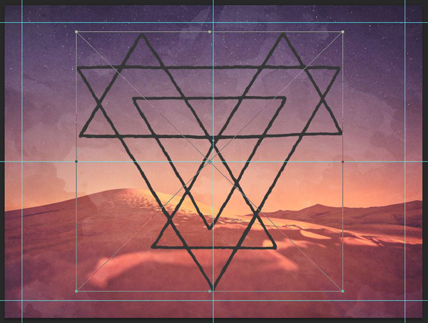
Once placed, change its blending mode to Overlay @ 75% opacity. The dark gray of the asset is just right to provide some neat transparency effects.
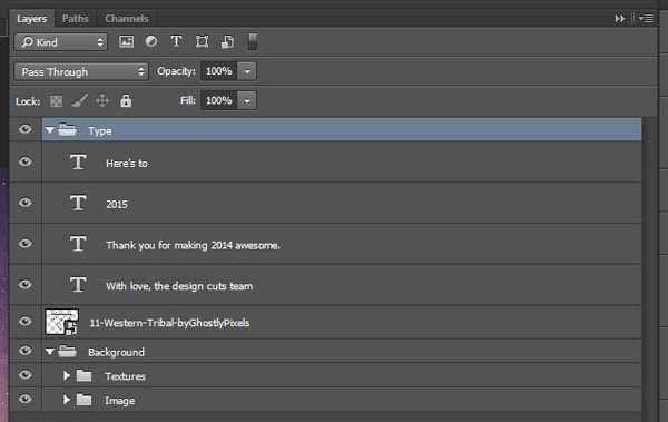
Type
We have one main type element to add, and it’s 2015. As stated earlier, we’ll use Yellow Design Studio’s Gist X typeface for that.
I’m using GistX Upright Bold that’s 504 points tall, and colored in white. My type element is visually centered in the canvas.
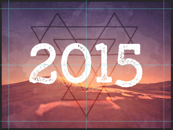
Change the object’s blending mode to Overlay @ 100% opacity.
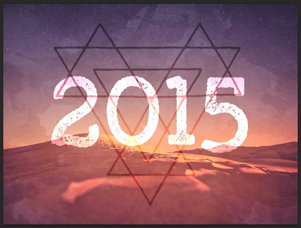
Next, we’ll use Font You’s Kraaken FY Regular for some additional copy. It’s a bold, curvy script that contrast well with Gist’s straight lines.
The copy I’m adding is Here’s to, above 2015, and a thank you note below it to you, our fantastic community. Here’s to is set in Kraaken FY Regular, sized at 54 points tall, and colored in white. It’s visually centered in the polygon’s “cell” that’s above “2015.”

The thank you note reads “Thank you for making 2014 awesome.” It’s set in Kraaken FY Regular, sized at 60 points tall, and colored in white. It’s centered in the bottom point of the triangle.

In other to “sign” the new year’s note, I’ve used Rodrigo Typo’s Lilirun Italic. It’s a great hand drawn sans-serif.

My line, With love, the Design Cuts team, is set in Lilirun Italic, sized at 36 points tall, and colored in white. It required bumping the thank you note a bit to center the complete text block as it was before.

With that done, it’s time to organize your text layers in their own layer group.
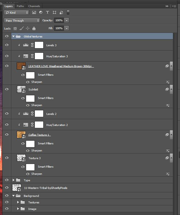
STEP 5: GLOBAL TEXTURES
We are now going to add a few more texture to visually tie everything together. The first one is one of Ilham Herry’s paint textures.
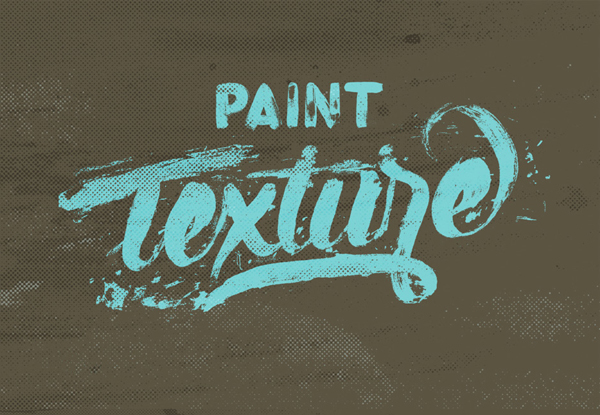
We’ll use the 3rd one in his PSD.
Place it so it covers the whole piece.
Change its blending mode to Soft light @ 50% opacity.

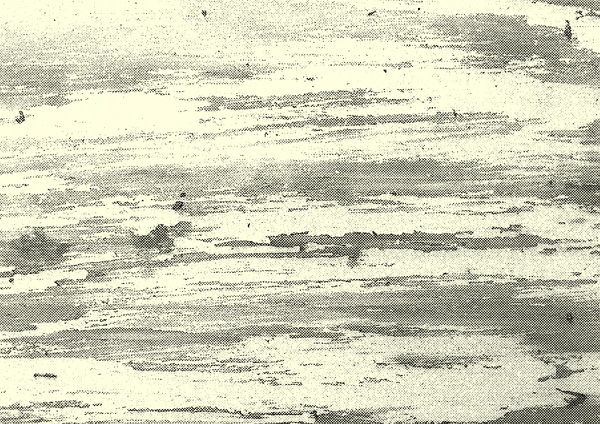
The next texture is Layerform’s Coffee Texture 1.jpg (D\Holiday-Gift-Bundle-layerform\Coffee Design Bundle). It will add some paper grain, as well as some staining effects to the poster.
Place it so it covers the whole piece.

Blending mode: Soft light @ 50% opacity.

Next up is a texture from Matt Borchert’s subtle distress pack, Subtle8.jpg. This one will add some highlights and noise effects to our piece.
Blending mode: Overlay @ 35% opacity.

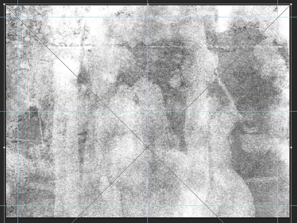
The last texture to add is LEATHER LOVE Weathered Medium Brown-300dpi.jpg, from Ornaments of Grace’s welcome kit (\Holiday-Gift-Bundle-ornaments-of-grace\Welcome-Kit\Textures). That texture features grain, creases, scratches, and all sorts of artifacts that will add contrast and substance to our composition.
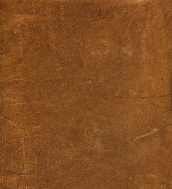
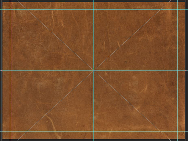
Blending mode: Soft light @ 75% opacity.
And since this is the last texture to place in the piece, we can properly organize them in their own layer group.
STEP 6: FINAL TOUCH
The last thing we’ll add to our piece is a halftone effect, courtesy of Photoshop’s filter gallery. Start by creating a merged copy of all your piece (CTRL/CMD+SHIFT+ALT/OPTION+E). It’ll create a new layer, that I’ve renamed into Halftones.
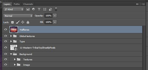
Make the layer into a smart object (Filter > Convert for smart filters on Photoshop CC).

Apply the halftone effect from the Filter gallery (Filters > Filter gallery > Sketch > Halftone pattern). I’m using values of 6 for the dot size, and 25 for contrast.


Next, we need to change the effect’s blending mode. Double-click on this symbol in the layer palette.

Change the blending mode to Soft light @ 100% opacity.
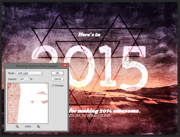
Finally, change the layer’s blending mode to Lighter color @ 35% opacity.
And we’re done!
WRAPPING THINGS UP
And we’re done! Once again, all the best for this new year.

I hope you had fun following the tutorial along. If you have any technical questions, please use the comments below, and I’ll reply to them.

Don’t forget to grab the free holiday bundle while it’s available!

Finally, we’d love to see your tutorial outcomes! Please share them with us on the Design Cuts facebook page. We’ll share the best ones with the whole community.
FREE 2015 WALLPAPERS PACK
As a last thank you for an awesome 2014, we wanted to get you an extra little bonus: art for your screens! We created an alternate version of the poster, that you can use as your wallpaper. The archive includes the art cut for the most common screen sizes (desktop and other digital devices).


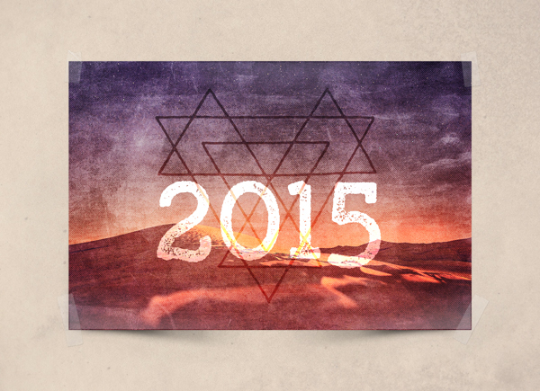
Download the pack of wallpapers here.
On that note, that’s all for today. Cheers!

WOW. I just love everything you offer from the products, bundles, tuts … best resources for print and web designers. Thank you!
Thank you so much for our lovely feedback Lisa. I hope you’ll enjoy all the design goodies you grabbed form us. If you have any questions, of if you want to show off your work, please don’t hesitate to drop me an email. :)
Thank you Lisa for your kind words. Don’t hesitate to share your tutorial outcomes, or the work you’ve created using some of the techniques we’re sharing.
Amazing tutorial and amazing work! I love the DC community… You guys are great. Thanks for sharing!
Thanks so much for the kind words. Simon is an amazing designer, and we really love his work.
Thank you for your kind words!
I have Lightroom 5 but CS6 – and don’t intend to go the CC route. I suppose some shilling for Adobe is going to come up.
Hey Tom, while I love CC, I can understand wanting to stick to CS6 and below. You should still be able to follow along though.
Just finished the tutorial. SWEET! Love the textures.
Thank you for the bundles & tutorials! It is such a tremendous help in ways of techniques and application.
Hi-5!
Chris
Awesome stuff Chris. :) Can we see your result at all? You can email it to us at hello(a)designcuts.com. I’d love to check it out.
Hey Chris, thank you for the kind words!
Gorgeous layering. I don’t have lightroom, but maybe in the new year! And thanks for the amazing freebies!
Thank you for your kind words. I’d say that you could use the base image without the Lightroom steps, and the piece would still look awesome.
Hi Gabrielle:
If you really want to get Lightroom there are two ways. You can purchase it as a standalone program, but the BEST BUY is to sign up for the $9.99 “a month” Adobe Photographers Package directly from Adobe.
In $9.99 monthly package you get BOTH Photoshop CC/CC2014 and Lightroom bundled together. You ALWAYS have the “latest” updates.
Hope this helps.
Roz Fruchtman
Thanks so much for the tip Roz. I completely forgot about that. I have the same subscription, but I never use Lightroom, but it’s a very good point. You get both PS and Lightroom for under $10.00. :)
Glad to help Tina.
I have the $9.99 thingy since December of 2013. It renewed in December 2014 as you need to make a year’s commitment, even though… you pay the $9.99 “by the month!”
It’s a good deal. I wouldn’t think of giving it up. I’ve not used Lightroom either yet. Lightroom is REALLY a good program! I’ve watched quite a few classes on it! VERY POWERFUL!
I had Lightroom 4 when I took the $9.99 Photographers Plan from Adobe. I think, by the time I signed on for the plan, Lightroom 5 was out and I got it FREE included in the package! Otherwise it would have cost me to upgrade to it when I was ready!
As long as it’s not your last $9.99 (plus tax), each month, you don’t even realize you are spending it. They charge my credit card automatically and I’m happy to have them do it. (I will admit, I was not happy in the beginning, I don’t like change, but once I DO change, I am thrilled I did it!)
Roz
I started using the monthly subscription when I joined Design Cuts, and it’s a pretty sweet deal. Certainly beats paying $900 in one go. lol
Hmm maybe I should have look into Lightroom. I guess I never thought about it, since I’m not a photographer, but I’m sure I can use it nonetheless.
Thank you very much for the lovely compliment. :) Simon is a very talented guy.