")
")
")
Design Training #2:
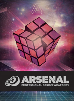
Create an 80s Style Poster Design With GoMedia
Create a cool retro poster using GoMedia’s best resources.
Stop! Before you start this free training…
Before you start this expert design training you should watch the video above.
Then, download the freebies you need to follow this tutorial below by entering your email:
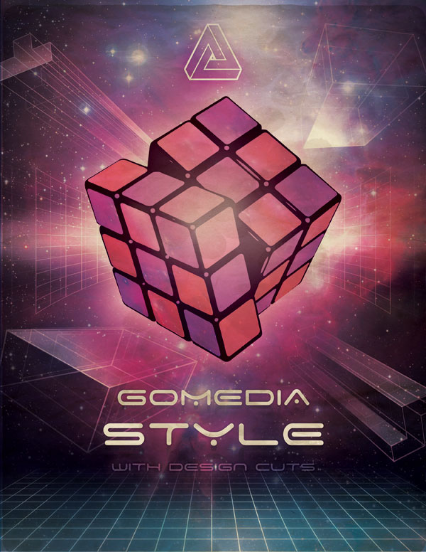
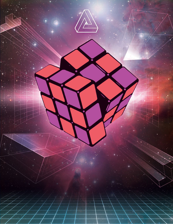
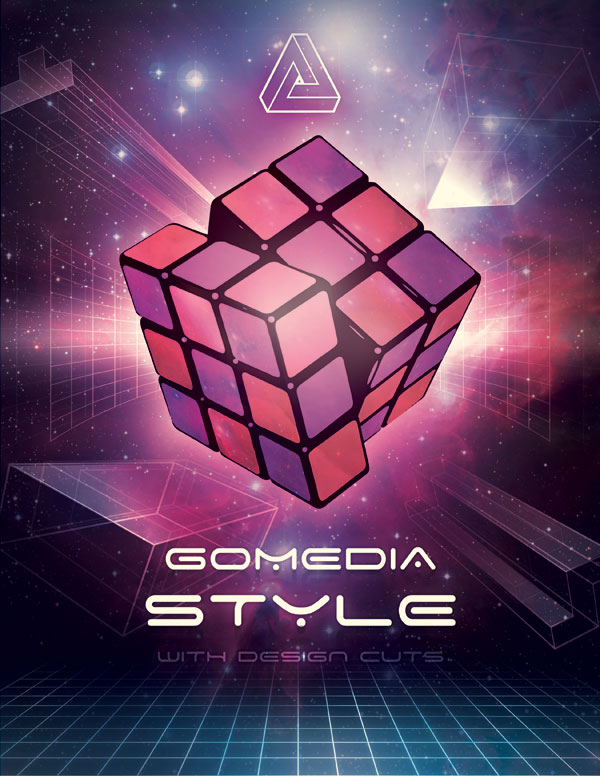
What We’re Creating:
Today we’re going to use the 80s pack from the GoMedia Arsenal to create a retro style poster design. We’ll be using a number of vectors from the pack to create a richly detailed design with plenty of awesome lighting effects and texture application.
Let’s get started by looking at the poster we’ll be designing:
Resources For This Tutorial:
• GoMedia 80s Texture Pack (Download Using Form Above)
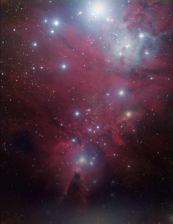
• Base Nebula Image
• Nebula Fog
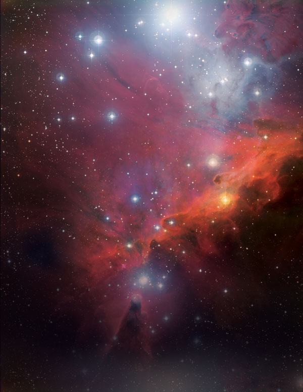
• Messy Nebula
• Nebula Emission
• Floral Paper Texture
• Cardboard Texture
Step 1:
Create a new document in Photoshop (21.59cm X 27.94cm), 300 DPI resolution.
Fill your canvas with a dark, deep purple color (#0b0513).
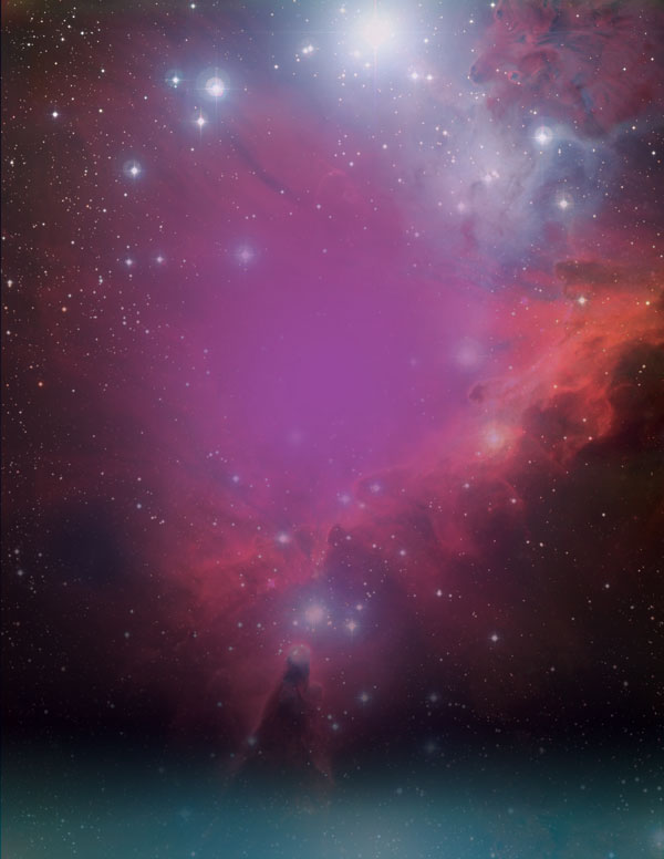
Download the ‘Base Nebula Image’ from the resources section for this tutorial.
Lay it over your main background color, masking off the bottom of the nebula, to let the purple background show through.
Then overlay the image ‘Nebula Fog’ from the resources section for this tutorial. Reduce it’s opacity to 20% and set the layer blend mode to ‘Multiply’.
This should start to build a nicely layered background:
Download the ‘Messy Nebula’ image from the resources section for this tutorial.
Place it over the center of your canvas, and change it’s blend mode to ‘overlay’.
Then use a layer mask, and soft black paintbrush to mask off the edges of this nebula, blending it smoothly into the main background:
Step 2:
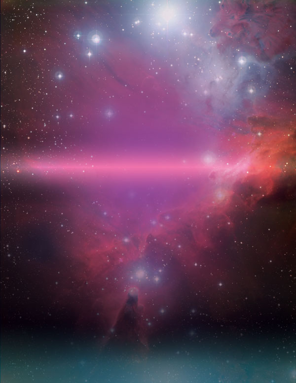
Time to start adding some more color!
Drag a linear gradient, ranging from 6bb9bf to transparent, up from the bottom of your canvas.
Then change this layer’s blend mode to ‘linear light’ and reduce it’s opacity to 45%. This should give a subtle lighting effect at the bottom of your composition.

Create a new layer and use a large, soft purple paintbrush (color: 98499b) to paint a spot of color in the center of your canvas:
Grab the gradient tool, and set it to ‘reflected gradient’.
Ensure that your gradient flows from transparent to white, to transparent (in the gradient settings this means just specifying white to transparent).
Drag it downwards from the center of your canvas to create a white light line across the center of your piece:

Set this layer’s blend mode to ‘overlay’ to create a lovely light effect:
Step 3:
Now download the freebies for this tutorial using the form above.
This includes an awesome pack of 80s style vectors that you’ll need to complete today’s training, as well as the tutorial source file so you can follow along in detail.

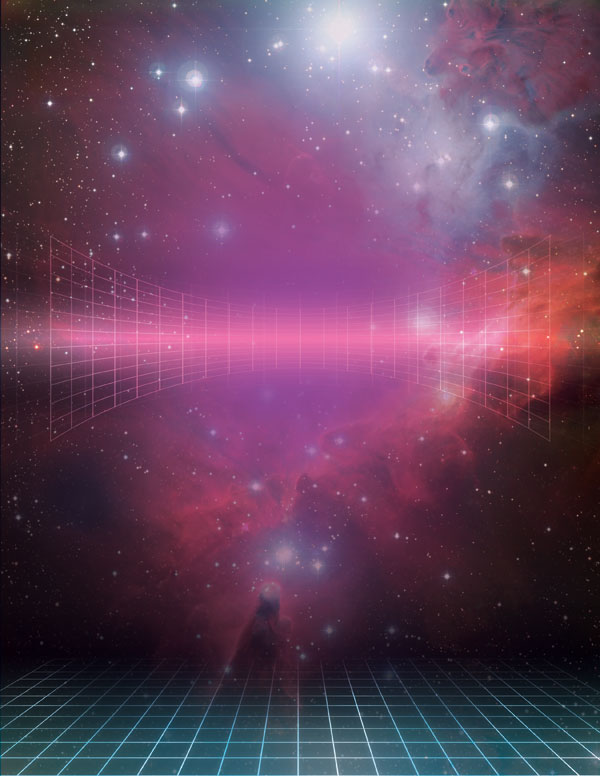
Start by importing the ground grid vector back into your main canvas.
Apply a white color overlay blending option to it.
Then save it as a smart object (this is important for a non-destructive workflow, and you’ll be required to save all vectors throughout this lesson as smart objects to preserve their quality).

Now change this grid layer’s blend mode to ‘overlay’ and mask off the top of the grid, so that it appears to disappear into the background.
Also, apply an outer glow blending option to the grid layer:
Outer Glow Settings:
Blend Mode: Overlay
Opacity: 27%
Color: ffffff
Spread: 0%
Size: 27%

Now option+click on your grid layer. This will select your grid.
With this selection active, create a new layer called ‘highlight grid’.
Use a soft white paintbrush to paint over areas of your grid where you want to give a highlight effect.
Change this highlight layer’s blend mode to ‘overlay’. This should add some variance to to your grid’s lighting.

Step 4:
Use similar techniques to Step 3 to import the curved grid from your freebies pack into your canvas.
Position it in the center of your canvas and set it’s layer blend mode to ‘overlay’:
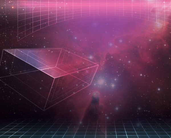
Use the same technique to import one of the 3D rectangle vectors into your canvas, positioning it between your existing grids:
I used layer blend mode ‘overlay’ and opacity of around 40%.

Now duplicate this rectangle twice, moving each duplicate to the right of the original, and resizing it smaller and lowering the opacity.
This creates a staggered effect, as if the rectangle is moving out towards us:

Now use your lasso selection tool to select the top panel of the largest rectangle.
Create a new layer, and drag a white to transparent linear gradient down the length of the rectangle.
Change this layer’s blend mode to ‘overlay’ and you’ll have a really cool 3D lighting effect:
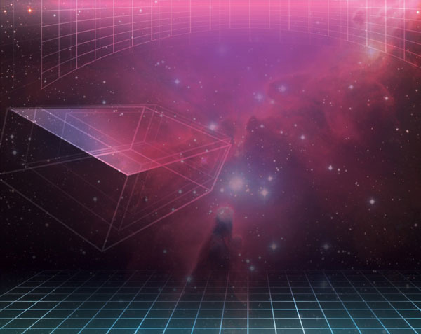
Refer back to the highlight technique in step 3, and apply the same to this rectangle shape, adding some nice light highlights to the main lines of the structure:
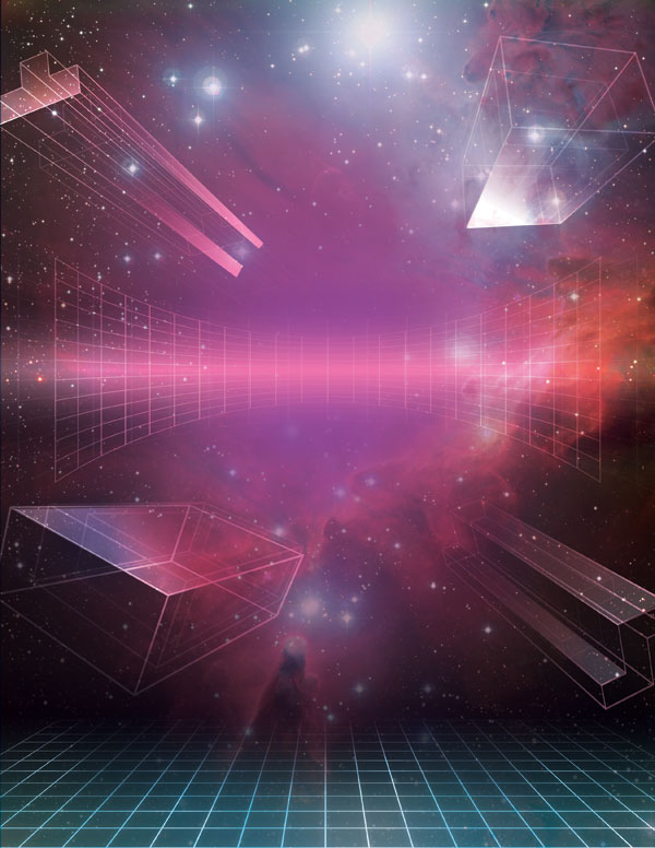
Step 5:
Repeat the techniques used in step 4 to create more 3D shapes with nice lightning across your canvas. Feel free to play around with opacities and light effects to create an outcome you’re happy with:
Step 6:
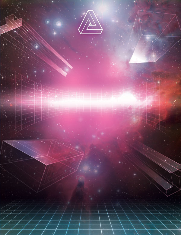
Return to the 80s freebies pack for this training, and download the cool triangle logo vector.
Import it into your main canvas, positioning it at the top center of your piece:

Now apply some blending options to this triangle logo layer:
Drop Shadow:
Blend Mode: Multiply
Opacity: 12%
Angle: 120
Distance: 5px
Spread: 0%
Size: 10px
Outer Glow:
Blend Mode: Overlay
Opacity: 100%
Color: 68374b
Spread: 12%
Size: 172px
Color Overlay:
Blend Mode: Normal
Color: ffffff
Opacity: 100%


Step 7:
Time to add some more space age lighting to the center area of our piece!
Add a few soft, white paintbrush marks around the center of your canvas.
Then change this layer’s blend mode to ‘overlay’:

Now paint a central white line across the canvas, using a large, soft white paintbrush.
Also change this layer’s blend mode to ‘overlay’ to blend the mark better:
Step 8:
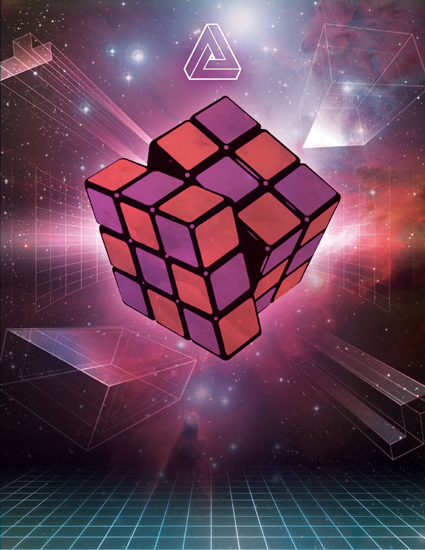
Jump back to your freebies pack and find the awesome Rubicks cube design there.
Paste this into the center of your main composition:

Create a new layer called ‘squares’ and use your magic wand tool to select various squares of your Rubick’s cube.
Fill these selected squares with a deep red color (#f15d66).

Now apply a color overlay blending option to the original Rubick’s cube layer (color: #b3509e).
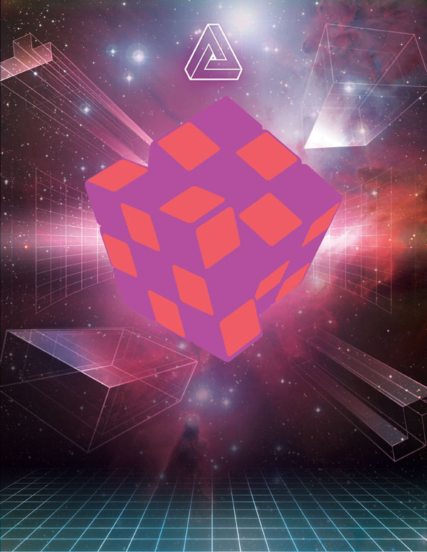
Now copy the original Rubick’s cube over these two layers, and set it to ‘Multiply’ blend mode. This means that the black outlines will be visible, but the white fill will become invisible, showing the colored squares beneath it.
I also applying a white outer glow effect to this layer:
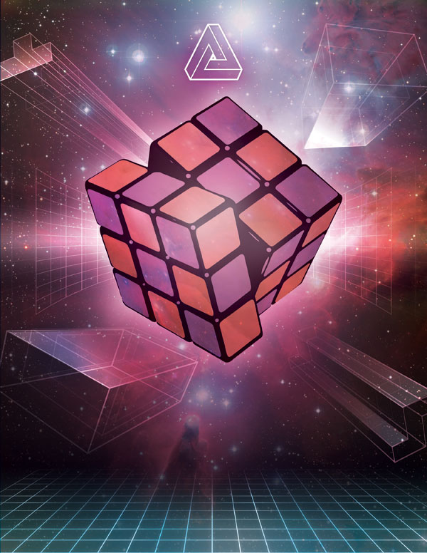
Paste one of the nebula images over your Rubick’s cube layer, and apply a clipping mask, so that it is clipped to the shape of the cube.
Change this layer’s blend mode to ‘multiply’ and reduce it’s opacity to 40%.
To complete the cube, apply further nebula textures to specific surfaces over the cube.
Then use subsequent layers to apply white lighting spots over the cube (using a mixture of ‘normal’ and ‘overlay’ for the light layers).
Step 9:
To help bring the focus into the center of the canvas, we need to add a basic vignette effect.
Use a soft black paintbrush to paint around the corners/edges of your piece.
Here’s the result:
Step 10:
Time to add some cool retro text!
I used the free font Space Age to add a title to my poster, and then created a subtle shadow/reflection effect by flipping the text, coloring it black and reducing it’s opacity:

Step 11:
Our poster design is almost there, but let’s bring all the elements together, and create a some retro overlays!
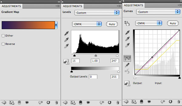
Start by applying 3 adjustment layers, as outlined below:
Gradient Map Adjustment Layer:
Gradient: Purple to orange
Layer blend mode: Overlay
Opacity: 15%
Levels Adjustment Layer:
15 / 1.00 / 247
Curves Adjustment Layer:
(see below)
Paste the floral paper texture from the resources section for this tutorial, and position it so that it covers your entire canvas.
Change this layer’s blend mode to ‘multiply’ and reduce it’s opacity to ‘50%’.
Finally, download the cardboard texture from the resources section for this tutorial and paste it so that it covers your entire canvas. Then change this layer’s blend mode to ‘overlay’ and reduce it’s opacity to 40%.
This should add a final vintage touch to your composition:
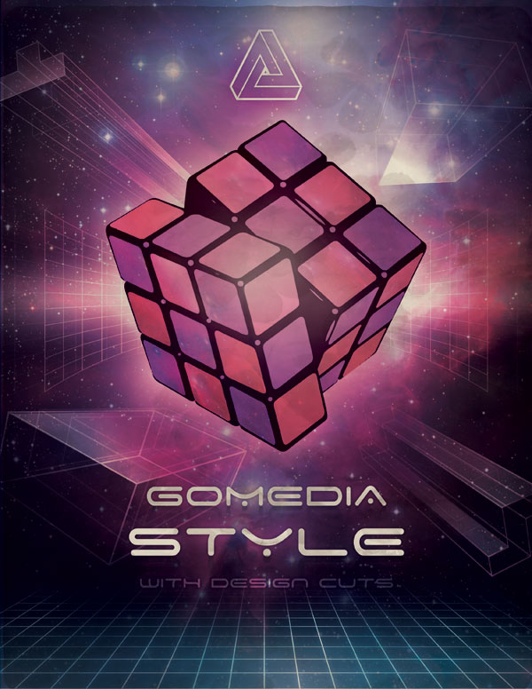
CONGRATULATIONS! YOU’RE ALL DONE.
Here’s the final outcome you’ve created. Be sure to show it off to friends and family to get valuable feedback. You can also show off your work in the GoMedia Flickr Pool.
Download the source file for this tutorial (plus exclusive freebie):
 Today’s tutorial uses GoMedia’s 80s vector designs, exclusively available to Design Cuts subscribers. Download this awesome freebie and the source file for this tutorial using the form below. Entering your email will allow notify you of our big launch.