The fundamental principles
With logos being the main brand identifier, it is essential that time and money is invested into creating one that will make a business both marketable and competitive. So let us start with the fundamental principles, which do not apply to every good logo but serve as a solid jumping off point.
A logo should be:
- Simple. You want it to be clear and visible, as well as replicable (eg. the Nike swoosh). You should not crowd it with too many visual elements.
- Original. It has to be different enough to stand out from the crowd, while still conveying the appropriate tone of the brand.
- Versatile. Since your logo will be used in all shapes and forms, like your website, t-shirts, stickers, social media, it needs to work across the board. This means it has to be clear and legible, whether blown up or small, in black & white or colour.
- Timeless. Successful logos will stand the test of time because they do not pay attention to trends that will pass and instead pay heed to long-lasting principles.
- Relevant. It has to have a connection to your brand and convey the intended message. If it does use a colour, make sure that the colour is on brand (eg. red conveys excitement and passion, yellow playfulness and friendliness, blue trustworthiness and confidence, etc.). For example, you most likely would not use a bright yellow, abstract logo for a traditional tech company.
Now that we have got the basics out of the way, we can delve a little deeper into additional elements that are equally important in the creation of a great logo.
Element #1: Try the Recreation Test
Imagine you are stuck on a desert island with just a pen and paper and your only chances of getting off are to draw a logo - any logo - with 90%+ accuracy. Chances of this happening are slim to none, but let us play along for the sake of the argument. Will you attempt the Mozilla Firefox globe or the Nike swoosh? Probably the Nike swoosh. Why? Because few people are even aware that the animal on the Mozilla Firefox globe is not an arc of fire, a phoenix, or even a fox, but a red panda. If you chose to draw that logo, you would probably be stuck on that island a lot longer than the browser has even been around.
The point is, if you are not able to recreate a logo from memory, it is probably not simplistic or memorable enough. There is a fine balance to be found between the two, and the best logos perfectly inhabit that space.

Element #2: Think of Logos as Structures
Logo design is in many ways like architecture. As a logo designer, you have to ask yourself: is it symmetrical and balanced? Do its elements work well together? Do they look intentional? If the answers are not a resounding ‘yes’, the whole structure threatens to collapse. Because though we humans appreciate the art of innovation, our eyes are also drawn to what is familiar, to what looks deliberate.
Even so, we are once again confronted with the issue of balance - if a logo is too structured it can look banal, too chaotic and it lacks professionalism. The solution? To research, plan, design, and then to do it over again until you nail it.
Element #3: Listen to the Client
If you are a logo designer, you will already know that you are not designing for yourself but for the client. What you should be focused on is catering to their vision, because they ultimately have the final say (even if you know what works best). This, of course, can be fraught with complications when dealing with customers who are emotionally attached to their brand. If, let us say, you are working closely with the founder of a company, you will want to spend a majority of the initial process researching the brand, gauging their taste, and crafting a solid concept that you can then sell back to them.
Ian Paget, for example, starts by sending out a questionnaire which “dives into questions around the business, around the target audience of the competition” and then compiles all the information to create a tick list, which then gets approved in writing by the client. This signals respect for the client’s taste/opinion and solidifies a collaborative relationship in which both parties have an understanding of what is to be expected. The goal is to have a clearly defined process so that you can minimise the back and forth and get on with what you do best - designing.
Element #4: Generate Interest
This one speaks for itself: if you want to create a successful logo it helps to make it memorable. A logo can conjure emotions and memories, which is why they can help us feel at home even when we are miles, or even countries, away. But to get to that point, you need to design a logo that will catch the eye, that will be a piece of art in itself. Great logos are ambiguous and intriguing, and linger long enough for the mind to stamp the visual cues into memory. If you can get people talking about your design without you necessarily needing to sell it to them, then you are successfully marketing your brand.
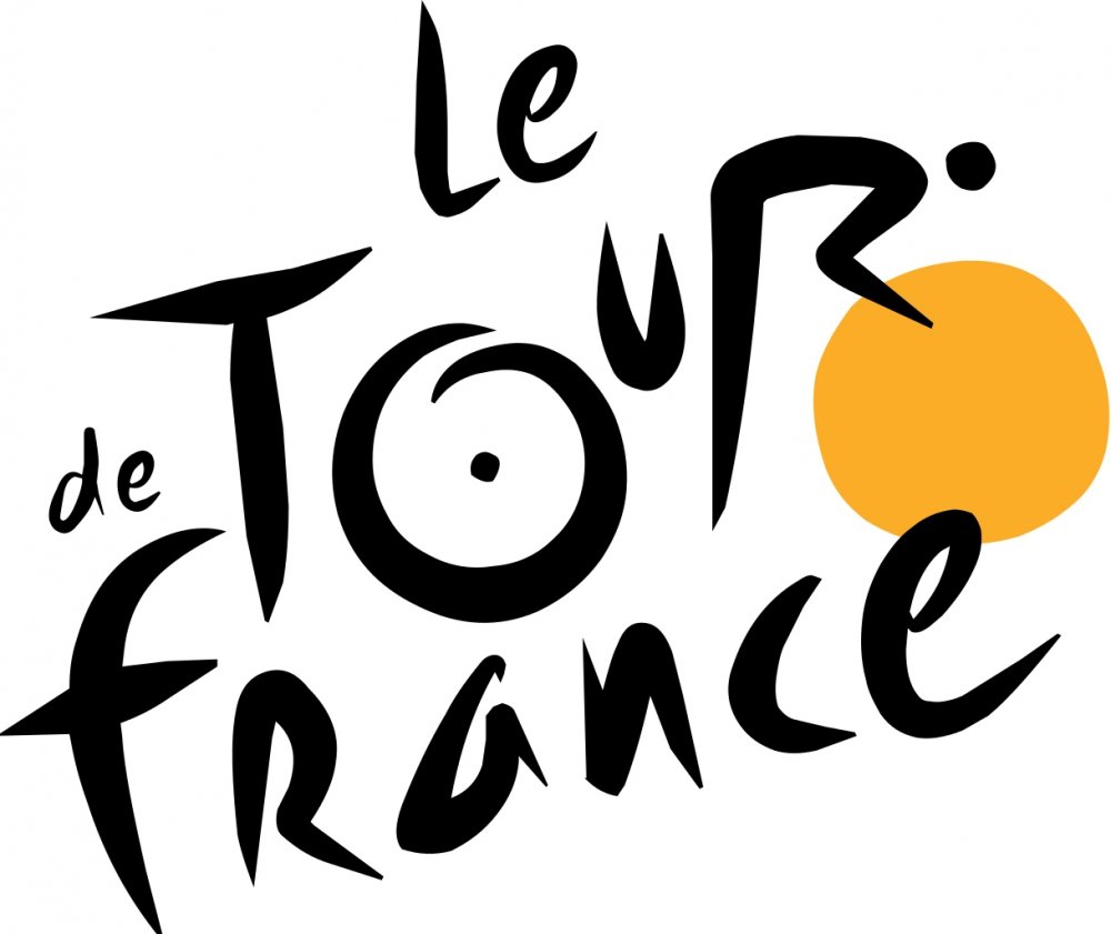
Take a look at the Tour de France logo. Given that it is a famous cycling race can you see how the logo is unique (hint: the “our” of tour looks like a cyclist and the yellow symbolises the yellow jersey awarded to the winner)? Now that you have taken a second to observe it and thought to yourself “mm… clever”, there’s a good chance that logo will have imprinted in your mind. Maybe you will even watch the Tour de France or look it up, who knows. The thing is, millions around the world will recognise this logo because it is dynamic and interesting, and this is exactly what you should hope your logo can do for your brand.
Final Words
We hope you have enjoyed this article and feel better equipped to start designing a logo (or improving one), whether for yourself or a client. Although these principles are a good starting point, only you as a logo designer will know what direction to head in. At the end of the day, each brand is unique and your job is to capture that uniqueness as best as possible.
To learn more about the logo design process, make sure to follow along our branding session with Gareth David. To skip ahead to the logo portion of his presentation, head to slide 57.
For help creating your logos or drawing inspiration, you can check out our Logo section which is full of mockups, pre-made logos, and branding toolboxes.

Yikes.. Number 3 has led me down a few dark holes in the past. If you are marketing yourself as a professional, there should be an understanding between you and the client, that you know better. I do however, agree with Ian Paget’s approach. You should listen, but don’t let them direct! You are the professional. You do know what’s best. The last thing you want is to negatively impact a brand. I’ve seen it happen. Just my 2 cents.
Hey Dennis,
Thanks for getting in touch and for sharing your thoughts on this article. We really love hearing from our amazing community, especially sharing their own experiences in designing. We hope you enjoyed this article Dennis and we look forward to seeing some of your designs in the future.