Let’s play a game. Can you name the brands given the following descriptions: a black swoosh, a red bullseye, and two yellow arches? If you answered Nike, Target, and McDonald’s, congratulations! You’ve won an all-inclusive family vacation to sunny Cancun. Just kidding, you didn’t win anything, sorry. The real winners of this contest are the brands. You were able to recognize them without descriptions of what they do. That’s the power of branding.
To stand out in a crowded market, you need a strong brand identity, and brand colors are a critical component of a brand’s visual identity. It’s not Target if the bullseye is pink.
Choosing the brand colors isn’t something you should do arbitrarily. There’s a reason why Barclays, Chase, Bank of America, and Deutsche Bank all use blue as a dominant branding hue. The right color doesn’t just catch the consumer’s attention. It also evokes a desired emotional response from them.
This guide will break down everything you need to know about branding colors. Let’s get started!
What Are Branding Colors?
Branding or brand colors are a palette of colors that visually represent a brand’s personality, increasing awareness and recognizability. Branding colors fall into two categories: primary branding colors and secondary branding colors.
Primary branding colors are dominant and consistent, and are featured in all your visual assets – logos, website, packaging, staff uniforms, in-store collaterals, etc. They rarely change because they are central to brand identity. What colors do you think of when you hear ‘IKEA’? Blue and yellow, right? That’s because these are the brand’s core colors.
Secondary branding colors complement primary colors and can be updated to reflect changing trends and marketing goals. Let’s say your latest marketing campaign targets Gen Z women; you can adapt your secondary palette to appeal to this demographic.
Choose up to three primary brand colors and five secondary colors. The distribution of your brand colors should follow the 60-30-10 rule of color design: 60% of your visual assets should be in the dominant color, 30% in the complementary color, and 10% (if you choose) in an accent color.
Importance of Color in Branding
You might be wondering what the big deal is about colors. Well, in color theory (yes, there is a discipline that studies colors), color is more than the qualities of light. Color is the human perception of light. It also communicates different messages so that green isn’t just the color of grass. Through continuous associations, green has acquired specific meanings, namely stability, wealth, and growth.
There are three reasons colors are important in branding.
Color Evokes Strong Emotions: For instance, pink, orange, and lilac have an uplifting effect on our moods, while grays and dark blue makes us sad. Red has an energizing effect, while pastel blue and green calms us. This effect of color on emotions is a result of biological and cultural conditioning.
Color Helps Differentiate Your Brand: Imagine your niche market is like the soda aisle in a grocery store. When you choose your branding colors strategically, you can stand out from the crowd. The right color combination is also crucial. The text should be readable against brand colors.
Color Helps Improve Brand Awareness: Consistent use of brand colors creates a strong association between that color and your brand. This association can transcend cultural barriers. Can you recognize the brand below?

Image Source Coca Cola Can China
Even in China, you can’t mistake this classic red can with white text for anything other than Coca-Cola.
Consistent application of branding colors will make your brand recognizable globally. This, in turn, helps increase conversions, enhances website traffic, and can boost sales.
4 Easy Steps to Picking Your Brand Colors
Now that you understand the impact of color, let’s look at four steps to picking the right colors for your brand.
1. Determine Your Brand
Before you pick your brand colors, you have to establish your brand personality first. Brand personality is the personification of a brand or company. Essentially, it’s what your brand would be like if it were a human being.
Giving human characteristics to brands creates an emotional connection with consumers and influences their purchasing decisions. Around 50% of customers prefer to shop from brands with strong personalities.
So, ask yourself these questions:
- What’s your mission?
- What are your values?
- What are the characteristics of a person who has these values?
- How do they communicate?
The brand personality framework below can help you identify the core traits of your brand.
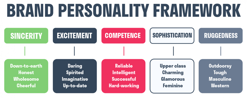
Image Sources Brand Personality Framework on Huree Blog
When you have a clear picture of your brand, it is easier to pick branding colors that support your brand identity.
Another consideration when defining your brand’s personality is your target audience. Customers tend to gravitate toward brands that are similar to them. Therefore, one of your SMART business goals should be to model your brand personality close to your target customers. Once you know your potential customers, you can pick brand colors that would appeal to them.
2. Study Color Codes
Now that you have defined your brand personality, it’s time to choose the colors that best represent that identity. Colors have meaning, but they vary from culture to culture and can take on different meanings when paired with other colors. For example, purple stands for royalty. When paired with gold it conveys luxury, but when paired with pink, it feels more playful.
Still, there are clear standards for the use of color. Let’s look at the popular meanings associated with different colors.
Red elicits the two strongest emotions – fear/danger and passionate love. In branding, the color signifies excitement and dominance. It also stimulates appetite. So, you will find many food brands with a dominant red branding color, for example, KFC, Chick-fil-a, and Pizza Hut.

Orange stands for playfulness, friendliness, and vitality. It’s the color of choice for creative brands targeting young customers. Brands that use orange as a dominant color are Fanta, Nickelodeon, and Blogger.

Yellow evokes happiness and optimism. Brands that showcase a joyful brand identity include Lays, SnapChat, and Chupa Chups. Notice how the food brands incorporate red in their logo to stimulate appetite.

Green is synonymous with stability and wealth in America due to the color of its currency. Universally, the color symbolizes a connection to nature. Brands that choose green to showcase eco-conscious values include Animal Planet, Starbucks, and Whole Foods.

Blue exudes tranquility, professionalism, and security. Hence financial institutions like American Express, Visa, and PayPal use it as a dominant brand color.

Purple has long been a symbol of wealth and royalty. Leaning on this heritage, purple signifies luxury in the modern context. Notice the homage to royalty in the logos of Crown Royal and Hallmark.

Pink usually stands for femininity and youth. Brands that use a dominant pink brand color are women’s lingerie brand Victoria’s Secret, women’s magazine Cosmopolitan, and some girls’ dream toy, Barbie.

Brown evokes dependability, rustic living, and outdoor adventure. If you want to create a rugged, salt-of-the-earth impression, this is the color for your brand.

Gray signifies neutrality, balance, and maturity. If you want to convey a sense of authority, consider using gray like Lexus, Wikipedia, and Apple.

Black exudes power, elegance, and sophistication. That’s why luxury brands like Chanel, Coach and Mont Blanc use this timeless color.

White evokes purity, simplicity, and minimalism. Brands with a dominant white brand color include Paramount Pictures, Adidas, and the World Wildlife Fund.

The effect of your brand colors will depend on your design and color combination.
3. Analyze Competitors
For your color choices to be unique and stand out, you should analyze other brands in your field. Say you’re in the wellness industry, and your competitors use green in their brand colors, try to understand why. You share the same health-conscious audience, so it’s reasonable that your target market responds well to that color because it represents nature and wholeness.
If you choose the trending brand color, you don’t want to be confused with other brands. Find a way to differentiate yourself from the competition, for example, the packaging material, logo design, or the fonts you use for branding.
You can also opt to use a color combination instead. Let’s talk about that in this next section.
4. Choose the Right Color Combination
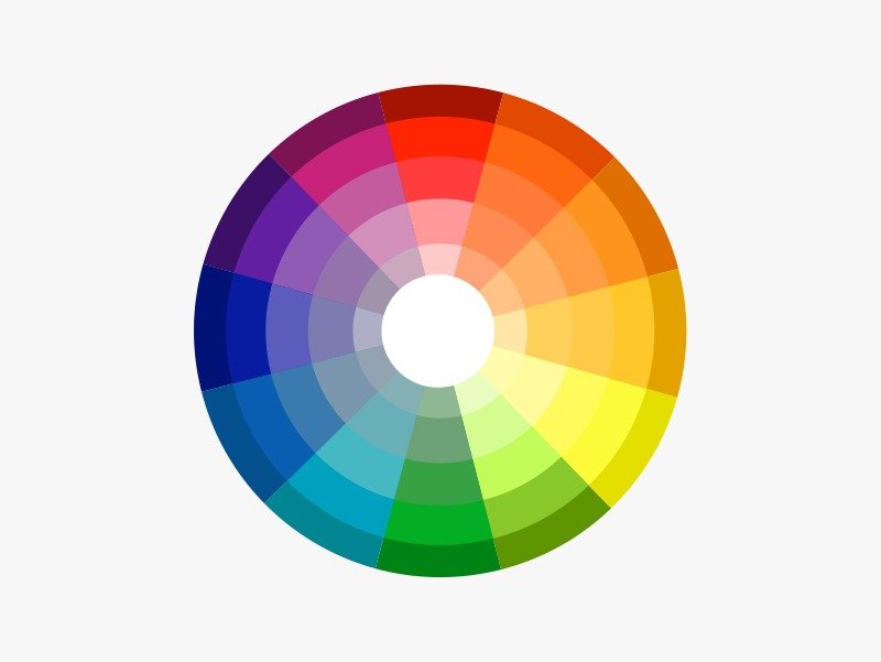
Single-color brands are rare. For many brands, one color isn’t enough to differentiate them in the market. A lot goes into choosing one color; what about three or five branding colors? Even if you opt for a single color, you shouldn’t skip over this section.

The image above is a 12-point color wheel you should refer to when selecting color combinations. The wheel includes primary colors (red, yellow, and blue), secondary colors (orange, green, and purple), and tertiary colors (teal, violet, magenta, amber, vermillion, and chartreuse).
Here are four schemes you could use to come up with the right color combinations:
- Analogous – this combination uses colors next to each other on the color wheel. They are low contrast and harmonious, with similar emotional connotations. The autumnal color palette is an example of an analogous color scheme.
- Complementary – We mentioned this a while ago. This combination uses colors on the opposite side of the color wheel. They are high contrast and create bold or dynamic effects when used together.
- Monochromatic – this color scheme uses shades, tones, and tints of the same color. It works well for minimalist brands or single-color brands.
- Triadic – this branding color scheme uses three colors from different sections of the color wheel. They are a balanced combination of analogous and complementary color schemes.
The color scheme you choose will determine the look of your website, social media pages, and marketing materials. Whichever way you choose to combine your brand colors, you must keep in mind your brand identity. For instance, use monochromatic schemes to emphasize a dominant personality trait. While triadic schemes offer harmony and contrast, matching all three colors to your brand personality is challenging.
In Closing
A strong brand identity is critical to standing out in a crowd. Brand colors play a major role in your brand’s visual identity, and you should choose them carefully. Colors have meaning and can communicate your brand values without saying a word.
We put together this guide to ensure that your brand colors communicate values and showcase your brand personality. But branding colors do more than accentuate brand identity. They can impact customers’ emotions, and emotions influence buying decisions. We shared popular color codes and meanings to guide you through selecting brand colors.
These color codes aren’t universal; they will differ from culture to culture. But we are confident that this guide will help you create the perfect palette for your business.
The Ultimate Guide to Branding Colors
We hope you have enjoyed this article and you have learned more about branding colours and you will be confident in choosing the right ones for your brand. If you need more resources for building a strong brand identity, please also check the article below
More Related Articles
What Your Font is Saying About Your Brand & How to Choose One That Suits You
30 Fonts For Logo Design Every Designer Should Own
A Behind-the-Scenes Look at Branding and Logo Design With Jacob Cass


Be the first to comment