A company’s success depends on attracting and retaining customers. To stand a chance in a competitive business environment, you need a recognizable brand identity. That recognition can be strengthened in the choice of font you use for your logo and messaging. Great branding is one of the top sales enablement tools.
A logo will be one of the first things a consumer sees from your company. Along with other aspects of the design, the font you use will elicit feelings from potential customers. To get the customer to react the way you want them to, you’ll want to make sure the font choice is consistent with your brand.
Fonts are used by your brand for many purposes. Brochures, events tickets, ad copy, the list goes on. Use font choice to strengthen your brand’s personality in the mind of the consumer.
What is your brand identity?
Regardless of the type of business you run, whether you own a small local coffee shop or you are fashion store owner, prior to choosing your font style, you need to know your brand’s personality. What is it about your company that customers can connect to? What emotional response are you looking to get from consumers? Take the time to figure this out.
The personality of your brand is about individuals and interactions, which may lead you to think of the agile manifesto principles. You want individuals to recognize your brand and feel confident in interacting with it. It’s less about what your company sells and more about how consumers feel about you.
How a font conveys brand identity
Visual stimuli such as fonts can cause subtle psychological effects. A script font can be perceived as more personal and creative whereas bold fonts can convey confidence and dependability.
It’s important then to know what impression a font will convey to its audience. Whether it’s for a logo, for web design, or flyers, font choice sends a clear message. Once you are firm on your brand identity, you can harness the power of fonts. Let’s now take a closer look at fonts and what they can do.
Key traits of different fonts
Different types of fonts have key identifying traits. By understanding those traits, and the effects they can have, you’ll be able to choose the right font for your brand. When a consumer sees a font, their brain makes connections to emotion and memory. Choosing the right font allows you to tap into that.
Let’s take a look at these traits and what sort of responses they can elicit.
- Rounded: These fonts, with their soft look, provide a sense of calmness and support.
- Angular: If directness and masculinity are required, angular fonts are the way to go.
- Complex: Unique and distinctive, complex fonts can help a brand to stand out of the crowd.
- Simple: These fonts provide clarity for the audience. This means the message gets through quicker.
- Upper case/lower case: If you wish to convey a strong and impactful message, uppercase fonts are best. To convey a more subtle or perhaps caring message, use lower case.
- Slanted: A slanted font gives a feeling of forward momentum. This is excellent if you wish to convey progress.
- Light: Thin and soft, lightweight fonts convey femininity.
- Bold: Confidently put your message across with a bold font.
- Short/Tall: Short fonts give a sense of stability whilst tall ones suggest a sense of class.
Using these traits in different combinations makes a font conjure different feelings in its audience. When choosing a font for your business, pick one with the traits that best match your brand identity. Also, choose the right one for the job. The font you use in your logo, for example, shouldn’t be the same one you use for internal presentation templates.
Let’s now look at how the traits of fonts can affect how a person feels about a brand.
Font traits in action
Font choice contributes to your company’s unique brand personality. It allows the consumer to differentiate you from the competition. This holds true within an industry just as much as across sectors.
To illustrate this, we’re going to look at two famous providers of gaming solutions. We’ll look at what each example communicates with its font choice. Both examples have a brand that goes beyond gaming, but they are probably both best known for their impact on this industry.
Nintendo

Image source Nintendo Logo
Although officially discontinued as the primary logo in 2008, this logo is extremely recognizable. It’s also one of my favorites and is still used as a secondary logo. The typography is a modified Helvetica that the company has used since 1967. Although it’s been further modified since then. It is a Sans-serif typeface (more on that later). Let’s study this logo and see what traits are present.
- Simple
- Bold
- Rounded
- Lower case
- Short
The font is clear and memorable. It’s impactive thanks to its boldness. The roundness and use of lower case lettering reveal Nintendo’s family-friendly brand personality. When a consumer sees this font, it triggers the fondest of memories oriented around fun and family.
Sony
![]()
Image source Sony Logo
Originating in 1957, this logo has changed very little over the years. The designer of this logo was Yasuo Kuroki, who also worked on the Sony Walkman. This font is named Clarendon Medium. It is a Serif font, which will be explained in an upcoming section. Although not exclusively a gaming brand, this logo makes gamers think of gaming. Let’s see how the traits of this font impact the consumer’s reaction to Sony’s brand.
- Simple
- Bold
- Angular
- Uppercase
- Tall
Like Nintendo’s font, this is clear and impactful thanks to the simplicity and boldness. It’s much more angular, however, and projects masculinity. That suggests power. The same can be said for the use of exclusively upper case lettering. It’s also taller than Nintendo’s, suggesting a level of luxury. The font suggests innovation, power and respectability.
Having seen the influence font choice can exert on consumers, let’s learn some of the technicalities.
Font classifications
There are literally thousands of fonts to choose from. Each of those will usually fall under one of six categories.
- Serif
- Sans-serif
- Slab serif
- Script
- Handwritten
- Decorative
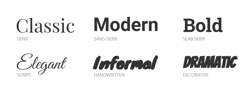
Image source Venngage Brand Fonts Article
Serif
Named for the hooks or feet that appear at the top and bottom of each letter, Serif fonts go way back. They can be first seen in the writings of ancient Greeks and Romans on stone slabs. As such, they instill a sense of trustworthiness and tradition. They are classic and familiar.

Image by Andrew Martin from Pixabay
If Serif fonts caught your attention and they are a strong choice for your logos, check out this selection of Serif Fonts from the Design Cuts Marketplace.
For brands wishing to appear respectable and trustworthy, Serif fonts serve that purpose. One such brand that successfully utilizes Serif to convey classic elegance is Tiffany & Co.
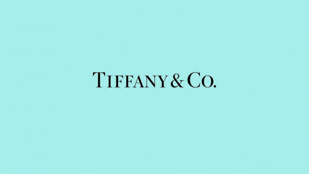
Image Source Tiffany Logo
Sans-serif
First appearing in the 19th century, Sans-serif fonts have a modern feel. Minimalist in nature, they provide a clean look that is popular amongst well-known Silicon Valley brands. They are non-serifed fonts, meaning the hooks or feet are absent.
This is an excellent choice for brands wanting to project innovation and forward-thinking. Sans-serif fonts are perfect for companies pursuing ecommerce growth strategies.

Image source Montreux Classic – Modern Swiss Grotesk
Discover more of out popular Sans Serf Fonts and get inspired for your next professional logo.
Slab Serif
Essentially a beefier Serif font, Slab Serifs are bold and strong. They convey a message of quality and dependability. Many well-established manufacturers like to use this style.
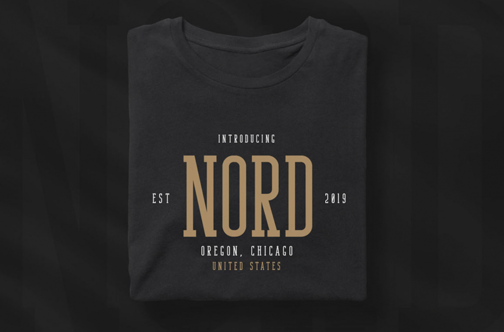
Image Source Bondie – Condensed Slab Serif Font
Discover more Slab Serif Fonts on the Design Cuts Marketplace, and give these fonts a try for your next logos.
Script
These fonts are attractive and bring some character to a logo. They are designed to emulate very neat handwriting and so bring a more human edge to things. They bring a level of elegance and allure when used. Thanks to their cursive style they tend to be rounded and light. This means Script fonts tend to conjure femininity and calmness.
![]()
Image source Madina Script
Handwritten
A type of Script, Serif, and Sans Serif font, the Handwritten style brings a playful informality to their use. They’re an excellent choice if you’re looking for something unique to accentuate a brand’s artistic personality.
![]()
Image source The Handwritten Font Pack
Decorative
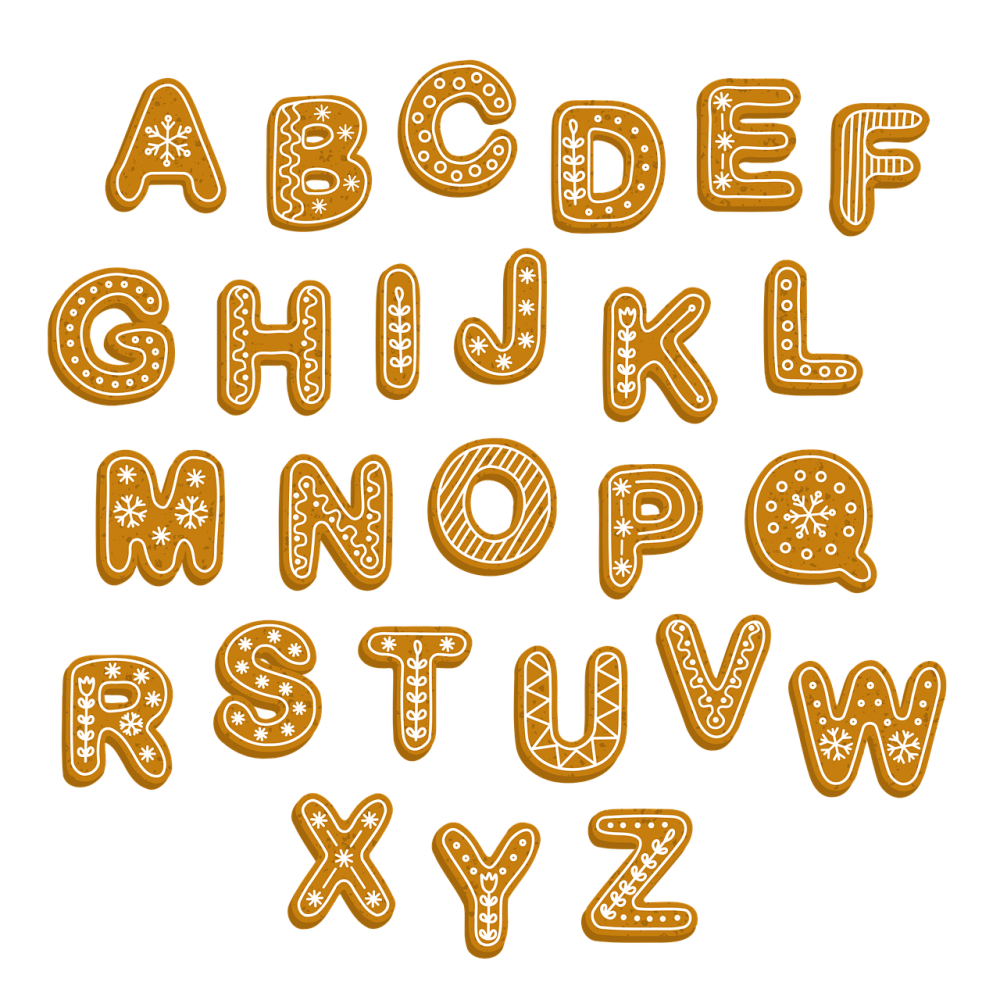
Image by gingertea from Pixabay
Some of the world’s most popular brands use Decorative fonts. They’re immediately recognizable, even when used out of context. Lego is a great example of a use of a Decorative font.
![]()
Image source Lego Logo
A risk with using a Decorative font is it may fall out of fashion. It may be distinctive and unique, to begin with, but could become tiring. This may make it difficult to tweak in the long term, to keep it fresh. If you have a recurring meeting about your brand personality, you may conclude that you’ll need to mix things up from time to time
Also, what you gain in artistic expression, you lose in legibility. Remember that your brand has an audience whose attention you wish to capture. This is why it is the best option for formal or business cloud communication solutions, like when choosing a font for your email forms. Decorative fonts may be eye-catching, but don’t let them obscure your message.
Get inspired by these Decorative Fonts from the Design Cuts Marketplace and create unique logos.
Using fonts in combinations
It’s not unreasonable to want to use different font combinations at once. In fact, it can be an excellent way to be unique and still effectively communicate. Be wary of using more than two or three different fonts at once. You don’t want your branding to be confused and messy.
Never use Script or Decorative types for large bodies of text. Imagine trying to read War and Peace, a difficult task already, but it’s all in the Disney font. These kinds of typefaces should be reserved for headlines and logos. Serif and Sans-serif fonts provide the best legibility for longer-form content.
A logo should only be up to two fonts at most. Using an eye-catching Script or Decorative font should be partnered with a Serif or Sans-serif font for clarity.
It can be a good option to combine fonts for sub brands. It maintains brand consistency while distinguishing the separate branch. Take a look at the example of Virgin Money below.

Image source Virging Money Logo
Font weight and kerning
Weight describes how thick or thin a font is. Some fonts have several weights to choose from. The advantage of this is you are able to maintain a consistent brand identity yet still have variety. Using the same font all the time for everything would become stale. Using different weights allows you to create a sense of harmony.
- Thin.
- Extra Light (Ultra Light).
- Light.
- Normal.
- Medium.
- Semi Bold (Demi Bold).
- Bold.
- Extra Bold (Ultra Bold).
Not every font will be available in every weight. Free fonts tend to have fewer options, whereas paid options offer greater flexibility.
The term kerning describes the spacing between characters of any given font. Its purpose is to create an aesthetically pleasing result.
The introduction of variable fonts has had a revolutionary effect on the choice of fonts. It removes all distinctions between width, weight, and how slanted a font appears. Instead of having to choose between predetermined options, the user can select the exact option that works for their brand identity. This specificity and flexibility helps a brand really pin down the font and style they want to set the desired tone.
If you’re working with a font designer consider setting up some video chats to discuss the different possibilities and which is right for your brand.
A font farewell

Image by Kate Cox from Pixabay
Whether you want to give a more high-fashion Beautiful Minds Font energy or a more whimsical Flor aesthetic, font choice says a lot about your brand identity. They can have a subconscious effect on consumers, thus it’s another important decision for any business.
No matter what your company sells, whether you sell the best cloud-based phone system or a range of luxury toiletries, use the opportunity to project your brand’s values and core beliefs through your choice of font.
You now have the information you need to choose a font that best represents your brand. You can monitor its success if you track emails or seek consumer feedback through surveys. Adjustments can always be made if required.
Oh, and before I forget, never use Comic Sans!

More Related Articles
We hope you have enjoyed this article and you can’t wait to have a look at your branding or start working on your next logo for your clients. If you need any inspiration for fonts to use in your work, make sure to check the articles below on some of our most popular branding fonts categories.
30 Fonts For Logo Design Every Designer Should Own
Best 60s and 70s Style Film Fonts
26 Great Outline Fonts For Your Design Projects
23 Elegant Serif Fonts to Use in Your Designs
15 Modern Calligraphy Fonts for all Your Design Projects
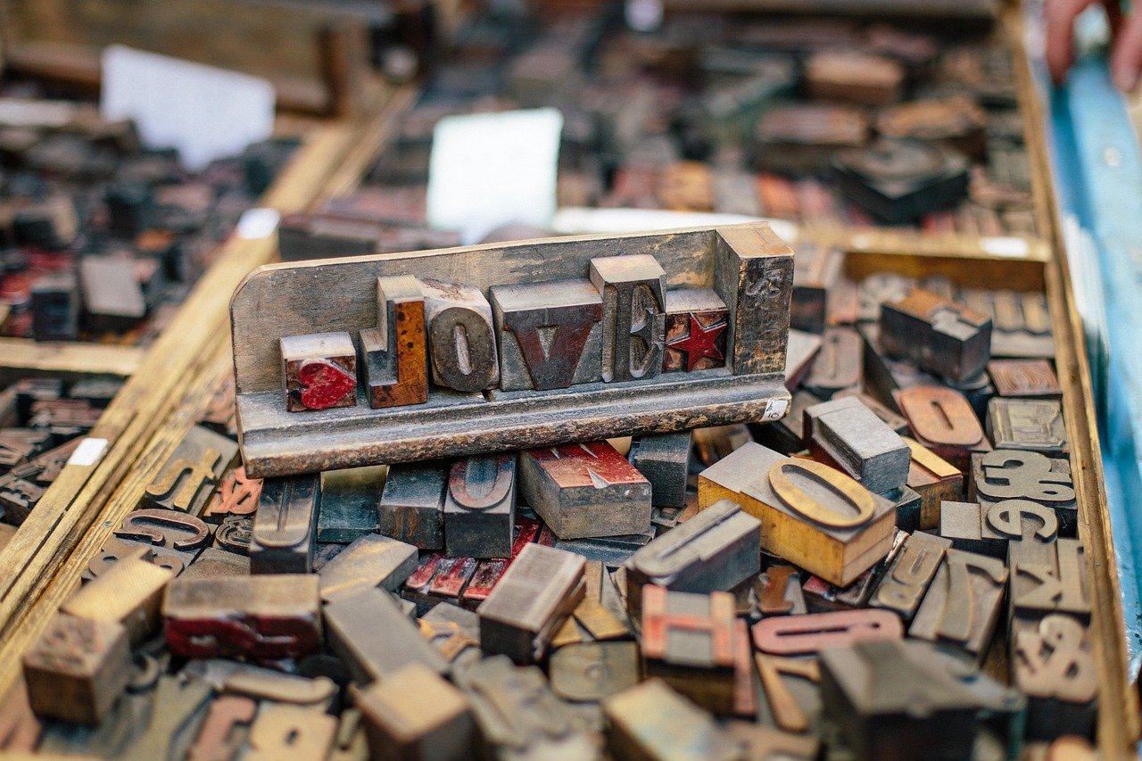
Cover by Foundry Co from Pixabay
Be the first to comment