“Just as your shoes must be fitted to your outfit, the fonts you use must match one another” - Pavel Korzhenko, Vintage Voyage Design Co.
Settling on a single font that matches your brand’s identity is a tricky task in itself, but as all designers can attest to, finding multiple fonts that pair well together is significantly harder. Founder of Zetafonts Foundry, Cosimo Lorenzo Pancini, agrees that “Font pairing has always been an elusive subject for us as designers. Balancing typeface use in a project is something that depends not only on personal taste but on many project-specific conditions”. This, compounded with the fact that today’s market is saturated with fonts for all different tastes and styles, makes it a very challenging and time-consuming process.
To make your life that much easier, we’ve enlisted the advice of top designers and foundries to help you understand how they choose and create the font pairings you know and love. We hope their tips will inspire you the next time you are faced with a font mind-block.
Determining the purpose
Before beginning the search for a type combination, Elena Genova from My Creative Land foundry does a bit of digging. She lists the qualities that describe the brand or project she is working on (eg. friendly, vintage, modern, elegant, etc.) and uses them to guide her decision on an appropriate headline font. She then moves onto choosing a typeface for the body text. She asserts that a good body font will never call attention to itself, will have a good x-height, and be highly legible. Suitable combinations are: Playfair Display/Roboto for a modern approach, and Recoleta/Avant Garde Gothic for a friendly, vintage feel.
In the same vein, Matt Slightam, Design Cuts’ Creative Director, finds research a crucial component in the font pairing process. The fonts used should vary depending on their application, with social headlines looking vastly different from those of print literature. To get an idea of what other designers use, he browses websites and social channels and develops a better understanding of what type works in what context.
Starting with superfamilies and font duos
When in doubt, Elena Genova chooses fonts from one superfamily (a superfamily referring to a set of typefaces that work together in harmony, like Montreux Grotesk.)
According to Zetafonts Foundry, we often forget “that a good typeface family can allow us enough variations in its weight and width range to make it usable in various design contexts. You could write a text using our Klein typeface, for example, and then use the condensed variant for titling, or side notes. Or you could use a typeface, like Erotique, which gives you the full range of sans, serif and text versions.”
Matt Slightam agrees with this approach. His best bet is to go straight to the foundries, which build synergetic typefaces like Montreux and Lutschine. Lutschine, for example, was created as an accompaniment to Montreux, and works very well when used as a headline font in combination with the lower case Montreux.
Matt also looks at the range of font duos already available and, if none are applicable, takes inspiration from them. This gives him a starting point as well as a leg up by offering him an idea of what visually works for experienced type designers. Font duos he recommends are La Luxes and Beautiful Minds.
Sticking to a serif and sans serif
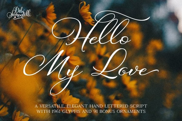
As a rule of thumb, it can be worth keeping in mind “just one serif, one sans per project”. Kris Lauren from Pretty Little Lines likes to combine a sans serif with a serif font, or a fancy font with something more subtle, all the while keeping it cohesive. As a script font designer, Debi Sementelli appreciates a good script paired with either a serif or sans serif. An example of this is her Hello My Love font, which was paired with Kinfolk to create its beautiful graphics.
Contrast and juxtaposition
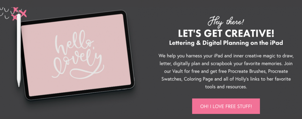
When it comes to fonts, Holly Pixels enjoys picking one font that is perfect for emphasizing a word or passage and complimenting it with a classic font for longer phrases. More recently, however, she has been carefully experimenting with multiple fonts. As you can see on her website, she uses a bold font for headers (Futura), that same bold font in a normal style for sub-headers (Futura regular), and lastly a script detail to add an element of playfulness (Bloomsbury). These three add just enough contrast to complement one another, but not enough to detract attention from the overall message.
Zetafonts Foundry sticks to an important ground rule, which is to not use fonts that are too similar. If, for example, “you choose a humanist grotesque for the body text (like the Body font family), it would make little sense to have another grotesque (like Cairoli) for the titling”, as the similarities would feel like a mistake. It would be better in this situation to use a slab or serif to create a visual juxtaposition. You may want to do this by combining “a very digital typeface like our Antipasto to something that has a handmade feel, like Freehand". In essence, the goal is to find a healthy balance between contrast and similarity.
Beware of competition
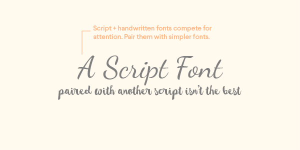
As was mentioned earlier on, competition between fonts is something to be wary of. Letterer Ian Barnard cautions against using two fonts that either look similar or fight for attention. “You can potentially have two simple fonts together or one simple and one fancy font, but never have two fancy fonts together.” For this reason, designers like Elena Genova generally do not use more than two typefaces at once. Though there are certainly exceptions to the rule (like Holly’s website), multiple typefaces can make a design look crowded and disjointed.
Font pairing case studies
Thanks to Pavel Korzhenko, the type designer behind Vintage Voyage Design Co., we are able to bring you two case studies:
A Jewellery brand:
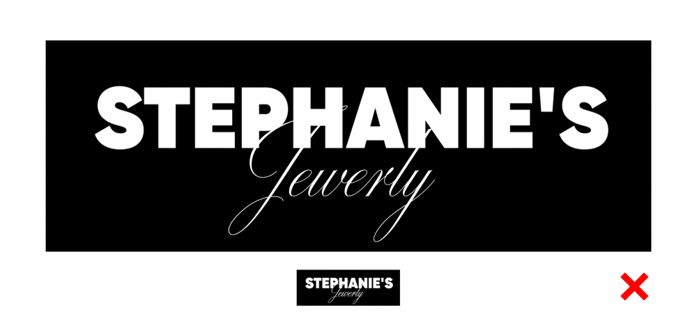
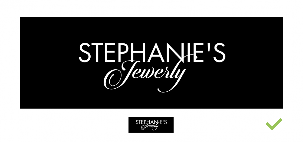
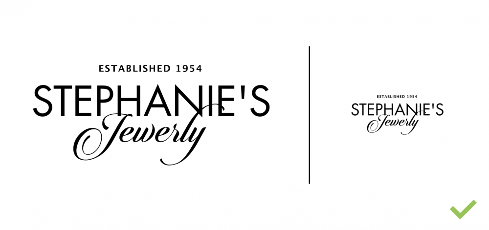
Let us say you want to create a logo for the brand “Stephanie’s Jewerly”. To get more of a romantic tone, you can pair a sans/serif with a script font. A heavy font will not work well in this situation because the weight of it will crush the script.
The visual weight of both words should stay approximately the same, with the thickness of the script resembling that of the sans/serif. To check if this is the case, you can scale down the logo five or more times and see if the script remains as legible as the other font. If the contrast is not balanced, you can choose a lighter sans/serif to ensure a more proportionate composition.
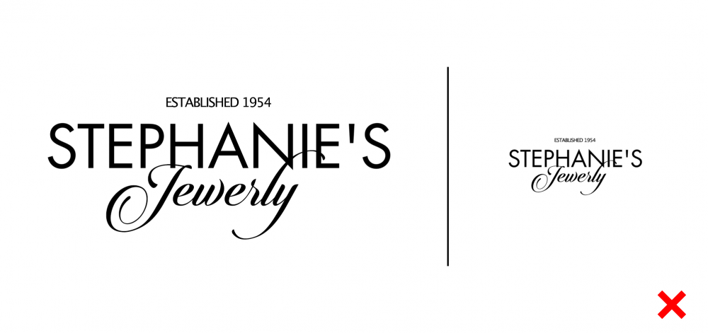
Nowadays, it is very popular to incorporate additional elements in logos, such as the year of foundation, address, or even a phone number. The same rules apply here, though this information should not hold the same visual weight as the rest of the logo. Its size should be smaller and its stroke thickness thinner. It is best to use normal or wide sans fonts in such cases (hint: serif fonts are not very readable at this size) in medium - bold weight.
A toy store brand:
Some fonts have more personality than others, which makes them more finicky to pair. In this case, we will take a look at a toy store logo. A more playful font, such as this balloon one, would not pair well with a calligraphic handwritten font. Their contrast is too strong and their commonalities too few. It would be best to combine the balloon font with a simple, readable font that does not attract attention. This secondary font would have to contain “visual anchors” that fit the balloon font’s tone and personality.
More designer recommendations:
Now that we’ve gone over our main designer tips, here are some of their favourite pairings and font duos:
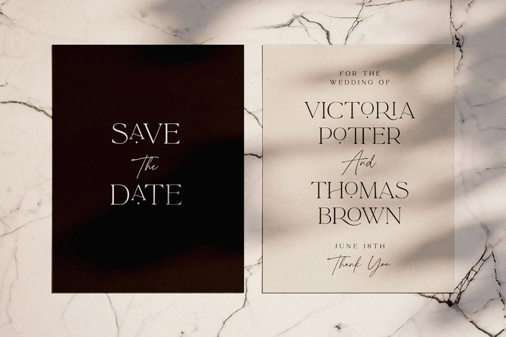
Vintage Voyage Design Co.:
Holly Pixels:
Debi Sementelli:

Was there a reason Jewelry was spelt Jewerly in all the “Stephanie’s Jewelry” samples?
Hey Linda,
Thanks for commenting and Pointing out this to us. I have flagged this with our Product team and they have contacted the designer to change this. :)