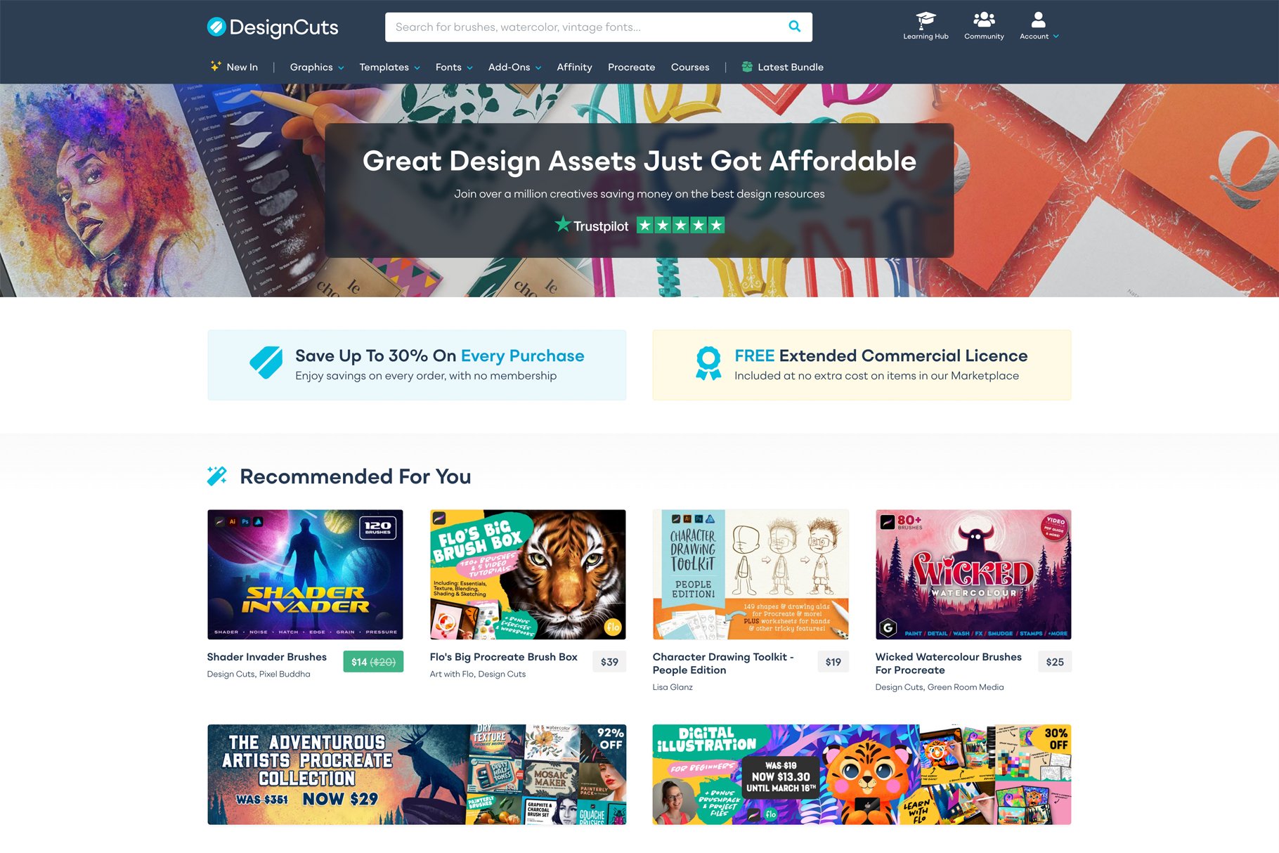
We recently rolled out our biggest website update in years. Many of you have already noticed the clean new look at Design Cuts, and we’ve been so happy to see the early feedback from our community.
Today, I wanted to introduce the man behind this project – our incredible UI/UX designer, Jon Warnes.
I sat down with Jon to ask him about some of the design decisions that went into this updated look. We chatted all things typography, brand and product discoverability. I wanted to give our community the chance to geek out over some of these design considerations and get a real behind the scenes look into our extensive website refresh.
What would you say were your main objectives for this redesign of the Design Cuts platform?
A few years have passed since the previous version of the platform was released, and in that time Design Cuts has evolved enormously as both a design community and a design assets marketplace. The main objectives were to do justice to this evolution – firstly with a fresh new look that aligns with our recent branding refresh, to better showcase the fantastic quality of our marketplace, and also by continuing that evolution with a host of improvements to the overall user experience – we’re all about helping our customers to find and save money on the best design products!
I’d love if you could break down some of the notable design decisions.
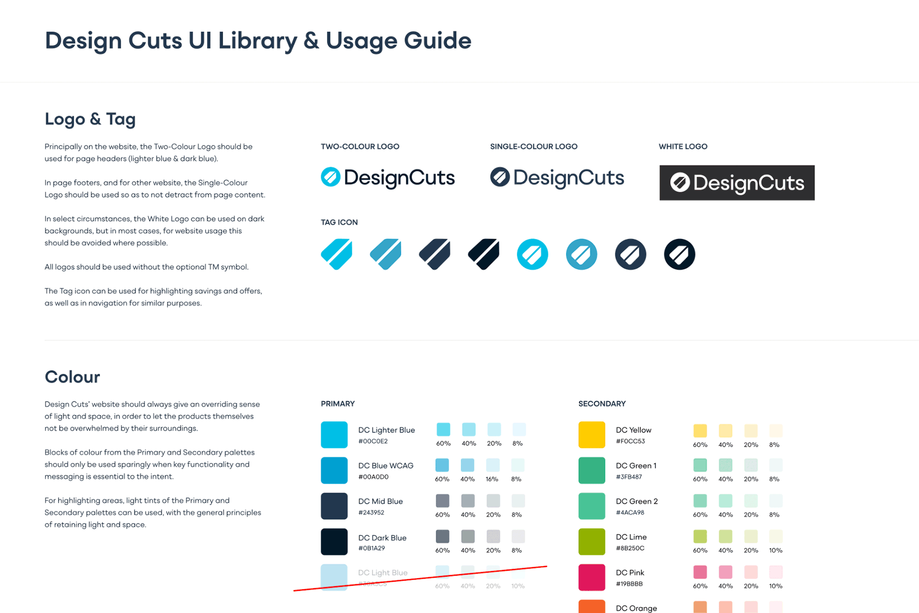
In 2022, our amazing Creative Director Matt led a huge effort into a branding refresh, to bring a fresh, more contemporary look to Design Cuts. This included a new logo and initial complementary colour palette, alongside working with one of our favourite font designers, ROHH to develop a Design Cuts brand font to help better convey the personality of the brand.
Design Cuts branding in-progress drafts & evolution
Continuing that brand evolution, we built a full UI style guide and translated this into a set of styling components that could be used across the platform to ensure clarity of information and improve the usability across the board. This involved a lot of work on the typography and spacing, to clearly define information and key messaging on the site, as well as expanding the color palette in order to differentiate different types of functionality. The purpose of all of this is to build a set of styles that can be drawn upon to convey information as clearly and consistently as possible to our wonderful customers!
UI Style Guide in progress
I believe this new design has been built in such a way that it’ll be easier to evolve/iterate from, compared to its predecessor. Could you talk me through how that will work?
That’s correct! We have a hugely exciting roadmap of new features for the website planned, and part of the UX/UI work involved in this redesign is to prepare the platform for those features. For example, our new navigation creates more room for new ways for Design Cutters to find the assets they’re looking for; we’ve added a collection of popular searches to each category to help inspire our community’s creativity via trending design themes, and we’re working hard to better categorise our fantastic product catalogue and assist users even further to find what they’re looking for!
The previous design had been built to accommodate the Design Cuts platform as it was several years back, but such is the pace of progress for Design Cuts and the design world as a whole, we could see the need for a bit of a clean slate for us to build upon for the many exciting improvements that are still to come!
Could you talk us through some of the challenges that the previous design presented?
Over the last year, we’ve done a lot of analysis and testing on various areas of the site to help identify problem areas. We have an incredible range of design assets to offer our community, but with the old website finding them wasn’t the easiest, and their product detail pages were mixed in terms of layout and clarity. We’ve sought to address these issues incrementally, and cemented them properly with this redesign, aiding clarity and product discoverability across the board.
The user experience on mobile devices previously was really sub-optimal, and whilst the majority of our users visit the site on larger devices, more and more people want the convenience of browsing on their phones. We’ve made great strides forward with this in the new design, with refreshed navigation, better product listings and an overhaul of all styles to make the experience an enjoyable one, however you browse the website!
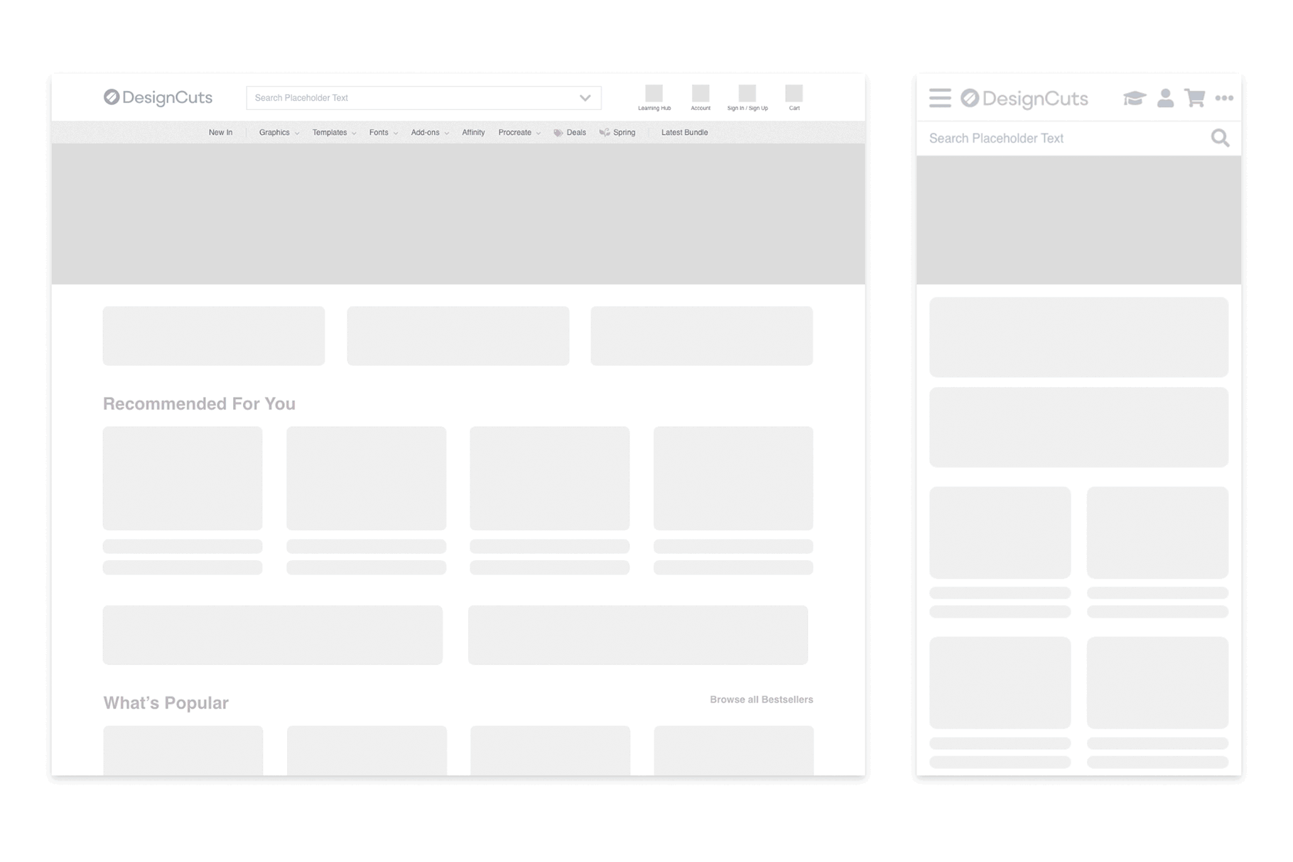
Evolution and work-in-progress versions of the new site navigation
What are some of the flourishes or elements of the new design that you enjoy the most?
I’m very proud of the new colour palette for the new design; a lot of work was done to keep some familiarity for our wonderful loyal community, whilst increasing clarity, and bringing some freshness into the look & feel. It all feels a lot more joyful, to my mind at least!
We’ve had a version of this in place for a while now, but the ‘sticky’ product information panel on product pages in the refreshed design is really pleasing to my UI brain, and really elevates the usability of the pages. We’ve also added the ability to quickly jump to different sections of the page, which I find really helpful.
We’re also testing new things on the homepage, and ‘swipe’ navigation for the different product categories on touch devices has been super satisfying to work on; those sections work so much better than I’d even envisaged; for me at least, it’s increased the fun factor as well as the usability!
Certain things have been given more priority within the new design, what are those and why/how have you successfully highlighted them?
We make a lot of use of data and testing to identify priority areas to work on. This means careful analysis of user journeys through the site, building hypotheses of why those behaviours come about, and then A/B testing different layouts to determine what changes are going to be most useful to our customers. Equally importantly, we also ask our wonderful community for their feedback and what they’d love to see from us! The design community is very diverse and varied in its needs, although not every designer is naturally vocal about these – using a blend of data points and individual user feedback is vital in designing improvements that work for everyone. It’s an involved but hugely rewarding process!
Based on the information we’ve gathered, the main areas of priority have been centred around product discoverability and clarity of information in a general sense. Our users have told us they want to be able to find the best resources easier, so our focus is very much on that. Everything has been done with one eye on the future; whilst it may not be immediately obvious, the design is a lot more flexible for the further improvements we have planned. Really excited to push further into these in the coming months!
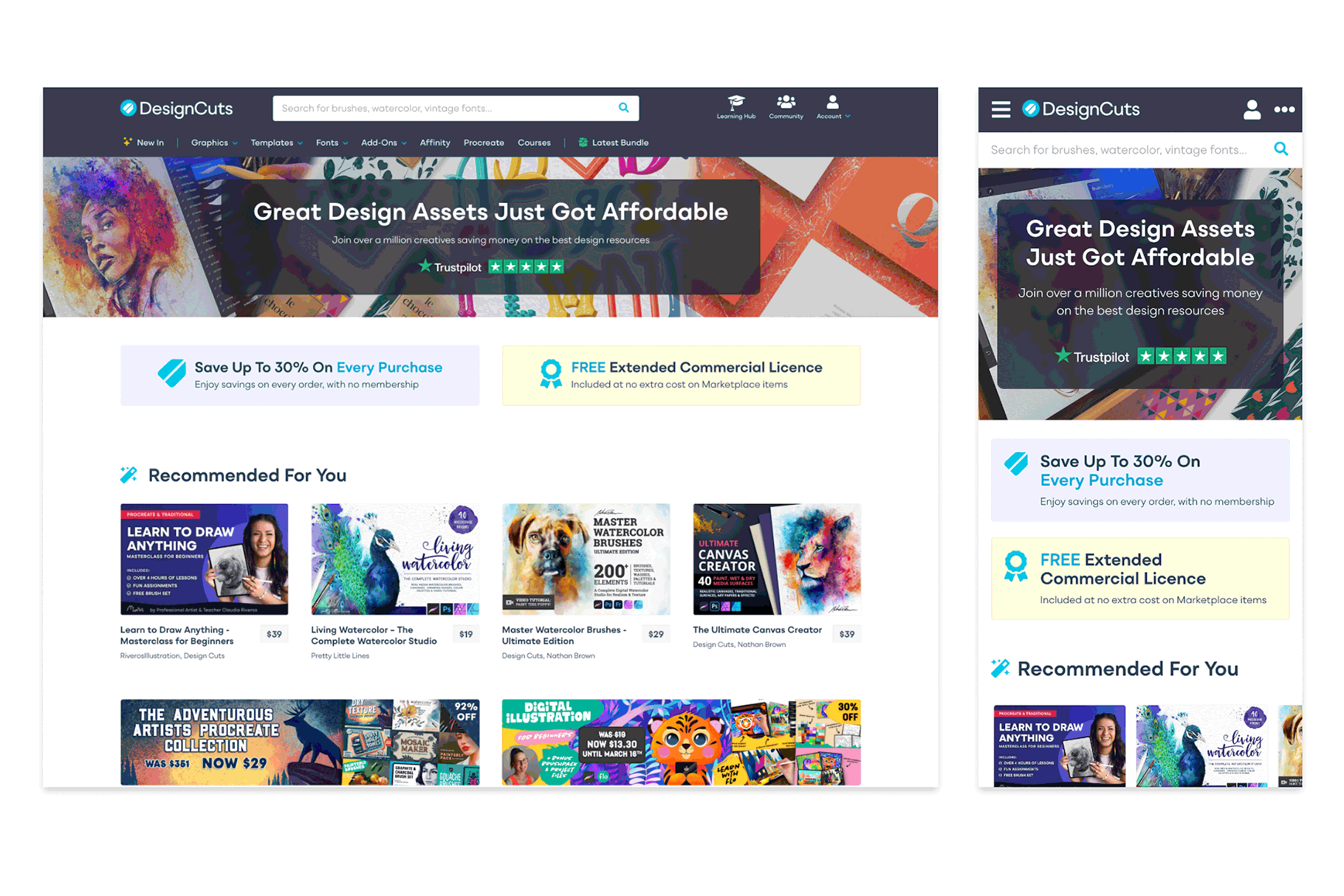
The final product!
What were some of the biggest struggles you encountered during this redesign process?
Our platform, as it has evolved over time, is very bespoke to the needs of our users, and as such, finding ways to improve the overall usability and UI of the website has meant that a lot of existing features have needed to be effectively rebuilt in order to achieve this. Alongside a thorough UX and UI design process, as a designer with a background in both UX/UI and front-end development, it’s been a real challenge, but one that I’ve relished – working alongside our incredible development team!
There’s some really complex technology that we’ve introduced to bring relevant products to the forefront for users based on their interests, and getting that running fully has been challenging, but great progress has been made here – all of which we hope provides a much slicker and easier-to-use platform for our users.
What is your vision for the website in future? Where would you like to see it go?
We have an ambitious roadmap of features planned for the website, all of which are centred around making Design Cuts a fantastic platform for our lovely members to use. The user is at the heart of all good UX/UI design, and delighting our users with useful features and usability improvements is core to my vision of where the website should be headed. Helping users find the assets they want is central to that – Design Cuts exists to bring incredible and affordable design assets and tools, and what excites me the most is making that even easier and more enjoyable! We’re listening to our community and working hard on features that we know they’ll love as soon as possible. (And yes, a Wish List is coming – we promise! 😊)
What do you think of our updated website? Please let us know in the comments below.
Congratulations on the rollout! “In my day” UX/UI was my job and I know how challenging it can be not only to make the decisions while keeping the trust and enthusiasm of both those in the corporate side and those in the user side! The site is lovely, user friendly, and everyone involved should be very proud!
Thank you so much Sherry! You have really made our day here in the office with your super kind words 🙂.
Can you please give us a “Wish List” option ON the site (not Pinterest). I use my shopping cart for this, but the size is limited, and I’d rather have a wish list that gives us all the same details and links provided by our shopping carts. Thank you!
I really appreciate you taking the time to provide your feedback Desiree – I have popped this over to our Senior Team, and rest assured, our Dev Team is working on getting a wish list onto our development road-map.
Thank you for all your hard work 😊 I love this site!
Thank you for your kind words Rhonda! It’s wonderful to hear you are a happy member of our community 🙂.
I love Design Cuts, been purchasing here for years. The one and only complaint I have is after all these years you still don’t have a wish list, or save favorites option. Every online site I shop at has a wish list or a favorites list…something to that effect. I do not want to “pin it”, as one of your people suggested to me. I am always limited by budget so I want to save what I like and be able to see those items when I visit the site. All in one place. Guys please!
It’s wonderful to hear you are a happy member of our community, Gail, and thank you for taking the time to provide your feedback. I’m unable to confirm exactly when we might be able to implement a wish list, but you can rest assured that our Dev Team is working to get this onto our development road-map. Thank you for your ongoing support, we really appreciate it 🙂.
Can’t wait for the Wishlist! 😁
That’s great to hear Laura-Anne – rest assured, this is certainly on our radar 🙂.