Color is one of the trickiest components of graphic design, but it is for this reason that it is just as important to master. Since it is a powerful yet subjective communication tool, it can have a massive impact on how your audience receives your design or product. The work that goes behind picking beautiful and effective colors is a blend of art and science, so in this article we are here to show you how mastering the process can get you on your way to creating pieces that your audience is unlikely to forget.
The basics of color
Let us start with the science. To understand what color actually is, we have to learn the fundamentals. That means taking a trip down memory lane to the color wheel.
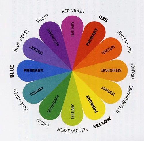
The wheel is comprised of 12 colors that are at the very core of all colors on the spectrum. It helps us understand what colors work well in combination and how they relate to one another. Whether we encounter a jarring or soothing color pairing, the wheel can usually explain to us why our brain has rejected or taken to it.
The 12 colors on the wheel can be divided into three main categories: primary, secondary, and tertiary colors. Primary colors are the purest ones (ie. red, blue, and yellow), secondary are created by mixing primary colors with each other (ie. orange, green, and purple), and tertiary are formed by combining primary and secondary colors (ie. blue-green, and so on).
Dividing color palettes
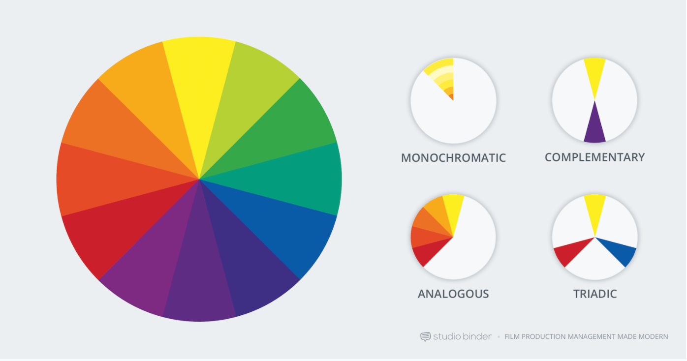
Now that we have refreshed our memory, we can look at how these colors are used to create color palettes. In the design community, palettes are generally broken down into 4 main categories: monochromatic, analogous, complementary, and triadic.
First we will cover a little terminology to help you better understand those 4 categories:
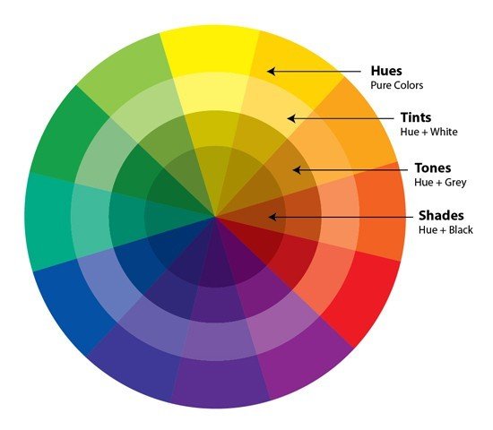
- Hue: the color of something, like blue or pink
- Tint: the result of adding white to a hue
- Shade: the result of adding black to a hue
- Saturation: the strength of a color (highly saturated = bold; lightly saturated = muted)
Monochromatic: here, only a single hue from the color wheel is used (eg. orange) along with some of its shades and tints. Because only one hue is used, these color palettes can oftentimes be the most straightforward ones to create. The danger lies in making them a little too boring if not executed well.
Analogous: a main color is used (eg. blue) along with the colors next to it on the color wheel (eg. blue-violet and blue-green). This is a popular and safe type of color palette to use because the colors are not too different in hue, but can be varied in shade and tint to create a pleasing contrast.
Complementary: colors on the wheel are paired with ones of the opposite side of them (eg. green and red). This can be great for striking a healthy balance whilst also creating contrast, but is most strongly executed when adding tints and shades so the palette is not too jarring.
Triadic: pairs colors that are equally distant from one another on the color wheel, like red, yellow and blue. This creates a more interesting palette, but requires more thought because there are more colors at play.
What colors mean
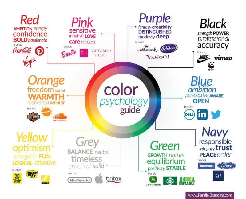
So what do colors mean? Well, the bottom line is that they mean different things to whoever is perceiving them. The good news is that certain colors do have stronger associations, in the way that red is more commonly paired with love, fire, anger or energy, blue with calm, trust, tradition, stability; purple with wealth, royalty, power; green with nature, growth, safety; orange with warmth, creativity, happiness; and yellow with joy, positivity, growth.
As subjective as colors can be, your job as a designer is to feel the mood and assess what color palette will best suit your project. This means not only taking into account which ones will pair well together aesthetically, but also how your audience will respond to them. Understanding this will help you decide what will work best for the brand.
Pinning down a color palette
All of that information we just discussed comes down to this: how do you choose the right color palette? Let us put that knowledge into practice.
Take inspiration from your surroundings
When in doubt, look around you. Nature is constantly evolving and changing in harmony with its surroundings, giving you endless inspiration. Go for a walk and observe the foliage, the sunset or sunrise, the flowers growing in your neighbour's garden. And if you are not immediately in nature, visit that pink house that you love or take a drive around the city, looking for colors that catch your eye. If you learn to take in the beauty around you, there will be no shortage of color palettes for you to pull from.
Use photographs or movies
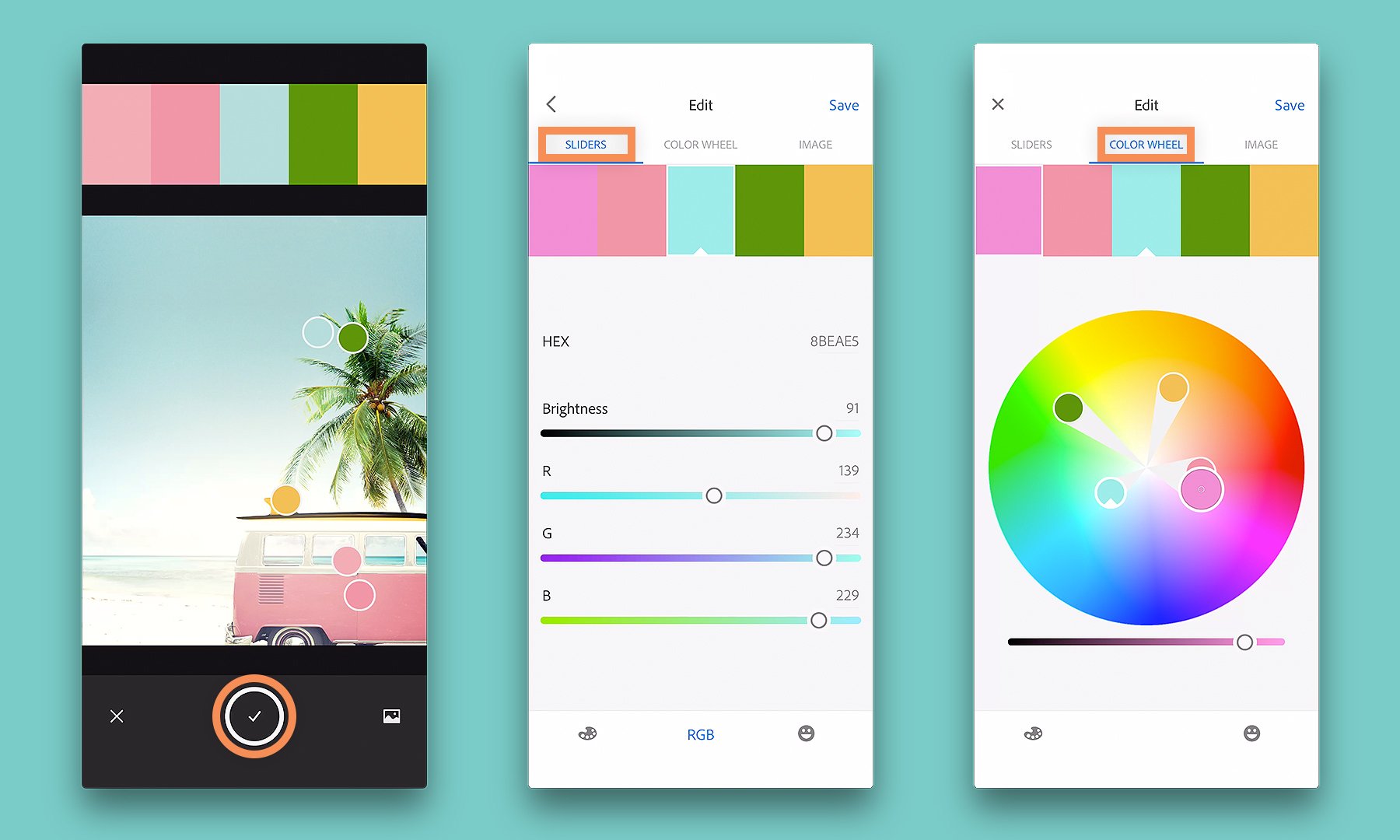
Have you ever come across a photograph or movie that captured color perfectly? Or taken a beautiful picture on your phone? Well, there are automated tools, like Adobe Capture CC, that can tell you the exact hex codes for those colors. All you need to do is import an image, get the information, and then import that information into your program of choice. Another example is Procreate, which allows you to pull a color palette from an image in your gallery.
Browse Pinterest
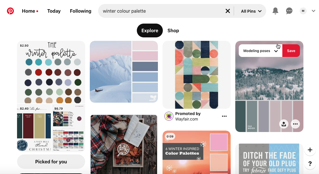
There is no limit to the inspiration you can find in the world of Pinterest. Many graphic designers collect their favourite color palettes, but a simple search for "winter color palette" will bring up a huge collection of options.
Access our free color palettes
For those of you who are stuck or simply want to see what color palettes work well, we have you covered! A while back, we asked top designers if they would be willing to share with us their favourite palettes, and here they are available to download for free.
I found this very useful, has help me in finishing an article I have been working on. Thanks a great deal
I’m so glad to hear you found this useful for your article Dyan. You’re very welcome :)
I wish I could download this article as a PDF!
Hey Kerri,
Thanks for getting in touch and the great news is that all of our pages are printable, so you can certainly save this article as a PDF to use at any time you would like.
I hope this helps, and if you have any other questions, please do let me know- I am always happy to help!
Thank you!
You’re so very welcome Kayce and happy designing!
Gracias Team!
From Sunny Puerto Rico
Hey Humberto,
You are so very welcome and we hope that you picked up some super handy tips!