Hello Design Cutters!
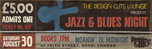
Jo again. For our latest tutorial we’re going to play around with a slightly different format, creating an event ticket for a Jazz and Blues Night at the groovy Design Cuts Lounge ;).
We’ll be looking at how to create a bold, simple layout using a limited colour palette and chunky fonts, plus using images, pattern fills and layer masks to add texture. It’s going to be fun!
Quick note: In this tutorial, the term “clipping” or “clipped layer” is used a few times. This means that the layer is only visible/applies to the layer directly below it. You can very quickly do this by holding ‘Alt’ down on your keyboard and clicking between the two layers. Here’s a quick demonstration.
Ok, you cool Design Cutting Cats, let’s get started!
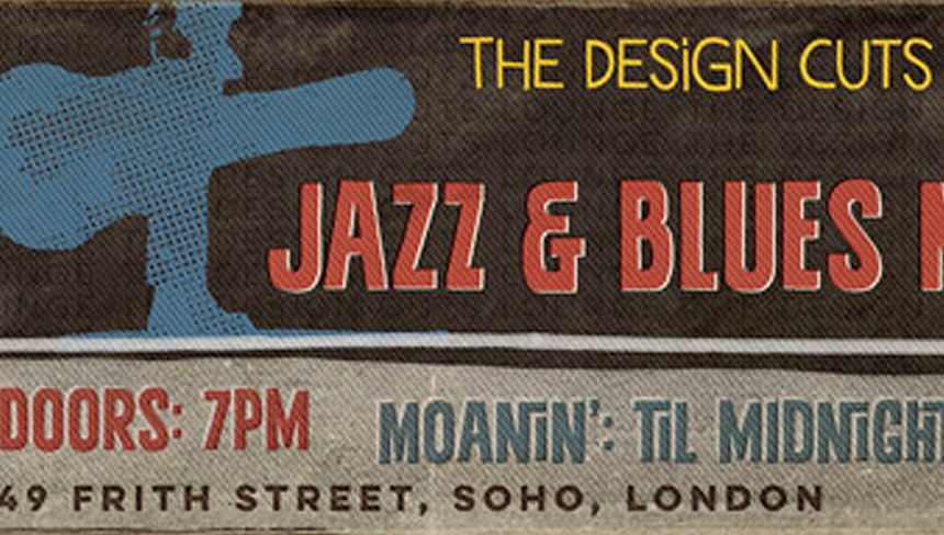
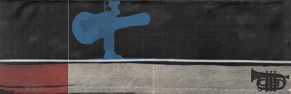
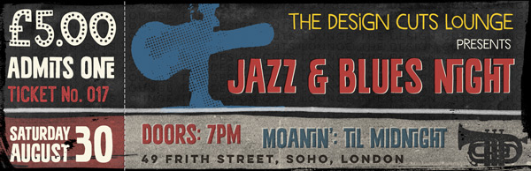
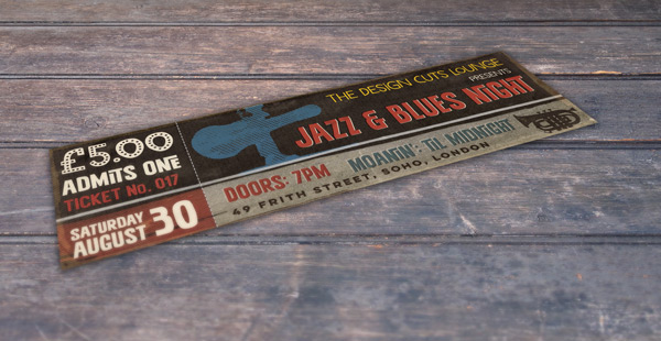
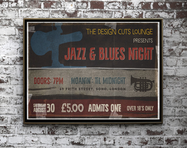
WHAT WE’RE CREATING:
We’ll be using the fantastic creative fonts from our current Inspirational Creative Fonts Collection to create this outcome:
Follow along with this tutorial: Download the freebies
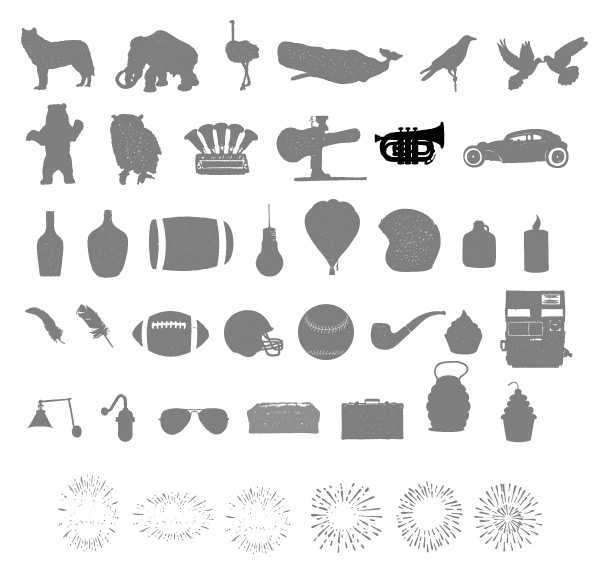
Today, we have another great freebie for you to enjoy. Maghrib have kindly donated their awesome Alpha Extras for the Design Cuts community. These images are so cool and versatile on their own, we’re sure you’ll find lots of creative ways to use them in your work!
Remember, this freebie is just a tiny sample taken from our current deal: The Inspirational Creative Font Collection (Includes Web Fonts) at just $29 (92% Off). This bundle is full of best-sellers and it’s easy to see why – they really are classic, versatile fonts that never go out of style and are bound to feature in your work for years to come.
Enter your email below to download this freebie, so you can follow along with this tutorial easily.
Step 1:
Open up a new 2.75 inch height x 8.5 inch width document in Photoshop.
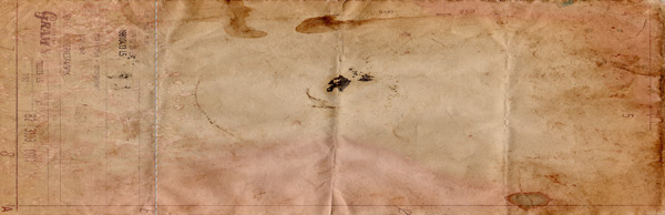
Then, we need to download this great paper texture from caminopalmero:
If you’ve followed some of my previous tutorials, it’s likely you’ve already got it downloaded – it’s a bit of a favourite ;)
Paste the texture on to your Photoshop canvas, scaling to fit the dimensions:
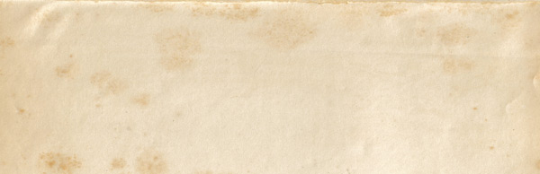
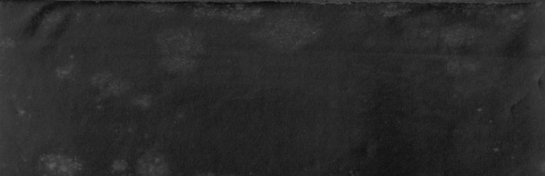
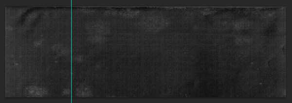
We want to create a dark background without losing the texture, so we’ll need to make sure the layer is rasterized so we can invert the colours (Image > Adjustments > Invert):
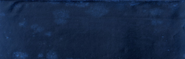
This gives us a nice inky-blue colour, but we want to build the design on a more neutral base. We’ll do this quickly with a clipped hue/saturation Adjustment Layer with the following settings:
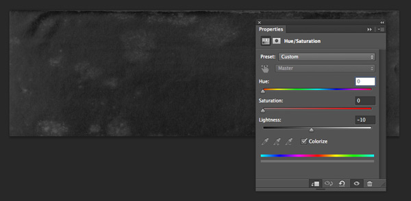
Hue/Saturation Settings:
Colourize: On
Hue: 0
Saturation: 0
Lightness: -10
We now have a subtly textured black base to work on:
Step 2:
Before we finish off the background, there’s something we can do to give it a more authentic touch.
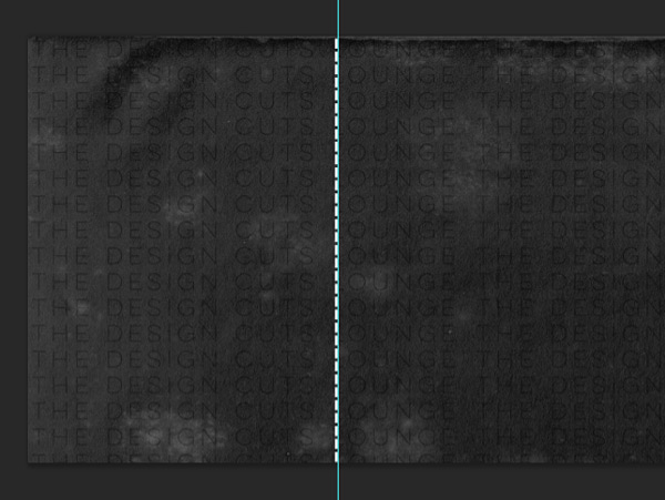
A lot of tickets have some sort of pattern in the background to make it harder to produce fakes. Here’s an example below:
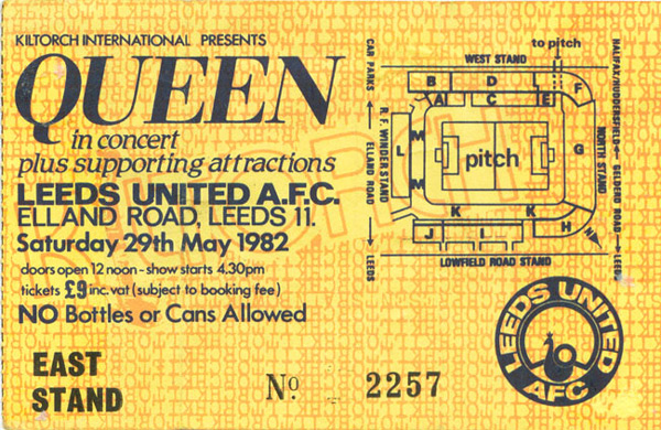
We’ll do something similar by creating a Pattern Fill.
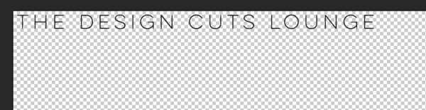
Open up a new Photoshop document with the same dimensions as our working canvas, and a transparent background.
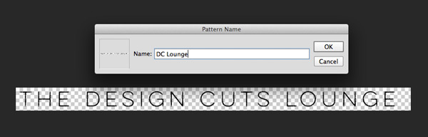
From the current bundle, select Yellow Design Studio’s Lulo One as the font, at size 10pt and colour black. Then type “The Design Cuts Lounge”.
Zoom in to 100% and position the text in the top left of your canvas, using the transparent grid to help align the text 1 square in from each side:
Then, crop the image so that there’s approximately 1 square below and four squares to the right of the image:

Once cropped, in the menu bar go to Edit > Define Pattern and type an appropriate name in the pop up box, then hit ‘OK’:
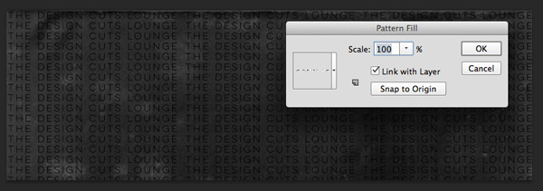
Going back to your working canvas, in the menu bar select Layer > New Fill Layer > Pattern. In the first pop up box that appears, you can leave everything as the default and click ‘OK’.
In the second pop up box that appears, make sure the pattern we just created is selected (the most recently created pattern should be selected as default) and that the scale is set to 100%. Then, click ‘OK’:
Change the layer blend mode to Soft Light and drop the Opacity to 40% for a subtler effect:
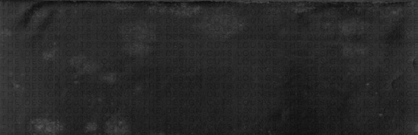
Great stuff! To keep things tidy and easy to locate, put all the layers we’ve just created in to a group called ‘Background’ and we’re ready to move on.
Step 3:
Next up, we’re going to use a little trick to create a perforated effect on the ticket.
We want this to be at a specific position and we’ll set up a guide to help us. Go to View > New Guide and in the pop up box that appears make sure ‘vertical’ is selected and type ‘2 inch’ for the position:
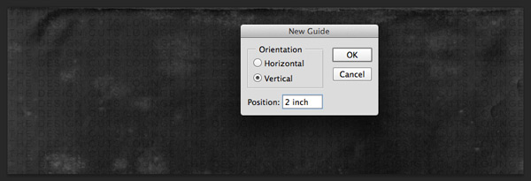
This gives us a guide exactly 2 inches in from the left of the canvas, and the perfect width for out ticket stub.
On a new layer, select a simple sans-serif font like Helvetica Light or Arial. Set the font size to around 18pt and colour to white and type a continuous line using the ‘dash’ key. Stop when it looks like it should cover the height of the canvas:
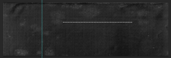
Rotate the text 90 degrees and position it against the guide we created:
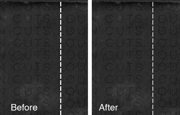
To create a more authentic perforated effect, we’ll add a subtle Drop Shadow with the following settings:

Drop Shadow Settings:
Opacity: 75%
Angle: 150
Distance: 2px
Spread: 0%
Size: 2px
You can see the difference it makes below:
Lock the layer to the top and we’re ready for the next step.
Step 4:
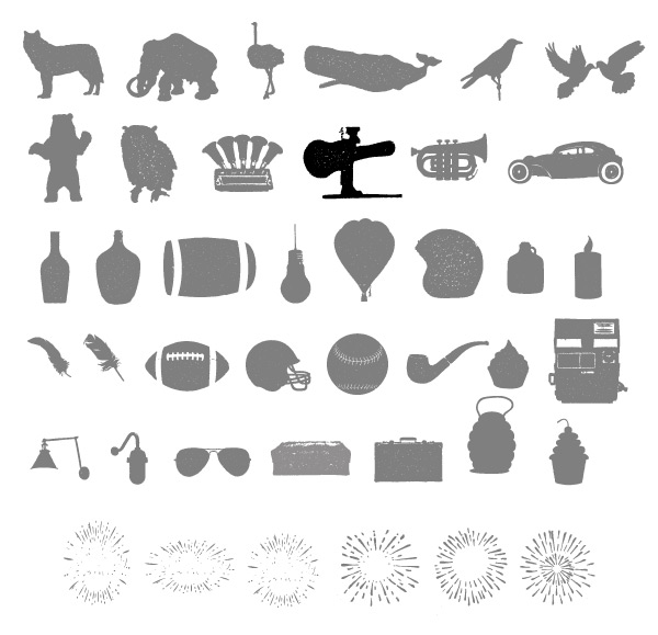
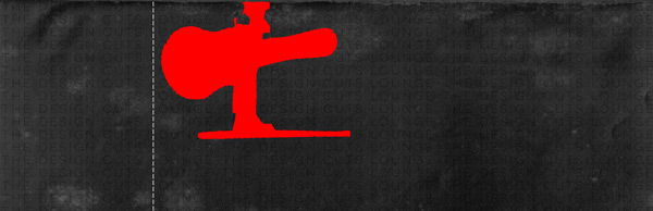
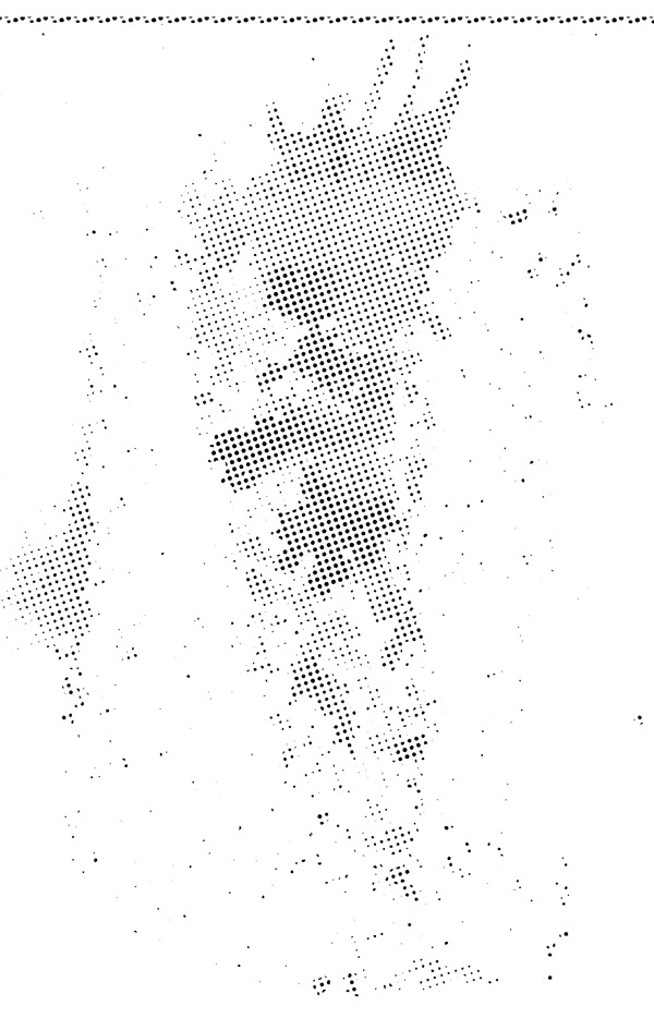
We’ll now start properly digging in to the amazing fonts in this bundle! From the Alpha Extras freebies select the following graphic of the person carrying a guiar case:
Paste it on to your Photoshop canvas so that it’s just to the right of the perforated line and approximately two-thirds of the height of the ticket (made red in the example so it’s easier to see):
To make the image easier to see without it being quite so dramatic, we’ll add a clipped hue/saturation Adjustment Layer:
Hue/Saturation Settings:
Colourize: On
Hue: 206
Saturation: 40
Lightness: 28
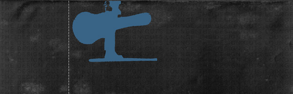
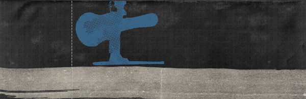
This gives us a nice, muted blue shade which feels far more appropriate for a jazz and blues music night!
The solidity of the shape is a bit distracting, though. We’ll add a more suitable, rough texture by using a Layer Mask on our original image.
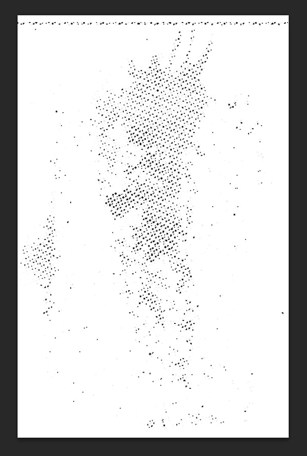
One of the great things about this bundle is the variety of extras that come with the font sets. We’ll be using inspirational-creative-font-collection > Ian-Irwanwismoyo > Bowney Marowney > Rebel Edges > Texture Bonus > Bloody Halftoner.png for this step.
Open Bloody Halftoner.png in a new Photoshop window:
Using the Magic Wand Tool, click on any area outside of the dark dots then inverse the selection ( shift+command+I):
Copy the selection, then go back to your working canvas. If you’ve not done so already, create a Layer Mask on our guitar man layer, then alt+click on the mask layer to edit and see it directly.
Then, paste the selection we just made from the Bloody Halftoner.png and scale it down so it’s positioned similarly to below:
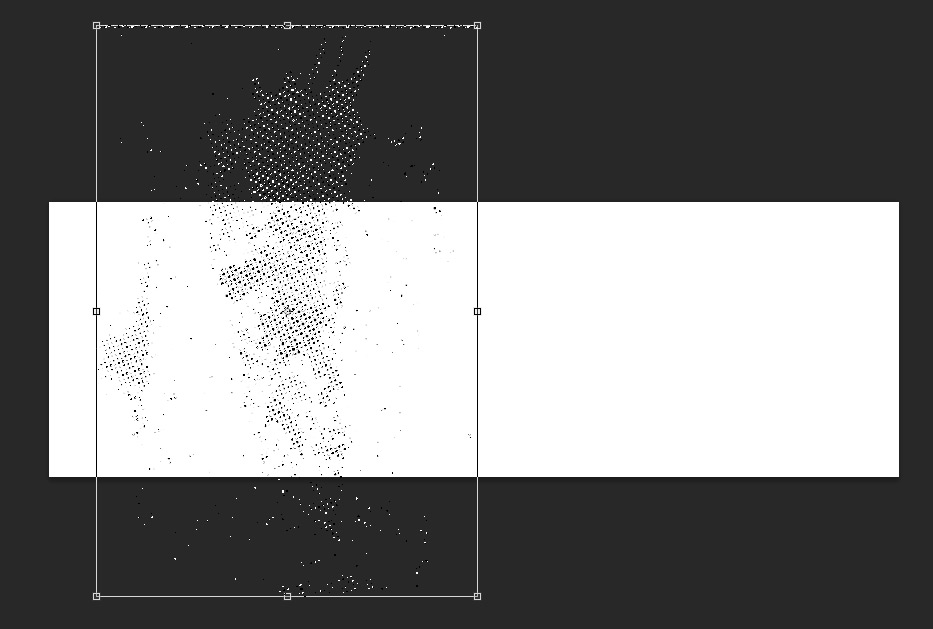
Click anywhere in the layers panel to go back to your working canvas. You can adjust the position of the mask to your liking by un-linking the mask and image, which you can do by clicking on the link between the two in the layers panel.
When you’re happy with the texture created, we’re ready to move on!

Step 5:
We’ll explore some of the extras a little further by going back to inspirational-creative-font-collection > Ian-Irwanwismoyo > Bowney Marowney > Rebel Edges and opening up strokes.psd. We’ll be using the following, Stroke 8:

Copy and paste (or drag and drop) on to your working canvas, scaling and positioning similarly to below:

We want to use this as a base to place some text on, so let’s add a clipped hue/saturation Adjustment Layer with the following settings:
Hue/Saturation Settings:
Colourize: On
Hue: 40
Saturation: 55
Lightness: +90
Next up, we’re going to use a Layer Mask to crete a ‘cutout’ shape, using the same method as before.
From the Alpha Extras locate and select the trumpet graphic:
Copy and paste on to a new Photoshop document, flipping the image horizontally (Edit > Transform > Flip Horizontal).
Use the Magic Wand Tool to click on any of the darker areas of the image to select it directly:
As before, copy the selection and return to your working canvas. If you’ve not done so already, create a Layer Mask on our stroke8 layer, then alt+click on the mask layer to edit and see it directly.
Paste the selection we just made of the trumpet in the lower right corner, then click anywhere in the layers panel to go back to your working canvas and see the mask.
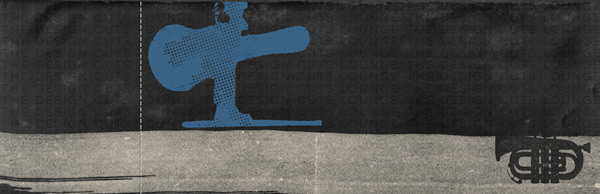
As you can see, the image is a bit too big. Not to worry! We can adjust this easily by unlinking the image and mask layer, then activate the mask layer icon to transform the shape as normal.
Once you’ve scaled the trumpet to fit within the stroke, we’re good to go for the next step.
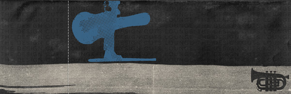
Step 6:
On a new layer, select #C24646 as the colour and use the Rectangular Marquee Tool to draw a rectangle that covers the brush stroke between the left edge of the canvas and the perforated line. Press ‘alt+delete’ on your keyboard to fill with the foreground colour :

Change the blend mode to Multiply then clip to the hue/saturation layer below:

Going back to inspirational-creative-font-collection > Ian-Irwanwismoyo > Bowney Marowney > Rebel Edges and opening up strokes.psd which we opened earlier, select Stroke 9:

Copy & paste this on to your working canvas, scaling so that the width just about matches the baseline on the Guitar Man graphic.
Use a clipped hue/saturation Adjustment Layer to apply the following settings:
Hue/Saturation Settings:
Colourize: On
Hue: 0
Saturation: 0
Lightness: +85
Put all the layers we’ve just created in to a group called “Decorative” and we’re ready to start playing with some fonts!
Step 7:
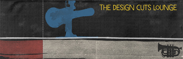
The first font we’ll work with is Marujo Fino by Pintassilgo Prints. Set the size to 27pt and colour as #F1CA2E, then type “The Design Cuts Lounge” (or whatever groovy venue that takes your fancy :)) and position towards the upper right of the image:
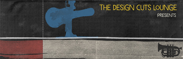
Next up, on a new layer change the font colour to #F9F5E4 and reduce the size to 17pt. Type “Presents” and position so that it’s aligned right below the original text:
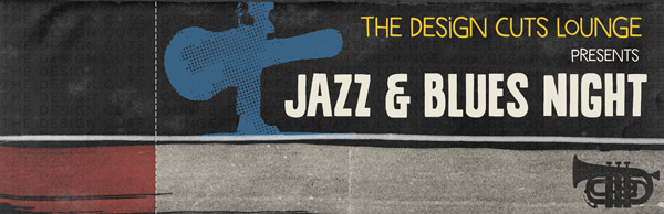
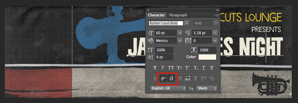
With the colour still set to #F9F5E4, select Rather Loud Bold by Pintassilgo Prints. With the font size at 60pt, type “Jazz & Blues Night”:
This font family contains some rather cool ligatures, which add some interest. You can apply these by selecting the text you’ve just typed and going in to the Character panel.
From there, make sure both the “Contextual Alternates” and “Discretionary Ligatures” are selected and you should see the changes instantly:
Duplicate the text layer we just created and change the font colour to #C24646. Change the layer blend mode to Multiply and use the arrow keys to nudge the text slightly up and to the left. This gives the text a nice offset print effect, giving it a more tactile feel:

Step 8:
Now we know what we’re attending, we need to know when and where we need to arrive!
With the font still as Rather Loud Bold, change the colour back to #F9F5E4. Set the font size as 34pt and type “Doors: 7pm”. Change the blend mode to Screen and drop the layer opacity to 35%:
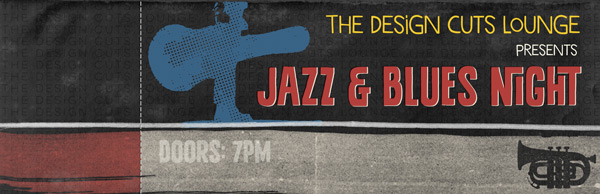
Duplicate the layer, changing the font colour to #C24646. Change the blend mode to Multiply and bring the Opacity back up to 95%. Again, use the arrow keys to nudge the text slightly right and down for that offset print effect:

Repeat the process with the text “Moanin’: Til Midnight”. Use #4D738E as the blue font colour and position the text so that it aligns with the bell of the trumpet:
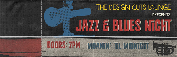
Finally for this step, we’ll add a venue location. Select Lulo One Bold by Yellow Design Studio as the font, 12pt size and the colour as #362D26.
Set the layer blend mode to Multiply and Opacity to 95%, then type “49 Frith Street, Soho, London” or any suitable address for your venue. Position so that it aligns left with the “Doors…” text:

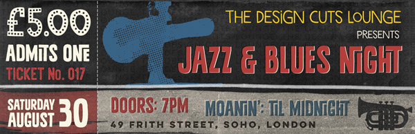
Step 9:
For the text on the ticket stub, I’ll give you an overview of the fonts, colours and sizes so you don’t have to read over the same steps over and over again, and can get to the finishing touches quicker ;)
£5.00
Font: Marujo Dotface
Size: 64pt
Colour: #F9F5E4
Admits One
Font: Rather Loud Bold
Size: 37.15pt (or so it’s the same width as ‘£5.00’)
Colour: #F9F5E4
Ticket No. 017
Font: Ostrich Sans Ink Regular
Size: 24pt (except for the ‘o’ in ‘No.’ which is 20pt)
Colour: #C24646
Saturday August
Font: Rather Loud Bold
Size: Saurday: 24pt / August: 32pt
Colour: #F9F5E4
30
Font: Rather Loud Bold
Size: 62.5pt (or the same height as Saturday/August)
Colour: #F9F5E4
Now we’ve got our funky text all sorted, we can move on to adding some finishing touches and textures.
Step 10:
We’ll give the ticket a slightly ‘rough round the edges’ feel using the inspirational-creative-font-collection > Ian-Irwanwismoyo > Bowney Marowney > Rebel Edges > 01.png.
Paste on to your canvas, scaling so that the edges go over the outside slightly:
Change the blend mode to Soft Light for a subtler effect:
To give the edges a faded, rather than darker effect, add a clipped hue/saturation layer with the following settings:
Hue/Saturation Settings:
Colourize: On
Hue: 30
Saturation: 40
Lightness: +75

Step 11:
Next, we need to download this awesome paper texture from Bashcorpo:

I’ve gone for Texture 6 as it’s got a warm, reddish hue to it, which reflects some of the text.
Paste on to your canvas, scaling to fit and rotating clockwise:
Change the blend mode to Multiply and drop the Opacity to 20% to add a subtle, warm tone to the image:

Step 12:
For the next texture layer, we’ll be using the original Old Paper Texture by caminopalmero that we used in the background. You can duplicate the version in our “Background” group and just Invert again to return to the original colour:

Change the blend mode to Vivid Light and drop the Opacity way down to 10%:

Step 13:
Finally, navigate to inspirational-creative-font-collection > Ian-Irwanwismoyo > Bowney Marowney > Rebel Edges > Texture Bonus > Halftoner-full.png:
Paste on to your Photoshop canvas, scaling to fit and rotating clockwise:

To finish off, change the blend mode to Soft Light and reduce the Opacity to 80%:
And we’re done!
I really hope you enjoyed doing this tutorial – maybe you could even try a variation to create an event poster to go with the tickets?
As you can see, it’s the fonts that really make these designs and is just a tiny glimpse of the aesthetic strength, quality and versatility of the fonts included in this bundle.
If you’ve got any comments or questions, do leave them below and I’ll keep an eye out. Also, if anyone got the hidden hint to a song reference in this tutorial, do let me know at @rockportraits for bonus points ;)
Remember to share your designs on the Facebook page as we’d love to see which fonts you use to create some awesome text based designs.
Hopefully this tutorial showed you just some of the ways you can use the best selling fonts in our current creative font bundle. With such a selection of timeless typography, you really will be using them in your design work for years. You can still get this bundle for a whopping 92% off this week – grab it below, while you still can:
The Inspirational Creative Font Collection (Includes Web Fonts)
What a great tutorial! Really enjoyed playing around with the fonts and I appreciated getting to know the “Character” menu a little better to access the ligatures.
I’ll be using the end result as the cover of a photo book of vacation photos from Riding Mountain National Park (Canada).
Thanks (and please keep these tutorials coming – so valuable and appreciated)!
I’m so pleased to hear you enjoyed the tutorial. If you need more help with the special characters and stylistic alternates you can find another tutorial explaining how to use them here: https://www.designcuts.com/design-cuts-deals/using-font-swashes/.
I’d love to see your final outcome of the tutorial, so please do feel free send it over. :)
My product: http://goo.gl/dQOR9M
Hey Chris,
Thank you so much for sharing this with us! We really appreciate you taking the time :)
I love the elements of this tutorial that you have incorporated into your design and I especially love the vectors you’ve used. Fantastic work!
I’ve always wanted to create a movie/concert ticket. One of many random graphic designing projects I’d like to tackle. I shall definitely give this a try.
Also looking forward to using these fonts! Just when I think I’m satisfied with my font collection, other awesome ones pop up!
What a great coincidence. I really hope you’ll enjoy the tutorial, and please do send us your outcome. I’d love to check it out. Thanks also for the kind words about our current font bundle. I’m glad to hear they’ll come in handy for you. :)