In this tutorial, we will be creating an advertisement for Sonny’s Cafe in Photoshop. To do this, we will be using a sample from the ‘Hops & Barley’ typeface from Fenotype, which is part of The Font Lover’s Versatile Library. This new font library is our most diverse bundle to date and there is literally a font for every project!
In the full bundle you’ll have access to a massive assortment of fonts from best-selling foundries such as Latinotype, Tobias Saul, and more. In addition to the sample typeface that we will be using for the tutorial, we will also make use of a fantastic product from the Design Cuts Marketplace from Lisa Glanz, and a free stock image from Unsplash. If you’re all ready to get started, then preheat those ovens and let’s bake up a beautiful design in Photoshop!
HAVE YOU SEEN OUR YOUTUBE CHANNEL?
Watch the video tutorial below and subscribe to our YouTube channel for regular updates direct to your inbox.
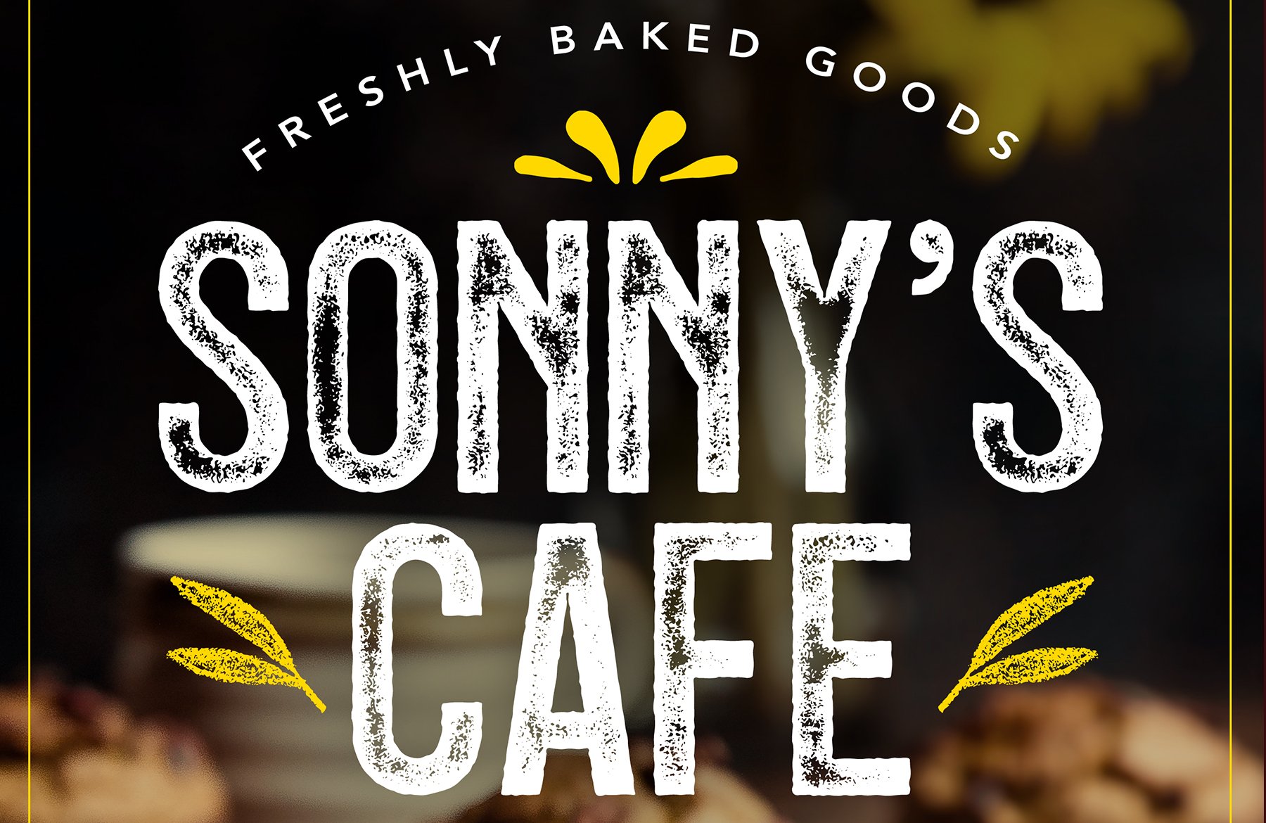
Here’s a look at what we’ll be creating:
Follow along with this tutorial: Download the freebie files
This freebie pack is just a small sample of what you can expect to find in The Font Lover’s Versatile Library for just $29 (that’s 99% off). From strong display fonts perfect for branding or social media to sans, serifs, vintage and so much more!
Step 1: Sonny’s Cafe Ad
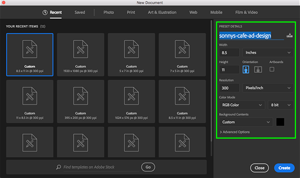
To get started we will first need to download this free stock image from Unsplash. Once you have downloaded the image, save it with the other resources or somewhere that is easy to find. Now let’s head over to Photoshop and create a new document that is ‘8.5’ inches wide by ’11’ inches tall with a ‘Resolution’ of ‘300’ and a ‘Color Mode’ set to ‘RGB’. Let’s also give our new document a name – here I am calling the file ‘sonnys-cafe-ad-design’ – and then click ‘Create’ in the lower right corner to continue.
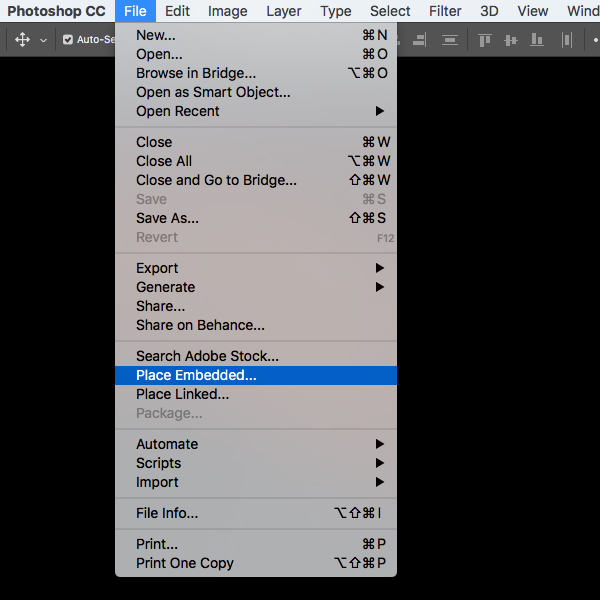
Next, go to the File menu and choose ‘Place Embedded…’ from the menu.
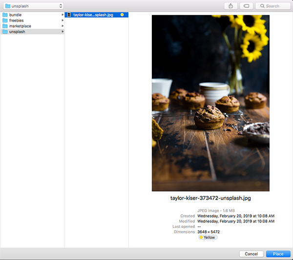
Now we will navigate to the folder where the stock image is saved, select it, and then click ‘Place’ from the lower right corner.
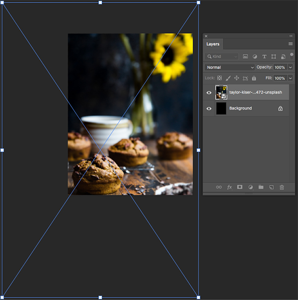
After we import the image let’s scale it up and crop it so that it matches the image below:
Step 2: Black & White Adjustment Layer
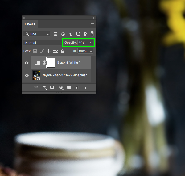
Now that we have our image in place we can drag the default ‘Background’ layer to the trash bin. From here, click the Adjustment layer icon and choose the ‘Black & White…’ option from the dropdown menu.
After applying the adjustment, reduce the ‘Opacity’ to ‘30%’ as shown below:
Step 3: Solid Color Adjustment Layer
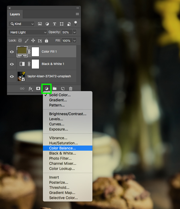
With the ‘Black & White 1’ Adjustment Layer selected, click on the Adjustment Layer icon at the bottom of the Layers Palette once again, and this time choose the ‘Solid Color…’ option.
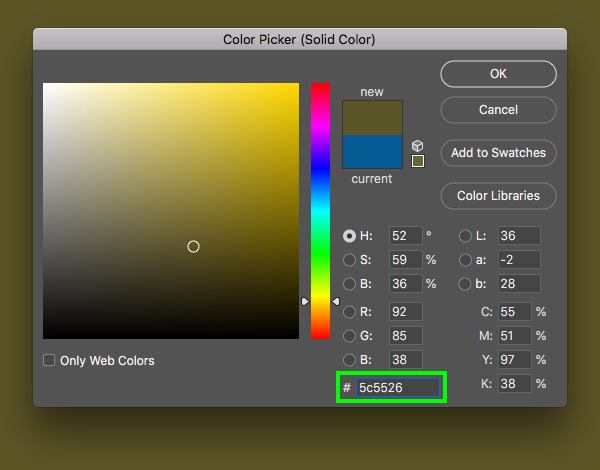
For the fill color enter the hex value ‘#5C5526’ and then press ‘Return’ or click ‘OK’ to continue.
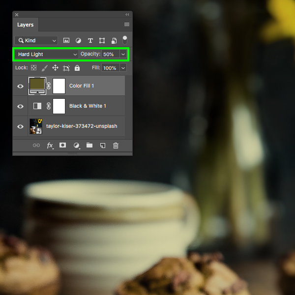
After applying the Adjustment Layer, reduce the ‘Opacity’ to ‘50%’ and change the Blend Mode from ‘Normal’ to ‘Hard Light’ as shown here:
Step 4: Color Balance Adjustment Layer
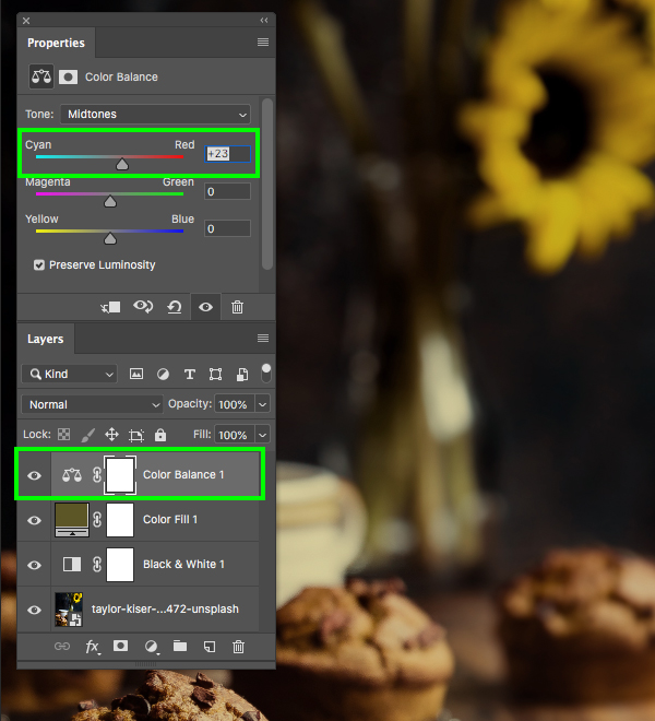
Make sure that the ‘Color Fill 1’ Adjustment Layer is selected, and then add a ‘Color Balance…’ Adjustment Layer on top as shown here:
In the Properties panel let’s move the first slider to ‘+23’ to increase the reds and make the image feel a bit warmer. Unlike our two previous Adjustment Layers, let’s leave the ‘Opacity’ of this one at a full ‘100%’.
Step 5: Background Image Group
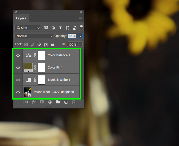
Select your top Adjustment Layer, hold the Shift key, and then select the stock image at the bottom so all of your layers are selected together.
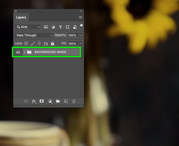
Press Command/Ctrl+G to place these layers into a new folder and double click the ‘Group 1′ text and rename the folder ‘BACKGROUND IMAGE’ so that we can keep these layers together.
Step 6: Faded Top
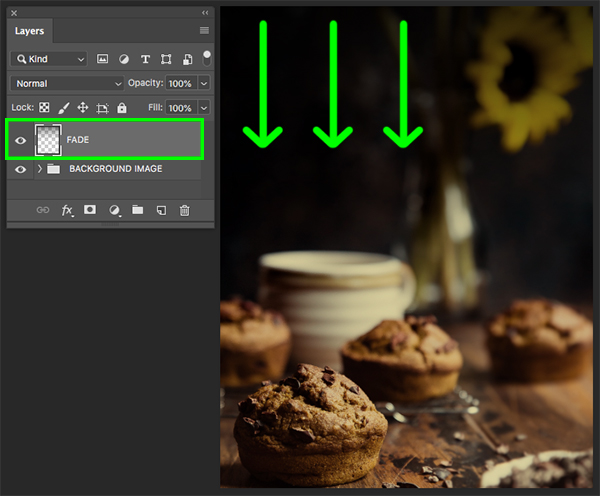
Create a new layer and then press ‘D’ to reset your default colors and make sure you have a solid black foreground color selected. After that, press ‘G’ on the keyboard to switch to the Gradient Tool. In the top toolbar let’s make sure we have a solid-to-transparent Linear Gradient selected as shown below:
With your new layer selected, click and drag from up above the top of the image outside of the canvas downwards to create a fade at the top like this:
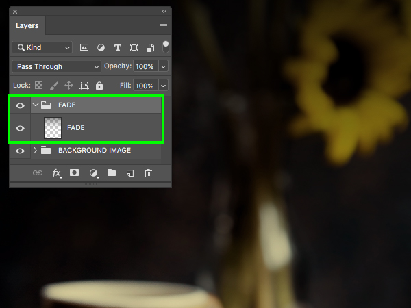
Double click the layer name and rename it ‘FADE’ and then press Command/Ctrl+G and place it into a new folder with the same name.
Step 7: Sonny’s Cafe
Create a new layer and switch to the Type Tool (T) and then type out the word ‘SONNY’S’ in all caps. Next, press ‘Return’ to start a new line and then type out the word ‘CAFE’ in all caps as well. Press Command/Ctrl+A to select all of the text and then open the Character and Paragraph panels found under the Window menu. From here, change the typeface to ‘Hops And Barley 4’ and make the size about ‘165 pt’ with a line spacing setting of ‘145 pt’ and a solid white fill.
Please note: Unfortunately, we are unable to offer the ‘Hops and Barley’ included with this tutorial, but we are offering an alternative for this font which you can download here. We would like to apologise for any inconvenience this may cause, however we do hope this font will help you create the poster and achieve the same outcome from this tutorial!
For this tutorial we will only be using this one style of the ‘Hops And Barley’ typeface, but the full bundle comes with several other styles in both a clean and rough version so be sure to check that out! So, with your text still selected, go to the Paragraph panel and make sure that the text is centered as shown below:
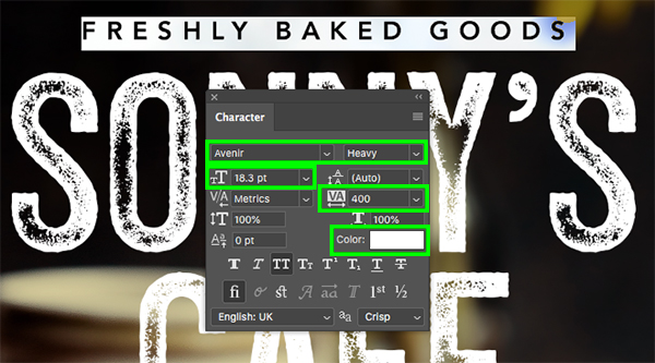
Add another new layer and type out the words ‘FRESHLY BAKED GOODS’ just above the ‘SONNY’S CAFE’ text. This time we will use a simple sans serif such as ‘Avenir’ set to the ‘Heavy’ style. Let’s make the text size about ’18 pt’ and the tracking can be set to ‘400’ with a solid white fill like this:
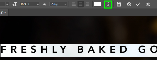
Click two or three times inside of the text box to highlight the whole line of text and then click on the ‘Create warped text’ icon highlighted in the image below:
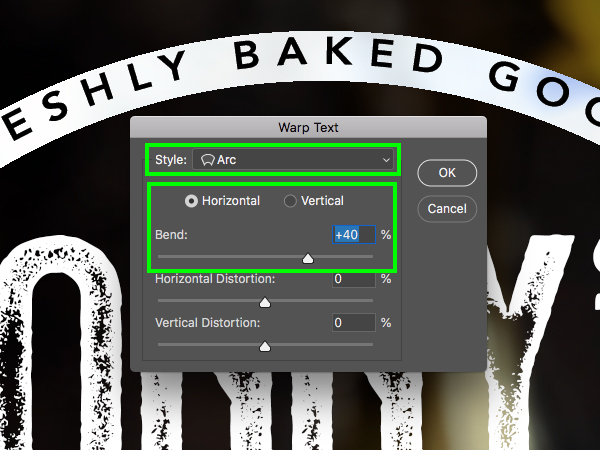
Once the ‘Warp Text’ dialog box appears, set the ‘Style’ to ‘Arc’ and then apply a horizontal bend of ‘+40’ to create a nice curved effect for the text. After that, press ‘Return’ or click ‘OK’ to apply the changes.
Let’s add one more line of text below the ‘SONNY’S CAFE’ title using the same ‘Avenir’ font we used for the curved text. This time, let’s change the size to about ’12 pt’ and make the tracking ‘940’ so that the letters are smaller and more spaced out.
Step 8: Title Treatment Group
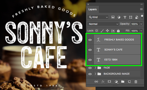
Select the top text layer, then hold the Shift key and select your bottom text layer so that all three of the text layers we created in the previous step are selected together.
Press Command/Ctrl+G to place the text layers into a new folder and then double click the ‘Group 1’ text and rename the folder ‘TT’ for ‘Title Treatment’.
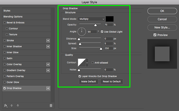
To help with the legibility of our text let’s double click the ‘TT’ folder and add a ‘Drop Shadow’ effect. For the settings, use a solid black color with a ‘Blend Mode’ of ‘Multiply’ and reduce the ‘Opacity’ to ‘75%’. From here, make sure to check off the ‘Use Global Light’ option with an ‘Angle’ of ’90’ and then change the Distance’ to ‘0’, the ‘Spread’ to ‘5’ and the ‘Size’ to ‘250’. Once you have applied those settings, click ‘OK’ to apply the effect and continue.
Now we can see that we have some effects applied to the whole group and our type is much easier to read on the background!
Step 9: Border Box
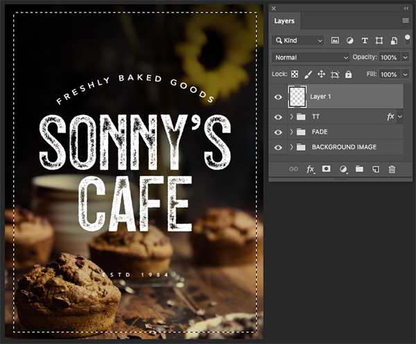
Create a new layer and press ‘M’ on the keyboard to switch to the Rectangular Marquee Tool. From here click and drag a large rectangle that is the same size as the canvas, but moved in a bit away from the edges as shown here:
Press ‘D’ on the keyboard to reset your default colors, and then ‘X’ to toggle between black and white until white is the foreground color. From here, press Alt/Option+Delete to fill your selection with solid white and then Command/Ctrl+D to deselect the rectangle.
Step 10: Border KO
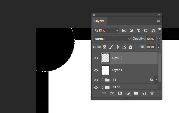
Create another new layer and now press ‘M’ and the Shift key together once to switch to the Elliptical Marquee Tool. Zoom in a bit into the upper left hand corner and then hold the Shift key and click and drag out a medium sized circle that extends outside of the canvas a bit.
What we want to do here is have our selection overlap the rectangle shape where the bottom right piece of the circle cuts into it. Once you have made a selection that you are happy with, press Command/Ctrl+Delete to fill the circle with your background color, which should be solid black. From here, you can deselect the circle by pressing Command/Ctrl+D on the keyboard.
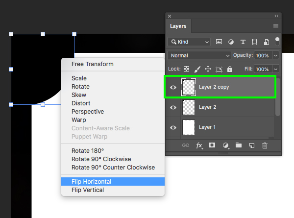
Select the circle layer and press Command/Ctrl+J to duplicate it and then Command/Ctrl+T to initiate a Free Transform. From here, hold the Control key and click on the shape before choosing ‘Flip Horizontal’ from the bottom of the menu that appears.
After flipping the circle, hold the Shift key and then click and drag it to the upper right corner so you have a circle on both sides at the top. Next, make sure your top circle is selected in the Layers Palette and then press Command/Ctrl+E to merge it with the layer below.
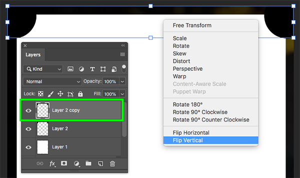
Now select the merged circle layer and duplicate it once again by pressing Command/Ctrl+J and then select the duplicate layer, press Command/Ctrl+T to do a Free Transform, and then click on the layer while holding the Control key. This time, let’s select the ‘Flip Vertical’ option from the menu to flip this layer upside down.
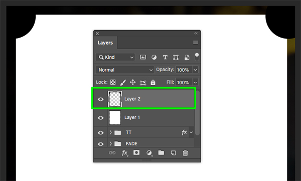
After flipping the duplicate layer upside down, hold the Shift key and click and drag it down to the bottom of the canvas. Once you’ve positioned the two circles on the bottom, select the top circle layer and once again press Command/Ctrl+E to merge it with the original two circles on the layer below. You should now have all four of your circles on a single layer as shown here:
Next, hold the Command/Ctrl key and click on the layer thumbnail icon for the black circles to activate a selection around all four of them at once.
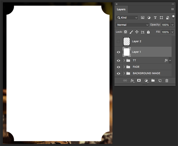
With your selection still active, poke the eyeball out to turn off the visibility of the circles and then select the white rectangle layer beneath. After you’ve selected the white rectangle layer we will simply press ‘Delete’ on the keyboard to knock the selection out of the white rectangle. You should now be left with something like this:
Step 11: Border Stroke
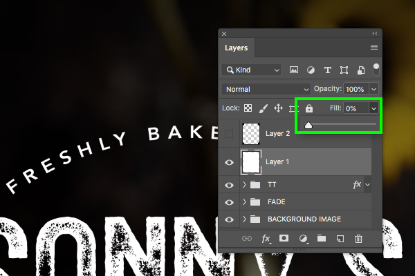
Select the white rectangle layer with the corners cut out and bring the ‘Fill’ slider all the way down to ‘0%’. You will notice that the layer now disappears, but not to worry! We are going to make some magic happen in the next step.
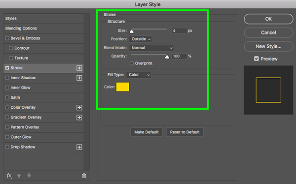
Double click on the now invisible white rectangle layer to open the Layer Style panel and then apply a ‘Stroke’. Let’s make the ‘Size’ about ‘4px’ and set the ‘Position’ to ‘Outside’. Once you have done that, click on the ‘Color’ box to change the stroke color.
For the stroke color enter the hex value ‘#FFD800’ and then press ‘Return’ or click ‘OK’ two times to apply the changes and close out of both panels. You should now see a thin yellow stroke that follows the shape of your invisible rectangle layer leaving us with a nice elegant frame around the image.
Step 12: Border Group
Select the top layer (this should be the layer with the black circles that is still turned off) and then hold the Shift key and select the white rectangle layer below so that both of the layers are selected simultaneously.
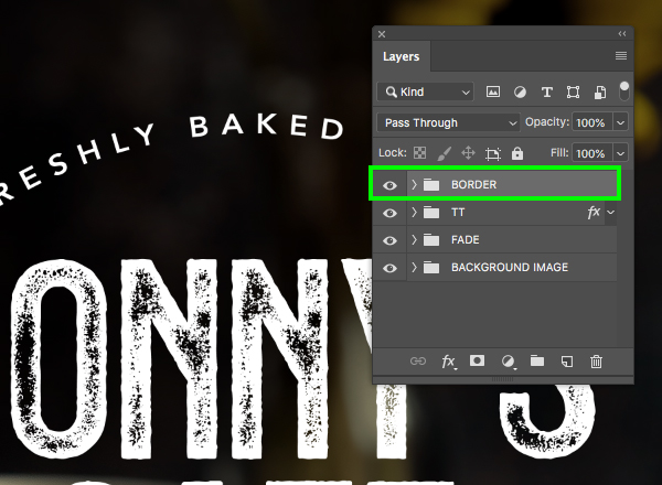
With both of your layers still selected, press Command/Ctrl+G to place them into a new folder and double click the ‘Group 1’ text to rename the folder ‘BORDER’ as shown below:
Step 13: Design Elements
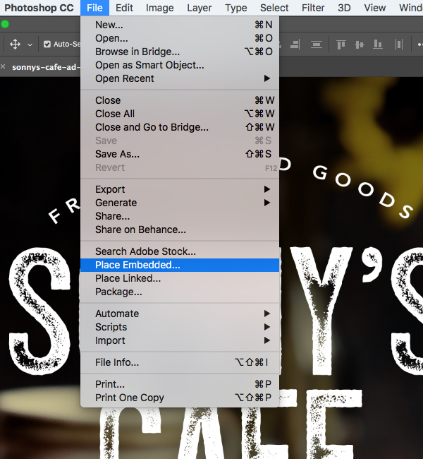
Go to the File menu and choose ‘Place Embedded…’ from the dropdown.
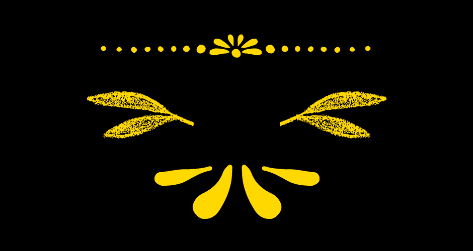
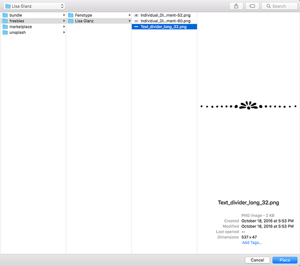
Navigate to the freebies folder for the tutorial and locate the ‘Lisa Glanz’ folder before choosing the ‘Text_divider_long_32.png’ file and choose ‘Place’ from the bottom right.
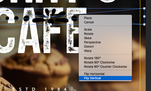
After bringing in the divider, hold the Control key and click on it before choosing ‘Flip Vertical’ from the dropdown menu.
Now that we’ve flipped the divider, let’s scale it down by dragging inwards from any of the four corners of the bounding box while holding the Shift key. Position the divider below the word ‘CAFE’ so that it spans the same width as the word as shown here:
Step 14: DIY Element 1
Go to the File menu and choose ‘Place Embedded…’ from the dropdown once again.
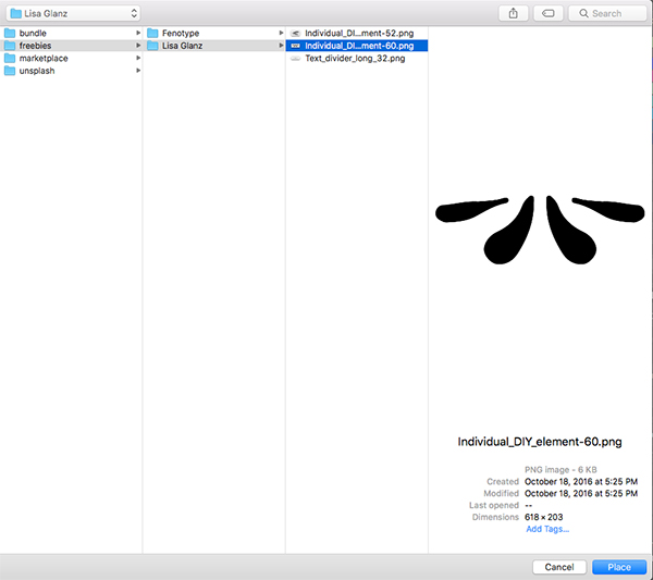
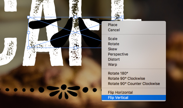
Return to the ‘Lisa Glanz’ folder inside of the freebies and select the ‘Individual_DIY_element-60.png’ file before choosing ‘Place’ to import it. After bringing in this element, hold the Control key and click on it before choosing ‘Flip Vertical’ from the dropdown menu like we did in the previous step.
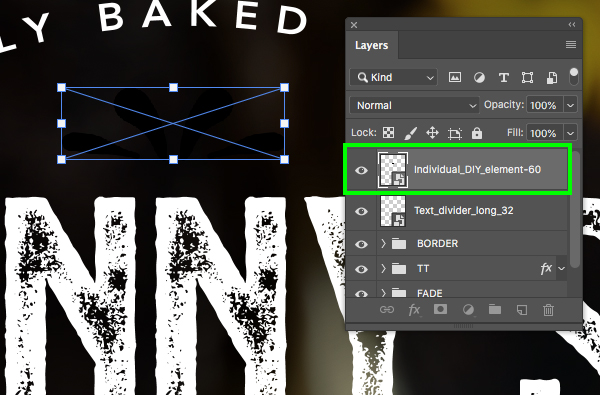
Scale this element down proportionally by dragging inwards from any of the four corners of the bounding box while holding the Shift key and position it just above the word ‘SONNY’ in the center of the design.
Step 15: DIY Element 2
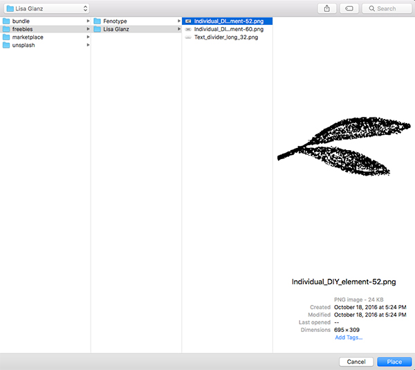
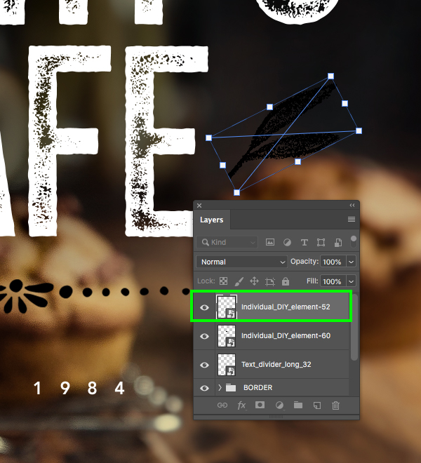
Return to the File menu and choose ‘Place Embedded…’ from the dropdown. Navigate to the ‘Individual_DIY_element-52.png’ file inside of the ‘Lisa Glanz’ subfolder and choose ‘Place’ once again to bring it into your file.
Reduce the scale of the leaf illustration and place it to the right of the word ‘CAFE’ before rotating it slightly so that it looks like this:
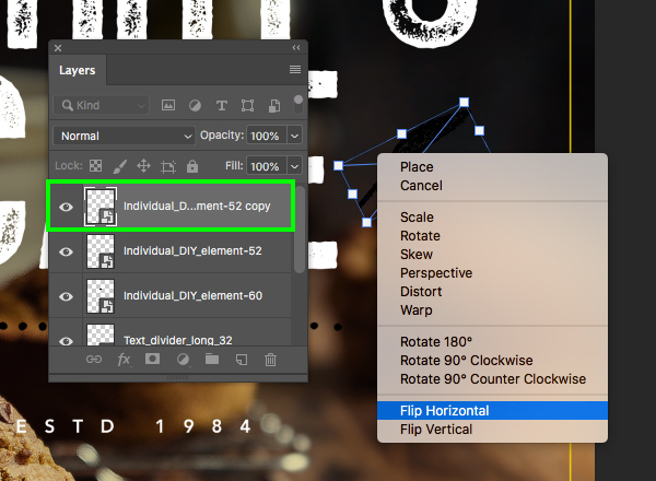
After positioning the first leaf on the right, press Command/Ctrl+J to duplicate it, Command/Ctrl+T to initiate a Free Transform, and then hold the Control key and click on the duplicate layer before choosing ‘Flip Horizontal’ from the menu.
Now that we’ve flipped the leaf illustration, hold the Shift key and slide this copy over to the left side of the word ‘CAFE’ so you have one copy on each side.
Step 16: Customizing The Design Elements
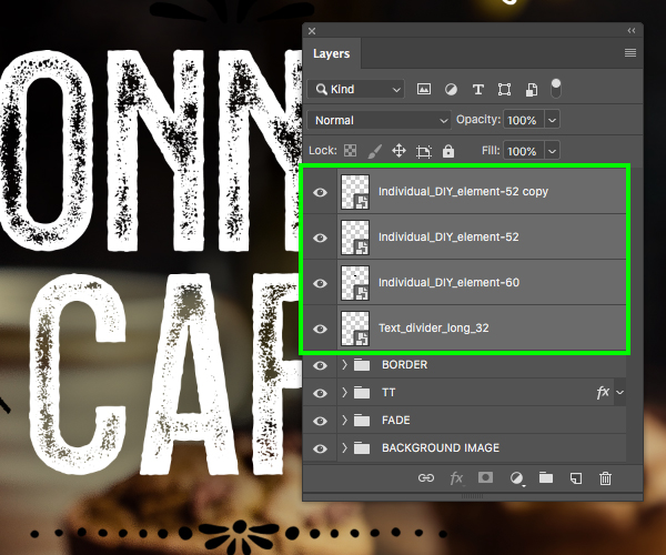
Select the top Smart Object in the Layers Palette, hold the Shift key, and then select the bottom design element so all four of the Lisa Glanz elements are selected together.
With all four of the elements still selected, press Command/Ctrl+G to place them into a new folder and double click the ‘Group 1’ text before renaming the folder ‘DESIGN ELEMENTS’ as shown in the image below:
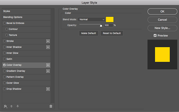
Double click on the ‘DESIGN ELEMENTS’ folder to open the Layer Style panel and then check off the ‘Color Overlay’ option.
For the fill color, let’s use the same yellow we used for the border earlier on by entering the hex value ‘#FFD800’ and then press ‘Return’ or click ‘OK’ twice to apply the changes and close out of both panels.
We have now completed our ad for Sonny’s Cafe! To design our ad we’ve used one of several styles of the ‘Hops & Barley’ typeface from Fenotype, a small handful of decorative elements from Lisa Glanz, and a free stock image from Unsplash. The ad we have created is just one of the many ways you can apply some of these beautiful resources to your projects.
Remember that whether it’s your outcome for this tutorial or something new you’ve made, we’d love to see your designs on our Facebook page.
Please leave a comment if you have any questions or suggestions. I always look forward to hearing from you!
There’s still time to check out The Font Lover’s Versatile Library featuring a massively diverse collection of fonts from some of the world’s most popular designers and foundries all for an unbeatable price of $29!

















Thank you!
Thanks for commenting Veselina, and we hope that you really like these!
Enjoyed the tut, thanks. Will put finished tut in Forum.
Yay that’s so great to hear Kim and we really look forward to seeing your finished cafe ad design!