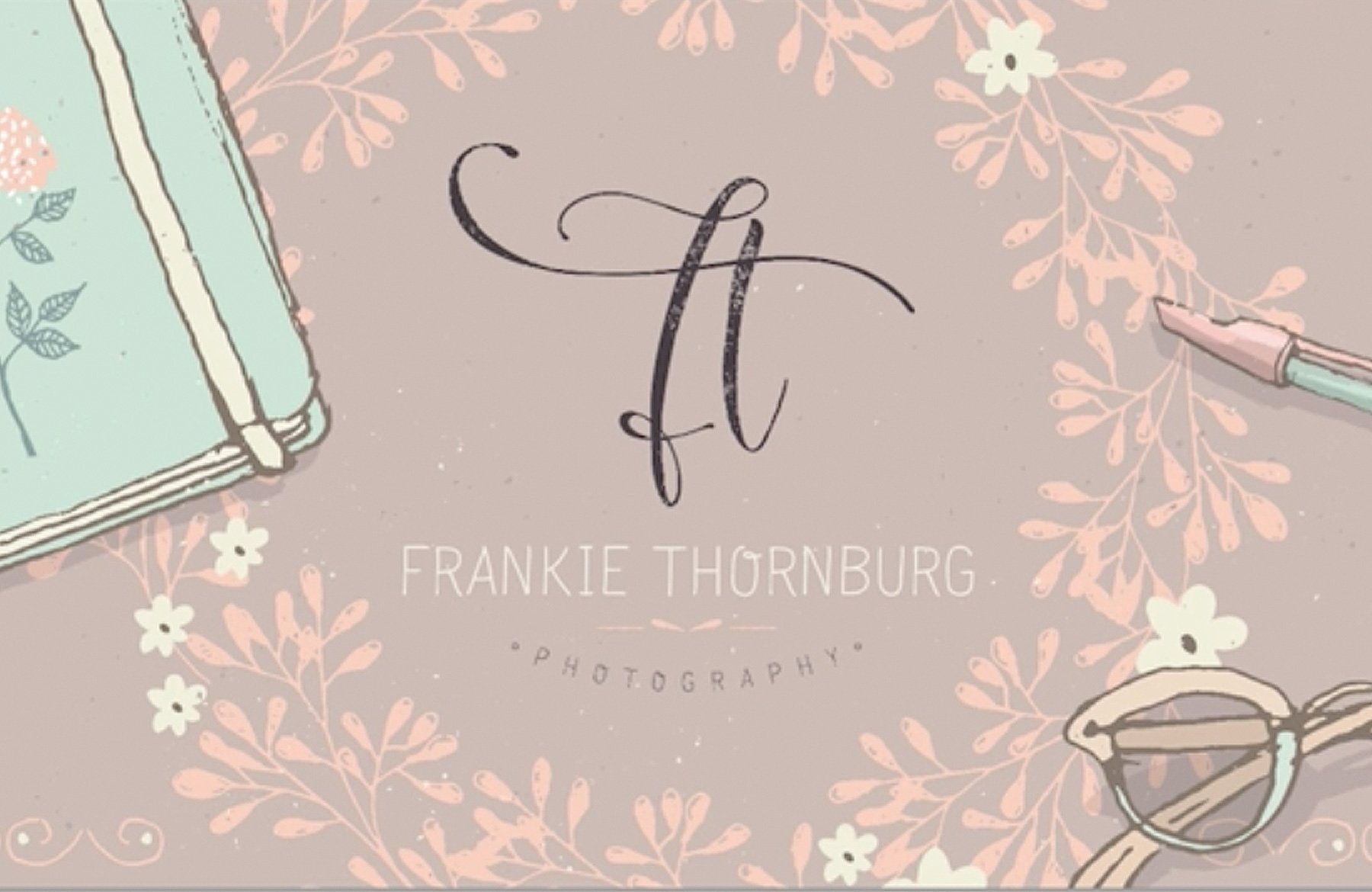
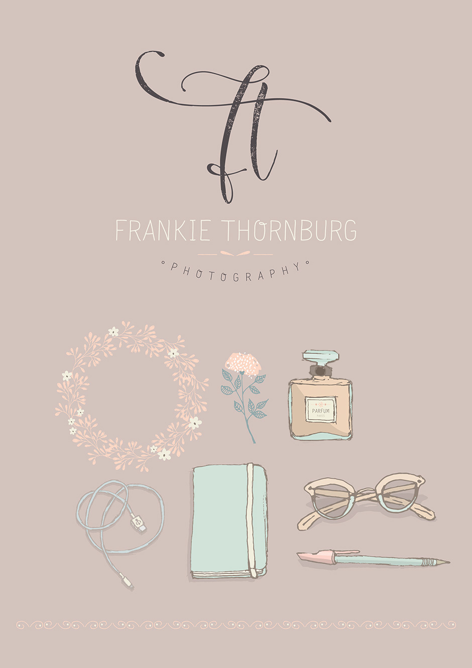
We’ve teamed up with one of our favourite designers, Lisa Glanz, to bring the Design Cuts community a brand new whimsical font called Salt and Pepper.
To celebrate the launch, Lisa has kindly put together a video tutorial and freebie pack for you to enjoy.
Salt and Pepper includes a beautiful hand-drawn aesthetic, 60+ bonus illustrations, lots of language support, glyphs, stylistic alternates, ornaments and all the other lovely extras that every good font geek appreciates!
You can download this special freebies pack below:
Lisa’s of my favorite contributor to DesignCuts. Can’t wait to get the new font. ❤️❤️❤️
Hey AmyFaith,
Thank you so much for such a lovely comment- we absolutely love working with Lisa :).
The font has now gone live so hopefully you will love working with and I would love to hear how you get on!
Thank you so much AmuFaith! That’s very humbling to hear :) Hope you like the font and enjoy creating with it!
Thanks for the grat tutorial! The texture part was particularly interesting.
Hey Barbara,
Thanks so much for your feedback! We really hope you got some tips from this one and please do feel free to share your finished design if you would like to :)
Nicely done.
I’m curious as to why you used text boxes to do the text (the monogram, the name, etc.), the same for using the Warp feature rather than placing the text on a curved path. To change the font, size, spacing,etc. on that part, you have to release the Envelope Distort/Warp, change the text, and then reapply the Envelope Distort/Warp. By placing the text on a curved path you have the option of changing any of those things (size, font, the arc or curve of the baseline, spacing, alignment, skew, etc.) without having to undo it for any changes.
I look forward to seeing the fonts.
I find applying the warp fx in Illustrator the text remains ‘live’ – you can change the font size and characters without ‘releasing and reapplying the warp effect.’ It’s a live effect.
Hi Brian,
Thanks so much!
I use text boxes purely as a habit – I’ve done a lot of layout work in Indesign in my time, so it’s just something I do instinctively. I also prefer the control a text box has when it comes to alignment, it behaves a bit better than when you just click and type.
The Arc effect is great to use if you want text on a curve quickly. It is a live effect so it reacts to any changes you apply to the text (color, size, font etc). But placing text on a curve path is definitely the more “technically” correct way of doing it :)
Hope that answers your questions. If you have any other questions at all, please don’t hesitate to let me know.
Lisa
Lovely tutorial!
Lisa work is always wonderful.
The short tutorial is PERFECT! ( hint: would not complain about getting more of those!)
Hey Roberta,
Thanks so much for your lovely feedback! We are super pleased to hear you liked it!
Rest assured I have noted this for your tutorial requests and I will definitely raise this with the team for our future tutorials!
Can hardly wait to get this font!
Hey Ashley,
I am super pleased to announce that you no longer have to wait and you can grab the font :).
We really hope you like it and please do let us know what you think!