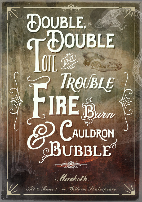
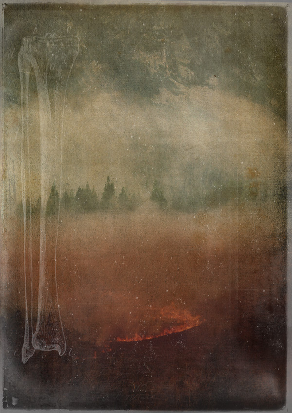
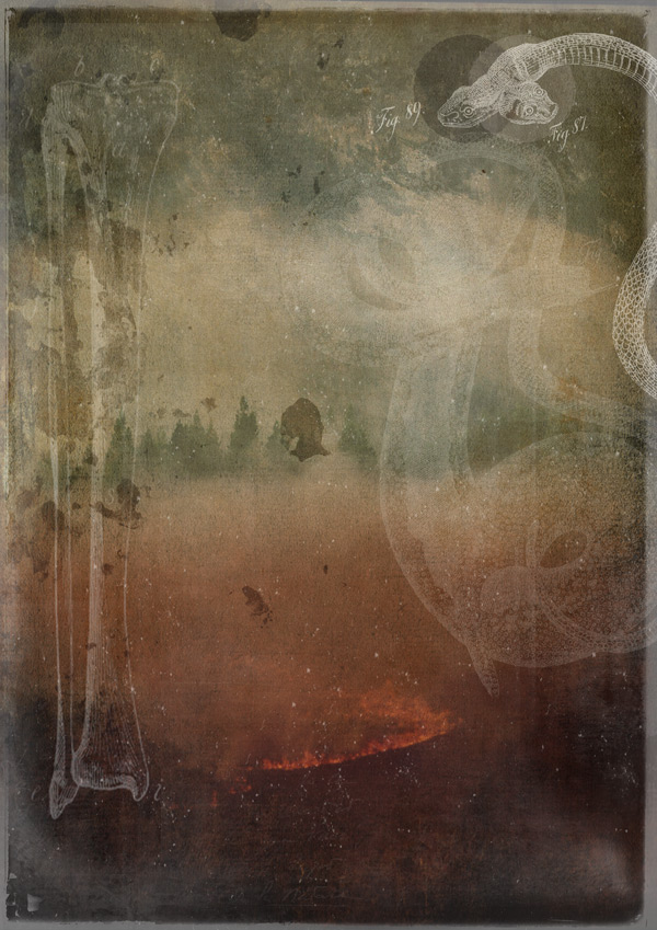
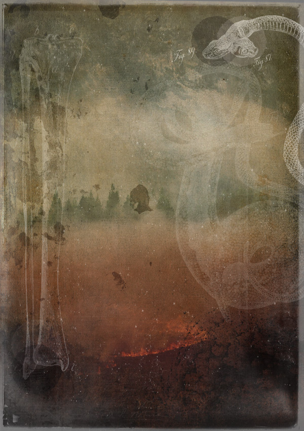
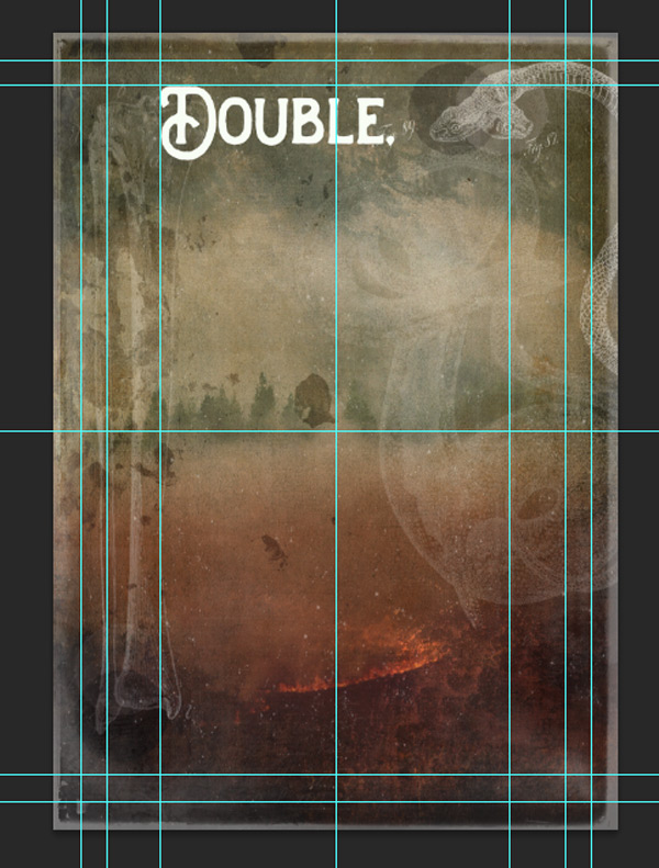
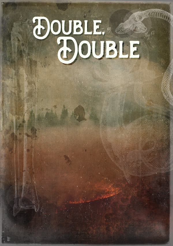
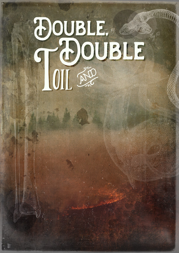
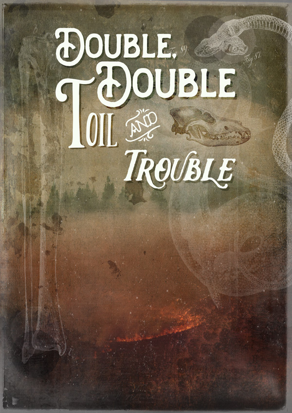
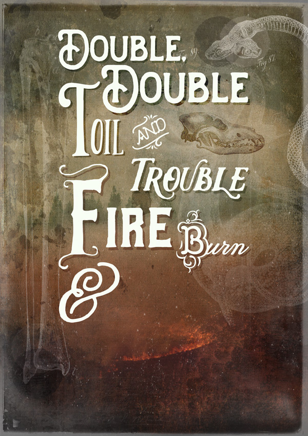
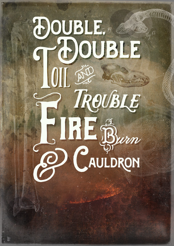
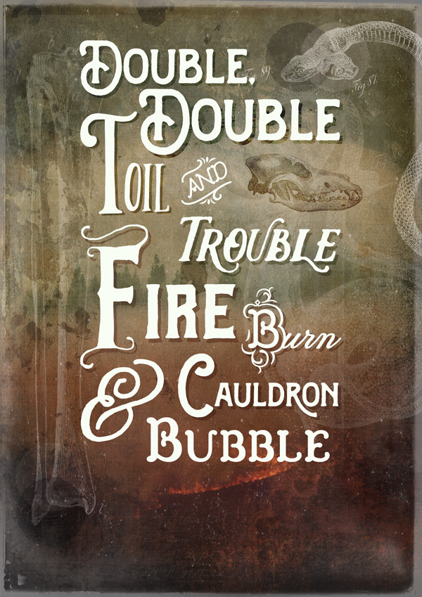
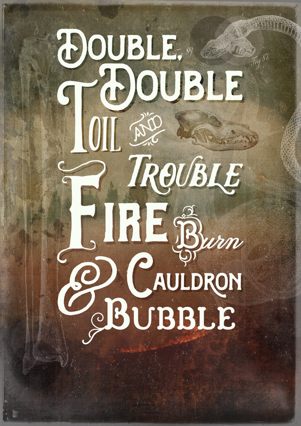
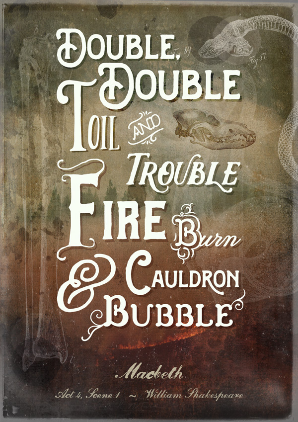
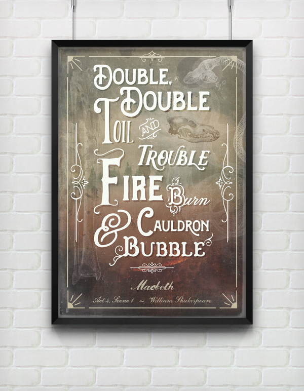
WHAT WE’RE CREATING:
Hello Design Cutters!
Jo here for another tutorial Tuesday, and today we’ll be brewing up a spooky poster using a variety of typographical ingredients (no eyes of newts required, thankfully).
We’ll go in to some details about font usage, including glyphs, extra characters and how to select groups of fonts that work well together.
I’d just like to add here that I certainly don’t consider myself a professional typographer. The information provided is based on my experience of typography as a designer, and my own thought processes when working with fonts. It’s by no means a definitive guide, but hopefully you’ll find it useful!
Of course, we’ll also be working with plenty of other photoshop techniques to create our richly layered background to showcase the fonts. Hopefully, you’ll pick up plenty of information to add to your designer’s spellbook! :)
Quick note: In this tutorial, the term “clipping” or “clipped layer” is used a few times. This means that the layer is only visible/applies to the layer directly below it. You can very quickly do this by holding ‘Alt’ down on your keyboard and clicking between the two layers. Here’s a quick demonstration.
Ok, let’s get started!
Follow along with this tutorial: Download the freebies
As always, we have another great freebie for you to enjoy. Ornaments of Graces and Konstantine Studio have very kindly donated some wonderful sample items from our current bundle for you to try. This pack includes a grungy texture pack from Konstantine Studio, as well as the Ornaments font within the Church of the Wildwood font family. Both of these freebies will be used within today’s tutorial, so we recommend downloading them before you get started.
Remember, this freebie is just a tiny sample taken from this mega bundle: 30 Best Selling Creative Fonts (With Web Fonts and Extended Licensing) at just $39 (a whopping 97% Off). This is our biggest font bundle OF ALL TIME (yes, I think we can justify the caps lock here… ;)) with a huge variety of styles and bonuses including textures, vectors and glyphs. You won’t believe how much this is going to boost your font collection!
Enter your email below to download the freebie, so you can follow along with this tutorial easily.
Step 1:
We’ll first prepare our background so we can focus on the fonts later on.
Decorative quote posters are always incredibly popular, and of course the star of the show is the typography. It is also important to consider the overall design though, which includes the background.
The best background will vary from design to design, from simple to the more complex, but in this instance we want to create something evocative and decorative, that reflects the text.
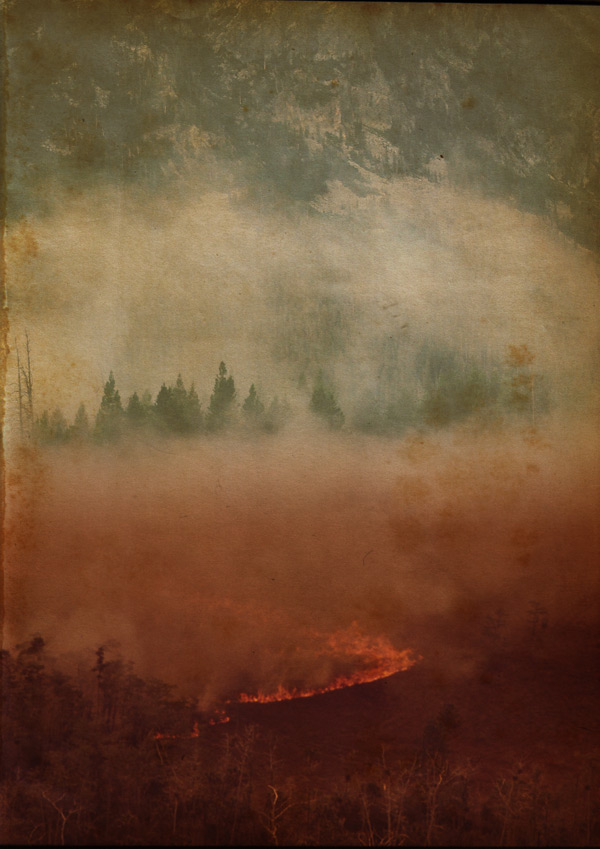
As you can see from the image at the top of the page, the impact of the fonts used comes from their strong silhouettes – we’re not adding any dramatic colours or textures to them. Therefore, we can get away with a more elaborate background to help set the mood of the quote. It’s not like the 11th century is famous for its minimalist design and use of white space, after all!
That’s the preamble over with, now we need to gather some resources…
We’re using quite a few extra resources for the background, so we’ll download and save these in a convenient place, ready to use:
Wolf Skull (bottom image)
5 High Resolution 2 Lil Owls Textures
2 Lil Owls Textures and Papers Sample Pack
All downloaded? Great! Let’s start putting them in to action…
Step 2:
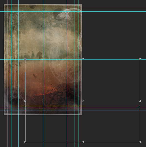
Open a new (A4) 3508px height x 2480px width document in Photoshop.
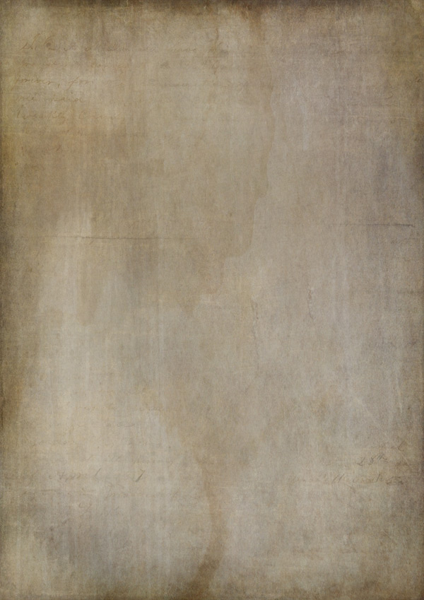
We’ll set up our base layer by pasting in the Old Paper texture we’ve just downloaded:
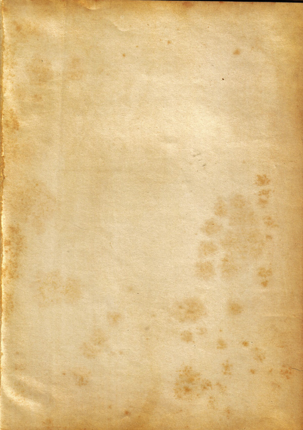
Duplicate the layer, changing the blend mode to Multiply and drop the Opacity to 83% for a richer colour:
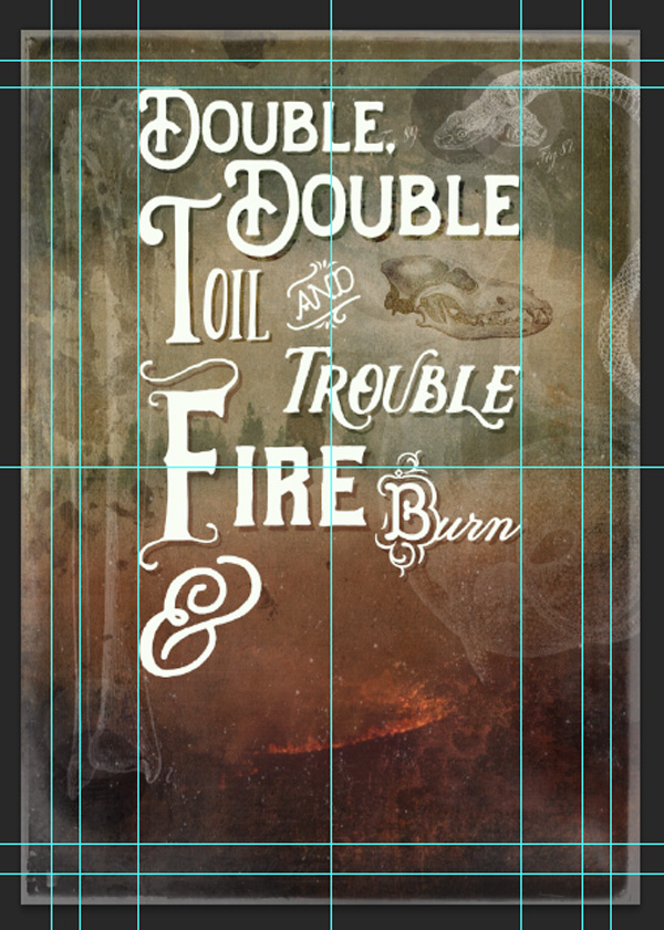
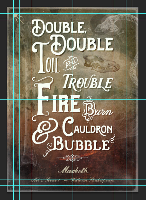
Next, we’ll set up some guides to help us with the composition later:
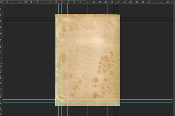
Vertical: at 1cm, 2cm and 4cm in from either side
Horizontal: at 1cm and 2cm in from either side
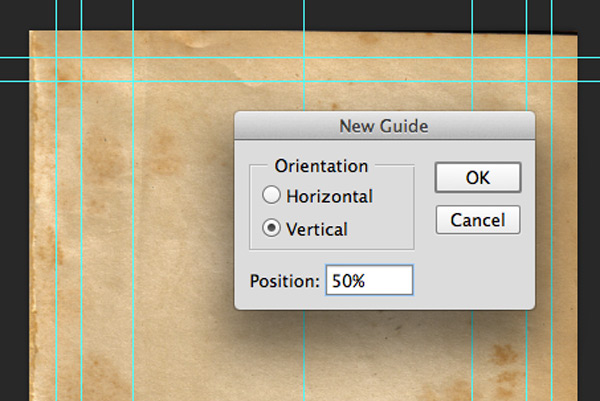
Then, go to View > New Guide and specify both a horizontal and vertical guide at 50%.
Step 3:
From the 2 Lil Owls Textures and Papers Sample Pack paste Sublime 5 on to your canvas, scaling to fit:
Then, change the blend mode to Overlay and Opacity to 70%:
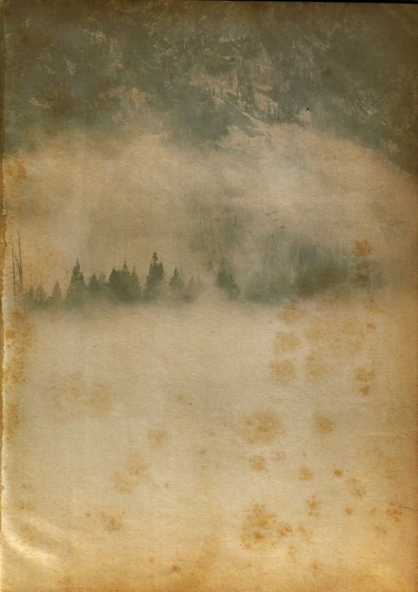
Next, paste the ‘Misty Scene’ photo we downloaded earlier on to your canvas, scaling to fit the full height:

Change the blend mode to Multiply and drop the Opacity to 70%:
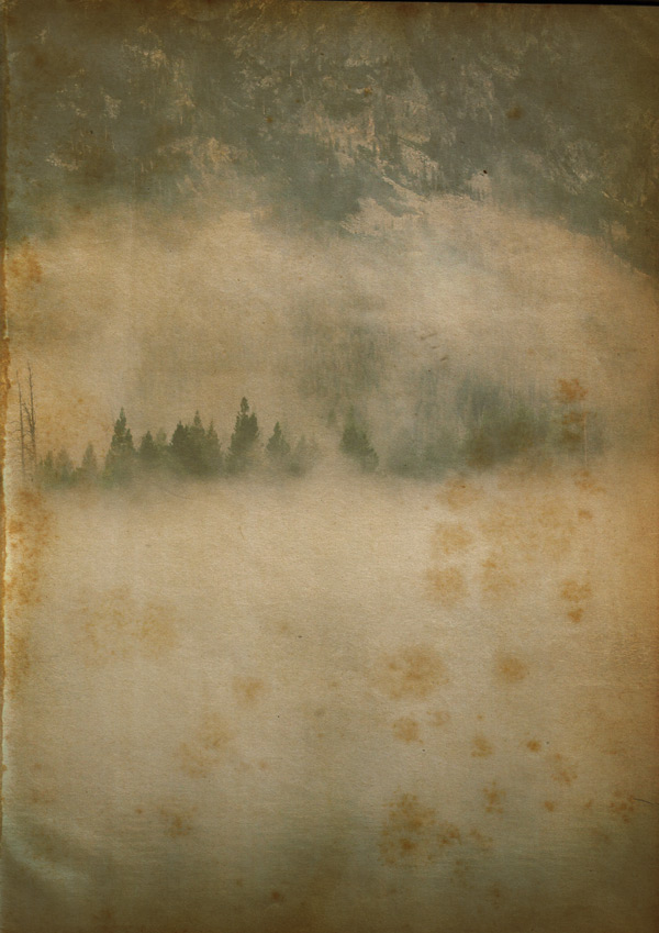
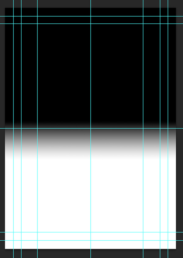
Create a gradient Layer Mask to hide the darker area at the bottom of the image. This is so the image blends in better with the second photo we’re going to add:

Paste the ‘Forest Fire’ photo on to the lower half of the canvas. Use the image below to help with the scale and position:
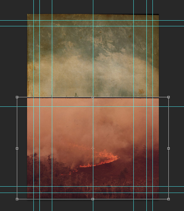
Once you’re happy with the position, change the blend mode to Multiply:

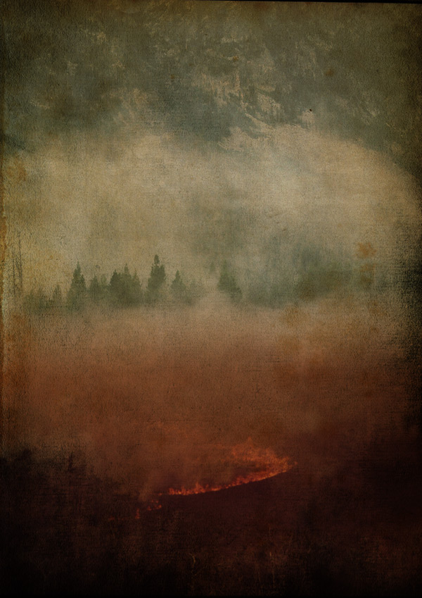
We want the two images to blend in with each other, so we’ll create another gradient Layer Mask, starting about 1-2cm down from the top of the image (almost exactly halfway down):
As you can see the mist/smoke now blends together a little less starkly.
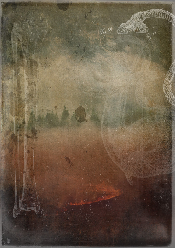
Step 4:
For the final texture effects, we’re going to use Winter Storms 7 from the 2 Lil Owls Textures and Papers Sample Pack. Paste on to your canvas and scale to fit:
Change the blend mode to Multiply for a suitably scorched, vignette effect:
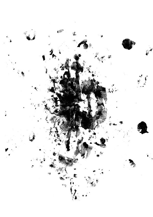
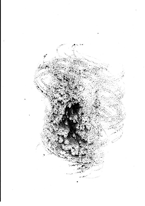
Lastly, from the 5 High Resolution 2 Lil Owls Textures pack, find and paste 2LO – Creative Masks set 2 – 20 on to your canvas, scaling to fit:

This works well as all the speckles will look a bit like floating embers from our fiery scene. Change the blend mode to Screen and reduce the Opacity to 70%:
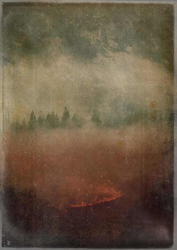
Lock this as the top layer, and we’ll be building up the rest of the image underneath it. For a bit of housekeeping, place all the other layers in to a group called “Background Textures” for easy navigation.
Step 5:
We’ll now start to add some of the illustrative elements to the background.
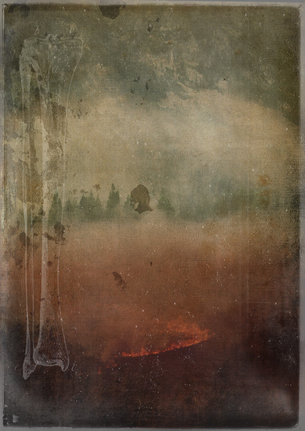
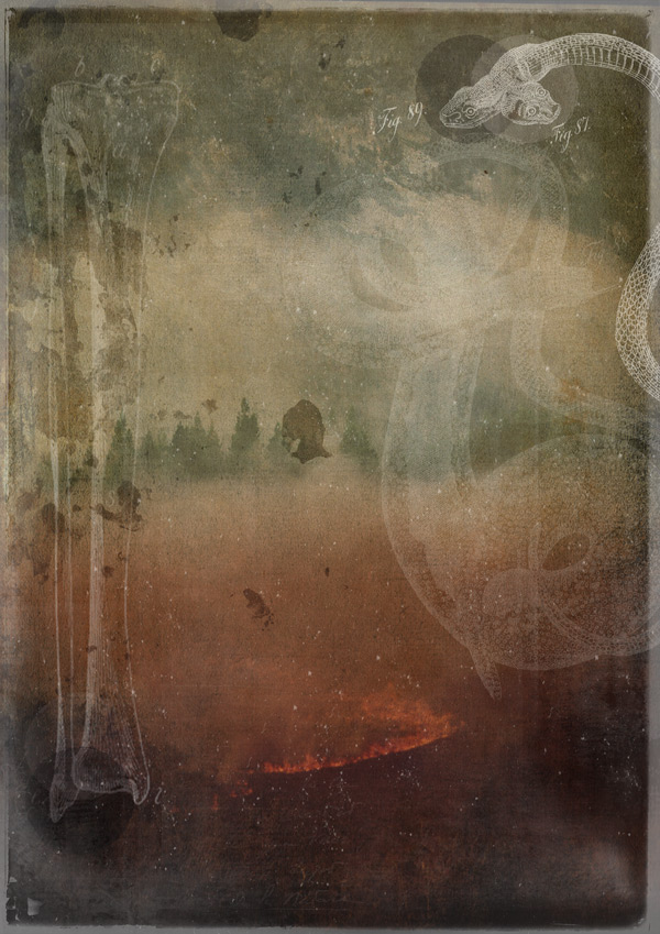
First, find the ‘Spooky Bones’ image we downloaded earlier, then paste on to your canvas, scaling to fit:
Create a duplicate of the layer and hide it (we’re keeping this as a backup). Then, rasterize the visible layer and use the Background Eraser Tool to remove the paper background. Make sure it’s set to ‘Discontiguous’ and give it a generous tolerance of about 70%. Click anywhere on the paper until you’re just left with the ink outlines:
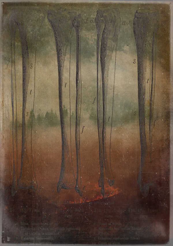
Invert the image (Image > Adjustments > Invert) to change the colour to white, then change the blend mode to Screen and reduce the Opacity to 30%:
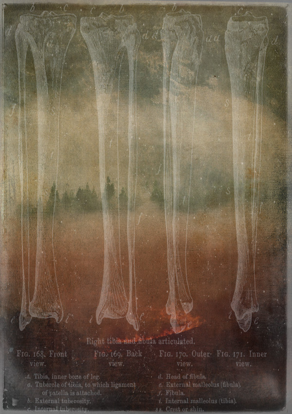
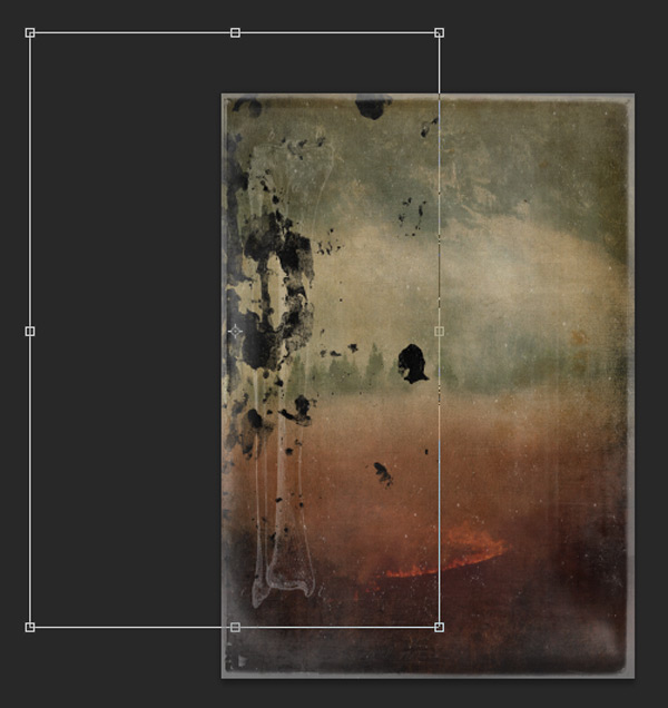
Use the reference below to stretch the image slightly, and move so that the top of the image lines up with the horizontal guides:
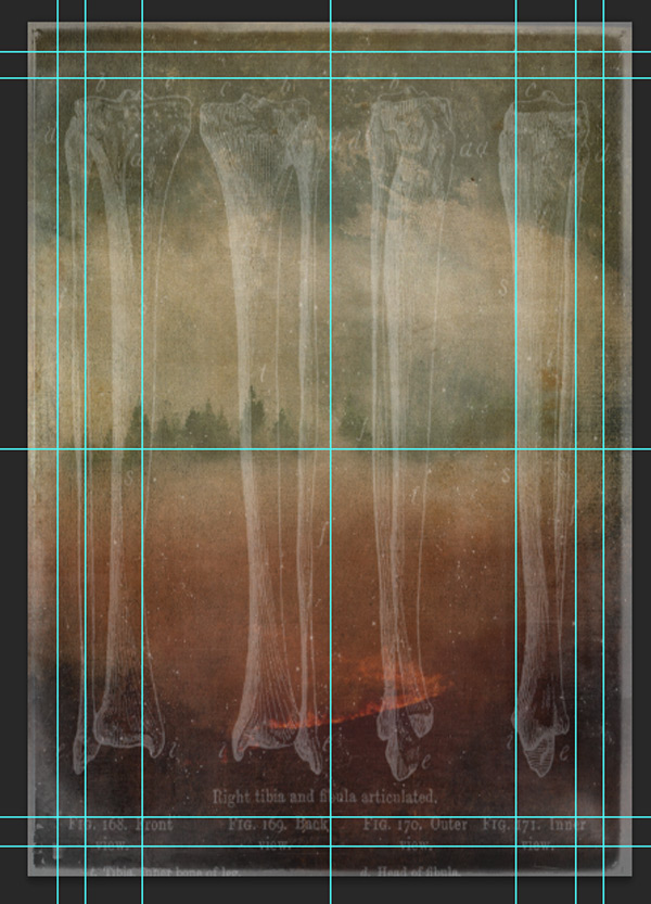
Then, use a Layer Mask to hide all the bones and text except for the one on the far left:
Step 6:
Next, we’ll delve in to one of the extra bonuses from this font bundle. Go to 30-best-selling-creative-fonts-bundle3 > konstantine-studio > UPJON Typeface (Plus Bonus) and open up TexturePacks.psd. (If you can, keep this file open, as we’ll be using some more textures from it later on).
From there, activate the ‘Stone Dropper’ layer:
Copy and paste on to your working canvas so it’s positioned similarly to below:
Once you’re happy with the position, change the blend mode to Soft Light and drop the Opacity to 65% for a subtler effect:
Step 7:
From the images you downloaded, find the ‘Two Headed Snake’ illustration and paste on to your canvas. Scale, rotate and position so that it’s similar to the image below:
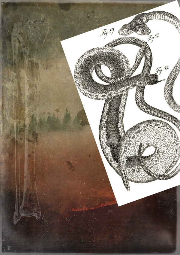
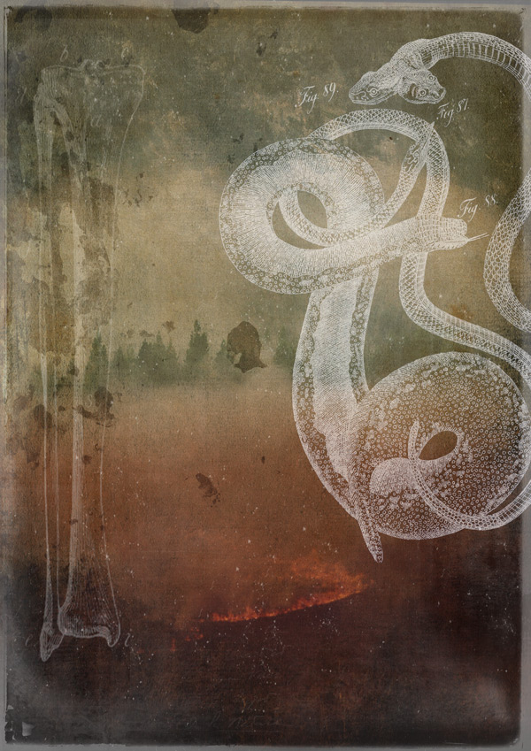
As with the bones, duplicate and hide the layer. Rasterize the visible layer and use the Background Eraser tool to remove the white areas of the image:
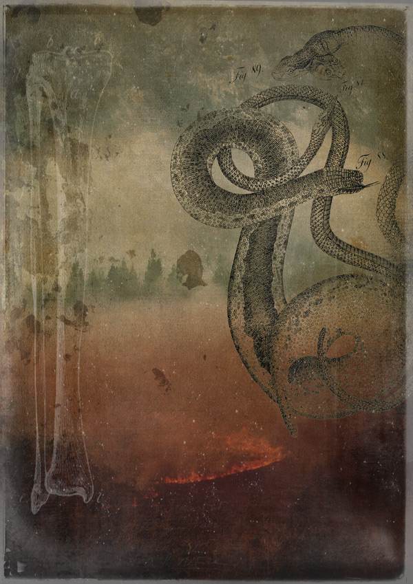
Invert the image to change the outlines to white, then drop the Opacity to 57% and change the blend mode to Screen:
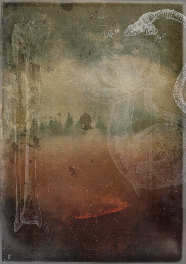
We want the two headed snake to be the most prominent, so we’ll fade out the other snake using a Layer Mask. Create the Layer Mask, then select #5f5f5f as the mask colour to keep the snake partially revealed. Use a chunky round brush to apply the mask to the relevant areas:
We’ll finish off the snake by adding a clipped hue/saturation Adjustment Layer to give it a subtle, green, reptilian tint:
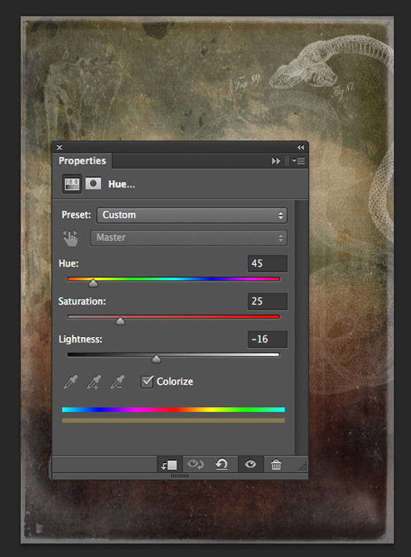
Hue/Saturation Settings:
Colourize: On
Hue: 45
Saturation: 25
Lightness: -16
Step 8:
For some extra decorative effects, we’re using yet another great bonus that’s included in this bundle. Go to 30-best-selling-creative-fonts-bundle3 > swist-blnk > Wilder + Super Bonus > Super Bonus Vintage Handdrawn Kit + Bonus Vector > Rocking Bones Bonus Vector.ai and select the following circle vector:
Paste on to your photoshop canvas, changing the blend mode to Soft Light and Opacity to 60%. Then, scale and position so that it sits over the left snake head:
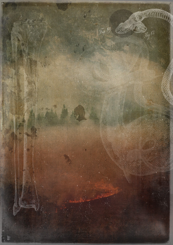
Duplicate the layer, this time changing the blend mode to Screen and bringing the Opacity back up to 100%. Then nudge across (or hold down ‘shift’ whilst clicking and dragging) to cover the right snake head, so we get a Venn diagram like effect:
Link, then duplicate the two layers. Move the duplicate to the lower left of the canvas, towards the bottom of the bone image. Rotate so the circles are stacked vertically, then adjust the Opacity of each to the following:
Soft Light layer: 85%
Screen layer: 40%
For the last bit of background texture, go back to the TexturePacks.psd we have open from earlier, this time selecting the ‘Skinny Spit’ layer:
Copy and paste on to your working canvas, rotating and scaling so that it sits similarly to below, in the lower right corner:
Once you’re happy with the position, change the blend mode to Overlay, and reduce the Opacity to 75%:
Finally, we’ll add a clipped hue/saturation Adjustment Layer with the following settings:
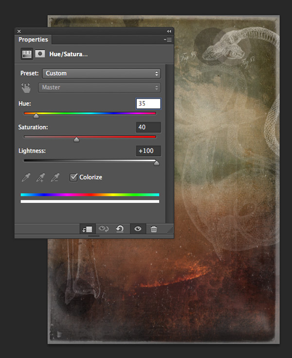
Hue/Saturation Settings:
Colourize: On
Hue: 35
Saturation: 40
Lightness: +100
This brightens up the corner and really brings out the heat of the fire, giving our image a rather sinister feel:
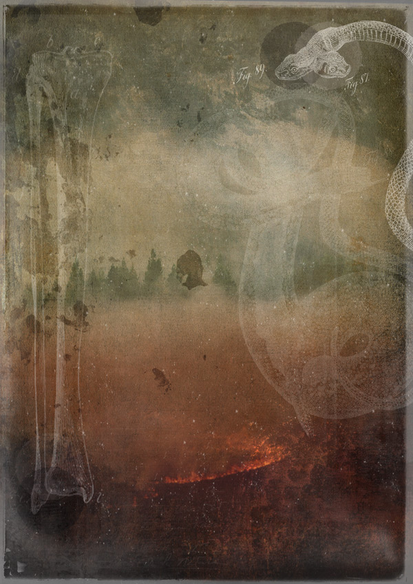
We’ll finish up here by grouping all the layers in to a folder called “Background Images” to keep things tidy and easy to find.
This is a good time to take a little break – grab a glass of water, stretch the legs and move away from the screen for a bit. Once you return, you’ll be refreshed and ready to move on to those fonts!
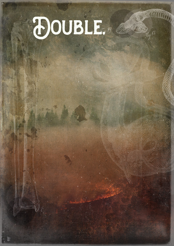
Step 9:
Working with fonts can seem quite daunting – typography is a complete area of expertise within itself, and the endless amount of seemingly conflicting rules out there (“NEVER use more than three fonts…” is one that’s touted often, but sometimes rules are there to be broken).
Of course, the first rule of font use is that we don’t talk about about font use… (ah, hang on a minute. Wrong tutorial…) :p
For me, the most important thing to consider when working with fonts is what you would consider when taking on any design project – how the everything relates to each other. Whilst an understanding of the more technical aspects can certainly help, be reassured that just trusting your own design sense and instinct is ok.
If you can appreciate fonts for their shape, size, outlines and just ‘how they look’, it means that you’re already paying attention to their form and that’s a great start. And experiment. Don’t be afraid to try different things out and feel free to post your works in progress on our Facebook page for feedback. Trial and error is the best way to learn, and getting feedback from others (we don’t bite!) will help raise your awareness of things to consider when teaming fonts, that you might not have been aware of before.
Of course, it also helps to look at other designs for inspiration, so here’s a list of inspiration and tips to browse at your leisure:
A beginners guide to pairing fonts
7 rules for mixing multiple fonts
8 tips for combining typefaces
Now, are you ready to start putting these into practice? :)
Step 10:
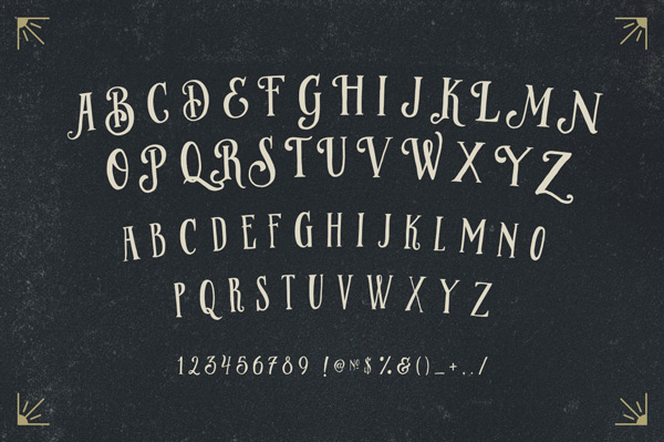
The first font we’re going to use is Handters Regular. Let’s take a look at the full set:
How would you describe this font? What are the first words that come to mind? What do you think are its most distinctive features?
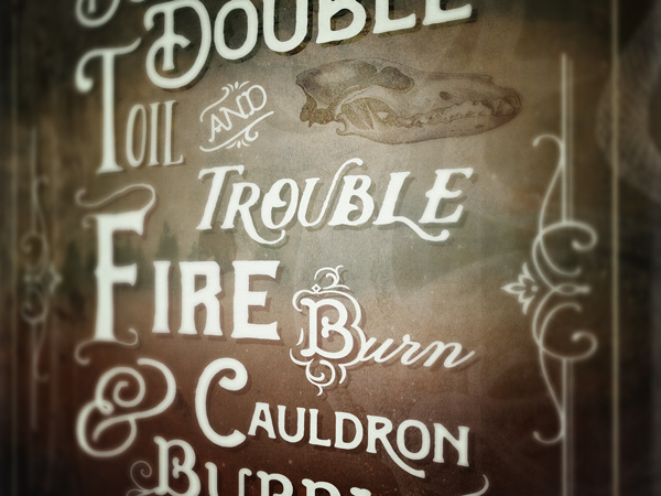
For me, the words; solid, vintage, chunky, bold and curvy spring to mind. It’s a good, strong font that creates impact for our first word, plus the opening letter ‘D’ has a right-angular shape helping to define the top corner of our quote (you can see how well it fits below):
Start the quote by typing “Double”, with the font colour as #F7FDF3 (this is the shade we’re using for all of the main quote text) and font size as 80pt.
Next, we’re going to create a drop shadow effect to help make the text stand out. Duplicate the layer and change the font colour to #546046. Move the duplicate layer below the original text, then set the blend mode to Overlay and use your arrow keys to nudge a few pixels to the right and down:

The effect is a little too subtle as it is, so we’ll add a bit more depth by adding a clipped texture to the drop shadow effect. From the TexturePacks.psd document, select the ‘Mad Slasher’ layer:

Copy and paste on to your working canvas, dropping the Opacity to 50% then rotating and scaling so that it’s similar to below:
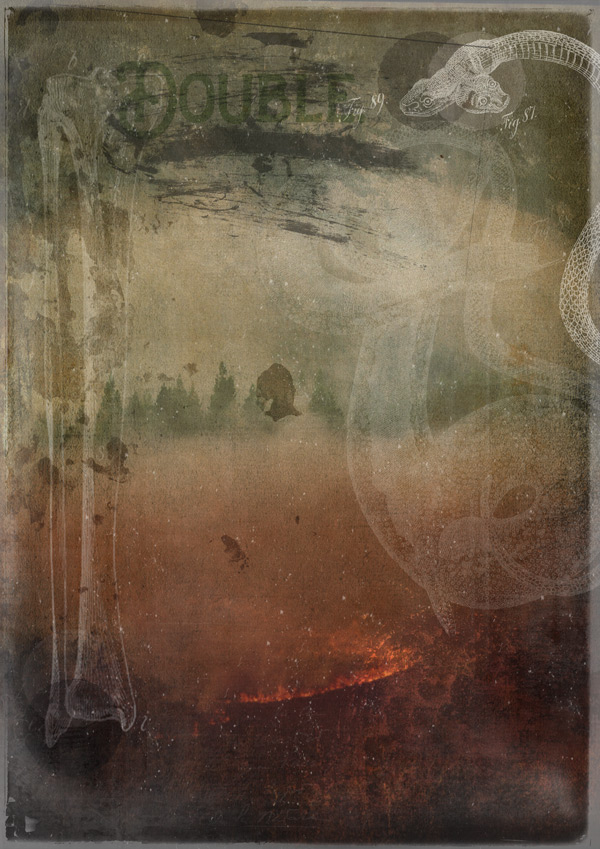
Then, clip the layer to the shadow effect text below, to see the texture applied:

Turn the visibility back on for the main text, and you can see the shadow stands out a little more:

Next, since the word “Double” appears twice, it makes sense to use the same font just to strengthen the point :) We can then simply duplicate the font and accompanying layers we just created, and transform so that it sits similarly to the image below:
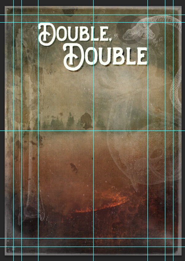
The capital “D” of the second word is quite close to the first line of text. This is deliberate, to help guide the eye to read the words in the right order.
When working with quotes, it’s important to find the right balance between keeping things readable whilst still being decorative. In English, it’s natural to read from left-to-right, top-to-bottom. Keeping words stacked and staggered loosely to this format will help with readability, and keeping words close together also helps to suggest what order they need to be read.
In this instance, the “u” in the top “Double” acts a bit like a downwards arrowhead, and the strong, vertical line directly below it in the “D” of the second “Double” helps to continue to guide the eye downwards into the word.
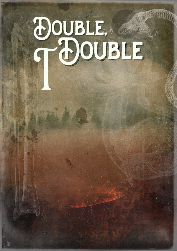
Step 11:
Next, we want to fill the space left between the two “D”s. We’re going to use the ‘Brilant Regular’ font here:
What words come to mind when you see this set? Can you spot the similarities with the ‘Handters Regular’ font we just used? The swashes, curves and shapes are almost identical, just a little looser and more ‘relaxed’. These stylistic similarities makes it a good choice to use as an additional font.
We’ll include it by first typing “T” at 183pt. Position this so that it sits in the space between the two “D”s, paying attention to the interplay between them and top of the “T”. Notice how the shapes link, reflect and compliment each other.
We’ll complete the word by typing “oil” at 102pt, and positioning so that it sits snugly next to the “T” so that despite the size difference, it’s still clear that they’re all part of the same word.
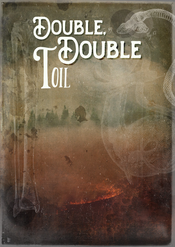
As we did with the word “Double”, create a subtle drop shadow effect by duplicating the layers, changing the colour to #546046, setting the blend mode to Overlay and nudging slightly to the right and down (no need for any mad slashers this time!). This is the approach we’ll be using for all the drop shadow effects, unless stated otherwise.
Step 12:
Many font families include bonus characters known as Catchwords. Although no longer the original meaning of the word, these are the little connecting words such as “and”, “the”, “of” , “at” and “with”. They tend to take a backseat in the design as they’re not adding any real context to the quote, but are of course completely necessary for sentences to make sense.
We can show these words a little love by giving them some extra decorative impact, which is what most catchwords included in font families do. They also make our jobs as designers a little easier by providing a ready made solution!
We’ll be using one of the catchwords from ‘Church in the Wildwood Classic Catchwords Regular 1’. We’ll be using a common catchword “and” which you can access by typing “G” at approximately 91pt (I say approximately, as nearly all the fonts were manually adjusted in size using the transform tool, to get the best fit).
The curves and swashes included in the catchword help tie it in with the other fonts used, whilst it’s more delicate nature creates a nice contrast, helping to differentiate it from the main words in the bolder fonts.
We won’t be adding a drop shadow effect to this, as it is still a secondary word and doesn’t need to stand out as much as the others. Again, this adds a bit of contrast and sense of depth to the image.
Step 13:
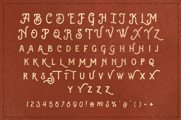
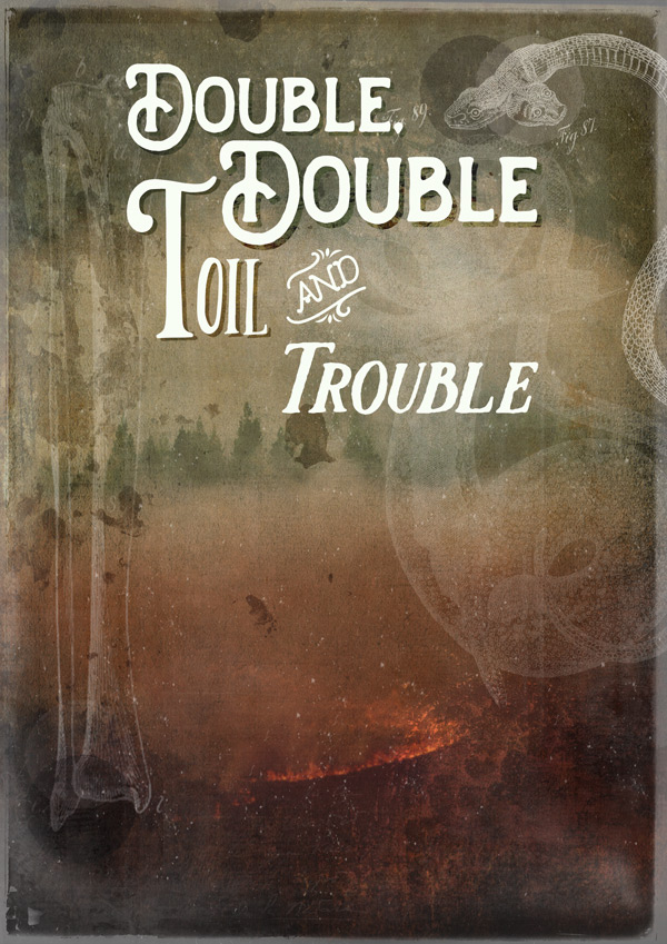
Next, we’re going to use the ‘Glowist’ set of fonts:
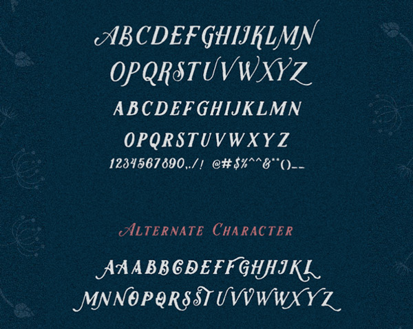
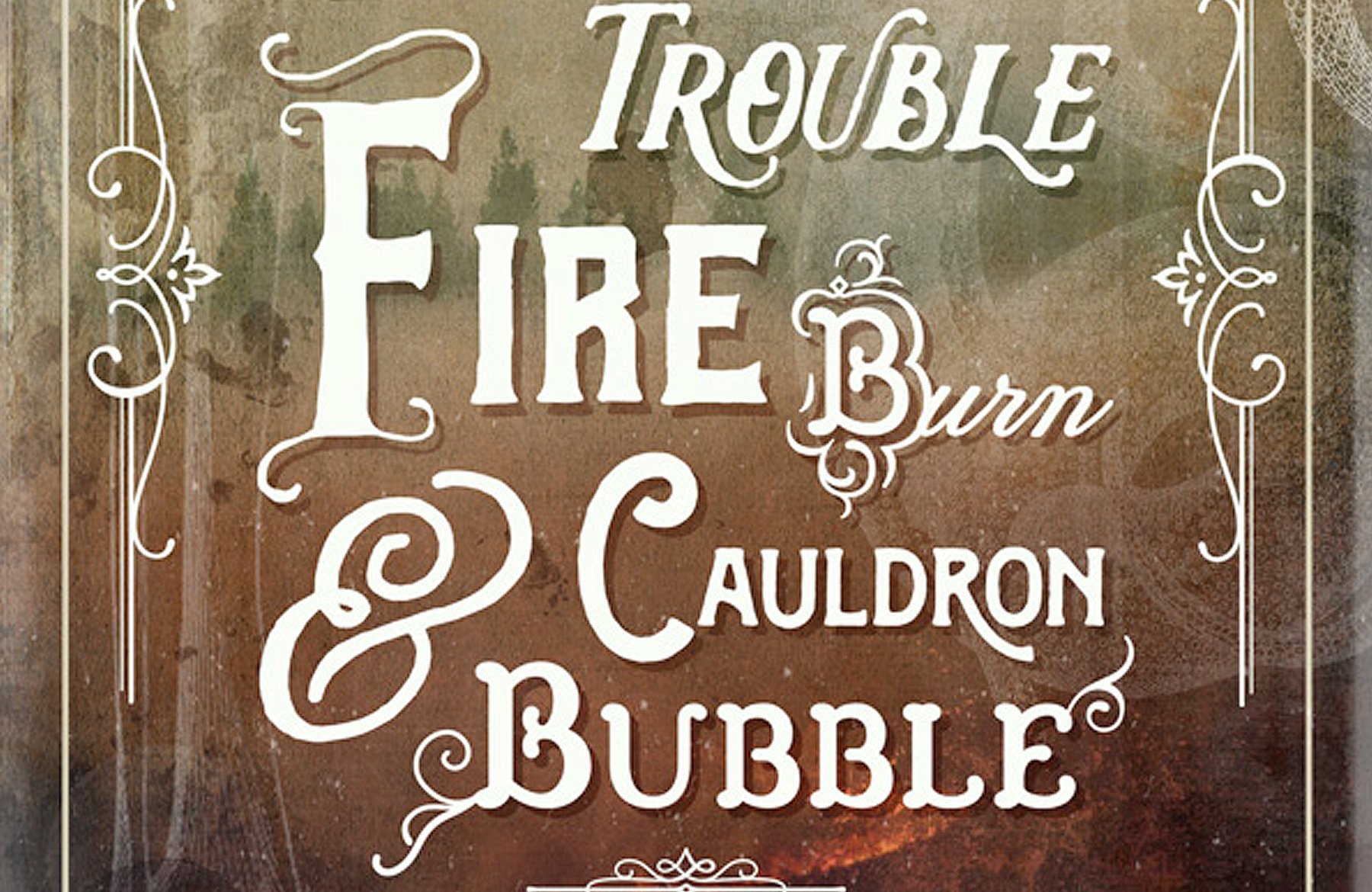
Again, this set is quite bold, chunky and a similar shape to the previous fonts we used, plus it’s got those decorative swashes that help tie it in. Let’s go ahead and type “Trouble” at about 86pt:
This looks ok, and the slanted, italic effect helps add emphasis to the word, but it looks a little flat compared to the rest of the fonts…
If you look back at the image of the full font family, you’ll notice at the bottom an extra set titles “Alternate Character”. Some font families include alternate characters so you can have variations of the same character, giving your work a more organic look as well as more control in deciding what works for your design.
In our case, we’re going to take full advantage of this by giving our “Trouble” a bit of flair to keep up with the other fonts! To use this feature, select the characters you want to use the alternate versions of (these can be individual characters or groups):
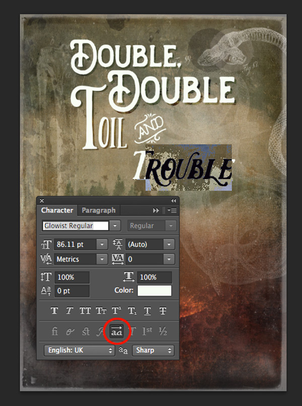
Open up the Character options, and select the ‘Stylistic Alternates’ button, which is circled above. This will instantly apply the alternate version (if available) to the selected characters.
Add a drop shadow using the same technique as with the previous words, and we have a fantastic font medley taking shape! The slightly more delicate swashes also tie in nicely with the details on our “and” catchword. Happy days :)

We’ll finish off here by filling the space between “Double” and “Trouble”. From the images you downloaded at the very start of the tutorial, paste the ‘wolf skull’ illustration on to your canvas and erase the white background. Scale and position so that it fits nicely between in the gap, then change the blend mode to Overlay and drop the Opacity to 85% :
Step 14:
The next font we’re using is ‘Reidfork Hand drawn Regular’:
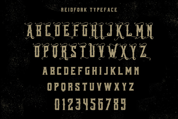
Like the previous fonts, this is bold, chunky and quite tall so has enough similar features to help tie it together as part of the image. The capital letters also have some nice decorative swirls, which mimic the shapes found in the other letters.
Go ahead and type “Fire” at 180pt, then select the “F” individually and resize to approximately 234pt so that it fits the space:
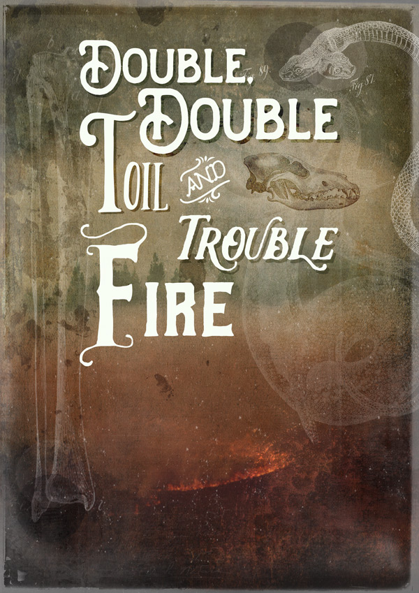
We’ll create a drop shadow effect by duplicating the layer and changing the colour to #8A2E06. Set the blend mode to Multiply and drop the Opacity to 55% before nudging to the right and down slightly:

Step 15:
Next up, we’ll be using some fonts from the mega family that is ‘Church in the Wildwood’. We’re going for ‘Church in the Wildwood Inspired Regular + Swashes’ to give us a decorative capital on the word “Burn” typed at approximately 78pt:
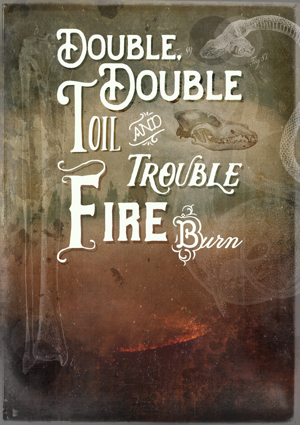
This font introduces a new script style in to the mix (the “..urn” part of the word) but is held together with the strong, decorative “B” that ties in with our catchword from earlier, keeping some visual cohesiveness.
We’ll give this layer a drop shadow effect too. Use exactly the same approach and colours as we did for “Fire” but bring the Opacity up to 60% this time, to make up for the slightly lighter background:
Step 16:
Ok, we’re getting there!
Next up, we’re going to use an ampersand instead of the word “and” in our design. Whereas the catchwords tend to take a backseat, ampersand symbols can be visually stunning and are a bit of a gift in that they add a strong, decorative element whilst still retaining meaning and not disrupting the flow of the quote.
We’re going to add a statement ampersand from the ‘Melany Lane Bold’ set:
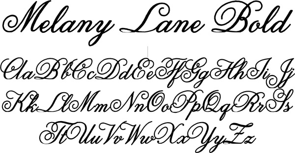
This font family is highly decorative, and would be a bit too ornate to use for a full word in our design, compared to the chunkier fonts. However, using it for our ampersand symbol allows us to add a decorative accent to reflect some of the decorative swirls, curls and flourishes found present in the existing fonts:
Type “&” at 185pt and align to fit within the quote guidelines:
Step 17:
To bring a bit of unison back from the top part of the quote, we’ll use the ‘Handters’ font again for “Cauldron”.
Type “C” at 90pt, and “auldron” at 55pt so that the word sits nicely in the space, and we continue theme of having much larger first letters on some of the words:
We’ll add a bit of detail here by selecting the letter “r” and applying the Stylistic Alternative (like we did on the word “Trouble” in Step 13). This helps break up the ‘straightness’ of the word and continues to mimic the curves and flourishes elsewhere in the design. It also helps guide the eye down to the final word, which we’ll add in the next step:
Add a drop shadow effect in exactly the same way as we did for the word “Burn” to finish off:

Step 18:
The final font we’re using for the quote is another from ‘Church in the Wildwood Classic’ – this time, ‘bold’. Set the size at 90pt and type “Bubble”, positioning so that the opening “B” sits nicely between the “&” and “C” we typed earlier:
If you look at this font, we can see that it’s strong and chunky like many of the others, has just enough decoration to help it fit in and also, it looks kind of ‘bubbly’ adding a nice bit of visual onomatopoeia! The rounded shape brings a bit of softness too, which contrasts well with some of the rougher edges of the ‘Glowist’ and ‘Reidfork’ fonts we used.
It’s not over yet though! We’re going to use some of the glyphs/ornaments. In very basic terms, a glyph is a symbol representing a single readable character. Therefore all characters/letters/pictograms in global writing systems are glyphs.
In font families, glyphs usually refer to the more decorative elements that aren’t part of the standard western alphabet, and perhaps what you could consider ‘bonuses’. You’ll find that most premium fonts (like the ones in this bundle!) contain more glyphs than free fonts, making them far more versatile, and let’s be honest, fun to work with :)
And we’re going to have some fun with glyphs right now! From the ‘Church in the Wildwood Extras’ select ‘Ornaments’ as the font. Set the size to 70pt and type “o”:

Rotate and reposition so that it’s coming out of the first “B” in “Bubble” as follows:
This adds a decorative touch to the word, helping to tie it in with some of our other fonts and also echoes the curves and lines present in the adjacent ampersand symbol. It’s all about the continuity here, folks!
This time with the font size set to 60pt, type “f”:

Rotate and reposition so that it comes off the “E” at the end of the word, to create some balance:

Create a duplicate of the layers and go through the process of adding a drop shadow effect, this time with the Opacity set to 80%:
Step 19:
Now, we’ve already broken the “three fonts max” rule, so we may as well break it spectacularly by adding another font to the mix (tastefully done, of course)!
We’ll finish up the quote by adding some context and give some much deserved credit to that obscure playwright, William Shakespeare. ;)
The final font we’re using is the beautiful ‘Magesta Script’ (possibly my favourite in the bundle):
The font itself looks suitably Shakespearean, and its script style really adds to the context of the piece. Also, because it’s not part of the actual quote, it’s good to use a different font to help differentiate it.
We’ll be using the ‘Mix’setting, which combines all light, regular and bold versions of the font for a really organic feel – like your quill is leaking a bit too much ink at times!
Here’s what you need to type, and the details:
Macbeth: #C6BD9E, 50pt, Opacity 85%
Act 4, Scene 1 ~ William Shakespeare: #C6BD9E, 30pt, Opacity 65%
Step 20:
Finally, we’ll finish off the design with some decorative touches and a border.
To divide the quote from the credits, we’ll use another glyph from ‘Church in the Wildwood Extras’ this time from the ‘Rules’ set, which is perfect for our needs.
Set the font colour back to #F7FDF3, size to 72pt and type “Q”, dropping the layer Opacity to 90%. Position t so that it sits centrally between the quote and credits:

For the borders, go to 30-best-selling-creative-fonts-bundle3 > ilham-herry > Brilant Typeface > brillant ornament pack.ai and select the following corner:
Copy and paste on to your photoshop canvas, scaling and rotating so that it sits nicely in the top left corner (use the guides to help):
Duplicate, flip and rotate as necessary so that each corner is decorated:
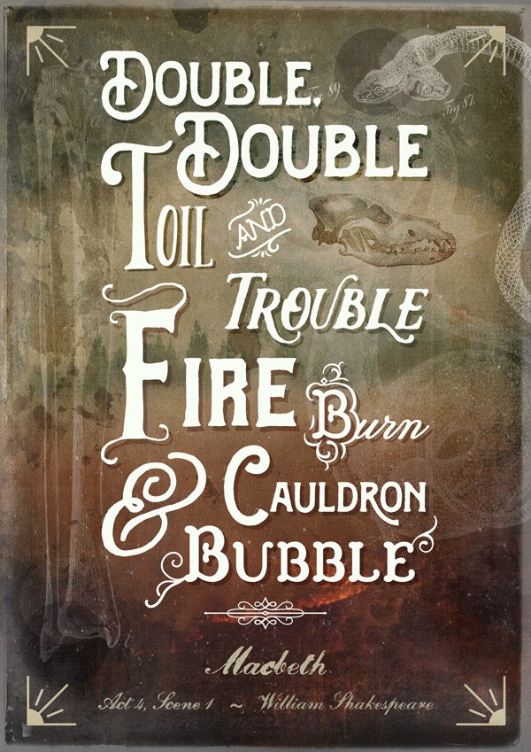
The original colour already works well with our design, so we don’t need to change anything there. Complete the frame by copying and pasting the individual lines from the .ai file, scaling to fit:

Step 21:
Since our fonts have so many decorative features, we’ll continue this in our border to help tie everything together.
Going back to our ‘Church in the Wildwood Extras Ornaments’ font, set the font size to 72pt and colour to #C6BD9E, then type “~”.
Position so that it sits centrally within the top border line:

To finish, still using ‘Church in the Wildwood Extras Ornaments’, set the font colour back to #F7FDF3, and size at 115pt, then type “(“. Rotate and position to the left as shown below:

Duplicate the layer and rotate so that it’s reflected on the right hand side:
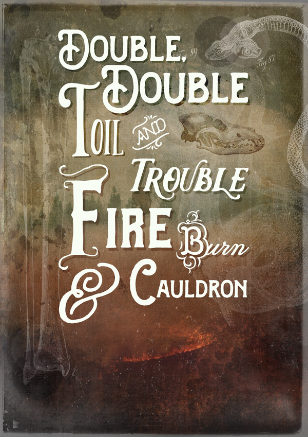
And we’re done!
I really hope you enjoyed doing this tutorial, and feel a little more comfortable working with fonts, if you weren’t before. At the very least, I hope you’re feeling more adventurous about them!
If you’ve got any comments or questions, do leave them below and I’ll keep an eye out. Also, feel free to get in touch @rockportraits!
Remember to share your designs on the Facebook page too, and we’ll be more than happy to offer feedback if you’re not sure about certain font combinations on your own work. The best way to learn really is through trial and error, and we always offer constrictive, positive feedback to help you take your design to the next level! :)
Hopefully this tutorial showed you just some of the ways you can use the huge variety of fonts available in this bundle, and got to know them a little better. Remember, you can get this mega bundle for an equally mega 97% off this week! Grab it below, while you still can:
30 Best Selling Creative Fonts (With Web Fonts and Extended Licensing)
Hello, guys!
It was very useful tutorial! I learn some new things. But I have 2 questions:
1. I also couldn’t find Stylistic Alternative for the “r” in “Cauldron” though I used recommended font.
2. It was a problem with last vectors from ilham-herry > Brilant Typeface > brillant ornament pack.ai . I couldn’t take off the dark blue background. What am I to do with it? Please help! Thank you for your job!
Hey Elmira,
Thank you so much for your kind words! We’re so pleased you found this tutorial useful :)
I’m so sorry for any inconvenience caused when working with your resources! Rest assured, I am on the case. I’ve sent you a quick email to get some more information from you and help get you up and running again!
I hope it helps, Elmira, and please don’t hesitate to contact me should you have any other questions. I’m always happy to help!
Another great tutorial. Thank you!
Thank you so much, Yulia! We’re so pleased you enjoyed this tutorial :)
Thanks, I’m new to Design Cuts and this is the first tutorial I’ve tried. I found it really easy to follow and learnt some valuable techniques along the way. The only part of the tut I couldn’t duplicate was the Stylistic Alternative for the “r” in “Cauldron”. For some reason my font doesn’t have any alternatives. Nevertheless, my poster still looks great!
Hey Nick,
What font did you use when you followed this poster? Did you use the same font, as in the tutorial, or one you had already loaded to your computer?