In this design tutorial I will be showing you how to design a poster for a department store using various objects in Photoshop. After we create our poster we will then present it using one of the awesome interior mocks from this latest bundle to showcase our work in an inspiring and professional way!
HAVE YOU SEEN OUR YOUTUBE CHANNEL?
Watch the video tutorial below and subscribe to our YouTube channel for regular updates direct to your inbox.
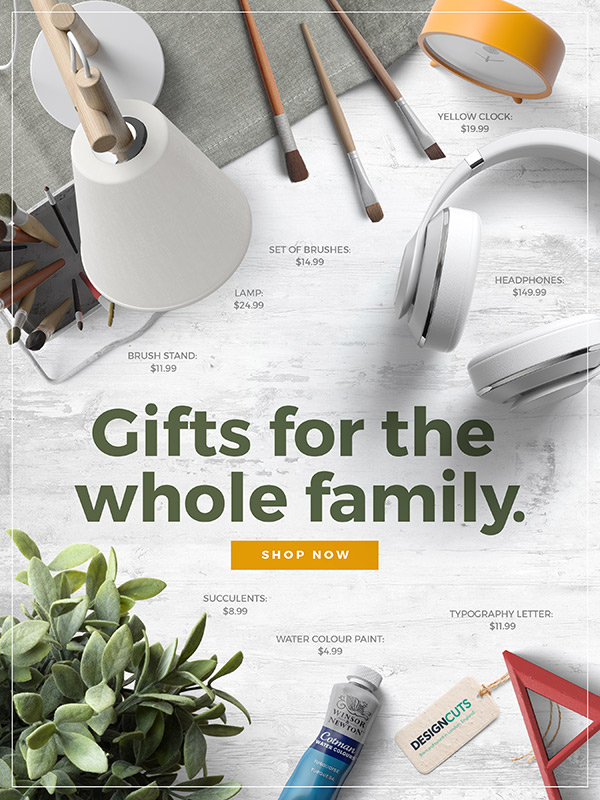
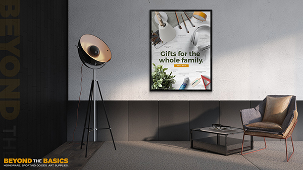
Here’s a look at what we’ll be creating:
Follow along with this tutorial: Download the freebie files
This freebie pack includes a range of realistic scene creator items, including tags, headphones, brushes, fabric tableclothes, succulents, a lamp and clock. It also includes a background texture and interior mockup template.
The freebie pack is just a sample of what you will find in the The Complete Mockup Templates Toolbox for just $29 (that’s 99% off). This bundle contains 1000’s of stunning mockup templates and scene creator items that would be incredibly time-consuming, and downright impossible to create for most designers to create. All of these mockups are super sharp and highly customizable, and they will help you present your work in a truly unique and professional way. Don’t miss out on this amazing deal where you will have access to amazing mockups for packaging, apparel, 3d renders, posters, rooms, and so much more!
Step 1: Beyond the Basics Poster
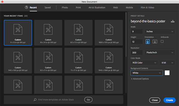
Let’s begin by opening Photoshop and creating a New Document. Since we will be creating a poster design we want to work with a fairly standard poster size. The mockup that we will be using to present the design contains a frame that is made for an 18” x 24” poster, but since it will be a digital image and not a full size print, we can create our poster at half of that size. So, let’s start with a document that is 9” wide by 12” tall with a resolution of 300, Color Mode of RGB, and set the Background Contents to ‘White’ which we can leave for now. Once you have set the parameters go ahead and click ‘Create’ to make your document.
Once we create our new document we should have one single layer named ‘Background’ that appears with a small lock icon next to it.
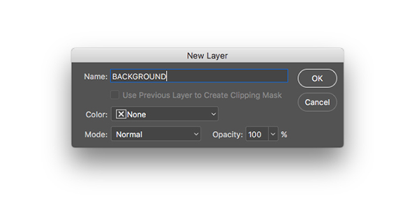
Double click on the ‘Background’ layer to unlock it and you will be prompted with a dialog box asking you to name the layer. Let’s enter ‘BACKGROUND’ for the name and then click ‘OK’ to apply the changes and unlock the layer.
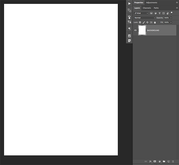
After renaming and unlocking the layer, your document should now look like this:
Step 2: Placing our Background
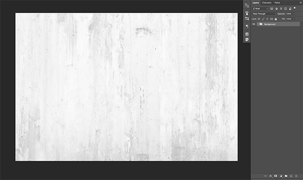
Open the freebies folder for the tutorial and then locate the ‘top_scene_background.psd’ file before opening it in Photoshop.
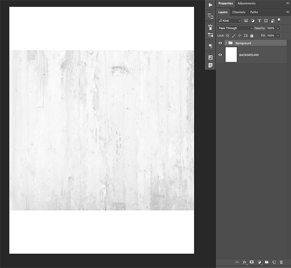
Select the ‘Background’ folder inside of this file and then drag it into your working document while holding the Command/Ctrl+Shift Keys. Doing this will ensure that the folder gets brought over into your document and dropped right in the center of the canvas.
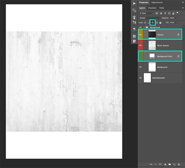
Click on the small arrow next to the ‘Background’ folder to expand it. After doing that you should be able to see all of the layers inside of the folder. We are going to hold the Command/Ctrl key and select both of the locked layers, which, in this case are the ‘Texture’ and ‘Background Color’ layers. You should now have both of these layers selected simultaneously and from here we can click on the small cross icon towards the top of our Layers Palette, highlighted by the blue box in the image below:
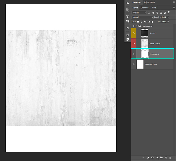
After unlocking both of these layers we can grab the ‘Background Color’ layer that is currently turned off and simply delete it or drag it to the trash can icon found at the bottom of the Layers Palette to remove it.
Step 3: Rotating the Background
Select the ‘Background’ folder that we have brought into our file, and then press Command/Ctrl+T to initiate a Free Transform Command.
Hover your cursor over any of the four corners of the bounding box and you should notice your arrow turning into a curved arrow. Once you see that arrow, hold the Shift Key and rotate the entire folder clockwise by 90 degrees. Holding the Shift Key here will give us more precision as we rotate the folder as it will force the transformation to rotate by 90 degree increments. You should now have something like this:
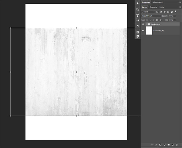
After rotating the background don’t press ‘Enter’ to commit to the changes just yet. Before we do that we want to hold the Alt/Option+Shift keys and drag outwards from any of the four corners of the bounding box to scale the background up from the center until it fills up the entire canvas like this:
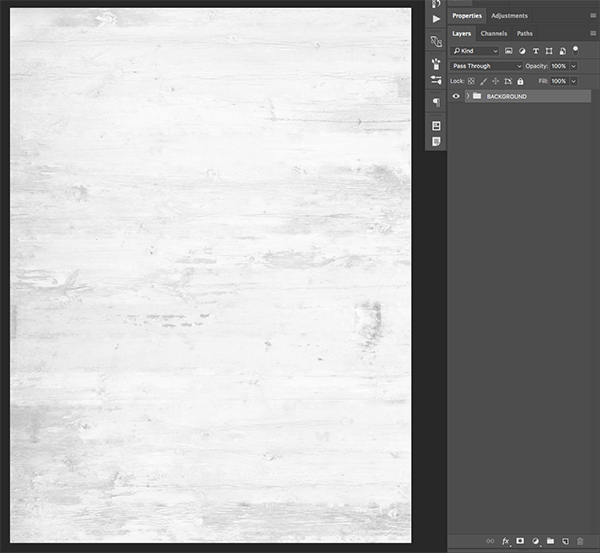
Now that our background is completely filled with the white wood texture we can press ‘Enter’ on the keyboard to apply the transformation. Next, we can select the original ‘BACKGROUND’ layer and drag it to the trash can or simply delete it since we no longer need it. We can now use that name for the folder so we are left with only the wooden texture background.
Step 4: Adding the Tablecloth
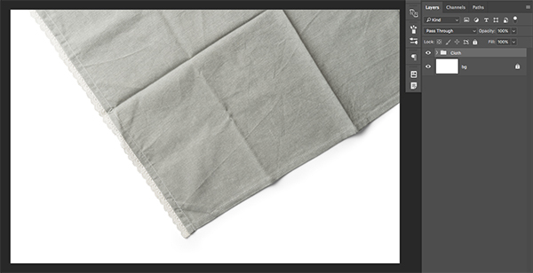
Open the freebies folder for this tutorial and then open the ‘fabric_tablecloth.psd’ file in Photoshop.
Grab the ‘Cloth’ folder and drag it into your working document. Here I will just double click the folder name and make it all caps so that it matches our other folder. Make sure that it’s above the ‘BACKGROUND’ folder and then position it in the upper left hand corner of the image using the image below as reference for the size and placement of the tablecloth:
Step 5: Turn on the Lights
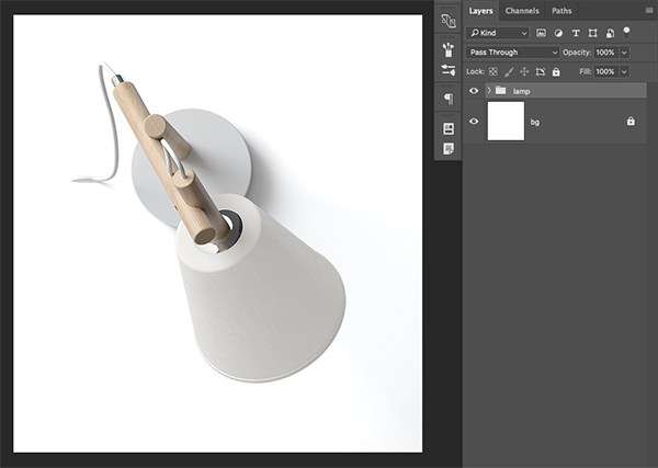
Open the freebies folder for this tutorial and then open the ‘white_lamp.psd’ file.
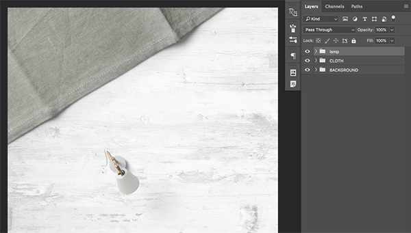
Hold the Command/Ctrl+Shift keys and drag the ‘lamp’ folder into your document and place it above the previous two folders like this:
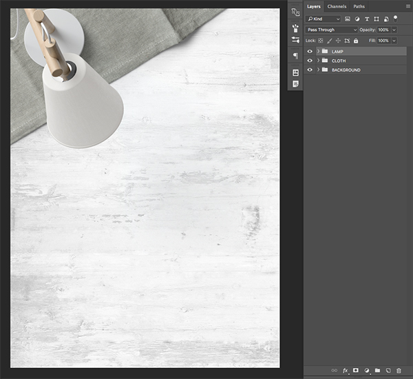
Again, I will rename the folder to ‘LAMP’ in all caps and then press Command/Ctrl+T to initiate a Free Transform. Hold the Alt/Option+Shift keys and scale the size of the lamp up to make it larger. From here we will place it on top of the tablecloth so that the top of the lamp goes outside of the image area as shown in the image below:
Step 6: The Red Letter
Next, open the ‘a_letter.psd’ file in Photoshop.
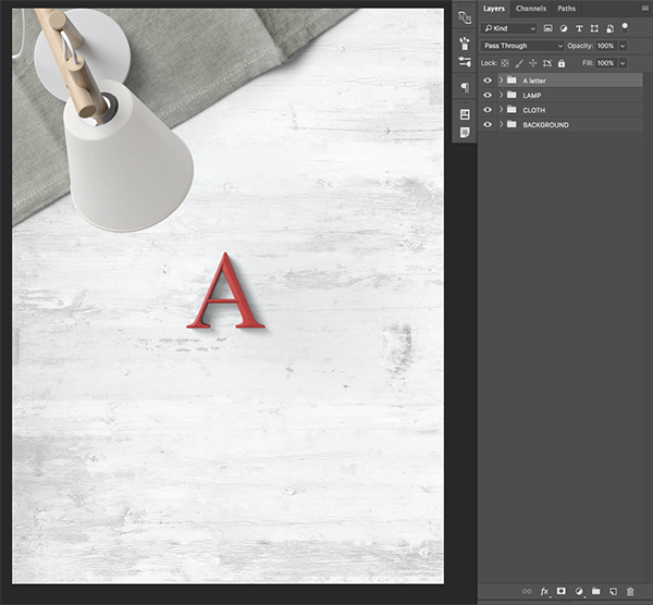
Click and drag the ‘A letter’ folder into your document while holding Command/Ctrl+Shift on the keyboard so that it falls in the center of your canvas.
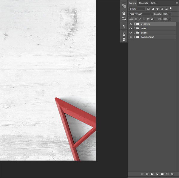
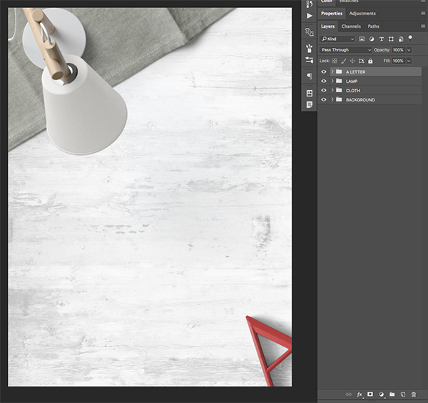
Double click on the folder to rename it and just call it ‘A LETTER’ before pressing Command/Ctrl+T to initiate a Free Transform. From here, hold the Shift Key and drag outwards from any of the four corners of the bounding box to make the letter a bit larger. From here, move your cursor over any of the corners and rotate the letter counter clockwise roughly around 45 degrees so that the top of the ‘A’ points towards the middle of the canvas. You should now have something like this:
Having the letter point towards the center of the image balances out the shape and direction of the white lamp, and this is a useful way to create some interesting angles and lead the viewers eye towards the center of the image.
Step 7: Plant Life
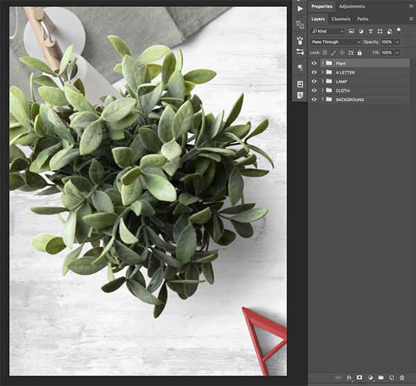
Next, open the ‘succulent.psd’ file from the freebies folder in Photoshop.
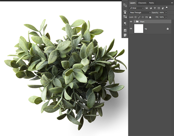
Click and drag the ‘Plant’ folder into your document while holding the Command/Ctrl+Shift keys.
You will notice that the plant is quite large in the workspace, so we will need to reduce this one to scale it so that it’s proportionate to the other objects in our workspace. To do that, press Command/Ctrl+T on the keyboard and then hold the Alt/Option+Shift keys and drag inwards from any of the four corners of the bounding box to reduce the size of the plant while constraining the proportions. We want to shrink this down around 20-30% and place it in the lower left corner to balance out the objects and help ground our design a bit. After placing the plant in the corner, double click on the layer to rename it to ‘SUCCULENT’ and your image should now look something like this:
Step 8: Time for Some Yellow
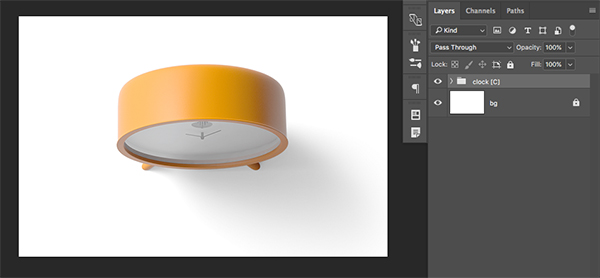
The next object we are going to use from the freebie folder is the ‘yellow_clock.psd’ so let’s go ahead and open that in Photoshop.
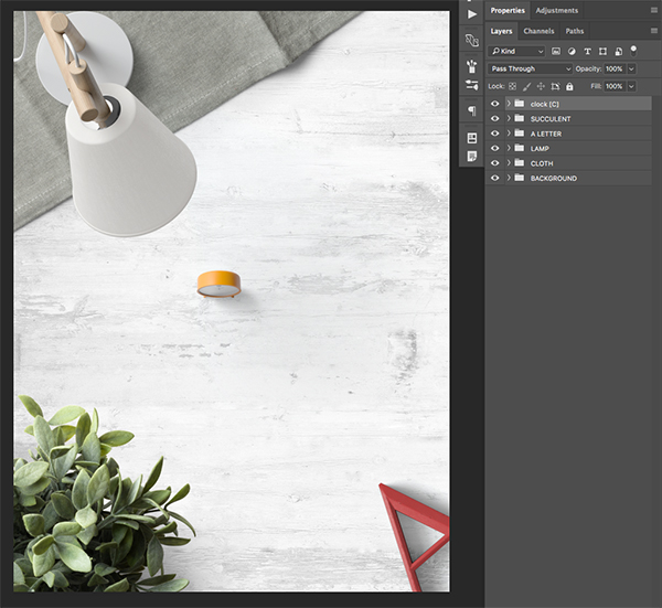
From here we want to click and drag the ‘clock [C]’ folder into our working document while once again holding the Command/Ctrl+Shift keys.
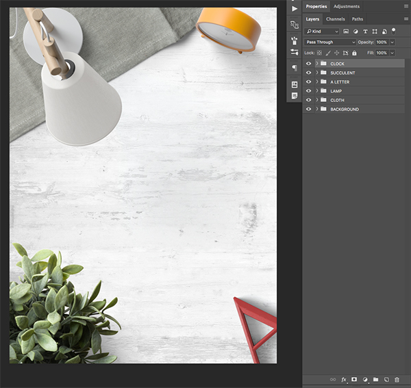
Once we bring the yellow clock into our document, place the folder at the top of the Layers Palette and double click on the folder to rename it to ‘CLOCK’ in all caps just like we have been doing with all of our previous folders and objects. Since the clock is fairly small, we will scale it up by pressing Command/Ctrl+T to initiate a Free Transform, and then holding the Alt/Option+Shift keys and dragging outwards from any of the four corners of the bounding box. Next, rotate the clock so that it faces down and towards the left, and then place it in the upper right hand corner of the image. It should be directly across from the plant to create more balance and to also point the viewers eye towards the center of the image. Use the image below as a guide for the size and placement of the object.
Step 9: Laying Down the Beats
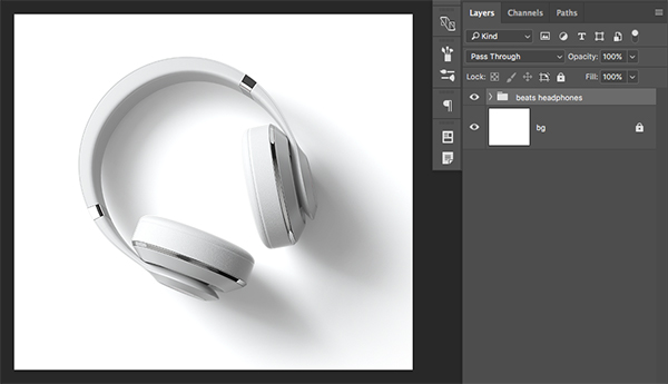
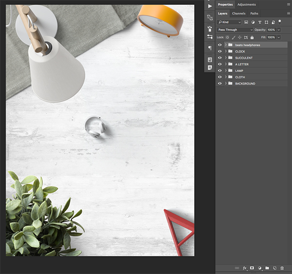
Next, open the ‘beats_headphones.psd’ file in Photoshop.
From here we want to click and drag the folder with our headphones into our document while holding the Command/Ctrl+Shift keys.
Make sure your headphones are at the top of the layer stack and double click the folder to rename it ‘BEATS HEADPHONES’ before pressing Command/Ctrl+T to initiate a Free Transform. Hold the Alt/Option+Shift Keys and drag outwards from any of the four corners of the bounding box to make the headphones larger while constraining their proportions. Then, move your cursor over any of the four corners of the bounding box and rotate them so that they are angled toward the right side and then we will place them on the right side of the canvas so that the headphones are slightly below the yellow clock. Once you are happy with the size and positioning of the headphones, press the ‘Enter’ key to apply the changes. You should now have something like this:
Step 10: Smaller Objects
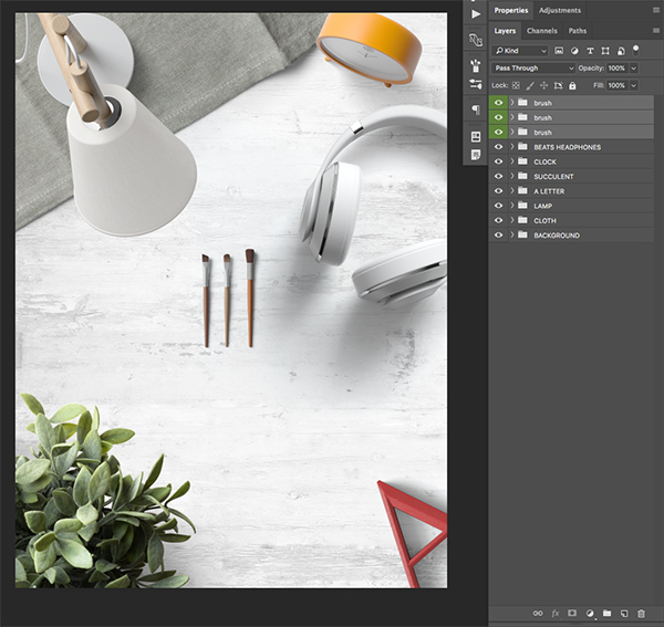
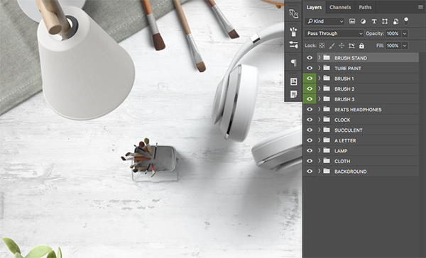
Next, open the ‘brushes.psd’ file from the freebies folder for this tutorial. You will notice that this file has three brushes inside as opposed to a single object.
Select the first brush folder, hold the Shift Key, and then select the bottom folder so all three of the brushes are selected at the same time. From here, hold Command/Ctrl+Shift on your keyboard and drag the three brushes into your working document and place them at the top of the Layers Palette.
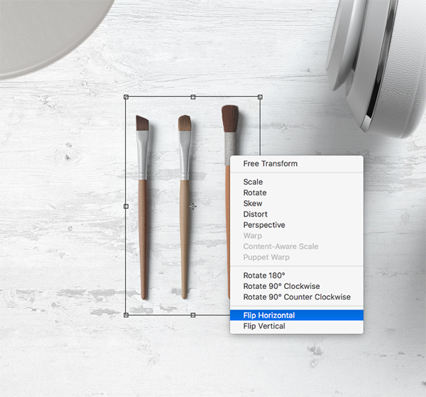
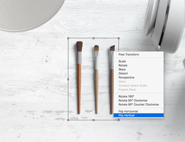
Once you’ve brought in the three brush folders, select them all together once again while holding the Command/Ctrl Key and clicking on each one, and then press Command/Ctrl+T to initiate a Free Transform. This time, hold the Control Key and click on the brushes once you see the bounding box around them to reveal a dropdown menu. From this menu, the first option we want to choose says ‘Flip Horizontal’ as shown below:
After flipping the brushes horizontally, hold the Control Key and click on the brushes once again. This time we will choose ‘Flip Vertical’ from the dropdown menu.
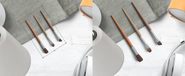
Once you have flipped the brushes both ways, drag them to the top of the canvas and rotate them so they point down and to the right, overlapping the fabric tablecloth. At this point you should still see the bounding box around your three brushes since we haven’t yet applied our transformation changes, which is good. If you did apply those transformation adjustments already you will need to initiate the Free Transform once again in order to proceed. Hold the Shift Key and drag outwards from any of the four corners of the bounding box and scale the brushes up a bit more to make them larger. The image below shows the before and after of the resized brushes.
We can now rename each of the brush folders ‘BRUSH 1’ and so forth by double clicking on the name of the folder and entering the new name of our choosing. From here we will select each brush individually, press Command/Ctrl+T to initiate a Free Transform, and then offset the brushes by rotating them and moving them slightly apart from one another so they appear more random in their arrangement. Use the image below as a guide for the size and placement of each of the three brushes.
Step 11: Blue Paint
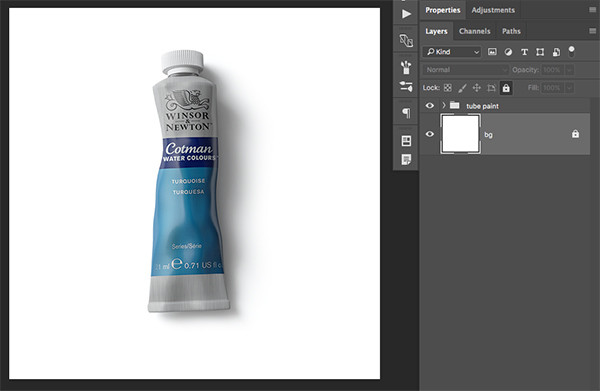
The next object we will open from the freebies folder is the ‘tube_paint.psd’ file.
Grab the ‘tube paint’ folder and drag it into your document while holding the Command/Ctrl+Shift keys.
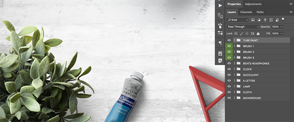
Move the tube of paint to the top of your Layers Palette and rename the folder ‘TUBE PAINT’ in all caps. From here, press Command/Ctrl+T and then hold the Shift Key to drag outwards from any of the four corners of the bounding box to scale the paint up and make it a bit larger. We then want to place it along the bottom edge of the canvas and rotate it slightly clockwise so that it points towards the red ‘A’ to create some contrast and counter balance. The image below can be used for reference with the size and placement of the object:
Your image should now look something like this:
Step 12: Brush Stand
Next, open the ‘brush_stand.psd’ file from the freebies folder for the tutorial.
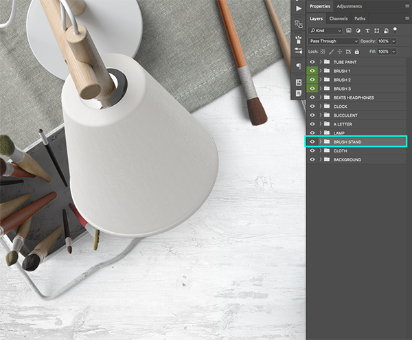
Hold the Command/Ctrl+Shift keys and drag the ‘brush stand’ folder into your document. From here, double click on the folder name and rename it ‘BRUSH STAND’ as shown in the image below:
Next we will move the brush stand below the ‘LAMP’ folder and then use the Free Transform Command to scale the brush stand up and rotate it so that it follows the same line as the fabric tablecloth. We will also get a bit more depth here since the lamp will be overlapping the brush stand like this:
Step 13: Badge of Honor
Next, open the ‘badge.psd’ file from the freebies folder.
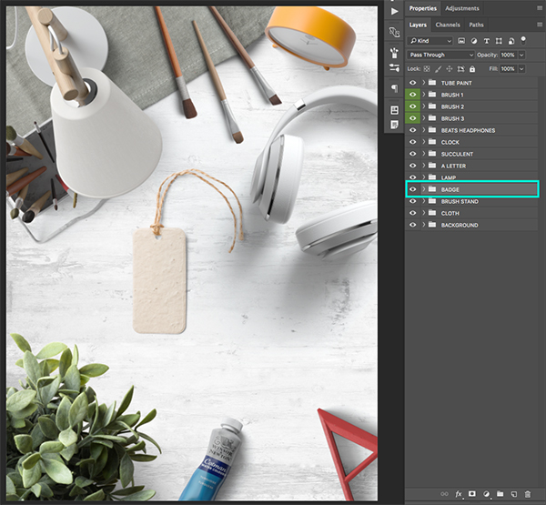
Drag the ‘badge’ folder into your working document while holding the Command/Ctrl+Shift keys, and then place it below the ‘LAMP’ layer if it doesn’t appear there automatically. Next, double click to rename the folder ‘BADGE’ in all uppercase.
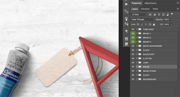
From here we will apply a Free Transform by pressing Command/Ctrl+T and then reducing the size of the badge by dragging inwards from any of the four corners of the bounding box while holding the Shift Key. Shrink the badge down and then rotate it clockwise before placing it next to the letter ‘A’ so that the yarn of the badge goes below the letter as shown here:
Step 14: Badge of Honor
From here we will place the Design Cuts logo onto the badge, so start by opening the ‘design_cuts_logo_on_white.jpg’ file in Photoshop.
Drag the logo into the document and rename the layer ‘DESIGN CUTS LOGO’ and then click on the arrow next to the ‘BADGE’ folder to expand the contents. Move the ‘DESIGN CUTS LOGO’ layer inside of the ‘BADGE’ folder and place it above all of the other layers inside. Press Command/Ctrl+T and then move your cursor over any of the four corners of the bounding box to rotate the logo counter clockwise and change the size of the logo so that it fits nicely inside of the badge, similar to this:
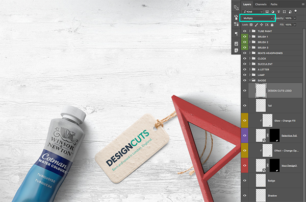
Once you are happy with the size and placement of the logo on the badge, change the Blending Mode of the layer from ‘Normal’ to ‘Multiply’ in order to hide the white around the logo. You should now have something like the image shown here:
Step 15: Framed
Now that we have our objects in place we are going to add a nice, simple frame around our design. Press ‘U’ on the keyboard to get the ‘Rectangle Tool’ and check along the top toolbar to make sure that you have a rectangle with no fill color, a solid white stroke, and a weight of 4 pixels as shown below:
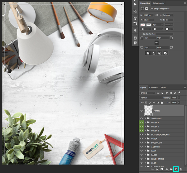
Next, click on the ‘New Layer’ icon found at the bottom of the Layers Palette, and then click and drag to create a thin white border that goes around the whole design while leaving an equal amount of space from the edges on all four sides.
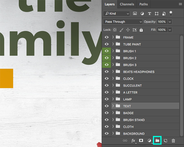
After you have placed your 4 pixel white border, make sure the layer is selected and double click it to rename it ‘FRAME’ and then click on the Group Folder icon at the bottom of the Layers Palette to put the frame into a new folder before giving it the same name. Your image should now look like this:
Step 16: Gifts for the whole family
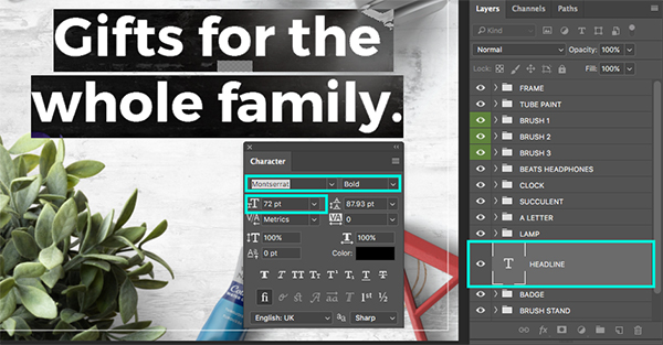
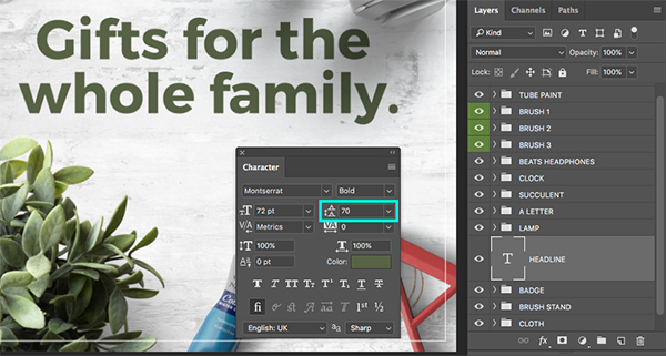
Next, select the ‘BADGE’ folder in your Layers Palette and then click on the New Layer icon found at the bottom of the panel. Alternatively, you can use the keyboard shortcut Command/Ctrl+Alt/Option+Shift+N on the keyboard instead. Once you have created the layer, double click on the layer name and call it ‘HEADLINE’ in all caps. Press ’T’ on the keyboard to grab your Type Tool and click on the canvas somewhere in the open space. From here we will type out ‘Gifts for the’ and then press ‘Return’ to go to a new line before typing out the words ‘whole family.’ on the second line. Open the Character Panel by going to the Window Menu and choosing ‘Character’ before changing the typeface to ‘Montserrat’ in a ‘Bold’ style. This is a free Google font that can be downloaded so you can follow along, but any clean, bold, sans serif typeface will work as a substitute. The other option we want to check here while we have our Character Panel open is that our text is about 72 pt size. All of these options have been highlighted below to show the settings I am using:
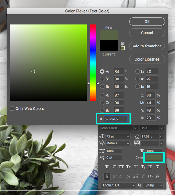
Double click inside of your text with the Type Tool (T) to highlight both lines of copy. From here, click on the small ‘Color’ option inside of the Character Panel to bring up the fill color. Here we want to enter a hexadecimal value of #576345 as shown below:
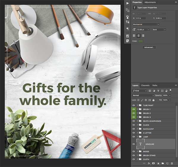
Press ‘OK’ to apply the color change, and then while your text is still highlighted, change the linespacing value to ’70’ as indicated by the blue box in the image below:
The last adjustment we want to make with our headline text is to grab the Type Tool (T) and click inside of the text before moving the cursor to just after the word ‘the’ and adding a single space with the spacebar. This will help to make the text appear more ‘visually centered’ and give a bit of breathing room between the headline and the headphones next to it. Your design should now look similar to this image:
Step 17: Adding a Button
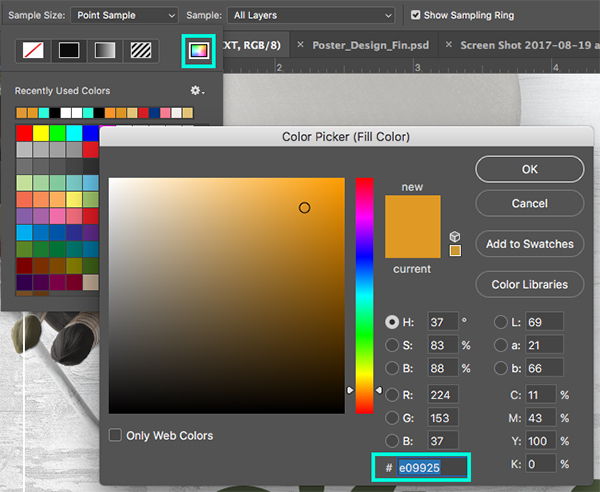
From here, press ‘U’ on the keyboard to once again grab the ‘Rectangle Tool’ and then check the top toolbar to make sure that you have a solid fill using the hex value #E09925 with no stroke as shown below:
If you are having trouble changing the fill color for the shape, hold Command/Ctrl and click on the rainbow color box as indicated by the blue highlight box in the image below:
Next, drag out a long, short rectangle shape below your headline text as shown here:
Step 18: Button Text
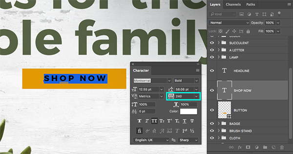
Create a New Layer above your button shape, but below the ‘HEADLINE’ layer and then switch to your Type Tool (T). Click inside of the yellow button and type out the words ‘SHOP NOW’ using the same ‘Montserrat’ typeface in the ‘Bold’ style. Double click inside of the text box and change the color to white, the size to about 12.55 points, and then also adjust the letter spacing so that it’s set to ‘240’ as indicated by the blue highlight box in the image below:
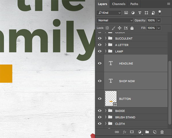
Click on the ‘HEADLINE’ text layer, and then hold the Shift Key and click on the ‘BUTTON’ shape layer so all three of these layers are selected at the same time.
With all three of these layers selected, press Command/Ctrl+G or click on the Group Folder icon at the bottom of the Layers Palette to place these three layers into a new folder. Once you have done that, change the name of the folder to ‘TEXT’ as shown below:
Step 19: The Price is Right
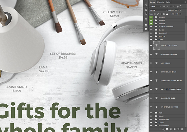
Create a New Layer above your ‘TEXT’ folder and switch back to your Type Tool (T). Click to the left and below your brushes and type out ‘SET OF BRUSHES:’ and then hit ‘Return’ on the keyboard to go to a second line before typing out the price ‘$14.99’. We can open the Character Panel once again to make sure that we are using ‘Montserrat’ for the typeface, this time in the ‘Regular’ style. We will also make this type slightly smaller (about 10 point) and change the color to #888888.
Press Command/Ctrl+J to create a copy of this text layer, and move it next to another one of the items. Use the Type Tool (T) to click inside and update the name and price for each item.
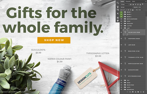
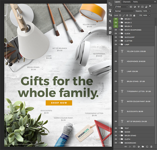
Continue making copies of each of the product names and prices until you have a copy for each item in the layout. For this I have just made up some prices, but I am using the product name based on the folder name for each item.
After you have added all of your prices, select the first text layer, hold the Shift Key, and then select the bottom price layer so they are all selected at the same time as shown below:
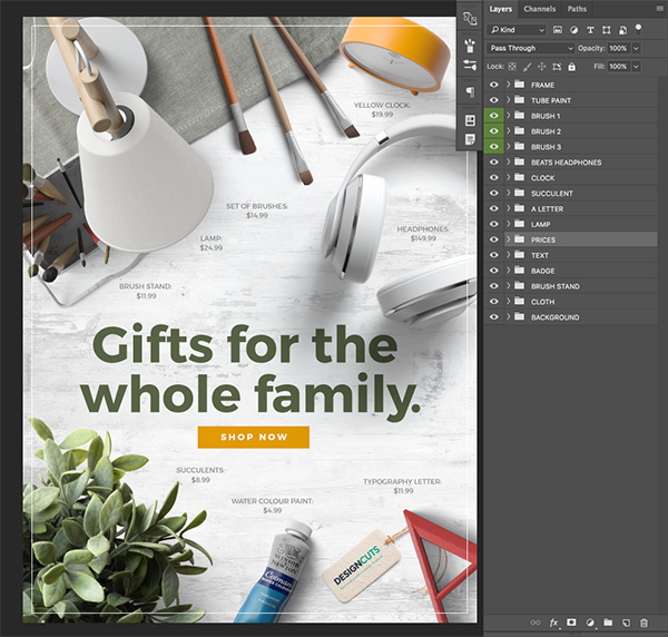
With all of your layers selected, press Command/Ctrl+G to put them into a new folder. Double click on the folder name and change it to ‘PRICES’ as shown here:
Step 20: Exporting the Poster
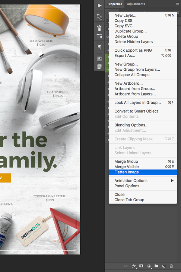
Now that our poster design is complete, it’s time to export it as a hi-res JPG. Before we continue, make sure that you have saved all of your work thus far as a layered PSD file since we will be flattening our image in the next step. After you have saved your work, click on the hamburger menu at the top right of the Layers Palette to reveal a dropdown menu. From this menu we want to choose the option towards the bottom that says ‘Flatten Image’ as shown here:
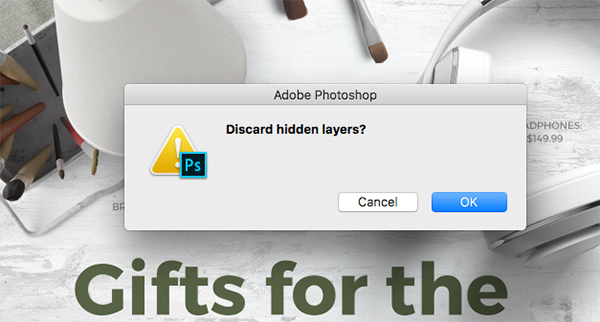
If you are prompted with a dialog box asking if you want to ‘Discard hidden layers?’ you can click ‘OK’ to move on.
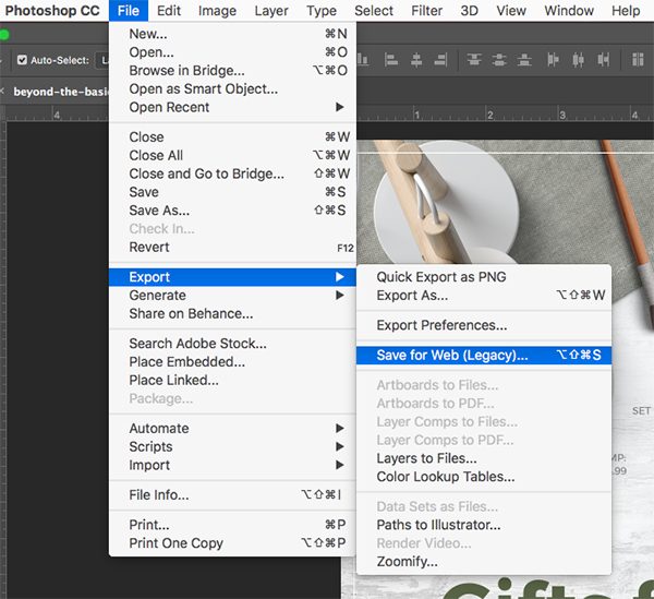
Now that the image has been flattened we want to save it out as a JPG file. To do this, go to the File Menu and choose ‘Export > Save for Web (Legacy)…’ as shown below:
You should now see the export screen asking you how you’d like to save the image. Check the parameters in the upper right hand of this screen to make sure that you have a JPG selected for the file type set to ‘Maximum’ and ‘100’ for the quality. From here you can simply press ‘Save…’ from the bottom of the screen and then choose a destination for your JPG to save.
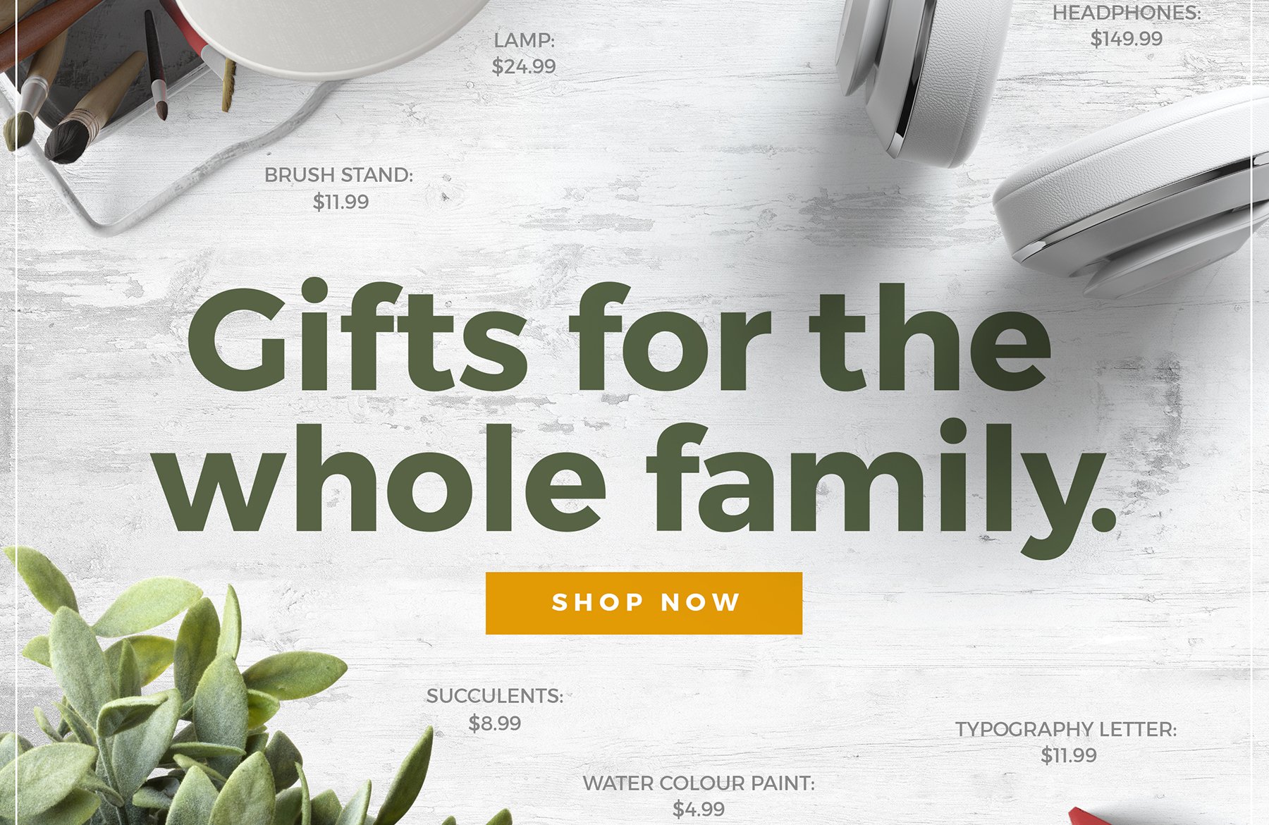
Here’s our final poster design:
Step 21: Printeriors
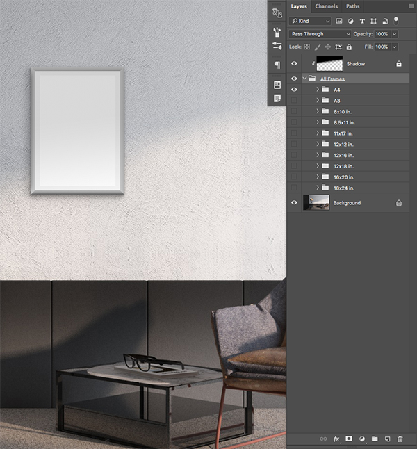
From here, open the ‘Printeriors-07.psd’ file from the freebies folder for this tutorial. Once the file has been opened, click the small arrow next to the ‘All Frames’ folder to reveal the contents of the folder.
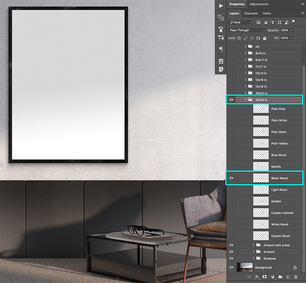
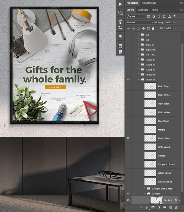
By default, the ‘A4’ folder will be turned on, but as I mentioned in the beginning of the tutorial we will instead be using a larger format for the poster. Poke out the eyeball for the ‘A4’ folder to turn off the visibility, and then turn on the visibility of the ‘18×24 in’ folder. After that, expand the contents of the folder and turn on the ‘Black Wood’ layer to change the frame color.
Next, click on the ‘Artwork’ folder to reveal the contents and make sure the ‘Artwork with a Mat’ folder above is turned off. Inside of the normal ‘Artwork’ folder is a Smart Object called ‘18×24 (Double Click to Place Your Artwork)’ which we will double click just as the description says.
Step 22: Putting the Poster in the Frame
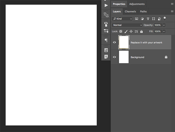
Inside of the Smart Object Layer we can now see two layers – this is where we will be placing our flattened JPG of the poster design.
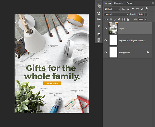
Click and drag the flattened poster JPG into this window and place it at the top of the Layers Palette.
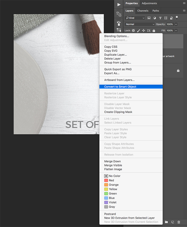
Hold the Control Key and click on the layer to reveal a dropdown menu. From this menu we will want to choose ‘Convert to Smart Object’ as shown below:
With your Smart Object Layer selected, press Command/Ctrl+T to initiate a Free Transform. From here, press Command/Ctrl+0 on the keyboard to zoom out.
From here, hold the Alt/Option+Shift keys and drag inwards from any of the four bounding boxes around the image to reduce the size until it fits perfectly within the document bounds as shown below:
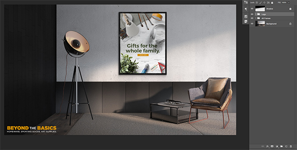
Press Command/Ctrl+S to save the file, and then close out of it by pressing Command/Ctrl+W. You should now see your poster design updated in the room mockup!
Step 23: Adding a Logo
Next, open the ‘beyond_the_basics_logo.psd’ file from the freebies folder.
Drag the main ‘Logo’ folder into the interior mockup, and then place it in the lower left hand corner as shown below:
Step 24: Finishing Touches
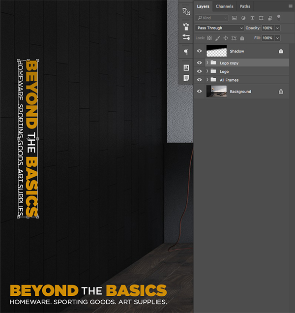
Select the ‘Logo’ folder and then press Command/Ctrl+J to duplicate it. Select the copy and then press Command/Ctrl+T to initiate a Free Transform. Once you have done that, hold the Control Key and click on the logo to reveal a dropdown menu. From here, choose ‘Rotate 90 Clockwise’ and then press ‘Enter’ on the keyboard to apply the changes.
Move this copy of the logo up towards the left of the layout and then once again press Command/Ctrl+T to do another Free Transform.
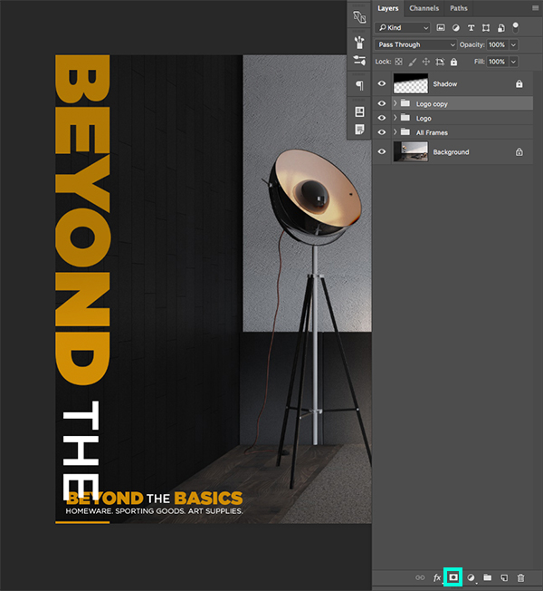
Hold the Alt/Option+Shift keys and drag outwards from any of the four corners to scale up the logo. We will now want to crop it so that the words ‘BEYOND’ and ‘THE’ are the only parts showing on the left edge of the layout. Once you have positioned the logo accordingly, click on the ‘Add Layer Mask’ icon from the bottom of the Layers Palette as shown here:
Press ‘G’ on your keyboard to switch to the Gradient Tool and then make sure you have a Linear Gradient that fades from solid black to transparent. Here you can see how that should look along the top toolbar:
Click a bit off the bottom of the canvas and drag upwards using your Gradient Tool (G) and the bottom of the logo should now fade out. Lastly, change the opacity of the group folder for this logo to 10% by simply pressing the number ‘1’ on the keyboard while the folder is selected in your Layers Palette.
We have now completed our Beyond the Basics Poster Design and Mockup! After using just a small selection of the realistic items from this latest bundle we created a fun layout before adding some stylish text. From there, we used one of the many interior mockups to display our awesome poster design before adding a logo and tagline as a finishing touch. Be sure to pick this bundle up soon as it will help you to create some awesome branded presentations that will really take your work to the next level. I can’t wait to see what you guys do with it!
Remember that whether it’s your outcome for this tutorial or something new you’ve made, we’d love to see your designs on our Facebook page.
Please leave a comment if you have any questions or suggestions. I always look forward to hearing from you!
There’s still time to check out The Complete Mockup Templates Toolbox featuring 1000’s of professional mockups for an unprecedented price of just $29.



























Another excellent tutorial! Always appreciate learning about using mock ups
Hey Andrea,
Oh thank you for the awesome feedback!
We love sharing them with you, so we’re really glad that you enjoyed it :D
oh my the mockup looks great! i’ve never done anything like this, gonna have to try now. thanks a bunch!
Hey Faliha,
Ooh how exciting! Good luck, we hope you’ll have loads of fun with it and we always love to see the end result, so please feel free to share it with us on Facebook :)
This is awesome!! Thanks so much for this tutorial.
You’re so welcome Andrea and we are super glad that you liked it :)
The shadows of the individual objects in the poster composition are not correct. They go every-which-way. This is a mistake I see over and over again. Lighting is important. The shadow cast by lighting is equally important. When both are done badly, it destroys the illusion of reality that you would otherwise achieve. To produce a convincing mock up, one must have a key point of light in mind–as occurs outdoors in nature. If one is mocking up an indoor staged shoot, you need to compensate for 3 light sources: key, back-, and fill light. Again, this is something that I’ve seen few PS mock-ups compensate for.
I wish they did! LOL! My eyeballs would bend less often.
If one needs to adjust the shadows in a manner beyond what is available in the drop shadow fx panel, do this:
1. Open the drop shadow fx panel and untick Global Light and click okay
2. In the Layer Panel, right click on the drop shadow fx layer to bring up the menu for more options.
3. Choose “Create Layer”: this will isolate the drop shadow effect into its own independent layer.
4. Use the Transform tool to modify the shadow as needed, apply masks, layer adjustments, brushes, etc. until the shadow looks right.
That’s it! I don’t have to do this often but when I do, it really helps create the illusion of reality.
I should have remembered to add this:
If the lighting and shadows on the object’s MASS dictates the light is coming from a specific direction, then adjusting the shadow cast by that object has limitations. If the table lamp (for example) is lit on the left but you’ve adjusted the shadow to be thrown in the opposite direction, all the “Create Layer” adjusting will be for naught. It won’t look right at all.
Hey Mary,
Thank you so much for taking the time to not only give your feedback on this, but to offer alternative suggestions too!
You are completely right, you can adjust the shadows in other ways- for the purpose of this tutorial however our Tutorial Writer Eric has chosen to use them ‘as is’. The great news is though, the full pack featured in the Complete Mockup Templates Toolbox does offer more variations and will allow you to customize the shadows to your preference :)
We really appreciate your expertise though and I am sure this will come in super handy for our community.
Good
Thanks so much Jason!