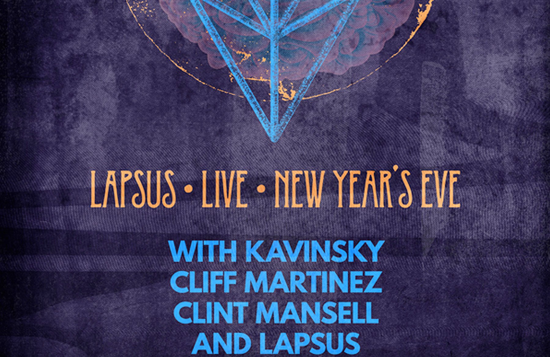
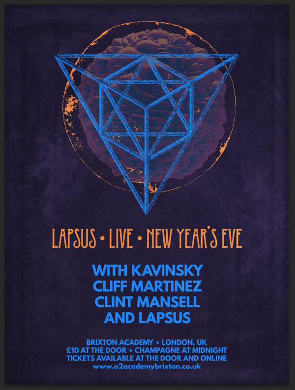
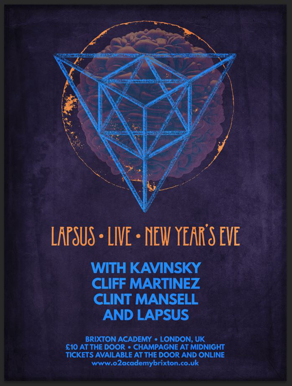
WHAT WE’RE CREATING:
HAPPY HOLIDAYS!
Hello Design Cutters! Simon here, for this week’s second tutorial. I wanted to start by wishing you and yours happy holidays, as we’re nearing the end of 2014.
On that note, it’s time to explore the Incredible All in One Design Bundle! The various resources included are all very nice, but some struck a chord more than others.
Namely, they are the geometric polygons, as well as the surface asset pack.
The analog textures are also quite amazing, especially the process to get them made.
STEP 0: INSPIRATION AND CONCEPTUALIZATION
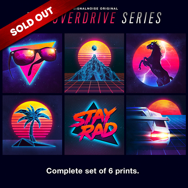
With that in mind, I started exploring pieces that could be made using these assets. After browsing for inspiration, I came across Signalnoise’s Overdrive Series of prints.
James White’s work is known to grasp its inspiration in the neon colors of the 1980s. Just look at his Tumblr for more of that bright goodness.
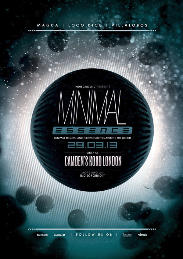
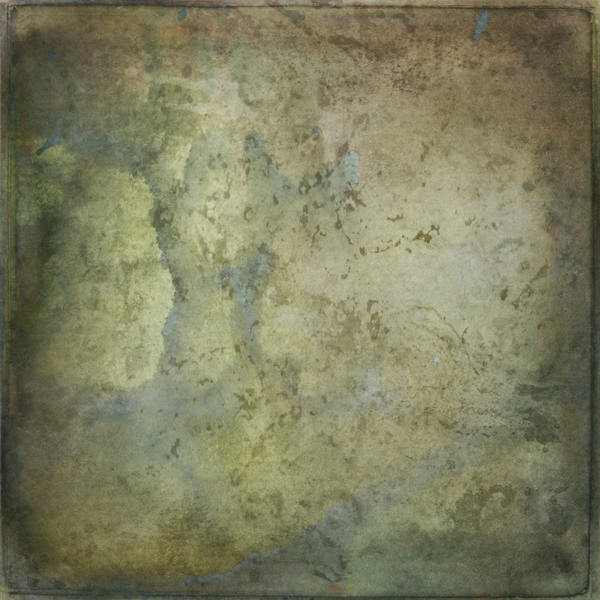
The other inspiration was this events poster, which had a great dark, minimal feel to it:
I started brewing all of this together, and sketched my ideas on paper. The ideas that emerged tried to channel some of that sci-fi/electro/technological vibe, while some others where exploring some of the vector assets in the bundle.
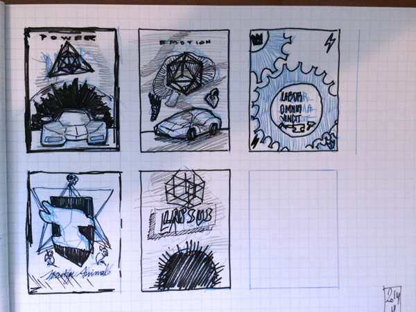
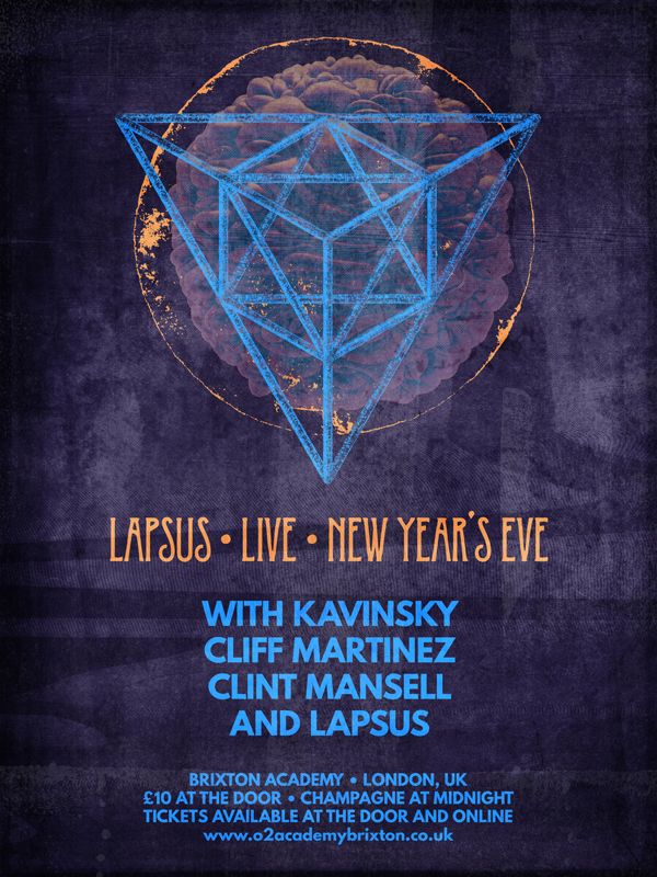
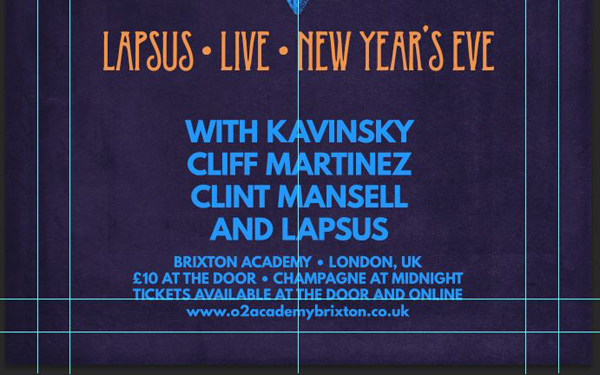
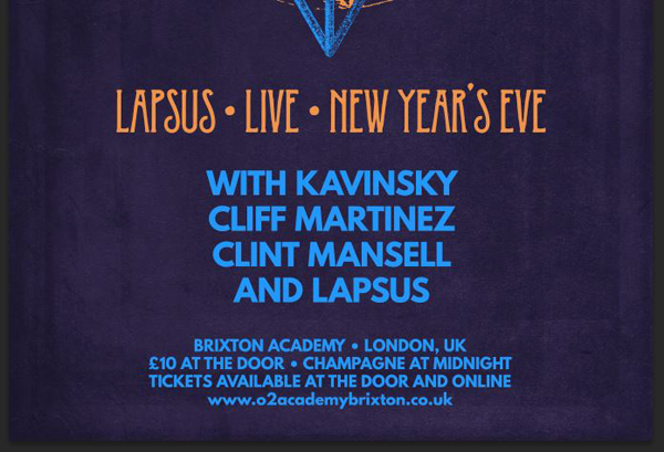
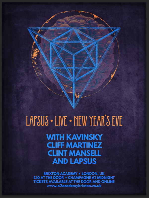
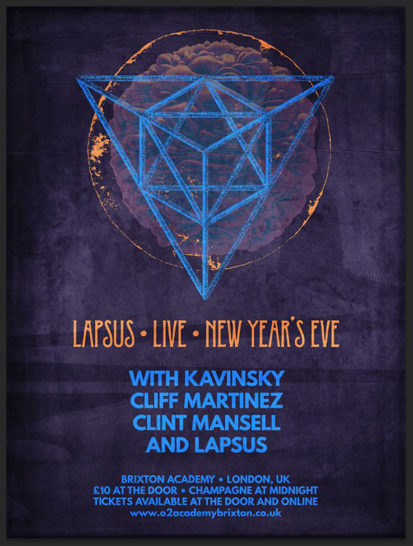
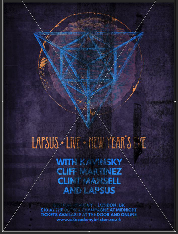
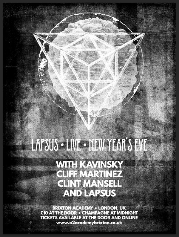
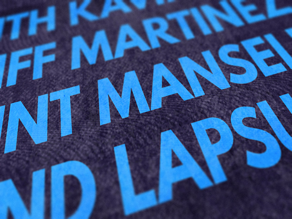
After chatting a bit with the team, we decided to develop the top left concept into a concept poster, rather than a car inspired piece. Below is a peek at the result. It’s a concert by a band called Lapsus (Latin for error), supported by Kavinsky (Drive soundtrack), Cliff Martinez (Drive soundtrack), and Clint Mansell (Requiem for a Dream soundtrack). The concert would take place at the Brixton Academy in London.
Let’s go through how you can make your own version of it, shall we?
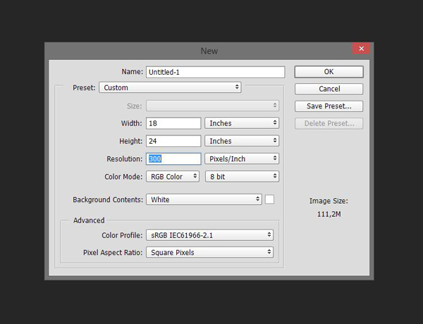
STEP 1: DOCUMENT SETUP
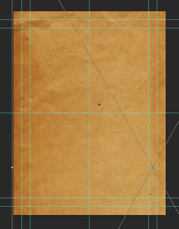
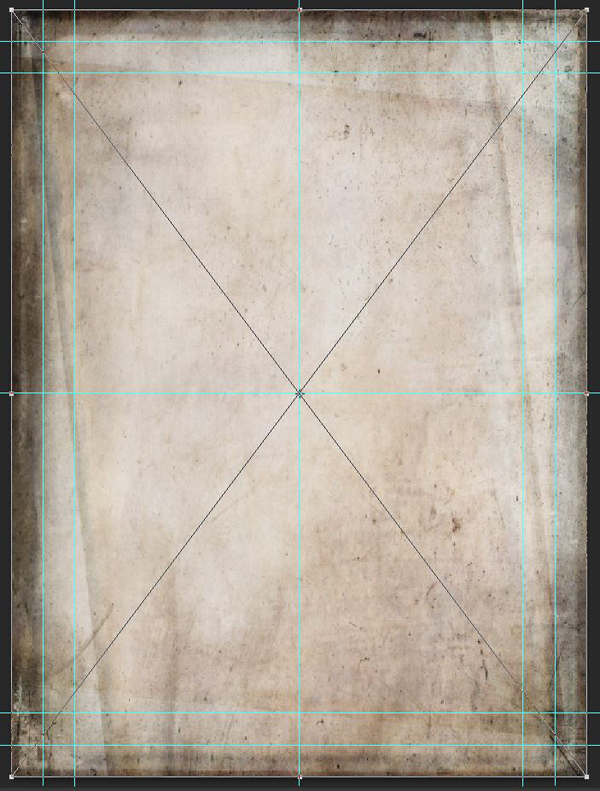
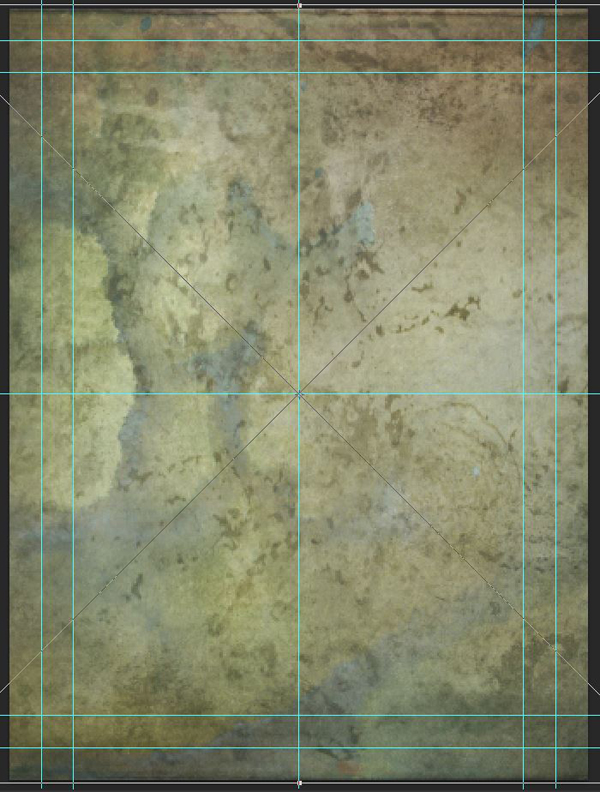
We’ll be creating our poster in Photoshop. We’re working within an 18″x24″ canvas, at 300 ppi.
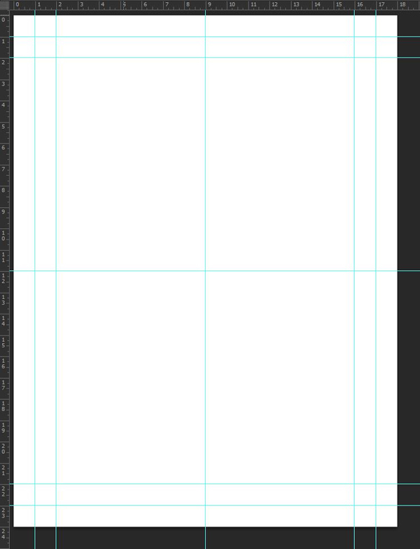
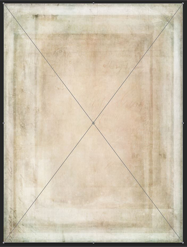
I’ve added a few guides around as well, in order to easily place my elements around. There are guides at 1 and 2 inches of the canvas’ edges, as well as guides to mark the middle of the piece.
STEP 2: THE BACKGROUND
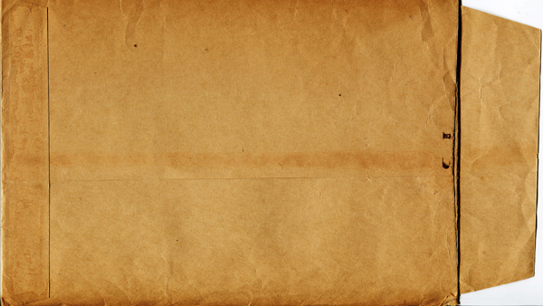
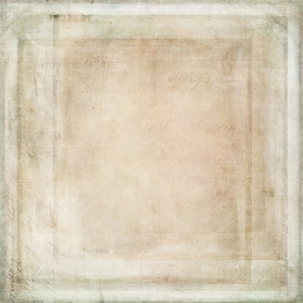
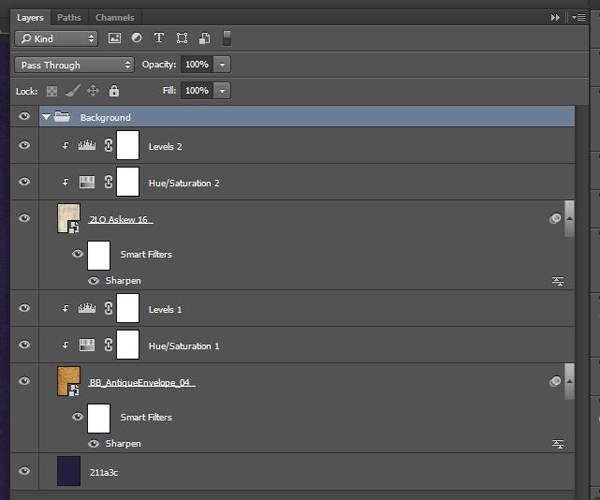
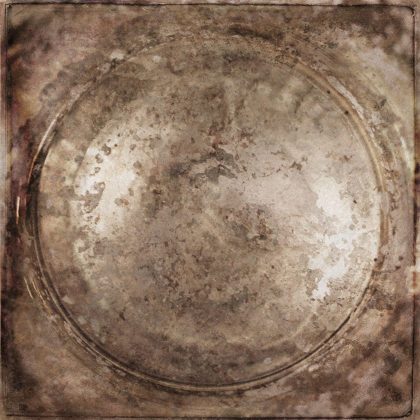
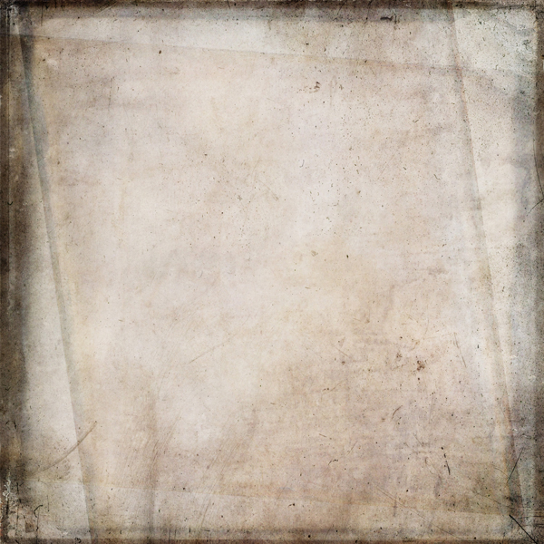
We’re going to use 2 Lil’ Owls textures to build up our background. Additionally, we’ll also make use of Dustin Schmieding’s BB_AntiqueEnvelope_04 paper texture. If it isn’t part of your asset library, I strongly suggest you to go and get it.
Also, if you’re new to this, here are a few quick notes:
Quick note #1: in this tutorial, the term “clipping” or “clipped layer” is used a few times. This means that the layer is only visible/applies to the layer directly below it. You can very quickly do this by holding ‘Alt’ down on your keyboard and clicking between the two layers. Photoshop secrets created an handy animated gif demonstration.
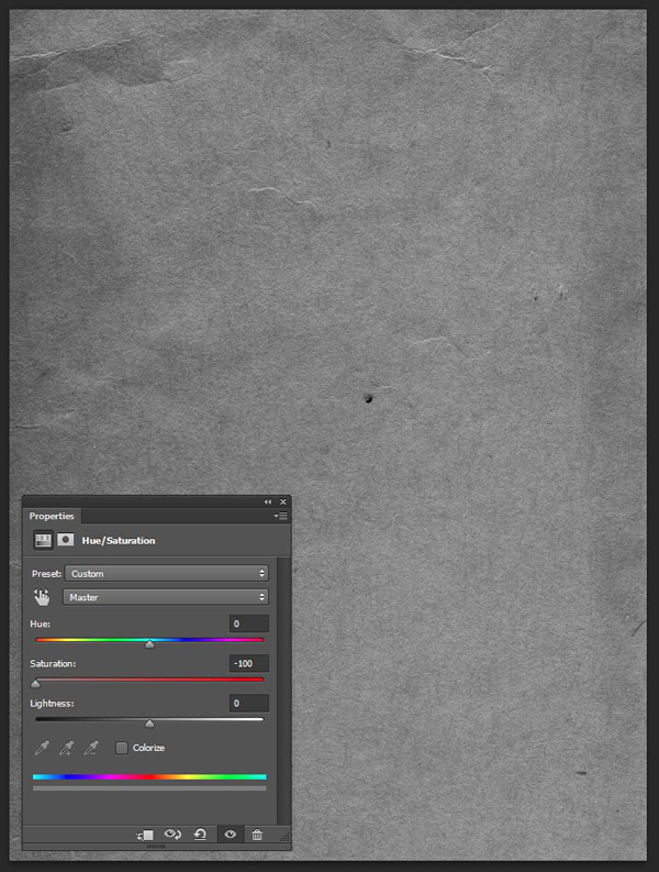
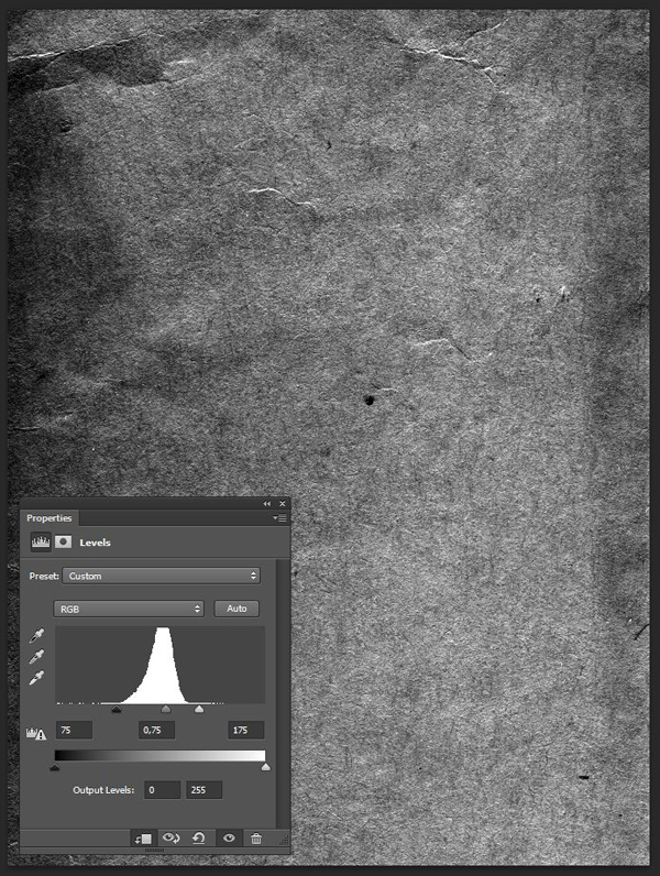
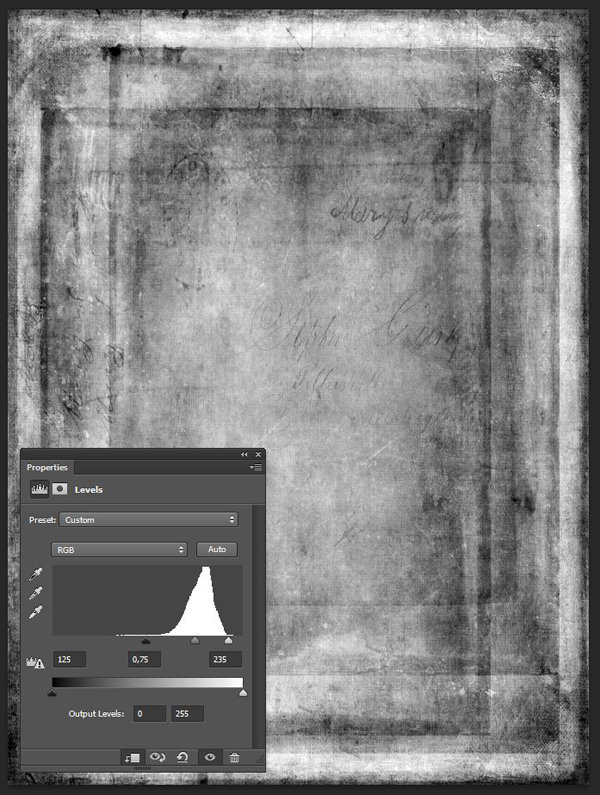
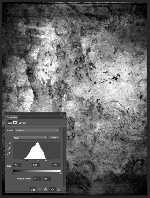
Quick note #2: every time we’ll work with textures, we’ll follow this simple process: place as smart object, sharpen, desaturate, enhance contrast with levels, and modify the blending mode.
Quick note #3: placing the textures as smart objects, and using adjustment layers to tweak them, allows us to stick to a non destructive workflow. We’ve explored in depth the numerous pros and few cons of such a workflow in this past tutorial: “How to Use Textures The Right Way.”
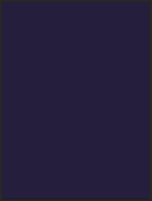
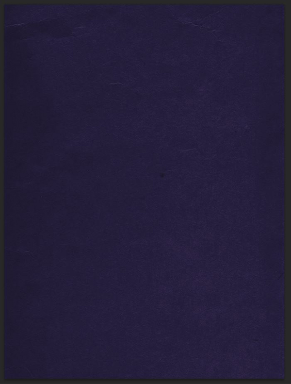
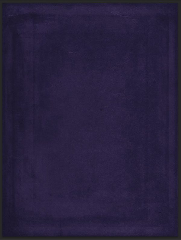
Now that these are out of the way, let’s get to it. Start by filling your background layer with a rich, dark purple. I’m using #211a3c.
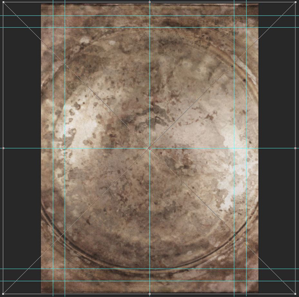
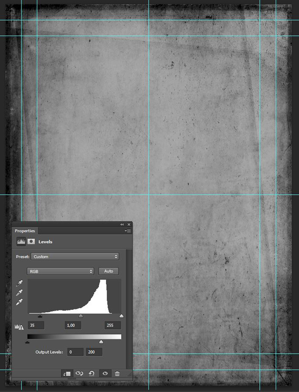
The next step is to bring in our paper texture. This will help us to add some well defined paper grain and creases to our piece.
Start by placing the texture as a smart object in your piece, so its middle seam isn’t visible.
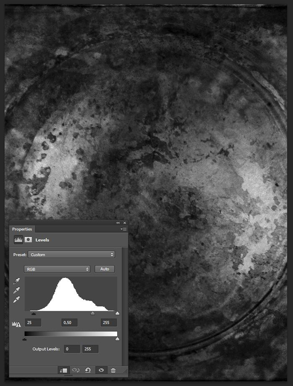
Sharpen the texture (Filter > Sharpen > Sharpen), use a clipped hue/saturation adjustment layer to desaturate the texture, and use a clipped levels adjustment layer to bring its grain out more.
Blending mode: Soft light @ 35% opacity.
The next texture is 2LO Askew 16.jpg. It will help us to bring a frame effect on the background of our poster. Find it in \all-in-one-2-lil-owls\Askew\.
Place it so it fits our canvas. That means not respecting its aspect ratio.
Blending mode: Soft light @ 25%.
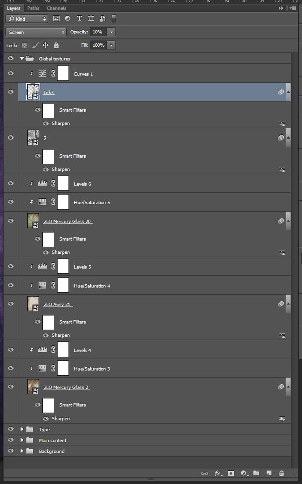
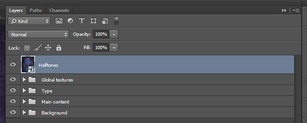
From there, it’s time to organize our layers. I created a layer group named Background to hold everything we’ve done so far.
STEP 3: MAIN VISUAL ELEMENTS
Now that our background is in place, we can assemble the main visual piece for our poster. We’ll use 3 assets for that, all by Rule by Art.
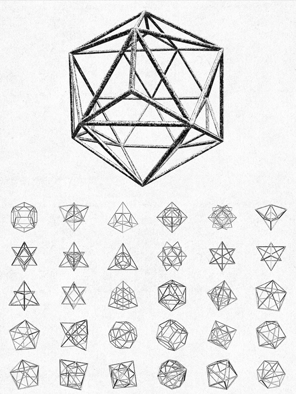
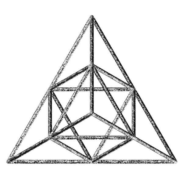
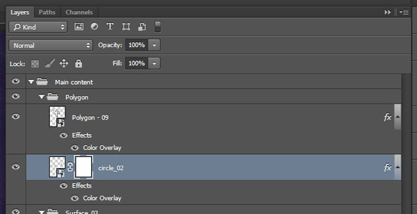
Polygon #9 (found at \all-in-one-rule-by-art\RuleByArt_Geometric_Polygons\symmetrical)
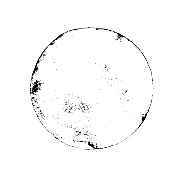
circle_02.eps (\all-in-one-rule-by-art\RuleByArt_Distressed_Shapes\EPS).
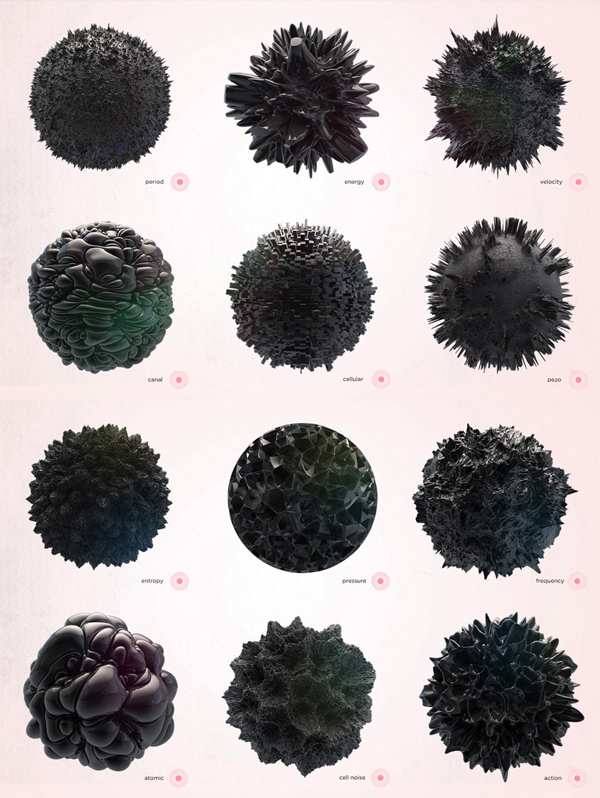
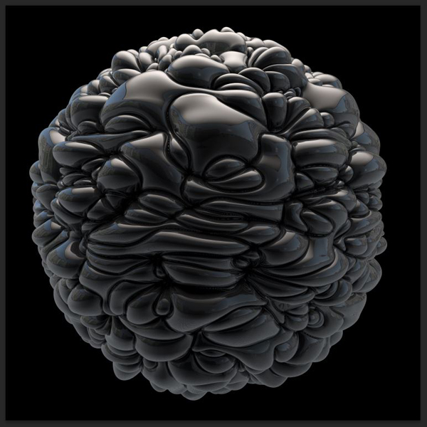
And surface_03.tif (\all-in-one-rule-by-art\RuleByArt_Surface\SURFACE).
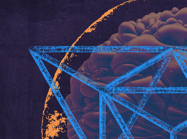
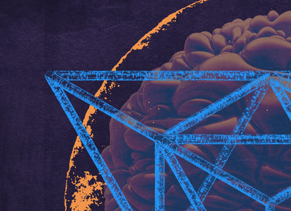
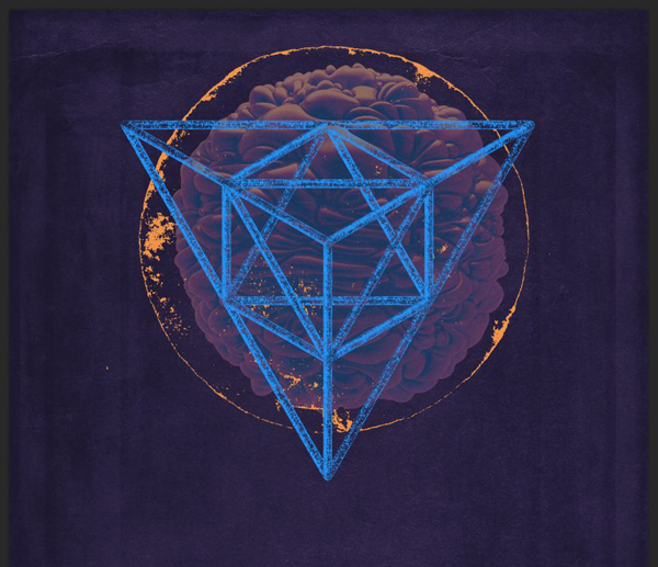
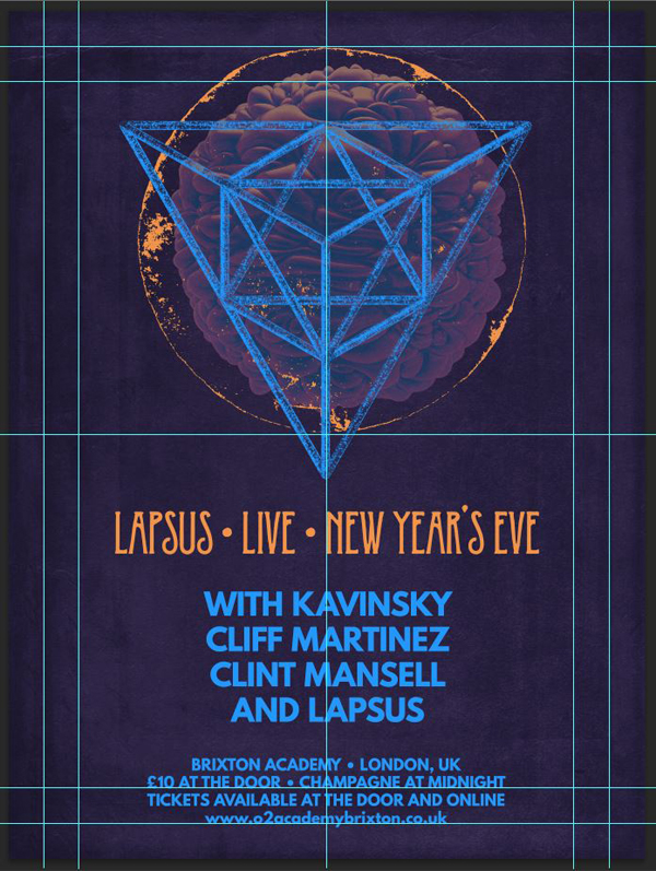
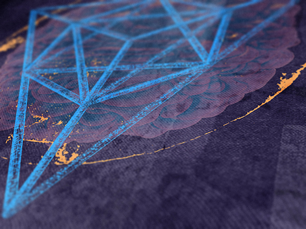
The elements, once combined together, will provide us with a badge that will generate much of the vibe that we’re looking to create in our piece (technological/sci-fi). Let’s start.
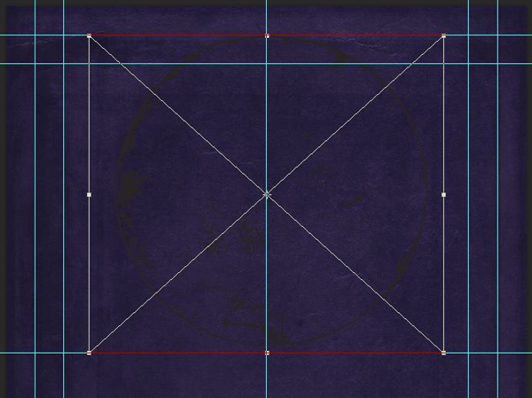
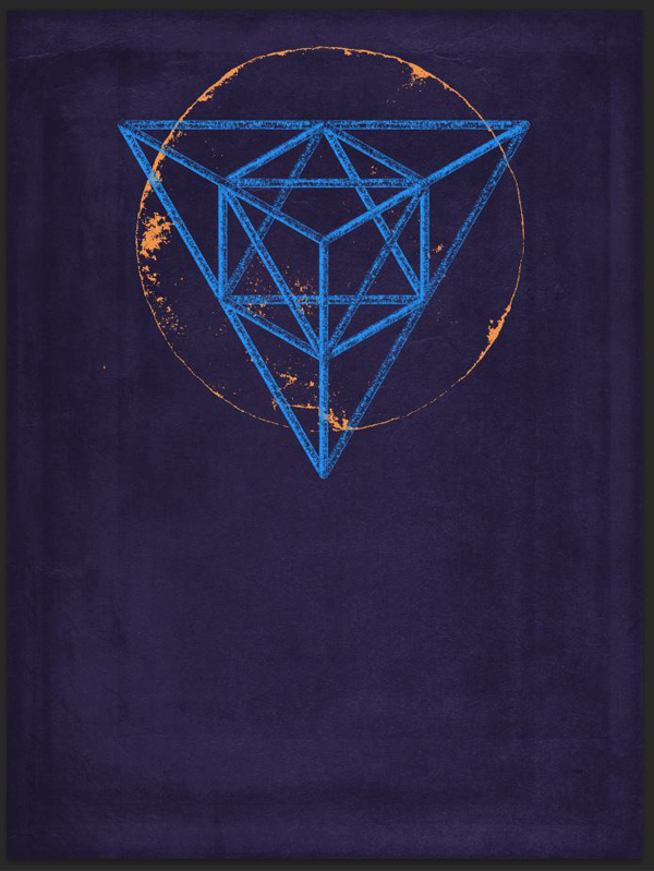
The first step is to place the circle_02.eps asset in your piece. Size it so it fits within the center and inner top horizontal guide (roughly 10″ in width and height).
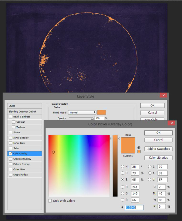
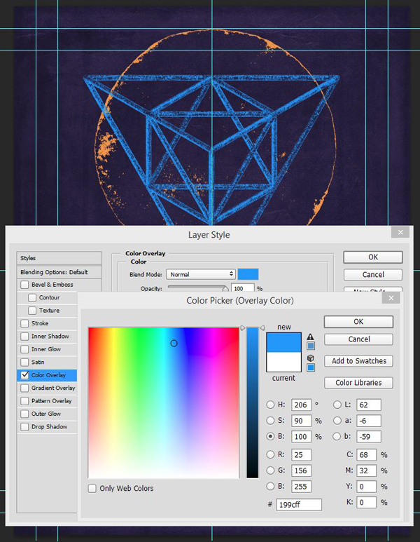
Proceed to give it a color overlay, in a color that contrasts nicely with the purple background. I’m using a nice orange, #f19542.
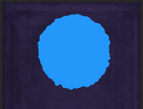
Next, we are going to place our polygon. Rotate it of 180°, and make sure it’s aligned with the middle of the canvas. I’m sizing it so its 3 summits overflow the circle a little.
Sharpen it like you would for a texture (mine was upsized at 125% of its normal size), and proceed to give it a bright blue color overlay (#199cff).
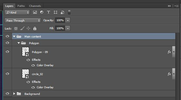
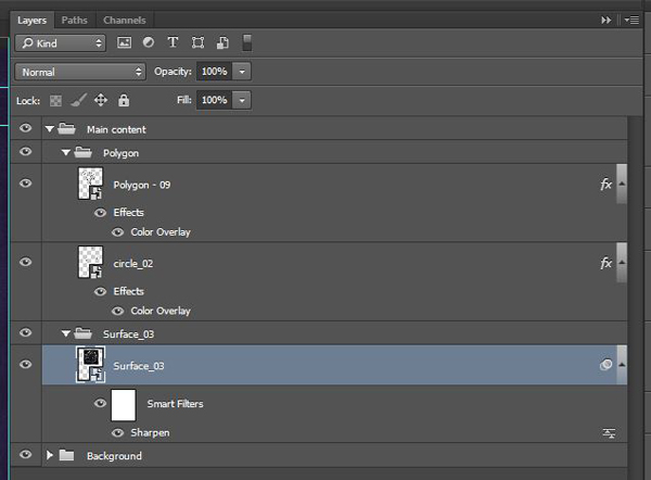
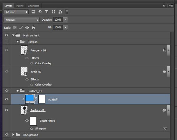
From there, it’s to organize layers a little bit. The insertion of the surface asset is going to make things a bit complex, and we might as well get a head start.
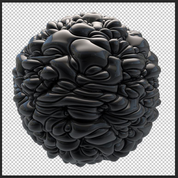
Place surface_03.tif below the Polygon layer group, but within the Main content layer group. In fact, give it its own layer group. It should be sized so it fits within the circle itself.
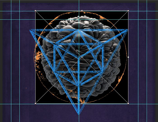
The asset’s background is black, which we need to correct. Double click on the smart object to open its content in a new document.
From there, unlock its layer, and make use the magic wand tool (W) to select the black background, and proceed to delete it.

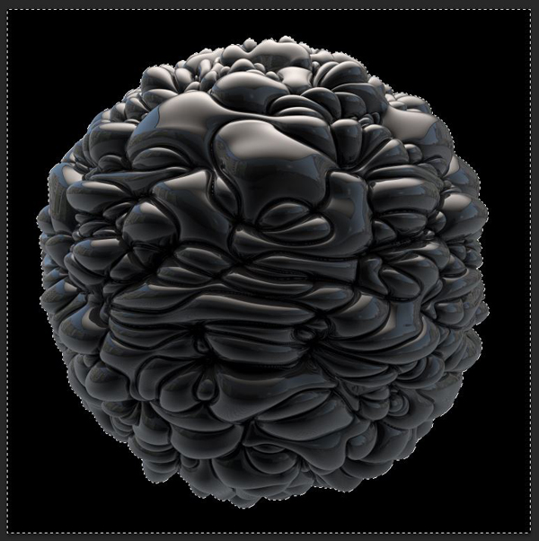
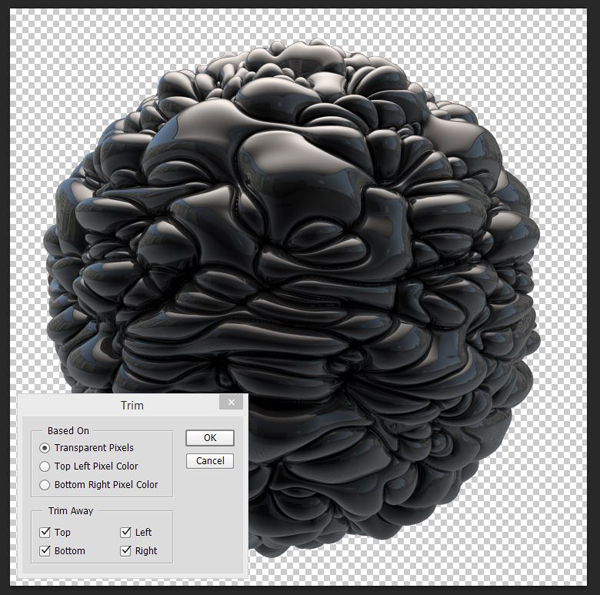
You can tidy things up further by trimming out the transparent pixels (Image > Trim).
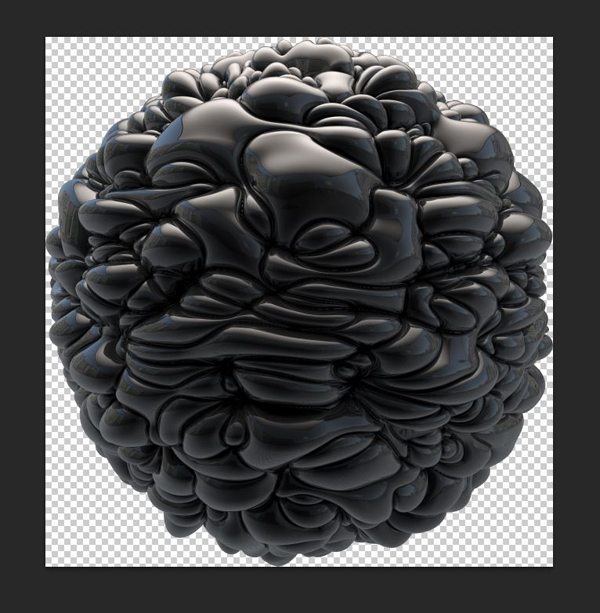
From there, simply save your changes, regardless of the warnings Photoshop will throw at you for saving a .tif file with layers, and head back to our poster. We now have an asset with a transparent background.
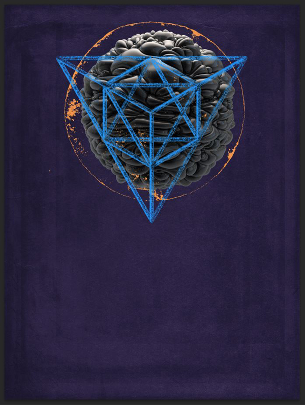
You can turn off the polygon and circle layers for the next few steps. Add a clipped solid color adjustment layer above your surface asset. Make sure its color is our bright blue (#199cff).
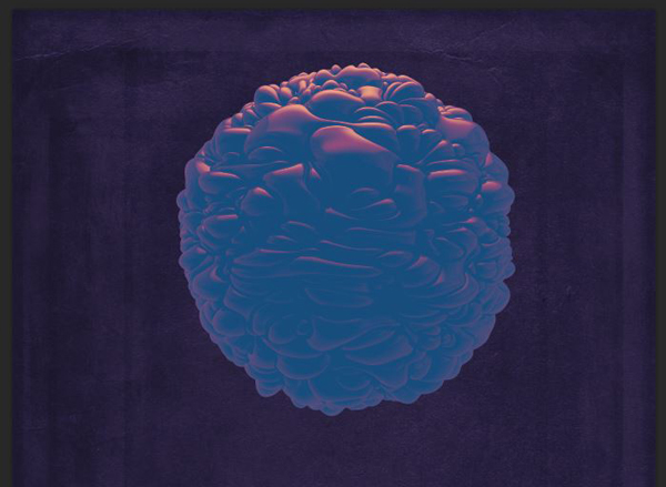
Change its blending mode to Difference @ 50% opacity. This gives the surface asset a rather alien feel.
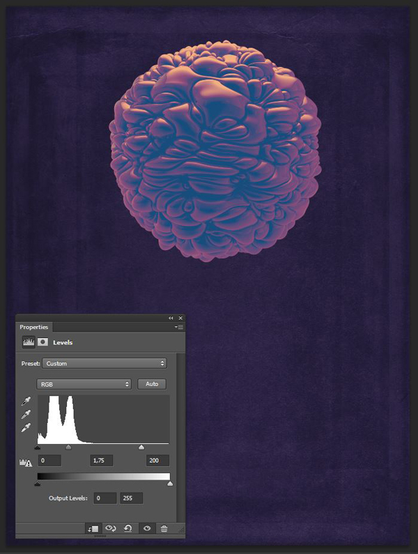
The result is interesting, but not defined enough at this point. We’ll use a clipped levels adjustment layer, placed below the solid color layer, to tweak the contrast of the surface piece, and in turn, how the color layer interacts with it.
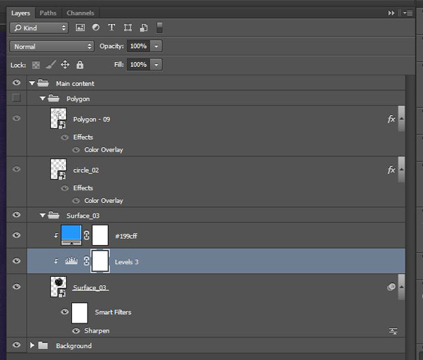
Finally, we’re going to lower the opacity of the surface asset to 50%, or else it’ll be overpowering both the polygon and the circle.
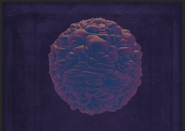
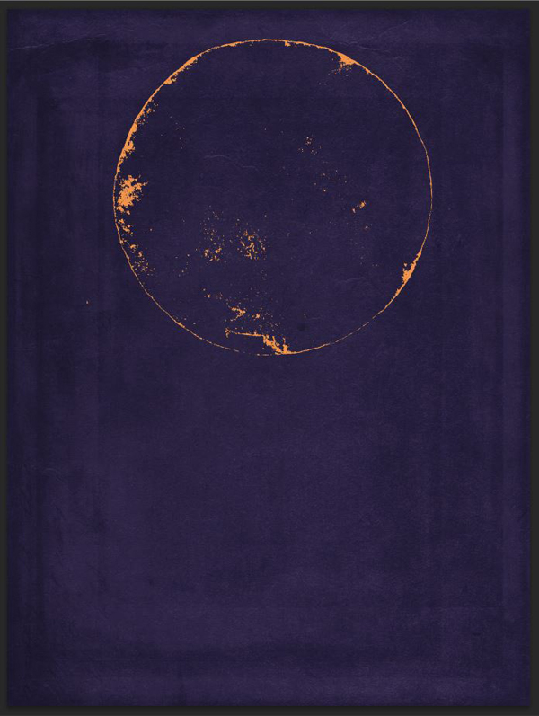
And here’s the result with the polygon and circle layers turned back on.
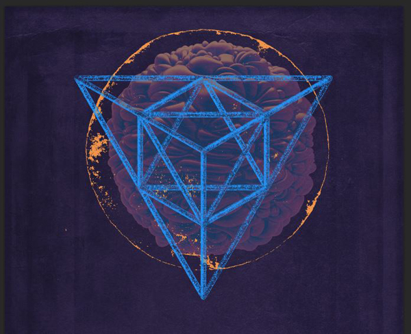
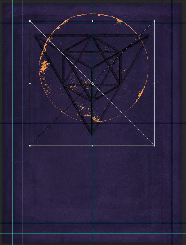
It’s neat, but we can tighten things up further: use a layer mask to hide the areas of the circle that go behind the polygon, as if it were solid.
Now that our visual element is locked in place, we can move on to type!
STEP 4: TYPE
The type elements to include in the poster are:
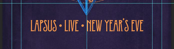
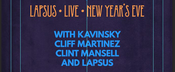
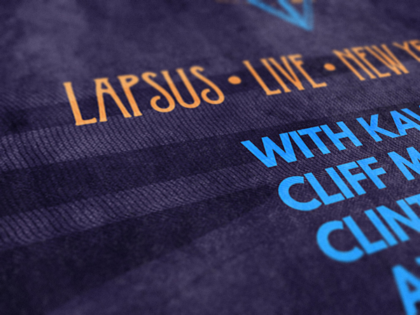
- Main title: LAPSUS • LIVE • NEW YEAR’S EVE
- A full list of the performers:
- Kavinsky
- Cliff Martinez
- Clint Mansell
- Lapsus
- Miscellaneous information:
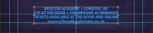
- Location: BRIXTON ACADEMY • LONDON, UK
- Ticket price, event detail: £10 AT THE DOOR • CHAMPAGNE AT MIDNIGHT
- Ticket details: TICKETS AVAILABLE AT THE DOOR AND ONLINE
- Ticket purchase point (and real site of the Brixton Academy): www.o2academybrixton.co.uk
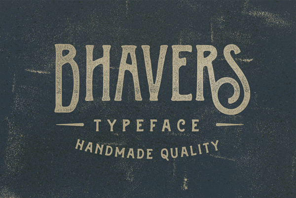
We’re going to use Bhaver for the main title element. It contrasts just enough with the vibe we’re going for that it’ll be standing out rather nicely.
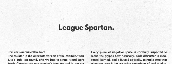
For the rest of the copy, we’ll use League Spartan Bold. It’s a nice, free, and open source typeface, in the direct lineage of Futura. It’s edited by The League of Movable Type, and you can download it on its dedicated page.
Start by preparing your various text elements. The main title is set in Bhaver. It’s written in all caps, centered, without any fancy open type swashes, it’s colored in our orange (#f19542), and is 114 points tall.
The performer list is set in League Spartan Bold. It’s also written in all caps, kerning is set to optical, centered, it’s colored in our bright blue (#199cff), and is 60 points tall.
Finally, the additional information is also League Spartan Bold, in all caps (except for the web address), kerning is set to optical, centered, it’s colored in our bright blue (#199cff), but is 60 points tall.
From there, it’s time to space these properly. I’ve started to align the bottom of the last bit of miscellaneous information to my bottom horizontal guide.
I followed by optically spacing the main title and the performer list in relation to each other, and to the miscellaneous text block.
Now that the type placement is over, we can organize the type layers better. I gave them their own layer group.
Now that the type step is wrapped up, we can move on to global textures!
STEP 5: TEXTURES
The global texturing step is the one that ties our disparate elements together, by applying speckles in a meaningful manner over multiple elements.
We’ll mostly use textures from the 2 Lil’ Owls sets (Mercury glass, Awry), but also one of Rule by Art’s analog texture, and one of Vintage Design Co.’s ink texture that came with PosterPress.
Start by bringing 2LO Mercury Glass 2.jpg into your piece. This texture will bring somewhat of a vignette effect; Make it big enough so it covers your whole piece.
Blending mode: Soft light @ 35% opacity.
The next texture is 2LO Awry 21.jpg. It reinforces the frame effect in the piece.
Place it so it actually fits the canvas (effectively distorting it).
Blending mode: Soft light @ 75% opacity.
The following texture is 2LO Mercury Glass 20.jpg. It brings some ink wash-like effects to the poster.
Blending mode: Soft light @ 25% opacity.
The next to last texture is Rule by Art’s black and white analog #2. This adds to the “sci-fi/tech” vibe of the piece.
Place it in the piece, so it covers it totally.
Blending mode: Soft light @ 35% opacity.
Finally, the last texture is Ink3.png (\all-in-one-vintage-design-co\PosterPress\PosterPress – Textures\Ink).
Place it in the canvas (rotate it 180°, and align the bottom edge of the texture with the bottom of the poster.
Use a clipped curve adjustment layer, set to the Negative preset. This will make the ink white instead of black.
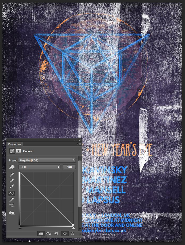
Finally, change the texture’s blending mode to Screen @ 10% opacity.
From there, it’s time to group the texture layers together.
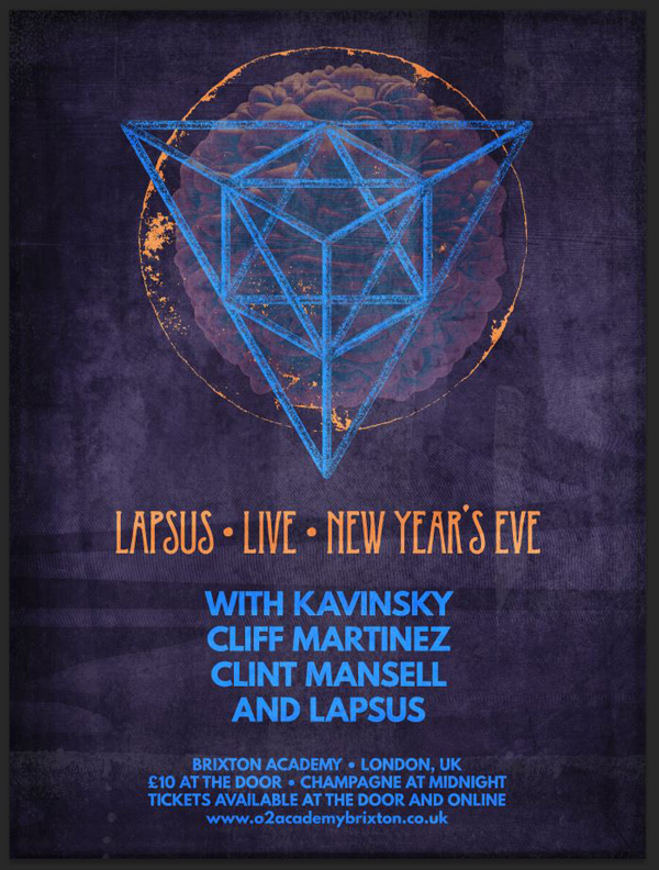
STEP 6: FINISHING TOUCHES
The finishing touch is a halftone effect. Start by creating a merged copy of all visible layers (CTRL/CMD+SHIFT+ALT/OPTION+E). I renamed that layer Halftones.
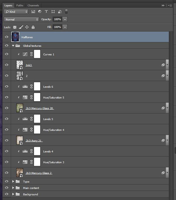
Transform that layer into a smart object (Filter > Convert for smart filters on Photoshop CC).
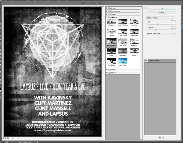
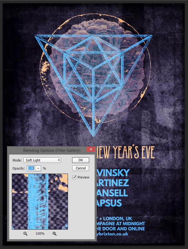
We’ll apply a halftone effect from the Filter gallery (Filters > Filter gallery > Sketch > Halftone pattern). I’m using values of 5 for the dot size, and 15 for contrast.
Next, we need to change the effect’s blending mode. Double-click on this symbol in the layer palette.
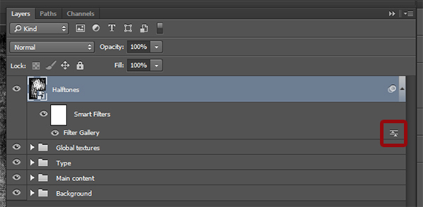
Change the blending mode to Soft light @ 100% opacity.
Finally, change the layer’s blending mode to Lighter color @ 25% opacity.
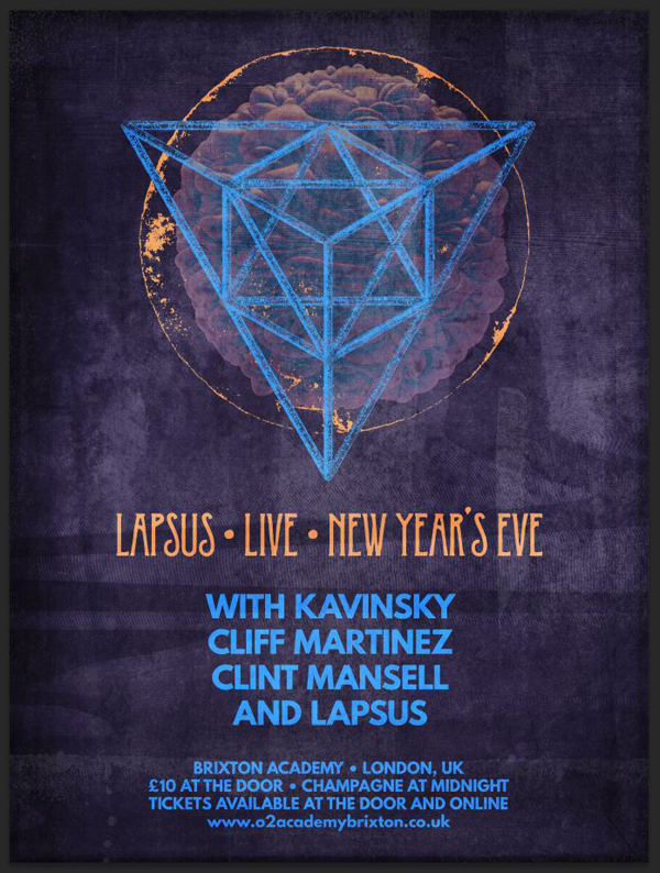
And we’ve got ourselves a poster!
CONCLUDING THOUGHTS
I hope you had as much fun going through the tutorial as I had writing it. If you’ve grabbed The Incredible All in One Design Bundle, I hope you enjoy your new resources.
If you haven’t yet, go check out the bundle’s collection of assets. The diversity of the resource is fantastic, and their uses are many. You can grab all of these best-selling resources for the next few days only, for 94% off the regular price.
Finally, I’d love to see your tutorial outcomes! Please share them on the Design Cuts Facebook page! If you have questions or concerns, don’t hesitate to get in touch! Use the comments below, the Design Cuts Facebook page, or tweet at us.
That’s it for today. Until next time, cheers!

Hi! I just completed the tutorial & it came out great, but my file size is almost 2GB and won’t even save now. Did anyone else come across this problem? I tried unembedding all the images & cropping anything outside the artboard but that didn’t seem to do much.
Hey Michelle,
Thanks for the comment on this one and I am so sorry to hear you are having an issue saving your tutorial. I have just popped you an email to try and get some more info about this and help you out :)
super job
Thank you for your kind words!
Thank you very much, Djib!
Beautiful poster!
Thank you very much, Lia. :)
Thank you for your kind words!