WHAT WE’RE CREATING:
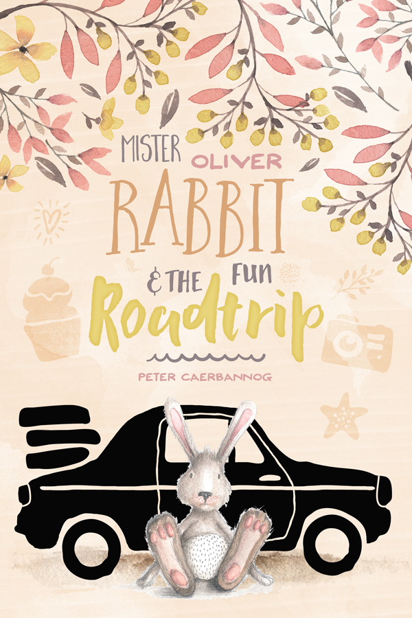
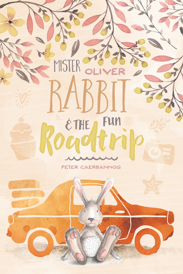
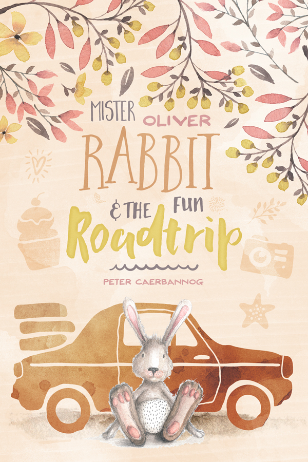
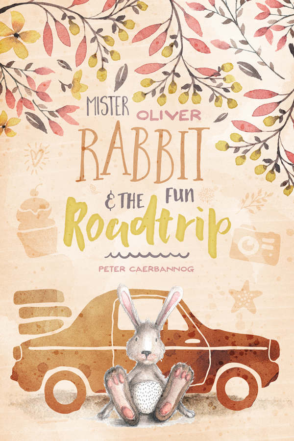
Hello Design Cutters! Simon here. For the second tutorial this week, we are going to use the Inspirational Artistic Design Bundle to craft a cover for a children’s book called “Mister Oliver Rabbit and the fun roadtrip.”
This tutorial covers a ton of useful techniques, from how to work with creative typefaces (there are some great tips for adjusting baselines) to applying watercolour effects, and artistic details to your final piece.
TECHNICAL NOTES
This tutorial’s end result will be accomplished using mostly Photoshop.
Do note however that my workflow will also incorporate Illustrator, even though it’ll be to copy and paste over vector assets into our Photoshop file. You should be able to do without if you don’t have it. I prefer to have access to real vector elements through smart objects, rather than deal with shape layers.
We will also use plenty of textures. Let’s have a quick reminder of our usual rules and processes with them.
- Don’t know what a clipped layer is? Glad you asked! This means that the layer is only visible/applies to the layer directly below it. You can very quickly do this by holding ALT down on your keyboard and clicking between the two layers. Here’s a quick demonstration.
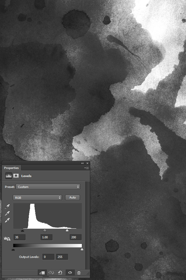
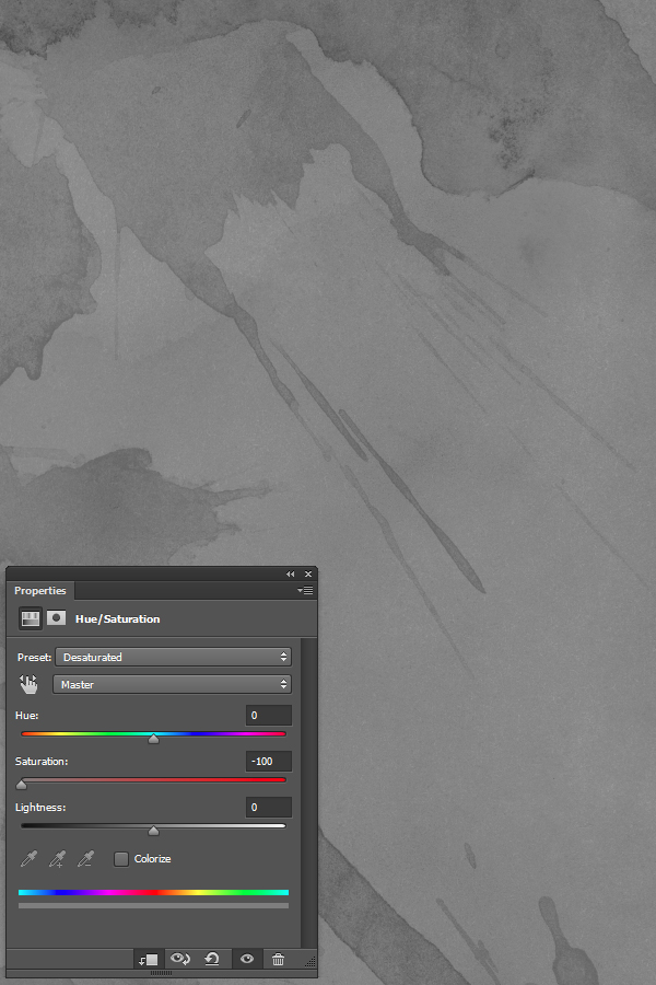
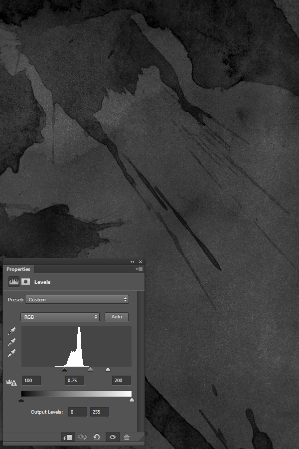
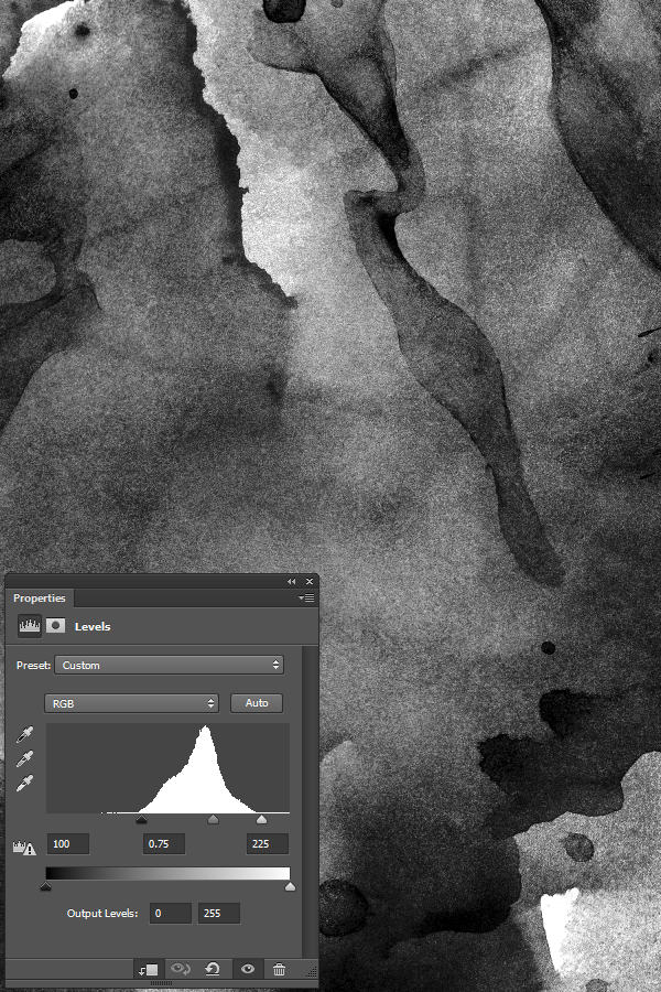
- Every time we’ll work with textures, we’ll follow this simple process: place as smart object, sharpen1, desaturate, enhance contrast with levels, and modify the blending mode.
- Placing the textures as smart objects, and using adjustment layers to tweak them, allows us to stick to a non-destructive workflow. We’ve explored in depth the numerous pros and few cons of such a workflow in this past tutorial: “How to Use Textures The Right Way.”
Notes: 1 – accessed through the Filter > Sharpen > Sharpen menu.
Now that this is out of the way, let’s talk concept!
STEP ZERO: THE STORY BEHIND THE PIECE
The visual puzzle in the piece
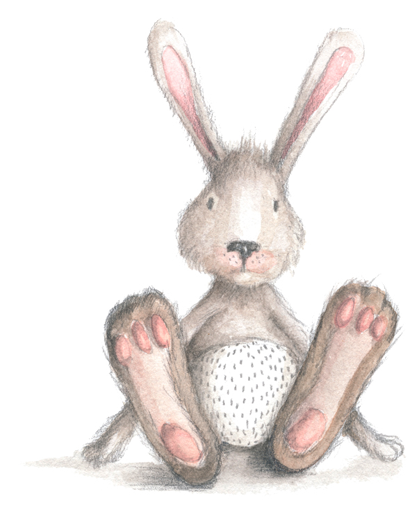
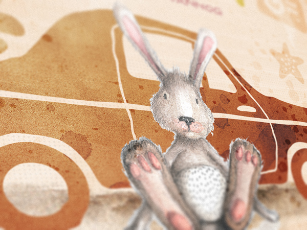
The fictional book cover came to be after seeing Lisa Glanz’ bunny, from her Magical watercolor graphics volume 02. The little guy is so cute.
From there, while browsing the bundle’s content, the various other visual goodies, floral elements, and typefaces came into place like the pieces of a puzzle.
The names used
The names used in the piece are all references to famous rabbits. I used two lists to put them together. One is from Listverse, and lists “the top 10 famous rabbits,” while the second one is from the House Rabbit Society, and offers a list of famous rabbits through history.
The rabbit’s name, Oliver, comes from another list of potential names for pet rabbits. The roadtrip idea comes from the car asset included with Nicky Laatz’ vectors. Peter comes Beatrix Potter’s Peter Rabbit stories. Finally, Caerbannog is the name of the killer rabbit that’s part of the Monthy Python and the Holy Grail movie.
“Peter Rabbit: Possibly the world’s only vegetable addict. So strong are Peter’s desires he is willing to risk life and limb to get into Farmer McGregor’s garden. In his final attempt at thievery, Peter loses his clothes. Mr McGregor uses them on a fancy new scarecrow and Peter has to go home nude. He gets a bit of a scolding and ends up with a cold. Peter makes appearances in a few more Beatrix Potter books, but is never again a title character.”
“The Killer Rabbit of Caerbannog, the guardian of the Legendary Black Beast of Aaaaarrrrrggggghhhhh. When the Knights of the Round Table are led to his lair by Tim the Enchanter, the Killer Rabbit of Caerbannog fools the knights with his non-intimidating appearance. He pounces and kills both Ector and Gawain before he is slain with The Holy Hand Grenade of Antioch.”
STEP ONE: DOCUMENT SETUP
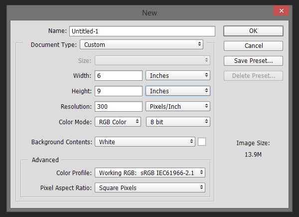
As said before, we’ll work in Photoshop for 99% of our piece. Since this is a book cover, we’ll use a 6″x9″ canvas, which is a popular book cover size here in the USA. It’s a 2:3 ratio, as opposed to the 3:4 ratio of our typical 18″x24″ canvases. Remember that a 6″x9″ document won’t account for bleeds, trimming, and other production constrains. Always check with your printer what you should take into account when preparing your documents.
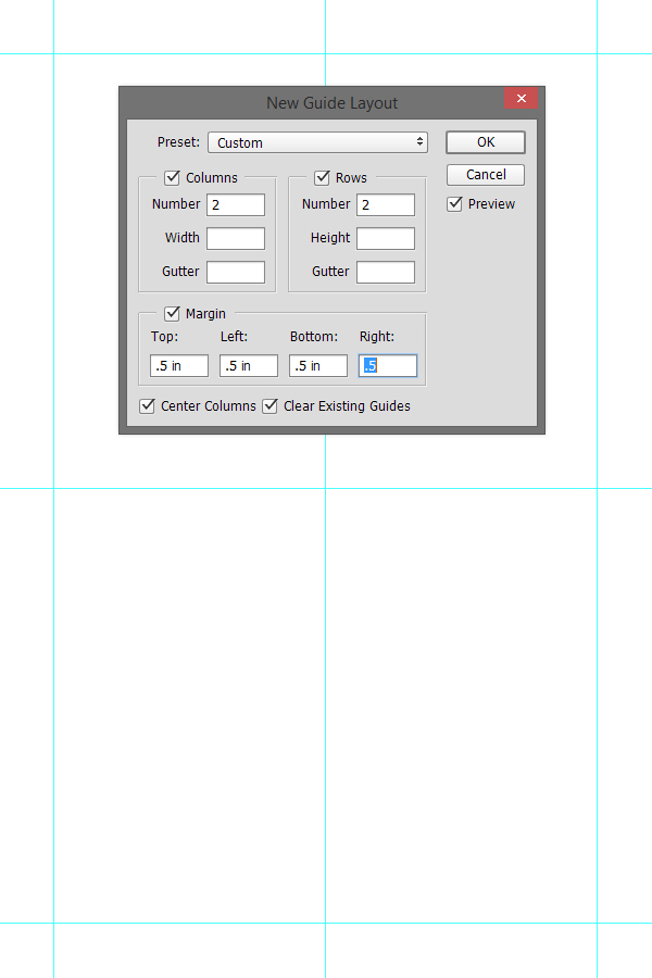
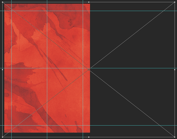
The next step is to add a few guides. We’ll use them to mark the center of our canvas, as well as a 0.5″ zone around its edges. I’m using Photoshop CC’s New Guide Layout feature to generate these rapidly.
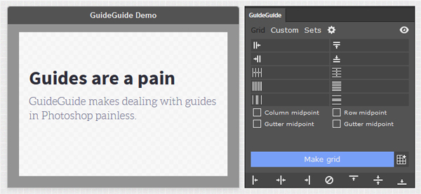
Protip: if you have an older version of Photoshop, a good alternative is a Photoshop extension called GuideGuide.
STEP TWO: ASSEMBLING THE MAIN ELEMENTS OF OUR LAYOUT
We are now going to assemble our layout’s pieces like a puzzle. Don’t hesitate to sharpen the various raster elements as you place them, as this will ensure they stay crisp, even with plenty of textures and filters applied to them (Filter > Sharpen > Sharpen).
Visual elements
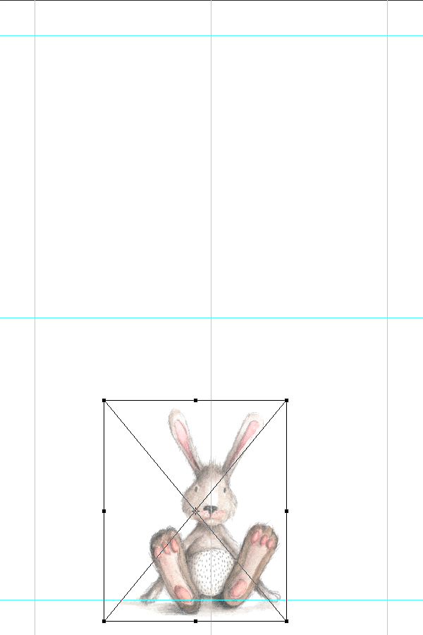
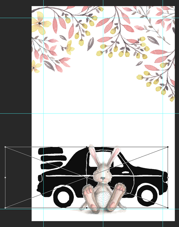
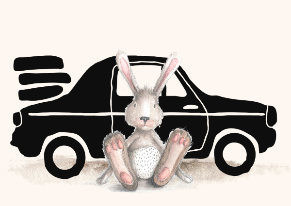
The rabbit is the star of our cover. Let’s start with him. You can find it in Lisa Glanz’ Magical Watercolor volume 02 set (\lisa-glanz\Magical-Watercolor-Vol2\ANIMALS\Bunny.png).
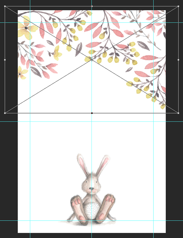
We are going to place it in our canvas as a smart object, sized down 40%, and sitting on the bottom edge guide (X: 2.77″, and Y: 7.23″). These exact placement coordinates for its center point might look funny, but they allow us to center the bunny’s face with the vertical center of the cover.
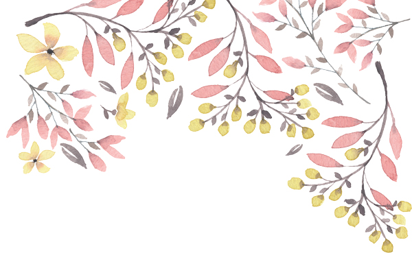
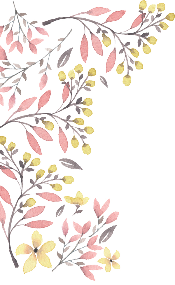
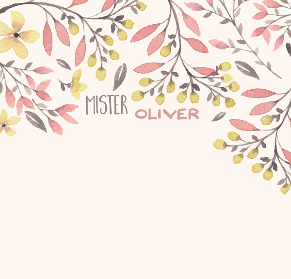
Next, we are going to add one Lisa’s beautiful floral border to the top of the piece. The one we’ll use is Border_pink.png, and you can find it in the Magical Watercolor volume 01 (\lisa-glanz\Magical-Watercolor-Vol1\FLORAL\WREATHS-BOUQUETS-BORDERS).
The border is rotated 90° clockwise, placed at X: 3″, and Y: 2″, and sized down to 70%.
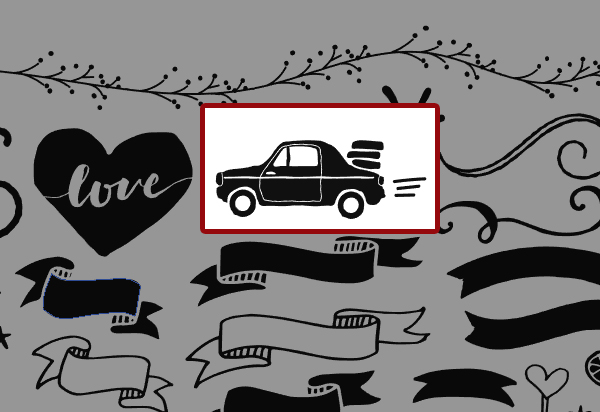
Let’s add the car behind our rabbit. As mentioned before, it comes from Nicky Laatz’ mammoth watercolor set (\nicky-laatz\Mammoth-Watercolour-Illustrator\Vectors\THESHAPES_Cs4.ai). You’ll find it in the top right corner of the file.
The car is flipped horizontally (so its front is oriented towards the right), scaled up to 350%, and placed at X: 2.3″, and Y: 7.17″.
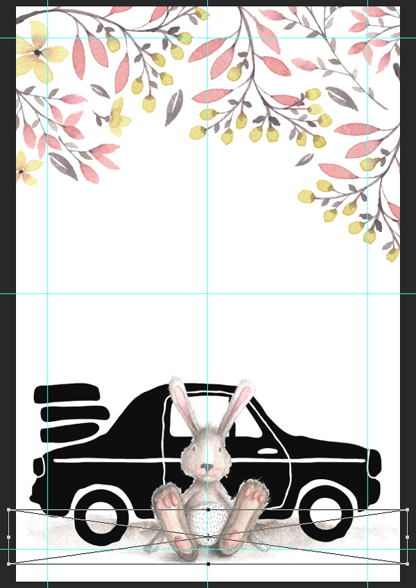
The next asset we need to put in place is a shadow for the car. We’ll use the shadow Lisa Glantz prepared for the ladybugs (\lisa-glanz\Magical-Watercolor-Vol2\ANIMALS\Shadow_for_ladybug.png).
The shadow is placed scaled up to 175%, and placed at X: 3″, and Y: 8.3″. Just like the bunny and the flower, it’s best to sharpen it some (Filter > Sharpen > Sharpen).
A splash of color before moving forward
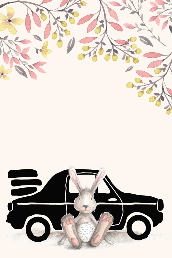
Let’s add the background color to the piece now. It’ll make gaging color contrasts easier as the piece progresses. The color we’ll use is #fdf7f0. It’s a very desaturated orange.
With the color in place, we are going to change the blending mode of our flower border to multiply @ 100% opacity. It gives it a stronger presence, without being overwhelming.
Similarly, we are going to change the blending mode of the shadow to linear burn @ 100% opacity.
STEP THREE: TYPE STUFF
Putting the type in place
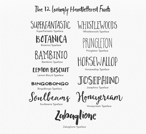
The type elements for the cover are made using the 12 typefaces hidden within Nicky Laatz’ Mammoth Watercolor set.
The floral border’s outline is ideal to fit a title block made of multiple typefaces. We’ll use the variety in the ones available to us at our advantage.
The full title reads “Mister Oliver Rabbit & the fun roadtrip.”
“Mister” is written in HorseWallop Bold, that is 36 points tall, and with a kerning set to metrics. It is housed in the opening at the top left of the border. Its color is sampled from the gray leaf right above it (#908387). Accurate placement at X: 2.19″, and Y: 2.15″.
“Oliver” is written in BingoBongo Regular, that is 24 points tall, and with kerning set to metrics. It’s located in the opening at the top right of the border. Its color is sampled from the pink leaves in the border (#d89f9f). Exact placement at X: 3.45″, and Y: 2.37″.
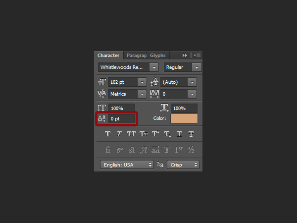
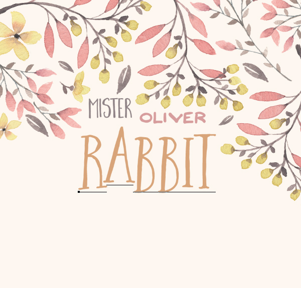
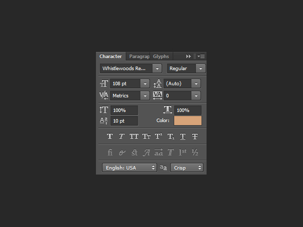
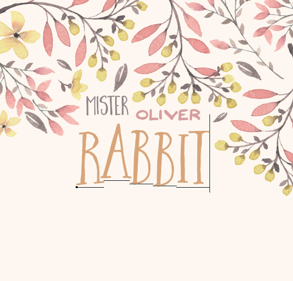
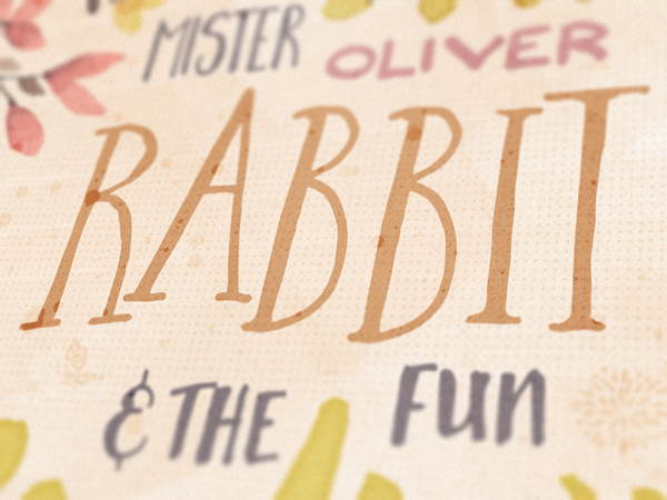
“Rabbit” is a bit more complicated to put in place. We’ll be using baseline shift tweaks (if a letter should be sitting higher or lower than the normal baseline for the typeface) to make the word look more interesting. The baseline shift can be adjusted through the character panel.
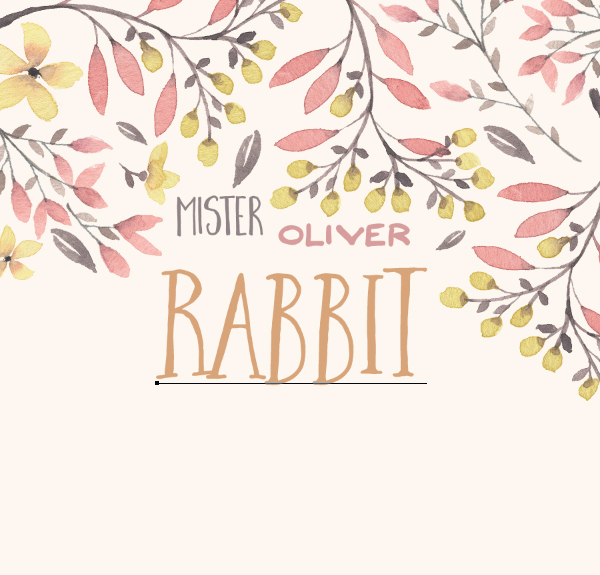
Let’s start by writing it without baseline shifts. It’s written in Whistlewoods Regular, that’s 108 points tall, and with kerning set to metrics. Its color is a desaturated orange, sampled from the darker area of one of the yellow flowers (#d9a577).
We’ll use the baseline shifts (and type size changes) to make the word look more hand-written, but also to occupy the line below “Mister Oliver” better.
The “A” should be sized 108 points tall, and given a baseline shift of 10 points.
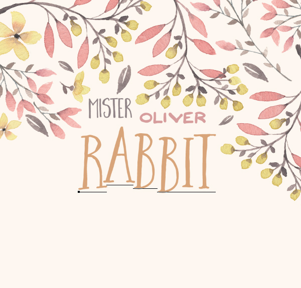
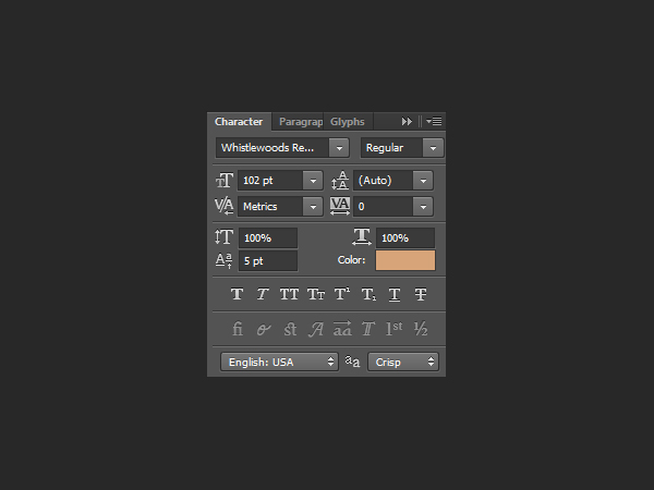
The first “B” is left at 102 points tall, but given a shift of 5 points.
Finally, the second “B” receives a basleine shift of 2 points.
Finally, its exact placement is at X: 2.91″, and Y: 3.07″.
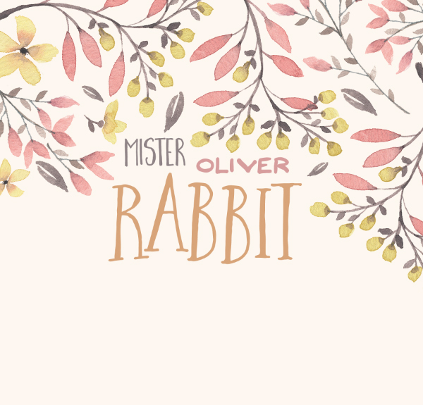
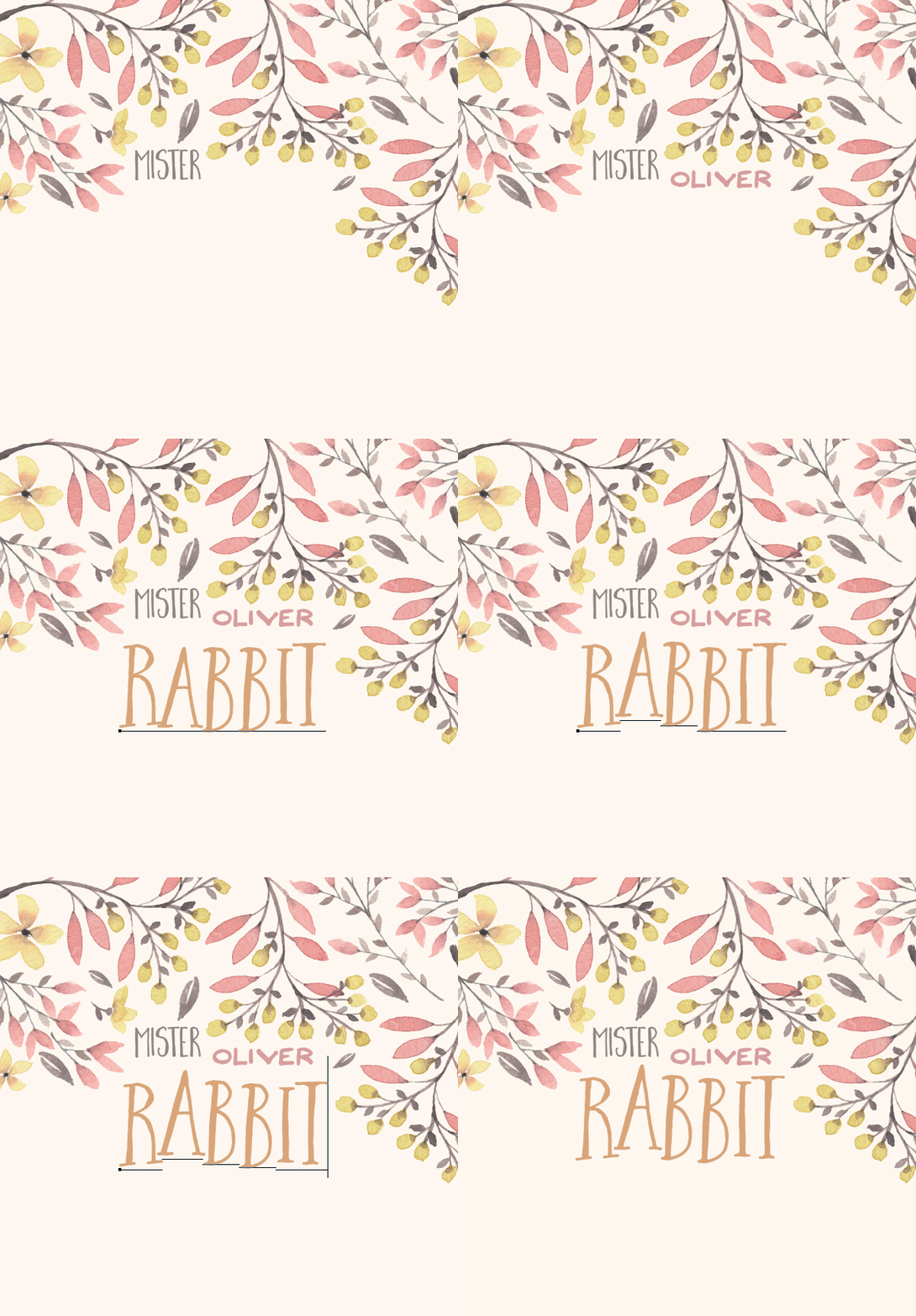
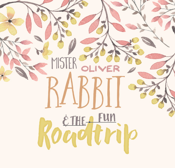
Here’s a gif showing the evolution of the title block so far, from placing the words to tweaking the individual letters within “rabbit.”
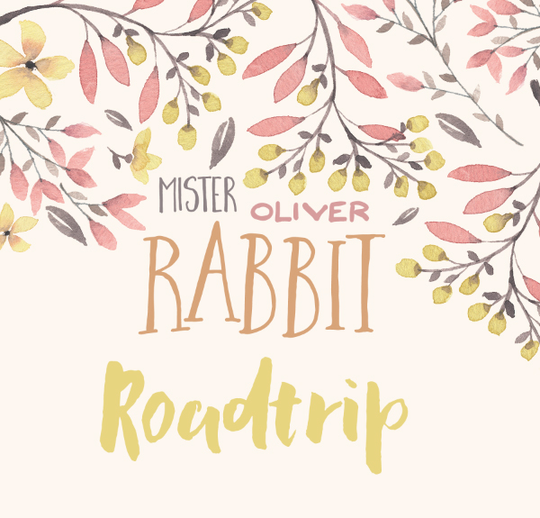
Next, we’ll take care of the word “Roadtrip.” It’s written in yellow Zabaglione Regular (#e9d57b, sampled from the lighter part of the yellow flowers), that’s 132 points tall.
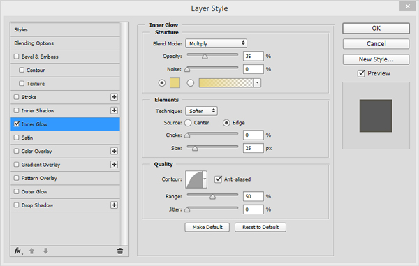
Its particularity is to use the “inner glow trick” to make it look darker on the edges. This is a quick way to make a type object more watercolor-like. We’ve first explored that trick in the watercolour holiday card tutorial.
Basically, it consists in adding an inner glow of the same color, set to multiply. Tweaking the opacity, choke, and size values affects the intensity of the effect.
The word’s final spot in the layout is at X: 3.01″, and Y: 4.55″.
The next piece of text is “& the fun.” It’s set in Lemon Biscuit Regular, that’s 30 points tall, colored in our warm gray (#908387), and with kerning set to metrics. Our goal is to make it fit on both sides of the tall “d” found in the word “roadtrip.” We’ll use a series of spaces to split the three words on each sides of the “d,” and baseline shift on “& the” to make it fit better in its allocated space.
Let’s start by writing out the text block.
From there, let’s add spaces between “the” and “fun” so the total amount of spaces is of 4.
Next step: give “& the” a -8 points baseline shift.
From there, we can assign the block to its final place within the layout: X: 3.01″, and Y: 4.06″.
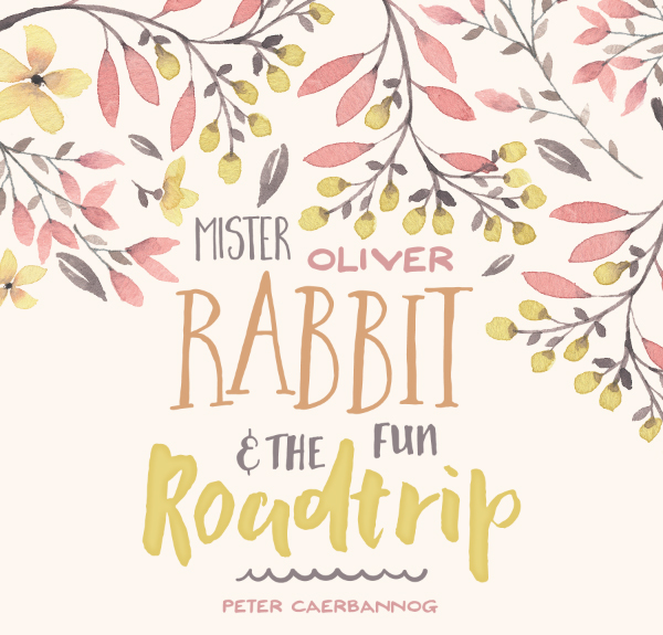
Last text element to put in place: the author’s name, “Peter Caerbannog.” It’s written in Bingobongo Regular, sized at 12 points tall, colored in the same soft pink as “Oliver” (#d89f9f), and with its kerning set to metrics. It’s located at X: 2.99″, and Y: 5.50″.
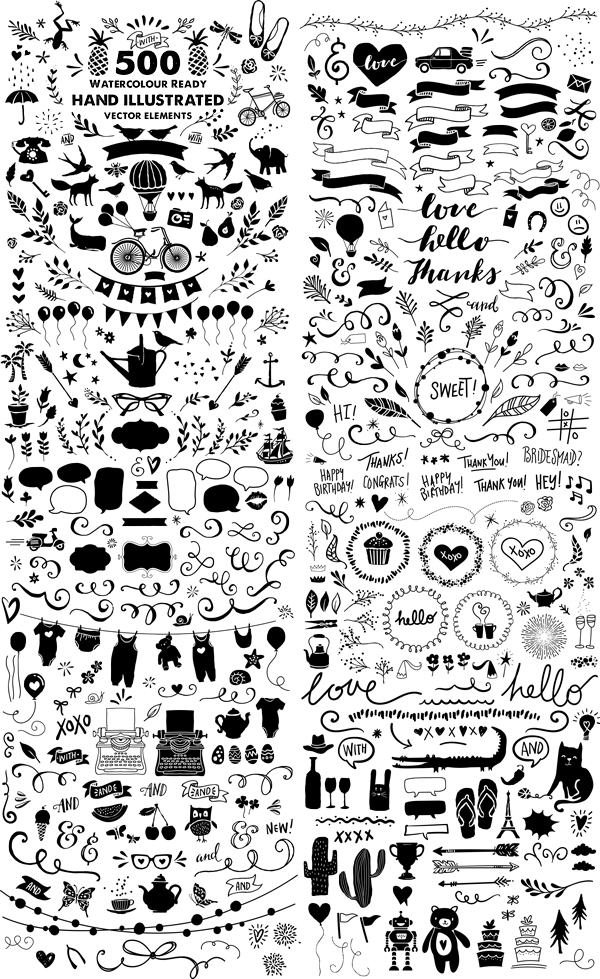
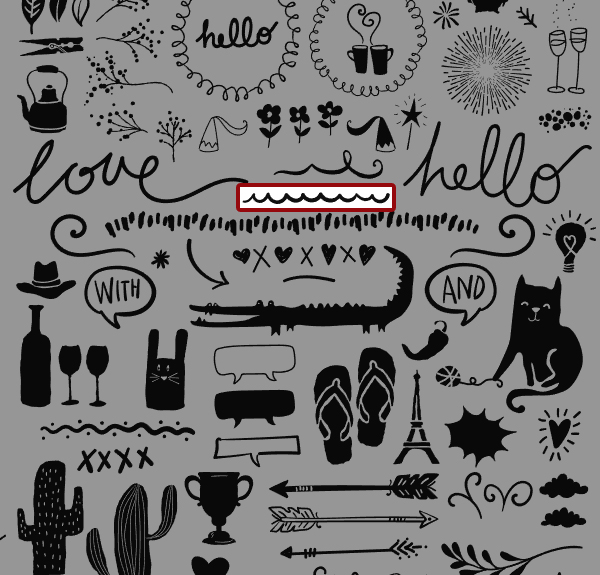
The last element to add to the title block is a little divider, between the actual title and the author name. We’ll use a wavy line element from Nicky Laatz’ mammoth watercolor set (\nicky-laatz\Mammoth-Watercolour-Illustrator\Vectors\THESHAPES_Cs4.ai). It’s in the lower right corner of the file.
It’s colored in our soft gray (#908387), scaled down to 85% of its original size, and located at X: 3″, and Y: 5.21″.
With all of these elements, we have completed the construction of the layout itself.
It’s now time to add additional smaller graphic elements, to organize our layer stack, and to add some textures to the piece.
STEP FOUR: ADDITIONAL GOODIES
We are going to add more little visual assets, drawn from Nicky Laatz’ vectors. These elements will add some depth to the final piece, and are loosely related to the roadtrip/vacation idea. They will live in the space available on each side of the title block. We’ll use the elements listed below:
- The starfish
- One of the branches
- The heart with a burst around it
- The butterfly
- The flower element
- The cupcake
- And the camera
The startfish goes to X: 5.01″, and Y: 6.06″, and is scaled up to 125%.
The branch goes to X: 5.20″, and Y: 4.11″, and is scaled down to 75%.
The heart goes to X: 0.75″, and Y: 3.24″, and is scaled at 100% of its original size.
The butterfly goes to X: 1.93″, and Y: 3.86″, and is scaled down to 35%.
The flower goes to X: 4.25″, and Y: 4″, and is scaled down to 50%.
The cupcake goes to X: 0.75″, and Y: 4.50″, and is scaled up to 200%.
And the camera goes to X: 5.20″, and Y: 5″, and is scaled up to 150%.
We can’t leave all of these black. We simply need to change their blending mode to overlay @ 100% opacity, and they’ll fade nicely in the background. The textures we’ll put in place later will make them blend in even better.
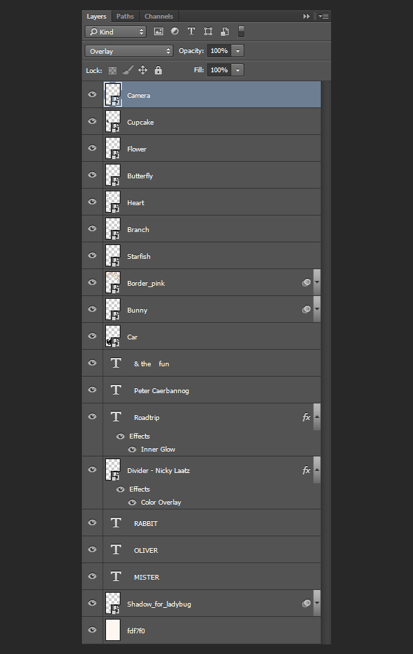
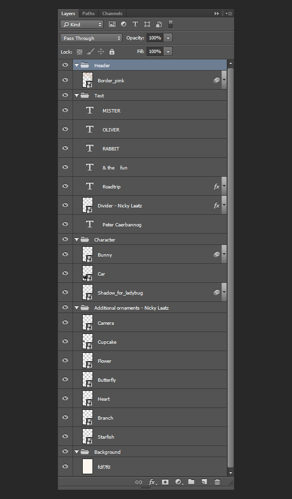
And with this, let’s have a look at the layer stack so far. It’s a real unorganized mess.
After grouping elements, and arranging their hierarchy, things are clearer. Text elements together, character related elements together, all the little vectors grouped together, and the background separated.
STEP FIVE: TEXTURES
It’s time to tie this piece together. To accomplish this, we are going to leverage the textures present in the bundle. Some will be applied only to a particular element, while most will be applied to the piece as a whole.
The background
After turning all the layer groups by the background off so we can what we’re doing, it’s time to give additional depth to the background of the piece.
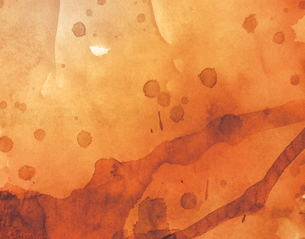
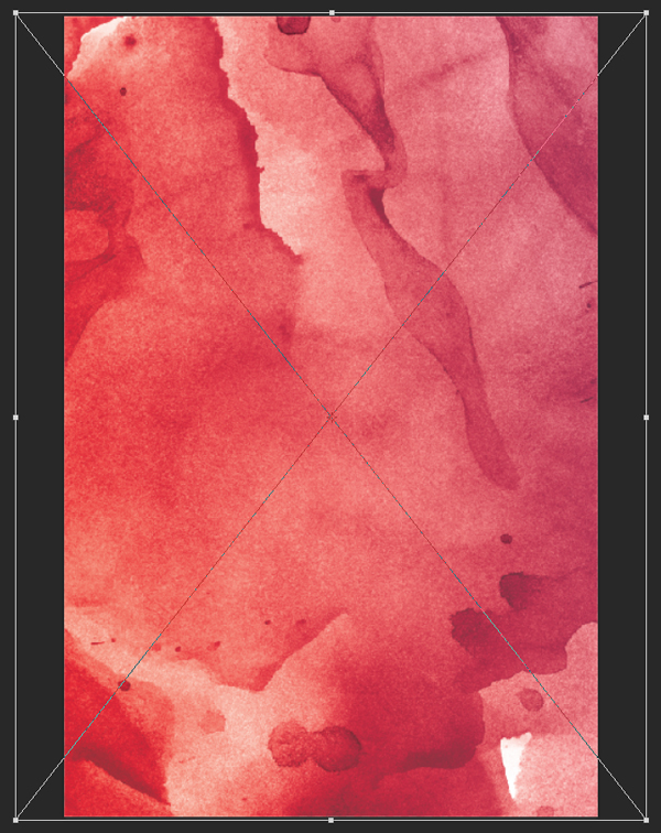
The first texture we’ll use is 2.jpg, from Design Spoon’s watercolor texture set (\design-spoon\Watercolor-Textures\2.jpg).
It’s placed centered in the frame, rotated of 90° clockwise, and it covers the whole piece.
Blending mode: soft light @ 50% opacity.
The next texture is 13.jpg, from the same set.
It’s placed so the top left corner of the texture covers most of the piece, barely scaled up.
Blending mode: soft light @ 50% opacity.
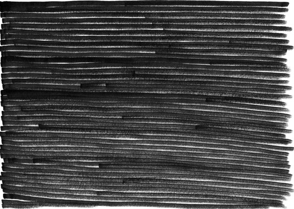
The next texture is from Design Spoon’s marker strokes set. It’s Marker-Pen-PNG (52).png (\design-spoon\131-Handmade-Marker-Pen-Strokes\PNG).
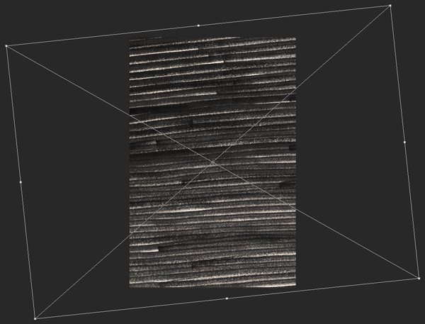
It’s placed centered in the frame, scaled up to 120% of its original size, and rotated of -6°.
Blending mode: soft light @ 50% opacity.
Here’s a look at the piece so far, with the textured background in place.
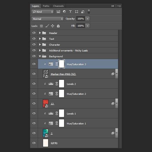
And here’s a look at the layers within the background layer group.
Adding texture and color to the car
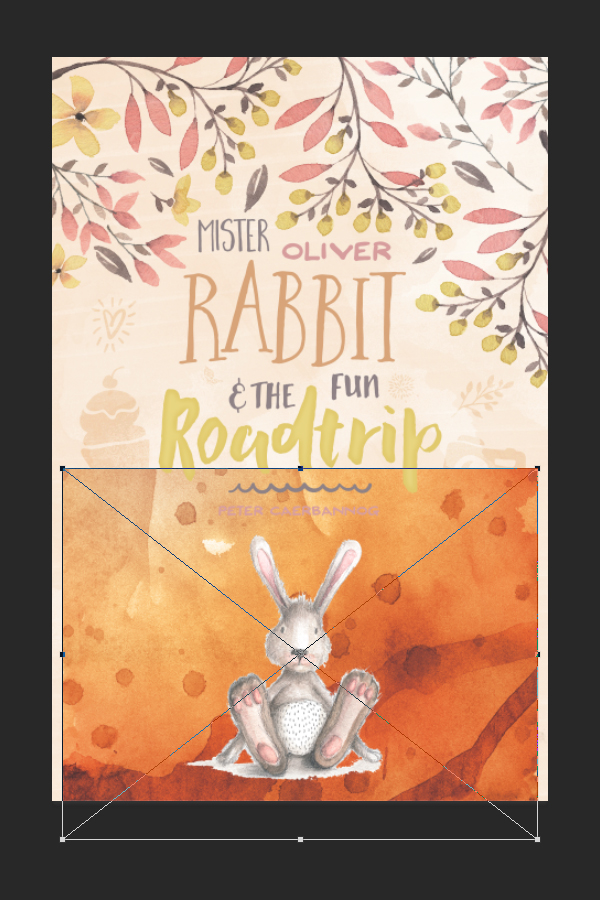
To add color and texture to the car at the same time, we are going to use another one of Design Spoon’s watercolor texture: 4.jpg.
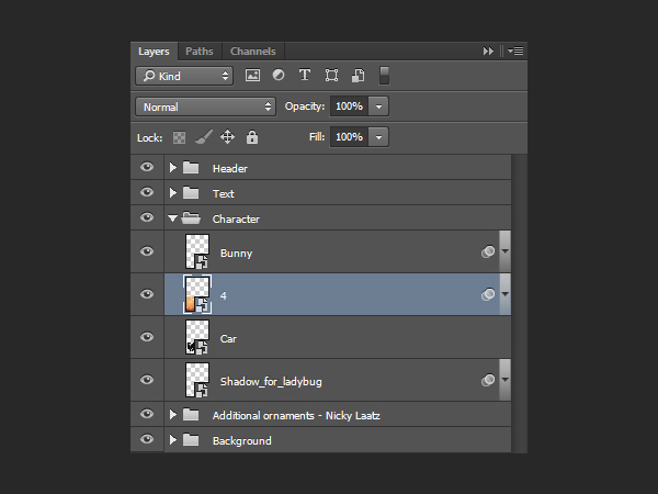
The texture is placed scaled down to 50% of its original size, at X: 3″, and Y: 7.22″. The layer should be right above the car smart object.
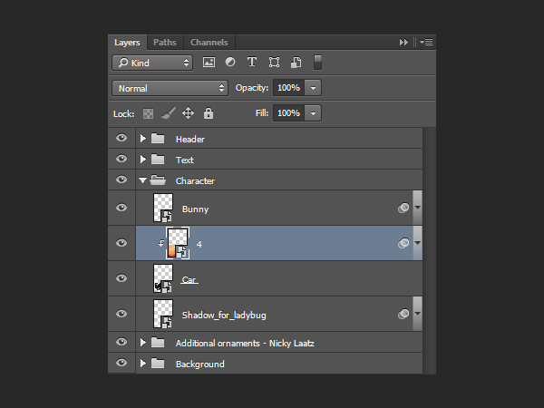
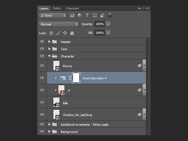
From there, we simply have to clip the texture to the car layer to restrict its visibility to the car shape.
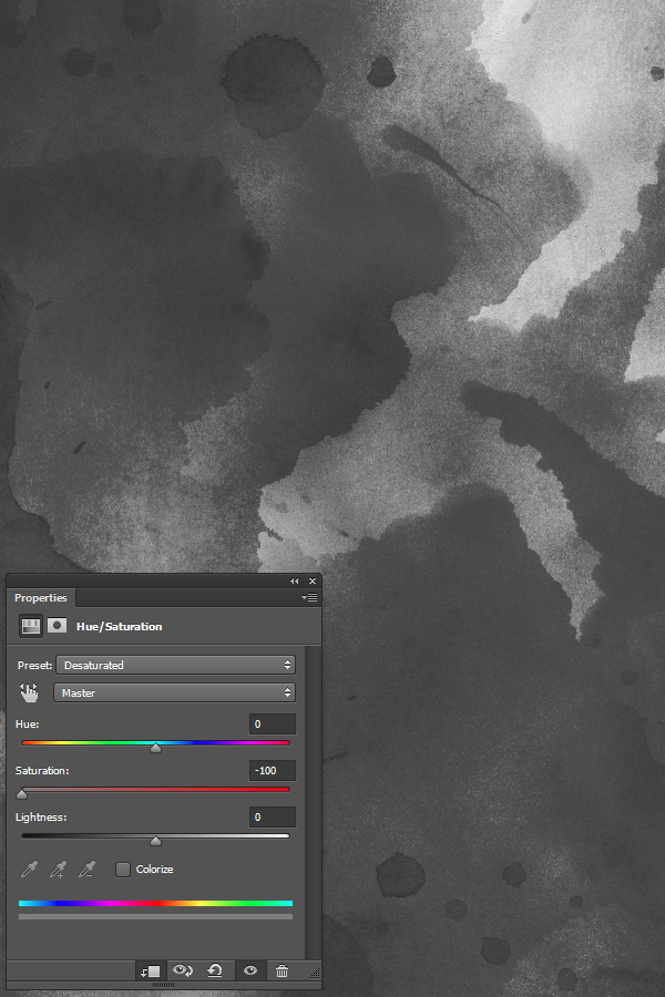
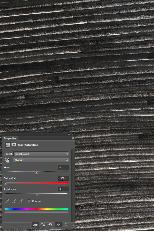
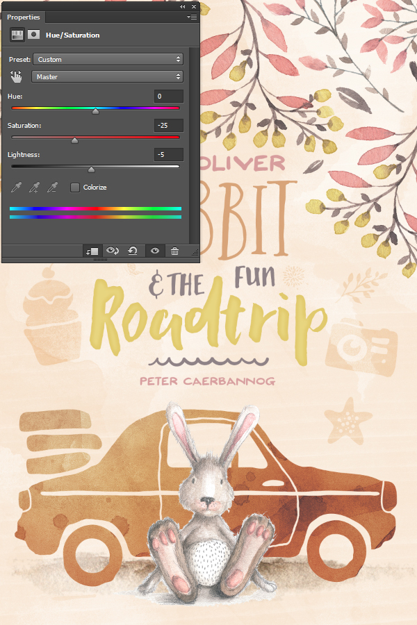
The texture is too bright, so we are going to use a clipped hue/saturation adjustment layer to soften things some.
Global textures
The next four textures are also the last ones we will apply to the piece. By sitting at the top of the layer stack, they will be applied to the piece as a whole, tying everything together visually.
The first of these textures is 6.jpg, from the watercolor set.
The texture is applied to the whole piece, and rotated clockwise 90°.
Blending mode: soft light @ 25% opacity.
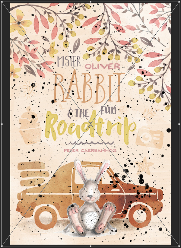
The next texture is a splatter texture from Design Spoon’s handcrafted grunge texture set, 21.png (\design-spoon\25-Handcrafted-Grunge-Textures\PNG-Files\21.png).
It should cover the complete canvas.
Blending mode: overlay @ 50% opacity.
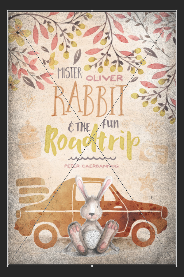
The next texture is called 2.png, can be found in the bonuses for Design Spoon’s grunge frame pack. It’ll help us to create a soft vignette effect (\design-spoon\40-Grunge-Frames\5-Bonus-Textures\PNG\2.png).
The texture has the same aspect ratio as our piece, so it fits (almost) perfectly with its edges.
Blending mode: overlay @ 100% opacity.
Finally, to complete the piece, we’ll use one of Design Spoon’s halftone texture, 15.png (\design-spoon\25-Halftones-Texture-Pack\PNG Files\15.png).
Just as before, it should cover the whole piece.
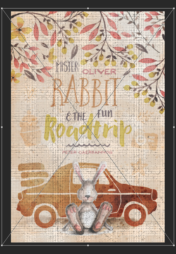
Blending mode: color burn @ 5% opacity.
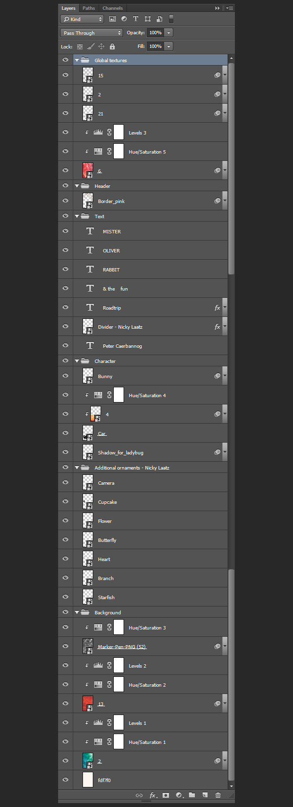
Here’s a final look at the layer stack:
WRAPPING THINGS UP
Phew, we’re done with the tutorial! Congratulations for making it until the end. I hope your outcome matches the goals you had set for yourself.
Any questions left about the processes, tips, and tricks explored in the tutorial? Any suggestions on how to improve things? Please share them in the comments below. The Design Geeks and myself will do our best to help out.
We’d love to see your tutorial outcomes! Please share them with us on the Design Cuts Facebook page. We’ll share the best ones with the whole community.
The inspirational artistic design bundle is still available for a few more days at 91% off its regular price! Don’t miss out if you haven’t purchased it yet.
If you’ve purchased the bundle, I hope you enjoy your new assets, and that this tutorial gave you a better sense of what you can accomplish with them.
That’s all for me this week folks! Have a wonderful weekend, and see you next time.
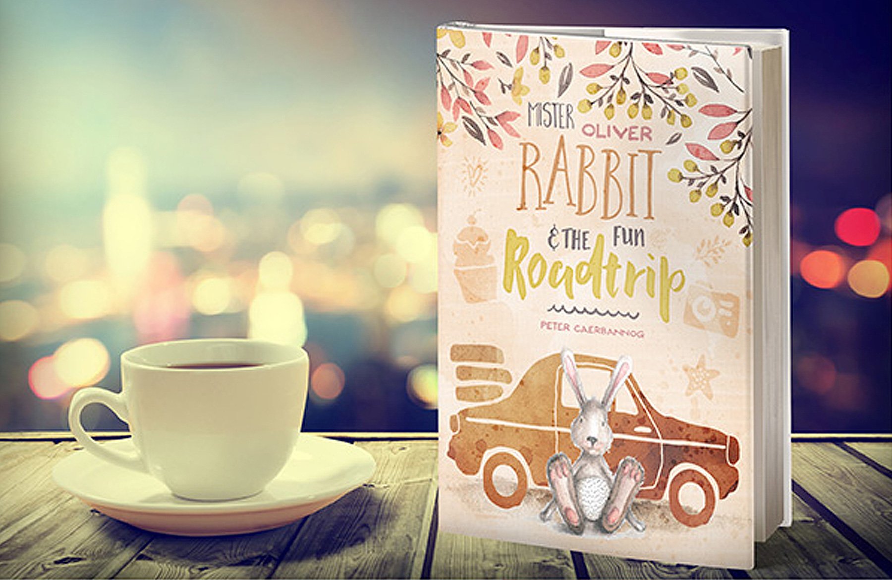

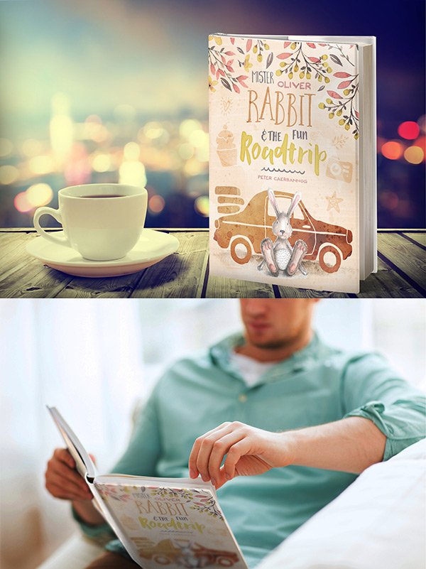






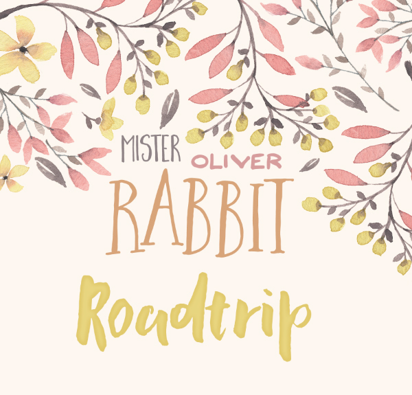
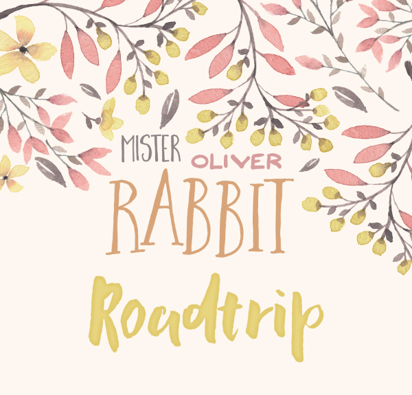




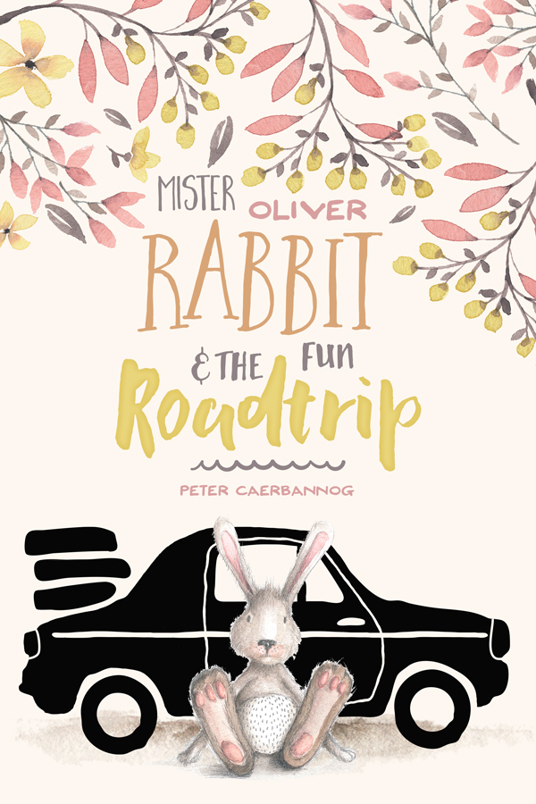







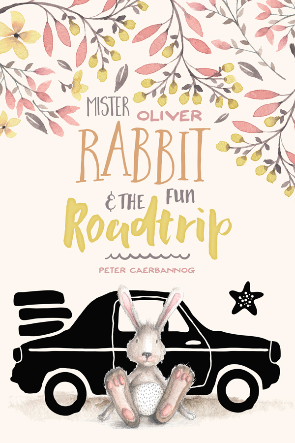
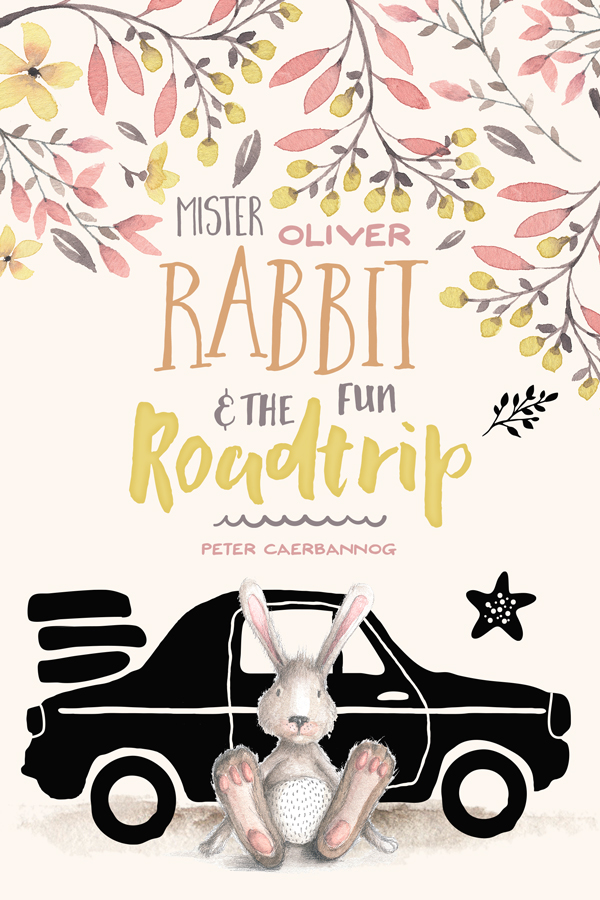

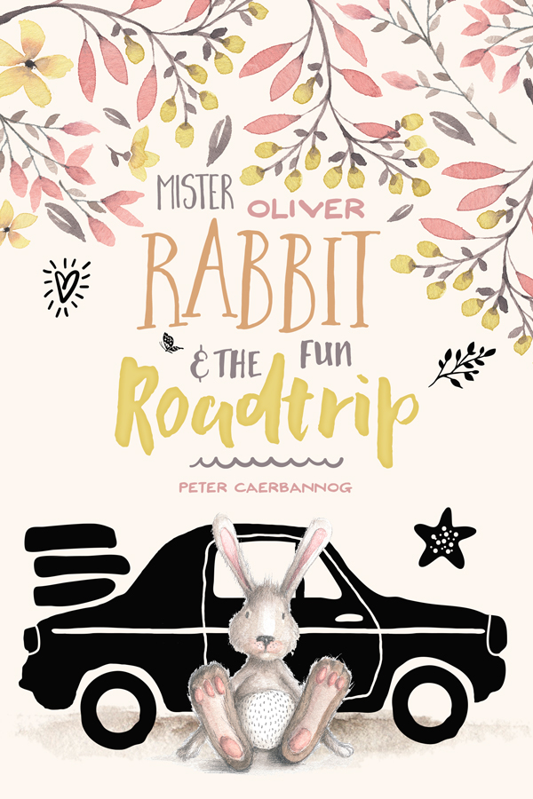
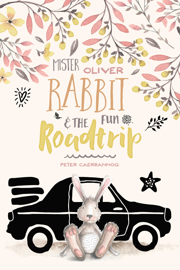
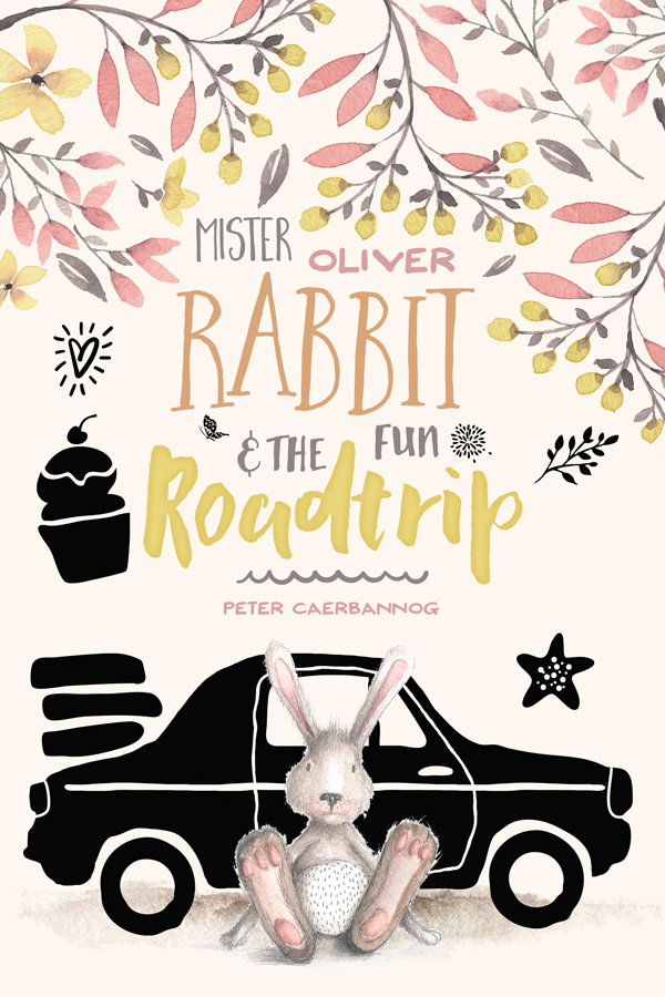
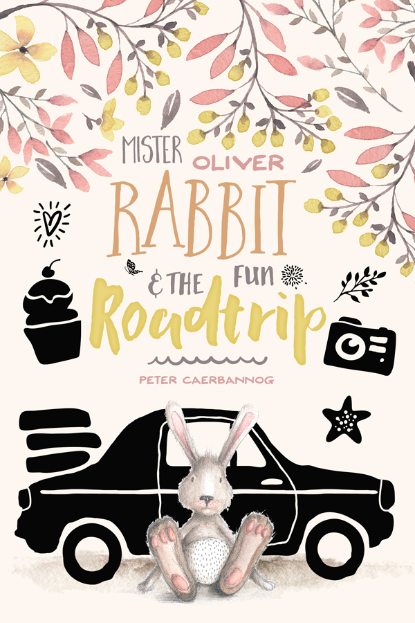
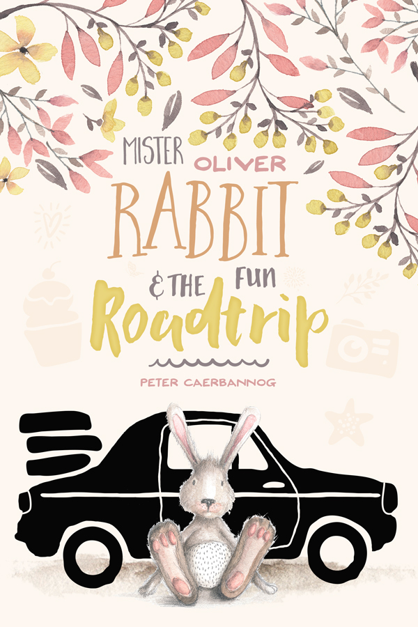












Thank you for your tutorial! So inspiring! After I made Mister Oliver cover I decided to make another one, so here’s the variation –
https://scontent.xx.fbcdn.net/hphotos-xtf1/v/t1.0-9/11259844_729264103844256_132027236431824899_n.jpg?oh=b711b79cc72e5fc6799dbbf0ebca73f2&oe=56793CD5
Not a big fan of textures so I guess it looks more simple, but I had a lot of fun making this. Thanx again, it’s very well explained tutorial and it’s really interesting!
Hey Olga,
I’m glad to hear you enjoyed the tutorial.
I actually just showed your design to the whole team and we all absolutely love it. Would you mind if we share it on our Facebook page?
Olga, that’s a sweet looking outcome. I really like how you made it your own. And sometimes, simpler is better ;-)
Do these tutorials stay up forever after the bundles are purchased?
Hey Kellie, yep indeed! Feel free to get back to them at a later point. You can browse the complete tutorial archive here: https://www.designcuts.com/deals-category/all/
I just worked my way through the tutorial – and thanks so much for such an adorable inspiration piece! I don’t have AI or PS; I work in PSE12. So, some of the steps don’t work exactly the same for me and I usually just make up what I can’t do with something else similar.
However, this time, a couple of things I thought should work didn’t at all and I’m not complaining – simply wondering why. In particular, the steps regarding the watercolours and giving texture to the background (the section entitled The Background) did not turn out at all. I followed the same process in Elements, but when I applied the blending mode, the background went white.
I played around with some other watercolours that were similar in color to the pink/peach scheme and feel fairly happy with what I have. I’m wondering if the inability (in PSE) to group layers has anything to do with it?
In any case, I simply love your products and your tutorials. I’ve learned so much already; please don’t think I’m umhappy! Just curious —
I posted my version on the Facebook page.
Thanks again for all you guys do!!!
Deborah,
Thank you for sharing your outcome on the Facebook page. I like how you turned it into your own, and adapted it into that birthday card.
I have to confess that since I don’t have a copy of Photoshop Elements, I wouldn’t be sure about its limitations, BUT here are some guesses:
– Are you properly clipping your adjustment layers? This could certainly be a source of issues if not done properly.
– For the layer structure in this tutorial, grouping is mostly used to organize the file properly, rather than to accomplish an effect.
– Just in case: double check that the blending modes are applied to the texture layers, and not to the adjustment layers.
These are the reasons that pop up in my head at this point. If you’d like, I’d be happy to have a look at your file, and see what I could dig up there. Feel free to email me at theshopdesignstudio {at} gmail {dot} com.
Cheers!
Thanks for this! It took me a while but I got through it. I have a question about the x/y unit. When showing us where to place smart objects, you give us the x/y in inches, but my menu bar only shows in pixels. I’ve tried changing the units in preferences, but my rulers are already set to inches, so I’m not sure where else to try. I’m using PS CC 2015. I was still able to complete it by eyeballing the placement, but it would be nice to know how to change that so it can be even more efficient. thanks again! I smile every time I look at the little guy (and my 5 year old son is Oliver, so it’s perfect.)
Hello Stephanie. I’m glad you liked the tutorial, and that it fits your son’s name :-)
There is a way to change the unit used for the menu bar: right-click on the fields, and change the unit to whatever suits you! You should have the choice between pixels, inches, centimeters, and millimeters.
Let me know if it helps.