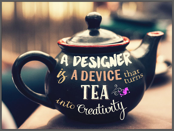
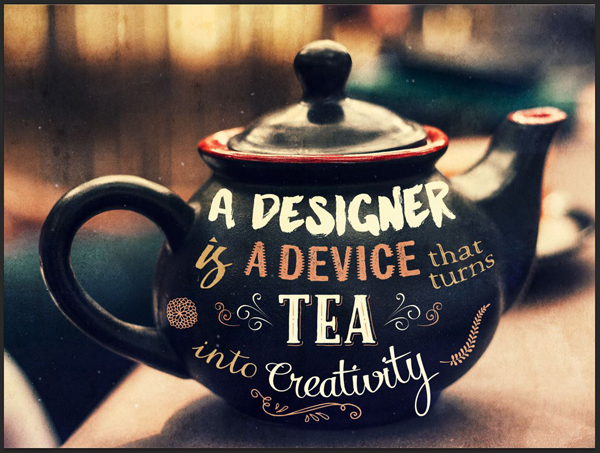
WHAT WE’RE CREATING:
Hello everyone! It’s Simon here again. Today, I’m excited to share with you my process for a piece made possible by the awesome typefaces found in the 21 Best Selling Beautiful Fonts Bundle.
The combination of raw, brush-based typefaces, along with the delicate ornaments of the script typefaces gives us a wide range of visual ambiances to play with. Sprinkle that with the occasional layered slab serif, and a few vector ornaments, and we have ourselves a plan for a great piece!

LET’S TALK CONCEPT
Assembling words
With the new year, other than working on my resolution, I’ve also explored a bit what it means to me to be a designer. I started on the lighter side of the question, and came across this quote:
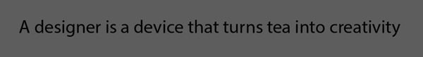
A mathematician is a device for turning coffee into theorems.
(Alfréd Rényi. Popularly attributed to Paul Erdős, who quoted him. (Bruce Schechter, My Brain Is Open: The Mathematical Journeys of Paul Erdős, 1998, New York: Simon & Schuster). Via Wikiquotes).
This one struck a chord for some reason, and I came up with my own variation on the theme:
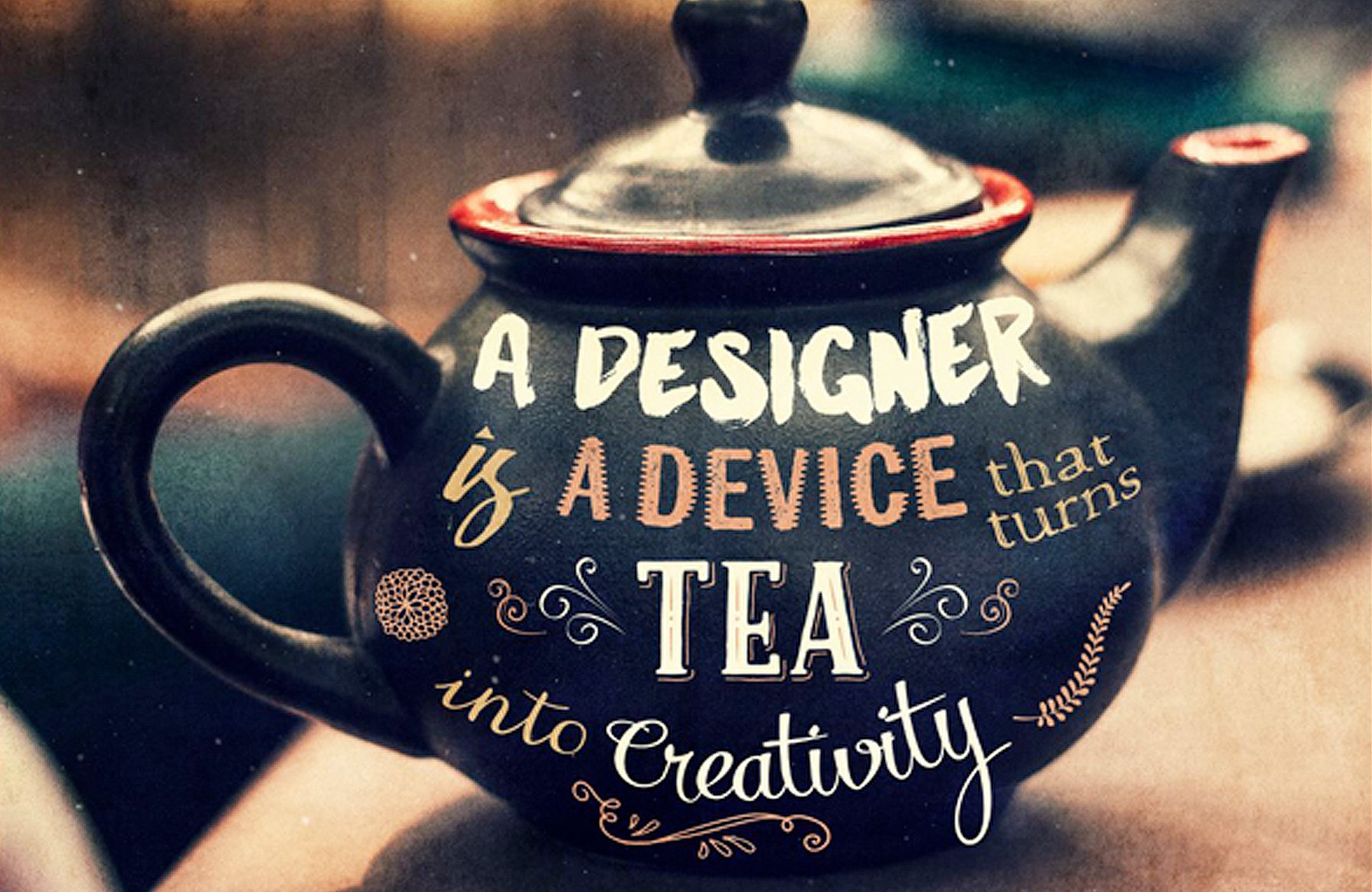
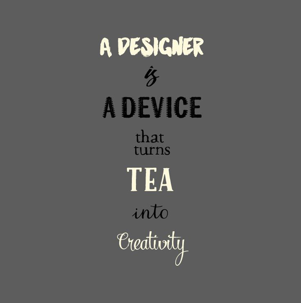
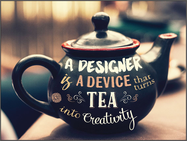
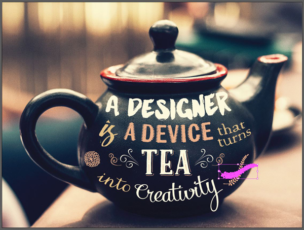
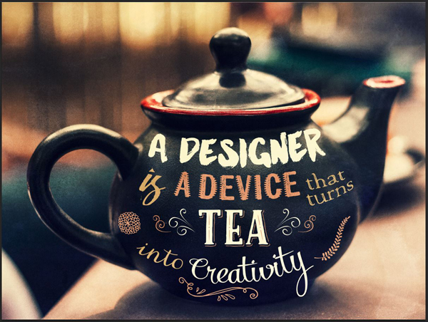
A designer is a device that turns tea into creativity.
I chose tea, simply because I had to stop drinking coffee, and as a nod to the British roots of the Design Cuts team.
Deciding on a visual treatment
After deciding on the saying, I had to decide on a visual treatment for it. I started browsing for some tea related iconography, and found a pleasant set of candidates for a base image.
As usual, when looking for a base image for a poster, I’m looking for pieces that either have a suitable space for type, or that can be “extended” in one direction or another, in order to provide additional space for written elements.
This first image might not be tea related, but its moodiness was too good not to keep in the list (via Unsplash).
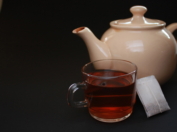
This second image is apparently also coffee, but could pass for a tea cup with a cloud of milk. The vibrant red could be a fantastic canvas to write on (via Unsplash).

This third image struck me by how quiet it is. It’s a very good still scene. Also, the dark area on the left would be perfect for writing (via FreeImages.com).
This next image captivated me because of its beautiful light and shadows. The light going through the transparent cup looks like smoke (via FreeImages.com)

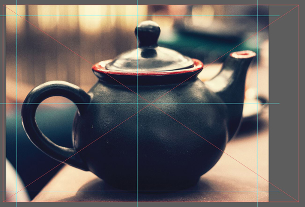
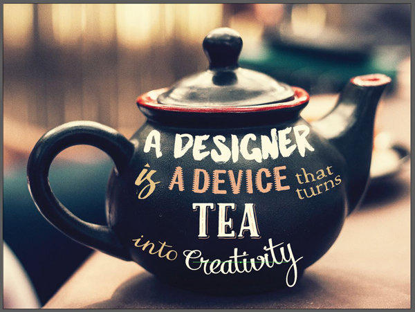
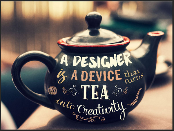
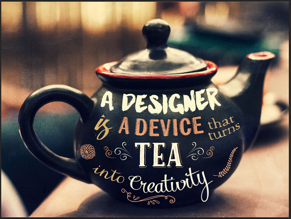
Finally, this beauty. This teapot is stunningly beautiful, the image’s lighting is soft and delicate, and the bokeh in the background contributes to center out attention on the pot itself (via Unsplash).

STEP 1: DOCUMENT SETUP
Wait, we’re using Illustrator this time?
We are mostly going to manipulate type for this piece. Manipulating type in Photoshop is something I rather dislike, so we’ll use Illustrator for the bulk of the work. I’m using the Creative Cloud version, but you should be able to follow along with CS3 and above.
We’ll make good use of the appearance panel, along with the warp tool. I like these two because you can edit the transformation after the fact, somewhat like you could change the values of an adjustment layer in Photoshop. These allow for non destructive editing.
Don’t worry, we’ll still polish the piece off at the end in Photoshop. We’ll add just a tad of texture to tie the piece together at the end.
The Illustrator document
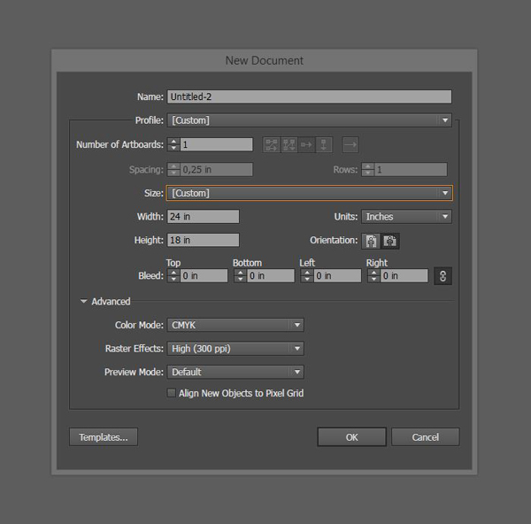
Our canvas for this piece is going to be a landscape-oriented, 18″x24″ document.
Once your document is created, let’s give him some guides to mark its center, as well as a 1″ exclusion zone around its edges.
I strongly recommend to use the absolute placement controls that are available to us in Illustrator.

I found out recently that you can resize your guides, should you find them too long, by using the same controls! The default guides are sized to be 225 inches long (and some change). While it can be useful at times (vertically stacked art boards – it allows to create the guide once for a whole column), in our case it’s pointless. Start by selecting all of your horizontal guides, and make sure that the chain link between width and height is inactive.

From there, let’s enter a width value that makes the guides go over the edge of the canvas by an inch on each side (26″).

The result is less visual clutter around the artboard, which can help tremendously when assembling elements on the side before bringing them in the piece.
Repeat the process for the vertical guides. The new height value will be 20″.

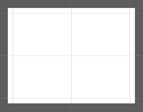
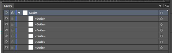
Once satisfied with the result, proceed to give the guides their own layer, and lock it in place. This will make sure we can easily turn them off (by switching the layer’s visibility), and that they won’t move while the layer is locked.
STEP 2: THE BACKGROUND
It’s time to execute the piece itself. Let’s start it by bringing the background image into place. Head to Unsplash, and download the teapot photo.
Save it in the same folder than your Illustrator file. This will make sure Illustrator will be able to locate the file after it’s placed in the piece. Illustrator allows you to only link files in a piece, rather than embed them in as part of the file. It’s a bit like a web page and images. This makes for a lighter, and less corruption-prone Illustrator file. The downside is that you have to sometimes send more than one file to the client/printer/other designer you work with.
Once you have the image ready to go, create a new Background layer, and place the asset in there (File > Place or SHIFT+CTRL/CMD+P).

We have to proceed to a few adjustments before going further:
- The image’s size
- The image’s orientation
- The image’s exact placement
The size is the easiest. Using the same controls we used for the guides, make sure the image is jus tall enough to fit in our canvas (18″).

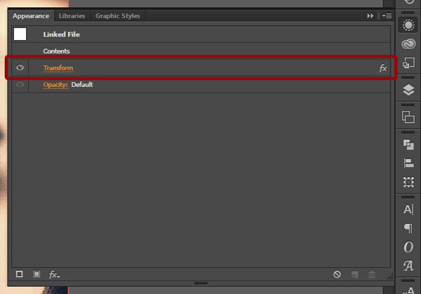
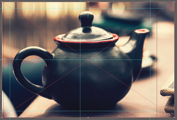
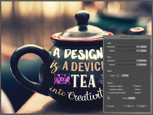
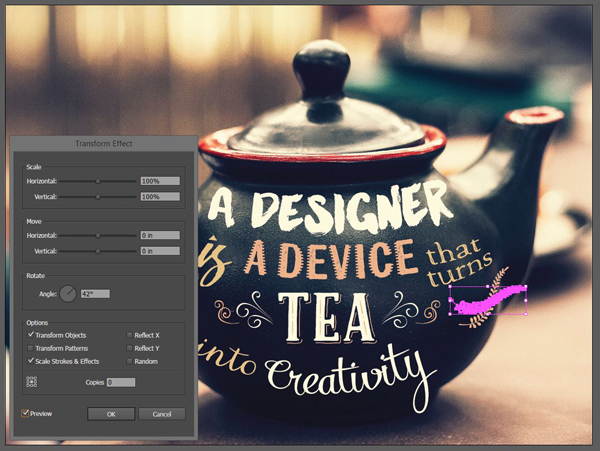
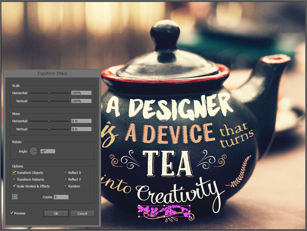
The orientation is informed by the Western culture, and more specifically the reading direction: we read from left to right. Therefore, elements oriented to the right communicate a sense of forward progression. the teapot image is oriented to the left. We’re going to flip it around. I’m going to use this occasion as a demonstration of the power of the appearance panel.
Start by selecting your image.
With the image highlighted, head to the appearance panel. If it’s isn’t in your toolbar, you can summon it by using Window > Appearance, or SHIFT+F6.

From there, let’s add the transformation to our image. We’re going to reflect it on its horizontal (y) axis. Click the little Fx icon at the bottom left of the panel.
This gives us access to a wide range of possibilities. Head to Distort and transform > Transform.
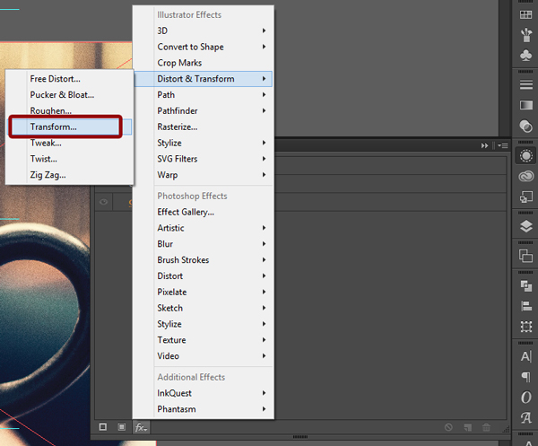
The transform effect is one of the most powerful thing to manipulate elements in Illustrator.
Let’s have a look at our options.
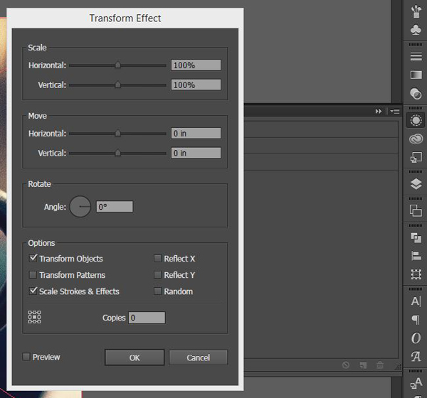
Scale allows to change the size of something. You could either keep the aspect ratio of the original element by using the same value for Horizontal and Vertical, or you could distort the element by using different values.
Move allows you to move the object around in the canvas. The values can be very small (0.1 pixels), or very big (1,000+ inches).
Rotate allows you to give a rotation to the object, expressed in degrees.
The Options section is also rather powerful. For instance, you can make sure that the transformation you’re creating applies to an object, its patterns, its stroke and other effects, or just to one of these characteristic.
The Reflect check boxes are what we’re interested in at the moment. This will allow us to flip the image on its horizontal axis.
The copies box is super neat. That allows you to duplicate the resulting object a certain amount of times. If you remember well, that’s how we created the long shadow title of our airshow poster, a few tutorials ago.
At the left of the copies box, there’s a little symbol that helps you to choose from which place you want the transformation to originate (corners or center).
Finally, there’s the preview check box, but that’s pretty straight forward.
Now, let’s flip that image. Simply check the Reflect X box, the preview box, and enjoy the show. Once happy, apply the transformation by clicking okay.
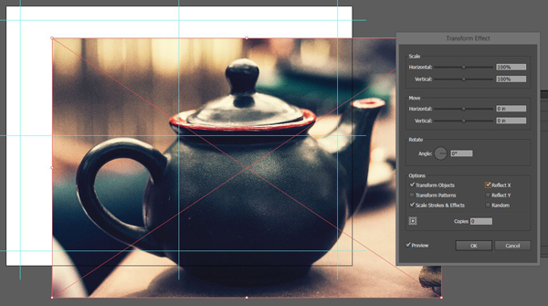
In the appearance panel, note the new line precluding to the transformation we just applied. Click on it to go back to the dialog box, and to modify the values. Truly a non-destructive workflow.
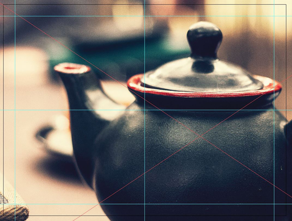
Next, center the image in the canvas. I’m using the absolute positioning boxes for that, as it goes faster and is more precise than doing it by hand.

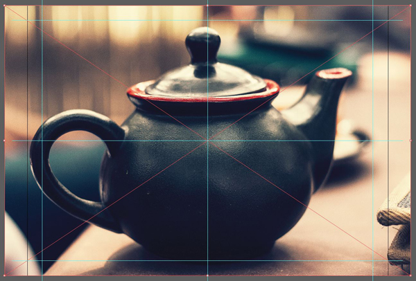
The image fits vertically in the canvas, but not horizontally. In addition, since the teapot isn’t centered in the image, its handle is closer to the edge of the image than its beak. Let’s adjust that.

Finally, once we’re happy with the placement of our image, we can hide the parts of it that overflow our canvas. We’re going to use a clipping mask for that. They are a bit like layer masks in Photoshop, except that they don’t handle transparency (things are either shown, or hidden).
Create a new 24″x18″ rectangle, and center it in your image. It needs to be above the image itself in the layer order. It can have a fill and/or a stroke, but it could also be transparent. The one I’m creating is this brightly colored for visibility purposes.
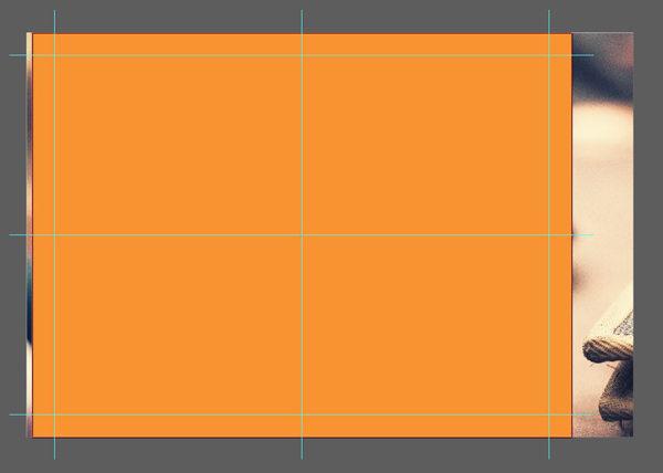
Select both the rectangle and the image, and create a clipping mask. You can either use the right-click menu for that, or Object > Clipping mask > Make. The result is what we needed: the out-of-frame image parts have been hidden.
And with that, our background is set. I know that the image looks very grainy in Illustrator, but it won’t be in the final piece. It’s (probably) due to the way Illustrator renders the image. After the obligatory layer palette shot, we’ll be switching to manipulating type! Note that I have locked the background layer, so it doesn’t move while we’re moving our type around later.
STEP 3: TYPE, TYPE EVERYWHERE
Breaking the sentence in elements
It’s now time to start the serious stuff. Let’s remember our “quote:”
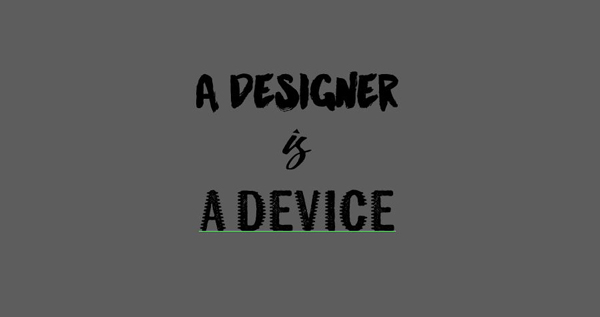
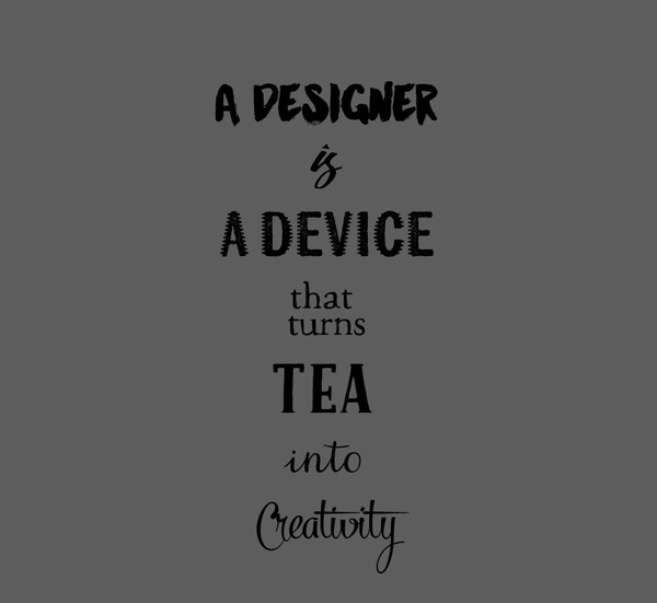
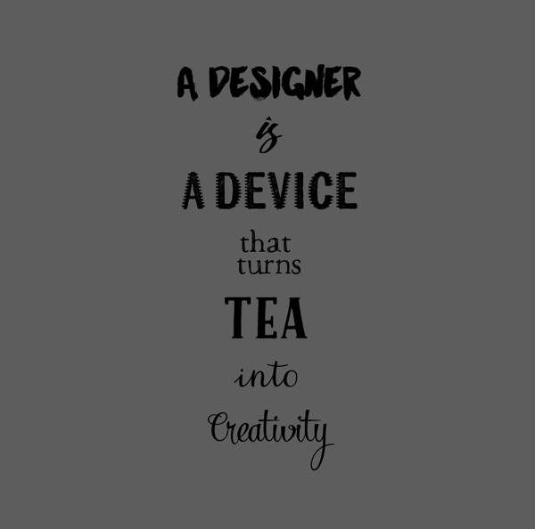
A designer is a device that turns tea into creativity.
We now need to decide how we want to split that sentence in smaller text elements, that will all feature a different typeface and adjustments. I suggest the following:
A designer / is / a device / that turns / tea / into / creativity.

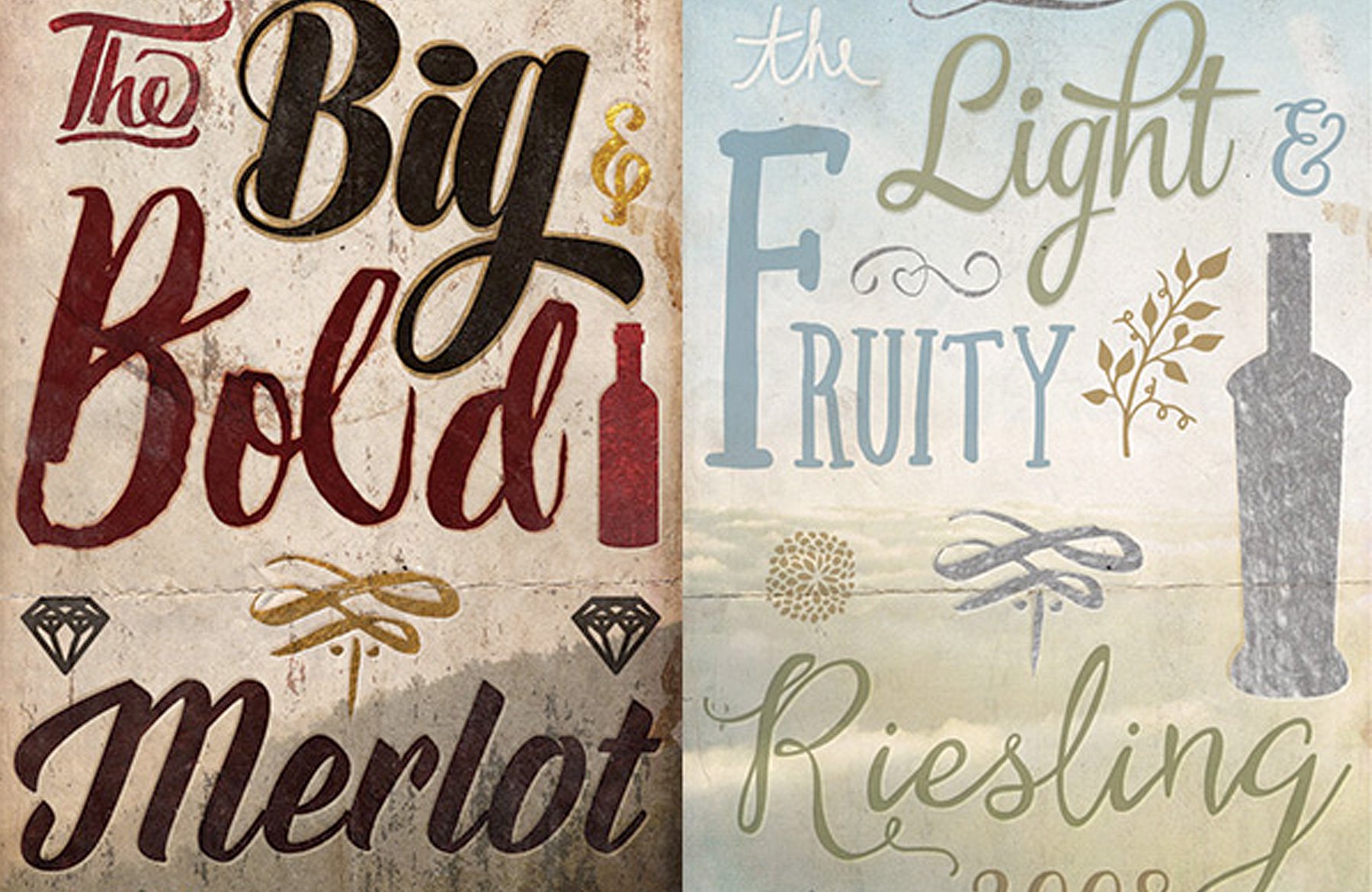
That will allow us to use seven different typefaces. The elements that should have slightly more impact than other should be A designer, a device, tea, and creativity. Let’s start by just assigning the base text styles to each elements.
A designer
We’ll use Manhattan Darling Regular for A designer.
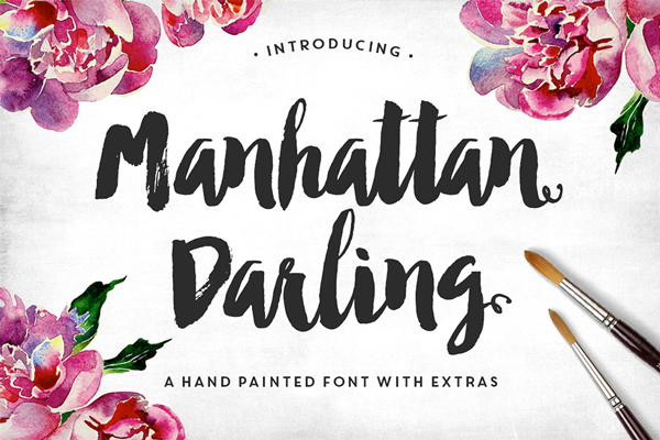
Write the text in all caps for more impact, and make sure that the text block alignment is set to “center.”

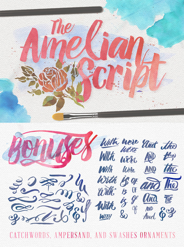
is
For is, we’ll actually skip on using a typeface. We’re going to grab one of the extra that come with Amelian Script. You can find the file at \irwanmismoyo\Amelian-Script\Bonus.ai.


a device
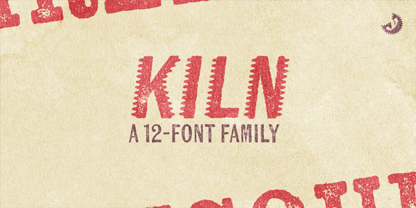
We’re going to use Kiln Sans Spiked for the next sentence part. The type family features only uppercase letters, so it doesn’t matter too much if you write in uppercase or lowercase.
that turns
That turns will be written in Macarons Sketch.

tea
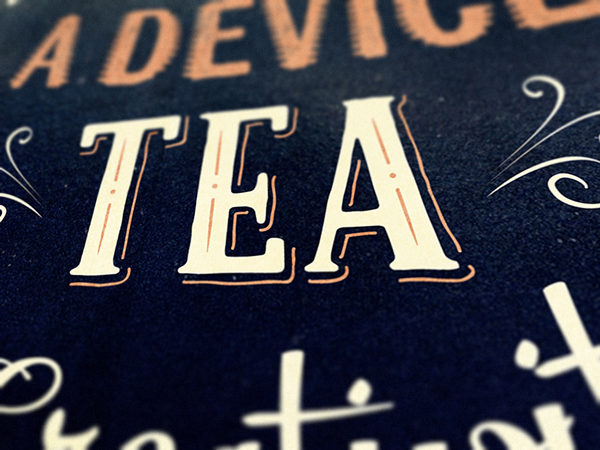
Since tea is at the center of the piece, I decided to put a little bit of extra flourish and emphasis on it. We’ll use the great Caferus layered type system for that. Set the base text in Caferus Basic, all in lowercase.


into
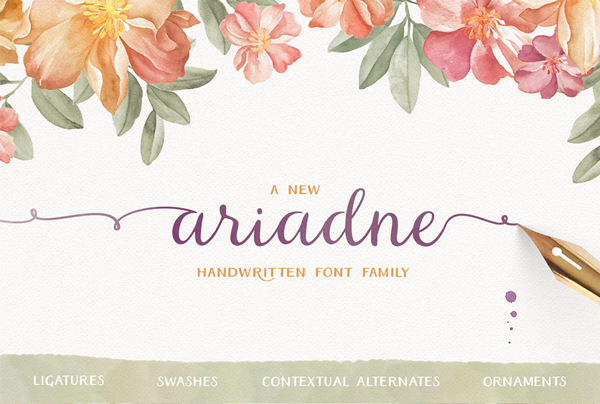
This little connecting word will set be Ariadne Script, all lowercase.

creativity
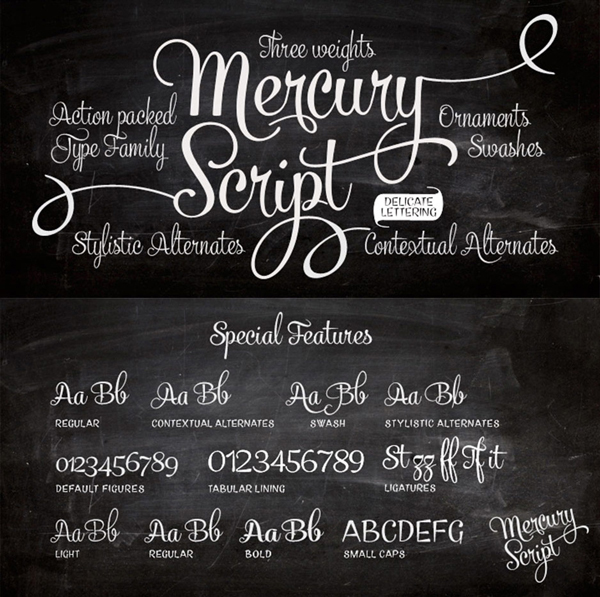
This word is also one of the main one in the sentence. We’ll use the flamboyant Mercury Script Regular for it. Write Creativity with a capital C.
We are also going to leverage some of the alternate characters offered by the typeface.
Note: A while back, I wrote a short tutorial walking you over the various ways to use the alternates and extras in your typefaces. It would be a good refresher at this point.
Select the glyph panel (>Window > Type > Glyphs). Select the “C,” and find the alternate “C” that buckles back.
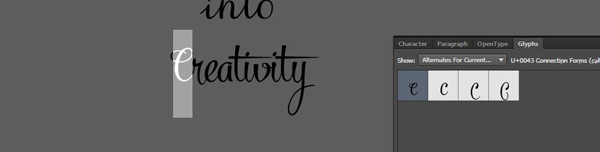
Switch both “Ts” to the “t” with the shorter cross bar.
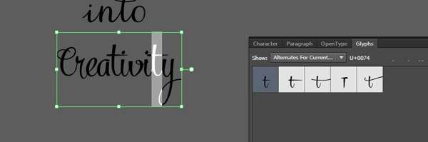
Switch the open buckle “a” to the closed “a.”

And we have our basic text elements.
Talking about color
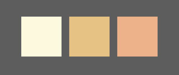
Before we manipulate the text further, now is the time to talk about colors. I sampled the following palette from the image itself.
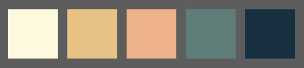
We will be using the body of the teapot as the spot for our text, which is dark, so our text will need to be light to contrast. The colors we’ll use are then the three colors to the left of the color palette: the super light yellow (#fcf5dd), the medium orange (#e5c381), and the salmon orange/red (#ecb186).
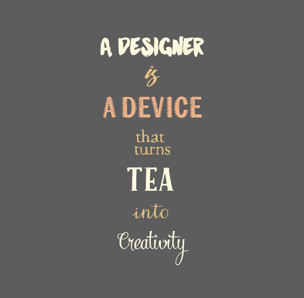
From there, we can assess colors according to the impact we want the words to have. We’ll use the bright yellow for the three key text block: A designer, tea, and Creativity.
A device is the secondary significant text block. Let’s make it the red.
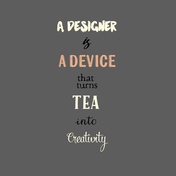
Finally, let’s change the color the connecting text elements (is, that turns, and into) in medium orange. This is what will softly “erase” them, and let the other words have more visual impact.
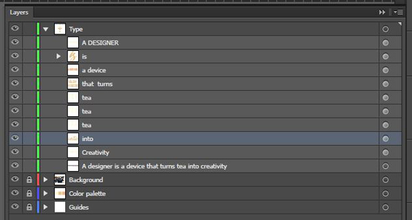
Finalizing “tea”
As announced earlier, we’re going to put some emphasis on the word “tea” by using the layers of Caferus. The system is simple: there are three layers, which you access by simply stacking three copies of the same text object, and changing the typefaces accordingly.
Let’s start by duplicating the “tea” text element two other times. Use “Paste in front” (CTRL/CMD+F), so the copies are perfectly aligned with each other.
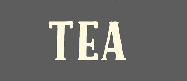
Change the copy at the bottom to Caferus Shadow Regular.
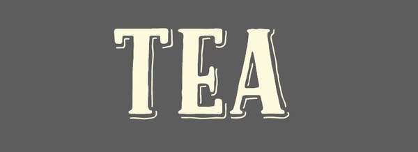
In order to give the shadow element more impact, we’ll change its color to the medium orange (#ecb186).
Now, let’s change the top copy to Caferus Inline Regular, in medium orange as well (#ecb186).
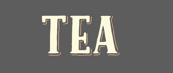
Here’s what our layers look like so far.
Putting the elements in place
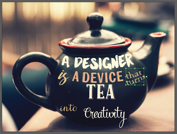
Now that we have our base elements ready, we should start putting them in place in our canvas. Here’s my starting point layout.

We’re going to start by adjusting the size of each elements so the space is better filled.
A designer is 192 points tall.

is isn’t a typeface, but should be 1.5″ wide.
A device is sized at 144 points tall.

that turns is sized 90 points tall. Also, the text block is left aligned, so the block matches the curve of the teapot better.
The three tea are 180 points tall.

into is 144 points tall.
Creativity is 180 points tall.

Finalizing each elements’ positioning and distortion
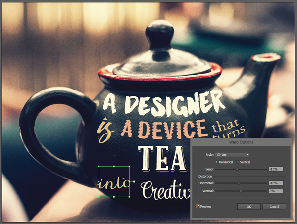
Now, what we need to do is to use the warp filter, and appearance panel to match the curvature of the teapot. Note that this part implied a lot of back and forth between each element, to fine tune everything. In order to make the tutorial shorter and more comprehensive, you get a much more straight-forward walkthrough.
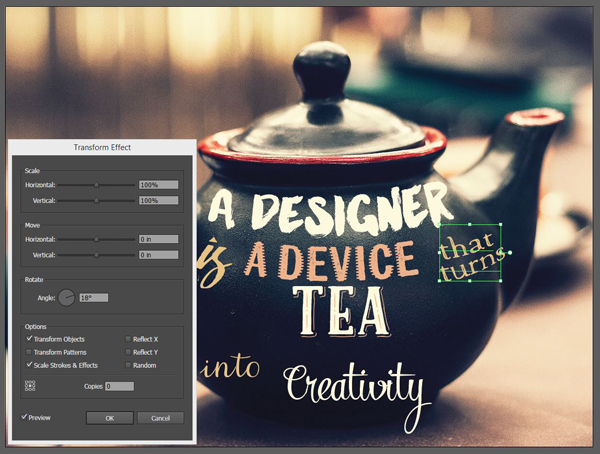
Let’s start with a designer. Use the warp filter (you can get it through Effect > Warp > Arc, or through the appearance panel’s Fx icon).
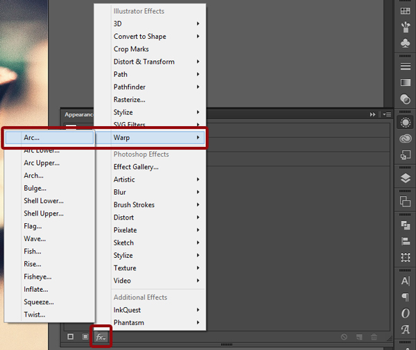
The values we’ll use are on the subtle side. We’re not looking to arch some text to fit a badge, but to softly follow the curves of the teapot. The bend value is -15%.
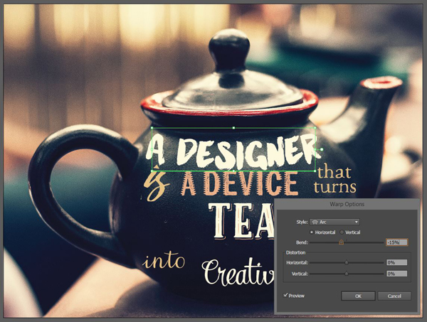
The next value we’re going to change is the horizontal distortion. The 10% we’ll assign it will compress the text element on the left, so it looks like the type is further away from us on that side.

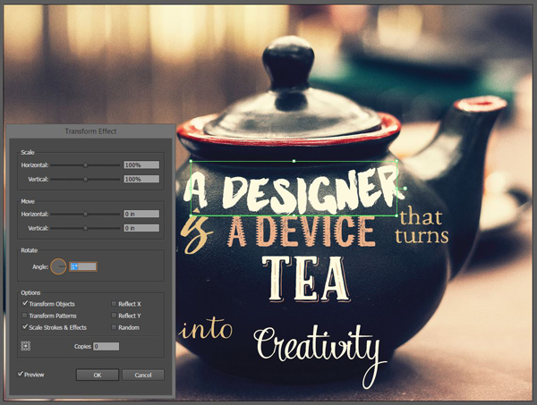
The next thing we need to assign to the object is a slight rotation, so the text fits even better. We’ll use the same transform panel that we used to flip the image over (Fx > Distort and transform > Transform). Give the object a 1° rotation.
Once that’s done, just nudge the text block up a little bit so it follows the curve of the top of the teapot. The absolute positioning values are X: 13.3069, and Y:8.2118.

is doesn’t get any transformations or rotation applied to it. Its position values are X: 8.5317 and Y: 10.4714.
a device gets a subtle negative arc of -10%, and gets moved to X: 13.3159, and Y:10.3683.


that turns receives a more complex treatment. First is a stronger warp, with both horizontal and vertical distortion (-15% all around).

The next step is a -18° rotation.
Its absolute position is X: 18.4833, and Y:10.3603.
tea doesn’t get any transformation, but gets nudged quite a bit lower (X: 13.2741, and Y: 13.0559). Make sure to select all three “tea” text objects together.

into gets the full treatment (warp, rotation, and position change).

Absolute position: X: 4.0377, and Y: 14.2308.

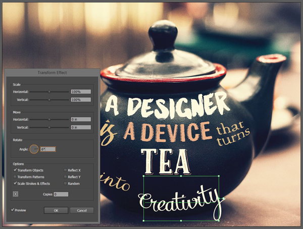
Finally, Creativity also gets the “full treatment,” to better match the bottom curve of the teapot.

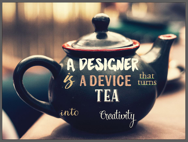
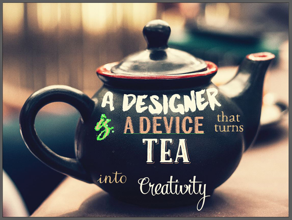
We now have a rather solid foundation in place, but as you can certainly see, there are “gaps” in the composition.

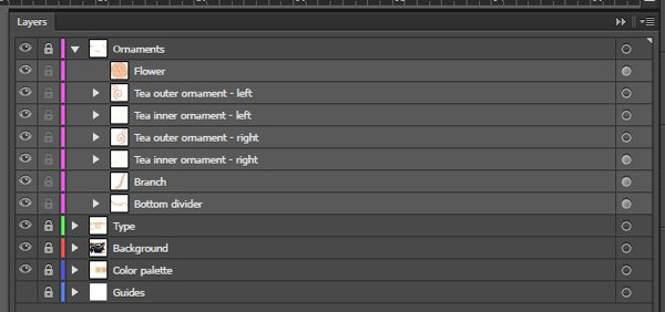
Taking care of the gaps will be accomplished at the next step, when playing with the various ornaments that are parts of some of the typefaces’ extras. Oh, and the layers are pretty straight forward.
STEP 4: ORNAMENTS TO SUPPORT THE COMPOSITION
Adding ornaments to a piece isn’t always an easy decision. Sometimes, they feel like they’re present as an afterthought, or worse yet, as fillers. In our case, I like to believe that they add additional depth and a sense of visual completeness to the piece.
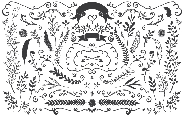
Let’s start with “tea.” Since the word is at the center of our piece, both visually and allegorically, let’s add some flourish to it. The typeface family it’s set in, Caferus, comes with a great set of ornaments.

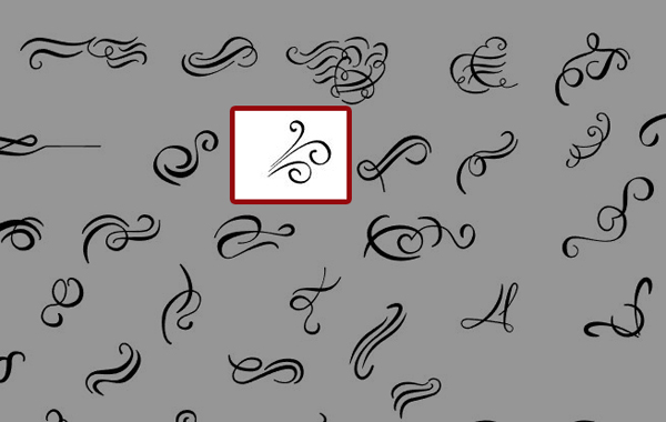
Let’s start by adding a simple flourish, mirrored on each side of the word. It’ll be a visual allegory of the steam coming from the hot cup of tea.
Paste it in your piece, sized at 1.5″ wide.

Change its color to our bright yellow (#fcf5dd), and position it at X: 16.152″, and Y: 12.466″.

The result is neat, but doesn’t extend much to the side yet. Let add a second ornament that will both horizontally extend the “branch,” and fit the curves of the first one.
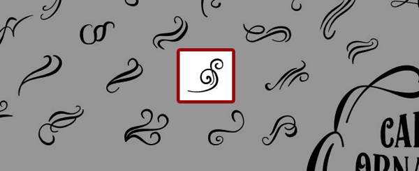
Paste it into your piece, close to the first ornament. It should be 1″ wide.
In order to give it slightly less visual weight, we’re going to change its color to our salmon orange (#ecb186). Make sure its location in the piece is X: 17.2879″, and Y: 12.5667″.

Finally, let’s mirror these on the left side of the word “tea.” I’ve simply duplicated both ornament using paste in front, mirrored them using the appearance panel,and visually adjusted their position to the left.

Absolute placement for the ornament group: X: 9.7676″, and Y: 12.466.

Here’s how the ornaments are named and organized.
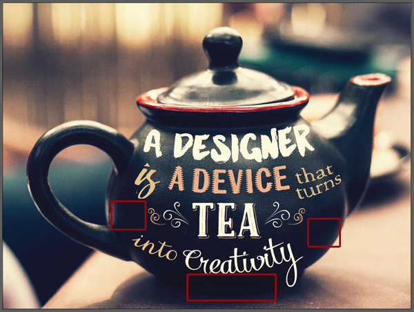
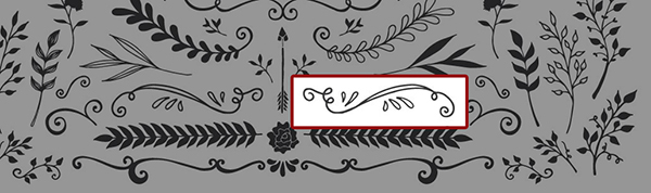
There are still some unsatisfactory voids on each sides of the word “tea,” as well as underneath the word “creativity.” We’re going to use the extras from the Manhattan Darling typeface to complete the curves (you can find them in \make-media-co\Manhattan Darling Typeface\SUPER SECRET GOODIES\AI\SuperSecretBonus_Elements.ai)
Let’s start at the left of “tea.” We’ll use this neat lower.
Paste it in your design, 1.25″ wide.

Change its to color our salmon orange (#ecb186), and place it halfway between the “is” and the “into” (X: 7.2261″, and Y: 12.5341).
Next, let’s occupy the space at the right of “tea.” We’re going to use this branch element, still from the Manhattan Darling extras.
Paste it in the piece at 3.1″ wide.

We’ll change its color to the same salmon orange (#ecb186). After that, we’ll give it a rotation to make it fit within its newly assigned space.
Absolute position: X: 18.8782″, and Y: 135135″.
The last ornament will be this divider of sorts, at the base of the teapot. It will require a rotation and warp to adapt this its spot.
Paste it in your piece, at least 4″ wide, and in the same color as the branch.


Absolute positioning: X: 12.1396″, and Y: 16.0945″.

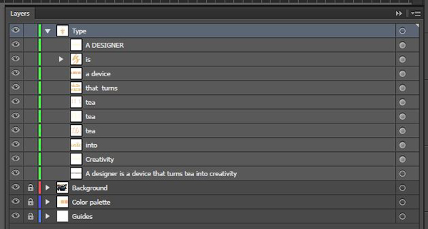
Obligatory layer shot:
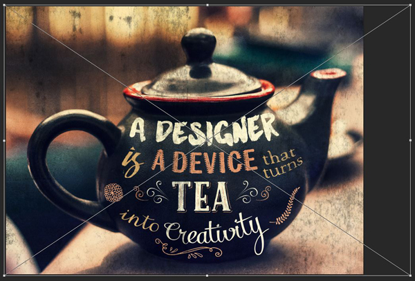
And with this, the vector part of the piece is complete. It’s now time to move forward with textures.
STEP 5: TEXTURES TO TIE THINGS TOGETHER
Before we can even assemble our assets, we have a preliminary step to take care of, and it’s to export our Illustrator art into a file we’ll be able to layer into Photoshop. Luckily for us, Illustrator allows us to export a PSD! It’s not entirely perfect, but it’ll fulfill our purpose today.
Head to File > Export.
Choose a filename, and PSD as your file format in the drop down list. Don’t forget to have the Use artboard box checked, it will save us some hassle.

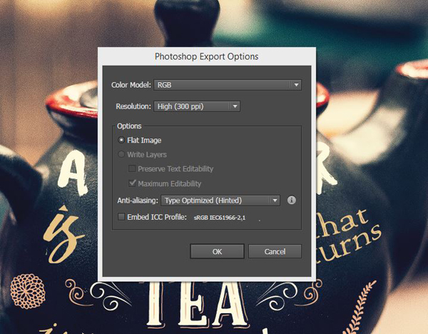
Exporting as PSD gives us some additional options, like the color model, the resolution, etc. We’re going to stick to RGB, which doesn’t allow us to export a layered PSD, but that’s alright. Stick to a resolution of 300 ppi.
With that PSD file at the ready, we can go ahead and gather the assets we’ll use to texture our piece.
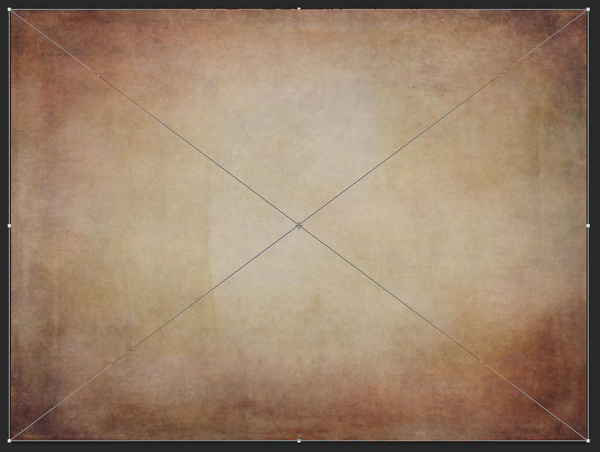
The first one is a paper texture I like a lot, BB_AntiqueEnvelope_04 by Dustin Schmieding.
The other textures all come from the Design Cuts Freebie Area.
You’ll have to get three freebie packs:
- The Supermoon poster tutorial freebie pack
- The Christmas poster freebie pack
- The mega birthday freebie pack
Once you have these, gather the following:
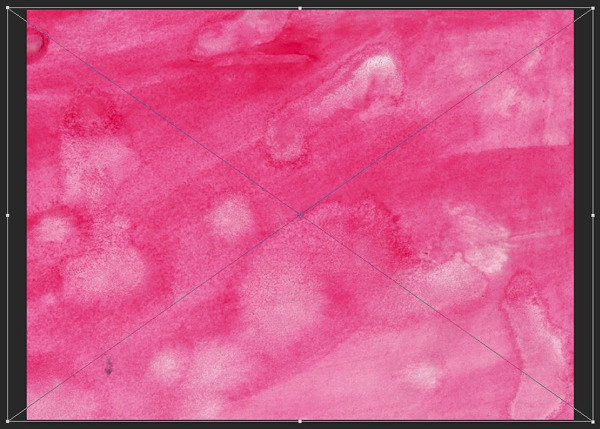
True Watercolor. Rose Collection (6).jpg, from \supermoon-tutorial-freebies\Charles Perrault.
Watercolor6_Version2.jpg, from \design-cuts-birthday-freebies.
Broken Rollers 1.png, from \supermoon-tutorial-freebies\Vintage Design Co.
2LO It’s snowing 3.jpg, from \christmas-poster-freebies-UPDATE2\2-lil-owls.
Finally, 2LO Relic 3.jpg, from \Freebies\design-cuts-birthday-freebies.

Once you have these at hand, it’s time for a quick refresher:
PSA #1: in this tutorial, the term “clipping” or “clipped layer” is used a few times. This means that the layer is only visible/applies to the layer directly below it. You can very quickly do this by holding ALT/OPTION down on your keyboard and clicking between the two layers. Photoshop secrets created an handy animated gif demonstration.
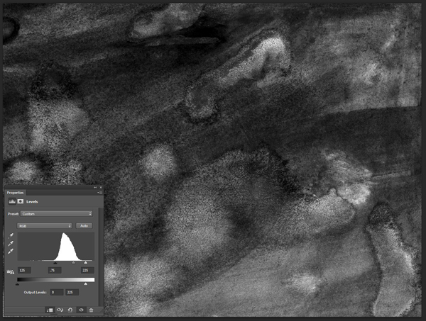
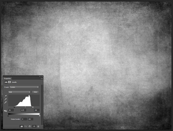
PSA #2: every time we’ll work with textures, we’ll follow this simple process: place as smart object, sharpen, desaturate, enhance contrast with levels, and modify the blending mode.
PSA #3: placing the textures as smart objects, and using adjustment layers to tweak them, allows us to stick to a non destructive workflow. We’ve explored in depth the numerous pros and few cons of such a workflow in this past tutorial: “How to Use Textures The Right Way.”
Now that these are out of the way, let’s press on. Open the PSD we exported earlier from Illustrator.
Start by placing BB_AntiqueEnvelope_04 in your canvas so none of the envelope’s seams are visible.
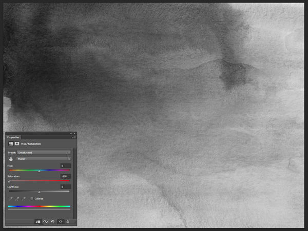
Sharpen it (Filter > Sharpen > Sharpen), and desaturate it with a clipped hue/saturation adjustment layer.
Enhance the texture with a clipped levels adjustment layer.

Finally, change its blending mode to Soft light @ 25% opacity.
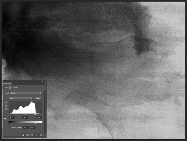
The second texture we’ll use is True Watercolor. Rose Collection (6).jpg.
Blending mode: Soft light @ 50% opacity.
Next texture: Watercolor6_Version2.jpg.
Blending mode: Soft light @ 35% opacity.
The following texture is Broken Rollers 1.png. Simply place it in the piece in landscape mode, sharpen it, and change its blending mode to Soft light @ 100% opacity.

The following texture is 2LO It’s snowing 3.jpg.

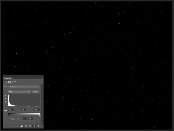
Blending mode: Screen @ 100% opacity.
The last texture we’ll add to our piece is 2LO Relic 3.jpg.
We’ll place it without respecting its ratio, but rather by sticking to the piece’s edges.
Blending mode: Soft light @ 50% opacity.
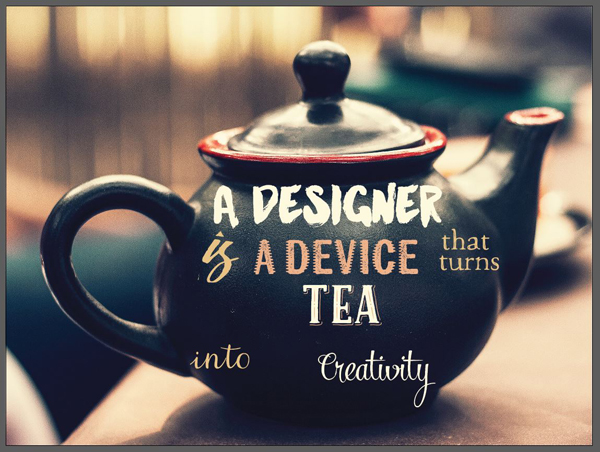
And our piece is finished! Here’s a look at the final layer stack in Photoshop:

FINISHING THOUGHTS
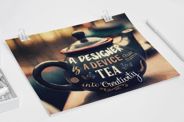
Well first, let’s have a look at our finished poster, mocked up as if it was printed. Pretty neat, huh?
It was a tutorial that got slightly longer than I thought it would, be it seemed important to detail al the type placement sequences. I hope you had as much fun following along than I had writing, and that you learned a few tricks along the way!
Any technical questions left unanswered? Please use the comments below, and I’ll reply to them!

Don’t forget to grab the 21 Best Selling Beautiful Fonts Collection! They are available for a few more days only, at 97% off regular price. If you have them already, I hope that you enjoy your new resources, and that this tutorial gave you a sense of what you can accomplish with them.
Finally, we’d love to see your tutorial outcomes! Please share them with us on the Design Cuts facebook page. We’ll share the best ones with the whole community.
That’s all folks! Until next time, cheers!
Be the first to comment