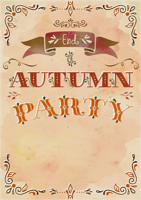
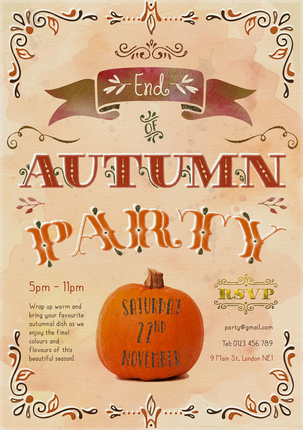
WHAT WE’RE CREATING:
Hey Design Cutters!
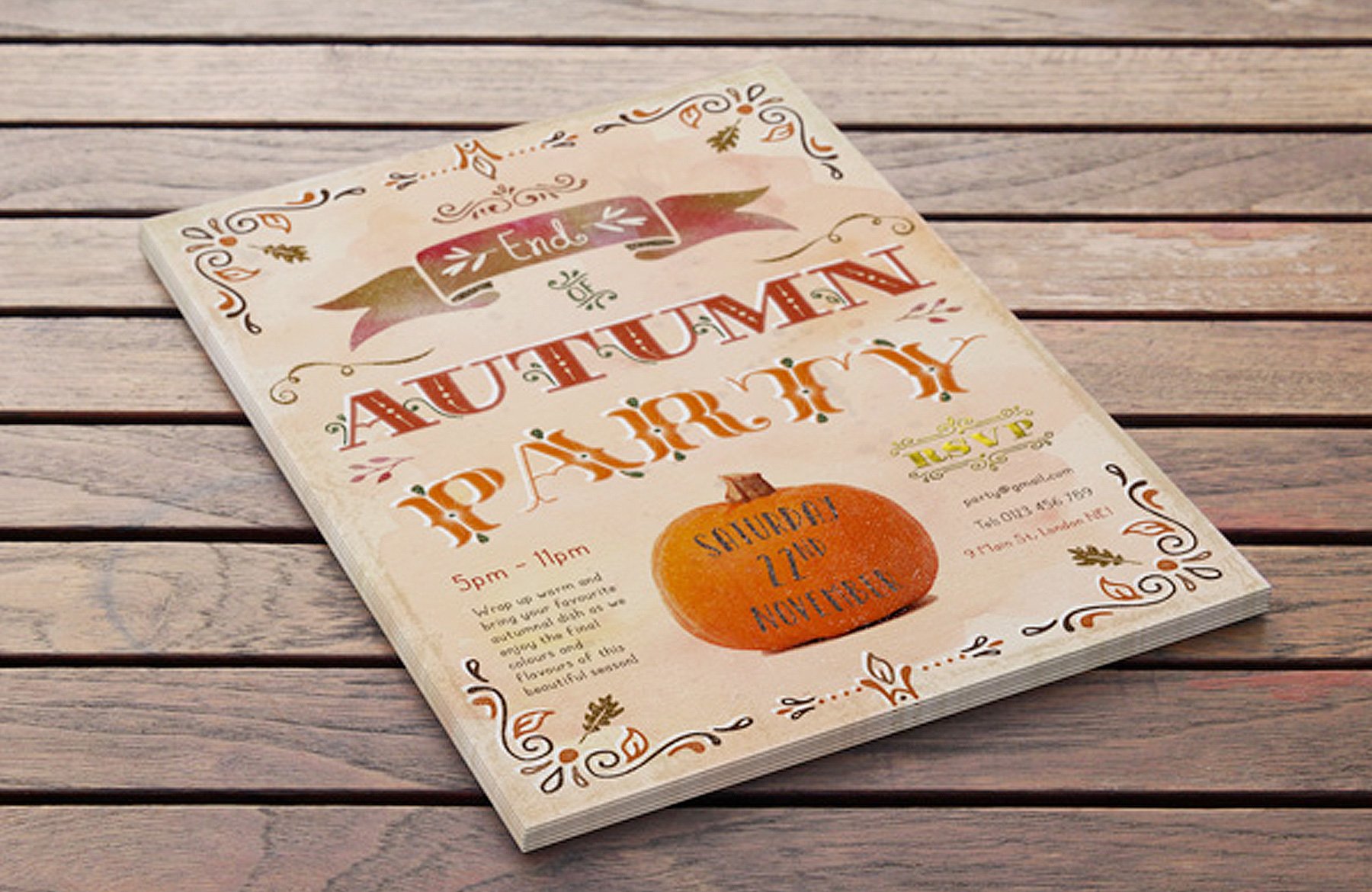
Jo here. Just when you thought you were over the excitement of the Birthday bundles, we’re inviting you to another creative party in today’s tutorial, where we’re designing a warm and sparkling invite for an End of Autumn Party. Not that you really need an excuse to enjoy the last few weeks of gorgeous colours and consuming as many pumpkin-flavoured treats as possible! ;)
We’ll be using plenty of the resources from the current bundle, and going through some of the actions based resources step-by-step so you can familiarise yourself with how they work.
Quick note: In this tutorial, the term “clipping” or “clipped layer” is used a few times. This means that the layer is only visible/applies to the layer directly below it. You can very quickly do this by holding ‘Alt’ down on your keyboard and clicking between the two layers. Here’s a quick demonstration.
Ok, let’s grab a hot drink (pumpkin latte, anyone?) and get started!
Follow along with this tutorial: Download the freebies
As always, we have another great freebie for you to use with this tutorial and for your own projects. Today’s resources have been kindly donated by Make Media Co and Nicky Laatz: a great watercolour paper texture, watercolour washes, splatters and sparkling glitter textures which will all help add some great tactile details to your digital work.
Remember, this freebie is just a tiny sample taken from this mega bundle: The Ultimate Designer’s Collection (Huge Variety of Best-Selling Resources) at just $29 (a fantastic 94% Off). This bundle brings together a ton of best-selling design resources you’ve been requesting from some of the most popular designers in the world. These items are hugely popular at full price and we’re sure you’ll want to get straight in and start trying them out on your own work.
Enter your email below to download the freebie, so you can follow along with this tutorial easily.
Step 1:
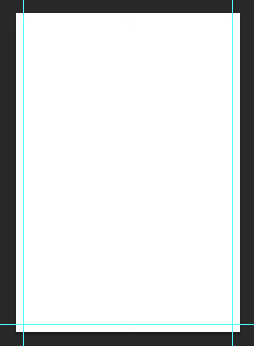
Open up a new 1748px x 2480px (A5) document in photoshop. From the main menu, go to Edit > New Guide to set up the following guides that’ll help us during the design process:
Vertical: 50%, 0.5cm, 14.3cm
Horizontal: 0.5cm, 20.5cm
From the freebies, grab the file paper16.jpg and paste on to your canvas, scaling to fit:
We’ll set the blend mode to Multiply and lock this as the top layer. This is to that we get the lovely texture applied to all the other elements we’ll be adding, making everything look like it’s printed on a nice, heavy stock.
Create a new layer underneath and fill with the colour #E8D3A9 for our background:
Step 2:
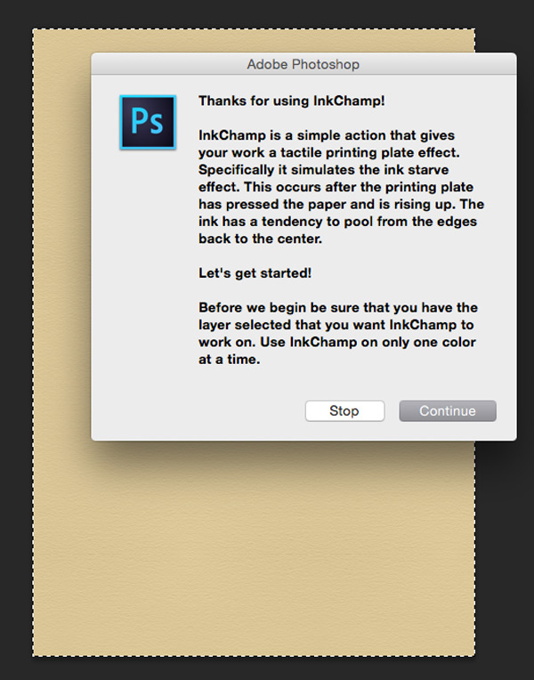
We’re jumping straight in now with one of the great actions included in this bundle: ultimate-designers-retro-supply-co > Mid Century Print Suite > InkChamp – Photoshop Action > Actions > InkChamp.atn. If you haven’t already, make sure this is installed and ready to go. (Whilst you’re here, you can install the brushes too, as we’ll be using them later!)
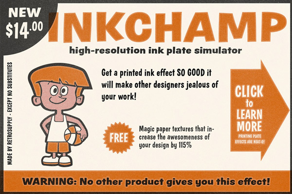
You can see in the example image above the type of effect we’ll be going for – the slight fade around the edges. Make sure the colour fill layer is selected, so the the effect can be applied to it.
From your Actions panel, find the InkChamp action folder, and select the option with instructions. This’ll give you handy prompts as we go through each step:
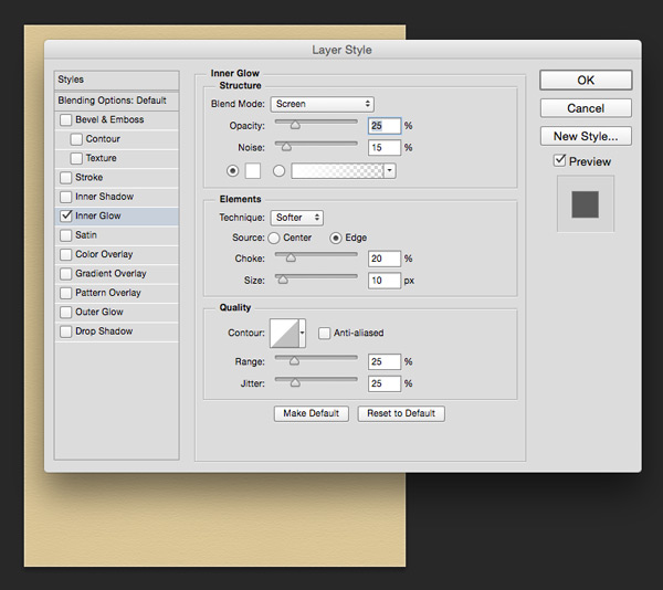
As you follow the instructions and click ‘OK’ you’ll eventually get to the Inner Glow settings panel. This is what it looks like with the default settings:
We want to tweak the following slightly:
Opacity: 35%
This setting should be kept fairly low for a realistic, subtle effect. A good rule of thumb is a darker colour might benefit from a lightly lower setting, a lighter colour from a slightly higher one. As our background is fairly light, we’ll push it up slightly to 35%.
Size: 25%
As the area we’re applying the effect to is quite large, we can get away with a larger effect to make it more visible and keep it proportional.
To get a better idea of how each setting will effect the final outcome, I recommend taking a quick look through this great explanation of the Inner Glow features from Tuts+. Oh, and of course playing around for yourselves! :)
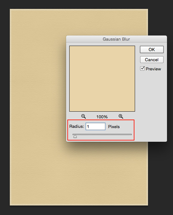
The next step is to add a gaussian blur, which we’ll increase a tiny bit to 1px, as the image is fairly large:
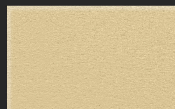
After you get your congratulatory completion message, zoom in and check out this sweet effect:
Finally, open up the newly created “InkChamp” folder in your layers panel and reduce the Opacity of the ‘InkChamp Copy’ layer to 75% for a slightly softer colour:
Now we’ve got one of the actions under our belt, let’s continue and familiarise ourselves with some of the other resources!
Step 3:
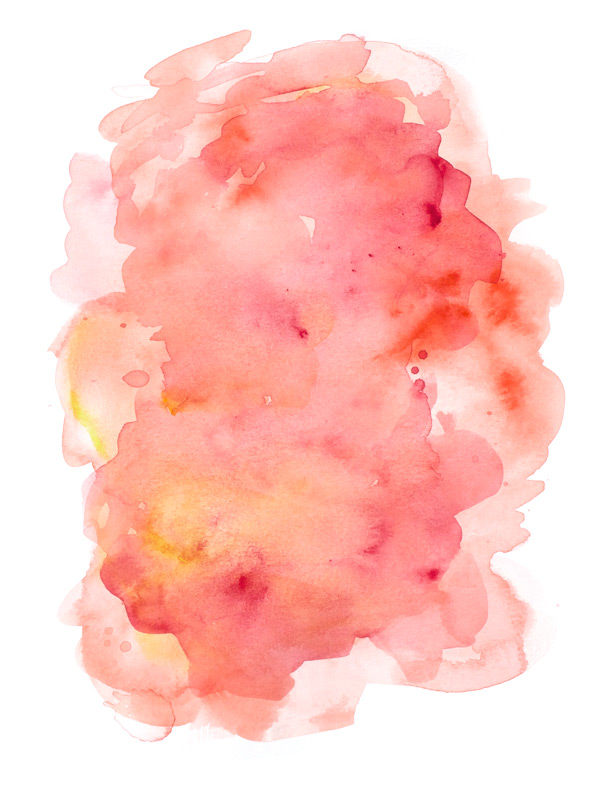
We’re going to add a little textural interest to the background with a watercolour wash. From the freebies, find the paints3.png by Nicky Laatz:
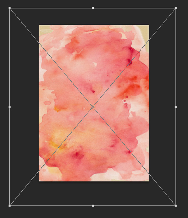
The warm, autumnal colours are a perfect fit for our invite, so let’s paste the image in to our document, scaling so that the watercolour covers most of the canvas:
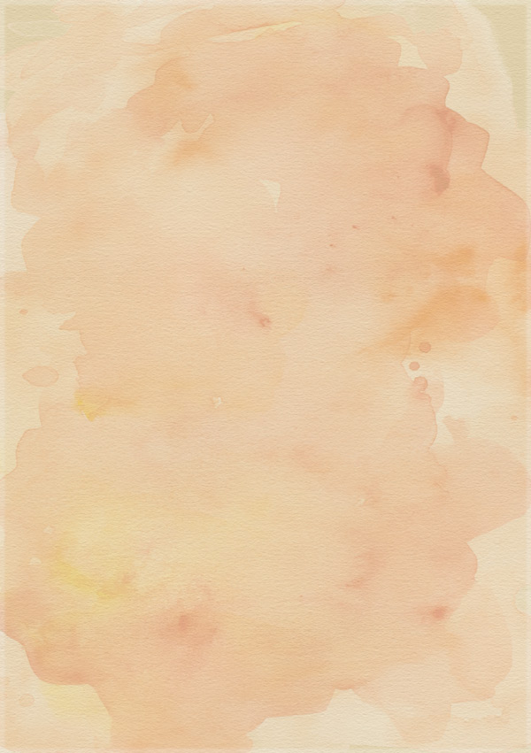
Once you’re happy with the coverage, change the blend mode to Overlay and reduce the Opacity to 50%:
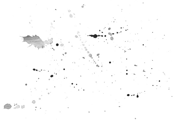
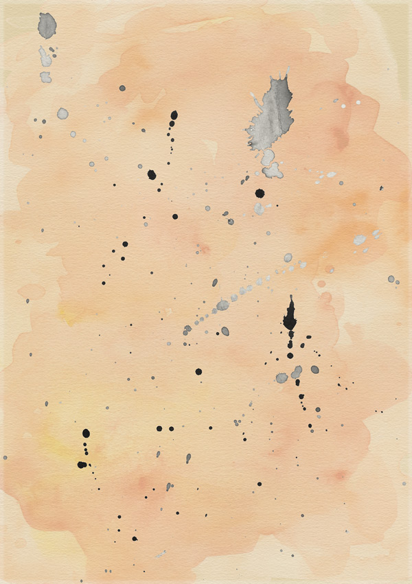
For a final bit of subtle texture, we’ll go back to our freebies for another Nicky Laatz resource, splat4.png:
Paste this on to your canvas, rotating and scaling to fit:
Next up we’re going to use a Layer Style to apply a watercolour wash texture to just the ‘splat’. For this, you’ll need to go to ultimate-designers-make-media-co > Glitter-Kit > Glitter, Graphics & Watercolor Pack > Patterns (Glitter & Watercolor) > Watercolors.pat and load the patterns if you’ve not already done so. Whilst you’re here, you can load the Glitter.pat file to as we’ll also be using that later.
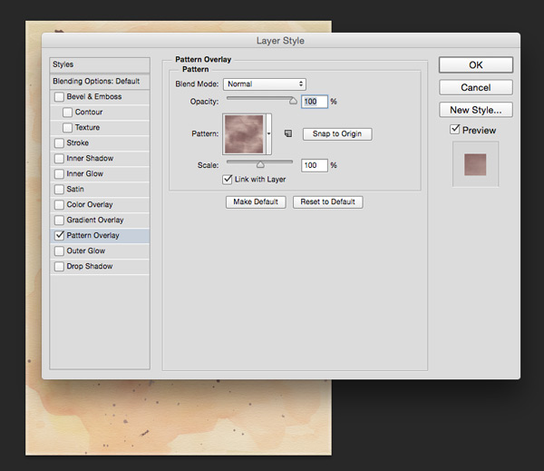
Once your patterns are loaded, in the main menu go to Layer > Layer Style > Pattern Overlay. You’ll then get the following settings open up:
From the thumbnails menu, select a fairly neutral colour. In this instance, I’ve gone for ‘Pinot’. Leave all the other settings as they are and hit ‘OK’.
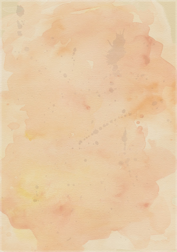
You can see below that the watercolour effect has been applied to all the non-transparent areas of that layer. How easy was that? :)
Finally, reduce the Opacity to 15% and change the blend mode to Multiply for a much softer effect:
We’ve now got our background all ready. Let’s keep things tidy and easy to find by grouping everything (except the paper texture at the very top) in to a folder called “Background”.
Step 4:
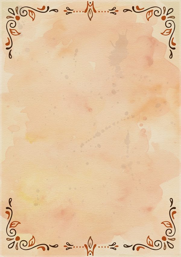
Next we’ll set up a decorative border using ultimate-designers-ornaments-of-grace > Thankful Complete-Intro > Harvest Winds Vector Collection > CS6 (or CS3) > Harvest Winds Patterns-CS6.ai:
Select the corner elements and borders that you like, then copy and paste them individually on to your photoshop canvas. Use the guides we set up at the start to help position your border elements.
Duplicate layers and rotate and flip the individual elements from the Edit > Transform menu options to complete all corners and sides with a design you like:
Once you’re happy with the design of your border, group all the individual elements together in to a folder called “Border Assets” and set the blend mode to Multiply. Duplicate the group, then go to Layer > Merge Group to create a single-layered copy. Move this layer below the original group, so that we can create a print offset effect.
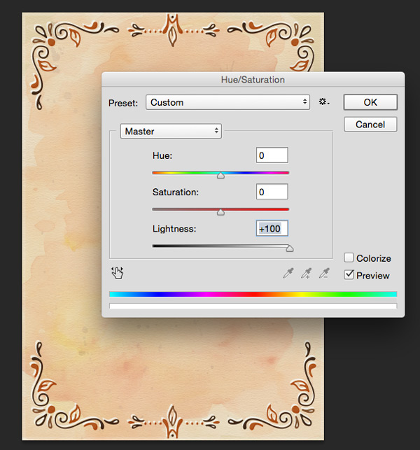
Make sure the blend mode for the layer is set to Normal, then adjust the hue/saturation for this layer by hitting ‘cmd + U’ on mac or ‘cntrl + U’ on windows and push the Lightness all the way up to +100 :
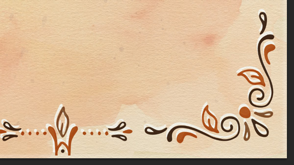
Nudge the layer up and left slightly using the arrow keys on your keyboard to create the offset effect:
Group both the assets folder and offset layer in to a new folder called “Border” for easy navigation.
Step 5:
Next we’ll start adding some text to our invite so people know what’s happening!
This bundle includes some lovely fonts and we’re going to start by using ultimate-designers-ornaments-of-grace > Thankful Complete-Intro > Fonts > Thankful Modern. Install the fonts first if you’ve not already done so.
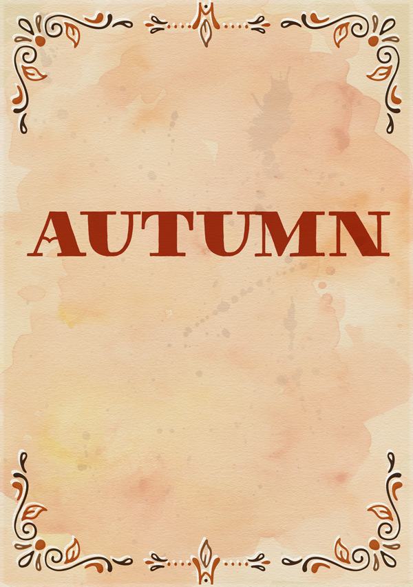
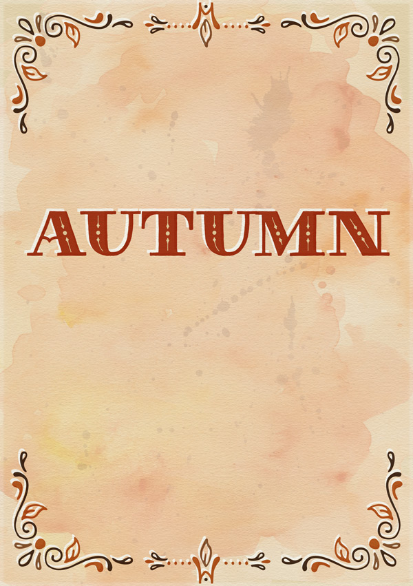
Select Thankful Modern Plain as the font, #A83718 as the colour and 65pt as the size. Set the layer blend mode to Multiply and then in all caps, type “AUTUMN”:
Duplicate the text on a new layer, then move it below the original text for an offset effect. Switch the blend mode back to Normal and change the font colour to white. As before, nudge the text slightly upwards and to the left:
Duplicate the original red, “AUTIMN” text layer, changing the font colour to #E8d3A9 and the font style to Thankful Modern Filigree to build up the decoration on the text:
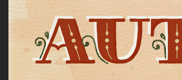
Duplicate the text layer again, this time changing the colour to #546046 and the font to Thankful Modern Illuminated to add more decorative details:
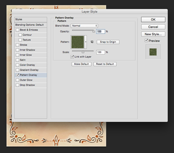
We’ll add a little extra sparkle to this decorative element by giving it a glitter effect using the freebies from Make Media Co. As we did in the background for the splatter effect, apply a Layer Style and select the ‘Moss’ glitter shade from the pattern swatches:
(If you’re using just the freebies kit, you can create a Clipped Layer using the glitter source file to get the same effect.)
Right click on this layer in the Layers Panel to assign a coloured label to it (I’ve gone for yellow). We’ll be doing this for every layer that has a glitter effect applied to it, so that we can easily identify them once we’ve completed the design. Why this is important will be revealed at the end – if you can handle the suspense! ;)
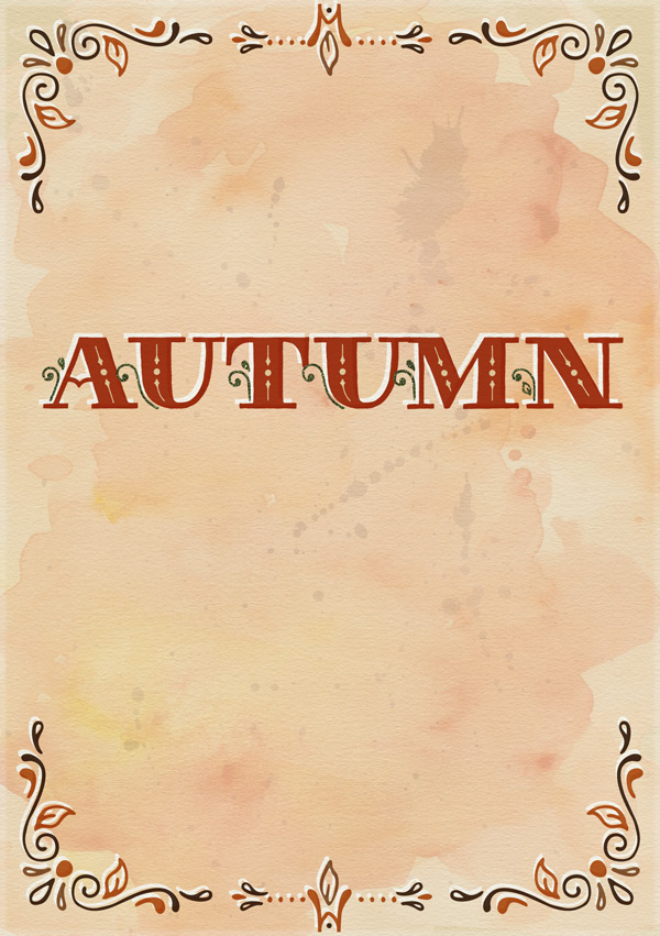
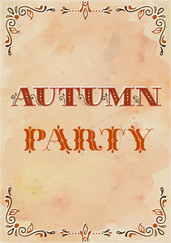
To finish off, go back to the original red “AUTUMN” layer and run the InkChamp action. All the settings can be left as the defaults on this occasion, which makes it all super easy for us!
Once the action has completed, you can admire your autumnal lettering!
Step 6:
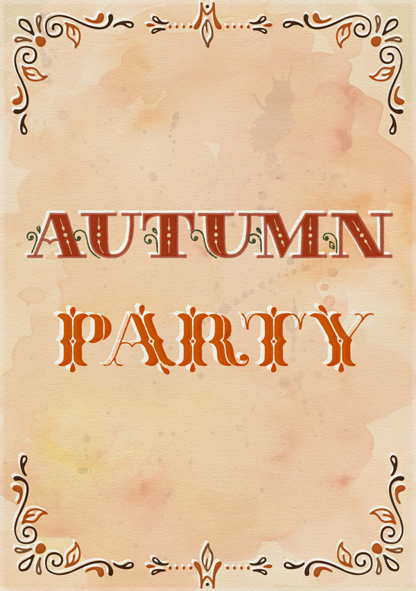
For the next set of text, select Thankful Ornate Plain as the font, size 76pt and colour #D55A00. Set the layer blend mode to Multiply, then type “PARTY” in all caps and position similarly to below:
Repeat the process from the previous step to create an offset effect:
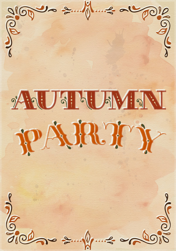
Like in the previous step, duplicate the original orange “PARTY” text on a new layer. Follow exactly the same process to add a glitter effect, changing the font to Thankful Ornate Plain Pro to pick out the decorative elements:
Remember to add a colour label to the layer as it’s glittery!
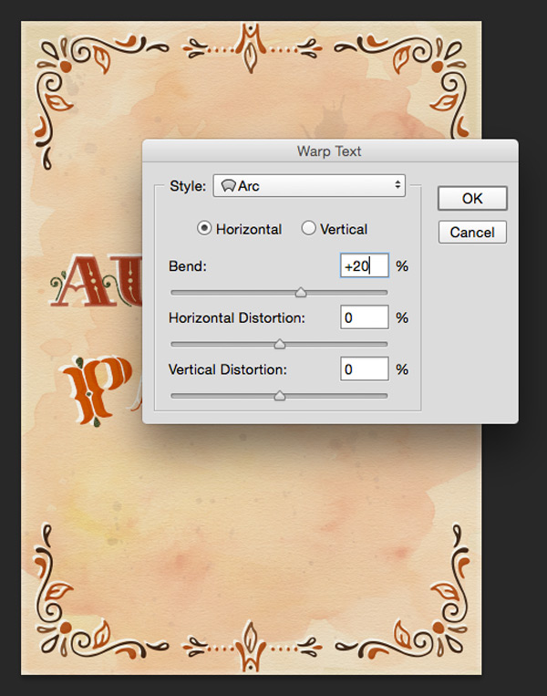
Once you’ve completed your text, select all the text layers and click the Create Warped Text tool (the icon that has a curved line under the letter “T”). Adjust the settings so that the style is set to Arc and the Bend to +20:
Your text should then look similar to this:
As we did for the “AUTUMN” text, run the InkChamp action on the original orange “PARTY” text, leaving all the settings as default:
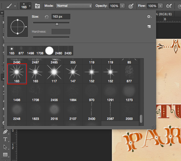
To finish off the text, we’ll add a little sparkling detail using the following brush from Glitter-Kit > Glitter, Graphics & Watercolor Pack > Brushes > Sparkles.abr:
Create a new layer above the original orange text, but below the green glittered text. Leave the brush at the default size and select white as the colour. Carefully position the brush centrally around each inner accent to create a sparkling effect:
Drop the layer Opacity to 50% for a subtler sparkle:
Step 7:
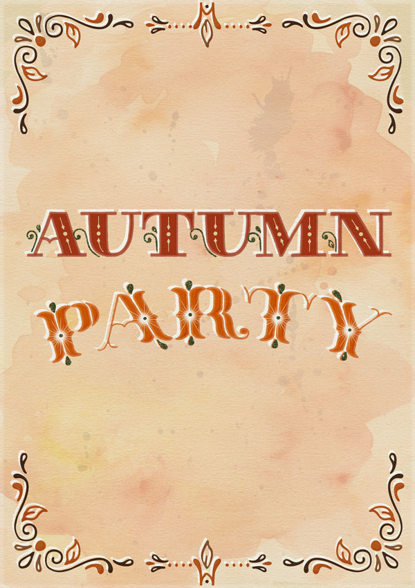
Next up, we’re going to add some decorative vectors. The images we’re going to use also have PSD versions, which we’ll be using.
Navigate to and open ultimate-designers-nicky-laatz > WatercolourShapeFiles > psds > WatercolourGraphics-01.psd:
Select a suitably autumnal, branch-like image of your choice, or use the one above (17th down from the top in the layers panel) if you want to copy the tutorial exactly.
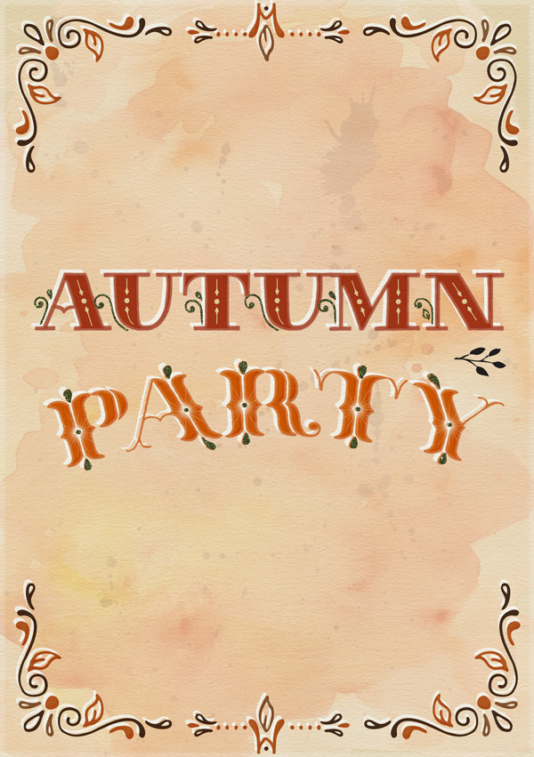
Copy and paste it on to your working document in the following position, scaling and rotating as necessary:
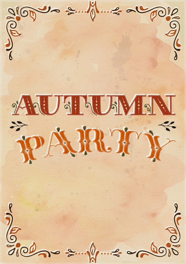
Duplicate the layer, then go to Edit > Transform > Flip Horizontal, moving it across to create a mirror image:
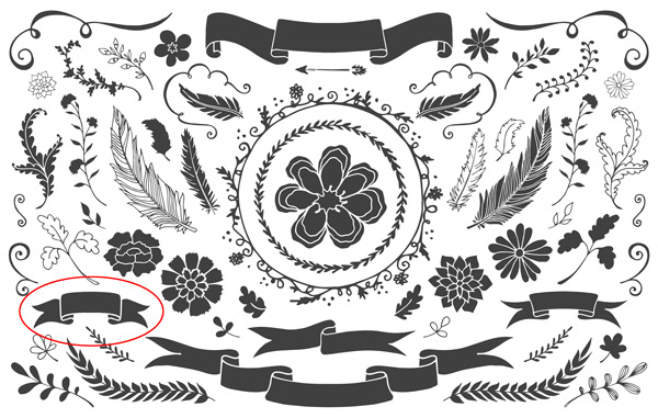
We’ll also add a banner from ultimate-designers-make-media-co > The Complete Watercolor Branding Kit > FLORAL VECTOR EXTRAS > CM_WatercolorBranding_Elements2.psd:
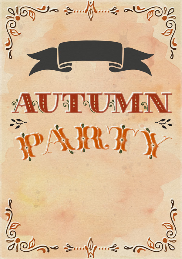
Copy and Paste this on to your working document, so that it sits centrally towards the top of the design:
Before moving on, create a duplicate layer from this, which we’ll temporarily hide and come back to shortly…
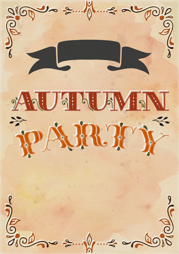
Going back to our original banner layer, use a layer mask to hide the two ‘shadows’ under the main part of the banner:
Then, group the banner and two branch vectors together in to a folder called “Watercolour Elements”. Selecting the group, apply a Pattern Overlay Layer Style to fill the shapes with a reddy/golden watercolour wash (such as “Crimson and Gold” from the freebies):
Step 8:
We’ll now come back to the hidden duplicate layer for the banner.
Make sure the layer is outside of the “Watercolour Elements” folder, then turn the visibility back on and create a Layer Mask to hide all of the banner except the two little shadows underneath:
Using the Layer Styles again, apply a dark, golden glitter texture such as ‘Champagne’ (included in the freebies):
Remember to add a colour label to the layer to indicate it’s a glitter layer.
We’ll finish off the banner by having it house some text. We’ll be using the Veronia font family, which you can locate at ultimate-designers-make-media-co > Veronia-Font-Pack > Veronia Fonts + Elements > Veronia Fonts. Install the fonts if you haven’t done so already.
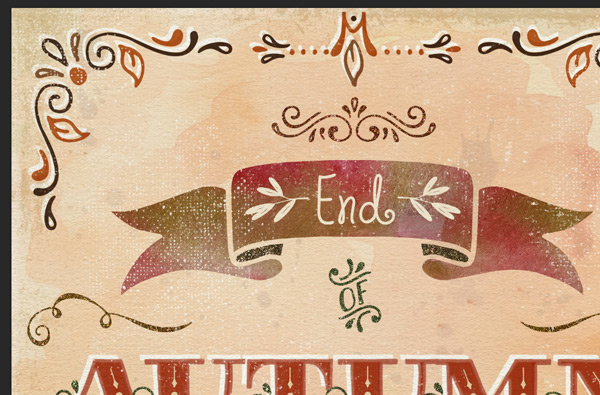
Selecting Veronia Bold as the font, 40pt as the size and #F8EFDD as the colour, type “yEnd”. Select the “y” and change the font to Veronia Elements to get a little leaf decoration:
As there isn’t a mirrored version of this glyph in the character set, we’ll need to type “y” again separately on a new layer and manually reflect and position it at the end of the word “End”:
Group the two layers together in to a folder called “Banner Text” to keep things easy to find.
Step 9:
We’ll add some more decorative elements in this step, starting with a sparkling catchword!
Selecting Thankful Extras Catchwords as the font, size as 50pt and colour as #546046 , type a lowercase “L”:
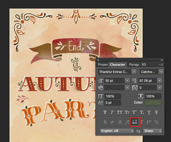
This style doesn’t quite fit with our overall design, so we’ll go in to the Character panel to select the Stylistic Alternative:
Use a Layer Style to apply the ‘Moss’ glitter texture, and assign a colour label to the layer so we can spot it easily later:
Next, select Thankful Extras Centers at size 40pt and type an uppercase “D”. Use a Pattern Overlay Layer Style to apply a deep red glitter texture (such as ‘Rust’, included in the freebies), then position centrally above the banner:
Going back to ultimate-designers-make-media-co > The Complete Watercolor Branding Kit > FLORAL VECTOR EXTRAS > CM_WatercolorBranding_Elements2.psd, copy and paste the following curl motif on to your working document:
Scale and position so that it sits towards the upper left of the “AUTUMN” text, like in the image below:
Duplicate the layer and reflect on the opposite side:
Group them together in to a folder called “Swirls” and use a Pattern Overlay Layer Style to to apply a golden glitter texture:
Step 10:
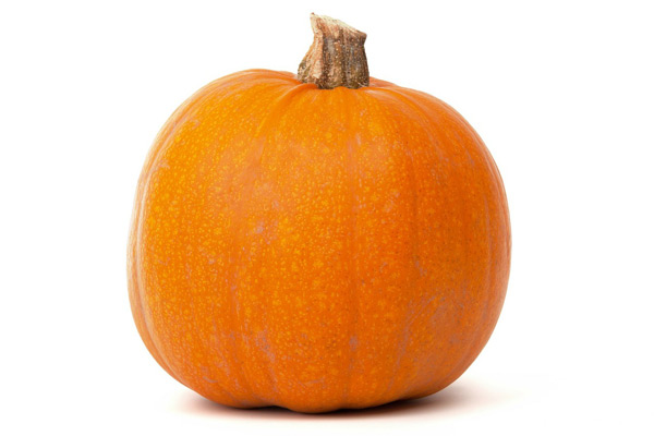
Next up, we’re going to add the following pumpkin picture to our invite to continue the autumn theme:
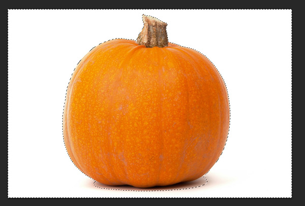
Use the Magic Wand Tool at about Tolerance: 20 to remove the white background, keeping a little bit of the shadow underneath the pumpkin.
We want to isolate the image on a transparent background so we can apply the RetroSupply-Photo-Toaster action to give this pumpkin an illustrated look.
Install the ultimate-designers-retro-supply-co > Mid Century Print Suite > RetroSupply-Photo-Toaster > Action > retrosupply-photo-toaster.atn action file if you’ve not already done so.
Open the image in it’s own Photoshop document, then apply the “Photo-Toaster (with instructions)” action and follow the steps with the following settings…
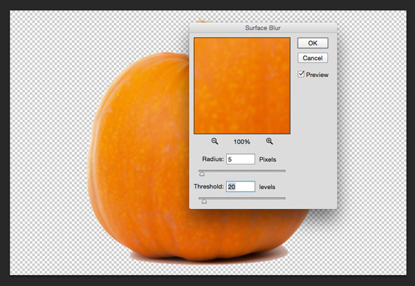
For the initial blur, stick with the default settings of 5 for the blur and 20 for the threshold:
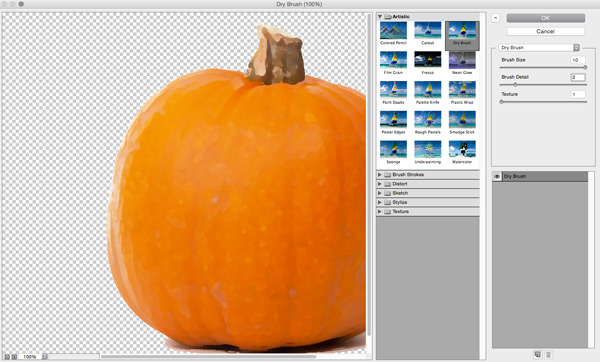
For the brush effects, we can use a chunkier, less detailed brush with the following settings:
Effect Settings:
Dry Brush
Brush Size: 10
Detail: 2
Texture: 1
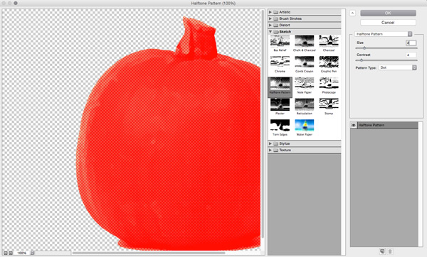
For the Halftone effect we’ll keep the effect fairly subtle, as our focus is more on producing an illustrated feel, rather than a ‘vintage print’:
Effect Settings:
Size: 2
Contrast: 4
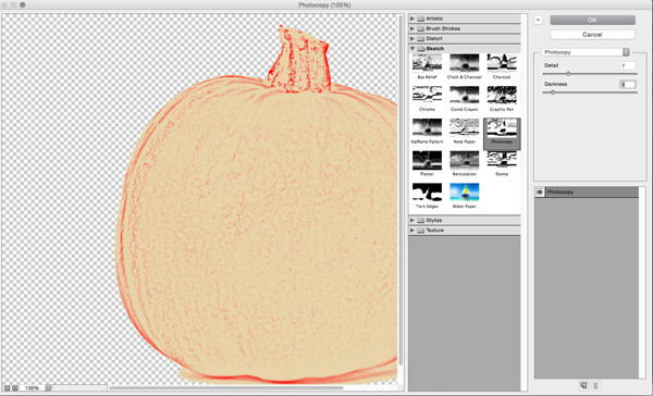
For the outline effect, we’ll keep the detail low and the edges fairly dark:
Effect Settings:
Detail: 7
Darkness: 5
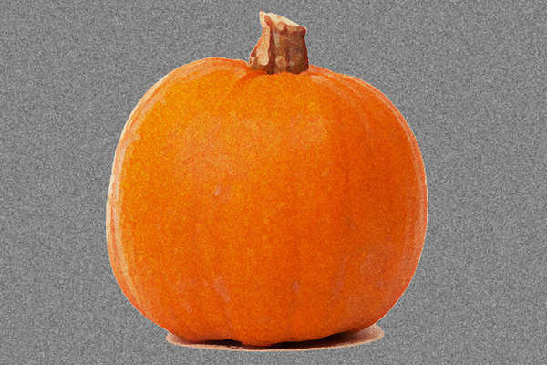
After all the actions have been completed, the end result should look something like this:
The effect looks great, but our transparent background has been filled with the grain texture too.
Not to fret! We’ll easily solve this by opening up the “Photo-Toaster” group folder that’s now appeared in our layers panel and move the Grain to outside and above the group. Clip the layer to the group so that the effect only applies to the areas that contain pixels.
Depending on your version of Photoshop, you may need to duplicate the group and flatten it to apply the clipped layer. Make sure you keep a hidden, unflattened version of the group so you can come back and make edits if necessary.
Save the image as a separate .psd file so that we have an editable version, then also as a .png, which we’ll paste on to our working document. By using a .png version, it reduces the file size and also makes it quicker and easier to adjust things like size, as the smart filters aren’t having to all readjust.
Step 11:
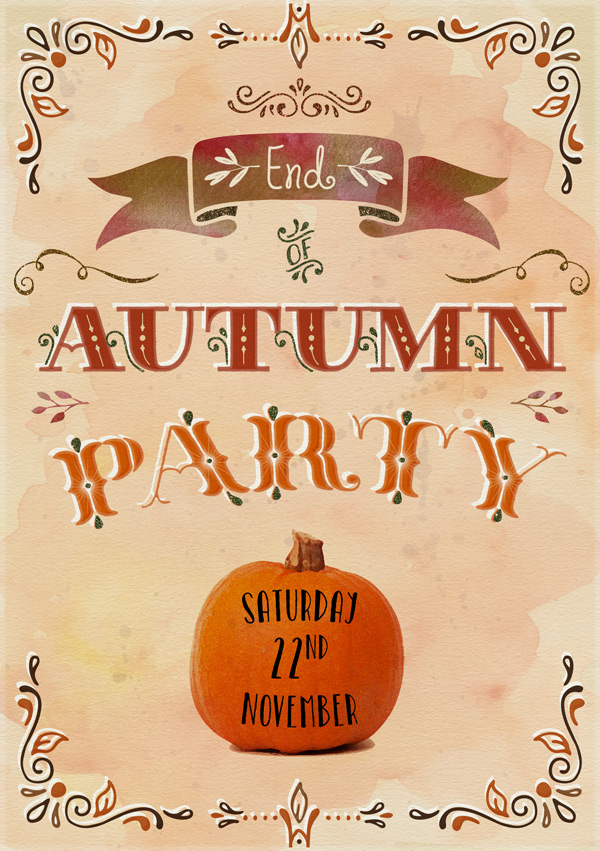
Once you’ve saved the pumpkin image as a .png file, scale and paste it on to your canvas so that it sits centrally below the “PARTY” text, and set the blend mode to Multiply:
Now that we’ve enticed our potential guests with a tasty-looking pumpkin, we need to let them know what day to arrive!
We’re going to use the ultimate-designers-kimmy-design > Catalina-Font > catalina avalon font family, which you’ll need to install if you haven’t already.
Choose Catalina Avalon Sans Regular as the font, and with each word on a new layer, type the following:
Saturday
Size: 30pt
Warp text: Arc, bend +20
22nd
Size: 40pt
(use the Superscript option in the character panel to alter the “nd”)
November
Saturday
Size: 30pt
Warp text: Arc, bend -20
Make sure the fonts are centred within the pumpkin, then group them together in a folder called “Date”. Use a Pattern Overlay Layer Style to give the text a glittery finish (I’ve gone for the shade ‘Copper’ which is included in the freebies), then apply a colour label to the group so we can identify it easily as a glitter element.
Step 12:
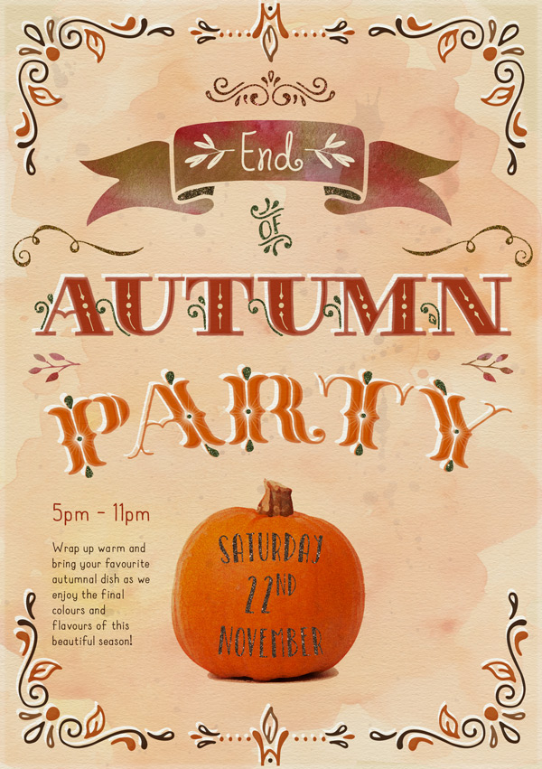
Now we need to add the time and a little extra info. We’ll use another member of the Catalina font family here, this time ultimate-designers-kimmy-design > Catalina-Font > catalina clemente, which is a nice, friendly sans-serif with a hand written feel, and should work well on our invites.
For the time, type the following:
5pm – 11pm
Font: Catalina Clemente Bold
Colour: #A83718
Size: 18pt
Then we’ll add a little descriptive text – feel free to write your own personal message here!
Font: Catalina Clemente Bold
Colour: #3F2A1A (colour picked from the border)
Size: 10pt
Set the layer blend mode to Multiply, and our invite is really starting to take shape!
Step 13:
Next, we need to let people know how and where to reply. Because who’d want to miss a party with such an awesome invite? ;)
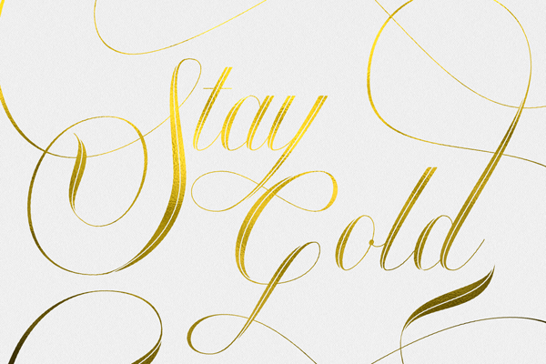
Since this bundle includes a lot of great resources to add a bit of shiny goodness to your design (and I’m sure I’m not alone here in having “oooh… shiny!” tendencies) we’ll create a gold, embossed ‘RSVP’ icon to make our invite stand out.
For this we’ll need to open ultimate-designers-ian-barnard > Gold-Leaf > GoldLeafPress-PSD > GoldLeafPress-Landscape-4500px in a new Photoshop document:
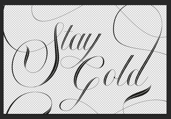
Double click on the top layer with the green colour label to go in to a new editing window, which is where we’ll add our own text.
Create a new layer then either hide or delete the original example layer (shown above).
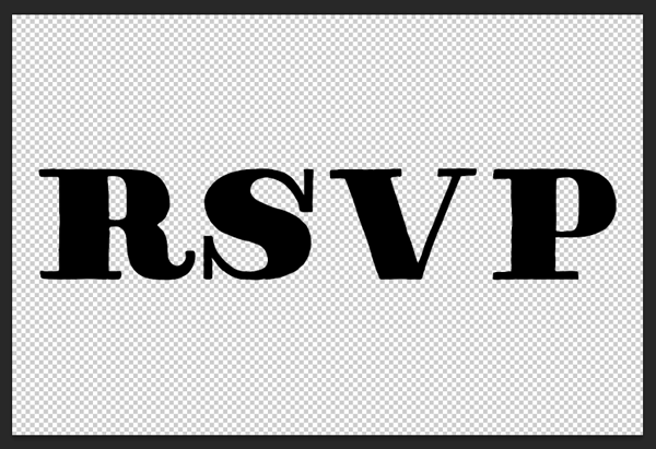
We’ll use Thankful Modern Plain again as the font, then type “RSVP” scaling manually to fit almost the full width of the canvas:
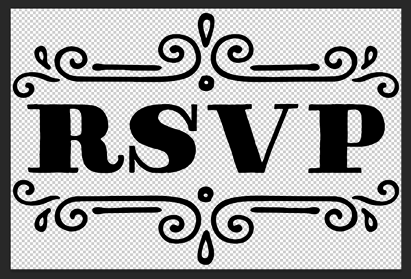
On a new layer type an uppercase “N” and change the font to Thankful Extras Centers to get a decorative upper surround for our text, and scale manually to fit te width of the canvas. Duplicate the layer and rotate so we have a matching decoration underneath:
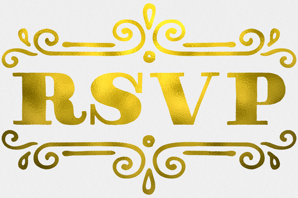
Save the file, then go back to the main Gold Leaf document to see the result:
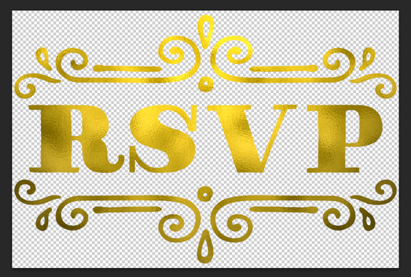
We want to extract just the gold text to use on our invite, which we’ll do by hiding the “Paper” and “Background” groups in the layers panel:
Save the file as a PNG and then paste it on to our invite design:
It’s a little flat and difficult to see at the moment, so we’ll quickly add a Bevel & Emboss Layer Style, leaving the settings as default:
Give this layer a colour label too, as the gold leaf can be considered a ‘glitter’ effect
Step 14:
Next we’ll add the RSVP details. We’ll use Catalina Clemente Bold as the font again and 10pt as the size.
Remember to include:
Email (#3F2A1A)
Telephone (#3F2A1A)
Address (#A83718)
Group the text layers in to a folder called “Contact Details” and set the blend mode to Multiply. Align so that they sit nicely under the ‘RSVP’ icon.
Step 15:
In this step we’re going to add a few dark and light textures to give our invites a slightly worn and scuffed look.
For this we’ll need to install the brushes from ultimate-designers-retro-supply-co > Mid Century Print Suite, which you’ll find within the individual products.
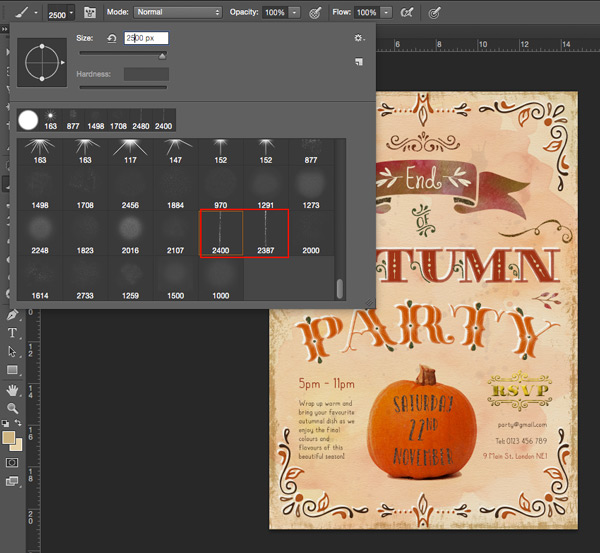
For the edges, use the SparkPrint Fold 1 and SparkPrint Fold 2 brushes at around 2500px to fit the height of the canvas and set to the colour #CDB380.
Stamp around the sides a few times to get a worn effect, then duplicate the layer, rotate by 90 degrees and scale so that it covers the top and bottom edges.
Change the blend mode to Multiply and reduce the Opacity to 45% for a subtler effect:
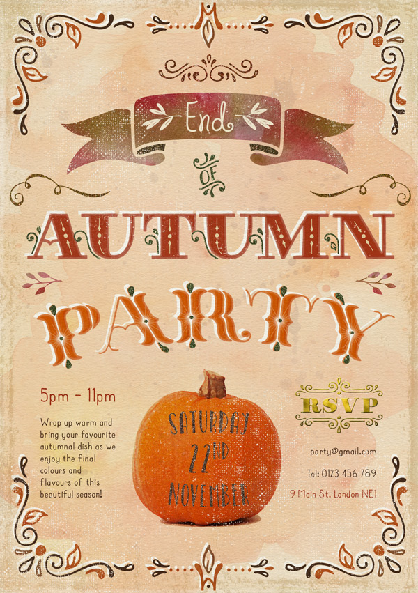
Next, create a new layer and select white as the brush colour. We’ll be using this layer to create our lighter scuff marks. I suggest experimenting with the brushes to see which textures and styles you like until you have an effect you’re happy with:
Reduce the Opacity of the layer to 60% to soften the overall effect:
Step 16:
We’ll add a final bit of detail to our design with a touch more glitter (you gotta love them sparkles)!
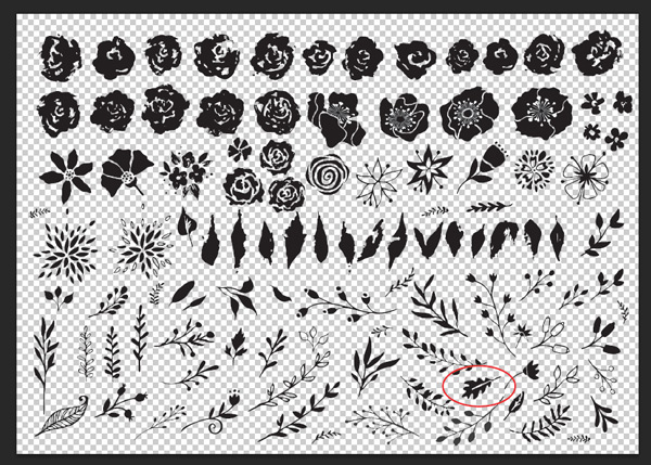
Open up the ultimate-designers-nicky-laatz > WatercolourShapeFiles > psds > WatercolourGraphics-01.psd file we used earlier and locate this oak leaf (2nd layer from top):
Paste it on to your working canvas, scaling and rotating so that it sits within the top left corner:
Duplicate the layers and rotate/flip the images so that they sit one in each corner:
Finally, group them together and add a Pattern Overlay Layer Style to give them a golden, glittered texture:
Remember to give the group a colour label, indicating that it’s a glitter element.
Step 17:
Last step before we send out the invites! ;)
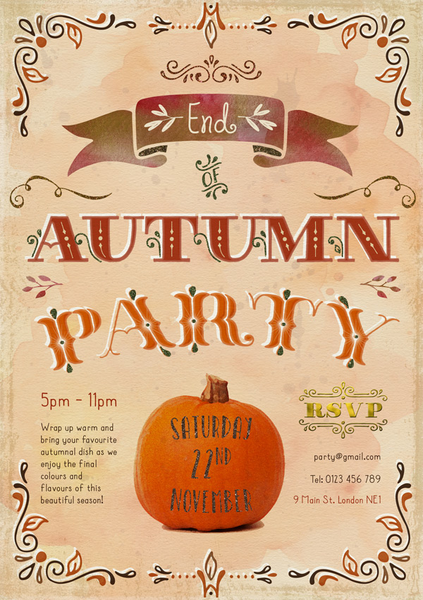
Now for the reason we’ve been adding colour labels to all our glitter layers… We’ve obviously been creating our layers in the most logical order and adding the effects as and when we’re working and before we moved on to the next step. This makes sense working digitally and creates a natural flow.
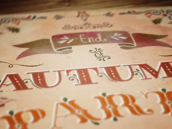
To give this image a more authentic feel, what we’re going to do now is move all the glitter layers to the very top of the layers panel, so that they are above the paper effect.
This is because if we were adding glitter to a card by hand, it would most likely be the top layer – a final embellishment. Therefore the paper effect doesn’t need to apply to it, nor would the paper scuff marks show up on them.
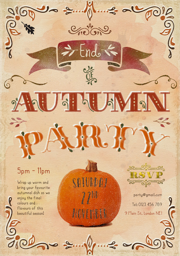
And we’re done!
Thanks for following along with this tutorial! I really hope you had fun creating your party invite and trying out some of the great resources available in this bundle. Hopefully it’s given you some ideas of how you can apply them to your own creations.
Please do share your designs on the Facebook page as we always love to see what you do with your new tools! :)
Hopefully this tutorial showed you just some of the ways you can use the huge variety of resources available in this bundle, and got to know them a little better. Remember, you can get this mega bundle for an equally mega 94% off this week! Grab it below, while you still can:
The Ultimate Designer’s Collection (Huge Variety of Best-Selling Resources)






















LOVE LOVE LOVE the tutorials I just wish they would come in a pdf that I could save for future references. Especially for the ones that I purchase the bundle of.
Thank you so much for your suggestion. We’re already working on PDf versions of the tutorial, as we’ve been getting a lot of requests for them. We’ll let everyone know when we get this launched. :)
Thanks for the compliments and feedback, Jordan! Really great to hear what approach is useful for you and will make sure there are more tutorials like that in the future. Your work always looks like you’re beyond being a learner, though! :)
Love when you do up a tutorial that is so easy, yet loaded with detail! For those of us still in learning mode this is PERFECT!
:D I couldn’t have said it better, Jordan. Jo did an amazing job with this.
This tutorial (and bundle) is fantastic and I’m going to use it right away! Awesome stuff, Jo!
Thanks so much, Chris! Always great to hear that the tutorials are useful and can’ wait to see your own take on it. :)
Awesome! Let me know if you create anything with the freebie, or if you follow the tutorial. I’d love to check out what you create. :)
LOVE this freebie + very detailed tutorial! LOVE Design Cuts too!!!!
Glad you enjoyed the tutorial and freebie, Candi! I’m a sucker for anything sparkly so it was great to be able to include the glitter textures. I hope you have fun using them in your own work. :)
Hmm Who doesn’t like a little sparkle, especially around Christmas. :D
It really is a lovely tutorial, and so perfect for this time of year.