WHAT WE’RE CREATING:
In today’s tutorial, I’m going to walk you through several ways to use many of the awesome vintage items in our best-selling vintage bundle.
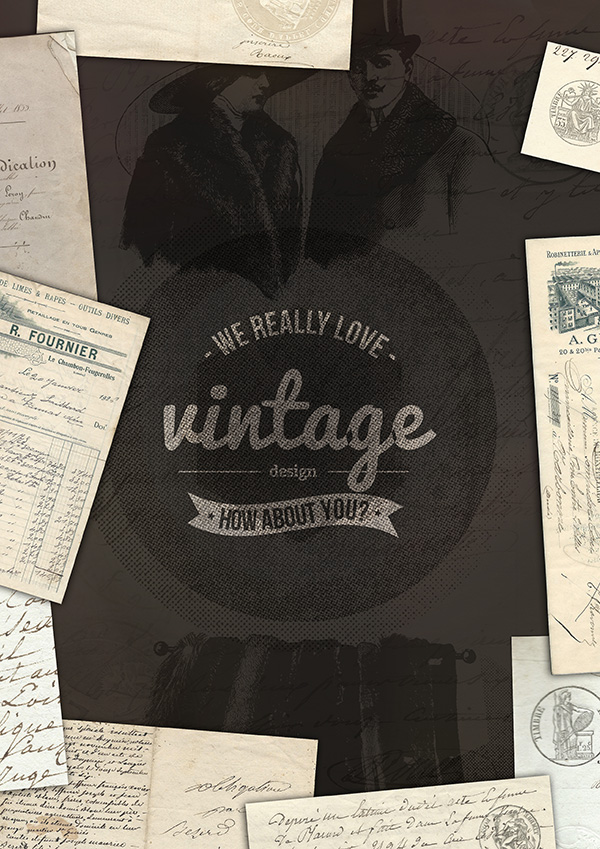
There’s so much included in this 6GB whopper of a deal that I wanted to combine lots of different resources into a single composition, just to show you how easy it is to layer up these great vintage goodies into an authentic looking outcome.
If you haven’t grabbed the vintage bundle yet, then you’ll need to, in order to follow along properly with this tutorial. We’ll be using dozens of different resources from the bundle, so if you have already purchased it, then you’ll be able to follow along, step by step.
Click here to see what’s included with our best-selling vintage bundle, and to grab the deal now.
Ok, all ready to go?
Let’s get started!
Step 1:
Start by opening up Photoshop.
Create a new document (A4 paper size, and 300 DPI resolution).
Fill your canvas with a deep brown colour (#332f2c).
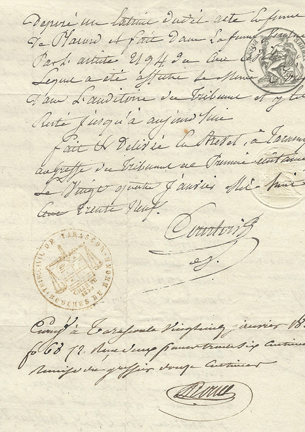
Within your new vintage bundle, locate the 2 Lil Owls French Paper Textures (found in part 1 of the bundle).
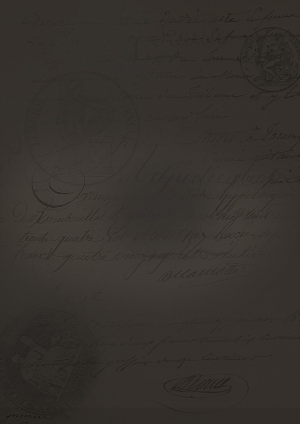
Paste in one that you like, positioning it to fill your entire canvas:
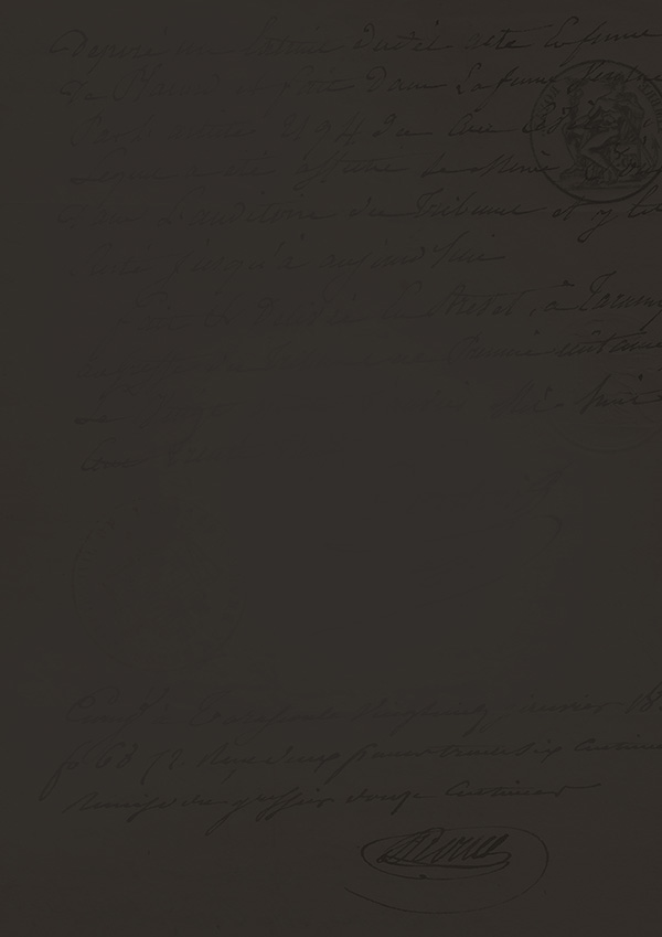
Now change this layer’s blend mode to ‘multiply’ and reduce it’s opacity to around 50%. Also apply a layer mask, and use a large, soft black paintbrush to mask off some of the areas of texture, making it a little more random looking:
Now play around with adding more French Paper textures to your canvas. Experiment with layer blend modes and opacities. The important thing is to layer up multiple surfaces and elements of detail, without making your piece too busy.
Don’t worry if it looks a little strange at this stage. We’ll be adding up more layers and effects to give it a more authentic vintage look. At this stage it’s just about adding subtle elements of detail to your background, in order to give it a bit more depth.
Step 2:
Open up part seven of your vintage bundle and you’ll find the offerings from Offset design shop.
There are some absolutely love vintage shapes and circles included, that include cool halftone effects and other old-time textures.
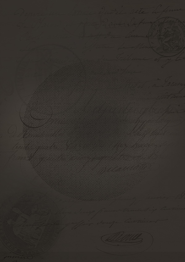
Paste in one of the halftone circles from these packs, positioning it in the centre of your canvas.
Reduce it’s opacity to around 40%:
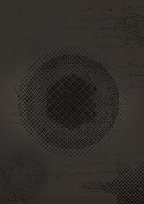
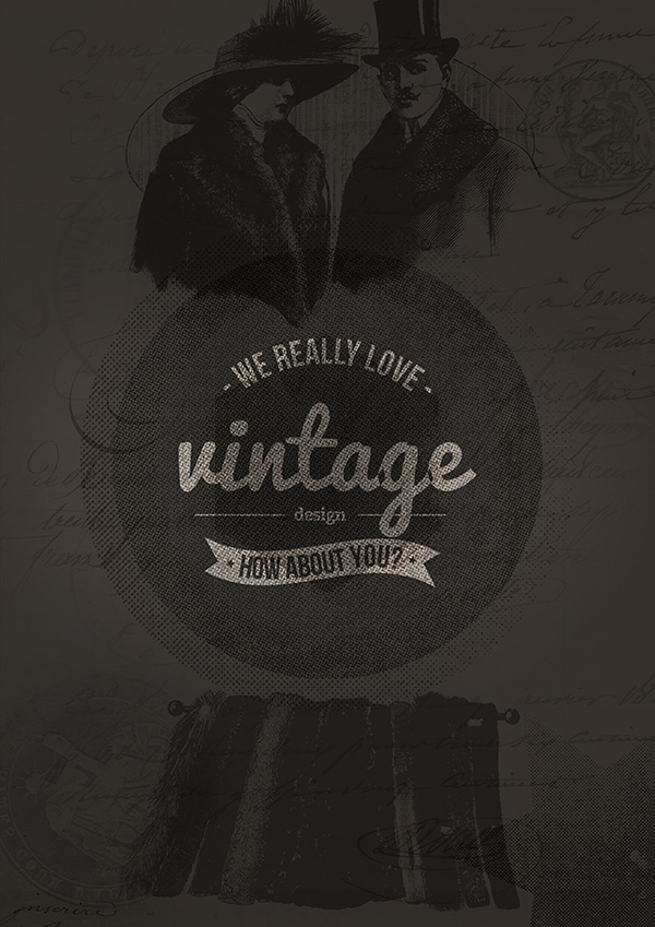
Now continue to find cool shapes within these Offset packs, and paste them into your canvas, resizing them accordingly. I’ve stacked up several shapes to sit within one another, and also applied a nice star design to the bottom right corner:
Step 3:
It’s time to add some vintage logo work to our poster design.
For this piece, I’m going to use the awesome logo/insignia templates from Tom Anders (found in part 8 of your vintage bundle).
Open up your logo pack of choice, and you’ll get a warning that the fonts can’t be found. This is totally normal, so don’t worry.
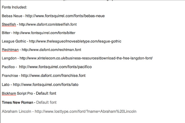
Each logo/badge/insignia pack in this deal actually comes with a helpful read me text document, providing links where you can download any fonts used in these products totally free.
Here’s an image showing the text document for Tom Ander’s packs:
Once you’ve downloaded these awesome fonts, it’s time to choose a suitable logo for our piece.
I settled on this great design, found with the Tom Anders section of this bundle Vintage Logo-Insignia Bundle – Collection 2.
Changing the text is incredibly easy, once you’ve download the necessary fonts. Simply select your text tool and click on the existing text. Then replace it with text of your choosing.
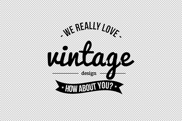
I replaced the text with some nice vintage messaging, and then was sure to hide the white background layer, so that this logo is set against a transparent background:
Go to layer > merge visible and then copy this logo, so that it’s ready to be moved into our main composition.
Step 4:
Paste in your new logo design, positioning it in the centre of your canvas, and resizing it accordingly.
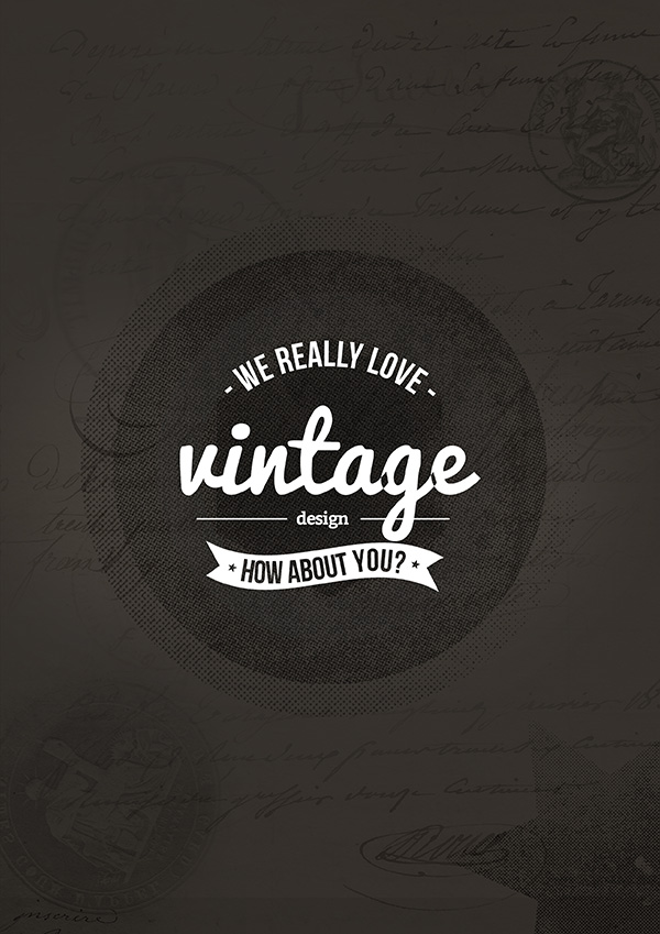
I also went to image>adjustments>invert to change the logo from black to white, giving it more contrast against our dark brown background:
Change this logo layer’s blend mode to ‘overlay’ and keep the opacity at 100%. Then duplicate it, and reduce the duplicate’s opacity to 50%.
This should create a really nice text effect, as the logo let’s some of the underlying details and patterns show through:
Step 5:
I want to add some more illustrative elements to this poster, so I’m used some vectors from an expired deal of ours. We encourage you to source some suitable free of paid vectors for this purpose.
If you’re looking for incredibly high quality vectors, then we do have a perks section, giving you 15% off Go Media’s entire store (their vectors are world renowned, and we love them!).
In this instance, I just set the vintage vector’s layer blend mode to ‘multiply’ and played around with the opacities a little:
Step 6:
For this step, you can really have some creative fun!
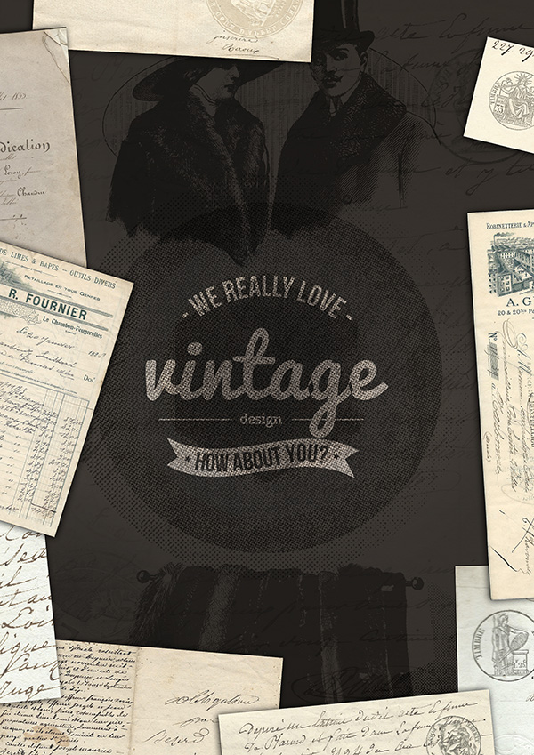
Open up the 2 Lil Owls French Paper packs again, and then paste in several of the designs, positioning them around the edges of your poster, to give a kind of scattered effect.
Be sure to apply a subtle black outer glow blending option to these layers, in order to give the impression of them casting a small shadow on the underlying poster:
Step 7:
If you return to Tom Ander’s section of the bundle, you’ll find some cool bonus textures and light leaks.
Light leaks are a great way to bring your designs together, but creating a unified light effect that can be overlaid over your entire piece.
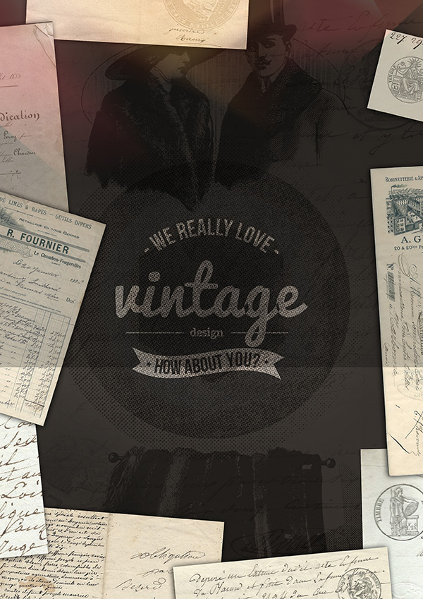
In this case, you can see that I’ve applied one of the light leak images to the top of my canvas:
When I change the layer blend mode on this light leak layer to ‘screen’ it hides the black background effectively. Then by reducing the layer opacity to around 30%, we get a more subtle, realistic overlay effect:
Here’s the effect after adding a couple more light leaks over other parts of my canvas:
Step 8:
Now we’re going to use the ‘screen textures’ found in part 3 of this bundle, courtesy of Cruzine.
These textures are some of my favourite resources from the entire vintage bundle!
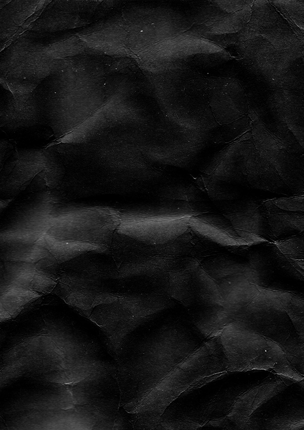
They give you a variety of crumpled, worn and distressed paper/card textures, which are all black/white, and on a primarily dark background. This means that when you set them to ‘screen’ layer blend mode, the black background is hidden, and all the lovely distressed details remain.
Take a look at this beautiful texture:
Now when I change it’s layer blend mode to ‘screen’ and reduce it’s opacity to 50%, you’ll see what happens:
This is a really easy way to give your work a lovely vintage feel.
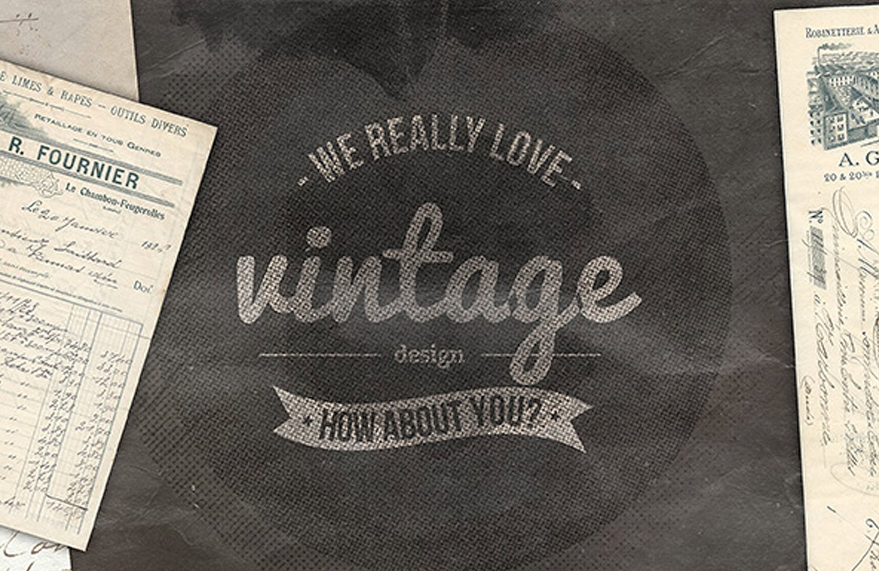
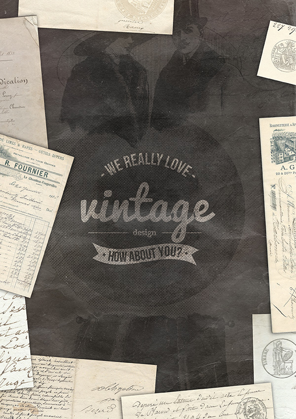
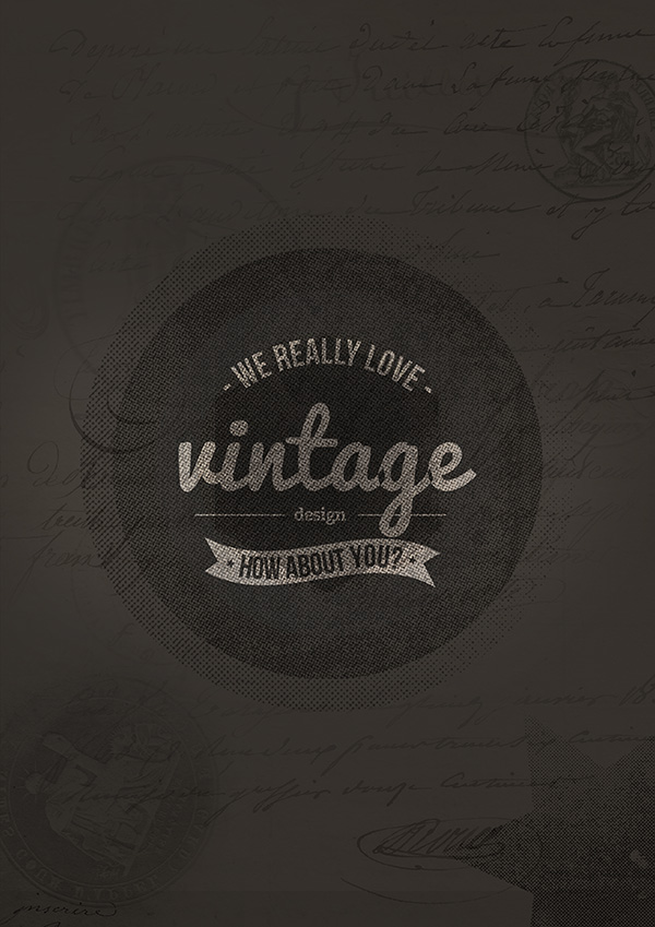
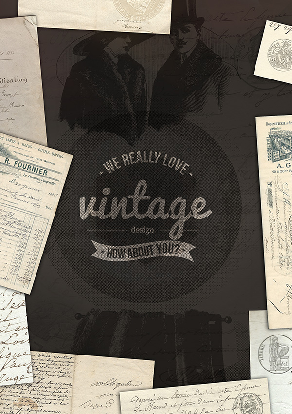
Here’s my final design, after applying a couple more distressed ‘screen textures’:
AND WE’RE DONE
I really hope that you enjoyed this tutorial. Have fun with it, and please comment and let us see your outcomes.
If you haven’t yet grabbed our HUGE vintage design bundle, then remember, there’s only one week left to get it, before it’s gone forever. This is the biggest and best vintage bundle we’ve ever seen, and the comments further down this page show much the community have been loving it.
Click here to see what’s included with our best-selling vintage bundle, and to grab the deal now.



Be the first to comment