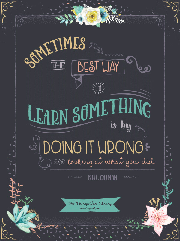
WHAT WE’RE CREATING:
Hello designers! This is Renee bringing you a new tutorial with a hand drawn flair. This week, we’ll be working with beautiful, handmade vector graphics in Illustrator.
Follow along with this tutorial: Download the freebies
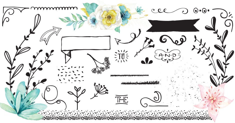
We have a huge freebie pack of gorgeous hand crafted illustrations, patterns and borders for you..
Of course, this freebie is just a small sample taken from the amazing collection: The Lovingly Handcrafted Design Bundle: 1000s of Handmade Resources at just $29 (that’s 95% off). This is the collection you’ve been asking for! Our incredibly talented designers have spent hours creating unbelievably beautiful hand drawn pieces that you’ll love.
SOURCE FILES
The source file will be provided in two versions. You will find an outlined version for those of you who haven’t downloaded the bundle yet and a text version for those of you who have, so you can see the font settings.
RESOURCES
Everything you need except the fonts will be included in the freebies file. If you haven’t pulled the trigger on buying the bundle yet, I’d recommend checking out other handwritten fonts out there as alternatives.
QUOTE NOTE!
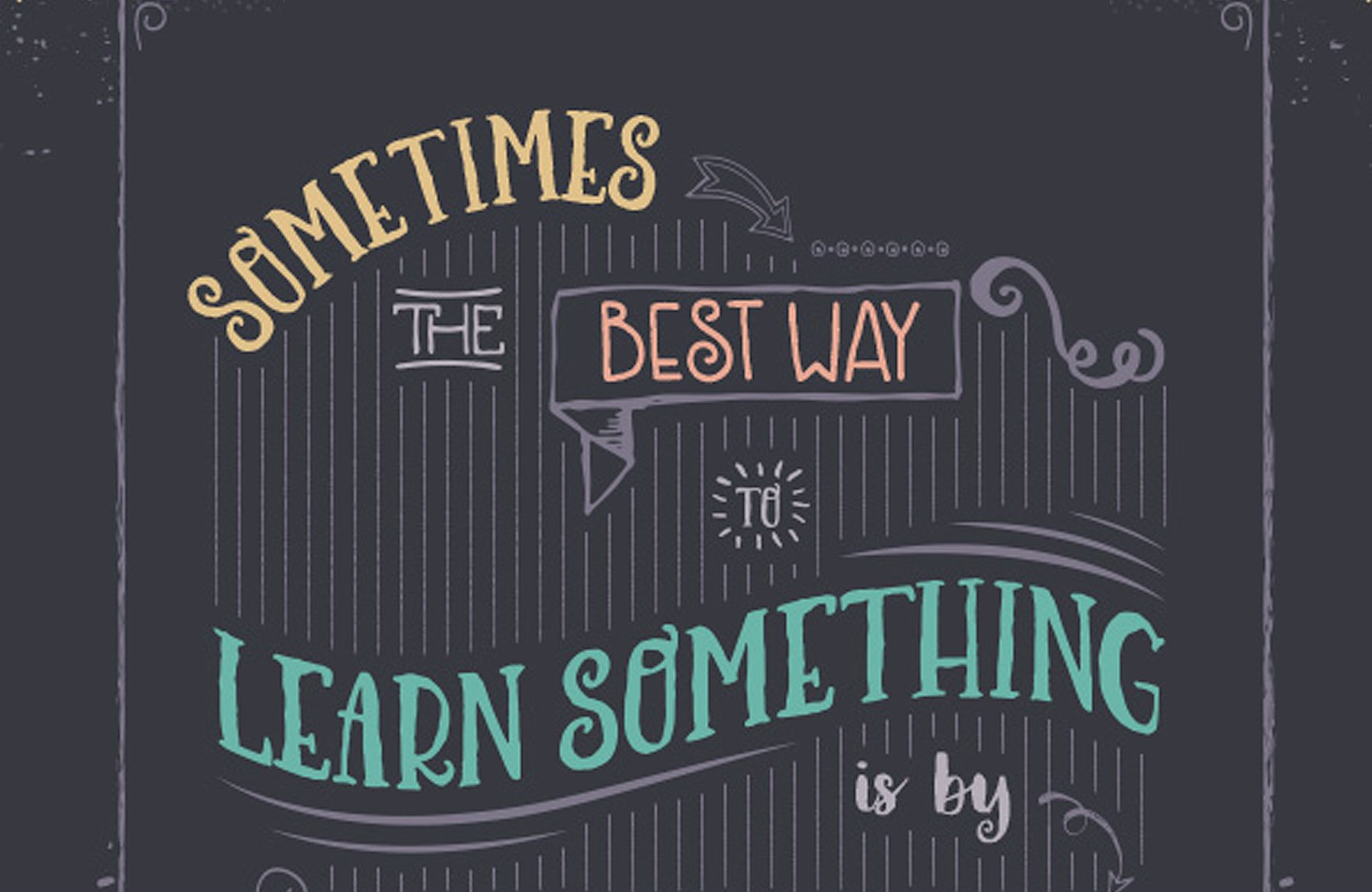
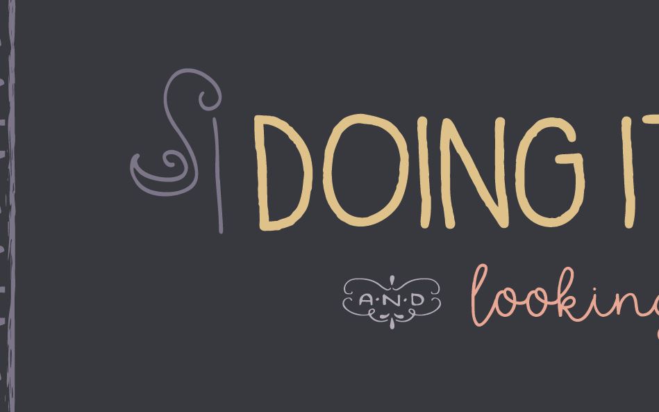
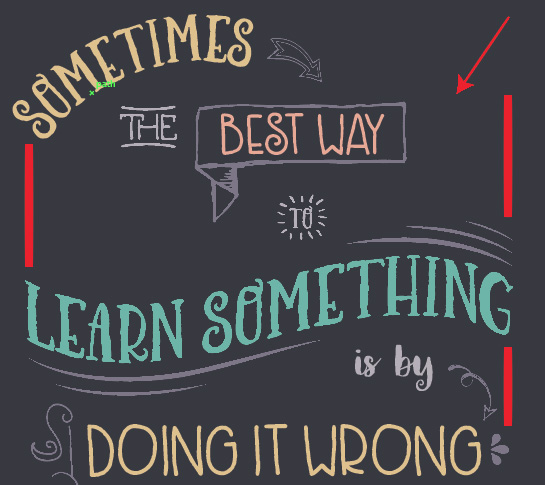
First of all, I’ll admit that this is a thinly veiled excuse to use a quote from my favorite author. Secondly, having said that, I really believe that this quote applies so much to what we do in graphic design in a couple of different ways. The quote is “Sometimes the best way to learn something is by doing it wrong and seeing what you did.”
So many times, I discover totally new effects when I’m trying to emulate something I’ve seen someone else do. I might not always figure out how the original effect was created, but I end up making something awesome with the new effect by “doing it wrong”. Point being, even a goal that you’ve set out and haven’t achieved can result in something incredible. Remember always to celebrate your creativity – even when it isn’t what you were expecting!
The other thing I want to share with you is a technique I sometimes use when I’m scouting for unusual ideas. Sometimes I’ll change my approach and break design rules (mixing too many fonts, colors that don’t traditionally go together, odd angles, etc), effectively “doing it wrong”. This can lead to awesome breakthroughs, ideas and unique ways of looking at things that you might not otherwise have discovered. Sometimes, doing it wrong is just right!
TECHNICAL NOTE
Shortcuts will be listed for both Mac and PC, in that order. For example, if the shortcut to copy something is written as cmd/ctrl + c, you’d use cmd + c on a Mac and ctrl + c on a PC.
Step 1:
Open Illustrator and create a new file. We’ll use an 18” x 24” poster size with resolution at 300 ppi and Color Mode of CMYK. We’ll also set a bleed of .125” on each side. When printing a piece, it’s standard to have ⅛” bleed (or extra) around each side so you can trim down to the correct size without leaving any white edges.

Save your newly created file.
Let’s start by creating our color palette. After a little bit of experimentation, I came up with 6 colors that create a fun, crafty palette.
Pink: 7/39/38/0
Tan: 13/22/51/0
Green: 59/13/62/0
Teal: 59/10/38/0Light Purple: 59/56/38/0
Dark Purple: 72/65/55/50
To create your new swatches, open your Swatches palette (Window > Swatches) and click on the New Swatch icon at the bottom right of the Swatches palette. Change the name to an easy description (like Craft Pink) and enter the appropriate values.

Now, open your Layers palette (Window > Layers). Double click on Layer 1 and rename it Background.
Select your Rectangle tool (m) and click once anywhere on your artboard to bring up your Rectangle options. Our finished size is 18” x 24”, but we want our background color to extend out to the edge of the bleed area. So for width, we add 18” + .125” + .125” to get a total width of 18.25”. We’ll do the same for the height to get a total height of 24.25”. Enter these values in your Rectangle options box and click OK.

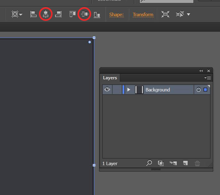
To center the rectangle, with it still selected, click on the align icons at the top of your artboard – Horizontal Align Center and Vertical Align Center. These can also be found in your Align palette (Window > Align).
In your Layers palette, click the empty spot to the right of the eye icon to lock the Background layer so we don’t accidentally select the background when we’re trying to manipulate our other elements.
Click the New Layer icon to create a new layer and name it Border.
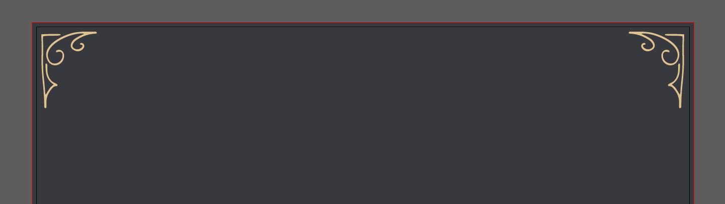
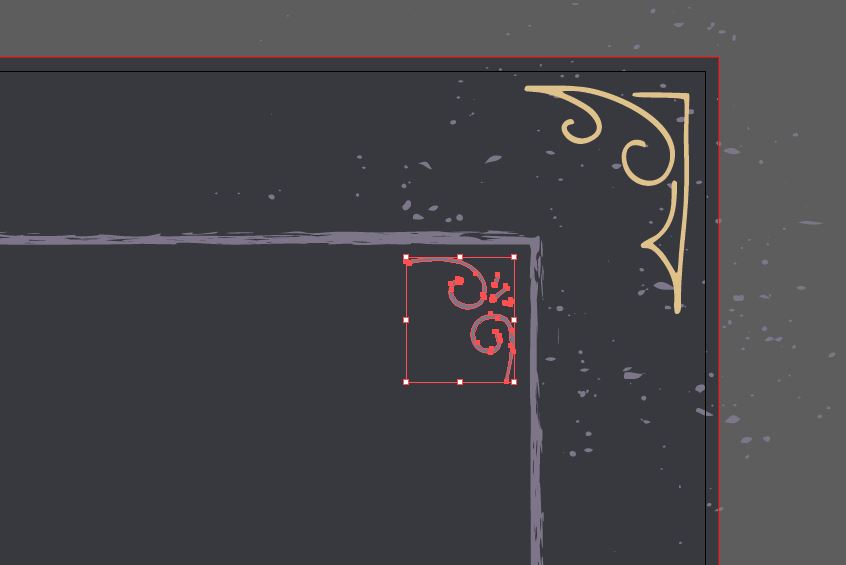
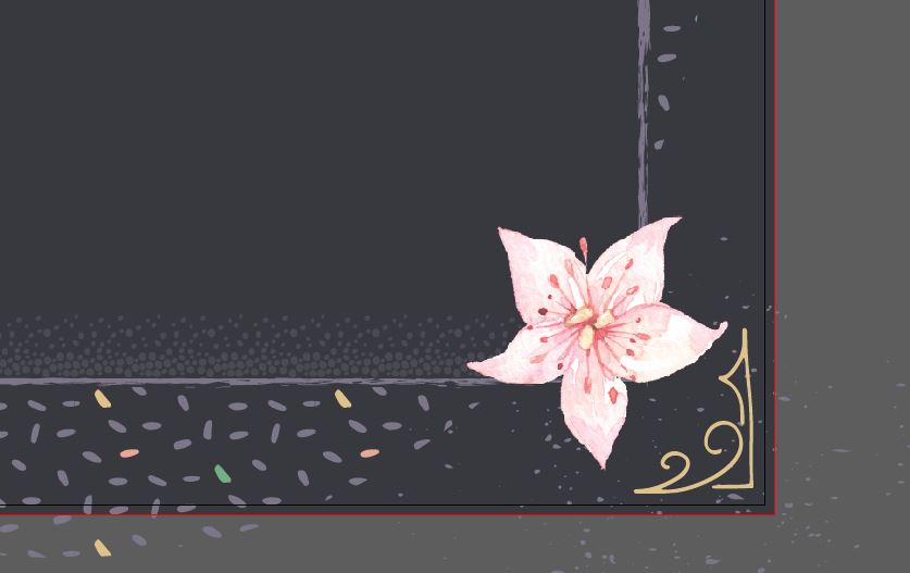
Open the vector freebies file. Select the cute little hand drawn corner element from Flavor Type’s Carneval Extras in the middle towards the top and copy it (cmd/ctrl + c), then paste (cmd/ctrl + v) onto the poster layout. Change the color to the yellow we added to our palette earlier.
We’ll also want to scale our corner up about 200%. Go to Object > Transform > Scale. In the dialog box, enter 200% next to Uniform. Position it in the lower left corner of the poster, making sure to stay within the trim edges (black line) and not out to the bleed area.

Next, we’ll create a mirror-image for the bottom right corner. Go to Object > Transform > Reflect. Select Vertical and click Copy. Hold shift and drag the copy to the right side of the poster.

Now we’ll create copies for our top corners. Use your Selection tool (v) to select both bottom corners. Go to Object > Transform > Reflect. This time, choose Horizontal for the Axis. Click Copy. Hold shift and drag the reflected copies to the top corners of the poster.
Go back to the freebie file and copy the Lisa Glanz spatter texture. Paste it into the poster and change the color to Light Purple. Go to Object > Transform > Scale and scale it up uniformly by 300%.
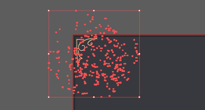
We’ll duplicate this texture into each corner. There’s no need to reflect it though, since we’re going for a random look. Hold down opt/alt and shift while clicking on the texture and dragging it to the right.
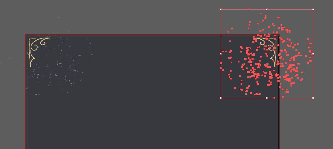
Select both textures in the top left and right, then use the same technique to copy those to the bottom. Hold opt/alt + shift and drag the textures to the bottom corners.
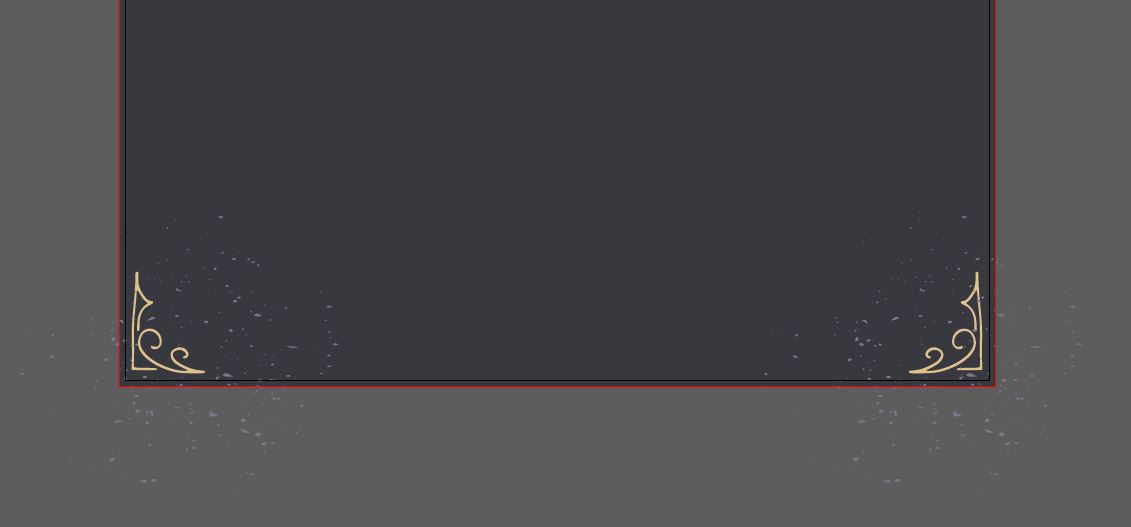
Finally, we’ll send the textures to the back, behind our yellow corners, by selecting all 4 and hitting shift + cmd + [ (or go to Object > Arrange > Send to Back).
For our inner border edge, select your Rectangle tool (m) and click once on your artboard. In the dialog box, enter 15” width and 21” height. This will give us a 1.5” border around the sides. Use your align icons again to Horizontal and Vertical Align Center and change your fill color to Dark Purple and stroke color to Light Purple.

In your freebies file, copy the thicker of the two stroked lines from Retro Supply Co. and paste it into your poster.

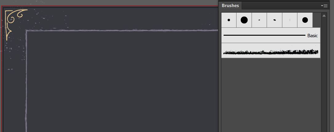
This will add the hand brushed stroke, called PN 4, to your Brush palette (Window > Brushes) in your poster file. Now that it’s been added to the brush palette, you can delete the line you just pasted in.
Select the rectangle and then click on PN 4 in the Brushes palette. This will apply the stroke to the rectangle edges.
In the freebies file, copy the other corner element (on the left in the middle), also from the Carneval Extras, and paste it into the poster file. Change the color to Light Purple and scale up about 160%. Position in the top right corner of the inner rectangle.
Just like we did with the other corners, we’ll copy this corner element to the other 3 corners using the Reflect/Copy technique. Go to Object > Transform > Reflect. Choose Vertical Axis and click Copy. Drag the copy to the left corner.
Select both top corners and go to Object > Transform > Reflect. Choose Horizontal Axis and click Copy. Then drag these copies to the bottom corners.

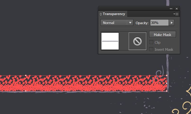
For a little added texture, copy the Lisa Glanz dotted border at the bottom of the freebies file and paste it into the poster. Scale it up to roughly the width of the inner rectangle by holding shift and dragging the corner handle. Position it at the bottom edge of the inner rectangle.

Change the color to light purple. It’s a little overwhelming, so open your Transparency palette (Window > Transparency) and change the transparency to 30%.
To duplicate at the top edge, go to Object > Transform > Reflect, choose Horizontal Axis and click Copy. Drag the copy to the top edge of the inner rectangle.
Let’s bring our purple corners to the front, above the dots, by selecting all 4 purple corners and hitting cmd/ctrl + shift + ] or go to Object > Arrange > Bring to Front.
Now we get to make a fun pattern! Copy the Lisa Glanz dot pattern from the freebies file (on the left middle – looks like jelly beans) and paste it into the poster, then scale it up about 300% and change the color to Light Purple.
Select your Group Selection Tool by clicking and holding on the Direct Selection Tool (the little white arrow at the top right of your toolbar) until you see the flyout menu. The Group Selection Tool is the white arrow with a plus sign next to it.
With your Group Selection Tool, select a few individual “jelly beans” and change the colors to something else from our palette. Here are the ones I changed:

To make it into a repeating pattern, go back to your regular Selection Tool (v) and select the jelly bean pattern. With it selected, go to Object > Pattern > Make. A dialog box will open. Click OK.
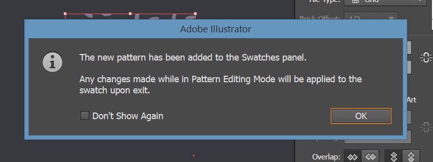
Illustrator will now be in Pattern Editing Mode. In the Pattern Options box, change the name to Jelly Beans (because I think it’s funny, but you can call it whatever you want) and click Done in the top left of the artboard.

We want to add just a little fun with this pattern and have it peeking out from behind the inner rectangle without totally overwhelming the design. To accomplish this, we’re just going to draw a couple of circles and fill them with the pattern.
Choose your Ellipse tool (L) and hold shift while drawing a circle with a radius of about 14.5”. Position it at the top middle so it just hangs off the edge a bit. Use the Align tools to center it in the middle.

Draw a second circle a little bigger – about 16.5” – and position it at the bottom center.
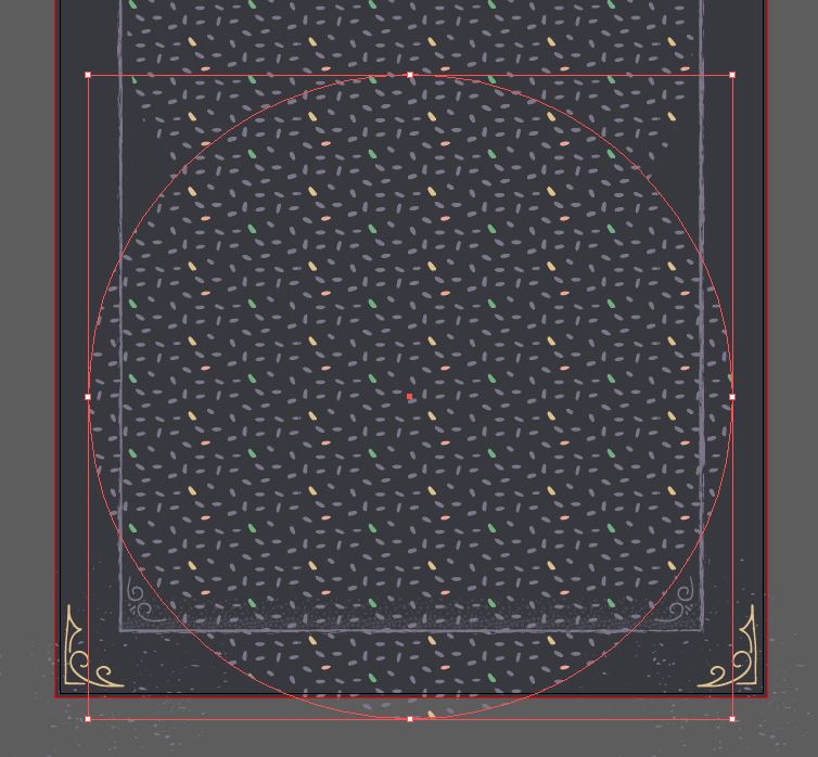
Arrange both circles so that they’re behind the inner rectangle. Do this by selecting both circles with your Selection tool and clicking cmd/ctrl + [ until they’re behind the inner rectangle.
Lock the Border layer by clicking the empty area to the right of the eye icon.
Step 2:
Now we’re going to add some floral elements around the edges of our inner border.
Create a new layer and name it Florals.
Go to File > Place and navigate to the freebies folder. Select Octopus Artis’s Mint&Gold_03 and click Place. At the top of the artboard or in your Align palette, select Horizontal Align Center, then drag the image up over the top edge of the inner border.
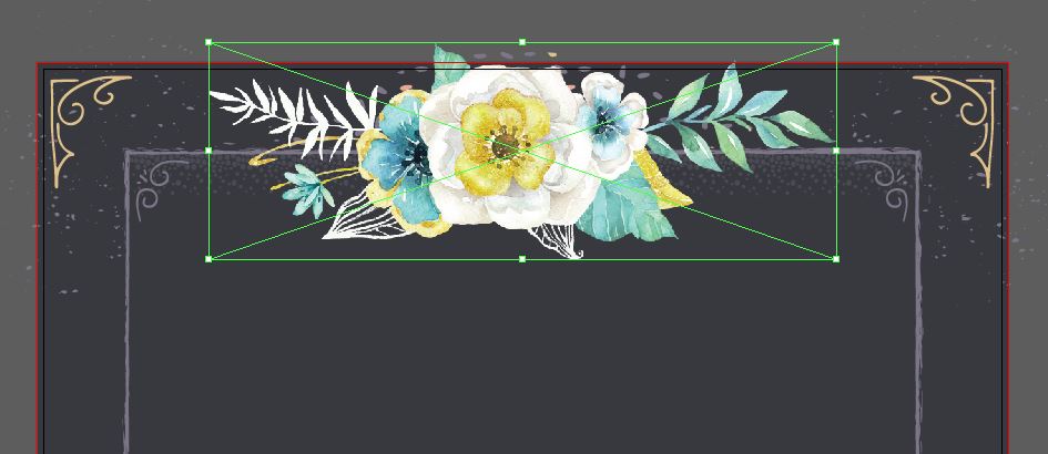
Then, go to Object > Transform > Scale and uniformly scale the image down by about 60%. Finally for this image, rotate it 180 degrees. You can do this by hovering over the corner handle until you see the round arrow, then hold shift and rotate. Or go to Object > Transform > Rotate and enter 180 degrees, then click OK.

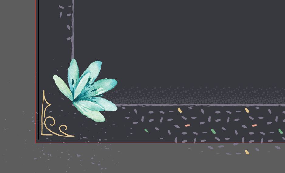
Let’s add individual flowers to the bottom corners to balance it out. Go to File > Place and navigate to Mint&GoldElements_10. Click Place.
Rotate the flower 45 degrees to the right, either by holding down shift and rotating with the corner handle or going to Object > Transform > Rotate and entering 45 degrees.
Scale it down about 50% and place it in the lower left corner of the inner border.
Go to File > Place again and navigate to PassionGoldElements_04, then Place. This one we’ll only scale about 90% and place it in the bottom right corner.
To frame it up a little more, we’ll take the Lisa Glanz floral elements from the freebies vector file and arrange them on the bottom edges so they curve in toward the middle of the piece. I’m using the longer leafy pieces on the edges and the smaller flower bits to fill in the gap between, rotating or reflecting as needed. I’m changing the colors to random selections from our swatch palette, with an eye on keeping things balanced.

Lastly for our florals, Select the watercolor flowers that we placed and bring them to the front by hitting cmd/ctrl + shift + ] or going to Object > Arrange > Bring to Front.

Lock the Florals layer and let’s move on to our quote!
Step 3:
Create a new layer and name it Quote.
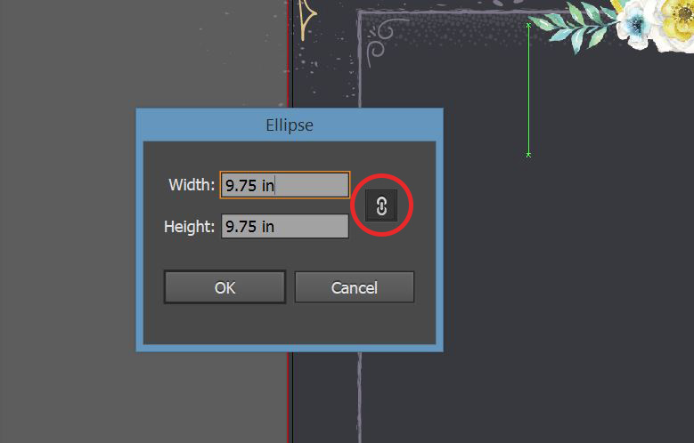
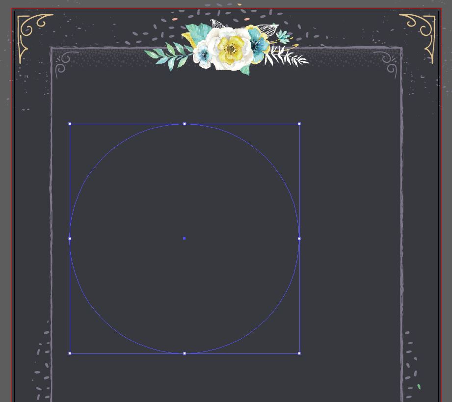
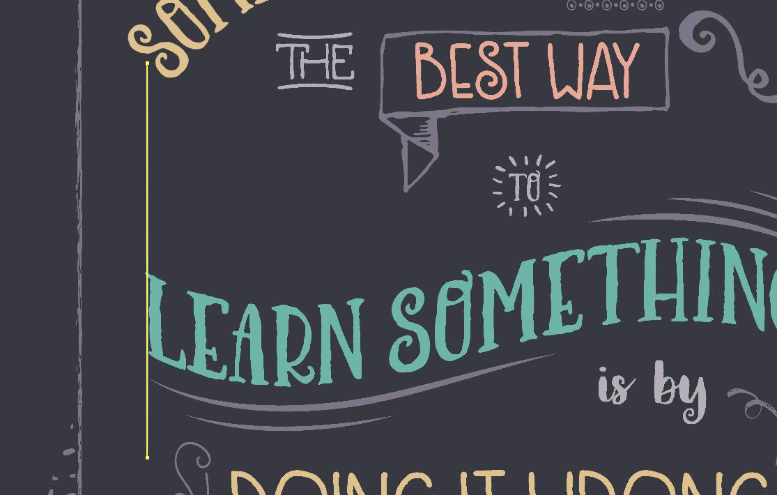
Let’s have our first word start out on a curve. Start by drawing a circle. Use your Ellipse tool (L) and click once on the artboard. Enter a width of 9.75” and click on the little link icon on the right to turn on Constrain Proportions. This will automatically make a perfect circle.
Position the circle in the mid/top left area of the poster.
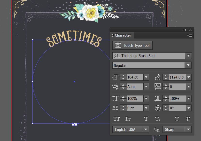
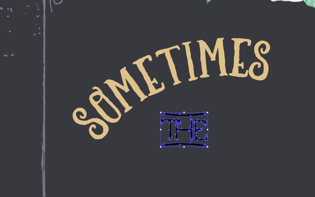
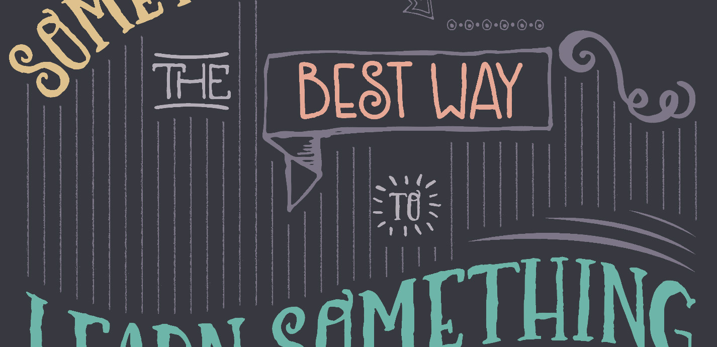
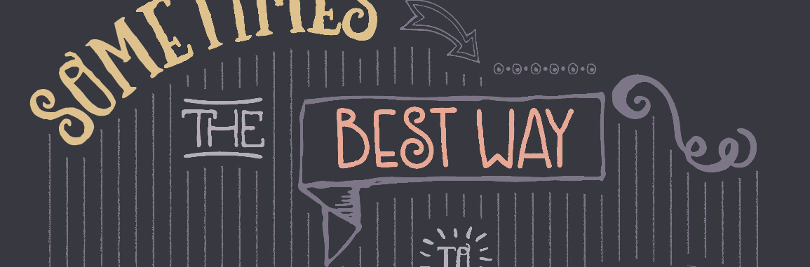
To add our copy, we’ll need our Type on a Path tool. Click and hold on the Type tool until you see the flyout menu and select Type on a Path (3rd down). Now click once at the top of the circle. A cursor should appear. Type “Sometimes”.
Change the color to Craft Yellow. In your Character palette (Window > Type > Character), change your font to Thriftshop Brush Serif at 104 pt.
Now go to Object > Transform > Rotate and enter 20 degrees, then click OK.

In the freebies file, copy “THE”, an extra from Make Media’s Thriftshop font, and paste into the poster file to the lower right of “Sometimes”.
We want to use the light purple color for this element, but to make it stand out a little more from the other purple bits, we’ll make it a lighter purple. Here’s a little trick to find a lighter tint of a color.
Change the color of “THE” to light purple. Then, in the Swatches palette, click on the Create New Swatch icon.When the dialog box pops up, change Color Type from Process Color to Spot Color and click OK.
Now open the Color palette (Window > Color). Move the slider to 50%.

Now we have a 50% tint of our light purple. To make sure it prints correctly, since this is set up as a 4-color print job, click on the little CMYK icon under the percentage on the Color palette to convert from a spot color to a process color.

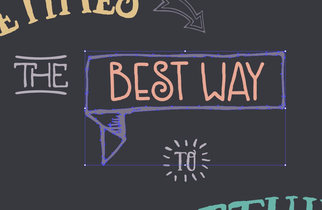
Use the regular Type tool (t) to type “Best Way” in Thriftshop Sans at 98 pt and change it to Craft Pink. Position to the right of “THE”.

Next, copy and paste “TO”, another Thriftshop extra, from the freebies file. Increase the scale by 300%. Use the Eyedropper tool (i) to click on “THE” and sample the color. Then, center below Best Way.

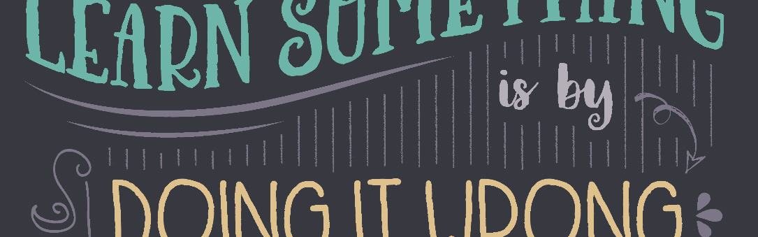
Use your Type tool again to type “Learn Something”. Change the font to 131 pt Thriftshop Brush Serif and center on the artboard, below TO.
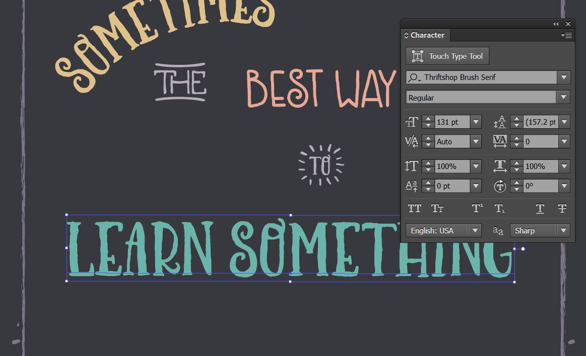
To give it a fun wave shape, go to Effect > Warp > Flag. In the dialog box, enter 65% for the Bend.

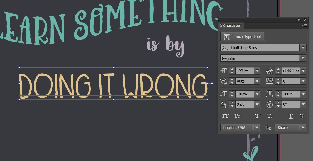
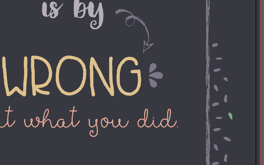
Use the Type tool again to type “is by” in Thriftshop Brush Script at 100 pt and use the Eyedropper tool again to sample the lighter purple color used on THE and TO. Position it below the end of “Something”.

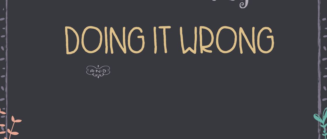
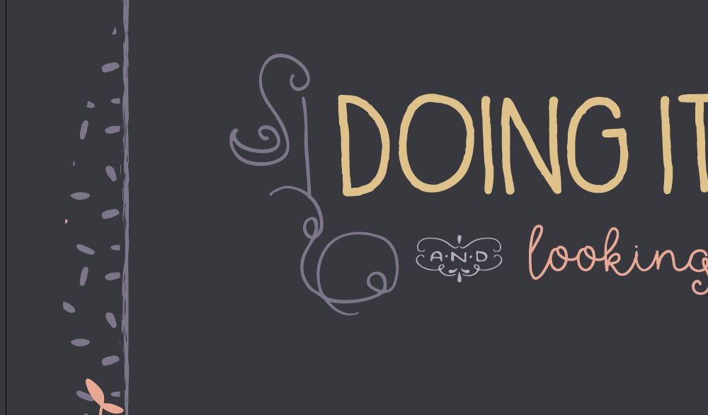
Next, type “doing it wrong” in 122 pt Thriftshop Sans and change the color to Craft Yellow. Position it below the last line, but offset ever so slightly to the right. We’ll add some ornamentation to the left of it later.
Copy the “AND” ornament from the freebies file and place into the poster. Position below the last line and scale up a wee bit – only about 115%. Use the Eyedropper tool to sample the light purple color from THE or TO.
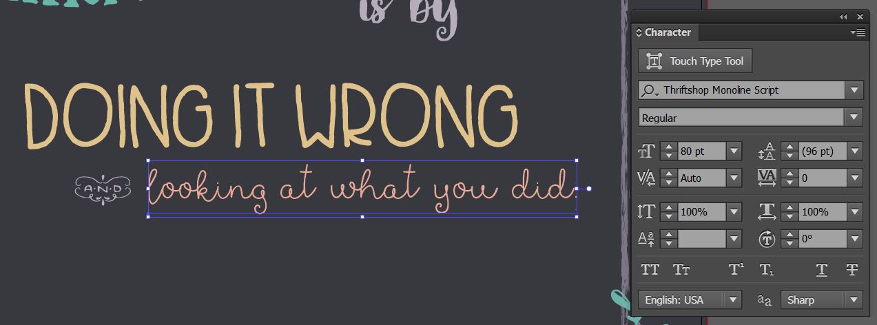
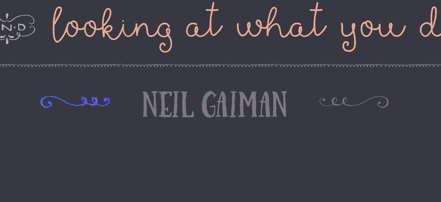
The end of our quote is “looking at what you did.” Position to the right of the AND ornament in Thriftshop Monoline Script at 80 pt and change the color to Craft Pink.
We’ll add the author’s name after we get a bit more ornamentation added.
Let’s start by going back up to the top of our quote.
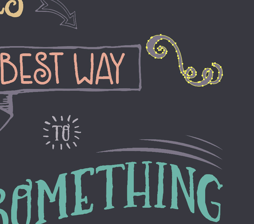
Copy the Lisa Glanz arrow with the double outline from the freebie file and paste it into the poster. Increase the scale by about 230%. Then rotate about -35 degrees, change the color to Light Purple and position at the end of “Sometimes” so it points down to Best Way.

Next, copy the Lisa Glanz banner illustration from the freebie file and paste it into the poster file. Scale up so the words Best Way fit comfortably inside the banner area – about 285%. Then, change the color to light purple.
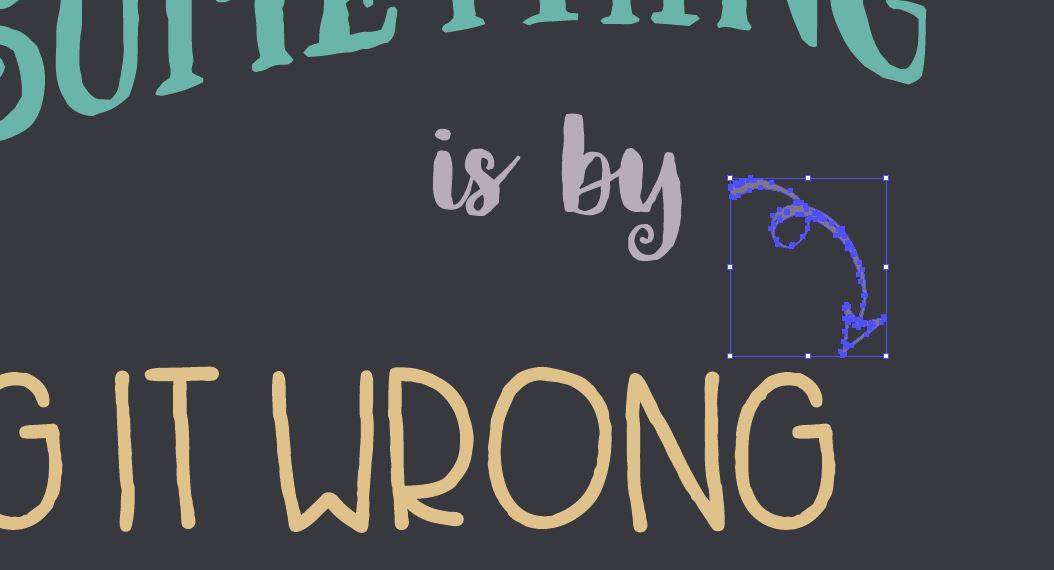
Now copy the curly arrow from the freebies file and paste into the poster. Change the color to light purple and scale up about 180%, then rotate about -55 degrees so it’s going from the end of “by” and pointing to Wrong.
For the ornamentation to the left of “doing it wrong”, we’ll combine two curly ornaments in the freebie files from the Carneval Extras.
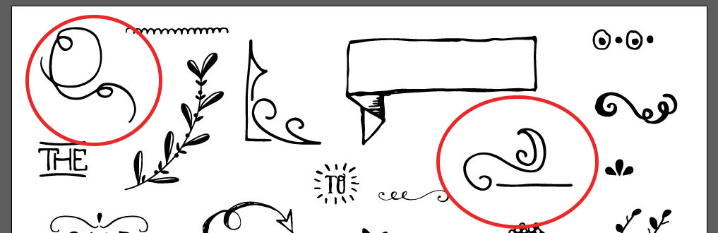
Copy and paste them both into the poster. For the ornament that looks a bit like a flag on its side, rotate it 45 degrees to the right and then go to Object > Transform > Reflect and choose Vertical Axis so the flag is pointing to the left. Scale up about 180%, then position to the left of “doing”.
For the curly ornament, go to Object > Transform > Reflect and choose Horizontal Axis, then click OK. Scale up about 180% and position just below the flag so it looks like it’s attached.
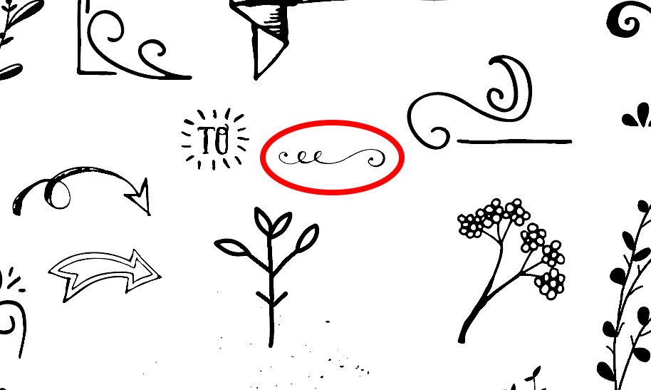
We’ll add another little ornament at the end of the sentence. This guy…
Paste it onto the poster, rotate it 90 degrees to the right and change the color to Light Purple. Then position it at the end of the sentence.
Now copy the scalloped border at the top left of the freebie file and place it into the poster. We’re going to use this to make a brush.
First, change the color to Light Purple. Then, go to your Brushes palette and click on the flyout menu at the top right and choose New Brush.
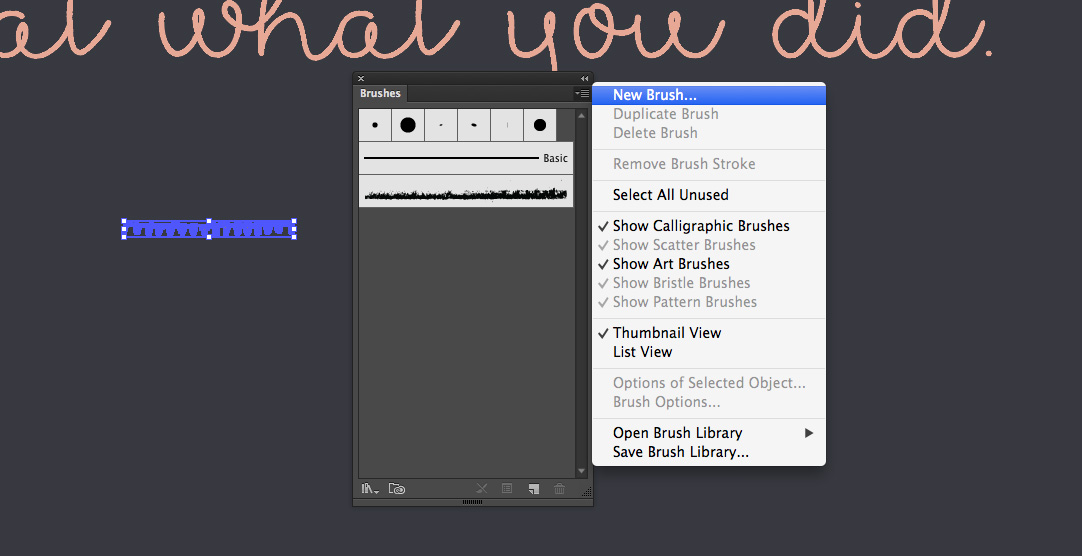
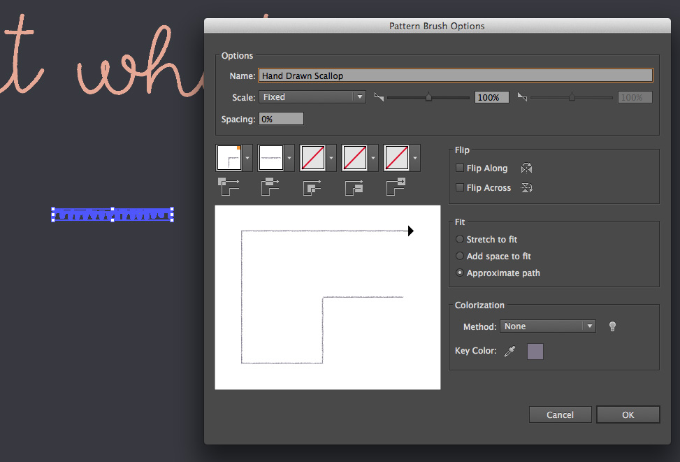
In the popup dialog, choose Pattern Brush and click OK. This opens the Pattern Brush Options. The only thing we need to do here is change the name (I’m using Hand Drawn Scallop) and under Fit, change to Approximate Path and click OK.
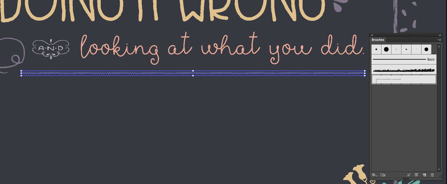
Now that we’ve added a new brush, let’s draw a line to apply it to. Select your Pen tool (p). Click once below the curly ornament (to the left of AND). Then hold shift and click once again on the right side under the period at the end of our quote. Holding shift keeps the line straight.
In your Brushes palette, click on the new brush we just made to apply it to our line.
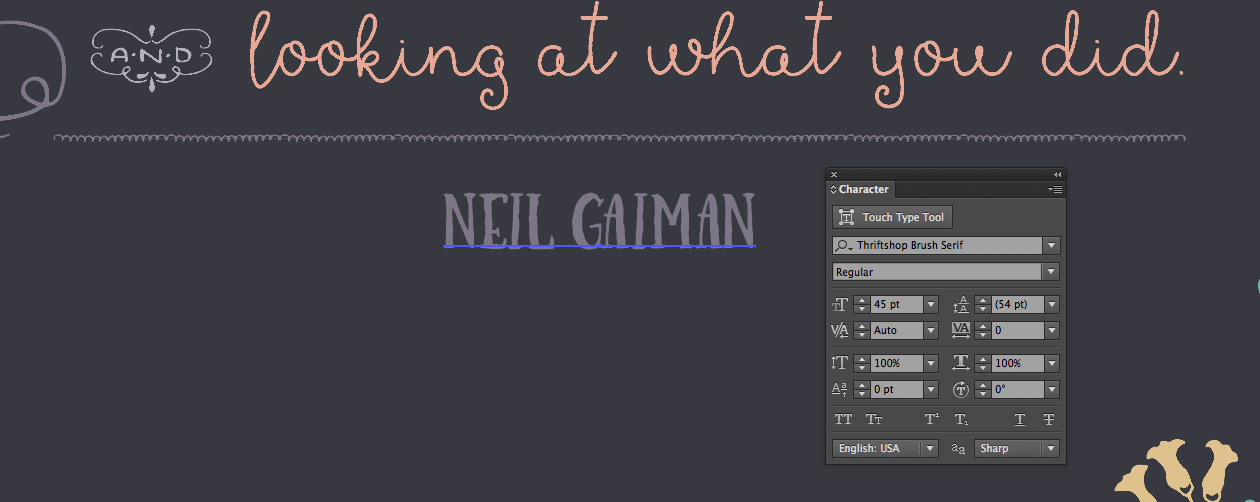
Let’s add our author’s name, Neil Gaiman, centered under our scalloped line in Light Purple, Thriftshop Brush Serif at 45 pt.
Select this cute curly ornament from the freebie file and paste into the poster.
We’ll position one on each side of Neil Gaiman’s name like bookends.
Scale the ornament up 200% and change the color to Light Purple. Position it on the right side of the name. Then, we’ll reflect a copy to the other side by going to Object > Transform > Reflect, choosing Vertical Axis and clicking Copy. Drag the copy to the left side of the name, the same distance as the one on the right side.
A quick way to make sure everything is center aligned with the scallop and equidistant to the name is to group the two ornaments (select both and hit cmd/ctrl + g), then select the author’s name and the scalloped line. In your Align palette, choose Align To: Selection. Then click the Horizontal Align Center icon.
The last thing we’ll do in this step is to add the name of the library that would be displaying this poster. The theory is that this would be one of several author quote posters displayed on a library wall.
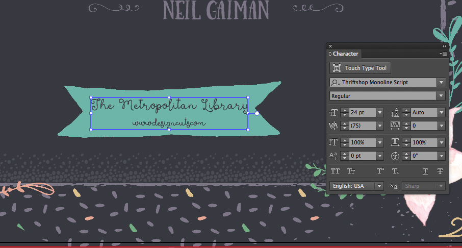
Copy the solid banner from the freebie file and place it into the poster. Scale it up 300% and change the color to Craft Teal. Center it at the bottom of the poster.
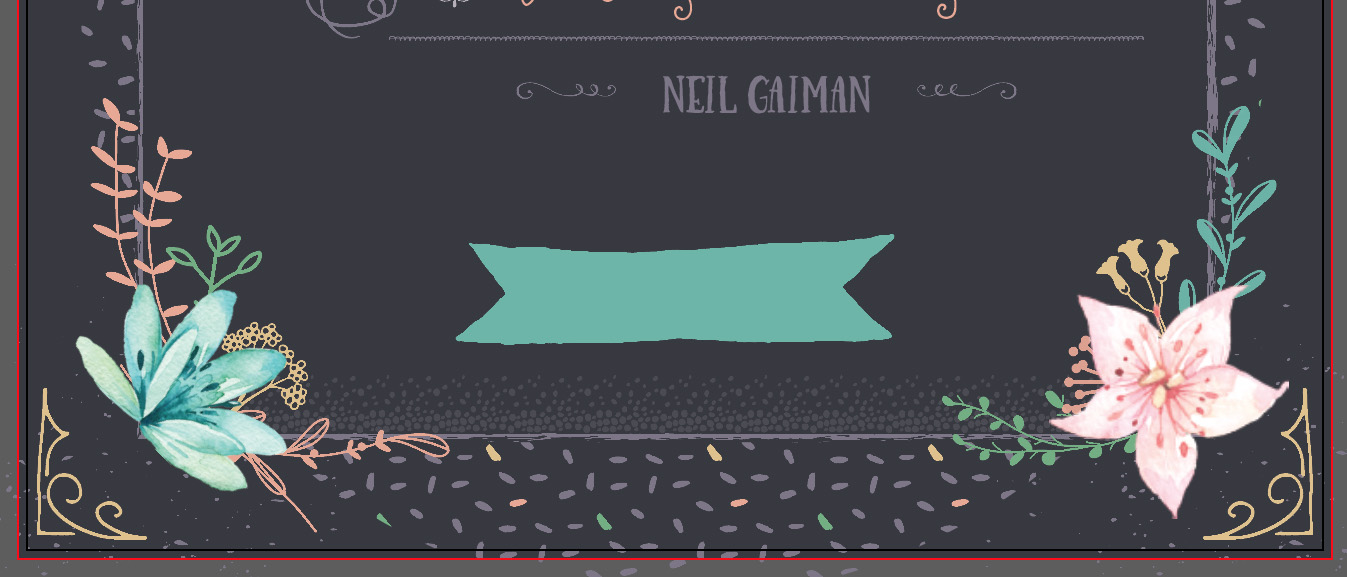
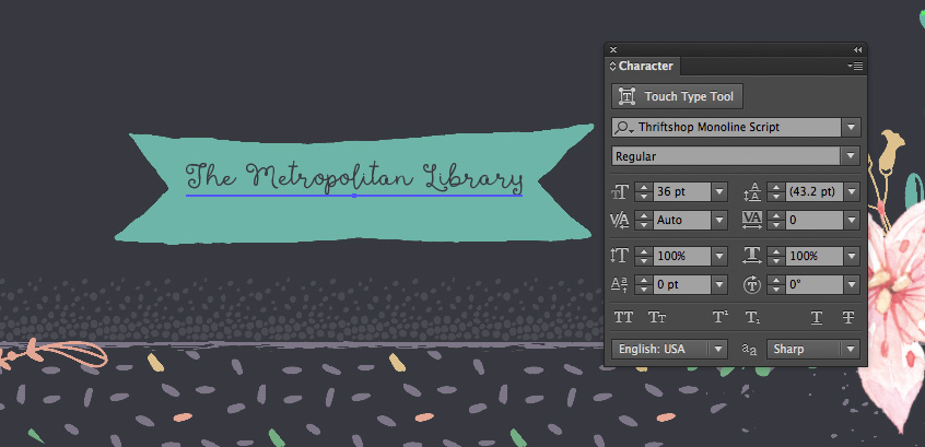
We’ll use Thriftshop Monoline Script again to type “The Metropolitan Library” in the banner at 36 pt in Dark Purple.
Under that, we’ll add the website. In this case, I’m using www.designcuts.com, still in Dark Purple Thriftshop Monoline Script, but reduced to 20 pt.
It looks a little empty on either side of the web address, so let’s add some hand drawn lines to balance it out with the library name.
Use your Pen tool (p) and click once under the T at the beginning of the library name, then hold shift and click to the right, under the M in Metropolitan.

Change the color to Light Purple. The previous brush we used, PN 4, is a little heavy for this little line, so copy the other brushed line from the freebie file, PN 3, and paste it into the poster.
Just as before, now that it’s been added to the Brushes palette, you can delete the line you just pasted in.
Select the line we drew next to the web address and in the Brushes palette, click on the brush we just added, PN 3. That’s still a pretty big brush, so open your Stroke palette (Window > Stroke) and change the weight to .25 pt.
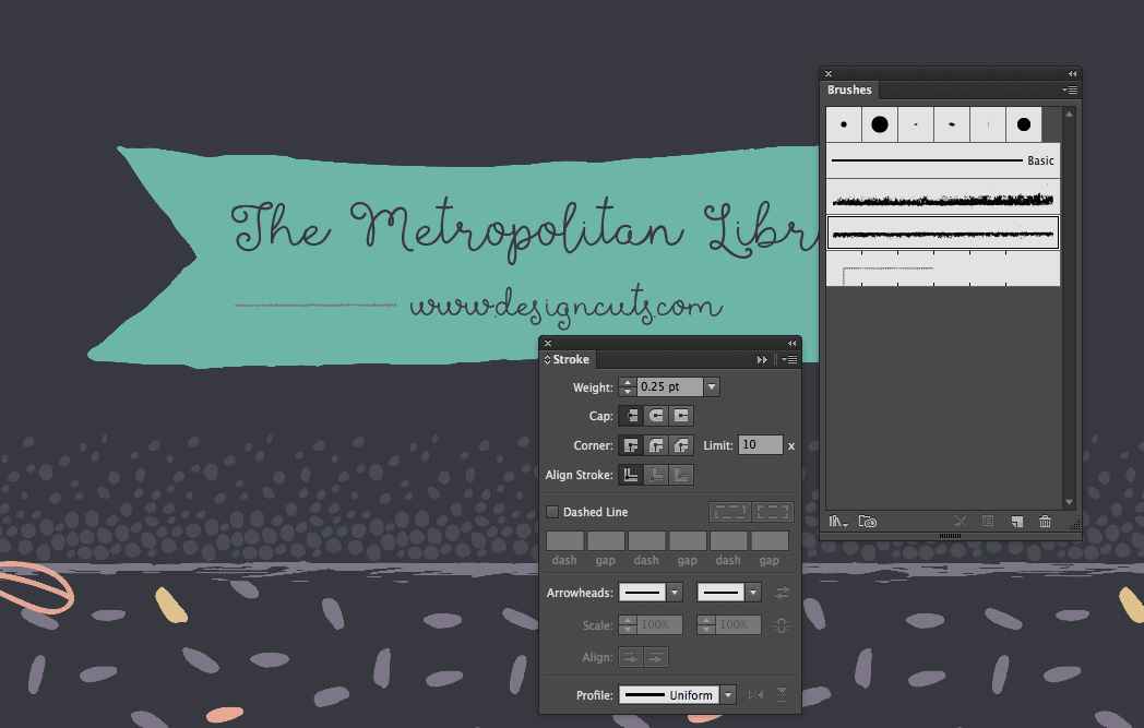
To finish this section off, copy the light purple line to the right side of the web address.

Lock your Quote layer.
Step 4:
For our last bit of ornamentation, we’ll add some little lines and a couple of ornaments to tie the whole piece together and really nail that hand drawn look.
Create a new layer and name it Lines.
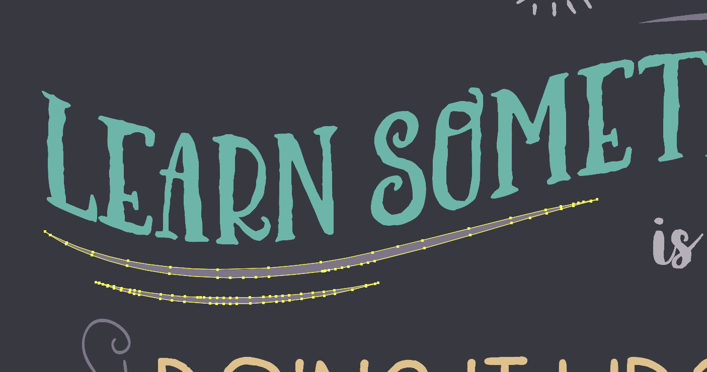
First, let’s add some swoopy lines around “Learn Something”. I’ve made some swoopy lines exclusively for this tutorial that are available in the freebies vector file on the lower right. Copy these and paste them into the poster.
Position the group with three lines above “Something”, change the color to Light Purple and scale up go from the beginning of the T to the end of the G in “thing”.

Position the group with two lines below “Learn”, change the color to Light Purple and scale up so it goes from the beginning of the L to the middle of the E in “something”.
I want to bring this whole thing together with a bunch of hand drawn vertical lines, but I need good start and end points on the design and that’s missing on the top right side next to “best way”, so let’s add a couple of additional ornaments.
In the freebie file, copy the super curly ornament on the top right of the file and paste it into the poster. Change the color to Light Purple and scale it up considerably – about 350%. Position next to “best way”. Then, rotate it to the right about -25 degrees so the right side lines up with the end of “learn something”.
Copy the circle and dots border on the top right of the freebies file and paste it into the poster.
We could make a pattern brush out of this, but we’re only using a tiny bit of it, so we’ll just duplicate the pieces to make the section we need.
Change the color to Light Purple and position above “best way”, just to the right of the arrow.

With it still selected, hold down opt/alt + shift and click and drag to the right.

Now hit cmd/ctrl + d to duplicate our last action, which will give us one additional copy to the right.
I think it looks a little funny to end that line with a small dot, so use your Group Selection tool (the white arrow with a plus sign found on the flyout menu of your Direct Select tool) to select just the last dot and delete it. Make sure to select the edge of the dot – if you click in the middle of the dot, it could select the whole last group.

Now that we have places to begin and end, we’ll start on our vertical lines.
To be honest, there are several quicker ways to do this, but the slightly longer way is the most convincing when it comes to our hand drawn look. We’re going to draw all of our lines and individually adjust the endpoints. It’s not quite as painful as it sound though :)
We only have to draw one line to start. That’s not so bad, right?
Use your Line Segment tool (/) while holding shift to draw a line from the middle of the S in “something” to the top of the “doing it wrong” line.
Change the color to Light Purple and in your Brushes palette, click on PN 3, the last hand drawn brush we added. In the Stroke palette, change the weight to .5 pt.
Now go to Object > Transform > Move and enter .3 inches next to Horizontal and click Copy.

Now all we have to do is press cmd/ctrl + d to duplicate this line over and over until we get to the right edge of the quote.
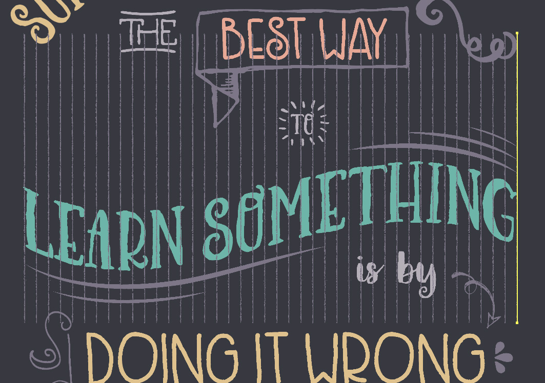
We’ll use our Direct Select tool (a) to adjust individual endpoints from here. For example, use your Direct Select tool to click on the top point of the second line from the left. Hold shift and press your down arrow a few times to bring it below the bottom curve of the S.
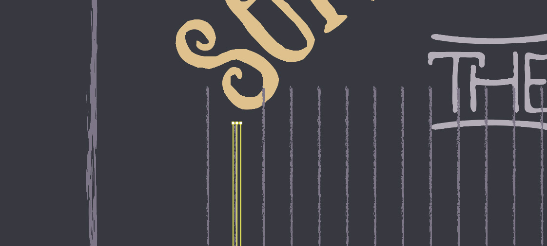
Continue this with each line at the top and bottom. When you come to an obstacle like “THE”, just bring the endpoint below it. We’ll add lines above it later.
I should also note that you may end up adjusting the location of some of your ornaments slightly to fit within the lines better. I moved “THE” a little bit to the left.
To fill in the gaps above “THE” and “TO”, select the lines directly below the gaps.

Hold down opt/alt + shift while dragging up to duplicate the lines.
From here, just adjust the endpoints to fit in the area needed.

Now we’ll repeat the exact same process above “best way”.
And also below “learn something” and around “is by” and the arrow.
And we’re done!
The process of adding the vertical lines is a little tedious, but your final look will really have that hand drawn, almost chalkboard feel.
Don’t forget that we’d love to see your designs on our Facebook page too.
Please leave a comment if you have any questions or suggestions. We love hearing from you!
If you haven’t downloaded this awesome Lovingly Handcrafted Design Bundle at an amazing 95% off, there’s still time!
You guys are awesome! I don’t know what I’d do without you.
Thank you so much Teddi, your support means so much to us all, we couldn’t do it with you :D