Hello Design Cutters! Simon here. I’m particularly excited by the Complete Vintage Design Arsenal, as it features many amazing resources. Incidentally, it includes a few of my most recent texture packs, which I hadn’t yet had a chance to write demo content for. This is the perfect excuse.
The bundle includes sweet stuff all around, from textures to vector elements. We’ll be using a handful of each, in order to create this retro, quote-based poster. We’ll use both Photoshop and Illustrator for this one, but you should be able to do everything in Photoshop should you want to. You’ll learn tons of great techniques in this tutorial, including texturing, composition, blending, masking and much more.
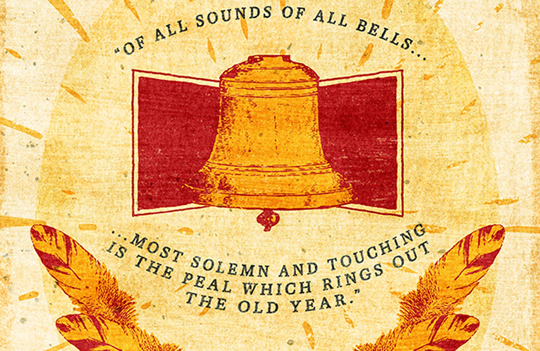
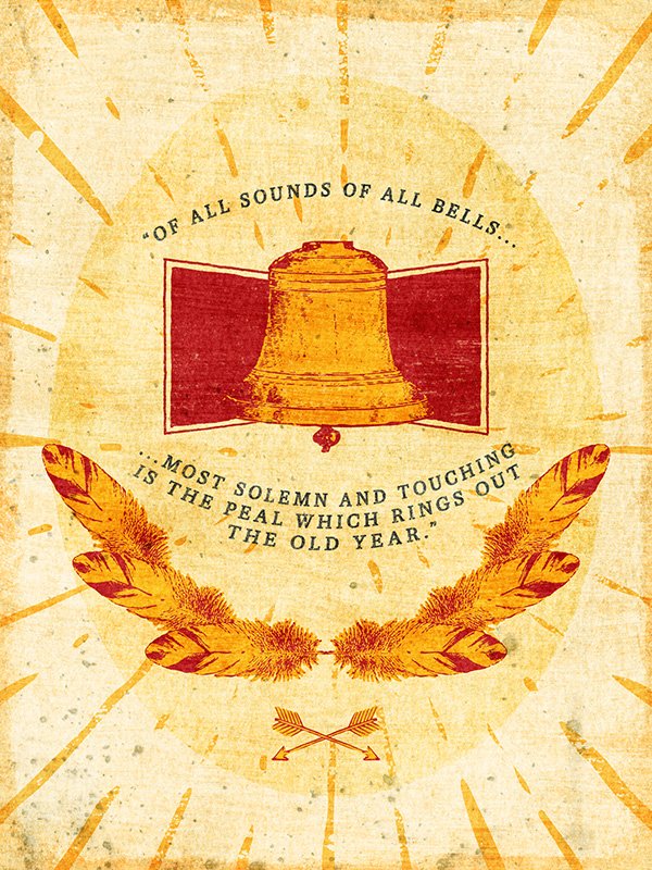
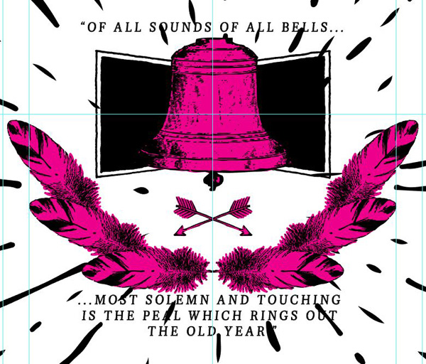
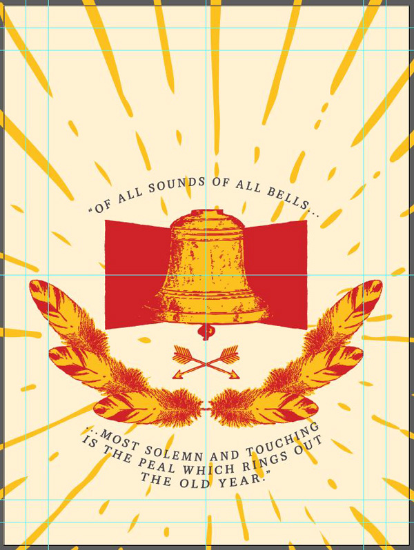
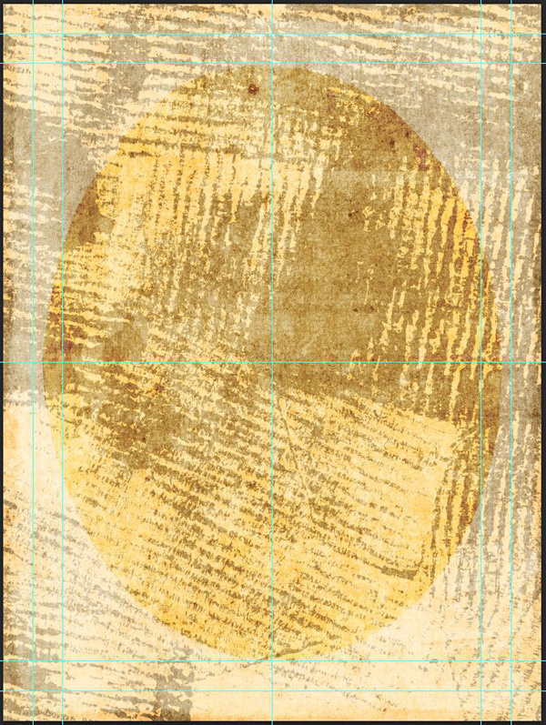
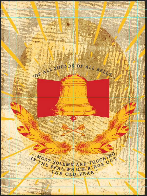
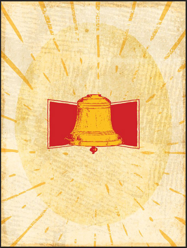
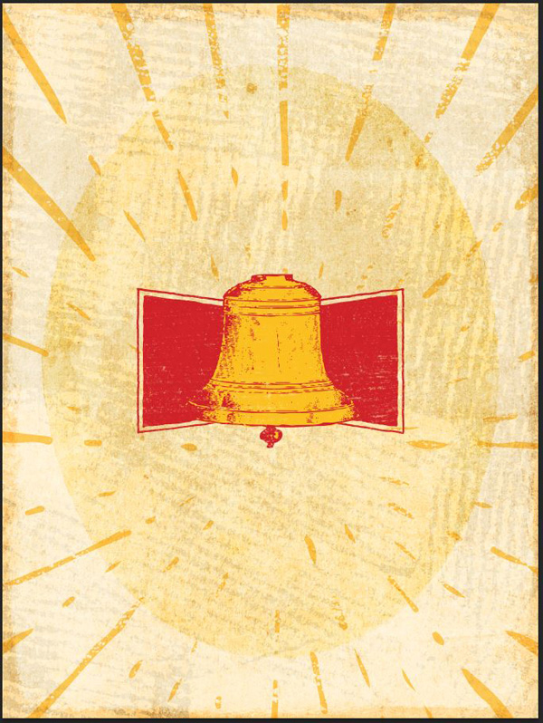
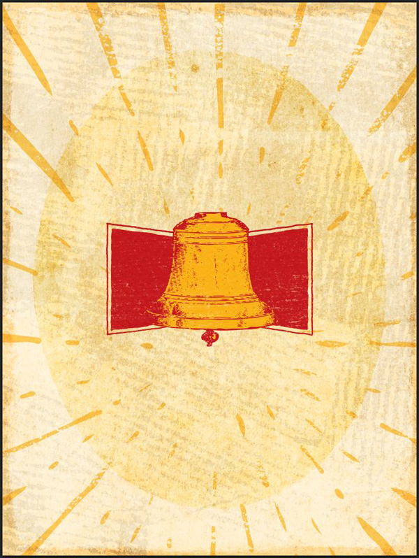
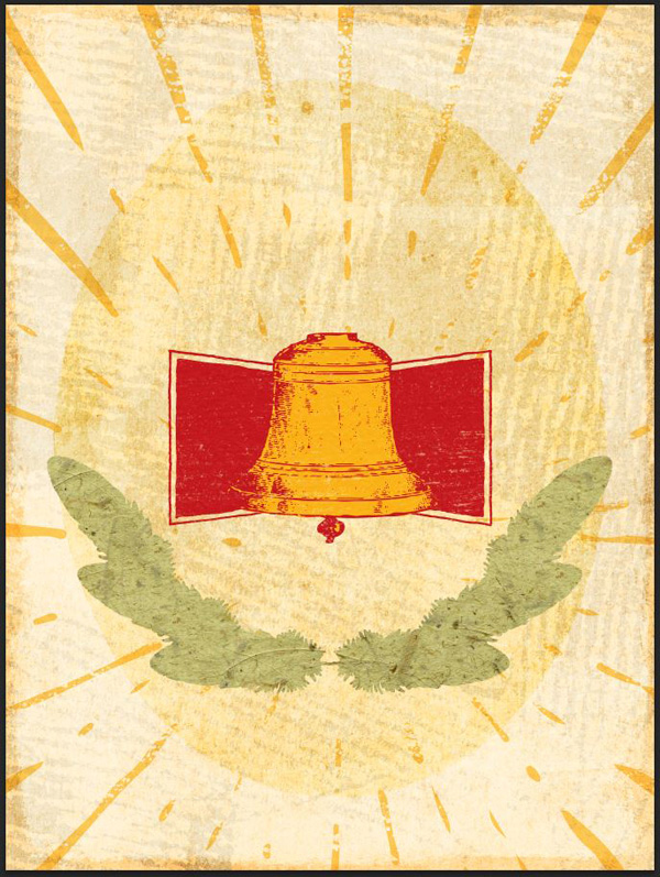
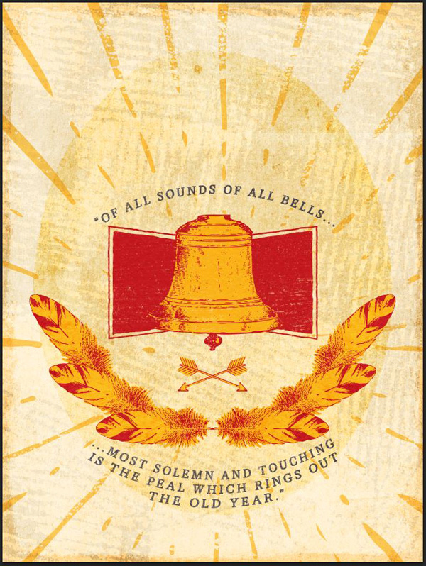
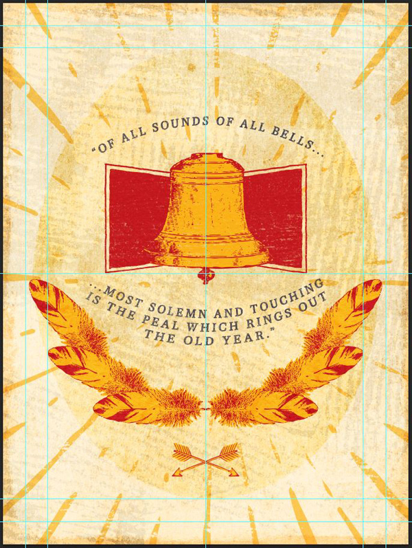
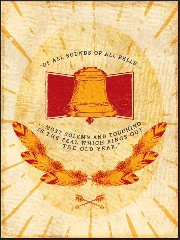
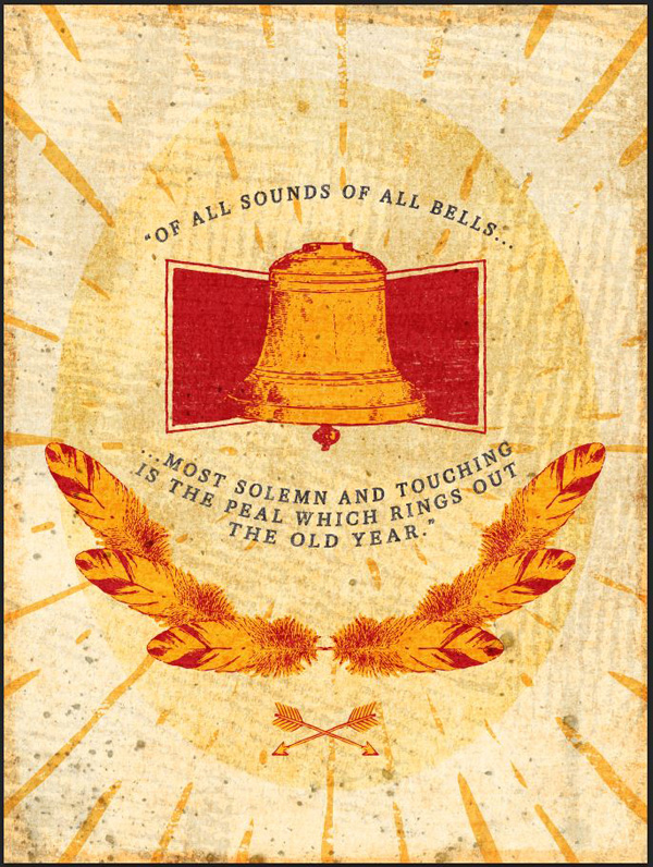
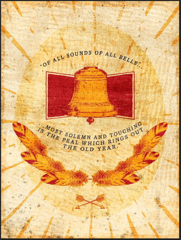
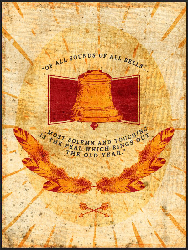
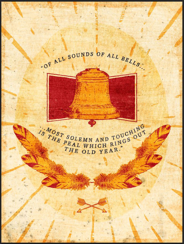
WHAT WE’RE CREATING:
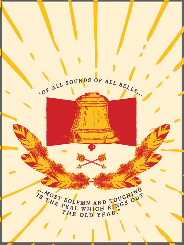
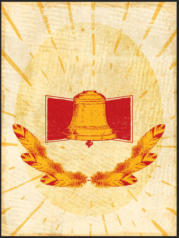
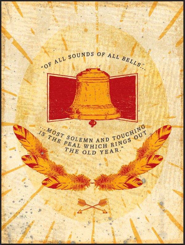
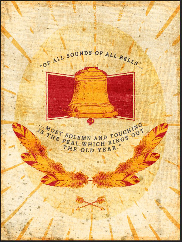
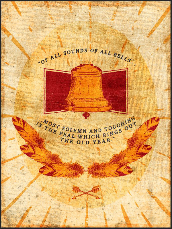
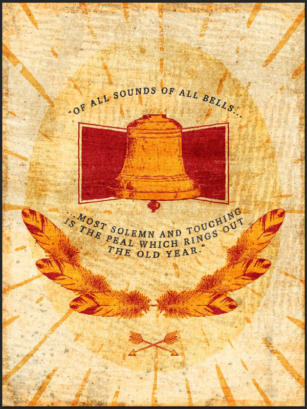
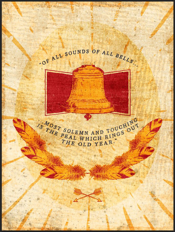
Here’s some close ups of our final design:


Anxious to get started? So am I!
STEP 1: DOCUMENT SETUP
It’s not one but two documents that we need to create. Since most of the elements that compose the iconography of our poster are vector elements, it’s much faster to get them ready in Illustrator rather than Photoshop.
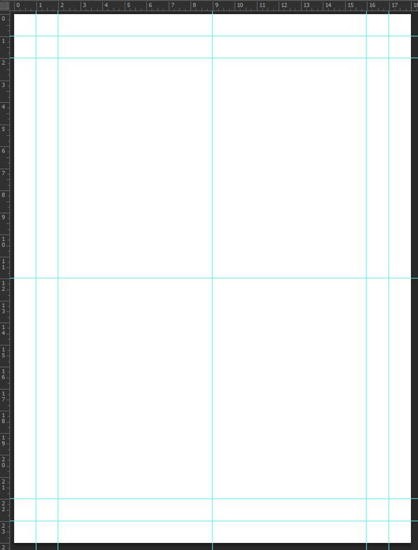
Start by creating a new Photoshop document. It should be an 18×24 inches canvas @ 300 dpi.

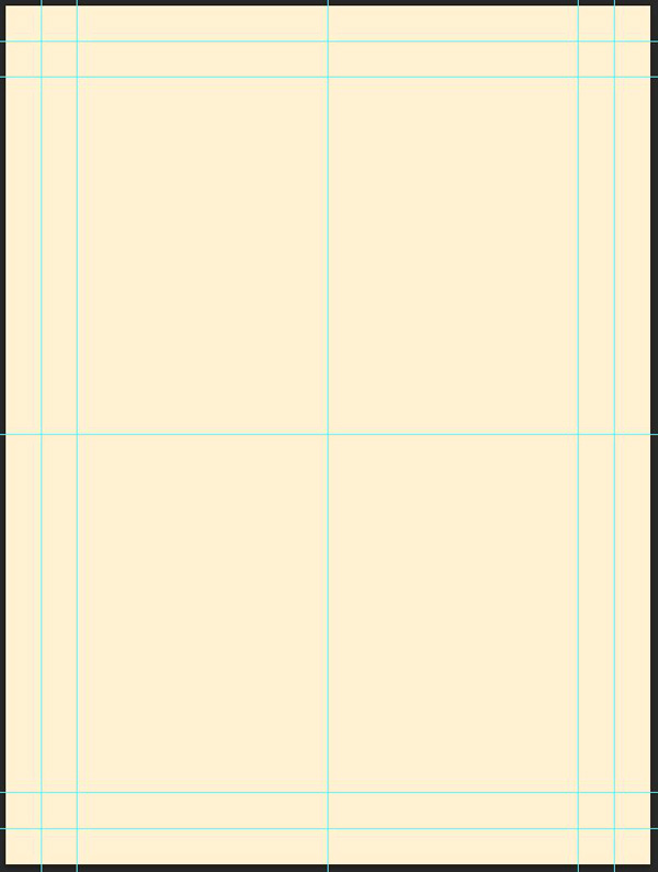
Add a few guides to facilitate the placement of elements later on. I have vertical guides at 1, 2, 9, 16, and 17 inches, and horizontal guides at 1, 2, 12, 22, and 23 inches.
Save your document, and turn your attention to Illustrator. Create a matching canvas. Note the RGB color mode. This will make sure that the colors are consistent between Photoshop and Illustrator.
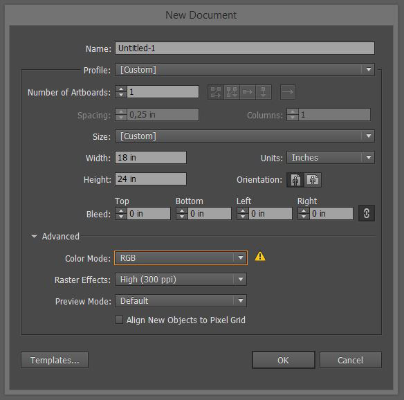
Don’t forget the guides.

All setup? Time to put our objects in place.
STEP 2: ELEMENTS GATHERING
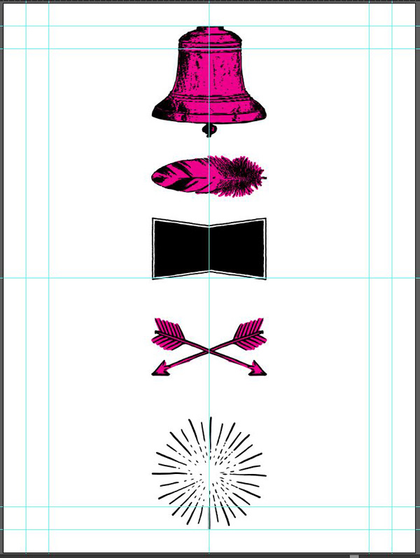
This step isn’t complex. We’ll simply peruse the bundle to grab the major bits and pieces we’ll be using. I’ve listed them below.
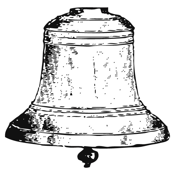
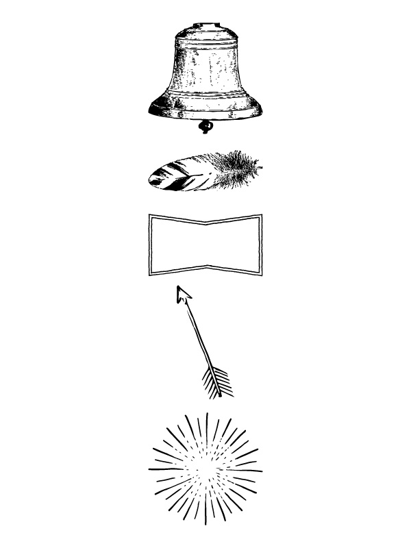
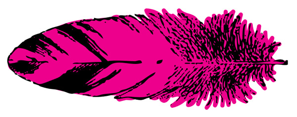
The bell from Nicky Laatz\The-Handmade-Vintage-Logo-Bundle\VintageLogosVol2\extraimagesCS5.ai.
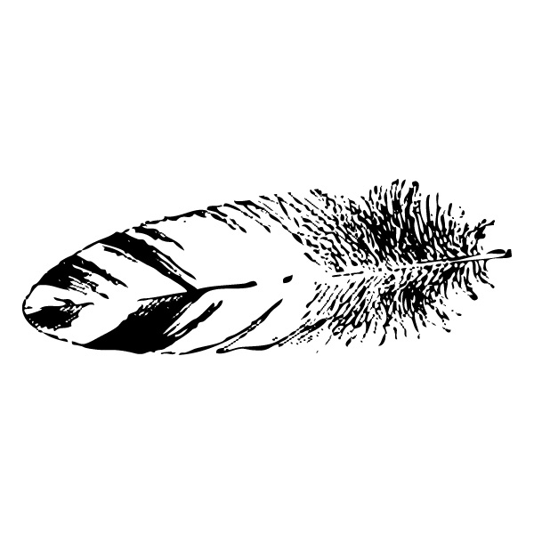
The feather, from the same document.
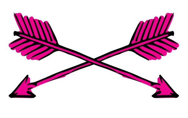
Then, there’s this arrow from Milka\Sable Kit\sable kit.ai
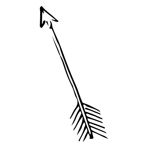
It’s located towards the bottom of the first artboard.
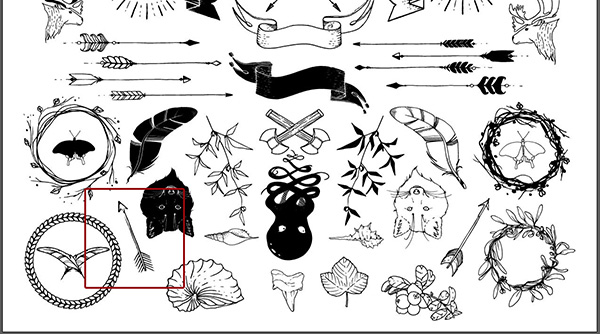
There’s this badge (we’ll transform it a bit later on), from Ghostly pixels\ExpeditionaLogos-byGhostlyPixels\Extra-Packs\Geometric-badges\EPS-Format\Thin_Outlines_Double.

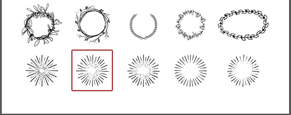
Finally, we’ll be using this burst, also from Milka\Sable Kit\sable kit.ai
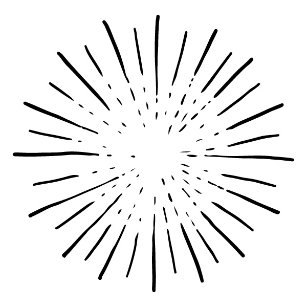
It’s the second one from the bottom left, on the second artboard.
While these jumped at me, I was also sketching the following layout concept.

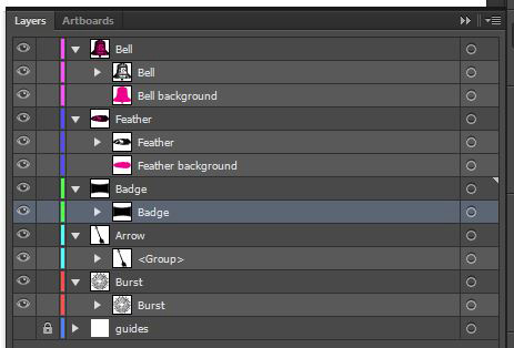
I created a new, square Illustrator document in which I’ve stored all of these. That’s a step that you can certainly skip.

If you still need to do so, bring all of the vector elements in your main vector document.
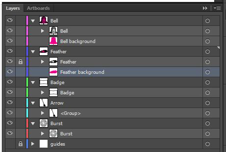
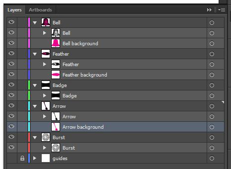
Give each of the elements their own layer. This will prove useful, as we have a few edits to make to each of them (adding a solid background to them, rotations, etc.).
STEP 3: ELEMENTS EDITING
This step is not very fun, but should go quickly non the less. A lot of the elements we want to use need a quick step or two of polish. The bell, the feather, and the arrow for instance, need a solid background color. The feather needs to be rotated a bit so it’s straight on an horizontal line. The badge needs to get its inner shape filled. The arrow also needs to be mirrored and rotated to form a small badge element. Let’s get to it.
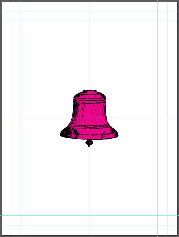
The bell
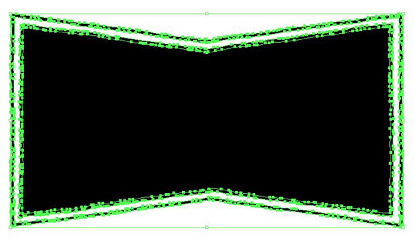
I’m using the pen tool to create a path behind the bell. That path is more or less an outline of the bell. Luckily for us, we don’t have to be too precise when tracing it. I’m using the bright magenta from Illustrator’s default color palette, just so I can visualize the shape I’m creating. Don’t worry, as the poster’s final colors palette will be way different.
Simply zoom in on the bell, take your pen tool (P), and start tracing away.
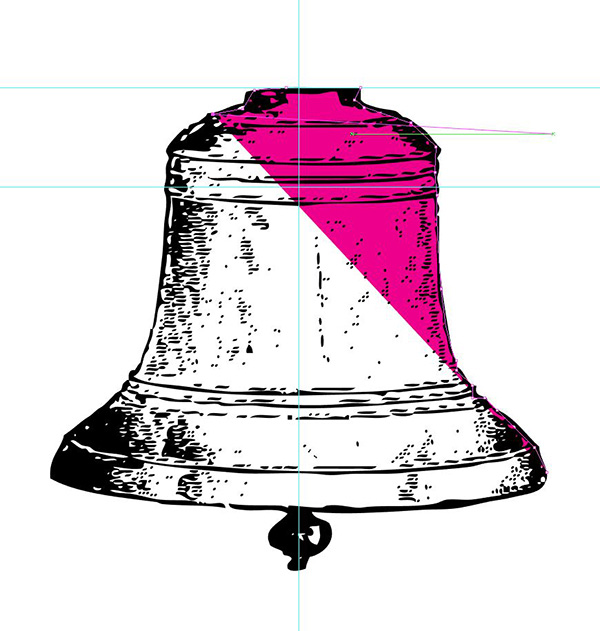
Feel free to adjust the layer order so the path is behind the bell already when creating it. Locking the bell for the duration of that step will probably help as well.

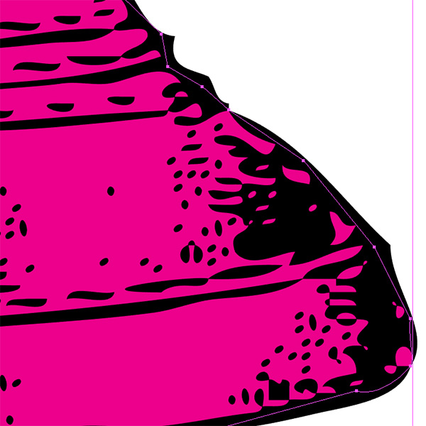
Once you’re done with that imprecise first pass, it’s time to zoom in further, and to make sure that the path fits the bell’s outline as well as possible.

Move (direct selection too – A), add or remove anchor points (with + and –), and edit the handles to make these pesky Bézier curves fit (with the anchor point tool, SHIFT+C). Here’s a close-up example of the bottom right part of the bell.

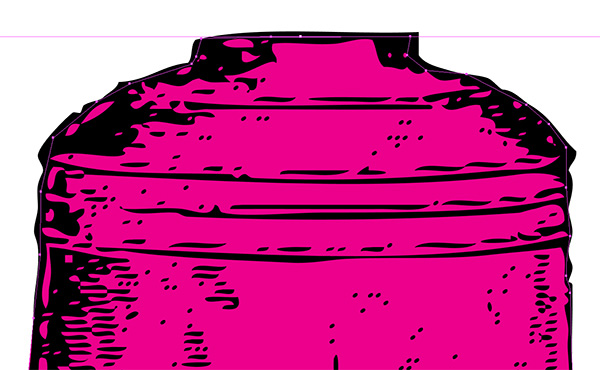
From there, the process is the same for the rest of the path. This is the section just above the one I was dealing with before.

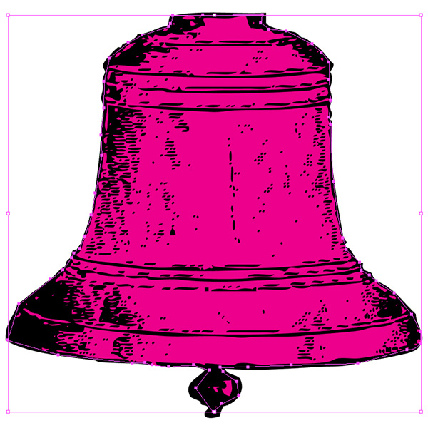
Once you’re satisfied with the result, don’t forget to properly name the path, and reorganize your layers if necessary.
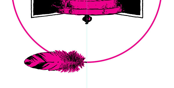
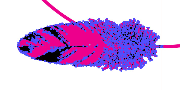
The feather
I’m going to use another technique for the feather: the blob brush. I shared it first in the “vacuum tube” poster tutorial.
The blob brush (SHIFT+B) allows you to paint multiple shapes that fuse themselves together. Lock the feather, and start painting in magenta. Quick tip: you can change your brush’s diameter by double-clicking on the tool’s icon.

From there, keep painting until the whole feather is filled.
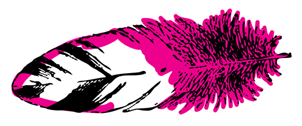
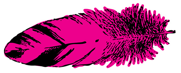
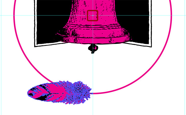
While we’re at it, let’s straighten the feather up. Unlock it if necessary, and rotate it by hand until it looks aligned on an horizontal line. The smart guides might help (View > Smart guides).
I rotated the feather itself first. The little indicator gave me a 90° value.
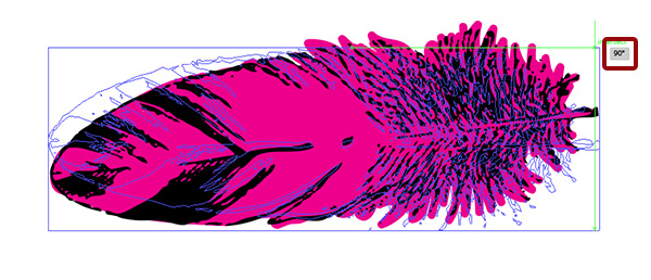
I then proceeded to rotate the background to match. The box indicated a value of -6.78°.
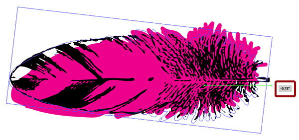
After some additional keyboard nudging (use your arrow keys), it’s all in place. Note that my outline is far from precise for the feather. The bell is a very hard object. A feather is fuzzy and flexible. My outline is a translation of these characteristics.
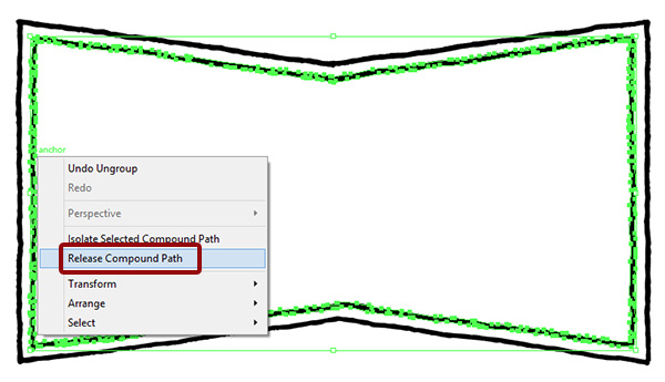
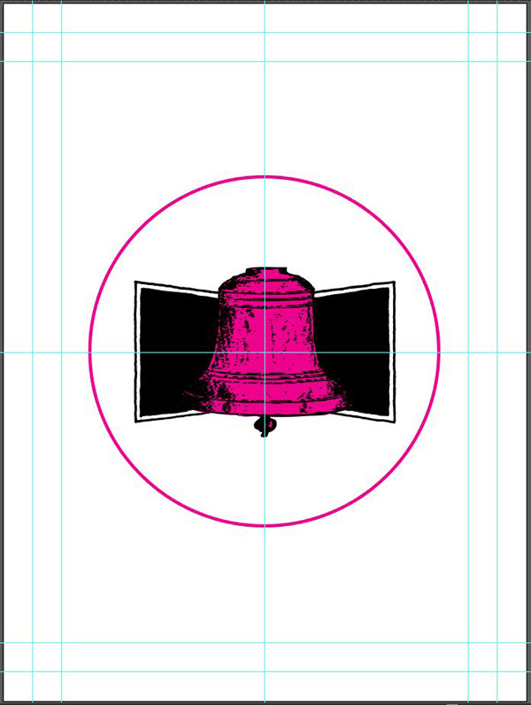
The badge
Next up is the badge. I’ll share one more technique. What we want to accomplish is to fill its center shape. We could use the same technique than the bell. But because the badge has a transparent shape in the middle, it’s considered to be a compound path. These can be released, which has for effect to fill the transparent shape. That’s what we’ll do here.
First, ungroup the badge (SHIFT+CTRL/CMD+G).
Then, select the inner shape of the badge, and right-click it. Choose “Release compound path, and watch the magic happen.
Select the badge shapes, and merge them together with the Pathfinder (SHIFT+CTRL/CMD+F9) to clean things up.

After renaming your layers properly, this is what you should have.
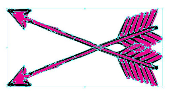
The arrow
For the arrow, choose which background creation technique you want. Note that the compound path release trick won’t work, as it’s not a fully closed path. I choose the blob brush.

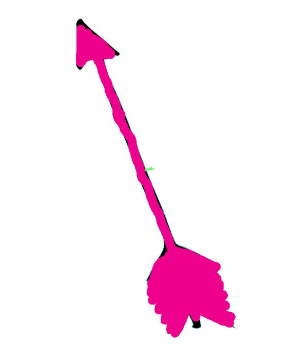

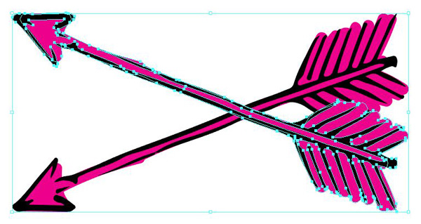
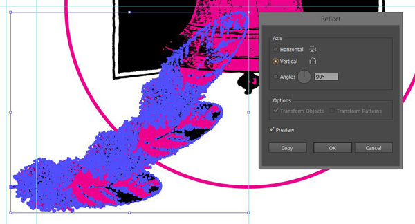
Next, we need to create the little badge element I mentioned earlier. Select both the arrow and its background. Then, proceed to reflect it (Right click > Transform > Reflect).
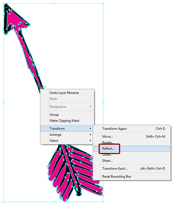
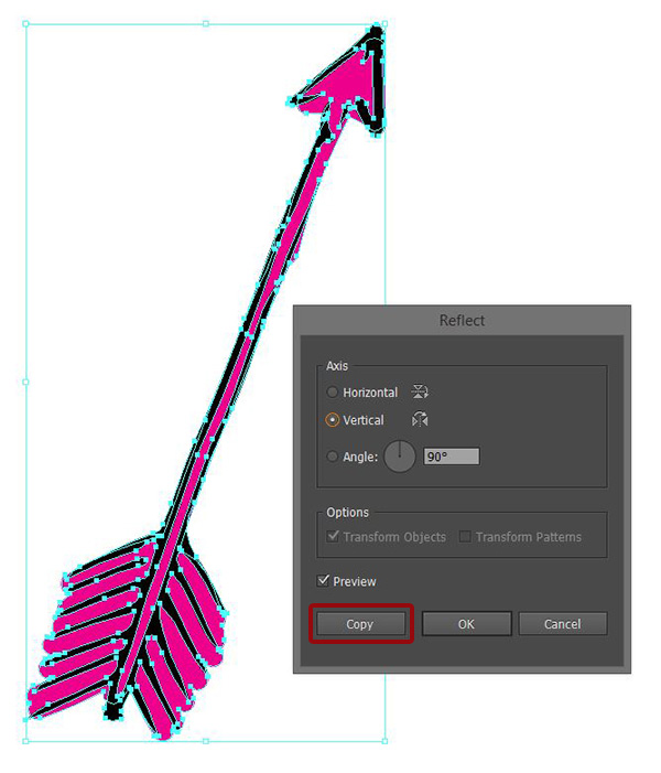
Create a mirror copy of the arrow and its background. Don’t forget to hit “Copy” in the dialog box.
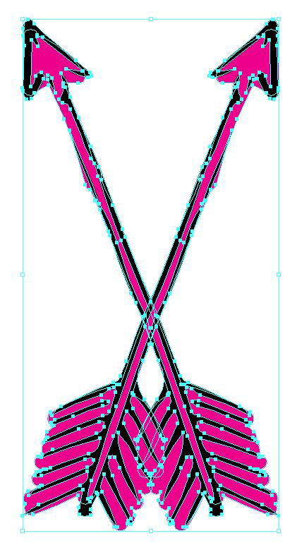
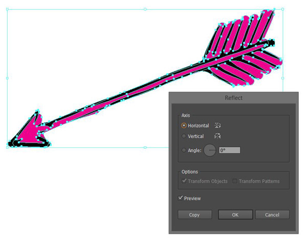
From there, rotate both arrows clockwise at 90°.
Select the arrow pointing to the top, and reflect it again.
And reflect it one more time.
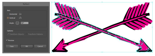
And we have our small badge.
All of our elements are ready!
STEP 4: COLORS, PHASE I
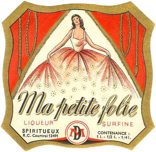
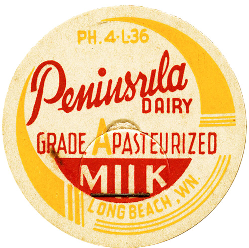
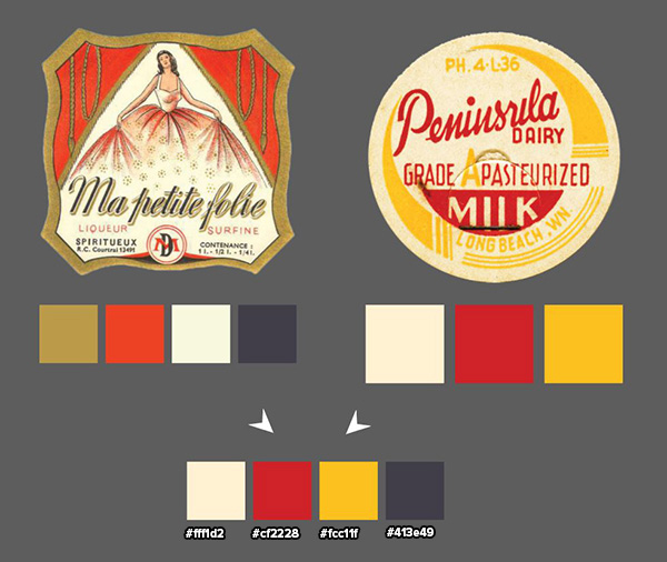
This is usually where I jump onto Colourlovers.com, and look for sweet palettes that are within the realm of what I’m creating. Today, we won’t need to do that. Vivki Robinson’s Paper ephemera 2 is filled with the perfect items to create a color palette from.
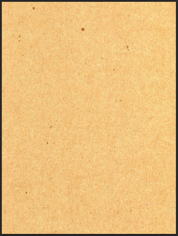
I’ve used vr_PaperEphemera2-ladylabel.png (an old liqueur label) and vr_PaperEphemera2-milk.png (an old milk container or create label) to sample colors from. I placed them in my document, and use the eyedropper (I) to grab a quintessential vintage palette: off white (#fff1d2), red (#cf2228), yellow (#fcc1ff), and dark blue (#413e49).
From there, it’s time to proceed to our poster layout.
STEP 5: POSTER LAYOUT
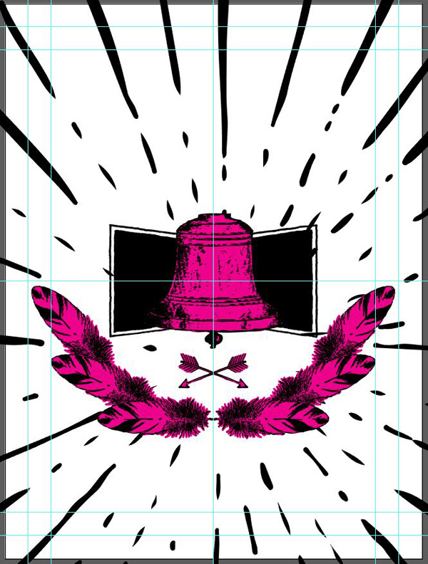
This part is where you’ll be able to make this design your own. I choose to use the bell as my focal element. The feather, after being rotated and duplicated, serves as an ornamental element. The arrows are another ornament. A bell-related quote helps to set the mood. Finally, the burst (and the textures) tie the poster together.
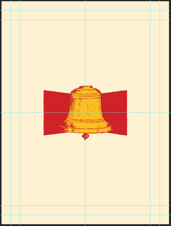
First: the bell and badge
Let’s start with our main element. I’ve placed it at the center of my poster, at roughly 6 inches wide.
Next, let’s place the badge behind the bell. It’s centered as well, and is 9 inches wide.

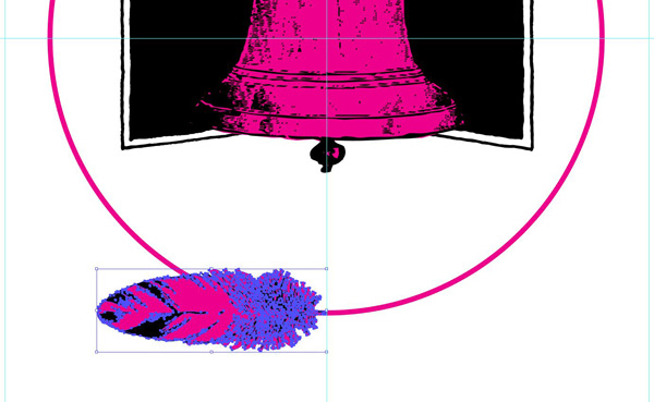
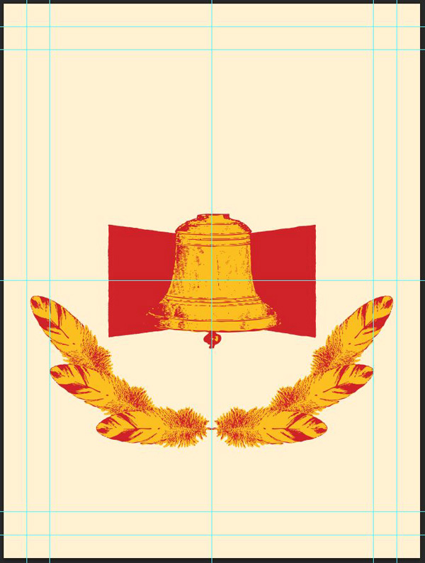
The feather “crown”
This part is a hair more complicated. On the feather layer, start by creating a centered 12 inches circle. It should just have a stroke to be visible, and no fill.
Next, proceed to align your feather and its background at the bottom of the circle so the center of its stem lines up with the circle. Make sure it’s around 4.5 inches wide.

Next comes the complicated part. We’re going to use the rotate tool (R) to duplicate and rotate the feather along the circle.
Select the feather.
Next, select the rotate tool (R). Notice the blue cross that appeared on the feather? It’s its center of rotation.
By default, it’s located at the center of the active shape. We’re going to move it (click and drag it while pressing ALT/OPTION+SHIFT – this will make sure the shape rotates along the circle) to the center of the circle.
Next, double-click on the rotate tool icon.

It will bring this tool box. Select the rotation you’d like to give to your feather. I’m using -24°. Hit the Copy button.
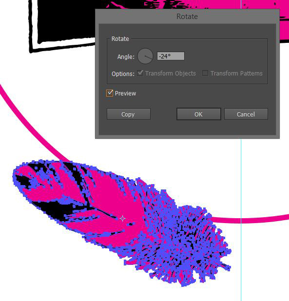
You’ll get a second copy of the feather, rotated of -24°, along the circle.

With that copy of the feather selected, simply press CTRL/CMD+D to repeat the transformation until you are satisfied with the number of feathers you have. I’m only using three on each side.

Reorganize the layers so the bottom feather is at the top.

Once you’re happy with the placement of that half of the “crown,” proceed to reflect it one more time to obtain the full crown. Align the new half properly, then delete the circle.

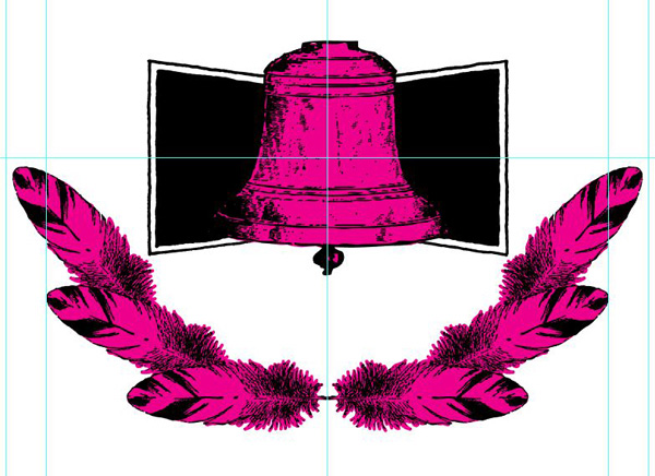

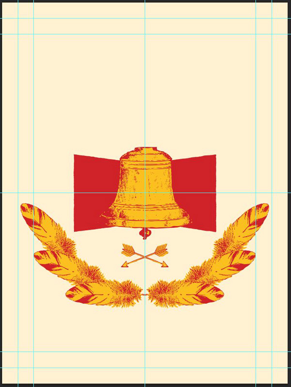
The arrows
The arrows are placed mid-way between the bottom of the bell and the feathers. My arrow badge is 3 inches wide.

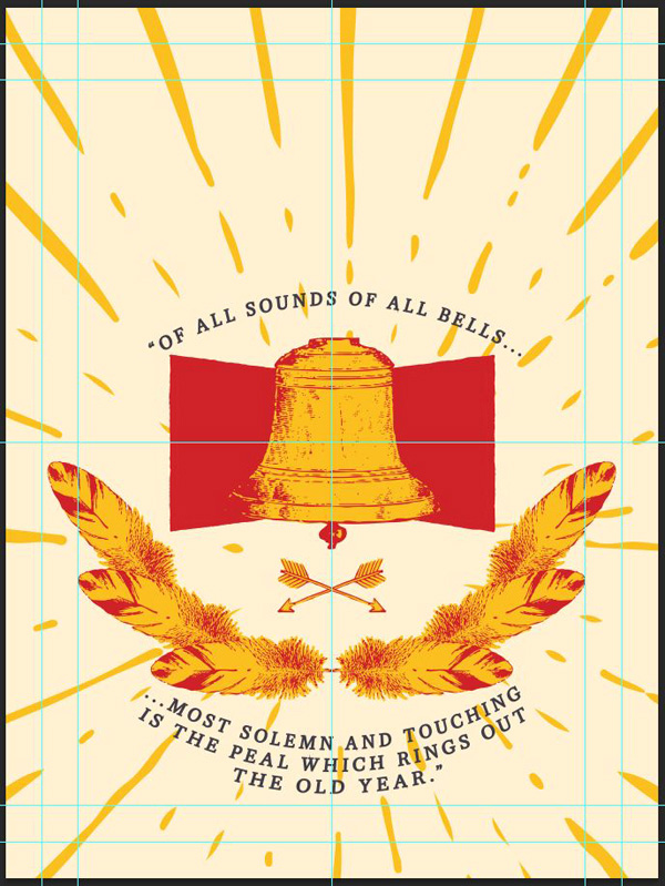
The burst
The burst is very loosely centered on the bell’s clapper. It should be oversized compared to the canvas, so all of its rays go beyond the frame’s edge. This gives it a tentative width of 38 inches.
STEP 6: TYPE
Since I’ve used the bell as my focal element, I wanted to find a text element that would relate to it. After a bit of digging, I found the following quote by Charles Lamb. If features the perfect amount of nostalgia for a vintage-inspired poster:
“Of all sound of all bells… most solemn and touching is the peal which rings out the Old Year.”
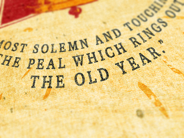
I split the text in two blocks: “Of all sound of all bells…,” and “most solemn and touching / is the peal which rings out / the Old Year.” The “/” indicate a line break.

The type is centered, and set in Lost Type Co-ops’s Pigeon. It’s a neat and elegant serif typeface.

In order to let the copy breath a little bit, I’ve tweaked the tracking a bit.
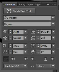
Another tweak I made was to add a 2 point stroke to the type. Pigeon is very thin, which can sometimes be challenging for legibility.
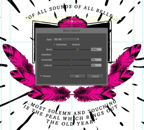
Finally, in order to make the type fit the piece better, I applied a Warp effect to both text blocks. I’m using Effects > Warp > Arc, with values of + and -35%, respectively.
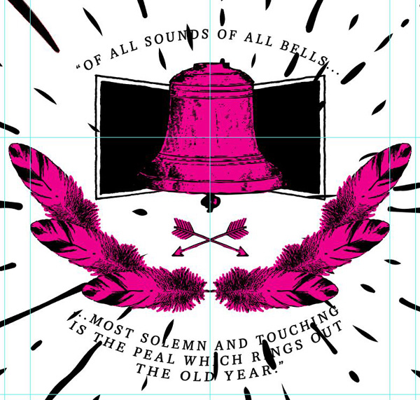
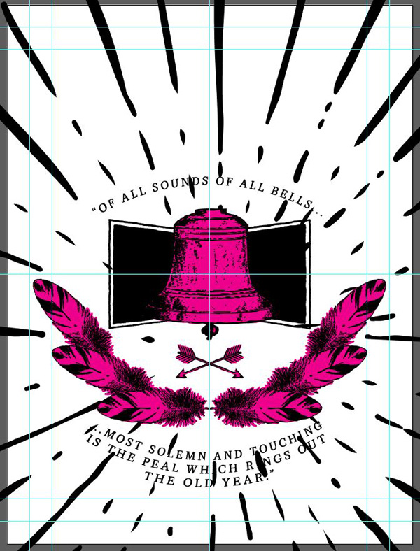
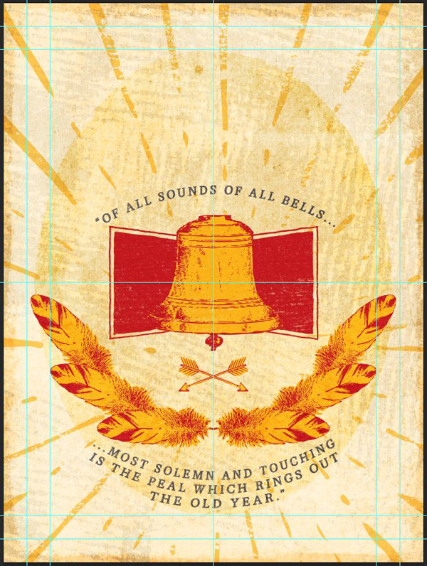
And this blocks our layout almost in full (there will be some minor adjustments after the colors are in place).
STEP 7: COLOR, PHASE II
It’s time to get back to our color palette. Both of our reference documents where using their lightes color as the background, so we’ll do the same. This will make sure that we don’t get weird results with the overall contrast of our piece.
I’m starting to color the background with our off-white (#fff1d2), and work my way from there. You’ll probably ungroup and regroup elements repeatedly during the coloring process, to get an easier access to the various fill shapes we created at the beginning.


And now that we have our color in place, we can move to the last and (most exciting?) part of the piece: textures!
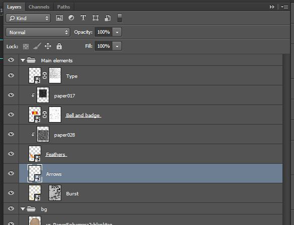
STEP 8: PLACING THE ELEMENTS IN PHOTOSHOP
This is quite easy: simply copy and paste the various elements of our piece in your Photoshop document. Please paste them as smart objects, as this will make tweaking the piece much easier, and without loss of quality. Do use the guides and position indications to accurately transfer your layout over.
Oh, and why do we bother to copy the elements over individually? Because they’ll be much easier to texture that way.

Our Photoshop document is ready to go.
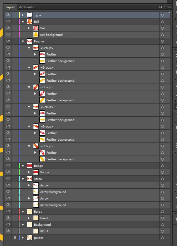
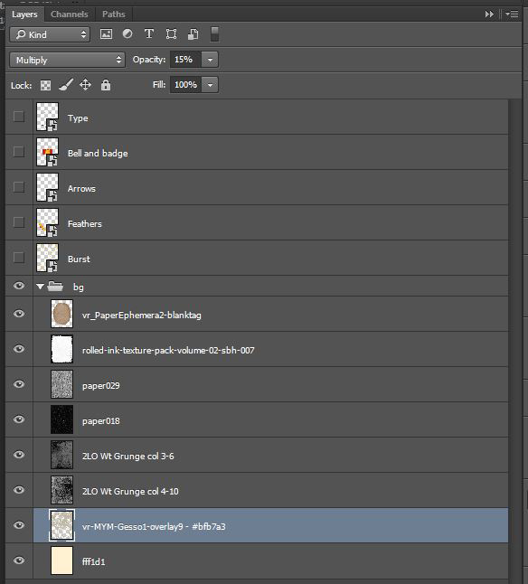
And here are our layers so far.
STEP 9: TEXTURES
This is where the fun begins. After looking extensively though the various textures available, I tried to use the ones that would contribute to make this piece unique.
Note that I’m following a destructive workflow in this tutorial. I detailed quite precisely a non-destructive version of my texturing process in this tutorial.
The background
Start by turning off/hiding all of your vector elements, so you can see that background building up.

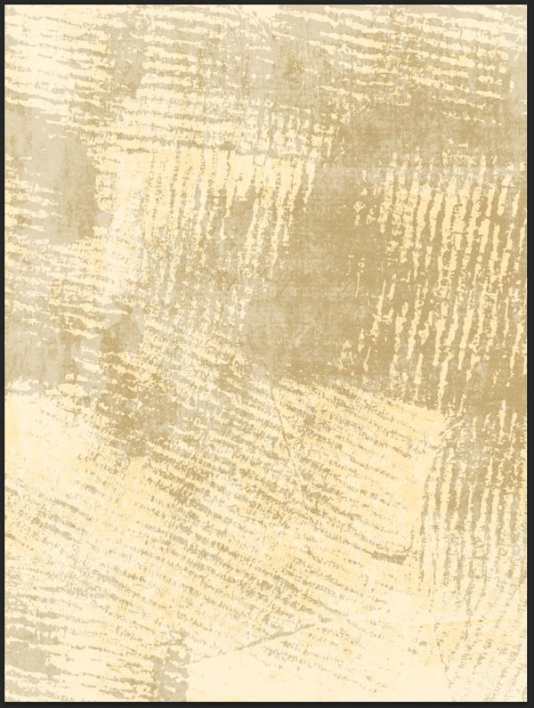
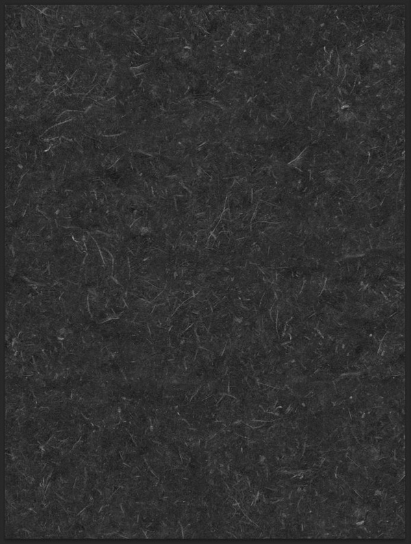
The first texture we’ll make a use of is vr-MYM-Gesso1-overlay9 (from Vicki Robinson\vr-GessoOverlays1\vr-MYM-Gesso1c).

Place it into your document so it fills the whole canvas.

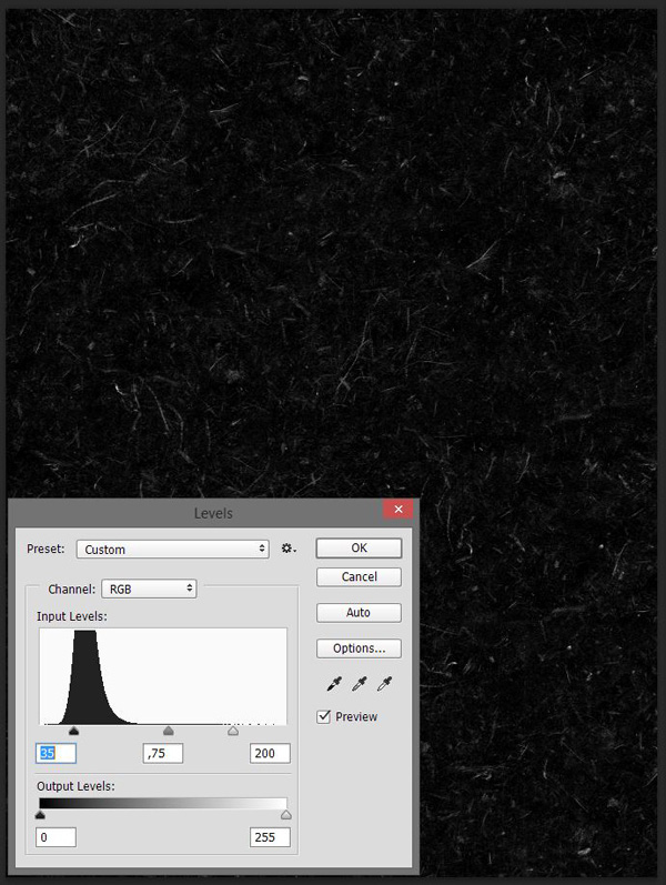
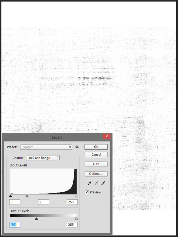
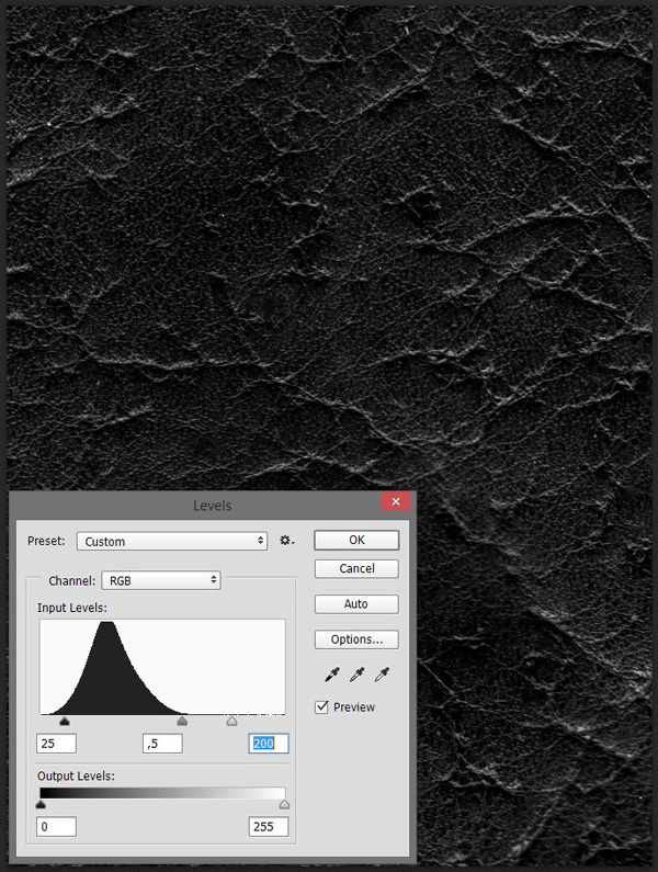
Process to rasterize the layer. The texture is great, but we want it to be darker than the background, not lighter. CTRL/CMD+CLICK the layer’s thumbnail to create a selection of its content.
Then fill it with #bfb7a3. This color has been obtained by reducing the saturation and brightness of the background’s color.

Finally, change the layer’s blending mode to Multiply @ 50% opacity.

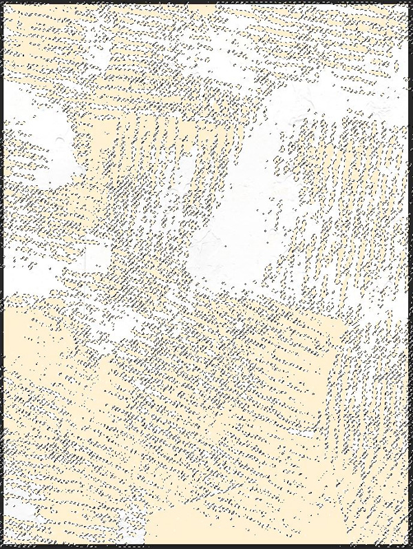
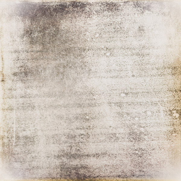
The next texture is 2LO Wt Grunge col 4-10 (from 2 Lil Owls\White Grunge collection 4).

Place it in the document so it covers it in full.
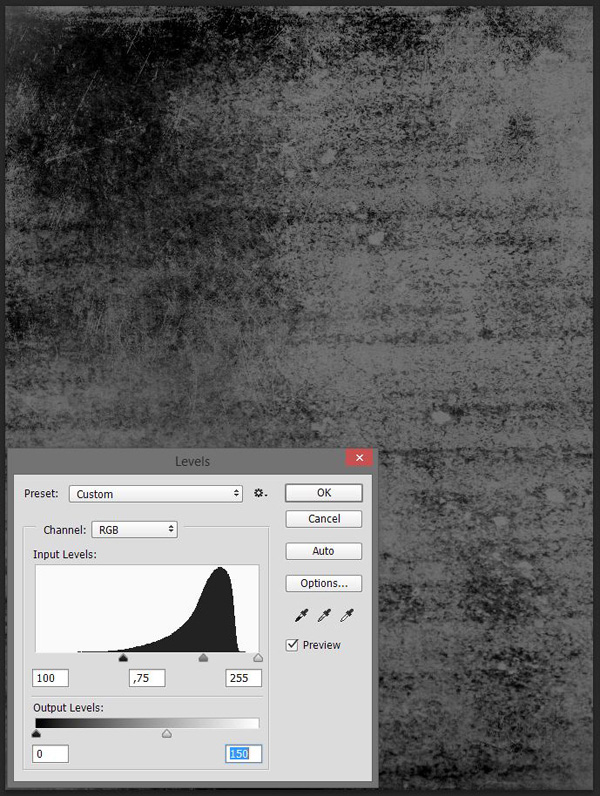
Rasterize the layer, desaturate it (CTRL/CMD+SHIFT+U) and sharpen it one or two times (Filter > Sharpen > Sharpen).

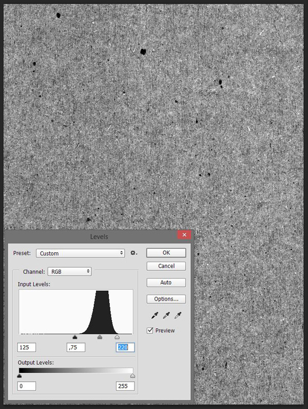
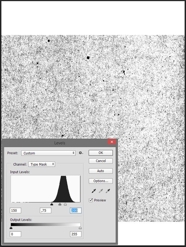
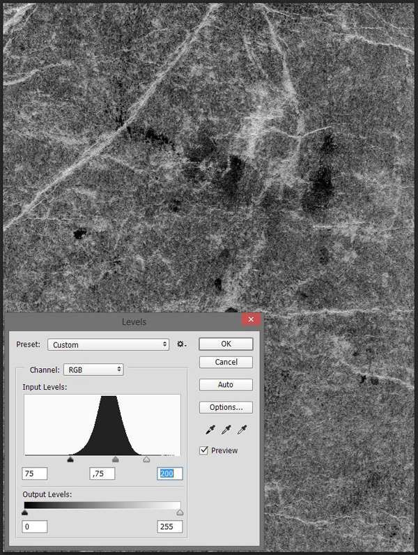
Use the levels (CTRL/CMD+L) to enhance the contrast and impact of the texture on our piece.

Finally, change the texture’s blending mode to Soft light @ 100% opacity.
Next up is 2LO Wt Grunge col 3-6 (from 2 Lil Owls\White Grunge collection 3). Follow a similar process to place the texture and edit it.
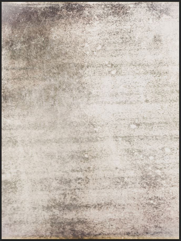
Finally, change its blending mode to Soft light @ 100% opacity.

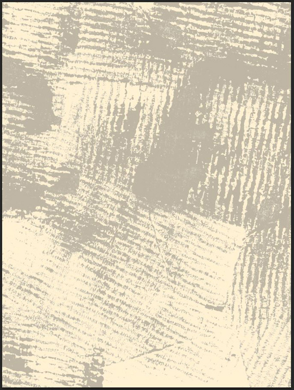
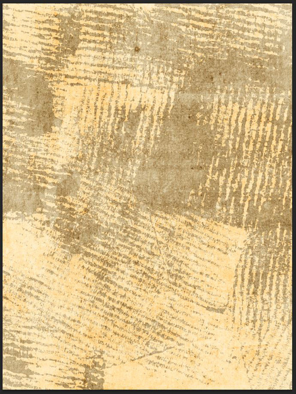
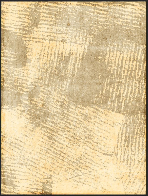
Next is paper18 (from Matt Borchert\Paper-Pack-30-Real-Paper-Scans).

Make it take the whole canvas, sharpen it, and invert it (CTRL/CMD+I).
Darken the texture with levels.
Change the blending mode to Soft light @ 35% opacity.
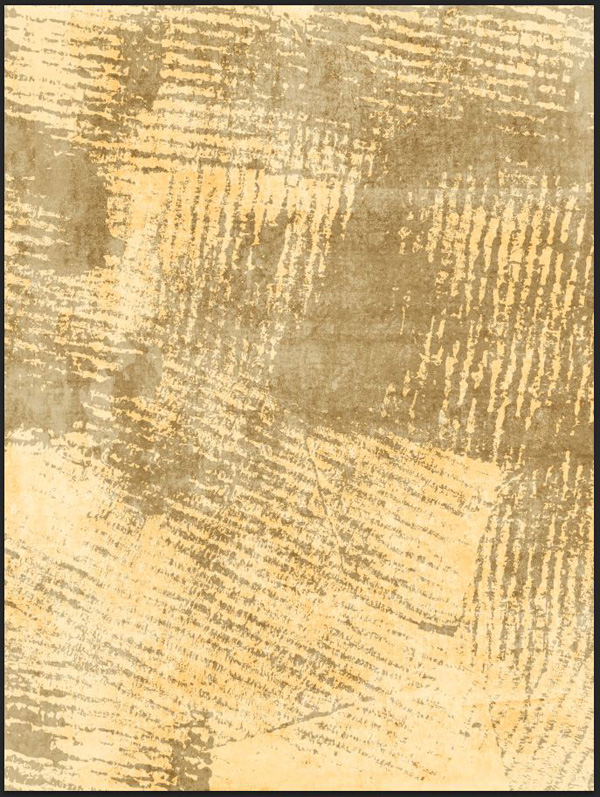
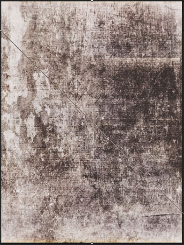
Next: paper29 (from Matt Borchert\Paper-Pack-30-Real-Paper-Scans).

Blending mode: Soft light @ 100% opacity.
Finally, we’re going to use rolled-ink-texture-pack-volume-02-sbh-007 to create a faint frame effect.
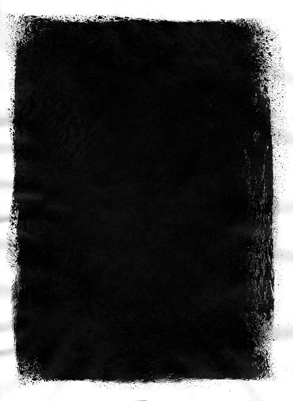
Invert the texture.
Change its blending mode to Soft light @ 50% opacity.
The final texture for our background is vr_PaperEphemera2-blanktag. This oval texture will create a frame for our vector elements.
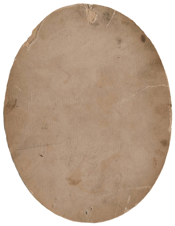
Place it so it fits between your most inner guides.
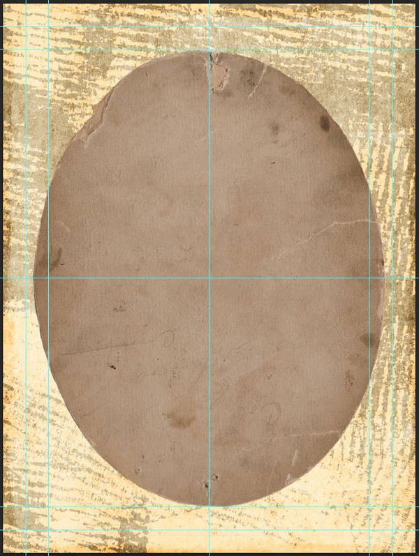
Change its blending mode to Color burn @ 50% opacity.
While this background is decent, it should be a bit softer for our piece. Just try to turn your vector elements back on to see that it’s too overpowering.
The solution? Lowering the opacity of some of the textures we’ve used.
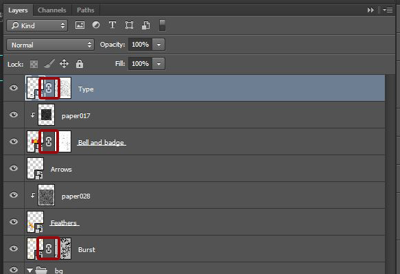
Now that the background is done, a quick look at our layers:
How to texturize the vector elements
There are two ways to texture the vectors elements we have at hand. We can either clip textures on top of them (CTRL/CMD+G with the texture layer selected), or we can paste textures in layer masks (ALT/OPTION+CLICK the layer mask thumbnail to see its content). We’ll do both.
The burst
The burst will get texture20.jpg from Matt Borchert\Distress-Texture-Pack-Vol1 pasted in a layer mask.

The mayer mask and the burst layer shouldn’t be linked, so we can edit them independently from each other. The texture should cover the whole mask.
Use levels to make the texture much darker (and erase/fade quite a bit of the burst).


Finally, change the burst’s blending mode to Multiply @ 100%.

The bell and its badge
We’ll both clip a texture and add one in a layer mask for that one. Let’s start with the layer mask texture. Locate Texture29.jpg from Matt Borchert\Distress-Texture-Pack-Vol2.
Paste it in the layer mask to cover the bell and badge in totality.
Since this is a strong texture, and the most important element of the poster, we’re going to lighten up things up a bit.
The next step is to clip paper017 from Matt Borchert\Paper-Pack-30-Real-Paper-Scans on top of it.
Rasterize, sharpen, and desaturate the texture prior to apply the following level settings.
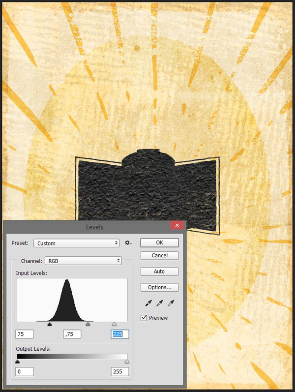
Finally, change the texture’s blending mode to Soft light @ 50% opacity.
The feathers
The feathers only get paper028, clipped on top of them.

Change the blending mode to Soft light @ 100% opacity.
The arrows
The arrows don’t receive any particular texture treatment
The type
The type elements get paper029.jpg pasted in their layer mask.
A few layout adjustment
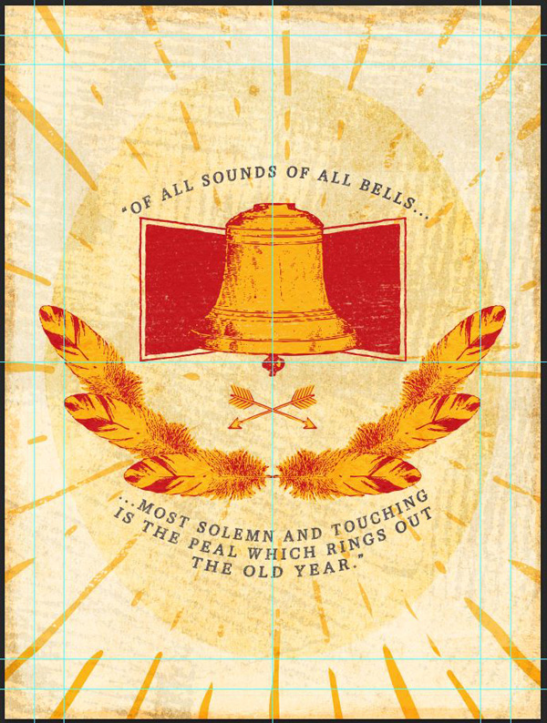
Before we finalize the piece, we need to do a few adjustments. The elements constituting the poster are located too low within the oval frame and general canvas.
Make sure that the various texture layers and layers masks are linked back to their respective objects, and simply slide everything up, so it’s centered within the oval frame.
Once that’s done, take advantage of the type being a smart object, and invert the placement of the bottom line of type, and the arrows. Simply double-click on the smart object layer to be taken back to Illustrator to edit it.
Finally, group all of the vector elements and their textures into their own layer group.
STEP 10: GLOBAL TEXTURES AND FINISH
That additional texture step is often critical to tie a piece together. By applying texture to the whole piece rather than to individual elements, there will be a visual consistency forming.
Let’s start with 2014-05-15-leather-billfold-textures-sbh-006.
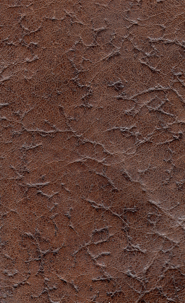
Place it so it covers the whole canvas.
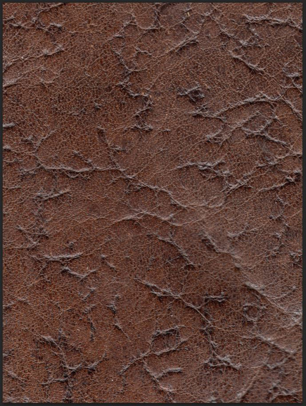
Change its blending mode to Soft light at 35% opacity.
Next is 2014-05-16-plastic-card-holder-textures-black-on-white-sbh-008. I used the transparent version. Place it to cover the whole canvas.

Like for the vr-MYM-Gesso1-overlay9 at the beginning, change the color of the dirt speckles to #bfb7a3.
Finally, change its blending mode to Linear burn @ 75% opacity.

Next up, a brush stroke texture: texture04 from Matt Borchert\Distress-Texture-Pack-Vol1.
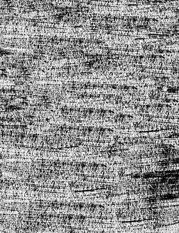
Change its blending mode to Soft light @ 25% opacity.
In the same vein, texture14.


Change its blending mode to Soft light @ 25% opacity as well.
Next to last texture, packing-material-texture-pack-vol-02-sbh-014.

Change its blending mode to Soft light @ 50% opacity.
Finally, there’s packing-material-texture-pack-vol-02-sbh-012.

Change, one more time, the blending mode to Soft light @ 50%.
Before we do the last of the last thing on this poster, we’re going to tweak layer opacities one more time. The current feel of the piece is “dirty,” rather than old or aged. Start by lowering the opacity of the 2014-05-16-plastic-card-holder-textures-black-on-white-sbh-008 layer to 50%.
Lower the opacity of the packing-material-texture-pack-vol-02-sbh-012 layer to 25%.
Lower the opacity of the 2014-05-15-leather-billfold-textures-sbh-006 layer to 15%.
Lower the opacity of 2LO Wt Grunge col 4-10 to 50%.

Same for 2LO Wt Grunge col 3-6.

Finally, lower the opacity of vr-MYM-Gesso1-overlay9 to 5%.
The wrap-up touch: a halftone effect. I’ve covered this technique before, but it’s so efficient that I’m going to use it again.
First, organize your layers.

Then, create a merged copy of all your layers. Make sure that you have your top layer selected, and press CTRL/CMD+SHIFT+ALT/OPTION+E. Rename the layer Comp, or halftones.

Transform the layer to a smart object (Filter > Convert for smart filters). Then apply the effect Filter > Pixelate > Color halftones. Use these settings.
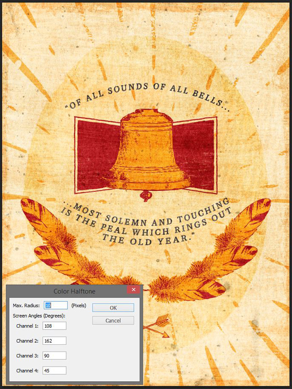
Because this layer is a smart object, and because the filter is compatible with smart objects, we have 2 blending/opacities modes to assign: the effect itself, as well as the layer itself. Double-click on the little extra icon on the layer to access this feature.

From there, change the layer’s blending mode to Lighter color @ 50% opacity.
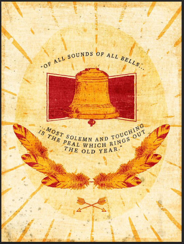
And we’re done!
I hope you had as much fun going through the tutorial than I had writing it. If you have any questions, feel free to use the comments below, or to tweet at me. As always, don’t forget to send us your outcomes, either through Twitter or Facebook.
FINAL THOUGHTS
I hope you had as much going through the tutorial as I had writing it. Don’t hesitate to share your outcomes on the Design Cuts Facebook page. If you have any questions please let us know in the comments below, or ask me directly on twitter: @simonhartmann.
Remember, there’s only a few days left to get the Complete Vintage Design Arsenal for just $29, so if you don’t want to miss out, we recommend checking it out now. It’s been getting some amazing feedback from the DC community, and you guys have been loving the hundreds of vintage items available.
The Complete Vintage Design Arsenal – 91% Off
Be the first to comment