
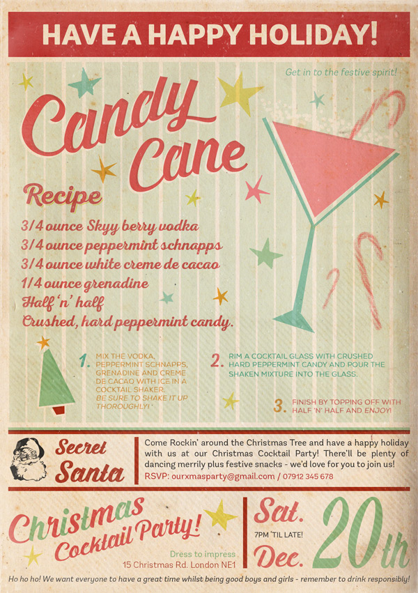
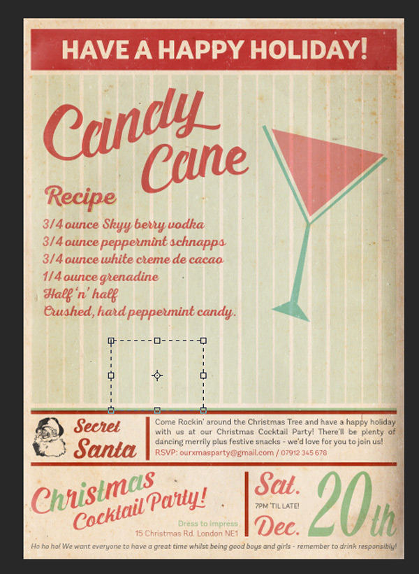
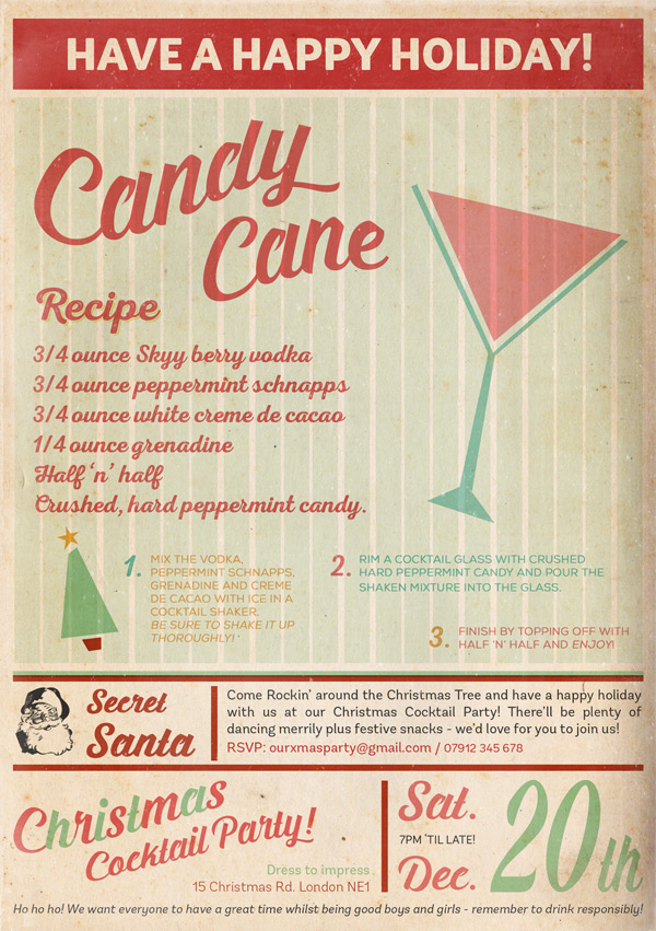
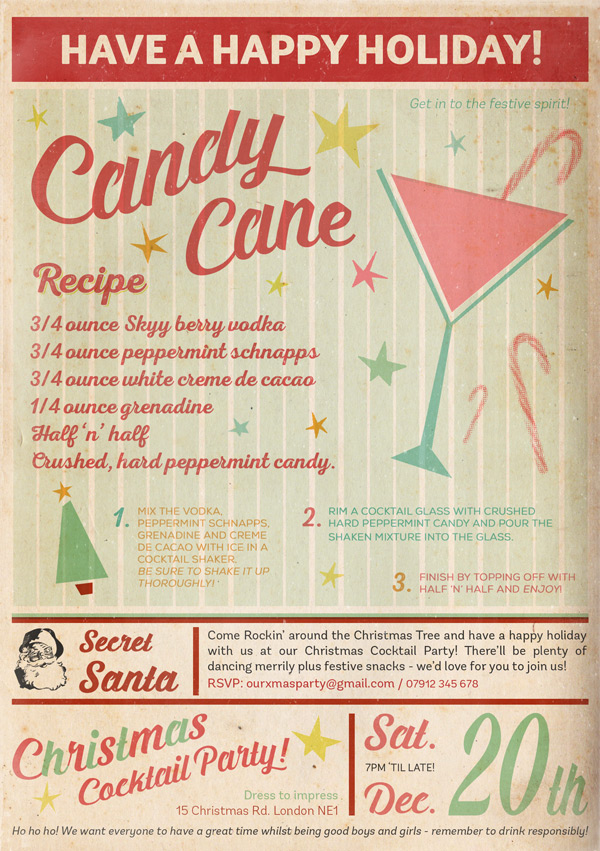
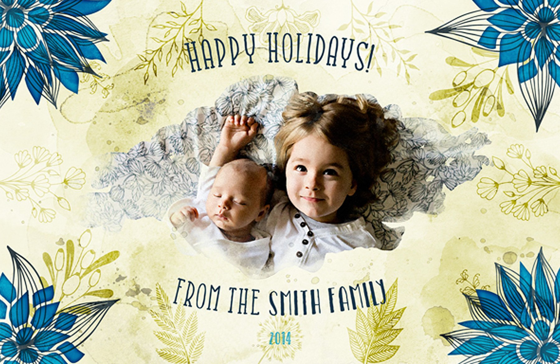
WHAT WE’RE CREATING:
Hello Design Cutters!
Jo here for another DC Tutorial. Whether you’re in a festive or “bah humbug” mood now that it’s December, the latest fonts bundle is bound to have brought some early seasonal cheer for many of you!
As the party season is rapidly approaching, we’ll be putting your new fonts to good use by inviting your nearest and dearest for a fun, festive cocktail party.
We’ll be focussing on a limited, retro colour palette and looking at the many ways Photoshop lets you tweak your fonts to your design desires.
Quick note: In this tutorial, the term “clipping” or “clipped layer” is used a few times. This means that the layer is only visible/applies to the layer directly below it. You can very quickly do this by holding ‘Alt’ down on your keyboard and clicking between the two layers. Here’s a quick demonstration.
Ok, let’s get started!
Follow along with this tutorial: Download the freebies
As always, we have another great freebie for you to enjoy. Artimasa have been kind enough to offer their Hipsteria font bonus vectors pack to the Design Cuts community.
Remember, this freebie is just a tiny sample taken from this beautiful collection of fonts: 20 All New Best Selling Fonts (With Web Fonts and Extended Licensing) at just $29 (an unbelievable 98% Off). The fonts included here really are spectacular, and you can see why they all sell so well at full price. This is a great opportunity to get a variety of bold headline fonts, scripted elegant fonts, playful whimsical fonts, professional fonts, gothic, rustic, vintage and elaborate fonts! With such variety and quality, you’ll feel that Christmas has come early for your font collection. :)
Enter your email below to download the freebie, so you can follow along with this tutorial easily.
Step 1:
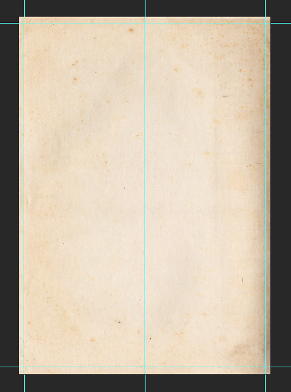
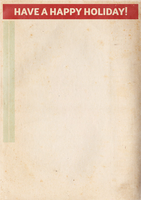
Open up a new (A5) 1748px x 2480px Photoshop document. We’ll start off by downloading some great vintage paper textures to help give our design an authentic feel:
Feel free to use whichever takes your fancy. The example used here is Paper 15:
Let’s download another freebie that’ll help with our design by giving it a faded look. We’ll be using some screen textures which you can get here:
Locate 2LO – Creative Masks set 2 – 20.jpg and paste on to your canvas, scaling to fit:

Drop the Opacity to 75% and change the Blend Mode to Screen:
Lock the layer so it stays at the top, and we’ll be keeping all subsequent layers below it. Although we can’t really see the effect at this stage, if you know you’re going to use a screen texture as a finishing touch on your design, I think it’s worth applying at the very start so you can get an idea of how the colours will appear, and be aware if a key part of your design is going to completely screened out!
Step 2:
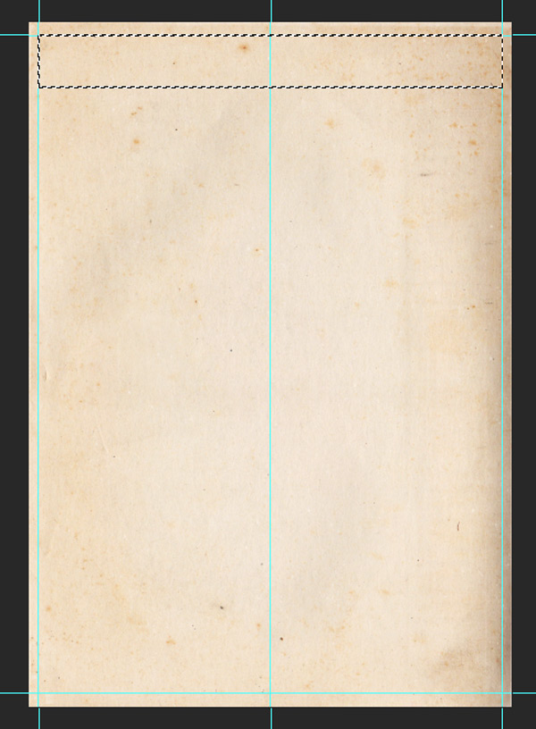
Now we’ve got our background and screen texture ready, we’ll set up some guides that we can refer back to during the design process.
To specify where we want our guides to be, in the main menu go to View > New Guide. In the box that pops up, specify the following:
Vertical: 2%, 50%, 98%
Horizontal: 2%, 98%

This’ll give us the following, which’ll help us keep a consistent border around our work:
Step 3:
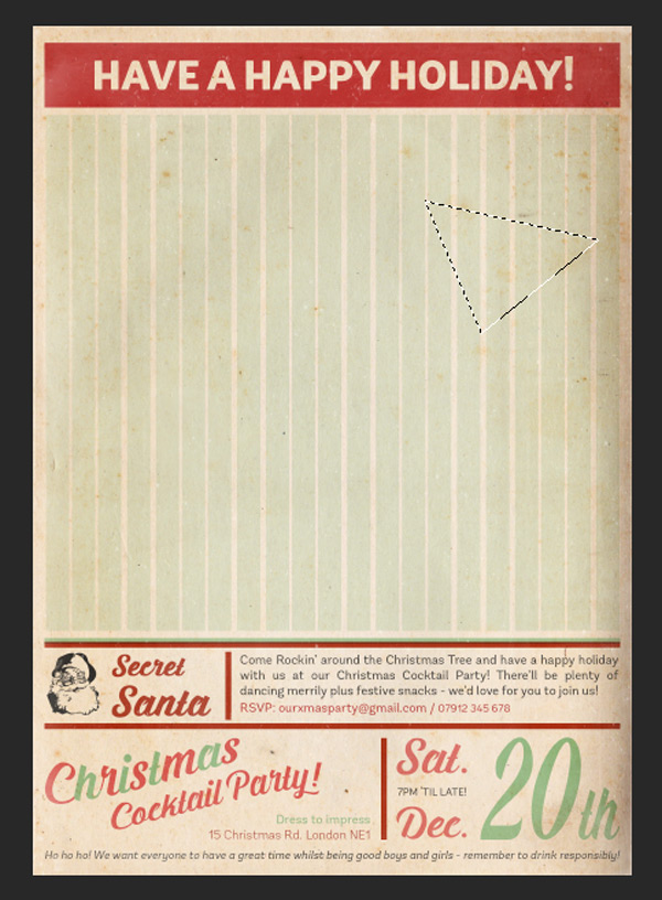
Make sure #C32929 is set as the foreground colour, then use the Rectangular Marquee Tool to draw a chunky bar across the top of our canvas. Remember to use the guides to help!
Hit ‘alt + delete’ on your keyboard to fill the selection with the foreground colour, then set the blend mode to Multiply (you can start to see our screen texture come in to play here as well):

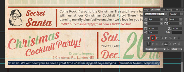
Create a Layer Mask, then click on the masked layer whilst holding ‘alt’ on your keyboard to edit it directly. We’ll be using our first font here, which is:
Font: Andes Rounded Black
Size: 29pt
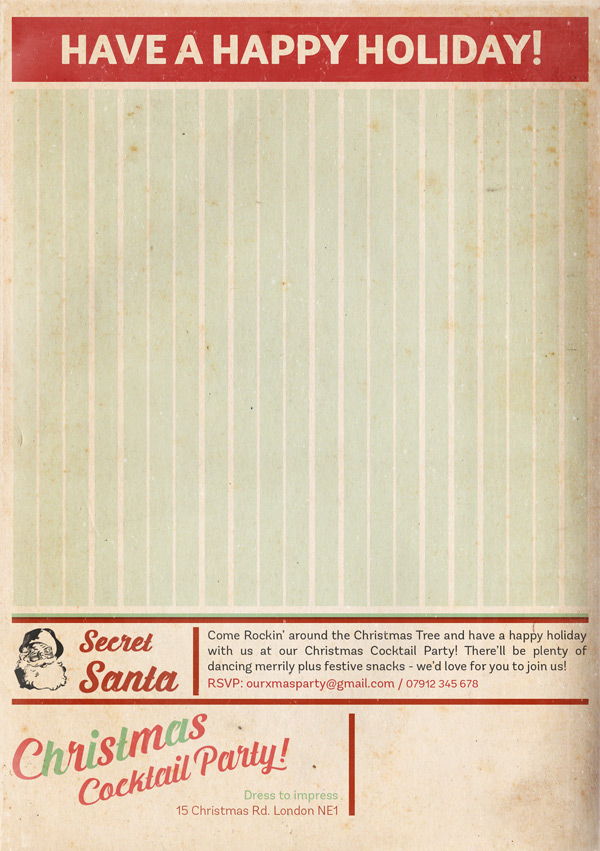
As it’s being used for a mask, make sure the foreground colour is set as black. Once you’ve got the right settings, type out the following in uppercase:
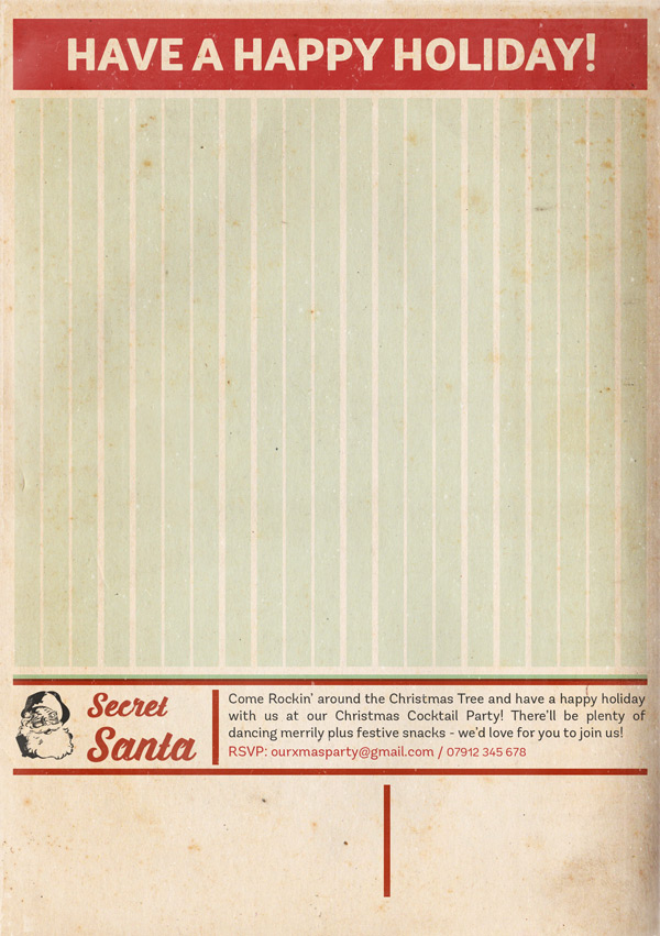
HAVE A HAPPY HOLIDAY!
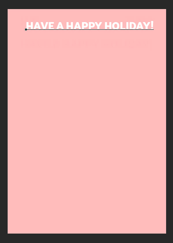
Once you’ve confirmed the type, it’ll automatically convert to pre-selected outlines:
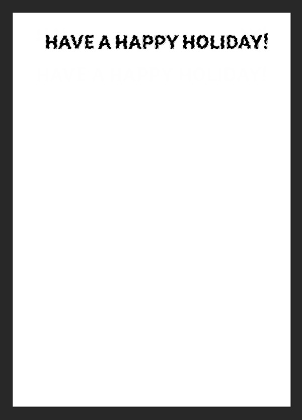
Click anywhere on your layers panel to go back to the main document. With the outlines still selected, unlink the mask from the header by clicking on the chain icon, in order to move the text freely so that it sits centrally within the header:

Step 4:
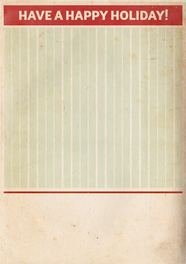
Select #96CD9C as the foreground colour and use the Rectangular Marquee Tool to draw a tall, narrow rectangle, as we did for the header. Hit ‘alt + delete’ on the keyboard to fill with the colour and set the blend mode to Multiply:
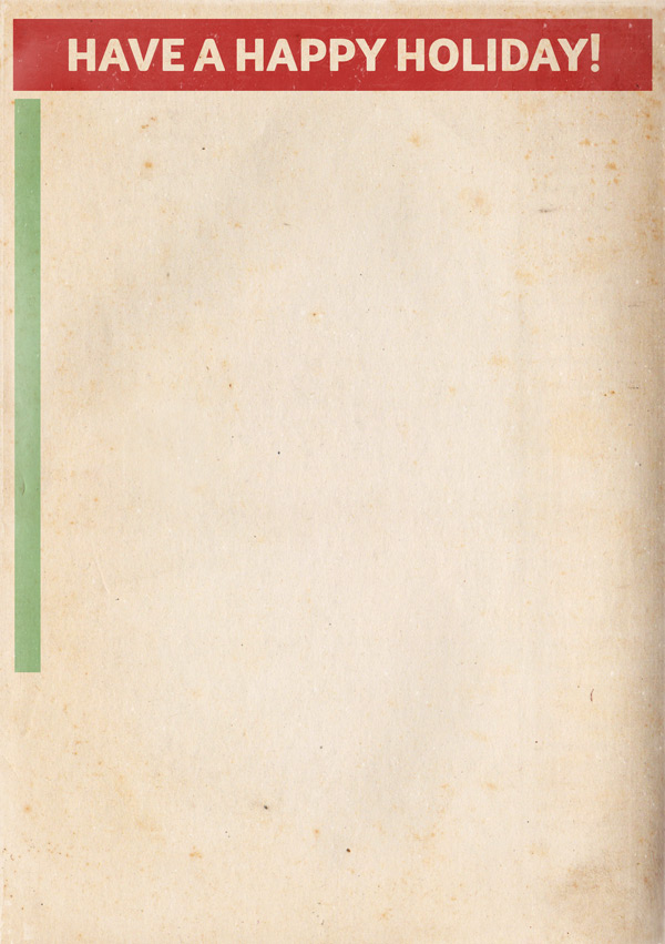
It’s a little strong as it is, so we’ll reduce the Opacity to 25%:

Duplicate the layer then move the copy across to the right, leaving a small gap in between.
Repeat this until you’ve reached the edge of the far-right border. You can duplicate multiple layers at a time to speed up the process, and use the transform tool at the end to reduce the width so that it all fits within the borders:

Group all the layers together and give the folder an easily recognisable name. I’ve gone with the imaginative, “Stripey Background”. :p
Step 5:
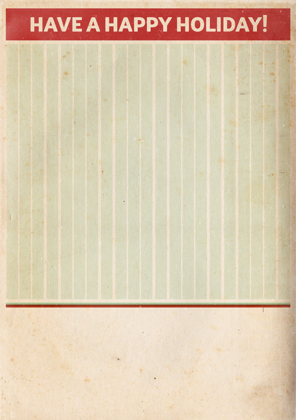
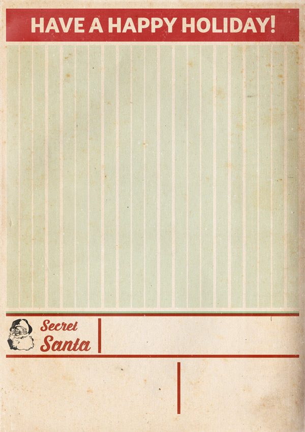
We’ll start setting up our main text area, where we’ll be putting the details of our party. Select our red #C32929 colour for the foreground and on a new layer use the Rectangular Maquee to draw a long, thin bar to fit within the borders:
Set the blend mode to Multiply then duplicate the layer. Use the Paint Bucket tool to fill with the green shade #96CD9C we used for the stripes. Use the arrow keys to move the layer up slightly so it overlaps the original, and reduce the blend mode to 80%:
Repeat the steps for creating our rectangles, and create a similar layout to below, leaving a little extra space at the bottom. We can always change the positions later if required to accomodate our text:
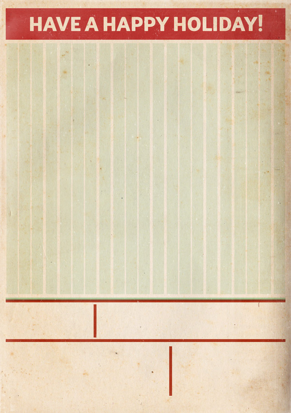
Group these layers together so that they’re easy to find later if needed.
Step 6:
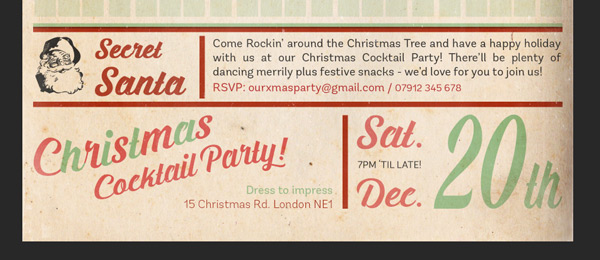
Now that we’ve created our text area grid, we can let it fulfil its purpose by filling it with some of our gorgeous new fonts!
First though, we’ll need to download this friendly festive face:
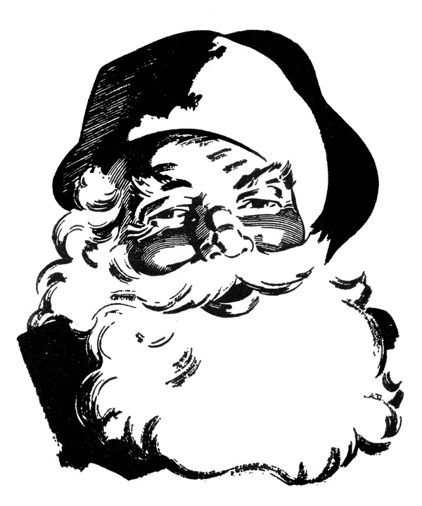
Paste on to your canvas, scaling so that it fits within the top left space in our text grid. Switch the blend mode to Multiply and reduce the Opacity to 85%:

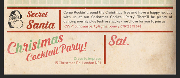
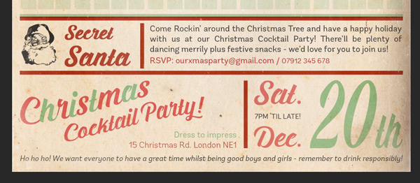
Next, we’ll add some text. Select Prada by Artimasa as the font, set the colour as our red #C32929 and size as approximately 28pt. Make sure the text is set to justify left, then type “Secret Santa” so that the words sit on separate lines.

We’re going to tweak this font slightly using the Character Panel.
Highlight the text, then we’ll make the following changes:
1. Apply a faux Bold effect by selecting the large “T” icon
2. Specify the Line Height as 28pt to reduce the gap between the lines
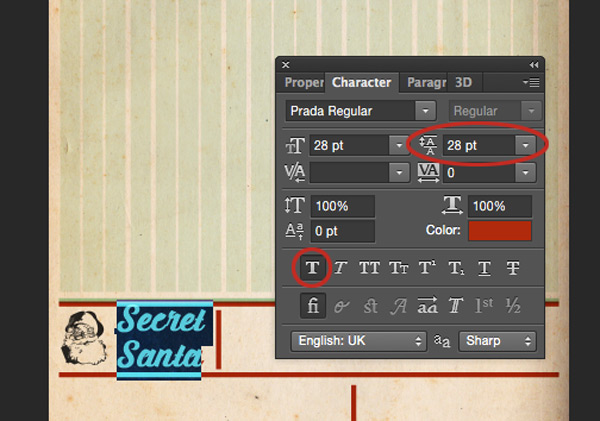
Once we’ve applied those changes, select just the “Secret” part of the text and reduce the size to around 20pt and set the blend mode to Multiply:
Use the transform tool to manually scale the text to fit if required, otherwise we’re ready to move on to the next step!
Step 7:
We’re going to add a longer block of text here, and we can use the cursor to specify an area we want the text to sit within. With the Text Tool selected, click and drag your curser out to draw the area you want your text to fill:
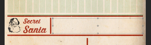
A text cursor wil have automatically appeared within the selection so you’re ready to go!
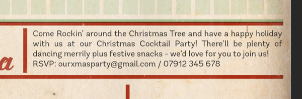
As this is a longer block of text, we’ll want to use a simple font that’s easy to read at smaller sizes. We’ll be using Andes Rounded Regular at size 9pt and colour #292929, with the layer blend mode set to Multiply.
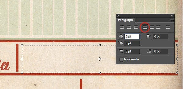
As a final check, make sure the Paragraph style is set to Justify Last Left, so that our text fills the full width and gives a clean visual edge:
You can then copy and paste the text below, or write out your own message!
“Come Rockin’ around the Christmas Tree and have a happy holiday with us at our Christmas Cocktail Party! There’ll be plenty of dancing merrily plus festive snacks – we’d love for you to join us!
RSVP: ourxmasparty@gmail.com / 07912 345 678”
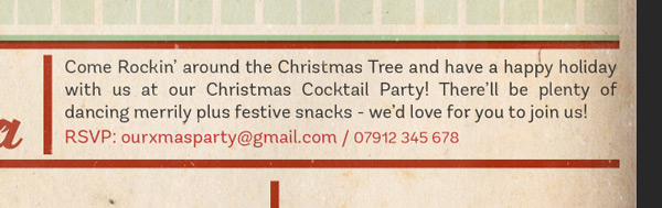
We’ll now make some minor tweaks to get the text looking just how we want.
Highlight the last line and use the Character Panel to manually increase the Line Height to 12pt. This’ll give us a slightly bigger space between the lines, and help the text stand out. We’ll also change the colour to red #C32929 to make it more noticeable.
As a final adjustment, highlight just the telephone number in the last line. You may have spotted that the numbers look a lot larger than the lowercase text, even at the same size. A good rule of thumb is to reduce numerals by 1.5pt to make them a more similar size and not look too giant in comparison, so we’ll change the font size for this to 7.5pt.
Step 8:
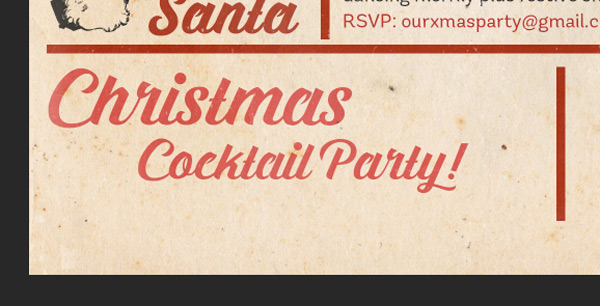
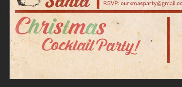
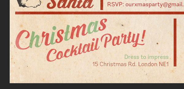
Next, we’ll go back to some more decorative text. Select Prada as the font, and #E25858 as the colour. Type “Christmas Cocktail Party” so that “Christmas” is 35pt and “Cocktail Party” is 25pt. Set the Line height as 25pt too, and use the space bar to push the “Cocktail Party” text to the right slightly. Change the layer blend mode to Multiply:
We’ll give this a fun feel by changing the colour of every other letter in the word “Christmas” to our green #96CD9C shade. Highlight the letters individually to select the new colour for them:
Once you’ve changed the colours, use the Transform tool to tilt rotate the text slightly so that it sits at an angle:


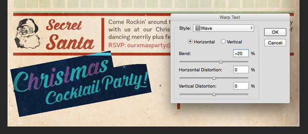
Finally, highlight the text and select the Warp Text tool. In the box that appears, use the following settings:
Hue/Saturation Settings:
Style: Wave
Horizontal
Bend: +20%
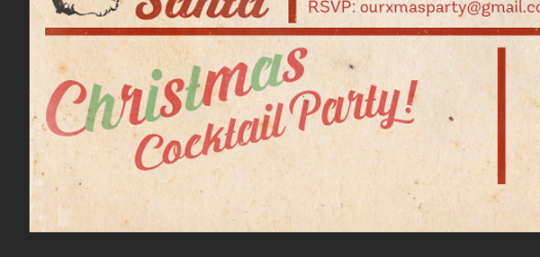
This gives our text a subtle wavy appearance, which adds to the sense of fun.

We’ll fill up some of the space with more details about our party. On a new Multiply layer, type the dress code and address:
Dress to impress
15 Christmas Rd. London NE1
Set the text to justify Right, with Andes Rounded Regular as the font and the size at 9pt. Change the colours to the same green and red we’ve been using so far in the tutorial:
Step 9:
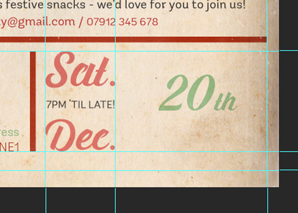
Next up, we’ll add some info about the date and time which is pretty essential!
Select Prada as the font at size 33pt, and use the pink #E25858 colour as before and type “Sat.” Make sure the blend mode is set to Multiply on all our text layers:
On a new layer, type “Dec.” with the same settings. Again, on its own layer type “7PM ‘TIL LATE!” with Andes Rounded Regular as the font and the grey #292929 as the colour.
Create some new gridlines to help you manually adjust the sizes of the text so that they all fit within a rectangular shape:

On a new layer with the font set to Prada and the colour as our green #96CD9C, type “20th”:
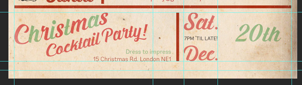
Highlight the “th” part of the text and use the Character Panel to reduce the size so that it appears about half the height:

Then, using the gridlines to help, manually transform the text so that it fits the desired shape:
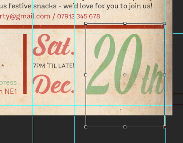
Let’s group these together in to a folder called “Date & Time” for easy location.
Step 10:
We’ll finish off the text in the lower half by adding a single line that acts as a footer at the very bottom. Aesthetically, it’ll be a nice touch as it helps weigh down the design and gives the page a clear end.
Using Andes Rounded Regular as the font, #292929 as the colour and 8pt as the size (which you can adjust later if needed). Copy and paste the following text, or write your own message:
“Ho ho ho! We want everyone to have a great time whilst being good boys and girls – remember to drink responsibly!”
Use the gridlines to help position your text, then using the Character Panel, we’ll apply a faux Italic effect:
Easy peasy! :)

We’re getting there! In the following steps we’ll be getting a bit more creative and colourful now we’ve got all our key information down.
This might be a good time to take a quick screen break for your eyes and stretch your legs. For those of you in the northern hemisphere, you could use this opportunity to make yourselves a hot drink – I certainly will! ;)
Step 11:
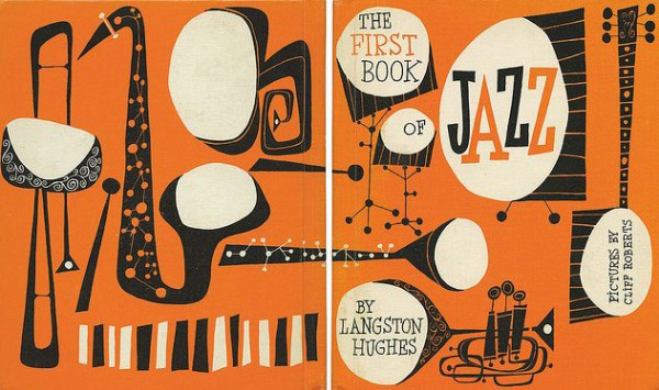
We’re going to be combining a mix of fonts and hand-drawn illustrative elements in the next steps to help create a retro vibe for our invite, which I hope will be fun for you!
If you need some inspiration, it might be worth spending a few minutes looking at 50s and early 60s illustration and design to get a feel for the aesthetics. We want to create the relaxed, clean lines and loose shapes which was a popular style at the time. Here’s an example below to help:
On a new layer, select the Polygonal Lasso Tool and use it to draw a rough triangle shape, which will form the main part of our cocktail glass:
Select our pink #E25858 shade as the foreground colour, and hit ‘alt +delete’ on the keyboard to fill the shape. Then, set the blend mode to Multiply:
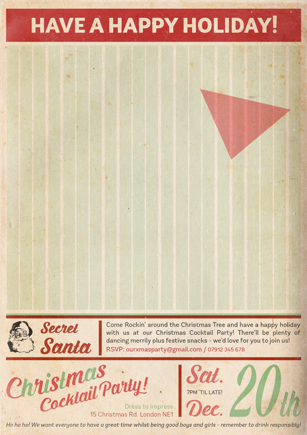
Use the same approach to draw the rest of the glass around our triangle, trying to recreate that relaxed 50s style. Use #72C6B8 as the colour then set the blend mode to Multiply and the Opacity to 70%:

Step 12:
We’ll now specify what our cocktail is. On a new layer select Prada as the font at around 70pt in size with our pink #E25858 shade as the colour. Type “Candy Cane” so that the words are on two separate lines and the “Cane” text is pushed to the right slightly by hitting the space bar a few times. Reduce the “Cane” text to about 60pt so that it’s a little smaller. This is to keep the style consistent with the text elsewhere in the design:
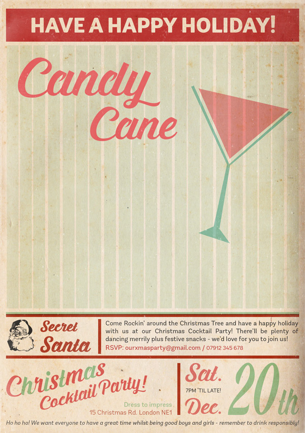
As we did for the “Christmas Cocktail Party” text earlier in the tutorial, rotate it slightly before adding a “Wave” Text Warp effect, setting the Bend to +30%:
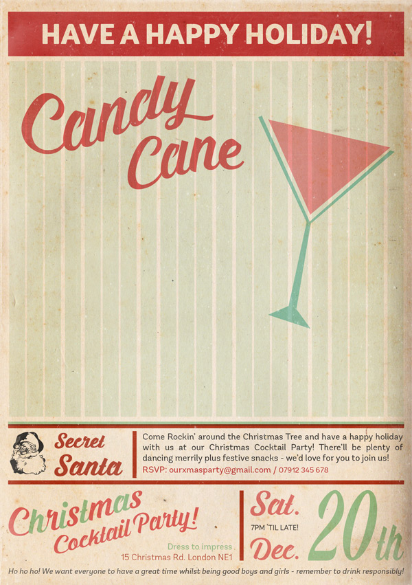
Select Nexa Rust Script S 00 as the font, at about 30pt size and using our pink #E25858 shade as the colour, type “Recipe”:
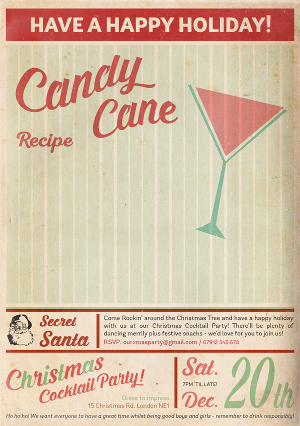
Duplicate the layer, then change the font to Nexa Rust Script S Shadow and the colour to #EFE657 to create a subtle shadow effect:

Next up, we need to add the recipe! As this is going to be a big block of text, we’ll use a fun, decorative font that really helps set the retro vibe. This time, we’ll use Nexa Rust Script S 01 with the same #E25858 pink shade, but reduce the size to 16pt.
Once you’ve got the font settings, copy and paste the following text:
3/4 ounce Skyy berry vodka
3/4 ounce peppermint schnapps
3/4 ounce white creme de cacao
1/4 ounce grenadine
Half ‘n’ half
Crushed, hard peppermint candy.
This should leave you with something like this:

Step 13:
Now we’ve got our ingredients, we need to know what to do with them! The font here is going to be rather small, so we want to choose something that’s fairly simple and easy to read.
This time, we’ll use Nexa Rust Sans Book at size 7pt, with a faux Bold effect applied from the Character Panel. Select #EBA64A as the colour and set the layer blend mode to Multiply, as for all the text.
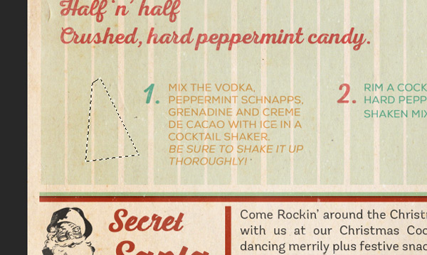
Using the text cursor, draw a fairly square box similar to below:
Then, copy and paste the following text:
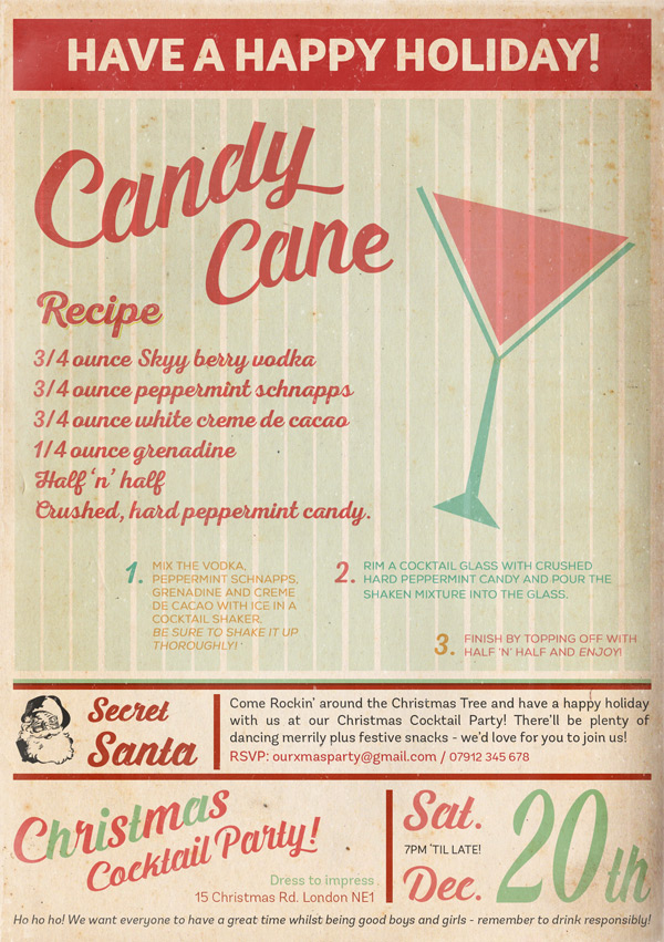
“Mix the vodka, peppermint schnapps, grenadine and creme de cacao with ice in a cocktail shaker.
Be sure to shake it up thoroughly!”
Make sure the paragraph style is set to justify left, and if you want you can use the faux Italic effect to add emphasis to some sections, such as “Be sure to shake it up thoroughly!”
Repeat for the remaining two steps, drawing slightly different shaped boxes to prevent things from looking too rigid:
The text you’ll need is:
“Rim a cocktail glass with crushed hard peppermint candy and pour the shaken mixture into the glass.”
and
“Finish by topping off with Half ‘n’ half and enjoy!”
And the colours are #72C6B8 for the blue and #E47272 for the pink.
We’ll finish off this section by numbering the steps. Going back to the Nexa Rust Script S 01 font and setting the size as 20pt, each on a new layer type “1.”, “2.” and “3.”. Position them so that they sit next to their corresponding text and mix up the colours we used to add to the fun, party feel:
Step 14:
In this step, we’re going to go back to some drawing with the Polygonal Lasso Tool. This time, we’re going to create a cute Christmas Tree.
On a new layer, draw an abstract triangle with the top slightly flattened:
Select our #96CD9C green shade to fill the shape with:

Use the same approach to draw a little star and pot! :)
The colours used here are the yellow and red used elsewhere in this design, #EBA64A and #C32929.
Group these layers together, then duplicate. Hide the original group and merge the duplicate so that all the shapes are on a single layer. We need to do this in preparation for a later step.
Step 15:
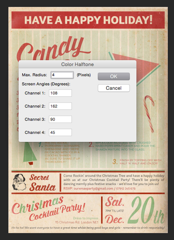
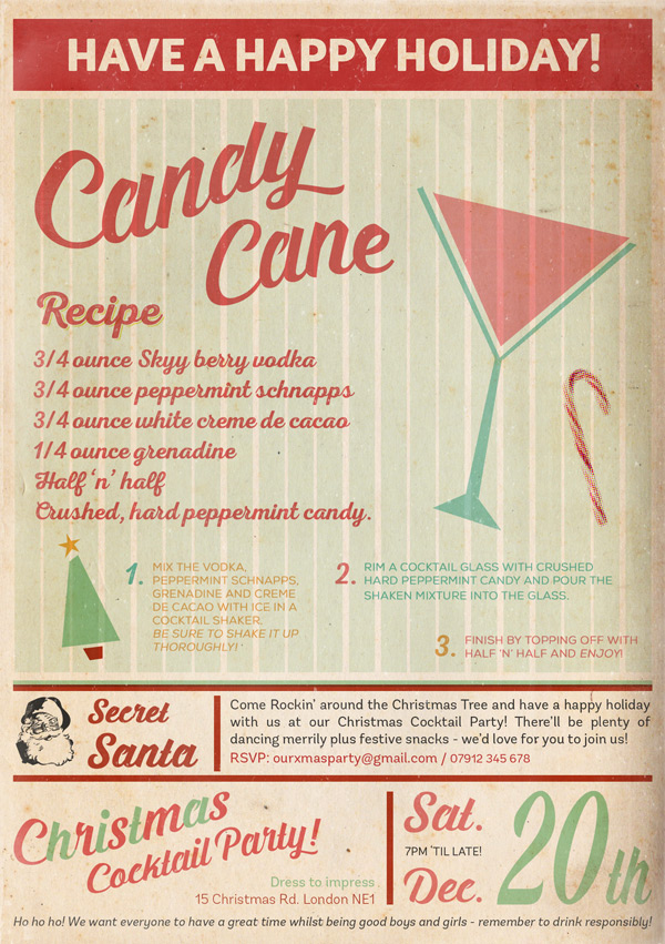
We’re going to decorate our invitation with some candy cane photos, applying a halftone effect to help add to the retro feel. First, we need to download our image:

Paste this on to your canvas, scaling and rotating so that it’s similar to below, setting the blend mode to Multiply:

We’ll apply a Halftone effect by going to Filter > Pixelate > Color Halftone. In the box that pops up, set the Max Radius as 4:
We’ll add a hue/saturation Adjustment Layer with the following settings to lighten the colour:
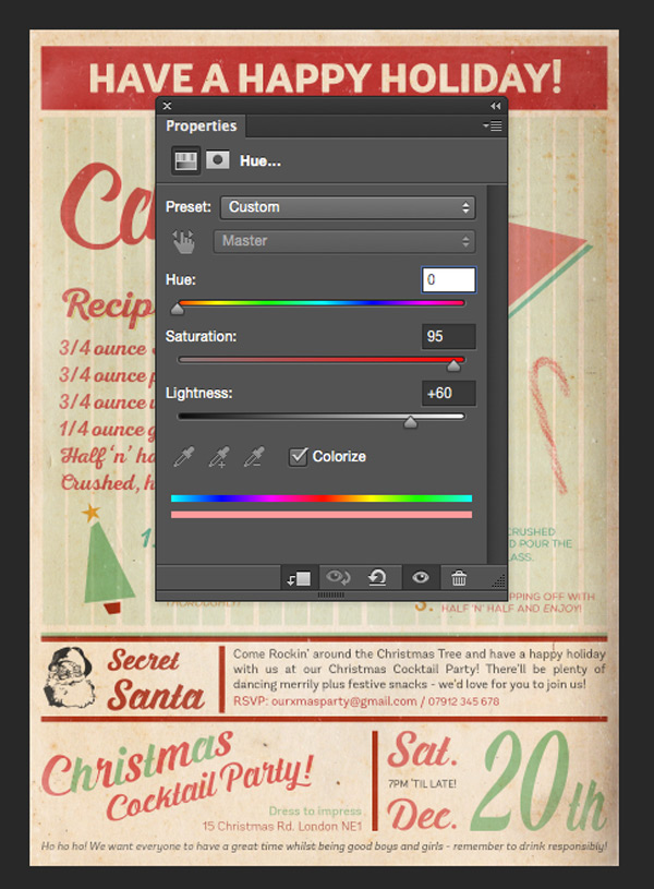
Hue/Saturation Settings:
Colourize: On
Hue: 0
Saturation: 95
Lightness: +60

Group the layers together, then duplicate a couple of times so that you have something that looks similar to below. Remember you can flip, scale and rotate as well as use layer masks to change up the appearance of your candy canes and add some variety:

Step 16:
We’ll add one more tiny little text detail before moving on to the final steps. In the upper right corner, type:
“Get in to the festive spirit!”
Set the font as Andes Rounded Light at around size 10pt, apply a faux Italic effect and set the colour to #62BFAF. This helps to fill up the space and add some extra interest.


Step 17:
This is where we get to have some fun. ;)
On a new layer, select the Polygonal Lasso tool and draw a star shape. It doesn’t have to be too neat as we want it to look slightly loose and hand-drawn. Set the blend mode to Multiply and fill with our yellow #EFE657 colour:

Draw a few more of these random star shapes, each on a new layer, and fill with a selection of the colours we’ve used so far in the tutorial. You can then go on to duplicate the layers, change the scale, rotation, colour and opacity of the stars to decorate the remaining areas of our invite:

Step 18:
In this step, we’re going to address the issue of the stripey background showing through some of the design, such as the christmas tree, large text and cocktail image.
For a cleaner and more authentic retro look, we’ll use an offset layer mask on the background to hide it around these areas. We’ve saved this step until towards the end, so that we’ve had an opportunity to finalise our layout before creating the masks.
The first step then is to go to our “Stripey Background” group and apply a Layer Mask. Depending on your version of Photoshop, you may need to flatten the group first.
Then, go back and activate the layer with the element we want to create a mask behind. We’ll start with the main part of the cocktail.
Use the Magic Wand Tool to select the shape:
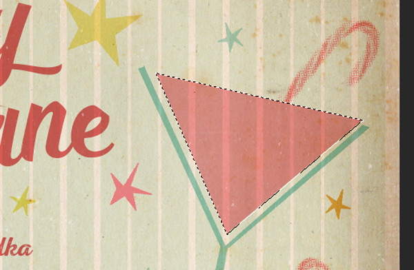
With the selection still visible, go back and activate our Mask Layer, then use the arrow keys to nudge the selection slightly down and to the left:
Then, make sure the mask is selected and the foreground colour is set to black, then hit ‘alt + delete’ on your keyboard:
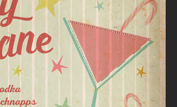
Repeat the process for the Christmas Tree drawing and “Candy Cane” text. You can hold down the ‘shift’ key on your keyboard when using the Magic Wand Tool to make multiple selections.
Step 19:
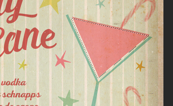
Whilst we’re working on the background Layer Mask, we’re going to create the effect of the cocktail glass being rimmed with some sugary crushed candy cane!
With the Layer Mask still activated, select a round, hard-edged brush at about 15px in size.
Click on the Brush Panel icon, next to the brush the Brush Presets icon at the top (it looks like a folder with little brushes on it).
From the box options box, go to ‘Scattering’ and change the following settings:

Both Axes: Checked
Scatter: 750%
Count: 1
Then, making sure you’re still on your mask layer, draw a single line just above the top of the cocktail glass:

This is how the background mask looks behind the scenes:
Step 20:
For our last step, we’re going to add a bit of subtle texture as a finishing touch. To do this, you’ll need to download the following freebie pack of halftone textures:
Open up the PSD file and select the following texture using the Rectangular Marquee tool

Copy and paste on to our working canvas, scaling to fit:

Finally, change the blend mode to Soft Light, and reduce the Opacity to 30%
And we’re done!
Thanks for following this tutorial! I really hope you enjoyed it and that it helped spark some creative ideas on how you can use your new fonts. If you’ve got any comments or questions do post them below and I’ll keep my eye open over the next few days so I can try and help out!
Remember to share your designs on the Facebook page too, as we always love to see how you’ve made the resources your own. We’re always impressed by what you guys come up with. :)
Hopefully this tutorial showed you just some of the ways you can use the huge variety of fonts available in this bundle, and got to know them a little better. Remember, you can get this fantastic bundle for a huge 98% off this week! Grab it below, while you still can:
20 All New Best Selling Fonts (With Web Fonts and Extended Licensing)
frustrating to get the tutorial and find the fonts deal is over…
Hey Diana, I’m so sorry you missed out on the font bundle. Let me just email you about this.
Got how your product works and so thrilled with these tutorials. Back to the “drawing board” to get my posters done.
Sounds like you’ve got a busy, creative time ahead. I’d love to see the posters when they’re done, so feel free to send us some examples. :)
I’m also having trouble finding the free graphics needed to do this project – the vector graphics, the masked textures, etc. I entered my e-mail, and was taken to a page of downloads that I have already downloaded for other projects. Can you give me the right link, or help somehow?
Hey Barbara,
The freebie pack you need for this tutorial is the Hipsteria Bonus Vector Pack. If all you can see is a link the current bundle, please just scroll a little further down. There you will see the freebie bundles you need.
Wow, I worked through this! Took a while, but it was fun and got the chance to use my new fonts and learn a couple of new tricks. I used the Pen Tool to draw shapes instead of using the Polygonal Lasso Tool. This way I was able to go back and make edits. Also I’ve found that Command (Mac) clicking the Layer Thumbnail to select the element on the layer can be just as easy as using the Magic Wand Tool to make a selection. Thx!
Awesome stuff, Kat! It sounds like you really enjoyed this tutorial. Can we see your outcome of it. :)
Thanks for the tips with the short codes. There are so many different ways to do something in Photoshop, so it’s always great to hear how other designers use their tools.
Sure! Sorry for the late reply, I’m so busy! I’m looking forward to doing some of the new tutorials when I’ve got more time. What’s the best way to send a pic to you?
No worries at all. You can always reach us via email, and send us your designs to hello@designcuts.com. :)
Thanks again for the great tutorial! I always learn a little something, and I love to watch other designer’s creative process!
Thank you so much! I’m glad you’re enjoying our tutorials. I’d love to see your outcome of this tutorial, so please do feel free to send it over to us. :)
Sorry to be so thick, but are all the elements for this tutorial located in one place to download? I can’t seem to find it. Thx!
This tutorial comes with a freebie bundle, that allows you to follow the tutorial. You will find a link to the freebie pack within the tutorial. In order to gain access to the freebie you have to enter your email address in the space provided. As you’re a subscriber to our newsletter you should be redirected to the download link for this freebie.
Let me know if you’re having trouble finding it, and I’ll be sure to help you further with this.