WHAT WE’RE CREATING:
Hello Design Cutters! Simon here, and we’ve got some fun new things to play with in this Essential, Creative Design Arsenal.
We’re going to explore the bundle by creating a fun piece with oversized type elements and overprinted graphical elements. You should pick up a bunch of useful new techniques in this tutorial that will have a direct impact upon your regular design work.
This is a long one, but we cover a whole lot. Ready? Then let’s get right to it!
THE STORY BEHIND THE PIECE
I have to confess that I strongly like overprinting effects. To have Gearwright’s Overpress in the bundle is a match made in heaven. I felt it would be a fun idea to recreate some of the effects allowed by Overpress, but without using their PSDs. It’s a good way to practice how to use textures, layer masks, and blending modes to create a nice effect.
Before I started working on my piece, I looked around for examples of work with that technique. Chris from SpoonGraphics had a good showcase post on his blog, and I found a few others too.
Wolf & Lion by Hydro74

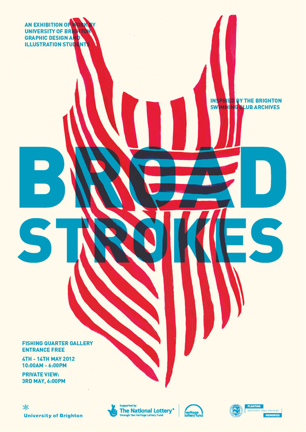
Broad Strokes by Jamie Rickett
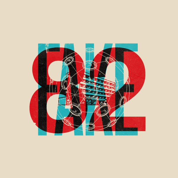
Fake 82 by Mark Weaver
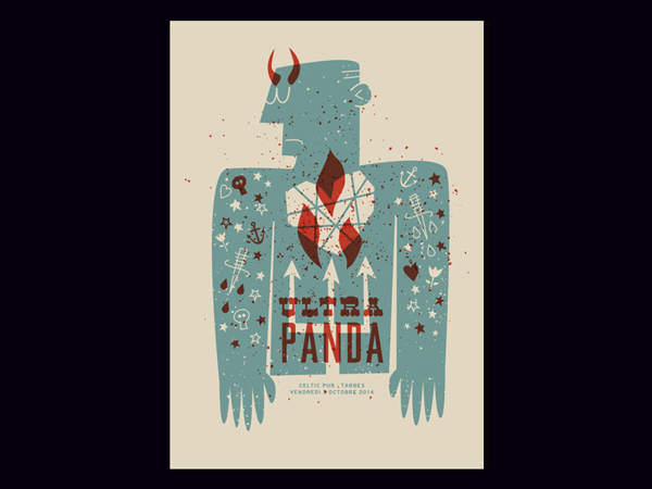
Ultra Panda gigposter by Jean Mosambi
Yes We (Still) Can by Northcoast Zeitgeist

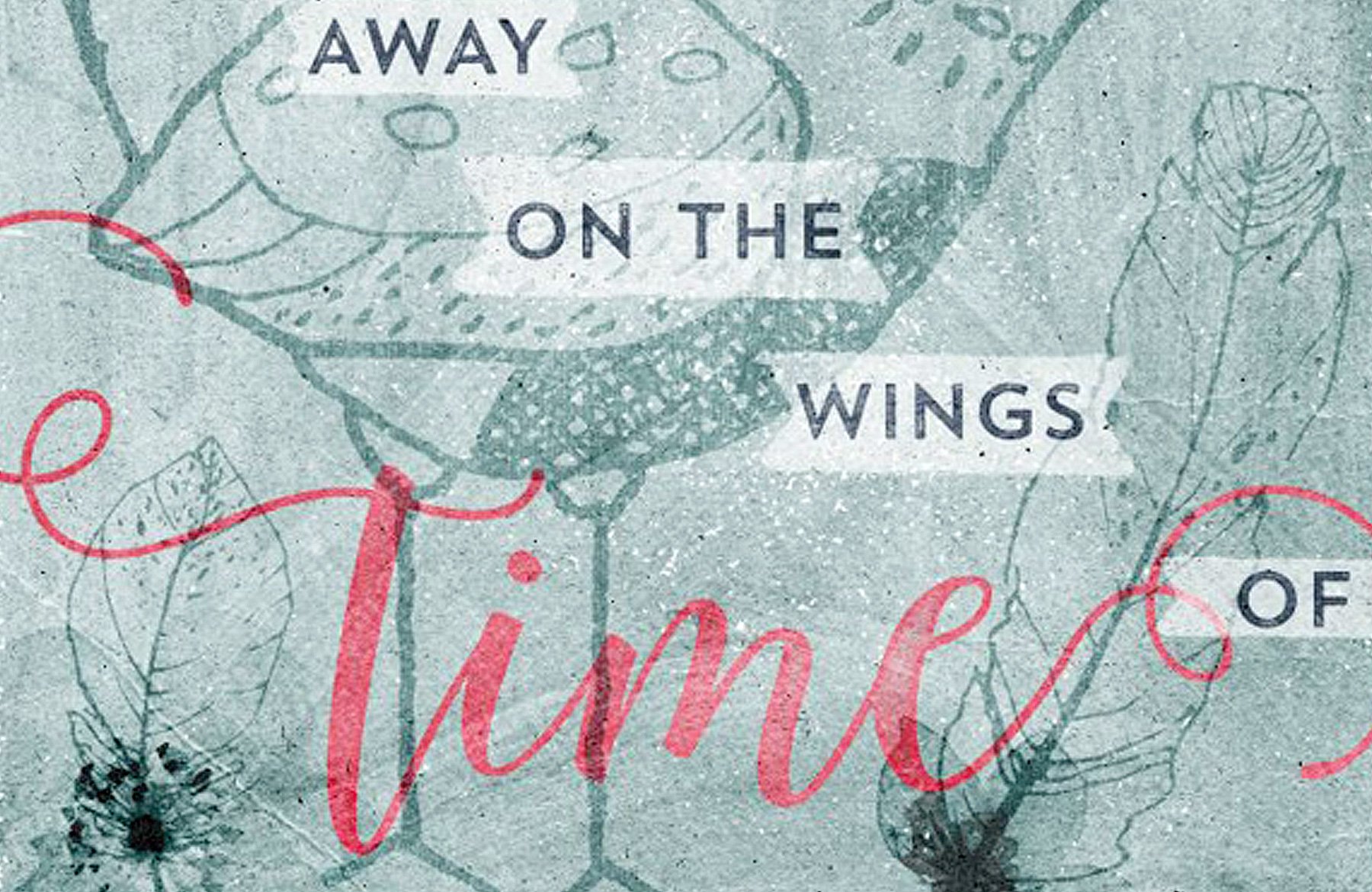
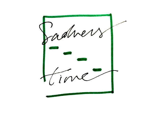
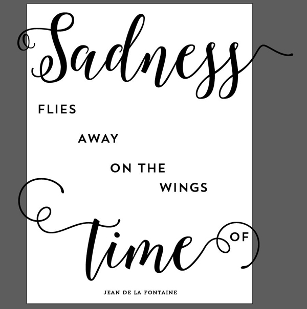
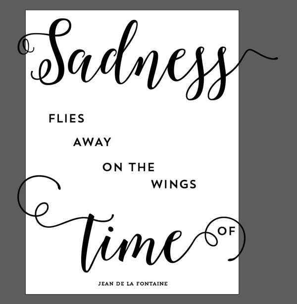
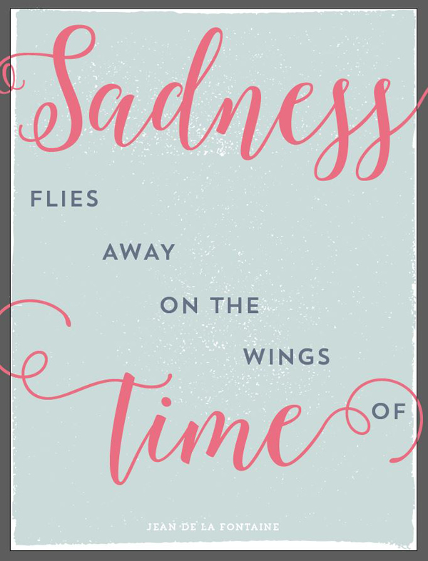
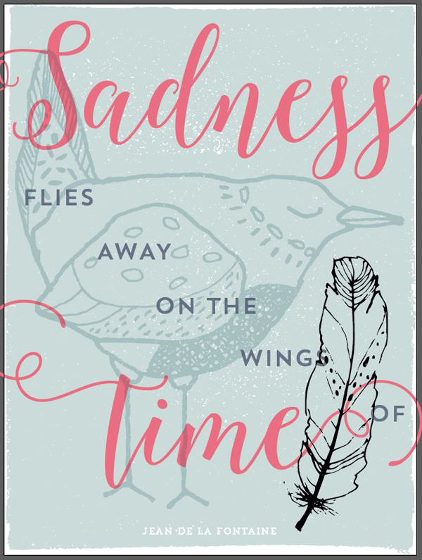
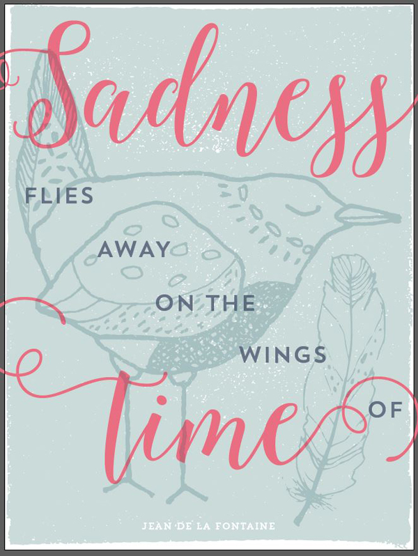
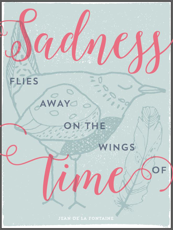
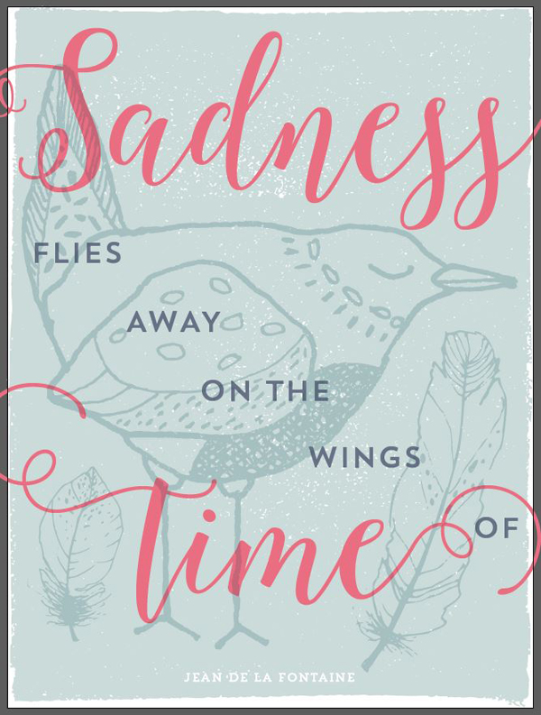
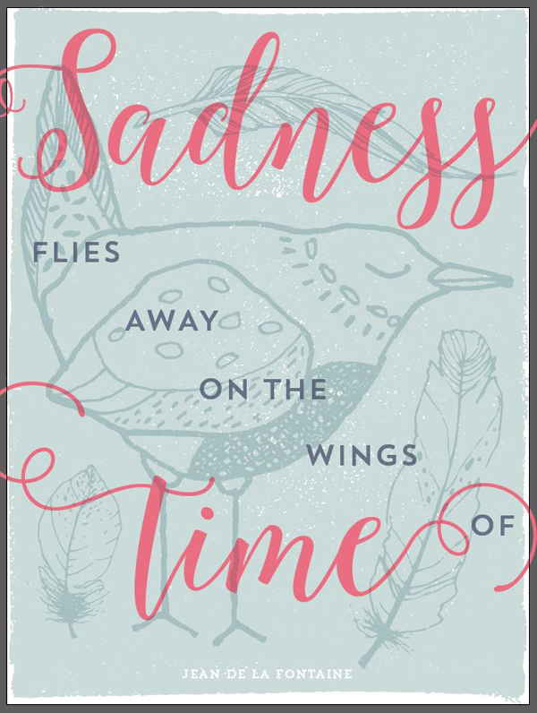
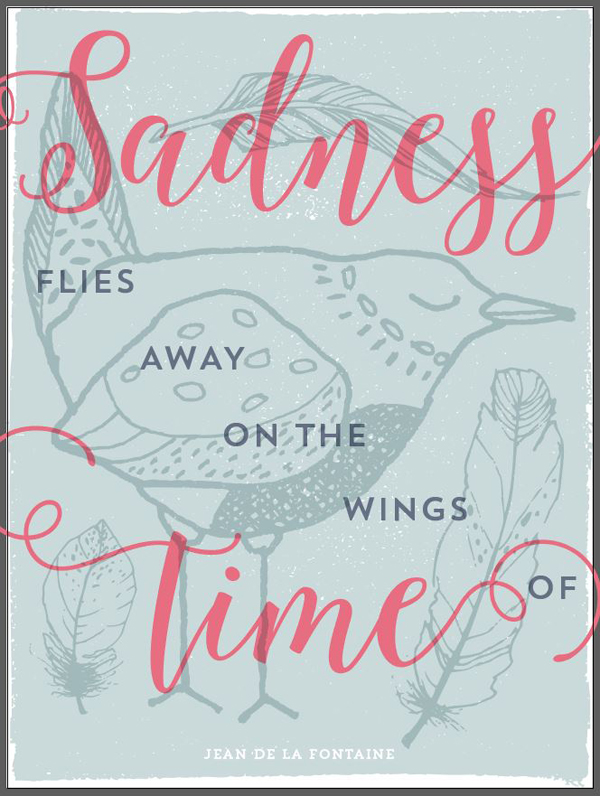
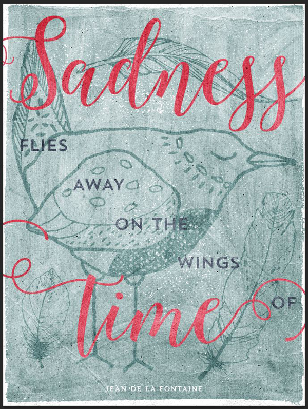
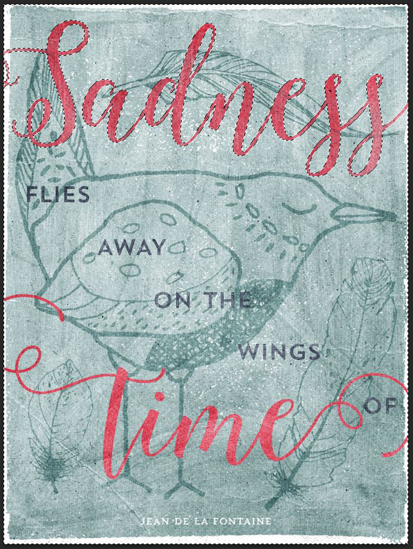
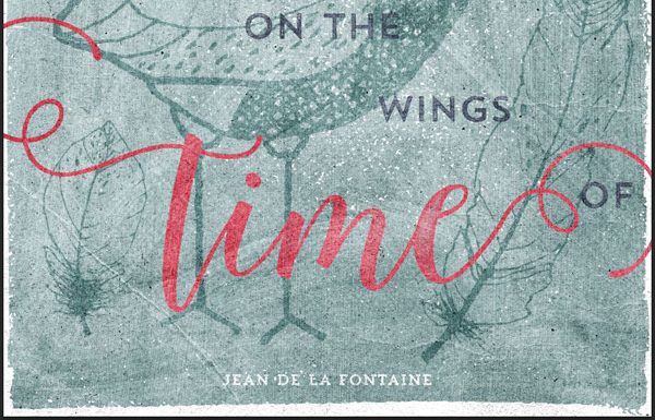
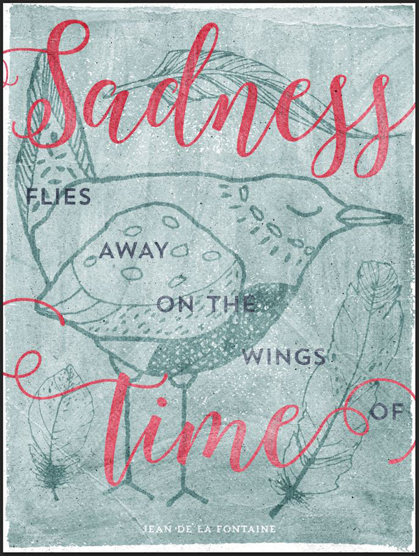
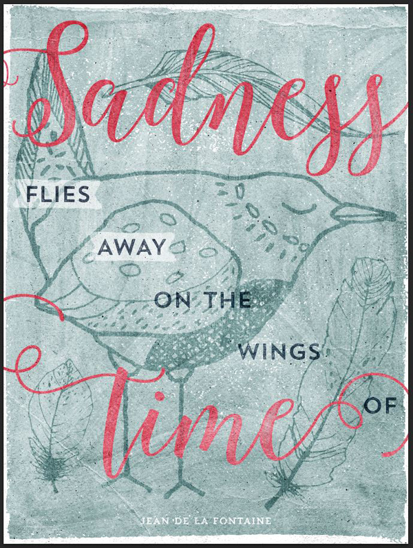
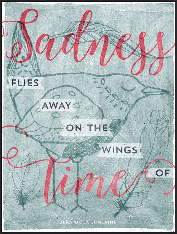
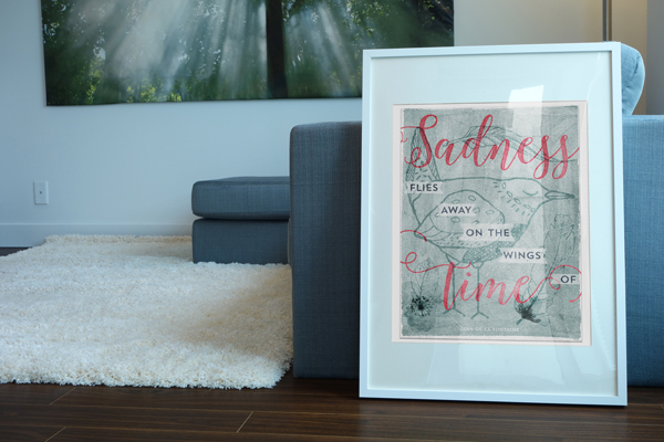
I came across this quote from Jean de la Fontaine I really like:
Sadness flies away on the wings of time.
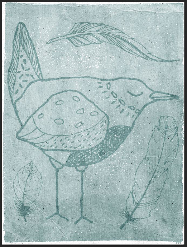
Seeing that quote, and the hand-drawn birds in Lisa Glanz’ vectors, made my brain go ‘bingo!”
Sprinkle that with type, a nice color palette, some textures, a few extra ingredients, and we’ll have ourselves our piece.
FILE PREPARATION
Because of the nature of the bundle, I decided it would be better to use both Illustrator and Photoshop. Sorry to all the Photoshop-only people! I promise it makes sense though: manipulating type and vector elements in Illustrator to assemble our layout is so much easier and logical than in Photoshop.
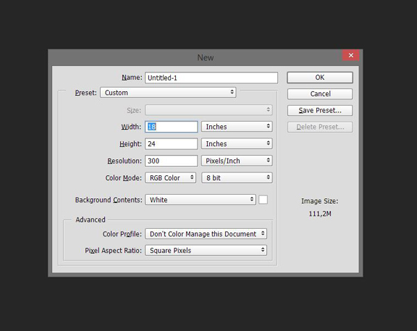
The documents we’ll use for this have the same specifications: 18″x24″ @ 300 ppi.

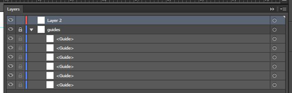
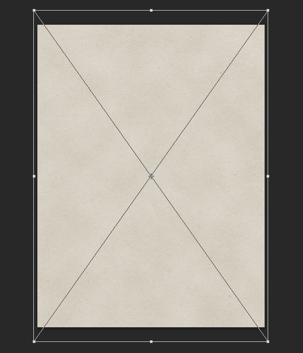
Once both documents are created, put the Photoshop one aside, and focus on Illustrator. Start by adding a few guides to highlight the center of the piece, along with a safe zone that’s one inch thick around the edges.

Also, and because this is Illustrator, don’t forget to organize your document by giving the guides their own locked layer.
Why don’t we add guides to our Photoshop document? I’m going to give you the precise placement of each element in my layout, using the X;Y coordinates of their center point. That way, you’ll be able to precisely reconstruct what I’ve done. I do encourage you however to make it your own!
We’ll also use that data when transferring our vector elements into our Photoshop, in order to ensure a precisely reconstructed layout.

All set? Let’s get to it!
STEP 1: TYPE ELEMENTS
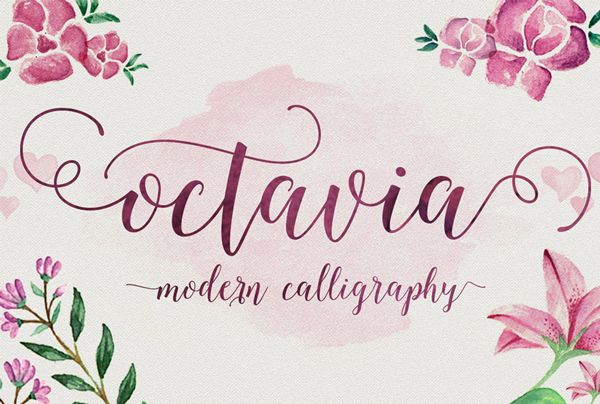
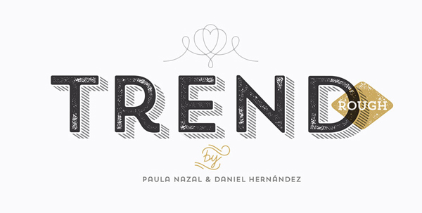
We’ll start with the text for once. We’ll use Octavia Script, contrasted with Trend Rough Sans (and Trend Rough Slab).
The structure, explained
If we look at the examples shared earlier again, one of their shared trait is big type. We’re going to apply a similar treatment to our piece.
Let’s look at our quote again:
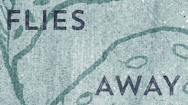
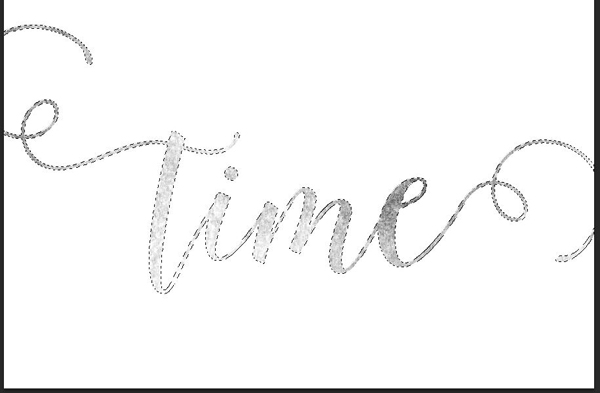
Sadness flies away on the wings of time.
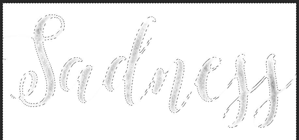
In order to emphasize its meaning, we are going to make the words “sadness” and “time” so big they’ll break the canvas’ bounds. The intricate swashes and letter forms of Octavia will be perfect for this.

The other words from the sentence will fit in the middle space, to connect both words. The cleaner shapes of Trend will help to keep things legible.
The big words
Start by writing the words really big, without worrying about their placement at the moment.
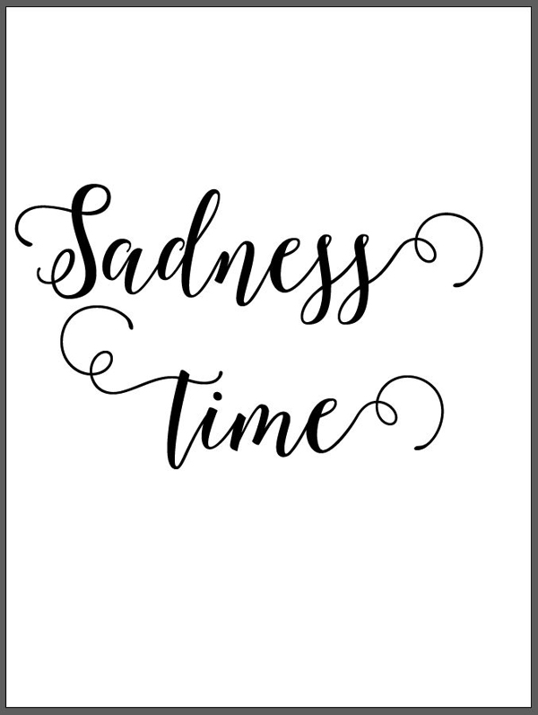
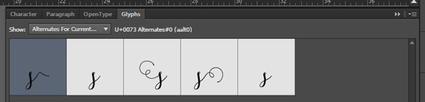
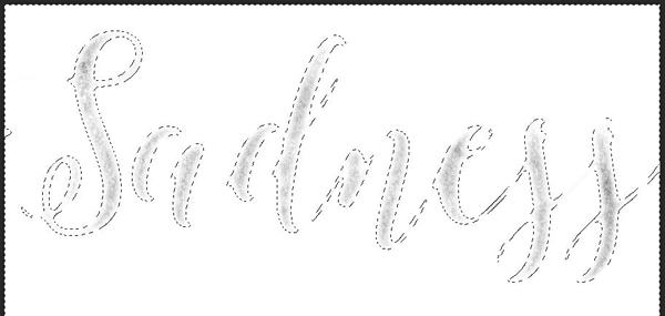
We’re going to tweak “Sadness” a little bit, by changing the starting “S,” and the trailing “s,” by one of their respective alternate options. Use the Glyphs panel for that. If your Glyphs panel isn’t visible, summon it using Window > Type > Glyphs.
Highlight the starting “S,” and open the panel.
Luckily for us, the capital “S” has only one possible alternate. Double-click on it to replace the highlighted character.
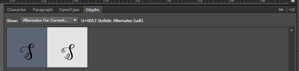

Pro tip #1: make sure to use the Alternates for current selection option from the panel’s drop down menu, so you don’t have to scroll through the whole typeface to find the letter form you’re interested in.

Pro tip #2: if you want to learn more about the Glyphs panel, consider reading this introduction to it we put together.
Next, proceed to replace the trailing “s” with its more subtle cousin.
The small words
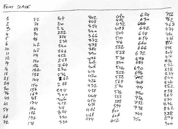
Now, it’s time to make that type big. More precisely, it should be sized at 732 points tall. Why that number in particular? First, it fits proportionally with the type sizes listed in the font sizes menu. The magic number to add/subtract to your type sizes is 6. I’ve made my own little size chart cheat-sheet:
Second, it was the right size for the words’ swashes to go out of the frame, without cutting the letter forms themselves.
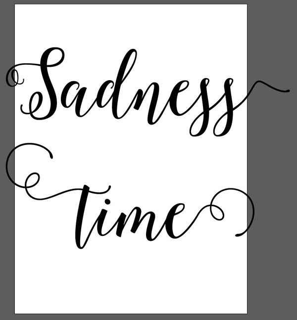
Let’s write the reminding words in Trend Rough Sans One. They should be sized at 72 points tall. Place them between “Sadness” and “time,” in a staircase arrangement.
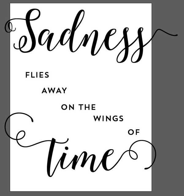
An interesting thing we can do: place the “of” within the buckling swash ending “time.”
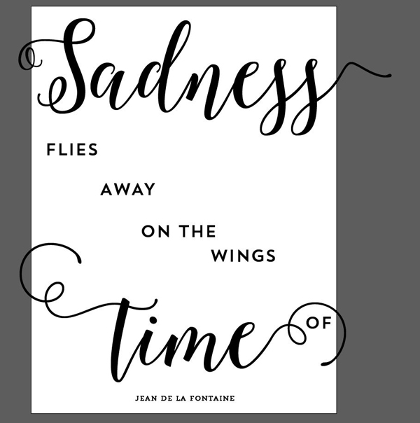
Complete the layout by adding the author’s name in Trend Rough Slab One, sized 30 points tall.

Fine tuning the positioning
Now that our base layout is established, let’s fine tune the placement of each word. The coordinates I’ll list are the ones to input in the Transform panel. Unless otherwise specified, the reference point used is always the center of the object’s bounding box.

Sadness – X: 10.25, Y: 3.25

Flies – X: 2.4, Y: 8.5

Away – X: 5.7, Y: 10.85
On the – X: 8.85, Y: 13.2
Wings – X: 12.25, Y: 15.5

Of – X: 16.75, Y: 17.9
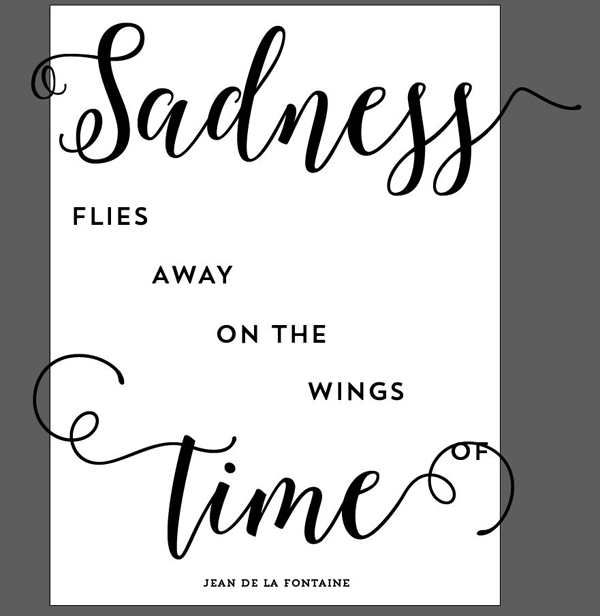
Time – X: 8.675, Y: 17.5
Jean de la Fontaine – X: 9, Y: 23
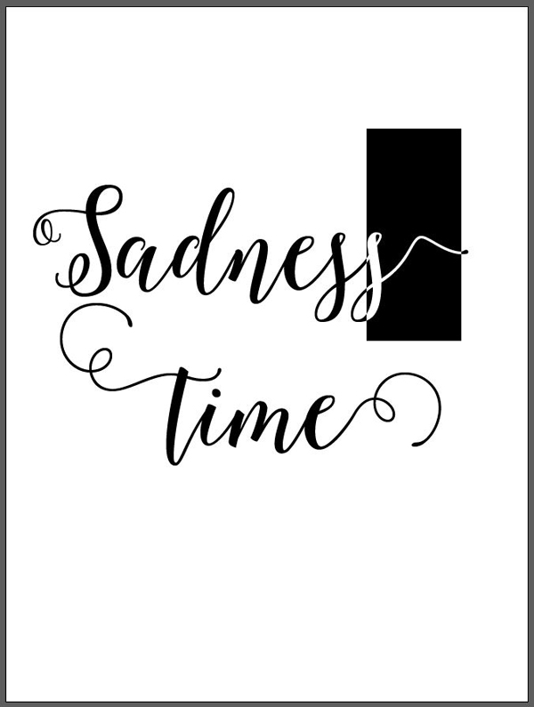
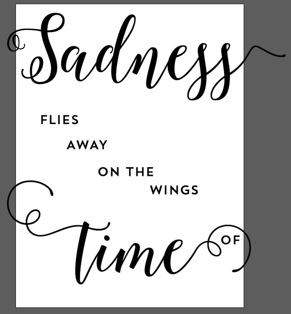
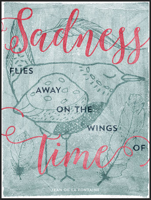
Here’s an animated gif showing the transformation of the composition over these changes.
Now that our text elements are in their final spot, we can proceed to organize our document better.

STEP 2: COLORS
It’s time to talk about colors. We need to attribute them now, as our next steps are concerning the background, and the actual overlaid elements.
I started looking on Colourlovers, but couldn’t find anything that seemed to capture the vibe for our piece. I looked further through Lisa’s hand drawn pack of goodness, and found her cards (essential-design-arsenal-lisa-glanz450_HAND_SKETCHED_MEGAPACKCARDSAI_FILES).
One in particular struck a nerve, LOVE_WREATH_CARD.ai.
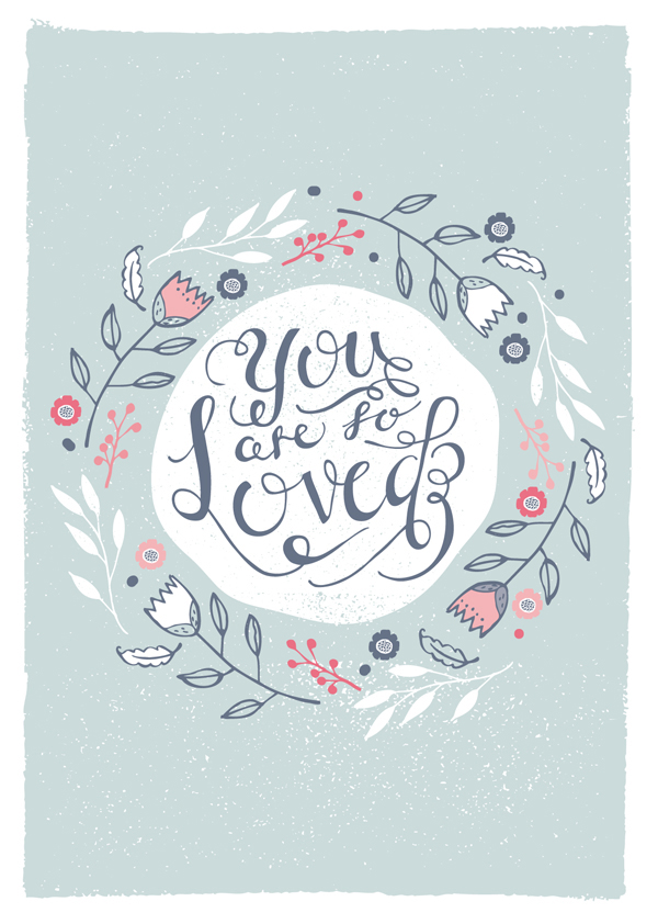
The color palette, with its soft or strong cold blues, pink, and red, is just perfect to translate the feelings associated with the quote.
Another thing we’ll borrow from the card is actually its background, more about that in a minute.
I chose to retain 4 colors:
- White – #ffffff
- Cold pale blue – #c5d6d6
- Cold dark blue – #657186
- Pale red – #e86f83

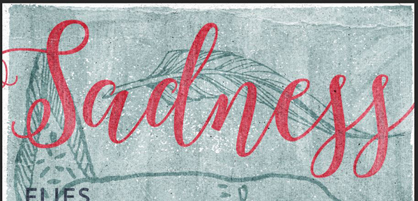
Let’s start by assigning colors. “Sadness” and “time” should become red (#e86f83).
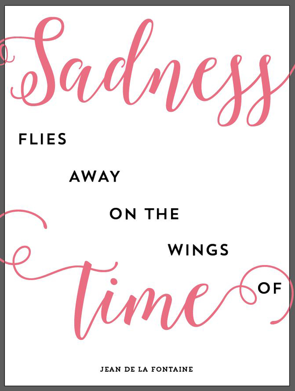
“flies away on the wings of” should be in dark blue (#657186).
Before we assign color to the credit line, we need to put our background element in place. We’ll use the same element used in the card. Find it in essential-design-arsenal-lisa-glanz450_HAND_SKETCHED_MEGAPACKTEXTURES&PATTERNSAI_FILESTEXTURES.ai.
Copy and paste it in your document. Make sure that it’s below all of your layers.
Make it fit in the canvas. That means we need to disregard its original ratio.
Change its color to our pale blue (#c5d6d6).
Finally, change the color of the author’s name to white.
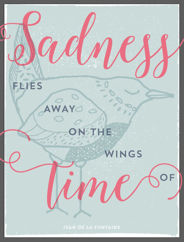
STEP 3: THE OVERLAYS
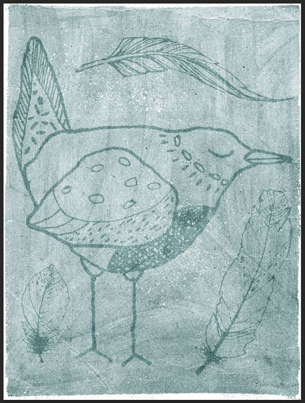
Now that the type is in place, we can finally bring our overlays in. We’ll find them in 2 others of Lisa’s hand drawn elements.
The main one is the bird. You can find it here: essential-design-arsenal-lisa-glanz450_HAND_SKETCHED_MEGAPACKHAND-DRAWN_ELEMENTSAI_FILESANIMALSHAND_DRAWN_BIRDS.ai. We’ll use this one.

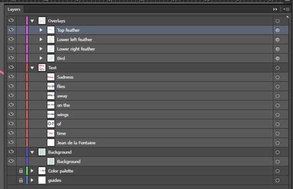
Create a new layer for the overlays.
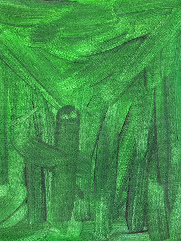
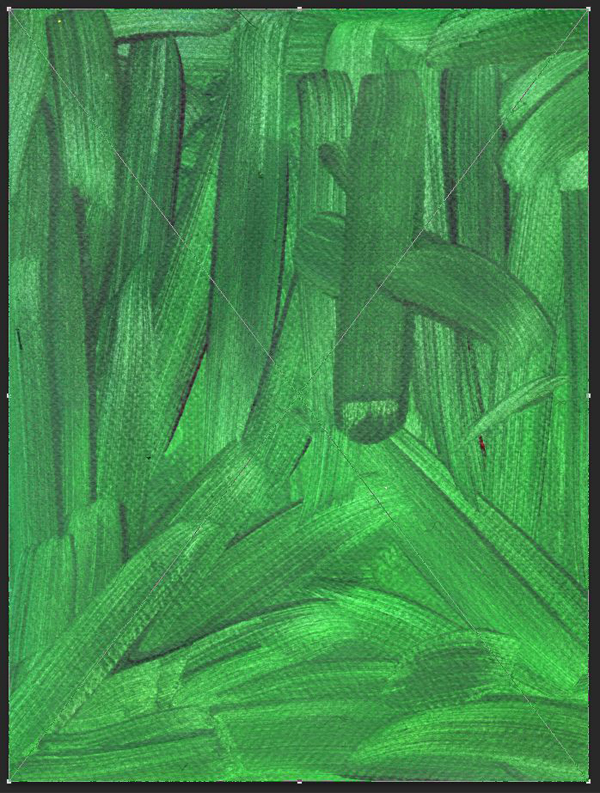
The bird is centered in the canvas, and 17″ wide.

Change its color to the pale blue (#c5d6d6), and its blending mode to multiply @ 100% opacity.
Note that the blending mode change in Illustrator is for preview purposes only. We’ll have to change it back to normal before transferring the layout to our Photoshop document. Note also that there are other ways to explore overprint effects, especially if you’re not using the same color “printed” over itself (hat tip to DC buddy Chris Spooner for this one).
The next overlays come from the outdoors selection (essential-design-arsenal-lisa-glanz450_HAND_SKETCHED_MEGAPACKHAND-DRAWN_ELEMENTSAI_FILESOBJECTSOBJECTS_EVERYDAY&OUTDOOR.ai).
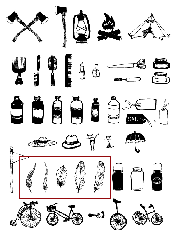
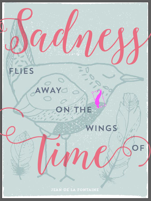
The first we’ll use is this tall feather.
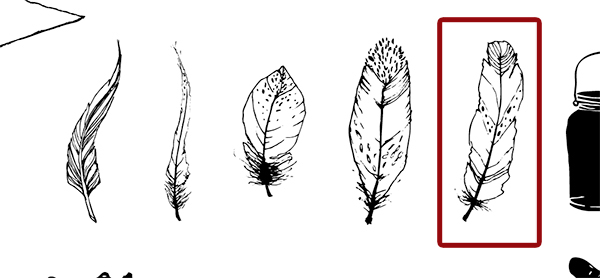
Copy and paste it in your document. Locate it at X: 14.5″, Y: 17 It should be 12″ tall. Give it the same color and blending mode than the bird.

Here’s a gif of these steps.

The next step we’ll take is to slightly tilt the feather to better fit the space. We’re going to use one of the same techniques we’ve used in the tea poster tutorial: rotate the feather through the appearance panel.
With the feather selected, open the appearance panel (SHIFT+F6, or Window > Appearance).

Make your way to the Transform panel (f(x) > Distort and transform > Transform).
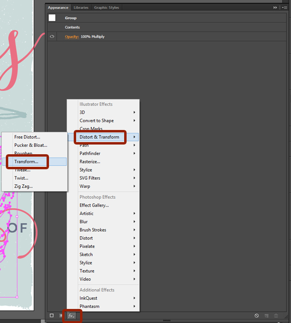
Let’s tick the preview box, and give the feather a rotation of -6°.

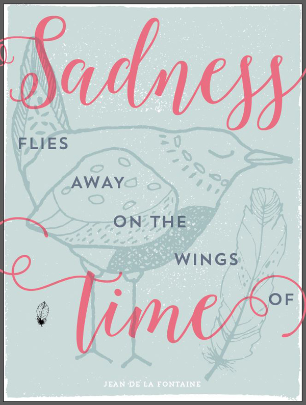
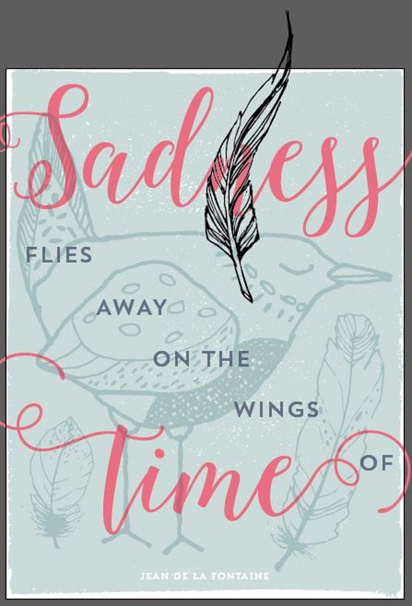
The next feather will go in the space at the bottom left of the piece. It’s this one.

Same as before, let’s bring it into our piece. Its coordinates are X: 2.35, Y: 18.75. It should be 6″ tall.

The last feather is this tall, thin one. It will require a rotation as well, but that’s getting ahead of ourselves.

Let’s start by bringing it in our document. Its coordinates are X: 11; Y: 4, and it should be 4″ wide.
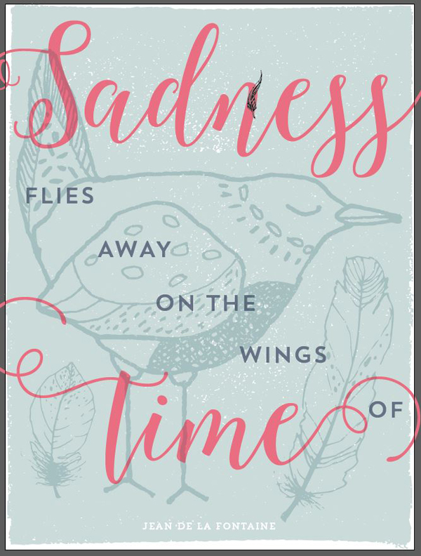
The feather clearly needs to be rotated. Using the appearance panel again, give it a -90° rotation.
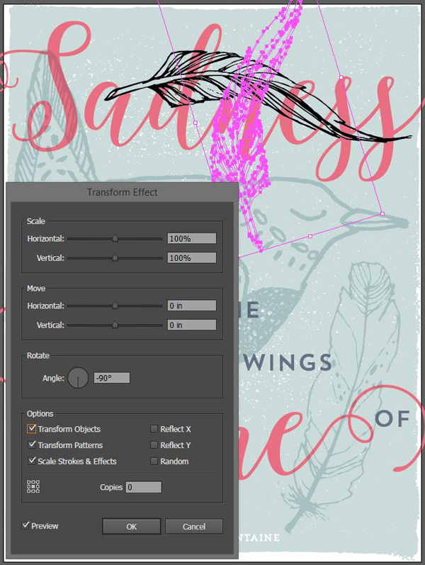
Finally, give it the proper color and blending mode (pale blue – #c5d6d6, and multiply @ 100% opacity).
Finally, and since we’re ready to move to Photoshop, organizing our file doesn’t hurt.
STEP 3: PREPARING OUR FILE FOR PHOTOSHOP
This step is somewhat boring. It consists in getting our layout elements transposed to our Photoshop file. You should copy them all one by one, and paste them as smart objects into your Photoshop document. This will ensure that you retain maximum edibility, and a way to get back to the original vector elements, all the way through.
Protip #1: use the absolute positioning values to transcribe things over in an identical manner.
Protip #2: don’t forget to switch the blending mode of the various overlays back to normal in the Illustrator document, and then back to multiply in the Photoshop document.
It’s a slow process.
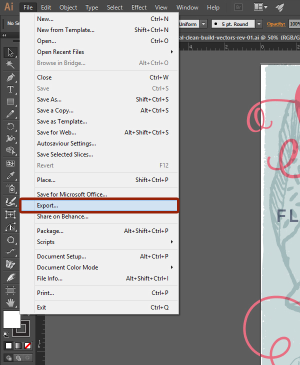
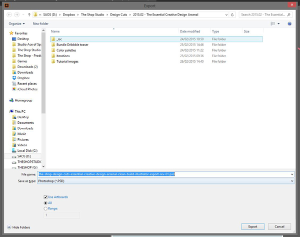
The other option is to use the export functionality of Illustrator.
The good thing: everything is exported at the right size, and the text can be left editable!
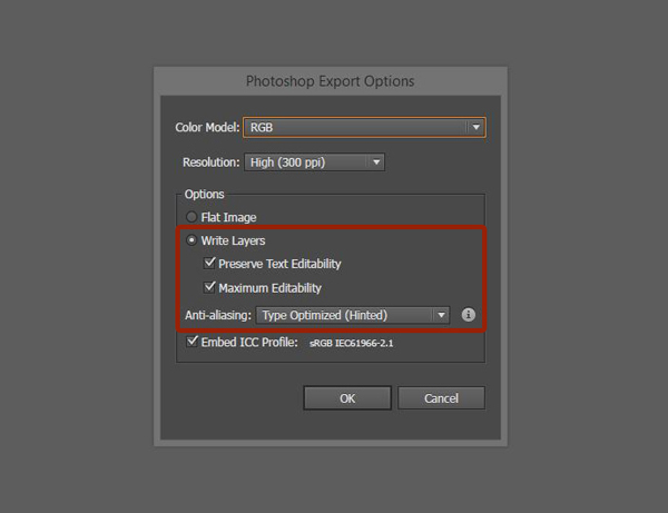
The downside: you don’t get smart objects, and there are a few things to tweak in the file.
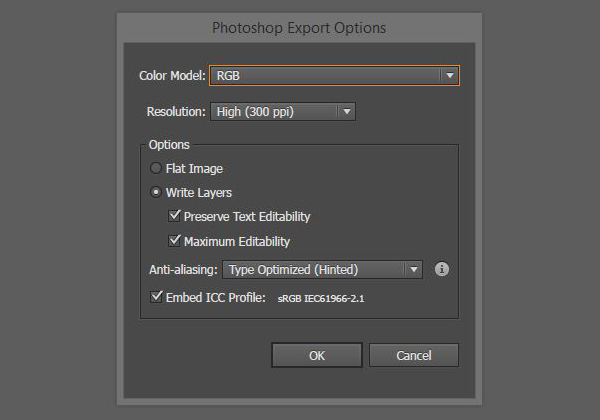
The first thing to take care of is to change the Illustrator document’s color mode to RGB. Second, is to put a solid white rectangle in the background. We need to do this to avoid the background to be transparent.

Next, go to File > Export. Select PSD as your file format when selecting the location to save the file to.
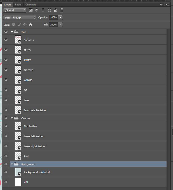
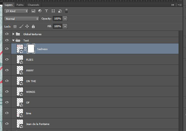
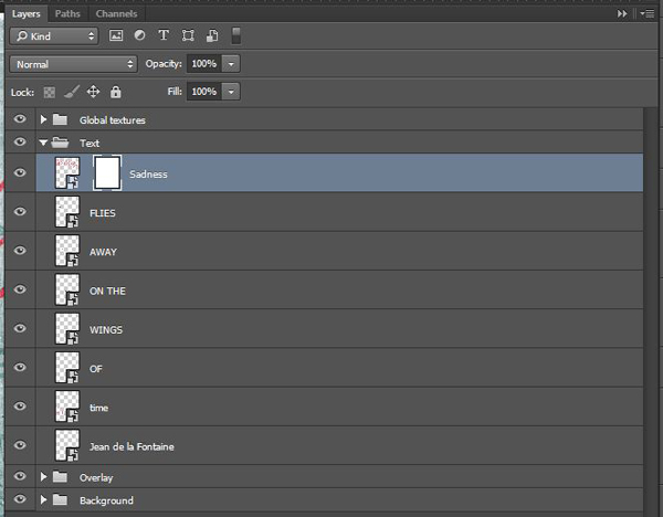
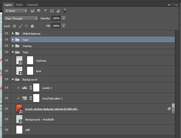
Once the Photoshop file is exported, this is what its layer stack will look like. The background layers (texture element and white layer) get merged together, which will complicate things during the texture process, but won’t make it impossible.

I would still recommend using the “element by element copy and paste” process, because of its greater degree of compartmentalization between elements, and because of the greater control it allows in the long run. That’s what I’ll be using in the next steps.
Once you’ve made your choice, it’s time to play with textures.
STEP 4: FAKING THE TACTILE
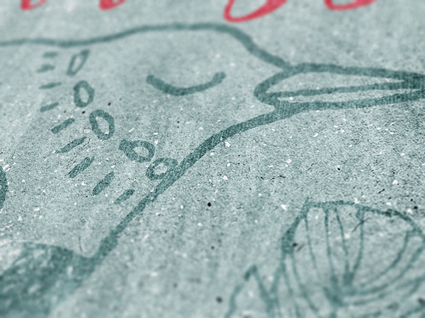
As mentioned in the description of the The Shop’s brush stroke texture packs, “textures help us to add depth to our digital art, and to break away from their flat, clean, and precise origins.
In juxtaposition to this, “analog art” is made with pens, pencils, markers, brushes, and paint. (…) The goal was to make the mark of the paintbrush visible, almost tactile, in order to be felt in the digital art.”
Our goal with the texturing step in our piece will be to add these ink patterns, brush marks, paper grain, etc. to the piece, so it doesn’t feel as clean and digital.
Here’s my PSD (again).

The background
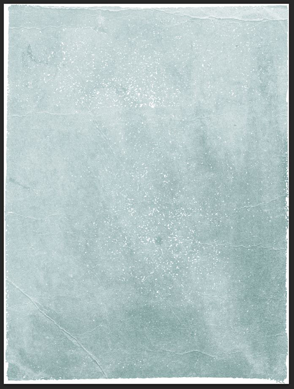
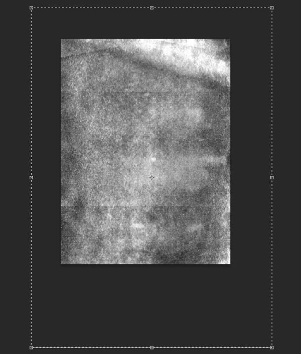
Let’s start with the background. I’m going to turn off the rest of the layers, so we can fully appreciate the texture effects.
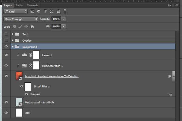
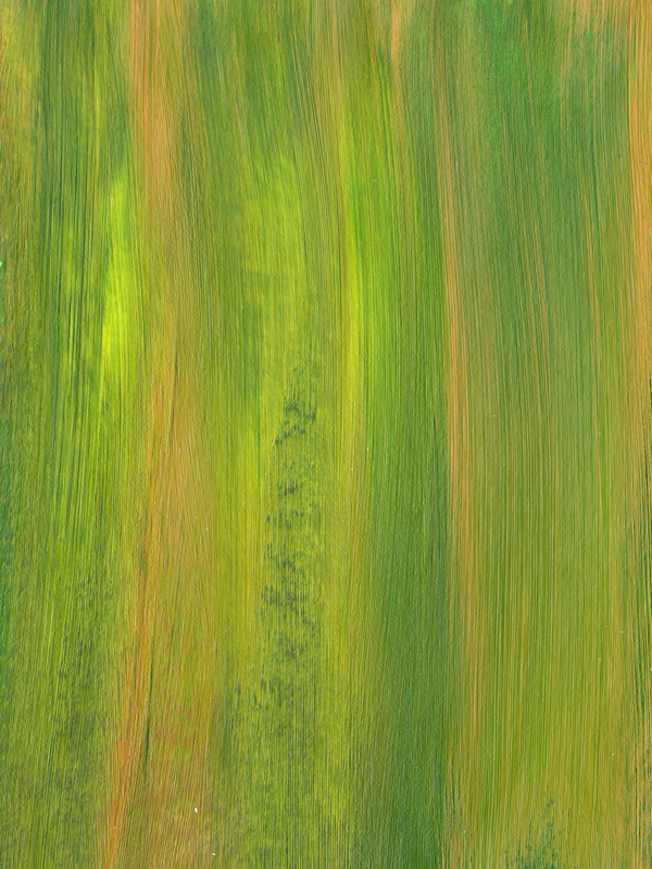
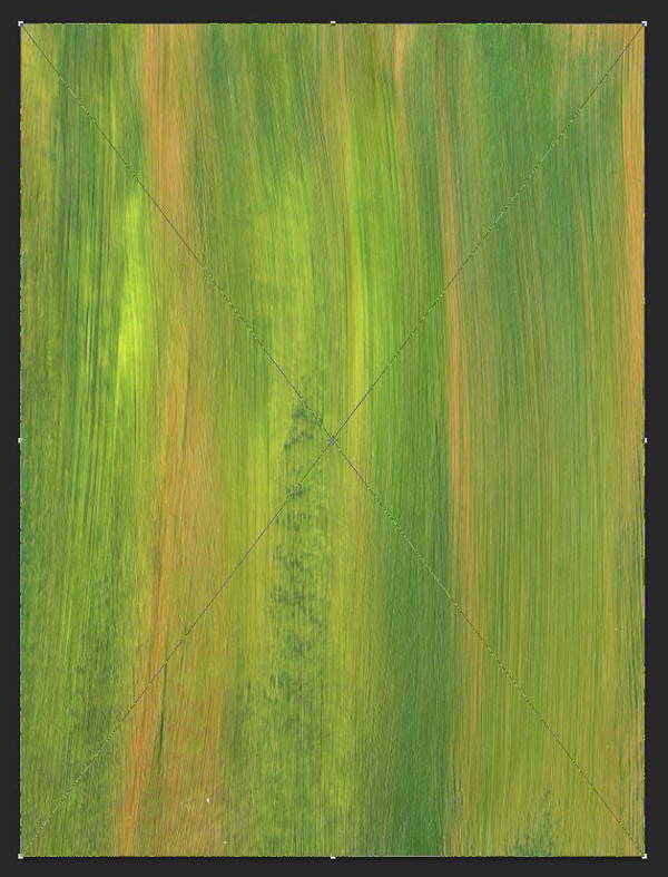
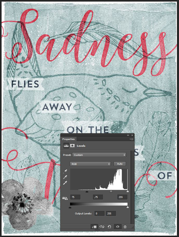
The work for this step is going to be quick and easy, as there’s only one texture to apply: brush-strokes-textures-volume-02-004-sbh.jpg. It’s from The Shop’s brush stroke textures volume two.
Before we apply the texture to the piece, take note of the following:
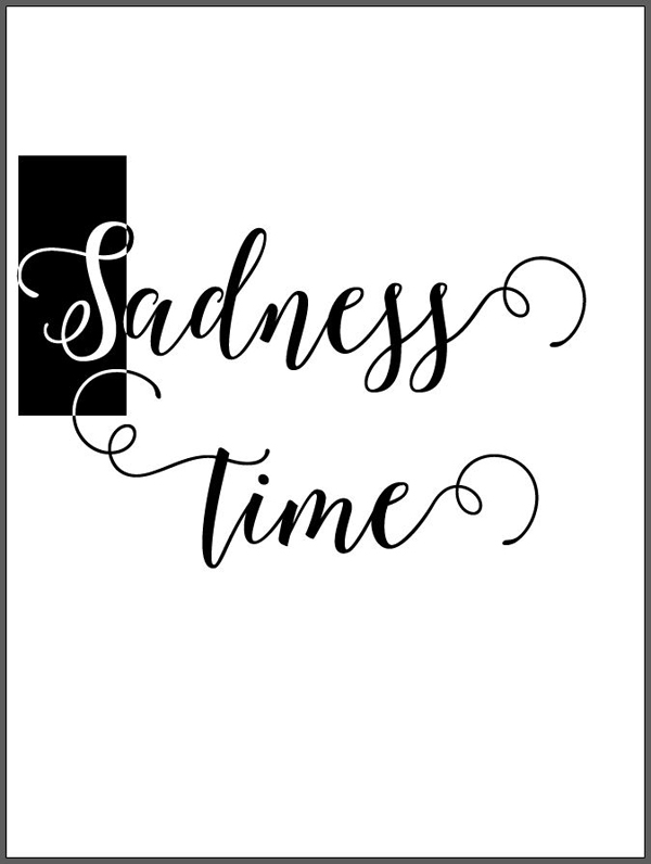
PSA #1: don’t know what a clipped layer is? Glad you asked! This means that the layer is only visible/applies to the layer directly below it. You can very quickly do this by holding ‘Alt’ down on your keyboard and clicking between the two layers. Here’s a quick demonstration.
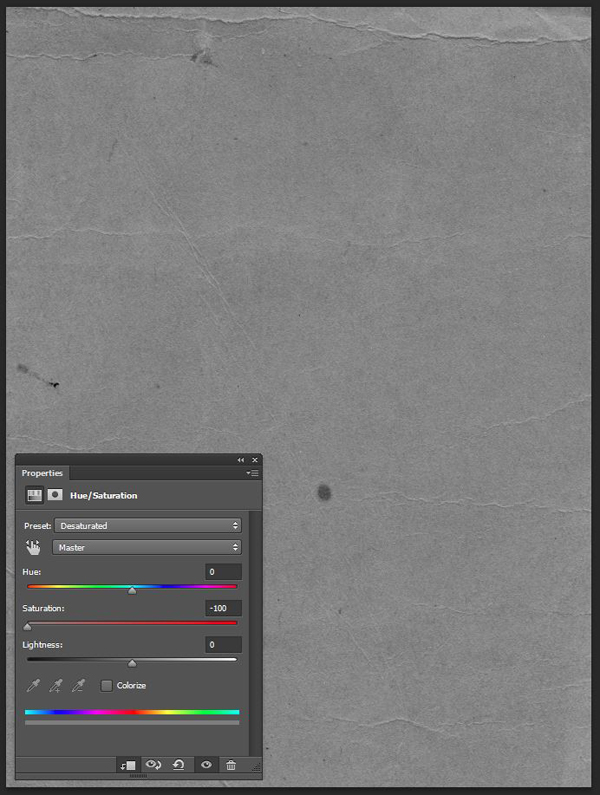
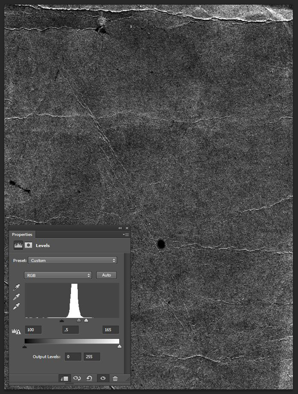
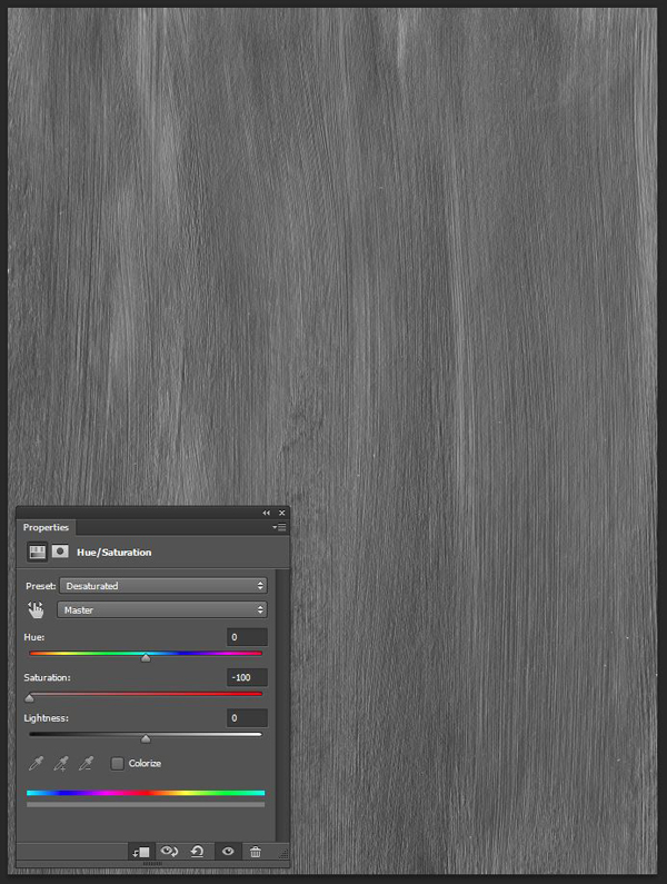
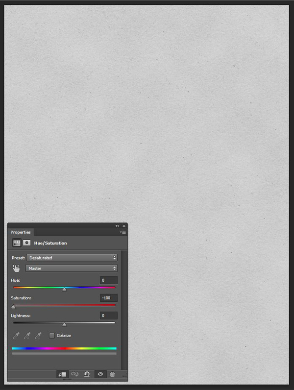
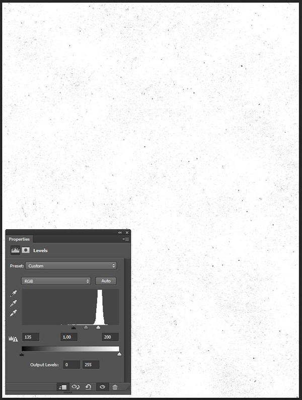
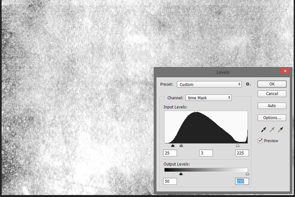
PSA #2: every time we’ll work with textures, we’ll follow this simple process: place as smart object, sharpen, desaturate, enhance contrast with levels, and modify the blending mode.
PSA #3: placing the textures as smart objects, and using adjustment layers to tweak them, allows us to stick to a non destructive workflow. We’ve explored in depth the numerous pros and few cons of such a workflow in this past tutorial: “How to Use Textures The Right Way.”
Now that this is out of the way, let’s keep going. Start by bringing the texture in the piece. Make it just a hair bigger than the canvas.
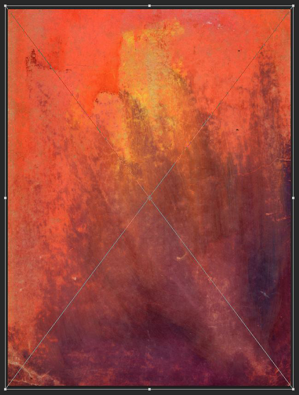
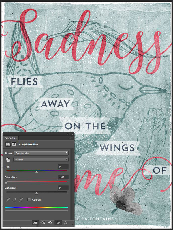
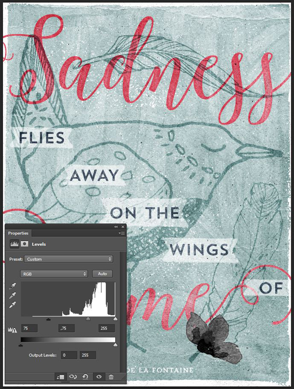
Sharpen it (Filter > Sharpen > Sharpen), and desaturate it using a clipped hue/saturation adjustment layer.
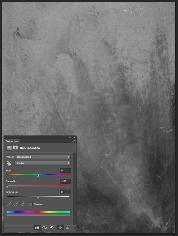
Next, let’s tweak the texture’s contrast, and intensity, with a clipped levels adjustment layer.

Finally, change its blending mode to Soft light @ 100% opacity.

And this is what the background layer group looks like.
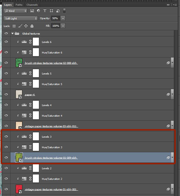
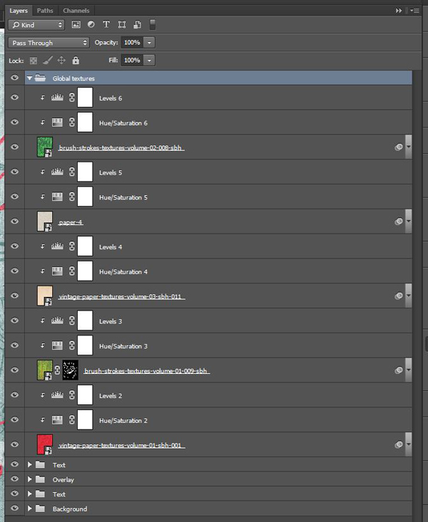
Global textures
Now that the background is ready, we’re going to add the global textures to the piece. These are to be placed at the top of the layer stack, in their own layer group.
Let’s start with vintage-paper-textures-volume-01-sbh-001.jpg.

It should be placed so it covers the whole canvas, and features its folds and creases prominently.
Blending mode: Soft light @ 100% opacity.
Next is brush-strokes-textures-volume-01-009-sbh.jpg.
Place it so it fits the canvas. Its size and resolution should make it effortless.

Blending mode: Soft light @ 50% opacity.
Next up is vintage-paper-textures-volume-03-sbh-011.jpg.

It should also cover the complete canvas, while making sure that some of its upper artifacts are off frame.


Blending mode: Soft light @ 75% opacity.
The next texture is called paper-4.jpg, and comes from Sivioco’s Woodcutter effect texture set (essential-design-arsenal-siviocoWoodcutter-EffectTextures).

Blending mode: Linear burn @ 100% opacity.
The last global texture to apply is brush-strokes-textures-volume-02-008-sbh.jpg. Note that it’s placed upside down.


Blending mode: Soft light @ 65% opacity.
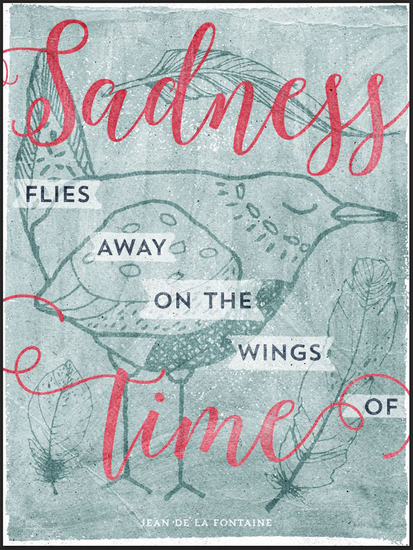
Texturing the text
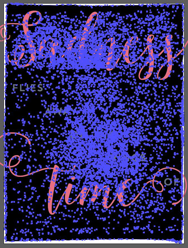
Now that the bulk of the textures are in place, let’s have a look at the piece in its entirety, with the text layers turned back to visible.
The text itself lacks a texture of its own. Another issue that arised through the process is that the middle words of our quote (“files away on the wings of”) have somewhat faded, engulfed by the intensity of the textures.
Let’s start by giving the text its own texture. If you take a closer look at Trend Rough, you’ll notice that it already features some texture into it. Because of this, we will focus on our lead-in and lead-out words, “Sadness” and “time.”
Luckily for us, the bundle features some incredible rolled ink textures. They are part of Gearwright’s Overprinting press (essential-design-arsenal-gearwrightOverprinting PressHandmade Rolled Ink Texture Pack).

We’ll use #5 (5.jpg) for our purposes.

Assign a new layer mask to the Sadness smart object. Make sure the smart object and its layer mask are unlinked, to allow us to play with the size and placement of the texture independently from the size of the smart object.
Proceed to paste the texture in the layer mask. It needs to be wide enough to affect the whole canvas (and word along with it).
If you’ve never pasted a texture in a layer mask, it’s super simple. Use CLICK+ALT/OPTION on the layer mask’s thumbnail to access its content. You may paint, copy, paste, use filters, etc. Once you’re done, simply click on the smart object’s thumbnail to go back to the “regular” mode.
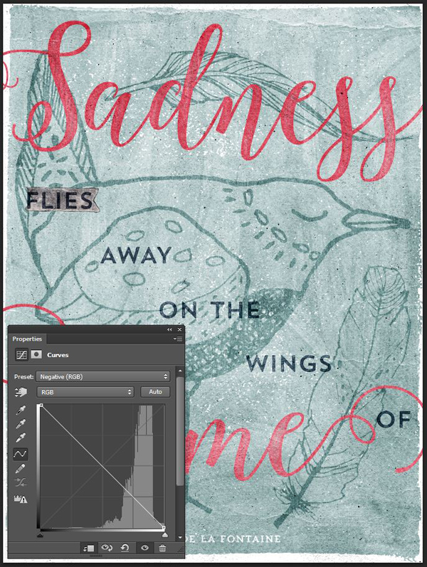
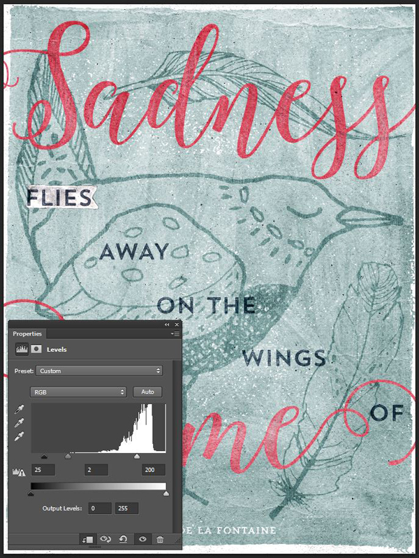
If you switch back to the regular view, you’ll notice that the current effect is too strong. We’re going to use levels (CTRL/CMD+L – you can’t use adjustment layers when editing the content of a layer mask) to soften things.


The result is better, but we going to fine tune it dramatically.

Start by loading the layer’s content as a selection (CTRL/CMD+CLICK on the layer’s thumbnail).

Invert the selection (CTRL/CMD+SHIFT+I), in order to select everything but the word.
Head back to the layer mask, and delete the content of that selection.

Load again the word as a selection.

What we’re going to do now will allow us to delete parts of the texture, so the layer mask applies only to the center part of the letters, like the ink would do in a real press.
Go to Select > Modify > Feather (SHIFT+F6). This gives the selection a gradual “fade.” I’ve chosen a 25 pixels radius, but feel free to experiment with other values.
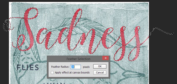
The result is this selection that appears much smaller than at the start.
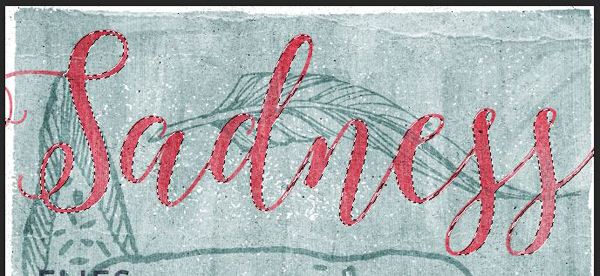
Head back to the layer mask’s content, and invert the selection.
Proceed to delete that selection, up to 5 times, to see the texture fade away from the edges towards the center.


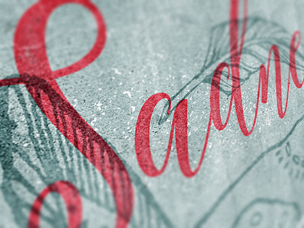
The result is this soft wear of the type, that’s compatible with the reactions of real ink.
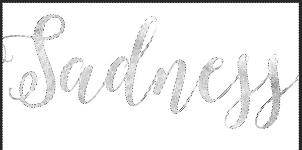
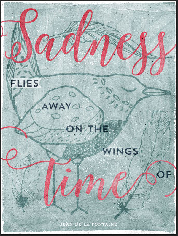
Next, apply the same effect to “time.” I’m using the same texture as a starting point, but feel free to bring some variety to your piece by selecting another one.


And here’s the result.
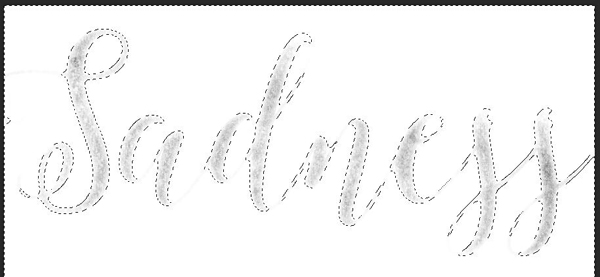
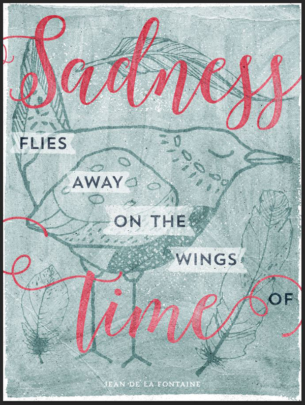
The global result is neat, but we’re still faced with the legibility issue of the central words we acknowledged earlier.

STEP 5: FINE-TUNING
To address that legibility issue, we have a few tricks up our sleeves. It’s time to bring them into play.
Softening some of the texture work
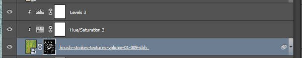
The first action we’ll take is to apply one of the more intense texture only to the overlays (bird and feathers). The happy candidate for that tweak is brush-strokes-textures-volume-01-009-sbh.jpg.
Click the layer thumbnails of all the overlay elements to load them a selection (CTRL/CMD+SHIFT+CLICK).

Assign a layer mask to the texture – the layer mask will be painted accordingly to the selection we just made.
The result is already much softer.
Making the central text more visible, part 1: the blending mode change
Our first step in making the central text elements more visible is to switch the blending mode of the text layers from Normal @ 100% opacity to Linear burn @ 100% opacity.
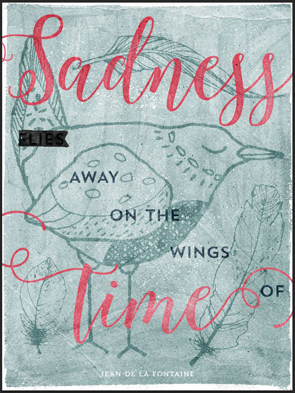
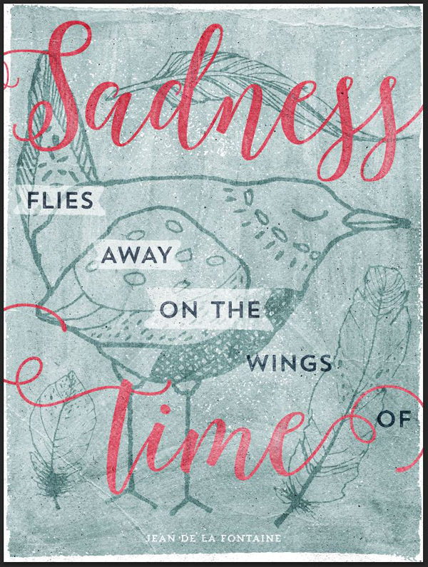
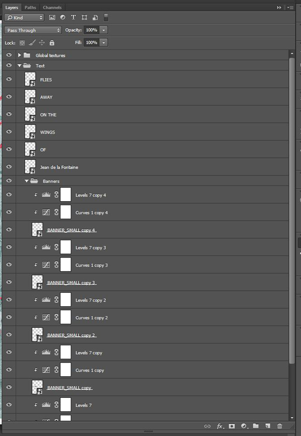
Making the central text more visible, part 2: adding the banners
The text is popping more, but it still seems too faded. In order to address this, we’ll make use of one of Lisa’s numerous watercolor element, BANNER_SMALL.png (essential-design-arsenal-lisa-glanzWOODLAND_WATERCOLOR_SETPNGBANNER_SMALL.png).
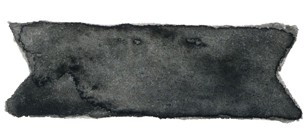
We’ll place a copy of it behind each of the words we want to highlight, properly sized of course. Bring a first copy of it behind “flies.”
We need to switch the banner’s color to white (easy, that’s inverting its color), and to tweak its levels. Finally, we’ll also change its size so it matches the word better.
You can place the banners center at the center of the word (using th exact X and Y values from earlier), but placing them by hand allows for a more organic, less mechanical result.
First, use a clipped curve adjustment layer to invert the colors of the banner.
Proceed to make the banner even lighter with a clipped levels adjustment layer.
Change the banner’s blending mode to Screen @ 65% opacity to make the black pixels disappear.
Finally, increase its size to 125% (using the transform controls), and align it better with the word.

The result is soft, but efficient.
Repeat the process with the reminding text elements. Note that you can just duplicate the first banner and its adjustment layers to speed things up. Here are the size adjustments values for each element:
- away: 125%
- on the: 175%
- wings: 150%
- of: 100%
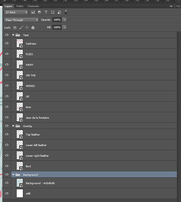
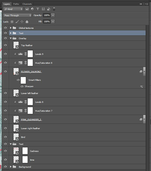
Here’s a look at how I organized my layers. They have they own sub-group within the “Text” layer group.
Additional layer order tweak
Before we can add the last touch of polish, we need to change one more thing. We are going to slide the text elements “Sadness” and “time” in a new layer group, located below the “Overlay” layer group.
The new layer stack:

The before/after comparison is below. Watch closely how the newly added banners are now over the text and overlays, re-enforcing the overprint effect.
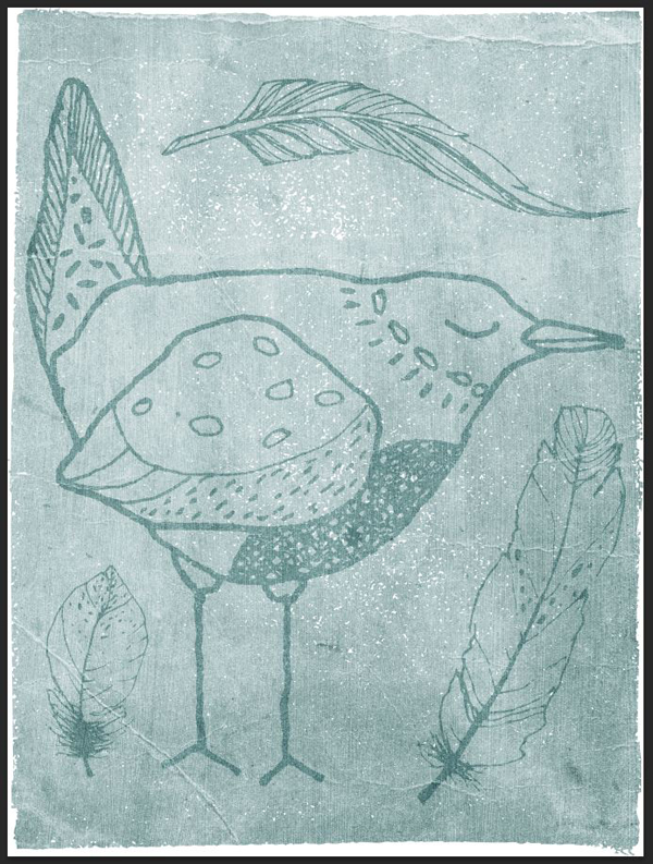
Finishing touch
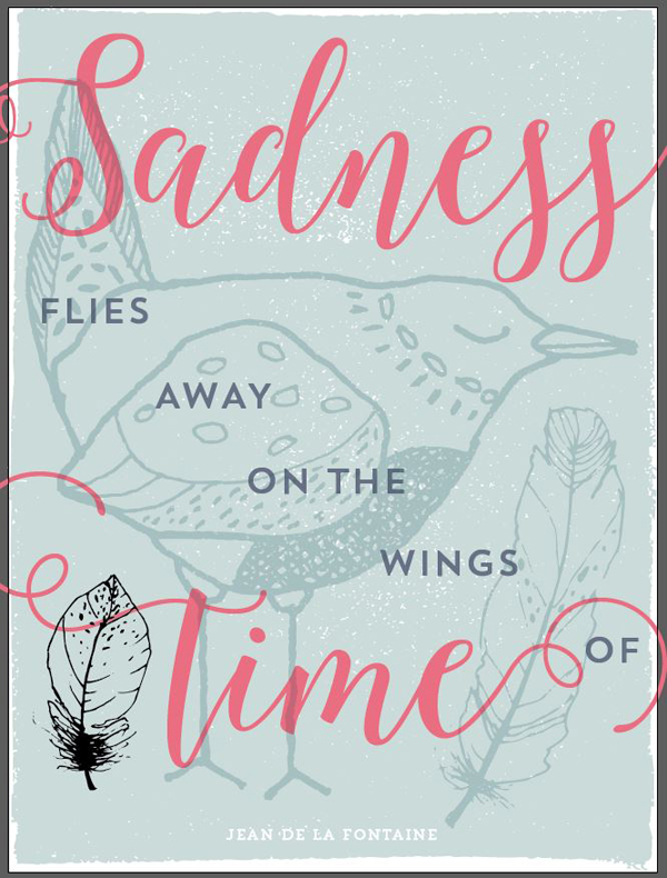
We are now close to finishing the piece. We’re going to use some of the individual elements from Lisa’s wreath creator to add some subtle highlights to the 2 bottom feathers. You can find them in essential-design-arsenal-lisa-glanzWREATH_CREATORINDIVIDUAL_ELEMENTS
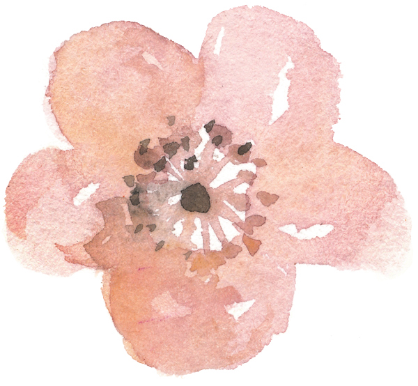
The first element we’ll add to the mix is PINK_OLEANDER_2.png.
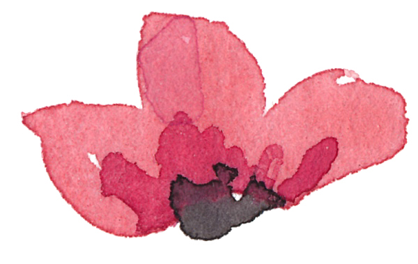
We’ll place it above the lower right feather, sized at roughly 250%. I’ve aligned the stem of the flower with the “stem” of the flower.
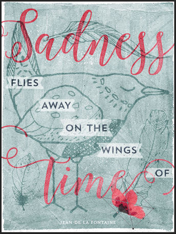
Desaturate the flower, and sharpen it.
Levels
Blending mode: Color burn @ 50% opacity. The result is an added painterly touch to the piece.
Following a similar logic, we’ll place FLOWER_SALMON2.png over the left side feather.
It’s sized at 150% of its original size.

Blending mode: Color burn @ 85% opacity.
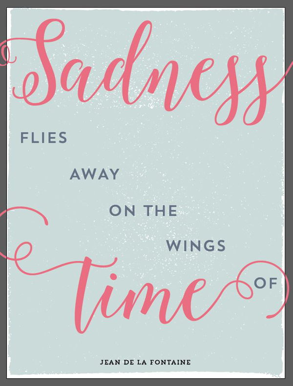
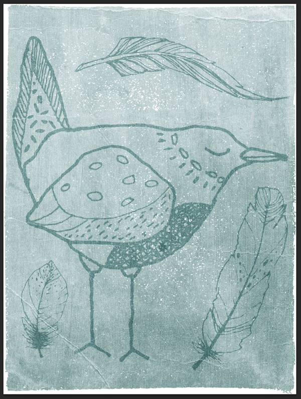
And we’re done!
Here’s a last look at all our layers.
WRAPPING UP
I hope you had fun following the tutorial along. If you have any technical questions, please use the comments below, and I’ll reply to them.
If you have already purchased The Essential, Creative Design Arsenal, I hope you’re enjoying your new resources, and that you got a glimpse of you can now accomplish with them. If you haven’t yet, you can still grab it for 98% off its normal value, but only for a few more days!
Finally, we’d love to see your tutorial outcomes! Please share them with us on the Design Cuts facebook page. We’ll share the best ones with the whole community.
That’s it for me today! Until next time, cheers, and have a wonderful weekend.
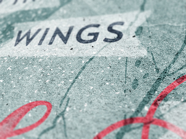
Wonderful! I love this quote, and the final result. Your step-by-step instructions are great. I also love the close up photos at the end.
I love this quote myself Renee!
I am a big fan of Jean de La Fontaine- one of my favourites is ‘By the work one knows the workman’ I always think that sums up designers perfectly :).
Thank you for your kind words, Renee!
Simon — I just want to say THANK YOU. The tutorials you post are not only superb, but a very generous gift of your time, knowledge and expertise. I am a graphic designer for over 30 years and you make is so easy to learn new tricks and techniques….a very heartfelt thanks.
Hey Anne- Marie,
Thanks for the comment on Simon’s tutorial.
How good are they? We are really pleased to hear you are enjoying them as I know Simon will be as well.
I would love to see what you create using Simon’s tutorials if you would like to share your designs :).
Awww, thank you Anne Marie! I strongly believe in sharing the knowledge. It’s not the knowledge that makes us unique as designers and artists, but rather what we do with it.
Simon,
What beautiful words! I think this should be made into a motivational poster :)
Ha! Well, here’s an idea for an upcoming piece ;-)
Definitely Simon but for me or you?? :)
Both!
Sounds like a plan Simon :)
Just wanted to send you a special thanks for this tutorial. I’ve enjoyed all the ones I’ve followed so far but this one is really superb with all of the details you’ve included and the screen shots of your layers panel, at different points through the process.
I’m first and foremost a Photoshop person but I am trying to get into Illustrator, especially to use for type, so this tutorial is helping me get my feet wet with that program.
Thank you for your kind words, Joanne! I’m glad this tutorial struck a chord. I can’t recommend using Photoshop and Illustrator together. It exponentially increases the options you have at hand.
Don’t hesitate to ask questions if things are unclear, or to suggest different ways to do things if you find a better solution!
I totally agree with you Joanne!
This tutorial is excellent- thank you Simon for another great one :).
If you have any queries about PS or Illustrator, please let me know. I am always happy to help!
Hey there! Greetings from Hanoi, Vietnam. I’m so glad I stumbled on these tutorials (this is my 2nd one). You’re doing an amazing job!
Just a quick question regarding the glyphs… I can’t find in my panel the trailing “s” you chose for Sadness. I actually only have 4 options, not 5. Is this because I’m using an older version on Illustrator (CS6)?
Hello Michela!
Ha, that’s a strange one. The version of Illustrator should not impact how many alternates of a typeface you can access. It could be because you’re using an uppercase version instead of the lowercase?
If you can, take a screenshot, and share it with us here. We’ll get a better idea of what’s happening.
Also, welcome! There’s quite a lot of past tutorials you could catch up on: https://www.designcuts.com/deals-category/all/
Nope, I was using a lowercase version. And, for some reason, I’m now discovering that I can access the 5 alternates if I get rid of one “s” (which I can then add in the middle once I’ve already change the alternate). Weird, but not a big issue… Anyway, thanks again for this fantastic tutorial! I’ll try to catch up with the past ones in the next weeks, months (years ??!) ;)))
Hey Michela,
Thanks for commenting on the tutorial. I can see that Simon came back to you about your initial query. Is everything working ok for you barring the issue with the ‘s’
Thanks for taking the time to come back to us about the tutorial- we are really pleased to hear you enjoyed the tutorial. I would love to see your finished results!
How is Hanoi at this time of year? It has been a few years since I had the pleasure of visiting :)
Oh yes, that makes sense! It’s due to the alternate engine.
When you have a double letter, most typefaces now include some neat ligatures to make the double letter look better. That ligature is considered as a different character altogether, which in turns limits the number of alternates you have access to.
I really like the colors and ways to adjust color and layers in this article. It is refreshing! Thank you very much.
— Luis Bravo, CEO
Bravo GD, Corp. Graphic Design
http://www.bravogd.com
Hey Luis,
Thanks for taking the time to comment- we really appreciate you taking the time to leave feedback!
We are so pleased you enjoyed the tutorial. I would love to see anything you have created from the tutorial- please feel free to share your designs with me
Thank you for your kind words, Luis!
We are in total agreement with Luis on this Simon!