WHAT WE’RE CREATING:
Hey Design Cutters!
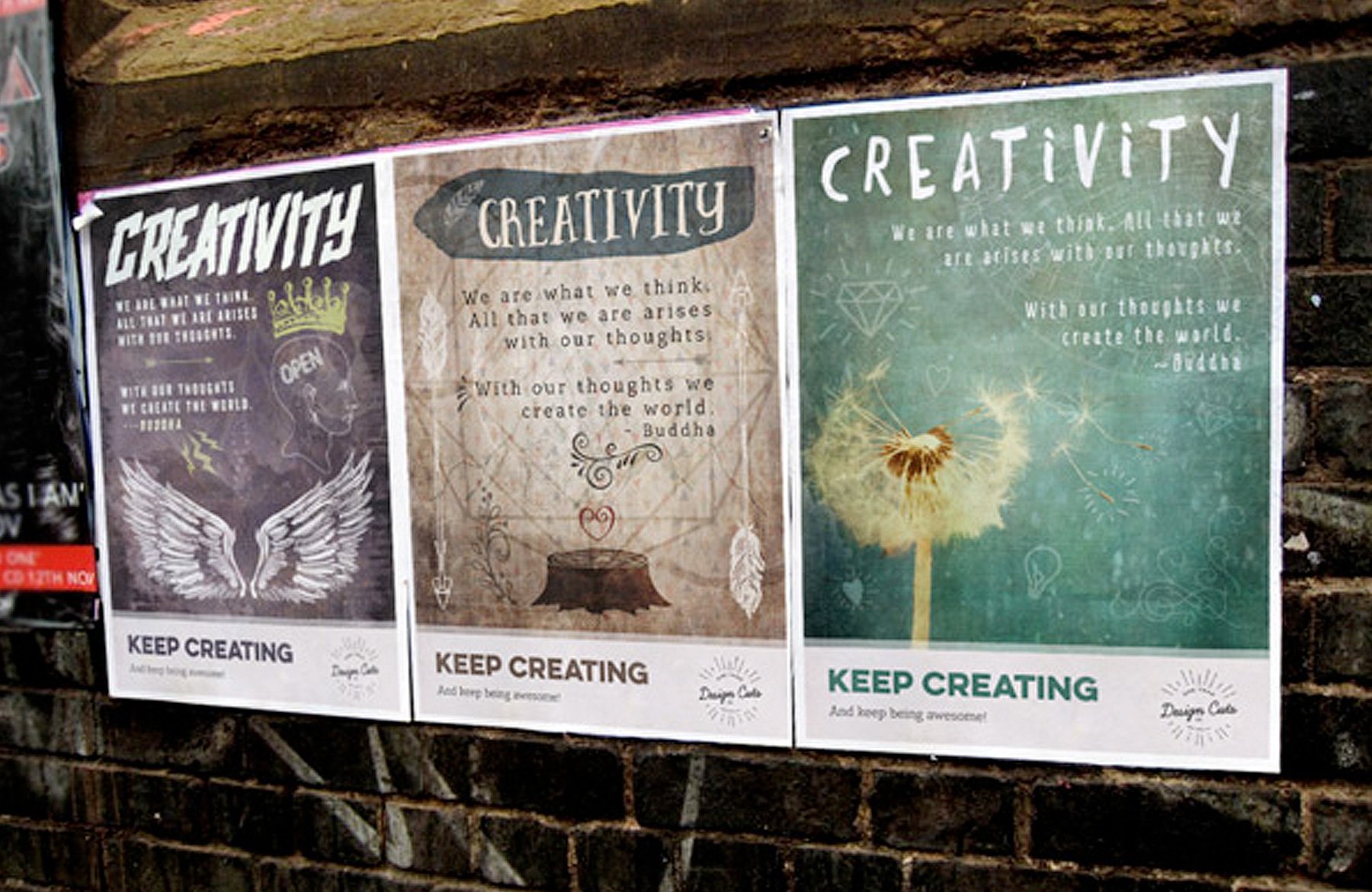
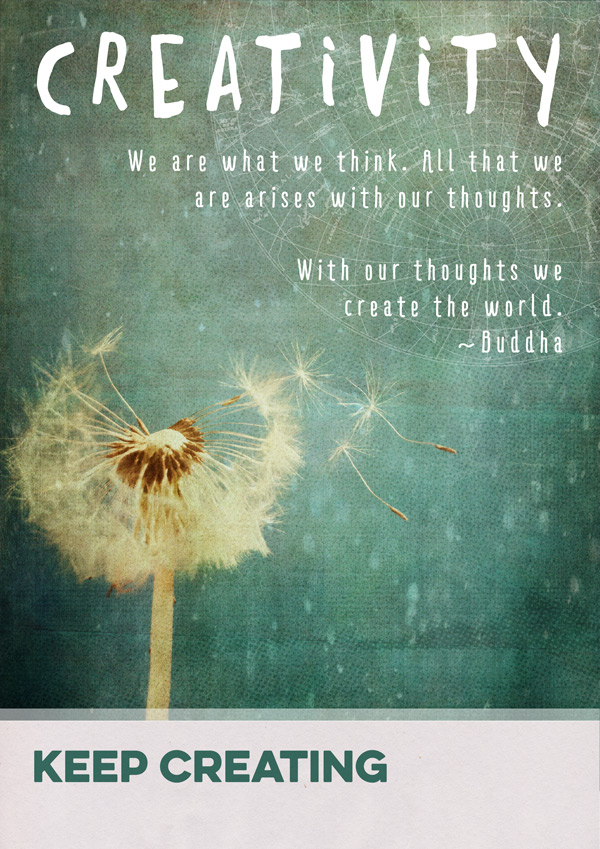
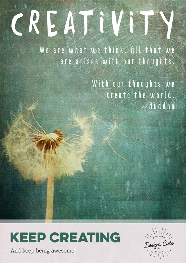
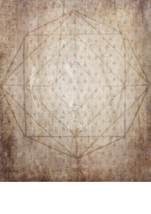
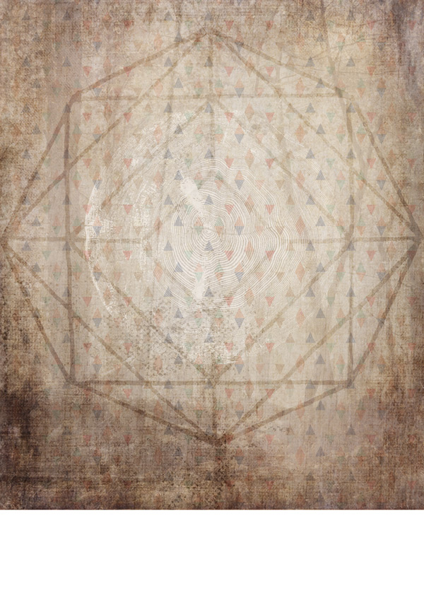
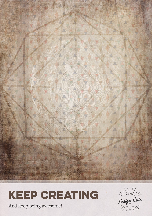
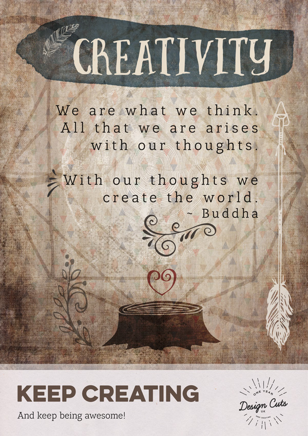
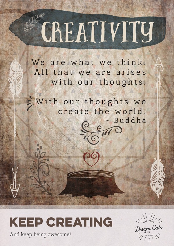
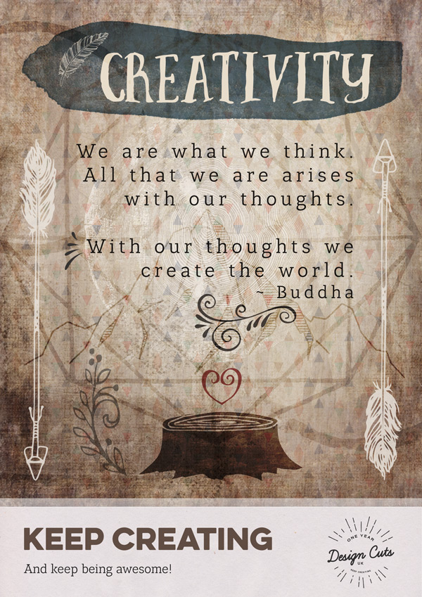
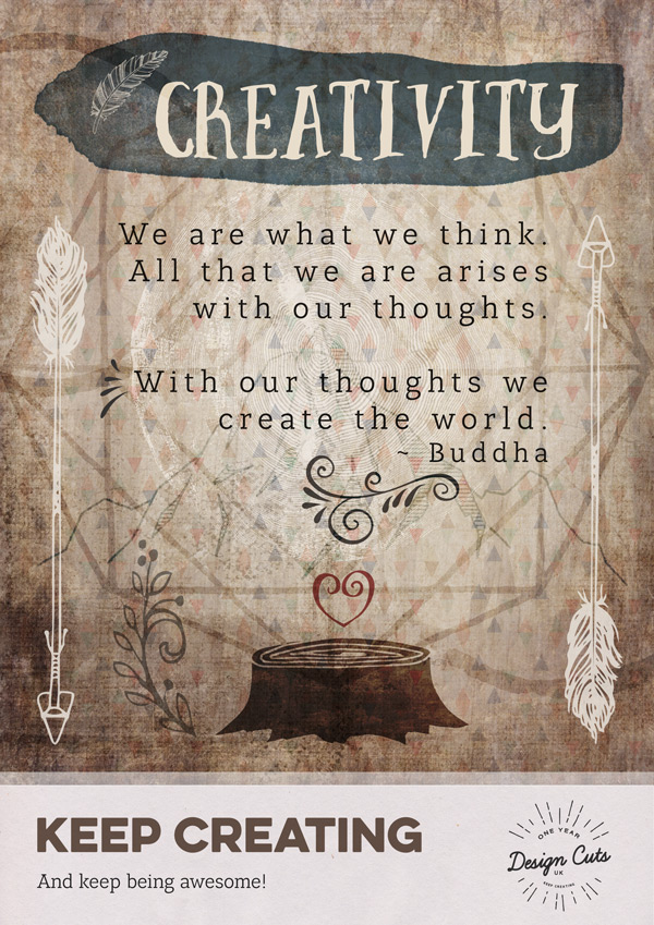
Jo here, and in today’s Birthday Bonanza tutorial we have the exciting task of combining the collective creative resources from some of the most popular Design Cuts Deals. That’s a whole lotta goodies to choose from, and to mix and match as many in as possible, we’ll be creating three posters in different styles, with an inspirational creative message.
Quick note: In this tutorial, the term “clipping” or “clipped layer” is used a few times. This means that the layer is only visible/applies to the layer directly below it. You can very quickly do this by holding ‘Alt’ down on your keyboard and clicking between the two layers. Here’s a quick demonstration.
Ok, let’s get started!
Follow along with this tutorial: Download the freebies
Today, we also have a rather epic freebie for you!
So many of the designers we work with have kindly included their resources, enabling us to provide you with our biggest freebie to date!
There’s a huge variety of vectors, fonts, textures and patterns for you to choose from and we’re sure you’ll find plenty of great ways to use these in your future projects.
Remember, this freebie is just a tiny fraction spanning our current Multi Deal Bonanza which features 22 of the most popular deals from the past year.
Enter your email below to download the freebie, so you can follow along with this tutorial easily.
Poster 1
Step 1:
Open a new (A4) 2480px x 3508px document in Photoshop, and set up four guides that are 1cm in from each side of the canvas:
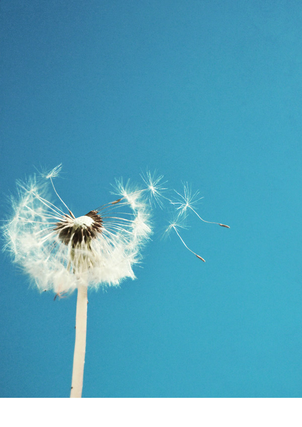
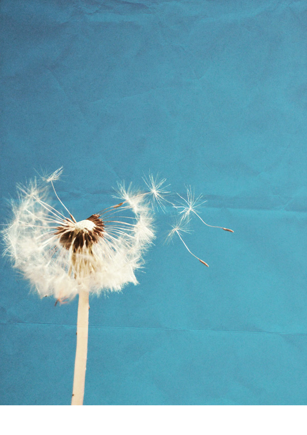
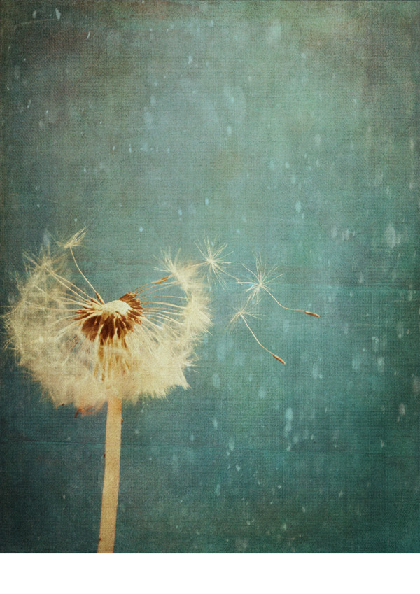
Then from the freebies, select the blown-dandelion.jpg photo and paste on to your canvas, positioning so that the bottom of the image reaches about 27.5cm down on the canvas:
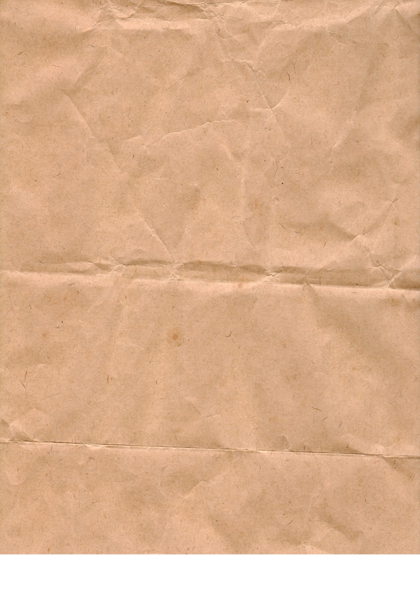
We’ll be building up a lot of textures in this background, and next up is the a great crumpled, brown paper texture: the-ultimate-brown-paper-texture-pack-volume-01-sbh-015.jpg which we’ll paste on to our canvas so that it aligns with existing image:
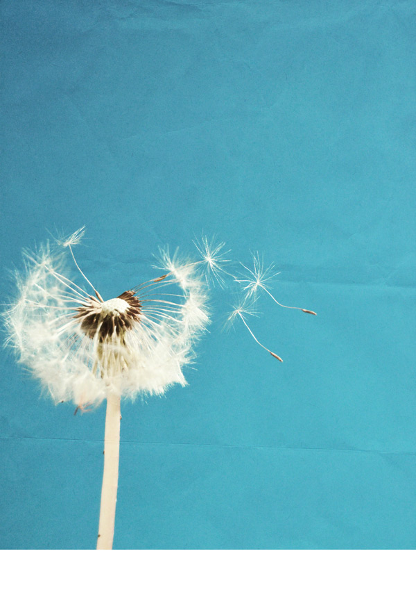
Let’s change the blend mode to Overlay and drop the Opacity to 35%:
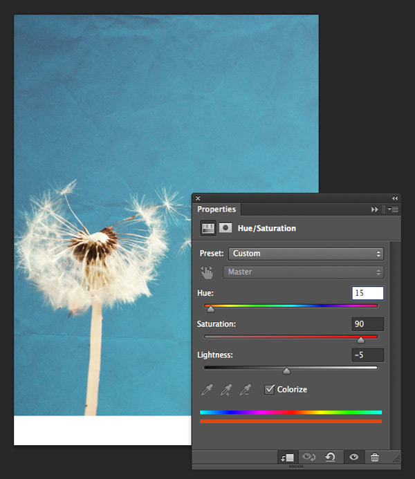
We can see the creases in the paper through our image, but we want to make it a tad darker. We’ll do this by creating a clipped hue/saturation Adjustment Layer with the following settings:
Hue/Saturation Settings:
Colourize: On
Hue: 15
Saturation: 90
Lightness: -5
This helps create a bit more contrast and texture to build up the background from:
Step 2:
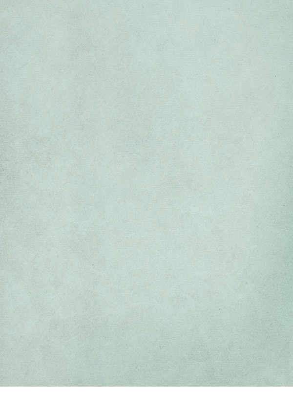
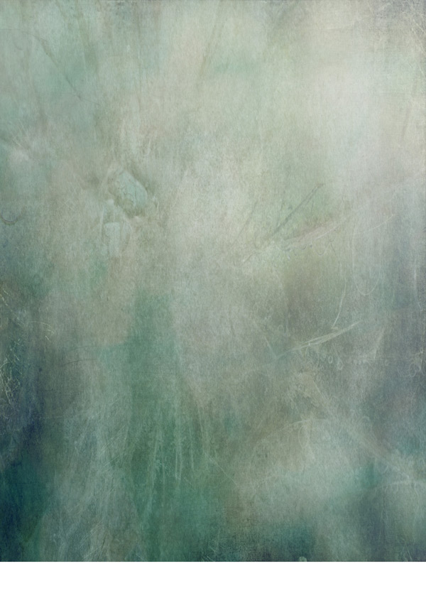
We’ll now start to add more textures, which are always a popular resource as they’re so versatile. Let’s start by giving the image a darker wash using the solid-aqua.jpg paper texture:
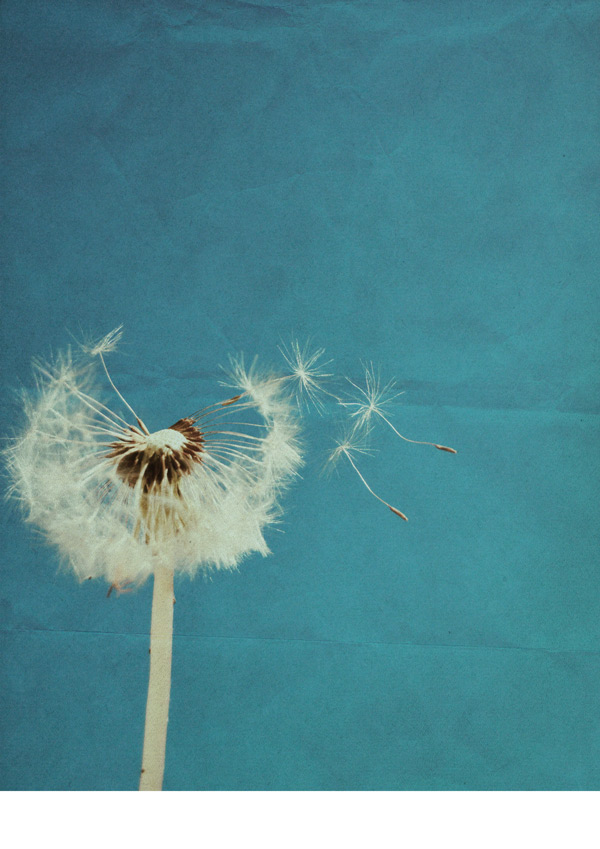
Change the blend mode to Multiply:
We’re aiming to make the background fairly dark and textured to create a greater contrast between that and the cleaner lines of the white text and vectors we’ll be adding later.
Next up, grab 2LO Starry night 5.jpg and paste on to your canvas, scaling to fit the image:
Switch the blend mode to Soft Light an bring the Opacity down to 20% for a subtle effect:
Then, we’ll use the 2LO Starry night 6.jpg image from the same set to strengthen the effect:
Change the blend mode to Soft Light again, and reduce the Opacity slightly to 85%:
Next up is 2LO Luscious Linen 18.jpg, which we’ll scale to fit the image:
Change the blend mode to Soft Light and reduce the Opacity to 70% for the desired effect:
These textures are great for building up and experimenting with blend modes and opacity to create some unique effects. We’ll continue doing this using 2LO Shabby Creek 5.jpg, again scaling to fit the image:
We’ll change the blend mode to Overlay this time, and reduce the Opacity to 20%:
Finally for the textures, we’ll use 2LO Crackle 13.jpg:
Change the blend mode to Soft Light, leaving the Opacity at 100%:
Step 3:
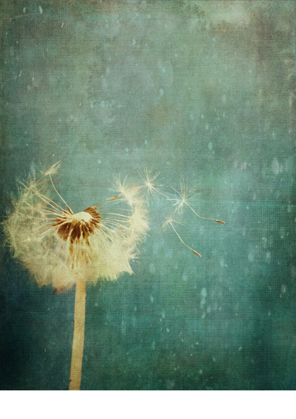
Next, we want to add some extra details to our design. Paste the image of the india ink splash, 28.png on to the upper right of your canvas:
Change the blend mode to Soft Light and reduce the Opacity to 65% for a subtle effect:
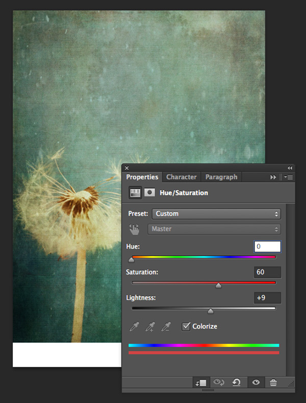
To blend the colour in better with the rest of the image, we’ll create a clipped hue/saturation Adjustment Layer with the following settings:
Hue/Saturation Settings:
Colourize: On
Hue: 0
Saturation: 60
Lightness: +9
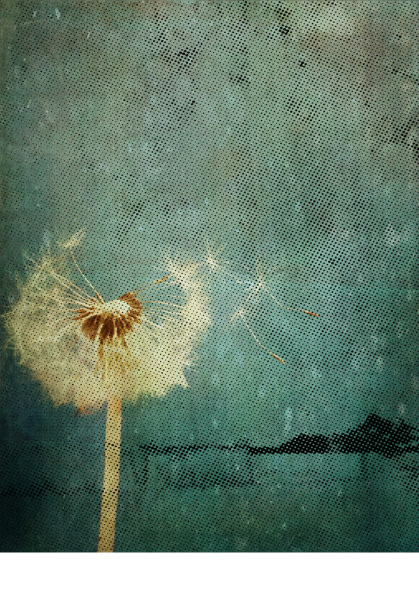
We’ll go on to add the halftone texture 07.png from the freebies, pasting on to your canvas and scaling to fit the image:
Let’s make this a little less obvious by changing the blend mode to Soft Light and dropping the Opacity to 30%:
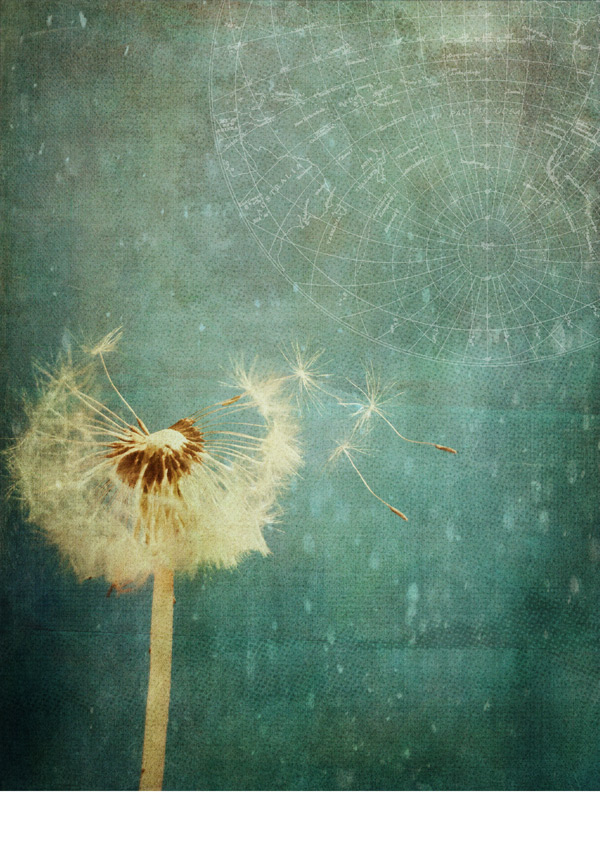
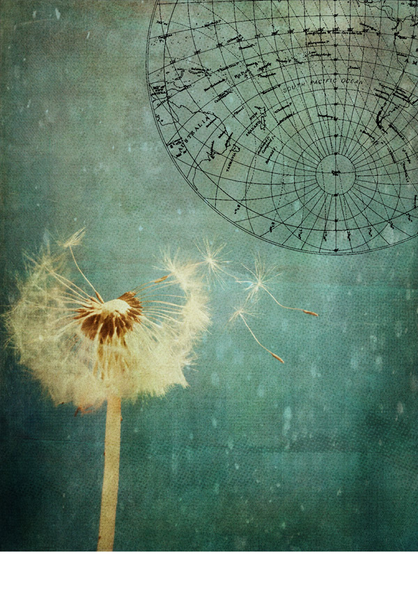
To finish off the background we’ll add a sense of creative wanderlust using a map and chart graphic, which you can grab from the freebies as the file 18.eps.
Paste and scale so that it sits in the upper right of the canvas, similar to the image below:
Rasterize the image and hit either ‘cmd + I’ for Mac or ‘cntrl + I’ for Windows to inverse the colour:
We’ll blend this in to the image better by changing the blend mode to Screen and reducing the Opacity to 35%:
To keep things neat and easy to find, place all the layers we’ve created so far in to a group called “Background”.
Step 4:
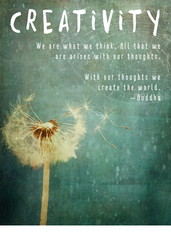
Next we’ll start to add our quote. Using the font Daft Brush from the Monster Creative Fonts Bundle set the colour to white and type “Creativity”, our theme, and scale to fit within the guides we created earlier:
For the quote itself, select Ride My Bike Pro Bold from the Huge Creative Font Bundle as the font, set to size 30pt and colour white. Set the text to justify right, then type:
We are what we think. All that we

are arises with our thoughts.
With our thoughts we
create the world.
~Buddha
Pop the two layers in to a group called “Quote” and we’re ready to move on!
Step 5:
In the next couple of steps we’ll put together the ‘footer’ that ties our three designs together.
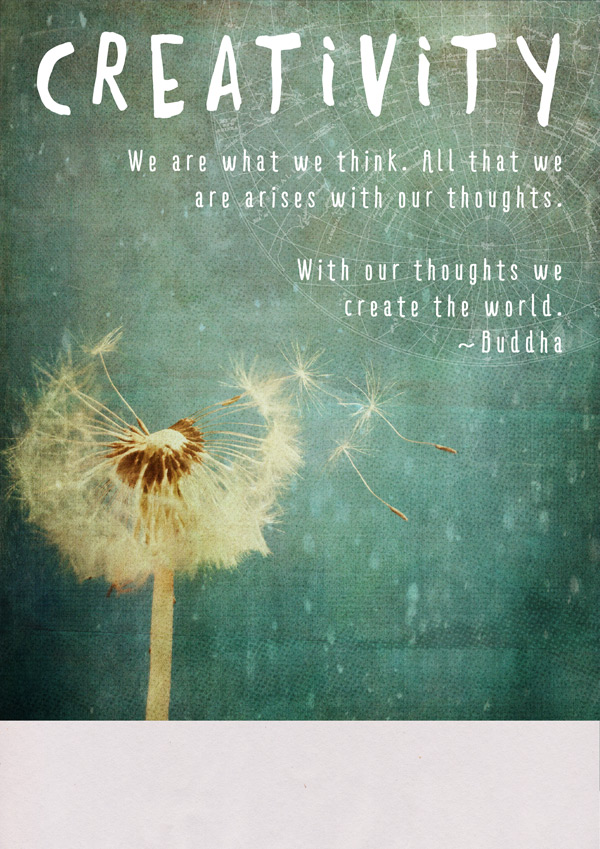
We’ll use a light, paper texture for our base, which you can grab from the freebies as texture07.jpg:
Paste on to your canvas so that the top of the image is only covers approximately the bottom 2.5cm of the canvas:
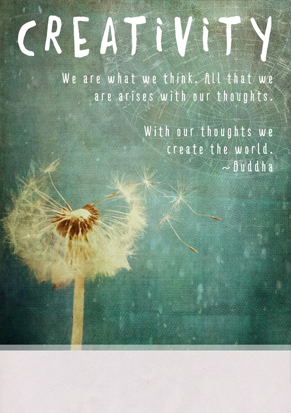
Use the Rectangular Marquee Tool to draw a thin rectangle that spans the width of the canvas, just above the paper texture we’ve placed:
Making sure white is set as the foreground colour, hit ‘alt + delete’ on your keyboard to fill the selection. Then, reduce the Opacity to 50% to create a visual transition between the image and the footer:
We want to reinforce the sentiment of the quote using some footer text, and to do this we’ll use a strong but fairly simple font, Eveleth Clean Regular which is part of the Massive Artistic Font Bundle.
Set the size to 40pt and use the Colour Picker tool to select a darker shade from the background (in this case #3B7669). Type “Keep Creating” and align to the left guide that we set up on the image:
We also want to remind you how great you guys in the community are! Select LeanO FY Regular from the Beautifully Professional Font Bundle , set the size to 18pt and colour to #1E1E1E, then type “And keep being awesome!”.
Set the blend mode of both the text layers to Multiply, and we’ll move on to the next step…
Step 6:
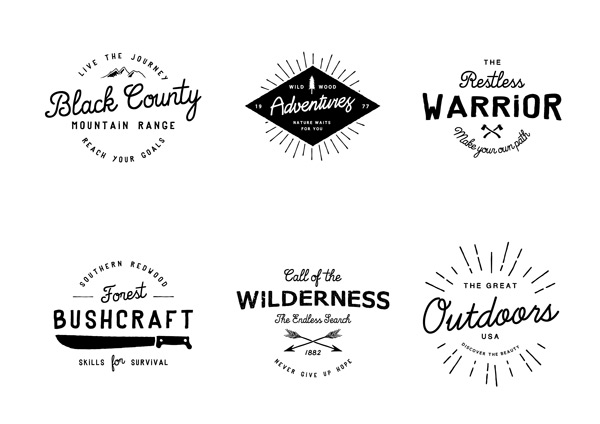
To finish off the footer, we’re going to add a stylish badge for a branding element. This is really easy to do thanks to the ‘Logos from the great outdoors’ resource we have for you, Check out the Outdoor-logos-editable.psd freebie:
We’ll be using the badge on the bottom right, modifying the text to fit our design. For this to work, you’ll need to download and install the following free fonts:
Learning Curve
MJLetter2
Good Bye Lullaby
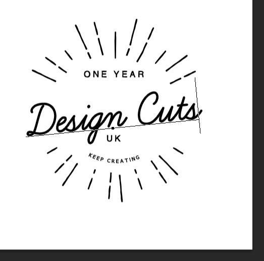
Edit the text to read:
You’ll need to reduce the font size for “Design Cuts” to about 50pt so that it stays proportionate to the rest of the badge.
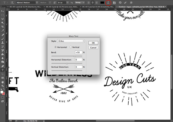
Select the “ONE YEAR” text, and use the Create Warped Text tool to Arc the text so that it fills the space better:
Warped Text Settings:
Style: Arc
Orientation: Horizontal
Bend: +50%
Once the text has been warped, nudge it down slightly using the arrow keys on your keyboard, so that the spacing around the text is more even:
We’ll copy the group the badge is contained in, “Outdoors”, to our working photoshop document, placing and scaling so it fits in the lower right within the footer:
Place the layers that make up the footer in to a group called, you guessed it, “Footer” so we can find everything easily and copy them between documents. :)
Step 7:
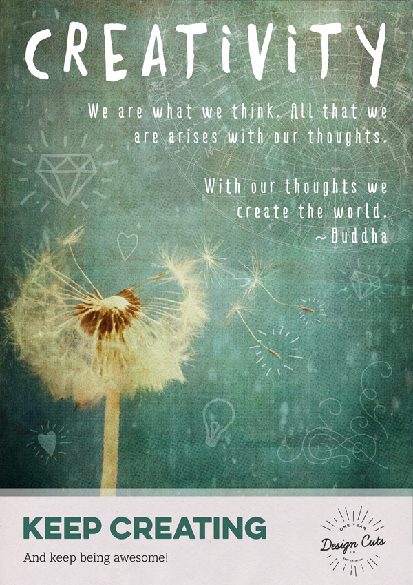
We’ll finish off this design with some hand-drawn style glyphs which come as part of the Trend HM font as Trend HM Ornaments.
Feel free to experiment with the characters, size and Opacity to see which glyphs appeal most to you. In this case, white is set as the text colour for all of them, the blend mode to Soft Light and the following characters used:
B (solid heart): Opacity 70%
p (outlined heart): Opacity 70%
6 (corner swirl): Opacity 80%
k (diamond): Opacity 65%
i (lightbulb): Opacity 75%
D (burst around seed): Opacity 50%
Group all these together in a folder called “Ornaments” for a bit of housekeeping.
Step 8:
We’ll finish off by adding a screen texture to create a worn, tactile feel to the poster design.
From the freebies, select the screentexture20.jpg file and paste it on to your canvas, this time scaling to fit:
Switch the blend mode to Screen to get the full effect:
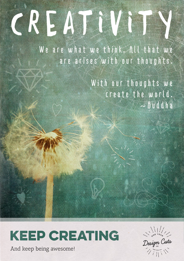
Good work! We’ve now completed our texture-tastic first poster. Before we move on to the next, take a quick break, stretch your legs and give your eyes a rest from the screen to refresh.
All good? Let’s move on to design #2! :)
Poster 2
Step 1:
As with our first poster, open up a new (A4) 2480px x 3508px document in Photoshop, and set up four guides that are 1cm in from each side of the canvas.
We’ll start building up the background with 2LO Relic 3.jpg from our freebies, scaling so that the bottom reaches slightly below the 25cm mark on our canvas:
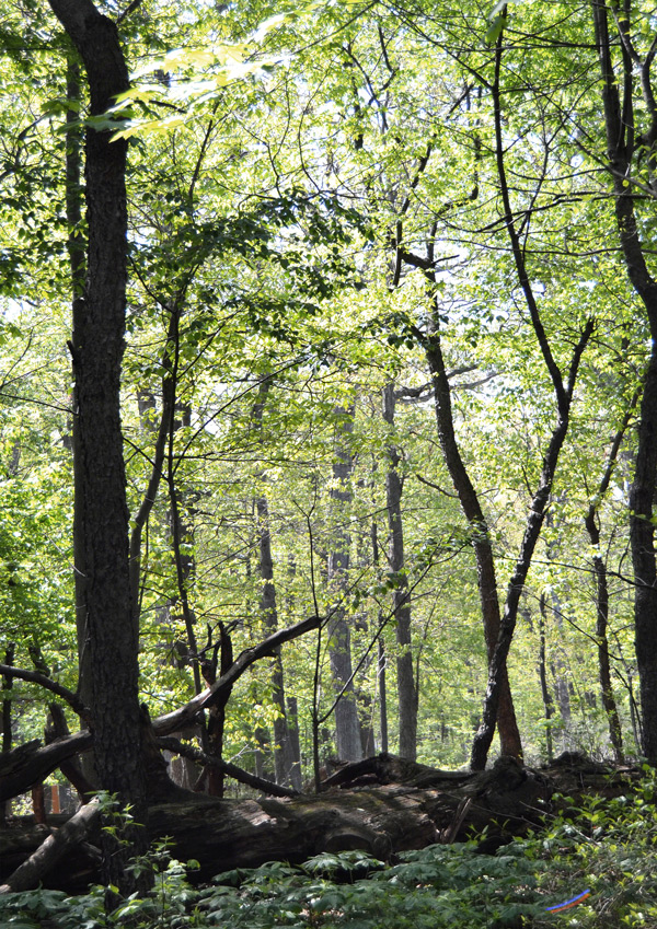
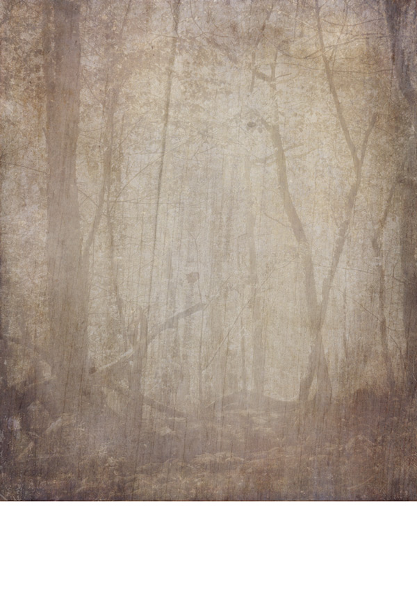
We’ll be using another photo, forest1.jpg from the freebies to help add some detail and texture. Paste on to your canvas, scaling to fit:
Then, shift the image up so that the base aligns with the layer below:
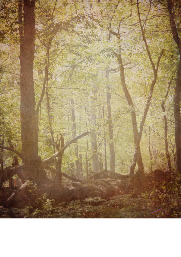
Change the blend mode to Soft Light so we can see the lovely texture come through from underneath:
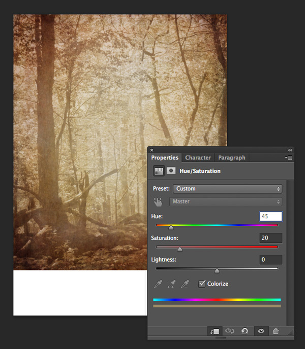
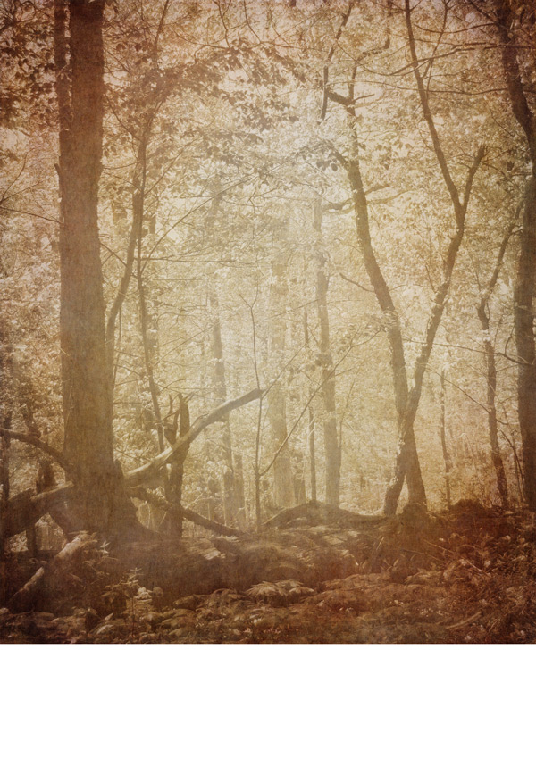
We’ll warm up the image to give it a more autumnal feel by creating a clipped hue/saturation layer with the following settings:
Hue/Saturation Settings:
Colourize: On
Hue: 45
Saturation: 20
Lightness: 0
Step 2:
We’ll build up the texture a bit more and give it a flatter tone to help the vectors we’ll be adding later to stand out.
Grab the 2LO Relic 23.jpg, which has an appropriately bark-like texture, and paste it on to your canvas, scaling to fit the image:
Reduce the Opacity to 65% so that we still get a sense of the image behind it:
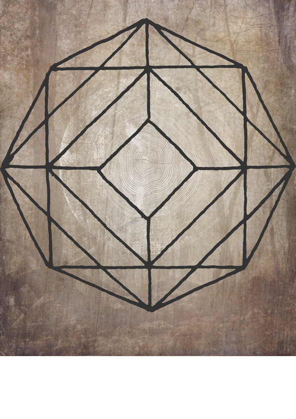
We’ll add our first vector design with a fittingly woody theme. From the freebies, find C03.eps which looks like this:
Paste and scale so that it sits in the middle of our background with a fairly generous space around it (you can always come back to tweak the size and position if necessary):
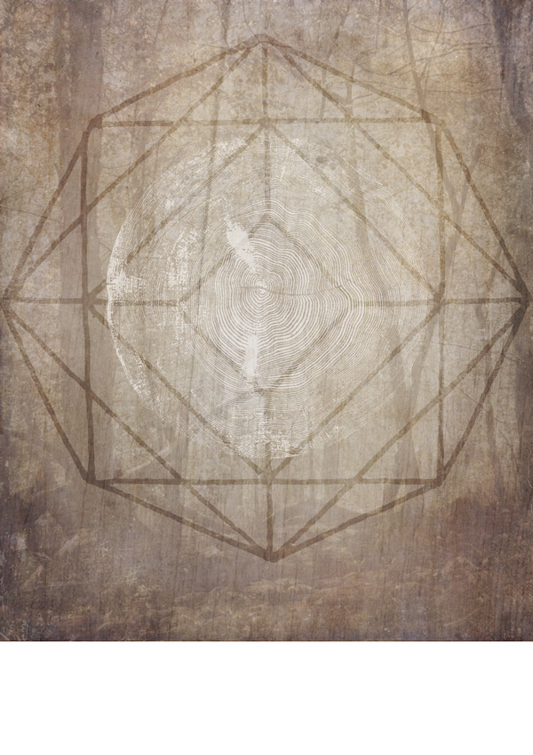
It’s a bit grey as it is, but we can easily change this by switching the blend mode to Screen:
I like to think this gives the images a slightly mystical feel, like there’s a tree spectre hovering about! :)
We’ll continue the use of vectors in the background with Polygon-12-byGhostlyPixels.png. Paste it on to your canvas so that it fits the width and sits centrally above our tree bark pattern:
We’ll tone it down by changing the blend mode to Overlay and reducing the Opacity to 50%:
For some final vector detailing, find the Scuff05_byGhostlyPixels.png image and paste it on to your canvas towards the lower left, scaling to a similar size as below:
We’ll tone this one down by changing the blend mode to Soft Light:
Step 3:
We’ll finish off the background by adding a final couple of textures and patterns.
From the freebies, grab the extremely versatile 2LO White Grunge.jpg and paste on to your canvas, scaling to fit the image:
We’ll change the blend mode to Soft Light to see our image with the texture applied:
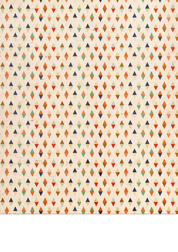
We’ll add a subtle pop of colour with a great pattern texture that’s included within the freebies. Find Digital Paper – Brood-01.jpg and paste on to your canvas, scaling to fit the image:
To get the desired effect from this, change the blend mode to Multiply and drop the Opacity down to 20%:
We’ll add a final bit of localised detail to the background using RGough_S_Dry01.png, which looks like this:
Paste it on to the lower left of your image, scaling and positioning so that it’s similar to the image below:
Change the blend mode to Soft Light and drop the Opacity to 40% so that it’s not quite so dramatic!
We’ll finish off the background by keeping things tidy and easy to find by putting the layers we’ve created so far in to a group called “Background”.
Step 4:
Next up, we’ll copy the “Footer” group from our first poster, and drop it in to our current working document:
Since we’ve already done most of the legwork in the first poster, all we need to do is change the main font colour to something more in-keeping with our current design. As we did the first time round, use the Color Picker Tool to select a dark shade from our image so far. In this case, the selected colour is #6B584C:
We’re now ready to move on to add our quote…
Step 5:
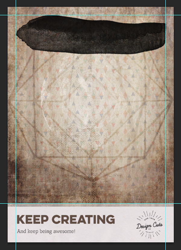
First up, grab the RGough_S_Wet11.png file from the freebies and position towards the top of the image, within the guides:
Set the blend mode to Multiply and drop the Opacity slightly to 92%.
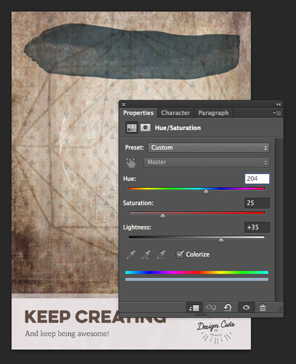
The black is a little too harsh as it is, so we’ll use a clipped hue/saturation layer to turn it to a contrasting, muted blue shade with the following settings:
Hue/Saturation Settings:
Colourize: On
Hue: 204
Saturation: 25
Lightness: +35
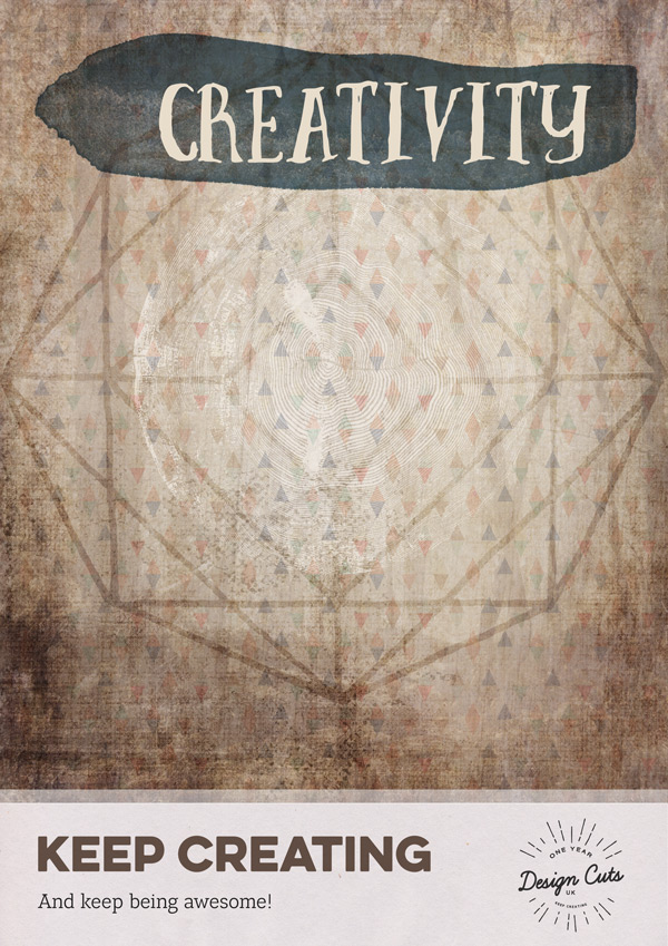
Select the font Brave Regular which is part of the Massive Artistic Font Bundle, setting the size to 100pt and colour to #E8DDCB. Type “Creativity” and position it so that it sits slightly towards the right of our painted background:
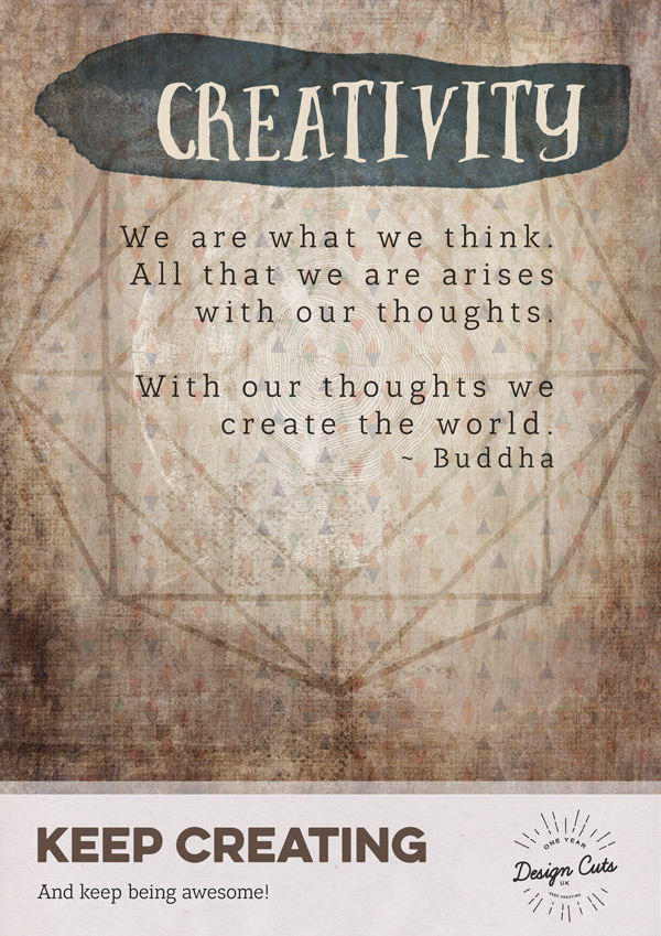
Next, we’ll add our main quote. Select LeanO Fy Regular as the font (which we’ve already used in the footer) and set the font size to 25pt and colour to #34312E.
Copy and paste the quote, so that the text is justified right but the paragraph sits centrally on the canvas:
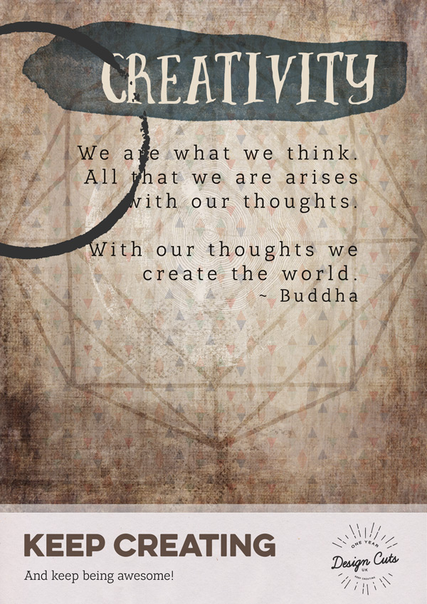
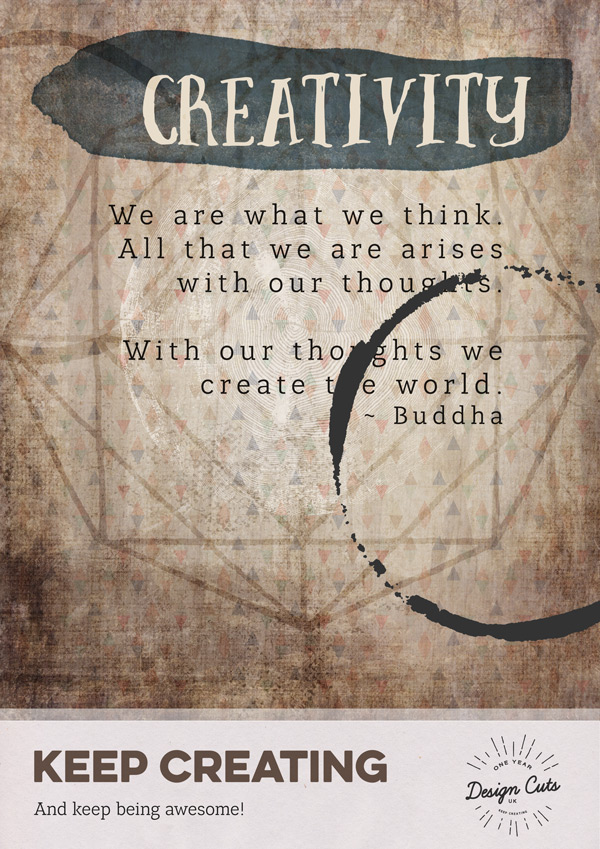
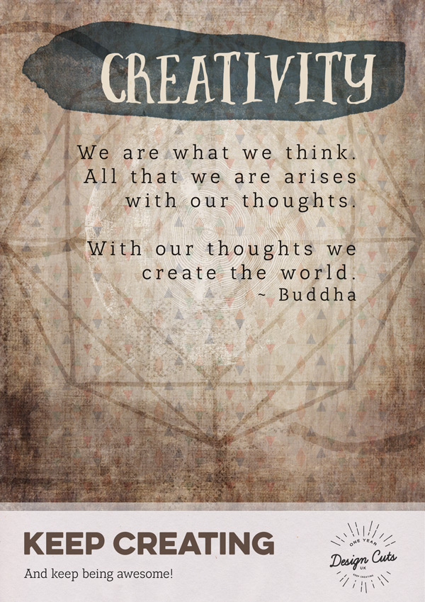
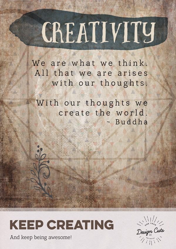
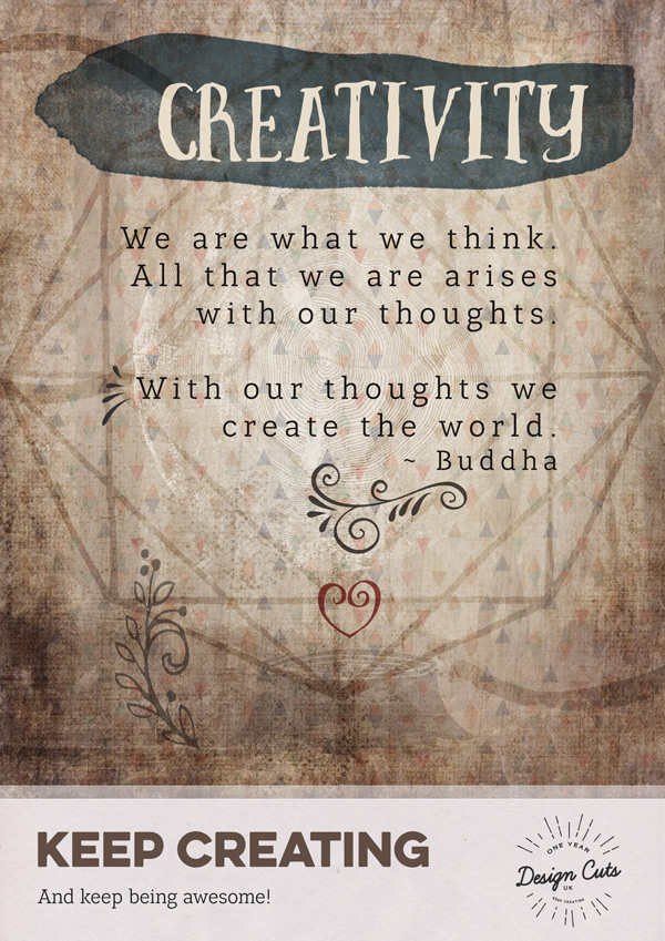
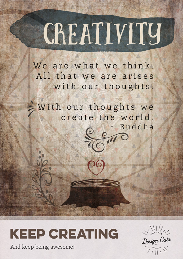
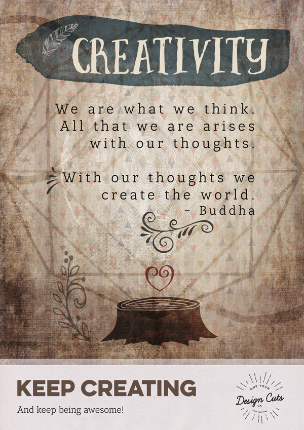
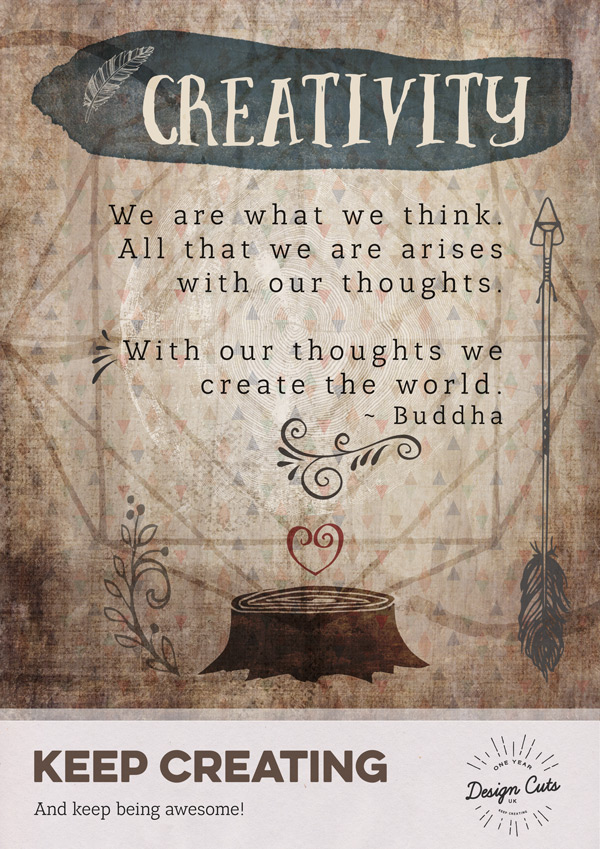
We are what we think.

All that we are arises

with our thoughts.
With our thoughts we
create the world.
~ Buddha
Set the blend mode to Multiply and duplicate the layer to help the text stand out a bit more. On the duplicated layer, reduce the Opacity to 60%:
Ok! We’re now ready to throw a proper vector party! ;)
Step 6:
To start with, we’ll add some casual coffee stains using CoffeeStain-02.png. Paste, scale and position similar to the image below:
We’ll make this look a little more realistic by dropping the Opacity to 50% and changing the blend mode to Overlay:
We’ll repeat the process with CoffeeStain-04.png:
Change the blend mode to Overlay, but this time reduce the Opacity a little more to 40%:
Step 7:
Next we’ll be using some of the vectors from curlsAndSwirls.ai set:
Place the plant-like swirl on to your photoshop document, scaling and positioning as below:
Change the blend mode to Multiply and drop the Opacity to 60% for a softer effect:
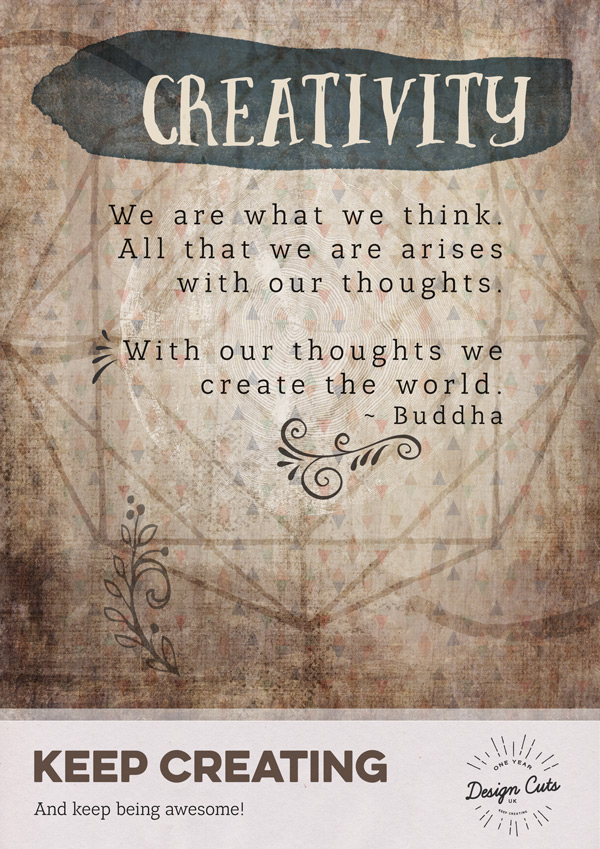
We’ll add a bit of emphasis to the quote by adding a couple of swirls and splashes around the text:
Change the blend mode to Multiply and drop the Opacity to 90% on both:
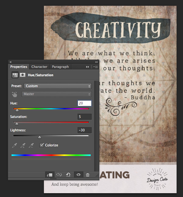
We’ll add a bit of warmth to the elements we’ve just added using a clipped hue/saturation adjustment layer with the following settings:
Hue/Saturation Settings:
Colourize: On
Hue: 20
Saturation: 5
Lightness: -30
You can duplicate the hue/saturation Adjustment Layer and clip it to the other vector element to get the same settings (you may need to re-clip the original after doing this):
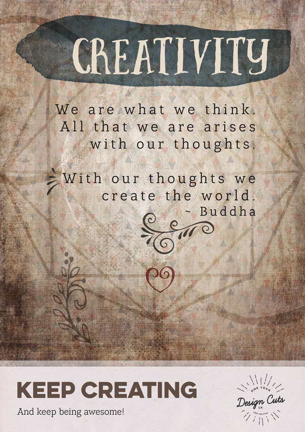
Next, copy and paste the heart shaped swirl on to your photoshop document as follows. Change the blend mode to Multiply and reduce the Opacity to 80%:
We’ll use this element to add a pop of colour using a clipped hue/saturation Adjustment Layer with the following settings:
Hue/Saturation Settings:
Colourize: On
Hue: 0
Saturation: 60
Lightness: +10
Step 8:
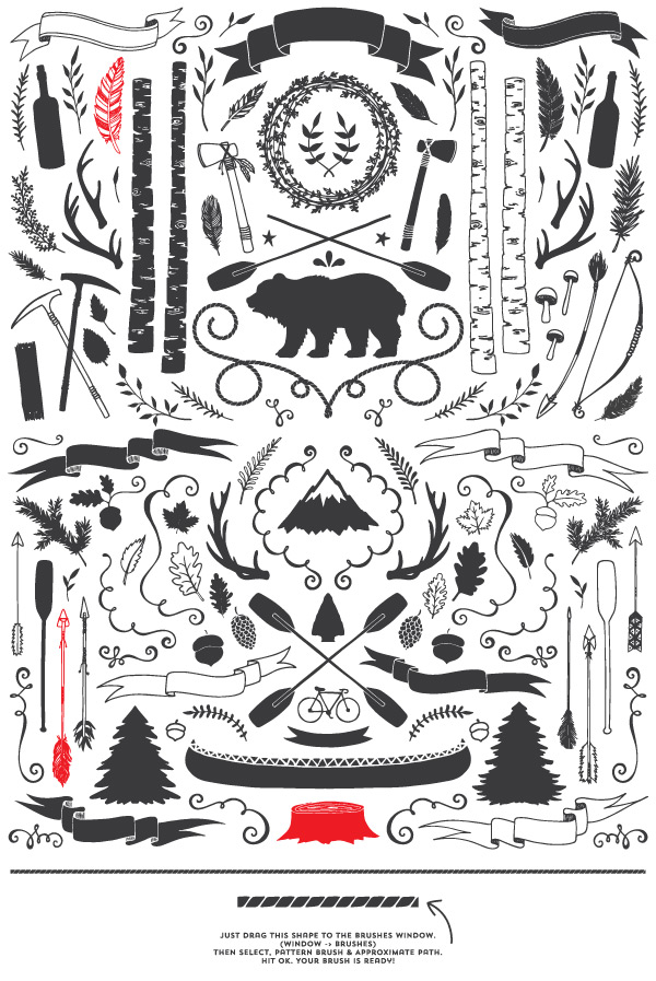
Next we’ll be using some outdoorsy vectors from CreativeMarket_RusticPack_Master_CC.ai:
Copy and paste the tree stump vector on to your photoshop document as follows:
Drop the Opacity way down to 20% and switch the blend mode to Multiply:
Duplicate the layer, switching the blend mode to Overlay and bringing the Opacity back up to 100%:
We’ll give the tree stump a richer colour using a clipped hue/saturation Adjustment Layer with the following settings:
Hue/Saturation Settings:
Colourize: On
Hue: 20
Saturation: 5
Lightness: -30
Next we’ll add the feather to the space to the left of our “Creativity” header. Copy and paste on to your document, dropping the Opacity to 80% and use a clipped hue/saturation Adjustment Layer to see the image more clearly:
Hue/Saturation Settings:
Colourize: On
Hue: 37
Saturation: 25
Lightness: +75
Step 9:
Next we’ll copy and paste the arrow on to our photoshop canvas, scaling and positioning as follows, then dropping the Opacity to 85%:
Create a clipped hue/saturation Adjustment Layer with the following settings to lighten the image:
Hue/Saturation Settings:
Colourize: On
Hue: 37
Saturation: 25
Lightness: +85
Duplicate the layer plus its accompanying Adjustment Layer, move to the opposite side of the canvas and rotate it 180 degrees to balance out the design:
Step 10:
We’ll finish off the vectors with the very cool Karakoram-byGhostlyPixels.png, pasting on to your canvas so that it sits slightly below centre:
Change the blend mode to Overlay for a subtler effect:
Then, we’ll add a clipped hue/saturation Adjustment Layer to give it a bluer tone to match the header paint. Use the following settings to get the desired colour:
Hue/Saturation Settings:
Colourize: On
Hue: 195
Saturation: 25
Lightness: +6
We’ll finish off this step by selecting the Microbrew Ornaments font at 100pt and typing “s”. Position it in the space between the sentences in the quote:
Drop the Opacity to 55% so that it doesn’t distract from the quote itself:
Place all the vector layers in to a group called “Vectors” for easy location!
Step 11:
Finally, we’ll finish off by using the same screentexture20.jpg screen texture as in the first poster. Paste and scale to fit before changing the blend mode to Screen:
Excellent! We’ve now had lots of fun with textures and vectors, we’ll move on to our final poster which is a lot grittier and grungier…
Poster 3
Step 1:
As with our previous posters, open up a new (A4) 2480px x 3508px document in Photoshop, and set up four guides that are 1cm in from each side of the canvas.
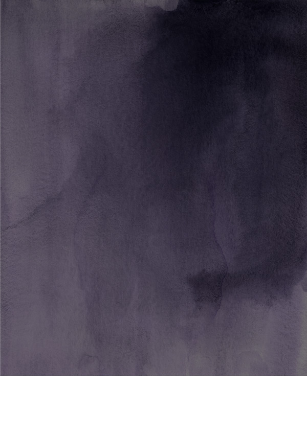
Then, to start off our background let’s use Watercolor6_Version2.jpg and scale to reach just over 25cm on our canvas:
You can find the entire watercolor backgrounds pack by Make Media Co in our currently running Massive Patterns, Textures and Backgrounds Bundle.
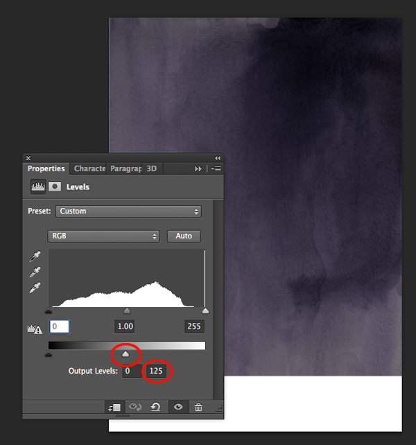
We’ll add a clipped Levels adjustment Layer to darken this and reduce the contrast. In the Levels panel, adjust the White Balance to 125:
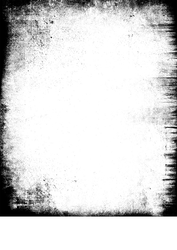
From the freebies, paste the distressed border 07.jpg on to our canvas, scaling to fit the image:
Switch the blend mode to Soft Light and reduce the Opacity slightly to 90%:
We’ll add some more texture using rustgrunge.jpg scaling to fit the image:
For a subtler effect, reduce the Opacity to 80% and change the blend mode to Soft Light:
That’s our background prepared! Place the layers in an easy-to-find group called “Background”.
Step 2:
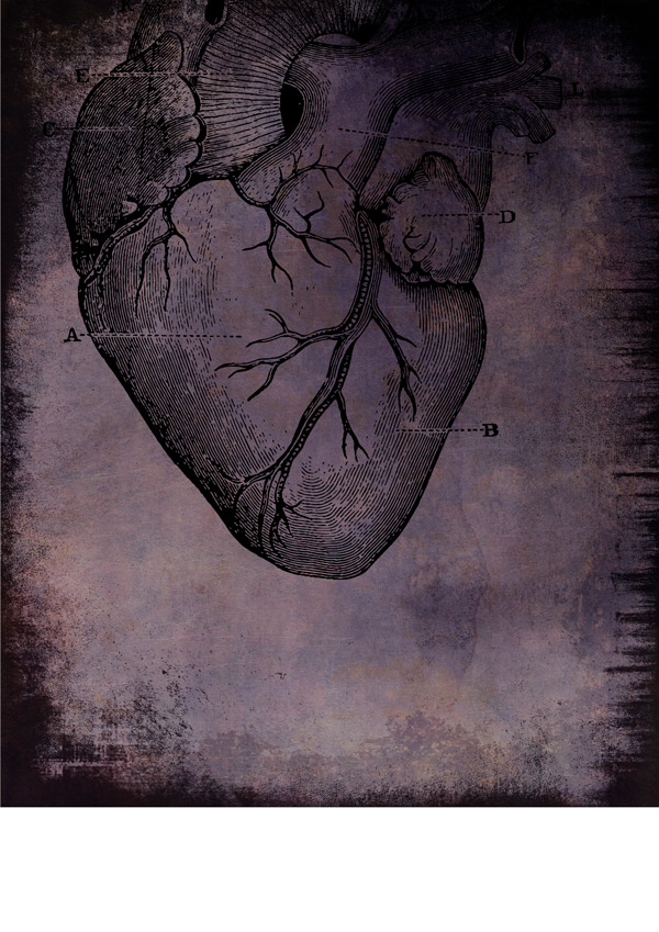
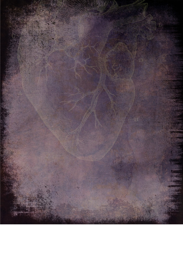
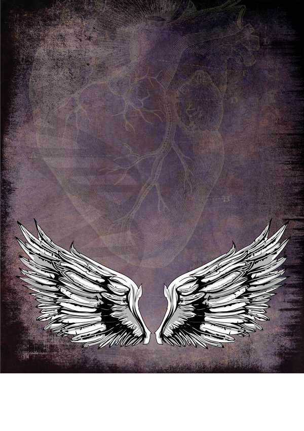
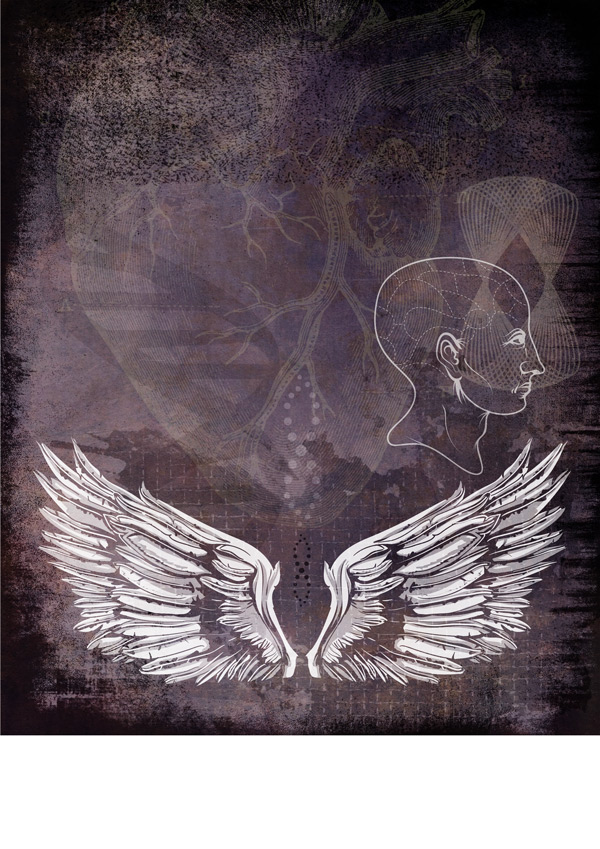
Next up, we’ll start adding some extra details. from the freebies, paste HEART.eps towards the top of your canvas, similar to below:
We’ll help this stand out by using a clipped hue/saturation Adjustment Layer to change it to a contrasting colour with the following settings:
Hue/Saturation Settings:
Colourize: On
Hue: 65
Saturation: 25
Lightness: +50
That’s certainly made it stand out more! However, we’ll tone this down as it’s meant to be a background element. Change the blend mode to Screen and drop the Opacity way down to 20%:
That’s a little easier on the eye now. :)
Step 3:
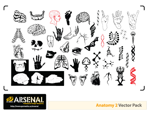
We’ll add some more decorative vectors this time from gma_vector_set10_anatomy02.eps:
Remember, you can find over 1300 more quality vectors from Go Media as part of our currently running Go Media Ultimate Vector Collection.
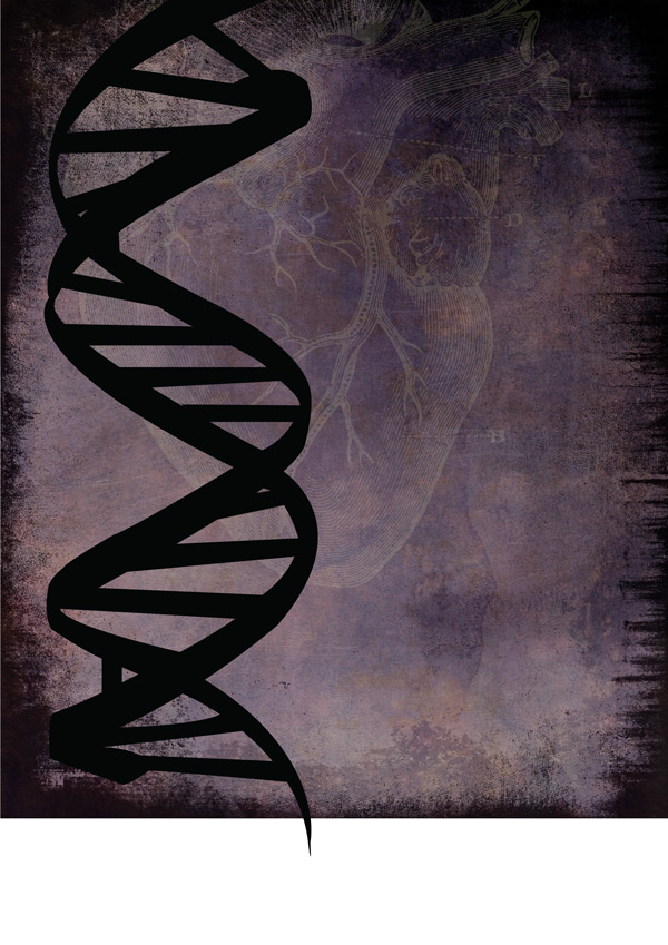
Paste the DNA strand on to your photoshop document so that it fills the left side, as below:
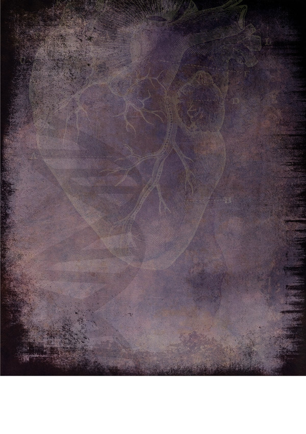
To keep things subtle, we’ll change the blend mode to Soft Light and reduce the Opacity to 20%:
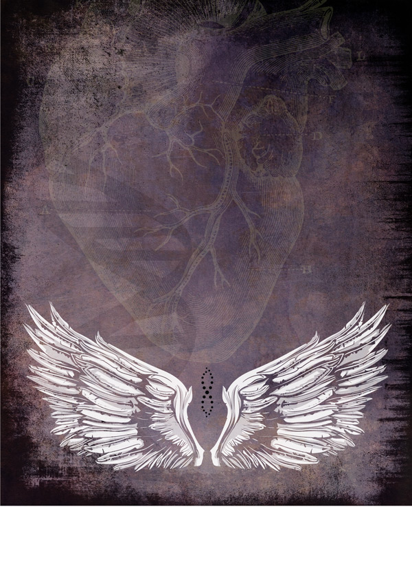
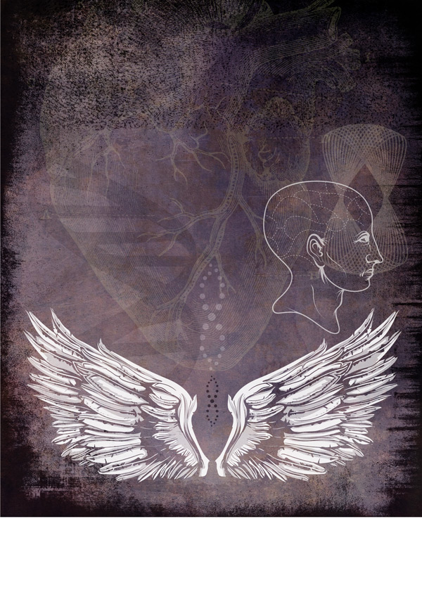
From the wings_set10.eps copy and paste the following design towards the bottom centre of your canvas:
As this is going to be more of a feature graphic, we’ll tone it down slightly without losing too much impact. Let’s do this by reducing the Opacity to 90% and changing the blend mode to Screen, so the white still stands out:
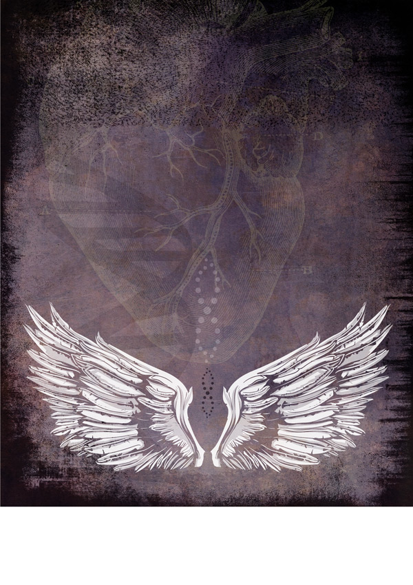
We’ll add a little detail using the crossed dots from the anatomy vectors set. Place centrally between the wings as follows, scaling to fit:
We’ll tone it down a touch by changing the blend mode to Soft Light:
Duplicate the layer, increasing the size slightly and moving directly above the original image. Drop the Opacity to 50% for this one:
We want to make this one lighter, so we’ll create a clipped hue/saturation Adjustment Layer. The only setting that needs to be changed is the Lightness, which we’ll push all the way up to +100:
Step 4:
We’ll grab some extra textures from Texture Pack Vol.3.psd, using the ‘Sponge’ layer:
You can grab this full pack, and many more as part of our Massive Patterns, Textures and Backgrounds Bundle.
We want to use Sponge_19, which is highlighted in the bottom left. Copy this texture on to our working document, and paste across the very top, scaling to fit the width of our canvas:
Let’s change the blend mode to Soft Light to soften the effect slightly:
Step 5:
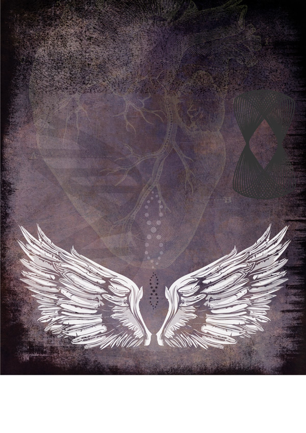
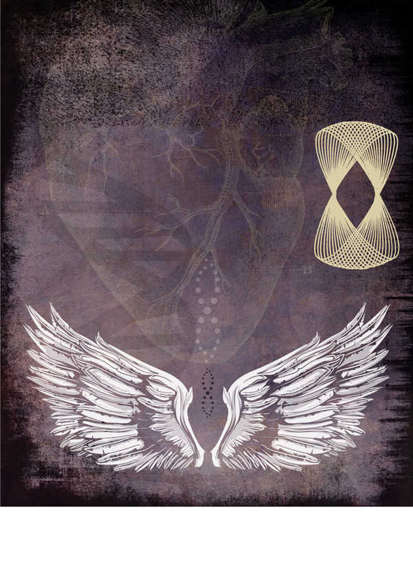
Next, we’ll use Spyrographics13-byGhostlyPixels.png, pasting it towards the right of our canvas and rotating 90 degrees:
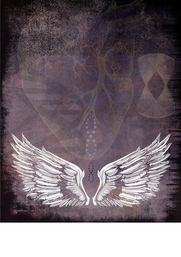
Again, we want to make this stand out a little more, so we’ll use a clipped hue/saturation Adjustment Layer to alter the colour with the following settings:
Hue/Saturation Settings:
Colourize: On
Hue: 48
Saturation: 40
Lightness: +69
We could do with toning this down, which we’l do by changing the blend mode to Screen and dropping the opacity to 20%:
That’s better! :)
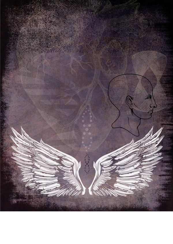
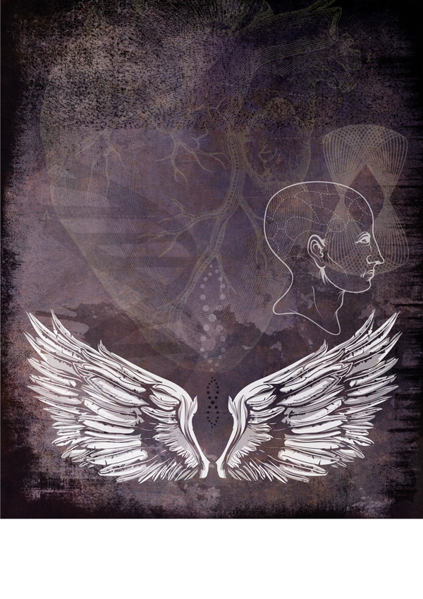
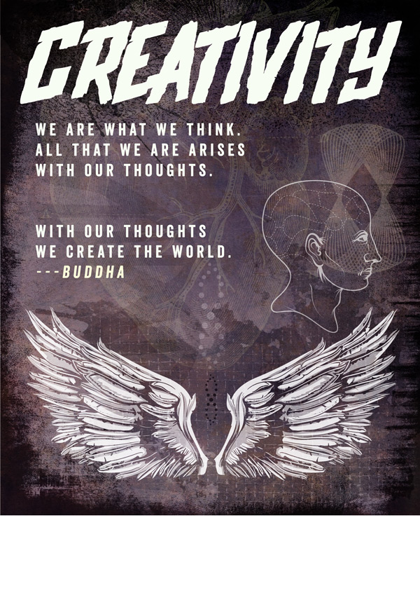
Let’s go back to our anatomy vectors, selecting the phrenology head and pasting on to our canvas as below:
We’ll add a clipped hue/saturation Adjustment Layer (they’re just so useful! ;)) to make it lighter to fit in with the rest of the design. We’ll use the following settings on this one:
Hue/Saturation Settings:
Colourize: On
Hue: 50
Saturation: 20
Lightness: +95
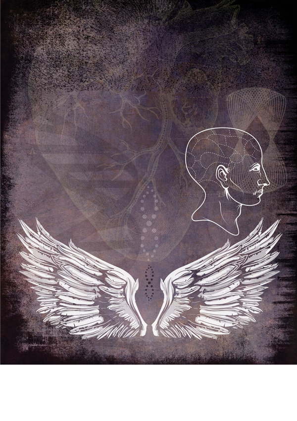
We’ll make it a little more subtle by changing the object layer to Screen and dropping the Opacity to 65%:
Step 6:
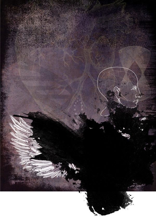
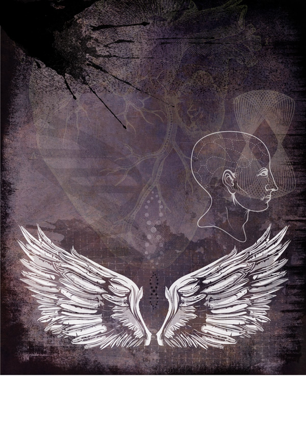
We’ll now add some fantastic, grungy ink splashes using RGough_S_Splatter15.png. Paste in to the lower right of your canvas:
These ink splashes are a tiny part of our massive Beautifully Artistic Brushes Bundle (containing over 1000 professional brushes).
We’ll change the blend mode to Soft Light and drop the Opacity to 65% so that it blends in with the rest of the design:
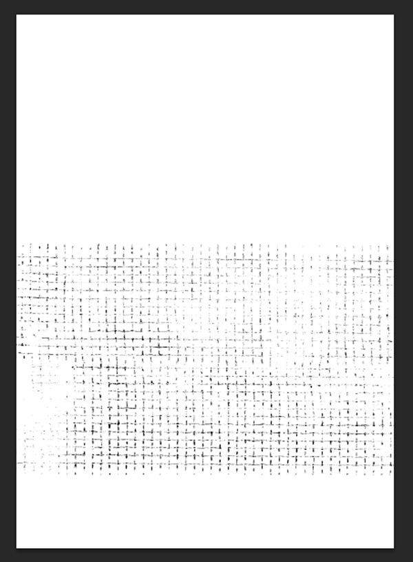
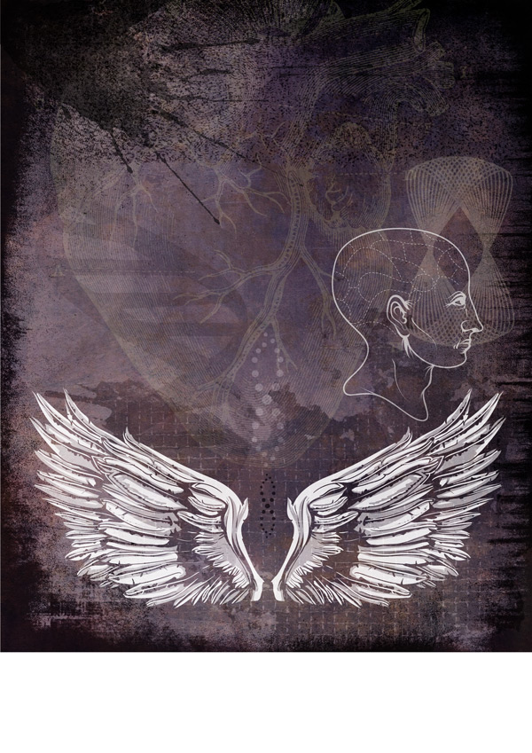
Next, we’ll up the grunge-factor by adding a textured mask to our ink splash. To do this, reopen Texture Pack Vol.3.psd this time selecting the ‘Mesh’ Layer:
Select the upper Mesh layer using the Rectangular Marquee Tool and copy. Before pasting, head back to your working document and create a Layer Mask for the ink splash. Once you’ve created the mask layer, whilst pressing ‘Alt’ on your keyboard, click on the mask layer icon to edit it directly. Paste your Mesh texture on there:
Click on the visibility icon to go back to your main document and see the result:
We’ll add one final ink splash using RGough_S_Splatter04.png and place it in the very upper left corner:
Change the blend mode to Multiply and reduce the Opacity to 60% to soften the effect slightly:
Step 7:
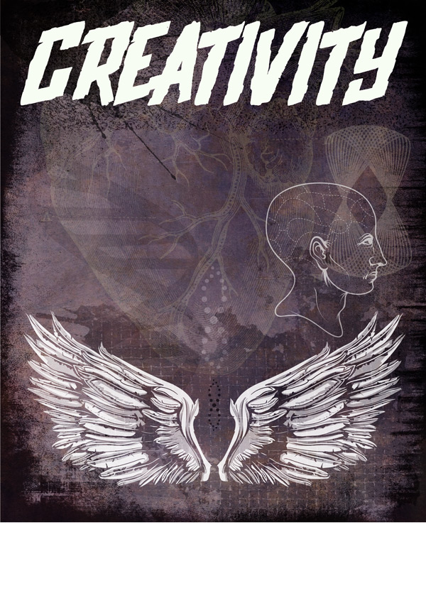
Now it’s time for some fun with fonts! Select Upjohn Rough Regular which is part of the 30 Best Selling Creative Fonts bundle, and set the colour to white.
Type “Creativity” and scale to fit within the guides we set up at the start:
Next, select the font Veneer Regular from the Huge Creative Font Bundle bundle, set the colour to white and size to 24pt. Use Veneer Italic and colour #FAFDDB for the “—Buddha” attribution at the end:
We are what we think.

All that we are arises

with our thoughts.
With our thoughts
we create the world.
---Buddha
Step 7:
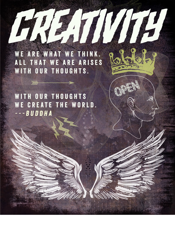
Next we’re going to use some awesome glyphs from the
Here’s a rundown of what you’ll need to type:
C = ‘Open’
Colour: white
Size: 60pt
Opacity: 70%
Z = ‘crown’
Colour: #DEE77A
Size: 148pt
Opacity: 65%
G = ‘lightening’
Colour: #DEE77A
Size: 148pt
Opacity: 50%
t = ‘arrow’
Colour: #DEE77A
Size: 100pt
Opacity: 50%
Step 8:
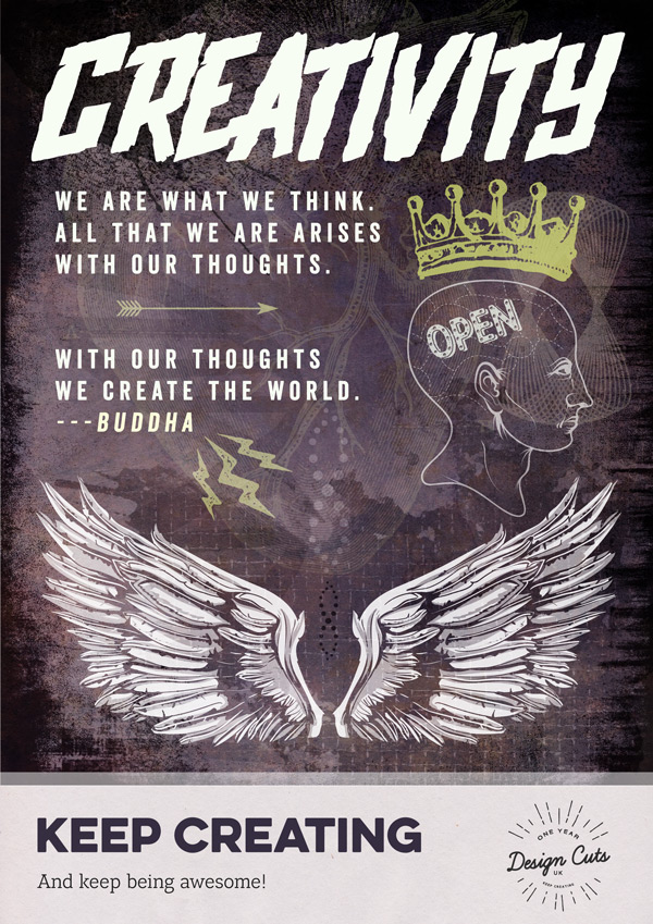
Almost done! We’ll copy our footer from the previous poster, selecting a new more appropriate colour from the background using the Color Picker Tool. In this instance, we’ve used #3B3449:
Step 9:
And finally, copy the screentexture20.jpg which we used on the previous two posters. Paste on to our working document and change the blend mode to Screen:
And we’re done!
I hope you enjoyed this week’s Birthday Bonanza tutorial, and got a taste of the variety and versatility of the deals that have been available, to help supercharge your creativity! :)
If you’ve got any comments or questions, do leave them below and I’ll keep an eye out. Also, feel free to get in touch @rockportraits!
Remember to share your designs on the Facebook page too, and we’d love to hear which deals and resources you enjoy using the most and why. :)
Hopefully this tutorial gave you some ideas on how you can use your new (or previously bought!) resources to create your own awesome designs. Remember, you can still take your pick from any of our 22 most popular deals at a mega discounted rate! Grab them below, while you still can:














































Hey there, Tina!
Fabulous tutorial! So funny… as it was going along, and element after element was layered on top, I kept thinking ‘too busy, too much stuff,’ only to see the absolute perfection of blending and balance achieved in the end result. Really an eye opener for me from a composition standpoint, and I adore the trio together.
Question: I didn’t see it in the birthday freebie pack, but didn’t see another pack credited for it either. Can you tell me what deal the ‘wings_set10.eps’ came from? I LOVE that set of wings, and definitely need to keep a look out for the next time deal is offered. ;)
Thanks so much! Being a newish fan of Design Cuts, it’s great fun to know I can work my way back through all these tutorials. And seriously. . . how fabulous that you guys offer most of the elements in freebie packs for these projects, so even when the deal is gone, we can still work through the tutorial. Yay!
With hope,
rachel
Haha, yeah sometimes you think, gosh this is too much, but once all the parts come together it’s just perfect. Jo creates some amazing tutorials. She’s so talented. :)
The wings vector is from the T-Shirt factory bundle. I’m just gonna email you about this.
Yeah, the freebie is really important to us. That way our community members can still follow the tutorials, even way after the deals expired. :)
Hi, thanks for the awesome tutorials. I noticed that the “solid-aqua.jpg” file (from the first poster tutorial) was not included in the tutorial pack download. Is there any chance I could get that file so I can follow the tutorial step by step?
Thanks,
Esther
Hey Esther,
I’m so sorry about that. We worked really hard to try and get permission for all the resources in this freebie pack, but unfortunately the solid aqua texture is not part of the freebie. If you find a similar texture you should still be able to achieve a similar look.
Sorry I couldn’t be of more help in this case.
Ok, thanks so much!
You’re very welcome, Esther. :)
AWESOME!!!
:D