In this design tutorial I will be walking you guys through the design process for creating a vintage looking car poster in Photoshop! To create our poster we will be using a retro illustration from Piddix, textures from The Beacon Collection and Vector Hut, and some decorative vector elements from Heybing Supply Co. to give you guys a small taste of what’s available in the full bundle. Let’s get started!
HAVE YOU SEEN OUR YOUTUBE CHANNEL?
Watch the video tutorial below and subscribe to our YouTube channel for regular updates direct to your inbox.
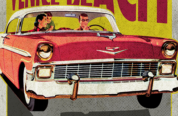
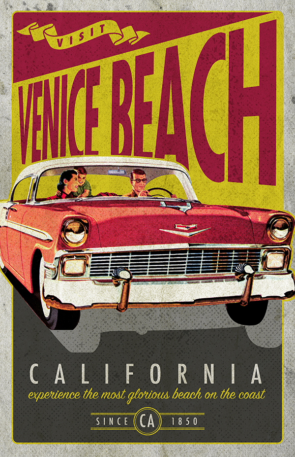
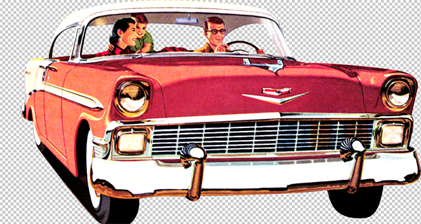
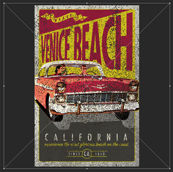
Here’s a look at what we’ll be creating:
Follow along with this tutorial: Download the freebie files
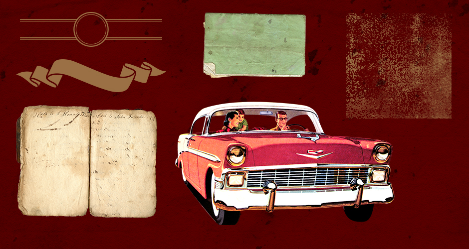
This freebie pack includes an assortment of textures, vectors, and illustrations that we will be using to create our vintage car poster.
The freebie pack is just a sample of the massive collection you can expect to find in The Eclectic, Vintage Design Library for just $29 (that’s 99% off). This bundle brings you a huge selection of top-of-the-range tools from some of the biggest names in the industry, and not just for the festive season! You will find thousands of high-quality creative resources to help keep your creative juices flowing for all of your projects, all year round!
Step 1: Vintage Car Poster
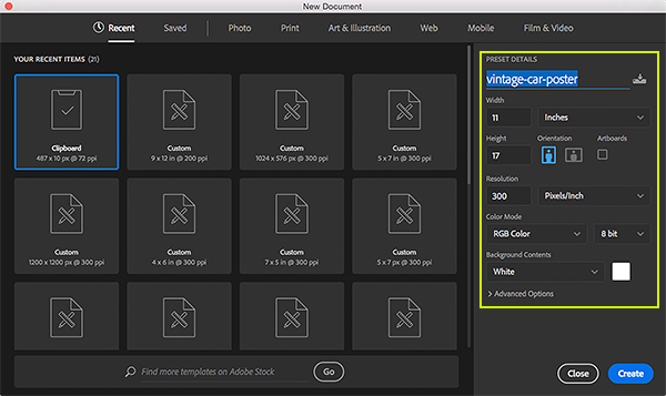
To begin we will open Photoshop and create a New Document that is 11” wide by 17” tall and set to ‘RGB’ Color Mode with the ‘Background Contents’ set to ‘White’. We’ll also want to make sure that we have a ‘Resolution’ of ‘300’ and then we will enter a name for our document. In this case I am using the name ‘vintage-car-poster’ but you can use any name you like. Once you have done that, go ahead and click ‘Create’ from the bottom right corner to make your document.
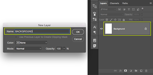
Once you’ve created your new document you should see one locked layer named ‘Background’ in your Layers Palette. Double click on this layer to unlock the layer and bring up the ‘New Layer’ dialog box. Here we can unlock the layer and rename it ‘BACKGROUND’ before clicking ‘OK’ as shown in the image below:
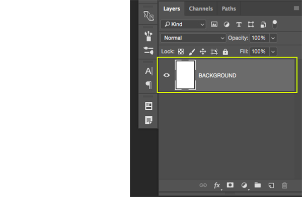
After renaming and unlocking the layer your Layers Palette should just have a single ‘BACKGROUND’ layer that is unlocked like this:
Step 2: Adding Our First Texture
Open the ‘Old Notebooks029.png’ file from the freebies folder in Photoshop.
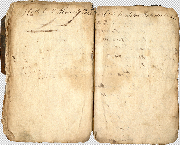
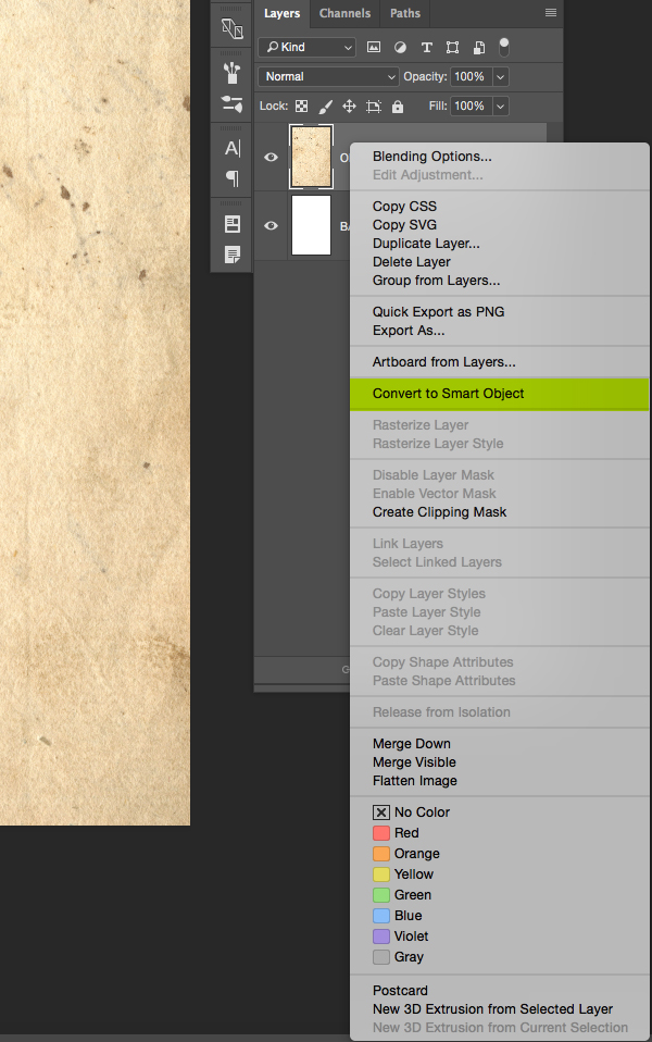
Click and drag the texture over into your document, placing it at the top of your Layers Palette. The image will be significantly larger than the canvas area but that’s alright. What we want to do is place the texture so that only the right page of the old notebook is visible on our canvas, so make sure that you don’t see the ‘gutter’ or middle of the book in your workspace. Double click on the ‘Layer 1’ text in your Layers Palette to rename the texture – here I am just going to use the name of the file itself as shown below:
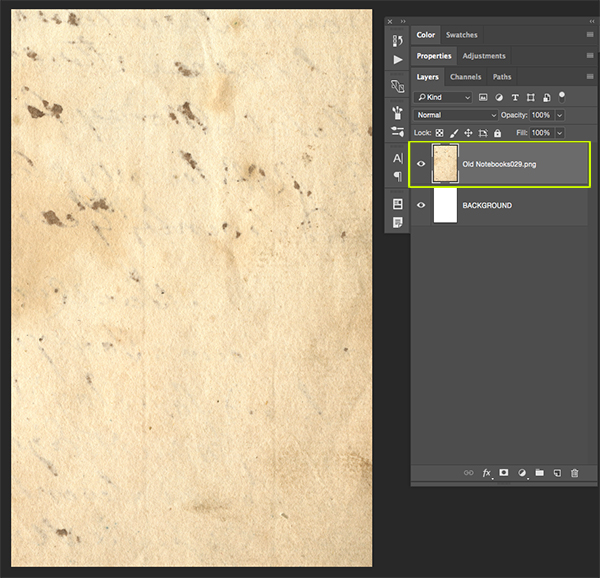
Once you have renamed your file, hold the Control Key and click on the layer to reveal a dropdown menu. From the list that appears, choose the ‘Convert to Smart Object’ option as highlighted in the image below:
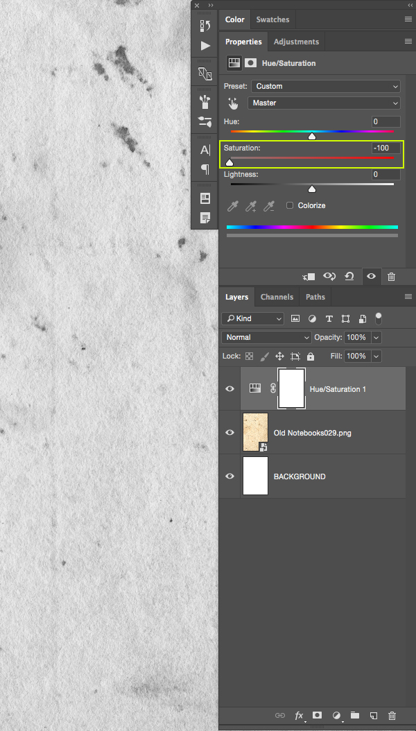
Next, click on the Adjustment Layer icon found at the bottom of the Layers Palette and you will see another dropdown menu. From this menu we want to select the ‘Hue/Saturation…’ option to apply the Adjustment Layer above our texture.

After applying the Hue/Saturation Adjustment Layer you should now see the ‘Properties’ where we are simply going to move the ‘Saturation’ slider all the way to the left to desaturate everything below this layer.
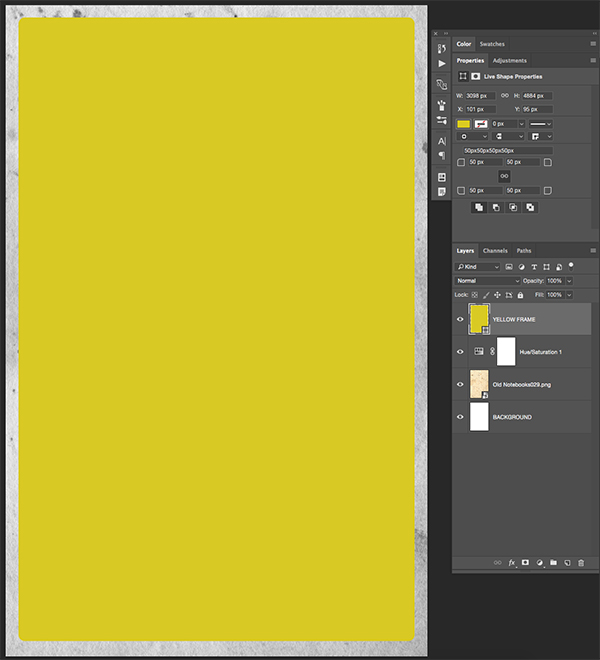
Step 3: Yellow Frames
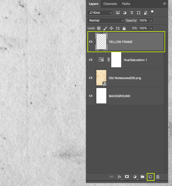
Click on the ‘Create a new layer’ icon at the bottom of the Layers Palette to add a new layer. Double click the ‘Layer 1’ text and change the name of the new layer to ‘YELLOW FRAME’ as shown below:
Press the letter ‘U’ on the keyboard and you will then have your Shape Tool. By default you will probably have the ‘Rectangle Tool’ selected, but we’re going to instead be using the ‘Rounded Rectangle Tool’ so what we want to do is click and hold on the tool in the toolbar to reveal a pop-out menu that will enable us to select the other variations of this tool. An alternative way to do this is to press ‘U’ on the keyboard while also holding the Shift Key to scroll through until you come to the ‘Rounded Rectangle Tool’.

After selecting this tool, you should see that you will now have some options in the toolbar across the top of the Photoshop interface. The option we are most concerned with from here is the ‘Radius’ option, which we want to change to a value of about ’50px’ as shown below:

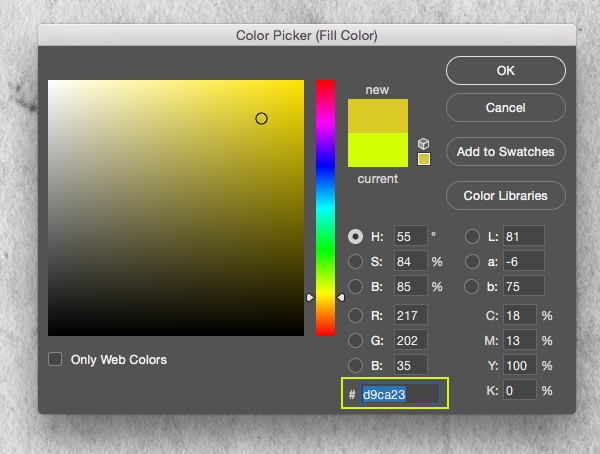
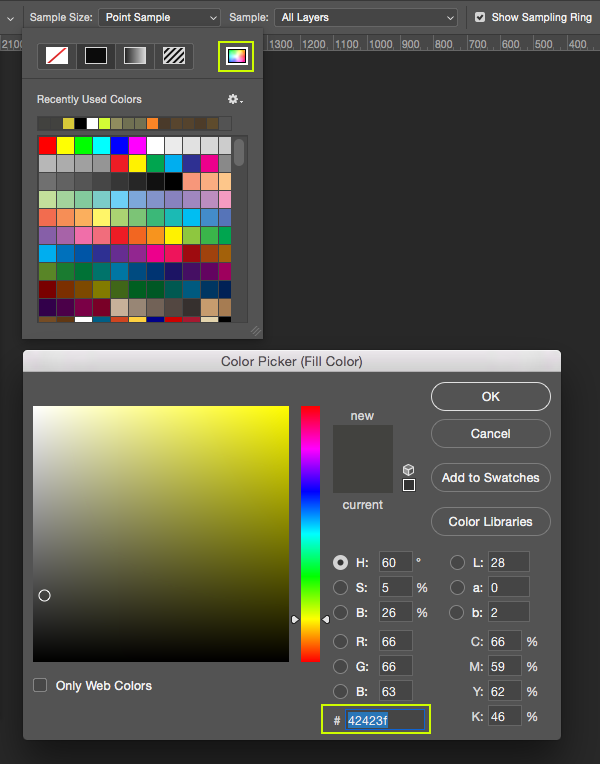
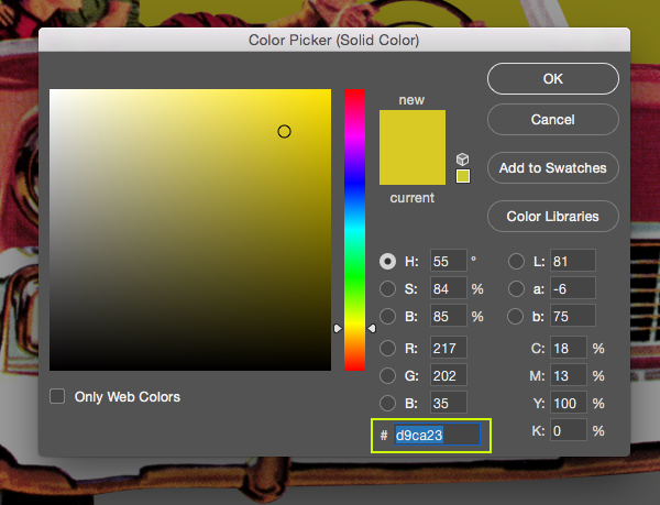
Once you change the value for the radius, click on the ‘Fill’ color to reveal the dropdown menu. From here, hold the Command Key and click on the small rainbow spectrum icon highlighted in the image below:
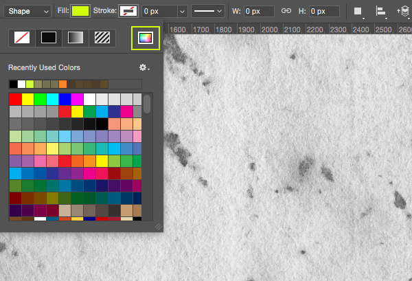
You will now be able to enter a custom fill color. For this let’s enter a hex value of ‘#D9CA23’ as shown here:
We can now click and drag on our canvas to create a large rounded rectangle with a custom yellow fill color. We want our shape to fill almost the entire canvas area leaving a bit of breathing room on all four sides so that we can still see our notebook texture on the edges like this image:
Step 4: Yellow Strokes
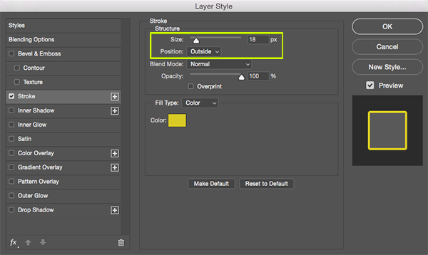
Double click on your ‘YELLOW FRAME’ layer to open the Layer Style panel and check off the ‘Stroke’ option. For the settings we want to apply an ’18px’ sized stroke and make sure the ‘Position’ is set to ‘Outside’ as shown below:
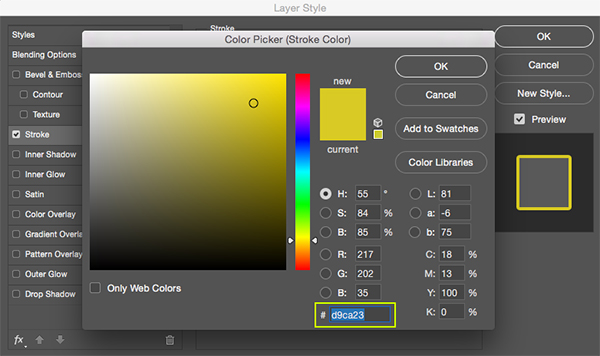
Next, change the fill color to the same color that we used previously when we made our rounded frame – ‘#D9CA23’.
Step 5: Retro Car
Open the ‘MidCenturyPeopleTwo_Car_13310.png’ file from the freebies folder for this tutorial in Photoshop. I have already taken the liberty of removing the background from this image to save you guys some time!
Click and drag the car illustration into your main document and place it at the top of your Layers Palette. Next, double click the layer name and change it to the name of the file before clicking the layer while holding the Control Key and choosing ‘Convert to Smart Object’ to convert the illustration.
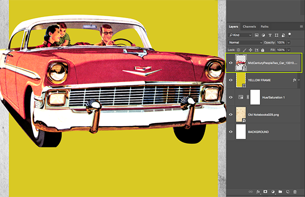
After renaming the layer and converting it to a Smart Object, position the car roughly in the center of the image as shown in the image below:

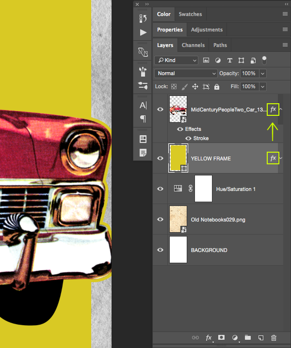
From here, hold the Control Key and click on the small ‘fx’ icon from the ‘YELLOW FRAME’ layer and drag it onto the retro car illustration Smart Object Layer. This will copy the same Layer Style effects that we applied previously onto this layer resulting in an 18 pixel yellow stroke around the outline of the car.
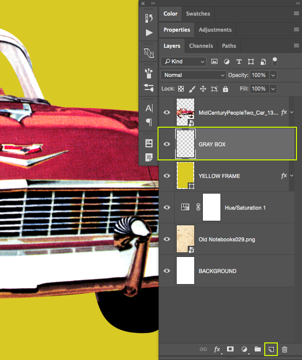
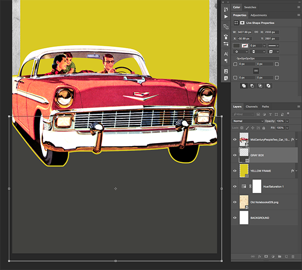
Step 6: Racing Stripes
Add a new layer just below the retro car illustration and name it ‘GRAY BOX’ as shown below:
Hold the Shift Key and press the letter ‘U’ on the keyboard until you have your ‘Rectangle Tool’ selected. You should now see the settings for your tool running across the top of the interface.

Click on the ‘Fill’ option, and then hold the Command Key and click on the color spectrum icon. From here we will enter the custom hex value ‘#42423F’ which should be a dark gray color.
Next, on your new layer, click and drag out a large gray box that runs beneath the car all the way down to fill the bottom half of your canvas like the image shown here:
Step 7: Ruby Red Rectangles
Select the ‘GRAY BOX’ layer and press Command/Ctrl+J to duplicate it. Hold the Shift Key and slide this box up towards the top of your canvas as shown below:
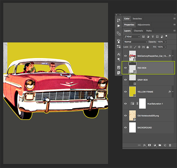
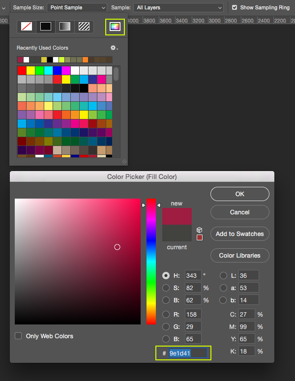
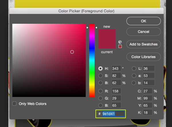
Rename this layer copy ‘RED BOX’ and then press the letter ‘U’ once again to reveal the settings along the top toolbar. From here, open the ‘Fill’ option for the shape before holding the Command Key and clicking on the color spectrum icon. This time let’s enter a hex value of ‘#9E1D41’ before pressing ‘OK’ to apply the change and close out of the dialog box.
Press Command/Ctrl+T to initiate a Free Transform and then click on the red box while holding the Control Key to reveal the dropdown menu. From this list we want to choose the ‘Distort’ option.
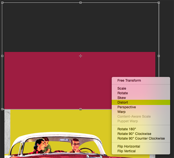
From here we will just need to drag the lower right corner of the bounding box upwards to create a more dynamic looking angle for the shape. You may also wish to move the entire shape up a bit more towards the top of the canvas like the image below:
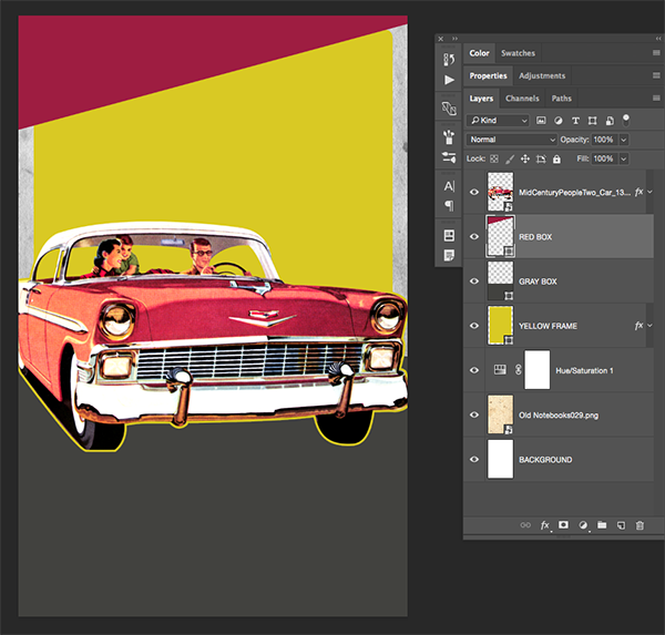
Step 8: Stripe Groups
Select the ‘RED BOX’ layer, and then hold the Shift Key and select the ‘GRAY BOX’ layer below it so both layers are selected simultaneously.
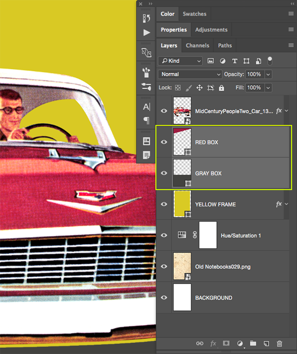
With both layers selected, press Command/Ctrl+G or select the ‘Group Folder’ icon from the bottom of the Layers Palette to place the layers into a new folder. Next, double click on the ‘Group 1’ text to rename this folder ‘COLOR STRIPS’.
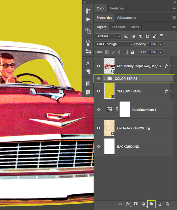
Step 9: Stripe Mask
Make sure that you have your newly created ‘COLOR STRIPS’ folder selected in your Layers Palette. From here, hold the Command Key and click on the layer thumbnail icon of the ‘YELLOW FRAME’ layer directly below. This will activate a selection around the inner part of the yellow frame, not including the yellow stroke around the shape.
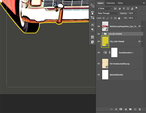
With your selection now active and your folder still selected in the palette, click on the ‘Add Layer Mask’ icon found at the bottom of the Layers Palette to apply a mask. This will ensure that the red and gray color strips are both contained within the inner portion of the yellow box.
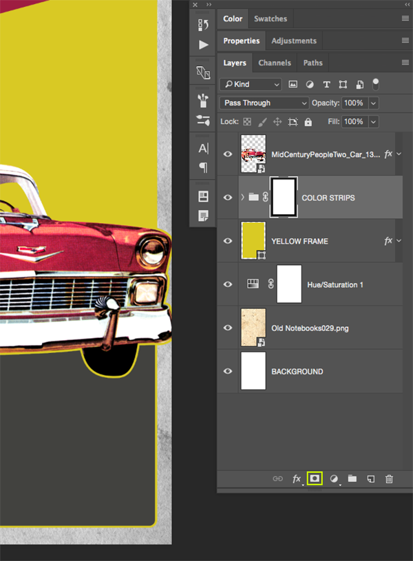
Step 10: Background Group
Next, select the ‘COLOR STRIPS’ folder, hold the Shift Key, and select the ‘BACKGROUND’ folder all the way at the bottom of your Layers Palette so all of the layers in between are selected.
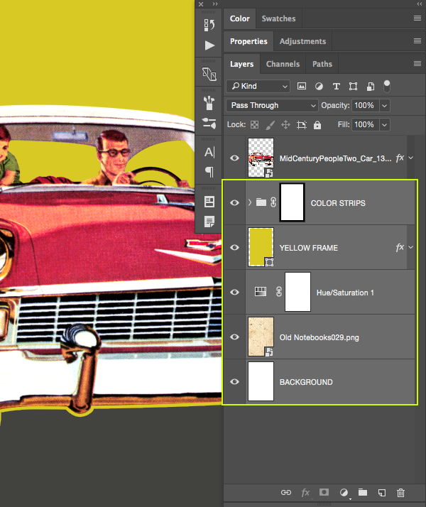
Once again, press Command/Ctrl+G or select the folder icon from the Layers Palette to place all of these layers into a new folder. From here we will simply double click on the folder name to rename the group ‘BACKGROUND’ and your Layers Palette should now look like this:
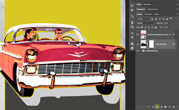
Step 11: Car Shadows
Hold the Command Key and click on the layer thumbnail icon of the retro car Smart Object layer to activate a selection around it.

With your selection still active, click on the ‘Create a new layer’ icon from the bottom of the Layers Palette, or use the keyboard shortcut Command/Ctrl+Alt/Option+Shift+N. After creating your new layer, double click the ‘Layer 1’ text and rename this layer ‘CAR SHADOW’. Press the letter ‘D’ on the keyboard to get your default colors and black should now be your foreground color. If instead you are seeing white as the foreground color, simply press the letter ‘X’ to toggle them. From here, simply press Alt/Option+Delete on the keyboard and it should fill the active selection on your new layer with solid black. Once you’ve done that, press Command/Ctrl+D to deactivate the selection.
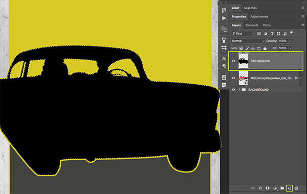
With the ‘CAR SHADOW’ layer selected, press Command and the left bracket key to move this layer down one spot so that it’s below the car. After that, hold the Shift Key and tap the shadow down and to the right to offset it until it looks similar to the image shown here:

Step 12: Lighter Shadows
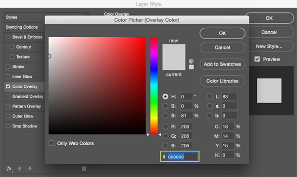
Double click on the ‘CAR SHADOW’ layer to open the Layer Style panel and check off the ‘Color Overlay’ option.
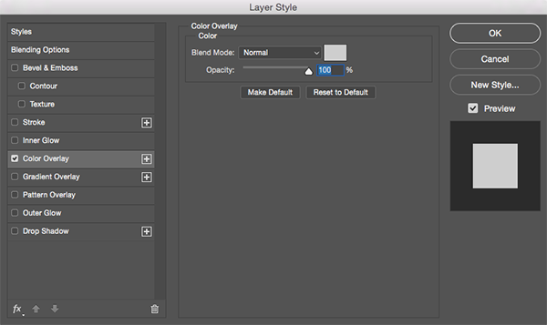
For the fill color enter the hex value ‘#CECECE’ and then press ‘OK’ to apply the changes and close out of both dialog boxes.
Step 13: Masking Our Shadows
Now that we’ve lightened up our shadows we will need to mask them so they don’t spill outside of the yellow frame. To do this we will first need to click the small arrow next to our ‘BACKGROUND’ folder to reveal the contents of the layers inside. From here, hold the Command Key and click on the layer thumbnail icon for the ‘YELLOW FRAME’ layer in order to activate a selection around it. Notice that in the image below I still have my ‘CAR SHADOW’ layer selected even though I’ve clicked the layer thumbnail icon of a different layer to use it to make a selection.
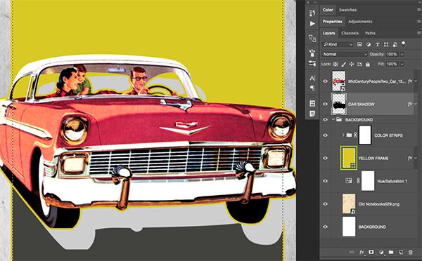
With your selection still active, and your ‘CAR SHADOW’ layer selected in your Layers Palette, click on the ‘Add Layer Mask’ icon to apply a mask to the shadow layer. Doing this will ensure that it stays contained within our frame.
Now that we’ve masked the sides of the shadow, we also want to hide the top portion that is visible through the windows of the car. For this, press the letter ‘M’ on the keyboard to get your Rectangular Marquee Tool and then click and drag a selection around the entire area around the car and the windows as shown here:
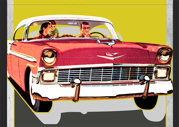
With your selection around the windows still active, click on the layer mask attached to your ‘CAR SHADOW’ layer and then press Alt/Option+Delete to fill the selection with solid black. Your image should now look like this:
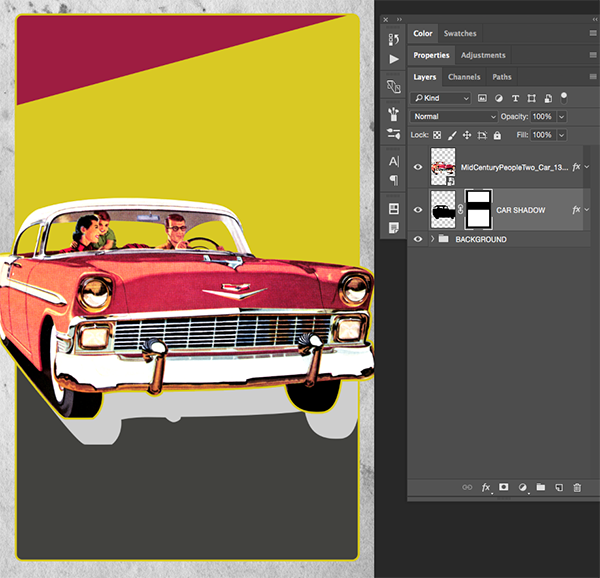
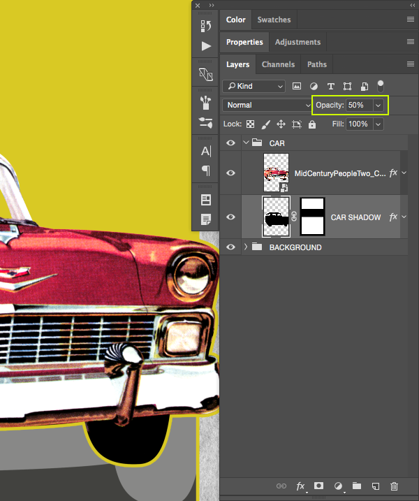
Step 14: Car Group
Select the car Smart Object layer in the Layers Palette, and then hold the Shift Key and select the ‘CAR SHADOW’ layer just below.
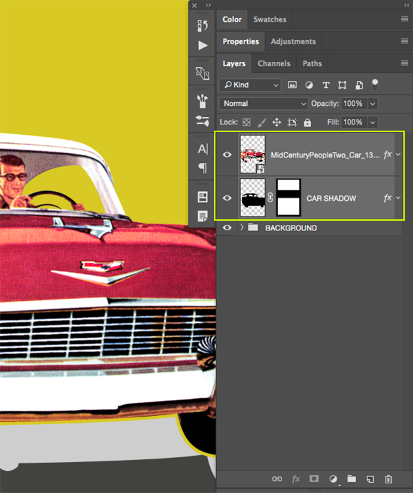
While both of your layers are highlighted in the Layers Palette, press Command/Ctrl+G to place both of these layers into a new folder. Double click the name of the folder and change it to ‘CAR’ or give it a similar name of your choice.

Before moving one we just need to make one more adjustment to the ‘CAR SHADOW’ layer so expand the ‘CAR’ folder and select the shadow layer, and then press the number ‘5’ on your keyboard or you can manually move the ‘Opacity’ slider to the left until the shadow is set to ‘50%’ resulting in a slightly less distracting shadow. After that you can collapse the ‘CAR’ folder by once again clicking the arrow to the left of the folder name.
Step 15: Venice Beach
Click on the foreground color at the bottom of your toolbar and enter the hex value ‘#9E1D41’ that we used for the ‘RED BOX’ layer earlier on.
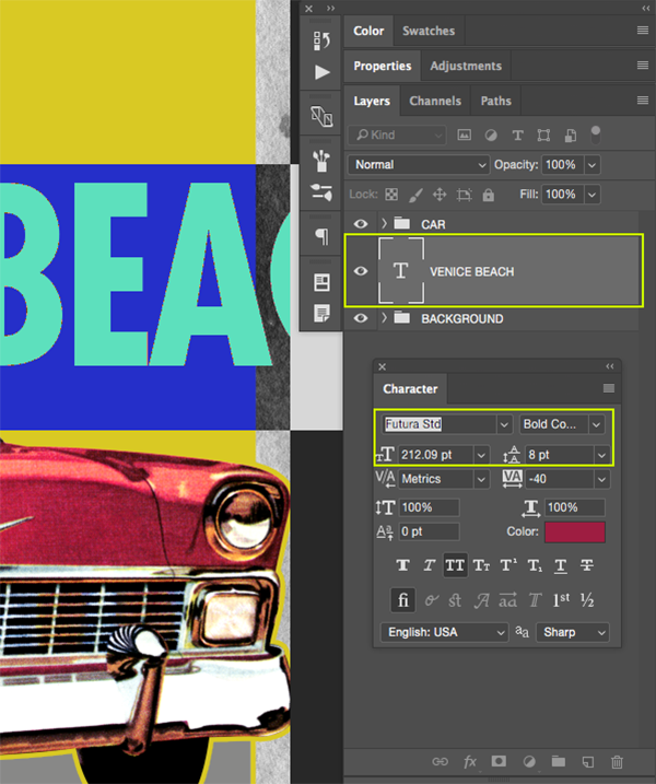
Create a new layer just above the ‘BACKGROUND’ folder, but below the ‘CAR’ folder. Next, press ‘T’ on the keyboard to get your Type Tool and type out the words ‘VENICE BEACH’ in all caps. Open the Character Panel so you can change the font settings and if you don’t see it on the right side of the interface you can always bring it up by going to ‘Window > Character’ menu. For this type I am using ‘Futura Std’ in a ‘Bold Condensed’ style, but if you don’t have this particular typeface, any bold, condensed, sans serif will do. You could also try out ‘Helvetica Neue’ in a ‘Bold Condensed’ style just as an alternative. For this part it’s okay if the text is running off of your canvas because we will be manipulating it in the next step. Once you have picked out your typeface, make the size of your text about ‘212 pt’ in size as shown in the image below:
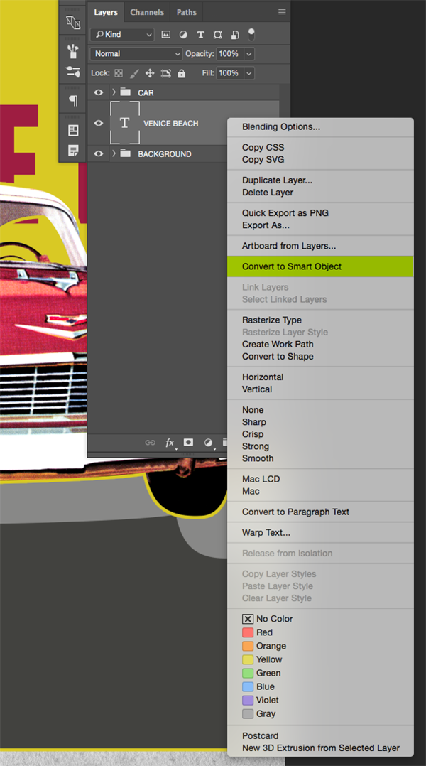
After placing your text, hold the Control Key and click on the text layer before choosing ‘Convert to Smart Object’ from the dropdown menu.
Step 16: Changing Perspective
Select your text Smart Object layer and then press Command/Ctrl+T to initiate a Free Transform. Hold the Control Key and click on the text on your canvas to reveal a dropdown menu. From this list we want to choose ‘Perspective’ as shown here:
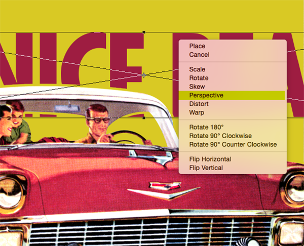
Move your cursor over the upper right corner of the bounding box and then drag upwards while holding the Command/Ctrl+Alt/Option+Shift keys all at the same time. Doing this will make the right side of the text appear to be coming closer as it extends on the top and the bottom simultaneously. Your text should look something like this:
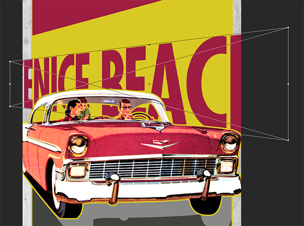
Before applying the changes, hold the Control Key and click once again on the text on your canvas to bring up the same menu once again. This time we will choose ‘Distort’ from the menu as shown below:

What we want to do now is use the diagonal red strip along the top of the image as a guide. We will click the upper left corner of the bounding box and place it beneath the left side of the red box, and then grab the upper right corner and bring it in, placing it just below the right side of the diagonal red box. We will also want to bring in both of the lower corners so that the text appears to run straight down. Once you are happy with the appearance of your text and it looks good, press ‘Return’ on your keyboard to apply the transformation. Here is how my text looks after applying these changes:
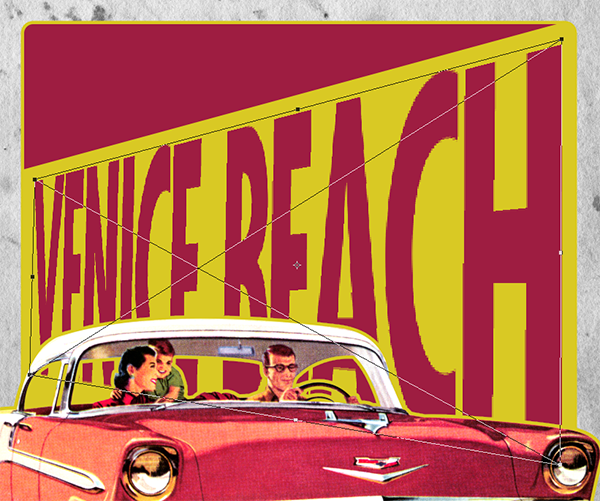
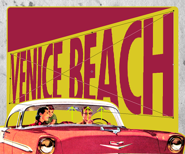
The last thing we need to do for our text is make it shorter vertically, so we will do that by once again pressing Command/Ctrl+T to initiate another Free Transform, and then click and drag the middle point of the bottom of the bounding box upwards until you can see the bottom of the letters behind the top of the car. Your image should now look something like this:
Step 17: Racing Ribbons
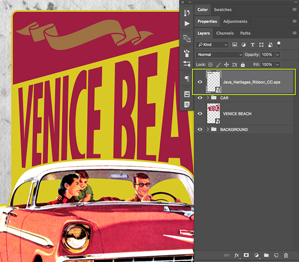
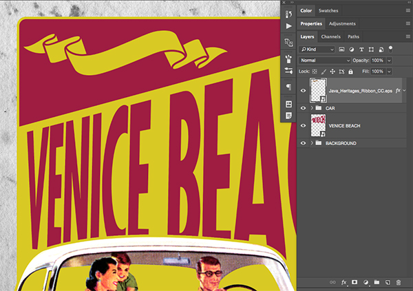
Open the ‘Java_Heritages_Ribbon_CC.eps’ file from the freebies folder for this tutorial. There are several versions of this file saved so be sure to use which ever version is compatible with your version of Illustrator.
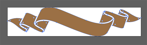
Once the file is open, press Command/Ctrl+A to ‘Select All’ and then Command/Ctrl+C to copy the ribbon. Then, return to Photoshop and paste the layer as a Smart Object into your file. Here I have placed the ribbon in the upper left corner while also scaling it up a bit by dragging outwards from the corner of the bounding box while holding the Shift Key. Also, let’s change the name of the layer to match with the file name so we can identify it quickly and easily.
Step 18: Old Yeller
Double click the vector ribbon layer to bring up the Layer Style panel, and then check off the ‘Color Overlay’ option.
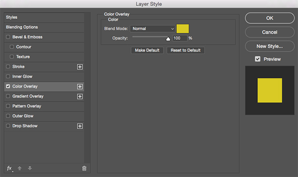
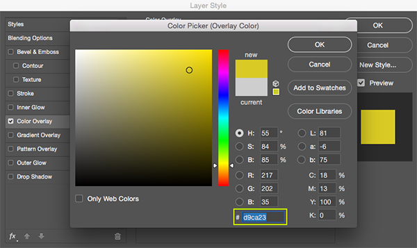
For the fill color let’s enter a hex value of ‘#D9CA23’ as shown below:
Press ‘OK’ twice to apply the changes and close out of both dialog boxes. Your ribbon should now look like this:
Step 19: Come and Visit!
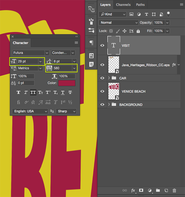
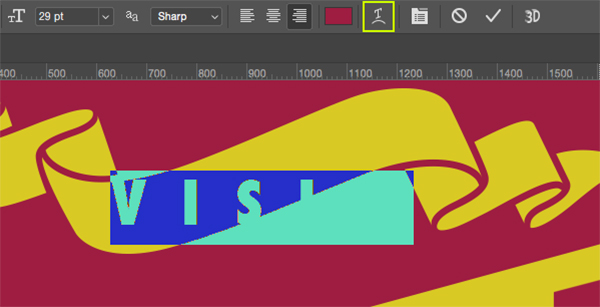
Create a new layer just above the vector ribbon layer, and then press ‘T’ on the keyboard to switch to your Type Tool. Click your cursor around the ribbon and then type out the word ‘VISIT’ in all caps using the same typeface that we used for ‘VENICE BEACH’ earlier on. You will need to once again open the Character Panel and set your type size to about ’29 pt’ and the tracking should be set to ‘580’ as shown here:
With your Type Tool (T) still active, click two or three times inside of your text box to highlight the type. Once the type is highlighted we will then go towards the top toolbar across the interface to choose the small ‘T’ icon with a curved line underneath it. This is the tool we will be using to warp our text and make it fit nicely inside of the banner.
Once the ‘Warp Text’ panel opens you will see a menu next to the word ‘Style’ that we can click on. Click on the menu to reveal the warp options and then choose ‘Rise’ from the list.
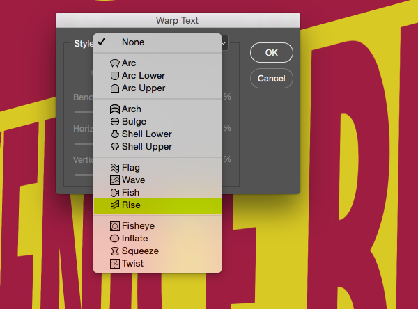
For our settings, let’s make sure that we have it set to a ‘Horizontal’ bend at about ‘59%’ before we apply the change as highlighted in the image below:

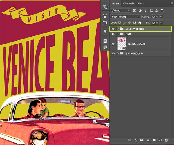
After applying the warp to our text, let’s move it so that it fits nicely in the center of our yellow ribbon. Once you are happy with the placement, select the ‘VISIT’ text layer, hold the Shift Key, and then click on the ribbon vector layer below so both layers are selected together. After that, press Command/Ctrl+G to put both layers into a new folder and rename it ‘YELLOW RIBBON’ like this:
Step 20: Lonely Beaches
Since we have placed all of our layers into folders except for our ‘VENICE BEACH’ text, let’s go ahead and do that just for the sake of consistency and keeping our file neat and organized. All we are going to do here is select the layer and then press Command/Ctrl+G to put it into a folder that we will call – you guessed it! ‘VENICE BEACH’ so our Layers Palette now looks like this:
Step 21: Going Back to Cali
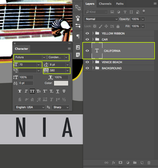
Create a new layer just above the ‘VENICE BEACH’ folder and grab your Type Tool (T) before typing out the word ‘CALIFORNIA’ in all caps on your canvas. Bring up the Character Panel and use a regular or medium condensed style of ‘Futura’ that we used earlier. For the settings let’s make the size about ’70 pt’ and keep the tracking at around ‘580’. We also want to make sure that our text is a light gray color so all we need to do to change the color is click inside of our text box to highlight the type and then click on the ‘Color’ option inside of our Character Panel and changing it to ‘#DCDAD6’.
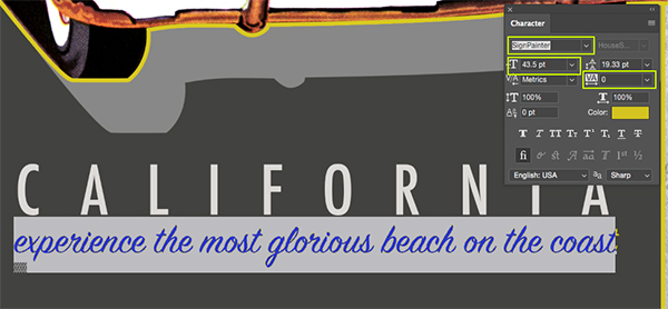
With your Type Tool (T) still selected, add another new layer just below the ‘CALIFORNIA’ layer and type out the phrase ‘experience the most glorious beach on the coast’ in all lowercase. This time we will mix things up by using the free font ‘SignPainter’ with a tracking setting of ‘0’ so our letters look connected. Let’s also go ahead and change the size to about ‘43.5 pt’ so it matches the width of the ‘CALIFORNIA’ text above it. Lastly, click on the ‘Color’ option here and then sample an area of our yellow color or change it manually to the hex value ‘#D9CA23’ as shown below:
Select the ‘CALIFORNIA’ text layer, then hold the Shift Key and select our script layer below so they are both selected at the same time.
From here, press Command/Ctrl+G to place these two text layers into a new folder and rename it ‘CALIFORNIA’ as shown here:
Step 22: Adding the Badge
Next, open the ‘Java_Heritages_Badge_CC.eps’ file from the freebies folder in Illustrator. Press Command/Ctrl+A to ‘Select All’ and then copy it by pressing Command/Ctrl+C. From here, you can close the file and return to Photoshop.

Paste the badge as a Smart Object into your document and change the layer name to the name of the file or use something that will make it easy for you to identify. Use the image below as a guide for the size and placement of the badge.
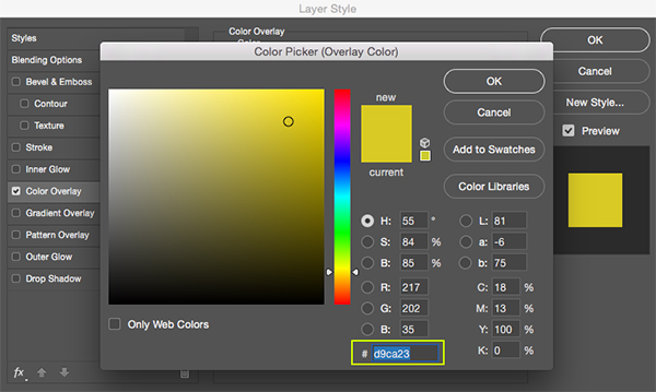
Double click on the badge layer to bring up the Layer Style panel and check off the ‘Color Overlay’ option.

For the fill color use the hex value ‘#D9CA23’ and then click ‘OK’ to apply the changes and close out of both dialog boxes.
Step 23: Since 1850
Create a new layer just above the vector badge and then press ‘T’ to switch to the Type Tool. Using the same regular or medium style of our condensed font, type out the letters ‘CA’ and place it inside the circular portion of the vector badge. For the settings I am using the same light gray color as our ‘CALIFORNIA’ text, which is ‘#DCDAD6’ a size of about ‘45.85 pt’ and a tracking setting of ’60’ as shown below in the character panel:

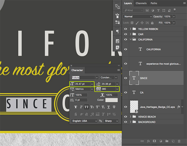
Press Command/Ctrl+J to duplicate the layer, and then press Command/Ctrl+T to move it towards the left while holding the Shift Key. Once you’ve placed this copy over to the left press ‘Return’ on your keyboard to apply the transformation. From here we will grab our Type Tool (T) and click inside of the text two or three times to highlight it and type out the word ‘SINCE’ in all caps. Open up the Character Panel if you don’t already have it available and then reduce the size of the text to ‘25.47 pt’ and the tracking should be set to ‘380’ before placing it in the center of the left side of the badge as shown here:
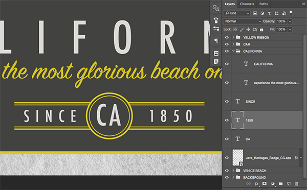
Next, create a copy of the ‘SINCE’ layer by once again pressing Command/Ctrl+J and this time slide the copy of the text over to the right side of the badge. Click inside the text box with your Type Tool (T) and change the text to ‘1850’ before centering it. Your badge should now look like the image shown here:
Select the vector badge layer, hold the Shift Key, and then select your top text layer from this lockup. You should now have all of the badge layers selected together like this:
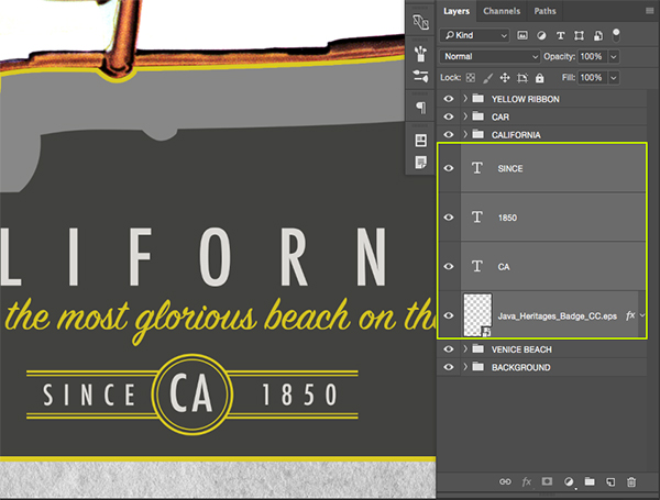
Click on the folder icon at the bottom of the Layers Palette or press Command/Ctrl+G to place these layers into a new folder and rename it ‘BADGE’ as shown in the image below:
Step 24: Backing It Up
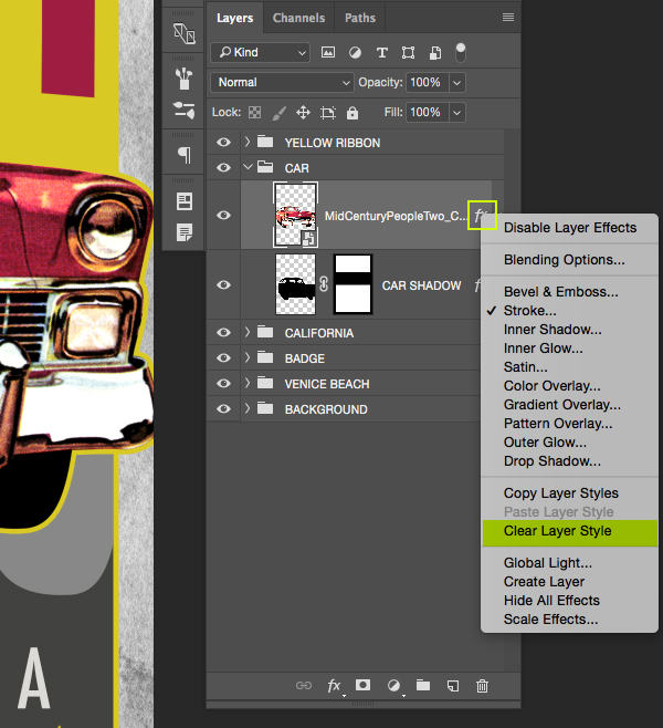
Before moving on there is something that we should go back and fix on the retro car illustration. At the moment we have the yellow outline going all the way around the car via the Layer Style we applied earlier on, however, we want it so that we can get rid of the yellow line on the lower portion of the car. Since we can’t do that only using the ‘Stroke’ option we will manually create an outline around the car and then leave only the parts that we want visible. To start, click the small arrow on the ‘CAR’ folder to reveal the contents of the folder and then hold the Control Key and click on the small ‘fx’ icon to reveal a dropdown menu. From this list we will then choose ‘Clear Layer Style’ as shown below:
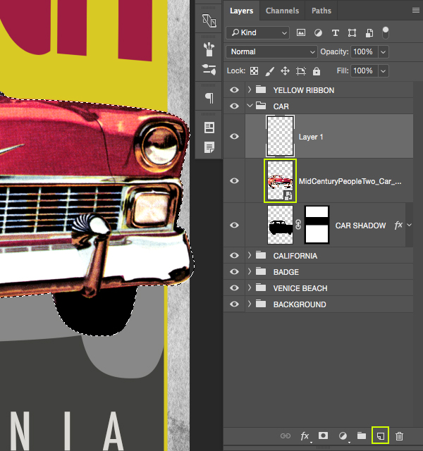
Hold the Command Key and click on the layer thumbnail icon of the retro car illustration to activate a selection around it, and then add a new layer just above the car.
While your selection is still active, select your new layer and then go to the Select Menu and choose ‘Modify > Expand’ as shown here:
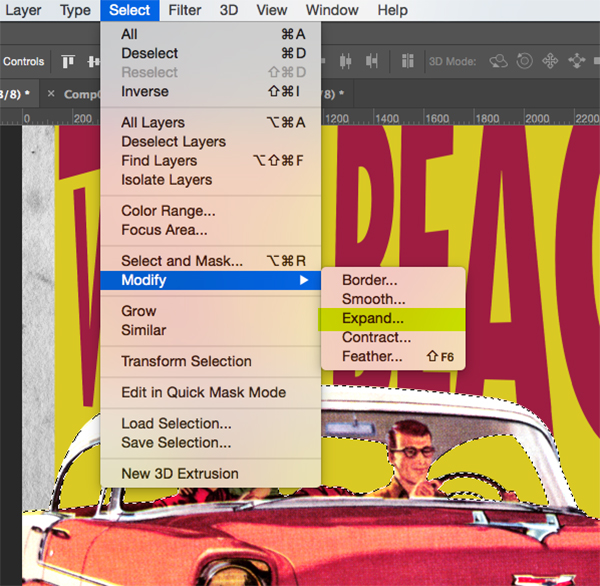
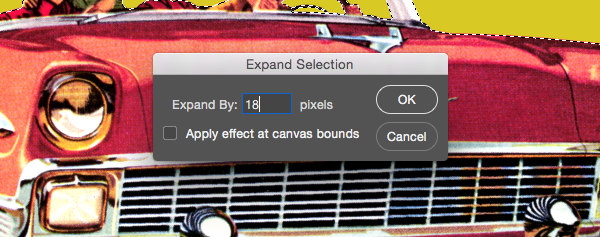
When prompted with the ‘Expand Selection’ dialog box, enter a value of ’18 pixels’ and then press ‘OK’ to expand the selection.
Set your foreground color to the same yellow color we have been using – ‘#D9CA23’ and then press Alt/Option+Delete on the keyboard to fill the selection on your new layer with yellow. Rename this layer ‘YELLOW STROKE’ and then press Command/Ctrl+D to deselect everything. From here, press the Command Key along with the left bracket key on your keyboard to move this layer down one place so that it is now beneath the car illustration. Conversely, you could also just manually drag the ‘YELLOW STROKE’ layer below the car.

Press ‘M’ on the keyboard to get your Rectangular Marquee Tool and then zoom in by pressing Command/Ctrl and the ‘+’ key on the keyboard. You can hold the spacebar and then use the Hand Tool to drag your way around the document. Let’s get in close to the left side of the car and then click and drag downwards to create a rectangular selection that follows the inside of our frame, dragging the box out to the opposite side so that we wind up with a selection that looks like this:

From here we can simply press ‘Delete’ to remove the yellow stroke from the bottom of the car. At this point you should only see the yellow stroke on the top and the sides of the car which is exactly what we want. The yellow line on the top of the car helps to break up the car from the type, and the stroke on the sides tie it together with the outline around our frame.

Step 25: Time For Texture
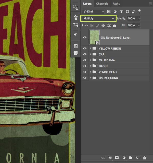
Open the ‘Old Notebooks013.png’ file from the freebies folder in Photoshop.

Click and drag the texture into your working document and then convert the layer into a Smart Object before renaming it with the name of the file. Also check to make sure that the texture is at the very top of the layer stack. Once you have done that, change the Blend Mode of the layer from ‘Normal’ to ‘Multiply’ as shown here:
Next, select your texture Smart Object and then hold the Alt/Option Key and click the Adjustment Layer icon from the bottom of the Layers Palette. When the menu appears we want to choose ‘Hue/Saturation…’ from the list.
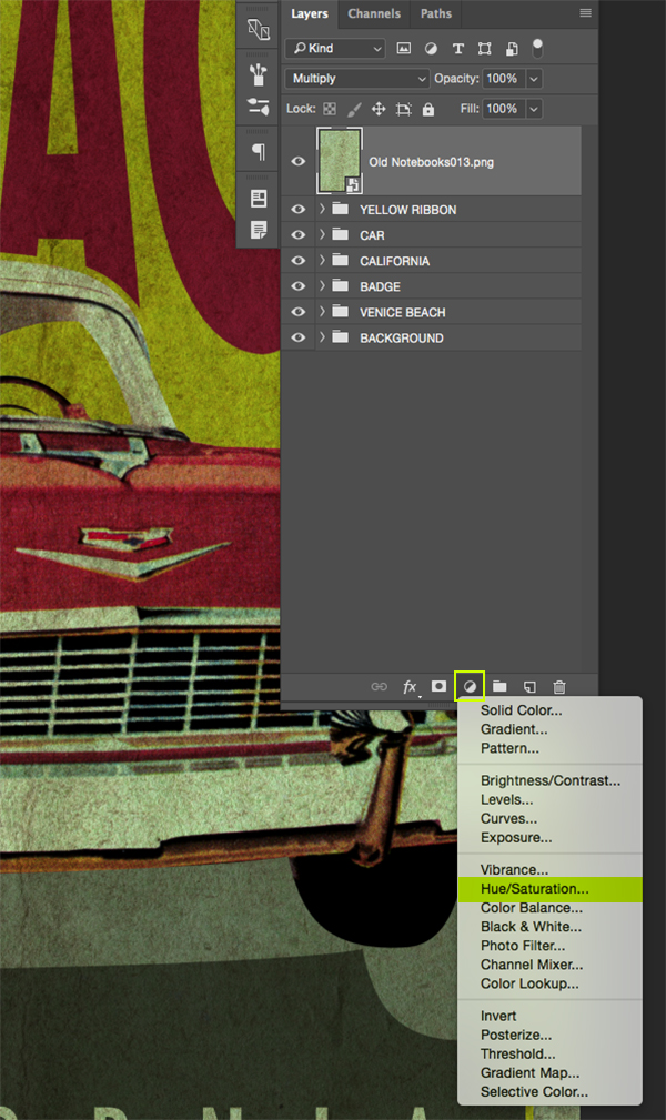
When the ‘New Layer’ dialog box appears make sure to check off the box that says ‘Use Previous Layer to Create Clipping Mask’ and then click ‘OK’.

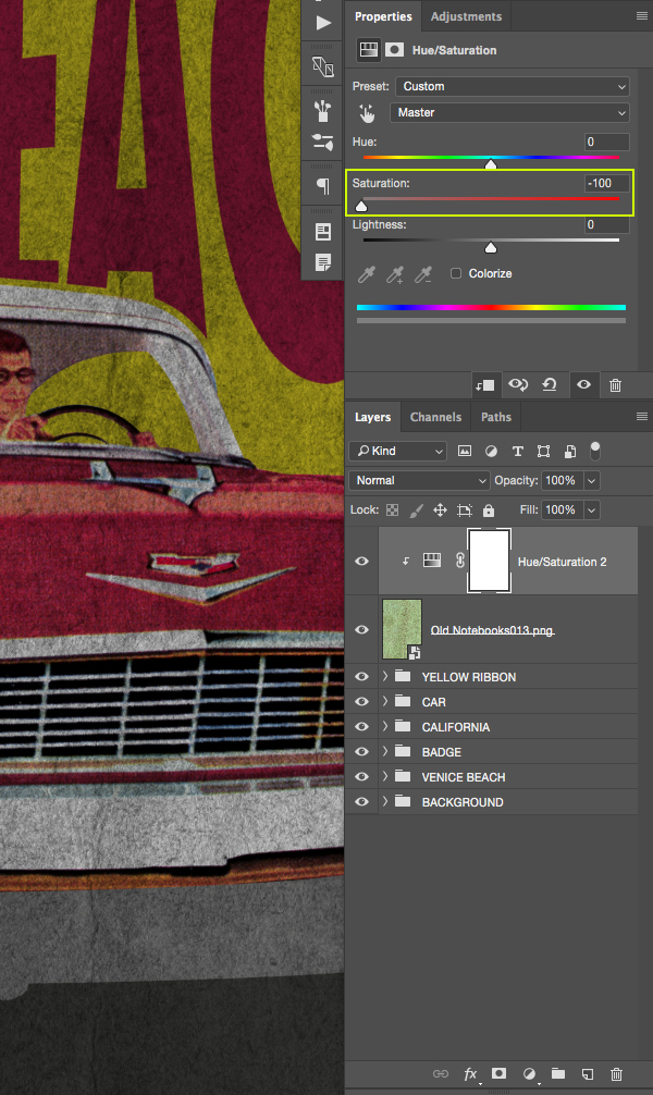
Your Hue/Saturation Adjustment Layer will now be added with a Clipping Mask so that it only affects the texture layer below. For the properties let’s now move the ‘Saturation’ slider all the way to the left to completely desaturate the texture like this:
Step 26: Leveling Out
Once again select your Smart Object texture at the top of the layer stack and then click the Adjustment Layer icon at the bottom of the Layers Palette. This time we want to choose ‘Levels…’ from the list that pops up.
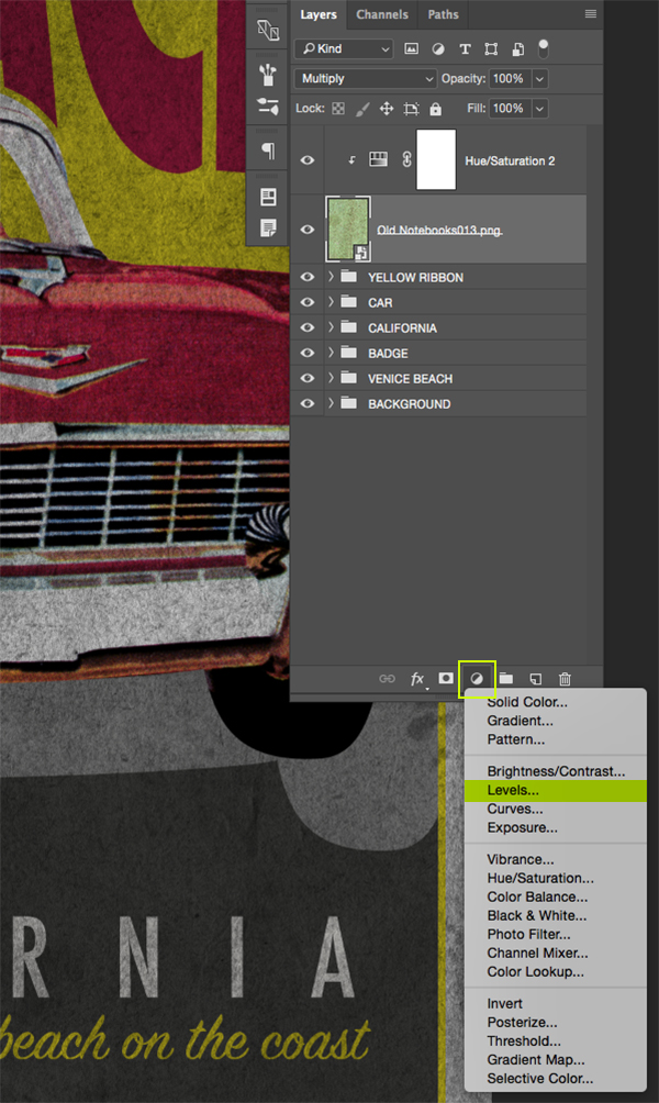
Since we already created a Clipping Mask for our Hue/Saturation layer this one should automatically be clipped as well. For the properties all we need to do is move the white slider on the right side in towards the left until it’s set to ‘175’ as shown in the image below:

Step 27: Private Screening
Let’s go ahead and add one more Adjustment Layer by first selecting our Smart Object texture, then clicking the Adjustment Layer icon and choosing ‘Solid Color…’ from the top of the list.
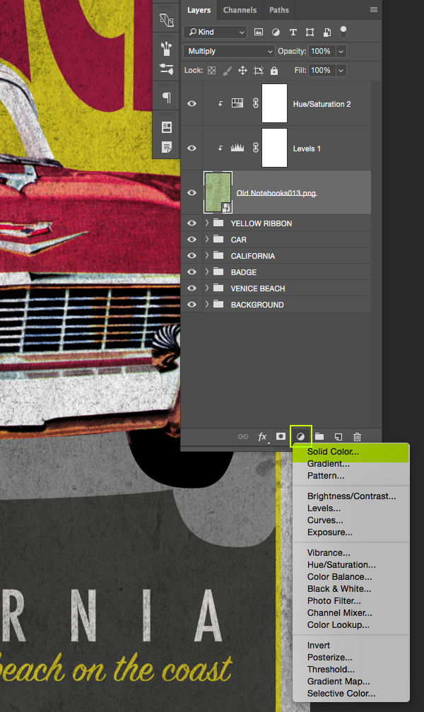
For the color, we are going to once again use our yellow – ‘#D9CA23’ and then click ‘OK’ to apply the changes.
After picking our color, press the Command Key and the right bracket two times on your keyboard to move the ‘Solid Color…’ layer above the Hue/Saturation and Levels Adjustment Layers. It is important to note that if we press the Command Key and the right bracket more than two times it will no longer have the Clipping Mask applied to it, so we want to make sure that this layer is still clipped. If you happen to mess up, you can simply move it down one spot in the layer order. Once you’ve moved the layer in the correct spot, change the Blend Mode from ‘Normal’ to ‘Screen’ and reduce the opacity to about ‘50%’ as shown below:

Step 28: Vector Texture
Next, open the ‘The_Beacon_Collection_Texture_CC.eps’ file from the freebies folder for this tutorial in Illustrator. Press Command/Ctrl+A to select everything and then Command/Ctrl+C to copy it before closing the window and returning to Photoshop.
Once you are back in Photoshop, press Command/Ctrl+V and paste this as a Smart Object before pressing ‘OK’ to bring in the vector texture. After that, rename the layer with the name of the file.

By default, the texture will appear pretty small, so we want to scale this up by dragging any of the four corners of the bounding box outwards while holding the Alt/Option+Shift keys and make sure the texture covers the whole canvas before pressing ‘Return’ to apply the changes.
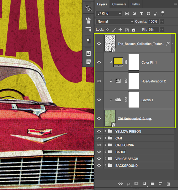
Once we have set the size and placement of the texture we are going to set the ‘Fill’ of the layer all the way down to ‘0’ to make it disappear as shown below:
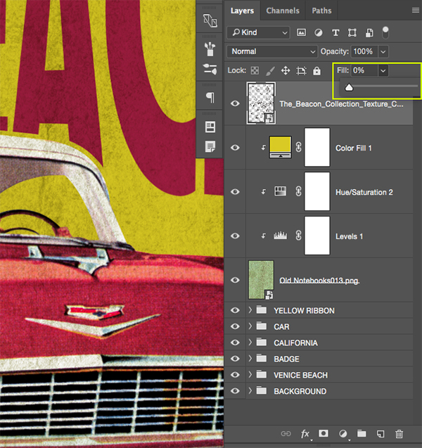
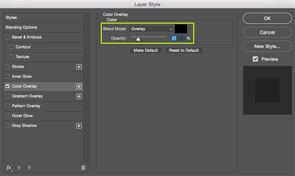
Double click on the vector texture layer to bring up the Layer Style panel and check off the ‘Color Overlay’ option. For this we will use a solid black color and change the Blend Mode to ‘Overlay’ before reducing the opacity to about ‘22%’. Once you have done that, go ahead and press ‘OK’ to apply the changes and bring back the texture.
Step 29: Texture Groups
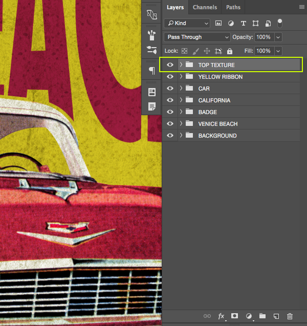
Select the vector texture layer at the top of your Layers Palette, and then hold the Shift Key and click on the old notebook texture so all of your textures and Adjustment Layers are selected at the same time like this:
Press Command/Ctrl+G on the keyboard to place all of these layers into a new folder and rename it ‘TOP TEXTURE’ as shown below:
We have now completed our Vintage Car Poster! We designed this image with a small handful of elements from this completely packed design bundle. The full bundle has hundreds of vintage photos, textures, and fonts for your next project. This eclectic library of beautiful work will surely help you step up your design game and we can’t wait to see what you create with these amazing resources!
Remember that whether it’s your outcome for this tutorial or something new you’ve made, we’d love to see your designs on our Facebook page.
Please leave a comment if you have any questions or suggestions. I always look forward to hearing from you!
There’s still time to check out The Eclectic, Vintage Design Library featuring thousands of high-quality creative resources ranging from ready to use elements to professional-grade effects packs. This bundle will be your new best friend making sure you are never stuck for that perfect brush or texture all for an unbeatable price of $29!
I am happy every week. Actually always interesting and fun.
Hey Ulrike,
Thank you so much for your lovely comment and we are so pleased to hear you are happy with the website and what we release! We hope that this year brings you lots more fun projects to try and inspire your own work :)
Hey thanks for the first tutorial of the year. I’m having an issue though, the car file downloaded in the piddix folder here still has the background. Could you check and maybe reupload with the transparent version? Thanks!
Hey Antoine,
Thanks so much for your comment and we are so sorry about this!
We have reached out to Eric this morning to see if we can get the transparent file for you all. If we are able to get hold of this, we’ll get it added to the freebie download :)
Hey Sarah, well done thnx!
Actually I’m not using PS or AI so some steps like this one can get very tricky (i.e. also having a challenge with Venice Beach perspective and distortion transformations but that one is on me to figure out :) )
You’re so welcome and i’m sorry to hear that you are having trouble!
If there is anything I can help with, feel free to pop me over an email :)
I’ve noticed that many of the DesignCut tutorials often import files using the following method:
1. Open the desired element image file from the freebie folder.
2. Drag the file image layer into the main document window.
3. Right-click (or Control-click on the Mac) on the layer and choose the Convert to Smart Object option from the menu.
4. Double-click the layer name to rename the layer to the same name as the source filename.
An example of this would be Step 2 import of the Old Notebook texture file. Over the course of the tutorial, many unnecessary steps are repeated for each imported freebie item when there is a quicker and easier method to accomplish the same results listed above.
Thus as an FYI, you might want to eliminate most of the above step method by substituting the following method:
1. Using Windows Explorer (and guessing the same idea will work from Finder on a Mac)… drag the file from Window Explorer (or Mac’s Finder) into the main Photoshop document window.
NOTE: This may result with a bounding Transform box around the new layer object (in case the user wishes to resize the imported object). Also note that holding the Shift key while dragging will center the new object into the destination window.
2. If the Transform bounding box is displayed, press Enter if no resizing is needed (or after resizing has been applied as desired)… and voila… the same result is achieved in one swoop in which a new Smart Object layer is generated with the layer using the source filename as the new layer name.
Give it a try and save some steps, typing, and time future work or future tutorials.
All my best,
Mara
Hey Mara,
Thanks so much for your feedback on this one!
I guess this is just the way our tutorial writer, Eric likes to work, but it’s great to see other methods too and I am sure this will come in super handy for our community :)
Wow, thanks for this incredibly detailed tutorial! I did see one thing that thrilled me until I tried it: it says if you hit control + FX you can copy the layer styles. What a timesaver that would be. I tried it, and it didn’t work. So I looked it up and it’s actually ALT+ FX. (Which makes sense, since ALT+ anything copies it.) Anyway, just wanted to let you know so other people can enjoy this wonderful trick that’s gonna save me so much time from right-clicking and searching for “Copy Layer Styles” all the time. God bless! :)
Hey Rebekah,
Oh that’s great news, thank you so much for sharing this!
We’re glad you liked this one and learnt something new :)
Thanks, this is fun, and im learning a lot. Can you recommend a good tutorial on removing the background for the car? Im havung a hard time of it. Thanks!
Hey Brandy,
That’s great news, thank you for letting us know!
I’ve just popped you over an email with regards to removing the background :)
To tools2:
There are two methods I would recommend for removing the background. The first method as follows:
1. Add a layer mask to the layer.
2. If needed, press D (for default colors of black and white)
3. Choose the brush tool and start painting with black on the layer mask icon to hide the pixels
4. If you make any mistakes, press X to switch white to the foreground, and paint the pixels back in where you want them. Simply press X again to switch back to black as the foreground color and to continue painting to hide pixels (when done correcting mistakes).
NOTE: Make sure the layer mask icon is active and selected whenever painting or fixing the mask. If the image icon is active and not the mask icon, then you will be painting on the image instead of painting to hide or show pixels. You should see a thin outline around the layer mask icon when it is the active selection on the Layers Panel.
It might be useful to also know that when painting around the border of the object, I like to use a small 5 px brush with 50% hardness for precision around the edges of the desired object. When the brush tool is active, simply right-click anywhere on the canvas to get quick access to brush settings, and be sure to press Enter to dismiss the settings dialog box (when finished adjusting the settings). The bracket keys on the keyboard can be used to increase or decrease the brush size quickly. Left bracket key [ to decrease and right bracket key ] to increase.
The second method and my personal favorite is to use the Quick Mask method. If you never used Quick Mask, I would recommend adjusting the default settings before using the tool. To do this, first locate where the Quick Mask icon resides on the Tools Panel — look at the bottom of the Tools Panel. Hover over the bottom button that looks like a mask icon and a tool tip should appear as “Edit in Quick Mask Mode”
Next to adjust the default settings, double-click on this icon and a settings dialog box will appear. The default setting is “Masked Areas” which means that where ever you paint, the opposite areas will be masked. I recommend changing this option to “Selected Areas” to avoid confusion so the areas you paint will be the selected areas in the image. Once you change the settings, they will stay permanently changed until you wish to revisit the dialog box and change them again. The default color setting works fairly well but if you ever wish to change it, then revisit this settings box to change it here. This is a color overlay that will give you a visual clue as to what you are selecting (as you paint). Click OK to exit the settings box and do the following:
1. First make sure that the image layer on the Layers Panel is not a locked Background layer. Do this by double-clicking on the layer and renaming the layer or accept the default “Layer 0” name in the Layers Properties dialog box and click OK.
2. You may also wish to keep a copy of the original layer, so press Ctrl+J to duplicate the layer and turn off the visibility of the bottom original copy. But make sure the top copy is the selected active layer.
3. Now you can simply toggle Quick Mask on or off by pressing “Q” on the keyboard — or alternately click the Quick Mask icon as needed to toggle in or out of Quick Mask.
4. When Quick Mask is on, use the same principles as described in the first method above — by using the Brush tool, in which you paint with black to add the red overlay color to the desired areas you wish to remove, paint with white if you make a mistake and wish to remove the overlay color (while in Quick Mask). Recall, that if needed, press D for default colors of black and white. Press X to toggle the black and white colors between foreground and background as needed. Again I would recommend the small 5 px brush with 50% hardness when painting close to the border edges (and would paint around all the border areas first). Then fill in the bigger areas later. Red color overlay will display over any of the areas you paint.
5. When finished painting over the background, press Q to exit Quick Mask and the overlay color areas will become a selection (with the marching ants selection seen surrounding the desired area previously painted).
6. Simply press the backspace key to delete this area that is selected.
Quick Mask has a nice benefit of giving that visual color overlay feedback to see what you are painting… I actually have a quick method for painting in the large areas… but the above information may be enough to digest for now.
Hope this information is helpful.
Mara
Thanks so much for sharing this Mara!
We have now had the files updated though, so you can simply re-download the freebies in order to get the car without the background :)