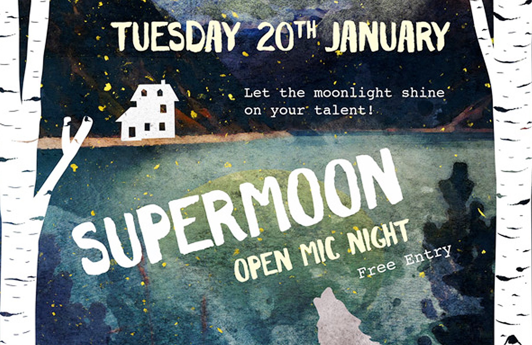
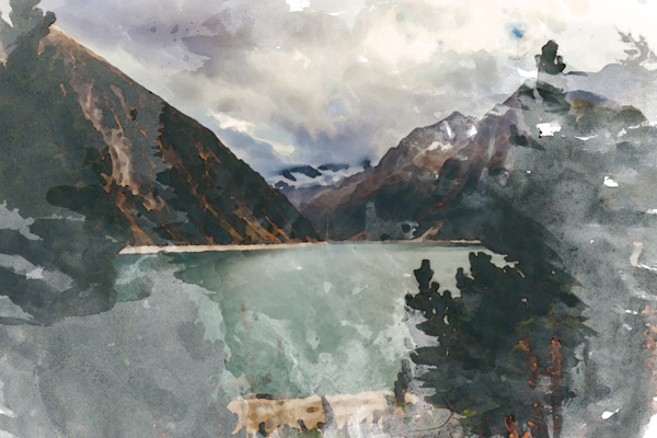
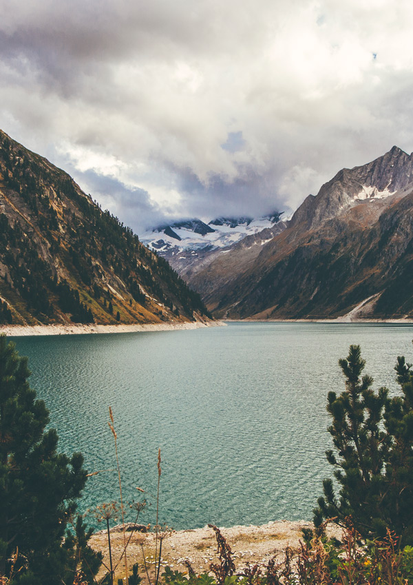
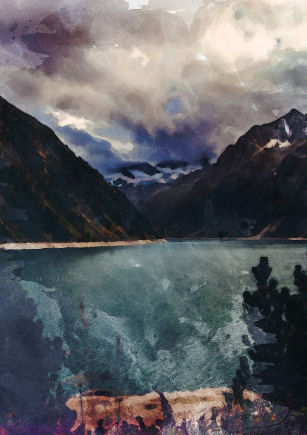
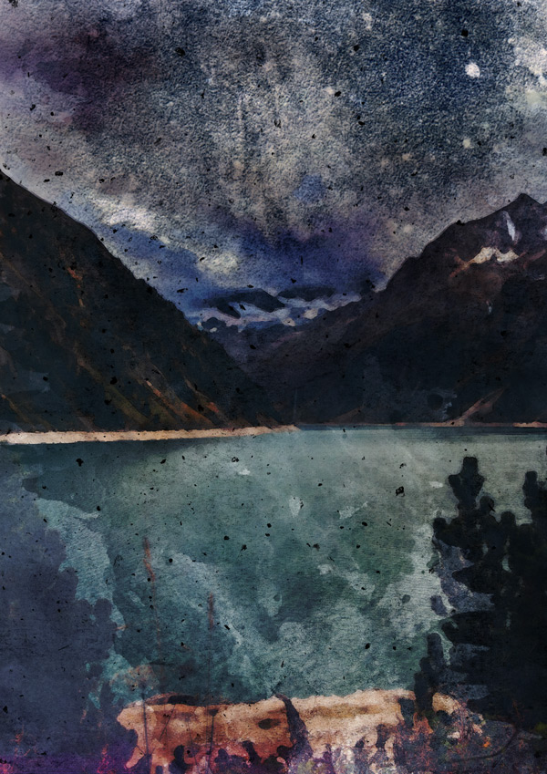
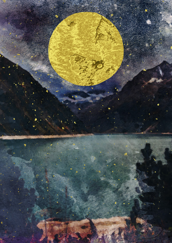
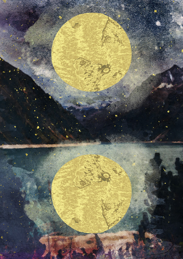
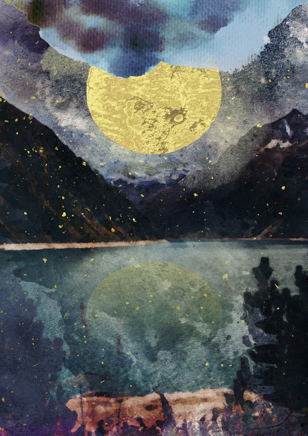
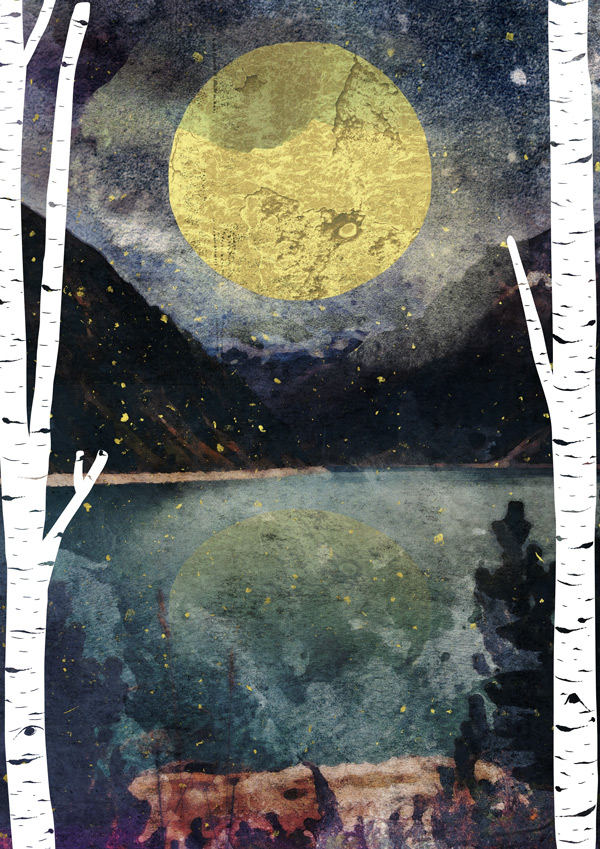
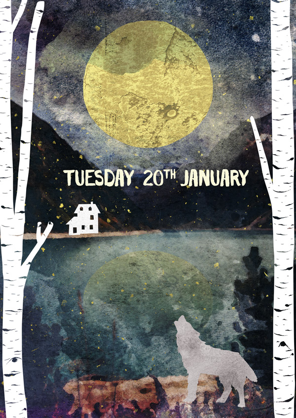
WHAT WE’RE CREATING:
Hey Design Cutters!
Jo here, and what a treat this bundle was to work with! We’ll be going through how to give your images an instant watercolour effect, build up some fantastic arty textures to give your images a real hand-made look and finish everything off by going through how to present our work in a mock-up.
Quick note: In this tutorial, the term “clipping” or “clipped layer” is used a few times. This means that the layer is only visible/applies to the layer directly below it. You can very quickly do this by holding ‘Alt’ down on your keyboard and clicking between the two layers. Here’s a quick demonstration.
Ok, let’s get started!

Follow along with this tutorial: Download the freebies
As always, we have another great freebie for you to enjoy.
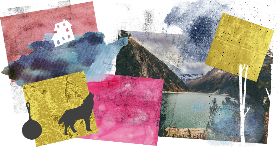
Today’s freebie pack is a delicious pick ‘n’ mix of textures vectors and watercolour graphics. You can grab it below:
Remember, this freebie is just a tiny sample taken from this mega bundle: The Gorgeous, Artistic Design Bundle (1000s of Popular Creative Items) at just $29 (a fantastic 93% Off). It’s perfect for those of you who love to give your digital work a creative, hand-crafted feel and includes so many fab resources to experiment with! The items included are already extremely popular so we’re delighted to be able to include them in this deal and offer you some freebies to try out.
Step 1:
Open up a new (A4) 2480px x 3508px Photoshop document for our working canvas:

For this piece, we’re going to start by using gorgeous-artistic-charles-perrault> Watercolor-Painting-Studio-Vol.-03 > Main Effects > Main PSD Effect.psd, which we’ll open as a new document.
Note: I’m afraid that the Watercolor Painting Studio isn’t included in the freebie pack for this tutorial, as it is one of the more extensive products in this week’s bundle. However, if you grab the bundle, which is still available, you will get full access to this item.
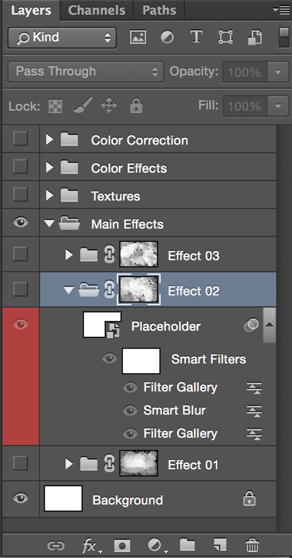
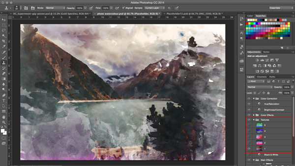
In the Layers Panel, open up the ‘Main Effects’ Folder, then the ‘Effect 02’ folder within there so you can see the red, ‘Placeholder’ layer:
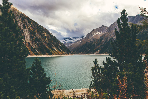
Double click on the layer icon to open the layer up in its own window. We’re going to add our background scene here, which uses one of the stunning photos from gorgeous-artistic-made-by-vadim > Go-Explore-photo-pack-45 > IMG_3500.jpg:
Save the file then switch back to the main document to see the effect:
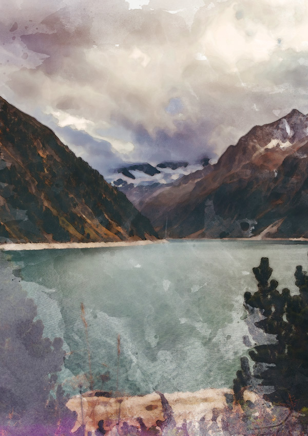
We’re going to customise this slightly by overlaying another watercolour texture over the top. This is super-easy to do from within the document: just open up the ‘Textures’ folder in the Layers Panel and turn on the visibility for texture ‘1’:
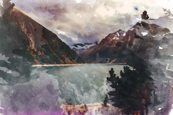
Save the image as a .jpg to your desktop (or anywhere you’ll be able to access it easily). We’re now ready to copy and paste this on to our original A4 document.
Scale so that the image height matches the canvas and position roughly centre:
Step 2:
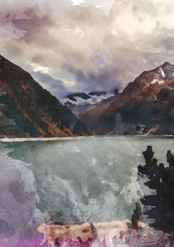
Above our watercolour layer, copy and paste the original IMG_3500.jpg photograph, again scaling so the height matches the canvas:
Reduce the Opacity to 25% and use the transparency to make sure the image is in the same position as the watercolour base and everything matches up. Doing this gives our image a little more detail without losing the overall painterly effect:
We’re going to up the watercolour textures using an additional resource from gorgeous-artistic-charles-perrault> Watercolor-Painting-Studio-Vol.-03 > Bonuses > Textures > True Watercolor. Rose Collection (6).jpg. Copy and paste the image on to your canvas, scaling and rotating to fit:
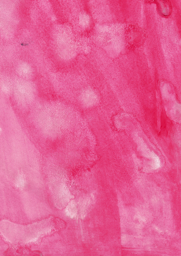
Change the blend mode to Overlay so we can see our landscape again:

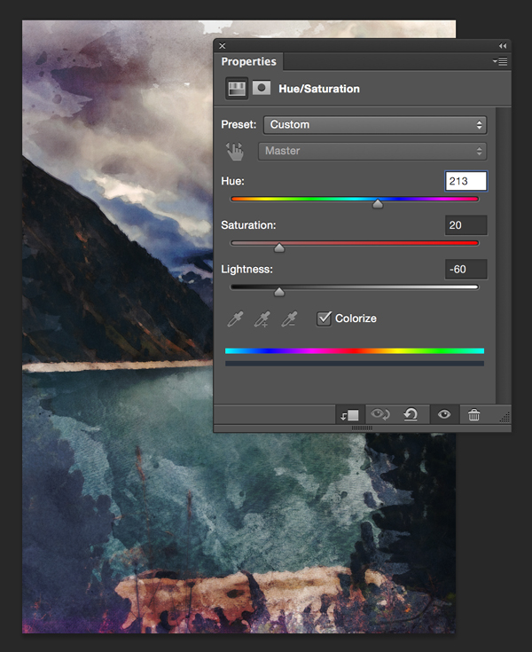
This gives us a nice rose-tinted view, but it’s not quite the dark, night time feel we want to use for our supermoon backdrop!
We can fix this easily by creating a clipped hue/saturation Adjustment Layer with the following settings:
Hue/Saturation Settings:
Colourize: On
Hue: 213
Saturation: 20
Lightness: -60
For some housekeeping, group all the layers up to now in to a folder called “Main Background”.
Step 3:
The Adjustment Layer has helped to give a darker feel to the image, but the sky is still contains a lot of white for a night time scene.
We can darken this up whilst keeping a watercolour effect by using the following resource: gorgeous-artistic-graphic-box > Winter-collection+20-Bonus > 20 bonus Watercolor forms > 17.png.
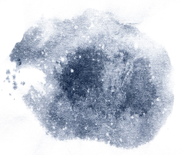
This looks like it’ll work as a starry, night sky pretty well! :)
Paste on to your canvas and rotate 180 degrees, then scaling and positioning so that it covers the sky. Some of it may go over the edge of the canvas, which is fine:
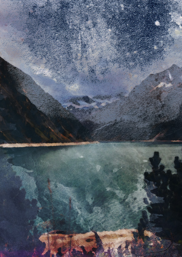
Once you’re happy with the position, change the blend mode to Multiply to create a darkening effect:
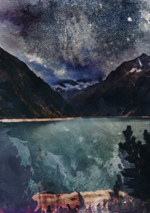
Step 4:
Next we’re going to add some textures to give the image a tactile, arts and crafts feel. First up, we’re going to use gorgeous-artistic-vintage-design-co-2 > SuperStrike > Super Strike – Textures > Broken Rollers > Broken Rollers 6.png:

Paste this on to our canvas, scaling to fit and then change the blend mode to Soft Light for a subtle, nicely textured effect:

Next, we’re going to use another bonus texture from the Super Strike resource. This time it’s in the form of gorgeous-artistic-vintage-design-co-2 > SuperStrike > Super Strike – Textures > Misc > Speckles-01.png:
As before, paste on to your canvas, scaling to fit:
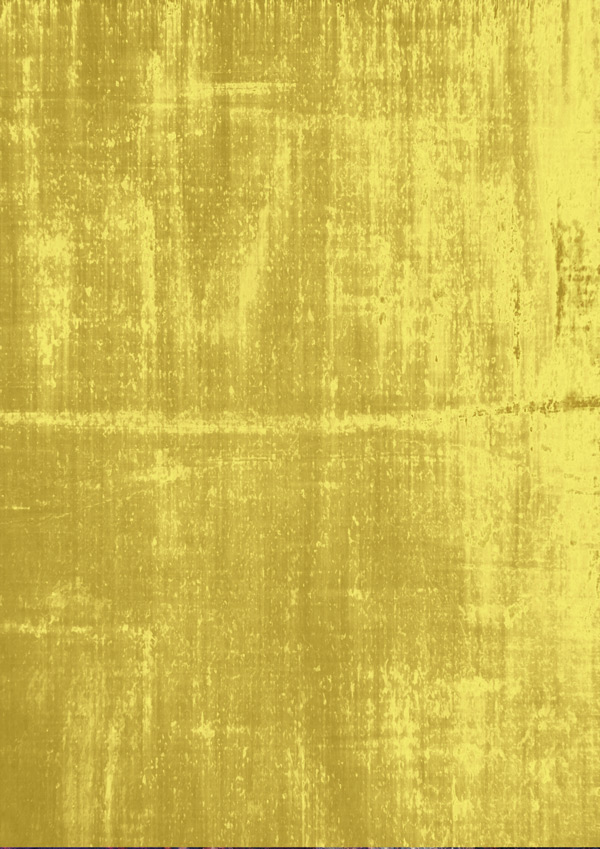
We’re going to brighten this up by giving the speckles a gold texture, taken from gorgeous-artistic-studio-denmark > 28-Gold-Foil-Textures-Backgrounds > Gold Silk.jpg.
Paste this on to your canvas, scaling to fit:
Clip the layer to the speckles below to get our desired effect:

Step 5:
Next we’re going to create our centrepiece – the supermoon!
To form our moon shape, we’ll use the following graphic from the gorgeous-artistic-make-media-co Rustica Pack Vol. 3+Birch Brush Mini > Rustica Vol. 3 Vectors > CreativeMarket_RusticaPack3.ai pack:
Copy and paste this on to your canvas, scaling and positioning so that it’s similar to below:
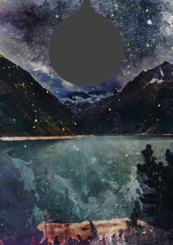
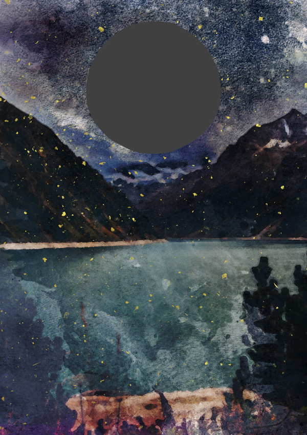
Use a Layer Mask and a hard-edged brush to remove the ‘handle’ and create a circle shape. We’re creating our moon shape this way, rather than creating the shape in Photoshop, to make the most of the looser edges and keeping things looking handmade.
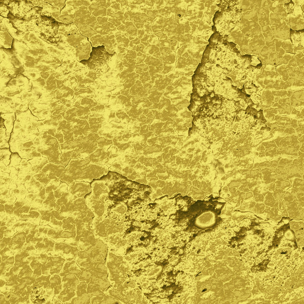
Once you’re happy with your moon shape, we need to give it a moon texture. :) We’ll do this by using the following resource: gorgeous-artistic-studio-denmark > 28-Gold-Foil-Textures-Backgrounds > Gold Nugget.jpg:
Isn’t it perfect? :) Paste this on to your canvas, scaling and positioning so that it just covers the moon shape:
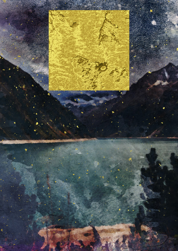
Clip the the texture layer so that it applies only to the shape below, to get our desired effect:
We’ll tone this down to a slightly paler shade using a simple, clipped hue/saturation Adjustment Layer with the following settings:
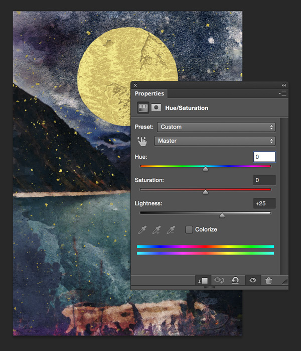
Hue/Saturation Settings:
Colourize: Off
Hue: 0
Saturation: 0
Lightness: +20

Step 6:
To complete our moon, we’re going to add a light glow around it using some watercolour textures. This helps enhance its sense of brightness.
We’ll get our resources from: gorgeous-artistic-graphic-box > Winter-collection+20-Bonus > 20 bonus Watercolor forms > 19.png.

Copy and paste this on to your canvas so that it sits over the moon and the texture can be seen outside of its edges:
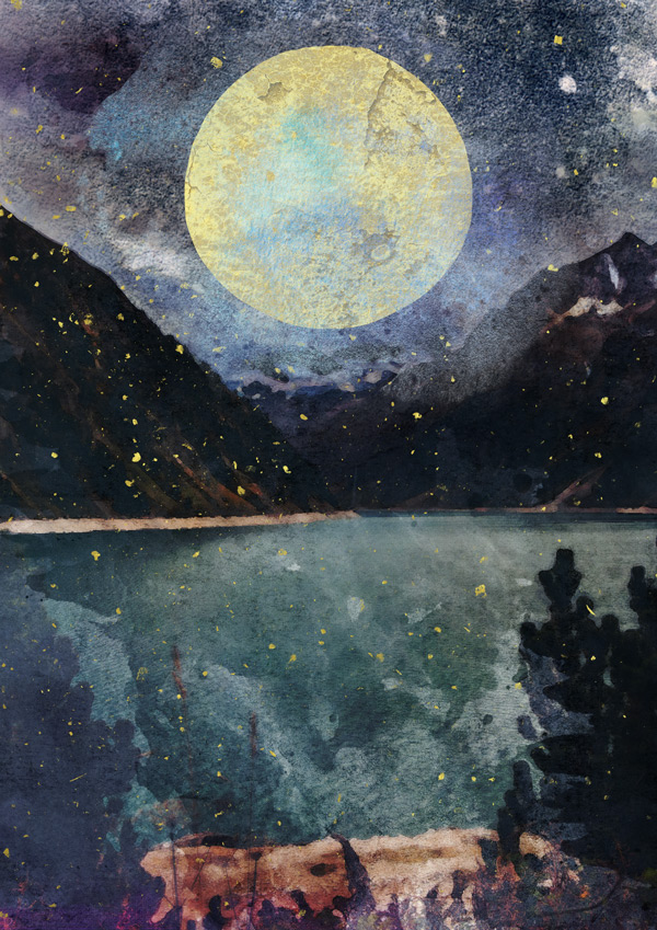
Now we know it’s in the right place, move the layer so that it sits behind the moon:
Reduce the Opacity to 70% and change the blend mode to Screen for a brightening effect:
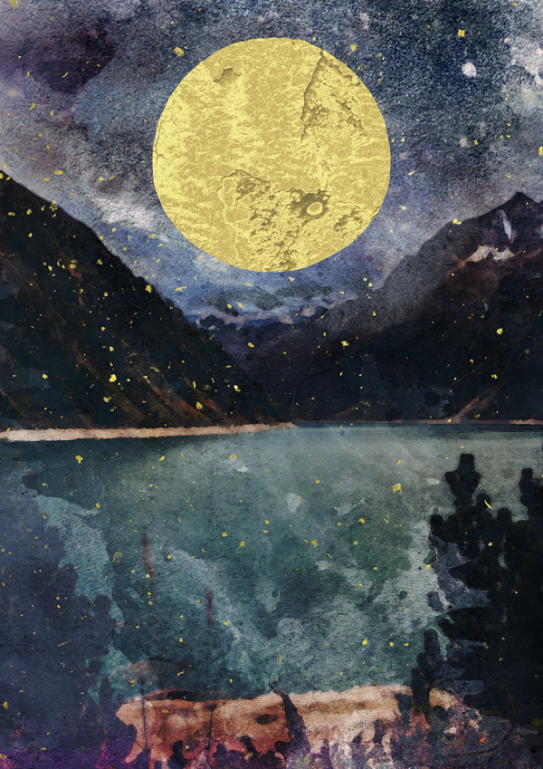
Duplicate the layer, then return the blend mode to Normal and drop the Opacity further to 50%:
We’ll give this a golden glow using a clipped hue/saturation Adjustment Layer with the following settings:
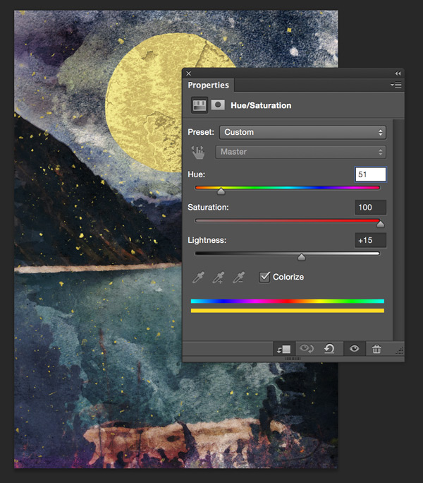
Hue/Saturation Settings:
Colourize: On
Hue: 51
Saturation: 100
Lightness: +15
Group the layers we’ve created in the last two steps in to a folder called “Moon”, and then we’re ready to move on to the next!
Step 7:
We now need to create a reflection in the water. Start off by duplicating the “Moon” group and moving down so that it sits in the water:

You can see that doing this exposes the handle from our original vector that had been hidden off the canvas. We can fix this simply by going back to the layer mask in the group and covering up the rest:

Once that’s been done, flip the group vertically by going to the main menu bar and selecting Edit > Transform > Flip Vertical. This gives us the reflected effect, and you may need to move the image back to the desired position:
We’ll tone down the reflection by reducing the group Opacity to 50%:
With the group still selected, use the Transform Tool to ‘squash’ the shape slightly. This takes in to account the foreshortening that would occur in the reflection:
Create a Layer Mask that applies to the group, and add a gradient. Whilst holding down the ‘Shift’ key, make the starting point slightly inside the moon reflection, then drag the cursor so that the end point goes up to the edge of the water on the image.
This should leave you with something similar to below:
Step 8:
We’ll build up the image using some more of our resources to create depth and texture.
To give the effect of a cloud covering some of the moon, we’ll grab the following resource: gorgeous-artistic-graphic-box > Winter-collection+20-Bonus > 20 bonus Watercolor forms > 7.png.

Copy and paste this on to our canvas, scaling and positioning so that it covers the top part of the moon, similar to below:
Drop the Opacity down to 40% and change the Blend Mode to Multiply:
Next, we’ll use gorgeous-artistic-vintage-design-co-2 > SuperStrike > Super Strike – Textures > Broken Rollers > Broken Rollers 1.png for some extra texture:
Paste this on to your canvas, scaling to fit, then change the blend mode to Multiply:

Step 9:
We’re going to build up some more depth by adding a couple of foreground elements, which’ll also act as a frame for the images.
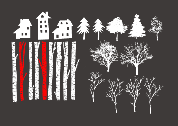
We’ll be grabbing our resources for this from gorgeous-artistic-graphic-box > Winter-collection+20-Bonus > Graphic elements > Eps > 6.eps, using the elements highlighted in red:
Copy and paste these on to your Photoshop canvas so that they sit to the sides, scaling to fit the height. You may also want to transform them slightly so that they remain fairly narrow, as we don’t want them taking up too much space!
Step 10:
We’ll continue to add some vector elements to our image. The solid edges of these also create a nice contrast to the soft, painterly background, adding some interest to the design.
Going back to gorgeous-artistic-make-media-co Rustica Pack Vol. 3+Birch Brush Mini > Rustica Vol. 3 Vectors > CreativeMarket_RusticaPack3.ai which we used earlier for the moon, select the following graphic:
Copy and paste this on to your Photoshop document, then flip it horizontally so that it’s facing the moon. Then, scale and rotate slightly so that it’s similar to below:
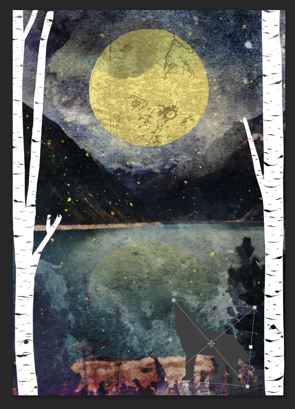
We’ll add a little texture to our wolf using gorgeous-artistic-charles-perrault> Watercolor-Painting-Studio-Vol.-03 > Bonuses > Textures > True Watercolor. Rose Collection (4).jpg. Paste this on to your canvas:
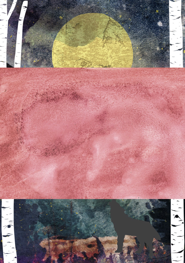
Clip this to the wolf layer below, and move it around a bit until you get an area of texture displayed that you like the effect of:

We’ll make this a more wolf-like colour by creating a clipped hue/saturation Adjustment Layer with the following settings:
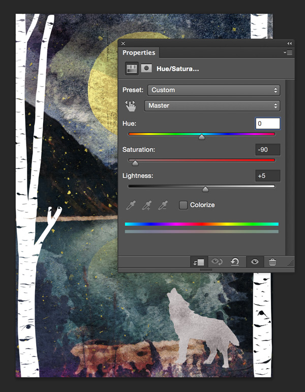
Hue/Saturation Settings:
Colourize: Off
Hue: 0
Saturation: -90
Lightness: +5

For our final vector element, we’ll go back to gorgeous-artistic-graphic-box > Winter-collection+20-Bonus > Graphic elements > Eps > 6.eps and select the following little house:

Copy and paste this on to your Photoshop canvas, scaling and positioning so that it sits on the shoreline, as below:

We’ll soften this slightly by adding a texture. You can grab the one we’re using from gorgeous-artistic-vintage-design-co-2 > SuperStrike > Super Strike – Textures > Papers > Manilla 2.png:
Copy and paste this on to your canvas, scaling to fit. Reduce the Opacity to 70% then clip it to the house layer below to isolate the effect:
Step 11:
Now that the main part of our image is complete, we can start to add some text using the following cool font which is included in the bundle: gorgeous-artistic-make-media-co > Rustica Pack Vol. 3+Birch Brush Mini > Birch Brush OTF > BirchBrush-Regular.otf.
Install the font if you haven’t done so already, then type “Tuesday 20th January” using the following settings:
Font Settings
Font: Birch Brush Regular
Size: 40pt
Colour: #FAF8DA
Justify: Left
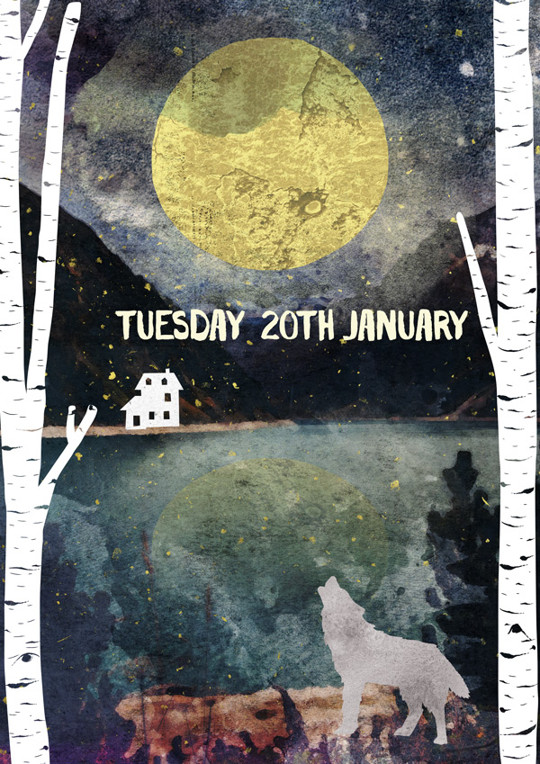
Select the “TH” after the date and open up the character panel. We’ll format this slightly by using the automatic ‘superscript’ feature in Photoshop so that it looks a little more natural.

Position so that the text sits slightly right of centre:
Next, we’ll add a fun little event slogan: “Let the moonlight shine on your talent!”
Font Settings
Font: Courier
Size: 16pt
Colour: #FFFFFF
Justify: Left
We’ve gone for a typewriter style font here, but feel free to experiment with some other fonts that look ‘hand crafted’.
Align so that the text fits nicely in the space between the date, house and the waters edge.

We’ll continue to add some event details to fill up the poster:
“Supermoon” Font Settings
Font: Birch Brush Regular
Size: 16pt
Colour: #FFFFFF
Justify: Left
“Supermoon” Font Settings
Font: Birch Brush Regular
Size: 30pt
Colour: #FAF8DA
Justify: Left
“Free Entry” Font Settings
Font: Courier
Size: 18pt
Colour: #FFFFFF
Justify: Left
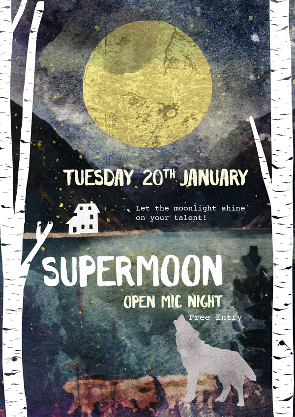
This set of text looks a little cramped at the moment, but not to worry! Group them together then use the Transform tool to rotate them slightly:
We typed everything out first so that the angles would be the same for all the text. There’s nothing as frustrating as trying to separately align each word to matching angles (trust me, I’ve been there)!
Rotating the text slightly helps to fill the space better, and gives the poster a more relaxed feel.
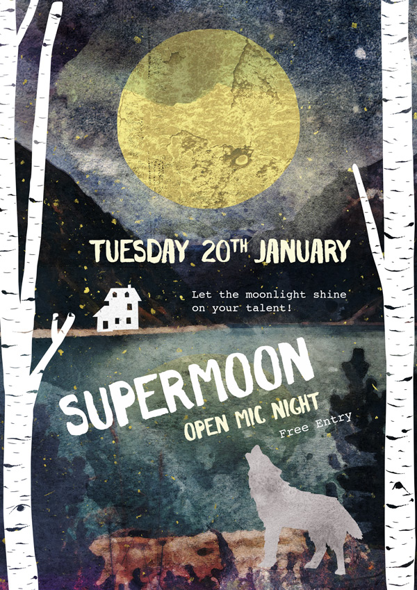
We’ll finish off by typing in some details to fill the space in the bottom left:
“7pm – midnight” Font Settings
Font: Courier
Size: 25pt
Colour: #FAF8DA
Justify: Left
“Address” Font Settings
Font: Courier
Size: 18pt
Colour: #FFFFFF
Justify: Left

Step 12:
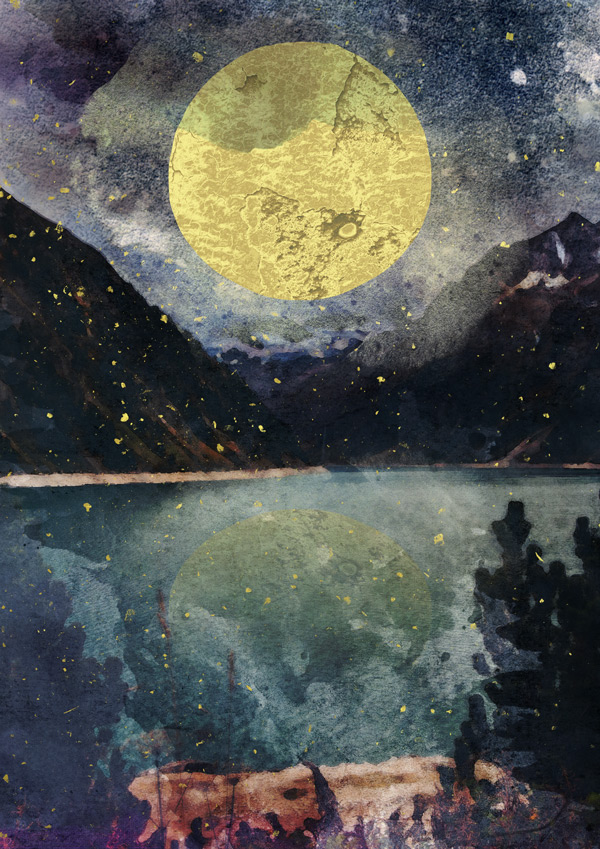
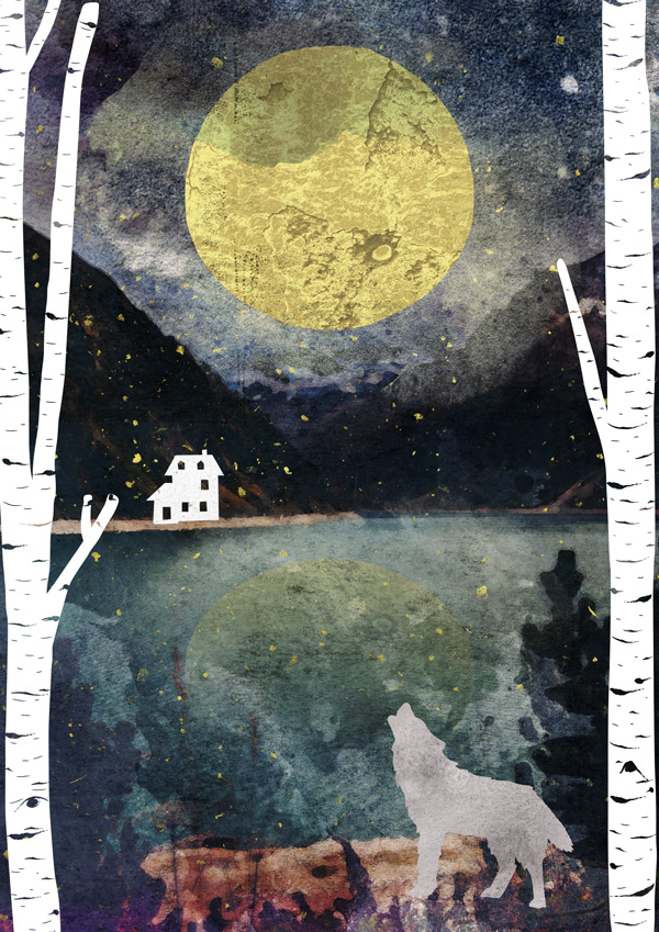
The image is now complete, but I’m wondering how it’d look if the overall colours were a little brighter… Luckily, using Photoshop makes it easy for us to experiment and tweak our images until we’re completely happy with them.
I’m going to try out adding a hue/saturation Adjustment Layer (no need to clip it this time as we’re applying the effect to the whole image)!
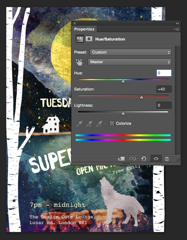
Hue/Saturation Settings:
Colourize: Off
Hue: 0
Saturation: +40
Lightness: 0
I think this makes the image look far more exciting, so let’s keep the effect! I know that I tend to lean towards using more muted colours in my work, so sometimes it’s worth being aware of your own design habits and trying something different. You don’t have to change anything you don’t want, but sometimes it’s interesting to shake up your habits a bit – you never know what new creative sparks might form!
Step 13:
And we’re almost done!
Normally at this point in the tutorial, you’ll see a few mockups of the design we’ve just created. Since this bundle happens to include some awesome mockup templates, we’ll go through how to put that together too. :)
The first thing we need to do is save our image as a high quality jpeg and save it somewhere we can access easily, such as your desktop.
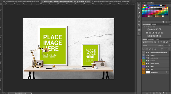
Once you’ve done that, open up the mockup file gorgeous-artistic-place.to > Mockup-Pre-Creator > Mockup Pre Creator – Photographers desk.psd:
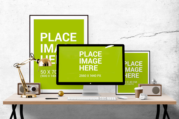
There’s a lot going on in this image, but it’s also extremely customisable, so let’s get stuck in!
When you open up the document, you’ll notice lots of different groups in the layers panel. These are really well organised to help you easily identify and isolate different elements you want to include or exclude in the mockup.
To start with, we know that we don’t want any computer elements, so we can quickly hide the “Screen” group to lose the monitor:
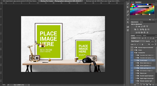
Next, if you open up the “Accessories” folder, you’ll se a rather extensive list of elements you can edit. From here, I’ve hidden the visibility of the keyboard and mouse, and added the camera. I’ve also moved the coffee cup and curled paper across so that they fit the new layout.
Feel free to play around and experiment – turning different elements on and off to see what you like! :)
I’ve gone on to turn on the visibility for a foreground element, and selected a different frame (“Medium Portrait):
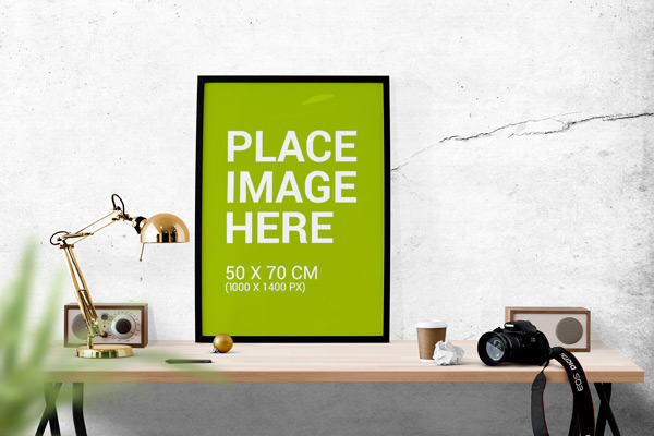
Although the style is great, I’d like it to be a little bigger. No problemo! Just use the Transform tool and scale it as you would any other element – just make sure you select the whole element group:

For the frames (or any element you can add your own work), open up the group folder and you’ll see a “Place your image here” layer:
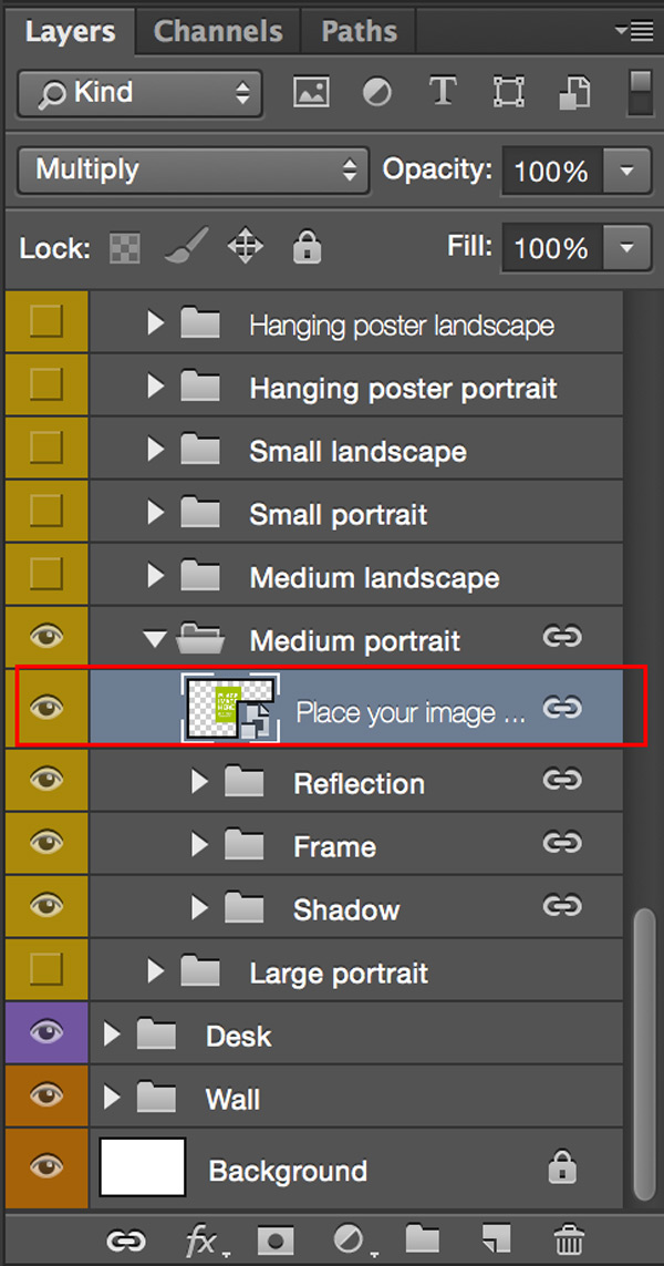
Double click on the icon and you’ll be taken to a new document window with some clear instructions. ;)

Copy and paste the image we saved on to the document. You may need to transform it slightly to fit:
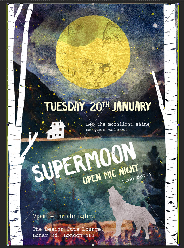
Once your image is scaled and positioned to fit the canvas, save to apply the changes to the main mockup document. Once saved, go back to the main mockup to see the final result:

And we’re done!
I hope you enjoyed doing this tutorial and found it useful so that you can now get straight in and do some amazing things with your resources! There really is lots to play with. :)
Do share your designs on the Facebook page too, as we love seeing what you create and it really makes the community an inspiring place to share ideas.
Hopefully this showed you just some of the ways you can use the huge variety of creative resources available in this bundle, and that you got to know them a little better. Remember, you can get these artistic gems for a fantastic mega 93% off this week! Grab it below, while you still can:
The Gorgeous, Artistic Design Bundle (1000s of Popular Creative Items)

Please tell the rest of us how to turn a website into a PDF. Thanks for the great tutorial!! I learned a lot.
BTW – I didn’t really understand this in Step 1 “Double click on the layer icon to open the layer up in its own window”.
Also, in Step 2, I think the Hue/Saturation Settings should be -60, not +60
I agree with Griz Bear that it would be nice to have a chance to try out certain resources before purchasing the Deal, but I think the deals are very good and your tutorials are fantastic!
Could you please do a tutorial using the Glitz Shoppe resource. Thanks so much!!
Hey Lisa,
You can create a PDF of the tutorial page by downloading and using this software: http://www.printfriendly.com/. This was recommended by some of our community members, and it really seems to be working very well.
For Step 1 you have to click on the little smart object icon next to the Placeholder layer icon. Here’s a screen shot of it to explain what I mean.: https://www.designcuts.com/wp-content/uploads/2015/01/smart-object.jpg.
Thanks so much for the heads up about the hue/ saturation error. This was definitely an oversight on our side, and we’ve gone ahead and rectified this. We’ve also added an extra image in the tutorial that shows the diagram.
We always offer a small freebie pack for each of our deals, so that our community members can test some of the resources included in the full bundle. Unfortunately, we can’t offer testers for all the items in our deals, as that would hugely degrade the value of the resources.
I’m afraid we won’t be able to create another tutorial with Glitz Shoppe for this bundle, as it’s about to expire very soon. But Nicky Laatz always includes guides in her resource sets, which show how to use the items. Please let me know if they’re enough, or if yo need some more guidance with Glitz Shoppe, and I’ll be here to help.
He comprado muchos deals vuestros. Todo perfecto, pero es una pena que justamente no puedo seguir este tutorial porque faltan archivos. Tenía muy buena pinta.
Hey Linda,
I’m so sorry about that. We always try to include as many of the resource files for our tutorials, but were unable to secure the watercolour painting studio, as it’s a very extensive file. We’ll try to make sure that more necessary resources are included in the tutorial freebie packs in the future of course.
I hope you’ll enjoy our next tutorials. :)
Google Translate:
Lo siento mucho por eso. Siempre tratamos de incluir el mayor número de los archivos de recursos para nuestros tutoriales, pero eran incapaces de asegurar el estudio de pintura de acuarela, ya que es un archivo muy extenso. Vamos a tratar de asegurarse de que cada vez más los recursos necesarios están incluidos en los paquetes de regalo de promoción de tutoría en el futuro, por supuesto.
Espero que usted disfrute de nuestros próximos tutoriales. :)
Neat piece, Jo!
Thanks for the kind words, Simon!
What a wonderful tutorial, as always! Well written, explained and inspirational, thanks a lot!
Like Jordan, I think it would be a great idea to have this, and the other tutorials of course, as a downloadable pdf. :)
Thank you so much for your kind words, Johannes! We’re so pleased you enjoyed this tutorial :)
It’s great to hear you would be interested in a PDF download for our tutorials – rest assured, this is certainly on our radar and I am hopeful that these can be implemented soon :)
Am loving this tutorial! Was wondering if you’ll have it available in pdf for download??
I’m afraid not Jordan. I do remember though that some community members recommended some way to turn a website into PDF. Let me find the right links for you, and email them over.
You’re the best, Tina! Thank you! =)
No problem Jordan. :)