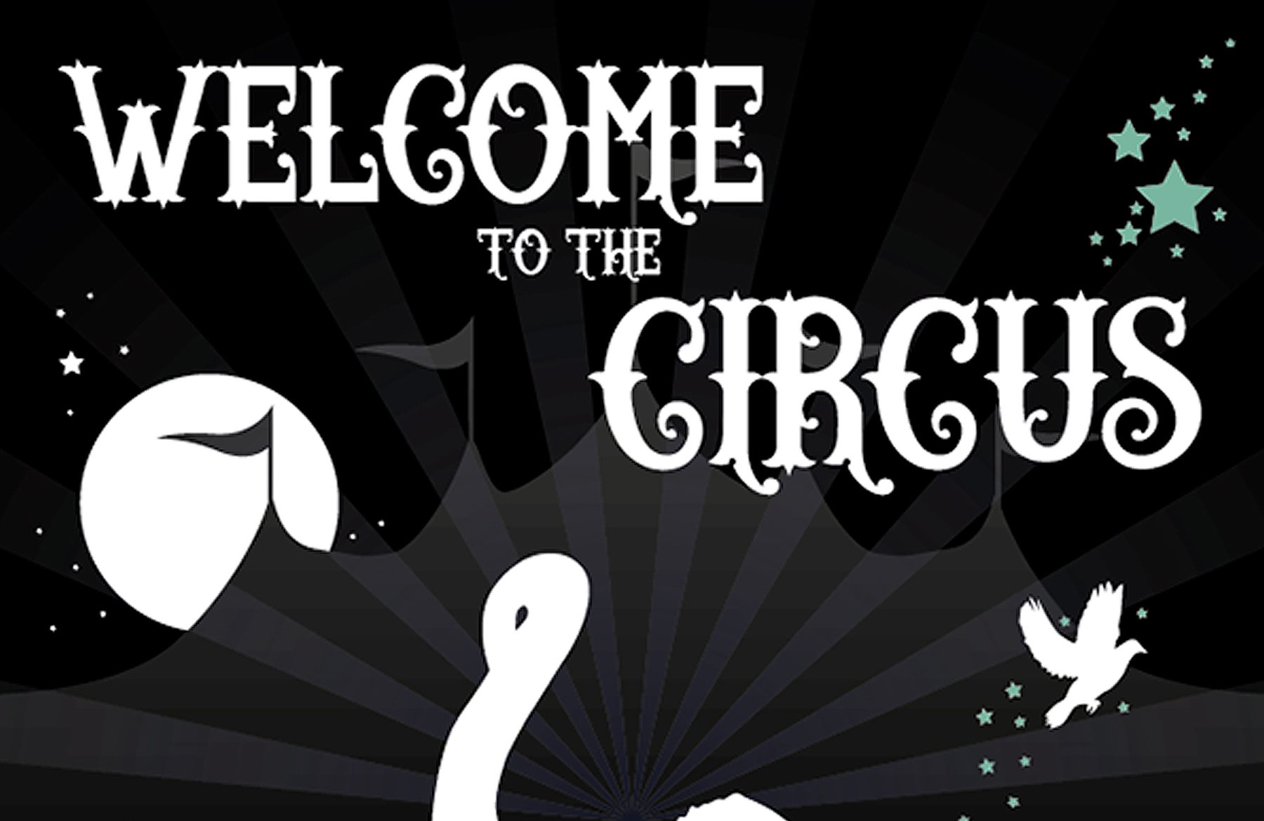
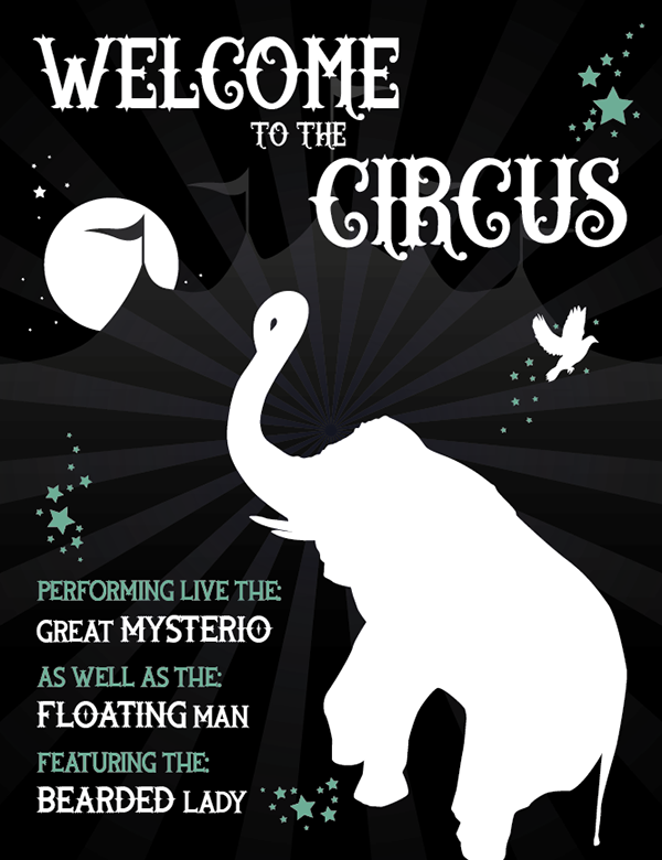
WHAT WE’RE CREATING:
Hi all! Matt here, from the Design Cuts team.
This is my first foray into DC tutorials, as it’s a font based deal and I love typography and illustration … I couldn’t resist!! :)
It’s also nice to get away from corporate work once in a while and just do something for the sheer love of it! The fonts in this month’s deal are beautiful and it wasn’t difficult to come up with something up with a theme as they are so powerful.
This particular work is a homage to the beautiful illustration which supports the book The Night Circus, it’s magical, enchanting and when I read it really captured my imagination. So I thought it fitting to use it to help aid my creativity.
Ok, here we go, as it’s my first one be gentle with me, if you have any questions leave a comment and I’ll reply asap. I’ve assumed some knowledge of Illustrator as otherwise I’d still be here writing next week after a caffeine overdose…
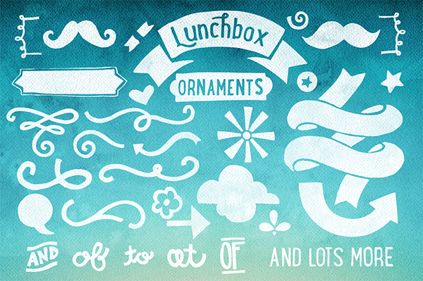
FREE BONUS: Lunchbox Ornament Extras (Font Set + Vectors)
If you like the look of the fonts in our current bundle, then we have a fantastic taster pack for you. This freebie pack includes the complete Lunchbox Ornaments pack, which supports Kimmy Design’s popular Lunchbox font. Not only does this beautiful hand-drawn font feature tons of quirky designs, but it also comes in a vector pack version.
Step 1:
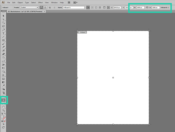
Create a new document (top menu: file / new) and set the size to 1000px wide by 1300px high, or create a new document and then set your artboard size
Step 2:
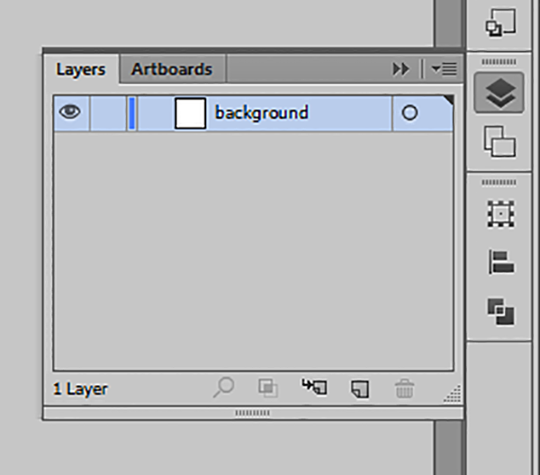
Open the layers pallet and rename layer one to ‘background’
Step 3:
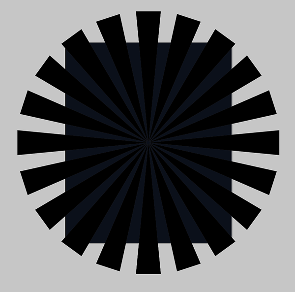
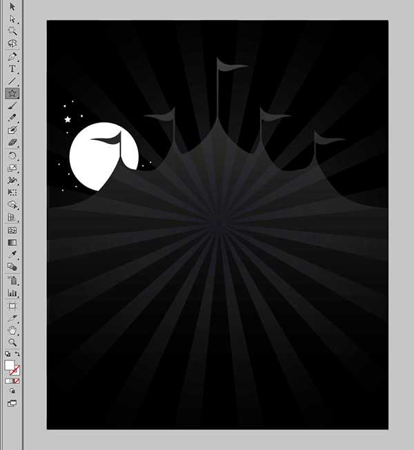
To create the starburst element for the background:
a.) Go to view in the top menu and click on ‘show grid’ and ‘snap to grid’
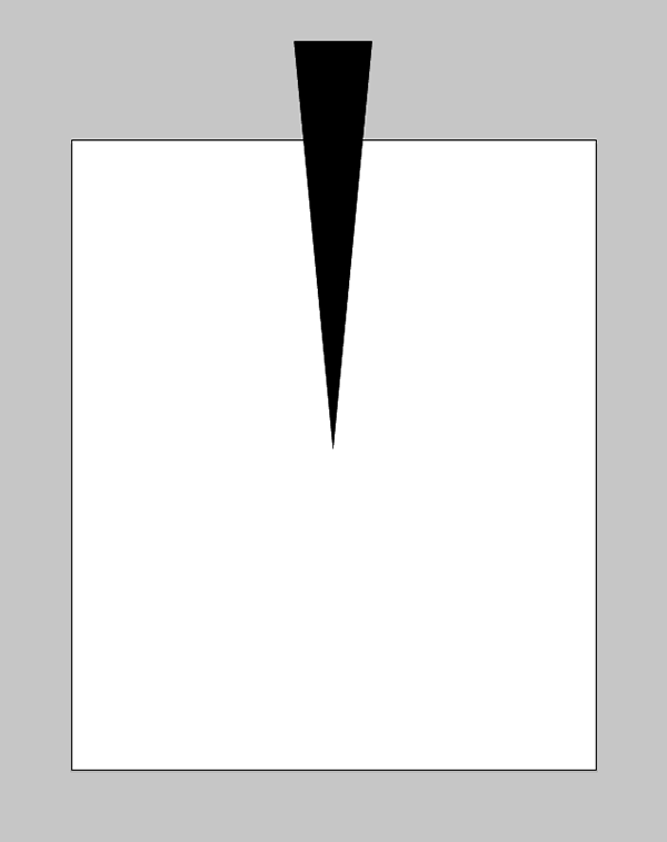
b.) Using the pen tool from the toolbar draw a black triangle, then turn off both snap options
c.) Stretch your triangle to the same proportions as one of the segment elements we’ve used in our background (make this slightly larger than the background as we’ll be clipping it down later and when we rotate it we want it to reach the corners of the artboard)
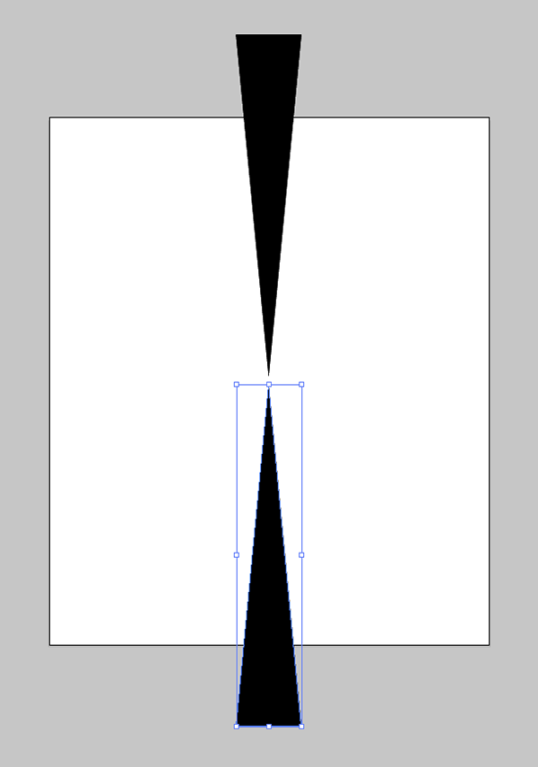
d.) Copy this triangle, rotate it 180 degrees, place it under the other triangle leaving a slight gap in the middle
e.) Select both and group them to lock them together
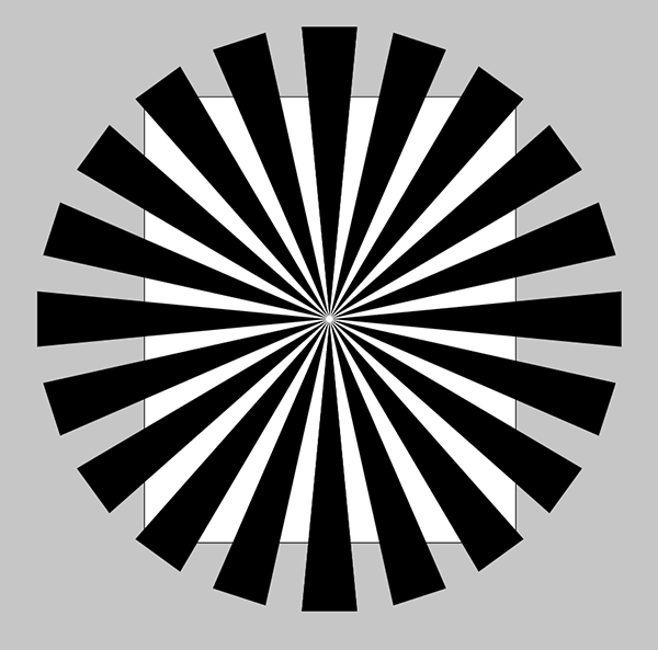
f.) Copy the two triangles and rotate them by 18 degrees, keep doing this until you have segments making a circle, then select all and use the align tool to get all the elements aligned to the centre horizontally and vertically
g.) Create a grey rectangle the same size as the artboard behind this, we’ve used a cold grey (it’s good to experiment with cold and warm greys in your design – they make a huge difference to just using plain old grey and bring much more life to design!) values: C: 100 M: 85 Y: 50 K: 88. Then use arrange send to back to put it behind the triangles
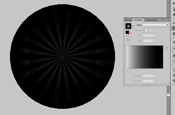
h.) To create the vignette effect on the background make a circle, then radial fill it with black, and black, setting the black at the centre to an opacity of 0, then place this over the background (fine tune the effect using the gradient slider)
i.) Select everything and group it
j.) Now make another rectangle the same size as the artboard and place it directly over the artboard, to help you do this you can switch on the outline view (view / outline) – then switch it back to preview once done
k.) Select everything and create a clipping mask (object / clipping mask / make)
l.) You’re done with the background!! Lock this layer in the layer pallet
Step 4:
.. at this point you might want to make a nice cuppa to help the creative juices flow, possibly with a biscuit … or if available cake!
Step 5:
Ok – fully refreshed? Create a new layer above it called ‘big top’, to create the big top:
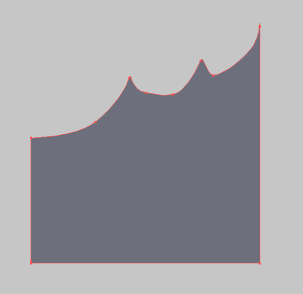
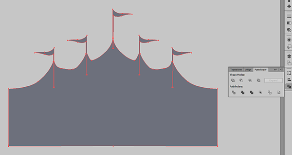
a.) Use the pen tool to draw half of your big top
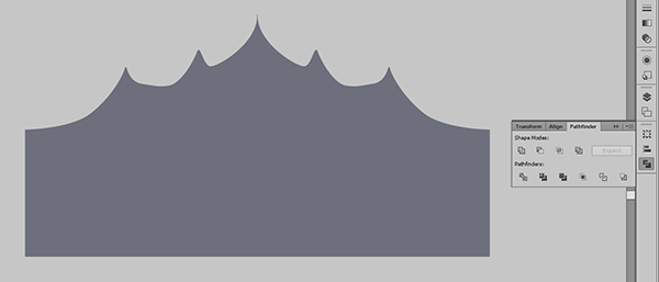
b.) Copy it, flip it horizontally, place it next to the other half (you may need a tiny overlap) and then unite the two shapes using the pathfinder tool
c.) Use the pen tool to draw a flag, then copy this and place it over all the big top points
d.) Use unite again to make it all one shape
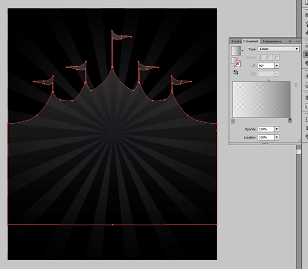
e.) Place this over your background and select linear fill, using a 60% tint of black (K) for both colours
f.) Set the bottom grey to a transparency of 0%
g.) Lock this layer
Step 6:
Create a new layer called ‘moon & stars’
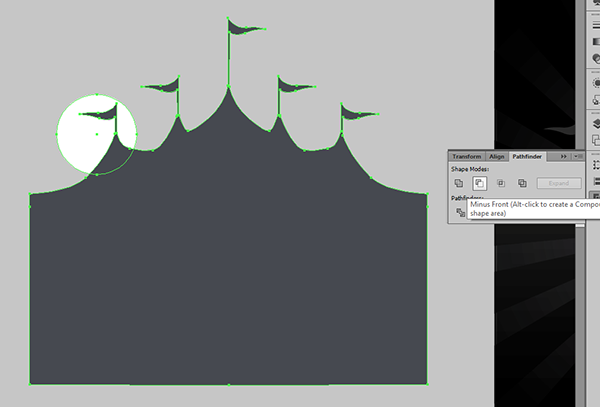
a.) Draw a circle then take a copy of the big top and place it over the top (oops, sorry, I just asked you to lock that layer! Unlock and lock it again to get at the shape)
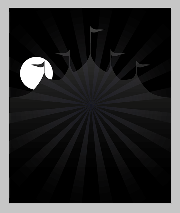
b.) Use the ‘minus front’ option from pathfinder to create the moon shape
c.) Place this moon shape back over the big top in your artwork
d.) Then use the ‘star’ tool from the pallet (this is set to rectangle by default so look for that initially) to draw some stars around your moon, I found that by rotating some of them it created a nicer effect
e.) Lock the layer
Step 7:
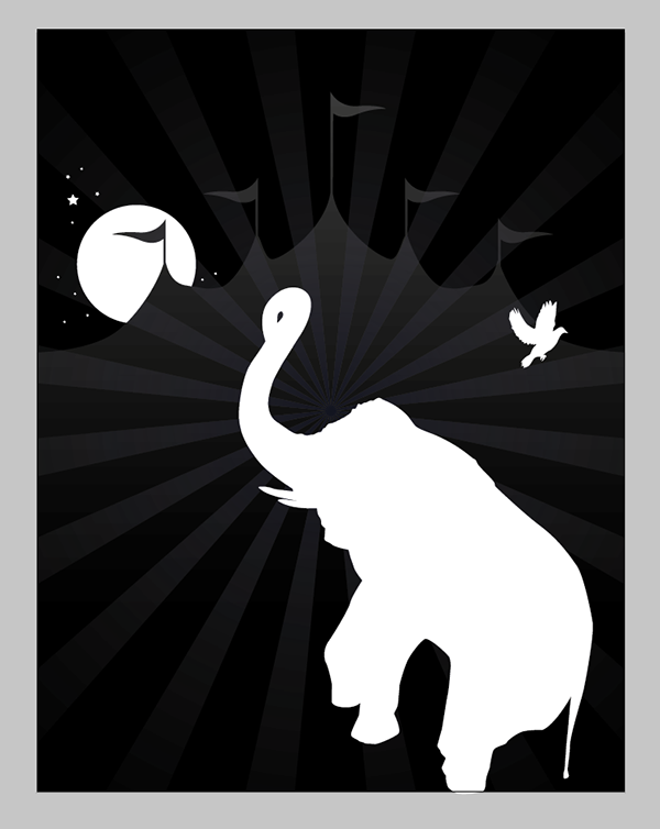
Create a new layer called ‘animals’
a.) Use the pen tool to draw some animals, we’ve created an elephant and a dove (the latter being suitably magical!) – if you’re stuck for ideas look at images online, don’t copy them directly however as you don’t want to get into trouble with copyright
b.) Place the animals on your artwork, making sure you leave space to add some circus text later
c.) Lock the layer (broken record I know, but it makes it easier to move elements around without selecting the underlying ones by mistake :)
Step 8:
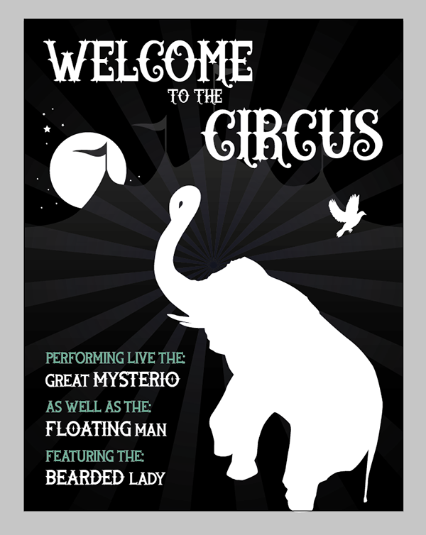
Create a layer called ‘typography’ and add your text, we’ve used Wild Rover for the main heading and Rooters for the supporting text (which I think are pretty awesome, I love the curl on the tail of the S of circus!). Have a play with emphasising some text using size, uppercase, lowercase and use of colour
Step 9:
As a finishing touch I added some more stars – if you look at the positioning of these you’ll see that I’ve placed them in such a way as to lead the eye around the artwork in a circular fashion (I kept a half eye on position of all design elements throughout the design process to support this layout). This ensures the eye of viewer moves nicely around the composition and isn’t lead off, instead it moves round and round locking in their attention and giving the design focus and impact
That’s it! Phew! I’m really looking forward to seeing your creations based around the current deal – I really enjoyed creating this one :D
Well, your tutorial is impressive. I like it. Thanks for sharing. You have explained every detail so nicely and put it all together in a proper manner. It takes a lot of patience to sit there and describe even the smallest details. I appreciate your effort. I am expecting more such tutorials to come from your side.
Thank you so much for your super kind words Ritika- it really means so much to us to hear that you feel that we are doing a good job with our tutorials and that you find them really useful :).
We can’t wait to share lots more tutorials and freebies with you, and if there is anything in particular that you would like to see a future tutorial cover, please let us know- we always love to hear from our community!