Hi Design Cutters, Joanna here with a new tutorial where we’ll be creating a label for a luxury skincare bottle in Photoshop. We’ll be using some freebies from The Spectacular Type Lover’s Selection, which is a superb selection of top quality fonts, allowing you to stand out from your competitors, and versatile enough for all your projects.
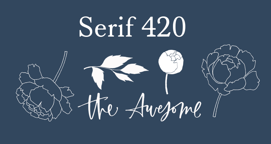
We’ll be using Serif 420 by Hanken Design Co. for the text, and some extras from LaPaloma by Callie Hegstrom. Combining these with some free stock photos from Unsplash, we’ll be applying our final design to a realistic mockup for a super-stylish way to present the end result.
Ok then – let’s open up Photoshop and get started!
HAVE YOU SEEN OUR YOUTUBE CHANNEL?
Watch the video tutorial below and subscribe to our YouTube channel for regular updates direct to your inbox.
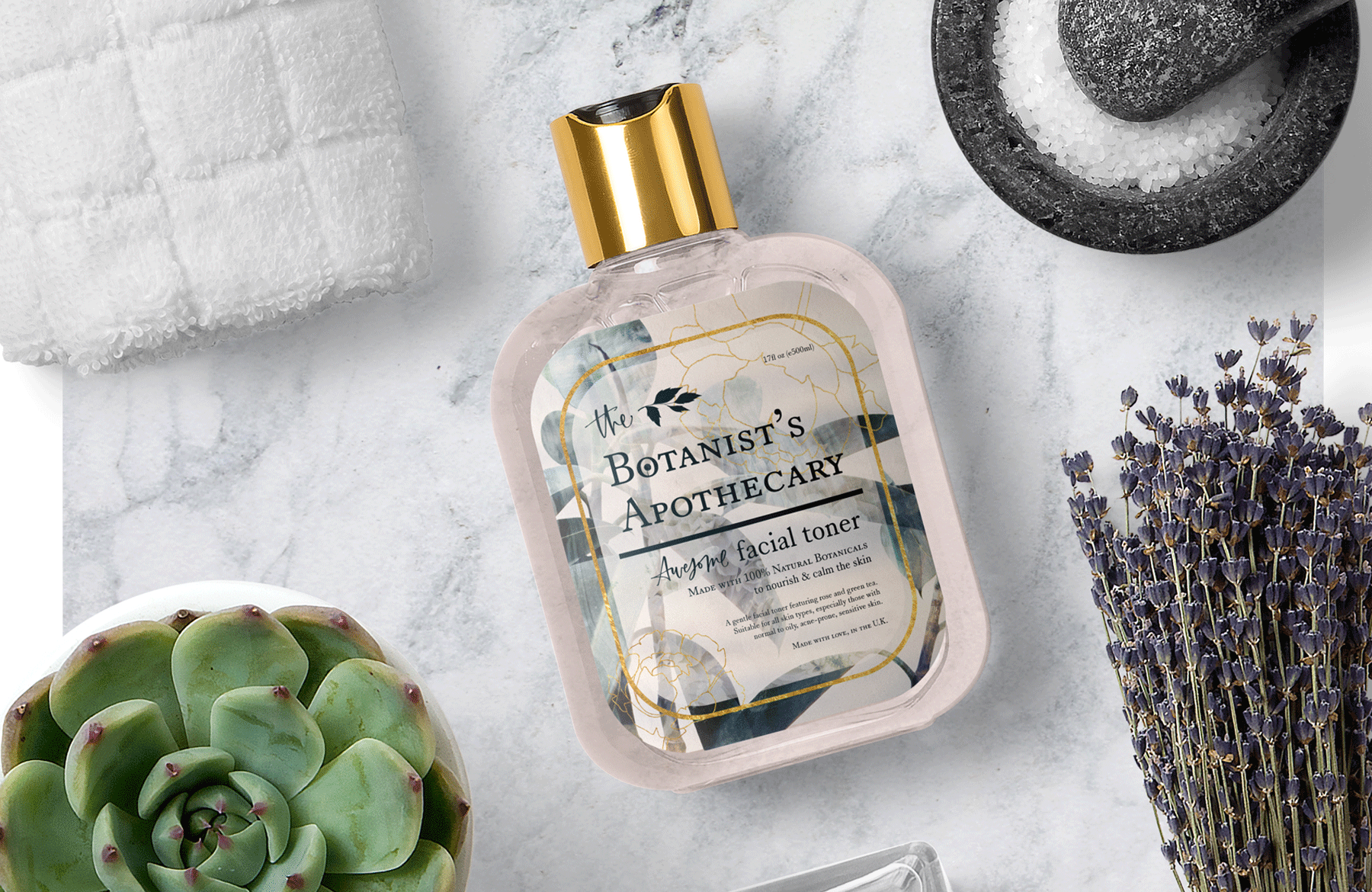
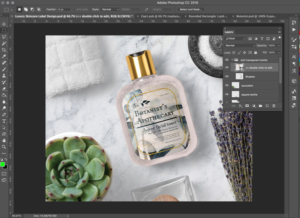
Here’s a look at what we’ll be creating:
Follow along with this tutorial: Download the freebie files
This freebie pack is just a small sample of what you can expect to find in The Spectacular Type Lover’s Selection for just $29! As with all our bundles, these fonts come with our extended license and at a staggering 99% off, for a limited time only!
Step 1: Luxury, Natural Skincare Packaging
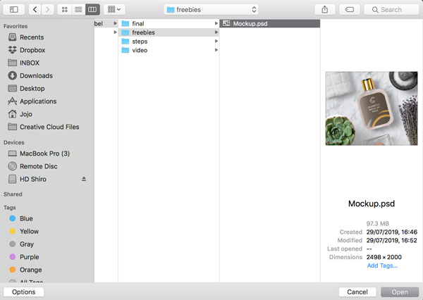
From the Photoshop main menu, go to ‘File > Open…’ and navigate to the freebies folder for this tutorial, and open the ‘Mockup.psd’ file.
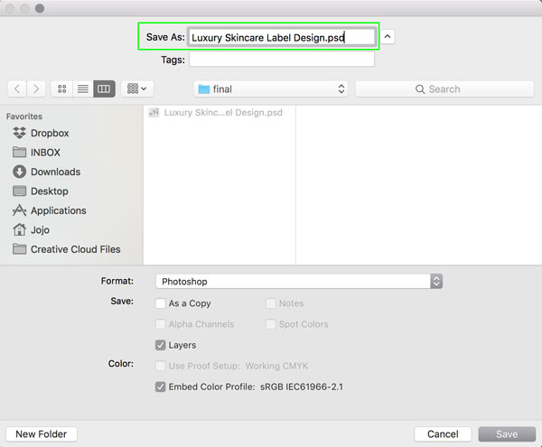
Once the file is open, we’ll save a new version for our working document, with a different name, so as not to overwrite the original. Go to ‘File > Save As…’ and in the window that opens, rename the file ‘Luxury Skincare Label Design’ and save to a folder which works best for you.
Now the file is all set up, we’re going to be working straight from the mockup to create our label design. Keep all the mockup windows open, as we’ll need to come back to them at the end of the tutorial!
*Please note this is a mockup that’s been created specifically for this tutorial, using resources from Mockup Zone and Unsplash.
Step 2: Going in to the Mockup
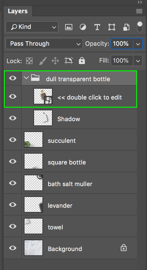
In the Layers panel, open up the ‘dull transparent bottle’ folder by clicking on the dropdown arrow to the left. Double click on the thumbnail, on the layer that says ‘<< double click to edit'.
[open-beige-image]
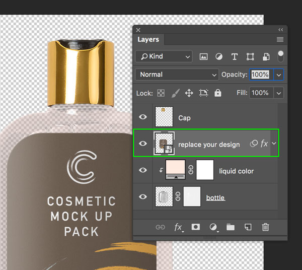
From the new window that opens, double click on the thumbnail on the layer that says ‘replace your design’.
Select everything within the folder labelled ‘put everything inside this group’ by selecting the top layer, then whilst holding down the Shift Key, clicking on the bottom layer. All the layers in-between should now be selected too. Then, with everything selected, hit ‘Command/Ctrl + G’ on the keyboard to create a new group, which we’ll rename ‘ORIGINAL’.
Step 3: Gathering the Stock Photos
As we’ll be using a few different stock images to create our design, let’s get these downloaded in advance. Create a new folder somewhere you can locate easily to store the files, then, download the following and save to the folder you just created:
NordWood Themes: Paper Texture
Scott Webb: Green Plants
Yulia Khvorostiana: Dahlia Plant
Henrik Dønnestad: Abstract
Adrien Ledoux: Moving Water and Ink
Scott Ruzzene: Orange Waves
Gold Texture
Please note: The gold texture can only be used in your personal projects, as it is not covered by our licence for commercial projects.
Great – now that we have all our resources ready, let’s get started with the design!
Step 4: Paper Background
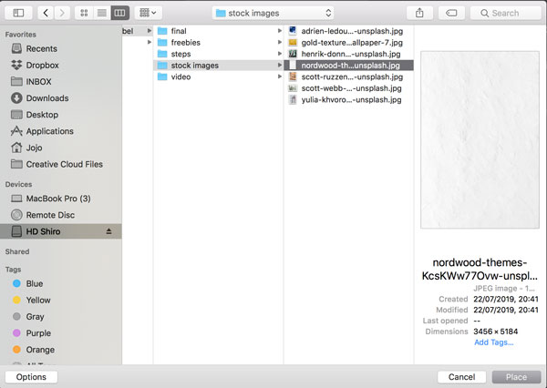
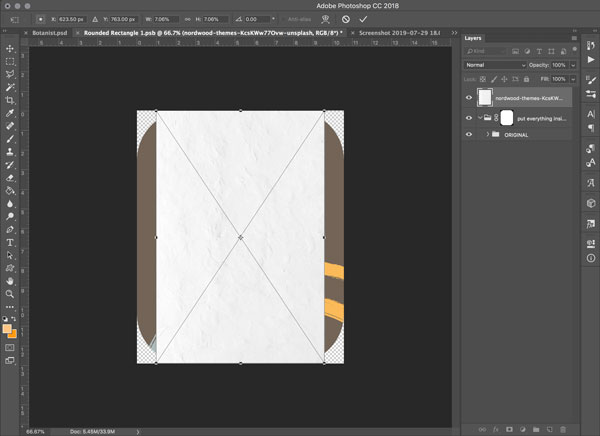
As this is a luxury, natural skincare brand, let’s give the label a tactile, paper effect. From our Photoshop menu, go to ‘File > Place Embedded…’ and navigate to the NordWood Themes paper texture file from the images you just downloaded. Click ‘Place’ in the bottom right, or hit ‘Return’ on the keyboard to place the file.
The file should now appear with the Free Transform bounding box active.
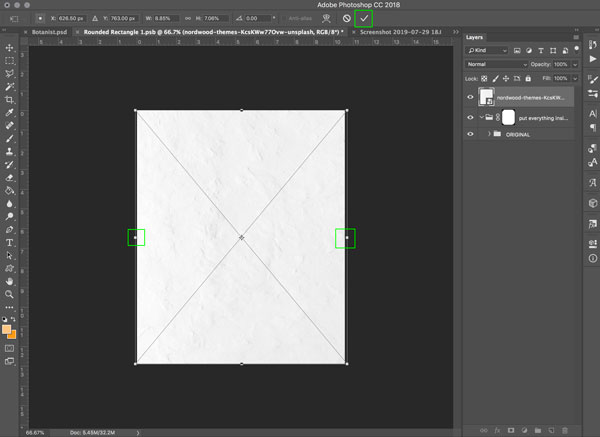
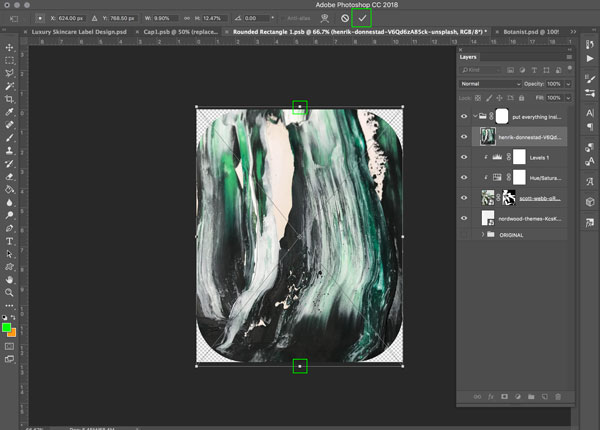
Use this to pull the left and right sides out so they fill the canvas. Then hit ‘Return’ on the keyboard to apply the changes, or click the ‘tick’ icon in the upper right.
In the Layers Panel, move this layer down so it sits inside the ‘put everything inside this group’ folder. You can see that this has applied a mask, so the edges appear rounded. You can then hide the visibility of the ‘ORIGINAL’ group for now, by clicking the ‘eye’ icon to the left, so that it disappears.
Step 5: Planting the Images
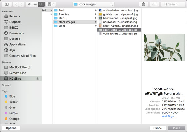
Now, we’ll do the same for our next image. From the Photoshop menu, go to ‘File > Place Embedded…’ and navigate to the Scott Webb Green Plants file from the images you just downloaded. Click ‘Place’ in the bottom right, or hit ‘Return’ on the keyboard to place the file.
The file should now appear with the Free Transform bounding box active.
While holding down the ‘Alt + Shift’ keys, scale up the image by dragging out from one of the corners, and then position so that you have something similar to the image below (though feel free to experiment with scale/position to your liking)! Hit ‘Return’ on the keyboard to apply the changes, or click the ‘tick’ icon in the upper right.
Step 6: Isolating the Subject
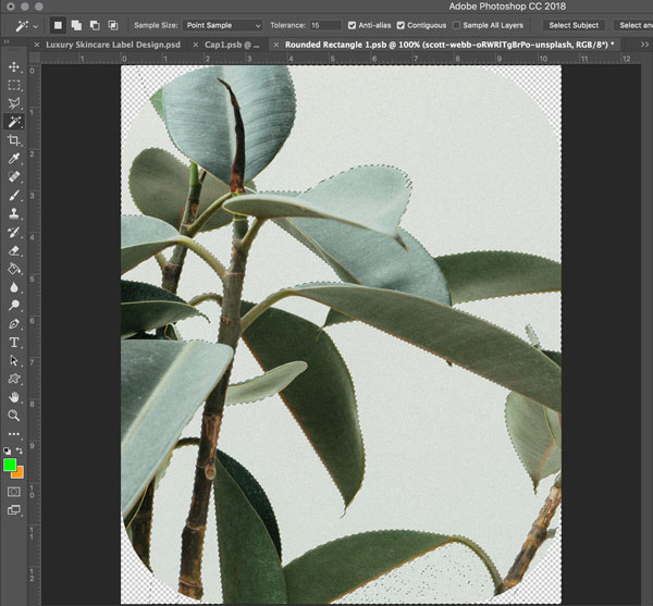
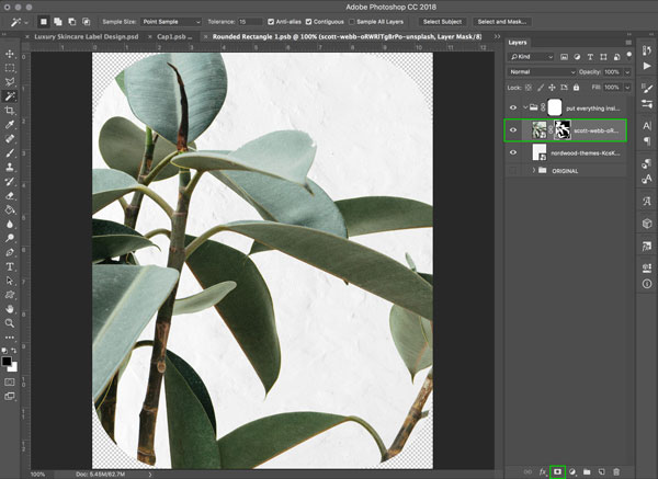
Once we’re happy with the position of the plant, we want to remove the background. Select the ‘Magic Wand Tool’ from the Toolbar, and in the options panel, put in ’15’ as the value for the ‘Tolerance’, and make sure the ‘Contiguous’ option is checked.
Then, whilst holding down the ‘Shift’ key, start clicking on the background areas of the image, paying particular attention to the small gaps between the leaves and stalks.
When you’ve completed your selection, and can see the marching ants round the background areas, hit ‘Shift + Cmd + I’ on the keyboard to inverse the selection, then click on the ‘Layer Mask’ icon at the bottom of the Layers Panel to hide the background.
Step 7: Adjusting the Levels and Saturation
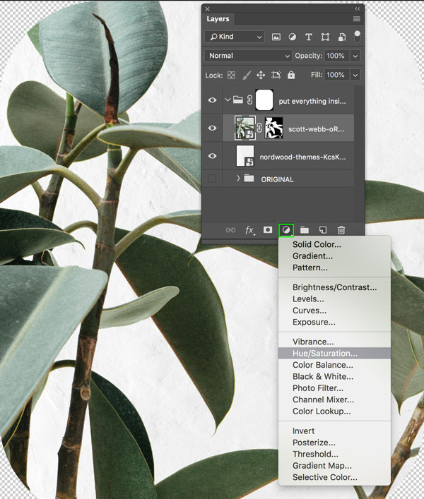
Next, we’re going to make a few tweaks to the image with the Levels and Hue/Saturation tools. Click on the ‘Adjustment Layer’ icon at the bottom of the Layers Panel, and select ‘Hue/Saturation…’
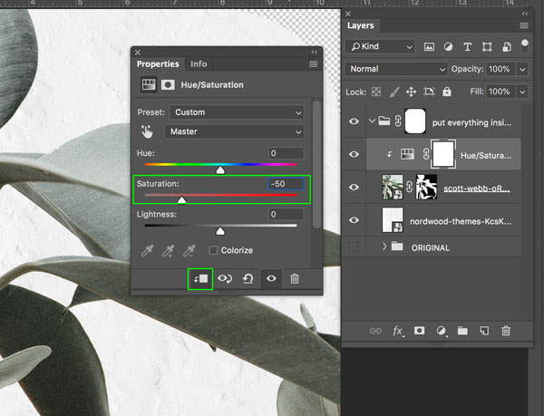
In the ‘Hue/Saturation’ panel that opens, make sure the ‘Clip to layer below’ icon is selected, then change the ‘Saturation’ value to ‘-50’.
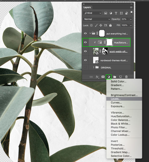
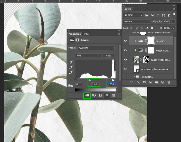
With the ‘Hue/Saturation’ layer we just created selected, go back to the ‘Adjustment Layer’ icon at the bottom of the Layers Panel, and this time select ‘Levels…’
In the ‘Levels’ panel that opens, make sure the ‘Clip to layer below’ icon is selected, then change the mid-tones (middle slider) value to ‘1.40’ and the highlights (right slider) value to ‘239’. You can do this by typing the values in manually, or moving the sliders.
Step 8: Adding some Texture Effects
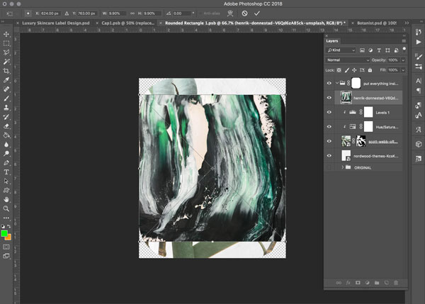
Now we’re going to use a couple more of our stock photos to add some luxe texture! From the Photoshop menu, go to ‘File > Place Embedded…’ and navigate to the Henrik Dønnestad: Abstract file from the images you just downloaded. Click ‘Place’ in the bottom right, or hit ‘Return’ on the keyboard to place the file.
The file should now appear with the Free Transform bounding box active.
Stretch the image by dragging out from the top and bottom edges so that it fills the canvas. Hit ‘Return’ on the keyboard to apply the changes, or click the ‘tick’ icon in the upper right.
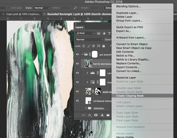
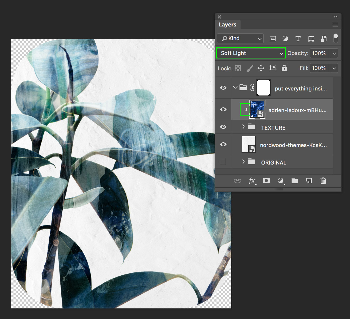
We’re going to ‘clip’ this layer to the ‘Levels’ layer directly below it, so that it only applies to the plant silhouette. To do this, right click on the layer, and select ‘Create Clipping Mask’. Alternatively, whilst holding down ‘Alt’ on the keyboard, hover the cursor between the two layers until it turns in to a box with a small downwards arrow, and then click.
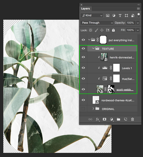
A small arrow will have appeared to the left of the thumbnail to indicate the layer is ‘clipped’, and you can see the image is now only visible on the plant silhouette.
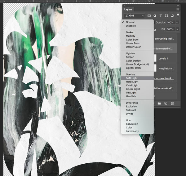
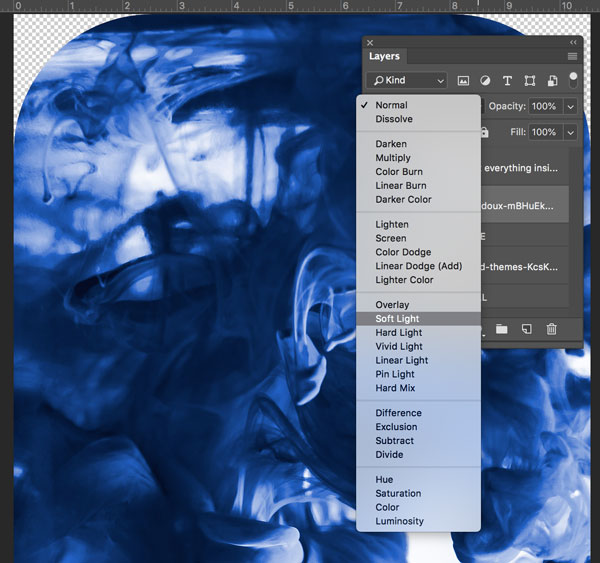
We still want to see the plant through the texture, so let’s change the layer ‘Blend Mode’ to ‘Soft Light’.
You can see that we have some nice painterly strokes covering the leaves.
Step 9: Finishing off the Leaves
Select the layers we’ve been working on in Steps 5 to 8, hit ‘Command + G’ on the keyboard to group them together, then name the folder ‘TEXTURE’.
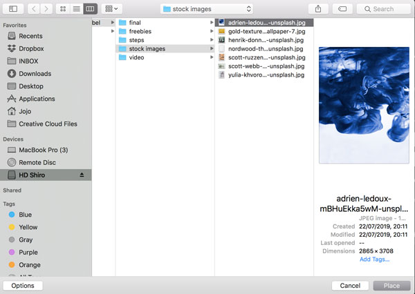
From the Photoshop menu, go to ‘File > Place Embedded…’ and navigate to the Adrien Ledoux: Moving Water and Ink file. Click ‘Place’ in the bottom right, or hit ‘Return’ on the keyboard to place the file.
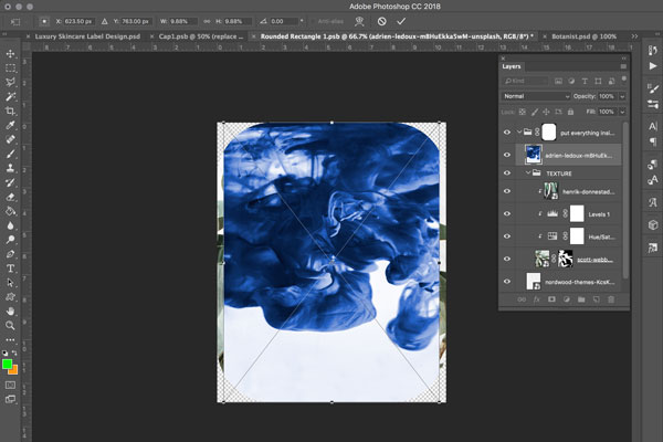
The file should now appear with the Free Transform bounding box active.
Stretch the image by dragging out the left and right sides so that it fills the canvas, and the bottom edge down until the blue reaches the bottom of the canvas. Hit ‘Return’ on the keyboard to apply the changes, or click the ‘tick’ icon in the upper right.
Then, change the layer ‘Blend Mode’ to ‘Soft Light’, like we did with the previous texture.
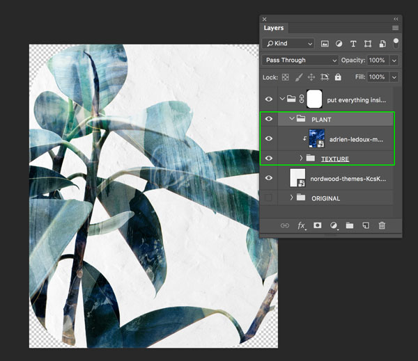
We’re going to ‘clip’ this layer to the ‘TEXTURE’ folder directly below it. Like before, right click on the layer, and select ‘Create Clipping Mask’, or alternatively, whilst holding down ‘Alt’ on the keyboard, hover the cursor between the two layers until it turns into a box with a small downwards arrow, and then click.
Finally, group this layer and the ‘TEXTURE’ folder together into a new folder called ‘PLANT’ to keep things tidy.
Step 10: Pale Background for Text
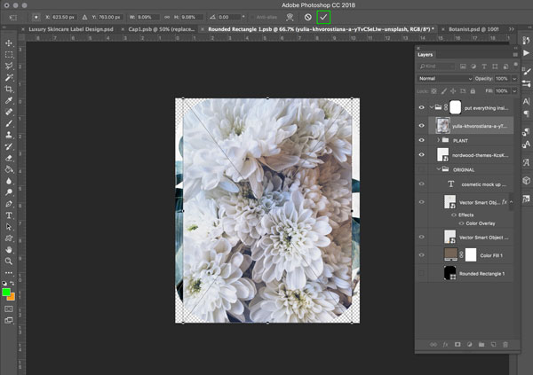
To help the text stand out more clearly, let’s create a paler backdrop within our design. From the Photoshop menu, go to ‘File > Place Embedded…’ and navigate to the Yulia Khvorostiana: Dahlia Plant file from the stock images. Click ‘Place’ in the bottom right, or hit ‘Return’ on the keyboard to place the file.
The file should now appear with the Free Transform bounding box active. Hit ‘Return’ on the keyboard to apply the changes, or click the ‘tick’ icon in the upper right.
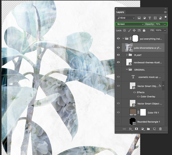
Next, change the ‘Blend Mode’ to ‘Screen’ and the ‘Opacity’ to ‘75%’.
We want to make this a little whiter to help the text stand out, so click the ‘Adjustment Layer’ icon and select ‘Levels…’ from the dropdown menu. In the ‘Levels’ panel that opens, make sure the ‘Clip to layer below’ icon is selected, then change the mid-tones (middle slider) value to ‘1.37’ and the highlights (right slider) value to ‘207’. You can do this by typing the values in manually, or moving the sliders.
Step 11: Rounded Rectangle
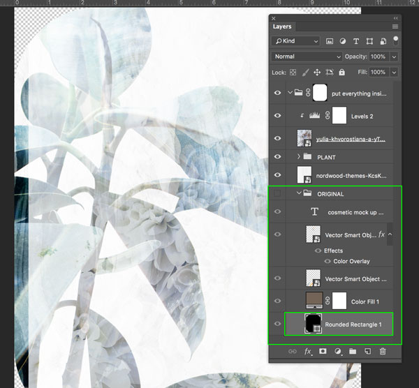
We want to reflect the rounded edges of our label within the design, which we can do by utilising the layers from the original mockup example. Open up the ‘ORIGINAL’ folder we created earlier, and select the ‘Rounded Rectangle 1’ layer:
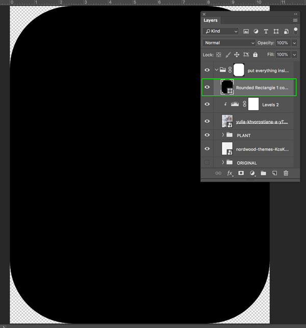
With the layer selected, hit ‘Command/Ctrl + J’ on the keyboard to duplicate the layer. Then, move the duplicated layer to above the ‘Levels’ ‘Adjustment Layer’ we just created.
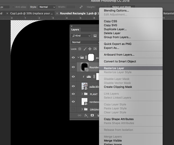
Right click on the Rounded Rectangle layer, and select ‘Rasterize Layer’ from the dropdown menu.
Select the ‘Magic Wand Tool’ from the toolbar, leaving the settings as before, and click anywhere on the black rectangle.
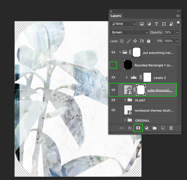
With the ‘marching ants’ still visible, select the pale, floral background layer and click on the ‘Layer Mask’ icon at the bottom of the ‘Layers Panel’. Turn off the visibility of the ‘Rounded Rectangle’ layer by clicking the ‘eye’ icon to its left, to see the mask effect.
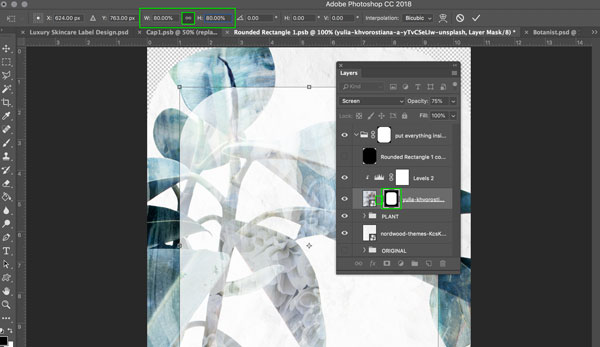
The mask is larger than we’d like, so let’s scale it down. As we only want to scale the mask, and not the graphic, click on the ‘chain’ icon between the two thumbnails to ‘unlink’ the mask and layer. The ‘chain’ icon should disappear.
With just the mask thumbnail highlighted, hit ‘Command/Ctrl + T’ on the keyboard to active the ‘Free Transform’ bounding box. In the properties panel at the top, make sure the proportions are locked by selecting the ‘chain’ icon, then change the value of either the height or width to ‘80%’.
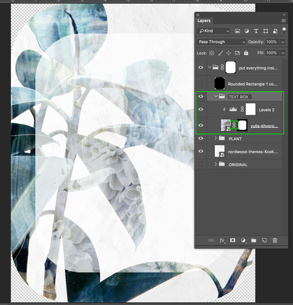
Relink the mask and layer by clicking on the gap between the two thumbnails, and the ‘chain’ icon should reappear. Select both the masked layer and ‘Levels’ layer by holding down the shift key whilst selecting them, then hit ‘Command/Ctrl + G’ on the keyboard to group them together. Name the folder ‘TEXT BOX’.
Step 12: Rounded Border
Next, we’re going to use the original rounded rectangle shape again to create a gold border around our text box, to help it stand out.
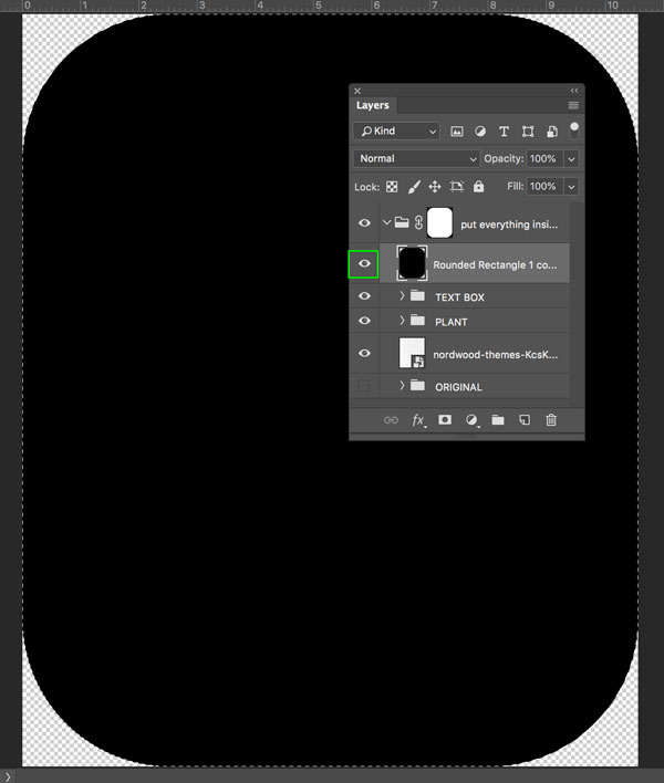
Turn the visibility of the ‘Rounded Rectangle’ layer back on by clicking to the left of the thumbnail, so the ‘eye’ icon reappears. Then, select the ‘Magic Wand Tool’ from the toolbar, leaving the settings as before, and click anywhere on the black rectangle.
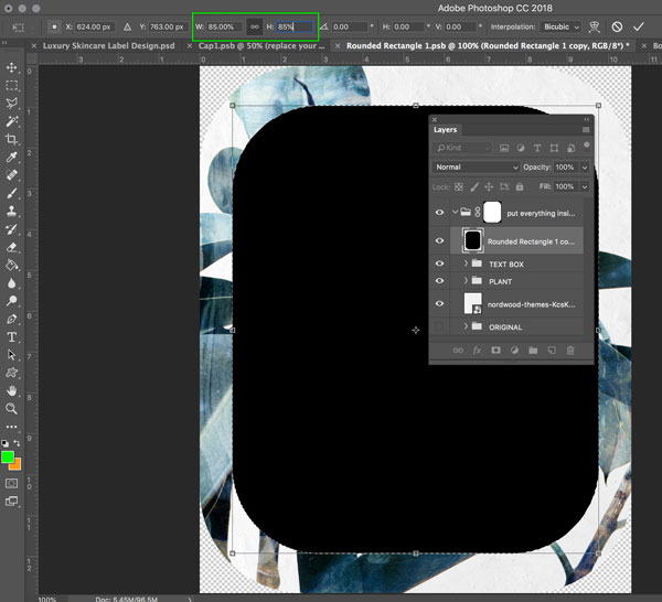
With the ‘marching ants’ still visible, hit ‘Command/Ctrl + T’ on the keyboard to activate the ‘Free Transform Tool’ bounding box. In the properties panel at the top, click the ‘chain’ icon to make sure the proportions are locked, then change the value of either the height or width to ‘85%’. Hit ‘Return’ on the keyboard or click the ‘tick’ icon in the upper right to apply the transformation.
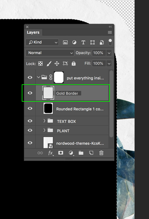
With the ‘marching ants’ still active, create a new layer above, and name it ‘Gold Border’.
With the ‘Gold Border’ layer selected, from the main menu go to ‘Edit > Stroke…’:
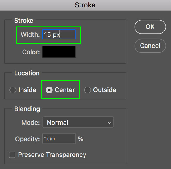
In the ‘Stroke’ panel that opens, enter ’15px’ for the Width value, and select ‘Centre’ for the Location. The Color can be anything, as we’ll be applying the gold texture over the top of it. Click the ‘OK’ button to apply the stroke.
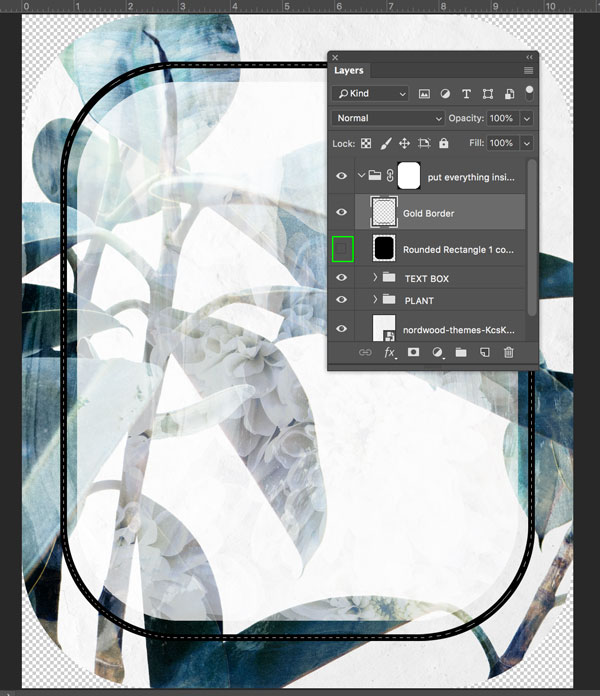
Hide the visibility of the ‘Rounded Rectangle’ layer to see the result:
Step 13: Adding the Gold Texture
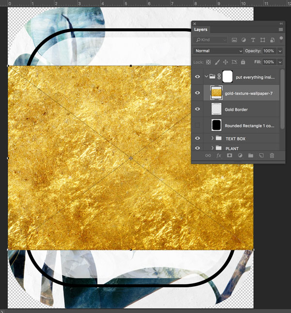
Now that we have our rounded border outlined, let’s make it look a little more inspiring with some gold texture. From the Photoshop menu, go to ‘File > Place Embedded…’ and navigate to the Gold Texture file. Click ‘Place’ in the bottom right, or hit ‘Return’ on the keyboard to place the file.
The file should now appear with the ‘Free Transform’ bounding box active.
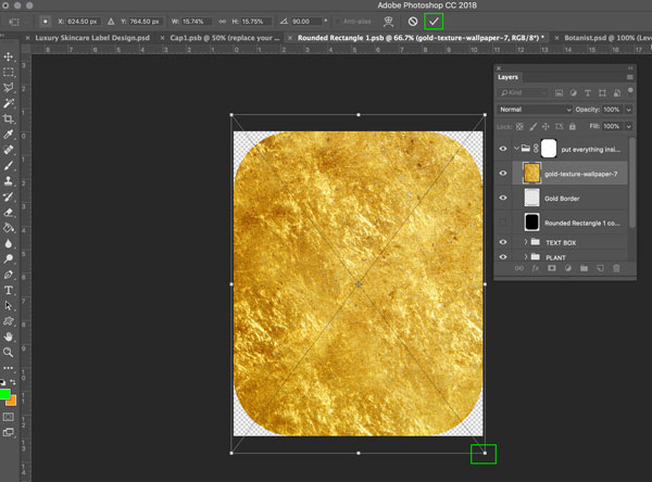
With the Free Transform’ bounding box still active, hold down the ‘Shift’ key and rotate the image right, so that it’s in a portrait format. Then, whilst holding down both the ‘Alt + Shift’ keys, drag out from one of the corners until the image fills the canvas, then hit ‘Return’ on the keyboard or click the ‘tick’ icon in the upper right to apply the transformation.
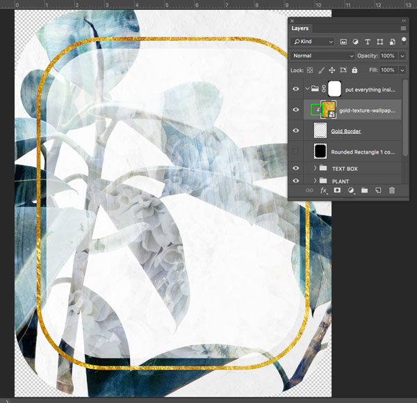
Apply a clipping mask like we’ve done previously in the tutorial, so that the gold texture only applies to our border:
Step 14: Floral Elements
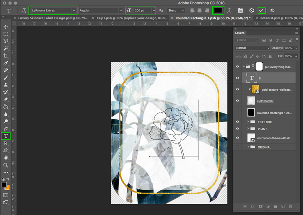
Now we’re going to add some decorative elements using ‘La Paloma – Extras’, one of the fonts included in the current bundle.
Select the ‘Type Tool’ from the toolbar, then enter the following options in the properties panel across the top:
Font: LaPaloma Extras
Size: 200pt
Color: #000000 (black)
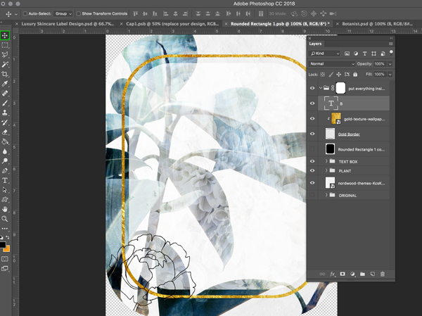
Then, type the letter ‘B’ (making sure it’s uppercase) and click the ‘tick’ icon in the upper right.
Please note: Unfortunately, we are unable to offer ‘LaPalomaExtras.otf’ font file as a freebie for this tutorial. We would like to apologise for any inconvenience this may cause, however we hope the glyphs saved as .PNG files included in the freebie pack will help you follow along and achieve the same outcome!
From the main menu, go to ‘Edit > Transform > Flip Horizontal’.
Then, with the ‘Move Tool’ selected, position the flower in the lower left corner, similar to the image below:
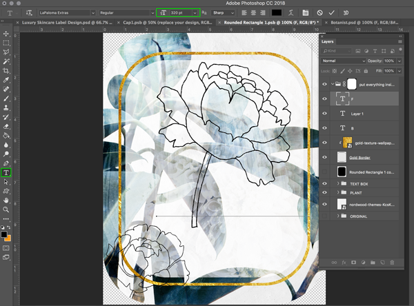
With the ‘Type Tool’ selected, update the ‘Font Size’ in the properties bar to ‘320pt’ and type the letter ‘F’ (uppercase) and click the ‘tick’ icon in the upper right.
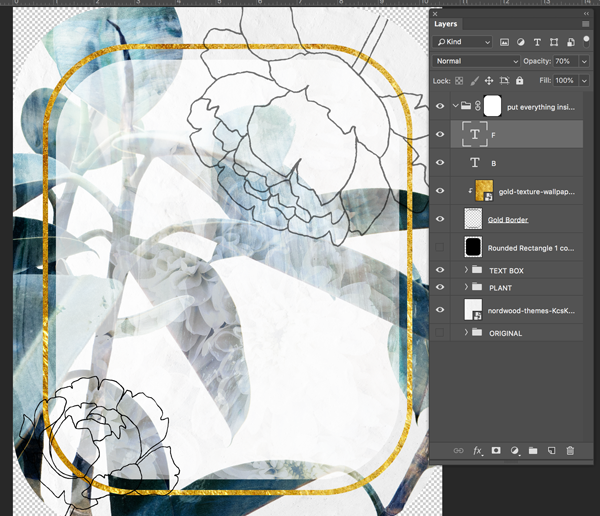
As we did with the previous flower, from the main menu, go to ‘Edit > Transform > Flip Horizontal’. Then, hit ‘Command/Ctrl + T’ on the keyboard to activate the ‘Free Transform’ bounding box, and rotate and position the flower in the upper right corner, similar to the image below. Hit ‘Return’ on the keyboard or click the ‘tick’ icon in the upper right to apply the transformation. Change the layer ‘Opacity’ to ‘70%’
Rename the two layers ‘Flower – bottom left’ and ‘Flower – top right’ so they’re clearer to identify.
Step 15: Gold Group
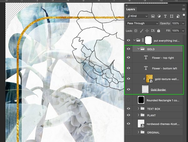
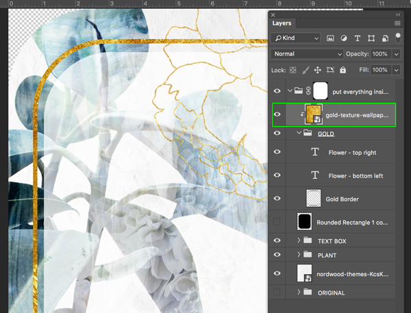
Group together the two floral layers, the gold wallpaper layer and border layer and name the folder ‘GOLD’.
Then, move the gold texture layer to above the folder and ‘clip’ it to the folder, using the same method as used earlier in the tutorial to create clipping masks.
Finally, group together the gold wallpaper layer and ‘GOLD’ folder into a new folder called ‘GOLD – ALL’ to keep things tidy.
Step 16: Adding Warmth
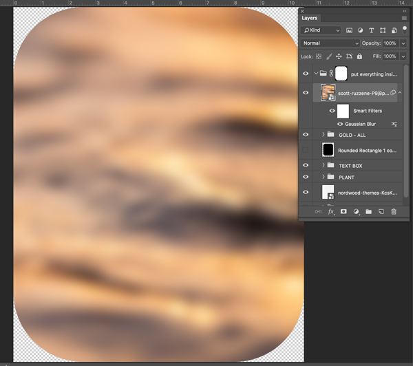
We’re going to add a warm wash of colour using our final stock image. From the Photoshop menu, go to ‘File > Place Embedded…’ and navigate to the Scott Ruzzene: Orange Waves file from the stock images. Click ‘Place’ in the bottom right, or hit ‘Return’ on the keyboard to place the file.
The file should now appear with the Free Transform bounding box active. Hold down both the ‘Alt + Shift’ keys, drag out from one of the corners until the image fills the canvas, then hit ‘Return’ on the keyboard or click the ‘tick’ icon in the upper right to apply the transformation.
From the main menu, go to ‘Filter > Blur > Gaussian Blur…’
In the panel that opens, enter ’25’ as the Pixel Radius value.
We now have a nice, warm, abstract texture we can apply to our design.
Reduce the layer Opacity to 20%, then place in to a folder called ‘WARM TEXTURE’.
Step 17: The Botanist’s Apothecary
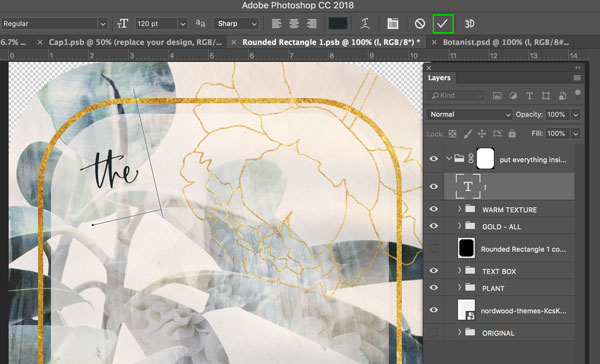
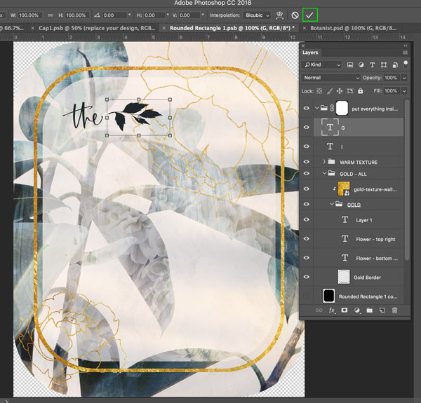
Now our label backdrop has been fully set up, we can start adding our beautiful fonts! With the ‘Type Tool’ selected, make sure the Font Family is still set to ‘LaPaloma Extras’, but change the font size to ‘120 pt’. Then type a lowercase ‘l’. Just use a dark, easy to see colour for now, as we’ll be applying a gradient effect over all the text later.
Then, hit ‘command/Ctrl + T’ on the keyboard, and rotate so that it’s on a slight angle, and move towards the upper left, similar to the image below. Hit ‘Return’ on the keyboard or click the ‘tick’ icon in the upper right to apply the transformation.
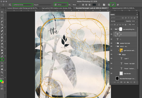
Go back to the ‘Type Tool’, with the Font Family still set to ‘LaPaloma Extras’, but change the font size to ’80 pt’. Then type an uppercase ‘G’.
Hit ‘command/Ctrl + T’ on the keyboard, and rotate so that it’s on its side, and move towards the right of the word ‘the’, similar to the image below. Hit ‘Return’ on the keyboard or click the ‘tick’ icon in the upper right to apply the transformation.
Step 18: Adding the Text
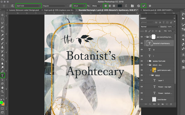
Now we’re going to use our freebie font, ‘Serif420 Regular’ by Hanker Design Co. With the ‘Type Tool’ selected, make sure the Font Family is still set to ‘Serif420 Regular’, the font size to ’40 pt’, and the text-justification to ‘left’. Then type ‘Botanist’s Apothecary’, with each word on its own line.
With the text highlighted, open the ‘Character’ panel, and change the ‘Leading’ to ’40 pt’ to bring the lines a little closer together.
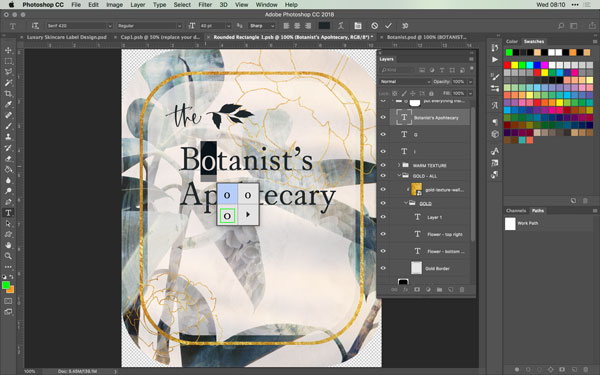
Now, we’re going to take advantage of the stylistic alternatives this font offers, by changing the lowercase letters in to small caps. To do this, highlight the letter ‘o’ then hover your cursor over it. A selection box should appear with some alternatives. Click on the capital ‘O’ (the third option) to change the character.
Repeat this process with all the lowercase letters.
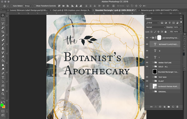
Now we need to align the text so it sits better on the canvas. Select both the ‘Botanist’s Apothecary’ text layer, and the paper background layer by clicking on them whilst holding down the ‘Command/Ctrl’ key. Then, with the ‘Move Tool’ selected, select the ‘Align horizontal centres’ icon in the properties bar across the top. Then move the ‘the’ and ‘leaf’ so that the vertical stroke of the ‘t’ roughly lines up with the vertical stroke of the letter ‘B’. Move the text so that it’s positioned similarly to the image below. Hold down the ‘Shift’ key if you want to move something along a locked horizontal or vertical axis.
Step 19: Little Details
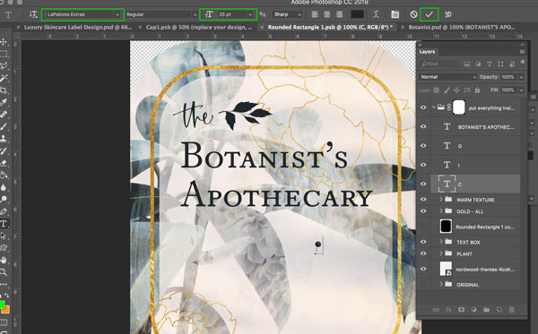
We’re going to use another of the ‘LaPaloma Extras’ to add a little decoration to the text we’ve just created. With the ‘Type Tool’ selected, change the Font to ‘LaPaloma Extras’ and set the Font Size to ’25pt’. Type an uppercase ‘C’.
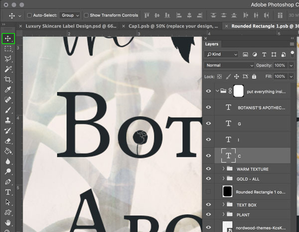
With the ‘Move Tool’ selected, move the character so that it sits in the middle of the ‘O’ in ‘Botanist’s’.
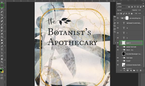
Create a new layer, then check the foreground colour is set to black (or any dark colour). Select the ‘Rectangular Marquee Tool’, and draw a thin rectangle slightly wider than the word ‘Apothecary’.
Hit ‘Alt + Delete’ on the keyboard to fill the shape with the foreground colour.
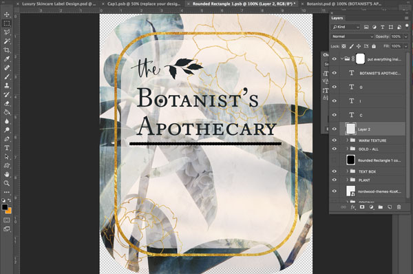
Rename the layer ‘Black Line’ and then centre to the background the same way we did for the text earlier. Using the ‘Move Tool’ position the line so that there’s about a letter’s height space between it and the text.
Step 20: More Awesome Text
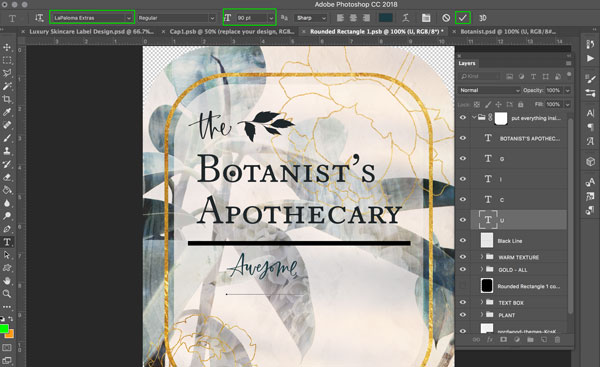
We’re going to use another of the ‘LaPaloma Extras’ to add some typographic diversity. With the ‘Type Tool’ selected, change the Font to ‘LaPaloma Extras’ and set the Font Size to ’90 pt’. Type an uppercase ‘U’ to get the catchword ‘Awesome’.
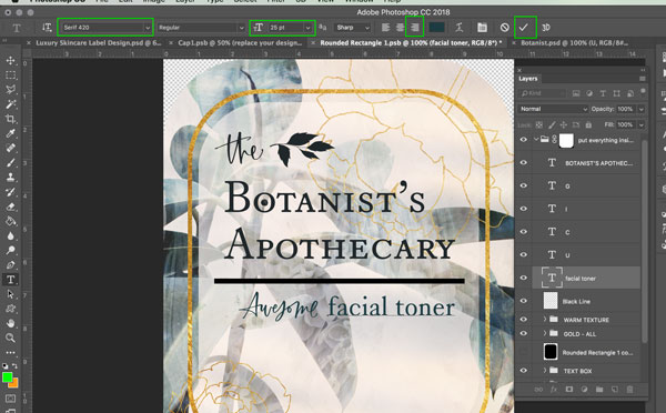
Then, with the ‘Type Tool’ still selected, click on the canvas to create a new type layer, and change the font to ‘Serif 420′ and the font size to ’25 pt’. Type ‘facial toner’. Use the ‘Move Tool’ to align it so that it lines up to the end of the word ‘Apothecary’. Continue to position both the ‘Awesome’ layer and ‘facial toner’ layer so they sit similar to the image below.
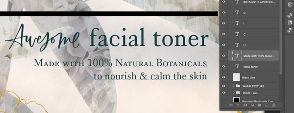
On a new type layer, with the font still as ‘Serif 420′ change the Font Size to ’10 pt’ and the text justification to ‘right’. Then type the following:
“Made with 100% Natural Botanicals
to nourish & calm the skin”
Position as in the image below.
On the top, “Made with…” line, change the lowercase letters to small caps, like we did earlier with the ‘Botanist’s Apothecary’ text in Step 18.
Step 21: Faux Italics
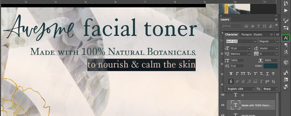
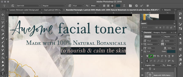
Highlight the line “to nourish & calm the skin” and open the ‘Character’ panel.
Then, select the ‘Faux Italic’ icon.
Step 22: Filling the Text Gaps
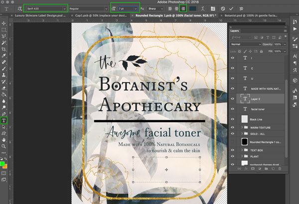
We now need to fill the remaining gaps with some more text. Create a new text layer, with the same font and justification as before, but reducing the Font Size to ‘7 pt’. With the ‘Type Tool’ still selected, click and drag from the lower corner to draw a bounding box for the text, which roughly fills the blank space in the lower right of the label.
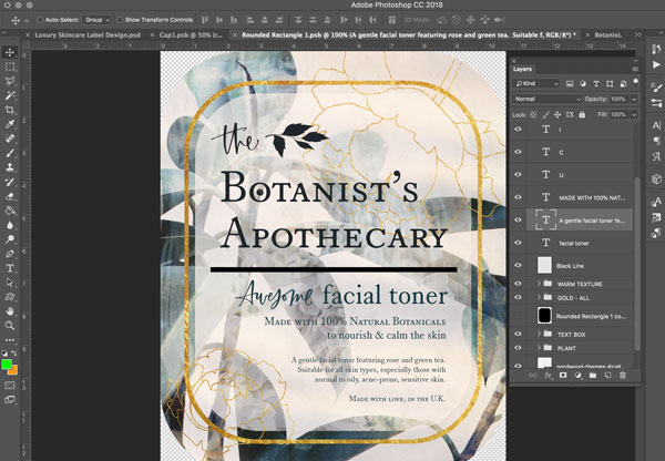
Then, copy/past or type the following text:
“A gentle facial toner featuring rose and green tea.
Suitable for all skin types, especially those with normal to oily, acne-prone, sensitive skin.
Made with love, in the U.K.”
Change the final line to small caps, and reposition the box as necessary so it sits neatly in the design.
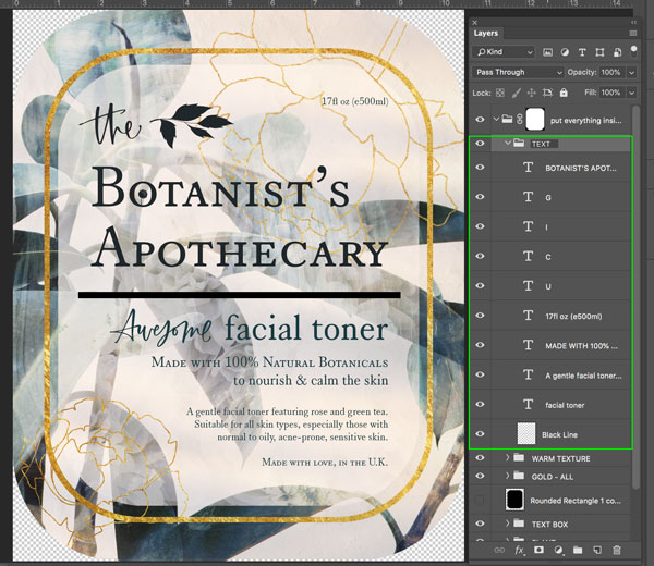
For our final bit of text, we’re going to add the volume of the product. On a new text layer, keeping the previous properties, copy/paste or type the following:
“17fl oz (e500ml)”
And position towards the upper right corner of the label.
Step 23: Adding a Subtle Gradient to the Text
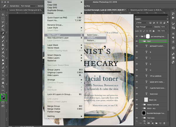
To finish the label, we’re going to add a subtle, dark gradient to the text. To apply the effect to all elements, group all the text and ‘Black Line’ layers and name the folder ‘TEXT’. Make sure this folder remains selected.
Change the Foreground Colour to hex value ‘394a53’ and the Background Colour to hex value ‘000000’ (black). Then from the main menu, go to ‘Layer > New Fill Layer > Gradient…’
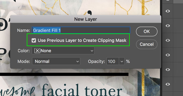
In the pop-up window that opens, make sure the ‘Use Previous Layer to Create Clipping Mask’ is checked, then hit ‘OK’.
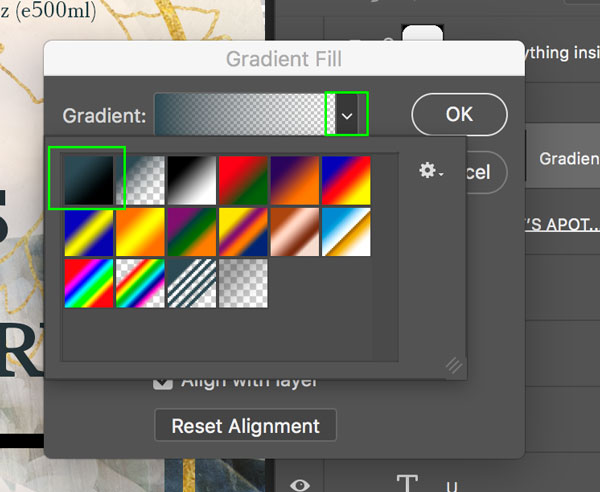
From the gradient dropdown, select the ‘Foreground to Background’ option, then hit ‘OK’.
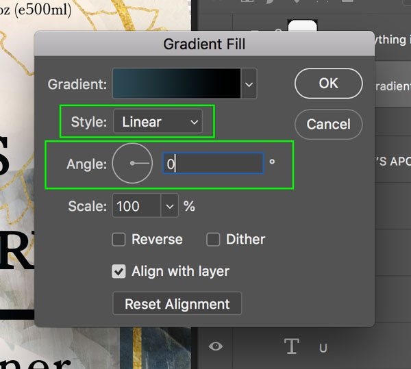
Finally, set the Style to ‘Linear’ and change the Angle to ‘0’.
Hit ‘OK’ to apply the effect.
Step 24: Completing the Mockup Presentation
And that’s our label design complete! To apply it to our mockup, we just need to do two very simple things… First, hit ‘Command/Ctrl + S’ to save the document. Then, go back to our Cap1.psb document, which is where we accessed the label template from.
You can now see how our label looks on the bottle. To apply this to our full mockup, hit ‘Command/Ctrl + S’ again to save, then go back to our main mockup window, where you’ll see the complete bottle updated in the design.
We’ve now completed our Luxury, Natural Skincare Packaging tutorial! To create this design, we’ve combined a selection of free stock images, premium quality fonts and a realistic mockup to make our presentation complete. Remember that the ‘LaPaloma Extras’ and ‘Serif 420’ fonts we have used for the tutorial just a couple from ‘The Spectacular Type Lover’s Selection’ (https://www.designcuts.com/product/the-spectacular-type-lovers-selection/) featuring many more fonts from top designers to cover every design project!
Remember that whether it’s your outcome for this tutorial or something new you’ve made, we’d love to see your designs on our Facebook page.
Please leave a comment if you have any questions or suggestions. I always look forward to hearing from you!
There’s still time to check out The Spectacular Type Lover’s Selection providing you with a fantastic resource of quality fonts that you’ll be using for years to come.



























Nice job Joanna. Good to hear your voice on the video. I enjoyed watching your other videos and the how to ones for the packaged items.
Thanks so much for commenting Jeanne and we’re so happy that you enjoyed it :).
Great!!!! Thank you!
We hope that you had a lot of fun working through this tutorial Veselina and thanks so much for taking the time to comment :).
Very cool–thanks! Love the touches on the plant–great ideas.
Thanks so much for your comment Heather, and we’re so thrilled that you enjoyed picking up some new tips and tricks in this tutorial :).
Wow. That label has a lot going on, but it’s beautifully balanced. Well done.
Hey Mark,
Than you so much for taking the time to comment and it really means so much to us to hear that you find this tutorial design super detailed, but balanced :). I hope that you enjoy following along with this one, and that you love working with your new freebies :).
What an amazing tutorial! Thank you for sharing and can’t wait to try it out. Lots of new ideas to be learned.
Woohoo we’re so happy that you love it Barbara!
I hope that you have lots of fun picking up some new design tips and tricks, and that they are really useful to put into action in your own creative projects too. Happy designing :).