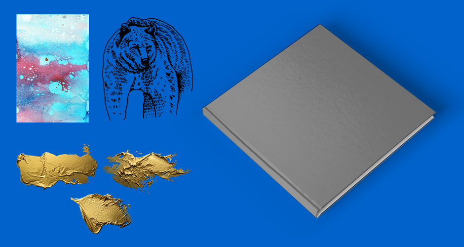
In this tutorial, we will be creating a book cover design for The Whimsical Winter in Photoshop. To create our cover design we will be utilizing a small handful of elements from The Totally Artistic Designer’s Toolbox, courtesy of Barn Owl Studio and NKate. In order to complete our book cover design we will also be working with a realistic book mockup from the Design Cuts Marketplace along with a free typeface and stock photo. The Totally Artistic Designer’s Toolbox contains a truly massive assortment of high quality assets from the popular Letter Builder by Ian Barnard, to the awesome Wilderness Scene Creator by The Artifex Forge that will let your imagination soar. So if you are ready to get started, then fire up Photoshop and let’s begin!
HAVE YOU SEEN OUR YOUTUBE CHANNEL?
Watch the video tutorial below and subscribe to our YouTube channel for regular updates direct to your inbox.
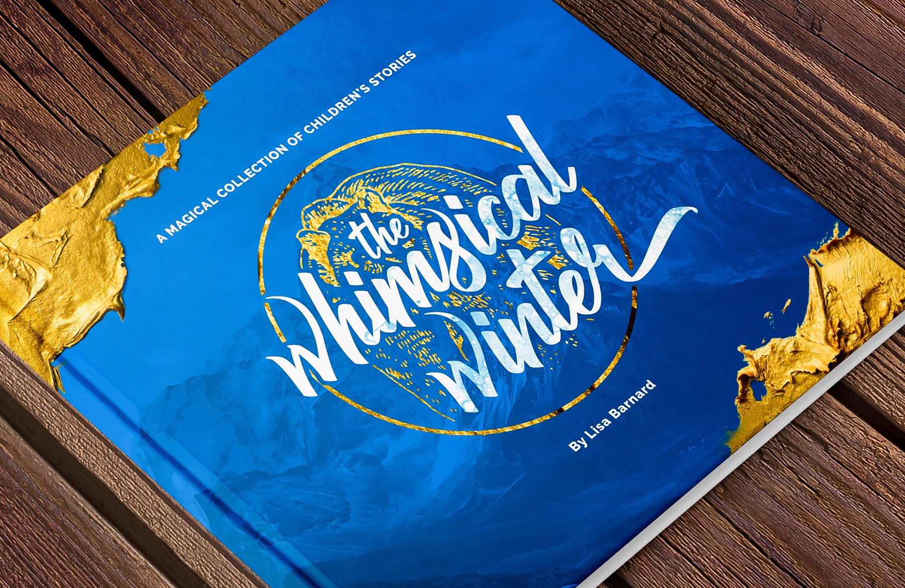
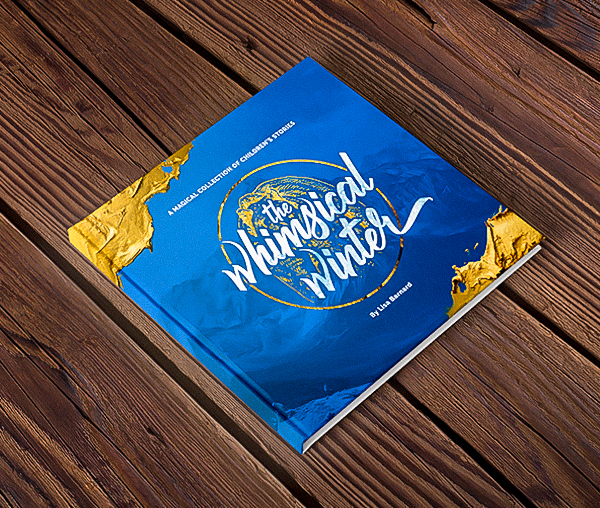
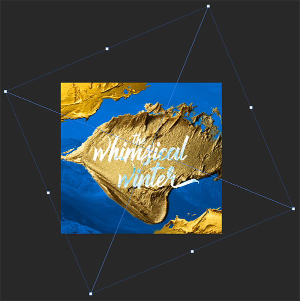
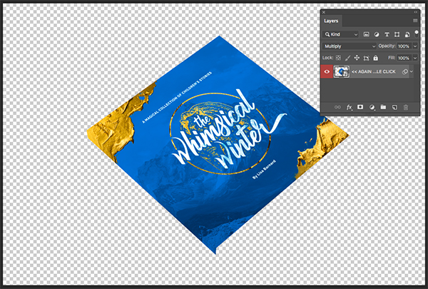
Here’s a look at what we’ll be creating:
Follow along with this tutorial: Download the freebie files
This freebie pack is just a small sample of what you can expect to find in The Totally Artistic Designer’s Toolbox for just $29 (that’s 98% off). You’ll be amazed at the depth and quality that this collection adds to your design work and just how much it’ll speed up your design process!
Step 1: The Whimsical Winter Book Cover
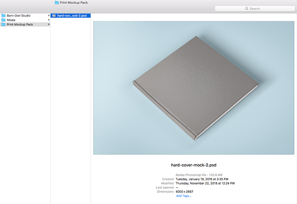
To get started, navigate to the freebies folder and open the ‘hard-cover-mock-2.psd’ file from the ‘Print Mockup Pack’ subfolder.
After opening the file the first thing we want to do is save it with a different name so we don’t overwrite the mockup PSD. You will notice there is a single Smart Object layer in the Layers Palette, so let’s go ahead and double click on that to go inside.
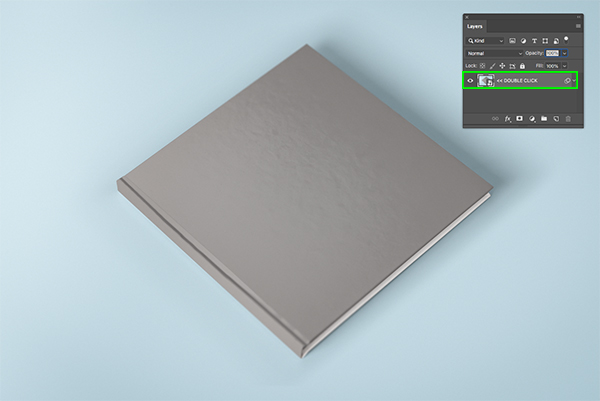
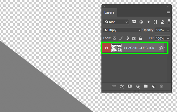
Once you are inside of that Smart Object you will see a few more layers – this time go into the ‘REPLACE GROUND TEXTURE’ layer by double clicking on it.
Step 2: Wooden Table Background
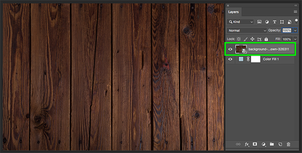
Now that we are inside of the background we want to download this free stock image here from Pexels.com. After saving the dark wooden background texture, bring it into the file and scale it so that it fills the canvas as shown below:
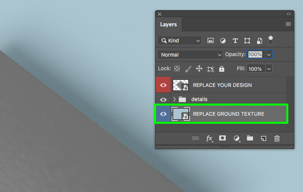
After you have sized the background accordingly, save the file by pressing Command/Ctrl+S and then Command/Ctrl+W to close the window and return to the previous window. You should now see the texture applied to the background. Now we can go ahead and double click on the top Smart Object that says ‘REPLACE YOUR DESIGN’ highlighted by the green box in the image below:
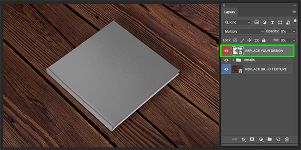
Once you are inside of this file we will once again need to double click on the Smart Object to go inside the main set of layers where we will be working.
Step 3: Blue Skies
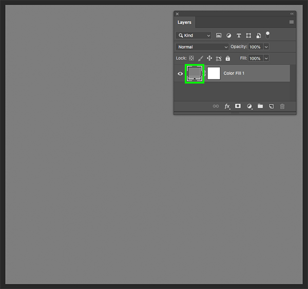
You should now be inside of the Smart Object that contains only a ‘Color Fill 1’ layer. Once we are here, let’s double click the layer thumbnail to change our background color.
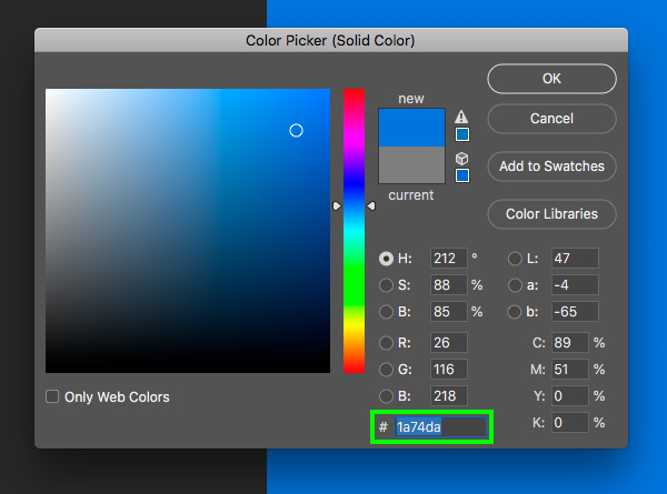
Enter the hex value ‘#1A74DA’ and then press ‘Return’ on the keyboard or click ‘OK’ to continue.
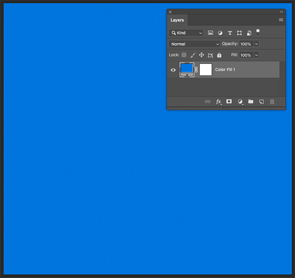
Your background will now be filled with a nice, rich blue color instead of the medium gray we had before.
Step 4: Snowy Mountains
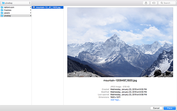
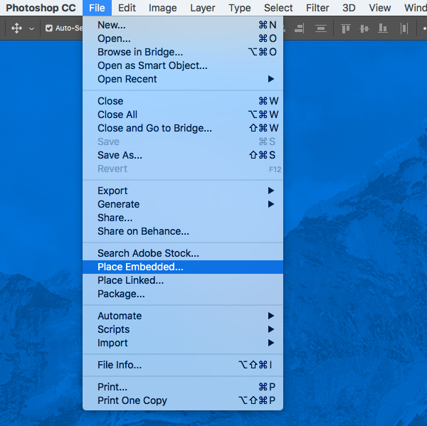
Now we will bring in our other free stock photo from Pixabay here and save it with the other resources. After saving the image, return to Photoshop and go to the File menu before choosing ‘Place Embedded…’ from the dropdown.
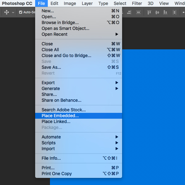
Now we will navigate to that free photo and choose ‘Place’ from the bottom right corner of the dialog box as shown below:
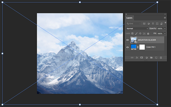
After bringing in the mountain photo, click and drag outwards from any of the four corners of the bounding box while holding Alt/Option+Shift to scale it up so the top of the mountain is just about centered. After placing the photo, press ‘Return’ to apply the changes. Next, double click on the layer name and rename it ‘MOUNTAIN GLACIER’ or something similar.
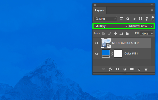
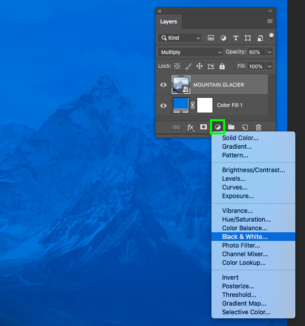
Now that we have resized and renamed the image, let’s change the Blending Mode from ‘Normal’ to ‘Multiply’ and reduce the ‘Opacity’ to about ’60%’ as shown here:
Step 5: B&W Adjustment Layer
You may wish to reposition or play with the size of the mountain image a bit more – here I have just moved it up and to the right a bit to show more of the bottom. Once you are happy with the placement, hold the Alt/Option key and click on the Adjustment Layer icon at the bottom of the Layers Palette and then choose ‘Black & White…’ from the menu.
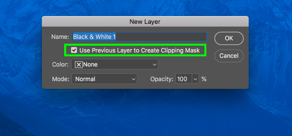
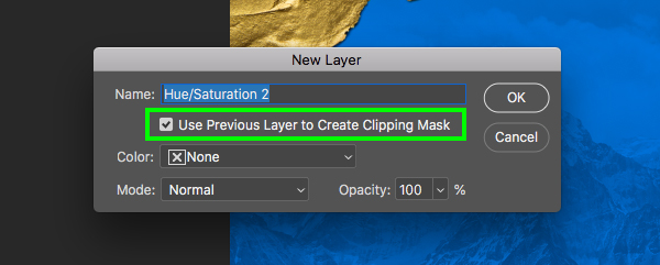
When prompted with the ‘New Layer’ dialog box, check off the option that says ‘Use Previous Layer to Create Clipping Mask’ and then click ‘OK’ to proceed.
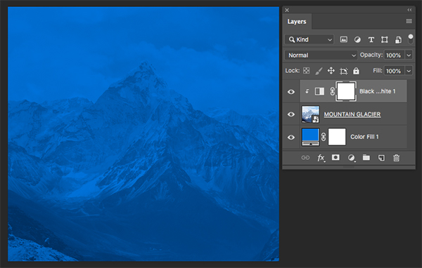
You will now have a Clipping Mask applied to the Adjustment Layer so that only the image of the mountains below is in black and white leaving your blue background intact.
Step 6: Metallic Strokes
Go to the File menu and choose ‘Place Embedded…’ from the dropdown.
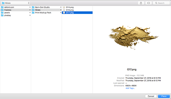
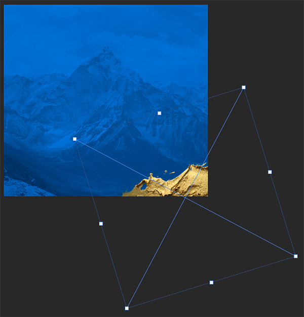
Navigate to the ‘G17.png’ file in the freebies folder for this tutorial. This is the first of three of these beautiful, gold metallic strokes from NKate that we will be working with. Once you have selected the file, click ‘Place’ from the lower right to bring it into the document.
After bringing in the image, rotate it counterclockwise and move it to the lower right hand corner as shown here:
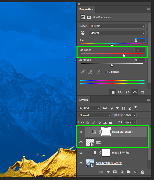
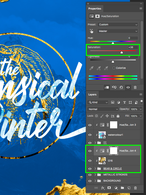
Next, hold the Alt/Option key and click on the Adjustment Layer icon at the bottom of the Layers Palette before choosing ‘Hue/Saturation…’ from the list.
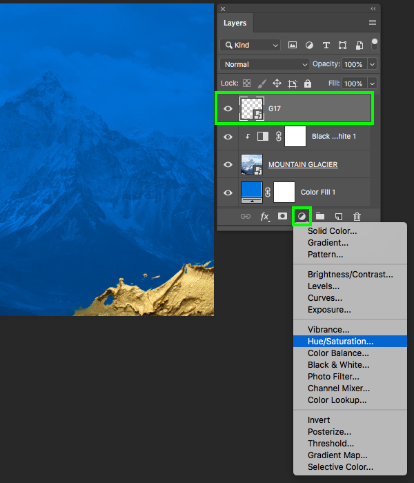
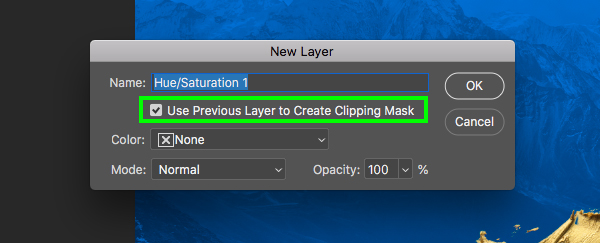
Check off the box that says ‘Use Previous Layer to Create Clipping Mask’ and then click ‘OK’ or press ‘Return’ on the keyboard to continue.
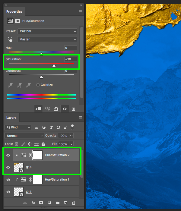
In the Properties panel, move the ‘Saturation’ slider up to ‘+38’ to increase the saturation of the gold paint stroke. Notice that the Adjustment Layer will be clipped to the paint stroke so the change in saturation should only affect the paint stroke layer.
Step 7: Second Metallic Stroke
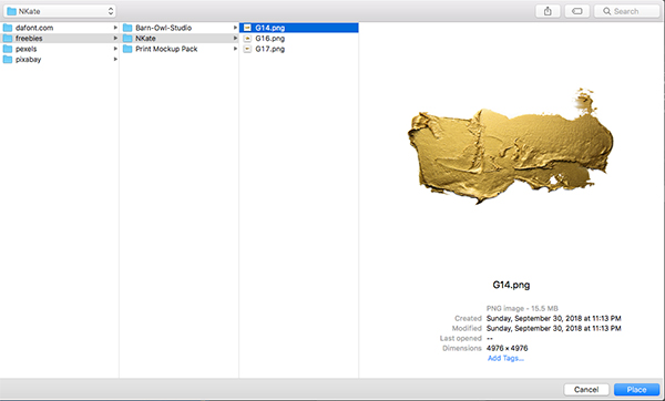
Go to the File menu and choose ‘Place Embedded…’ from the dropdown once again before navigating to the ‘G14.png’ file and choosing ‘Place’ from the bottom right corner.
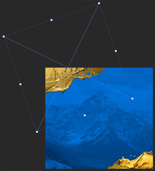
This time let’s rotate the image counterclockwise and place it in the upper left corner of the image as shown here:
With the ‘G14’ Smart Object layer selected, hold the Alt/Option key and click on the Adjustment Layer icon from the bottom of the Layers Palette before choosing ‘Hue/Saturation…’ as we did in the previous step.
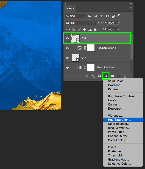
Once again let’s check off the ‘Use Previous Layer to Create Clipping Mask’ option and then click ‘OK’ to proceed.
Return to the Properties panel and boost the middle ‘Saturation’ slider to ‘+38’ so that the saturation of both metallic strokes matches.
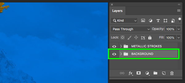
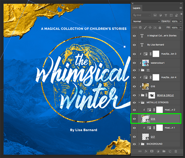
Step 8: Organizing Our Layers
Select the top Adjustment Layer and then hold the Shift key and select the ‘G17’ Smart Object layer so your top four layers are selected together.
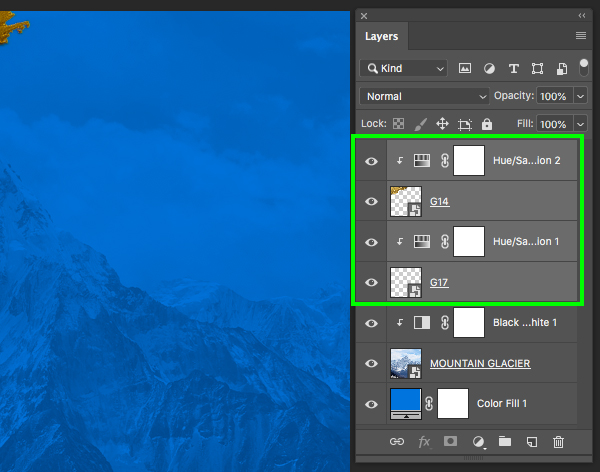
Press Command/Ctrl+G to place these layers into a new folder and then double click on the ‘Group 1’ text and rename it ‘METALLIC STROKES’ as shown below:
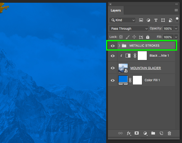
Repeat this for the bottom three layers and place them into a new folder called ‘BACKGROUND’.
Step 9: Adding The Title
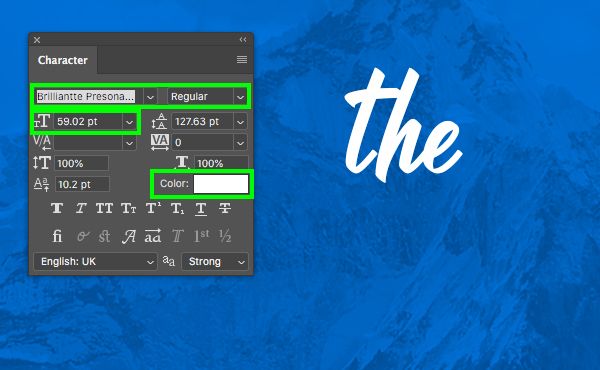
Before we continue we will need to install the ‘Brilliantte’ typeface, which you can download from DaFont.com by clicking here and installing it. Once you have done that, return to Photoshop, add a new layer, and then press ’T’ to switch over to your Type Tool. From here we are going to use the ‘Brilliantte’ font to type out the word ‘the’ in all lowercase. Use the Character panel to change the font size to about ’59 pt’ and use a solid white fill. (If you don’t see the Character panel you can find it under the Window menu).
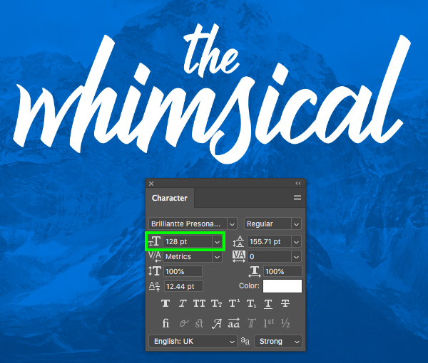
Add another new layer and using the same typeface let’s type out the word ‘whimsical’ again in all lowercase. This time, however, we will change the size to about ‘128 pt’ as indicated in the Character panel in the following image:
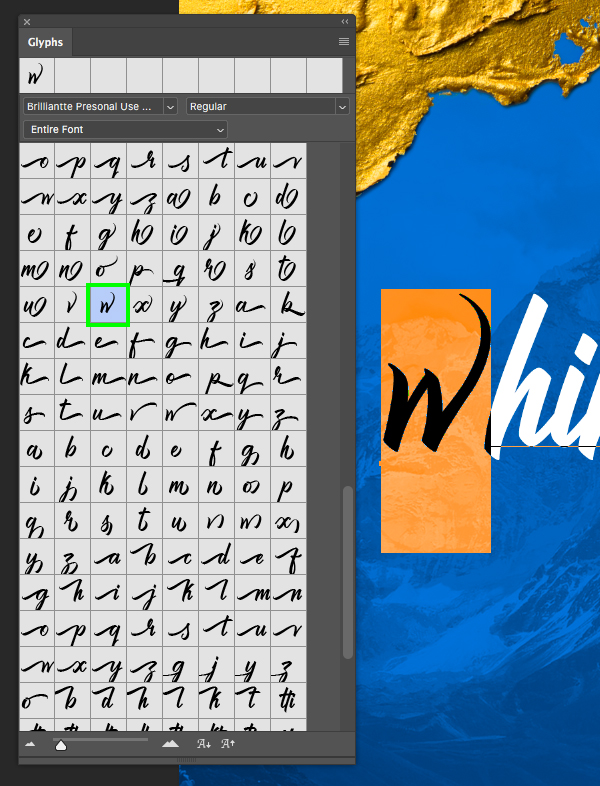
Next, go to the Window menu and choose ‘Glyphs’ from the dropdown.
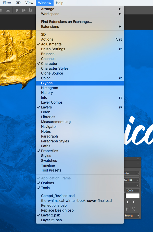
What we want to do now is use some of the alternate characters that are available for this typeface. To do that, use your Type Tool (T) to highlight the letter ‘w’ and then in the Glyphs panel, double click on the alternate character shown here:
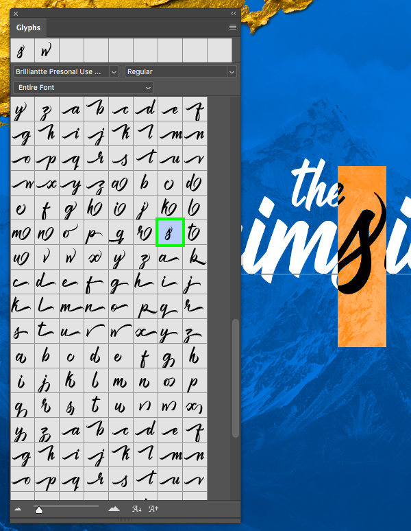
Do the same thing for the letter ’s’ by changing it to the following alternate:
We will now adjust some of the kerning between letters by clicking inbetween the two characters you’d like to adjust (between the ‘w’ and ‘h’ and also between the ’s’ and the ‘i’) and pressing Alt/Option and the left arrow to reduce the amount of space inbetween letters. Little touches like this are the kinds of details you want to look out for as they can often separate a beginner from a more skilled designer.

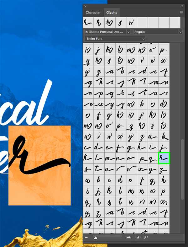
Now select the word ‘whimsical’ and duplicate the layer by pressing Command/Ctrl+J. Move this new copy below the original and then click inside and select all of the letters except the ‘w’ that we changed and delete them. Instead, type out the word ‘winter’ and then use the Glyphs to replace the last ‘r’ with the character alternate shown here:
Step 10: Title Treatment
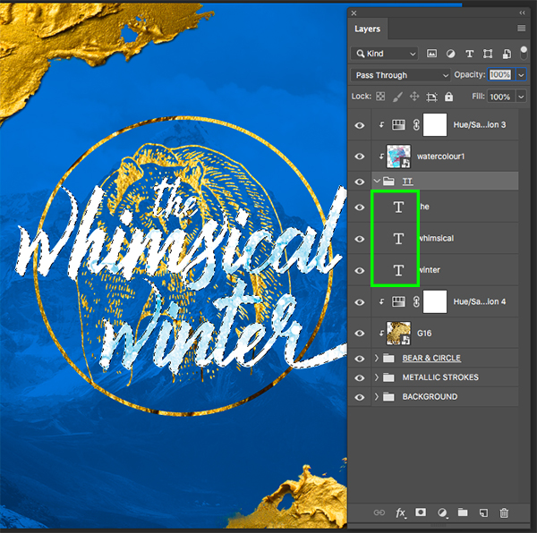
Select the top text layer, hold the Shift key, and then select the third text layer so all three layers are selected simultaneously.
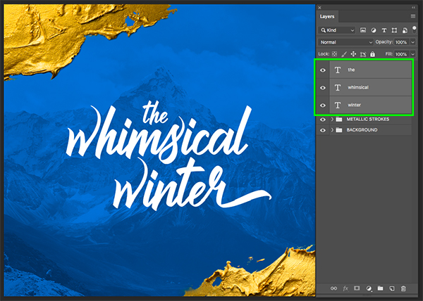
With your layers still selected, press Command/Ctrl+G to put them into a new folder and rename it ‘TT’ for ‘Title Treatment’.
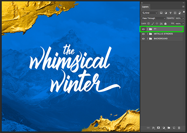
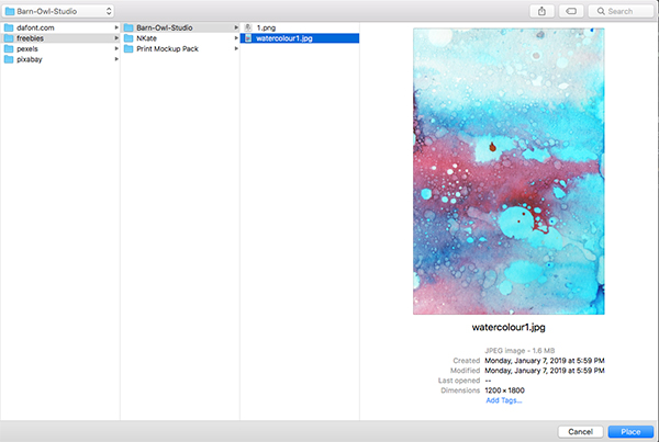
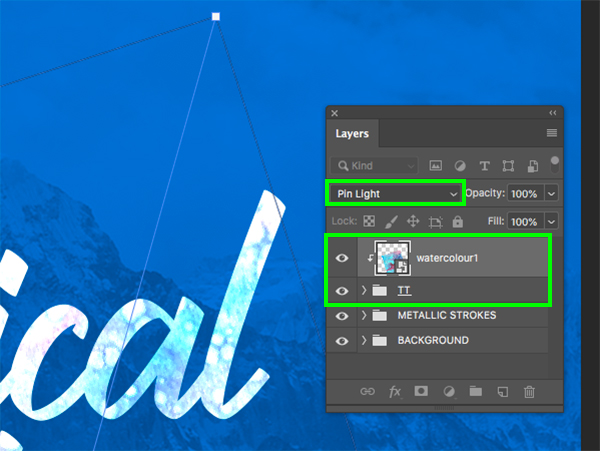
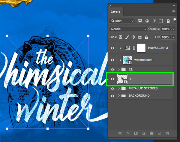
Step 11: Watercolour Texture
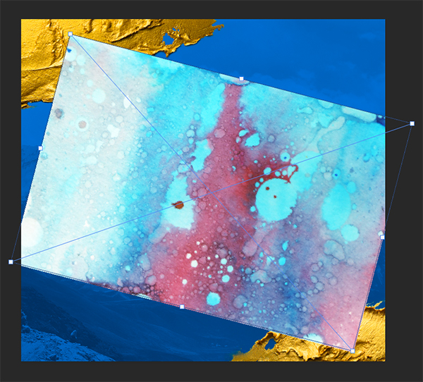
Go to the File menu and choose ‘Place Embedded…’ before navigating to the ‘watercolour1.jpg’ file in the freebies folder for the tutorial. This is one of several beautiful watercolour textures from Barn Owl Studio that comes in the complete bundle, but for today we will just be using one of them. Once you have selected the image, choose ‘Place’ from the lower right corner to import it to your document.
After bringing in the image, rotate it slightly and position it on top of your text layers.
With your texture Smart Object placed directly above the ‘TT’ folder, hold the Control key and click on the layer before choosing ‘Create Clipping Mask’ from the menu.
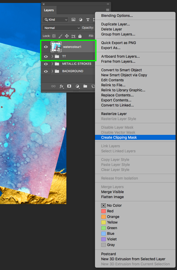
Once the Clipping Mask has been applied you can still rotate and/or reposition the watercolour texture without having to worry about messing up any Layer Masks, which is a very nice benefit of working this way!
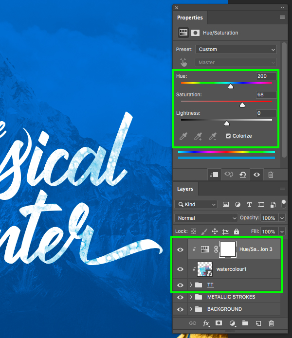
Step 12: Color Wash
Select the ‘TT’ folder and then click on the Adjustment Layer icon at the bottom of the Layers Palette before choosing ‘Hue/Saturation…’ from the list.
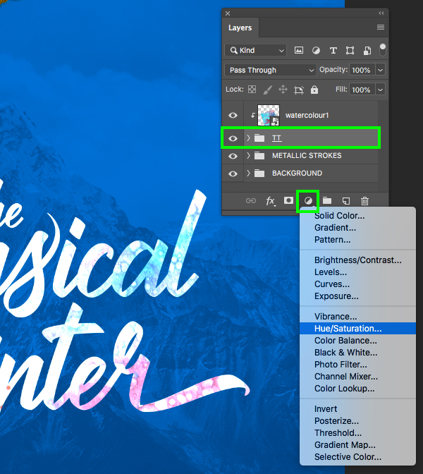
Once you add the Hue/Saturation Adjustment Layer it will be sandwiched between the ‘TT’ folder and the ‘watercolour1’ layer, but we want to place it above the texture while retaining the Clipping Mask. To do this we simply need to select the Adjustment Layer and then press Command/Ctrl and the right bracket one time on the keyboard – this will move it up one position in the Layers Palette and will ensure that the Clipping Mask is retained. Once you have done that, go to the Properties panel and check off the ‘Colorize’ box. From here, change the ‘Hue’ slider to ‘200’ and the ‘Saturation’ to about ’68’ as shown below:
Step 13: Bear Hands
Go to the File menu and choose ‘Place Embedded…’ once again.
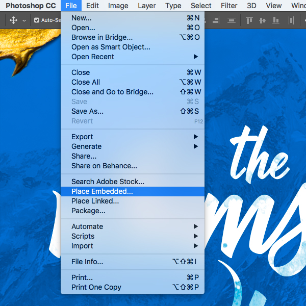
Navigate to the ‘1.png’ file inside of the ‘Barn-Owl-Studio’ subfolder with the freebies and choose ‘Place’ from the bottom right corner of the dialog box.
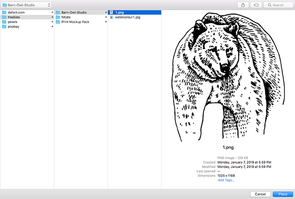
Once bringing in the illustration of the bear, place it below the ‘TT’ folder so that it’s set up behind the text like this:
Step 14: Ellipse
Press the letter ‘U’ on the keyboard while holding the Shift key until you have the Ellipse Tool selected. In the top toolbar we want to change the settings so there is no fill, and a black stroke of ’20 px’ as shown here:

Hold the Shift key and drag out an outlined circle around the bear and the text. Once you have done that, hold the Command/Ctrl key and click on each of the layers to select them both as shown here:
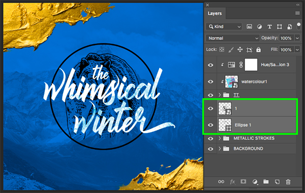
With both the bear and circle still selected, press Command/Ctrl+G to put them into a new folder and double click on the ‘Group 1’ text to rename the folder ‘BEAR & CIRCLE’ or another name of your choosing.
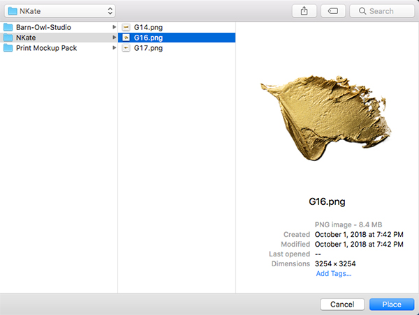
Step 15: Golden Bears
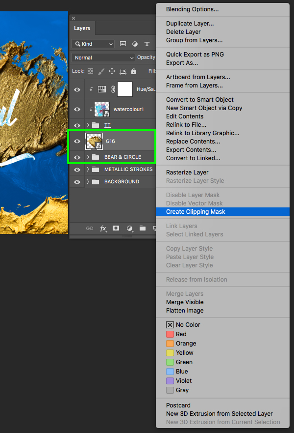
Return to the File menu and choose ‘Place Embedded…’ and this time navigate to the ‘G16.png’ file inside of the freebies for the tutorial before choosing ‘Place’ from the lower right.
Scale the metallic stroke up and rotate it so that it completely covers the bear and the circle. Once you’re happy with the size and placement of the stroke, press ‘Return’ to apply the transformation.
Place the metallic stroke just above the ‘BEAR & CIRCLE’ folder and then hold the Control key and click on the ‘G16’ Smart Object layer. From here, choose the ‘Create Clipping Mask’ option from the menu that appears.
Step 16: Gold Adjustment
With the ‘BEAR & CIRCLE’ folder selected, click on the Adjustment Layer icon and choose ‘Hue/Saturation…’ from the list.
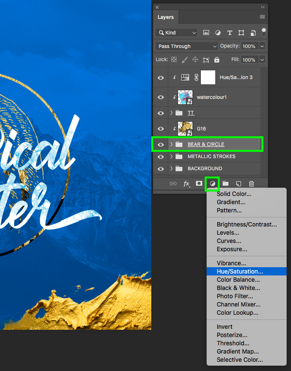
Just like before, we will need to move this Adjustment Layer up one spot in the Layers Palette by pressing Command/Ctrl and the right bracket one time. Once you have done that, move the ‘Saturation’ slider to the right until it’s set to ‘+38’ as shown here:
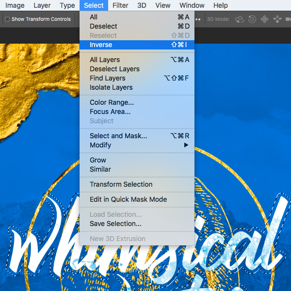
Step 17: Text Selection
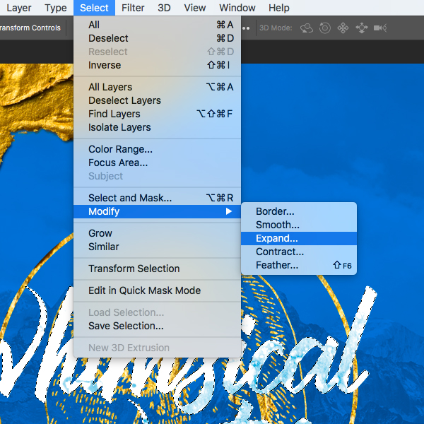
The next thing we want to do is click the small arrow next to the ‘TT’ folder to reveal the contents of the folder showing us the three text layers inside. From here, hold the Command/Ctrl+Shift keys together and click on each of the three layer thumbnail icons of the text layers – doing this will make a selection around each of the words.
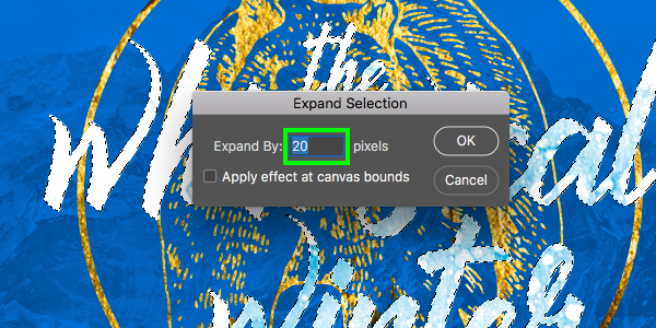
Once you have all three of the text layers with active selections around them, go to the Select menu and choose ‘Expand…’ from the menu.
Let’s enter a value of ’20’ for the ‘Expand Selection’ dialog box and then press ‘Return’ or click ‘OK’ to continue.
After expanding the selection, return to the Select menu and choose ‘Inverse’ from the menu.
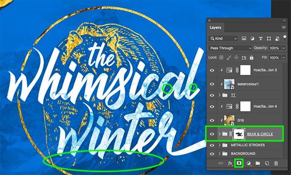
With your inverted selection still active, select the ‘BEAR & CIRCLE’ folder and click on the ‘Add Layer Mask’ icon at the bottom of the Layers Palette. You should now have a 20 pixel buffer around the text giving you a bit of space and helping with the legibility. The only problem now is there are a few areas from the bear illustration awkwardly sticking out behind the letters. Let’s go ahead and clean that up by grabbing the Brush Tool (B) and using a hard round brush with a solid black fill to go over a few of the areas highlighted in the image below:
Your image should now look something like this:

Step 18: Subtitle
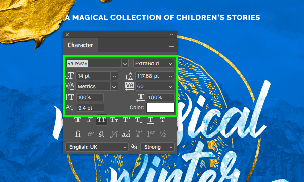
Add a new layer at the top of your Layers Palette and type out the words ‘A MAGICAL COLLECTION OF CHILDREN’S STORIES’ in all caps. Here I am using the ‘Raleway’ typeface in the ‘ExtraBold’ style at ’14 pt’ size with a solid white fill. This typeface is actually a free Google font that can be downloaded just by searching for ‘Google Fonts’ or by clicking here to download it.
Add another text layer and type out ‘By Lisa Barnard’ and place it below the title treatment using the same font parameters as before.
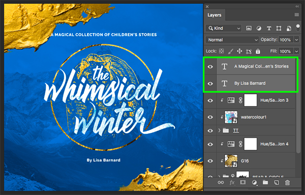
Let’s go into the ‘METALLIC STROKES’ folder from earlier and move the top left stroke over to give our subtitle a bit of breathing room as shown below:
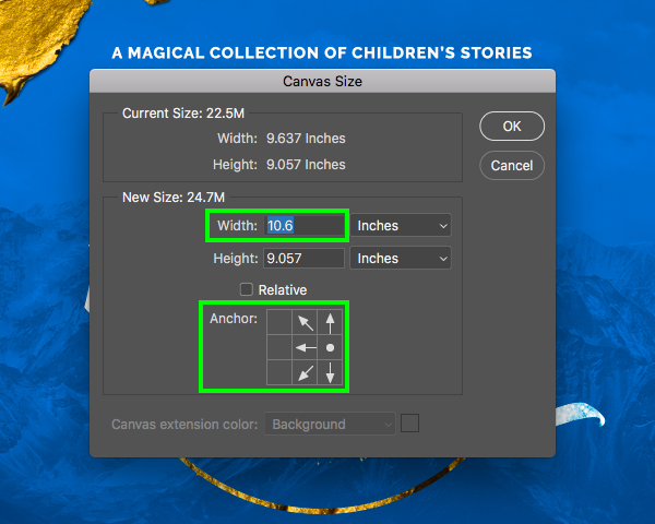
Step 19: Canvas Adjustment
Now that our cover design is set, we need to make one adjustment here to our actual canvas before moving on. The way that the book cover mockup is set up is that it will take some of the left side of the image and wrap it around the side or the ‘spine’ of the book. Because of this we will need to add a bit of extra room to the left side only to ensure that our cover is centered on the cover of the mockup. Let’s start by going to the Image menu and then choosing ‘Canvas Size…’ from the menu.
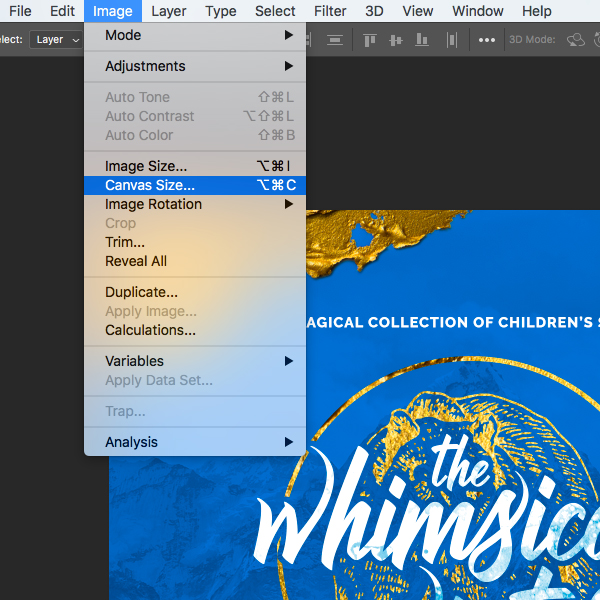
Once the dialog box has opened, click on the middle right square in the ‘Anchor’ section. Once you do this you will notice that the arrow icons shift over to the right side. This is how we can ensure that once we extend the width of our canvas that it will only extend to the left side. From here, enter a new value of ’10.6’ in the ‘Width’ section and then press ‘Return’ or click ‘OK’ to continue.
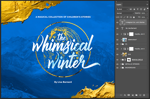
You should now have an extended canvas with a bit more room added to the left side of the layout. Once you have that, press Command/Ctrl+S to save the file, and then Command/Ctrl+W to close this window once it has finished saving.
Step 20: Saving It Down
You will now be in the previous Smart Object file where we simply want to press Command/Ctrl+S to save it once again, and then Command/Ctrl+W to close out and go one more level up.
Step 21: Extra Contrast
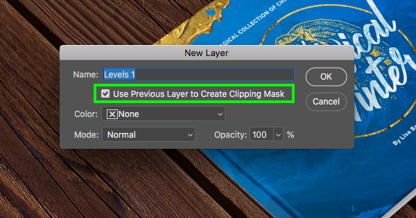
We will now be brought up one more level in our mockup file, and here we want to select the ‘details’ folder and then hold the Alt/Option key and click on the Adjustment Layer icon at the bottom of the Layers Palette. From the list that appears we will then choose ‘Levels…’ as shown here:
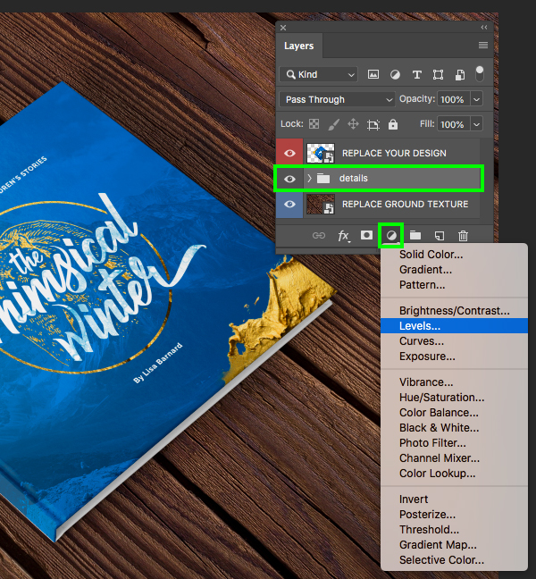
When the next dialog box appears, check off the ‘Use Previous Layer to Create Clipping Mask’ option and then click ‘OK’ to continue.
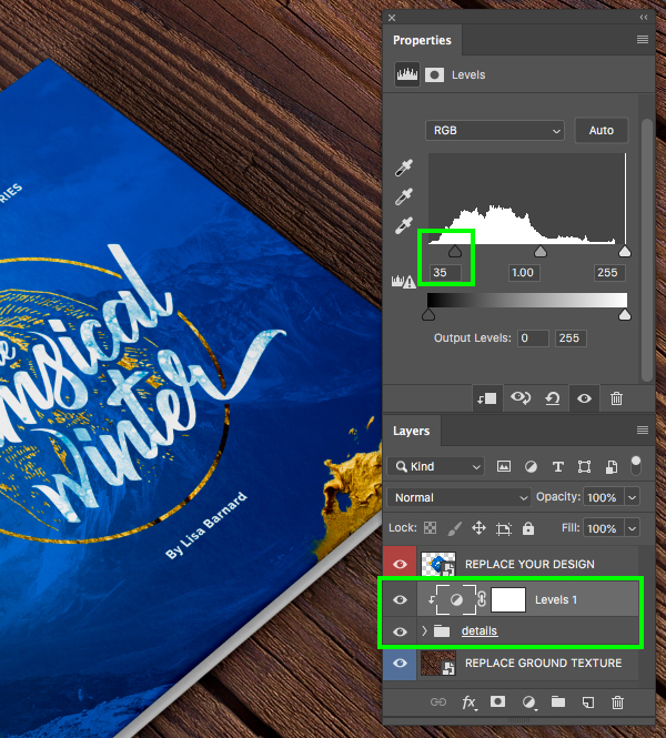
In the Properties panel we will now just move the dark gray slider in towards the center until it’s set to ’35’ adding a bit of contrast to deepen the values of the book cover. Once you have done that, press Command/Ctrl+S to save the file and then Command/Ctrl+W to close the window and return to the main mockup window.
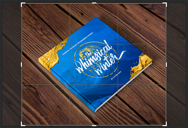
Step 22: Finishing Touches
Now that we are back in the main mockup file, press ‘C’ to switch to the Crop Tool and then click and drag the left or right handle in towards the center while holding the Alt/Option key to bring the crop in from both sides evenly. Doing this will help cut some of the extra room off of the sides of the image helping to keep focus on the book in the center. Once you are happy with the crop, simply press ‘Return’ on the keyboard to apply the change.
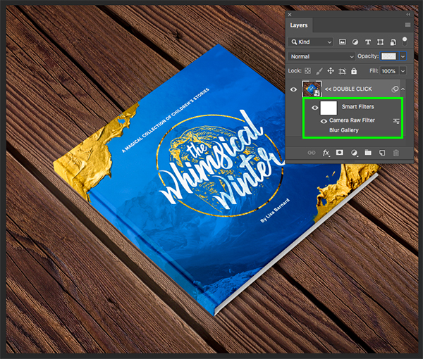
The last thing we want to do is select the small arrow to the right of the ‘DOUBLE CLICK’ layer to reveal the Smart Filters that are applied to the object. All we are going to do here is poke out the eyeball of the ‘Blur Gallery’ effect that is applied to turn it off.
We have now completed our book cover design and mockup! To create this design we’ve used a small sampling of elements including the illustrated animals and watercolour backgrounds from Barn Owl Studio along with a few beautiful metallic strokes from NKate, a free typeface, stock photo, and a fantastic looking mockup from the Design Cuts Marketplace to bring it all together. The elements we have used today are just a taste of the wide variety of high quality templates, digital brushes, maps, illustrated scenes, logos, calendars, fonts and more to add to your collection!
Remember that whether it’s your outcome for this tutorial or something new you’ve made, we’d love to see your designs on our Facebook page.
Please leave a comment if you have any questions or suggestions. I always look forward to hearing from you!
There’s still time to check out The Totally Artistic Designer’s Toolbox and save $1,479 on this amazing collection of hand-picked best selling resources!
Thank you for your amazing tutorial! You are The Best!
You’re so welcome! We are so happy that you enjoyed it Despina and hope that you have picked up some great new tips and tricks for your own creative projects :).
Nice tutorial. It is also very good to see how the mockups are used.
We’re so happy to hear that you find this tutorial really handy for using your mockups Jeanne! We hope that you have great fun working with all of your new freebies!
Hey there, kind folks at Design Cuts. Thank you for the cool tutorial! Always the best from you guys.
Aww thanks so much for your lovely comment Linda!
We hope that you really enjoy this tutorial and that you get great use out of your new freebies :).
Thanks so much for the kind words Linda! We’re so glad you enjoyed the tutorial! :)
Great tutorial. I haven’t tried it yet but really enjoyed the video.
Thanks so much for your comment Kay and we hope that you have great fun working through this tutorial when you take it for a spin :)
I think I know some students who might enjoy following this tutorial. Thanks!
Hey Mike,thanks for commenting and it’s awesome to hear that you think this tutorial is super useful!
Thanks Mike! Hopefully it will help to educate and inspire the students!