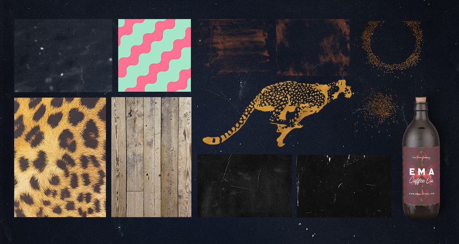
In this tutorial, I will be showing you how to design packaging for cold brew coffee in Photoshop. To create the packaging we will be using various textures, illustrations, and patterns from The Deluxe Textures and Patterns Bundle featuring artists such as Antipixel, Blue Line Design, MiksKS, and more. In addition to these high-quality elements from the bundle, we will also incorporate a few free typefaces to add details to the cold brew labels. To tie it all together we will be using a few mockup elements courtesy of TVartworks from the Coffee Scene Creator in the Colossal Mockup Templates Bundle. These mockup elements will give us a great way to present our cold brew packaging in an eye-catching and professional way. If you’re all ready to get started then fire up Photoshop and let’s get brewing!
HAVE YOU SEEN OUR YOUTUBE CHANNEL?
Watch the video tutorial below and subscribe to our YouTube channel for regular updates direct to your inbox.
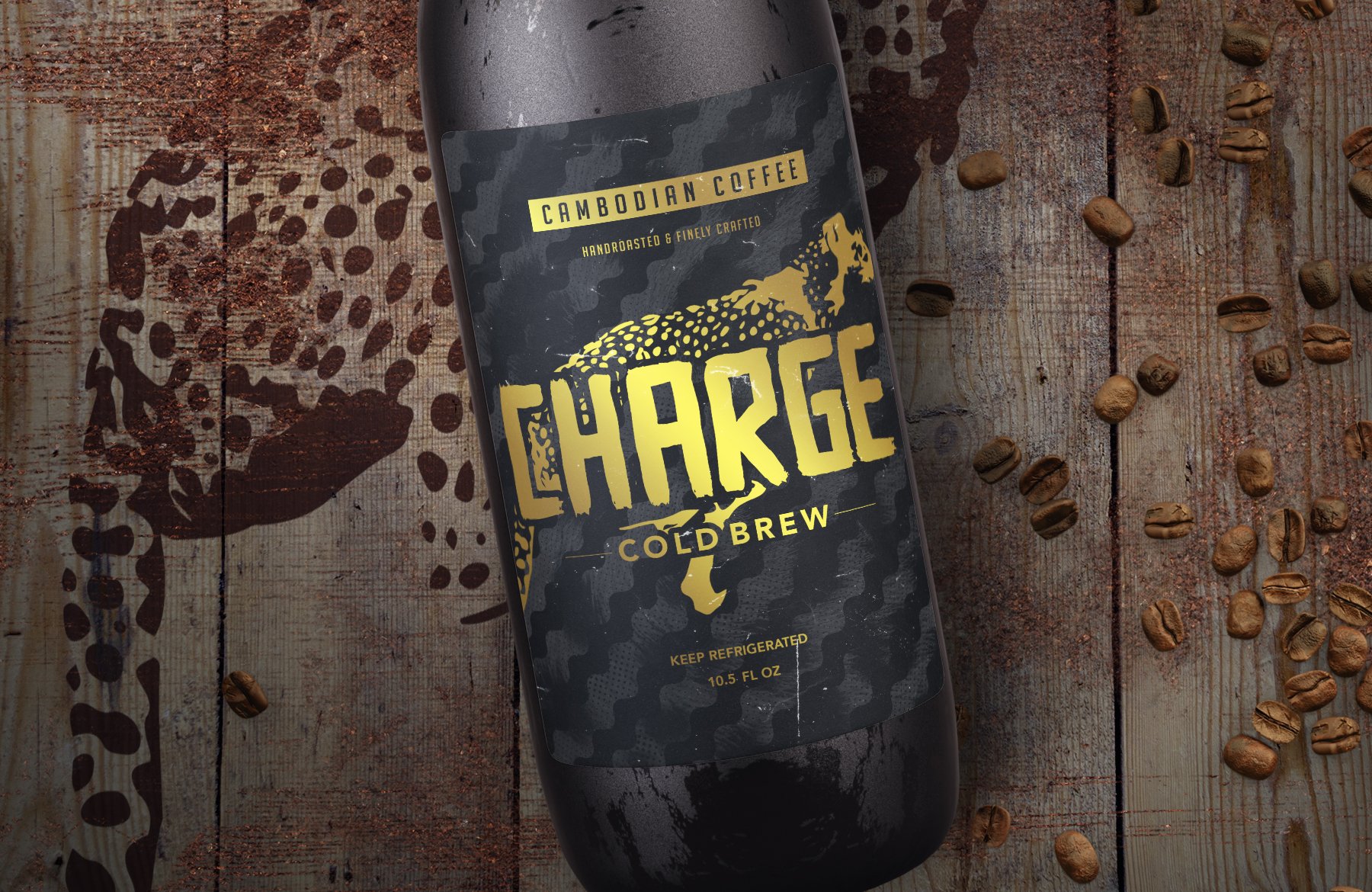
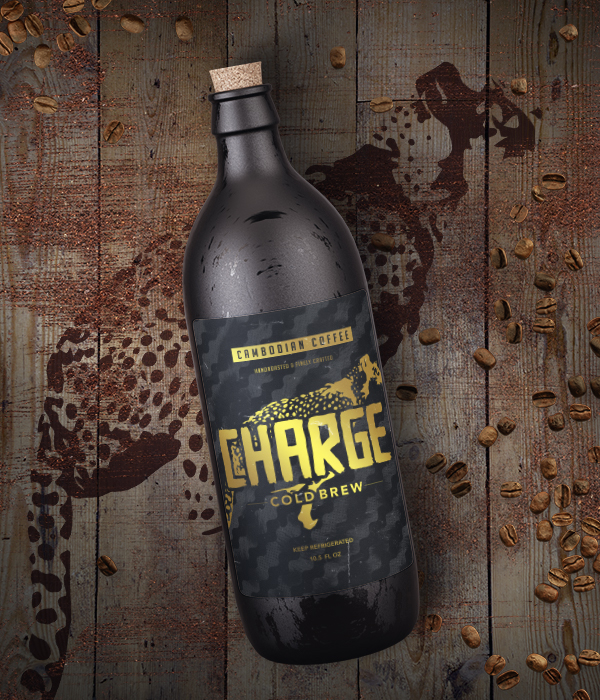
Here’s a look at what we’ll be creating:
Follow along with this tutorial: Download the freebie files
The freebie for this tutorial is just a small sample of the quality you can expect to find in The Deluxe Textures and Patterns Bundle for just $29 (that’s 99% off). Save tons of time and energy on your next project by gaining access to a massive bundle of high-quality design elements ready to use for any project passed your way.
Step 1: Cold Brew Packaging Design
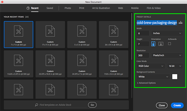
To get started, let’s first create a new Photoshop document that is ‘6”’ wide by ‘7”’ tall with a ‘Resolution’ of ‘300’ and ‘Color Mode’ set to ‘RGB’. Leave the ‘Background Contents’ set to ‘White’ and then give your file a name – here I am using ‘cold-brew-packaging-design’. Once you have set the parameters for your document, click ‘Create’ from the lower right corner.
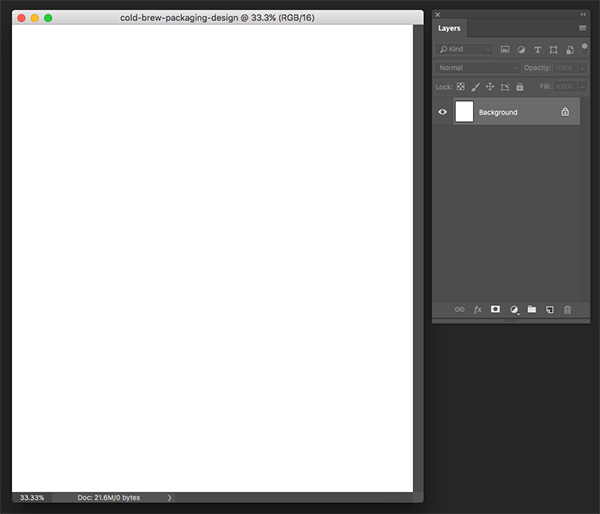
After creating your new document you will have a single ‘Background’ layer filled with solid white as shown below:
Step 2: Setting The Table
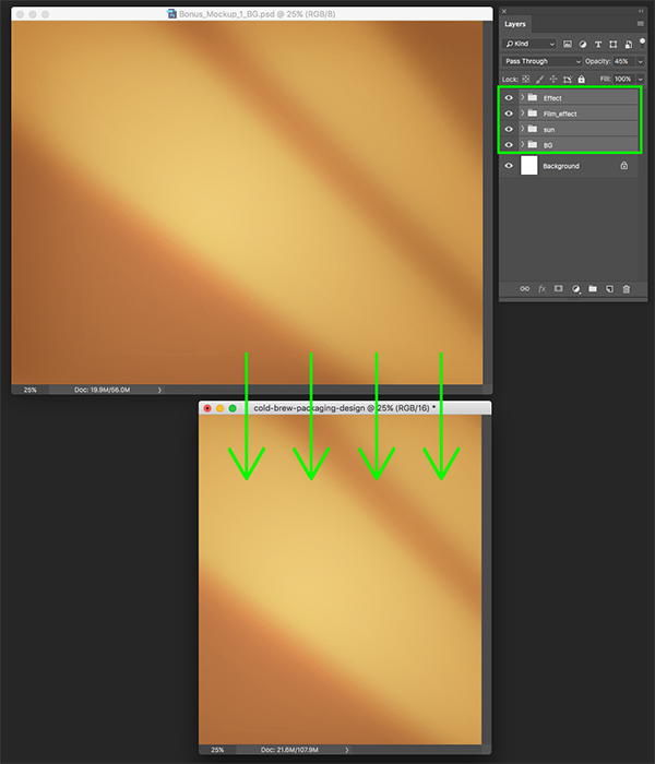
Go to the File menu and choose ‘Open…’ or press Command/Ctrl+O on the keyboard. Navigate to the ‘Colossal-Mockup-Templates-Bundle-tvartworks-Part1’ folder inside of the ‘Freebies’ folder for the tutorial and select the ‘Bonus_Mockup_1_BG.psd’ file before pressing ‘Return’ on the keyboard or clicking ‘Open’.
Once you’ve opened the background, select the top folder, hold the Shift key and then select the bottom folder so all four of the main folders in the file are selected together. From here, hold the Shift key and drag the folders into your working file as shown here:
Step 3: Adjusting The Folders
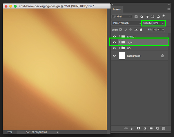
The first thing we want to do once moving the folders into our file is deleting the ‘Film_effect’ folder. Here I have just renamed each of the folders so they are in all caps, but that part is completely optional. After removing the ‘Film_effect’ folder, select the ‘SUN’ folder change the ‘Opacity’ to ’65%’.
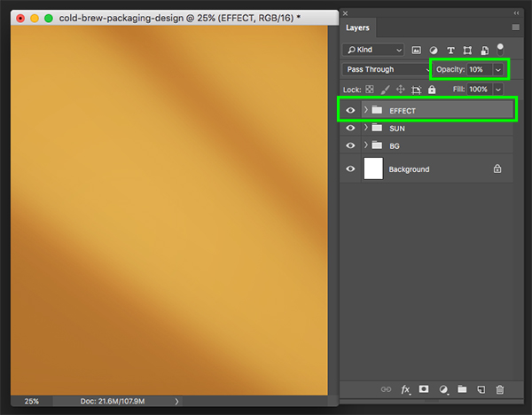
Next, select the ‘EFFECT’ folder at the top of the group and lower the ‘Opacity’ to about ’10%’.
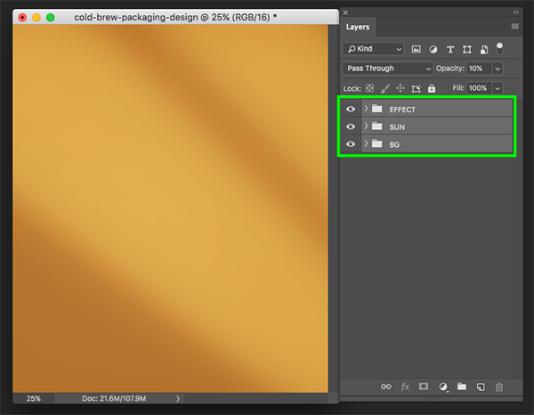
After changing the settings of these folders we can go ahead and simply delete the white ‘Background’ layer at the bottom. Your layer structure should now look like the image shown below:
Step 4: Wood Texture
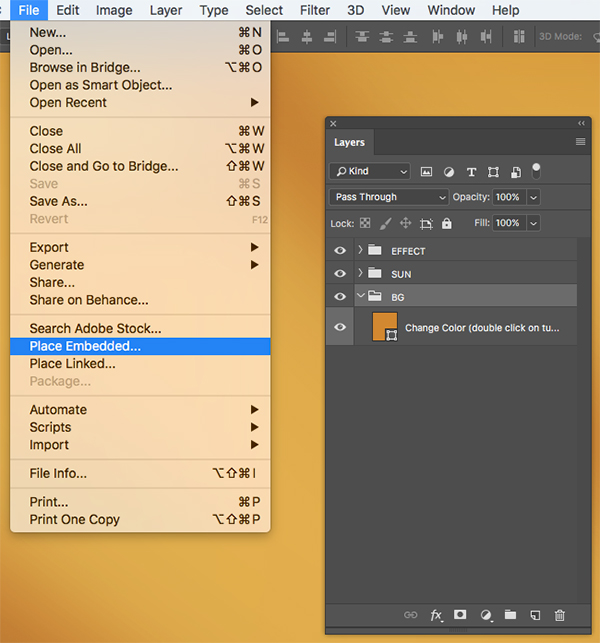
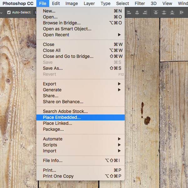
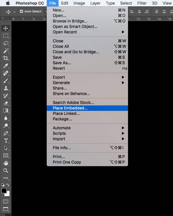
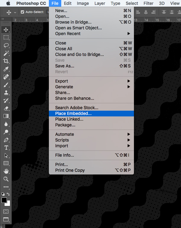
Select the ‘BG’ folder and click the small arrow to reveal the contents. From here, go to the File menu and choose ‘Place Embedded…’ from the drop-down menu.
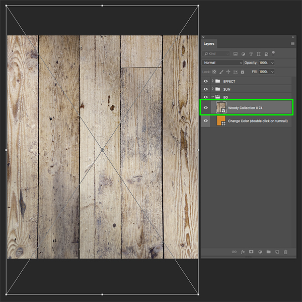
Navigate to the freebies folder for the tutorial and go inside of the ‘Madebyvadim’ folder and locate the ‘Woody Collection II 74.tif’ file before choosing ‘Place’ from the lower right corner.
Your wood texture will now be brought in as a Smart Object with the name of the file already included. Place this inside of the ‘BG’ folder and scale it up until it completely fills out the width of your document. To do this, simply drag outwards from any of the four corners of the bounding box while holding Alt/Option+Shift on the keyboard. Once you’ve scaled the texture up, press ‘Return’ to apply the transformation.
Step 5: Saturation
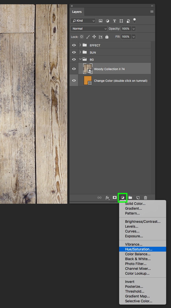
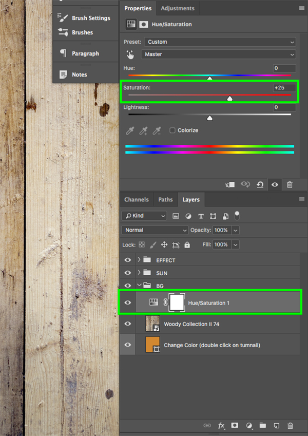
Select the wood texture Smart Object and then click the Adjustment Layer icon found at the bottom of the Layers Palette. After that, choose ‘Hue/Saturation…’ from the drop-down that appears.
After adding the Hue/Saturation Adjustment Layer, increase the ‘Saturation’ slider until it’s set to about ’+25’ as shown below:
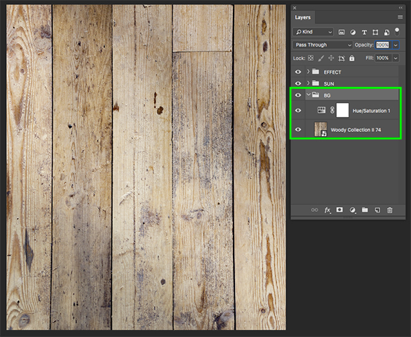
Now that we have a wooden texture that will serve as our background, let’s go ahead and remove the solid colour layer at the very bottom. You should now just have your texture and Adjustment Layer inside of the ‘BG’ folder like this:
Step 6: Cheetah
Go to the File menu and choose ‘Place Embedded…’ once again.
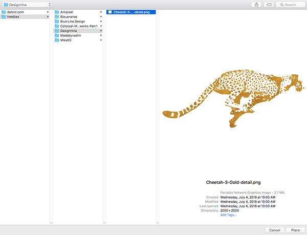
Navigate to the ‘Cheetah-3-Gold-detail.png’ file inside of the freebies and choose ‘Place’ from the lower right-hand corner. This cheetah illustration is one of several beautiful animal illustrations from Designnina that you will get with the complete bundle, but today we will just be working with one of them!
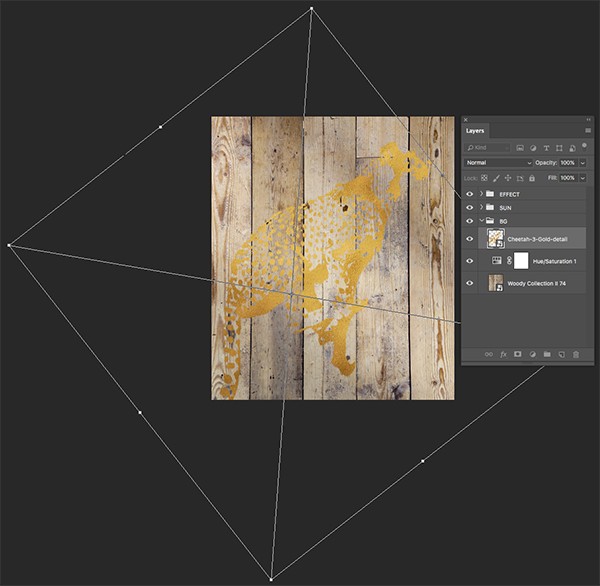
Once you’ve imported the cheetah, scale it up and rotate it counterclockwise so it looks like it is facing forward. Use the image below as a guide for rough size and placement.
Step 7: Cheetah Camo
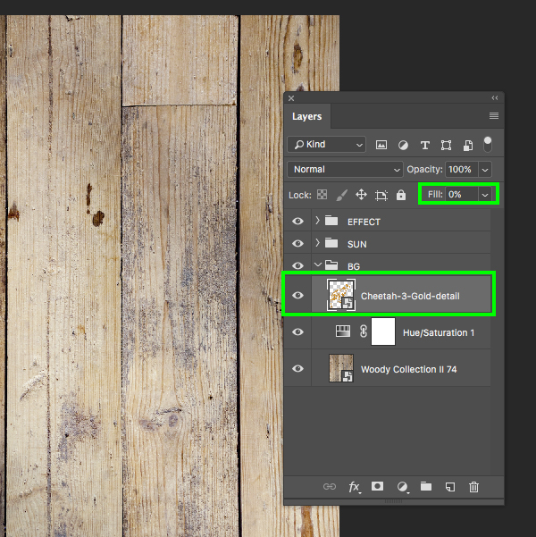
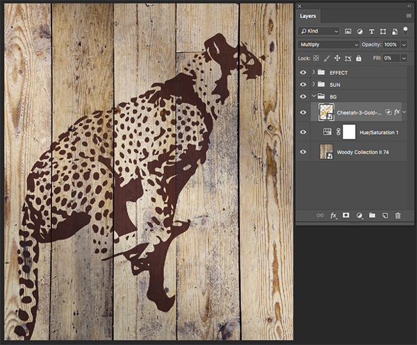
Once we’ve scaled and positioned our cheetah, select the Smart Object layer and lower the ‘Fill’ all the way down to ‘0’ as shown here:
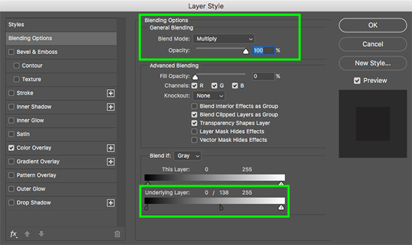
Once the cheetah disappears, double-click the layer to open the Layer Style panel and then go to the main ‘Blending Options’. Let’s change the ‘Blend Mode’ of the layer to ‘Multiply’ and then go to the very bottom and hold the Alt/Option key and drag to split the two grey sliders on the bottom left apart. Move the right piece in towards the middle until it’s set to ‘0/138’ as shown below:
After changing the main blending options, check off the ‘Color Overlay’ box and make sure that the ‘Blend Mode’ is set to ‘Multiply’ here as well.
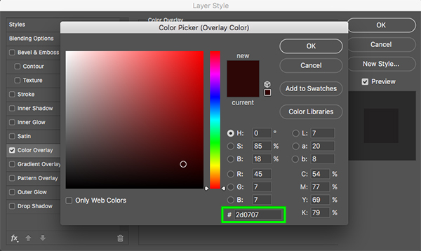
For the fill colour, let’s use a deep red such as the hex value ‘#2D0707’ and then click ‘OK’ twice to apply the changes and close out of both panels, returning to the main document.
The cheetah illustration should now reappear and it will now be blended with the wooden planks in the background to give it more of a natural, painted on look.
Step 8: Vignette Effect
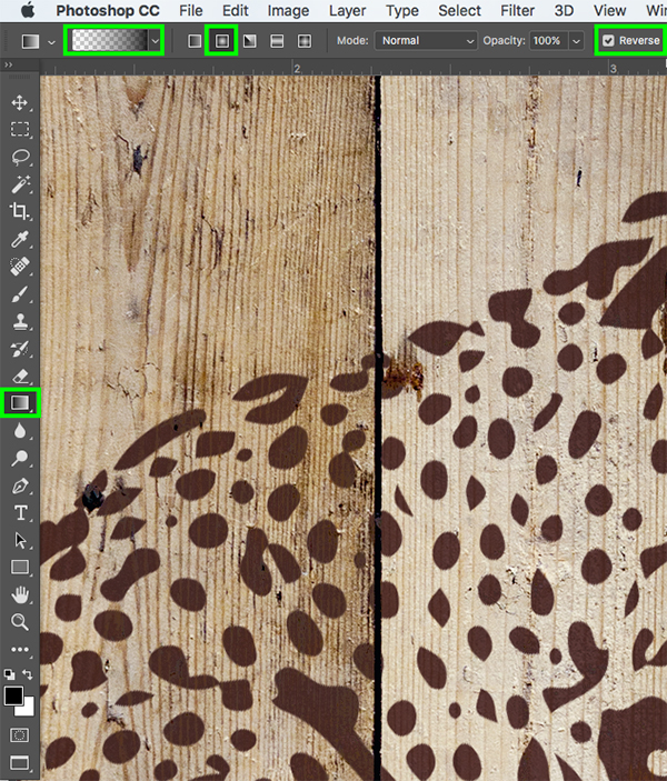
Press ‘D’ on the keyboard to reset your default colours and make sure that solid black is your foreground colour. Next, press the letter ‘G’ on the keyboard to switch to your Gradient Tool and make sure you have a ‘Radial Gradient’ selected. We also want to check that we have a gradient that fades from solid black to transparent and that we check the small box up top that says ‘Reverse’ as shown below:
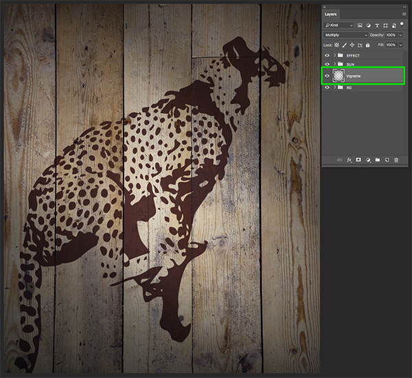
Create a new layer just above the ‘BG’ folder and then click and drag outwards creating a reverse gradient that fades to black on the outer edges. Doing this will help keep the focus and attention towards the centre of the image giving us more of a focal point.
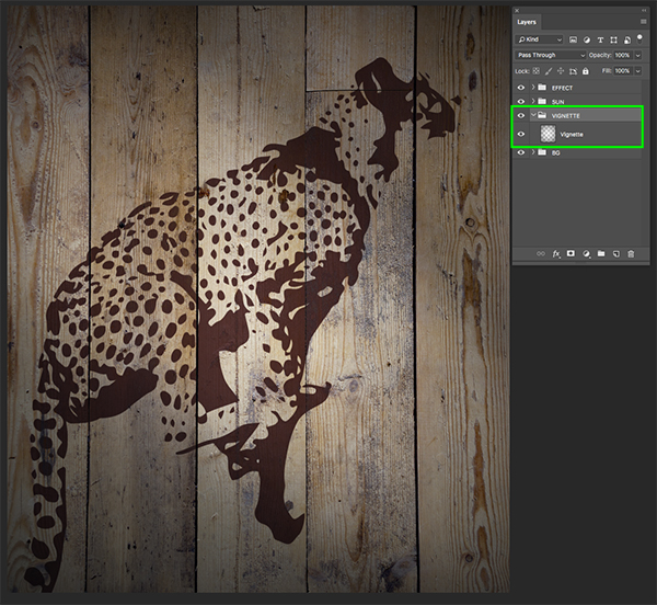
Next, select the layer and press Command/Ctrl+G to place it into a new folder, and then double-click the ‘Group 1’ text and rename the folder ‘VIGNETTE’ as shown in the image below:
Step 9: Coffee Grinds
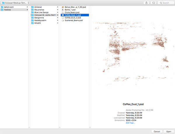
Go to the File menu and choose ‘Open…’ or press Command/Ctrl+O and then navigate to the ‘Coffee_Dust_1.psd’ file in the TVArtworks Coffee Scene Creator freebies folder. Once you’ve located the file, select it and choose ‘Open’ from the lower right corner of the window.
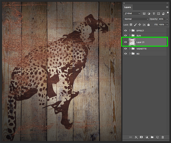
Once the file is open, hold the Shift key and click and drag it into your working file, placing it above the ‘VIGNETTE’ folder.
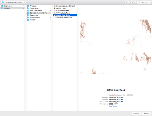
Press Command/Ctrl+O again and this time navigate to the ‘Coffee_Dust_2.psd’ file in the same folder as above and open it in Photoshop.
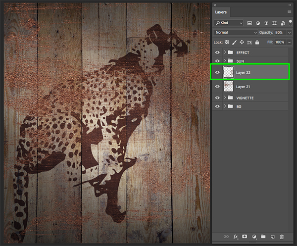
Click and drag the coffee dust into your main document while holding the Shift key and it should fit perfectly into the scene above the previous coffee dust layer.
Step 10: Coffee Beans
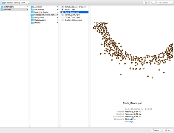
Go to the File menu and choose ‘Open…’ or press Command/Ctrl+O and then navigate to the ‘Circle_Beans.psd’ file in the same freebies folder. Once you’ve located the file, select it and choose ‘Open’ from the lower right corner of the window.
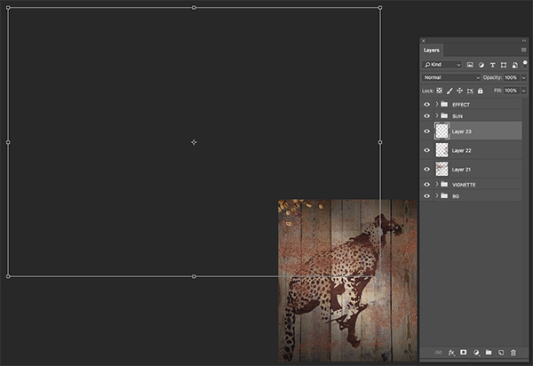
After the file is open, hold the Shift key and click and drag it into your file. Press Command/Ctrl+T to do a Free Transform and then click and drag outwards from any of the four handles while holding the Alt/Option+Shift keys to scale the beans up. After making the beans nice and large, crop it so only the lower right corner of the beans are visible and then press ‘Return’ to apply the transformation.
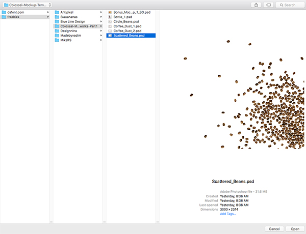
Press Command/Ctrl+O again and this time navigate to the ‘Scattered_Beans.psd’ file and open it in Photoshop.
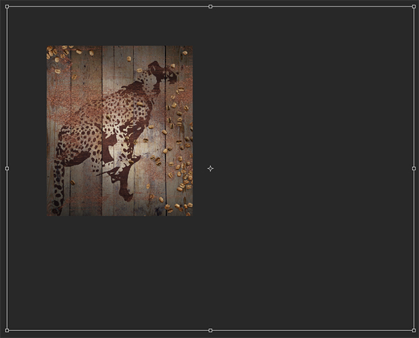
Click and drag the scattered beans into your document, press Command/Ctrl+T to do a Free Transform, and then scale and position the beans using the image below for reference.
Step 11: Background Coffee
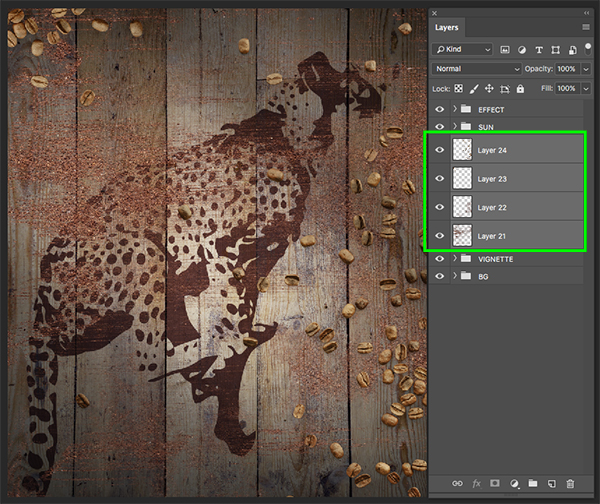
Now that we’ve brought in some coffee grinds and whole beans, select the top bean/dust layer, hold the Shift key, and then select the bottom layer so all four of the layers are selected together.
With all four layers selected in your Layers Palette, press Command/Ctrl+G to put them into a folder and double click on the ‘Group 1’ text and change the folder name to ‘BG COFFEE’ as shown here:
Next, select the newly created ‘BG COFFEE’ folder, hold the Alt/Option key and then click on the Adjustment Layer icon at the bottom of the Layers Palette before choosing ‘Curves…’ from the drop-down menu.
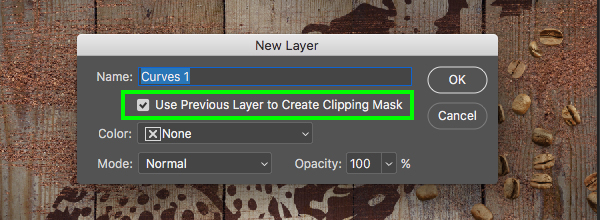
When prompted with the ‘New Layer’ dialog box, check off the option that says ‘Use Previous Layer to Create Clipping Mask’ and then click ‘OK’ to proceed.
Your Curves layer will now have a Clipping Mask attached to it so that it will only affect the layers contained within the ‘BG COFFEE’ folder. For the Properties let’s create a single point in the middle of the grid and move it slightly downwards and to the right to add contrast to the coffee beans and coffee dust. For the ‘Input’ let’s make it ‘153’ and then change the ‘Output’ to ’113’ as shown in the image below:
Step 12: Chilled Bottle
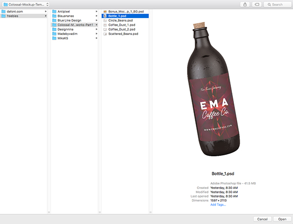
Next, return to the File menu and choose ‘Open…’ before navigating to the ‘Bottle_1.psd’ file in the freebies folder and choose ‘Open’ from the bottom right.
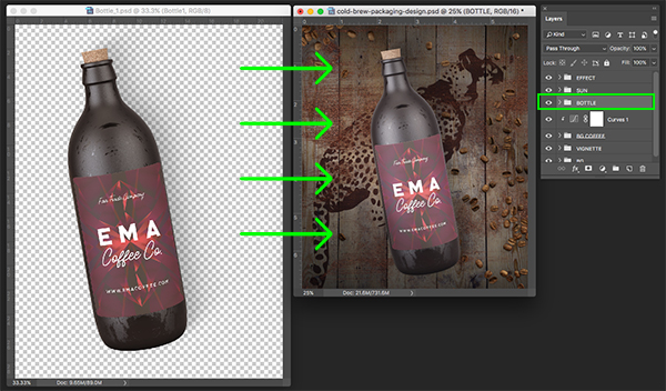
After opening the file, move it next to your working document and then grab the whole folder, hold the Shift key, and drag it into your document.
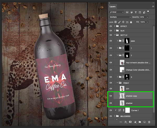
After bringing the bottle into your file, click the ‘Object’ folder nested inside and select the ‘Shadow’ layer beneath the bottle. From here, press Command/Ctrl+J to duplicate the shadow and increase the intensity.
Step 13: Bottle Contrast
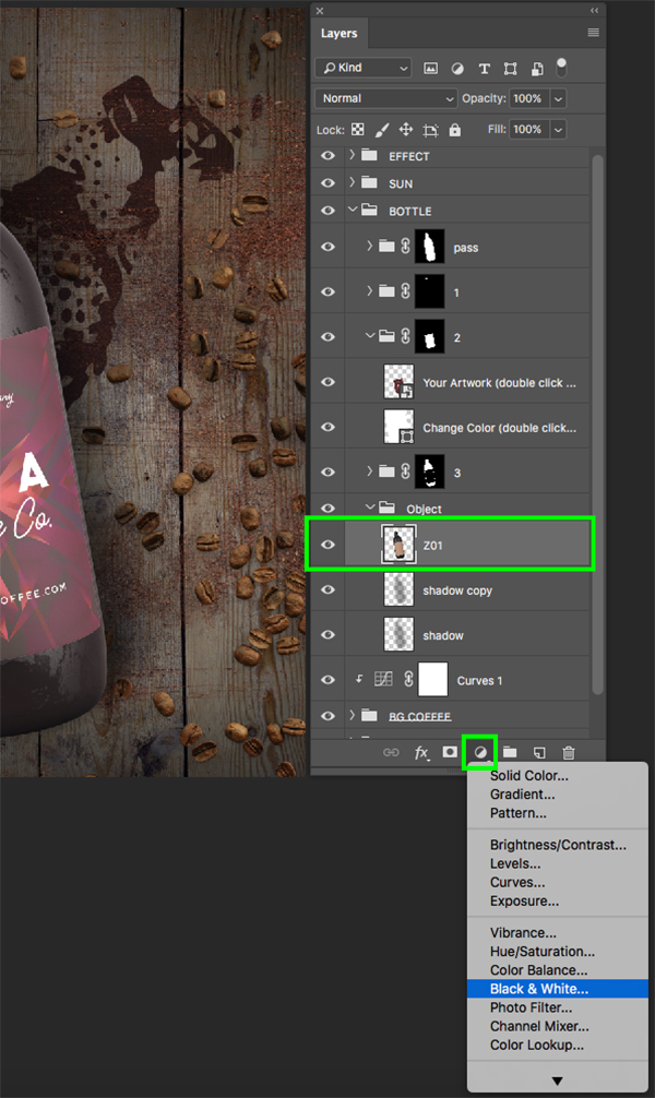
Inside of the ‘Object’ folder at the top you will see a layer named ‘Z01’ containing the main bottle shape. Select this layer and then hold the Alt/Option key and click on the Adjustment Layer icon at the bottom of the Layers Palette. Once the drop-down menu appears, choose ‘Black & White…’ from the list.
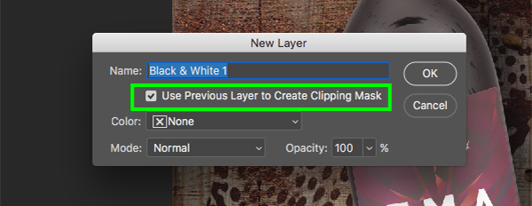
In the next panel, check off the box that says ‘Use Previous Layer to Create Clipping Mask’ and then click ‘OK’ to continue.
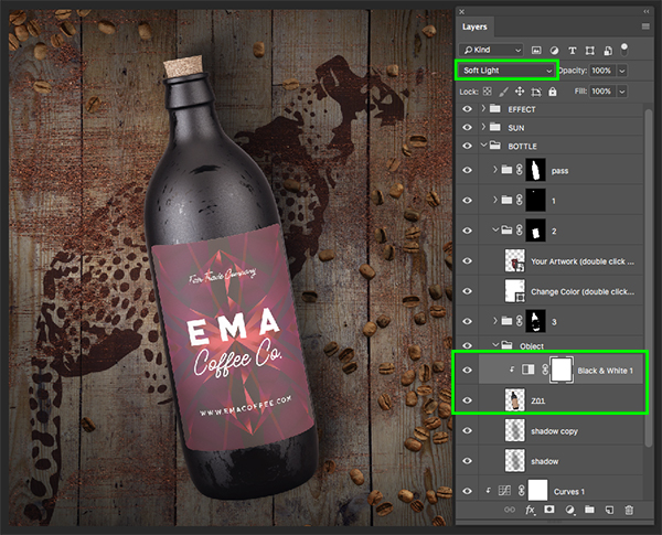
You will now have a Black & White Adjustment Layer with a Clipping Mask applied to the ‘Z01’ layer. What we want to do next is change the Blend Mode of the Adjustment Layer from ‘Normal’ to ‘Soft Light’ as shown below:
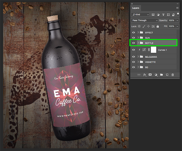
After making the changes we can collapse the folder and your layer structure and scene should now look like this:
Step 14: Label Design
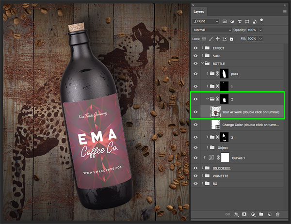
Now that we’ve set up the scene, let’s go into the ‘BOTTLE’ folder and then expand the contents of the folder labelled ‘2’ to reveal the top Smart Object. This Smart Object is labelled ‘Your Artwork’ and so we will now double-click this layer to go inside where we will begin creating our label design.
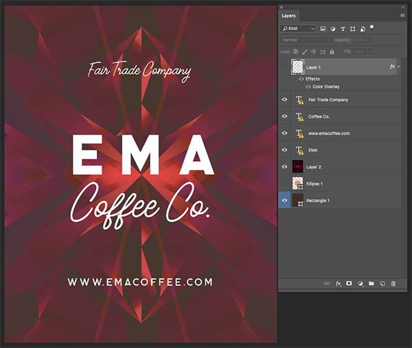
Once inside of the Smart Object you will see the flat artwork for the label that is applied to the bottle.
All we are going to do here is add a new layer and fill it with solid black. Once you have done that, you can delete all of the other layers inside to give you a fresh, clean start.
Step 15: Black Paper
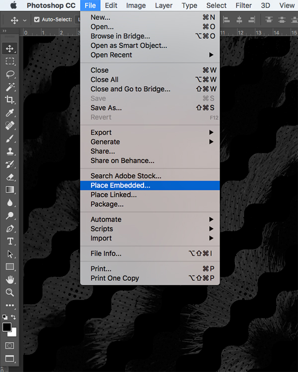
Go to the File menu and choose ‘Place Embedded…’ from the dropdown list.
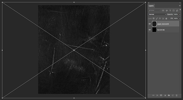
Navigate to the ‘paper_texture28.jpg’ from MiksKS inside of the freebies folder and then choose ‘Place’ from the lower right corner.
Your paper texture will now be brought into Photoshop automatically as a Smart Object and we want to scale it up to fill the canvas by dragging outwards from any of the four corners of the bounding box while holding the Alt/Option+Shift keys together. Once you’ve scaled up your paper texture, press ‘Return’ on the keyboard to apply the transformation.
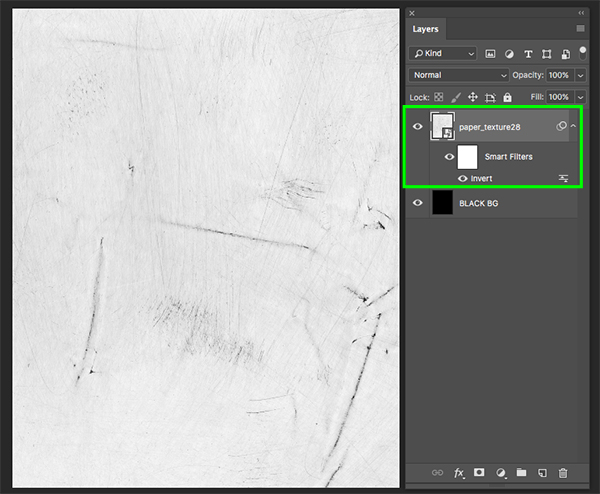
Select the paper texture Smart Object layer and press Command/Ctrl+I on the keyboard to invert it so that it appears mostly white. You should now see a ‘Smart Filter’ applied below the layer indicating the change.
Step 16: Halftone Texture
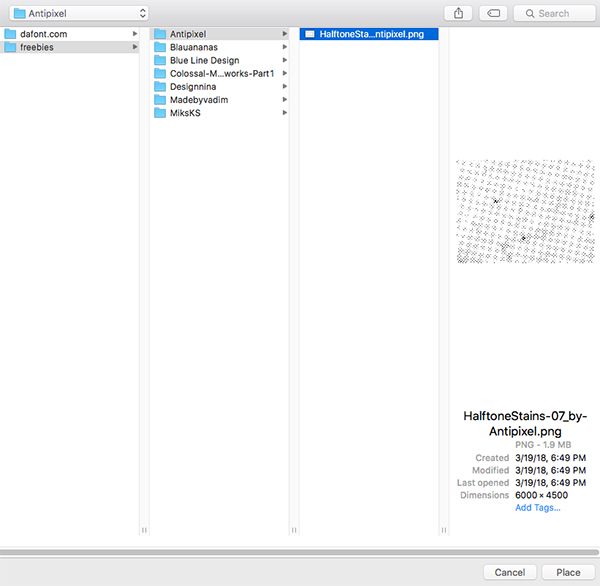
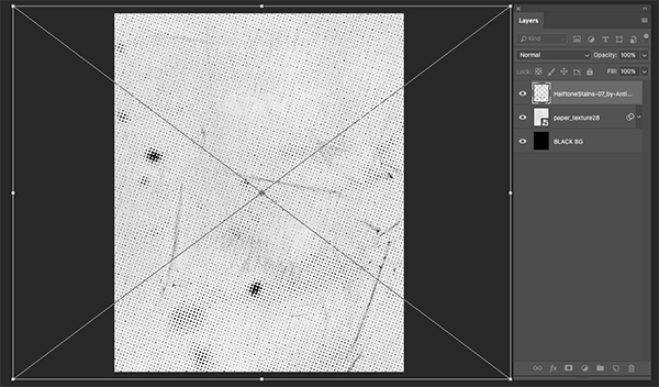
Go to the File menu and choose ‘Place Embedded…’ from the dropdown list once again. This time we want to select the ‘HalftoneStains-07_by-Antipixel.png’ file in the Antipixel freebies folder and then choose ‘Place’ to import it into your document.
Just like before we will scale this texture up while holding the Alt/Option+Shift keys and dragging outwards from any of the four handles until the texture completely fills the canvas. After that, press ‘Return’ to commit to the changes.
Step 17: Geometric Patterns
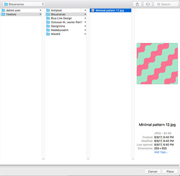
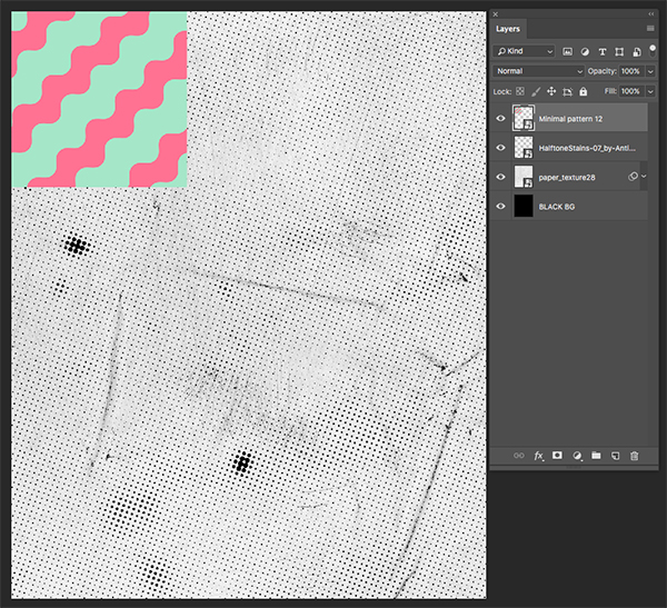
Go to the File menu and choose ‘Place Embedded…’ from the dropdown list and then navigate to the ‘Minimal pattern 12.jpg’ file in the Blauananas freebies folder before choosing ‘Place’ from the lower right corner.
Import the tiled pattern and move it to the upper left-hand corner of the workspace and then press ‘Return’ to apply the transformation.
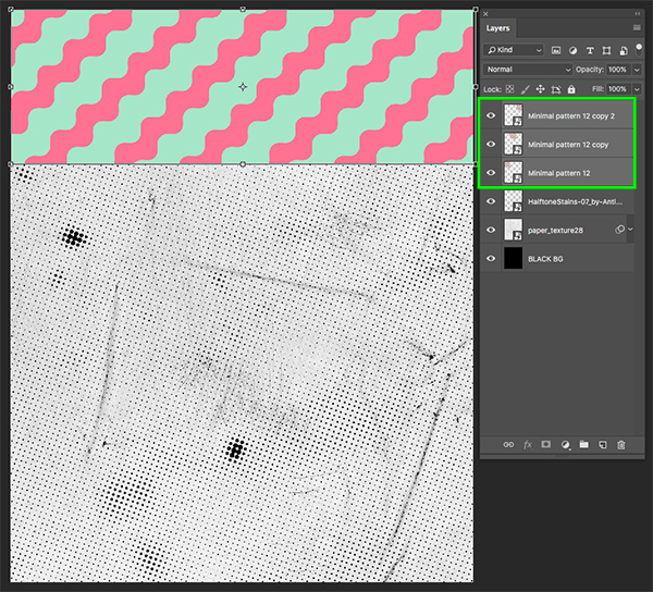
Select the tile, press Command/Ctrl+J to duplicate it, and then select it, hold the Shift key, and slide it over to the right until it snaps into place and lines up with the first tile. Do this again so you have three tiles in a row going across the top of the canvas as shown here:
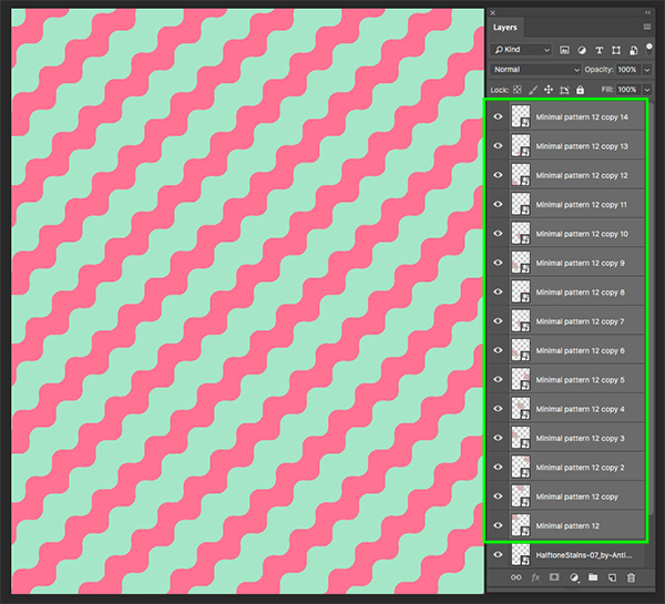
From here, select the first Smart Object, hold the Shift key, and then select the third pattern tile Smart Object so you have the entire row selected together. Press Command/Ctrl+J to duplicate all three of the tiles and then click and drag downwards while holding the Shift key to slide down a copy of that entire row below the original. Continue this process until you have about four rows of three tiles to completely fill the canvas with a seamless pattern as shown in the image below:
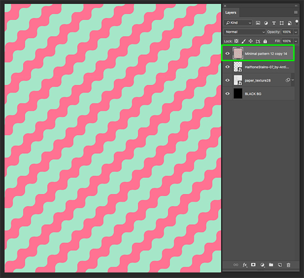
Select the very top tile in your Layers Palette and then hold the Shift key and select the very bottom tile. From here, press Command/Ctrl+E on the keyboard to merge them all into a single layer.
Step 18: High Contrast Pattern
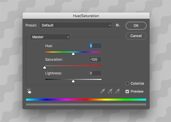
Select your newly merged pattern layer and then press Command/Ctrl+U on the keyboard to bring up the Hue/Saturation panel and simply move the ‘Saturation’ slider all the way to the left until it’s set to ‘-100’ to completely desaturate the pattern. Once you have done that, press ‘Return’ or click ‘OK’ to proceed.
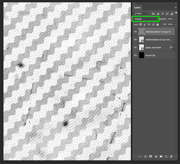
With the desaturated pattern still selected, press Command/Ctrl+L on the keyboard to bring up the Levels dialog box and bring both the dark grey and white sliders in towards the middle, light gray slider to make the pattern completely black and white. The goal here is to get as much contrast out of the pattern as possible. Once you have achieved that, press ‘Return’ or click ‘OK’ once again.
Now that we have a solid black and white pattern, let’s change the Blend Mode of the layer to ‘Overlay’ as shown below:
Step 19: Linear Burn
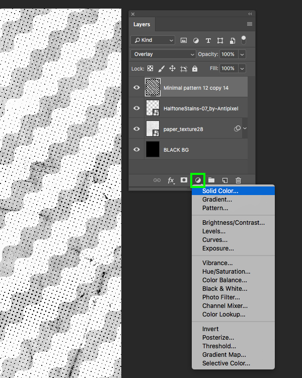
Select the ‘Minimal pattern 12 copy 14’ layer and then click on the Adjustment Layer icon at the bottom of the Layers Palette. From the drop-down menu, choose the ‘Solid Color…’ option.
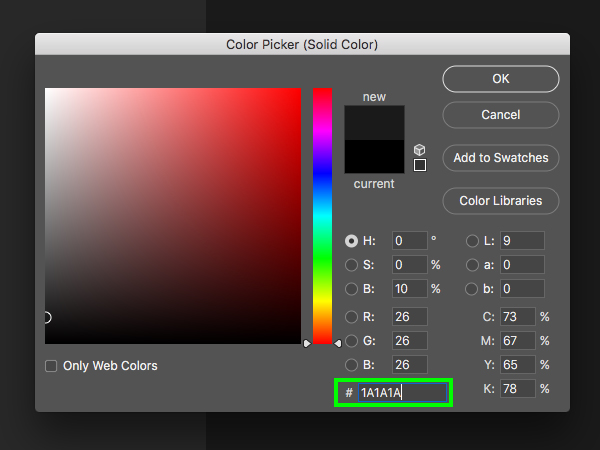
For the fill color, enter the hex value ‘#1A1A1A’ and then press ‘Return’ or click ‘OK’ to apply the colour changes.
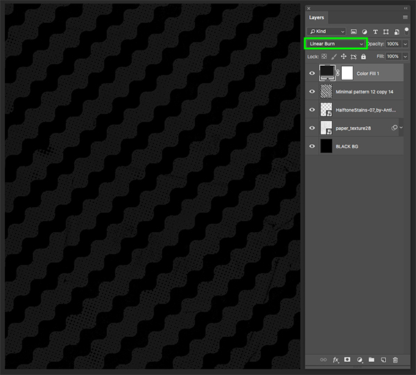
Next, select the ‘Color Fill 1’ Adjustment Layer and change the Blend Mode from ‘Normal’ to ‘Linear Burn’ to allow some of the texture beneath to show through.
Step 20: Cheetah Fur
Return to the File menu and choose ‘Place Embedded…’ from the list.
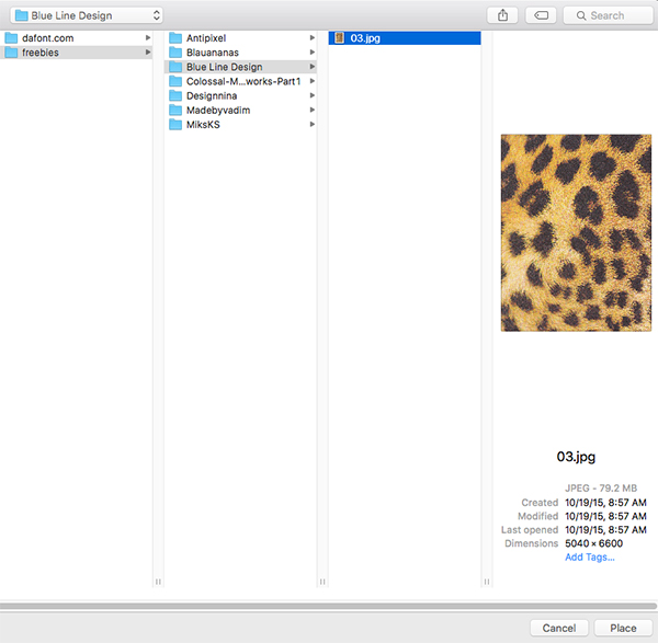
Navigate to the ’03.jpg’ file from Blue Line Design inside of the freebies folder and then choose ‘Place’.
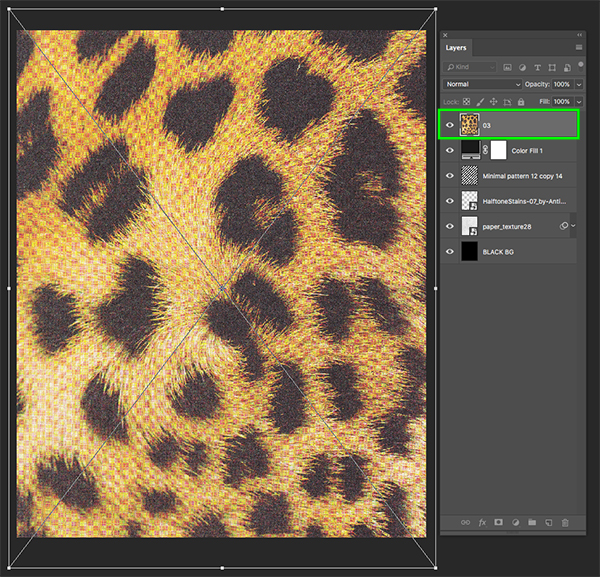
Once you have imported the fur texture, scale it up proportionally from the centre until it fills the entire canvas by dragging outwards from any of the four handles while holding the Alt/Option+Shift keys. After you’ve scaled it up and positioned the texture accordingly, press ‘Return’ to apply the transformation.
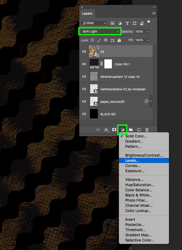
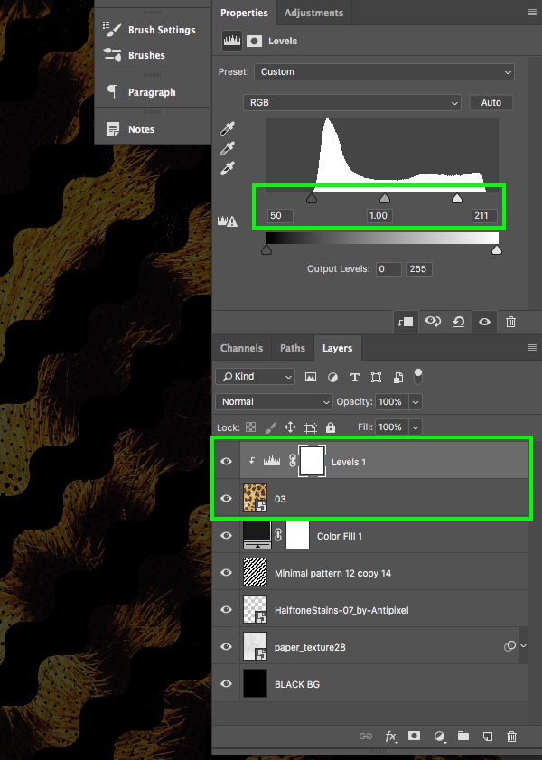
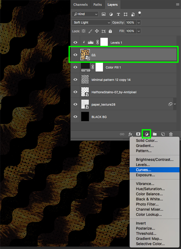
Next, change the Blend Mode of the fur texture from ‘Normal’ to ‘Soft Light’. After that, select the texture layer, hold the Alt/Option key, and click on the Adjustment Layer icon at the bottom of the Layers Palette before choosing ‘Levels…’ from the dropdown as shown here:
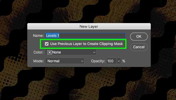
When prompted with the ‘New Layer’ panel, check off the box that says ‘Use Previous Layer to Create Clipping Mask’ and then click ‘OK’ to continue.
For the settings, let’s move the dark grey Levels slider in towards the centre until it’s set to about ’50’ and then move the white slider in towards the centre until it’s set to ‘211’ as shown below:
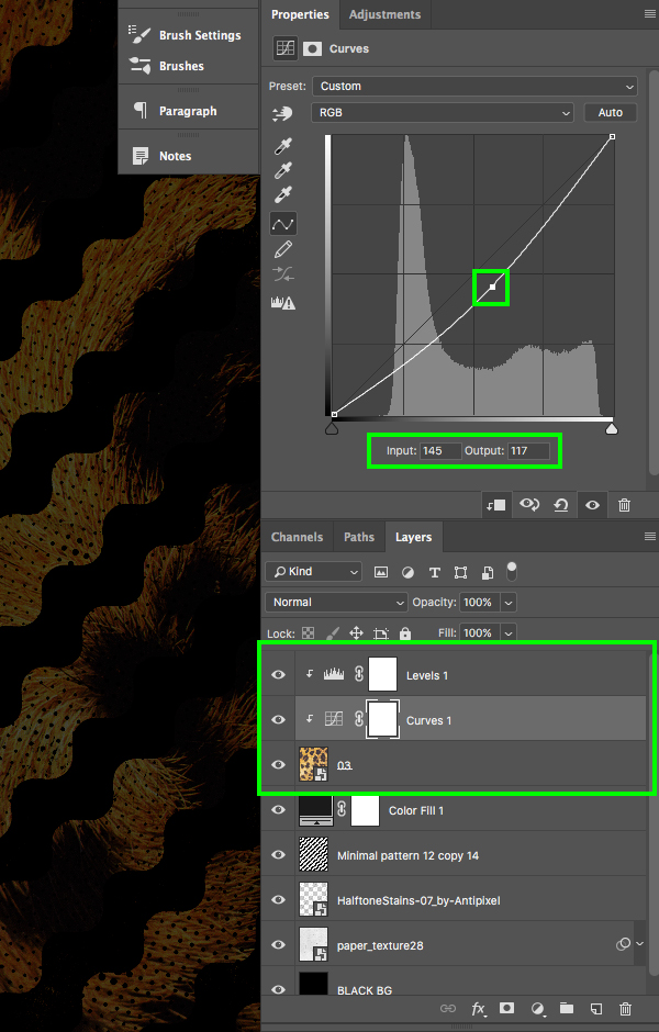
Select the fur texture Smart Object layer and then click on the Adjustment Layer icon again, this time choosing ‘Curves…’ from the menu.
For the Curves Adjustment Layer let’s create a point in the centre of the grid and move it down and to the right so that the ‘Input’ is set to ‘145’ and the ‘Output’ is set to ‘117’. You should also notice that the Curves and Levels Adjustment Layer’s are both clipped to the fur texture so they won’t affect any of the other layers besides the fur.
Step 21: Black & White Fur
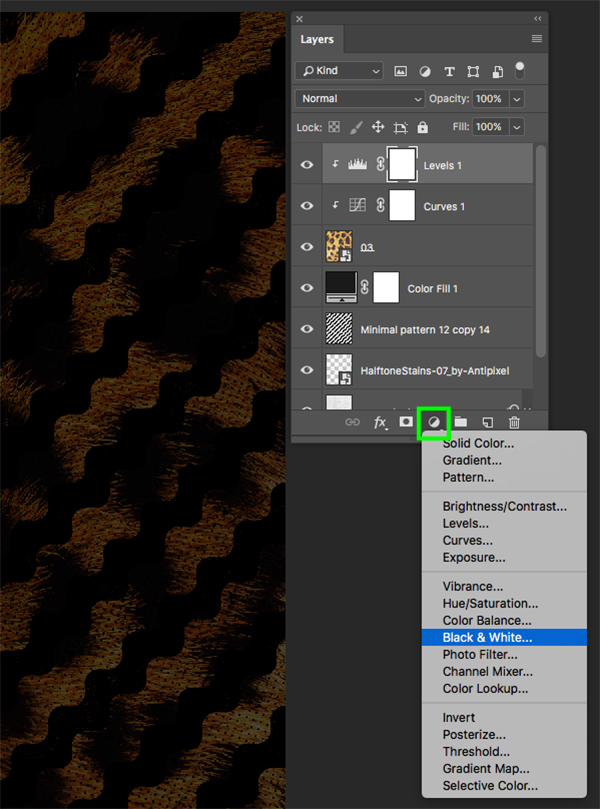
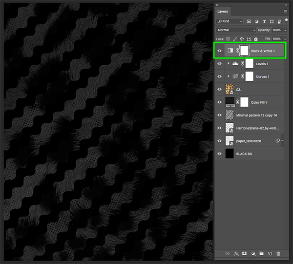
Select the top layer in your Layers Palette (in this case it should be the Levels Adjustment Layer) and then click on the Adjustment Layer icon at the bottom of your Layers Palette. From the menu, choose ‘Black & White…’ as shown below:
Now you should have a Black & White Adjustment Layer sitting at the very top of your Layers Palette – this one won’t have a Clipping Mask applied as we want every layer below this to remain in black and white.
Step 22: Background Folder
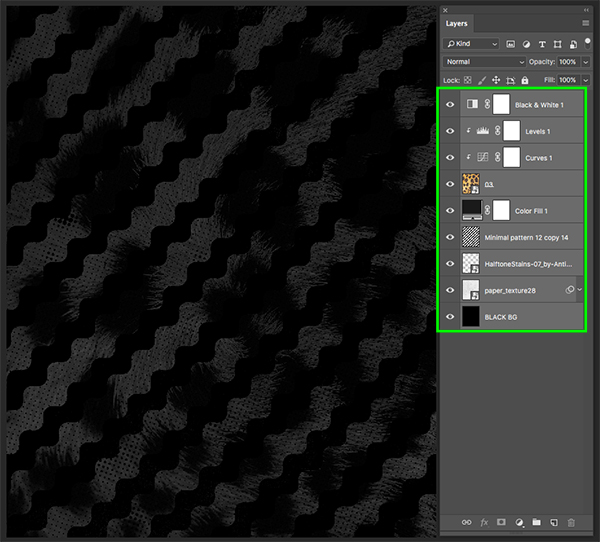
Now that we’ve set up our background, let’s select the top layer, hold the Shift key, and then select the very bottom ‘BLACK BG’ layer in the Layers Palette.
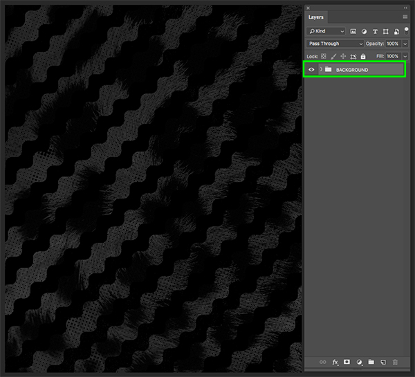
With all of your layers selected together, press Command/Ctrl+G to put them into a new folder and then double-click the ‘Group 1’ text to rename the folder ‘BACKGROUND’ as shown below:
Step 23: Wild Cats
Return to the File menu and choose ‘Place Embedded…’ once again.
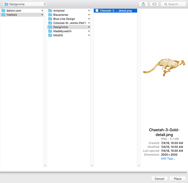
Navigate to the ‘Cheetah-3-Gold-detail.png’ file from the Designnina freebie folder, that we used earlier in our mockup scene, and choose ‘Place’ from the lower right corner.
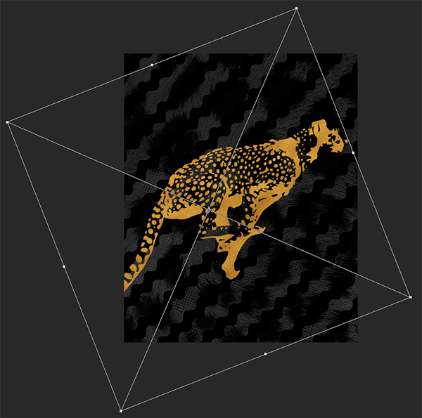
Once you’ve imported the cheetah, scale and rotate it using the image below as a guide:
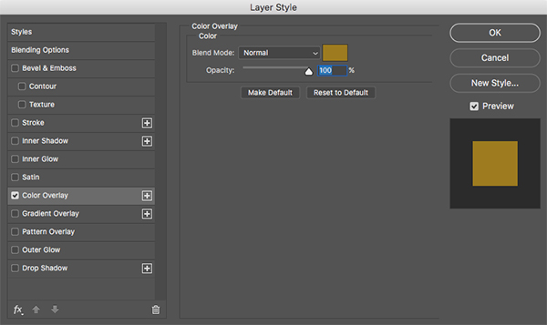
Double click on the cheetah Smart Object to bring up your Layer Styles and check off the ‘Color Overlay’ option.
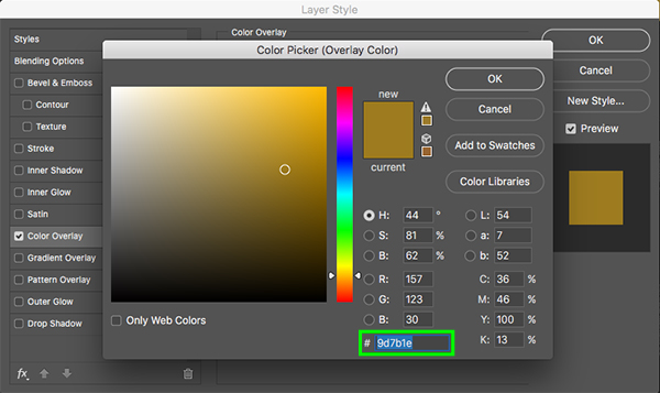
For the fill color let’s use the hex value ‘#9D7B1E’ and then press ‘Return’ or click ‘OK’ two times to apply the changes and close out of both panels.
Step 24: Charge
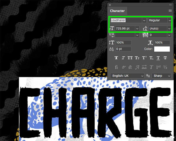
Create a new layer above the cheetah Smart Object layer and press ’T’ to switch to your Type Tool. Click the cursor roughly over the center of the cheetah and type out the word ‘CHARGE’ in all caps. For the typeface I am using a free font called ‘Loudhailer’ which you can download here for free. Open the Character Panel by going to the Window menu and choosing ‘Character’ and then make the font ’725.96 pt’ with a solid white fill as shown below:
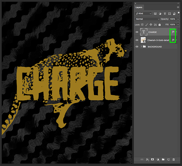
Next, hold the Alt/Option key and click and drag the small ‘fx’ icon from the cheetah Smart Object layer onto the text layer to apply the same Layer Style to both layers.
Step 25: Text Padding
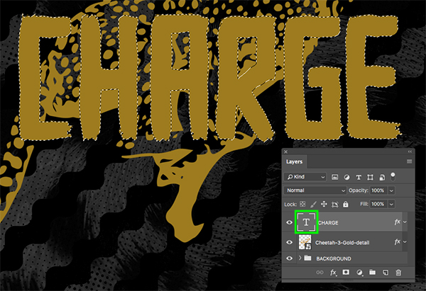
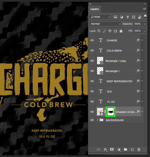
We now want to create a bit of padding or an outline around the text. To do this, hold the Command/Ctrl key and click on the thumbnail icon of the layer to activate a selection around it.
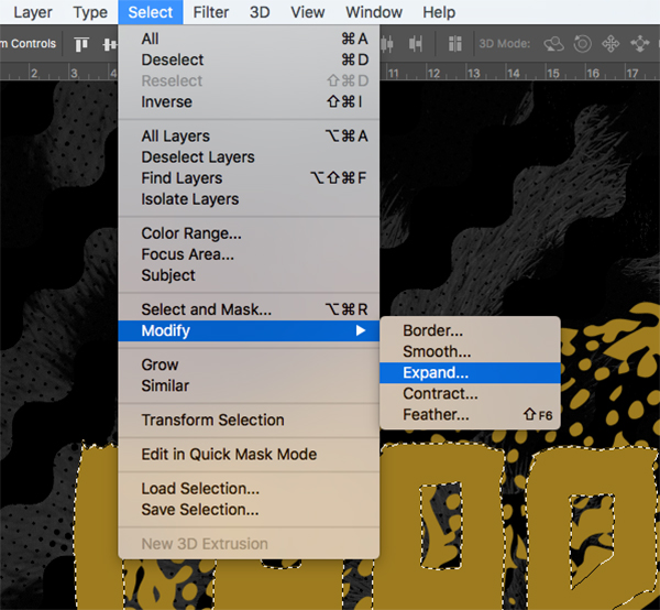
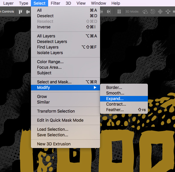
After making the selection, go to the Select menu and choose ‘Modify > Expand’ as shown here:
Expand the selection by ’25 pixels’ and then press ‘OK’ or hit the ‘Return’ key to proceed.
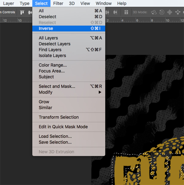
Now once we’ve expanded the selection we want to invert it by going back to the Select menu and choosing ‘Inverse’ as shown below:
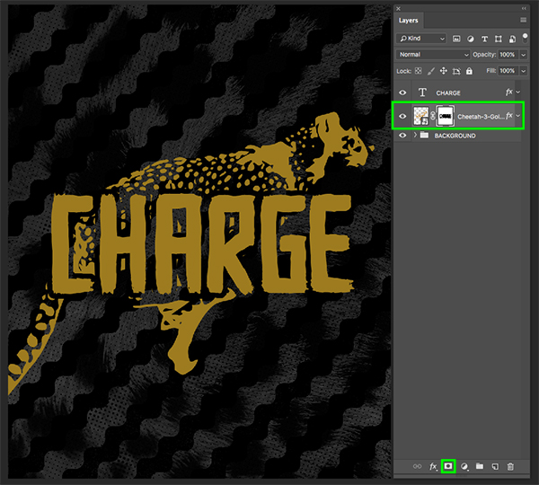
Next, select the cheetah Smart Object layer in your Layers Palette and then click on the ‘Add Layer Mask’ icon at the bottom of the Layers Palette to apply a mask to the cheetah layer. This will result in a nice effect that helps with the legibility of our text.
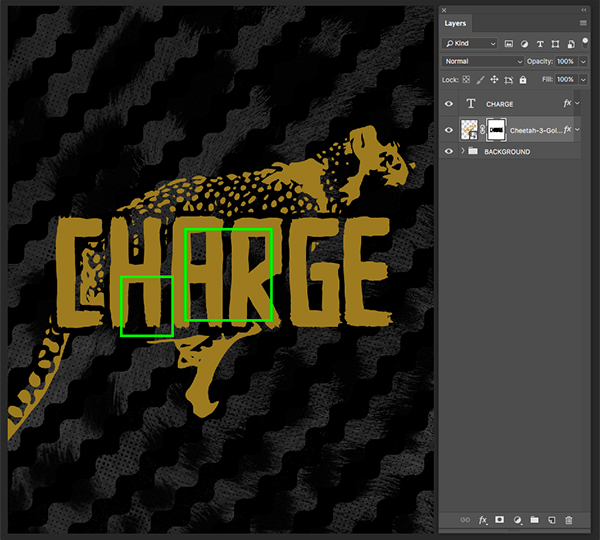
Switch to the Brush Tool (B) and make sure you have a solid black foreground colour selected. From here, go in and paint over some of the smaller shapes inside the spaces of some of the letters just to clean things up a bit. The image below shows the areas I have masked out to help keep things easy to read.
Step 26: Cold Brew
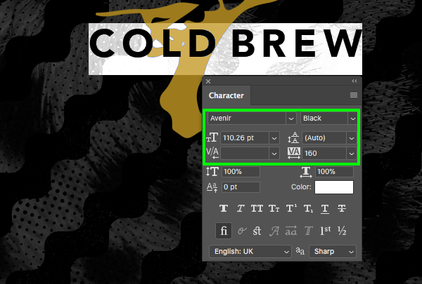
Create a new layer and use the Type Tool (T) to type out the words ‘COLD BREW’ in all caps. Bring up the Character Panel (located under the Window menu) and use a clean, bold, sans serif typeface such as ‘Avenir’. Let’s make the size about ‘110.26 pt’ and set the fill colour to solid white as shown below:
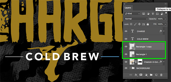
Press ‘U’ on the keyboard and then use the Rectangle Tool to draw out a long, thin line to the side of the ‘COLD BREW’ text. Press Command/Ctrl+J to duplicate the line, and then hold the Shift key and use the arrow keys to move the copy to the other side of the text.
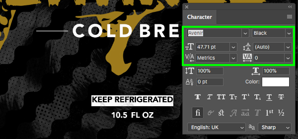
Create two more layers and on the first line type out ‘KEEP REFRIGERATED’ with the same typeface that we used for the previous text. This time, let’s go ahead and change the size to about ’47.71 pt’ so that it appears much smaller below the ‘COLD BREW’ line. Add another layer and using the same font and properties, type out ’10.5 FL OZ’ below the ‘KEEP REFRIGERATED’ text.
Step 27: Gold Styles
Hold the Control key and click on the small ‘fx’ icon of the ‘CHARGE’ layer. From the menu that appears, choose ‘Copy Layer Style’ as shown below:
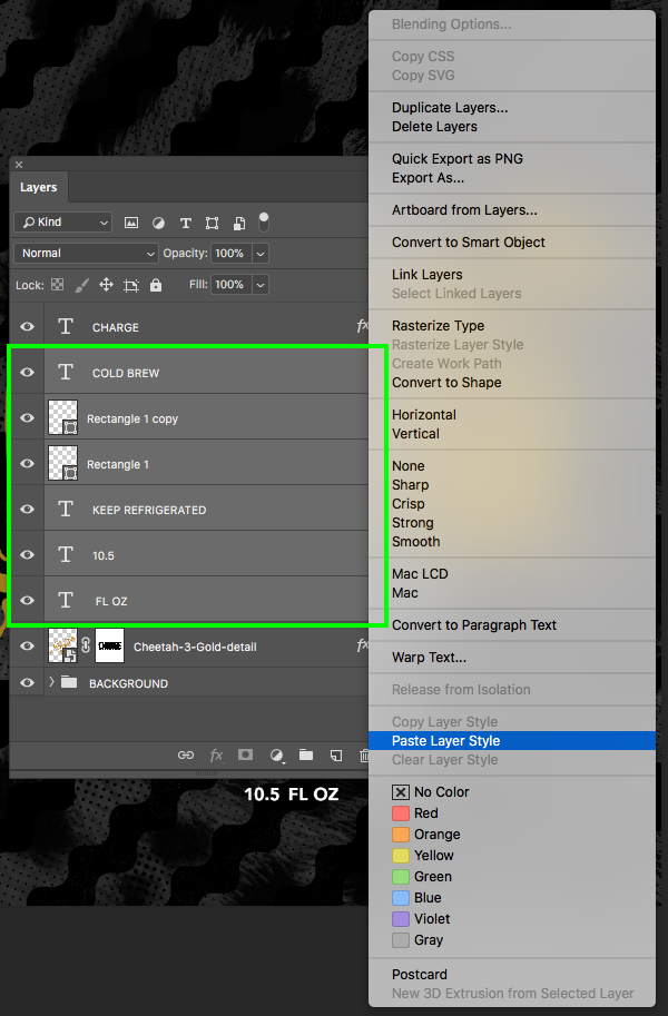
Next, select the ‘COLD BREW’ text layer, hold the Shift key, and then click on the bottom text layer so all of your text and lines are selected together. After you’ve done that, hold the Control key and click on one of the layers to bring the menu back. This time, however, we want to choose the ‘Paste Layer Style’ option to paste the same style that’s applied to the ‘CHARGE’ text to all of the other layers we have selected.
Step 28: Cold Brew Padding
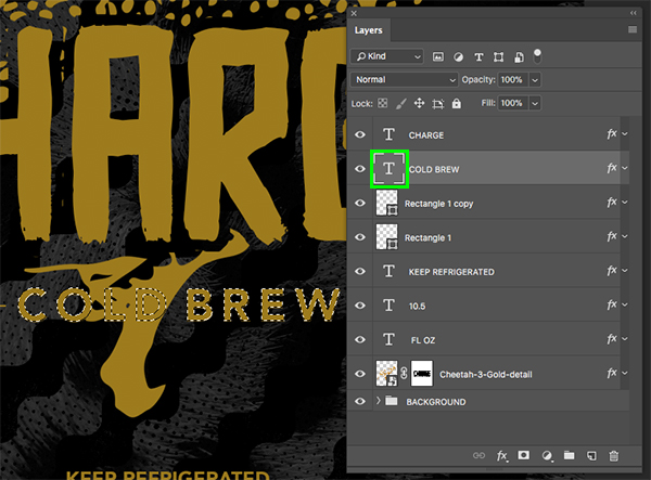
Hold the Command/Ctrl key and click the layer thumbnail icon of the ‘COLD BREW’ text layer to activate a selection around the letters.
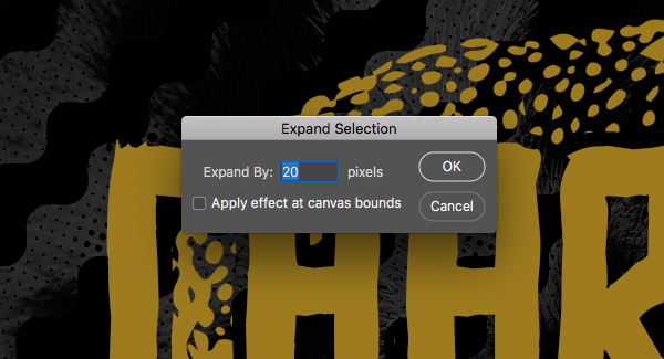
After activating a selection around the text, go to the Select menu and choose ‘Modify > Expand…’ as shown below:
Under the ‘Expand Selection’ panel, enter a value of ’20’ and then click ‘OK’ to continue.
After expanding the selection, let’s invert it by pressing Command/Ctrl+Shift+I on the keyboard. Once you have inverted the selection, press ‘D’ to reset your default colours, make sure that black is the foreground colour, and then click on the layer mask attached to the cheetah and press Alt/Option+Delete on the keyboard to fill the inverted selection with black. You should now have an area knocked out around the ‘COLD BREW’ text as we did with the ‘CHARGE’ text earlier on.
Step 29: Handroasted
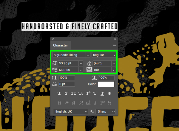
Add another new layer and this time type out ‘HANDROASTED & FINELY CRAFTED’ in all caps using the font ‘Big Noodle Titling’ which you can download here for free from DaFont.com. Use the Character Panel once again to adjust the type by making it ’53.96 pt’ in size with a solid white fill colour and place it above the cheetah.
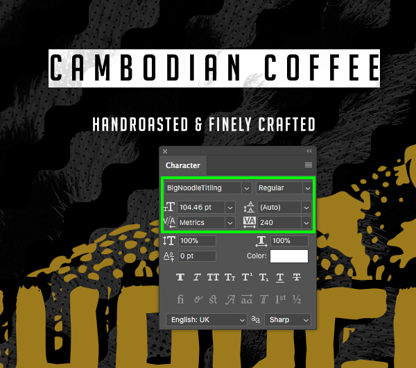
Add another new layer above the ‘HANDROASTED…’ text and with the same typeface let’s type out ‘CAMBODIAN COFFEE’ in all caps. Let’s make this text larger – maybe about ’104.46 pt’ for the size and then change the tracking of the text to ‘240’ as shown here:
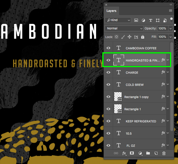
Hold the Control key and click on the ‘HANDROASTED…’ text layer and paste the Layer Style that we used before to fill the text with the neutral gold colour.
Step 30: Handroasted
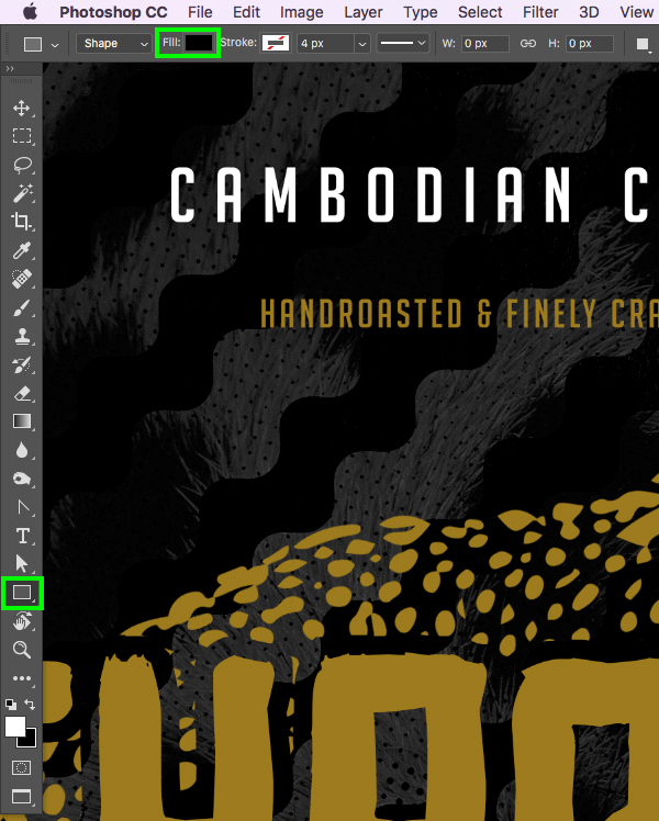
Press ‘U’ on the keyboard to grab the Rectangle Tool and then click on the ‘Fill’ swatch at the top of the toolbar highlighted here:
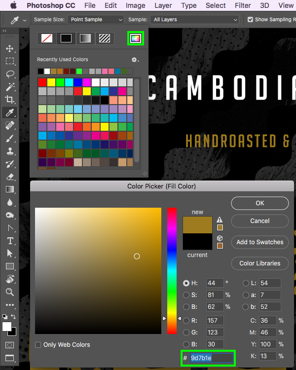
Once the poppet menu appears, click on the small colour spectrum icon in the upper right corner of the panel. From here, enter the hex value ‘#9D7B1E’ to keep consistent with the rest of the tutorial. Once you’ve done that, click ‘OK’ to continue.
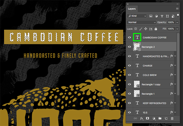
Next, click and drag out a long golden rectangle just below the ‘CAMBODIAN COFFEE’ line of text as shown earlier. After placing the rectangle beneath the text, hold the Command/Ctrl key and click on the layer thumbnail icon of the ‘CAMBODIAN COFFEE’ text layer to activate a selection around it. Once you have an active selection, turn off the visibility of the text layer by poking the eye out.
While the selection is still active, select the golden rectangle shape below, press Command/Ctrl+Shift+I to invert the selection, and then click on the layer mask icon at the bottom of the Layers Palette. This should knock the shape of the text out of the gold bar as seen below:
Step 31: Golden Folder
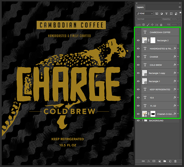
Select the very top text layer in your Layers Palette, hold the Shift key, and then select the cheetah illustration so every layer above the ‘BACKGROUND’ folder is selected.
With all of the layers still selected, press Command/Ctrl+G to put them into a new folder and double-click the ‘Group 1’ text to rename the folder ‘GOLD’ like this:
Step 32: Top Texture 1
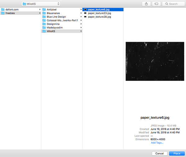
Go to the File menu and choose ‘Place Embedded…’ from the menu before navigating to the ‘paper_texture6.jpg’ file from MiksKS in the freebies folder. Once you’ve located the file, select it and choose ‘Place’ to bring it into your file.
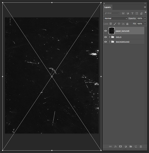
Click and drag outwards from any of the four corners of the bounding box while holding the Alt/Option+Shift keys to scale it up and then rotate the texture 90º counter clockwise. Once you’ve filled the canvas with the texture, press ‘Return’ on the keyboard to apply the changes.
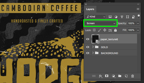
After placing the paper texture on top, change the Blend Mode of the layer to ‘Screen’ as shown here:
Step 33: Top Texture 2
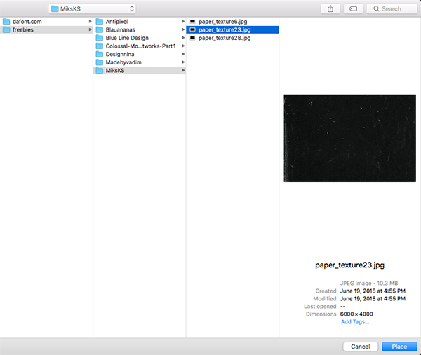
Go to the File menu and choose ‘Place Embedded…’ from the menu before navigating to the ‘paper_texture23.jpg’ file and choose ‘Place’ to bring it into your document.
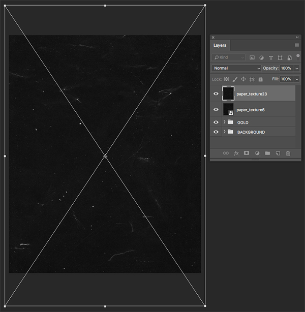
Repeat the transformation process by clicking and dragging outwards from any of the four corners of the bounding box while holding the Alt/Option+Shift keys to scale it up and then rotate the texture 90º counter clockwise. After scaling and positioning the second texture, press ‘Return’ to commit to the changes.
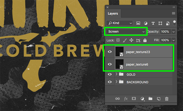
After placing the second paper texture, change the Blend Mode from ‘Normal’ to ‘Screen’ as shown here:
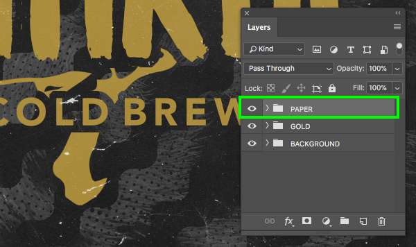
Select the top paper texture, hold the Shift key, and then select the second paper texture below. With both layers selected together, press Command/Ctrl+G to put the layers into a new folder and double click the text name to change it to ‘PAPER’ as shown below:
Step 34: Paper Levels
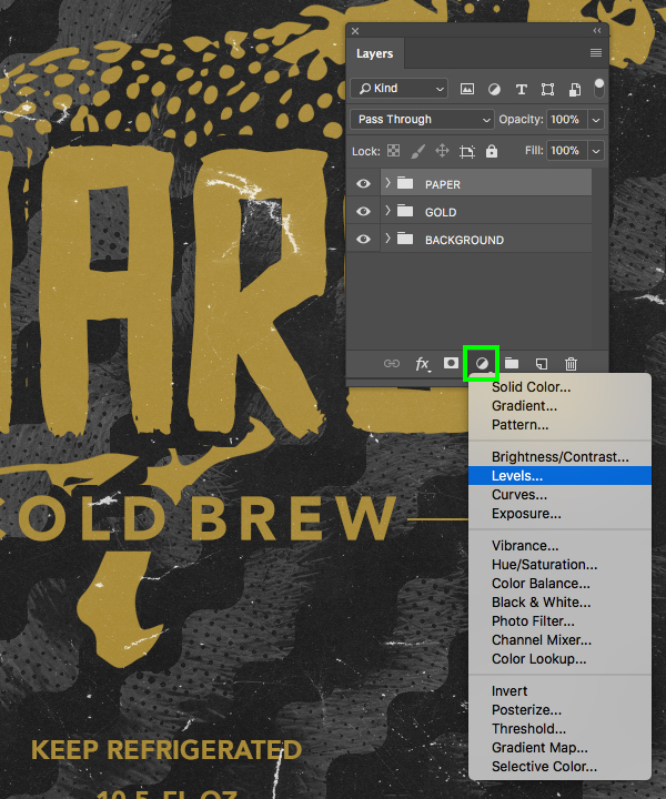
Select the ‘PAPER’ folder in the Layers Palette and then hold the Alt/Option key and click the Adjustment Layer icon at the bottom of the Layers Palette. From the list that pops up, choose ‘Levels…’ from the list.
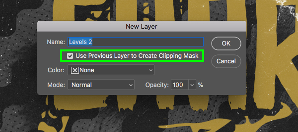
When prompted with the ‘New Layer’ dialog box, check off the ‘Use Previous Layer to Create Clipping Mask’ box and then press ‘Return’ to continue.
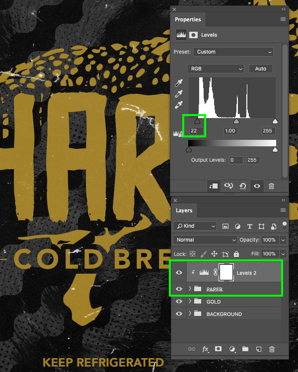
Your Levels Adjustment Layer will now be added with a Clipping Mask indicating that it will only affect the elements inside of the ‘PAPER’ folder.
Step 35: Gradient Fills
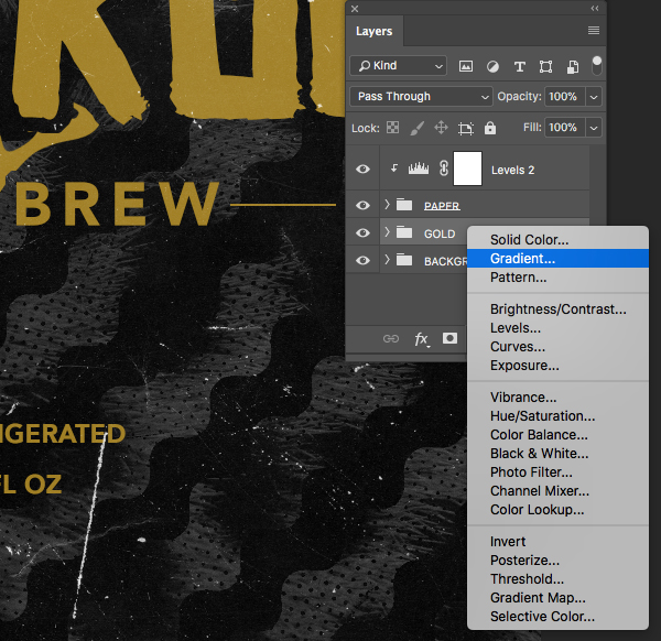
Select the ‘GOLD’ folder and then click on the Adjustment Layer icon again while holding the Alt/Option key and this time choose ‘Gradient…’ from the list.
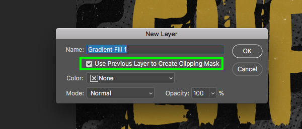
Once again, check off the ‘Use Previous Layer to Create Clipping Mask’ box and then press ‘Return’ to continue.
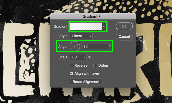
You will now see the ‘Gradient Fill’ dialog box where we first want to change the ‘Angle’ to ’35’ and then after that click on the little window or colour strip to modify the gradient.
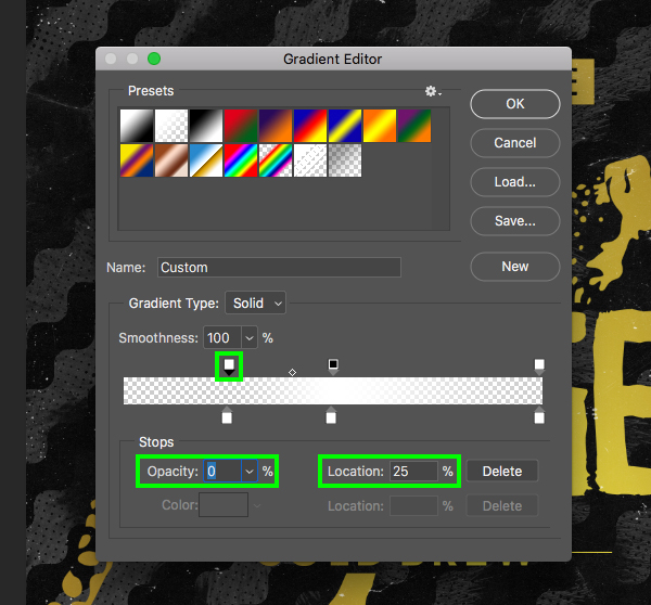
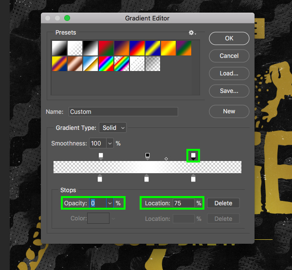
Click along the bottom of the editor and create a point filled with solid white, and make the point above it which controls the opacity set to ‘100’. Next, make another set of points on the left side (both the top and bottom boxes). For this, move the slider in towards the centre so that the ‘Location’ is set to ’25’ and then drop the ‘Opacity’ down to ‘0’.
On the opposite side let’s do the same thing where we set a point with a solid white fill, an ‘Opacity’ of ‘0’ and then move the ‘Location’ slider to ’75’. Once you are happy with the placement of the textures, click ‘OK’ or press the ‘Return’ key to proceed.
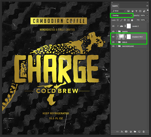
After the fill has been added, change the Blend Mode of the layer from ‘Normal’ to ‘Overlay’. After that, save the file by pressing Command/Ctrl+S and then close out of the tab/window by pressing Command/Ctrl+W.
Step 36: Curves
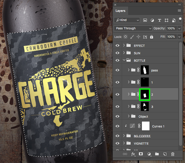
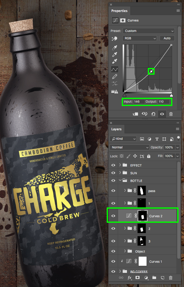
Once you are back in the main mockup file, expand the contents of the ‘BOTTLE’ folder and then hold the Command/Ctrl key and click on the layer mask thumbnail icon attached to the ‘2’ layer to activate a selection around the label on the bottle.
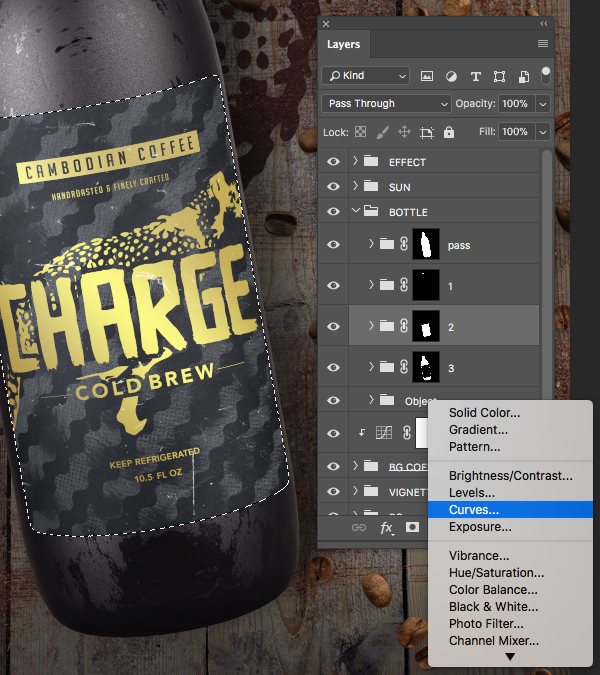
While your selection remains active, click on the Adjustment Layer icon and then choose ‘Curves…’ from the list.
Click in the center of the grid to add a point and then change the ‘Input’ setting to ’146’ and the ‘Output’ can be set to ‘110’. This adjustment will add some contrast to our label design to bring it all together!
We have now completed our Cold Brew Packaging Design in Photoshop! To create our packaging we’ve used a handful of freebies from The Deluxe Textures and Patterns Bundle along with some beautiful mockup elements and a few free typefaces. Check out the complete design bundle to gain access to even more high-quality textures and patterns for your design projects!
Remember that whether it’s your outcome for this tutorial or something new you’ve made, we’d love to see your designs on our Facebook page.
Please leave a comment if you have any questions or suggestions. I always look forward to hearing from you!
There’s still time to check out The Deluxe Textures and Patterns Bundle giving you access to an all new bundle, featuring some of the finest textures and patterns available in the design world, at an unheard of 99% discount!











I used to be suggested this website via my cousin. I’m
now not certain whether this put up is written by way of him as no one else
know such exact approximately my problem. You are amazing!
Thank you!
Yay we’re so thrilled that Eric’s tutorial was just what you were looking for Vilma, and we hope that you have great fun putting all these tips and techniques into practice for your own creative projects :).
Thanks, thanks, thanks!!!
I just love these types of tutorials. It gives me insight and cool designer tricks in to how to further use these resources for a polished finished piece. And I’m glad I paid attention the background pattern resizing. That will definitely come in handy when I take a shine to a particular set and it’s not an actual .pat file. Very Helpful!
Hey Richard,
Thank you so much for your super kind words and we’re so glad that you love our tutorials!
We hope that you have been able to pick up lots of great tips and tricks and that they come in great use for your own design projects :) Happy Designing!