In this tutorial I will be showing you how to design packaging for a healthy snack delivery service in Photoshop. These services have become quite popular and today we will be creating a packaging design of our own for our company called Freshbox. To do this we will be using some beautiful illustrations, typefaces, and textures from The Timeless Vintage Design Bundle. Once we create the artwork for the service we will apply it to a realistic mailer box mockup to push the idea even further. If you are all ready to begin then grab a healthy snack, open up Photoshop, and let’s get started!
HAVE YOU SEEN OUR YOUTUBE CHANNEL?
Watch the video tutorial below and subscribe to our YouTube channel for regular updates direct to your inbox.
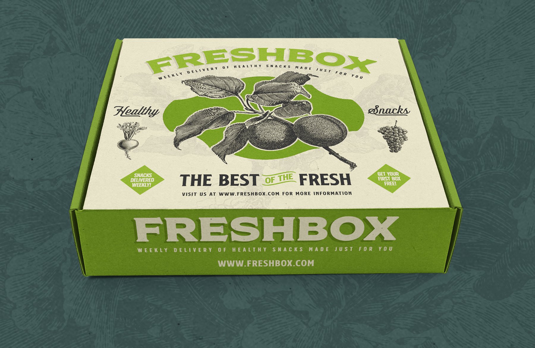
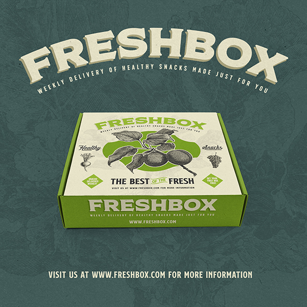
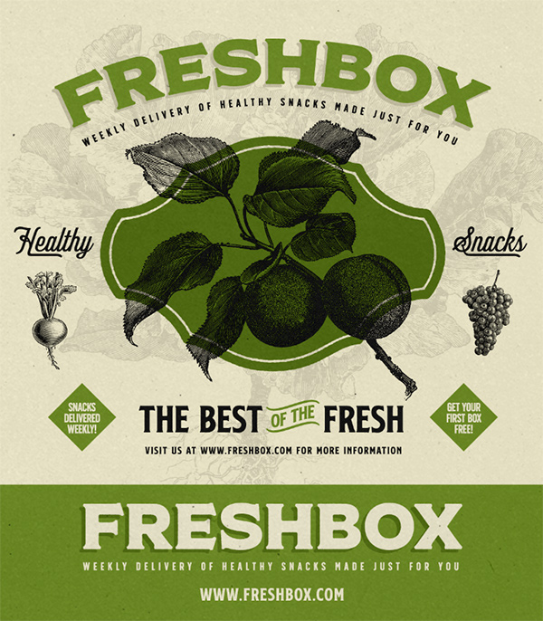
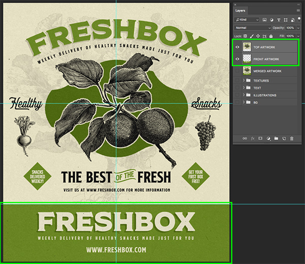
Here’s a look at what we’ll be creating:
Follow along with this tutorial: Download the freebie files
This freebie pack is just a taste of what you can expect to find in the The Timeless Vintage Design Bundle for just $29 (that’s 99% off). This is the most extensive and versatile vintage design bundle we have ever released! And inside this massive bundle you will find a variety of stunning vintage typefaces, 1000s of quality vector illustrations, actions, ephemera, and so much more!
Step 1: Freshbox Packaging Design
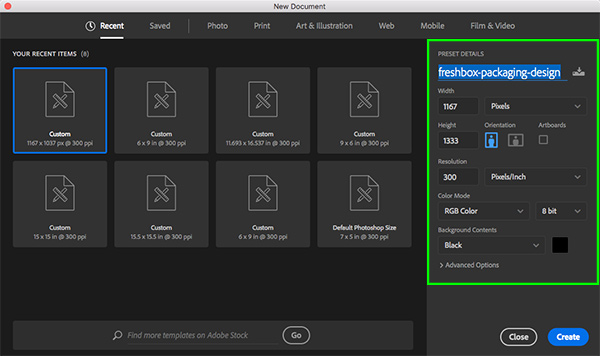
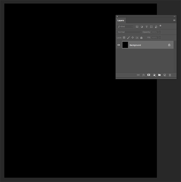
Let’s start by setting up a new document in Photoshop. We will make our document ‘1167 px’ wide by ‘1333 px’ tall with a ‘Resolution’ of ‘300’, ‘Color Mode’ can stay in ‘RGB’, and the ‘Background Contents’ can be set to ‘Black’. Once you have done that, give your document a name – here I am using ‘freshbox-packaging-design’. After you have set your parameters, click on the ‘Create’ button from the lower right corner.
You should now have your new document open and you will notice there is only a single layer named ‘Background’ that is locked and filled with solid black.
Step 2: Bottom Panel
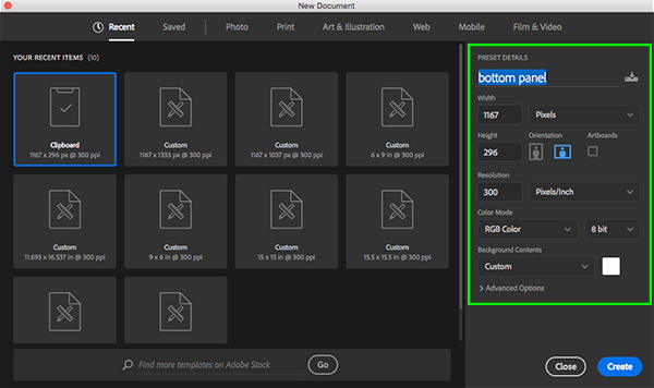
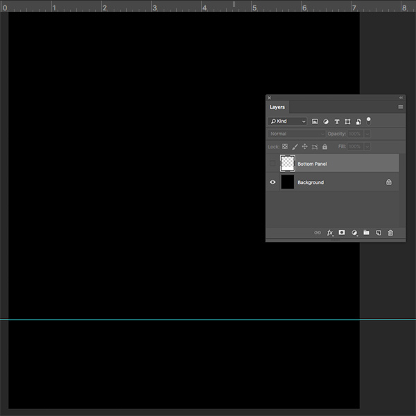
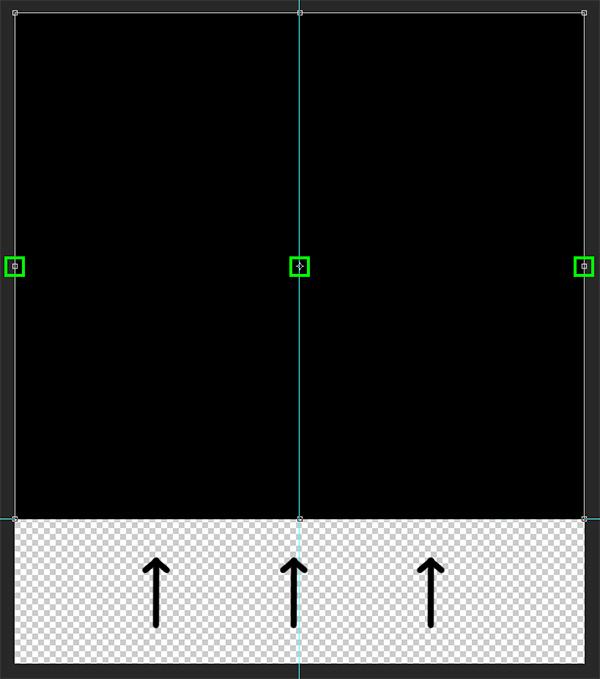
We’re now going to create a second document so that we can create the dimensions for the bottom panel, which will serve as the ‘front’ of our packaging mockup later on. To keep things simple, we’re going to be designing both the main and bottom panels in the same document. To do this, go back to the File menu and choose ‘New Document’ or press Command/Ctrl+N on the keyboard. This time let’s leave all the settings the same except we will give this document a different name – something like ‘bottom panel’ is fine, and then make the height ‘296 px’ and change the ‘Background Contents’ to ‘White’. From here, click the ‘Create’ button once again from the lower right.
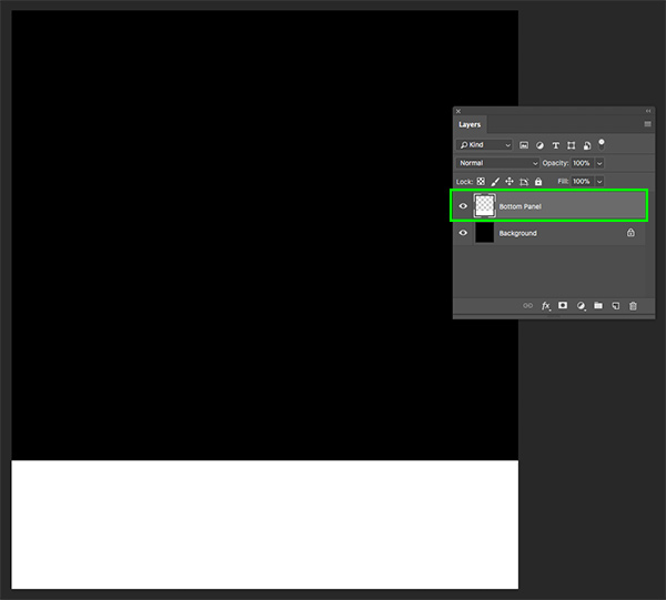
Once you have your new document filled with white, move this tab over and then hold the Shift key and drag it into your main document with the black background. After that, hold the Shift key again and slide the white box all the way to the bottom of the document so it looks like this:
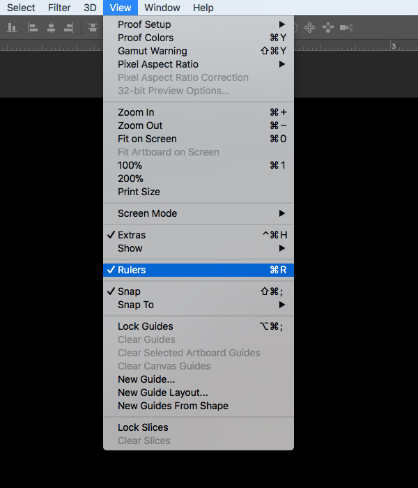
What we want to do next is place a guide at the top of the lower panel so we know where it begins. Let’s first make sure that we have our Rulers by going to the View menu and choosing ‘Rulers’ from the dropdown menu shown here:
Next, click and drag a guide down from the top ruler and it should snap into place where the top of the white box is. Once you’ve placed your guide you can either turn off the white box or remove it completely.
Step 3: Unlocking the Background
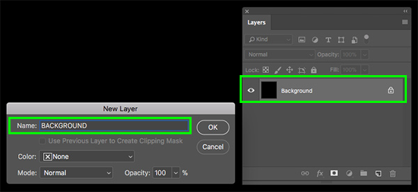
Now that we’ve placed our guide and we know where the main and lower panels will separate, let’s double click on the locked ‘Background’ layer to unlock it and give it a new name. After double clicking you will be prompted with a dialog box that says ‘New Layer’ and this is where we want to type in a new name for the layer. For now I will just call the layer ‘BACKGROUND’ and then go ahead and click ‘OK’ or press ‘Return’ on the keyboard to apply the changes and rename the layer.
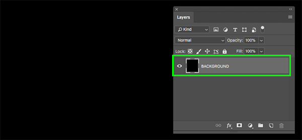
You will now see that your layer has been unlocked and renamed as shown below:
Step 4: Placing Additional Guides
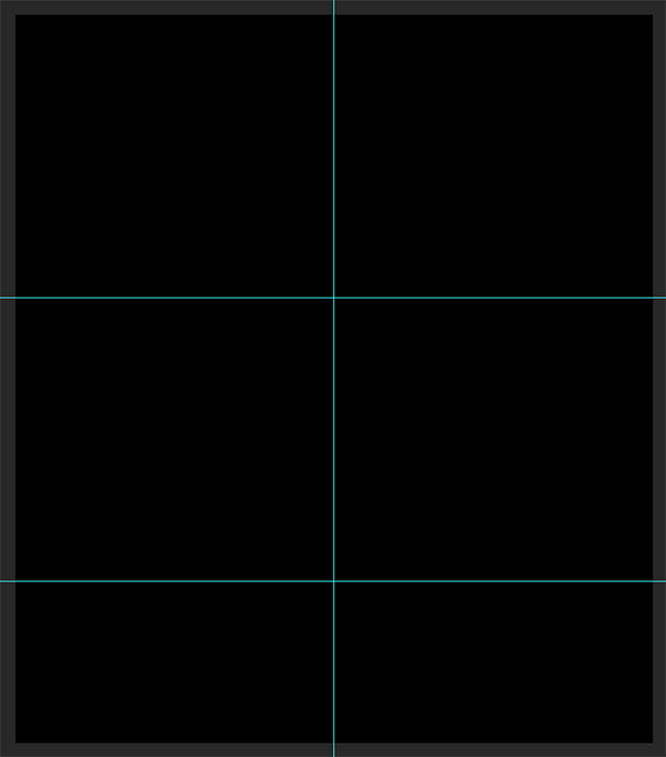
Select the ‘BACKGROUND’ layer and press Command/Ctrl+T to do a Free Transform. After that you will see the handles around the bounding box, and what we can do now is drag a guide out from the rulers on the left side and place it right in the vertical center. This guide should snap into place like the previous guide, and you will see the vertical line indicating the center of your image here:
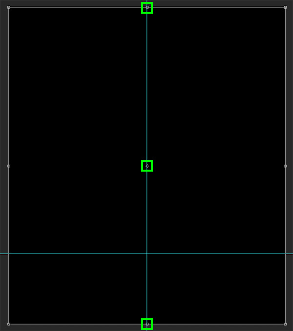
After placing this second guide in the center, grab the bottom handle and move the black ‘BACKGROUND’ layer up so that the bottom snaps to the bottom guide. Once you have done that, you will be able to see the horizontal center of the top portion of the image, above the lower panel. Let’s drag another guide from the top down to the middle of this area as well.
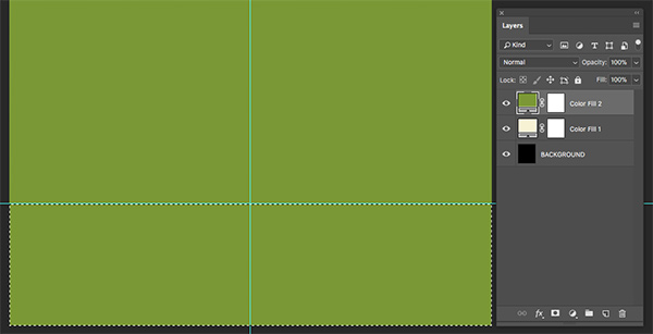
We can now bring the handle of the ‘BACKGROUND’ layer back down to the bottom so that it once again fills the entire canvas. It may not seem like it yet, but these guides are going to help us out once we begin laying out our packaging design! Your document should now have three guides as shown in the image below:
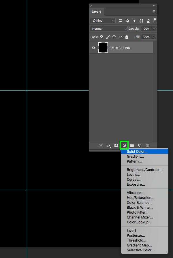
Step 5: Background Colors
With the ‘BACKGROUND’ layer selected, click on the Adjustment Layer icon found at the bottom of the Layers Palette and then choose ‘Solid Color…’ from the list.
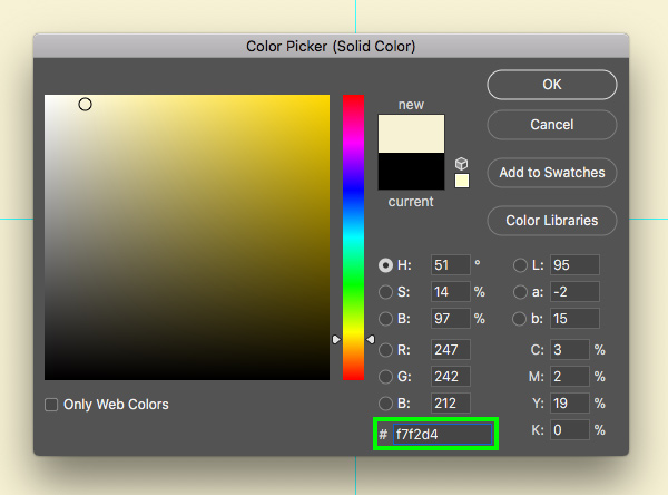
For the fill color, enter the hex value ‘#F7F2D4’ as shown below:
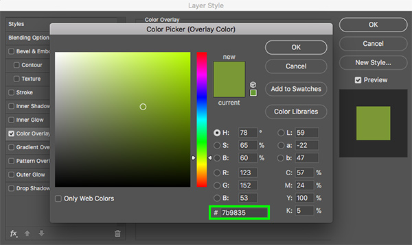
Add a second ‘Solid Color…’ Adjustment Layer above the previous one, and this time enter the hex value ‘#7B9835’ which is a nice natural green color.

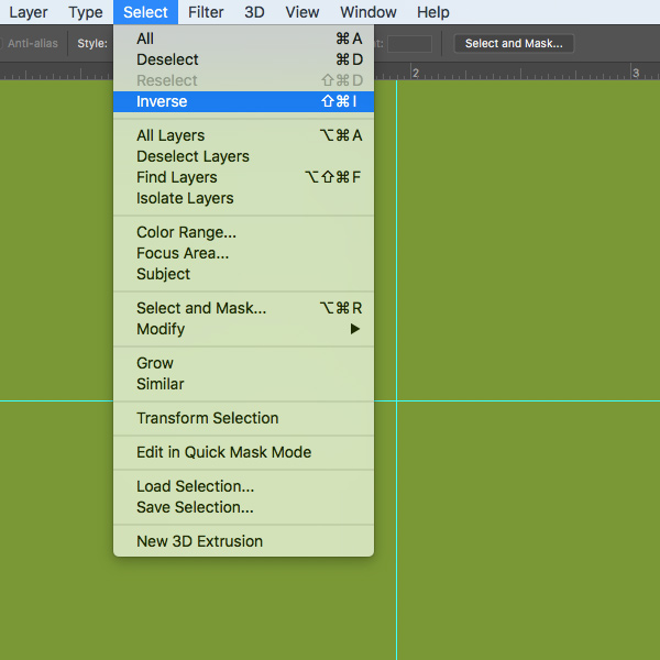
After creating both of the Adjustment Layers, press ‘M’ to switch to the Marquee Tool and then click and drag a rectangle that covers the entire bottom section. Here you can use the guide that we placed to help you make the selection.
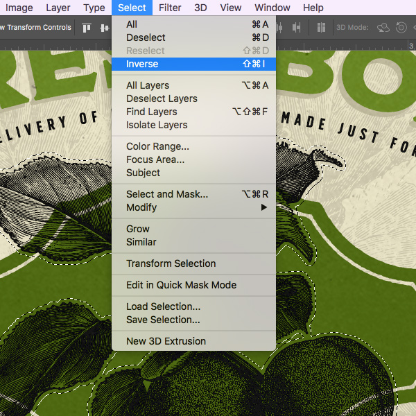
After making the selection around the bottom panel, go to the Select menu and choose ‘Inverse’ from the dropdown menu.
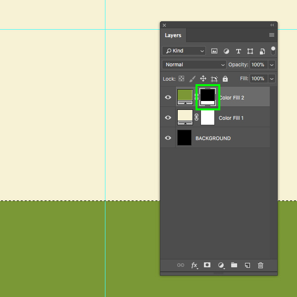
Make sure that the green Solid Color Adjustment Layer is active and then click on the Layer Mask that is attached to it in the Layers Palette. From here, press ‘D’ on the keyboard to reset your default colors, and then make sure that your foreground color is solid black instead of white. From here, press Alt/Option+Delete on the keyboard to fill the inverted selection with black. Doing this will make it so the green is only visible in the bottom portion of the image as shown below:
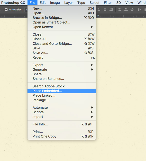
Step 6: Placing the First Texture
Go to the File menu and choose ‘Place Embedded…’ from the menu.
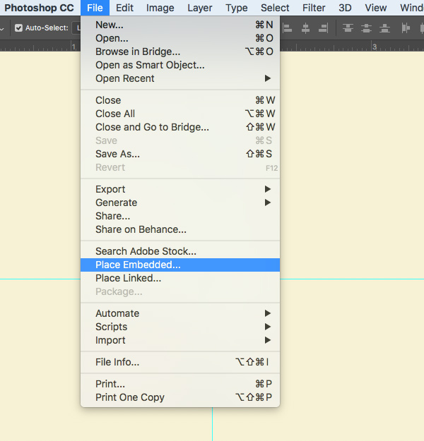
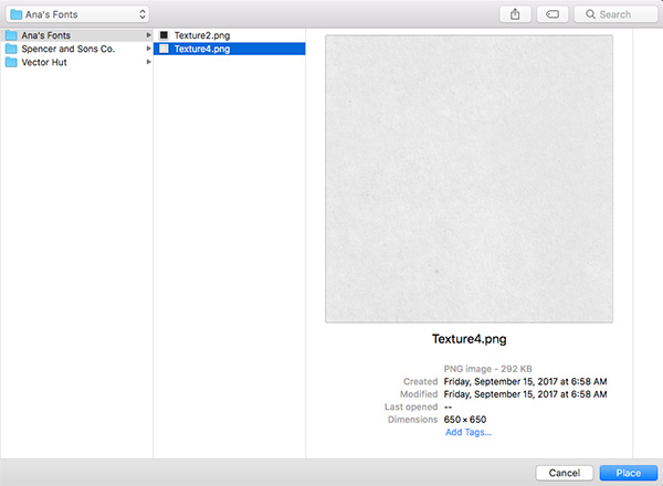
Navigate to the freebies folder for this tutorial and locate the ‘Texture4.png’ file from Ana’s Fonts and then choose ‘Place’ from the lower right corner.
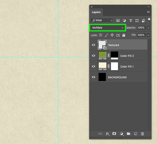
The texture will now be imported with the file name and as a Smart Object by default. Make sure that the texture covers the entire canvas by holding the Alt/Option+Shift keys and dragging outwards from any of the four corners of the bounding box. Once you’ve scaled and positioned the texture press ‘Return’ on the keyboard.

From here, change the Blending Mode of the texture layer from ‘Normal’ to ‘Multiply’ as shown below:
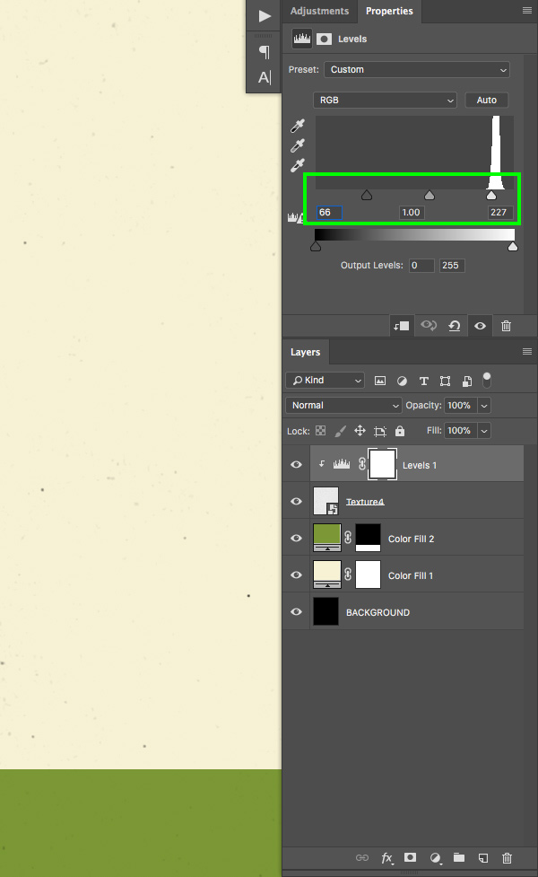
Step 7: Levels Adjustment
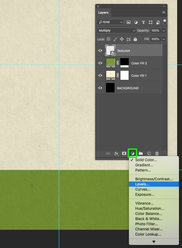
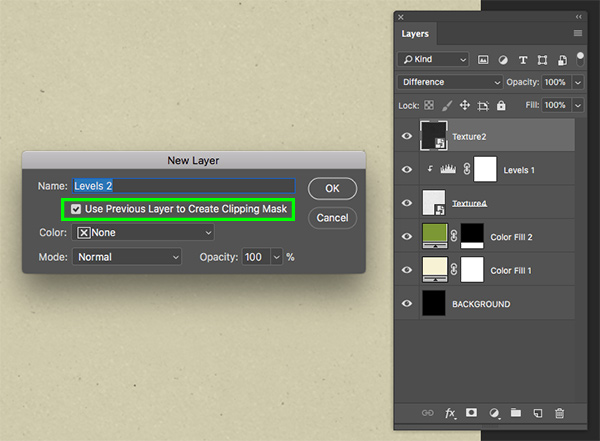
Select the ‘Texture4’ Smart Object layer and then hold the Alt/Option key and click on the Adjustment Layer icon at the bottom of the Layers Palette. When the popup menu appears, choose ‘Levels…’ from the list.
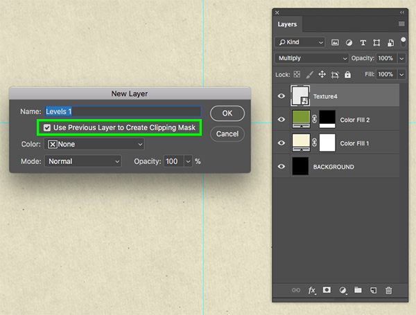
You will now be prompted with a dialog box where we want to check off the option that says ‘Use Previous Layer to Create Clipping Mask’ and then click ‘OK’ or press the ‘Return’ key to proceed. This will ensure that the Adjustment Layer is clipped to the layer directly below.
For the properties, let’s move the left gray slider in towards the left until it’s set to ’66’ and then move the right, white slider in towards the center until it’s set to ‘227’ as shown here:
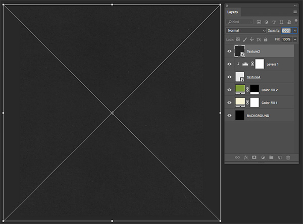
Step 8: Second Texture
Return to the File menu and choose ‘Place Embedded…’ once again.
Navigate to the ‘Texture2.png’ file from Ana’s Fonts and then choose ‘Place’ from the bottom right corner.

The texture will now appear as a Smart Object and with the file name automatically. Let’s scale this texture up as well so that it fills the entire canvas, and then press ‘Return’ on the keyboard to apply the changes.
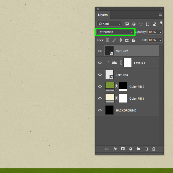
The next thing we want to do is change the Blending Mode of this layer from ‘Normal’ to ‘Difference’ as shown in the image below:
Step 9: Second Texture
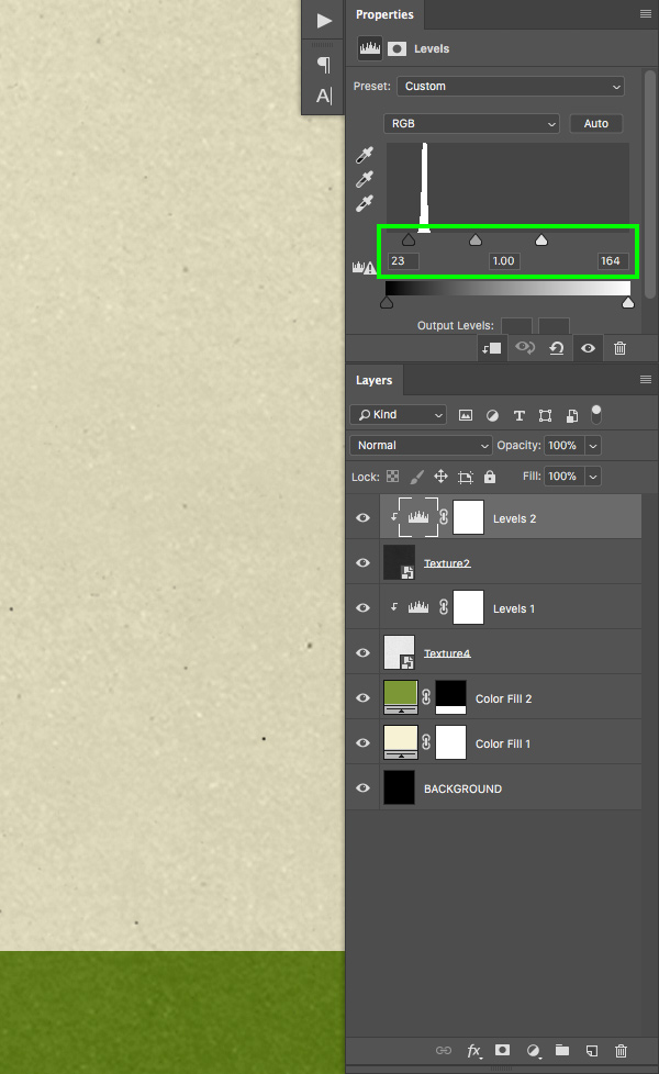
Make sure that the ‘Texture2’ layer is selected in your Layers Palette, and then hold the Alt/Option key and click on the Adjustment Layer icon at the bottom of the Layers Palette once again. From here, choose ‘Levels…’ from the list that appears.

Just like we did in the previous steps, check off the option that says ‘Use Previous Layer to Create Clipping Mask’ to ensure that it is clipped to the texture layer directly below.
For the properties, move the left slider in towards the center until it’s set to ’23’ and move the right slider towards the center until it’s set to ‘164’ as shown below:
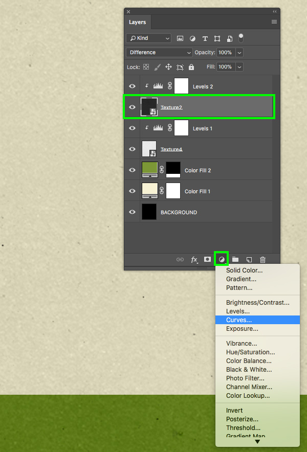
Select the ‘Texture2’ layer once again and then click on the Adjustment Layer icon and choose ‘Curves…’ from the menu. This time you do not need to hold the Alt/Option key as this layer will be added below the existing Adjustment Layer that already has a Clipping Mask.
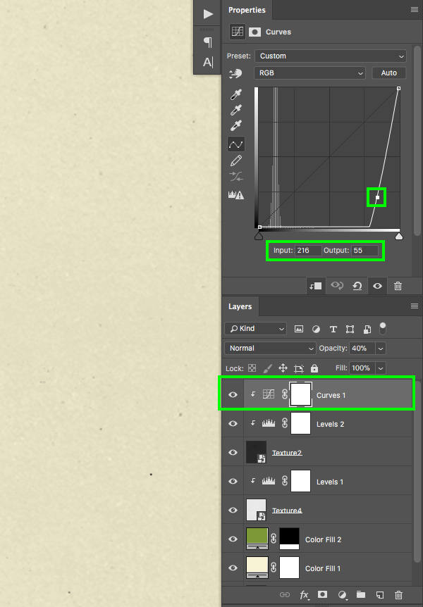
Next, add a single point in the middle of the grid and move it down and to the right so that it’s in the lower quadrant of the grid. For the ‘Input’ set it to ‘216’ and then set the ‘Output’ to ’55’. We also want to make sure that the Curves Adjustment Layer is on top of the Levels Adjustment Layer, so we can select the Curves Adjustment Layer and then press Command/Ctrl+] on the keyboard to move it up one spot in the Layers Palette. Be careful not to move it up more than once as this will release the Clipping Mask.
Step 10: Texture Group
Select the top layer in the Layers Palette which should be the Curves Adjustment Layer, and then hold the Shift key and click on the ‘Texture4’ Smart Object layer so all of the textures and Adjustment Layers are selected at the same time.
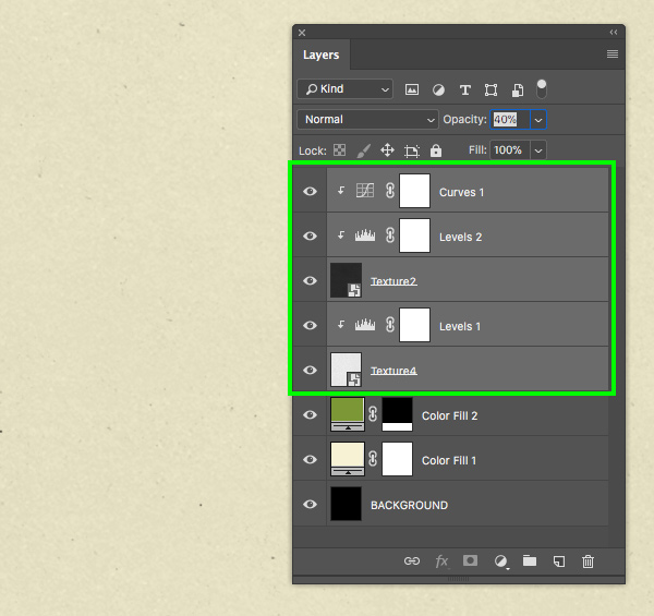
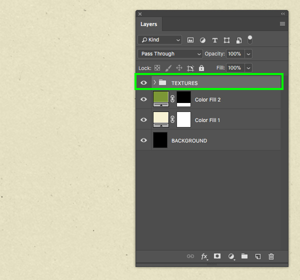
With the layers highlighted, press Command/Ctrl+G to place them into a folder and then double click on the ‘Group 1’ text to rename the folder ‘TEXTURES’ as shown here:
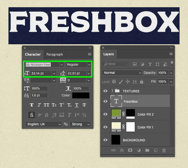
Step 11: Freshbox Text
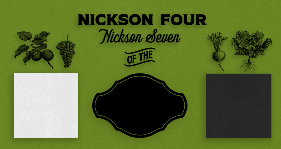
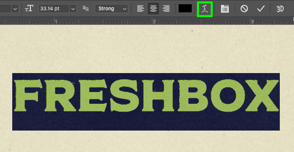
Create a new layer just below the ‘TEXTURES’ folder and press ‘T’ to get your Type Tool. Click on the canvas and type out the word ‘FRESHBOX’ in all caps using the ‘SS Nickson Four’ typeface from the freebies folder for the tutorial. Make sure to open up your Character Panel by going to the Window menu and choosing ‘Character’ so that you can change the point size to about ‘33.14’ as shown below:
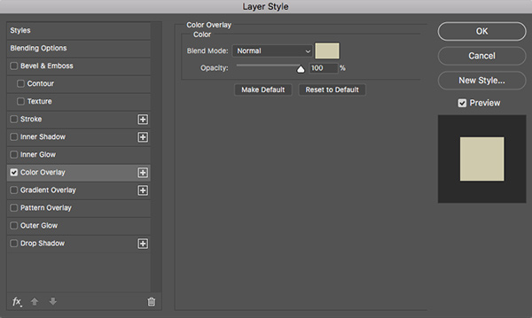
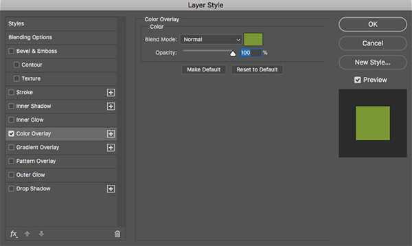
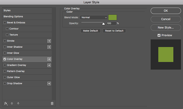
Double click on the text layer to open the Layer Style panel and check off the ‘Color Overlay’ option.
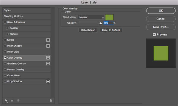
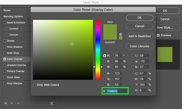
For the fill color, enter the hex value ‘#7B9835’ and then press ‘OK’ two times to apply the changes and close out of both dialog boxes.
Step 12: Text Warp
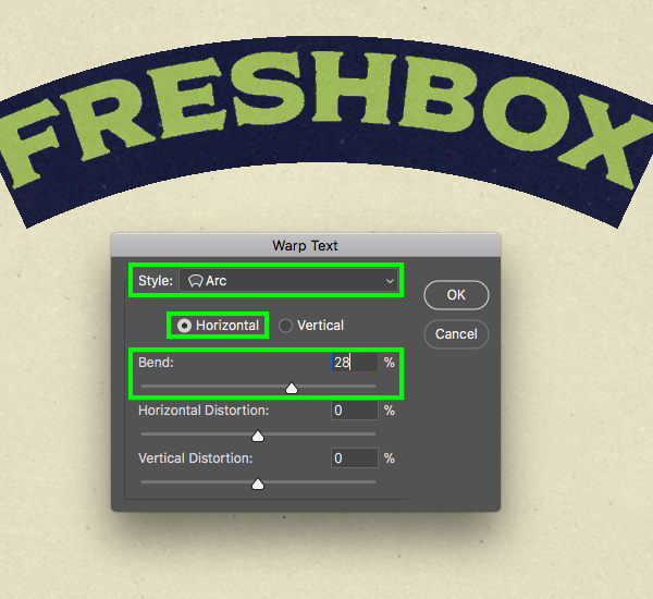
With your Type Tool still selected, click inside of the text two or three times to highlight it, and then click on the ‘Create warped text’ button in the top toolbar, highlighted in the image below:
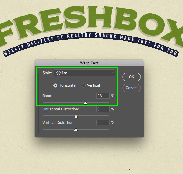
When the ‘Warp Text’ panel appears, select ‘Arc’ under the ‘Style’ dropdown, and then make sure to select ‘Horizontal’ and change the ‘Bend’ setting to about ‘28%’ before pressing ‘OK’ to apply the changes.
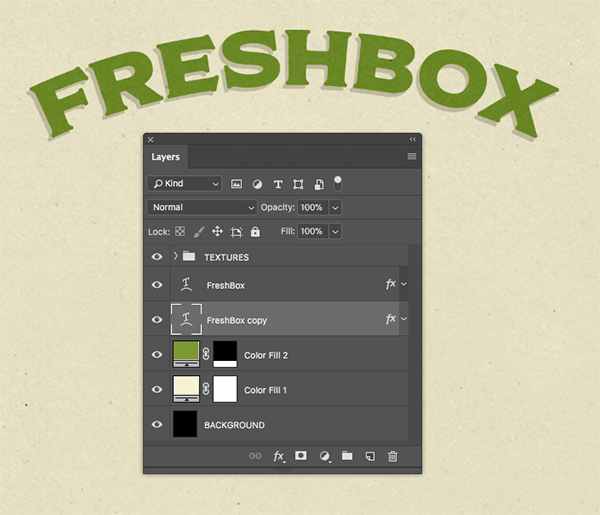
Step 13: Text Shadow
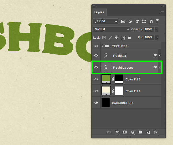
Select your warped text layer and press Command/Ctrl+J to duplicate the layer. After that, press Command/Ctrl+[ to move the duplicate layer below the original. From here, use your arrow keys to move the copy down and to the left a few clicks to offset the text.
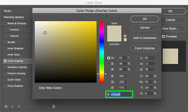
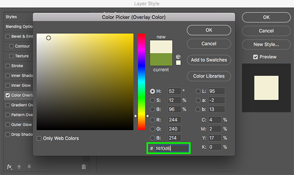
Double click on the duplicate text layer to bring up the Layer Style panel and check off the ‘Color Overlay’ option once again.
For the fill color this time we will enter the hex value ‘#CFCAAD’ and then press ‘OK’ two times to apply the changes and close out.
You should now have a nice stylized drop shadow effect that looks like this:
Step 14: Secondary Text
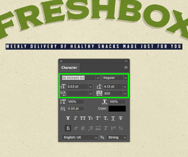
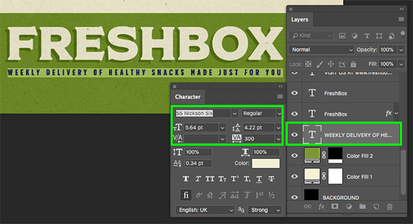
Create another new layer and use your Type Tool (T) to type out ‘WEEKLY DELIVERY OF HEALTHY SNACKS MADE JUST FOR YOU’ in all caps. If you have access to the bundle files, use the Character Panel to select the ‘SS Nickson Six’ typeface, otherwise you can use a similar font from your own collection. We will then make the type ‘5.53 pt’ in size with a tracking setting of ‘300’ to space the letters out. We can also leave the fill color here set to solid black.
Return to the warp text panel and apply the same settings that we used on the main text in the previous step.
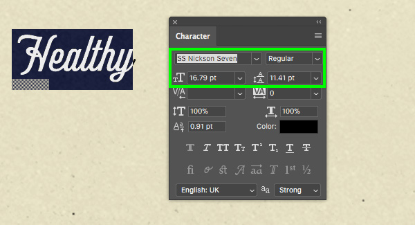
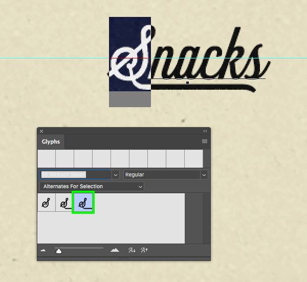
Add another new text layer and type out the word ‘Healthy’ on the left side of the top panel using the ‘SS Nickson Seven’ font from Spencer and Sons Co. Return to the Character panel and change the size to about ‘16.79 pt’ as shown below:
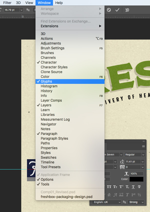
Next, go to the Window menu and open the ‘Glyphs’ option shown here:
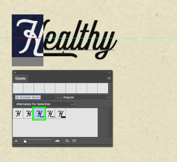
Once the ‘Glyphs’ panel is open, use your Type Tool to select the letter ‘H’ and you will then see that you have a few alternates for the uppercase letter. Let’s go ahead and choose the third option from the left so we have a nice underline running below the type like this:
Select the ‘Healthy’ text layer and press Command/Ctrl+J to duplicate it. Click and then hold the Shift key to drag this copy over to the opposite side and change it to say ‘Snacks’. From here, highlight the letter ‘S’ and then select the third glyph in the ‘Glyphs’ panel so we have an underline below the entire word as shown here:
Step 15: Callout Boxes
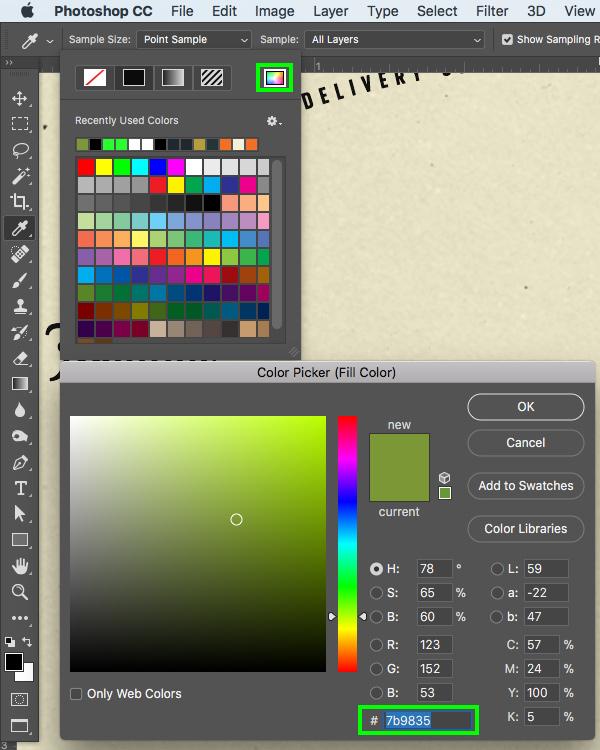
Press the letter ‘U’ to switch to the Rectangle Tool and then click on the ‘Fill’ swatch along the top toolbar highlighted in the image below:
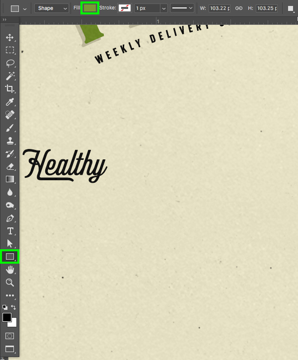
Click on the color spectrum icon from the upper right of the panel that appears which will then open the ‘Color Picker (Fill Color)’ dialog box where we can enter the hex value ‘#7B9835’. After that, press ‘OK’ to close out of the panel.
Hold the Shift key and click and drag out a small green square below the word ‘Healthy’ on the left side. From here, press Command/Ctrl+T to do a Free Transform, hold the Shift key, and rotate the square 45º so you end up with a green diamond shape like this:
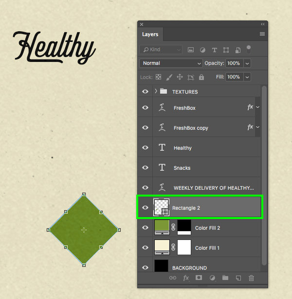
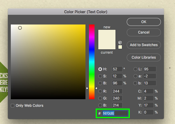
Create a new layer above the green diamond and use your Type Tool (T) to type out the words ‘SNACKS DELIVERED WEEKLY!’ on three separate lines. If you have access to the bundle files, use the Character Panel to select the ‘SS Nickson Six’ typeface, otherwise you can use a similar font from your font library. Set it with a point size of ‘6.19’, a tracking setting of ‘-40’ and the linespacing can be set to ‘5.65’ so that it fits nicely inside of the diamond. For the fill color, let’s go ahead and click on the ‘Color’ swatch in the Character Panel to change it.
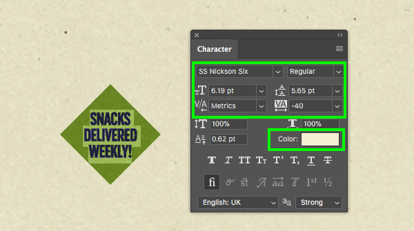
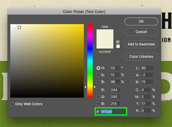
Next, enter the hex value ‘#F4F0D6’ and then press ‘OK’ to apply the changes.
Step 16: Duplicating the Callout Box
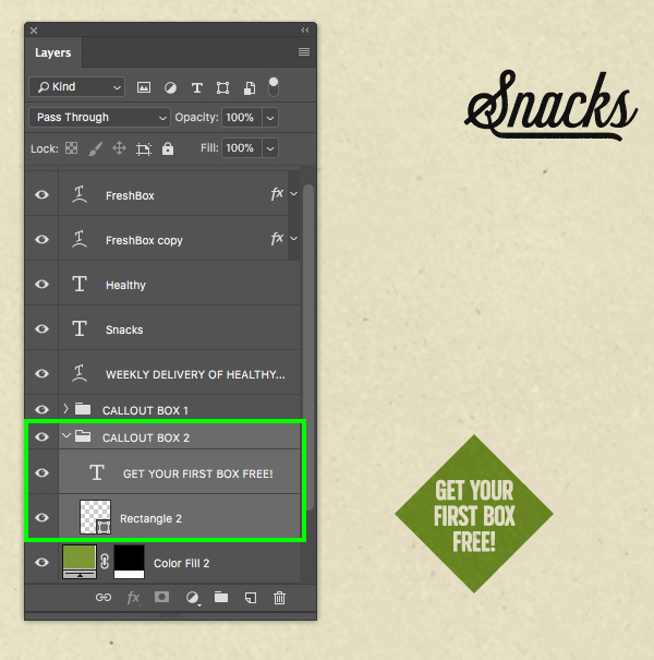
Select the ‘SNACKS DELIVERED…’ text layer in the Layers Palette, hold the Shift key, and then click on the green diamond layer below to select both layers at the same time.
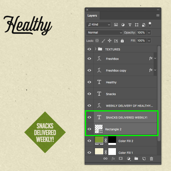
Press Command/Ctrl+G to put both of these layers into a folder and double click on the ‘Group 1’ text to rename the folder ‘CALLOUT BOX 1’ as shown here:
Select the ‘CALLOUT BOX 1’ folder and press Command/Ctrl+J to duplicate it. Click on the folder and then hold the Shift key and slide it over to the opposite side where we will place it below and towards the left of the word ‘Snacks’. Switch to your Type Tool (T) and change the text on this side to read ‘GET YOUR FIRST BOX FREE!’ on three lines like the image shown here:
Step 17: Catchwords
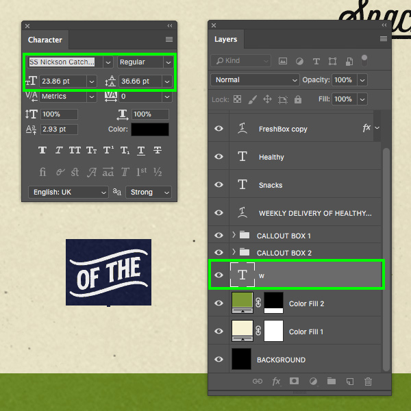
If you have access to the the bundle files, create a new layer and switch back to the Type Tool (T). Type out a lowercase ‘w’ and then use the Character Panel to change the typeface to ‘SS Nickson Catchwords’. This will give us a nice, decorative catchword that says ‘OF THE’ in all caps. For the settings, let’s make the point size ‘23.86 pt’ as shown below. Otherwise go to the Spencer and Sons Co from the freebies folder for the tutorial and open the SS Nickson Catchword.eps and drag it onto your main file. Then resize and place in the position as shown below.
Double click on the catchword text layer to open the Layer Style dialog box and then check off the ‘Color Overlay’ option.
For the fill color, let’s enter the same green hex value that we used earlier – ‘#7B9835’ and then click ‘OK’ twice to apply the changes and close out of both dialog boxes.
Step 18: Completing the Phrase
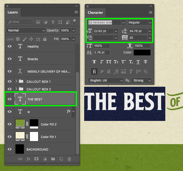
If you have access to the bundle files, create another new layer and type out the words ‘THE BEST’ using ‘SS Nickson One’ with a point size of ‘22.62’, and a tracking setting of ’20’ with a solid black fill. Otherwise you can use a similar font from your font library. Place the text just before the catchword that we created in the previous step.
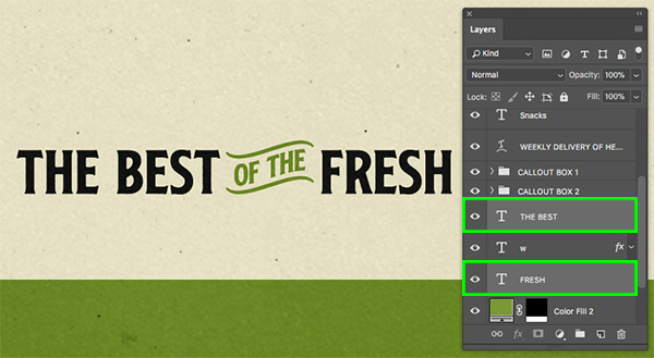
Select ‘THE BEST’ text layer and press Command/Ctrl+J to duplicate it. From here, click on the layer, hold the Shift key and slide it over to the right side of the catchword, and then use the Type Tool (T) to change the text to say ‘FRESH’ in all caps. You can leave the typeface and all of the other settings the same.
Step 19: Visit Us
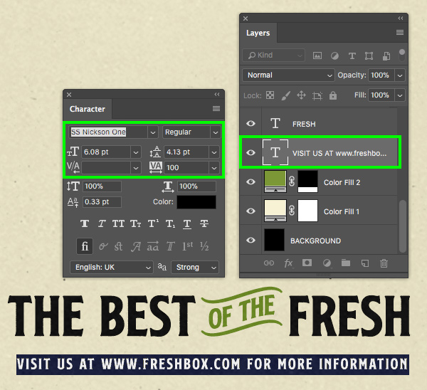
Add a new layer and type out ‘VISIT US AT WWW.FRESHBOX.COM FOR MORE INFORMATION’ underneath ‘THE BEST OF THE FRESH’ line. Use the Character Panel to change the font to ‘SS Nickson One’ using a ‘6.08 pt’ font size with a tracking setting of ‘100’ and a solid black fill as shown below. If you don’t have access to this font you can use a similar style from your collection.
Let’s take a look at what we have so far:

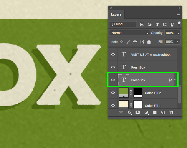
Step 20: Bottom Panel
Now that we’ve placed most of our text for the top portion of the design, let’s shift gears and work on the bottom green panel. We will start by adding a new layer and then using the Type Tool (T) to type out ‘FRESHBOX’ once again using the same ‘SS Nickson Four’ typeface. Let’s also change the font size to ‘33.15 pt’ and then click on the color swatch.
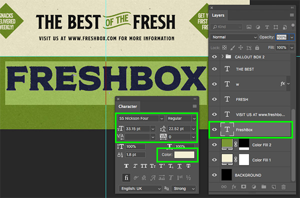
Change the font color to the hex value ‘#F4F0D6’ and then press ‘OK’ to apply the changes.
Select the text layer and press Command/Ctrl+J to duplicate it, and then move the duplicate layer below the original. Just like we did earlier on, we’re going to create the same stylized shadow effect on our text so we will use the arrow keys to offset the duplicate text layer a few clicks down and to the left.
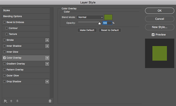
Double click on the duplicate text layer to open the Layer Style panel and check off the ‘Color Overlay’ option.
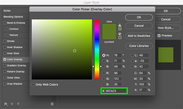
This time we will change the fill color to ‘#607A23’ which will be a darker shade of green. Once you have done that, press ‘OK’ twice to apply the changes and close out of both panels.
Step 21: Second Tagline
Add another new layer and type out the tagline once again – ‘WEEKLY DELIVERY OF HEALTHY SNACKS MADE JUST FOR YOU’. Use the Character Panel to change the typeface to the ‘SS Nickson Six’ font we used earlier, and then change the size to ‘5.64 pt’ and the tracking setting should be set to ‘300’. We can use the same fill color that we used for the bottom ‘FRESHBOX’ text – ‘#F4F0D6’. If you don’t have access to this font you can use a similar style from your collection.
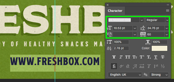
Add another new layer below the tagline and type out the url ‘WWW.FRESHBOX.COM’ using the ‘SS Nickson One’ font. For this text we will need to change the size to ‘10.53 pt’ with a tracking of ’60’ and use the same fill color as before – ‘#F4F0D6’. If you don’t have access to this font you can use a similar style from your collection.
We now have a nice treatment for the bottom panel that will look great on our box mockup! Your image should now look something like this:

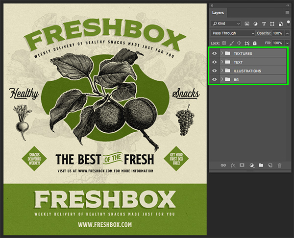
Step 22: Text Group
Let’s now select the very top text layer in the Layers Palette, just below the ‘TEXTURES’ folder. After that, hold the Shift key and click on the very bottom text layer so all of the layers between the textures and the background are highlighted together.
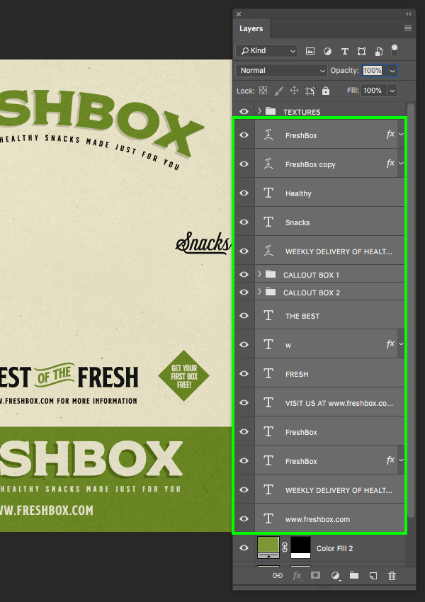
With all of the layers selected, press Command/Ctrl+G to put them into a folder and then double click on the ‘Group 1’ text to change the name of the folder to ‘TEXT’ as shown here:
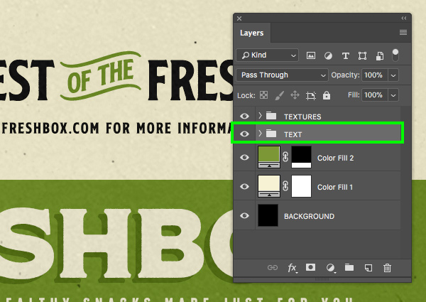
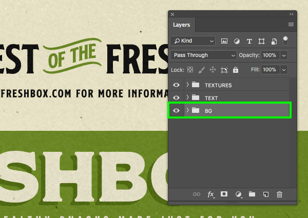
Next, do the same with the bottom layers and place them into a new folder called ‘BG’. This will help to keep all of our layers neat and organized.
Step 23: Vintage Illustrations
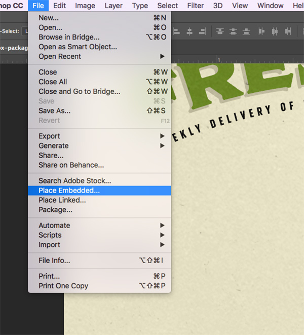
Now we will begin importing some of our beautiful vintage illustrations courtesy of Vector Hut. To begin, go to the File menu and choose ‘Place Embedded…’ from the menu.
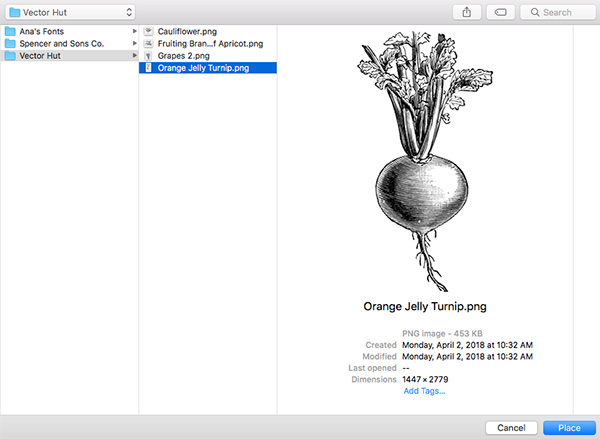
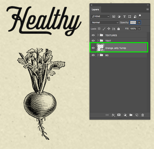
Navigate to the freebies folder and select the ‘Orange Jelly Turnip.png’ file and then choose place from the lower right corner.
Once the turnip has been imported, scale it down by dragging inwards from any of the four corners of the bounding box while holding the Shift key, and place it below the ‘Healthy’ text as shown here:
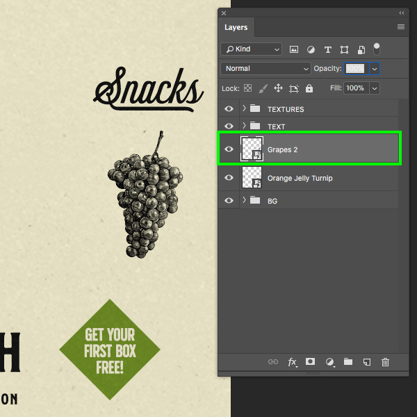
Repeat this step to import the ‘Grapes 2.png’ illustration and place this one on the opposite side, just below the ‘Snacks’ text.
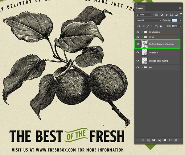
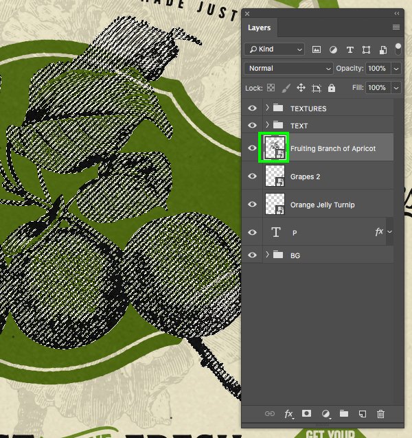
Next, let’s import the ‘Fruiting Branch of Apricot.png’ file and place this one large and in the center of the composition. Let’s also rotate the apricot slightly by pressing Command/Ctrl+T to do a Free Transform and then moving your cursor over any of the four corners of the bounding box and rotating it counter clockwise a bit.
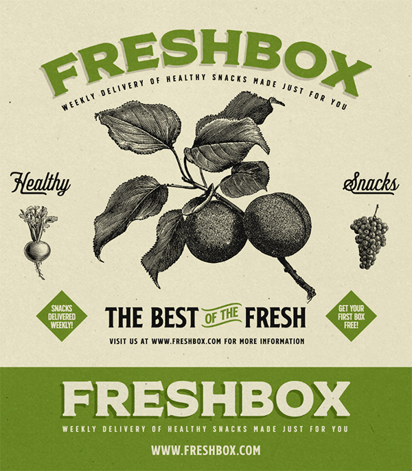
Your image should now look like this:
Step 24: Background Illustration
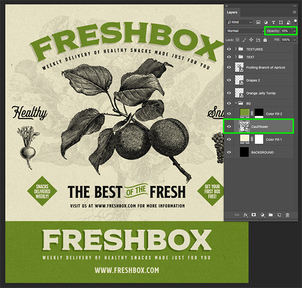
Let’s return to the File menu and choose ‘Place Embedded…’ from the menu once again. This time, navigate to the ‘Cauliflower.png’ file and choose ‘Place’ from the lower right corner.
We want to keep this illustration nice and big, and then place it inside of the ‘BG’ folder, just below the green color fill layer so it can only be seen in the top portion of the design. Once you have done that, reduce the opacity of the cauliflower illustration layer to 10% as shown below:
Step 25: Background Badge
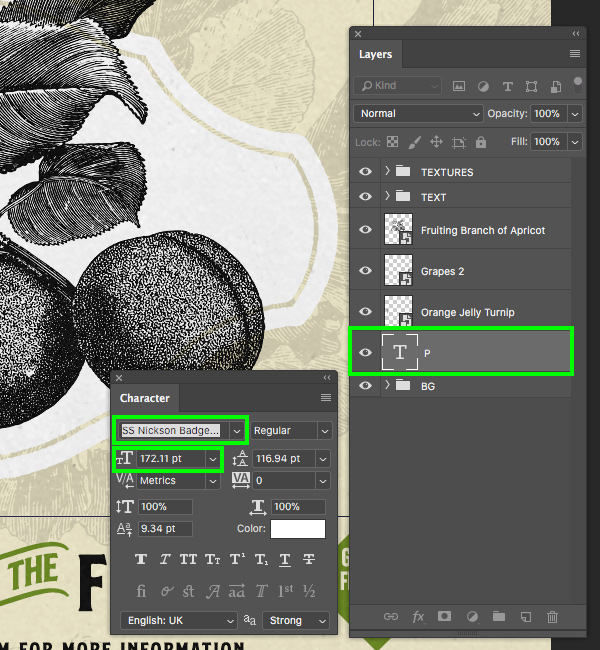
If you have access to the the bundle files, create a new layer just above the ‘BG’ folder and then use the Type Tool (T) to type out an uppercase ‘P’. From here, use the Character Panel to change the typeface to ‘SS Nickson Badges and Labels’ and also change the size to about ‘172.11 pt’ as shown below. Otherwise go to the Spencer and Sons Co from the freebies folder for the tutorial and open the SS Nickson Badge.eps and drag it onto your main file. Then resize and place in the position to look like below.
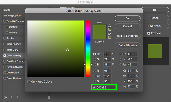
Double click on the badge layer to open up the Layer Style panel and check off the ‘Color Overlay’ option.
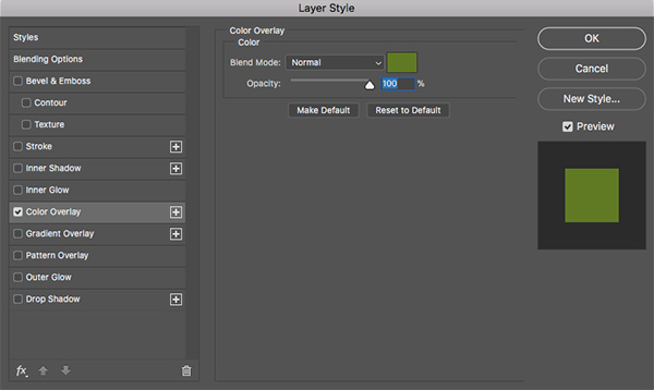
Change the fill color of this layer to ‘#607A23’ and then press ‘OK’ twice to apply the changes and close out of both dialog boxes.
Your image should now look like this:
Step 26: Breaking Out
Hold the Command/Ctrl key and click on the layer thumbnail icon of the apricot illustration layer to activate a selection around it.
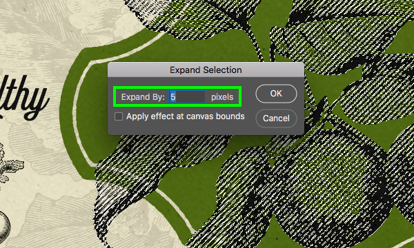
Go to the Select menu and choose ‘Modify > Expand…’ from the dropdown menu.
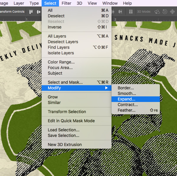
When the ‘Expand Selection’ panel appears, enter a value of ‘5’ and then press the Return key.
From here, go to the Select menu and choose ‘Inverse’ from the menu to invert the selection.
Make sure that your ‘P’ layer is active in the Layers Palette and then click on the Layer Mask icon at the bottom to apply a mask. You should now have a 5 pixel border knocked out of the badge going around the outside of the apricot illustration.
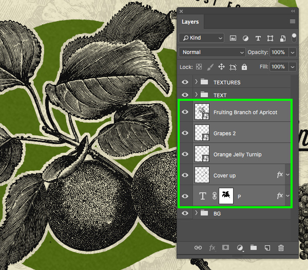
Step 27: Cover Up
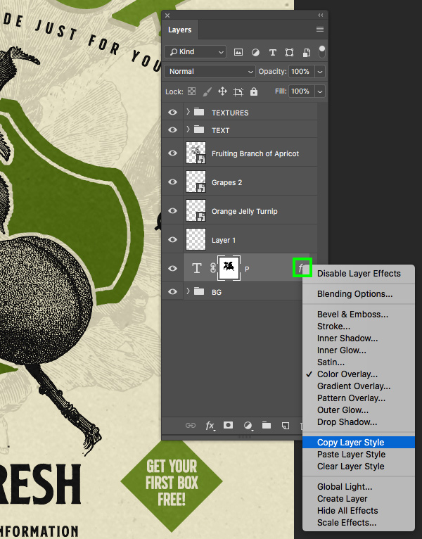
Hold the Control key and click on the small ‘fx’ icon of the badge layer. When the dropdown menu appears, select ‘Copy Layer Style’ from the list.
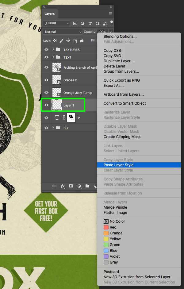
From here, create a new layer just above the badge layer, hold the Control key and click on the layer, and then choose ‘Paste Layer Style’ as shown below:
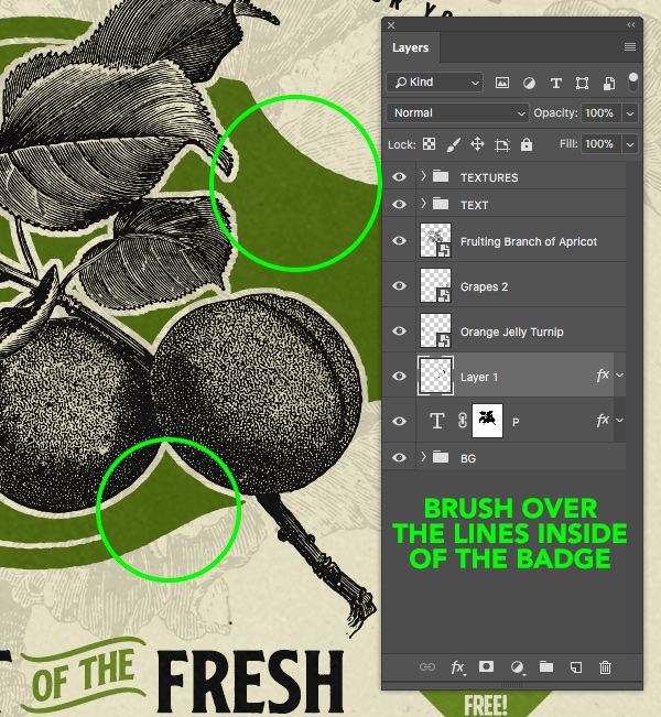
What we want to do next is select the Brush Tool (B) and make sure you have a relatively small brush at 100% opacity. Zoom in to the badge and begin brushing over the lines inside of the badge. Doing this will cover up the line running around the inside as the layer itself will already have the same color as the badge. Go all the way around the badge and do this to fill in the lines.
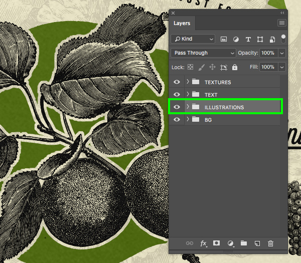
Step 28: Illustration Group
Select the top Smart Object illustration layer in your Layers Palette, hold the Shift key, and then select the bottom badge layer just above the ‘BG’ layer. You should now have all of your loose layers selected as shown here:
With your layers selected, press Command/Ctrl+G to put them into a new folder and double click on the ‘Group 1’ text to rename the folder ‘ILLUSTRATIONS’.
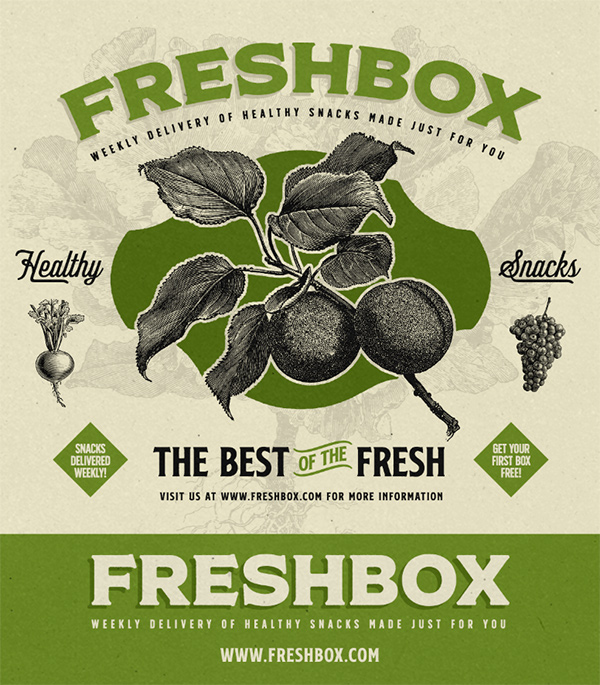
We have now finished the design for our mailer box packaging, and in the next part of the tutorial we will apply this to our box and build out a nice scene with a similar look and feel. Let’s take a look at the finished label artwork below:
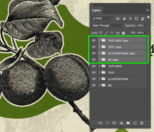
Step 29: Duplicating the Folders
Select the very top folder, hold the Shift key, and then select the bottom ‘BG’ folder so all of the folders in the Layers Palette are selected at the same time.
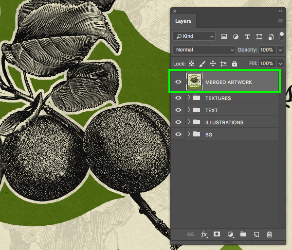
With all of the folders selected, press Command/Ctrl+J to duplicate all of the folders above the originals.
With the duplicate folders still highlighted, press Command/Ctrl+E to merge them into one layer and rename this layer ‘MERGED ARTWORK’ as shown below:
Step 30: Splitting the Artwork
Now what we can do is select the Marquee Tool (M) and then press Command/Ctrl+: to show your guides. Next, click and drag out a large rectangle selecting only the top portion of our design and then press Command/Ctrl+J to duplicate the selection onto a new layer.
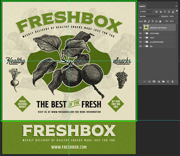
Repeat this for the bottom section as well by first selecting the ‘MERGED ARTWORK’ layer and dragging a rectangle around it before pressing Command/Ctrl+J. You should now have the top and bottom portions on their own layers at the top of the Layers Palette.
Step 31: Mailer Box Mockup
Next we will download the free mockup template from Graphic Burger here and then opening it in Photoshop. The first thing we want to do here is double click on the ‘Design: front’ Smart Object layer to open it in a new window.
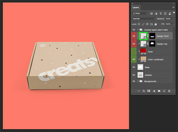
You will now see the front panel of the box mockup like this:
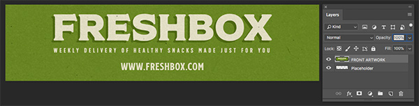
Let’s go to our label design artwork and grab the ‘FRONT ARTWORK’ layer, hold the Shift key, and drag it over to this Smart Object window. You will need to do a Free Transform (Command/Ctrl+T) and then drag outwards slightly from any of the four corners of the bounding box around the merged artwork to scale it up a bit and make sure it fills the entire document area like this:
After placing the front panel artwork, press Command/Ctrl+S to save it and then Command/Ctrl+W to close out and update the main mockup file. You should now see the front panel artwork applied as shown here:
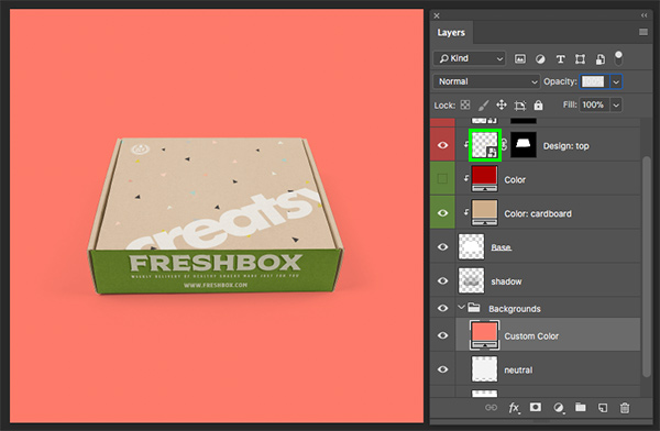
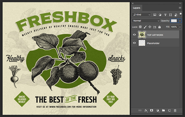
Next, double click on the ‘Design: top’ Smart Object layer to open it in a new window. From here we will need to hold the Shift key and drag the ‘TOP ARTWORK’ layer into this file, save it, and then close the window.
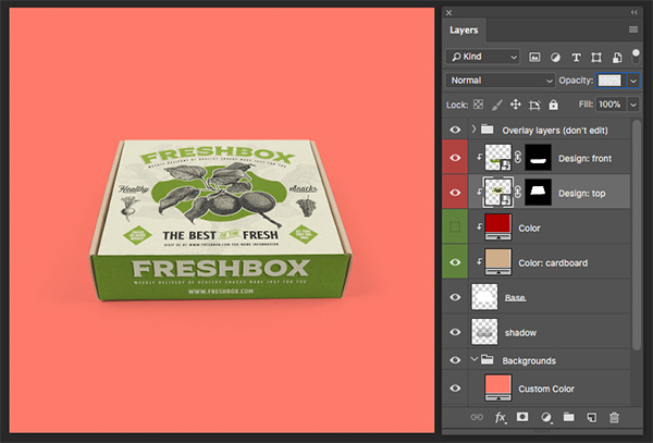
You should now have your artwork placed perfectly on the box and here is how our mockup looks so far:
Step 32: Box Color
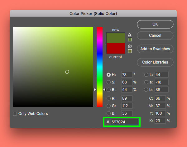
Next, turn on the visibility of the ‘Color’ layer and click on the red swatch.
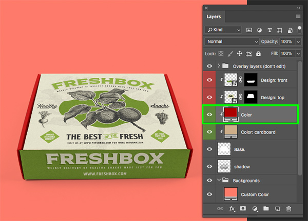
For the new fill color, enter the hex value ‘#597024’ and then press ‘OK’ to apply the color changes.
Select the ‘Design: front’ layer, hold the Shift key, and then click on the ‘shadow’ layer so all of the layers related to the main box are selected together.
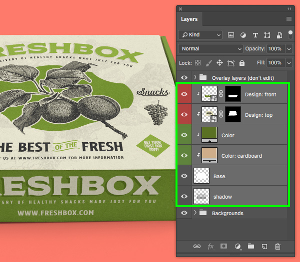
Press Command/Ctrl+G to place these layers into a new folder and rename it ‘Box Mockup’.
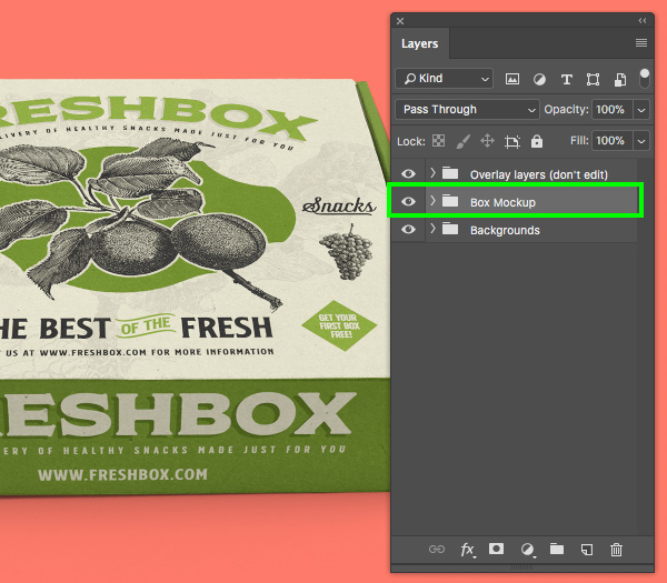
Step 33: Background Colors
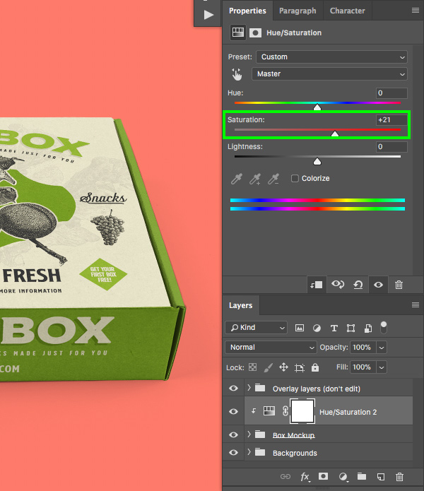
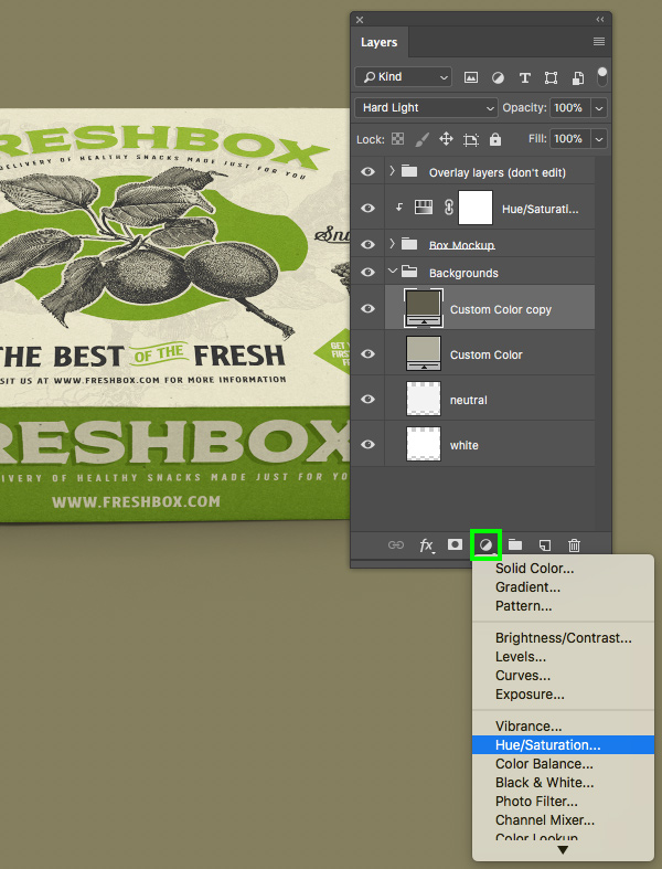
Select the newly created ‘Box Mockup’ folder and then click the Adjustment Layer icon at the bottom of the Layers Palette. From the list that appears, choose ‘Hue/Saturation…’ as shown below:

When prompted with the following dialog box, check off the option that says ‘Use Previous Layer to Create Clipping Mask’ and then press ‘Return’ on the keyboard.
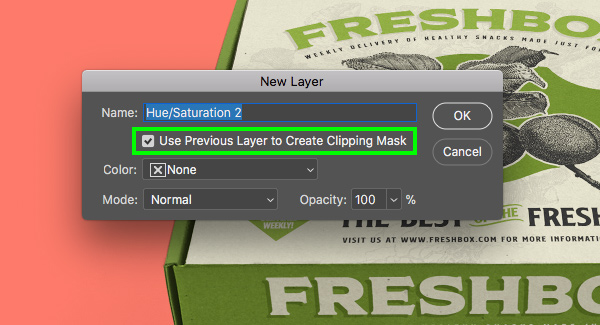
You will now have your Hue/Saturation Adjustment Layer with a Clipping Mask applied to it. In the properties panel we now just want to move the ‘Saturation’ slider up so that it’s set to ‘+21’ to boost the colors.
Step 34: Custom Colors
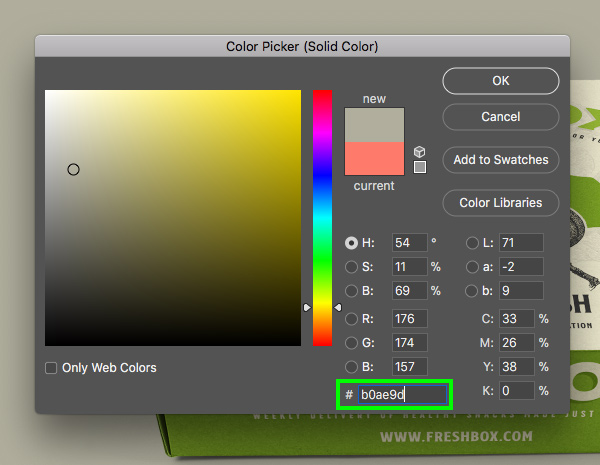
Next, click on the ‘Custom Color’ layer inside of the ‘Backgrounds’ folder.

For the fill color, let’s use the hex value ‘#B0AE9D’ and then press ‘OK’.
Press Command/Ctrl+J to duplicate this layer and then change the Blend Mode from ‘Normal’ to ‘Hard Light’. Once you have done that, click on the swatch color of the ‘Custom Color copy’ layer on top.
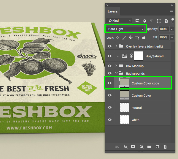
Change the hex value of this layer to ‘#605D4C’ and then press ‘OK’ to apply the changes.
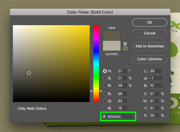
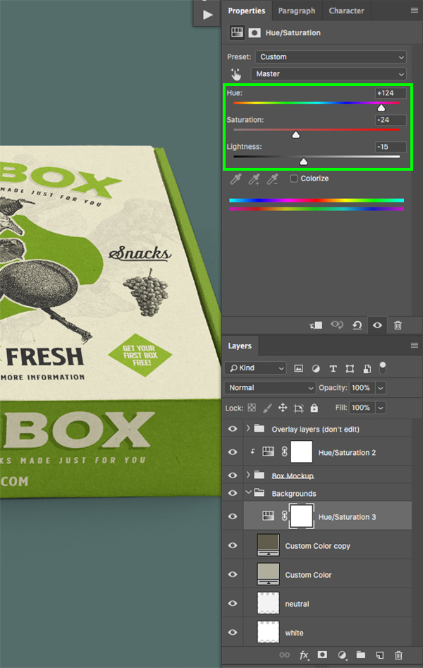
With this darker ‘Custom Color copy’ layer selected, click the Adjustment Layer icon and choose ‘Hue/Saturation…’ from the list.
This time we don’t need a Clipping Mask as we want the Hue/Saturation Adjustment Layer to affect all of the layers below it. For the properties let’s change the ‘Hue’ to ‘+124’, the ‘Saturation’ to ‘-24’ and the ‘Lightness’ to ‘-15’ as shown below:
Step 35: Importing the Illustrations and Textures
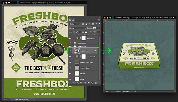
Let’s go back to our main label design and turn off the merged layers. Activate the visibility of all of the original folders and then open the ‘BG’ folder. From inside of this folder, select the ‘Cauliflower’ Smart Object layer, hold the Shift key, and drag it over into the mockup PSD at the top of the ‘Backgrounds’ folder. You may need to scale it up a bit so that it serves as more of a background element like in our main label design, but it should look something like this:
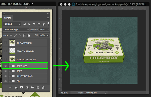
Let’s also go ahead and grab the ‘TEXTURES’ folder from our main label design and drag it over into the mockup template as well. Here we will use the Free Transform (Command/Ctrl+T) to scale up the textures so they fill the entire background of the mockup template and just make sure it is below the box mockup itself.
Step 36: Call to Action
Create a new layer and then use your Type Tool (T) to type out ‘VISIT US AT WWW.FRESHBOX.COM FOR MORE INFORMATION’ using the ‘SS Nickson One’ typeface at ‘16.32 pt’ size with a tracking setting of ’60’ as shown here:
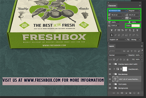
Next, change the fill color of the text layer to ‘#F4F0D6’ and then press ‘OK’ to apply the color changes.

Step 37: Importing the Title
Return to the main label design and select the ‘FreshBox’ headline inside of the ‘TEXT’ folder. Hold the Command/Ctrl key and select the stylized shadow layer directly below, and then select the tagline as well. You should now have three text layers selected from the top of our original artwork file.
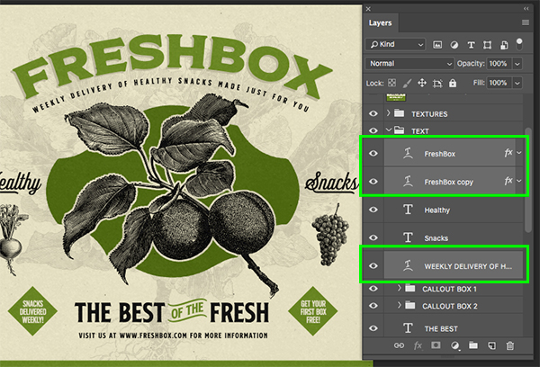
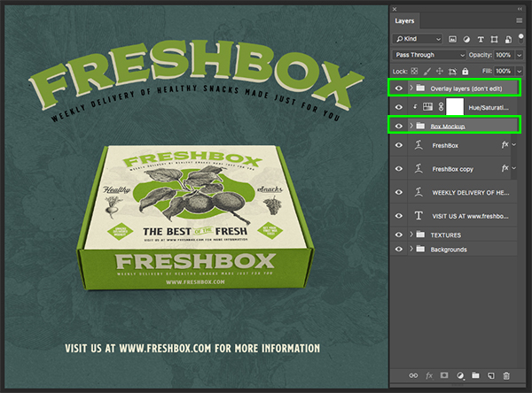
Click and drag these three layers into your mockup PSD while holding the Shift key and move it towards the top of the canvas. Let’s also go ahead and move the box a bit to center it – to do this you will need to grab the ‘Box Mockup’ folder, hold the Command/Ctrl key again, and then click on the very top folder labeled ‘Overlay layers (don’t edit)’ to make sure they move together. You could also just drop this top folder into the ‘Box Mockup’ folder but doing so may affect the appearance of the overlays since it would then inherit the properties of the Hue/Saturation Adjustment Layer that has been applied to the ‘Box Mockup’ folder so just beware of that.
Next let’s double click on the top ‘FreshBox’ layer to open the Layer Style panel.
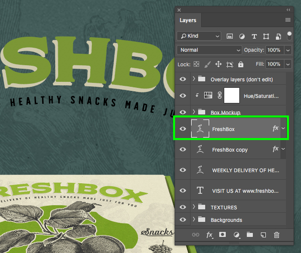
From here, check off the ‘Color Overlay’ option.
Change the fill color here to the hex value ‘#F4F0D6’ so that it matches our call to action from earlier. Once you have done that, press ‘OK’ to move on.
Step 38: Dragging Layer Styles
Now that we’ve applied a Color Overlay to our main ‘FreshBox’ text, hold the Alt/Option+Shift keys and drag the small ‘fx’ icon onto the tagline layer to apply the same color effects.
Step 39: Importing the Title
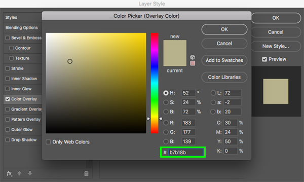
Next, double click on the ‘FreshBox copy’ layer to open the Layer Style panel once again.
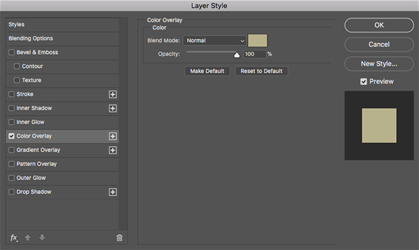
This time we will use the hex value ‘#B7B18B’ to use a darker shade of our light tan color. Once you have done that, press ‘OK’ twice to apply the changes and close out of both panels.
Step 40: Cleaning Things Up
Select the top ‘FreshBox’ layer, hold the Shift key, and then select the call to action text layer so all of our text layers are selected together as shown here:
Press Command/Ctrl+G to place these layers into a folder and double click the ‘Group 1’ text to rename it ‘TEXT’. Once you have done that, move this folder beneath the ‘TEXTURES’ folder so that the textures will appear on top of the text just like in our original label artwork.
This last step is optional, but just for the sake of consistency let’s go ahead and just rename the other folders here so they are in all caps. I know I am probably going overboard here, but it drives me nuts when some folders are upper and lowercase and others are all caps!
We have now completed our Freshbox packaging design! To create our packaging design we have used several beautiful vector illustrations from Vector Hut along with a few styles from the S and S Nickson Family and textures from Ana’s Fonts. From there we applied our artwork to a realistic mailer box mockup and brought in a few elements from our packaging design to customize the scene and tie it all together. This is just a small sample of what The Timeless Vintage Design Bundle has in store! These gorgeous vintage resources have been sourced from authentic materials, designed to give your work a genuine vintage aesthetic just like the one we have created today.
Remember that whether it’s your outcome for this tutorial or something new you’ve made, we’d love to see your designs on our Facebook page.
Please leave a comment if you have any questions or suggestions. I always look forward to hearing from you!
There’s still time to check out The Timeless Vintage Design Bundle providing you with a massive collection of quality, vintage design resources for an unbeatable price of $29!
Amazing tutorial (and so much fun :) !!
The only thing was the “ss nickson catchword” didn’t show up as a font. It was an .eps. Am I missing something?
Thanks again.
Hey Julie,
We weren’t able to provide the font free of charge for this tutorial for licensing reasons, so we went with EPS files instead :)
Excellent tutorial! Thanks Eric!
Thank you so much for your comment Andrea, we are so glad that you loved Eric’s latest tutorial :)
We hope that you picked up some great new tips!
Thanks Andrea! I’m so glad you enjoyed this one :)
This tutorial was amazing. I learned so much, and also realized how much I have left to learn. Thank you
for all the weekly fantastic freebies and the valuable learning tutorials. So Appreciated!
Cheers from Canada, Dee
Hey Dee,
Thank you so much for taking the time to leave us such an awesome comment!
Your fab support means so much to us and we are so glad to hear that you find our tutorials so useful for picking up some awesome new tips and tricks to use in your own design projects :)
All of us at DC HQ want to send you a big hello from a very sunny UK Dee and wish you happy designing!
Thanks Dee! That is definitely great to hear! I have been working in Photoshop for a pretty long time now and I still love finding new things in the program to learn and get excited about!
Thank you for teaching.
You are so welcome Po-wei and thank you so much for taking the time to leave us a comment.
We hope that you found these tips and tricks really useful!
Just a question on procedure. In our studio, we would have built this in .AI or .IND. Am I missing something in not seeing the advantage of building this in Photoshop? Or is it just a preference?
Hey Greg,
Thank you so much for taking the time to leave us a comment and it is so great to hear that you have an alternative way of approaching this type of design project!
I am so sorry for any confusion caused by the choice of Photoshop for this one. Our tutorials are devised as a bit of fun, and to help our community pick up some great new tips and tricks when using professional design software, which are usually focussed on working with Photoshop and illustrator.
As these tutorial designs have been created for mostly presentational use, there may certainly be alternative ways to approach these from a designer’s perspective so it is great to hear your thoughts on this Greg :)
We hope that you enjoyed this tutorial and picked up some interesting tips!
Hey Greg and thank you for your comment! I totally see how building the elements out in Illustrator would be very effective for real world projects, but here I just wanted to reduce the amount of jumping back and forth between Photoshop and Illustrator to build the label art, mock up the box, and then design a branded scene around it. In this case, it was more a matter of cutting down on the number of steps in the process and hopefully making it a bit easier to follow for more beginner and intermediate users. I hope that answers your question and thank you for checking out the tutorial!