WHAT WE’RE CREATING:
A SLIGHTLY DIFFERENT FORMAT
Hello Design Cutters! Simon here. I’m excited to share a new set of tutorials with you today. Yes, I write “set of tutorials.” Today, we’ll be creating two smaller pieces instead of one big one.
A common issue we hear from the community at Design Cuts is that people tend to ‘over do’ their texture art. It’s easy to get carried away with adding beautiful textures to your work, but it takes real design skill to build up a subtle texture effect, and to do so using a professional workflow. Today, I’m going to walk you through a couple examples of how to nail working with your new textures.
NOTE FROM TOM: This is seriously useful stuff guys, and I hope that you’ll learn a lot from the process. Any questions, just let us know in the comments at the bottom of this page.
The reasoning behind this is the following: I’ve been sharing my texture workflow in multiple tutorials before.
The little owl design and texturing tutorial
The retro/grungy poster tutorial
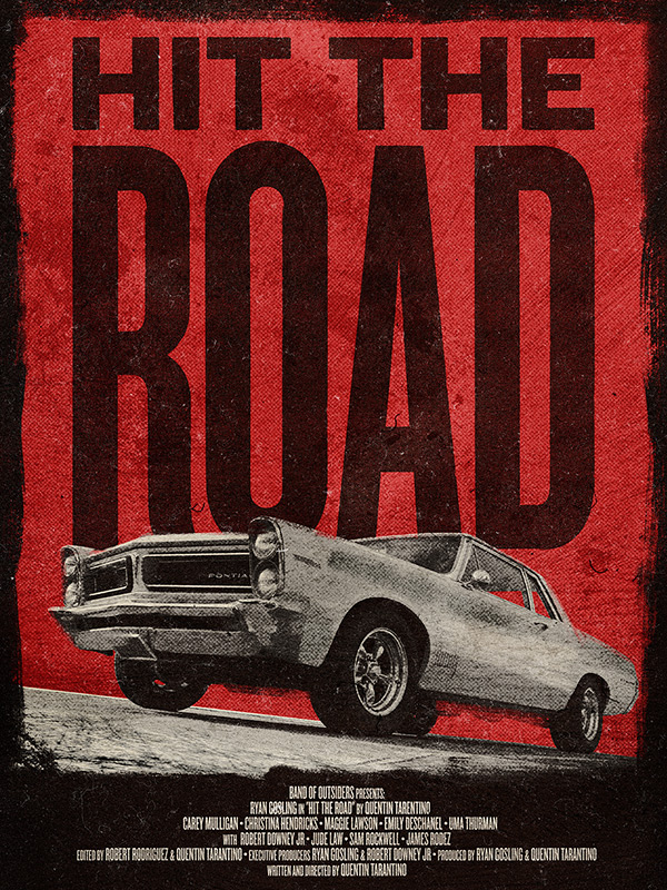
The grindhouse-style movie poster tutorial
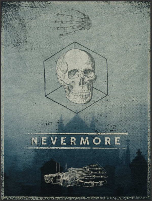
The gothic/hipster poster design tutorial
After going through these, I believe that your main takeaway should be that when it comes to textures, it’s about knowing what you have at hand, and about blending modes. So, instead of repeating what I’ve said in them, I wanted to insist on something new, while still playing with the amazing textures from the 2 Lil Owls collection as much as possible.
Our focus in these mini-tutorials will be how to maintain a non-destructive workflow throughout the process. Adjustment layers, clipping masks, and clipped layers will become your new best friends. While it might seem cumbersome at first, such a workflow has many advantages. You could go back to your original piece of content in a heartbeat, by simply turning layers off. You could quickly change the intensity of an effect used during the making of the piece, to make it stronger or more subtle. You could do much, much more, and PSD Tuts covered it nicely in this post from September 2012.
Let’s get started, shall we?
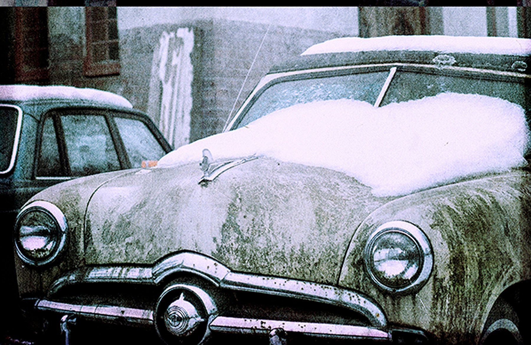
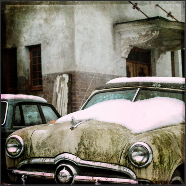
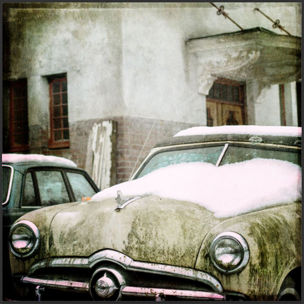
FIRST PIECE: DECAYING OLD FORD
Step 01: grab the stock image
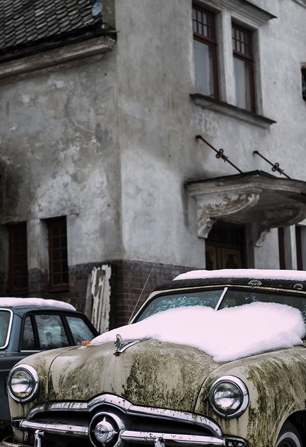
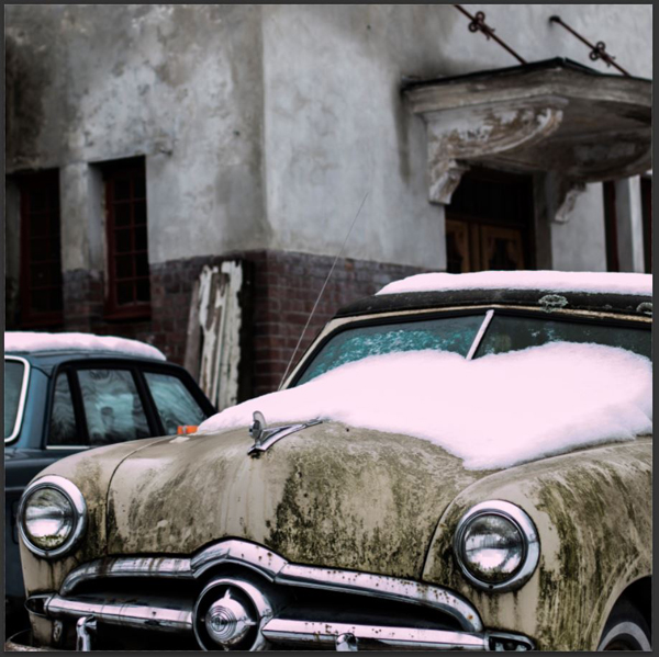
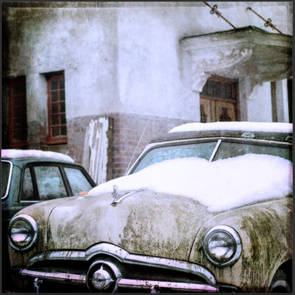
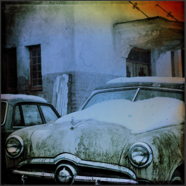
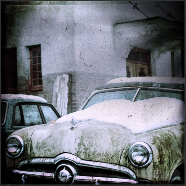
Once again, our starting points will be provided by Unsplash. You all know Unsplash now, right? The snowy shot of that old 1950s Ford is by Kristian Karlsson. Curious about the car? There’s a bit more to read over here.
Once you have the high resolution image (3635×5301 pixels), head over to Photoshop.
Step 02: document preparation
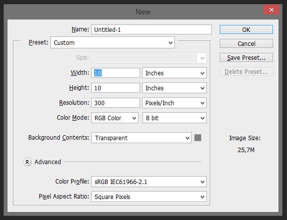
Create a new Photoshop document. We’ll be working with a square format, as most of the great textures in the 2 Lil’ Owls collection are square documents. I’m working with a 10″x10″ @300 dpi canvas.
Step 03: place your image
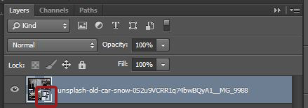
This is our first opportunity for a non-destructive action. Place your image as a smart object. Use File > Place (embedded if you’re using Photoshop CC) to accomplish this.
Not sure if you placed your image as a smart object? This is what your layer thumbnail should look like. Note the little icon on the top.
Step 04: first texture pass
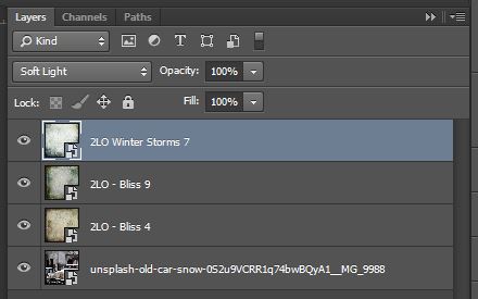
We’re going to use the following textures:
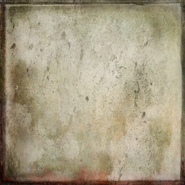
- 2LO – Bliss 4
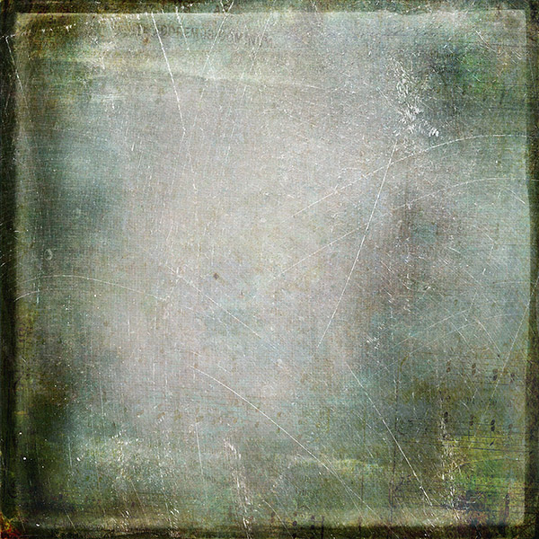
- 2LO – Bliss 9
- 2LO Winter Storms 7
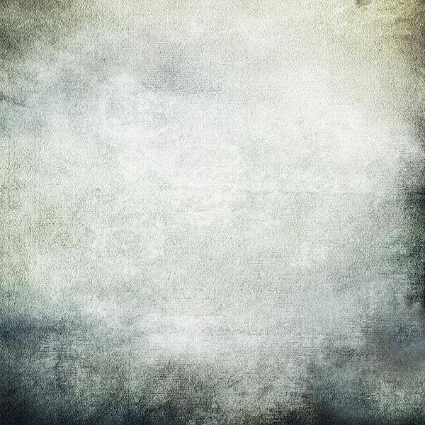
We’re going to leverage both their actual textural qualities and their colors. The textures feature scratches, dirt, and a frame. Their green, brown, and blue tones will help to give a retro/old vibe to our image.
Once again, make sure that you place your textures as smart objects, just like the actual photo.
Here’s our starting point:
Here’s 2LO – Bliss 4, with its blending mode set to Soft light @ 100% opacity. Make sure it’s centered within your canvas, especially since this one is the one giving us our frame effect.
Next is 2LO – Bliss 9, again set to Soft light @ 100% opacity. This one gives us the scratches, and further shifts the colors towards muted tones.
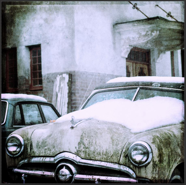
Next is 2LO Winter Storms 7 (Soft light @ 100% opacity). It shifts the colors to a colder vibe, lightens the image, and adds a bit of grain.
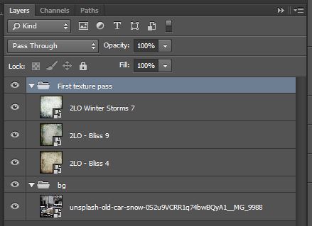
Let’s do some layer clean-up (keep them organized, or else!). Here’s what you should have right now:
Here’s what I’d suggest: a layer group for the background, and one for the first textures.
Step 05: some quick image adjustments
This next step will make us further alter the colors of the image, to give it back its cold tone (it’s a snowy decay scene after all), and to further the vintage feel we’ve created so far.
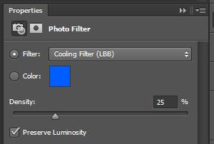
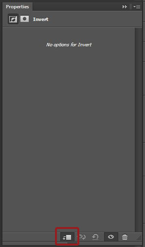
Start by adding a photo filter adjustment layer. You can access most of the adjustment layers at your disposal via this button at the bottom of your layer palette.
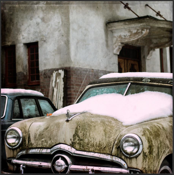
The photo filter adjustment layer preset we’ll use is the LBB cooling filter, at its default density of 25%.
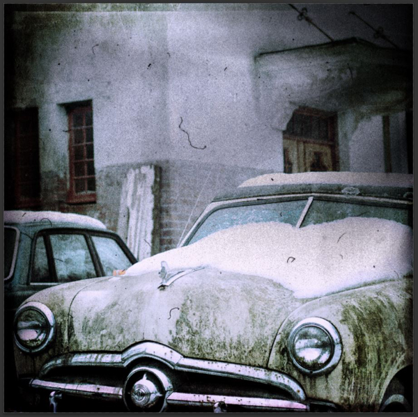
Here’s the result.
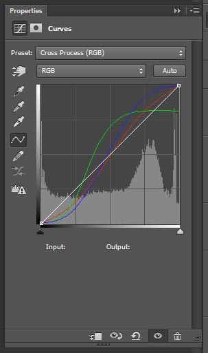
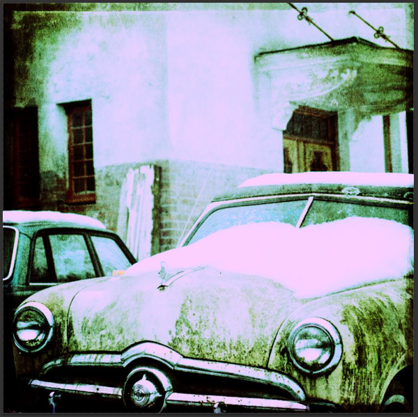
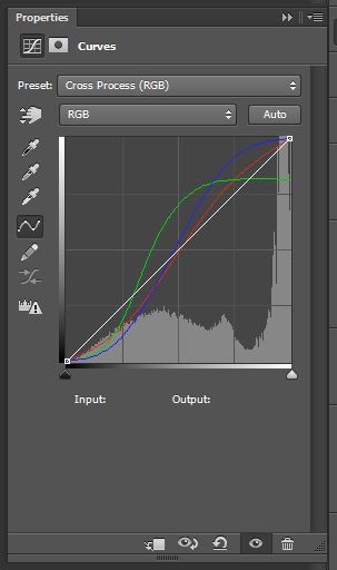
Next up is a curve adjustment layer, set to its Cross processing preset. This curve is looking to emulate the cross processing process used with analog film.
The result is far from subtle.
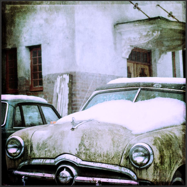
Lowering the adjustment layer’s opacity to 25% will get us back into acceptable territories.
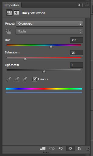
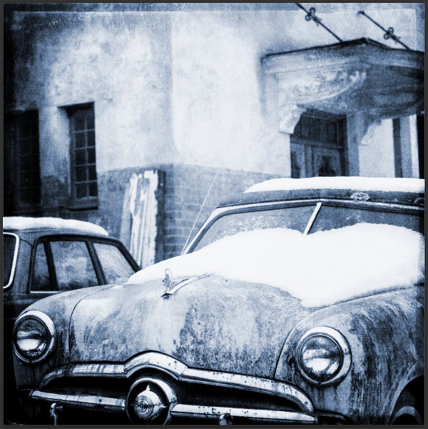
Finally, we’ll make use of a hue/saturation adjustment layer. We’ll be leveraging its Cyanotype preset, to further “cool” the image by shifting the colors to blue hues even more. Wikipedia has some more information about cyanotypes to help you understand that choice.
The effect is once again far from subtle.
Lowering the opacity of the adjustment layer to 25% will bring us back to a more reasonable vibe.
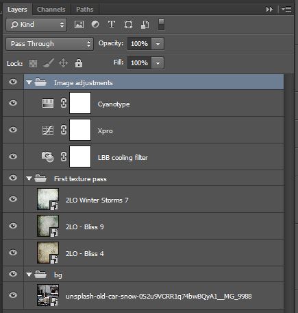
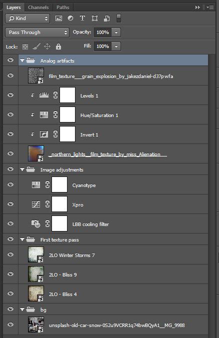
And here’s time for the layer house keeping. Note how I’ve renamed my adjustments layers to indicate their functionality. This is super helpful in the long term, especially if you have to walk someone through your layers to explain how you’ve accomplished something.
Step 06: analog artifacts
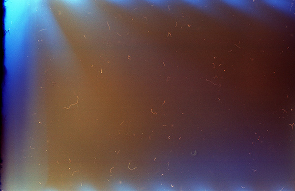
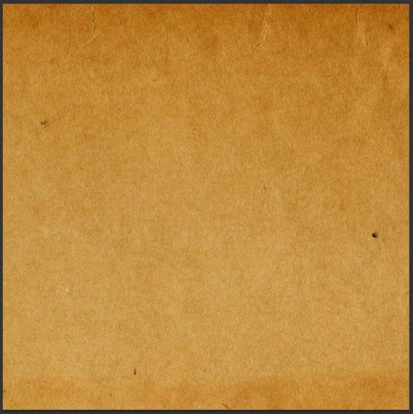
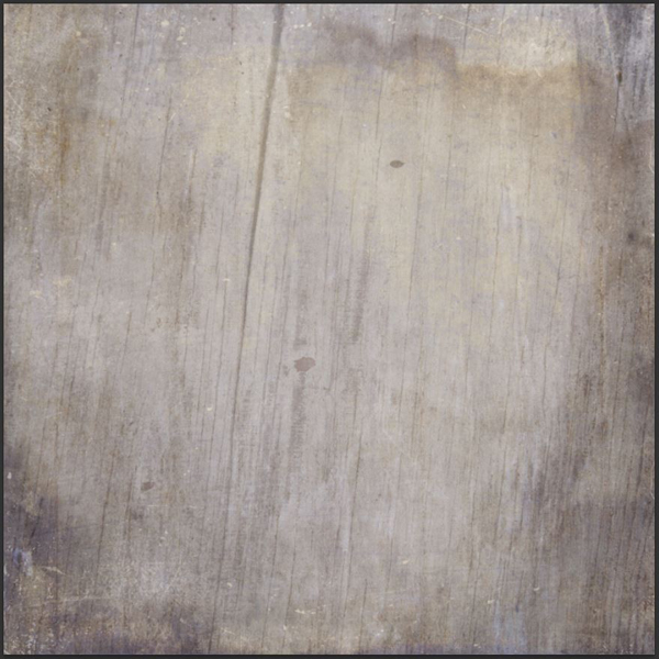
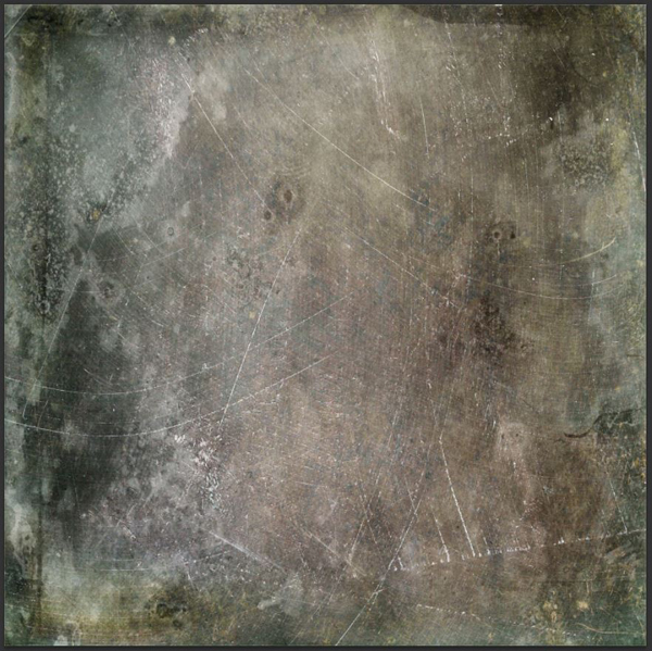
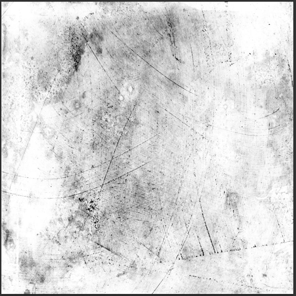
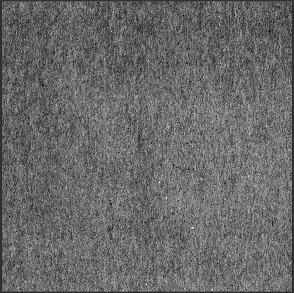
To give our image a more tangible feel, we’ll be adding some film artifacts: dust, grain, that sort of thing. The first texture I’m using to do so is this beauty, created by MissAlienation, and available on DeviantArt. She has some amazing film textures in her gallery, don’t hesitate to browse a bit.
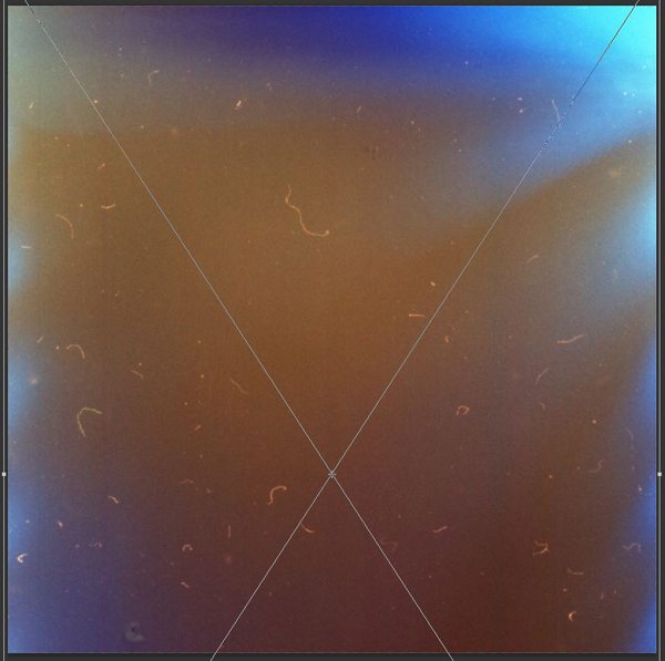
Once you have downloaded the high resolution texture, place it (as a smart object) vertically in your design. Make it so the top dark part isn’t visible, and so that a lot of these dust speckles are part of your piece.
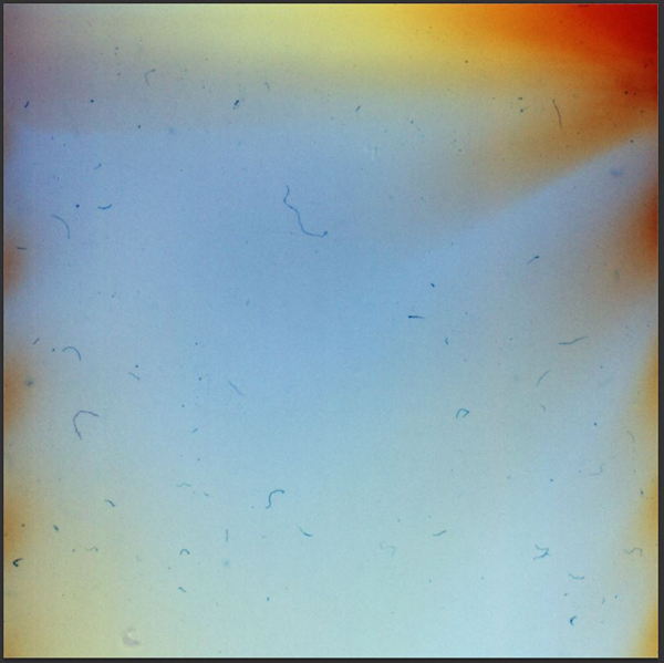
Given that our image is rather bright, we’ll want the dusty elements to show in dark tones. Note that the dust parts on the original texture are white.
How will we change that? Super simple! Let’s start by using an Invert adjustment layer.
Don’t forget to clip it to the texture’s layer, as we don’t want that effect to apply to the whole piece.
Now that our dust elements are dark, let’s simply place the texture’s blending mode to Multiply.
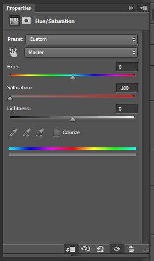
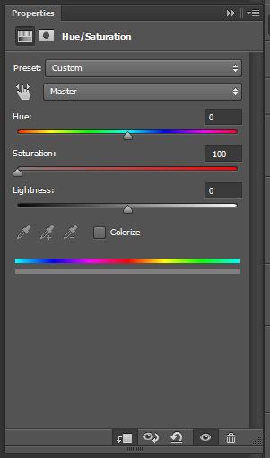
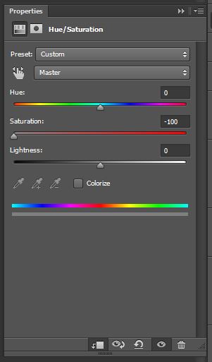
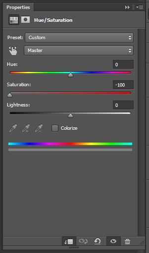
The dust is showing alright, but our careful color adjustments from earlier are all messed up because of the texture’s inverted colors. Let’s fix this with a clipped Hue/saturation layer. Slide the saturation to -100 to desaturate the texture.
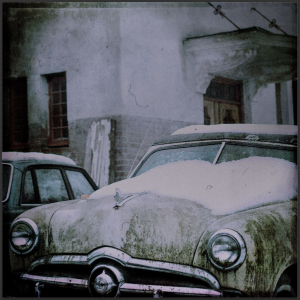
The result brings us back closer to our original fell, but with dust.
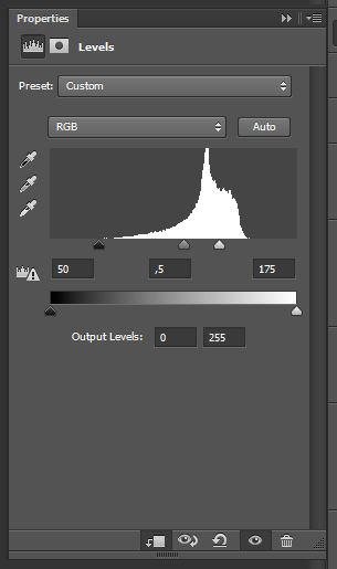
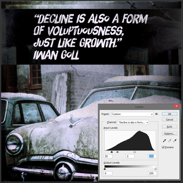
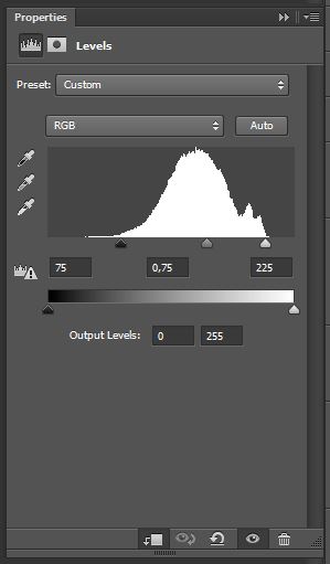
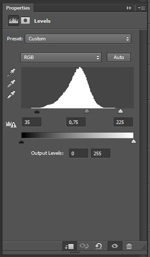
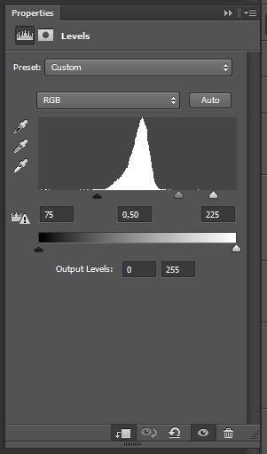
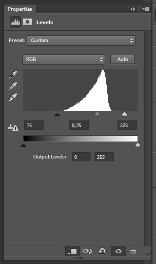
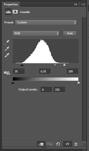
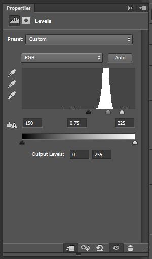
The texture is a bit dark, which results in a darker image (Multiply will do that). In order to fix this, we’ll use a Levels adjustment layer. This will allow us to darken the darkest pixels (the dust elements), and to brighten the mid-tones, which are currently giving that dark overcast to our image.
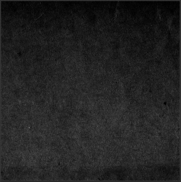
The layer is clipped, and darkens both the dark and mid-tones, while dramatically brightening the lighter pixels.
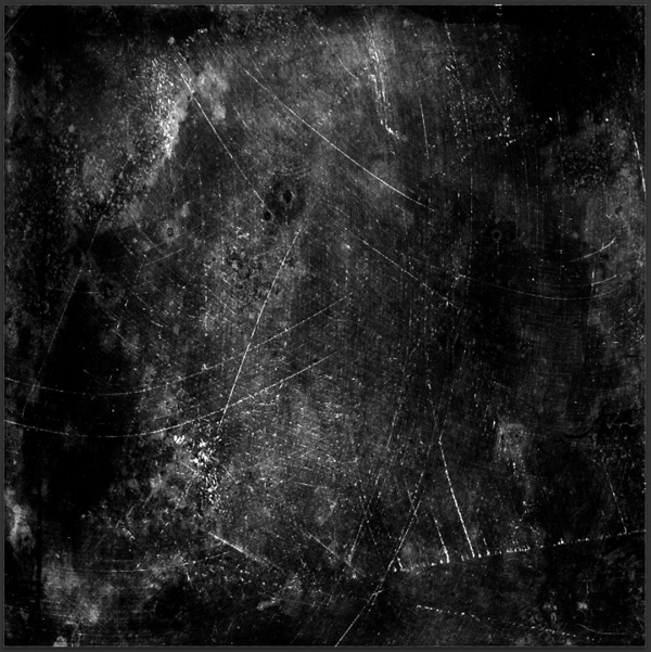
This creates enough contrast to mostly keep only the dust elements visible.
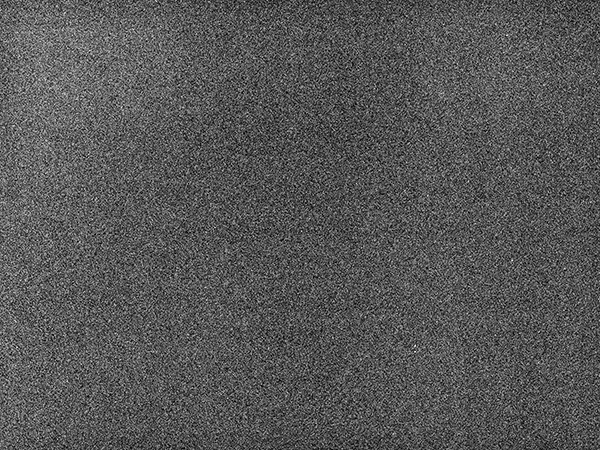
Next up, we’ll add some real film grain to our image. There are many options available to do so, but my favorite is this grain texture by JakezDaniel from DeviantArt.
Place it in your document so it covers your whole canvas. Then, simply switch its blending mode to Soft light @ 35%. The effect is amazingly subtle.
Layer house keeping:
Step 07: type
Our piece so far is quite nice, but it lacks something. A nice quote about decay would be just perfect. I found one by Iwan Groll after a bit of googling:
“Decline is also a form of voluptuousness, just like growth. Autumn is just as sensual as springtime. There is as much greatness in dying as in procreation.”
— Iwan Goll
Since this is a bit long, I’ll simply shorten it to the following:
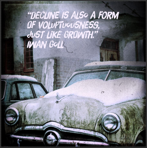
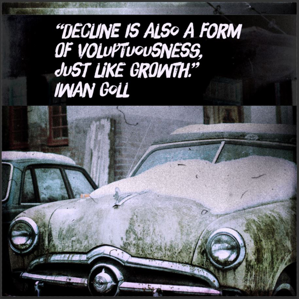
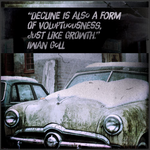
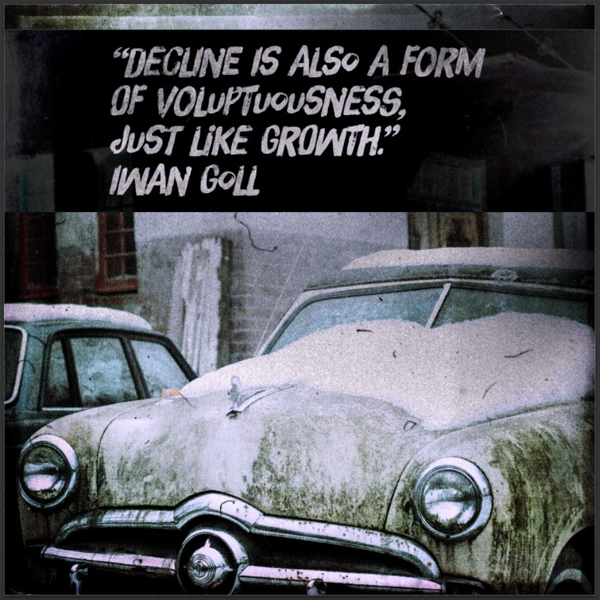
“Decline is also a form of voluptuousness, just like growth.”
— Iwan Goll
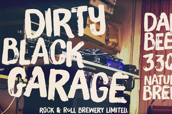
I’ll be using a typeface called Brush Up Too to write the quote. I’ve already used that typeface in my fake gig poster tutorial, that was accompanying the Monster Creative Font Bundle deal from a few weeks back. I like it a lot because of its alternate characters that give it a realistic hand-executed feel. Read up on the gig poster tutorial, or this tutorial, to learn how to leverage these best if needed.
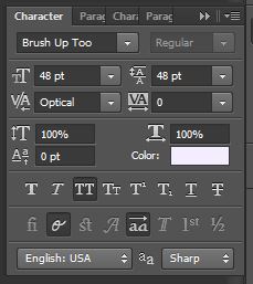
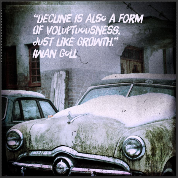
Here’s my quote. The color (#f5edfd) is sampled from the lightest point I could visually find in the image.
It’s set in Brush Up Too, sized at 48 points, with a line spacing of 48 points as well.
I’ve tried to use the alternate characters and a combination of uppercase/lowercase as randomly as possible, to make it look like a real brush pen piece.
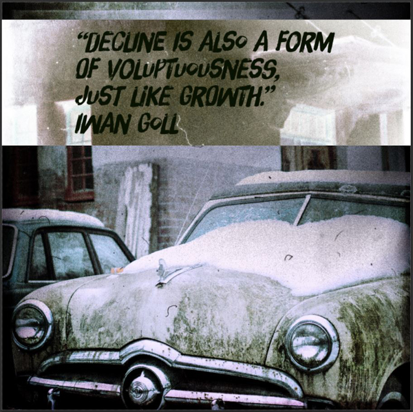
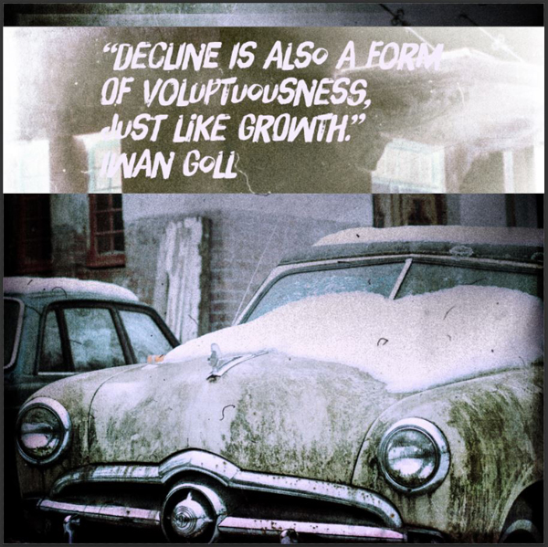
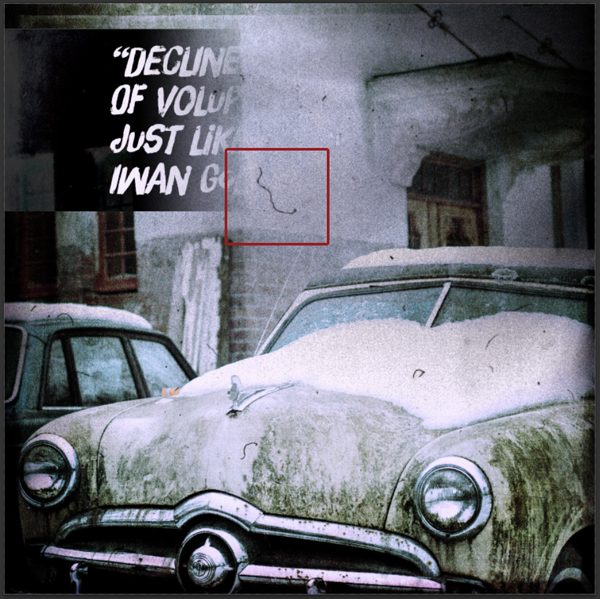
The problem is that even with the lightest off-white I could find, the quote still gets a bit lost at the top of the image. We’re going to leverage localized Invert and Hue/saturation adjustment layers to add a dark bar behind the type.
Start by creating a selection that fits the area you’d like the bar to cover.
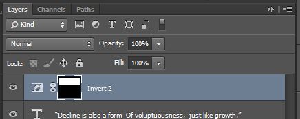
With that selection being active, create a new Invert adjustment layer. Because the selection is still active, the layer’s layer mask will fit it.
See the layer mask?
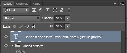
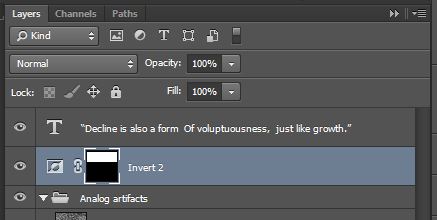
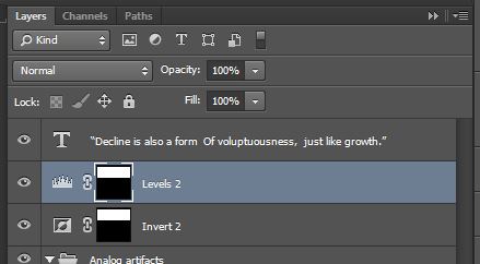
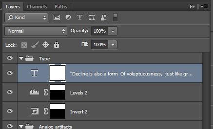
The issue at hand is that we don’t want our type to be impacted by that inversion. So we’ll slide the Invert adjustment layer below the type layer.
So we have a background that’s already darker behind our type.
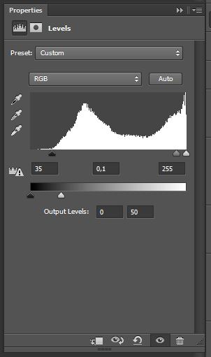
The next step is to make that inverted area even darker. And that’s where our Levels adjustment layer comes in. Start by CTRL/CMD+CLICK the Invert layer’s layer mask, to load its visible area as a selection again. Then, with the selection active, simply create the Levels adjustment layer.
Make sure it’s placed below the type layer.
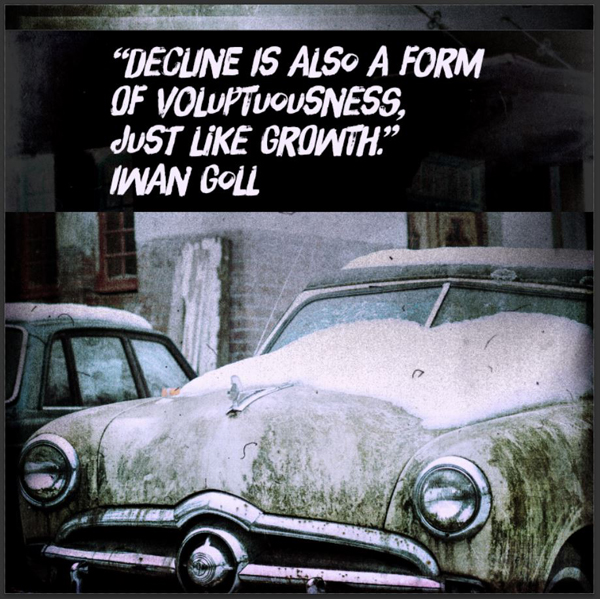
And the result is a much more legible type element.
The placement of our type element results in us losing one of the main dust speck.
The fix is super simple. Simply grab MissAlienation’s texture, size it a hair up, and slide it down a bit (mind that top section though).
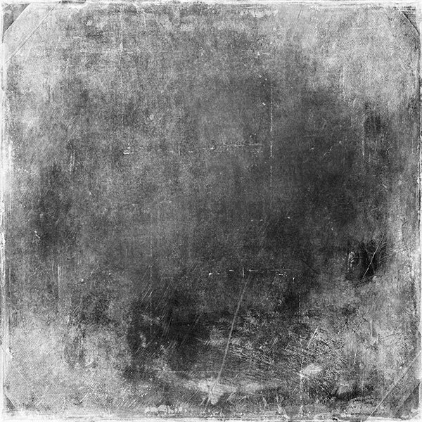
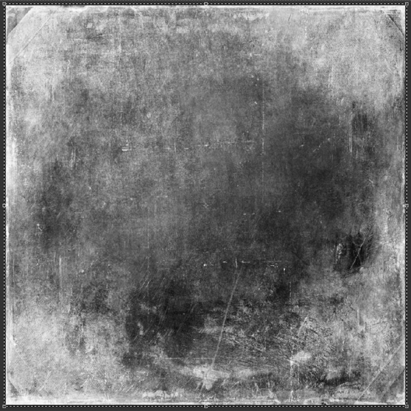
To conclude that first mini-tutorial, here’s its only destructive step. We’re going to paste one of the textures in a layer mask applied to the type, in order to rough it up a little. I’m using 2LO – The Grey Collection 38.
To paste a texture in a layer mask, simply ALT/OPTION+CLICK a layer mask to access its content. From there, you can do almost whatever you want: painting, erasing, copy and pasting…
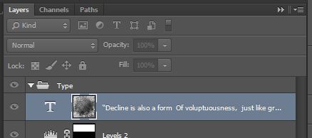
Add a layer mask to the text layer. Make sure it’s unlinked, so we can transform the layer and its layer mask independently from each other. While you’re at it, you can also make sure your type-related layers are grouped together.
From there, open 2LO – The Grey Collection 38, copy it, and paste it into the layer mask you created for the type layer. Size it so it fits your canvas.
Click back on the text layer’s thumbnail to go back to the regular view, and admire your results.
The effect is nice, although a bit too strong for my liking. Time to call the Levels (CTRL/CMD+L) to the rescue once more. Click once on the layer mask thumbnail to make sure the levels adjustments we’re going to make are impacting the layer mask only.
Start by inverting the layer mask (CTRL/CMD+I).
From there, Levels away.
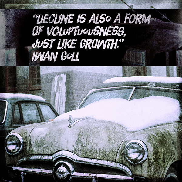
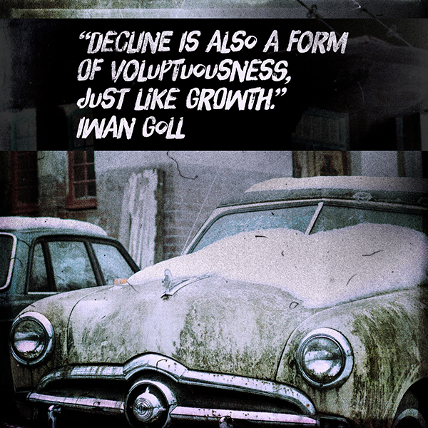
And our first piece is complete.
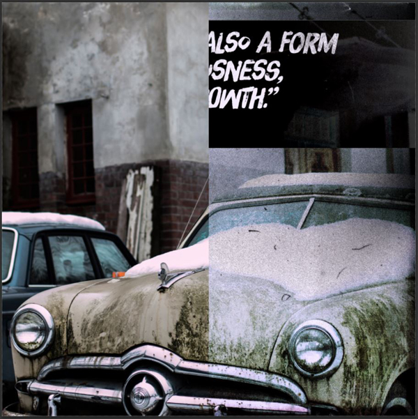
Looking back, we’ve desaturated, inverted, “cross-processed,” leveled, photo-filtered, and more, an image, without altering a single of its pixels. The only step that isn’t non-destructive is the texture we pasted in the text’s layer mask. And we still managed to drastically impact our starting image, just we could we a “normal” workflow.
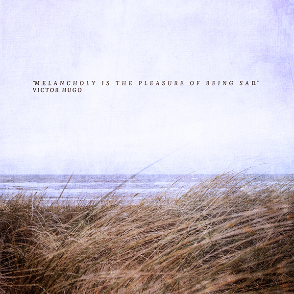
SECOND PIECE: THE MOODY BEACH SCENE
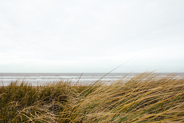
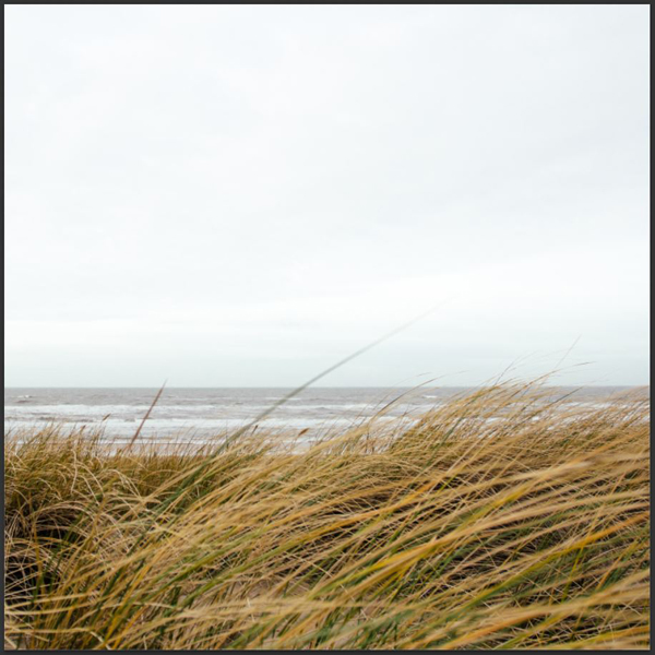
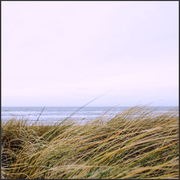
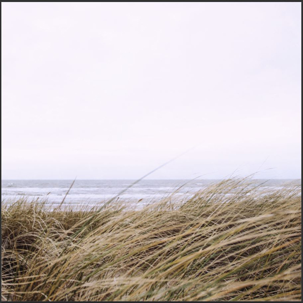
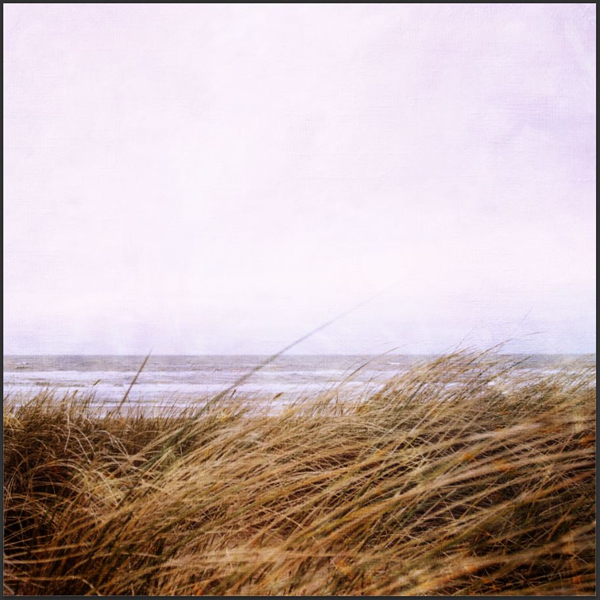
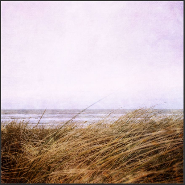
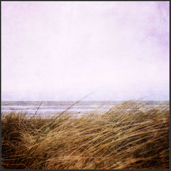
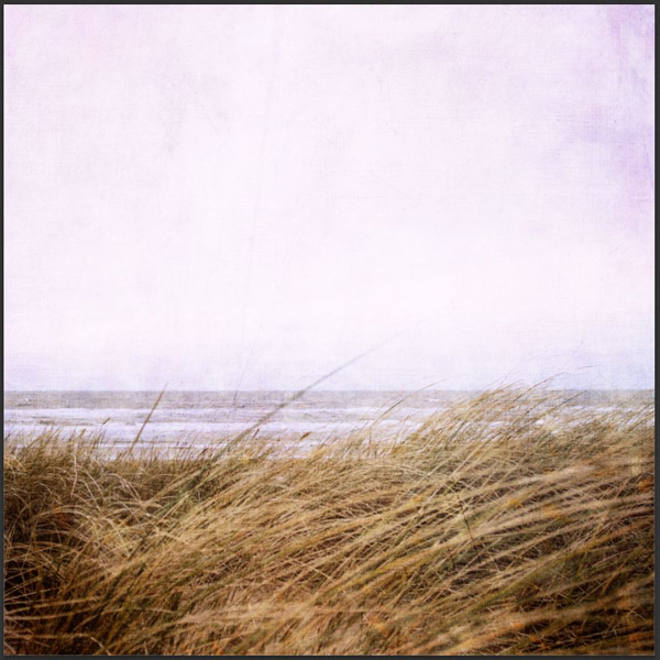
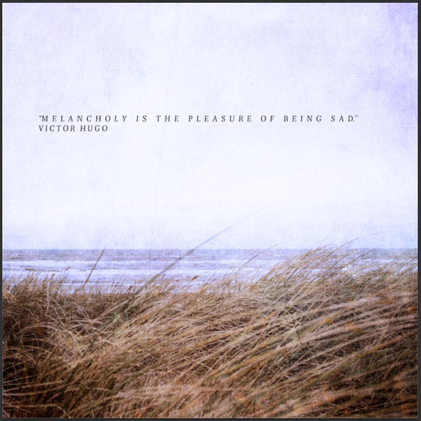
For this piece, we’ll be using this beautiful and melancholic beach shot. And yep, it also comes from Unsplash. It’s a shot by Alex Talmon.
We’ll once again stick to a non-destructive process. The image is very washed out at the top. We’ll leverage some adjustment layers to edit the image, and bring back some of these bright pixels back. We’ll then use some of the textures from the Delicate paints series to bring a slightly painterly feel to our piece. After a few other ingredients sprinkled here and there, and an appropriate quote on melancholy, we’ll be good to go.
Step 01: file setup
First, start by creating another 10″x10″ @ 300 dpi canvas, and import your image as a smart object. I chose the frame the shot so the tall, blurry grass blade is somewhat centered.
Step 02: photo adjustments
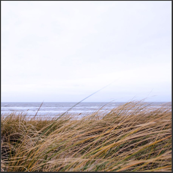
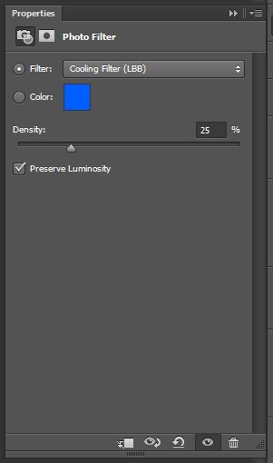
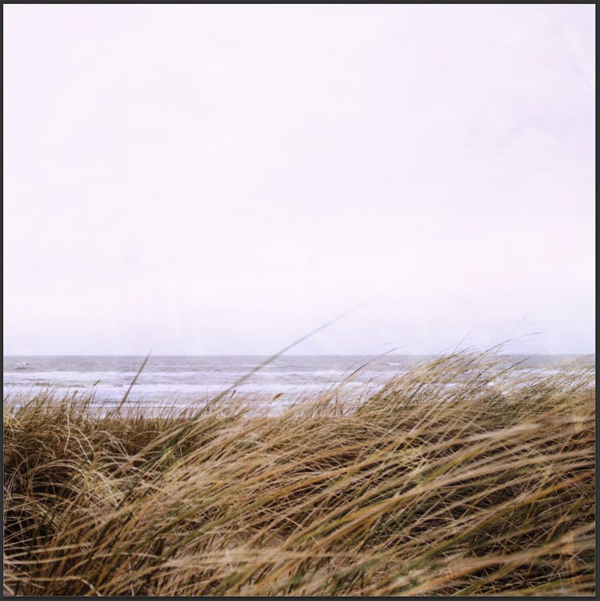
The first of these photo adjustment is a cold photo filter (LBB, at 25% density).
Next is a cross-processing curve…
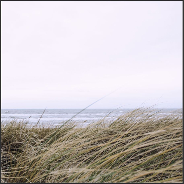
…Set at 25% opacity for more subtle results.
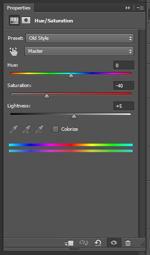
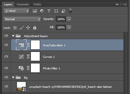
Finally is a Hue/Saturation adjustment layer, set to its Old style setting.
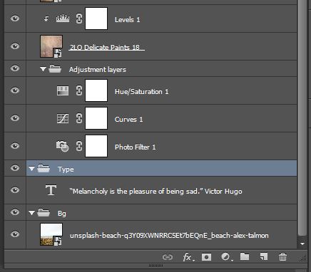
And here’s some layer organization ideas.
Step 03: textures!
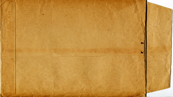
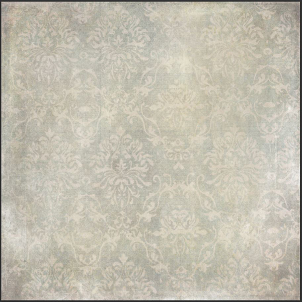
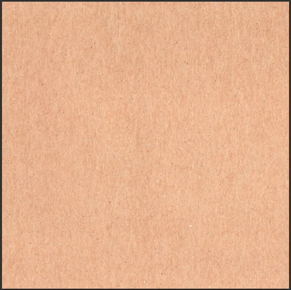
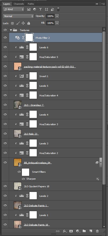
The textures come all from the 2 Lil Owl collection, except for two. The first one is this awesome old envelope texture, by Dustin Schmieding, and the second one comes from a set of packing material textures, that I happen to have created and to be selling.
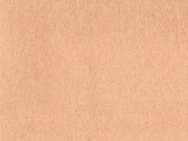
Here’s the texture that I collected. If you’d rather not buy the pack it’s from, there are some free alternates available. But you could also right-click here, and magically save a high-resolution freebie. I’ll let you figure that one out.
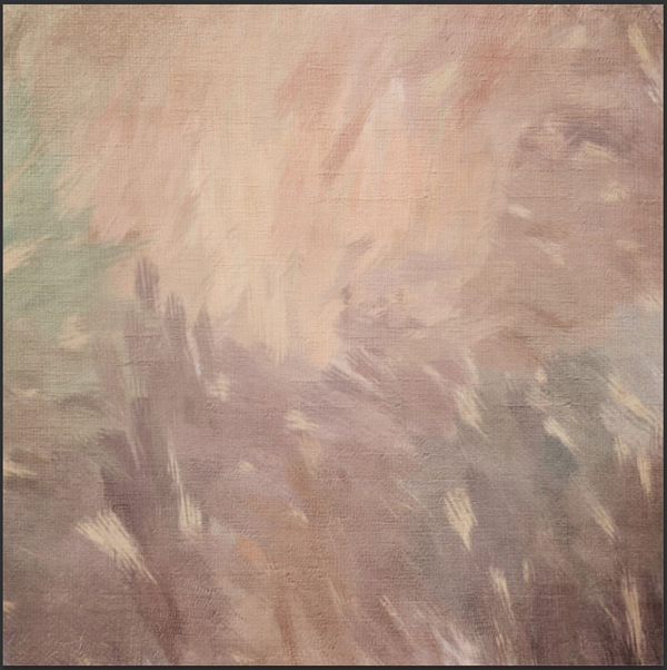
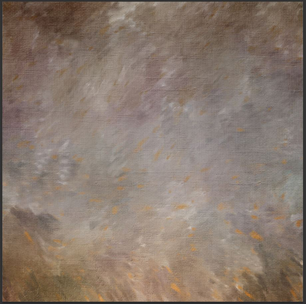
But before there’s a use for these, let’s start with 2LO Delicate Paints 18 (Soft light @ 75% opacity).
The result isn’t too pronounced, so a clipped Levels adjustment layer is needed to tweak the texture a bit.
Next is 2LO Delicate Paints 1 (Soft light @ 100% opacity), once again with a levels adjustment layer.
Let’s add 2LO Opulent Papers 18 to our layer stack (Soft light @ 100% opacity).
Next is BB_AntiqueEnvelope_04. This will be desaturated, and enhanced with Levels. Place it big enough in your canvas so that the seams are not visible. If necessary, don’t hesitate to sharpen the texture (Filter > Sharpen > Sharpen).
The texture is then set to Soft light @ 75%.
Following is 2LO Relic 23.
The texture’s blending mode is Soft light @50% opacity.
The next texture is 2LO – Grandeur 7. Make sure to size it big enough so its frame features aren’t visible. The beginning is standard procedure.
What’s interesting is what happens here. I’m adding an Invert adjustment layer. This gives us this very bright texture.
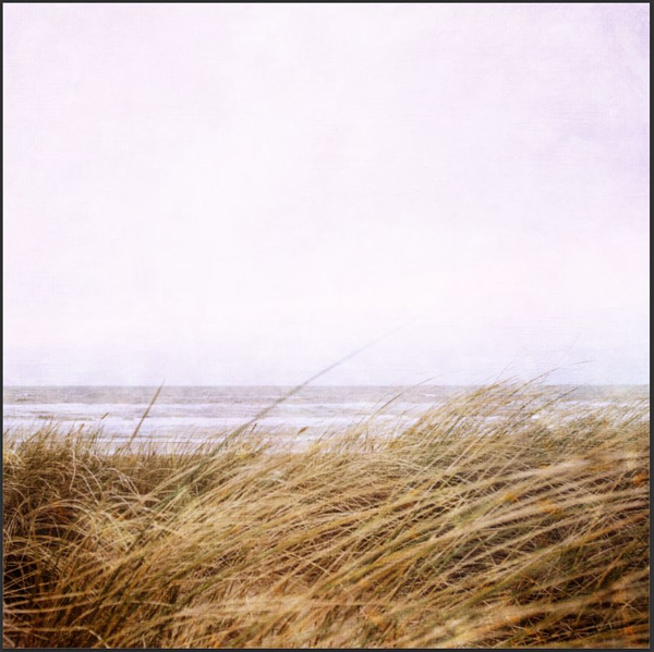
Since the blending mode is Soft light @ 50% opacity, all these bright areas will brighten our image quite nicely. We’re circling back to the original mood of the image, but with more substance.
Last texture: packing-material-texture-pack-vol-02-sbh-011.jpg (grab the freebie by right-clicking here and saving the link’s target if you haven’t done so already).
Change the blending mode to Soft light @ 50% opacity.
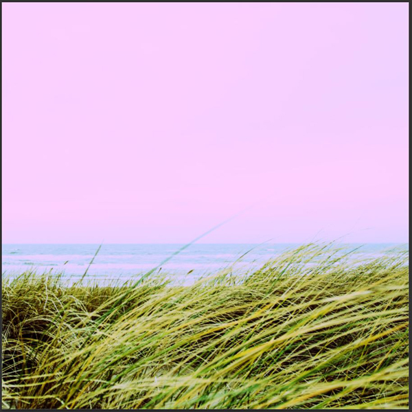
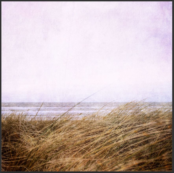
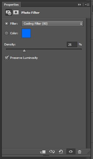
The icing on the cake is next. The colors have shifted towards red-ish/pink-ish hues. In order to bring them back towards the original mood a bit more, we’re going to use a photo filter adjustment layer again (Cooling filter (80) preset).
Oh, and layers!
Step 04: type
The piece wouldn’t be complete without a neat quote about melancholia. I’ll be using this beautiful one:
“Melancholy is the pleasure of being sad.”
― Victor Hugo
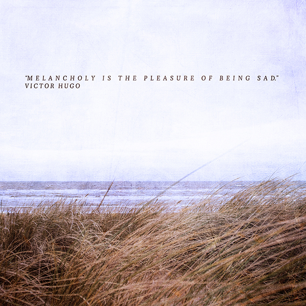
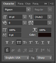
For a classic feel, I’ll be using Pigeon, a beautiful serif from Lost Type. I played a bit with letter spacing, so the sentence has almost an ethereal feel to it. The top line (minus the quote marks and the period at the end) is spaced at 500. Victor Hugo’s name is spaced at 250. The type is set at 14 points tall. The color of the type (#0a0402) was sampled in the darker areas of the image for a better fit in the general piece. The type block is vertically centered, and is half-way between the top of the image and the start of the grass blades.
In order to give a hair more presence to the type, we’re going to slide it almost all the way to the bottom of the layer stack. In fact, the only thing behind the type layer will be our starting image. You can even give it its own layer group.
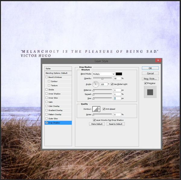
Next, we’ll be giving the text a very discreet drop-shadow, so it can stand out even more. I’ve used the same color for the drop shadow than the text for a more subtle integration in the design.
And we’re done with our second piece!
SOME FINAL THOUGHTS
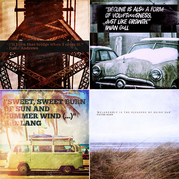
I actually started the tutorials with four different pieces.
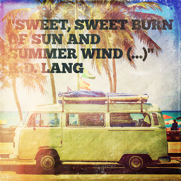
There’s also this one, based on this great shot of a WV camper.
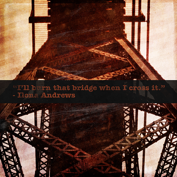
Also, there’s this one, based on a cool low-angle bridge structure shot.
While I was writing their respective step by step instructions, I realized that they wouldn’t bring much more to your comprehension of what the 2 Lil Owls textures can do, or demystify more a non-destructive workflow. The only more complex Photoshop trick there is is in the VW camper image, and it’s the halftone pattern. I’ve detailed how to get that effect in the finishing steps of the gothic/hipster poster tutorial.
That said, don’t refrain to ask questions, I’ll happily answer them (in the comments below, or on Twitter).
So I’d rather not dive into these two additional images too in detail. What I’ll do instead is to admire what you all will come up with when adapting the techniques I’ve shared above, but for these last two images. I’d love if you’d share your outcomes with me over on Twitter (@simonhartmann or @DesignCutsDeals). If you don’t have Twitter, you can always share stuff on the Design Cuts Facebook page!
I hope you had as much fun going through these explorations of the 2 Lil Owls textures than I had writing them. Until next time, cheers!
Remember, the textures used in this tutorial are just a tiny selection from the huge 2 Lil Owls textures collection that we’re currently running. You can grab over 300 high-res, incredibly artistic textures and digital papers for 93% off. Hurry though, this deal is expiring soon:
2 Lil Owls Textures and Digital Papers Collection – Just $28 (93% Discount)




Hi! I also couldn’t understand the profit of smart objects in this case. Please, explain all of us it!
Hey Elmira,
Thank you for your comment! I can certainly help you out with your query :) with smart objects and non-destructive editing techniques, you are able to create your design without altering the original pixel data. There is an awesome blog with more information on this here: http://bit.ly/2iLnTue that I would definitely recommend checking out!
I hope this helps, Elmira, and please don’t hesitate to contact me should you have any other questions. I’m here to help!
Hii! I feel a little silly for asking, but I must know: What’s so great about using non-destructive techniques anyway?
Hey Aimee!
No need to worry – There’s no such thing as a silly question at DC, I’ve sent you over a quick email explaining the bonuses of using non-destructive techniques.
Any and all questions are welcome, Aimee! Get touch and we’ll be more than happy to help you out :).
For what it is worth, the ‘packing material texture didn’t show up when I downloaded it with the link. The .jpg image is there, but, it is un-viewable. Danke!
Su
I’ve got the same problem, Su.
Hey Su,
Thank you so much for getting in touch and letting us know about this. I’m so sorry for any confusion caused! I’ve just double checked this on my side and it appears to be working correctly but if you are still having any problems, please do email me directly and I will happily lend a hand in getting you up and running with it.
Apologies again, Su! If there is ever anything else I could assist you with please do get in touch. I’m always happy to help!
I never saw this tutorial before. Wow, Simon! You really put a lot into this! I have to try some of the techniques even tho I didn’t get this particular bundle. Thank you so much!
Su
Hey Su,
Thank you so much for your kind words! It’s great to hear you enjoyed this tutorial :)
Excellent tutorials featuring the fabulous textures from Denise @ 2 Lil’ Owls. For anyone who has been wanting to get started adding textures to their work/photos and are not sure where to begin, these tutorials are where you should start. :)
Thanks so much KJ! Glad to hear you’re enjoying Denise’s textures. They are really awesome! I hope you’ll love the new tutorials. I’d be great to see how you get on with them, so please feel free to send you end results. :)
Thank you so much for your kind words!