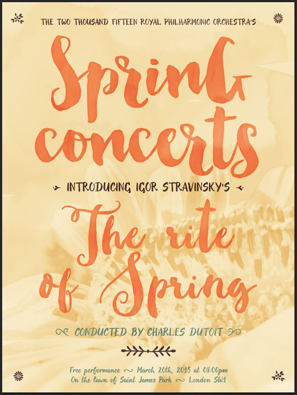
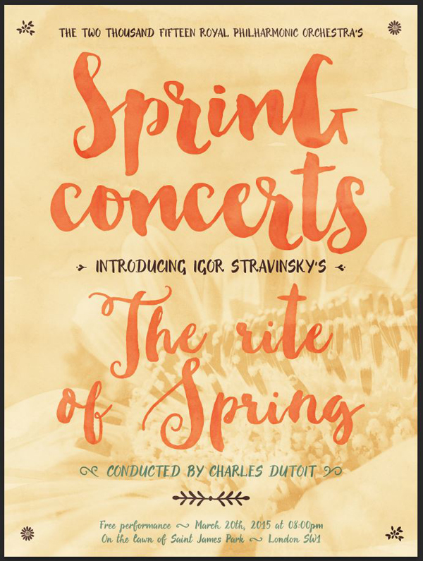
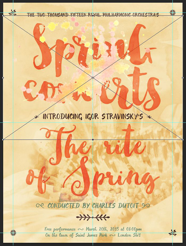
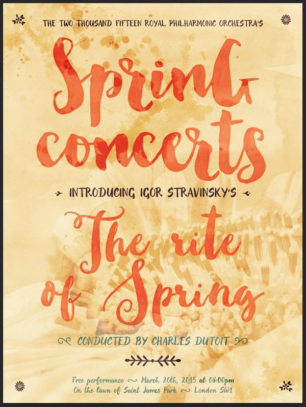
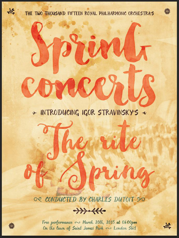
WHAT WE’RE CREATING:
Hello Design Cutters! Simon here today. For our exploration of the Beautifully Artistic Designer’s Kit, we are going to create a fictitious poster for a fictitious concert by the Royal Philharmonic Orchestra.
The concert in question will for a performance of Igor Stravinsky’s The Rite of Spring, which you might remember from Walt Disney’s Fantasia movie (the part about life’s birth on Earth). If you don’t remember the piece, some kind soul put it in full on Youtube. It makes for a great soundtrack while designing.
The bundle’s typefaces, and extensive collection of watercolor textures and elements are a perfect fit with a spring-like atmosphere. Let’s get to it!
A FEW TECHNICAL NOTES
Thanks to some amazing work that went into the typefaces included with this bundle (Evenfall in particular), this is a Photoshop-only piece!
Also, let’s get a few PSAs out of the way.
- Don’t know what a clipped layer is? Glad you asked! This means that the layer is only visible/applies to the layer directly below it. You can very quickly do this by holding ‘Alt’ down on your keyboard and clicking between the two layers. Here’s a quick demonstration.
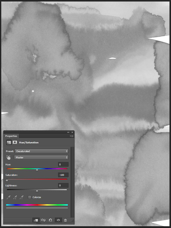
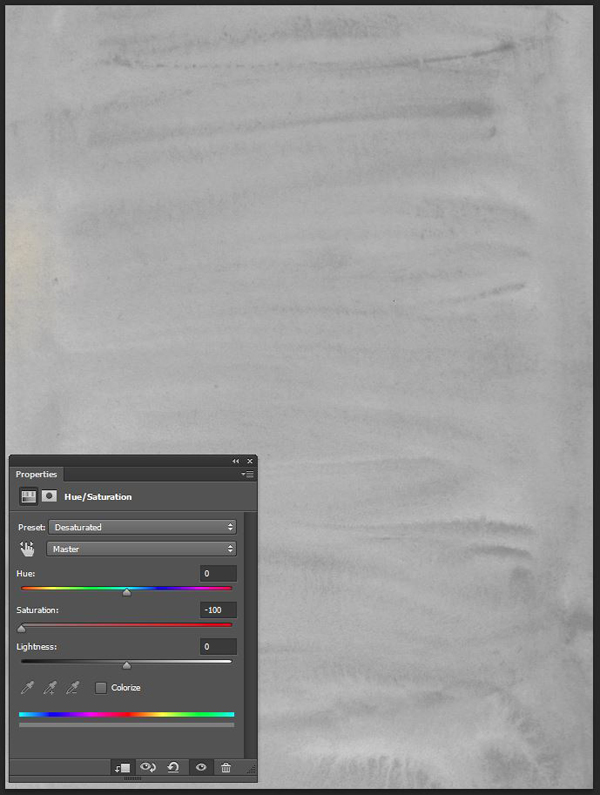
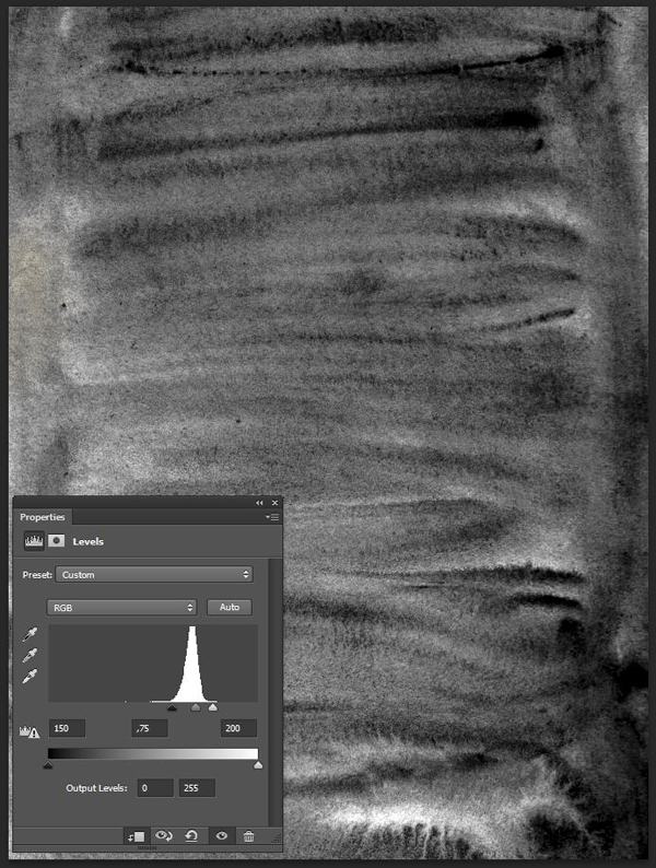
- Every time we’ll work with textures, we’ll follow this simple process: place as smart object, sharpen, desaturate, enhance contrast with levels, and modify the blending mode.
- Placing the textures as smart objects, and using adjustment layers to tweak them, allows us to stick to a non destructive workflow. We’ve explored in depth the numerous pros and few cons of such a workflow in this past tutorial: “How to Use Textures The Right Way.”
STEP ONE: DOCUMENT SETUP
We’re going to use our typical 18″x24″ canvas, but know that in the UK, people use the standard DIN paper sizes (A series in our case). The closest size to our canvas would be an A2 sheet (420mm x 594mm, or roughly 16.5″x23.4″).
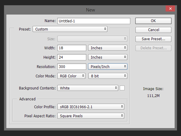

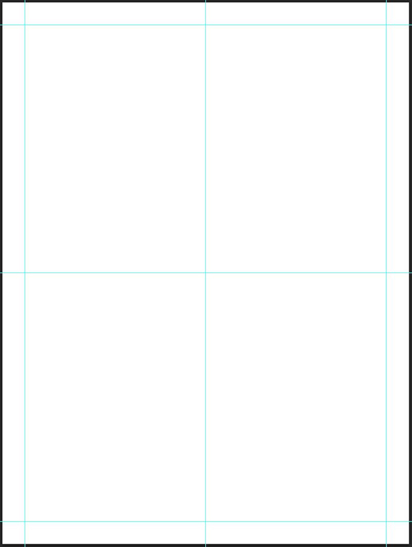
It’s also good to have a few guides in place. Let’s put some to mark a 1″ area around the piece, as well as its center.
We are now ready to dive into the execution of the poster.
STEP TWO: THE BACKGROUND
Base color
The base color for our poster will be #f4da9f. Fill the background layer with it.

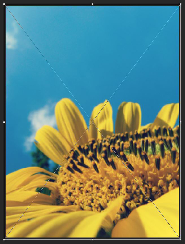
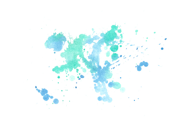
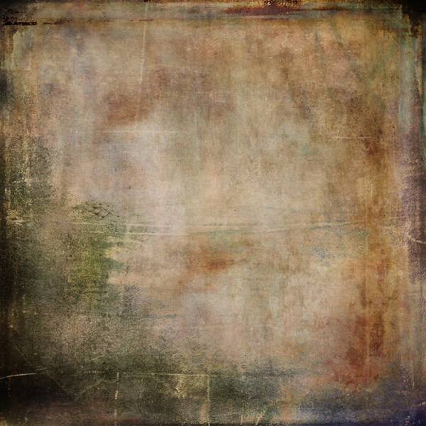
Finding a proper background image
It’s been too long since we last used one of the beautiful images from Unsplash in one of our pieces. We are going to fix this right now, by using this gorgeous shot of a sunflower. You can download it via Unsplash’s mirror on Pixabay.

Let’s place it in our document, right above the background layer. Given its dimensions, it’ll be scaled down to 68% of its original size. Note that we’re rotating the image 90° counter-clockwise, to fit our portrait-oriented canvas.

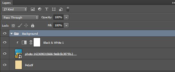
To blend the image in the background, we are going to use a clipped black and white adjustment layer to desaturate it first. The “Maximum white” preset is giving interesting results contrast-vise.
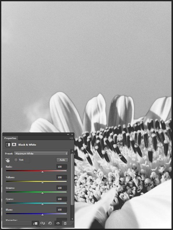
Finally, we’ll change the blending mode of the flower to Soft light @ 100%.
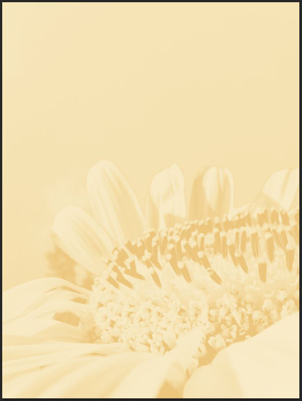
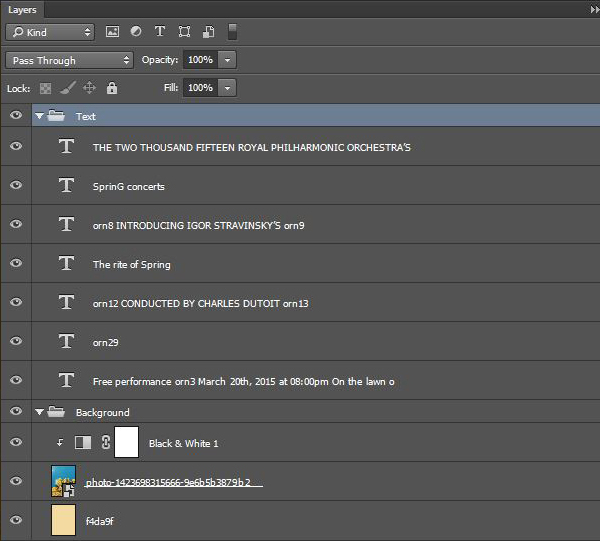
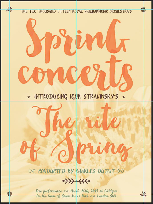
And with that, our background is ready. Here’s a detailed look at our layer stack so far.
STEP THREE: TYPOGRAPHICAL ELEMENTS
We need to talk about how clever Evenfall is
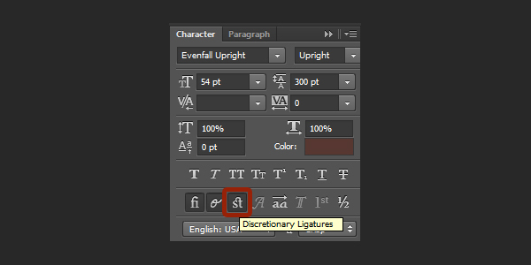
By exploiting the discretionary ligature engine, My Creative Land’s typeface allows us to use over 40 different ornaments, simply by typing a letter and number combination. Brilliant.
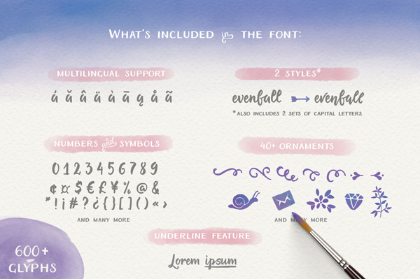
This will prove priceless to add a bunch of little typographical ornaments, and other graphical elements, easily and effortlessly.
With that out of the way, let’s proceed with the type.
What is our poster going to say anyways?
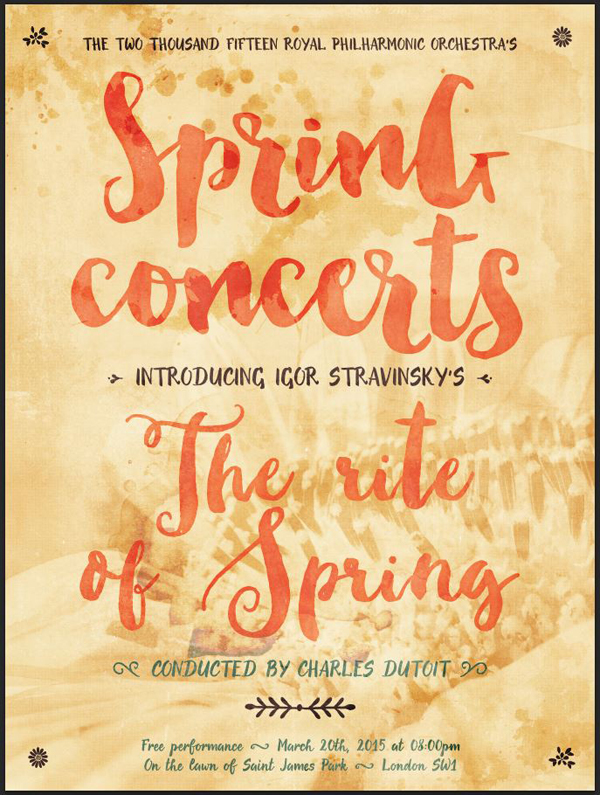
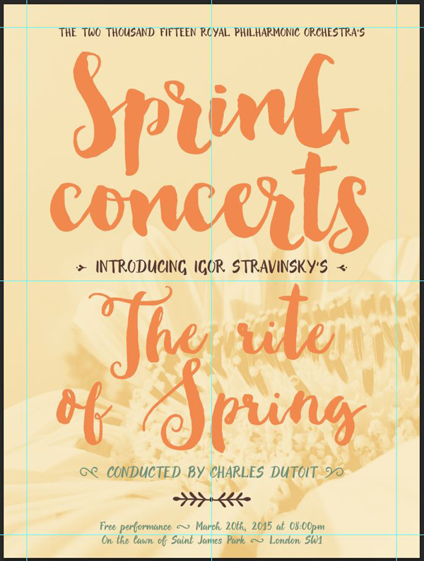
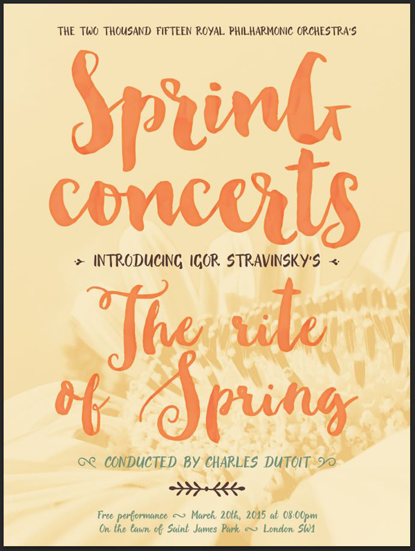
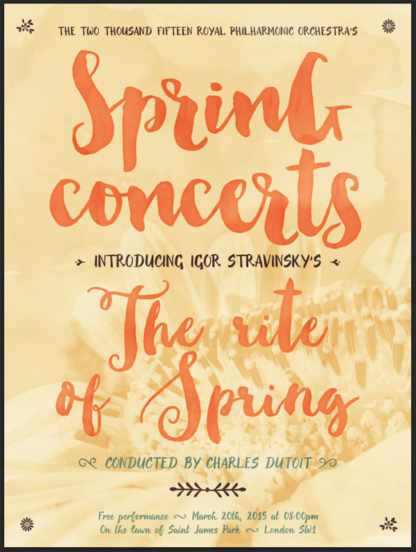
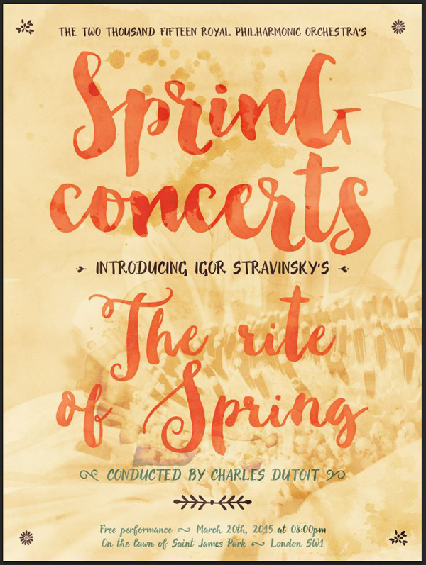
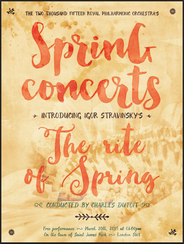
As stated in the introduction, the poster is to advertise a performance of The Rite of Spring by the Royal Philharmonic Orchestra. To add further credibility to what is happening, we’ll also imply that the concert is part of a series of concerts organized to celebrate the season change. We’ll call that the Spring concerts.
Also, additional research on the RPO’s website tells us that their artistic director and principal conductor is a gentleman named Charles Dutoit. We’ll credit him as conducting the performance.
Finally, and as with every concert poster, a mention of the performance’s date, time, and location won’t hurt. Since this is a concert to celebrate the season of nature’s rebirth, we’ll make it an outdoor event. Saint James Park is the park located around Buckingham Palace, which is perfect for such an event.
The concert will take place on the first day of Spring (which is passed, on March 20th, 2015), on the lawn of Saint James Park. Some additional research tells us that the general postal code for that area of London is SW1 (Westminster).
With all that knowledge, we can start typing.
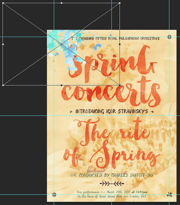
Subhead: the performers
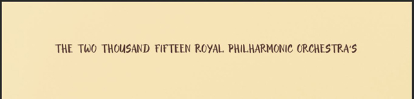
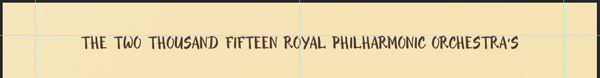
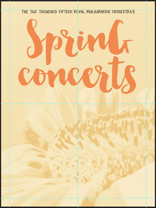
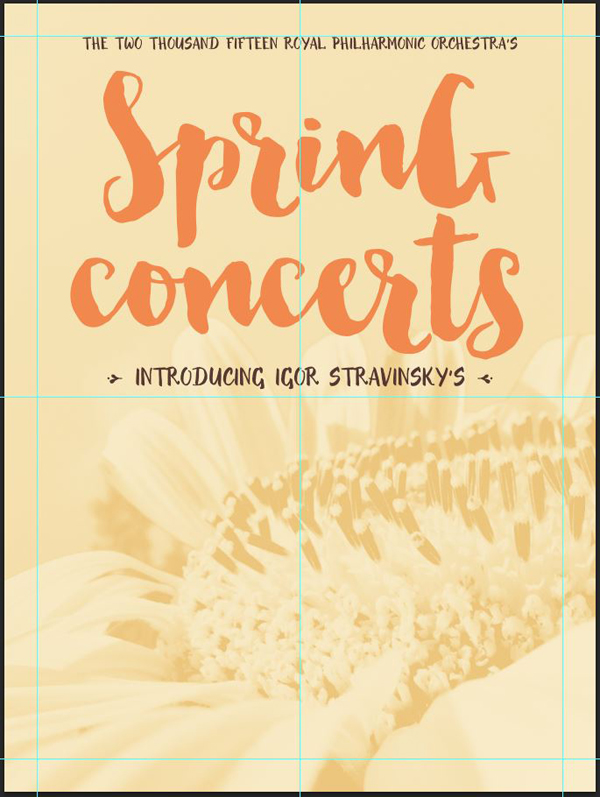
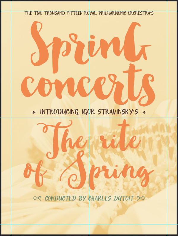
The subhead for our poster will announce the concert series. Its text will read “The two thousand fifteen Royal Philharmonic Orchestra’s,” will be set in Evenfall Upright that’s 36 points tall, and colored in a warm, dark brown (#57342d). The text is centered, and in all caps.
It’s placed as so the top of the type is aligned with our top divider.

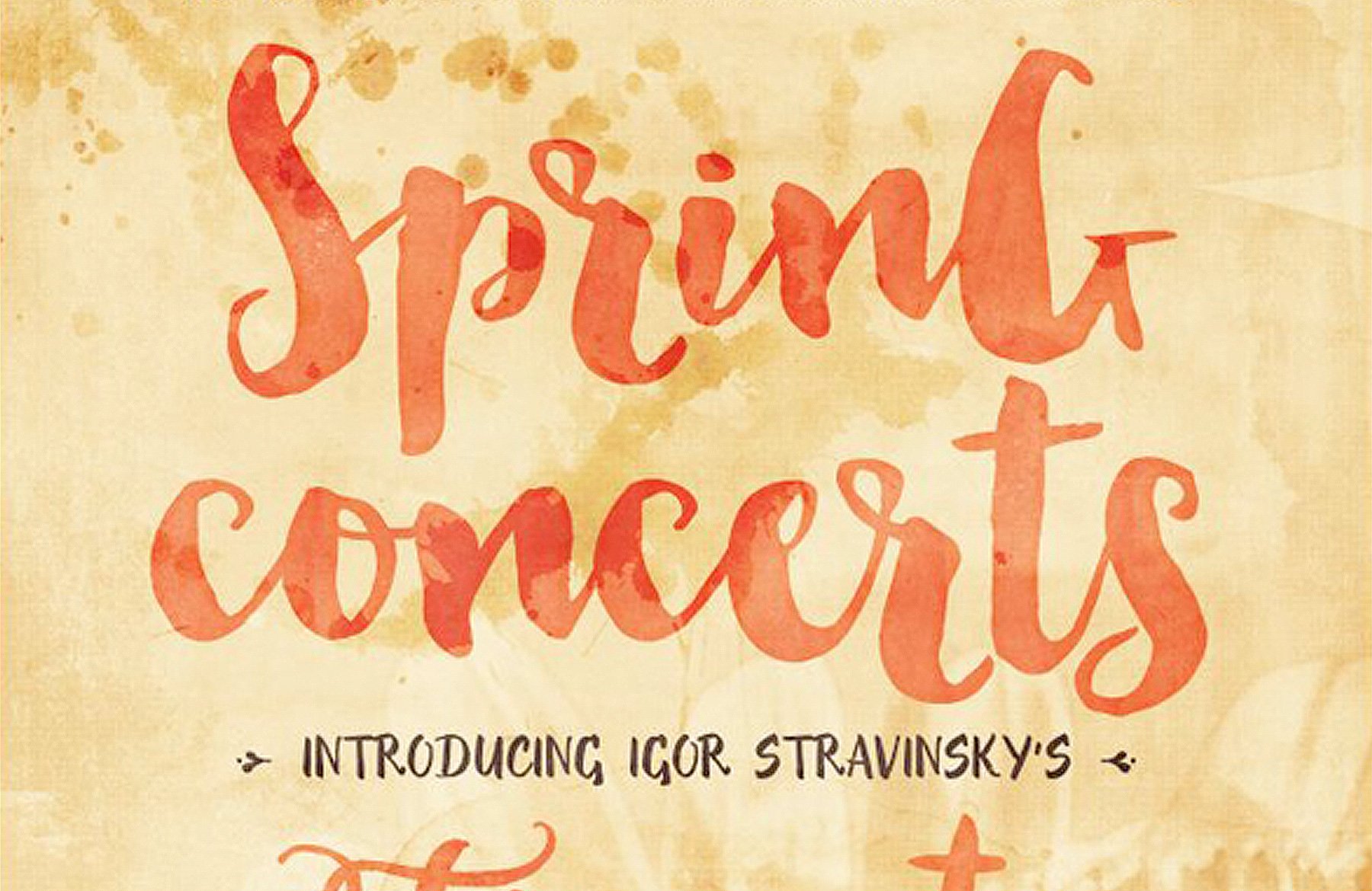
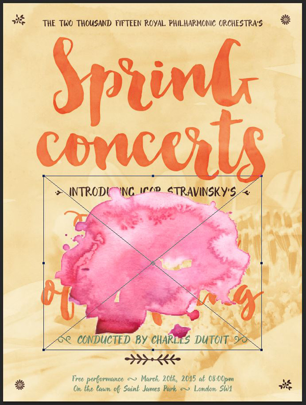
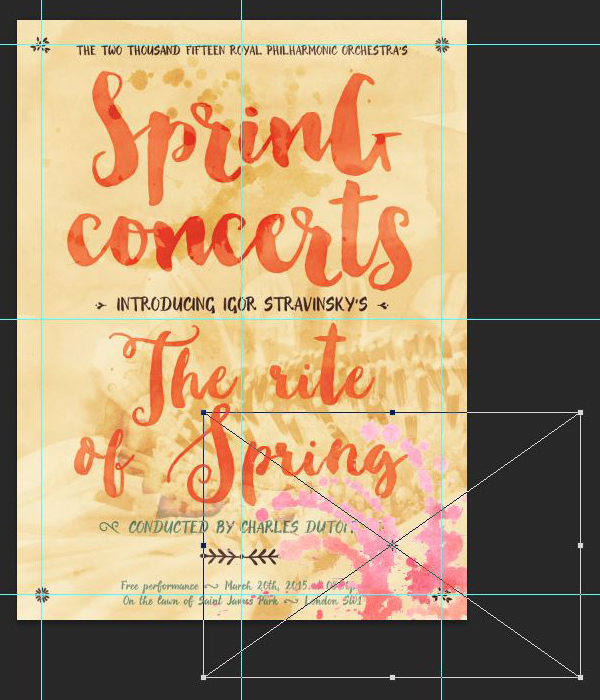
First headline: the concert series
This text piece is the name of the concert series: “Spring concerts.” It’s written in Nicky Laatz’s Bonjour Regular that is 402 points tall, with a leading of 300 points (line spacing), and colored in a nice, bright orange (#f28a49). The text is also centered, and broken in two lines.

Bonjour doesn’t feature alternate characters, but in order to make things visually more dynamic, we are going to mix uppercase and lowercase characters. Currently, my case is Spring Concerts. Let’s modify the case to SprinG concerts to see some magic happen.
The result is a title that isn’t too tightly together, and that has a certain quirkiness to it, to evoke the exuberant nature of the spring season.

The type object’s final placement is roughly in middle of the top half of our poster.

Second subhead: the composer
The second subhead will introduce the composer of The Rite of Spring, Igor Stravinsky. We’ll also make our first use of Evenfall‘s ornaments at this point.
The text will be set in centered, all-caps, dark brown Evenfall Upright again, but 54 points tall this time. The line should read Introducing Igor Stravinsky’s.

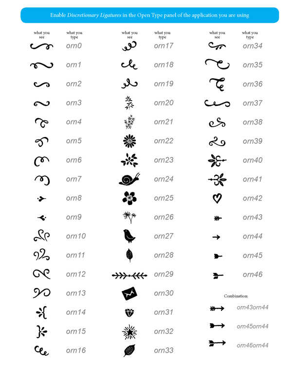
Now, the ornaments. A look at our options (see the evenfall-howto.pdf file, present in the beautiful-artistic-kit-my-creative-landevenfalladditional-documents folder) presents us with these simple, bullet points-like decorations.
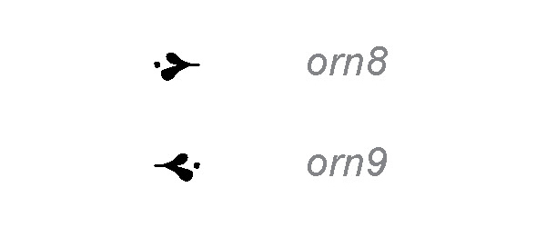
As per the key, we simply have to type the combinations orn8, and orn9 in our line of text for them to appear. Once again, make sure that your discretionary ligatures feature is turned on in your type panel.
With that in mind, our line of text will now be typed as orn8(space)INTRODUCING IGOR STRAVINSKY’S(space)orn9, and we’ll have ourselves some neat ornaments in place.

The type object final placement puts it almost at the center of our canvas.

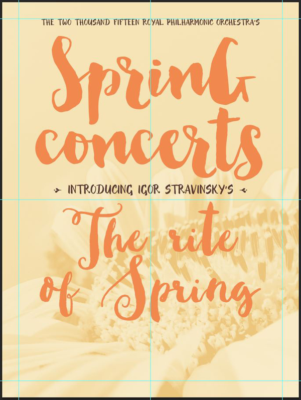
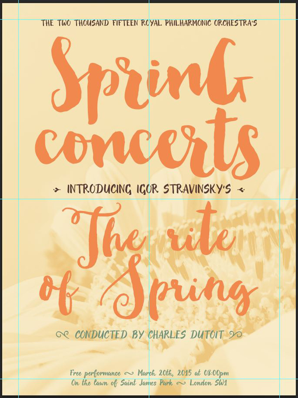
Second headline: the piece that will be played
The Rite of Spring will be set in Make Media Co.’s Sweetgrass Script Regular. It’s a great “hand brush style” script, that is somewhat similar to Bonjour, but still has its own personality. This will help us to add variety in the letter shapes we are using throughout the piece.
The type’s case is in title case, except for the “r” in “rite” (The rite of Spring), 402 points tall, with a leading of 222 points, and is in the same orange as the first headline (#f28a49). The text is centered as well.

Its final placement is at the center of the poster’s lower half.

Third subhead: the conductor
As our research revealed earlier, the principal conductor for the RPO is Charles Dutoit. We need to credit him.
For this line, we’ll use another set of ornaments to start and finish the line, #12 and #13.
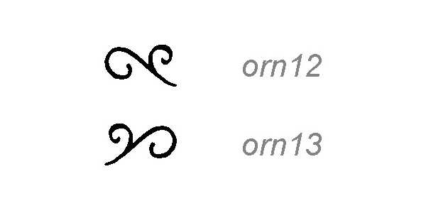
The text will be set in all-caps, centered Evenfall Italic, 48 points tall, and in a dark “sea foam” blue-green to contrast with the yellows and oranges of our palette (#729278). To include the ornaments, the line we have to type is orn12 CONDUCTED BY CHARLES DUTOIT orn13.

Its final placement is right below the performed piece.

Final text element: the where/when information
This information will be at the bottom of the poster, and tell people where they should have gone for the performance. We’ll split the text on two lines, and use Orn3 to divide its constituting parts. The text will use normal case.
Free performance orn3 March 20th, 2015 at 08:00pm
On the lawn of Saint James Park orn3 London SW1
The element is set in Evenfall Upright that’s 36 points tall, and colored in our blue-green (#729278).

Its final placement puts it right at the bottom of the piece.

Filling the gap
Putting the location information so low in the piece has left an open gap between it and the conductor information.
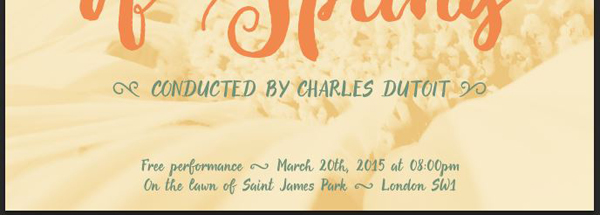
We are going to use one of Evenfall‘s ornaments to fill that gap, and to provide additional visual variety.
The one we’ll use is orn29.

It’s set in Evenfall Uprright that is 72 points tall, and in our dark brown (#57342d).

Its placement is visually centered between the two text elements it’s separating.

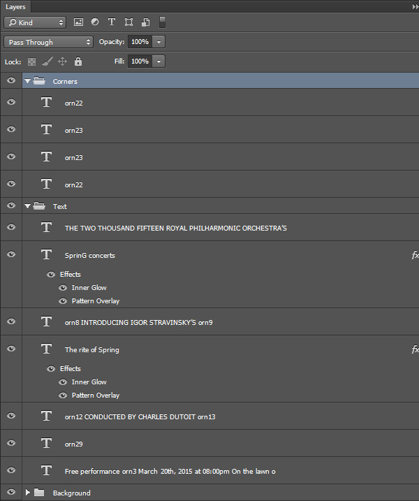
All of our text elements are in place, which means it’s time for a bit of house cleaning before dressing them up some.
STEP FOUR: TYPOGRAPHICAL EYE CANDY
We are now going to accomplish two things: dress our main type elements up to look more “hand painted,” and add a few additional ornaments as corner elements. Let’s start with the painting simulation.
The first step is simple, and involves customizing the effect that Nicky Laatz’s Bonjour layer styles create.

Once we have the layer styles loaded, it’s super easy to change our type from flat to inked in one quick click.

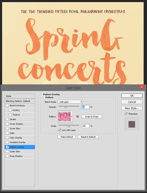
Now, let’s study how the effect works. It’s applying a painterly pattern overlay to the type. If the result is very satisfying, it also breaks our carefully crafted color scheme.
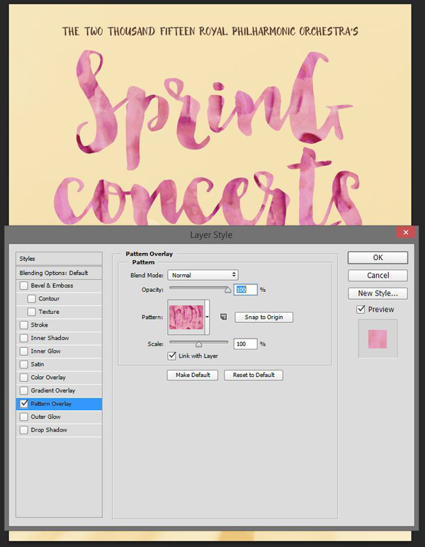
How are we going to solve the issue? Simply by tinkering with the pattern overlay’s blending mode and opacity. Switching it to Soft light @ 35% opacity still lets the pattern show through, but doesn’t completely overpower the color.
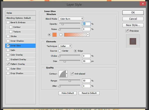
The next touch to make the effect more realistic is to make the edges of the type slightly darker, as if pigment had amassed there. We’ll use an inner glow effect for that.
Use the orange as for the type. The blending mode, once changed to Color burn @ 15% opacity will make the edges dark, but without muddying the colors, or over-saturating them.
The result is rather nice, especially once we’ll have gone through the texturing step later on.

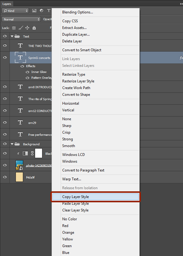
We are left with applying the same effect to the “Rite of Spring” type element. Instead of having to go through each settings screens again, we can simply copy and paste the layer style between each object (through the right-click menu).
Using Evenfall’s ornaments as corner elements
The next part will see us exploiting two additional elements from Evenfall Upright to add some eye candy to each corners of the composition. We’ll use orn22 and orn23.
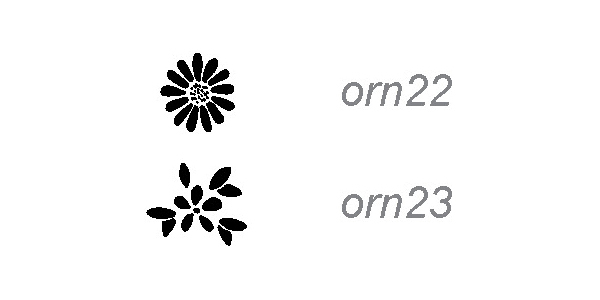
Set the type to Evenfall Upright, at 48 points tall, and in our dark brown (#57342d).
orn22 is at the top right and bottom left corners.

orn23 is at the opposite corners.
The type dressing up is now complete. It’s better to give the corner elements their own layer group.
STEP FIVE: TEXTURES
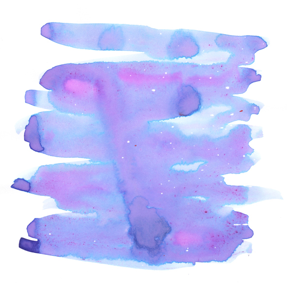
This step is what will “sell” the watercolor vibe of our poster. We are going to use textures that come from the Co-op’s Essential watercolors collection, except for two of them.
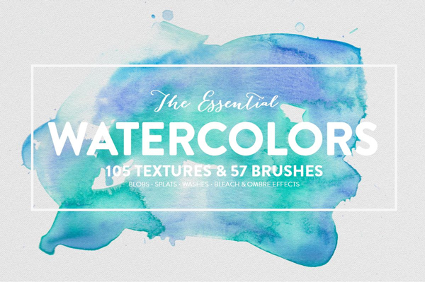
The additional textures come from the Design Cuts freebies area. Both are from Jo’s mother’s day card tutorial.

Once the freebies have been downloaded, it’s time to keep going.
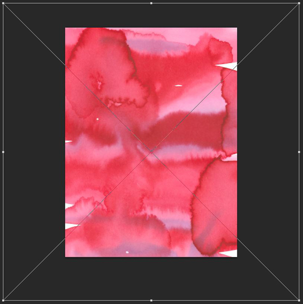
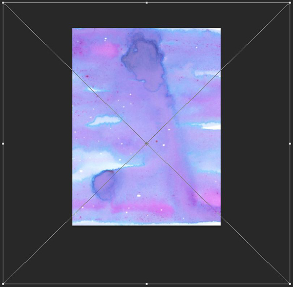
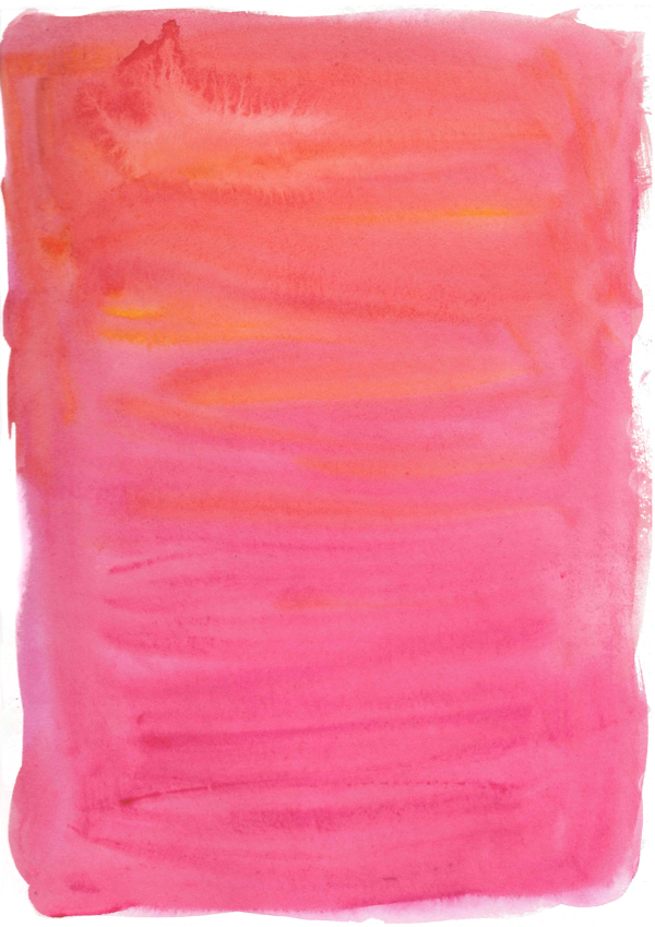
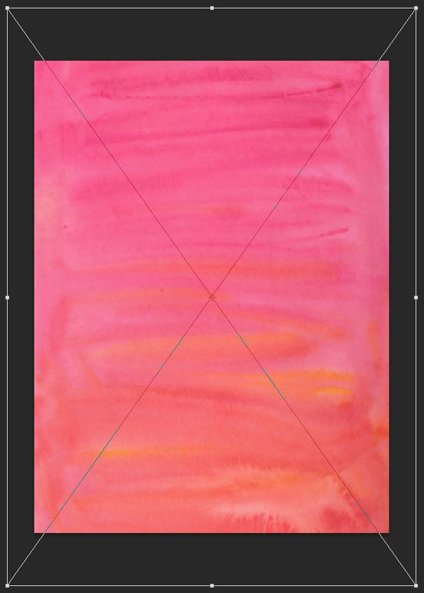
The first texture we’ll use is Red Velvet wash.jpg (beautiful-artistic-kit-the-co-op-watercolourWashes).
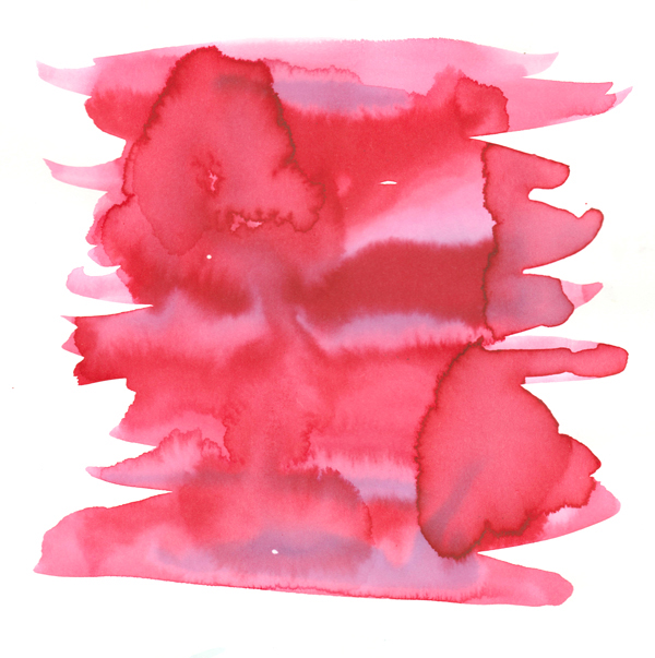
We have to place it almost centered in the piece (X:9″, Y:13″, and scaled up at 400%), as to cover it completely.
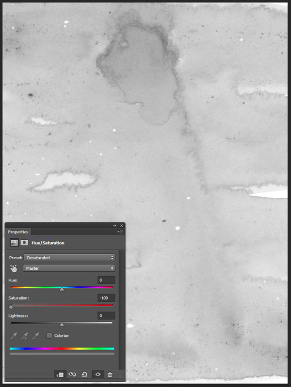
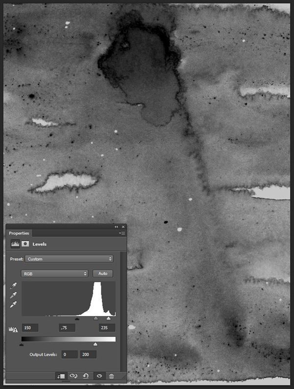
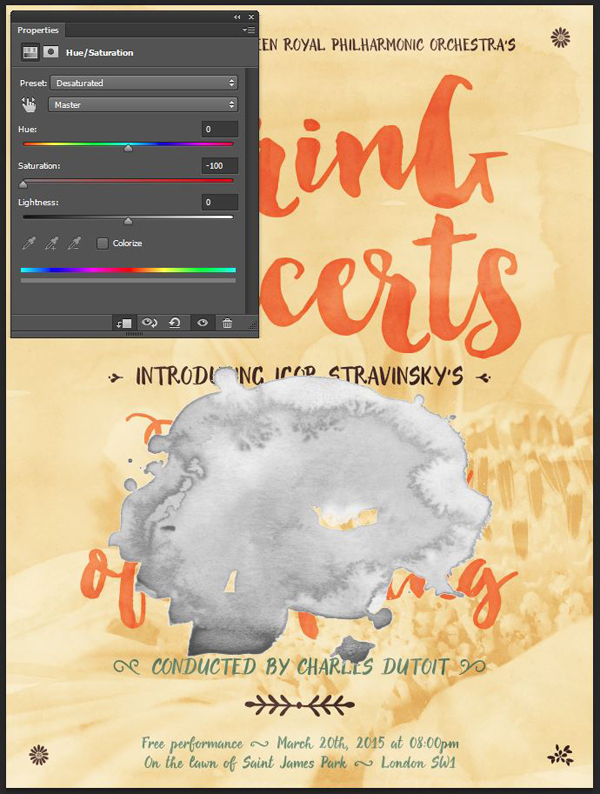
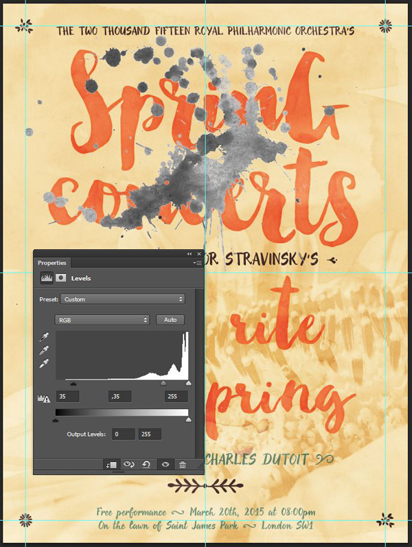
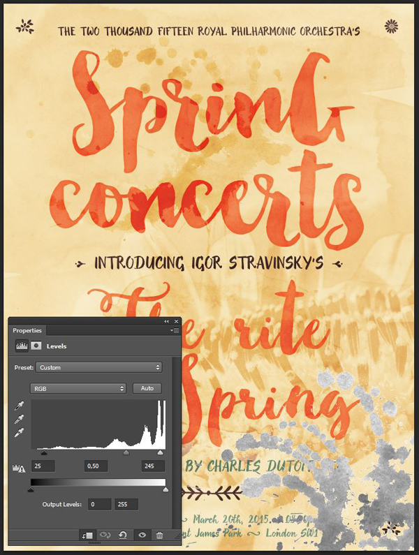
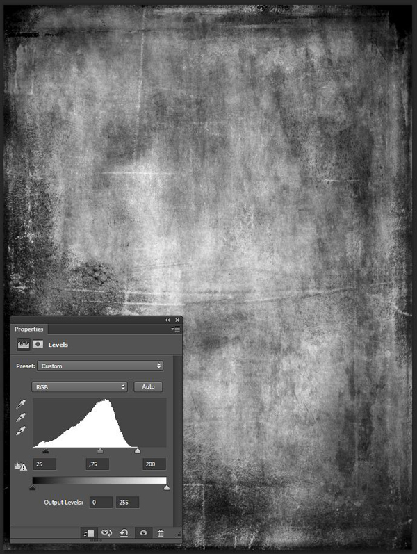
Once placed, and sharpened (Filter > Sharpen > Sharpen), we can desaturate it with a clipped hue/saturation adjustment layer (remember the PSAs from at the beginning?).
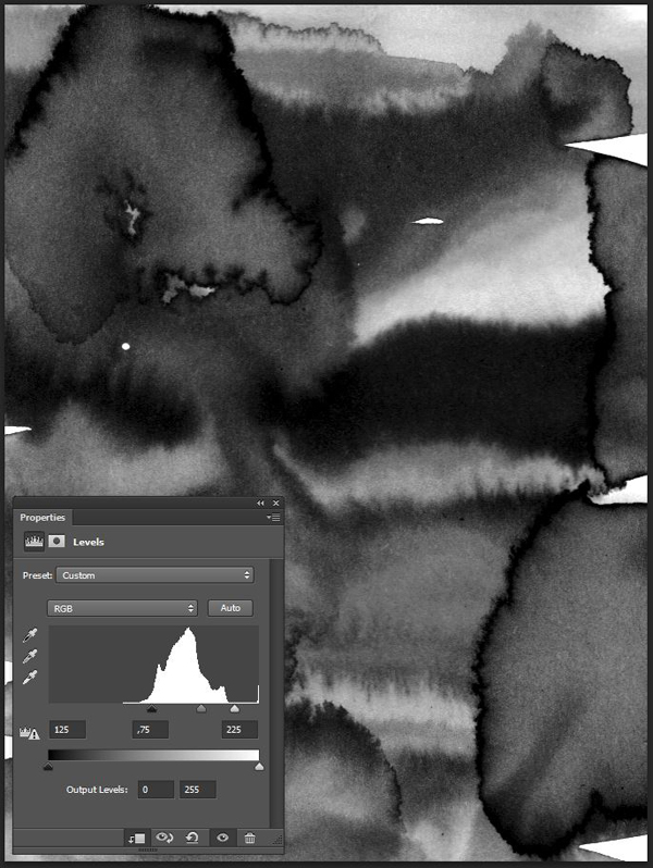
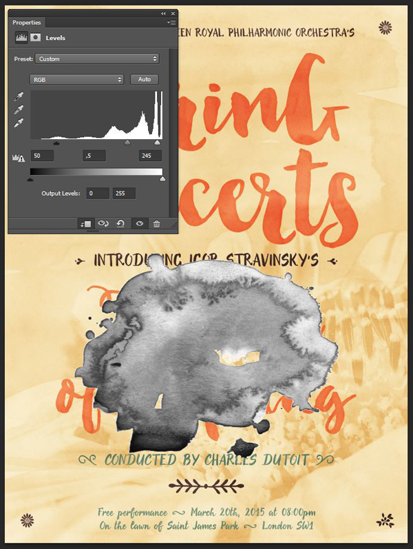
Next, a clipped levels adjustment layer will help us to emphasize some of the texture’s artifacts.
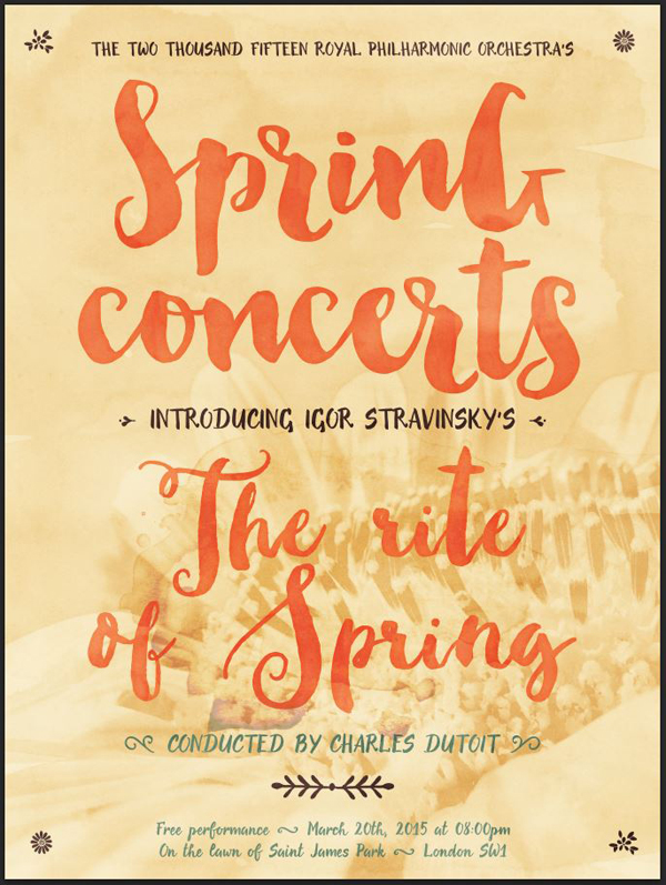
Finally, changing the texture’s blending mode to Soft light @ 35% opacity gives us the result.
The next texture is Blueberry wash.jpg.
Just as before, it should cover the full composition (scaled at 425%, and X:9″, Y: 14″). Rotating it of 180° will have its main artifact (the drip at the center) fit the top-to-bottom reading direction of the poster.
Blending mode: Soft light @ 25% opacity.
The next texture is the first from the freebie pack, watercolour_pinkback.png.
It should be scaled up at 250%, rotated of 180°, and centered in the canvas.
Blending mode: Soft light @ 35% opacity.
The next texture we’ll use comes from the PNG versions of the blobs. It’s Wine Red blob.png (beautiful-artistic-kit-the-co-op-watercolourPNG versionsBlobs).
Its precise placement is important: X:9″, and Y:15.65″. It’s scaled up at 275%. It’s to cover the bottom headline as much as possible.
Blending mode: Color burn @ 25% opacity.
The next three assets we’ll use come from the PNG versions of the splatters (beautiful-artistic-kit-the-co-op-watercolourPNG versionsSplats). They will be placed at precise points in the piece to add to the “watercolor/painterly” vibe of our composition.
First up is Peach splat.png.
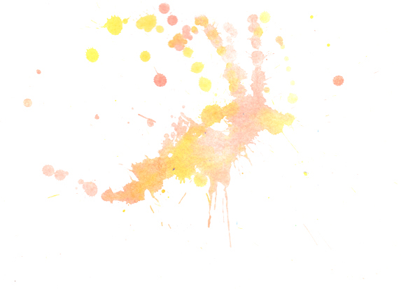
It’s located at X:9″, Y:7.5″, and scaled up to 225%.
Blending mode: Color burn @ 50% opacity.
Next up: Salmon splat.png.
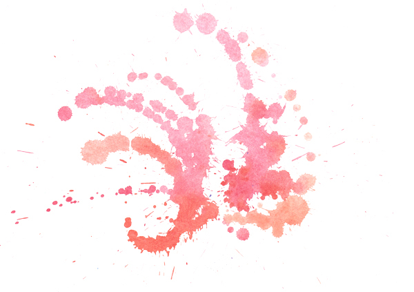
Coordinates: X:15″, Y: 21″, and scaled up at 225%.
Blending mode: Color burn @ 50% opacity.
Final splatter asset: Turquoise splat.png.
Coordinates: X:2″, Y: 2″, and scaled up at 200%.
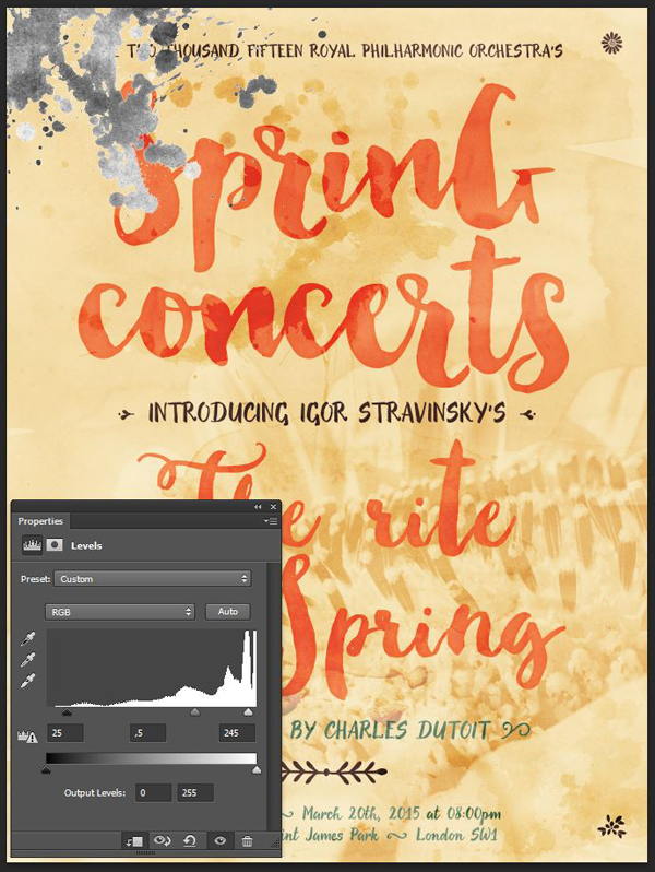
Blending mode: Color burn @ 50% opacity.
The next texture is our second freebie from the Mother’s day card tutorial, 2LO Daydreamer 20.jpg. We’ll use it to create a soft vignette effect.
We are going to disregard the texture’s proportions in this case, and distort it to fit the canvas.
Blending mode: Soft light @ 65% opacity.
Finally, the last texture we’ll put in place is 16×20 Chalkboard 2.jpg, from Studio Denmark’s Chalkboard sampler (beautiful-artistic-kit-studio-denmark-chalkboardChalkboard Background Sampler16x20). It’ll create some subtle noise effects.
It’s centered in the poster, and scaled up to 125%.
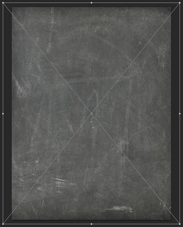
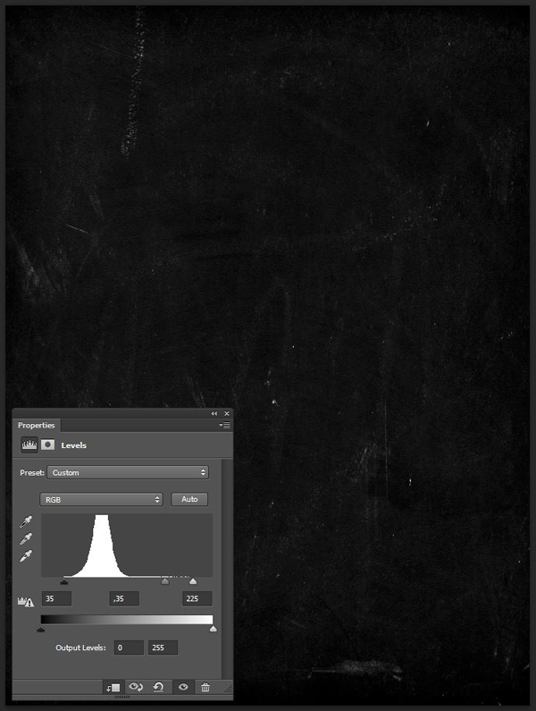
Blending mode: Screen @ 100% opacity.
And we’re done with our texture work. Time to organize the layers in their own layer group.
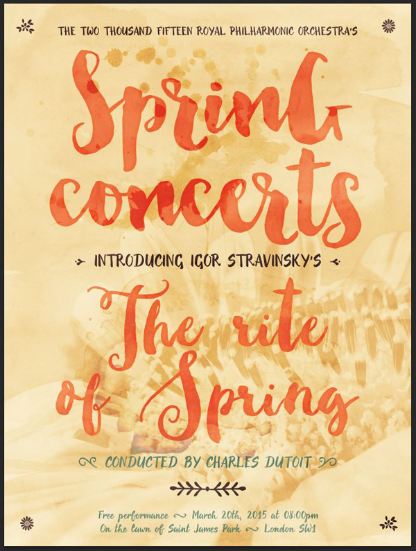
STEP SIX: THE FINISHING TOUCH
In order to give the piece a printed feel, the last thing we’ll do is to give it a subtle halftone effect.
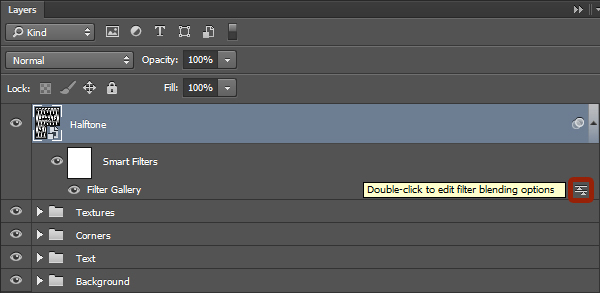
We start by creating a merged copy of all of our layers (CTRL/CMD+SHIFT+ALT/OPTION+E). This creates a new layer at the top of our layer stack, that we’ll rename into Halftones.
Make the layer into a smart object (Filter > Convert for smart filters on Photoshop CC, or Layer > Smart Object > Convert to Smart Object).

From there, and after making sure that our color palette is back to the default black and white (D), we have to apply a halftone pattern effect via the filter gallery (Filters > Filter gallery > Sketch > Halftone pattern).
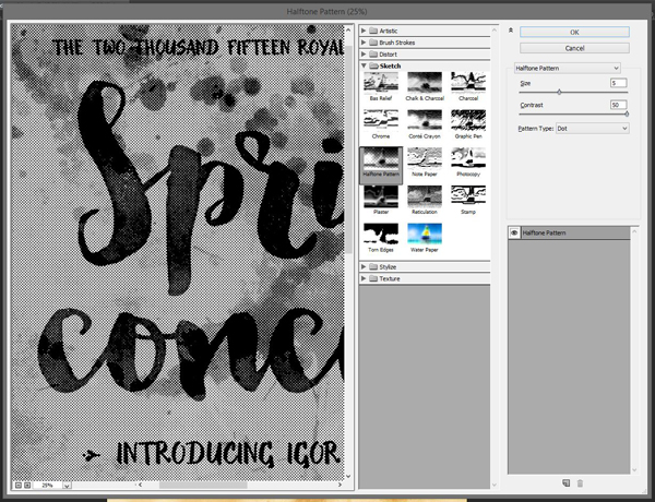
Next, we have to change the blending mode of the effect itself to Soft light @ 100% opacity, by double-clicking on this symbol in the layer palette.
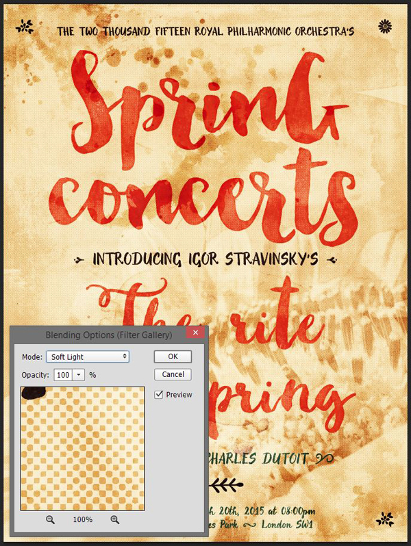
And finally, we have to change the blending mode of the layer to Lighter color @ 35% opacity, and our piece is done!
WRAPPING THINGS UP
I hope you had as much fun following along this poster design tutorial as I had creating and writing it.
Any technical stuff left unanswered? Any ideas on how to make the poster better? Any techniques that would make its build faster, easier? You should use the comment form below, and the Design Cuts team and myself will be sure to get back to you.


If you have completed the tutorial, you ought to share your outcome with us via the Design Cuts Facebook page.
If you’ve already purchased the Beautifully Artistic Designer’s Kit, I expect that you have gained a deeper understanding of your new design resources’ abilities. If you haven’t yet, there are only a few days left to purchase the bundle for 91% off.
I hope that you guys enjoyed this tutorial, and that you have a fantastic weekend ahead!

I thoroughly enjoyed the tutorial. You asked for suggestions so I have one. It was very good without the extra item though.
Make an action to add the sharpen filter and the hue and saturation adjustment layers with saturation at -100 and clip the Hue and Saturation layer to the object. If you have any rules/suggestions for how to set the values in Levels that would be helpful. I realize that some of this is likely move it until it looks right. If we could add the levels and have the action pause to type in the various settings each time that would be awesome and a good learning tool if we had to record it as part of the tutorial.
Great job. Thank you!
Hey Jeanne,
Thanks so much for your feedback and also the email you sent over to me!
We will definitely look into this for you and pass your feedback onto Pam. we are so pleased you enjoyed her tutorial though and please do feel free to send over your finished product- we would love to see it :).
OPTION ONE
You can ‘insert a stop’ (pause) an action so as to do something that cannot be recorded e.g., adjust levels, change color, tweak values, make a selection, etc. Once you’ve made that specific adjustment, the action will play on. You can also insert a message e.g., reminder instructions or explanation when sharing the action with others.
Note: to be clear, you ‘can’ record these steps but will most likely never have one set of values/adjustments that will work for all images hence the need to pause.
OPTION TWO
If you were recording an action that consisted of Smart Filters/Objects… you could record the action straight through with an arbitrary set of values and then go back after the action has run and adjust as necessary.
Jeanne,
The action idea is something we’ve toyed with over here. There might be more to come about that soon.
The main issue is, as you’ve outlined it yourself, that it’s a trial-and-error based process. I like to keep the values I use based on what I call “round number:” 25, 50, 75, 100, 125, 150, etc. But this is probably more symptomatic of mild OCD, rather than a real science.
The process of “fine tuning” texture is also very-context and goal dependent. A texture could be used to achieve a highly distressed effect in a mask, but could just as well achieve a subtle vibe if inverted.
Finally, it’s also a very subjective thing. What I consider light distressing might be seen as extreme by Tom, for instance.
I will look into doing maybe a micro tutorial/blog post to explore this in the near future if the action doesn’t come to life.
Hey Simon,
Thanks so much for coming back to Jeanne! I love the idea of a micro tutorial :)
Love your work, and thanks for sharing! Ceep on going!
Hey Yvonne,
Thanks so much for your comment on Simon’s tutorial! We are so pleased you enjoyed it and I know Simon will be so pleased to hear you enjoyed it!
Thank you for your kind words, Yvonne!
I had so much fun learning these techniques. I was unable to use the b/w adjustment layer ;it was greyed out; I also could not use desaturate under the h/s adjustment. I forgot to use as smart object .I have learned a lot and had such fun recreating this piece!!! Thank You!
Connie,
Thank you for your kind words.
For the adjustment layers being unavailable, it *could* be that you have a different color mode than RGB for your documents (CMYK, etc.).
Make sure that your document is setup in RGB color mode for your next attempt, and I think you might be all set!
Hey Connie,
How did you get on with Simon’s suggestions?
If you are having any further issues, please do let me know. We are always happy to help!
Another great tutorial, thank you! I especially love the tip about using Inner Glow on the text to darken the edges and make it more realistic. Love!
Thank you for your kind words, Angie!
I learned of the inner glow trick when tinkering around while creating the piece for the watercolor holiday card tutorial: https://www.designcuts.com/design-cuts-deals/the-ultimate-designers-collection/create-a-beautiful-watercolour-holiday-card/.
Another awesome tutorial(as always!)Simon!
And as always, it is receiving a lot of love :).
Ah, thank you!
As always, you are more than welcome :)
Thanks Angie for the feedback!
Simon will be so pleased to hear you enjoyed it! Please do feel free to send over your design if you would like to share it- we would love to see it :)