
Branding Mockup Essentials
Keeping along the same product lines as our breakdown above, the hugely compresensive Branding Mockup Essentials by Mockup cloud is a great example of showcasing a products value proposition. Highlighting the quality of the product, ease of use and also the time saving aspects that using a mockup bundles brings.
It's much easier to see how the cover competes with products within its category, once it's shown in a marketplace setting surrounded by its competitors, rather than on its own.
One of the identical covers above has 25% more colour saturation than the other - see how adding just a little more colour saturation can pull more attention.
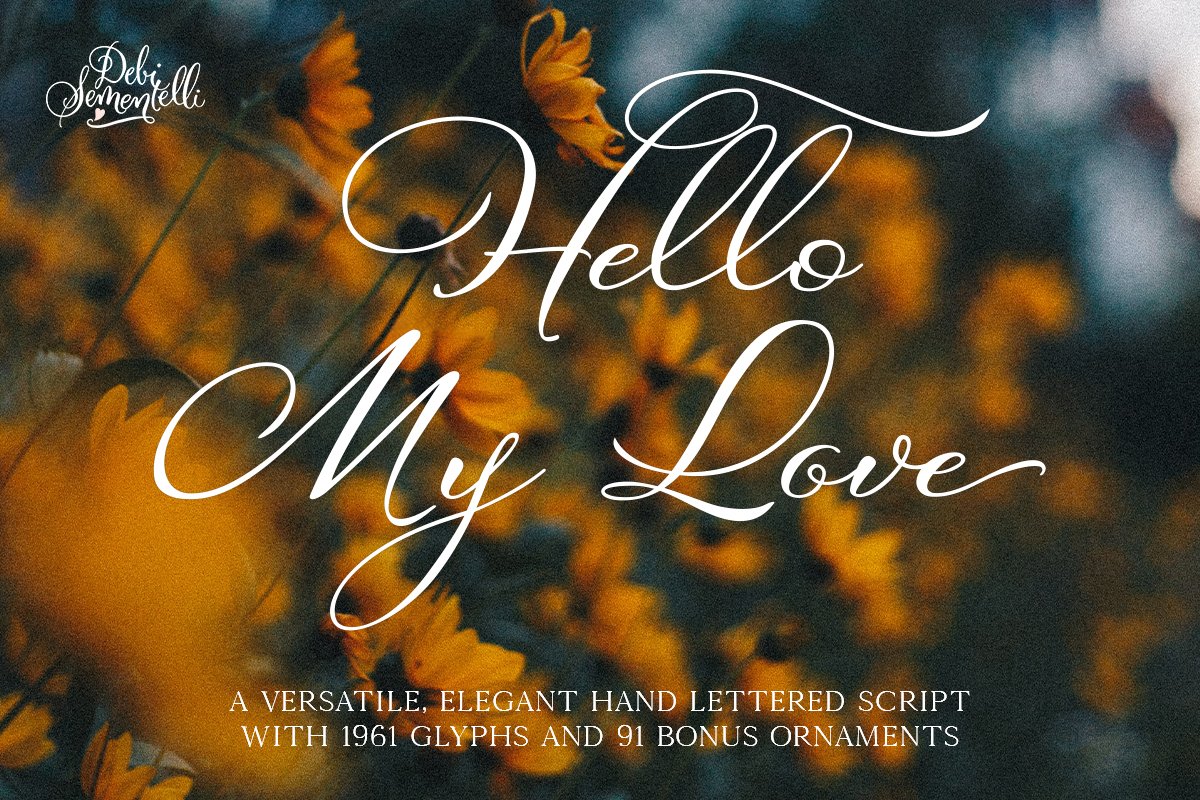
Hello My Love
The Hello My Love cover by the wonderfully tallented Debi Sementelli is a great example of ticking all the boxes when it comes to cover design. Debi reached out to the Design Cuts to request a collaboration in the presentation and launch of her fantastic new font, and we were absoltuely thrilled to help. We provided the cover design along with all the product previews and launched the font to our wonderful community, who absolutely loved it!

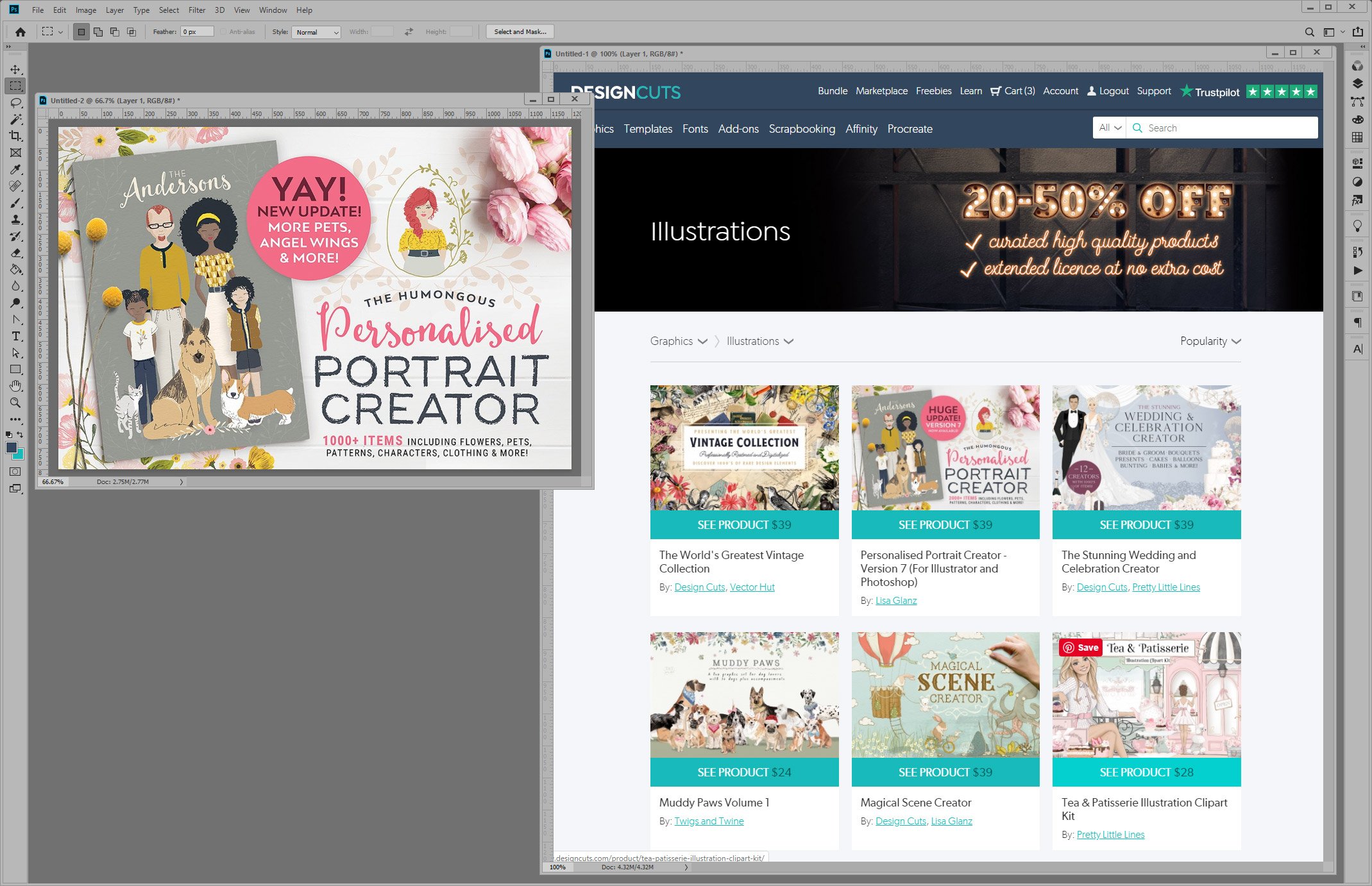
The World’s Greatest Vintage Collection
The World’s Greatest Vintage Collection by Vector Hut and Design Cuts illustrates beautifully how to connect with the potential customer through the design process and backstory. What could resonate more than seeing the designer hard at work putting the product together, combined with telling the customer how long it all took and connecting with them in terms of language (what designer doesn't understand the importance of caffeine in the design process!).

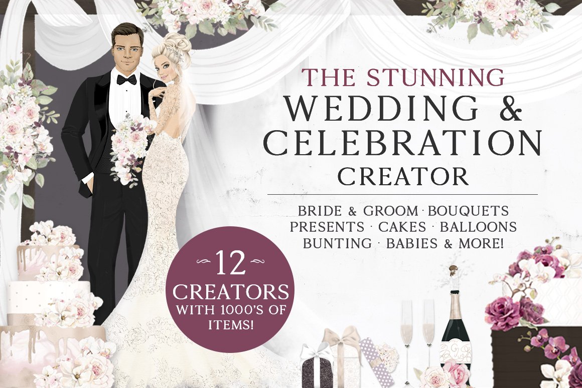
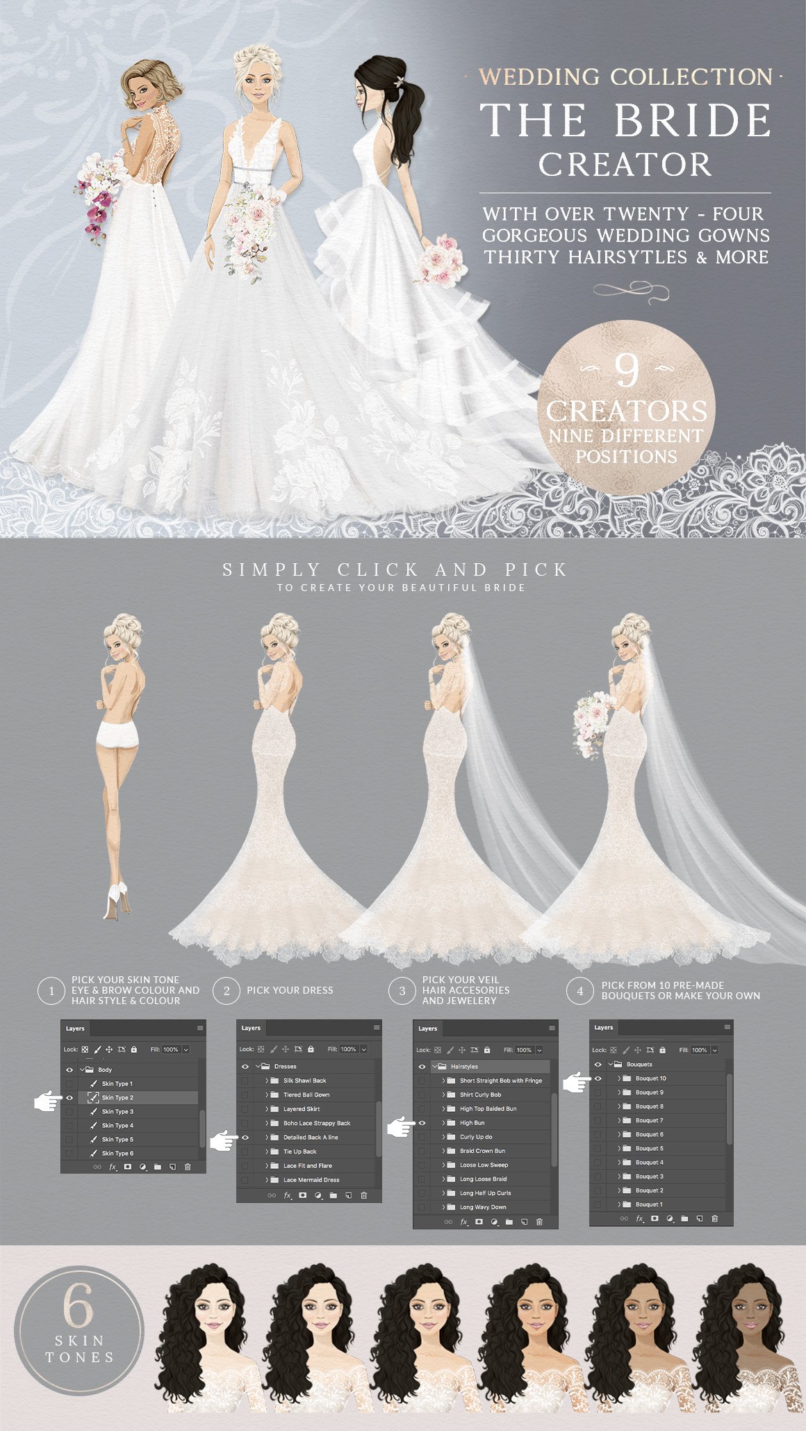
The Stunning Wedding and Celebration Creator
It doesn't get much bigger than The Stunning Wedding and Celebration Creator, a collaboration between the amazing Pretty Little Lines and Design Cuts. Kris at Pretty Little Lines leaves the potential customer in no doubt of the absolutely huge size of the product - making absolutely sure they see the amazing value it offers!
The previews beautifully and clearly display the huge amount of elements which come in the pack. So much so that Lisa Glanz commented on the product saying: 'This is stunning Kris! Can’t imagine how many hours of work this took!'. When the most renowned product illustrators leave comments like that, you can be sure you hit the spot with your presentation!
Here's just a small sample showing a tiny section of one of the creators it contains, visit the product to see more.
Kitchen Ready Mockup Creator
Back to Mockup Cloud again for this example; mockups are ideal for calling out benefits as they save so much time and money in the presentation process! Their Kitchen Ready Mockup Creator does a great job again of calling out the benefits of using their product.

Finest Vintage – Illustrator Brushes
Finest Vintage Illustrator brushes by The Artifex Forge is a great example of a product created specifically to solve customers problems. In this case, there had been requests from their audience to create vintage vector brushes for Illustrator which didn't stretch on long strokes; they created a beautifully presented pack of amazing brushes which did exactly that.


TT Hazelnuts
TypeType are a go-to when it comes to high-quality fonts; going above and beyond with features and functionality such as multilingual support and OpenType features - which lesser foundries often fall short on. Their beautiful, clean, professional previews do a great job of differentiating them from lesser competitors. See a great example here with their clean and characterful font TT Hazelnuts.

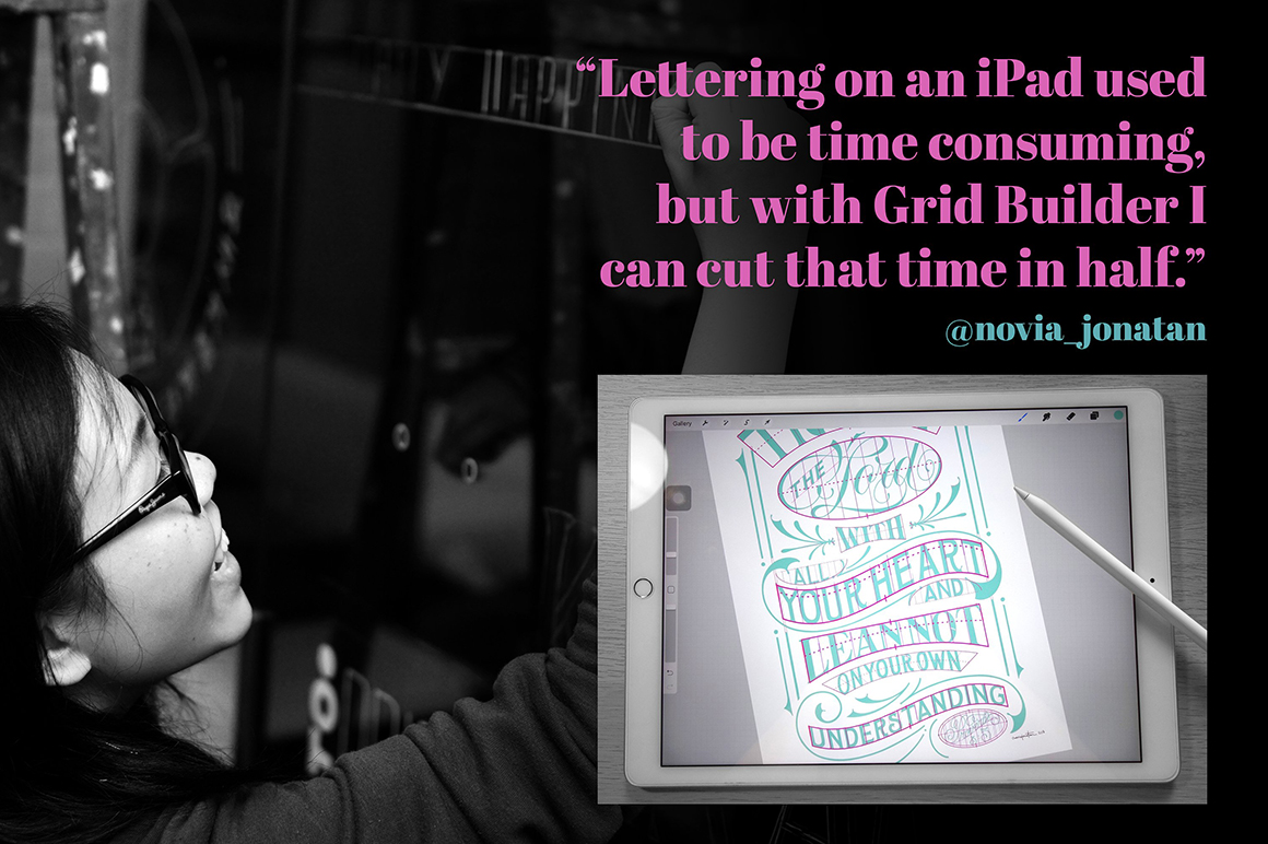
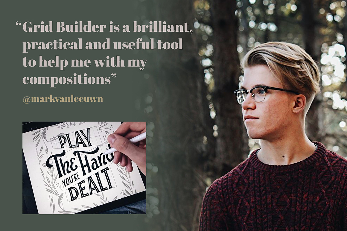
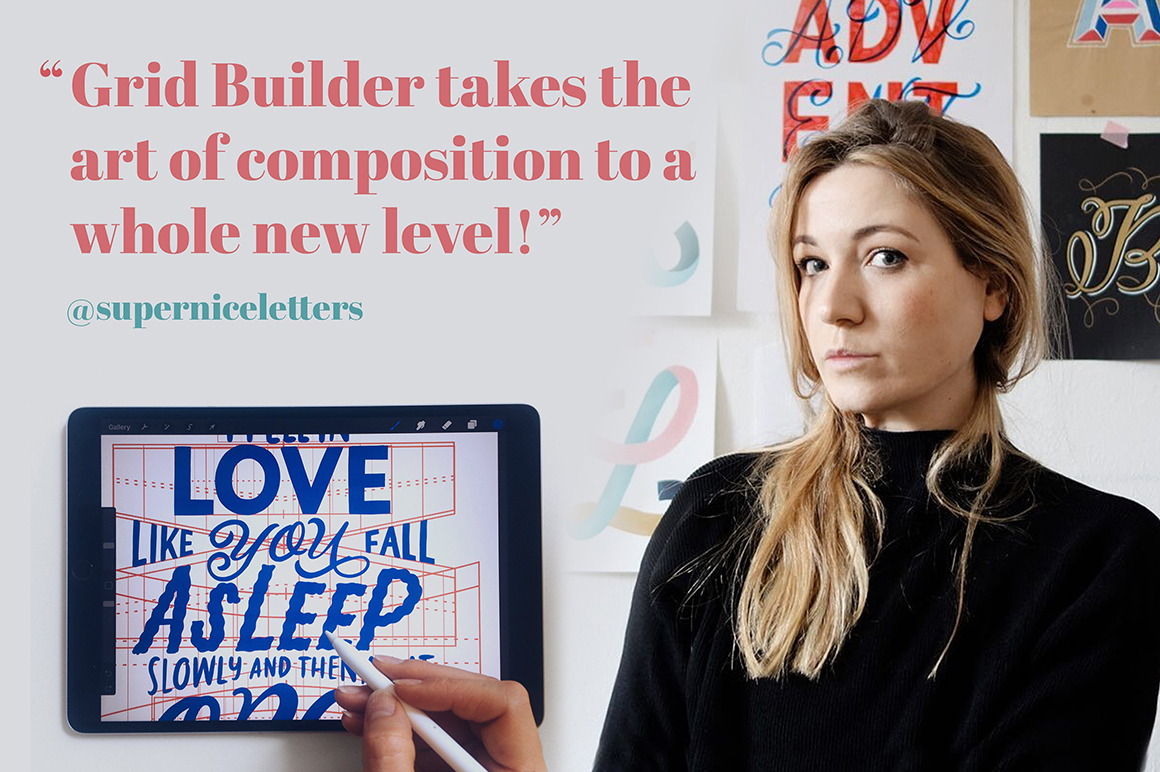
Grid Builder
Despite social proof being one of the biggest factors in increasing sales, it often surprises us how few products use it! So few, that despite us calling out Grid Builder in our previous article on how to create a digital design product, we're going to do so again - as quite simply it's such a fantastic example. The fact that so few products use it means that if you do - it puts your product at an absolutely huge advantage against the competition. It takes a bit of extra effort to gather, but if you can use it, you really should.
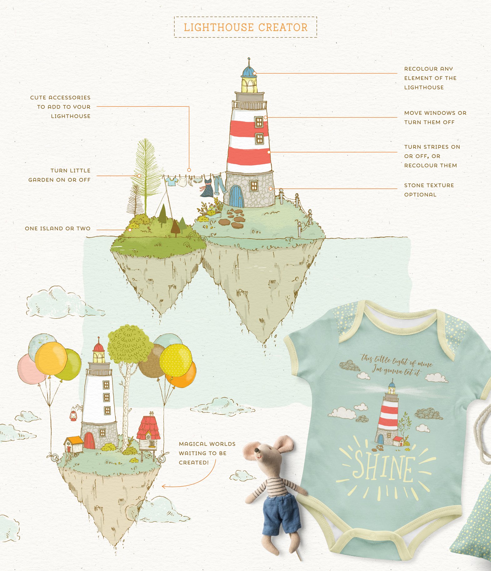
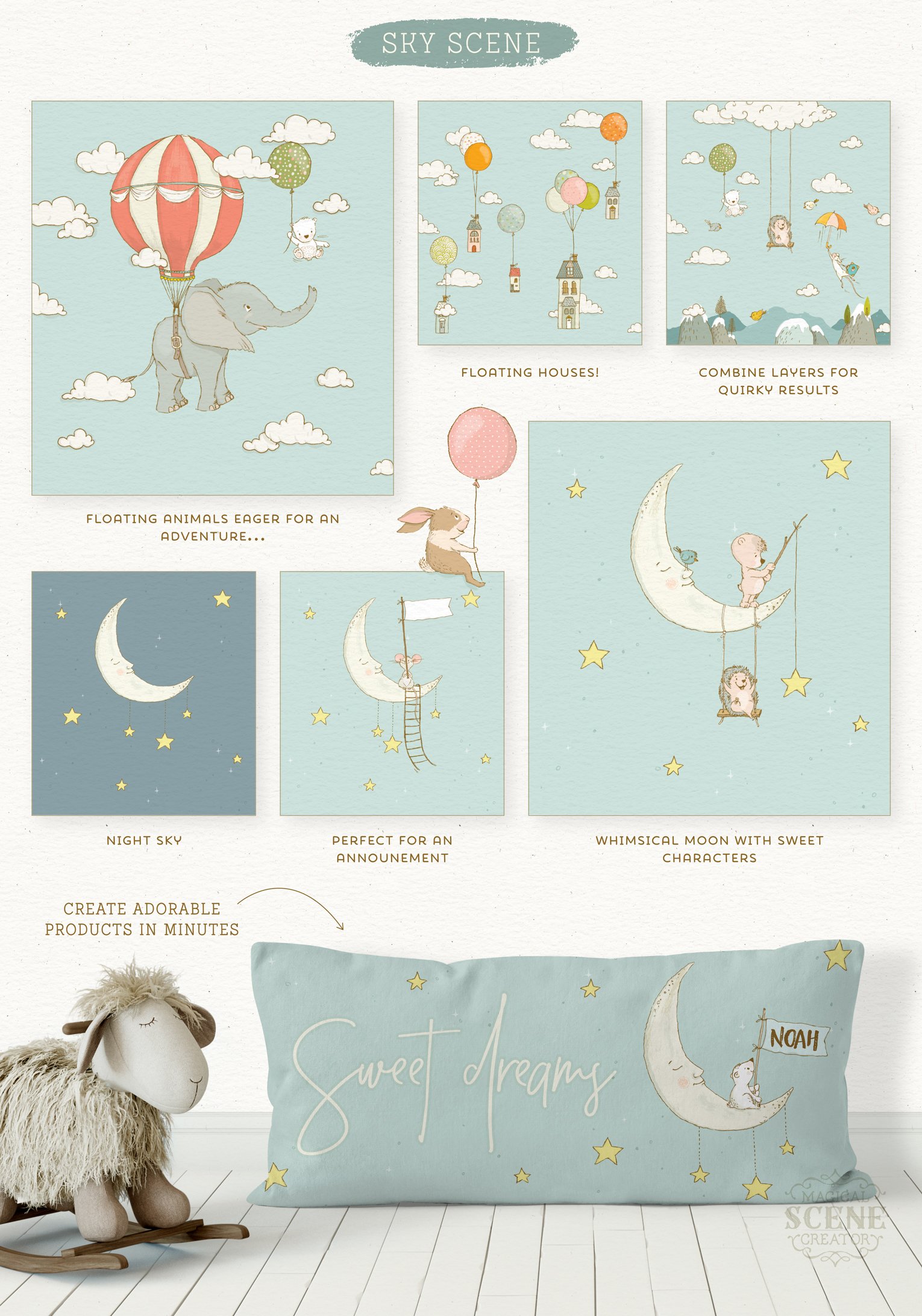
Magical Scene Creator
It's impossible to think product presentation without thinking Lisa Glanz! Lisa sets the bar not only for product design, but also product presentation. If you'd like to see how it should be done, we recommend looking at her products - she's the go-to!
The amazing Magical Scene Creator is a fantastic example - showing lots of beautiful mock-ups which bridge the imagination gap showing potential customers how the product could be used in the 'real world'.
The International Brand Collection
Also worth a special call-out is the amazing International Brand Collection by Julia Dreams. If you're looking to have as wide an appeal as possible for your product, and maximise its sales - it's important to show as many and varied real-world examples for your product as possible. The International Brand Collection does an amazing job of this.
It clearly shows that it's perfect for; branding, stationery, book design, packaging, fabrics, cosmetics, ceramics, and that it focuses on not one but eight locations for across the globe!


The Ultimate Texture and Photography Kit
Textures instantly transform photos and enhance their appearance, so they are a fantastic example of how you can showcase before and after. The hugley comprehensive The Ultimate Texture and Photography Kit by 2 Lil Owls shows this perfectly, with lots of wonderful examples to entice the prospective buyer!


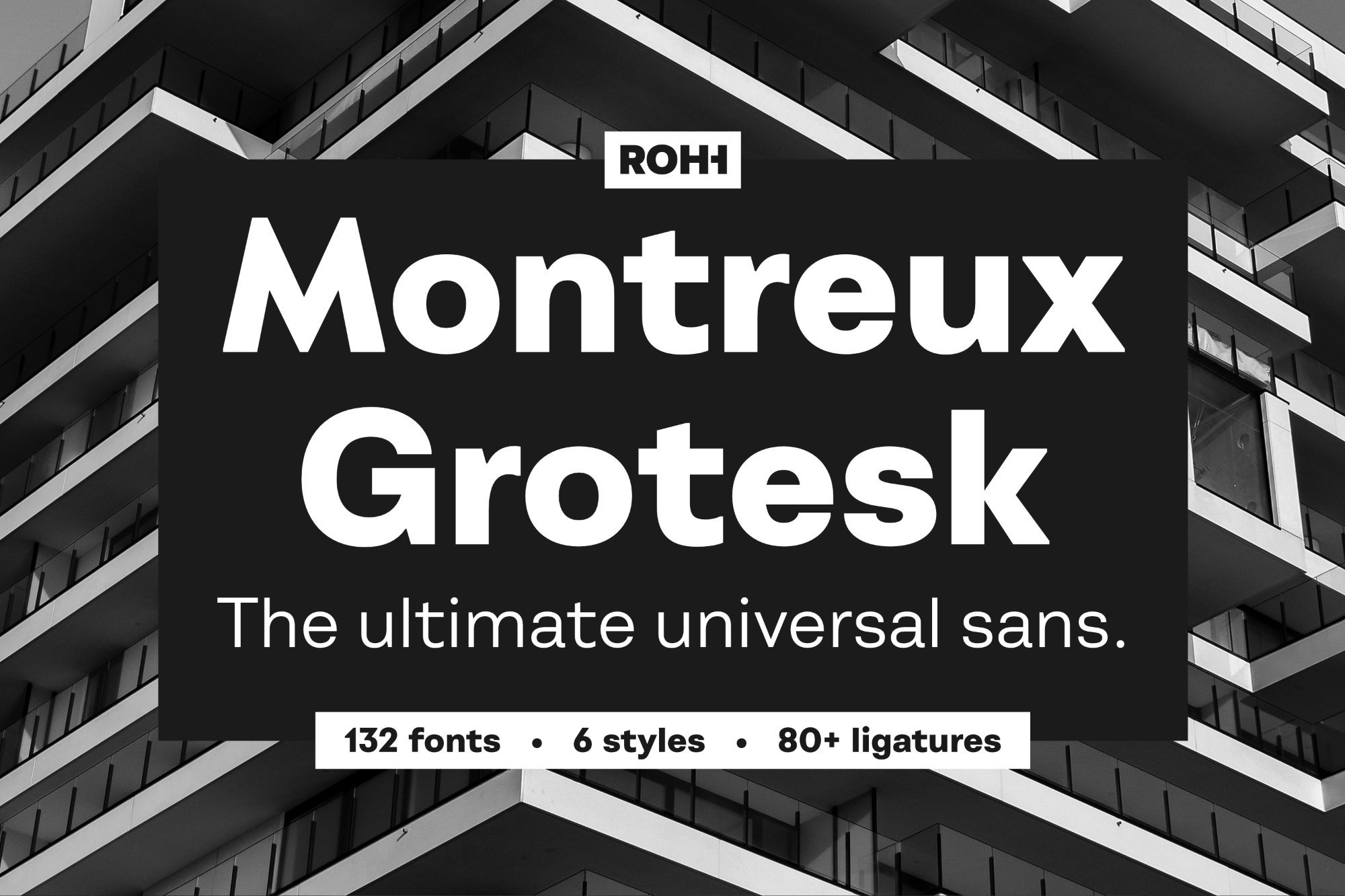
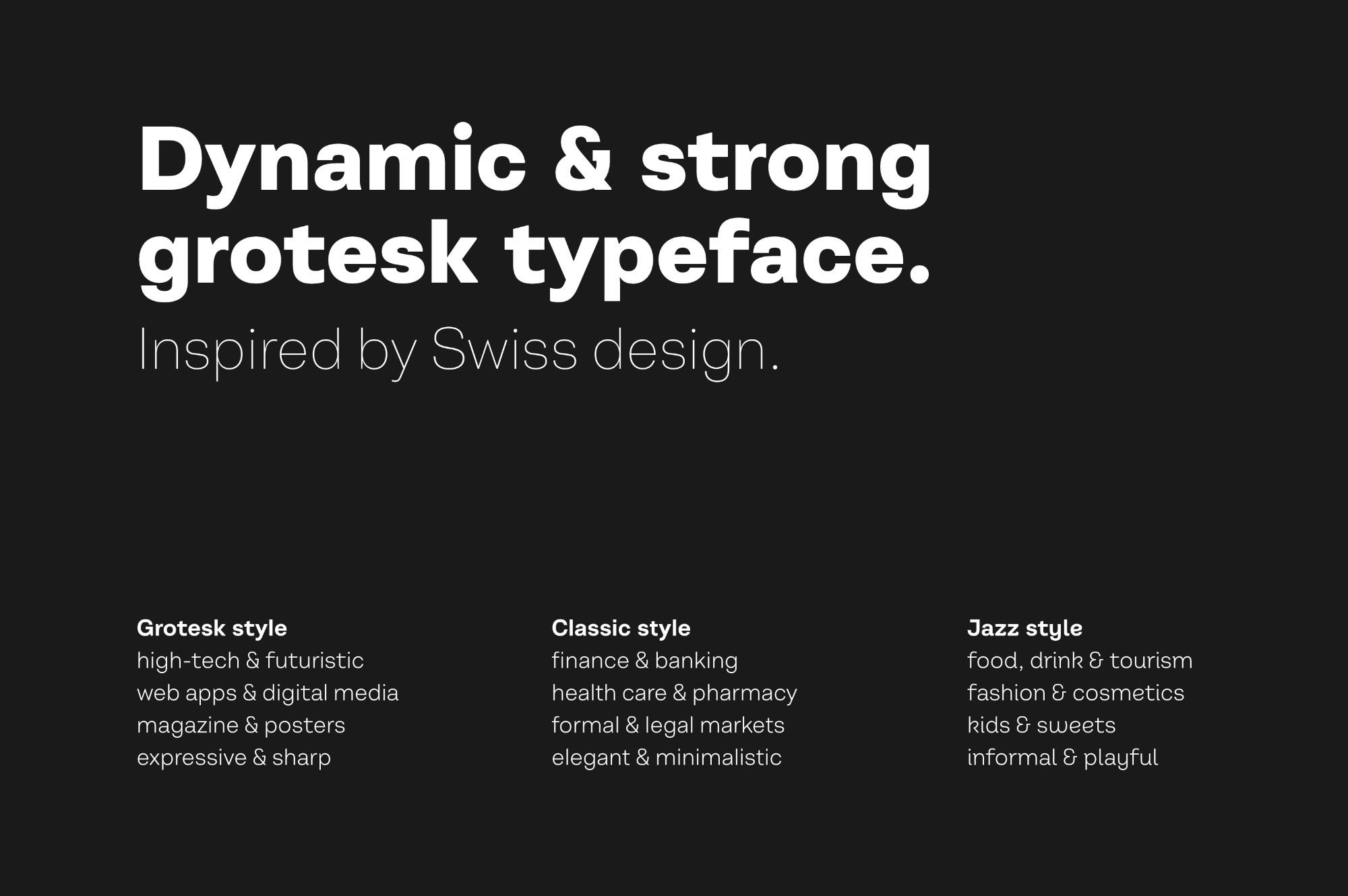
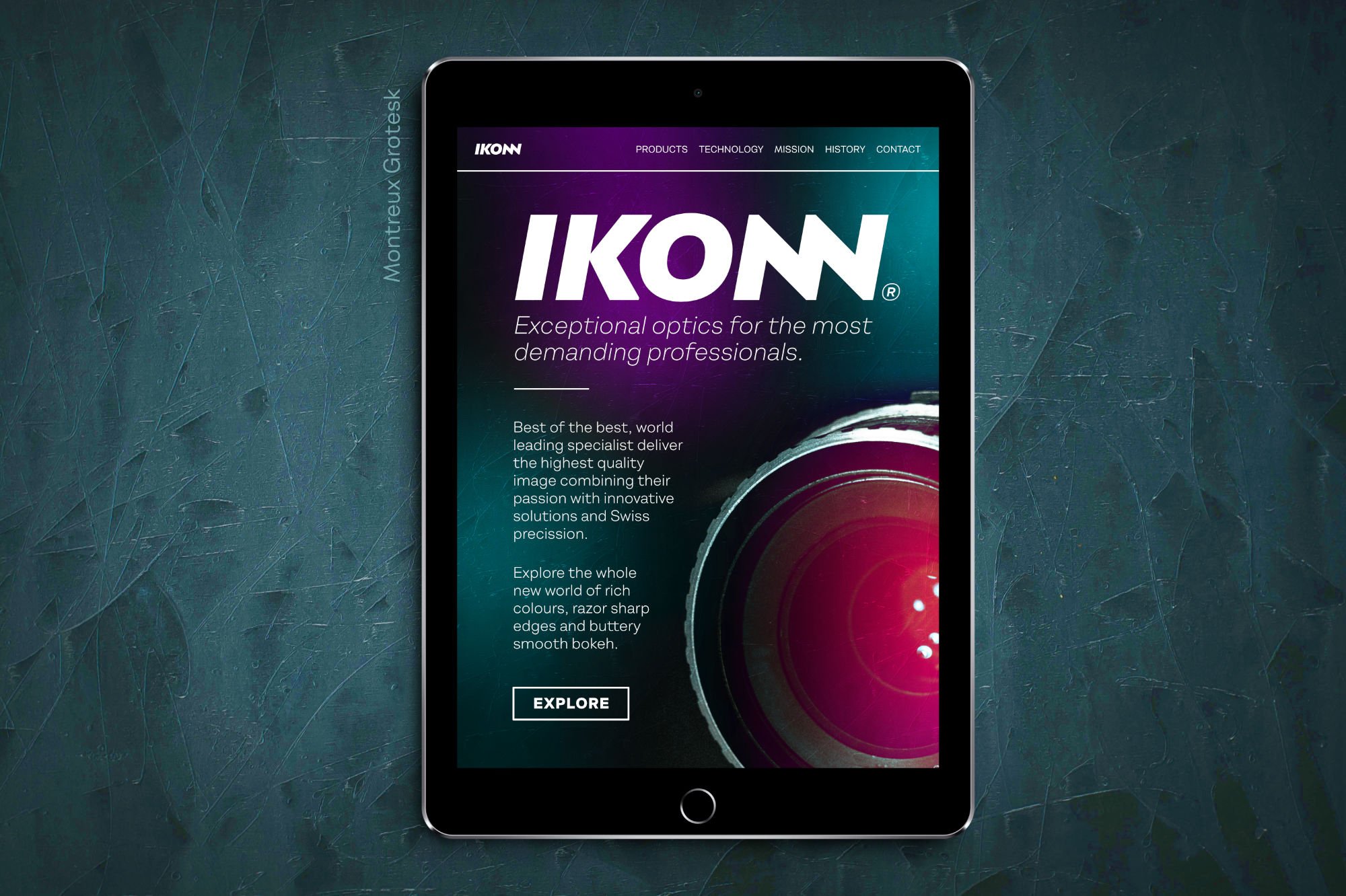
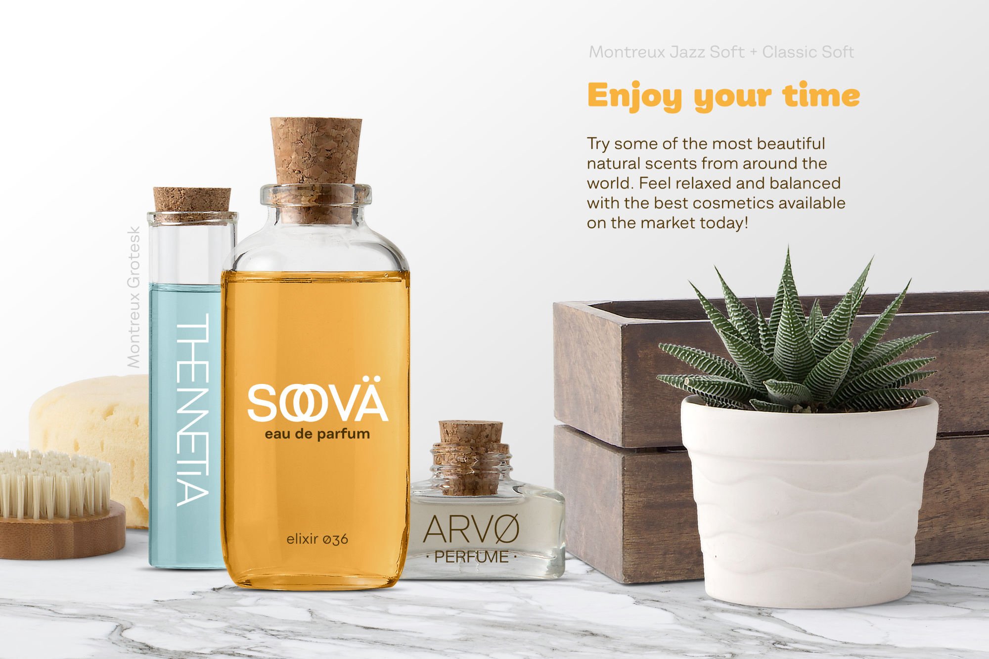
Montreux Grotesk
The amazing and hugely versatile Montreux Grotesk by ROHH foundry leads with what it's perfect for, so, within seconds of looking at the previews, you know the three variations of the font are perfect for a huge number of brand applications! Then, just in case you were in any doubt the previews go on to show the font being used in those applications!
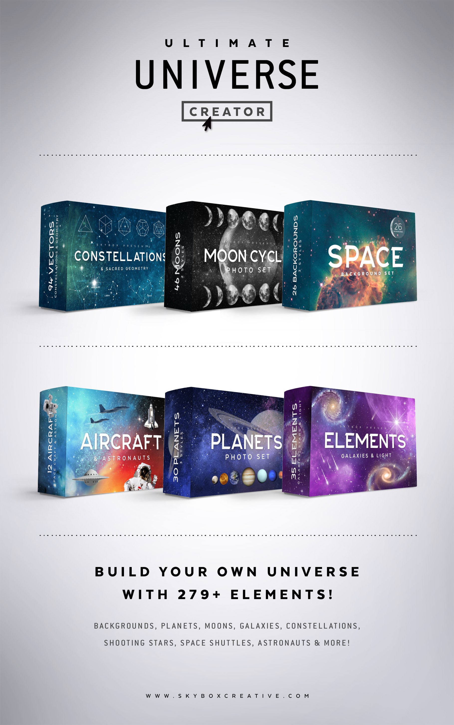
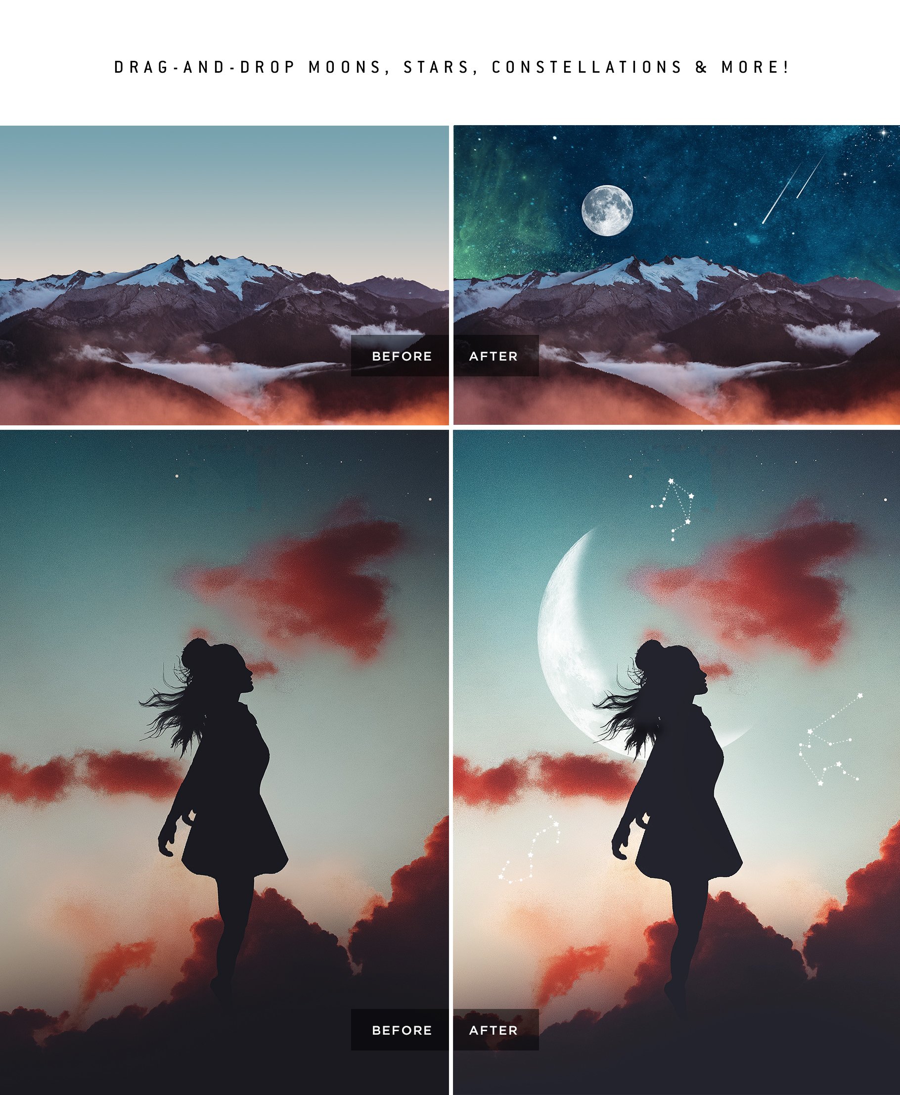
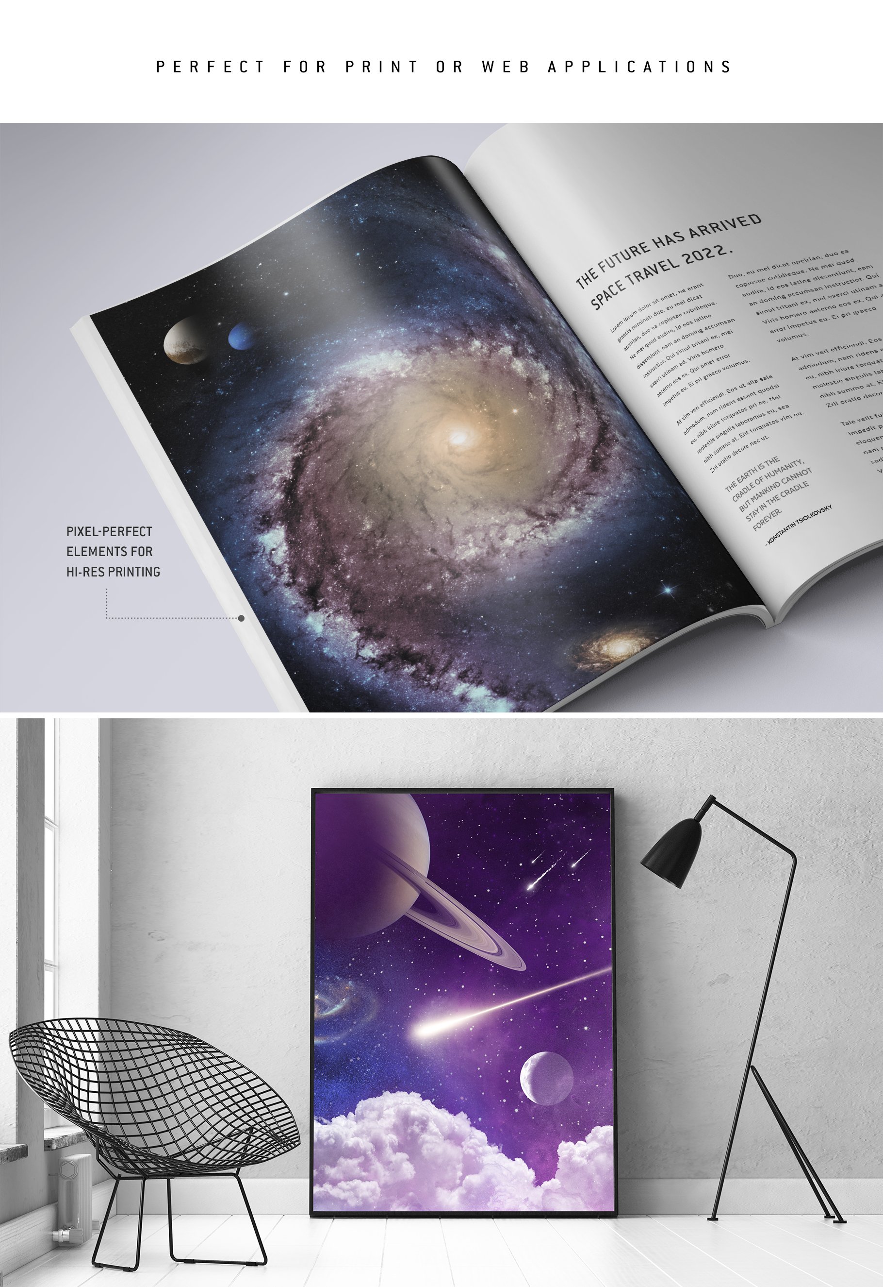
Ultimate Universe Creator
The Ultimate Universe Creator by Skybox Creative ticks all the boxes when it comes to product previews, including doing a great job of calling out the best features of the product!
Vintage Inspired Animals Portraits & Botanicals
Another fantastic example of calling out the best features can be seen in the beautiful Vintage Inspired Animals Portraits & Botanicals by Lisa Glanz, we call out Lisa's products again and again - as she really is the best of the best when it comes to product presentation!
Smitten Semi-Script
The beautifully artistic Smitten hand inked typeface by the incredibly talented Callie Hegstrom, highlights perfectly how to use bonuses to help sell your product. The font comes bundled with lots of bonuses, including 50 complementary hand drawn vector illustrations, 6 ink splatters and 4 hand painted ink textures!


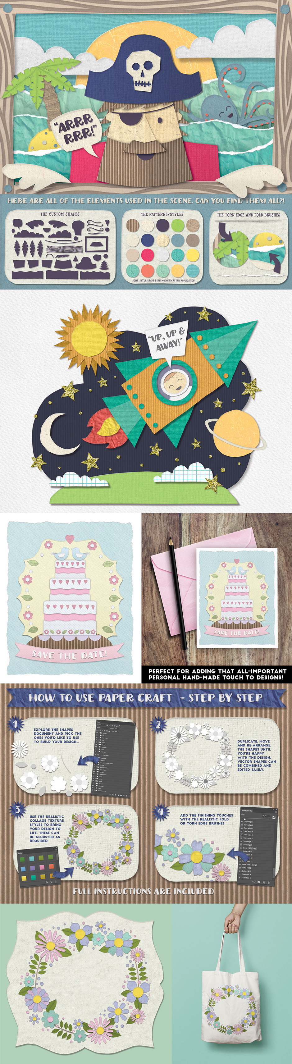
The Comprehensive Paper Craft Collection
The amazing Comprehensive Paper Craft Collection by The Artifex Forge, is a wonderful example of how to use a product to beautifully present itself.
An incredibly engaging cover is followed by lots of beautiful previews illustrating the product; including previews showing real world mock-ups of the product in action, every element of the product to show it's huge size, details of its authenticity and clear callouts to its best features! You're left in no doubt that it's an awesome, high quality product!

Getting Started - Slowly Level Up Your Videos
You don’t need to be a ‘Premier wizard’ or have a recording studio to put product videos together. They can be as simple as recording your screen whilst using the product and dropping a few well timed text callouts over the top of the content.
Start simple and build up over time, remember setting your sights too high initially in terms of complexity can run the risk of leading to stress and creative overwhelm! There is benefit to be found at all levels of video complexity.
Here are some great examples of how you can slowly level up:
Simple Product Video
At the simplest level, shown here by the fantastic Shader Invader Brushes by Pixel Buddha - you can record your screen and show the product in action! This is still a great way to bridge the imagination gap and show how well your product works!
Simple Video With Callouts
Once you’re comfortable with showing your product in action, you can think about adding some features and benefits callouts. As shown here with the wonderful Inspired Lettering Creative Builder by Nico Ng.
Simple Video With Effects
You can slowly build complexity in terms of effects both in terms of the visuals and music - but remember, don’t add them for the sake of it. Only if it will help add engagement to your content. Photo Spirit does a great job of layering them in with tempo in her Photo Time Machine – Vintage Effects & Overlays Collection
More Complex Video With Callouts & Simple Effects
You can then build it up further - graphically flagging many of the elements we recommend - as seen here in the awesome Procreate Print Works by Uproot Brushes.
More Complex Video With Voiceover
For maximum engagement, as seen here with Kris Lauren's Cute Artist Studio you can work towards appearing in your video’s - flagging all of the elements we highlighted above to convey the value of your product in as engaging a way as possible. Resulting in something hugely authentic which not only helps to sell this product - it builds on your brand too, helping to sell the rest of your product folio.
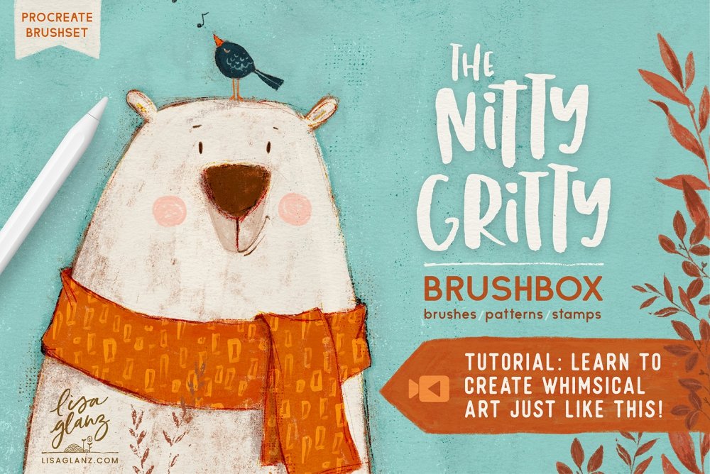
Tutorial Based Video
A really great and engaging tactic can also be to combine your product introduction video with a free tutorial! You can see that being used here by Lisa Glanz in her The Nitty Gritty Brushbox.
Here's how to do it:
- Create a tutorial on YouTube or similar, which gives free value by showing how to do something useful with your product. This can be a lead into buying your product for your audience as you can share it with them as useful content, it may also get found in YouTube searches and increase sales over time (so, it's worth keeping search in mind and finding a topic lots of people may want to learn).
- Combine that with a callout on your product cover - for instance, you could say on the cover 'learn how to create whimsical art just like this':

That then not only helps to market your product - but also adds as proof for how well the product works when you add the video to your product page, helping to increase sales of the product!


In fact, I only started using technology in general 7 years ago – Generation X ,not that that’s any excuse. Complete Luddite and resistant to change. Thankfully I’ve gotten over that hurdle :D !
Hey Madeleine,
To be designing on digital software like Adobe and Affinity in such a short time after starting to use technology is a steep learning curve and it seems like you are smashing it :). Well done on all of your successes so far and happy designing!
That’s great news!
I’m not on Instagram yet, I will be soon because I want to download your Digital Design Product Cover Templates. My art/paintings for the past decade are available to see on Flickr, Behance and Pinterest but not the stuff that I’ve been working on for the past 2 years because I don’t want to give away too many ideas before I start selling, but it would be fine art textures, PS stamp brushes and work that is similar to your artists in the “Scrapbooking” section like Leslie Nicole, Anna Aspnes, Julie Mead. I am an for artist the past 25 years with a great knowledge of paint and paint-effects, everything I have ever done has been hand painted or printmaking, I only started using design software like Photoshop and Illustrator in the past 5 years and they have really broadened my horizons in the terms of what I can do with my art, I was getting a bit “stuck” and limited with painting. Thank you for replying and I’ll follow you on Instagram when I set it up.
Hey Madeleine,
Thanks for getting back to us and it so wonderful to hear a little more about your design journey. We enjoy hearing from our community about how they started creating and what prompted them to start digital designing and it is amazing to hear about your previous experience in the design world and how you can bring that experience into the new medium.
We can’t wait to check out your work. :)
Thanks Zack, it was a steep learning curve for me indeed! I look forward to sharing my work soon in the new year, meanwhile keep up the good work at Design Cuts, you’re all doing great!
Best design site ever for digital resources, tutorials, advice and freebies :)
Hey Madeleine,
Thanks for getting back to me and we look forward to seeing your work in the new year :)
Hi Matt, thank you for sharing your design insights and invaluable information with us in the Product Academy. I am a regular purchaser on Design Cuts but intend to submit some of my products to Design Cuts early next year. They are fine-art/painterly based and I’m currently working on my preview pics, presentation cover and writing content and following all advice here before I submit anything. I also watch the Live Sessions when I can or the replays if I can’t make the live shows. I was watching the replay of the “Digital Design Cover Design” webinar (19th Nov), and although the Product Academy is promoted on it, it’s difficult to find on the main Design Cuts site. I typed it into the search bar on the main site to no avail, then I went into the Learning Hub and still couldn’t find it. Luckily I had bookmarked the page from a previous live session and was able to find it, but it’s not easy to find.
Thanks again for sharing your knowledge of the industry.
Thank you so much Madeleine – it’s really kind of you to say so, and I’m so glad you’re enjoying the Product Academy! We’re due for a refresh of the front end of our learning section, where the Product Academy will be promoted lots more! :) We’ll also be launching the section officially which will be great – as, it is a little hidden away currently!!
I can’t wait to see your products on Design Cuts – and please do reach out and say hello via Instagram too @mattslightam :D