For this bundle, we have teamed up with the most influential names in the font world, bringing you an expertly made and premium collection of font families. This bundle is brimming with class and professionalism. We have hand selected a collection of well-balanced and timeless fonts – from URW’s Bodoni, a typographical classic, to Latinotype’s Isidora Sans for a modern and fresh look. Quality is assured with every typeface which will help elevate your projects to the next level.
This bundle includes:
World class font families, with a huge 99% off
We have teamed up with the world’s industry-leading typographers, such as TypeMates, Cultivated Mind, Debi Sementelli and countless others, to offer a diverse and superb quality font bundle. Create beautiful work across a range of design styles, with these show-stopping fonts
Full extended license
Use these resources in commercial work available for sale (full license here).
Unlimited free support
If you need any help working with your new resources, our team are here to help.
URW++
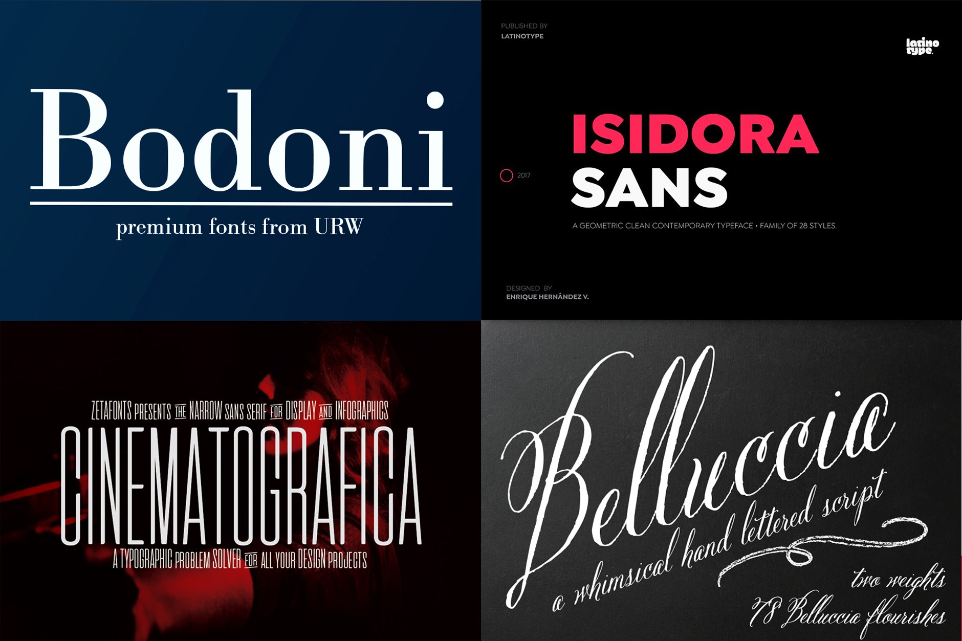
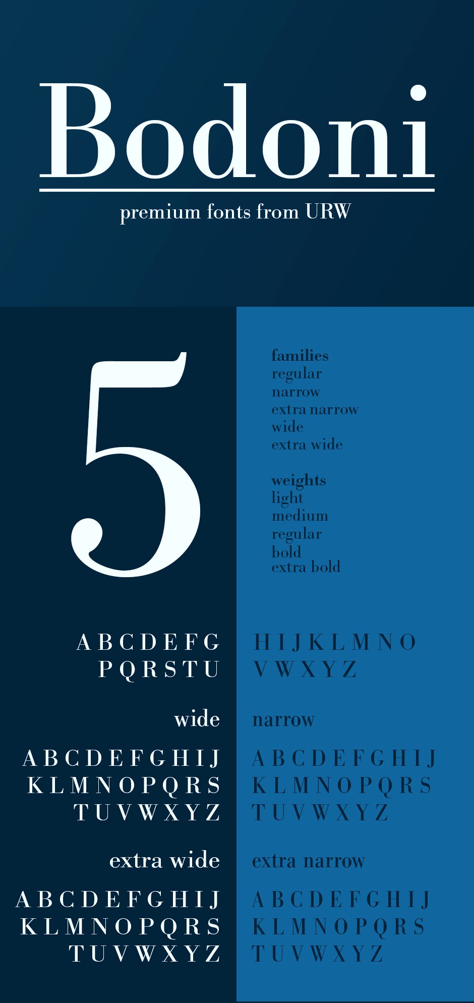
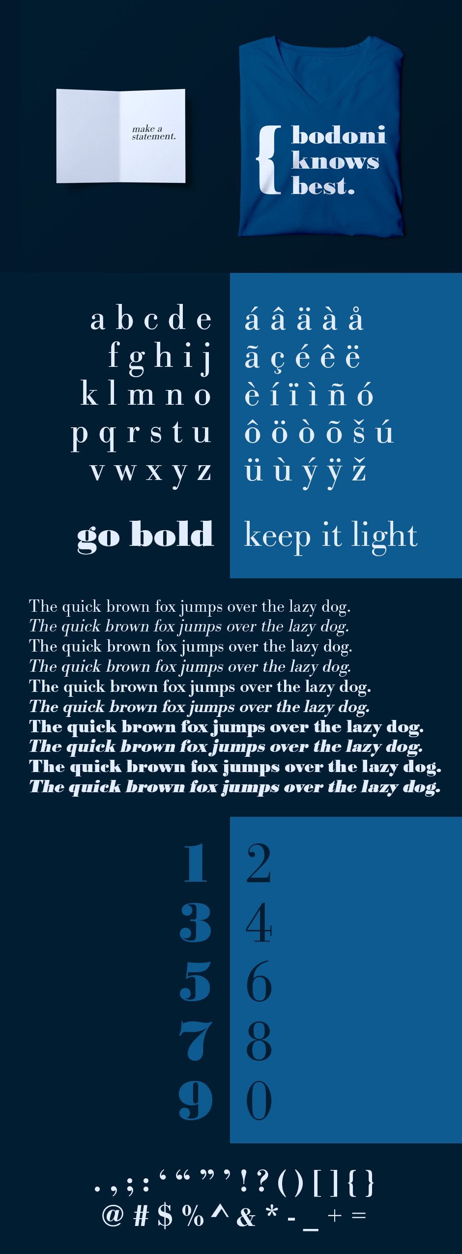
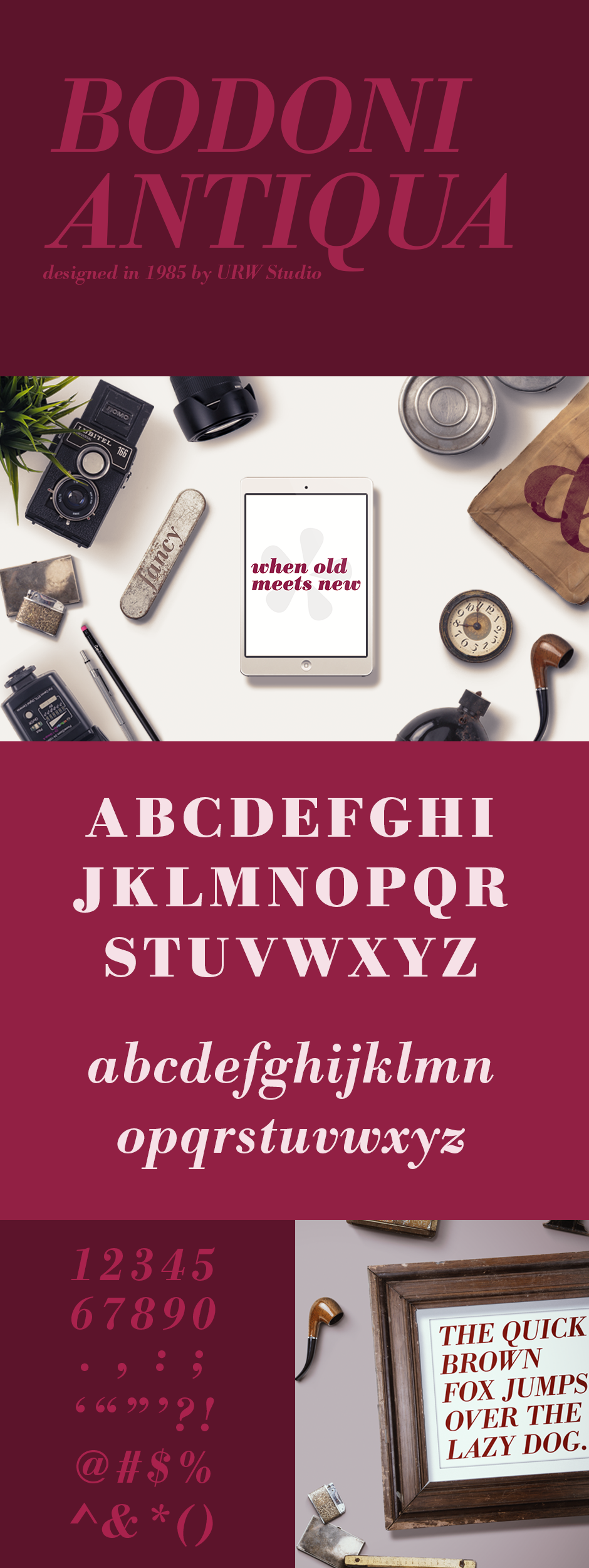
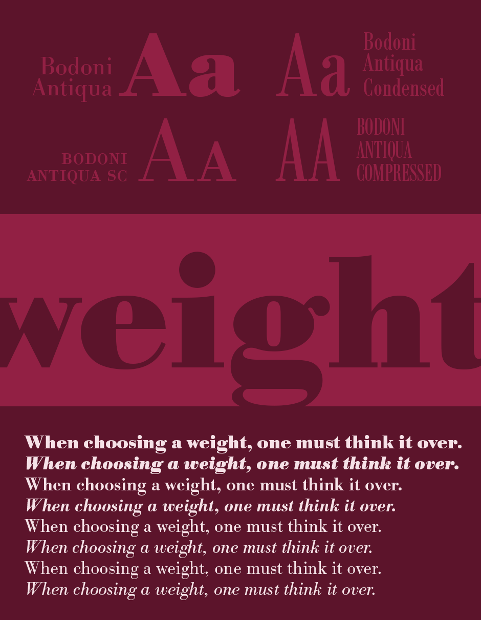
URW Bodoni
URW Bodoni is a family of 50 serif typefaces first designed by Giambattista Bodoni in 1798. The typeface is classified as didone modern. Bodoni followed the ideas of John Baskerville, as found in the printing type Baskerville, that of increased stroke contrast and a more vertical, slightly condensed, upper case, but taking them to a more extreme conclusion. Bodoni had a long career and his designs evolved and differed, ending with a typeface of narrower underlying structure with flat, unbracketed serifs, extreme contrast between thick and thin strokes, and an overall geometric construction. Though these later designs are rightfully called “modern”, the earlier designs are “transitional”.
Bodoni admired the work of John Baskerville and studied in detail the designs of French type founders Pierre Simon Fournier and Firmin Didot. Although he drew inspiration from the work of these designers, above all from Didot, no doubt Bodoni found his own style for his typefaces, which deservedly gained worldwide acceptance among printers.
These preview graphics have been provided by the designer for presentational use only.
Latinotype
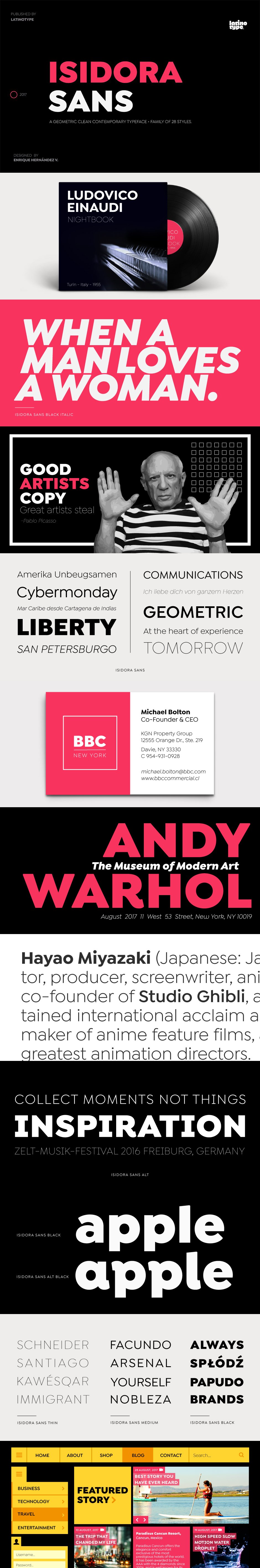
Isidora Sans
Isidora Sans is a new version of the bestselling font Isidora (released a year ago). The absence of terminals gives this new typeface a cleaner and more geometric look, keeping the essence and structure of the classic sans fonts of the early 20th Century yet with a fresh, clean and contemporary appearance.
Isidora Sans consists of two subfamilies of 7 weights, ranging from Thin to Black, with matching italics, giving a total of 28 fonts.
Isidora Sans is the perfect font for publishing, titles, books, magazines and corporate design. Its Alt version is ideal for logotypes, branding, packaging, and use on Web and TV. The family contains a set of 416 characters supporting 207 different languages.
These preview graphics have been provided by the designer for presentational use only.
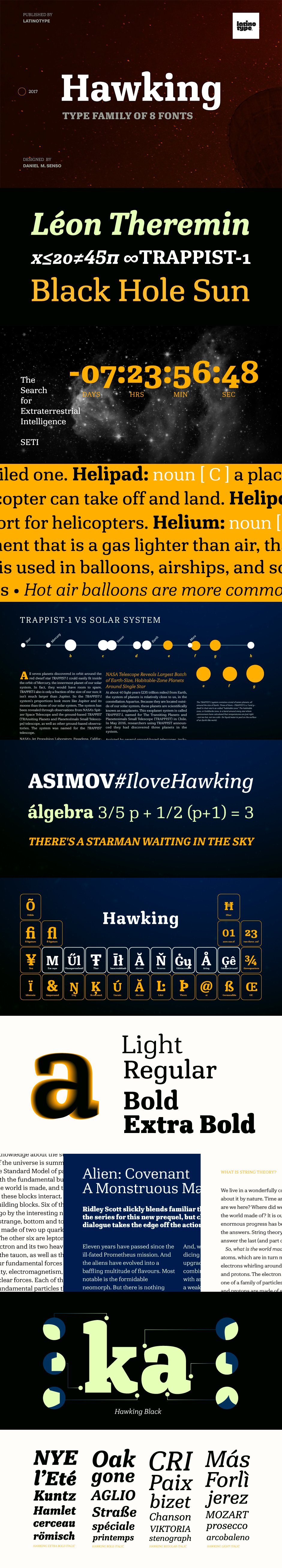
Hawking
Hawking is a slab typeface with slightly squarish shapes and a rational, modern look. The font has a minimal modulation, generous counter forms and relatively large x-height with lowercase ascenders extending above the cap-height for more legibility. Serifs are composed of curved and straight lines, which give the font a robust appearance and strong personality.
Hawking was specially designed for use in scientific publications (hence its name), but it can also be used with other type of continuous text, such as journalistic, technical or literary texts. Its heavier weights make it also well-suited for any display use (e.g. headlines)
Hawking comes in 8 styles: 4 weights plus matching true italics. The font also includes ligatures, proportional oldstyle figures, and tabular and lining figures. The family comes with the Latinotype’s standard character set that supports 213 different languages.
These preview graphics have been provided by the designer for presentational use only.
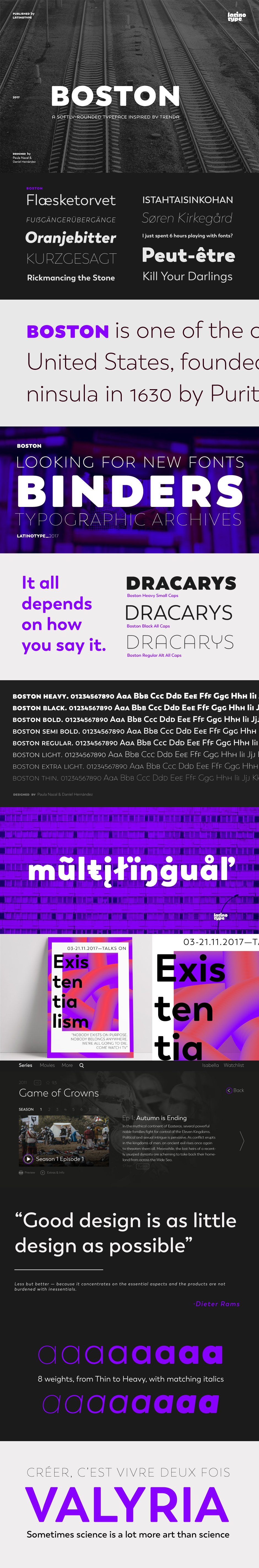
Boston
Designed by Daniel Hernández and Paula Nazal. Digital editing by Elizabeth Hernández. Corrections and review by Alfonso García and Rodrigo Fuenzalida.
Boston is a slightly rounded-edged typeface, which is inspired by ‘Trenda’—a geometric sans serif based on the uppercase of ’Trend’ (a Latinotype font, released in 2013, that was very well received). This new typeface comes with a wider character set that offers a complete family of uppercase and lowercase in different weights.
Boston is a versatile easy-to-use functional display font with a strong personality, especially its uppercase, which makes the designer’s work easier.
Boston’s lightest and heaviest variants are ideal for display use while its middle weights work well with short and mid-length texts. This typeface has been designed especially for corporate projects, logotypes and publishing.
Boston comes in 8 weights, ranging from Thin to Heavy, and includes matching italics as well as small caps and alternates. The family contains a 634-character set that supports 206 different languages.
These preview graphics have been provided by the designer for presentational use only.
Cultivated Mind
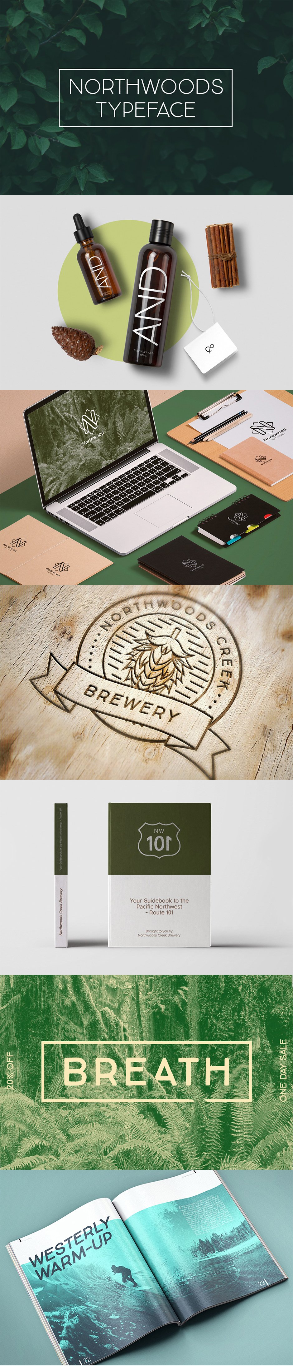
Northwoods Typeface
Introducing the Northwoods Typeface Duo! A handwritten sans serif font duo that is very useable and simplistic.
Northwoods Typeface Duo Includes:
• Northwoods Regular (includes .TTF & .OTF fonts)
• Northwoods Thin (includes .TTF & .OTF fonts)
• Latin Pro Languages
Northwoods is great for packaging, magazines, layouts, web design, corporate identity and marketing. Language Support: Afrikaans, Basque, Breton, Catalan, Danish, Dutch, English, Finnish, French, Gaelic (Irish, Scots), German, Icelandic, Indonesian, Irish, Italian, Norwegian, Polish, Portuguese, Saami (Southern), Spanish, Swahili, Swedish.
This font includes web versions
These preview graphics have been provided by the designer for presentational use only.
Typemates
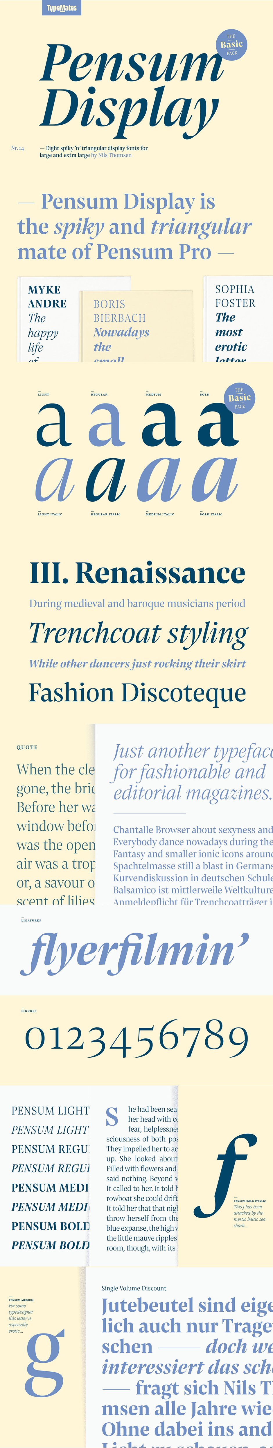
Pensum Display Basic
Pensum Display Basic is the triangular and spiky packmate of text monster Pensum Pro. Designed to be used for anything big and for nothing that isn’t big, Pensum Display is a sharp, high contrast design ready to take on display and headline uses. Distilled from the text-focussed Pensum Pro, Pensum Display embraces extremes. Triangular serifs, spikier detailing, and tighter spacing, Pensum Display brings dynamism to short text in posters, headers, titles, or anywhere where its deep ink traps and high contrast can work their magic.
From the extremely light styles, stylish and fashionable, to the strong bold with its striking tension between thick and thin, Pensum Display Basic’s four weights offer a broad spectrum of expression. When you need emphasis, the matching italics, curvy and deeply ink-trapped, can set heads spinning.
These preview graphics have been provided by the designer for presentational use only.
Jason Vandenberg
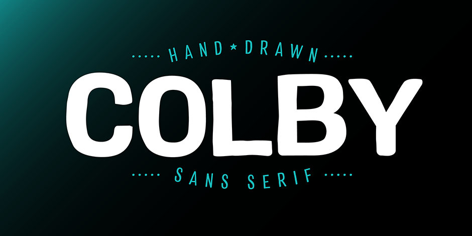
Colby Standard and Condensed
Colby balances the quirkiness of hand-drawn letters with the legibility of a clean sans serif. This combination provides authentic warmth with functional benefits. The fonts feature plenty of alternates, icons and arrows to add character and customization. Colby is perfect for packaging, restaurant menus, children’s books, digital applications, but will be comfortable in any situation.
Please note, included are the Standard and Condensed sets of the Colby Workhorse typefamily.
These preview graphics have been provided by the designer for presentational use only.
Set Sail Studios
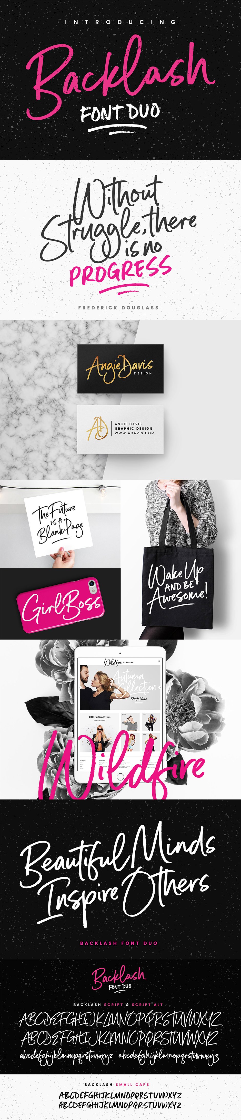
Backlash Font Duo
Introducing Backlash Font Duo! With a fancy script and a small-caps companion, this passionate pair of hand-drawn marker fonts is ideal for designing handwritten quotes, branding & logo projects, merchandise, social media posts and product packaging.
Included in this set:
Backlash Script
A hand-drawn script font containing upper & lowercase characters, numerals and a large range of punctuation.
Backlash Script Alt
This is a second version of Backlash Script, with a completely new set of upper & lowercase characters. If you wanted to avoid letters looking the same each time to recreate a custom-made style, or try a different word shape, simply switch to this font for an additional layout option.
Backlash Small Caps
A hand-drawn sans font containing 2 sets of uppercase only characters, numerals and a large range of punctuation. Designed to be used as a supporting font to Backlash Script. You can switch between the 2 character sets simply by turning the caps-lock on & off.
Ligatures & Swashes; Backlash Script ligatures (double-letters) are also available for ll, tt & ee. These are only accessible via software with opentype capability or a glyphs panel. Four swashes are also available which can be accessed simply by typing any of the these characters in the Backlash Small Caps font; [ ] { }
No special software is required to use Backlash Font Duo.
These preview graphics have been provided by the designer for presentational use only.
My Creative Land
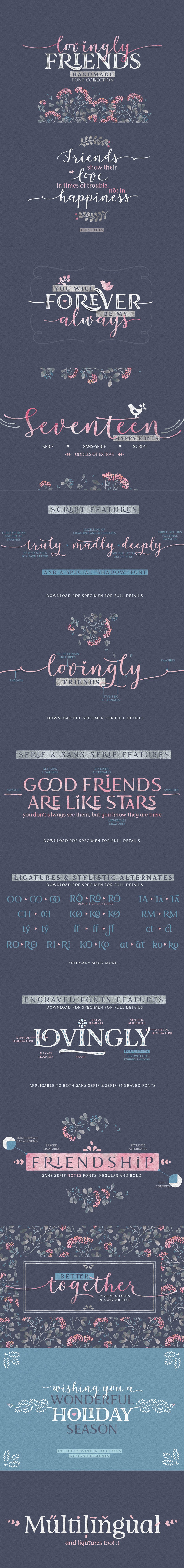
Lovingly Friends
Introducing “Lovingly Friends” – a community of fonts that get along together as good as best friends do. All of the fonts – Sans, Serif, Notes, Script and Extras are packed with stylistic alternates and ligatures, you can combine them the way you like – they will look balanced together as well as individually. Script and Engraved fonts also have a Shadow style – to add more personality to your designs.
Since Christmas is not that far away (time flies!), the Extras font has a set of Winter Holidays elements – so you could create and send your best wishes to your friends in no time.
While all the fonts are fully unicode mapped so you can use them in any application, they are still best used in an OpenType aware application. If the application you are using doesn’t support OpenType features, you can use Character Map (Windows) or Font Book (Mac) to select the glyphs you need.
Please note: The flowers used in the preview images are from Lisa Glanz’s 4 in 1 Elegant Watercolor Collection.
These preview graphics have been provided by the designer for presentational use only.
Debi Sementelli
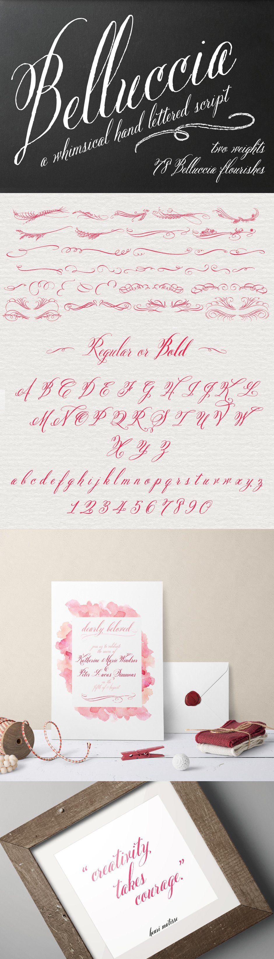
Belluccia
What’s unique about the Belluccia font family (now in both Regular & Bold weights) is the ability to turn on various features (Ligatures, Stylistic Alternates, Contextual Alternates, Swashes, Old Style Figures) to auto-magically swap out letter sets with alternate versions, allowing you to easily type your messages, while creating the visual diversity that gives you the unique look of custom lettering.
Belluccia is dedicated to Debi’s mother, aunt, and uncle…all talented creative people who inspired her to become an artist.
Included in this set:
• Belluccia Standard
• Belluccia Bold Standard
• Belluccia Flourishes Standard
These preview graphics have been provided by the designer for presentational use only.
Zetafonts
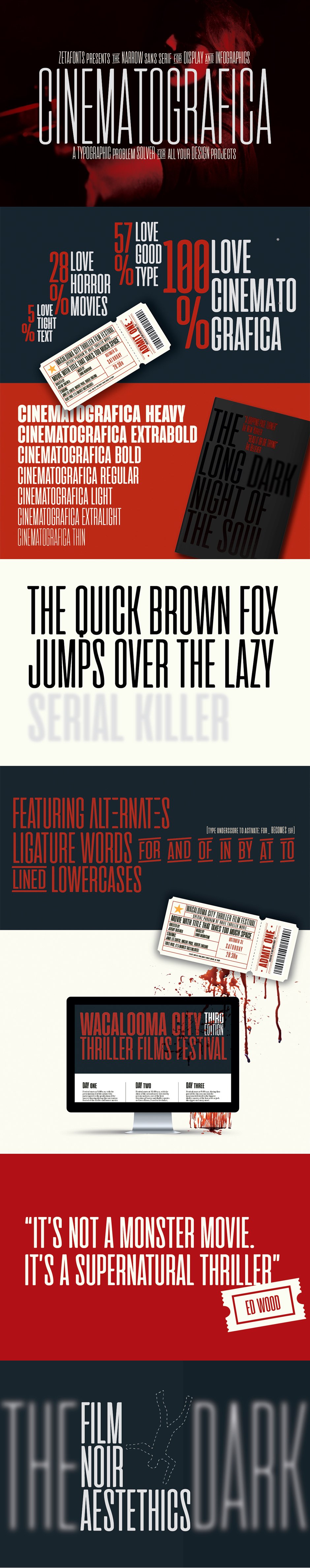
Cinematografica
Cinematografica is an Ultra Condensed Small Caps typeface created by Francesco Canovaro, which has been used in the advertising campaign for Lucca Comics 2017 Festival.
The family features seven weights from thin to heavy with OpenType alternate glyphs and some full-word ligatures (accessible by typing an underscore after words like “and”, “or”, “the”).
Cinematografica’s extra narrow width allows for extreme space-saving situations like movie posters and screen infographics.
These preview graphics have been provided by the designer for presentational use only.
Studio Buchanan
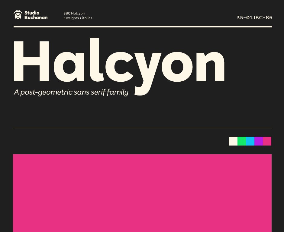
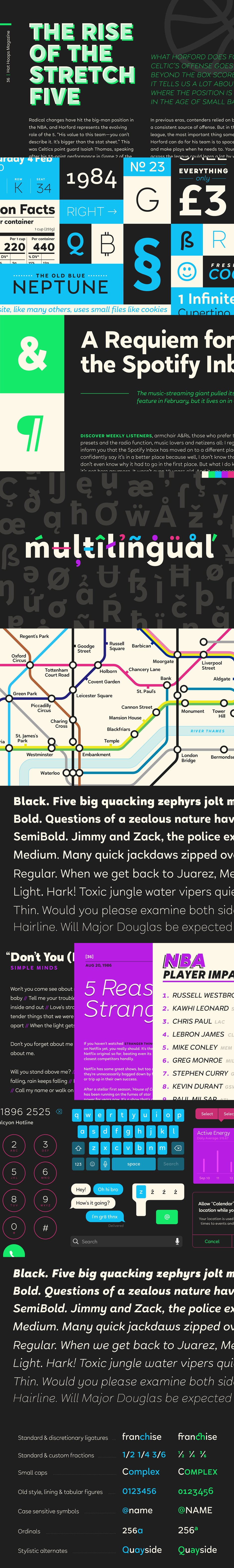
Halcyon
Halcyon is a post-geometric typeface made up of 16 fonts across 8 weights. Each weight contains an upright with a corresponding true italic.
Halcyon’s design builds on the foundations of classic typefaces such as Futura, Gill Sans and ITC Avant Garde, by mixing their geometric structure with more modern humanist qualities and attributes. The result is a friendly and approachable personality with a sophisticated and serious edge. Halcyon feels familiar, but unique, playful but not asinine. The versatility of its character makes Halcyon a reliable choice for any design decision.
With a large variety of weights, and a whole host of Opentype features, Halcyon can adapt to fit the tone of your communications. The lighter weights present a more refined and formal voice, while the heavier, oversized weights grow more exuberant. It’s large x-height and open apertures increase it’s legibility, making it perfect for setting large display headlines or small sized, long form text.
Halcyon is a multilingual family with hundreds of accented characters, and allows for customisable characters through diacritic combinations. All European languages are already covered, alongside many more within the Latin alphabet.
These preview graphics have been provided by the designer for presentational use only.
Artegra
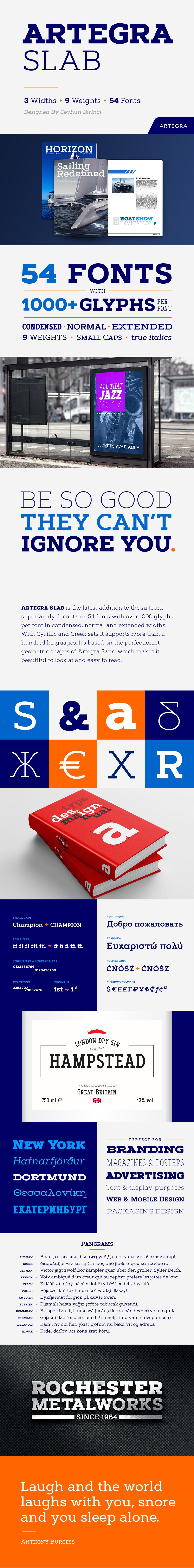
Artegra Slab
Artegra Slab is the latest addition to the Artegra superfamily. It contains 54 fonts with over 1000 glyphs per font in condensed, normal and extended widths. With Cyrillic and Greek sets it supports more than a hundred languages. It’s based on the perfectionist geometric shapes of Artegra Sans, which makes it beautiful to look at and easy to read.
Opentype features: Small Caps, Ligatures, Unlimited Fractions, Ordinals, Superscripts & Subscripts, Language Localizations for Turkish, Dutch, Polish, Romanian, Moldovan and so on.
")
")
")