In this design tutorial I will be showing you how to use some of the fun and playful elements from the latest bundle to design a book cover for a children’s book with Photoshop. We will be incorporating some floral elements, patterns, and textures, along with an adorable fox character complete with illustrated elements and beautiful title treatment. Let’s jump right into it!
HAVE YOU SEEN OUR YOUTUBE CHANNEL?
Watch the video tutorial below and subscribe to our YouTube channel for regular updates direct to your inbox.
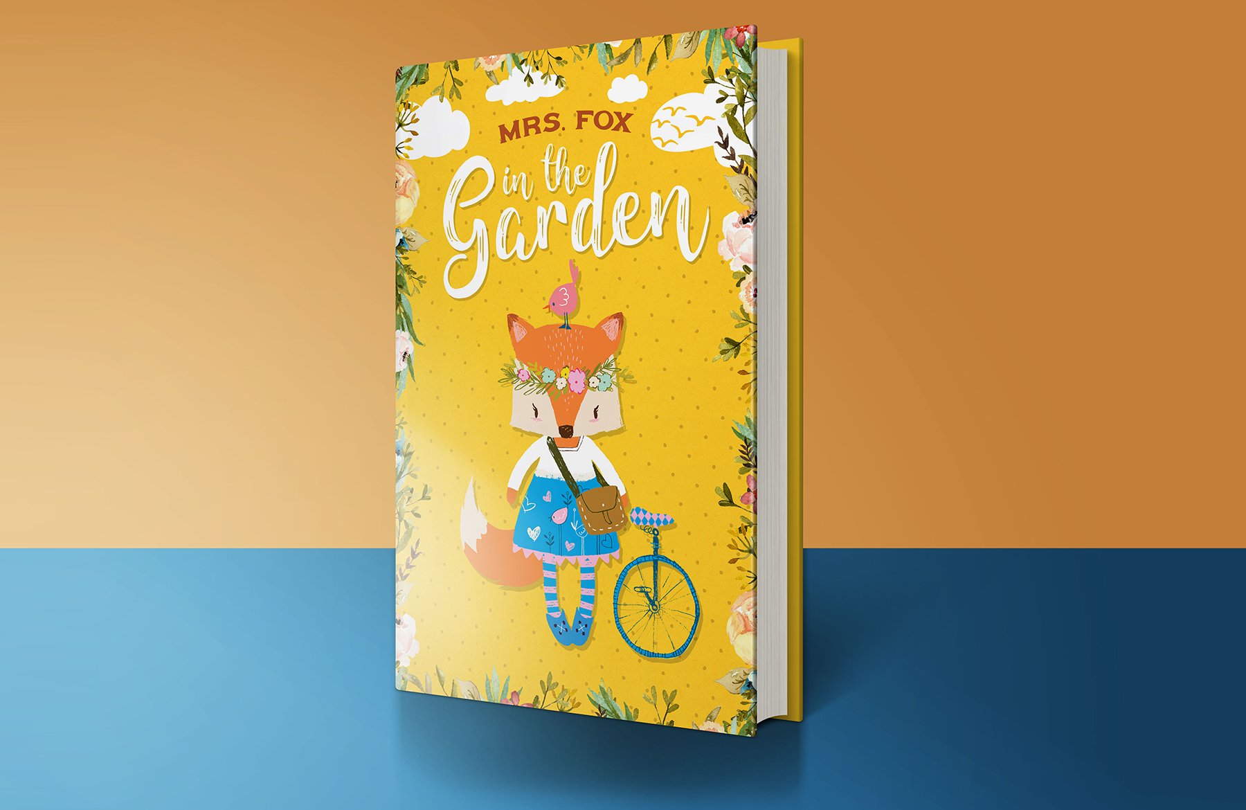
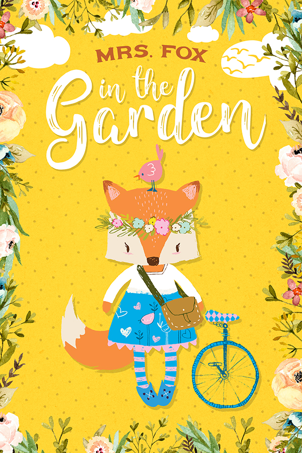
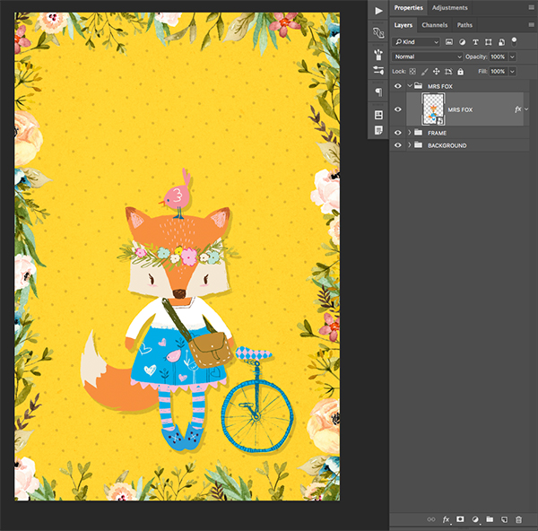
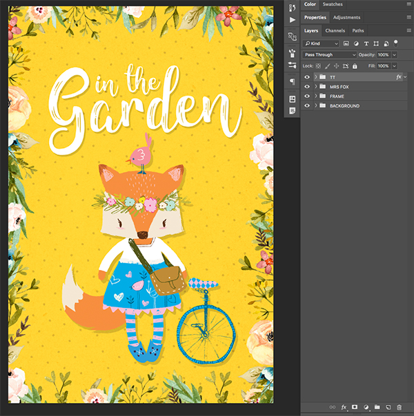
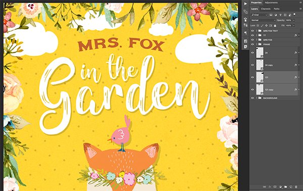
Here’s a look at what we’ll be creating:
Follow along with this tutorial: Download the freebie files
This huge freebie pack includes incredible resources from Lisa Glanz, Denise Anne, Kimmy Design, and Zeppelin Graphics.
The freebie pack is just a tiny taste of the resources available in The Vibrant, Artistic Design Bundle for just $29 (that’s 99% off). This bundle contains gorgeous glitter effects, vibrant florals, cute illustrations, and countless hours of fun to breathe new life into your design projects!

Step 1: Mrs. Fox in the Garden
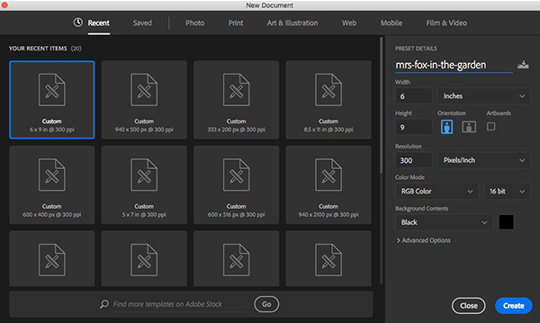
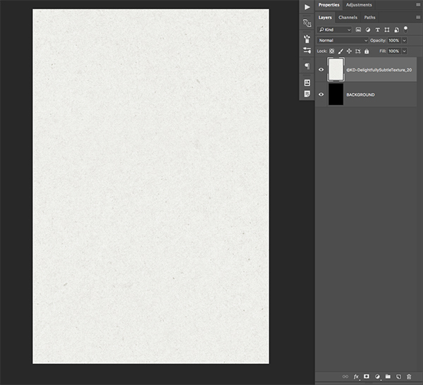
Open Photoshop and create a new document that is 6″ x 9″ as shown in the image. Make sure the resolution is set to 300 pixels per inch and leave the color mode in RGB for now. We can also take this opportunity to name our file ‘mrs-fox-in-the-garden’ or you can use a similar name before checking to ensure that your ‘Background Contents’ are set to black.
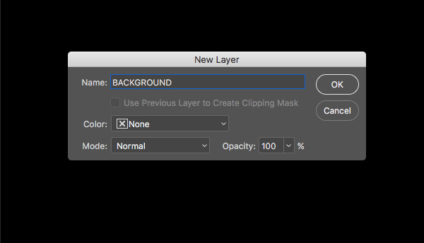
After you have input the correct settings for your new document, click on the ‘Create’ button or press the Enter key on your keyboard. Double click on the Background Layer to unlock it and when you are prompted with the ‘New Layer’ dialog box, rename the layer to ‘BACKGROUND’ as shown in the image below.
You should now have your document set up with one layer in your layers palette.
Step 2: Subtle Texture
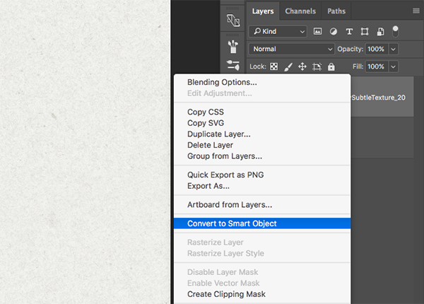
Open the ’©KD-DelightfullySubtleTexture_20.jpg’ file from the freebie pack for this tutorial and drag it into your Photoshop file.
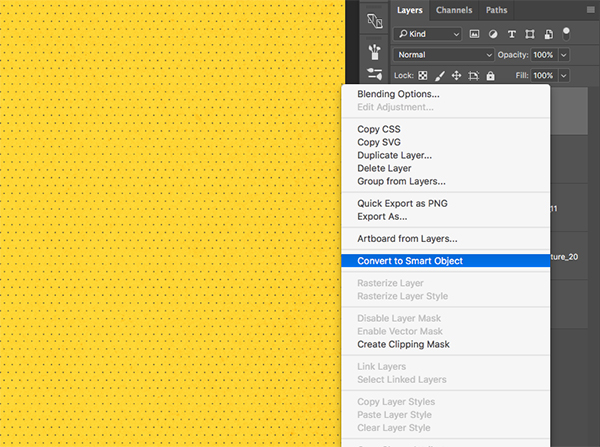
Double click the layer name to rename it accordingly, and then hold the Control Key and click on the layer to reveal a dropdown menu. From here we want to choose the option that says ‘Convert to Smart Object’ as shown below:
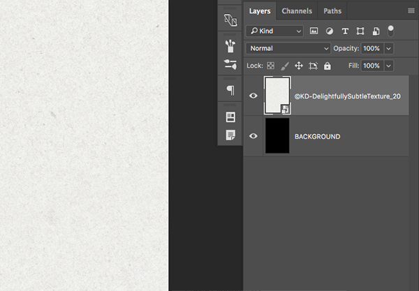
After converting your layer to a Smart Object, you should notice a small page icon with a folded corner on the layer that tells us that the layer has been converted.
Step 3: Marker Texture
We will now open the ‘©KD-MarkerSquare-Color_11.png’ file from the freebie pack and you should notice right away that there is no background here along the outer edges of the image.
We will do the same thing we did in the second step which is to first drag the file over into our main document before double clicking the layer to rename it. From here, we will once again hold down the Control Key, click on the layer, and then choose ‘Convert to Smart Object’ and you should see the same small icon next to the layer thumbnail that indicates the layer has been made into a Smart Object.

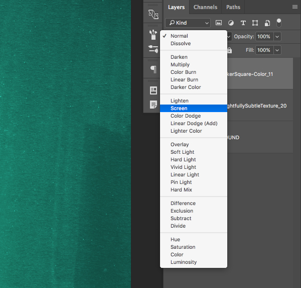
From here, let’s go ahead and change the Blending Mode of the marker texture layer to ‘Screen’ as shown below:
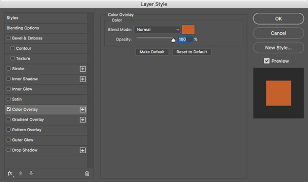
Step 4: Creating an Adjustment Layer
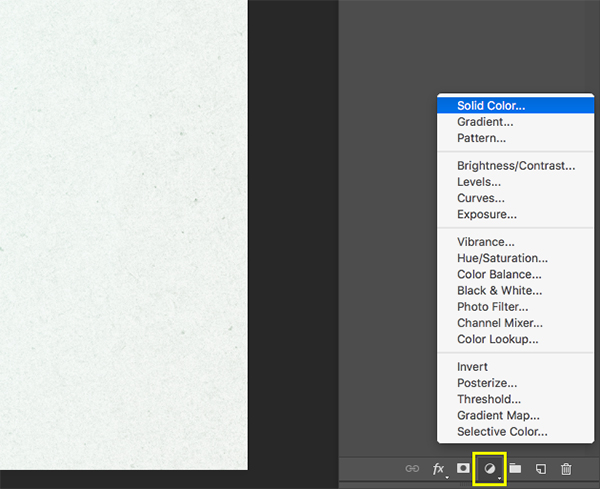
Make sure that your top layer is selected, which should be the marker texture from the previous step. From here, click on the small icon that looks like a black and white circle at the bottom of your Layers Palette to bring up the Adjustment Layers menu. Once the menu appears, choose the very top option for ‘Solid Color’ as shown in the image:
When prompted with the dialog box where you will pick a color, enter the hex value of #F37021 as shown below:
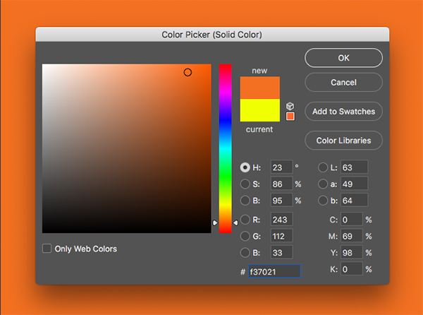
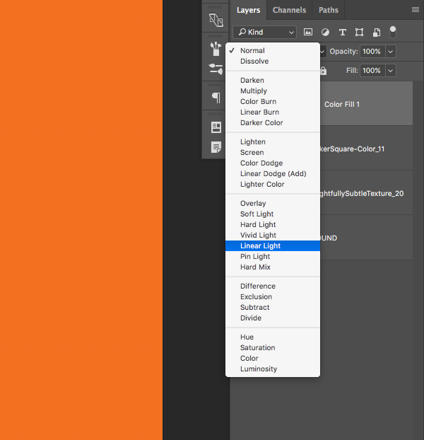
Press the Enter Key to apply the changes and you should now have a solid orange color fill sitting at the top of your Layers Palette. The next thing we want to do is change the Blending Mode of this Adjustment Layer from ‘Normal’ to ‘Linear Light’ as shown here:
Step 5: Connect the Dots
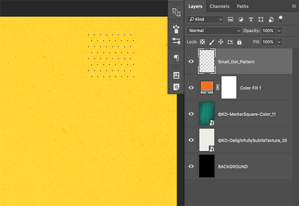
Next, open the ‘Small_Dot_Pattern.png’ file from the freebie pack for this tutorial.
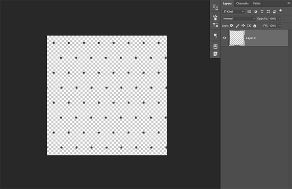
Drag the file into your Photoshop document and rename the layer by double clicking on it. Here I have just decided to go with the file name ‘Small_Dot_Pattern’ as shown below:
Select the ‘Small_Dot_Pattern’ layer and press Command/Ctrl+J to duplicate it. Hold the Shift Key and drag the copy down, directly below the original. Repeat this process again so you now have two copies in addition to the original all stacked on top of each other. The idea here is to create a copy and move it down so that it creates a seamless pattern of dots.
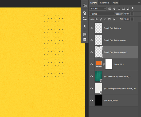
Select the top dot pattern layer, hold the Shift Key, and then select the third layer so you have all three copies selected at the same time. While these three layers are highlighted in your Layers Palette, press Command/Ctrl+E on the keyboard to merge all three copies together into a single layer.
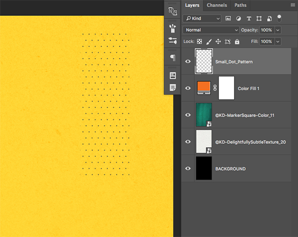
Select your new, merged copy of the dot pattern and repeat the process of making copies and dragging them while holding the Shift Key until you fill up the entire canvas with the dot pattern. Once you have filled the document with the seamless dots, select all of the dot pattern layers once again while holding the Shift Key and merge them all into a single layer by pressing Command/Ctrl+E on the keyboard. After that, hold the Control Key and click on the merged dot pattern layer and choose ‘Convert to Smart Object’ from the dropdown menu as shown below:
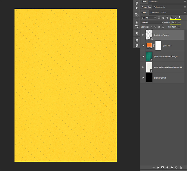
After you’ve converted your seamless dot pattern into a Smart Object, press Command/Ctrl+T to initiate a Free Transform. Hold the Alt/Option+Shift Keys and drag outwards from any of the four corners of the bounding box to scale the pattern up. Move your cursor over any of the four corners and then rotate the pattern so that it looks like this:

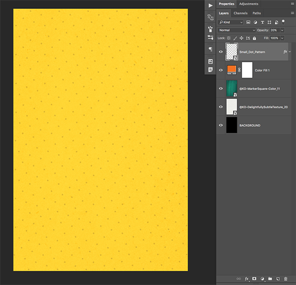
Now that we have made our pattern larger and rotated the dots, go ahead and reduce the opacity of the layer to about 20% by either dragging the opacity slider to the left, or by simply pressing the number ‘2’ on the keyboard.
Step 6: Layer Styles
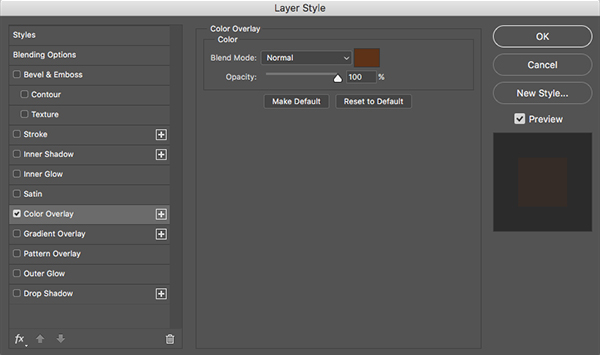
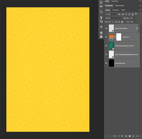
Double click on the dot pattern Smart Object layer to bring up the Layer Styles Dialog Box. From here, check off the ‘Color Overlay’ option.
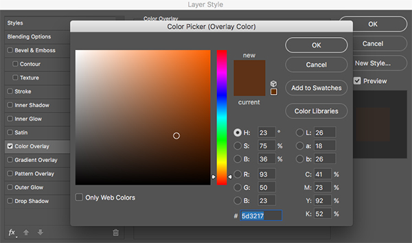
For the fill color here we will be using the hex value #5D3217 as shown below:
Press ‘OK’ or hit the Enter Key to apply the changes. Your image should now look like this:
Step 7: Layer Styles
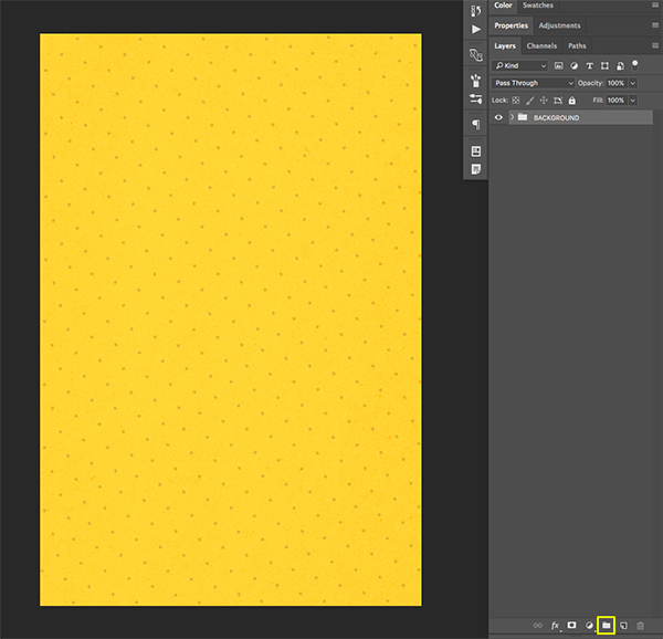
Select the top layer in your Layers Palette – this should be the dot pattern layer. Next, hold the Shift Key and select the very bottom layer, which, should be the ‘BACKGROUND’ layer. You should now have all of your layers selected together like this:
With your layers selected, click on the small folder icon at the bottom of the Layers Palette or you can use the keyboard shortcut Command/Ctrl+G to put all of your layers into a Group Folder. Next, rename this entire folder ‘BACKGROUND’ as shown in the image below:
Step 8: Floral Frame
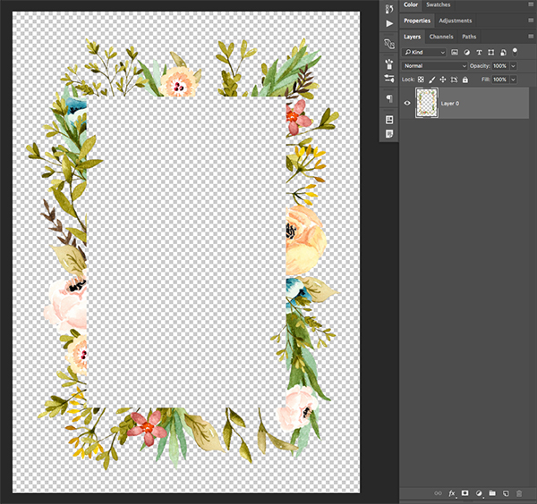
We will now open the ‘olive-meadow-frame.png’ image from the freebie pack.
Drag the frame into your document and rename the layer to ‘olive-meadow-frame’ or feel free to use a name that works for you. Then we want to hold the Control Key, click on the layer, and convert it into a Smart Object as shown here:
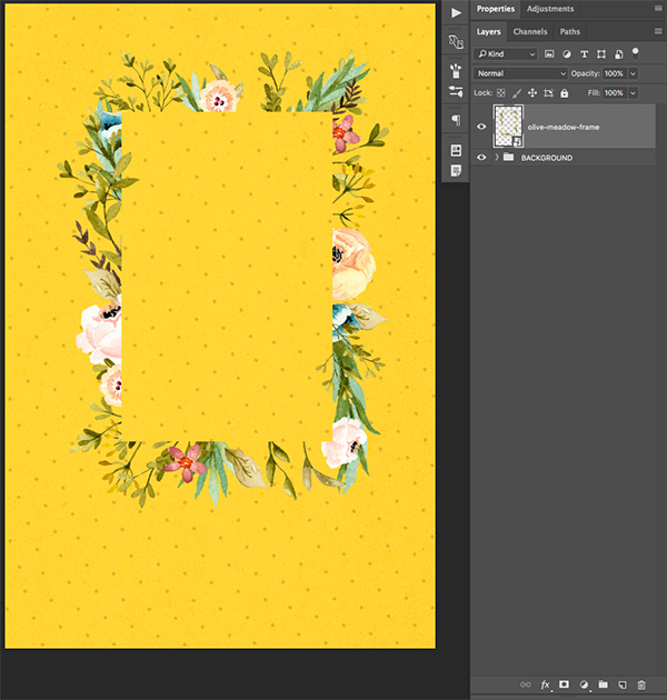
Click and drag the frame image so that only the left side of it is showing on the top right portion of your document like this:

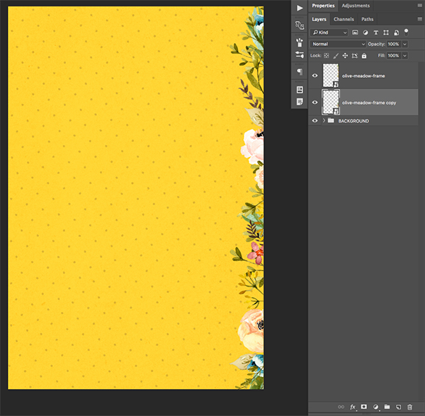
Select your frame Smart Object layer and press Command/Ctrl+J to make a copy of it. Select the copy and drag it below the original layer. Next, hold the Shift Key and slide the frame downwards so that the whole right side of the image has the side of the frame showing. For variation we will then press Command/Ctrl+T to initiate a Free Transform and then click on the object while holding the Control Key. Doing this will reveal a dropdown menu that will allow us to then choose the ‘Flip Horizontal’ option.

Your image should now look like this with two copies of the frame stacked on top of each other:
Hold the Shift Key and select both of the olive frame layers in your Layers Palette.
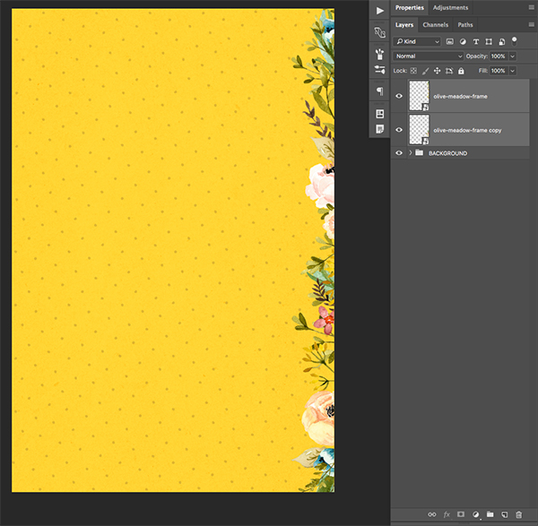
Move both of the new copies below the first two in your Layers Palette. From there, hold the Shift Key and slide both copies over from the right side of the image to the left until the floral frame is coming in from the opposite side like this:
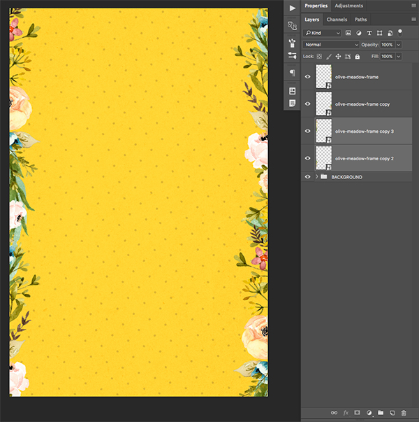
Create another copy of the frame by pressing Command/Ctrl+J and this time move it to the bottom right corner, so only part of the top of the frame is showing along the bottom edge of the document.
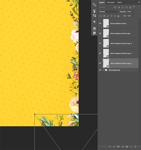
Make another copy of this layer, hold the Shift Key and slide it over towards the left until the entire bottom is filled with florals. To add more variation here you can press Command/Ctrl+T to initiate a Free Transform, and then click on the image while holding Control and then choose ‘Flip Vertical’ from the dropdown menu before pressing ‘Enter’ to apply the changes.

Repeat these last steps to do the same for the top of the image so you now have two copies of the frame on each side. Once you are happy with the placement of your florals, select the top layer, hold the Shift Key, and then select the very bottom frame layer so they are all selected at once.

From here we can once again put these into a Group Folder by pressing Command/Ctrl+G or by clicking on the small folder icon at the bottom of the Layers Palette. Once you’ve put these into a folder, let’s double click on the folder in the Layers Palette to change the name to ‘FRAME’ or something similar.

Step 9: Foxy Lady
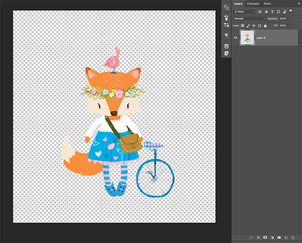
Next, open the ‘Fox.png’ file from the freebie pack. This is a fox that was creating using the Lisa Glanz Critter Creator from the full bundle. There are so many fun and cool options to customize in the full version that it’s sure to give you plenty of possibilities for your projects. Not only can you pick from some different accessories and clothing options, but you can change some of the facial features and edit the colors as well! Here is the character we will be using for the book cover:
Click and drag Mrs. Fox over into your Photoshop document before converting it into a Smart Object and renaming the layer ‘MRS FOX’ as shown below:
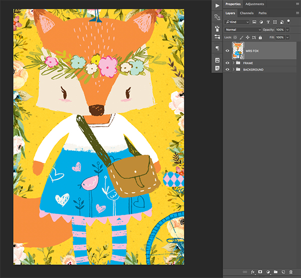
Press Command/Ctrl+T to initiate a Free Transform, and then hold the Alt/Option+Shift Keys while dragging inwards from any of the four corners of the bounding box to scale the image down from the center. Use the image below as a rough guide for the size and placement of the character.

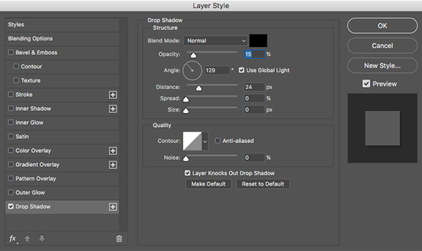
Once you have applied the transformation, double click on the layer to bring up the Layer Style Dialog Box. From here, check off the ‘Drop Shadow’ option and use a solid black color set to a ‘Normal’ Blending Mode. Reduce the opacity of the shadow to about 15%. For the other settings we will be using an Angle of ’124’, a Distance of ’24’ and a Size and Spread of ‘0’ as shown below:
Press ‘OK’ or hit the Enter key to apply the changes. The next thing we want to do is put the character into a Group Folder of it’s own by selecting the layer, pressing Command/Ctrl+G on the keyboard, and then renaming the folder to match the layer name we landed on earlier. Your document should now look like this:
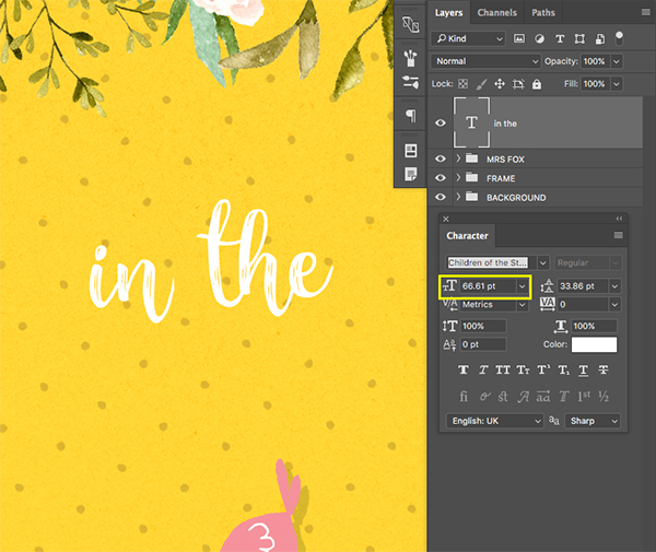
Step 10: Adding our Title Treatment
Create a new layer at the top of your Layers Palette and then press the letter ’T’ on the keyboard to get your Type Tool. Click above the fox character and make sure you have a solid white foreground color before typing out the words ‘in the’ using a free typeface called ‘Children of the Starlight’ which can be downloaded for free from DaFont.com. If you don’t see your Character Panel when using your Type Tool, you can bring up the panel by going to the Window Menu and choosing ‘Character’ from the list. For the font size, I am using a point size of about ’66.61’ as shown in the image below:
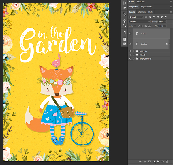
Create another new layer and this time type out the word ‘Garden’ and place it below the previous text. The size of this text will be significantly larger (around 172 points in size) so that the words ‘in the’ fit nicely in between the ‘G’ and the ‘d’ in the word ‘Garden’ as shown here:

Next, hold the Shift Key and select both of your text layers before pressing Command/Ctrl+G to place them into a new Group Folder. For now let’s call this folder ‘TT’ for ‘Title Treatment’ so that we know where to find our text.
Step 11: Shadow Type
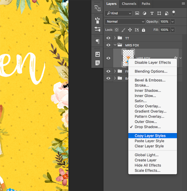
Click on the small arrow next to the folder icon for the ‘MRS FOX’ layer to expand it. Notice the small ‘fx’ symbol that appears to the right of the layer as shown here:
Hold the Control Key and click on the ‘fx’ symbol to reveal a dropdown menu. From here, go ahead and select the option that says ‘Copy Layer Styles’ to copy the Drop Shadow effect that we applied earlier.
From here, hold down the Control Key and click on the ‘TT’ Group Folder to reveal the same dropdown menu, except this time we want to choose ‘Paste Layer Style’ in order to apply the same effect to our title.

Double click on the ‘fx’ icon on the ‘TT’ folder to bring up the Layer Style Dialog Box. Go into the ‘Drop Shadow’ tab and change the distance from ’24’ to ’14’ pixels as highlighted in the image below:

Press ‘OK’ to apply the changes and your image should now look like this:
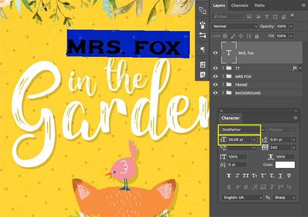
Step 12: Mrs. Fox Type
Create a New Layer at the top of your Layers Palette and switch back over to your Type Tool by pressing the letter ’T’ on the keyboard. Click on your workspace above the previous text and type out the name ‘MRS. FOX’ using another free typeface called ‘Godfather’ from DaFont.com. This font works nicely with our other typeface and gives a nice bit of contrast to the handwritten type of our main title treatment. In the Character Panel you will see the name of the font as well as the point size I am using – 38.06 pt.
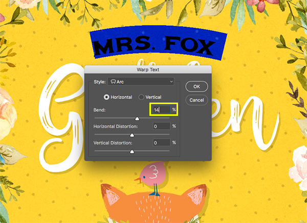
Double click inside of your ‘MRS. FOX’ text to highlight it and notice the toolbar along the top of the Photoshop window also shows you some options for your text. One of the icons along this top bar looks like the letter ’T’ with a curved line underneath it as shown here:

Click on this icon while your text is highlighted to bring up the Warp Text Dialog Box. Under the ‘Style’ dropdown we want to choose ‘Arc’ and then make sure that we have ‘Horizontal’ selected with a value of around ’14%’ as shown below:
Press ‘OK’ to apply the warp and then double click on the layer to bring up the Layer Style Dialog Box. From here we will check off the ‘Color Overlay’ option.
For the fill color, enter a hex value of #C3602C which is a dark orange/brown color sampled from the ears of the fox.
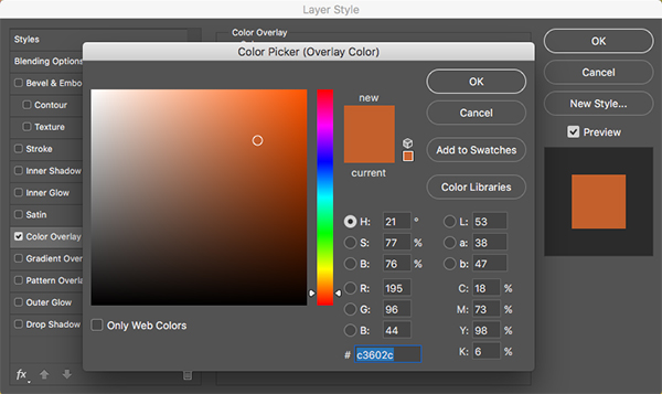
Press ‘OK’ to apply the changes and then select the layer and press Command/Ctrl+G to put it into a new Group Folder. Let’s double click the name and change it to ‘MRS FOX TEXT’ and now your image should now look like this:
Step 13: Mrs. Fox Type
Next, open up ’24.png’ from the freebie pack, which is the first of two cloud shapes we will be using.
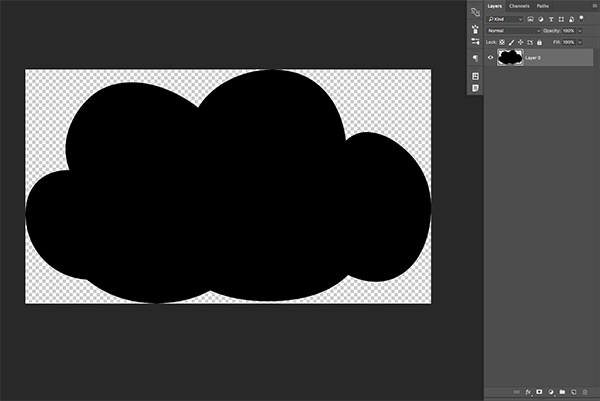
Drag the cloud into your main document and rename it ’24’ before converting it into a Smart Object. Press Command/Ctrl+T to initiate a Free Transform and then scale the cloud down by holding the Alt/Option+Shift Keys while dragging inwards from any of the four corners of the bounding box around the graphic.
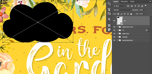
Click and drag this layer below your ‘FRAME’ Group Folder and use the image below for reference to see the size and placement of the cloud in relation to our other objects.
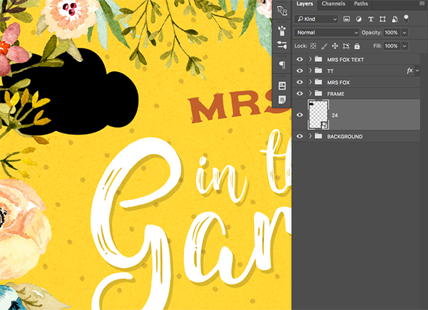
Once you have placed the cloud and scaled it accordingly, double click on the layer to bring up the Layer Style Dialog Box. From here, check off the ‘Color Overlay’ option and set it to solid white.

Press ‘OK’ to apply the changes and your cloud should now look something like this:
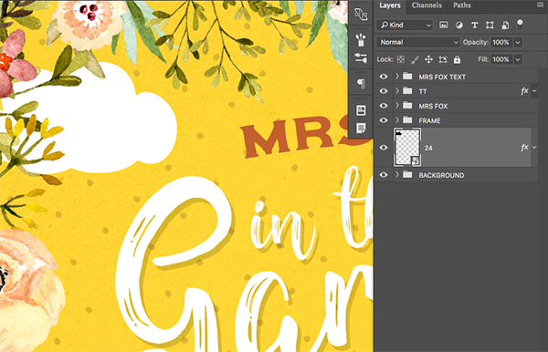
Select the ’24’ layer and press Command/Ctrl+J to create a duplicate, and then click and drag the layer below the original. Use the image below as a guide for the size and placement of this second cloud shape.
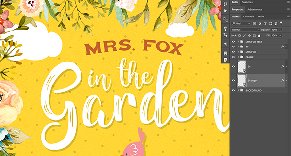
Step 14: Cloudy Days
Next, open up ’121.png’ from the freebie pack, which is the second of the two cloud shapes we will be using.

Drag this cloud into your main document and rename it ’121’ before converting it into a Smart Object like we did with our first cloud shape. Double click the layer and check off the ‘Color Overlay’ option and fill the shape with solid white. Create another copy of the cloud smart object by selecting it and then pressing Command/Ctrl+J. The image below shows the size and placement I have chosen for the clouds:
Step 15: Taking Flight
Next, open up ’72.png’ from the freebie pack shown below:
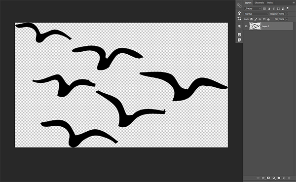
Click and drag the flying birds into your document before renaming the layer ’72’ and placing it above the other vector shape layers. Hold down the Control Key and click on the layer before selecting ‘Convert to Smart Object’ as we did with our previous shapes. Here we will also reduce the size of the birds using a Free Transform (Command/Ctrl+T) and then dragging inwards from the corner of the bounding box while holding the Alt/Option+Shift Keys. Use the image below as a guide for the size and placement of the flying birds.
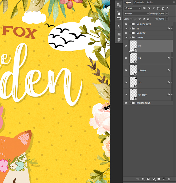
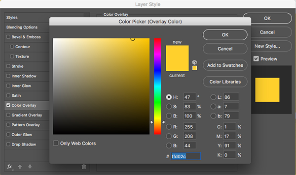
Double click on the layer to bring up the Layer Style Dialog Box and check off the ‘Color Overlay’ option as shown here:

For the fill color we are going to match the yellow of the background which is ##FFD02C.
Press ‘OK’ to apply the changes and then select the layer. Hold the Shift Key and click on the ‘121copy’ layer so all of your vector shapes are selected simultaneously as shown in the image:
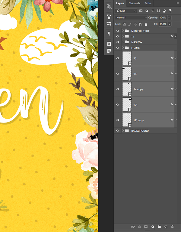
Press Command/Ctrl+G to place all of these layers into a Group Folder and rename it ‘VECTOR SHAPES’ or use a similar name for the group.
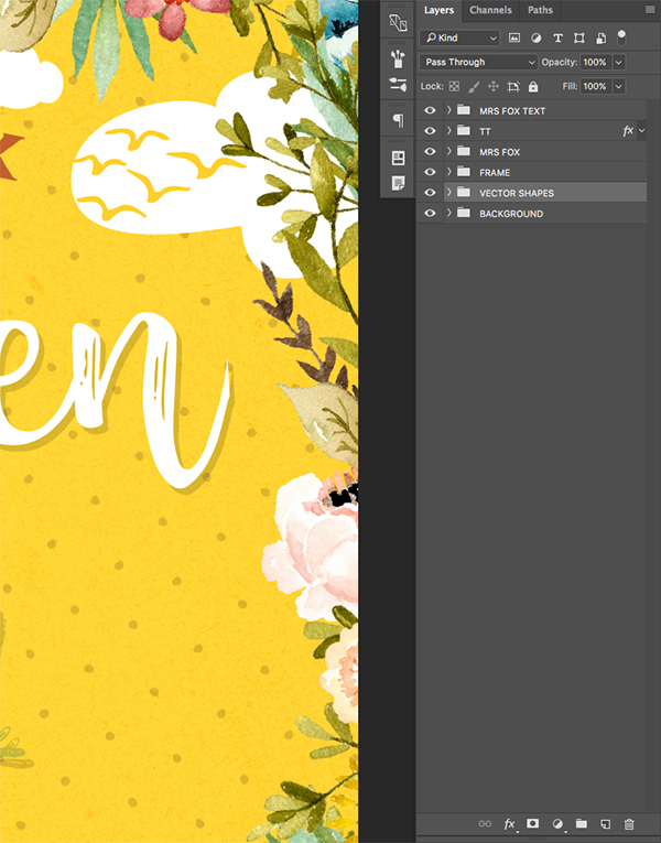
At this point our cover design is complete and all of our layers and objects are nicely organized in our Photoshop file. I hope that you have enjoyed this lesson and of course feel free to make any further adjustments or changes you like to the image.
Remember that whether it’s your outcome for this tutorial or something new you’ve made, we’d love to see your designs on our Facebook page.
Please leave a comment if you have any questions or suggestions. I always look forward to hearing from you!
There’s still time to check out The Vibrant, Artistic Design Bundle where you’ll discover thousands more quality resources and tools to add some design magic to your projects, all for just $29.

I just finished the tutorial as well and have more questions about the texture color, following up on the comment by maclusiau, above. How do you know what combination of texture colors to use to produce the final result? Would the placement of the “yellow” as the background color always produce a Yellow background color? What if you wanted a blue background? Would you just substitute the background color only? Would the orange and green remain the same? This was a great tutorial. As you already know, I am writing children’s stories and I have already used many of Lisa Glanz designs. I also use Julia Dreams and Artifex Forge a lot. I like portrait creators. My current book is an alphabet book, called Alphabet City. I already have the cover for it.
Hey Mary,
Thanks so much for your comment and I do apologize for any confusion!
The great news is, because we are creating a white subtle texture layer that appears on top of the green one, this won’t affect the colors that you chose. You can simply play around with blending modes of the adjustment layer (step 4) to get whatever color you like :)
We are so glad that you enjoyed this one though and we hope that it offered a little inspiration for your books too.
I loved the tutorial , learned something. The graphics are just wonderful and cute too.
Hey Mary,
That is wonderful news about the tutorial and we are so pleased that you enjoyed this one! Please do feel free to share your finished piece with us if you are keen as we would love to see it :)
Thank you for this tutorial. Would it be possible to provide the tutorial in a downloadable pdf format? Thanks in advance
Hey Carol,
Thanks for the comment and unfortunately we don’t have PDF’s for the tutorial- however it is written for you on the tutorial page so I would recommend using this as a guide :).
I will mention to the team here to see if we can look at including PDF’s for the future though!
So adorable! I had such fun making this – thank you!
Thanks so much for the comment! We are so pleased you liked this one :).
We would love to see your finished piece if you were keen to share!
Hello, I have just completed the Mrs Fox tutorial, thank you for the lesson. There are some steps that do not include an explanation and don’t quite make sense to me. For example, why do we start with a green marker background then cover with orange and then yellow? Thank you.
Hey Miche,
Thank you so much for your comment and it’s awesome to hear you’ve just completed this one!
I’m really sorry for any confusion caused though! The first green element is a texture, the orange is added for the spots and the yellow is for the background colour. If you are ever ensure though, please feel free to pop us an email when you are following the steps and we’d be more than happy to help :)