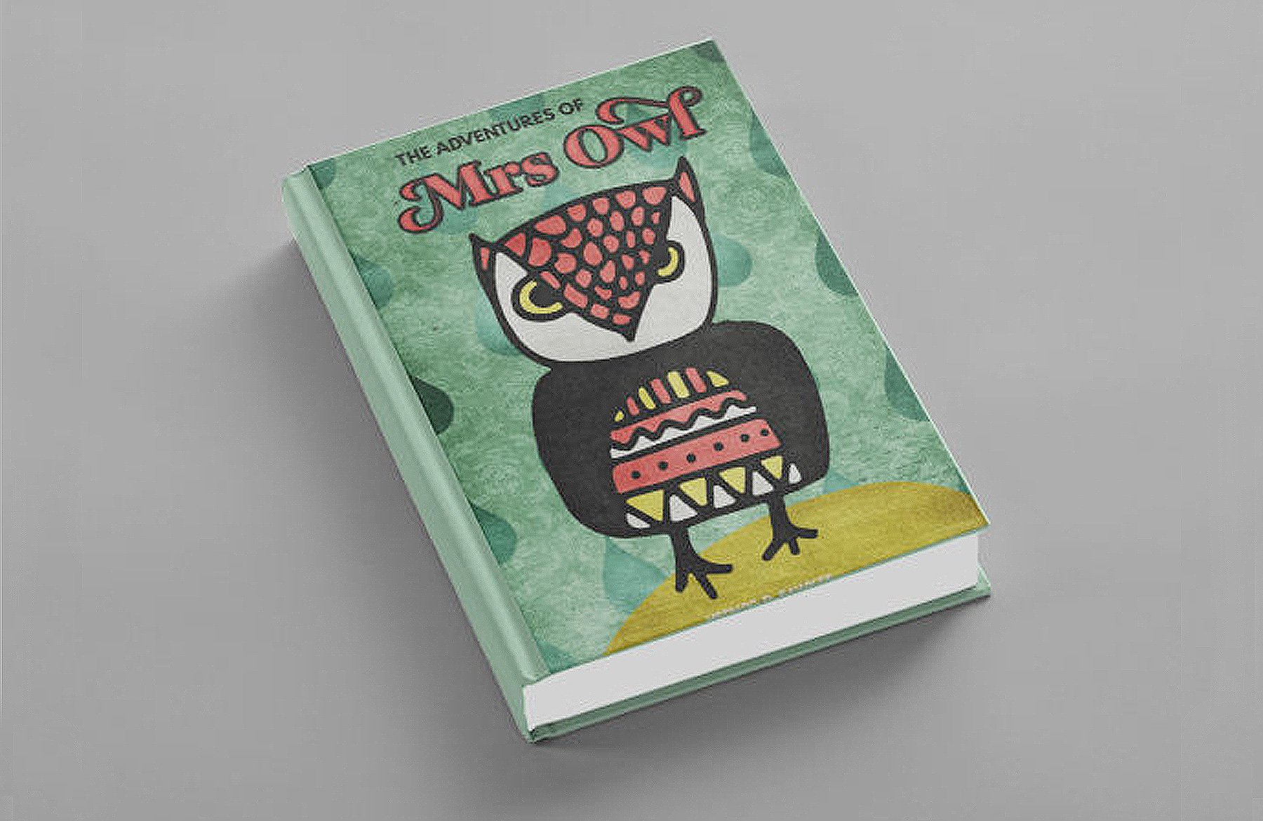
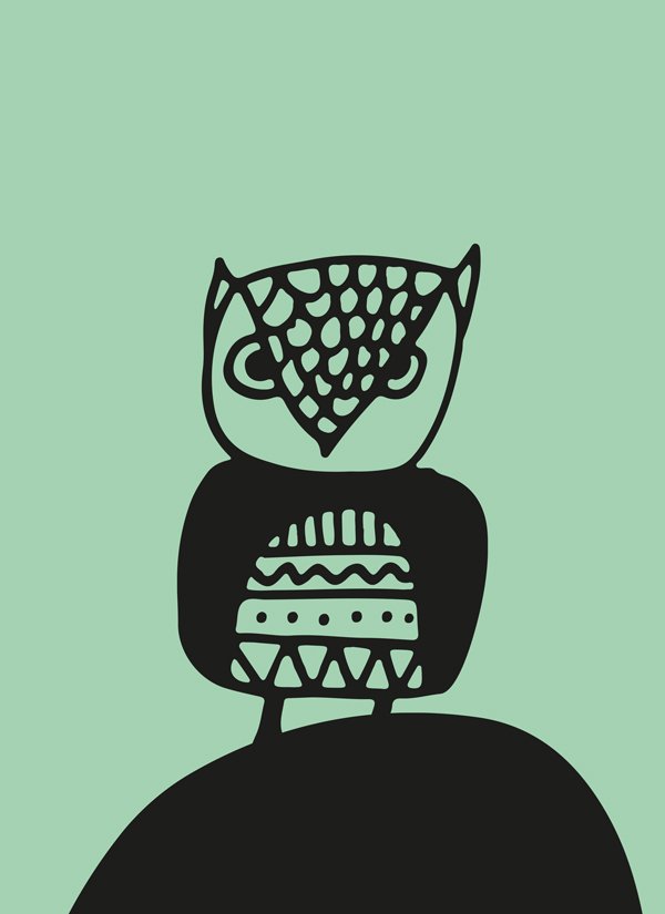
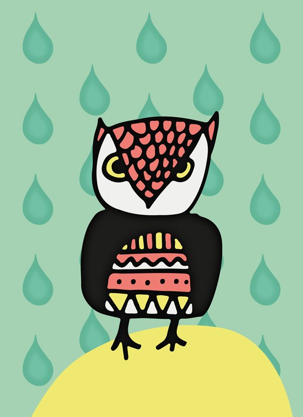
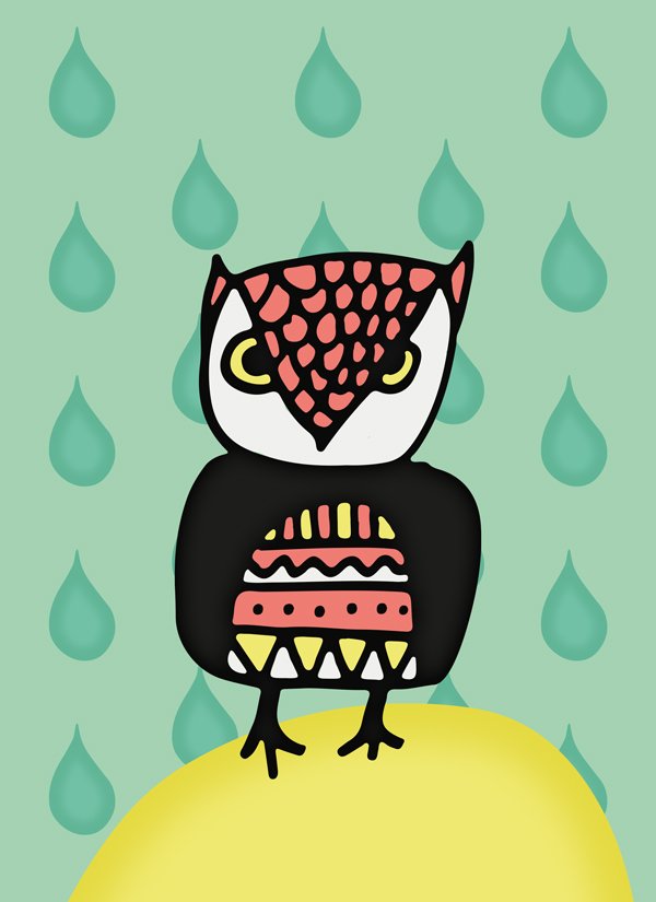
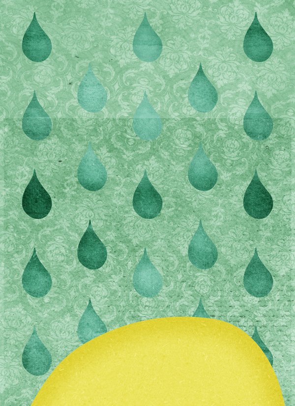
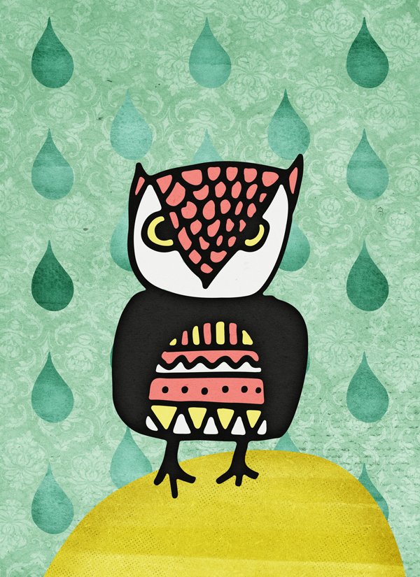
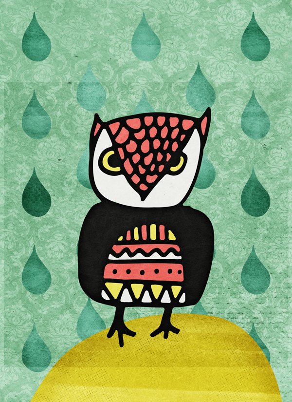
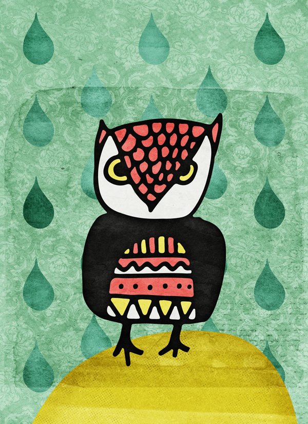
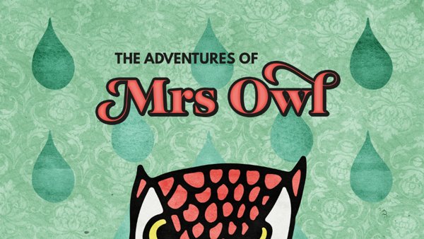
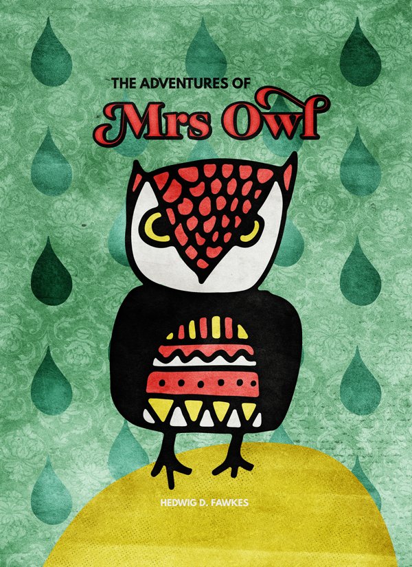
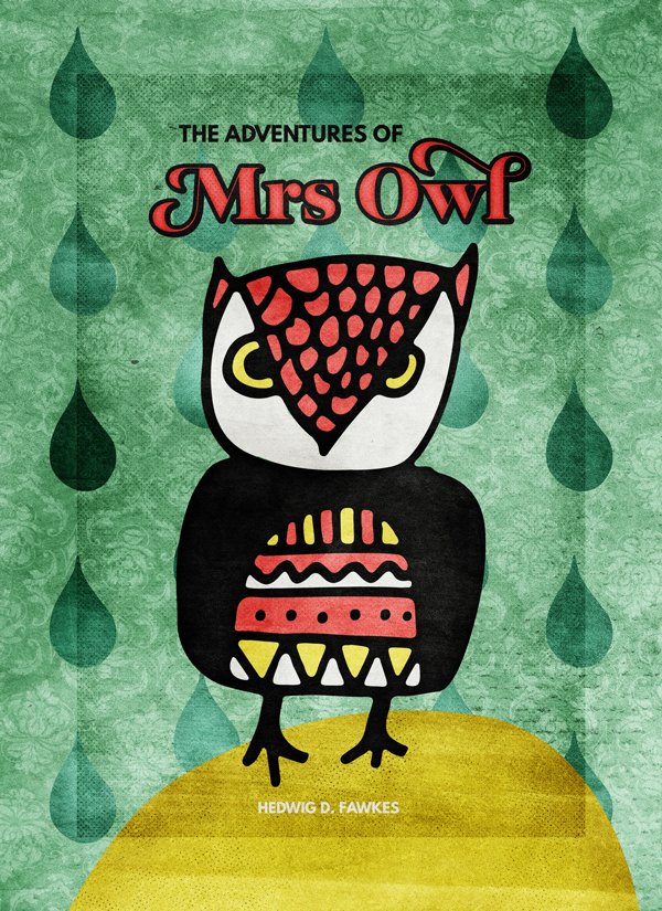
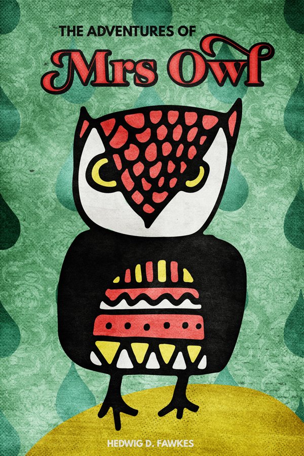
WHAT WE’RE CREATING:
Hello Design Cutters! Simon here today, from the sunny North East of France. This week, we are going to leverage the extensive textures, patterns and backgrounds bundle to create a children’s book cover.
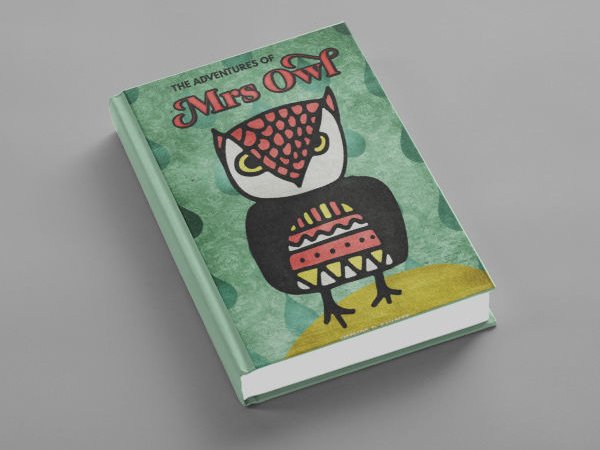
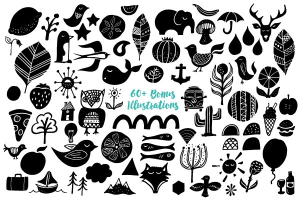
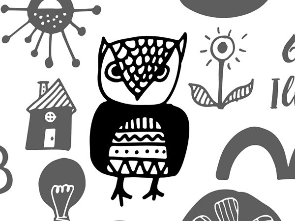
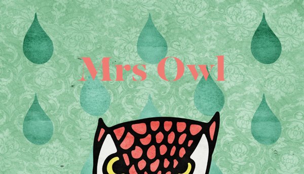
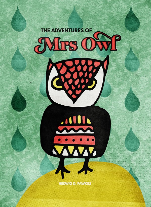
Our mission this week is to give life to The adventures of Mrs Owl, personified in the pack of illustrative elements from Vintage Media Co.
Additional visual elements from the same pack, coupled with some of the gorgeous textures from the bundle, will help us to put together a very tactile illustration for the cover.
A FEW TECHNICAL NOTES
We’ll use both Photoshop and Illustrator for this piece. Sorry Photoshop only users! It simply is way easier to manipulate the various vector assets with Illustrator.
We are going to work extensively with textures. It’s a good time to remind you guys of a few base rules, and processes:
- Don’t know what a clipped layer is? Glad you asked! This means that the layer is only visible/applies to the layer directly below it. You can very quickly do this by holding ALT down on your keyboard and clicking between the two layers. Here’s a quick demonstration.
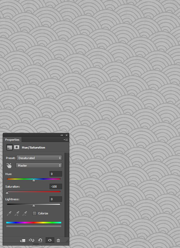
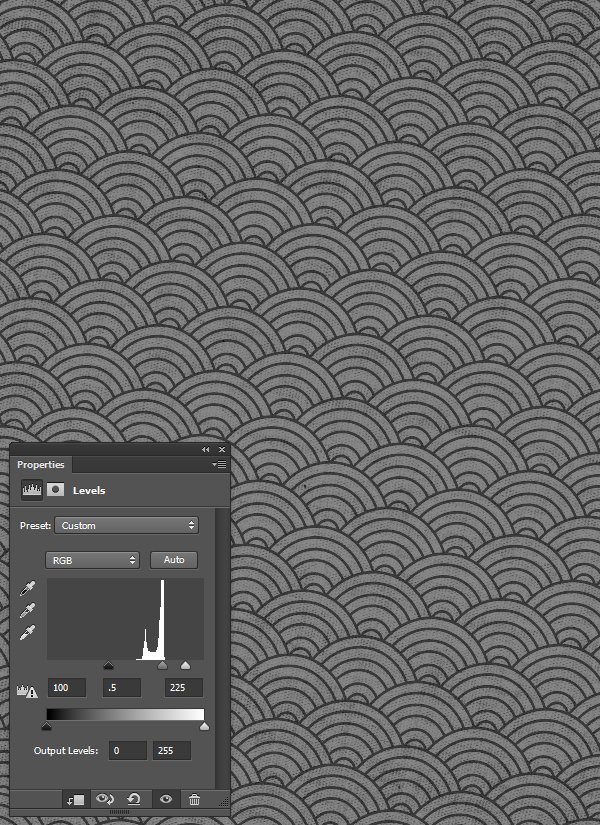
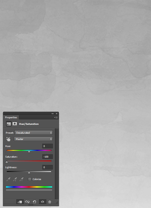
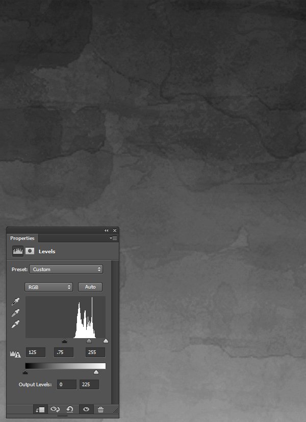
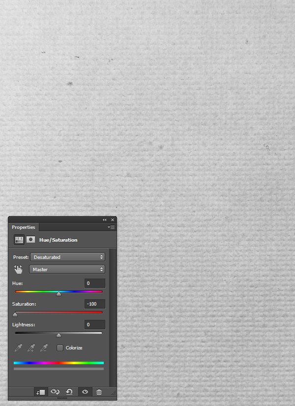
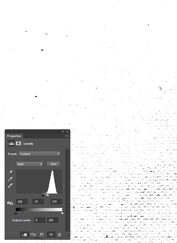
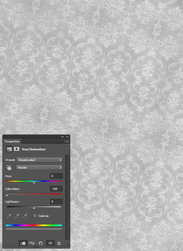
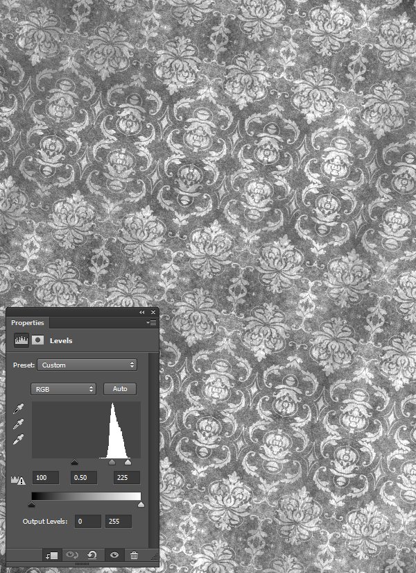
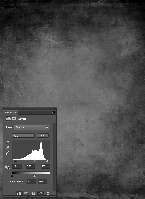
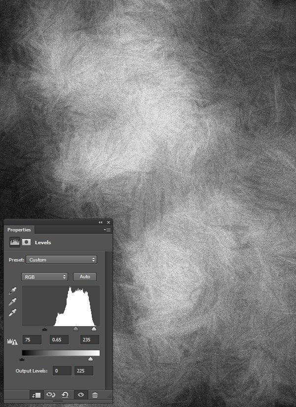
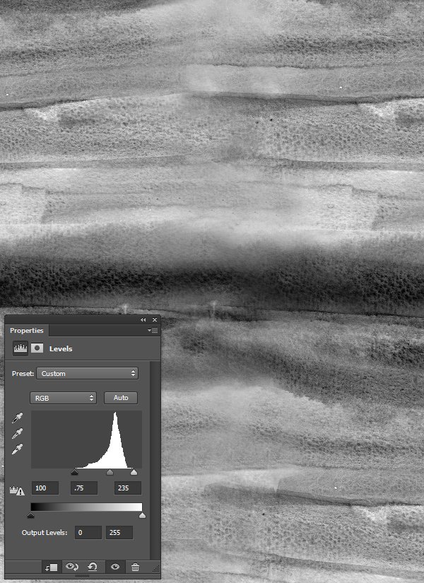
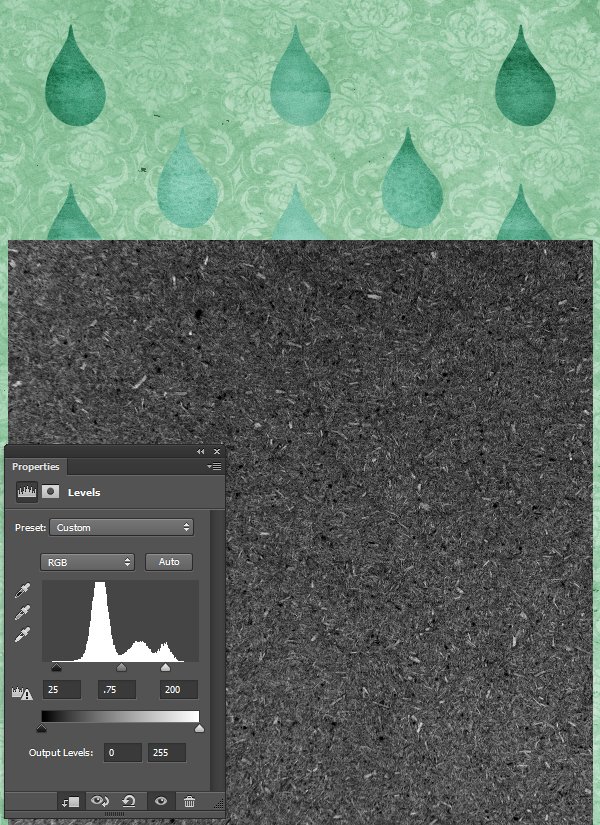
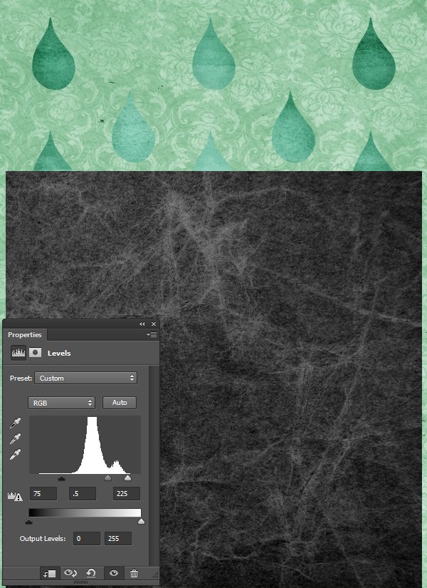
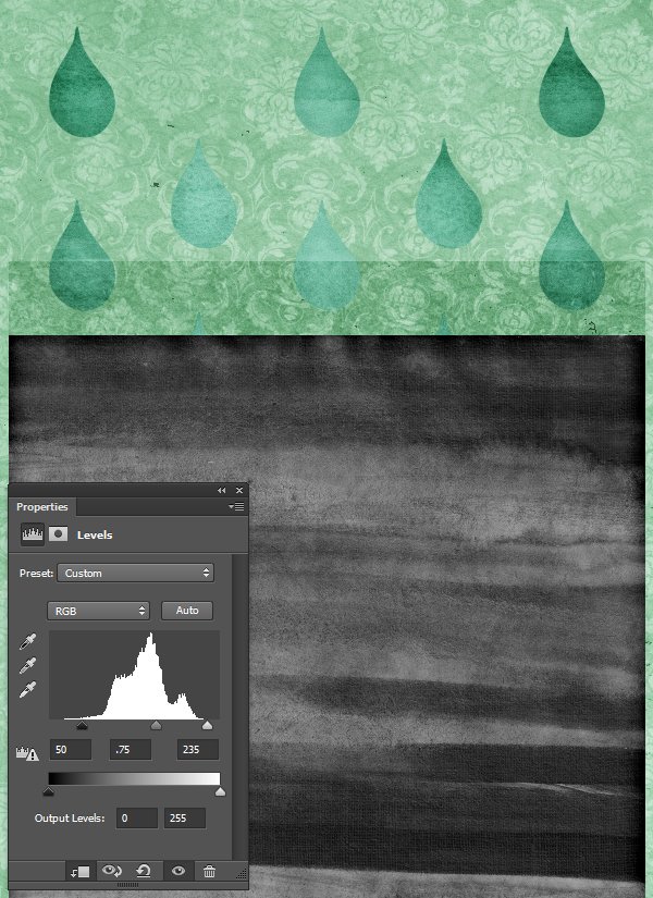
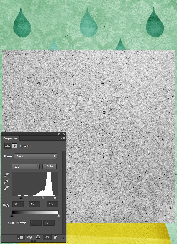
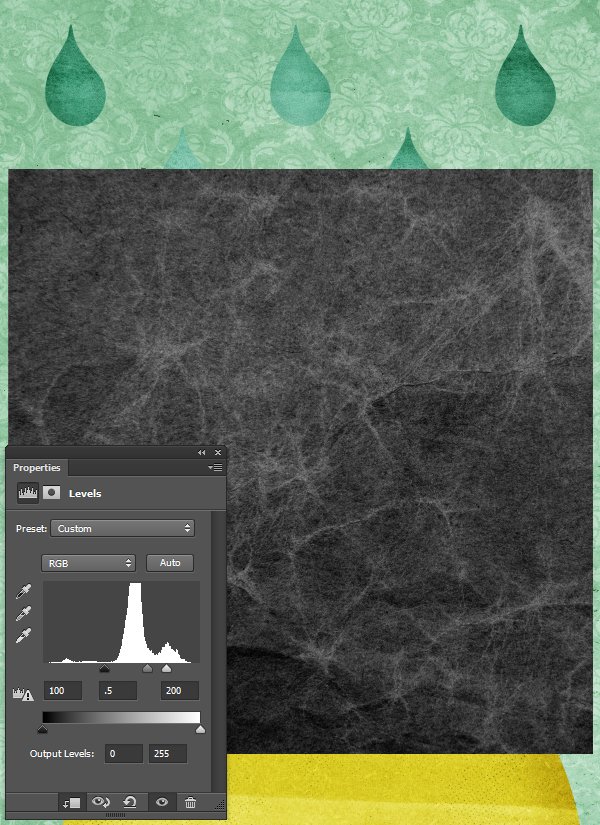
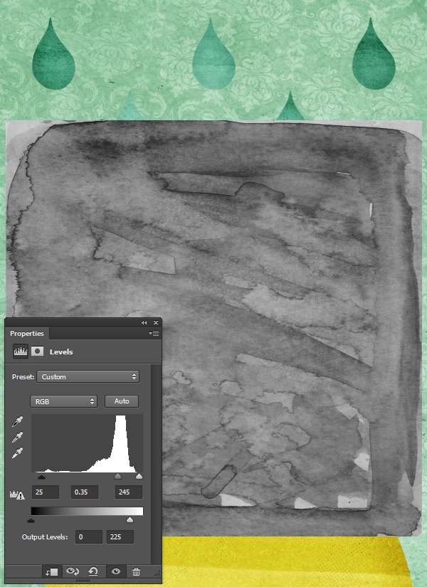
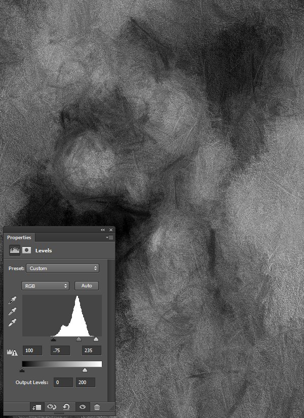
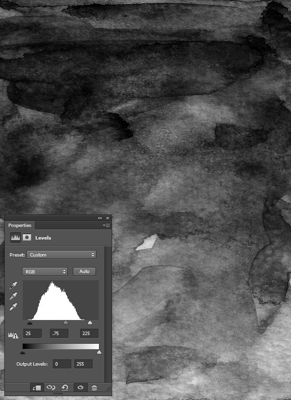
- Every time we’ll work with textures, we’ll follow this simple process: place as smart object, sharpen1, desaturate, enhance contrast with levels, and modify the blending mode.
- Placing the textures as smart objects, and using adjustment layers to tweak them, allows us to stick to a non-destructive workflow. We’ve explored in depth the numerous pros and few cons of such a workflow in this past tutorial: “How to Use Textures The Right Way.”
Notes: 1 – accessed through the Filter > Sharpen > Sharpen menu
With these out of the way, let’s get started!
STEP ONE: DOCUMENT SETUP
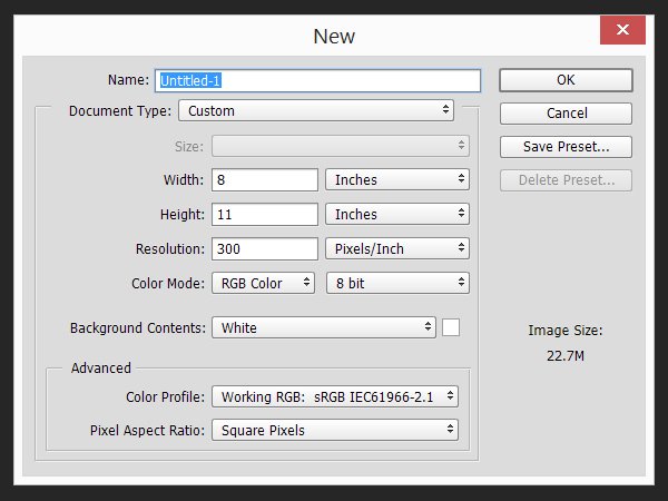
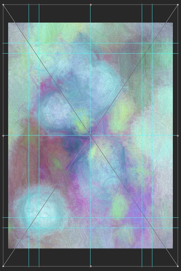
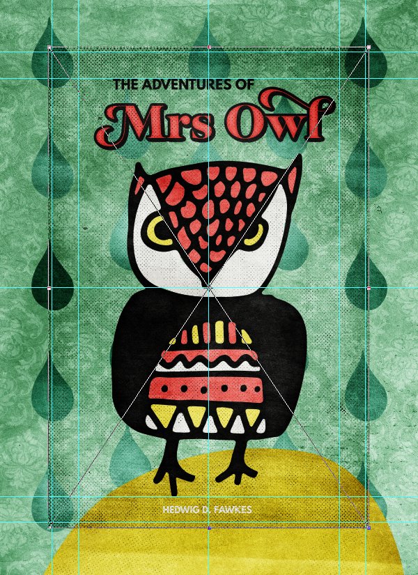
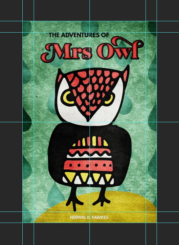
Since we are working on a book cover, we are going to work within a document with different measurements from our typical 18″x24″. One of the most popular book cover size is 6″x9″, which is an aspect ratio of 2:3.
Our document will have a one inch bleed/safe zone around it, to account for trimming and other production constrains. This means that instead of being 6″x9″ on the nose, it’ll be 8″x11″.
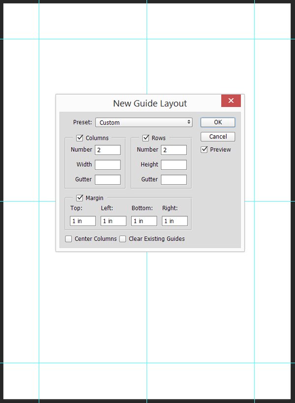
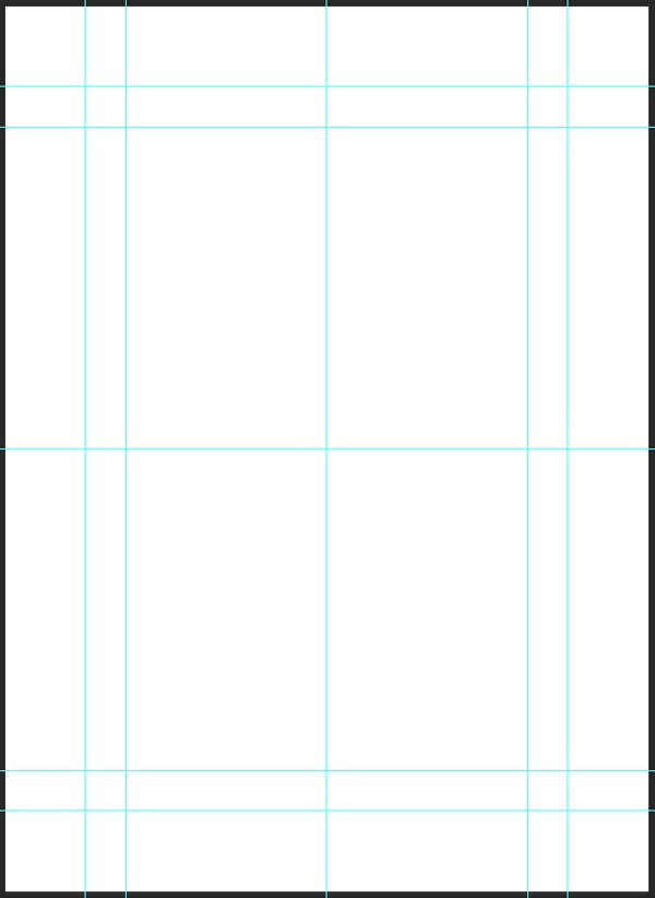
The next step is to add a few guides. We’ll use them to mark the actual cover’s size, as well as the center of our canvas. I’m using Photoshop CC’s New Guide Layout feature to generate these rapidly.
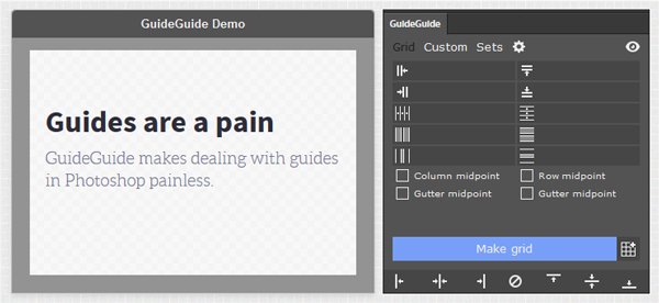
Protip: if you have an older version of Photoshop, a good alternative is a Photoshop extension called GuideGuide.
Additionally, we can also add guides to mark a half inch zone within the safe zone. These will help us not to stick our content too close to the edges of the cover.
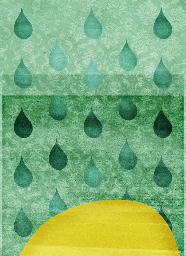
STEP TWO: PUTTING THE VARIOUS ELEMENTS IN PLACE
The background
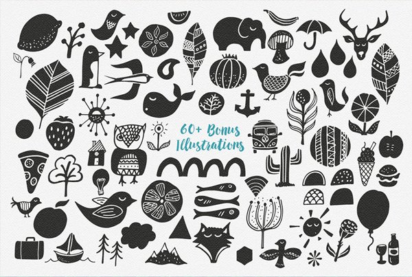
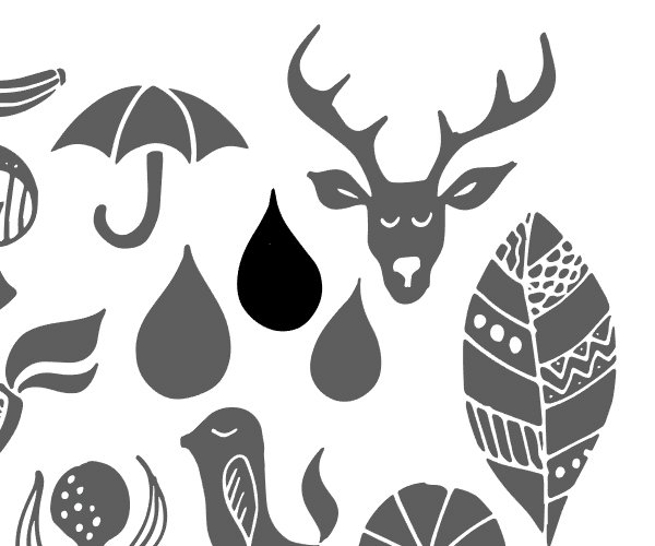
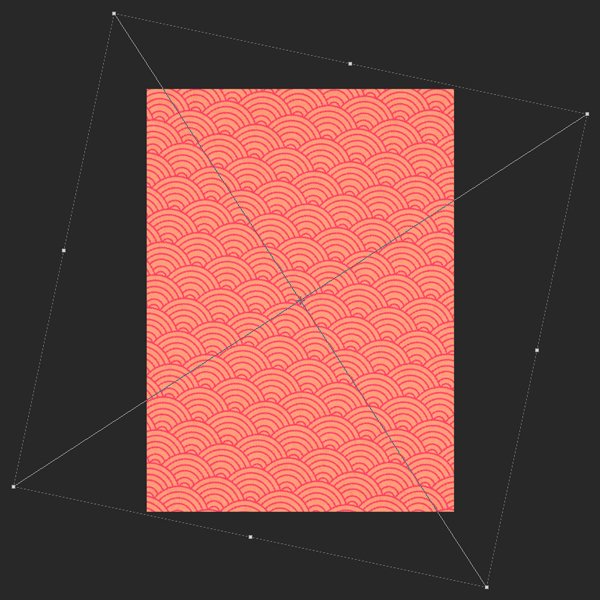
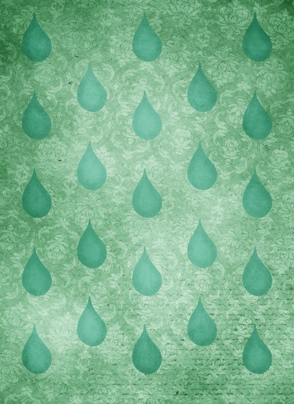
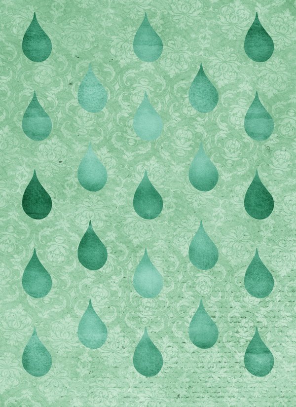
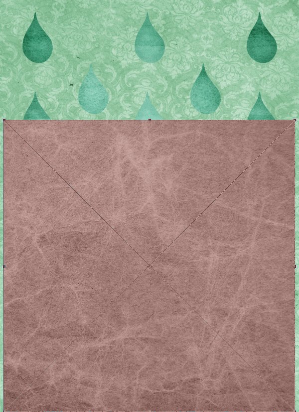
The first piece of our puzzle is a pattern of raindrops. The raindrop asset comes from Vintage Design Co.’s illustrative elements. It’s located in the \extensive-textures-vintage-design-co\PatternPress\4-Bonus-Illustrations\ folder.
The specific raindrop we are going to use is this one.
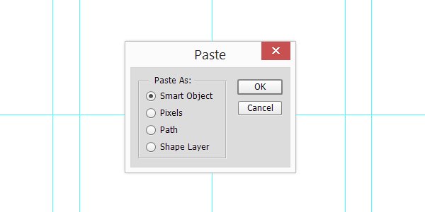
Copy and paste it in your Photoshop document, as a smart object.
Once pasted, size it down to 50%.
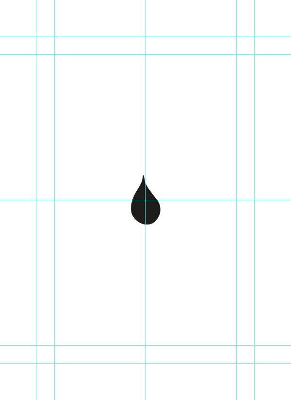
We are going to create a basic offset pattern with the drop. We need to place it so its center is at X: 1″, and Y: 9.5″. This will make it align it with the edge of the cover.
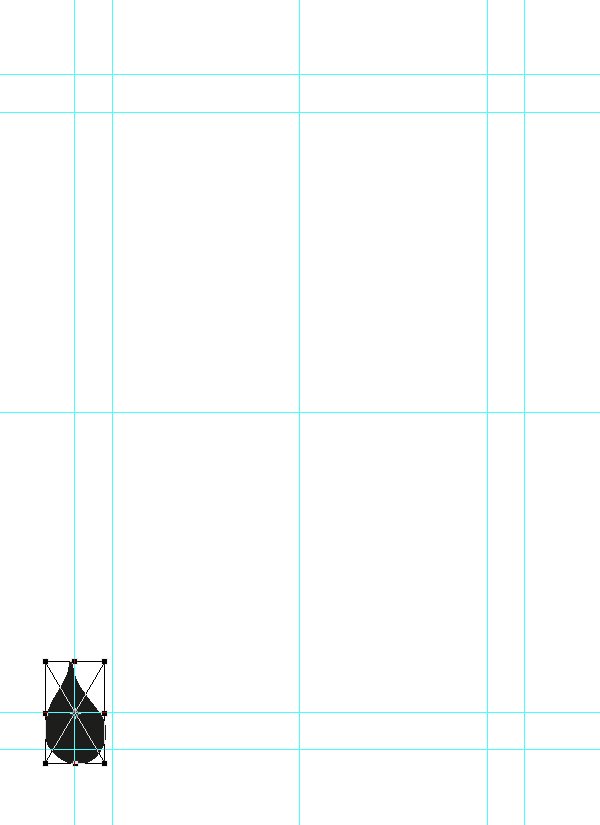
Duplicate the drop asset four times.
From there, we can place the top drop copy in the top left corner, in a similar fashion than the bottom one.
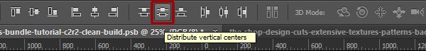
From there, we can use vertical distribute tool to evenly space the drop assets. We simply have to highlight the smart objects in the layer palette, and to press the appropriate button.
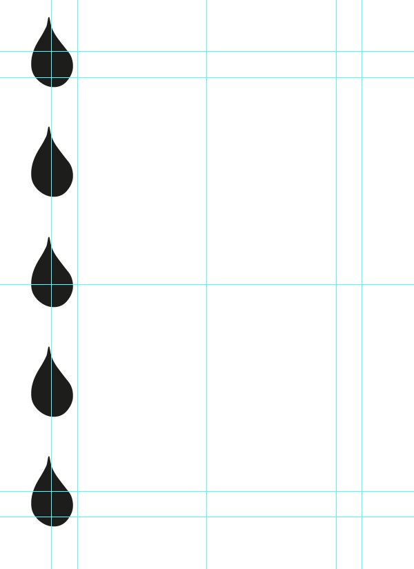
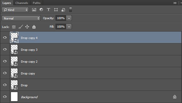
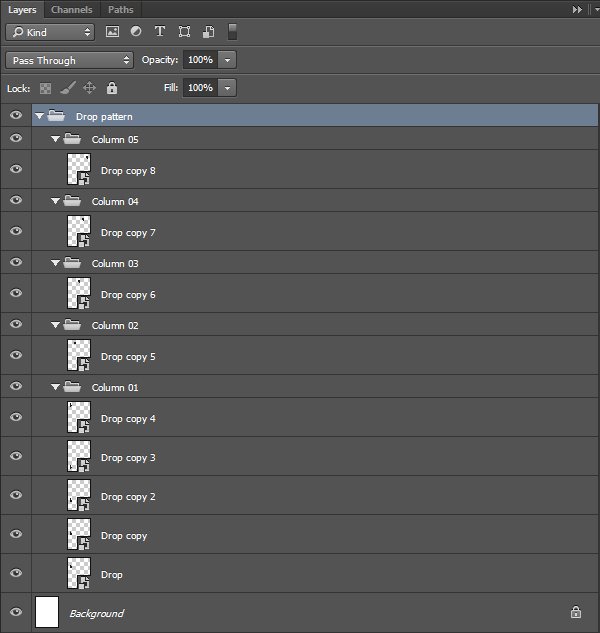
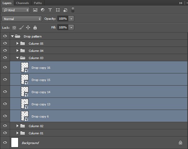
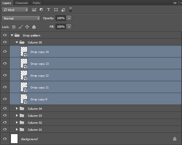
We have one column complete. Time to organize the layers better.
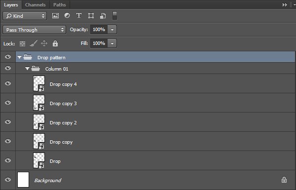
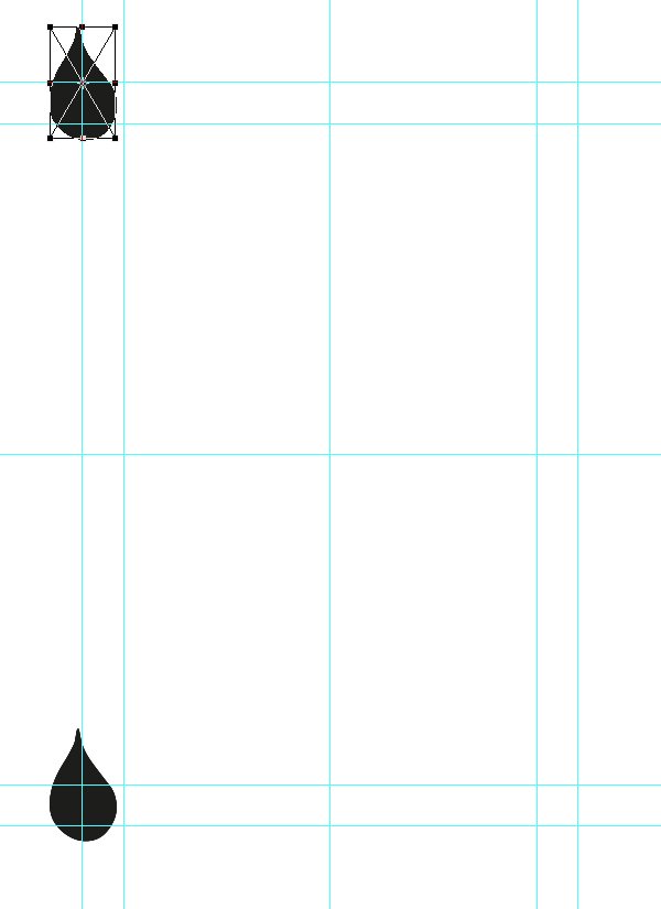
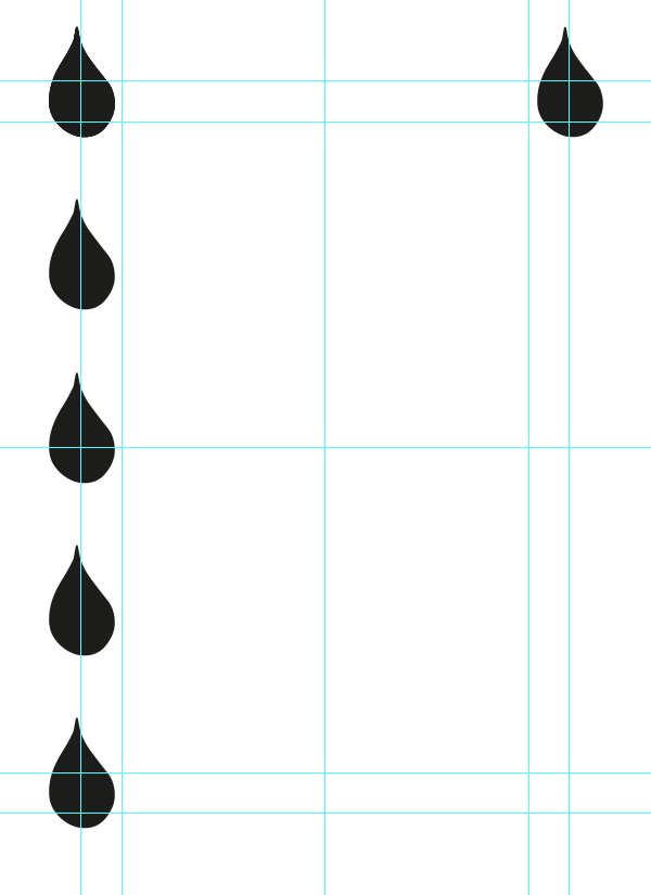
It’s time to generate the next columns of the pattern. We’ll start to create four additional copies of the top drop.
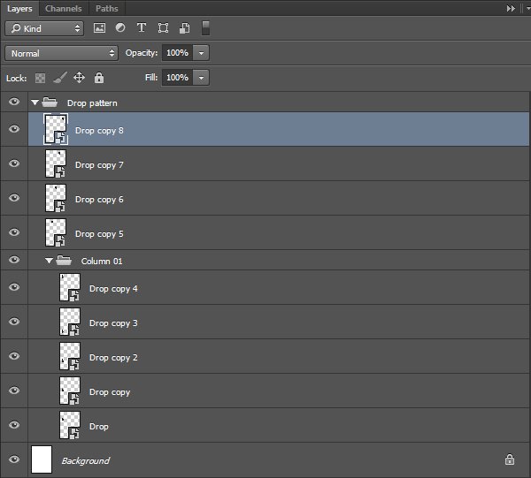
After mirroring the placement of the top drop in the top right corner, we can use the horizontal distribute tool to plant the seed of the next columns.

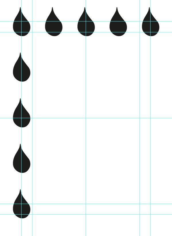
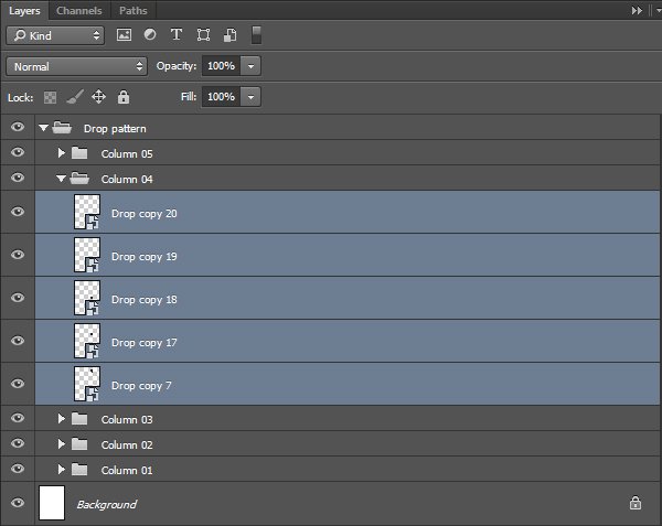
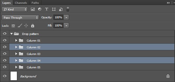
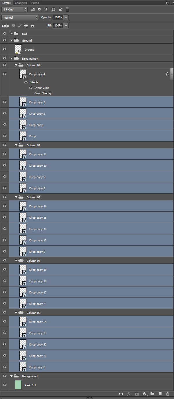
More layer organization. There’s one layer group for each column.
From there, we just have to repeat the duplication process for each column, as well as the vertical spacing, and we’ll have ourselves a pattern.
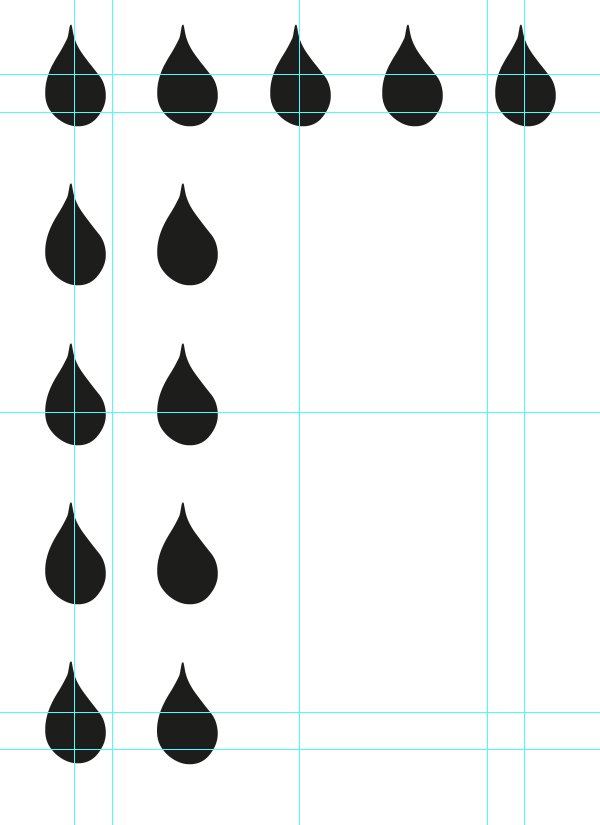
From here on, it’s a matter of repetition.
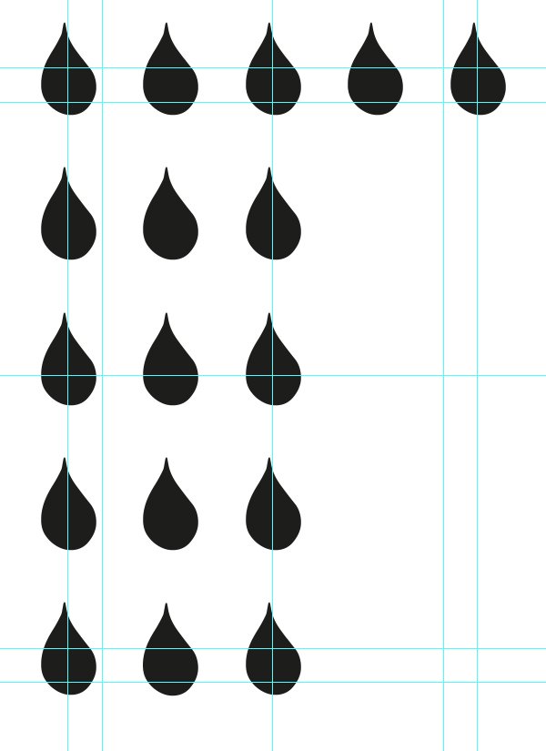
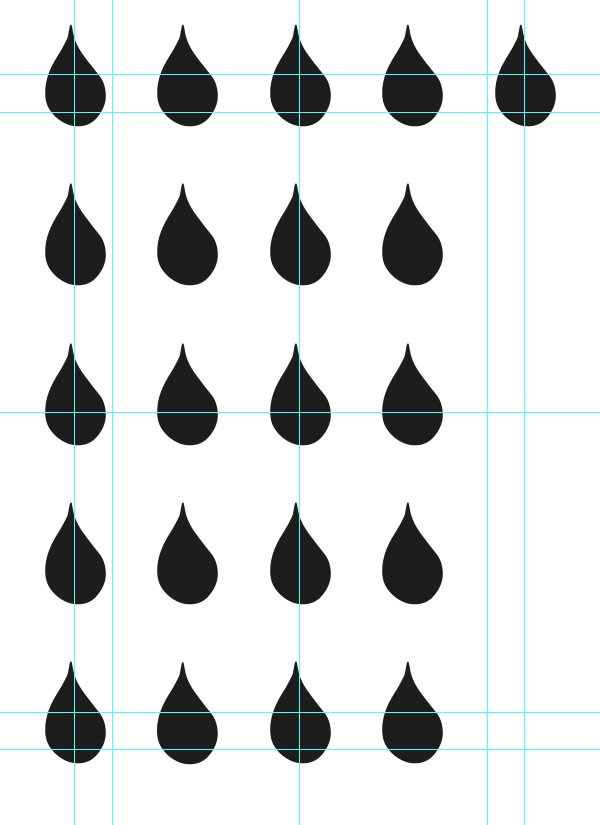
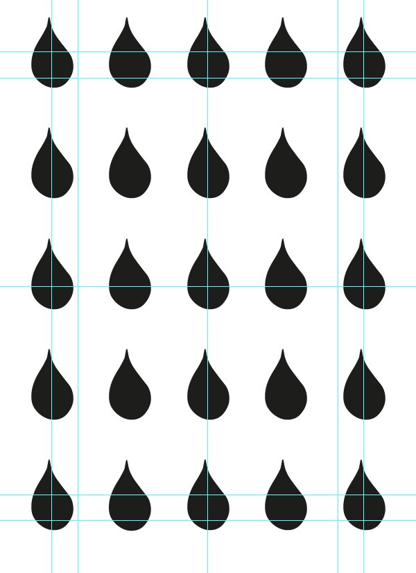
Wait, didn’t we say something about an offset pattern?
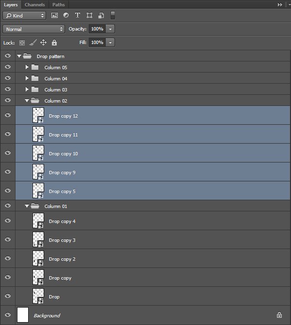
We absolutely did. Thanks to Photoshop’s smart guides, we’ll be able to offset each other pattern line quite easily. We first need to make sure the smart guides are turned on (View > Show > Smart guides). Then, let’s highlight both the second and fourth drop columns in the layer palette.
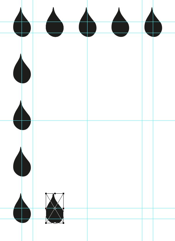
From there, we simply have to slide the column down while holding SHIFT (this will make sure that we slide down in a straight line), and to use the smart guides (in pink) to align the center of the drops with the top of the one in the next column.
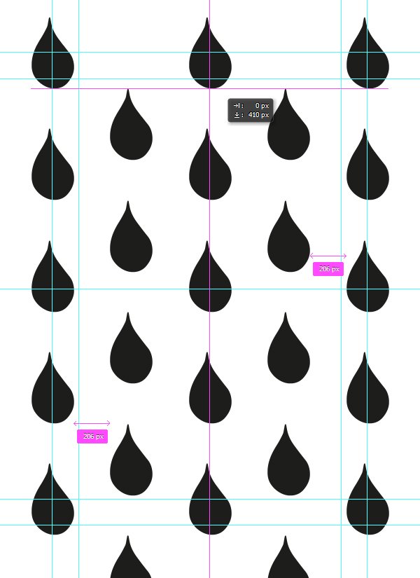
After that, we have our offset pattern. An extra thing to do would be to delete the two drops that are outside of the cover’s boundaries.
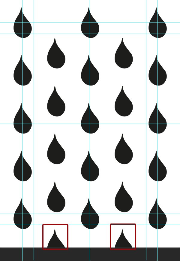
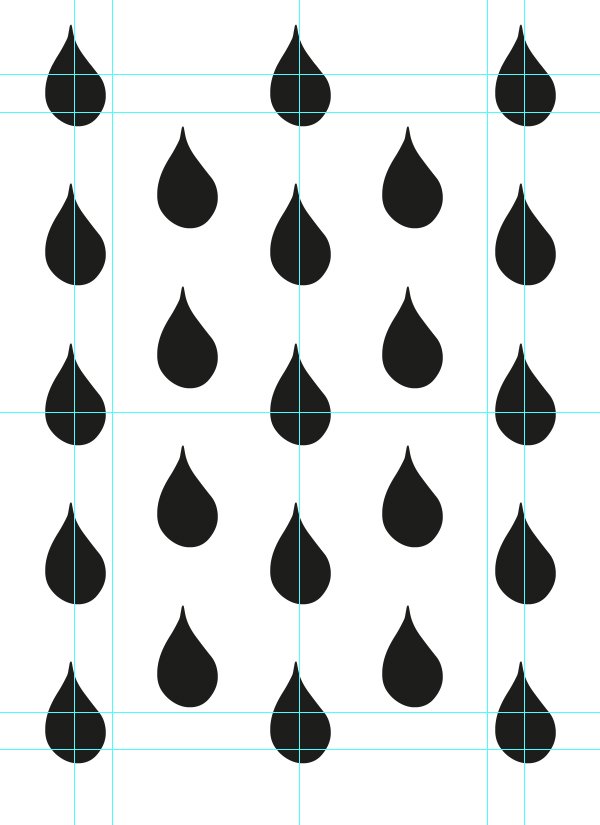
Now that the pattern is fully in place, we can move on to the other elements.
The owl
Vintage Design Co.’s pack features the owl character that inspired the base idea for our piece.
We need it as a smart object, full size. The lower edge of its bounding box should be flush with the bottom .5″ guide (X: 4″, and Y: 6.22″).
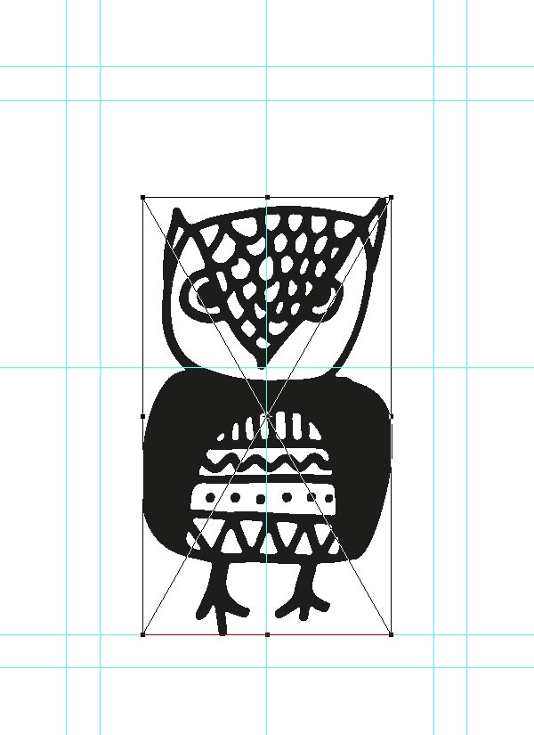
We also need to add a supporting element for the owl, as otherwise it’ll float within our cover. Luckily for us, it looks like Vintage Design Co. thought about everything.
This one is scaled up to 325%, and placed at X:4″, and Y:11.5″.
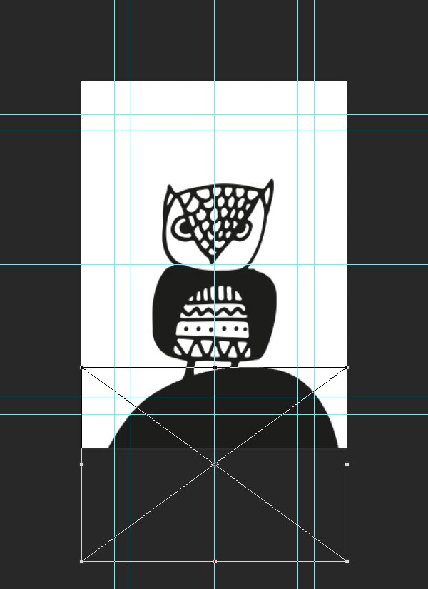
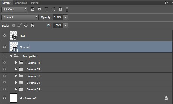
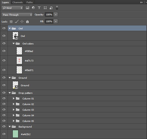
This is what our layers look like so far.
With all of that in place, we can finally think about colours. The type will cone right after that, followed by the textures.
STEP THREE: COLOURS
We are working on a children’s book cover. This gives us latitude to get away from realistic colours, and to make some rather bold choices. Let’s have a look at our palette.

From left to right, we have the following colours:
- #1d1d1b – dark gray
- #72c1a6 – deep turquoise
- #a4d2b2 – soft turquoise
- #ef7c73 – red
- #f0e971 – yellow
- #f0f0ed – off-white
We are going to start assigning them to elements. Two options for the various vector assets: either edit the smart objects, and assign directly to the vector elements (the best, as it will let us use blending modes without any limitations), or to use colour overlays.
Let’s start with the background. It should be in the soft turquoise (#a4d2b2).
The ground element should be in yellow (#f0e971).

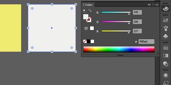
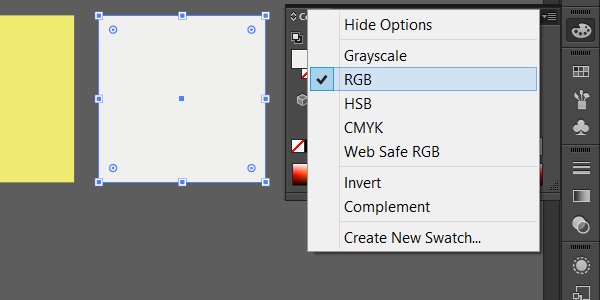
Protip: when assigning the colours to smart objects, make sure that both the document colour mode and the object’s colour mode are consistent with your master document’s colour mode. In our case, the master document is the Photoshop one, and it’s in RGB colour mode.
In Illustrator, you can change the document colour mode by going through the File > Document colour mode menu. To change an object’s colour mode, you’ll need to play with the options of the colour palette.
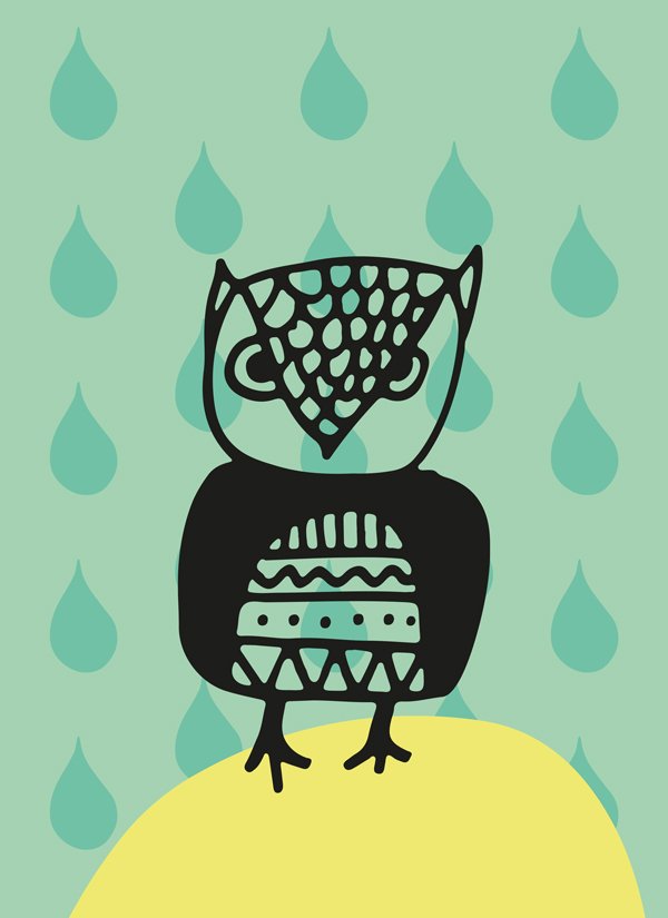
The owl’s body colour should be our dark gray (#1d1d1b).
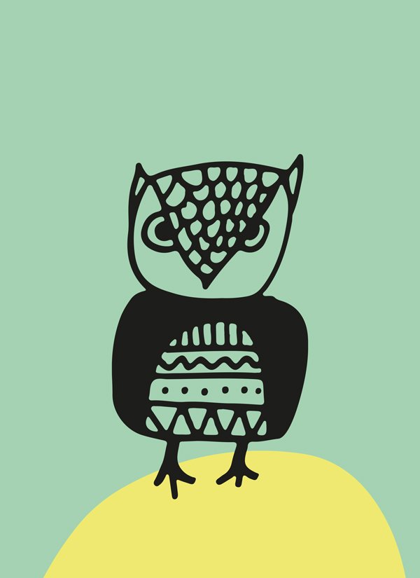
The water drops (once turned back on) should be in deep turquoise (#72c1a6).
Protip: changing the colour of the smart object directly could speed up things nicely here. For this trick to work, it is necessary to have duplicated the smart object by dragging it on the new layer button, or to have use the Duplicate layer right click menu item. What this does is that it creates an actual copy of your smart object, rather than consider it a new, independent element. The result is that changes made to one of the copies affects all of them. The result? Click once, affect 23 items.
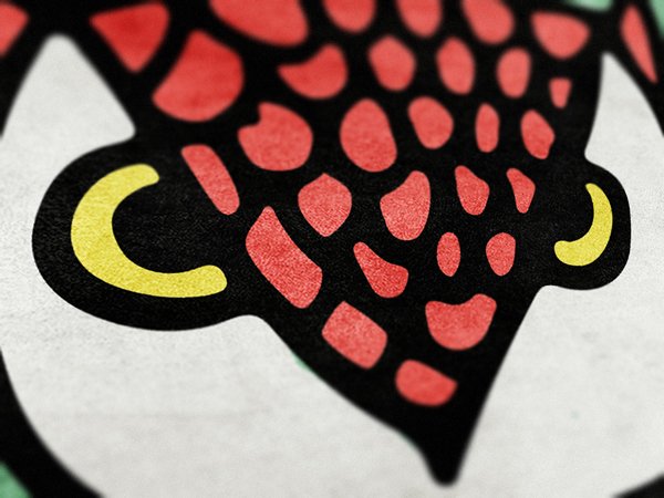
We need to add additional colours to the owl. It’ll make things more interesting to look at, and also avoid us to see through it. Let’s create a first layer below it, for a few yellow spots (#f0e971).
Using a precise brush (90 pixels), we’ll paint the eyes, along with some of the shapes in its abdomen’s patterns.
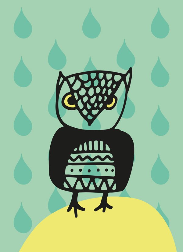


Using the same process, we’ll add a few splashes of red (#ef7c73).
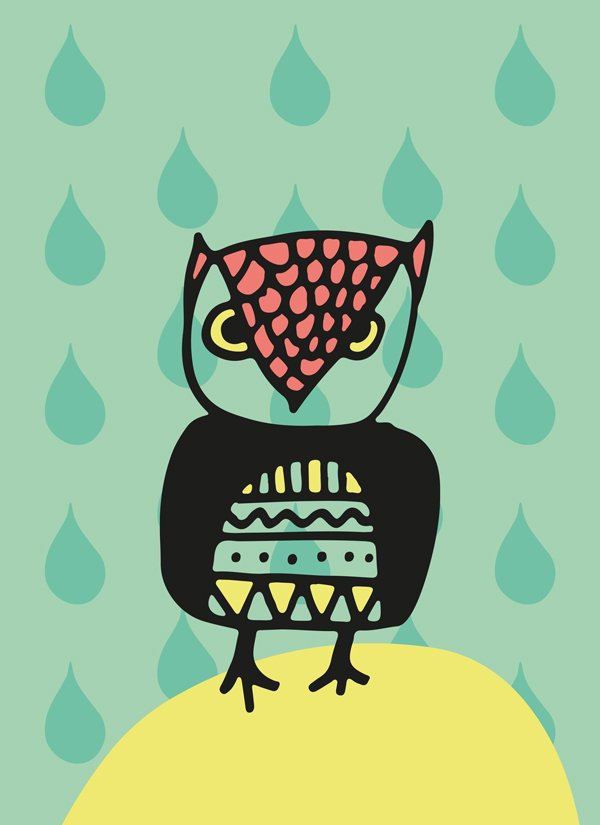
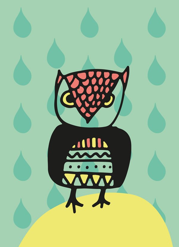

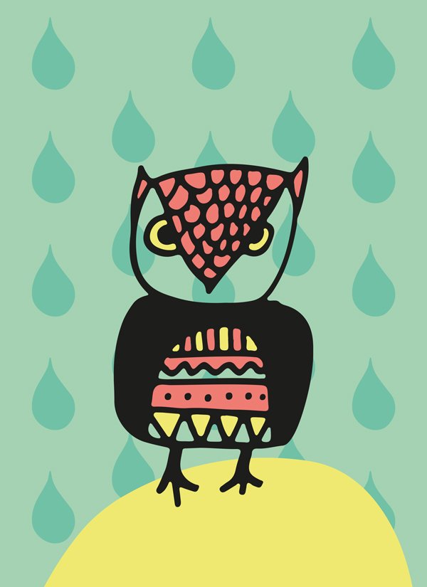
Last colour spots to add: off-white (#f0f0ed).
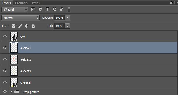


It’s time to organise things, because we’re almost ready for textures!
STEP FOUR: EXTRA DEPTH TRICKERY
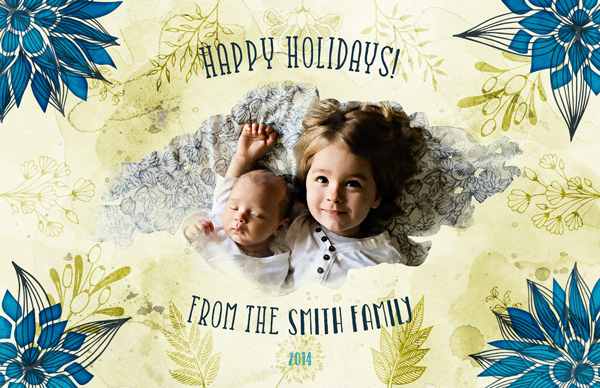
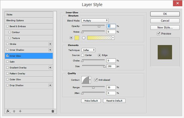
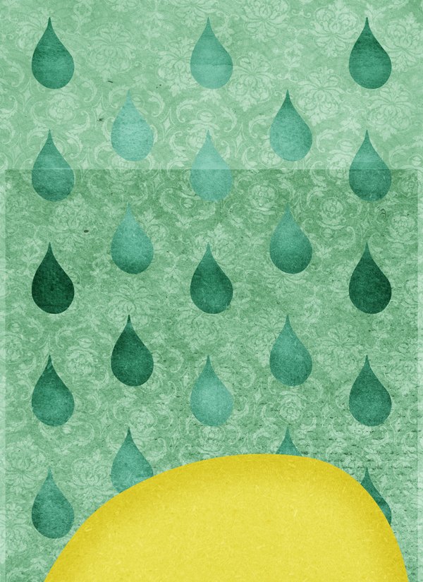
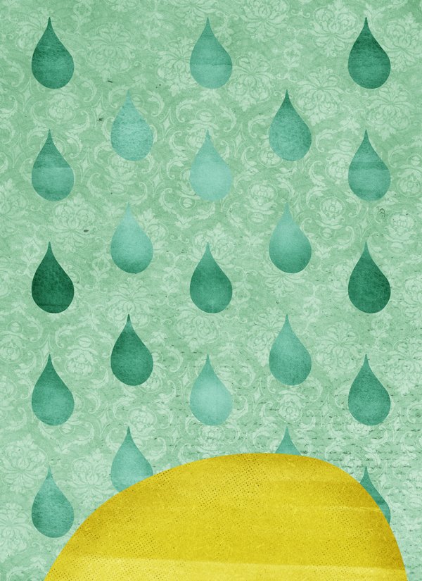
We are going to use a trick we first explored in the watercolour holiday card tutorial. The idea behind it is to use an inner glow of the same colour than the object it’s applied to to create a sense of volume. It can be spotted in the corner flowers in the piece below.
The owl
Let’s do the owl first. It’s coloured in dark gray (#1d1d1b), which is the colour we’ll make our inner glow.
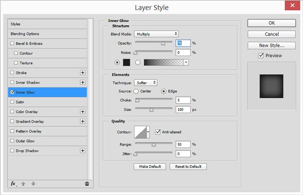
The result is this darker edge, looking like ink that would have dried darker around the edge of the shape, and lighter in its centre.

The water drops
We’ll follow a similar logic for the water drop. Let’s start by applying the effect to one of them (which one doesn’t matter). Let’s remember that the drops are in dark turquoise (#72c1a6).
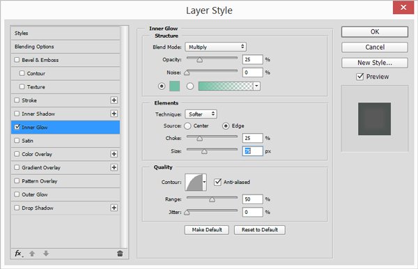
Here’s a 100% zoom view of the result.

Now, instead of having to apply the settings to each drop, we’re going to do it to all of them at once. Start by right-clicking on the affected drop. The menu that is of interest to us is Copy layer style.
Next, we simply have to highlight the layers we want to apply the layer style to in the layer palette, right-click again, and use the Paste layer style option to gain a non-negligible amount of time. Protip: pressing the CTRL/CMD key while clicking allows to select multiple layers at once.

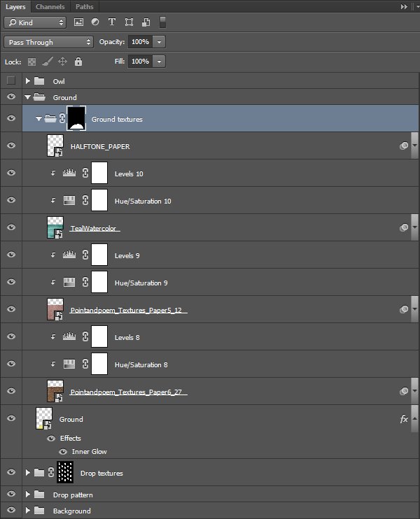
The ground
The last piece we’ll apply the trick to is the ground, which is yellow (#f0e971).
This makes us done with the trickery. Onto textures we go!
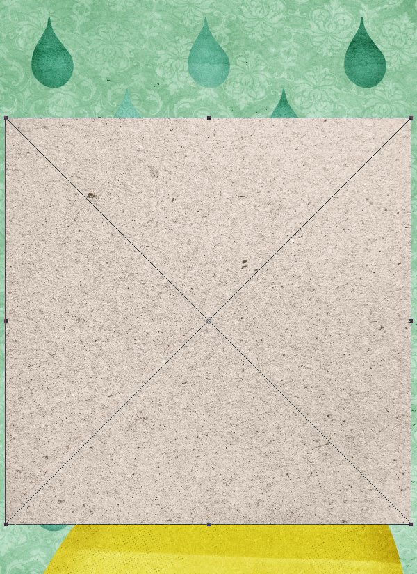
STEP FIVE: ALL THE TEXTURES!
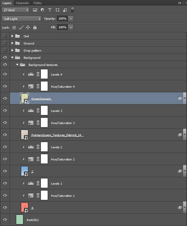
It’s finally time to give personality to our piece with a hand-picked selection of textures. There are many to choose from, and we’ll layer plenty of them to create a unique, tactile effect.
The background itself
There will be four textures to enhance the background. They are, in order of application:
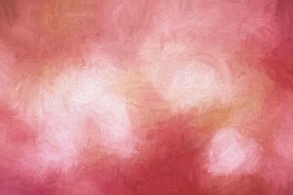
4.jpg – from the “6 Burlap patterned textures” pack by The Little Cloud (\extensive-textures-the-little-cloud\burplappatterns)
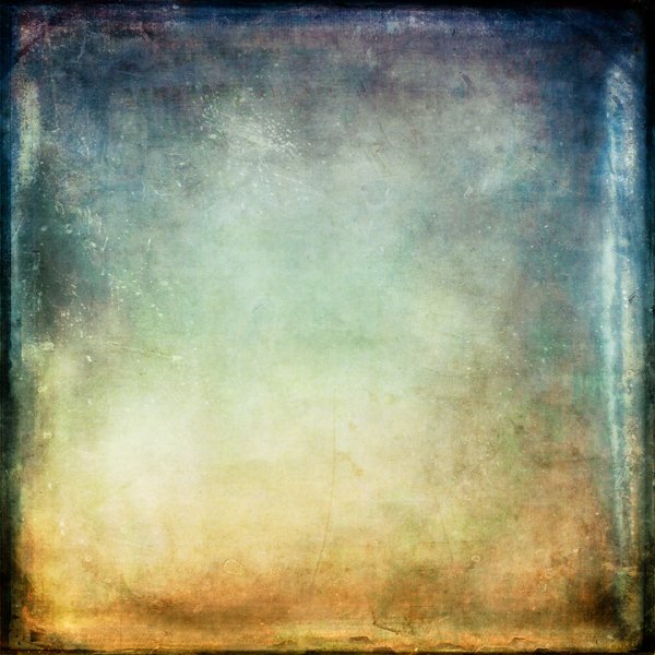
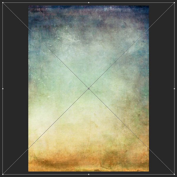
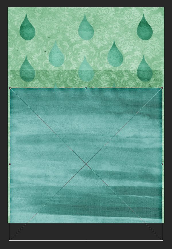
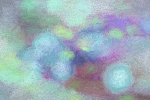
2.jpg – from the “Blue ombre watercolour backgrounds” pack by The Little Cloud (\extensive-textures-the-little-cloud\blueombre)

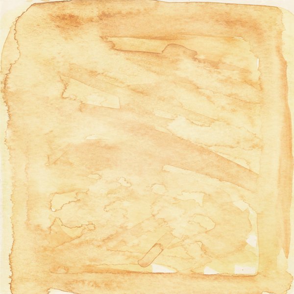
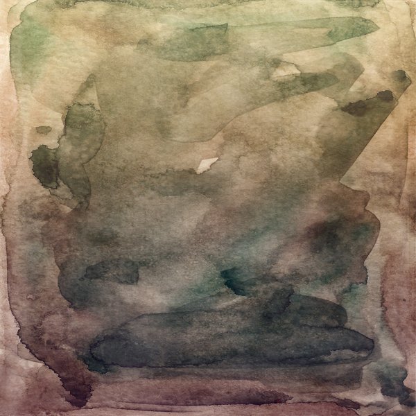
Pointandpoem_Textures_Fabric6_14.jpg – from the “Old vintage Paper textures” pack by Point and Poem (\extensive-textures-point-and-poem\Old-Vintage-Paper-Textures)
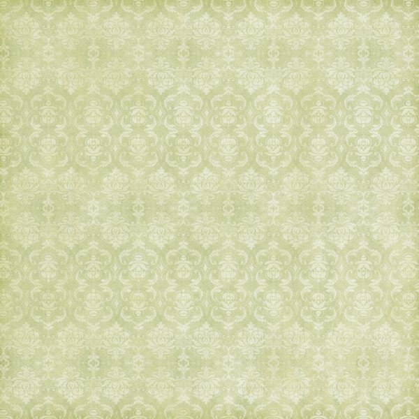
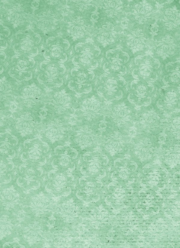
GreenDamask.jpg – from the “Nana’s Kitchen Digital Paper Pack” set by Clik Chic (\extensive-textures-clik-chic\Nanas-Kitchen)
Let’s begin. 4.jpg is placed centred, scaled up so it covers the full piece, and slightly rotated (105%, 12 degrees clock-wise).
Don’t forget to clip the hue/saturation adjustment layer.
Blending mode: Soft light @ 25%

2.jpg is next. We are using it to slightly lighten the bottom of the piece (200%, rotated 180°, and flush with the top edge of the canvas).
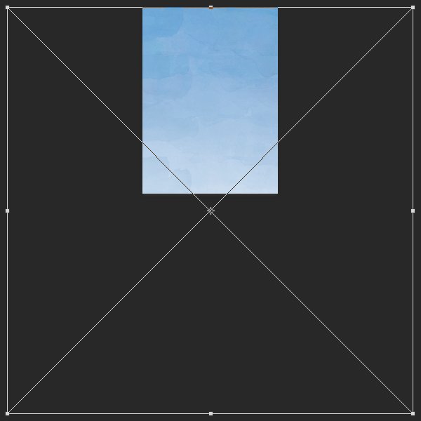
Blending mode: Soft light @ 50%

Pointandpoem_Textures_Fabric6_14.jpg is next. It’s centred, and scaled down to cover the whole piece (95%).
Blending mode: Colour burn @ 50%

Finally, GreenDamask.jpg. We’ll use like the first texture, as a way to add a subtle pattern to the background (105%, 12°).

Blending mode: Soft light @ 100%
And we’re done for the textures of the background itself. A quick look at the layers.
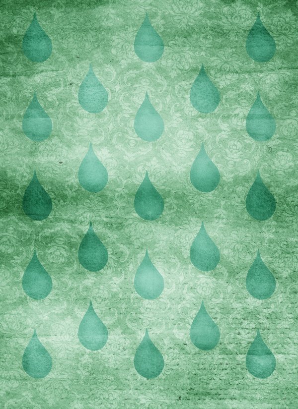
The drops
The next elements to go through the texturing process are the drops. We’ll use three textures for them.
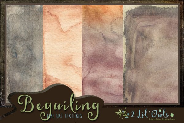
Enigmatic-10.jpg – from the “Enigmatic” set by 2 Lil’ Owls (\extensive-textures-2-lil-owls\Enigmatic)
Pixie-Paints-1.jpg – from the “Pixie Paints” set by 2 Lil’ Owls (\extensive-textures-2-lil-owls\Pixie Paints)
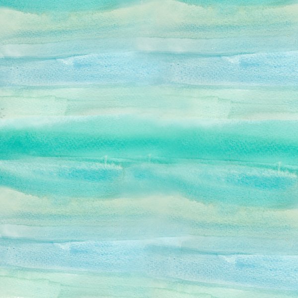
bluewatercolour.jpg – from the “Watercolour Papers” set by Angie Makes (\extensive-textures-angie-makes\Watercolour-Patterns\Watercolour Papers)
Enigmatic-10.jpg is scaled down to cover the whole piece.
Blending mode: Soft light @ 100%
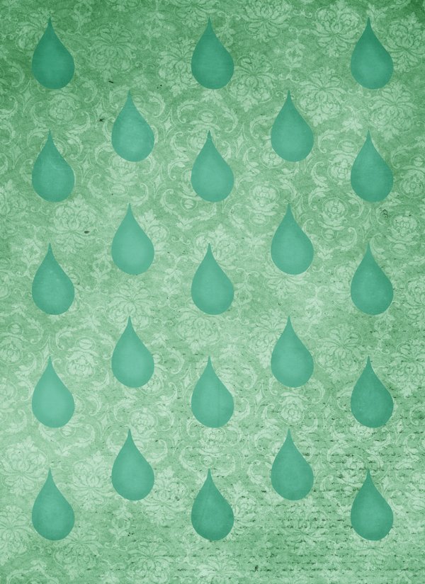
Pixie-Paints-1.jpg is rotated 90°, and scaled down to 82%.
Blending mode: Soft light @ 75%
bluewatercolour.jpg is scaled to cover the full piece.
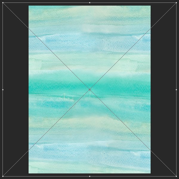
Blending mode: Soft light @ 100%
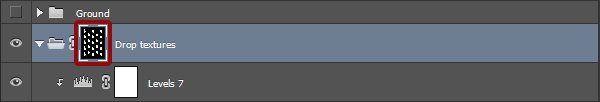
Next, we need to make sure these textures apply only to the drop pattern. First, let’s give these their own layer group.
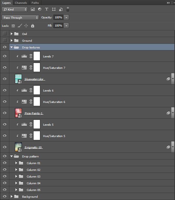
The following step is to load all of the water drop shapes as selections, by using CTRL/CMD+SHIFT+CLICK on them.
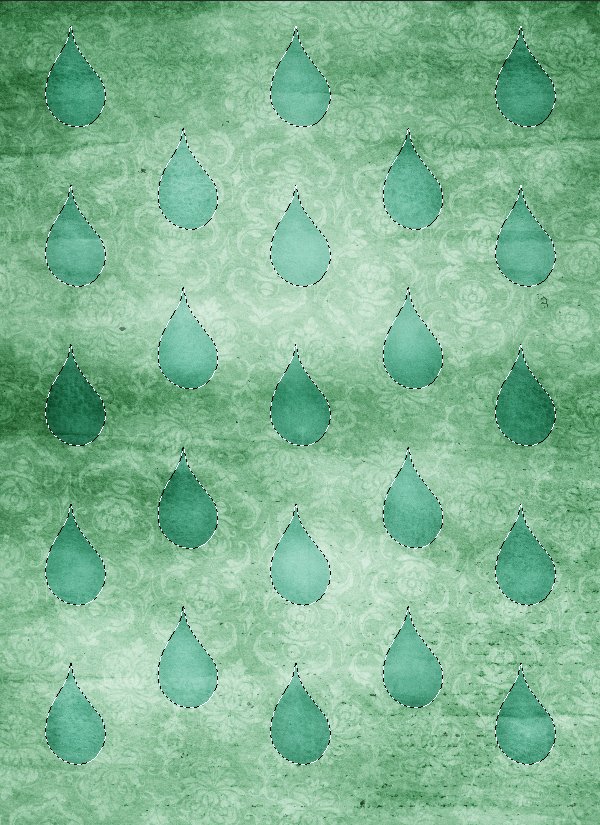
With the selection active, we just have to add a layer mask to the texture group, and we’re good to go.

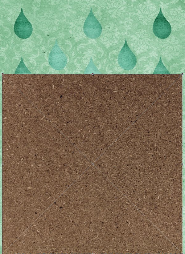
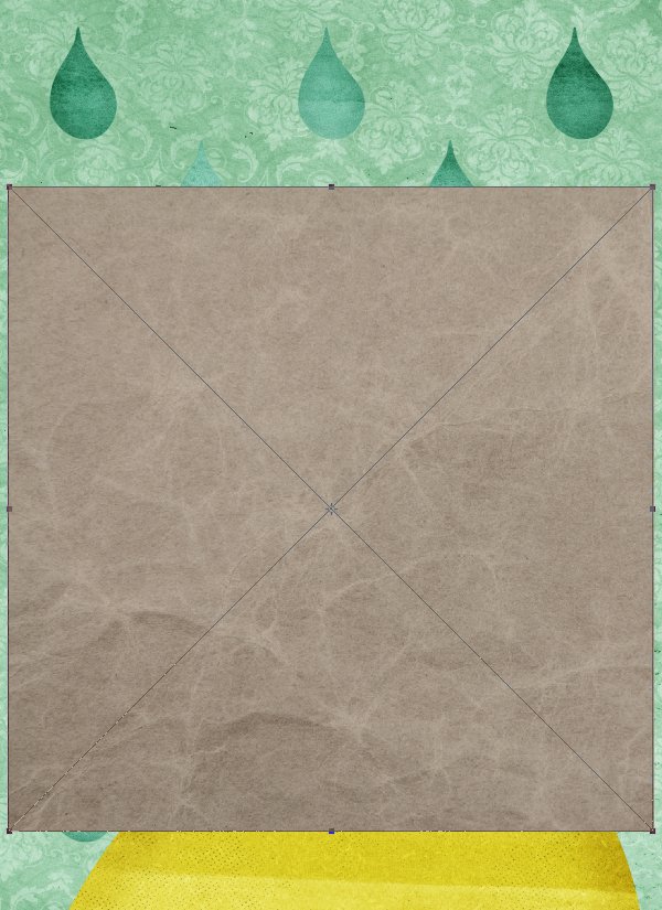
The ground
The next element we get to texture is the ground shape. We’ll use four textures.
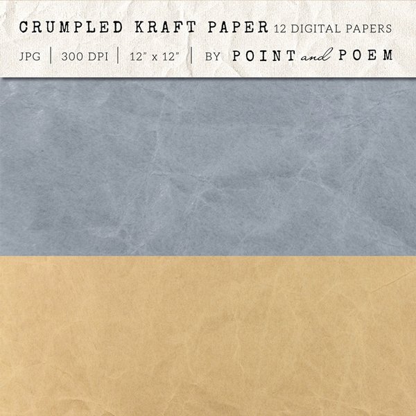
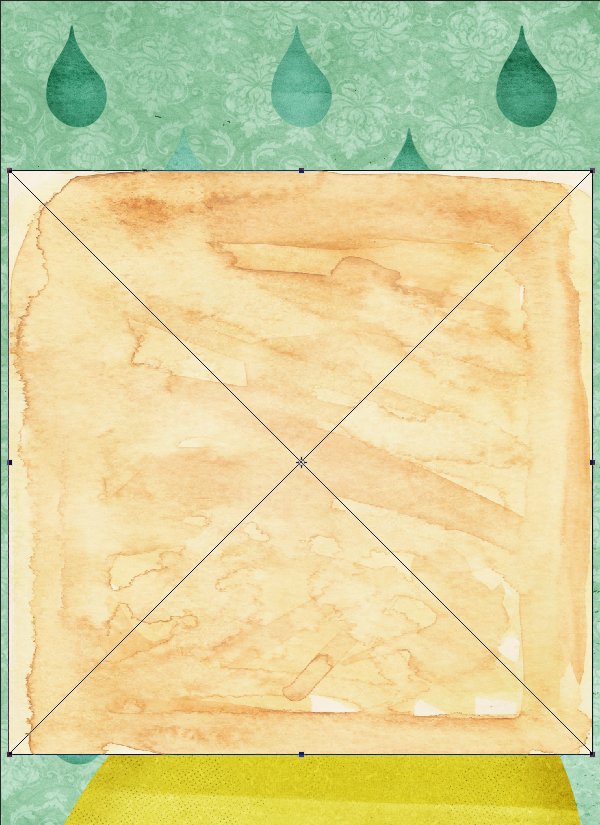
Pointandpoem_Textures_Paper6_27.jpg – from the “Kraft Paper Texture Pack – Neutral” pack by Point and Poem (\extensive-textures-point-and-poem\Kraft-Paper-Texture-Pack-Neutral)
Pointandpoem_Textures_Paper5_12.jpg – from the “Crumpled vintage kraft paper texture” pack by Point and Poem (\extensive-textures-point-and-poem\Crumpled-Vintage-Kraft-Paper-Texture)
TealWatercolour.jpg – from the “Beachy Watercolour Chevron Textures” pack by Click Chic (\extensive-textures-clik-chic\Beachy-Chevrons)
HALFTONE_PAPER.png – from the “Vintage Maps, Charts & Textures” pack by Offset (\extensive-textures-offset\Vintage-Maps-Charts-Textures\PNG_TEXTURES)
Pointandpoem_Textures_Paper6_27.jpg is scaled to fit the width of the shape (65%). Its bottom edge is flush with the edge of the canvas.
Blending mode:Soft light @ 75%.
Pointandpoem_Textures_Paper5_12.jpg is also scaled to fit the width of the shape (65%).
Blending mode:Soft light @ 35%.
TealWatercolour.jpg is horizontally centred, and its vertical centre is flush with the top of the ground shape (X: 4″, and Y: 8″). Just like before, it’s also to be scaled down to fit the width of the shape (65%). The goal is to get some of the darker parts of the texture to show within the shape.
Blending mode: Overlay @ 75%.
Finally, HALFTONE_PAPER.png is placed scaled up to 110%, rotated of 12°, and its top almost flush with the top of the background shape (X: 4″, and Y: 13″).
There’s no need for adjustment layers here, simply to change the blending mode to Colour burn @ 35%.
Also, just as with the water drops before, we need to constrain the textures to the background shape.
The owl
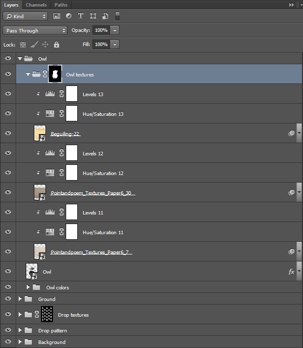
The owl also receives her fair share of textures – three of them.
Pointandpoem_Textures_Paper6_7.jpg – from the “Kraft Paper Texture Pack – Neutral” pack by Point and Poem (\extensive-textures-point-and-poem\Kraft-Paper-Texture-Pack-Neutral)
Pointandpoem_Textures_Paper6_30.jpg – from the “Kraft Paper Texture Pack – Neutral” pack by Point and Poem (\extensive-textures-point-and-poem\Kraft-Paper-Texture-Pack-Neutral)
Beguiling-22.jpg – from the “Beguiling” set by 2 Lil’ Owls (\extensive-textures-2-lil-owls\Beguiling)
Pointandpoem_Textures_Paper6_7.jpg is placed scaled down, to fit the owl tightly as a whole (65% – try to say this out loud super fast!).
Blending mode: Soft light @ 35%.
Pointandpoem_Textures_Paper6_30.jpg is placed and scaled the same way.
Blending mode: Soft light @ 75%.
Beguiling-22.jpg is aligned with the previous two textures.
Blending mode: Soft light @ 100%.
And just like previously, we need to use a layer mask to make sure the textures apply only to the owl. We can use the owl and the various colour layers to select it in its entirety, rather than painstakingly paint the inner gaps of the layer mask by hand.
And with this step, all of our individual elements received their textures.

We can now tackle another important part of a book cover: the title and author name.
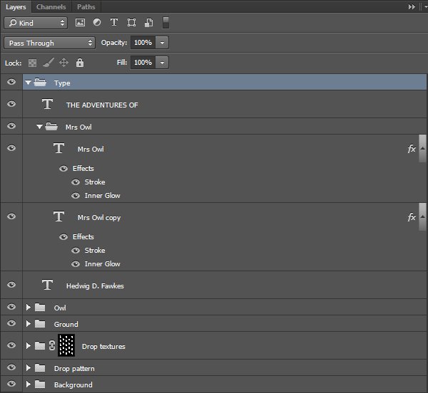
STEP SIX: TYPE ELEMENTS
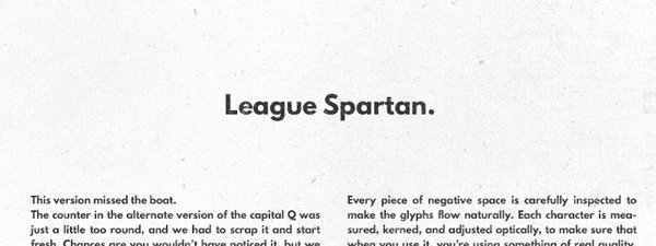
We will use two typefaces for our cover: Majesti Banner, by Joe Prince/Lost Type Co-Op (free for personal use), and League Spartan, from The League of Moveable Type (free, open-source license).
The copy to include
The book is titled The adventures of Mrs Owl, and was written by Hedwig D. Fawkes (whoever finds the origin of that fake author name gets a digital high-five).
Mrs Owl
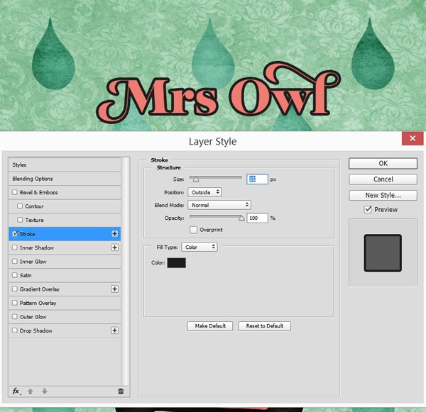
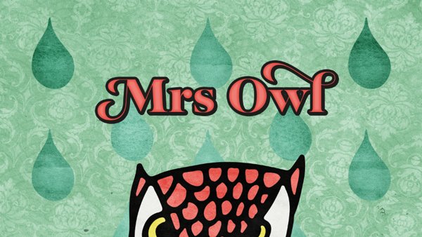
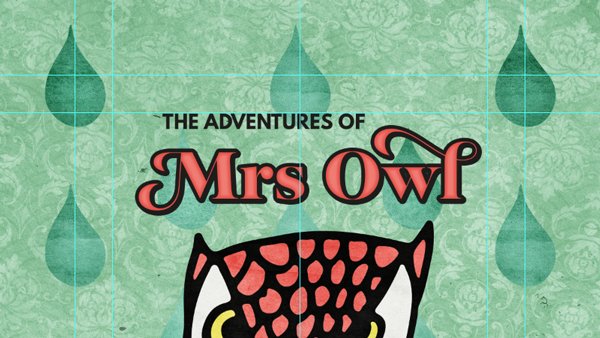
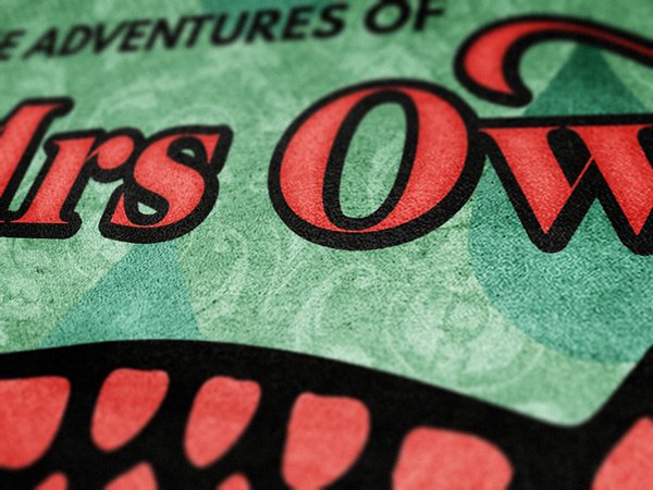
Start by writing “Mrs Owl” in Majesti Banner Heavy. It should be centred, sized 72 points tall, and in red (#ef7c73). The title will be in the top section of the cover.
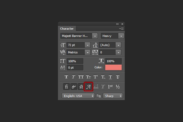
From there, we need to activate the swashes on the “M,” and on the “l.” You can do this through the character panel.
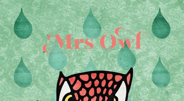
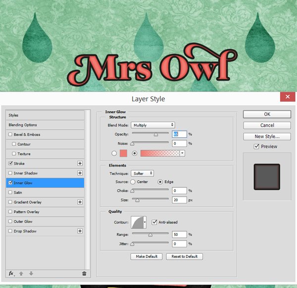
Next, we are going to give a bit of volume to that type block. Give it a thick dark grey stroke (#1d1d1b, 15 pixels, aligned to the outside), as well as a red inner glow (#ef7c73).
To add even more volume, we are going to create a shadow behind that text block. Step one: to create a copy of the text element (this is also a good time to organise things some).
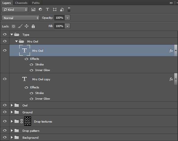
Simply nudge the copy down and to the right some with the arrow keys. Here’s the result with two taps in each direction.
The adventures of
“The adventures of” is written in left aligned, dark grey League Spartan, that’s 18 points tall, and that’s in all caps. It’s optically aligned within the gap at the top of “Mrs Owl.”
The complete title block is vertically centred between the top of the owl’s head, and the inner .5″ marker.
Author name
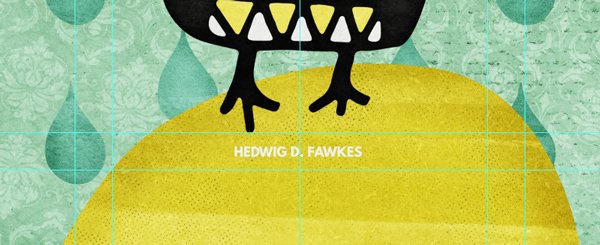
Hedwig D. Fawkes will also be written in all caps League Spartan, but in off-white (#f0f0ed), and only 12 points tall. It’s vertically centred between the edge of the canvas, and the bottom of the owl’s paws.
And after some clean-up, our layers should look like this.
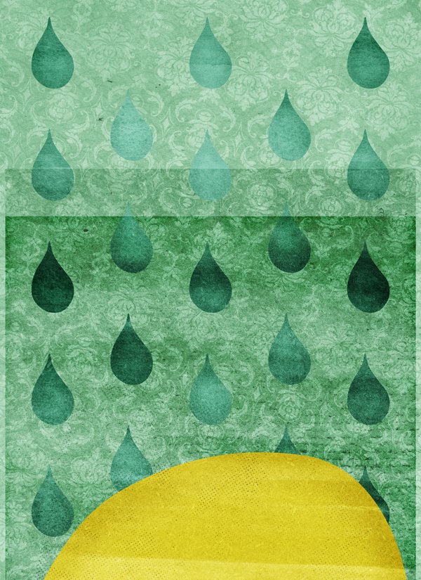
STEP SEVEN: THE HOME STRETCH
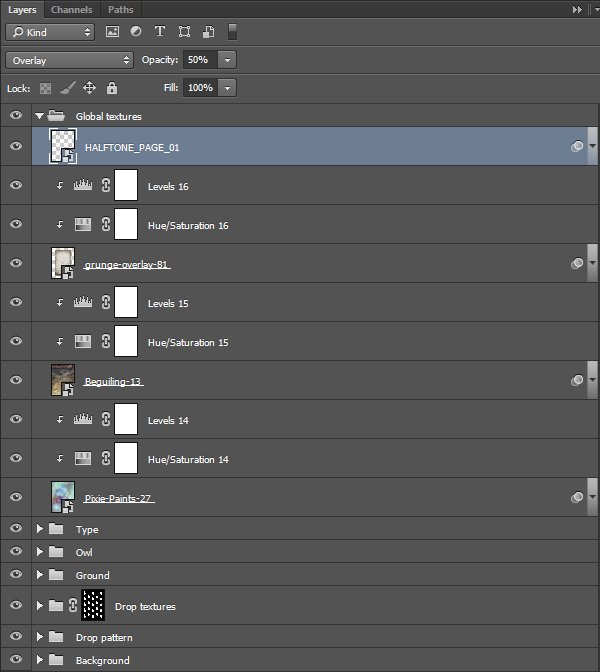
We have one more thing to do: one last round of texturing. These last four textures will tie the piece together visually, which at this point is crucial. The textures are the following:
Pixie-Paints-27.jpg – from the “Pixie Paints” set by 2 Lil’ Owls (\extensive-textures-2-lil-owls\Pixie Paints)
Beguiling-13.jpg – from the “Beguiling” set by 2 Lil’ Owls (\extensive-textures-2-lil-owls\Beguiling)
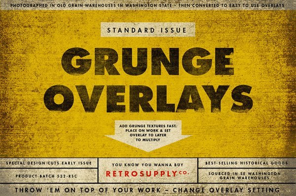
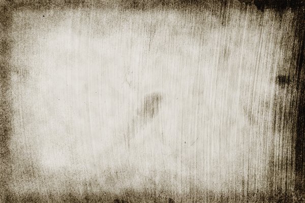
grunge-overlay-81.jpg – from the “100 Standard Issue Grunge Overlays” set by Retro Supply Co. (\extensive-textures-retro-supply-co\Standard-Issue-Grunge-Overlays)
HALFTONE_PAGE_01.png – from the “Vintage Maps, Charts & Textures” pack by Offset (\extensive-textures-offset\Vintage-Maps-Charts-Textures\PNG_TEXTURES)

Pixie-Paints-27.jpg is placed centred, scaled down to 85%, and rotated 90°.
Blending mode: Soft light @ 100%.
Beguiling-13.jpg is placed centred, scaled down to fit the piece (95%), and upside down.
Blending mode: Soft light @ 65%.
grunge-overlay-81.jpg is placed to fit very closely the limits of the finished cover (the actual 6″x9″ format). It’s centred, rotated 90°, and scaled down to 14.75%.
Blending mode: Soft light @ 65%.
Finally, HALFTONE_PAGE_01.png. It’s placed to fit the previous texture, to focus its effect within the final product.
With this one no need for adjustment layers. We’ll simply change the blending mode to Overlay light @ 50%.
A last look at the layer stack…
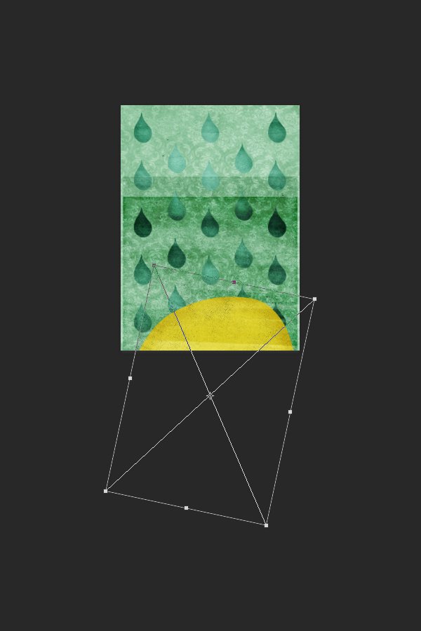
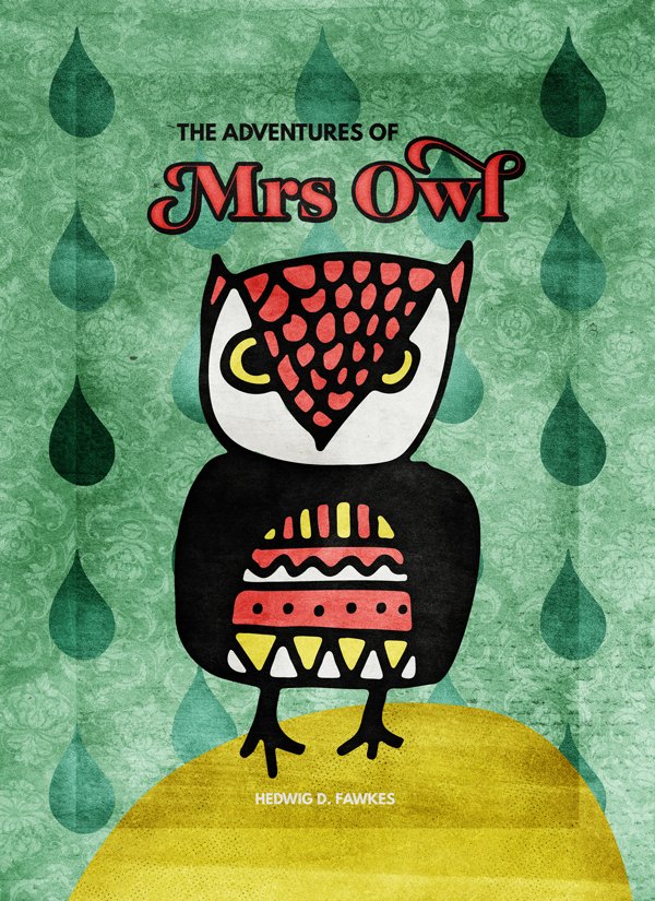
And we’re done. Now we simply have to crop the piece to the correct 6″x 9″ finished format to have a proper look at it.
WRAPPING THINGS UP
Congratulations on completing this tutorial. It was a long one. Awesome job!
Did I leave questions unanswered? Please ask in the comments below. The Design Geeks and myself will do our best and help out.
We’d love to see your tutorial outcomes! Please share them with us on the Design Cuts Facebook page. We’ll share the best ones with the whole community.
There is less than a week left to grab the extensive textures, patterns and backgrounds bundle for 95% the regular price (saving you over $575 in the process)! If you purchased the resources already, I hope that you enjoy them, and that this tutorial gave you a sense of what you can accomplish with them.
That’s it for me today! Until next time, cheers, and have a wonderful weekend!
I’m a newbie, and learning all the ins and outs, tools and techniques of photoshop can make me want to pull my hair out. This is the first of your tutorials I’ve taken, and just wanted to say that it was amazing – filled with “oooooh, THAT’s how you do it!” etc.
I’ll be back for more, and some texture packs too, now that I understand better what they’re for!
G
Hey Gwen,
Thank you for your lovely comment! I’m really pleased that you found this tutorial helpful and I’m sure Simon will be happy to hear it too, he did a fantastic job putting it all together :)
That is fantastic news! We look forward to hearing from you soon! If you ever need any help please do get in touch, I’m always happy to lend a hand :)
Hello G!
Thank you for your kind words. I’m very glad that my sometimes long posts can be of some help. We’ve got plenty more in the archive. I hope you’ll find them useful.
Don’t hesitate to reach out for help!
Thanks for the tut. So much in that pack awesome to have some guidance in how to make the most of it.
Really pleased to hear you enjoyed the tutorial, Joy! :) Simon did an awesome job!
Thank you for your kind words, Joy. And I agree, there’s so many cool little gems. The DC team and I were considering 8 different concepts to start from.
such a COOL tut, and so well done, easy to follow.
Hey Andria,
Thank you for your kind words :) Simon will be supper pleased to hear you enjoyed his tutorial! :D
Thank you for your kind words, Andria!
I love your style, Simon. Great tutorial, and I love your example. I’m looking forward to trying out some of your tricks. I use GuideGuide in CS6. Glad to hear they’ve made it standard in CC. The owl looks great with your added touches, and the textures really make it pop!
Hello Leah. Thank you for your kind words about the tutorial. Don’t hesitate to share your outcome!
And yeah, CC actually includes a lot of little things like the guides stuff that make it so worthwhile to upgrade.
great tut! :D
Hey Majo,
I’m really pleased you enjoyed the tutorial! :D Simon did an amazing job!
Thank you MaJo!