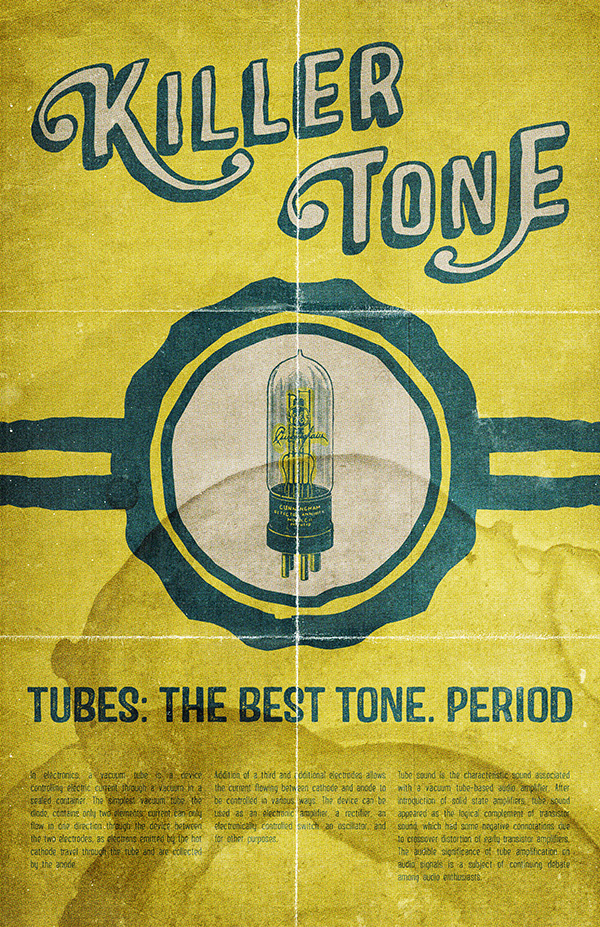
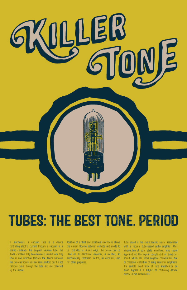
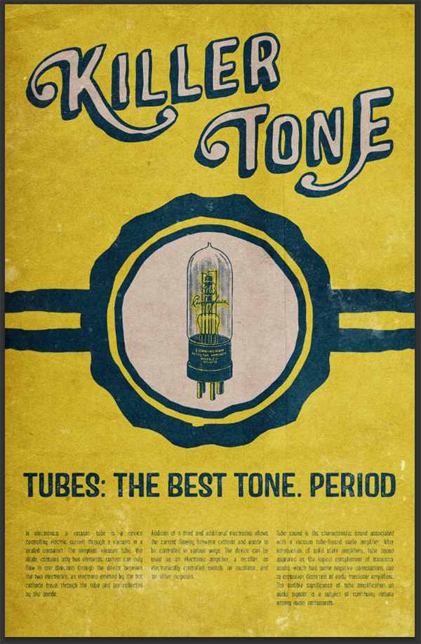
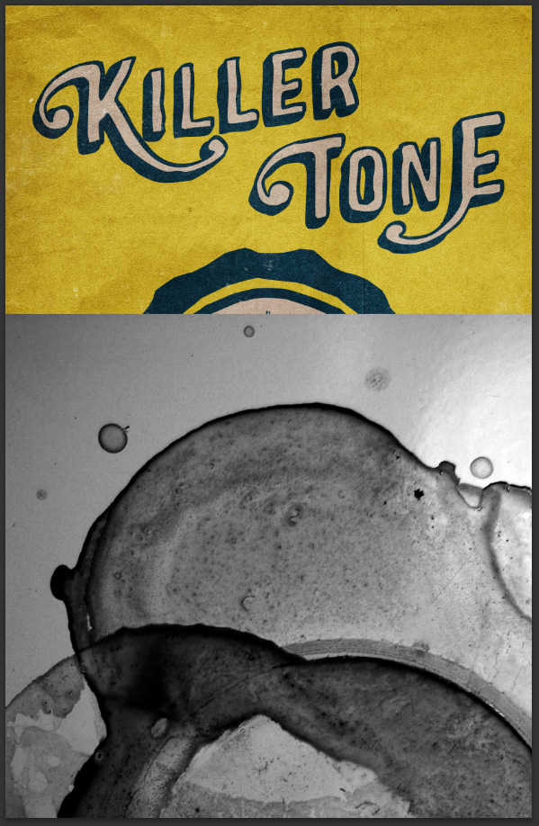
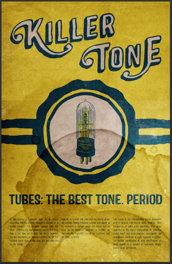
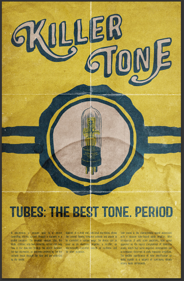
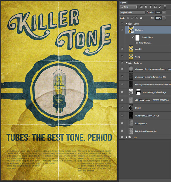
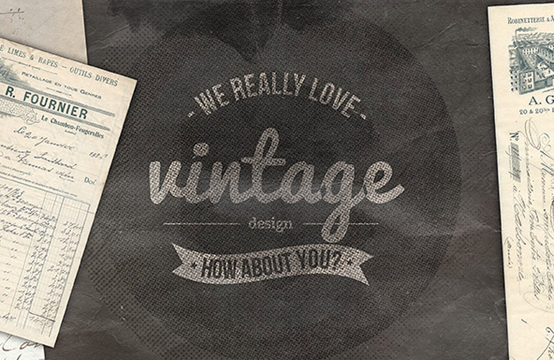
WHAT WE’RE CREATING:
Hello Design Cutters! Today we have an awesome retro tutorial for you, showing you how to design an ad poster using the typefaces in our current deal. The advert is promoting vacuum tubes, and is inspired by fantastic vintage packaging designs for these things.
You’ll learn plenty of great techniques such as:
- How to edit regular fonts into a more customised outcome (using line heights, kerning, ligatures and glyphs).
- How to layer up various textures to give an authentic retro outcome
- How to properly organise your design research and get inspired for your main design project.
Follow along with this tutorial: Download the freebies
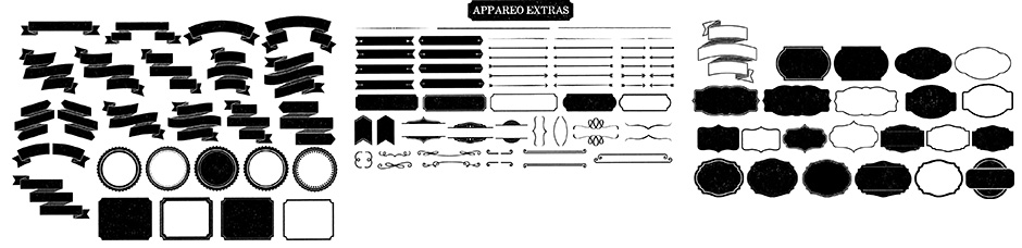
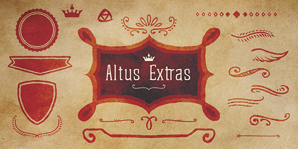
Today we have a HUGE freebie for all you design geeks to enjoy. Kimmy from Kimmy Design has kindly agreed to offer her Appareo Extras pack for the Design Cuts community. This pack regularly sells for $12, so is one of our biggest freebies to date. It contains dozens of cool badges, signs and ribbons, and is ideal for your illustration work.
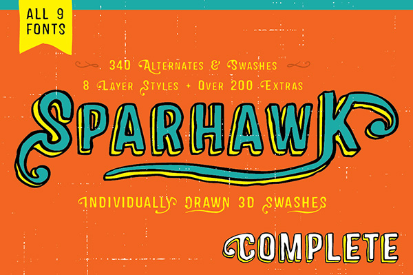
Remember, this freebie is just a tiny sample taken from our current deal Huge Creative Font Bundle (Including Web Fonts) Just $28 (95% Off). Most of the 11 awesome fonts included, come with packs of extra graphics, ligatures and more. It’s packed with value, as well as extended licensing on all items.
Let’s get started!
The tutorial will make use of the cool alternate characters from Sparhawk for the main title:
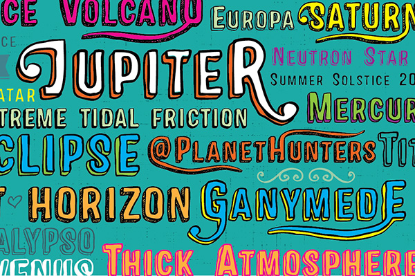
We’ll exploit Castor’s roughness for a sub-header, and some of its extra characters to quickly craft a badge for our center piece:
Finally, the clean and elegant Altus will be used for body copy:
Remember, you can grab these fonts and more as part of our Huge Creative Font Bundle (Including Web Fonts) for 95% Off.
The tutorial was written by Simon, one of the partners and designers at Studio Ace of Spade, who you might remember from the Swiss design-inspired poster tutorial, or textured owl illustration tutorials. To Simon!
STEP 1: RESEARCH AND CONCEPTUALIZING
Hello all! I’m excited for this tutorial, because unlike the Swiss design poster tutorial, we’ll also get to play a bit with textures.
Ater looking through the typefaces composing the deal, their vintage flair immediately made me think of old product ads. At the same time, I was researching vacuum tubes types for a guitar amplifier purchase, and found these amazing old tube packagings. The subject for the tutorial was just a matter of connecting the dots.
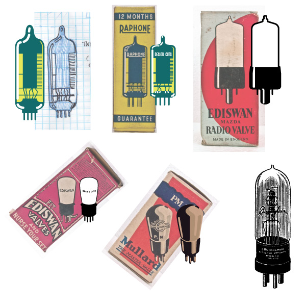
Let’s have a look at some of the reference material I’m talking about. First, there’s this amazing box for a Raphone EABC80 valve. It dates back to the 1960s.
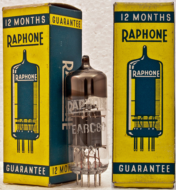
The box’s design is simple, straight to the point, and features that beautiful, iconic treatment of the valve.
Second, there’s this box for a Louden F1 valve. This one dates back to the late 1920s.
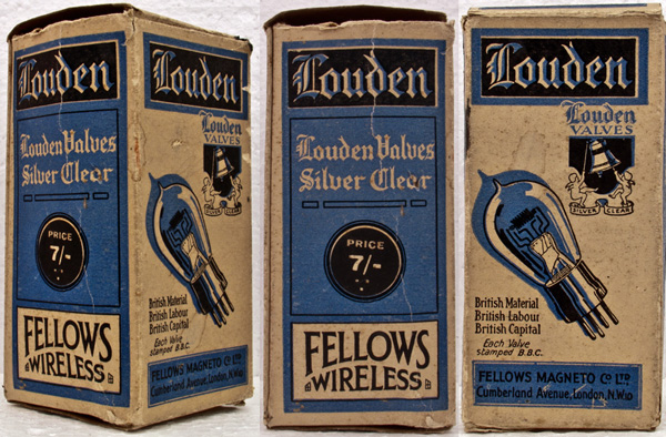
The box features beautiful type, and a very sweet line drawing of its content.
Both of these make great use of type, and of only a few colors to present their content. I personally just love how efficient these are. You should also note that I’ve looked at this Mullard PM5D box, but the way the valve was drawn didn’t fit the overall design of the poster in the end.
Let me also take a few seconds to extend my deepest thanks and admiration to Allan, the creator of the National Valve Museum. He’s been painstakingly assembling his collection of tubes, boxes, adverts, and more, just for fun. If you find the site useful, consider donating a buck or two.
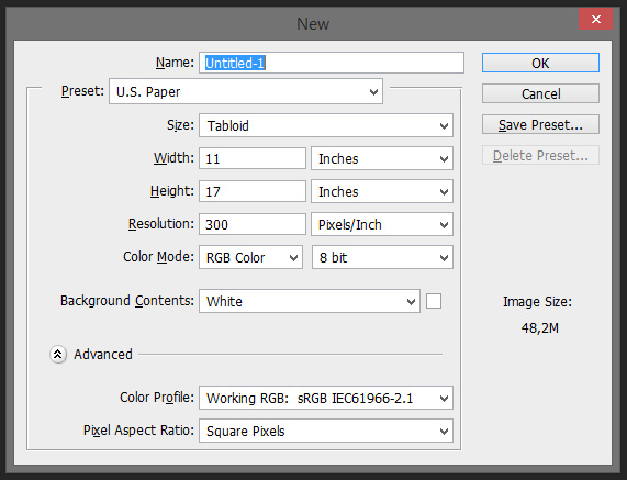
Now, after the research and inspiration gathering, it’s time to start thinking about our poster. I’ve chosen to work with an 11″x17″ format, but you could certainly work on bigger or smaller.
Once the format was chosen, I started sketching potential layouts. See below.
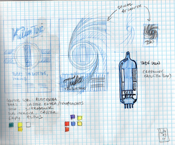
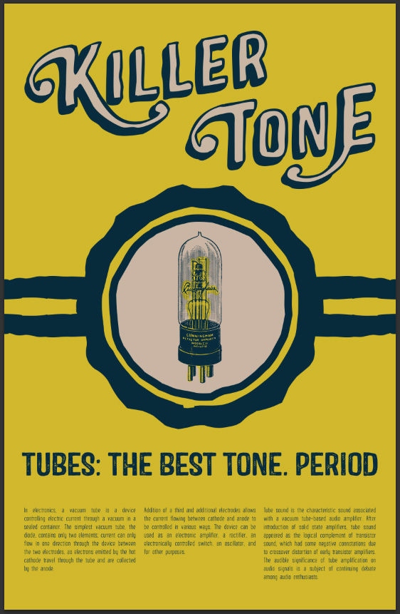
As you can see, there are two options here. The one on the left is using some of the extra elements presents in the typefaces to get a badge that would support the tube at the center. The color scheme is drawn from the Raphone packaging (teal, yellow, and off-white). The title runs all the way across, in order to feature the title type piece as big as possible.
The concept on the right features a more complex, spiral-like element to support the valve. The copy is written at the bottom of the poster, on a dedicated, solid band of color.
While the concept on the right seemed more prone to focus people to look at the center point of the poster, its smaller space for a title and for copy made me decide to develop the other layout instead. Also, the left concept’s badge can be obtained almost ready-made from the Castor typeface, rather than having to be created from scratch.
Now that we know what we’re creating, let’s get started.
STEP 2: THE ACTUAL VALVE
Well, if you look at my sketch closely, I actually drew a tube prototype.
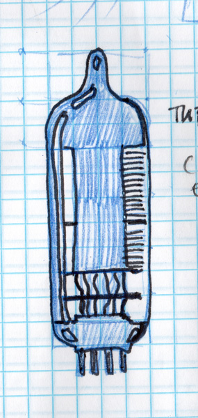
After a few attempts, here’s what I ended up with.
You can see my first attempt on the top left. The overall feel is decent, but I was really unhappy with the highlights. I then proceeded to directly trace the valve illustration (top row, middle). I had the same frustration over the highlights. I then proceeded to trace over a few more options (top right, bottom left, and bottom middle), to still not obtain a satisfying result. The bottom middle option is a good render, but didn’t fit the feel of the poster.
I then proceeded to see what my other options were. I then remembered that I had a sweet collection of three great books filled of a plethora of vintage illustrations, called “Scan this book” (you SHOULD totally get them – find them on Amazon: #1, #2, and #3).
I found the perfect tube in there, scanned it, and live traced it. See the settings below:
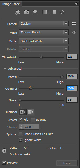
I’m not sure I have the right to include the tube image as a downloadable resource, but a quick search on DeviantArt returned results that could replace it. If you want to push it further, I can only encourage you to create your own tube asset, based or not on the ones you can find on these old packagings.
STEP 3: LET’S BUILD A POSTER
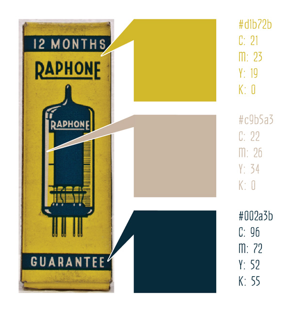
Let’s talk color palette
First, let’s start by establishing our color palette. I sampled mine from the Raphone box. I’ll use the yellow as my background color, the blue as my “black,” and the off-white for my mid-tones.
Creating a new file in Adobe Illustrator
This is pretty straight forward. As I’ve said earlier, I’m working with an 11″x17″ canvas.
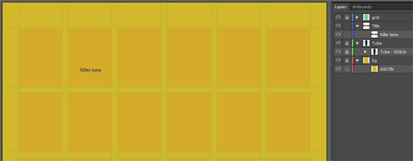
Using a grid
In order to give the poster a structure, I used a six-column grid from this handy grid kit from the Arsenal (168 grids, both in Ai and InD format). Note that you don’t have to use a grid, but it greatly speeds up the process of building the layout of the poster.
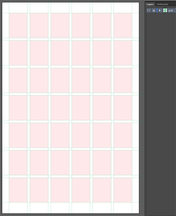
Note also that I’m just placing the grid in its own, locked layer. The rest of the poster will be built in layers underneath the grid layer. This allows for the grid to stay overlayed on top of everything as we build. I strongly suggest to turn the grid on and off at regular intervals through the building of the poster, in order to get a sense of how the poster flows together.
Placing our elements
Time to track down our main elements:
- A yellow rectangle for the background
- Our vacuum tube asset
- The badge element
- The title
- The main copy text
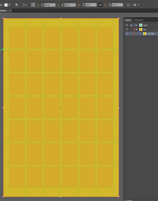
A yellow rectangle
Another straight forward step: create an 11″x17″ rectangle, filled in #d1b72b yellow, and place it in your canvas. I gave it its own “bg” layer as well, which you can lock as we won’t touch it again.
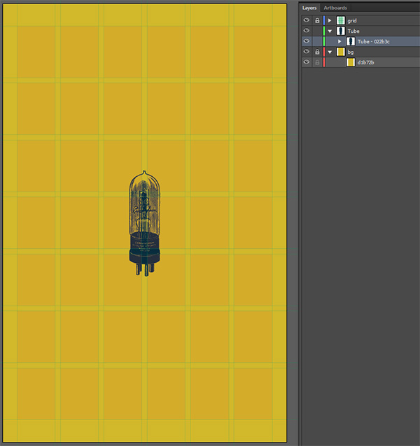
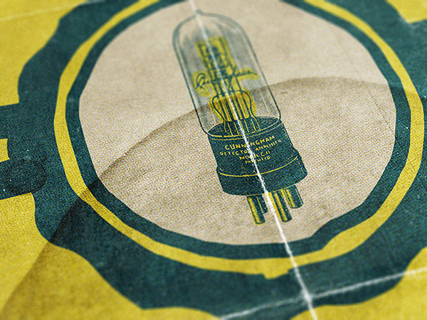
The vacuum tube, part 1
I just placed the tube on its own layer, at the center of my document. It stands at 4″ tall, and its color has been switched to our #022b3c dark blue. We’ll touch the tube again later, once the badge is ready to be put in place. But for now, you could lock the layer.
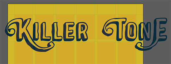
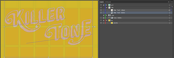
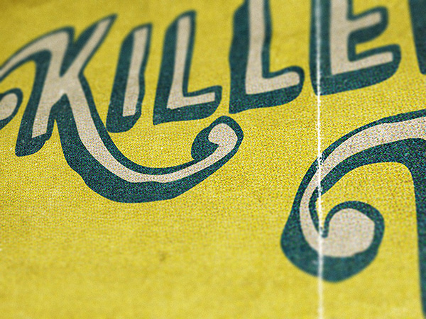
The title
Here’s a preview of what we’ll be creating. It uses only two of Sparhawk’s styles.
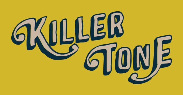
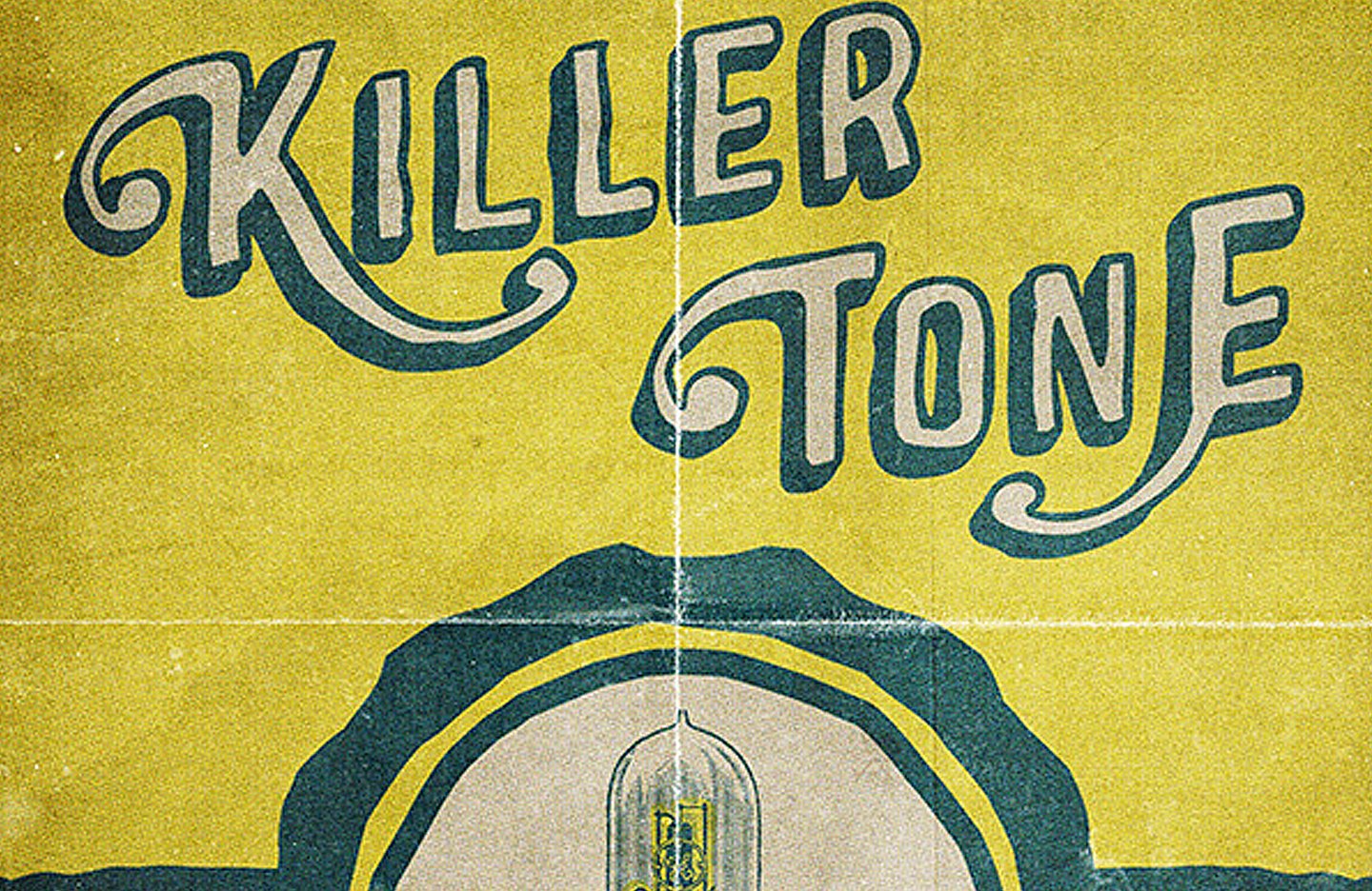
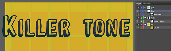
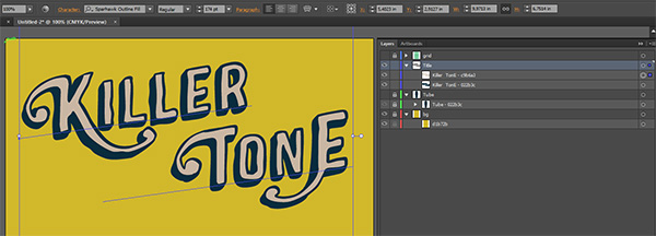
Using Sparhawk can seem tricky at first, but it’s actually very simple. You just layer the various type styles you want to combine. Start by creating a Title layer, and type “Killer tone” in it.
Next, we’re going to create the base of the title. Let’s switch our type to Sparkawk Black, increase its size (around 174 points is agood place to start), and change its color to our dark blue.
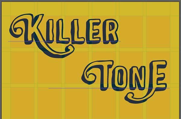
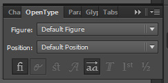
We’re now going to track down the various character alternates we’re interested in through the Glyph panel (Window > Type > Glyphs). Simply highlight the character you want to replace, browse the Glyph pannel until you find the one you want, double click, and tadaa, you’ve got yourself a new glyph in your text box.
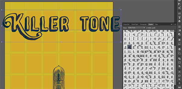
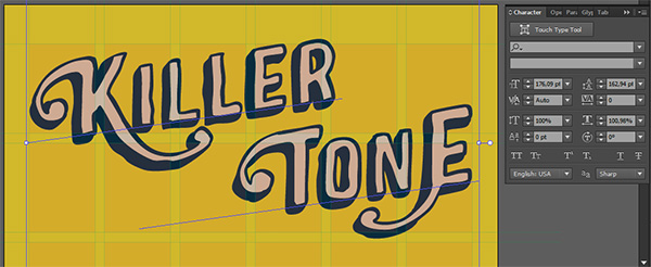
Pursue the operation until you’ve tracked down all the alternates you’re interested in. Simply keep in mind the end effect we’re looking to achieve: a two line, slightly sheared upwards title. Your letters’ extensions should look harmonious with that direction.
Once the letters are selected, it’s time to put the title on two lines. Once you’ve added a line break in your text line, use your tab key or space bar to align the word “Tone” to your liking. I chose to roughly line up the right edge of the “T” with the “R.”
The next step is to shear the type upwards. This functionality is available through the right click menu > Transform > Shear, and gives us the ability to angle shapes and objects. I’ve used a vertical shear at an angle of 8°.
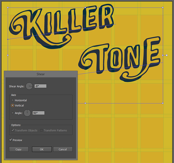
Now is also a good time to fine tune the line spacing. I want a tighter title block, for a little bit of extra impact. With your type still at 174 points, reduce the line spacing at 161 points.
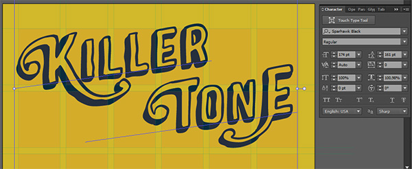
And now comes the last bit: just do a copy of your title (CTRL/CMD+C), and paste it in front (CTRL/CMD+F). Select that top copy, and switch its color to our off-white.
The last thing to do is to switch its typeface to Sparhawk Outline Fill, and you’ve got yourself a sweet looking title. It certainly isn’t “real” hand drawn type, but it comes damn close.
This is also the time to fine tune the width of the title to come to the edges of the grid. This brought my final type size slightly above 176 points.
The badge
The badge will also be relatively quick and easy to construct. We’ll use the badge that’s hidden under the number “8” in the Castor Ornament typeface. It’s the one with a red stroke on the image below. The one with an orange stroke would be a solid second choice.
![]()
But wait, how do we turn this monochrome type character into this bi-color badge? Don’t worry, the step by step process is indicated below!
![]()
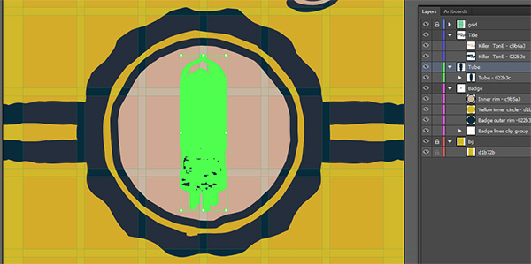
First up, let’s create a Badge layer. It’ll need to be placed below the tube layer. Then, use your type tool (set to the Castor Ornament typeface) to obtain the badge symbol.
![]()
The size doesn’t matter too much (mine’s at 500 points), because as soon as you’ve got the badge symbol, transform it to outlines (right click menu > Create outlines). This will allow us to edit the actual vector shape of the badge, and to decompose it into its outer rim and core shape.
The kicker is that here, the badge is a compound path once switched to outlines and ungrouped.
![]()
What are compound paths? Adobe’s online help offers the following definition:
Compound paths
Compound paths let you use an object to cut a hole in another object. For example, you can create a doughnut shape from two nested circles. Once you create a compound path, the paths act as grouped objects. You can select and manipulate the objects separately using the Direct Selection tool or Group Selection tool; or you can select and edit the combined path.
Basically, they are shapes that allow you to have transparent parts in them. What we need to do here is an operation called releasing the compound path. We’re going to break the relationship between all these shapes that create the worn aspect of the badge, in order to be able to individually assign colors to all of them. It’s quite simple to do so: pull up your right click menu and select “Release the compound path.”
![]()
This gives us access to all of the shapes, although it turns them all black.
![]()
It’s now going to be a game of color assigning, erasing, combining, and merging, in order to get to our result. If you scroll a bit back up, you can see half of the result we’re looking for: a dark blue outer rim, a yellow (or transparent) inner rim, and an off-white inner rim that has a dark blue stroke. There are also no grunge elements in the final badge.
Let’s start by making the outer rim dark blue.
![]()
Then, find the inner rim, and make it off-white. You can also right away add the 5 points stroke, aligned to the inside.
![]()
![]()
Once that’s done, you can delete the small leftover black shapes.
![]()
Switch the reminding black shape to yellow, and you’ll have a full badge.
![]()
After that, it’s time to turn the grid back on, to center the badge in our canvas, and to size it so it occupies the width of the four central columns.
![]()
You can bump the thickness of the stroke up a bit. Mine got bumped off from 9 and some points to 15 points.
![]()
The last series of steps concerning the badge is to add these two set of horizontal lines. These come from our trusty Castor ornament typeface. I tracked these down using the Glyph panel.
![]()
The typeface offers us a variety of dividers options. The ones I’ve used are at the bottom here. I like their very rugged appearance, but the two other options would be just as acceptable.
The process is similar to what we’ve done with the badge character. Turn the divider you’ve chosen into outlines (Right click menu > Create outlines). Switch its color to blue. Create a copy of the line, that you’ll place a bit down from the first one, in order to get two parallel lines.
![]()
![]()
Once that’s done, grab the two lines, and place them close to your badge, vertically centered in your canvas. You’ll then play with the size and spacing of the lines until you it a proportion relationship between them and the badge that you’ll be comfortable with. The spacing and size values won’t be the same depending of the divider you’ve chosen.
![]()
![]()
![]()
A little touch to hide the heavy copy and pasting we’ve been doing: choose one of the two lines, and flip it upside-down. This will trick people into believing you drew two individual shapes, rather than just duplicate one multiple times.
![]()
![]()
Once that’s done, we’re going to duplicate these and place the copies on the right side of the badge. Use Copy (CTRL/CMD+C) and Paste in front (CTRL/CMD+F), as it will speed the process up. Make sure the lines are properly centered in your canvas when done, and that they’re place underneath the other badge objects.
![]()
Once that your lines are in place, and that they’re properly named in your layer palette, it’s time to get rid of the parts of the lines that run beyond our canvas. You could just delete the excess by using the Scissors tool (you call call it by pressing C on your keyboard), and carefully cut, using the edge of the artboard as a guide. You can also use a layer mask, which gives you access to the parts of the lines you have hidden at anytime, just in case you need them. I’m going to show you how to use a layer mask, as non-destructive processes are better to master.
First, let’s draw a transparent rectangle of the exact width of our document (11″), and that’s as tall as the grid row our lines are in.
![]()
Make sure that the rectangle is above the lines in your layer palette. Once that’s accomplished, select the four lines as well as the rectangle.
![]()
Once that’s done, simply pull up your right click menu and choose “Make clipping mask” (if the option isn’t available, you can access it through Object > Clipping mask > Make). The result is quite simple: Ai will display anything within the boundaries of our rectangle, and hide anything beyond them. That new “group” of elements will be combined into what’s called a Clip group. I renamed mine “Badge lines clip group.”
![]()
![]()
And the badge itself is done. Now, it’s time to fine tune our tube.
The tube
It’s time to bring back the tube from the oblivion of hidden and locked layers.
My tube object stands at 4.25″ tall, and it’s centered within the badge and canvas. The only little thing I want to add in there is a little bloc of yellow behind some of it, to highlight some of its details (type, filament, etc).
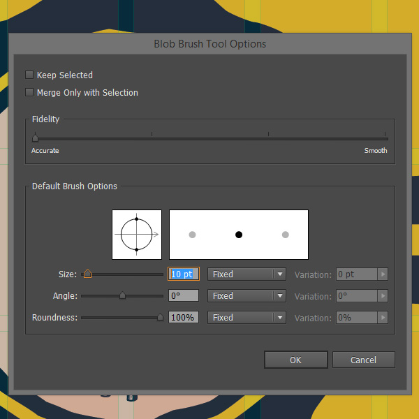
I’m using the Blob brush (SHIFT+B)to do so, as it’ll create just one big shape at the end. Lock the tube, and start painting in yellow. Tip: you can edit your brush size by double clicking on the tool’s icon.
I’ve put the shape I created with the blob brush in bright pink so you can see it better.
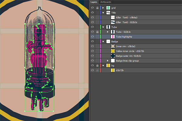
And here it is in its final yellow color. It’s very subtle, but helps to highlight the tube’s little details.
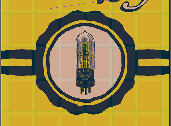
We’re now done with the tube and badge. The last thing we need to add is the copy!
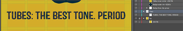
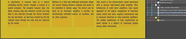
The copy
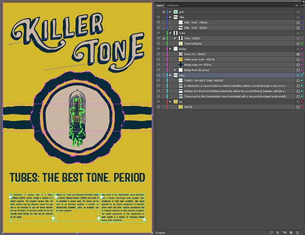
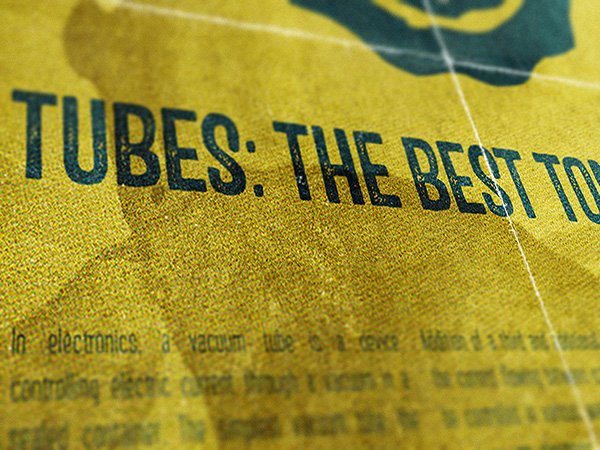
Start by creating a new “Copy” layer, and drag it below your badge layer. Once that’s in place, simply write “TUBES: THE BEST TONE. PERIOD” in Castor One in the row below the badge. I’ve horizontally centered the type, and it goes all the way across when sized at 66 points.
Castor includes these amazing alternate characters that can give it this credible, organic letter-pressed feel. My screenshot below might not be the best, but know that you can easily use the Stylistic alternates functionality of your Type/open type panel to bring some of these alternative characters into your text block.

Simply center the sub-header vertically and horizontally in the row below the badge once you’re done fine-tuning the text, and we’re done.
The next piece of copy are three text blocks at the bottom of our poster. I grabbed relevant-ish copy from Wikipedia (more specifically, from the Vaccum tube page and the Tube sound page):
“In electronics, a vacuum tube is a device controlling electric current through a vacuum in a sealed container. The simplest vacuum tube, the diode, contains only two elements; current can only flow in one direction through the device between the two electrodes, as electrons emitted by the hot cathode travel through the tube and are collected by the anode.”
“Addition of a third and additional electrodes allows the current flowing between cathode and anode to be controlled in various ways. The device can be used as an electronic amplifier, a rectifier, an electronically controlled switch, an oscillator, and for other purposes.”
“Tube sound is the characteristic sound associated with a vacuum tube-based audio amplifier. After introduction of solid state amplifiers, tube sound appeared as the logical complement of transistor sound, which had some negative connotations due to crossover distortion of early transistor amplifiers. The audible significance of tube amplification on audio signals is a subject of continuing debate among audio enthusiasts.”
I’ve simply copied and pasted these three paragraph in three text blocks in the last row of my grid. Each block is two columns wide. The text is set in Altus that’s 14 points tall. The paragraphs are justified, with the last line aligned to the left. There’s also no hyphenation allowed.
Done!
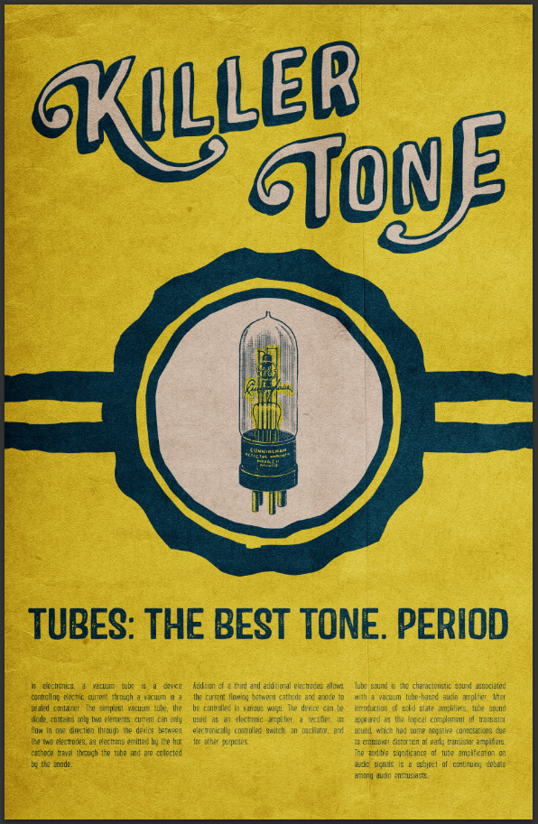
And now, you can turn the grid off, and admire your poster!
STEP FOUR: LET’S ADD TEXTURES
What are we trying to accomplish here?
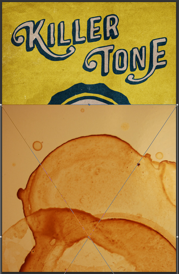
My aim with adding textures to this poster is to make it look old. Say, you just found this 50 years old thing in your attic or something. In order to accomplish this, you’ll need stuff like stain textures, paper textures, noisy textures… I’m going to list the ones I’ve used below, but feel free to use your own! Note also that will be switching to Adobe Photoshop for this part of the tutorial.
Resource list
This list of nine textures should get you started nicely. I’ve been collecting and making textures actively for the past three to four years, and my library is quite big (40+ Gb). I know my texture library very well, and usually I’m able to pick the ones I’ll be using on a project ahead of time based on the desired outcome. Seven of the ones below are some that I’ve not made myself. Note that the two that are mine are part of pack I’m selling on my Creative Market store, The Shop.
Note that you’ll also need a Ps action from the good people at Go Media that I’m calling “Aged 2W.” You can download it in this post (and read the poster tutorial should you feel so inclined). If you don’t want to read the tutorial, you can also try this direct link to it.
- BB_AntiqueEnvelope_04 by Dustin Schmieding
- Found paper #6 by Lost and Taken
- This dark and dirty texture by Caleb Kimbrough
- One of the dirty texture from the DesignCuts freebies page
- This old heavy paper texture by u_l33
- Coffee Stains Texture 02 by SixRevisions
- folded-paper-textures-volume-01-sbh-002 by me
- photocopy-noise-textures-sbh-005 by me
- This photocopy texture by clarisaponcedeleon
Once you’ve assembled your resources, it’s time to start.
A new Ps document
We want a document with the same specifications than our Ai document: 11″x17″ @ 300 dpi. Just note that I’m choosing to use an RGB color mode, as some of the aging trickery I’m using only supports the RGB color mode. You can always convert your file back to CMYK when exporting it to print. And most printers that know what they’re doing would be able to work with your RGB file anyways, even though CMYK is what they prefer.
In Ai, select and copy your whole poster (minus the grid).
Then paste it as a Smart object in your empty Ps document. Make sure it properly fills the canvas.
Once that’s done, it’s time to bring in our textures. I’m not going to detail the process I’m following for all the textures, as it’s very much the same. I do however want to point out a few things along the way.
First texture: BB_AntiqueEnvelope_04.jpg
Go ahead and bring the texture into your file.
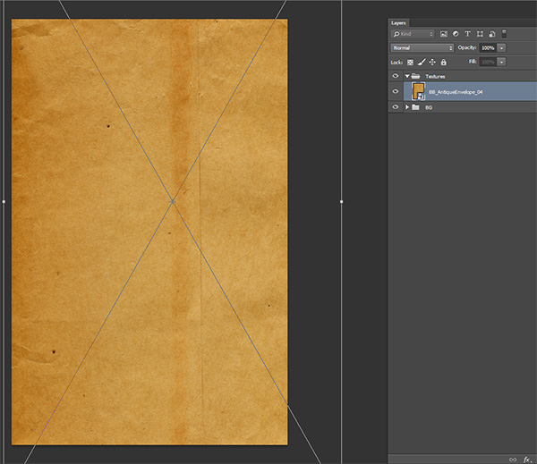
Note that I’m sizing the envelope texture so the top and bottom flaps aren’t visible. I’m also slightly offsetting it to the right, so the little folds on the left will be part of our design.
Also, you’ll notice that I’ve put the poster in its own layer group that I’ve named BG. Textures are getting their own layer group named Textures.
Once your texture is placed, desaturate it (CTRL/CMD+SHIFT+U), and sharpen it a few times (Filter > Sharpen > Sharpen). Once that’s done, it’s time to slightly play with the levels of the texture, in order to bring out some of its details more.
Bring the level palette (CTRL/CMD+L, or you could use a level adjustment layer for non-destructive editing), and start increasing the contrast, so the folds, creases, and paper grains are a bit more noticeable. You can see my values below.
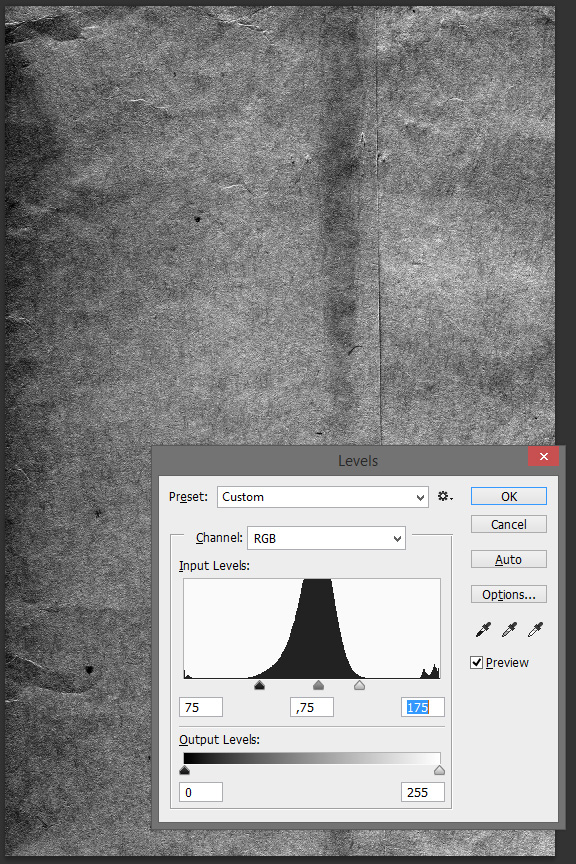
Once you’re happy with the result, just click OK. Now, it’s time to play with blending modes. When it comes to adding textures to pieces, my to-go blending modes are Multiply, Overlay, and Soft light. These are the ones I start with. If these don’t work, I’ll play with Screen, Color/Light burn, and the others. I simply cycle through them until I find an option that gives the textures characteristics to the piece, without being too overbearing. In this case, Soft light is the answer.
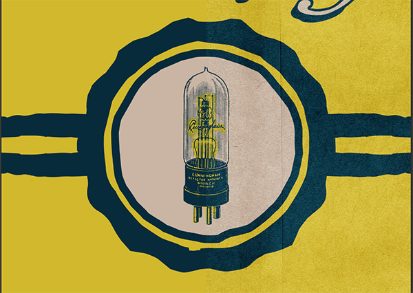
Here’s a close up before/after shot, so you can see how the grain plays with the piece.
And that’s the process. For each and every of these textures, I’ll repeat these steps. The following images show the progress after each texture is added into the mix.
foundpaper6.jpg, Soft light, 50% opacity
4816544568_371d667387_o.jpg (the dark and dirty texture), Screen, 100% opacity.
This one is a bit special. What we’re interested in with that texture is to bring its white grittiness in our piece as noise and dust. In this case, Screen is going to be our choice of blending mode, as what is white is shown, and what is black becomes transparent when selected (gray levels adapt accordingly). Also, and while it’s not the case here, these dark textures are so contrasted that you’ll often find it necessary to lower the opacity a bit.
Dirty2.jpg, Soft light, 35% opacity
old_heavy_paper_-_593038_70513966.jpg, Soft light, 25% opacity
3731106389_f534bcdd1e_o (the coffee stain texture), Soft light, 100%
This texture is also a bit special. Given how I changed its levels and how I placed it, I had to use a layer mask to mask the edges of the file. Take a big, soft brush, and simply paint the edge of the layer in black so it fades harmoniously.
folded-paper-textures-volume-01-sbh-002.jpg (this one is optional), Screen, 100% opacity
photocopy-noise-textures-sbh-005.jpg, Screen, 25% opacity
photocopy_by_clarisaponcedeleon_-_deviantart.jpg, Soft light, 50% opacity
I use that texture to create soft vignette effects.
And all the textures are in! It’s now time for the small, finalization touches.
STEP FIVE: LAST DETAILS
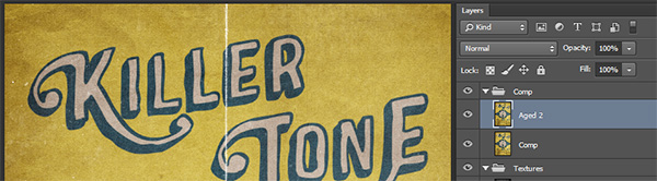
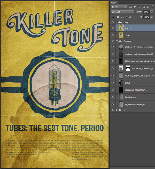
First, we’re going to create a layer called “Comp” that will include a merged copy of all the content of our file so far. There’s a handy shortcut for that: CTRL/CMD+ALT/OPTION+SHIFT+E. Make sure that you have your top layer highlighted when you do that. Give the Comp layer sit at the top of everything, in its own Comp layer group.
Duplicate the Comp layer and rename it into “Aged 2.”
Run the Aged 2 action we got from the good folks at Go Media on it. It will give it this bad color copy feel.
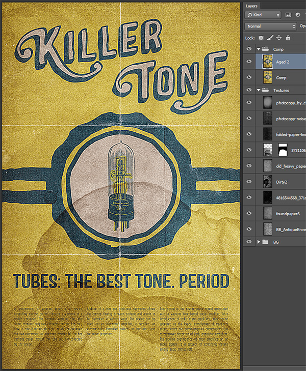
Place the layer on Soft light at 25% opacity.
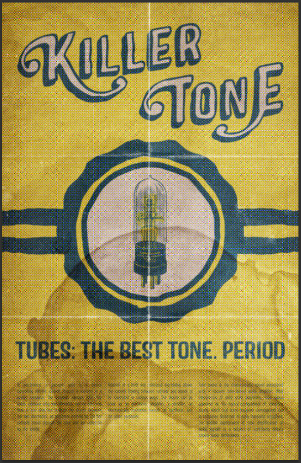
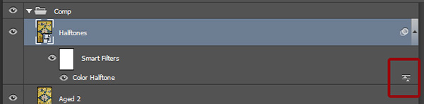
Last but not least, a little halftone effect. This is a nod to how bad cheap printing could be 50 years ago. The first step is to create a new merged copy of everything, and to rename the layer “Halftones“.
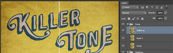
After that, you’ll want to convert it to a smart object (Filter > Convert for smart filters).
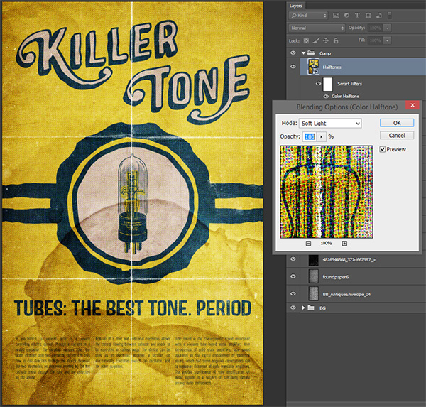
Once it’s a smart object, go to Filter > Pixelate > Color halftone. The settings below are the default ones, except for the radius that should show 8 instead of 6.
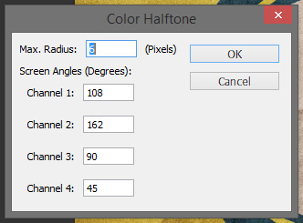
Because the layer is a smart object, we can control the blending mode of the layer, but also of the effect itself. Double click on the Smart filter name in order to change its blending mode to Soft light.
And the last step: change the layer blending mode to Lighter color, and lower its opacity to around 75%.
And you’re all done!
This concludes our tutorial. I hope you’ll have as much fun going through it than I had writing it. Until next time, cheers!
Don’t forget to check out this week’s deal, before it expires forever:
Be the first to comment