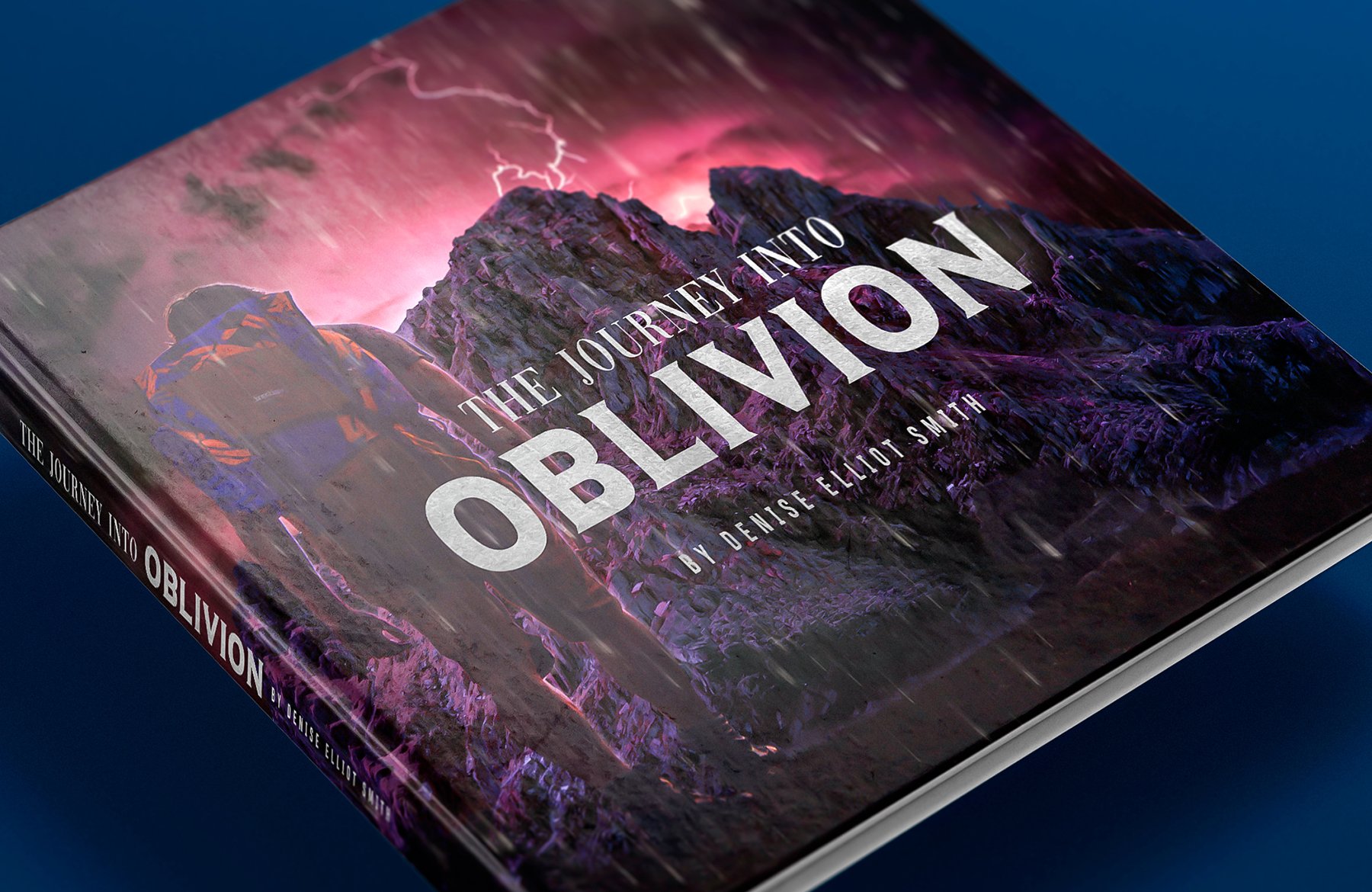
In this tutorial, we will be creating a science fiction book cover for ‘The Journey Into Oblivion’ in Photoshop. To do this we will be using a small assortment of resources from The Totally Eclectic Photography Bundle including elements from the Sky Builder For Photoshop, textures from 7th Avenue Designs, and backgrounds from Photo Spirit.
This all new bundle is chock full of amazing photography tools to help save you time while adding an extra bit of oomph to your design work. In addition to these elements we will also be working with a few free stock photos from Unsplash and a handful of typefaces from DaFont.com. We will then be bringing it all together and applying our artwork to a realistic hard cover book mockup from the Print Mockup Pack by Mockup Zone. So, if you’re all ready to take the journey into oblivion then fire up Photoshop and let’s get started!
HAVE YOU SEEN OUR YOUTUBE CHANNEL?
Watch the video tutorial below and subscribe to our YouTube channel for regular updates direct to your inbox.
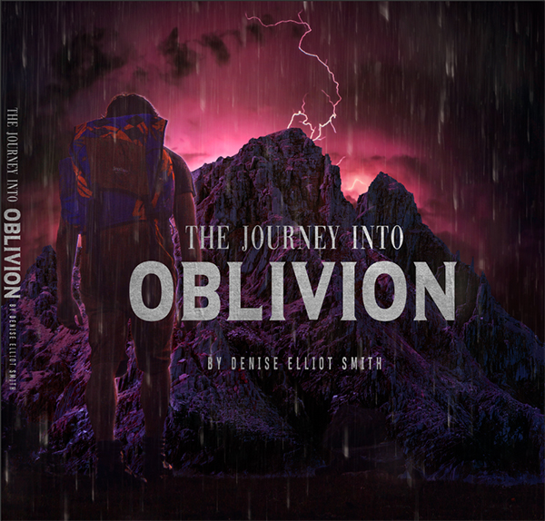
Here’s a look at what we’ll be creating:

Follow along with this tutorial: Download the freebie files
This freebie pack is just a small sample of what you can expect to find in The Totally Eclectic Photography Bundle for just $29! As with all our bundles, these resources come with our extended license at an amazing 97% off, for a limited time only!

Step 1: The Journey Into Oblivion
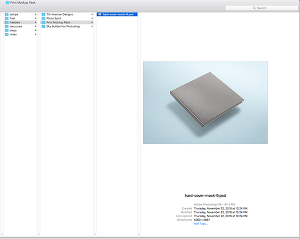
To begin let’s go to the freebies folder for the tutorial and navigate to the ‘hard-cover-mock-9.psd’ in the ‘Print Mockup Pack’ subfolder. This is one of many beautiful and high quality templates that you will find in the full product which can be purchased from the Design Cuts Marketplace. Once you have located the file let’s go ahead and open it up in Photoshop.
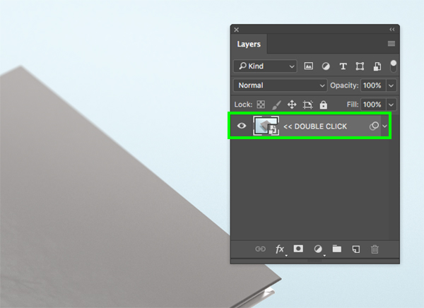
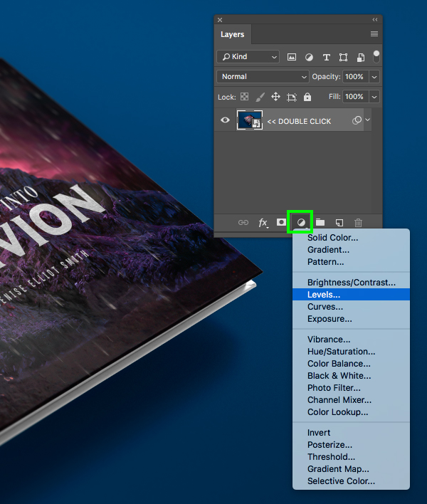
Once you have opened the mockup file the first thing we want to do is go to the File menu and choose ‘Save As’ to save this file with a new name – I will be using ‘the-journey-into-the-oblivion-book-cover-design’ but feel free to use a different name of your choosing. Once you have saved the file, double click on the single Smart Object layer that says ‘DOUBLE CLICK’ as shown in the image below:
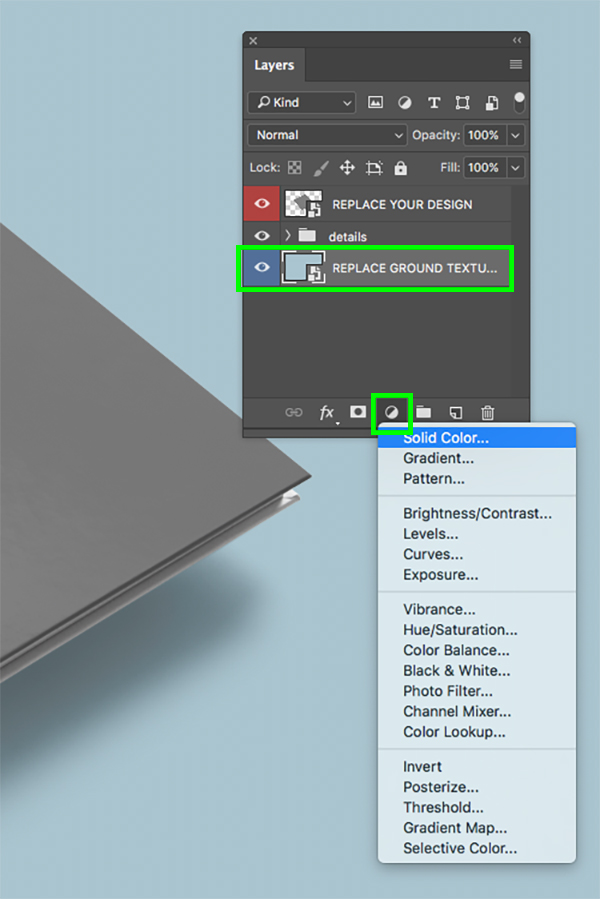
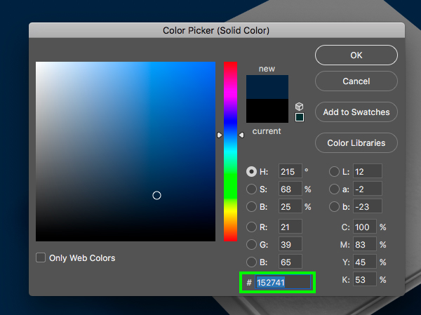
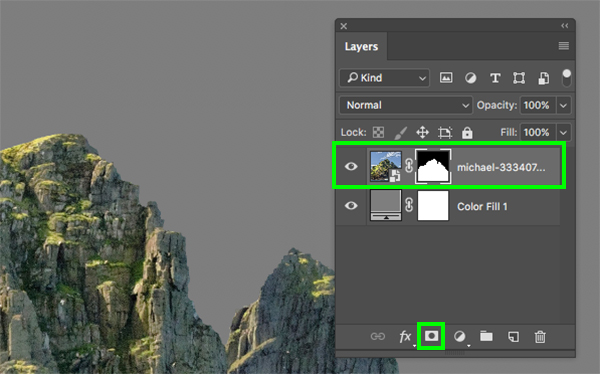
Next, select the very bottom Smart Object that says ‘REPLACE GROUND TEXTURE’ and then hold the Alt/Option key and click on the Adjustment Layer icon at the bottom of the Layers Palette before choosing ‘Solid Color…’ from the dropdown menu.
For the fill color, enter the hex value ‘#152741’ and then click ‘OK’ to continue.
Step 2: Venturing Into The Deep
Now that we’ve changed our background color let’s go down another level by double clicking the top Smart Object that says ‘REPLACE YOUR DESIGN’.
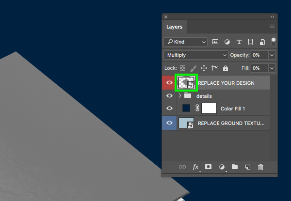
And once again we will need to dig one level deeper by double clicking the next Smart Object layer shown here:

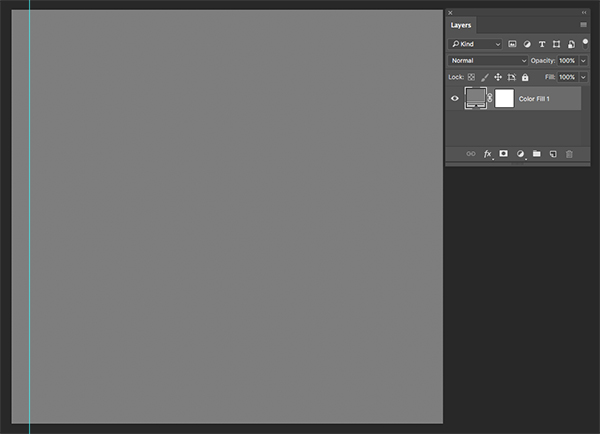
At this point we have taken a deep dive into the mockup file and we are now inside of the main cover art file. This Smart Object contains a single ‘Color Fill 1’ layer and this is where we can begin setting up our design.
Step 3: The Long Way Up
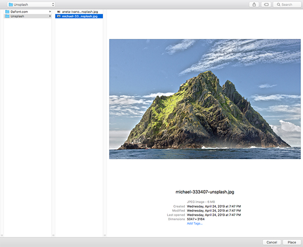
We will now need to download this free stock image from Unsplash. Be sure to save this file somewhere that is easy to locate and then return to Photoshop and choose ‘Place Embedded…’ as shown here:

Navigate to the folder where you have saved the free image of the mountain and then choose ‘Place’ from the lower right corner.
Once you’ve opened the image in Photoshop, hold the Alt/Option+Shift keys and scale it up proportionally from the center until it’s about the size of the image shown below:

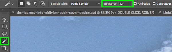
Step 4: The Mountain And The Wand
After sizing up the image of the mountains, press ‘W’ on the keyboard to switch to the Magic Wand Tool. In the top toolbar let’s also make sure that the ‘Tolerance’ setting is set to about ’32’.
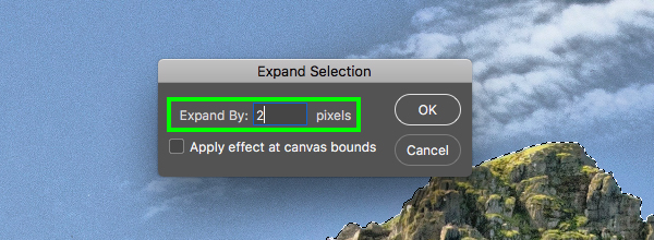
We will now begin clicking the wand to select all of the sky around the mountains. It is unlikely that you will grab all of the sky perfectly in one shot, so what we will need to do is hold the Shift key and keep clicking the clouds and all around the sky until the whole sky is selected. Once you have all of the background selected, go to the Select menu and choose ‘Modify > Expand…’ from the dropdown.
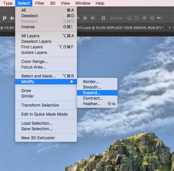
In the next panel that appears, let’s expand our selection by ‘2’ pixels and then press ‘Return’ on the keyboard or click ‘OK’ to continue. Doing this will simply expand our selection a bit to remove any edges that may have been a bit rough just to cut into the image slightly and give us a cleaner looking selection.
Let’s now return to the Select menu and then choose ‘Inverse’ from the list to invert our selection.
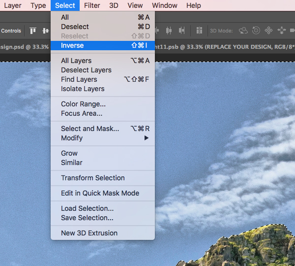
After inverting the selection we now just need to click on the ‘Add layer mask’ icon from the bottom of the Layers Palette and voila! No more background.
Step 5: Funky Colors
Now that we’ve placed our mountain and removed the background we can begin making some adjustments and color corrections. Let’s start by selecting the mountain Smart Object layer and then holding the Alt/Option key and clicking on the Adjustment Layer icon at the bottom and choosing ‘Hue/Saturation…’ from the list.

Check off the box that says ‘Use Previous Layer to Create Clipping Mask’ and then click ‘OK’ or press ‘Return’ on the keyboard to proceed.
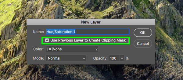
For the properties, let’s change the ‘Hue’ to ‘-48’ and the ‘Saturation’ to ’33’ as shown here:

Step 6: Blue Wash
Select the mountain Smart Object once again and then return to the Adjustment Layer icon, this time choosing the ‘Solid Color…’ option from the list.
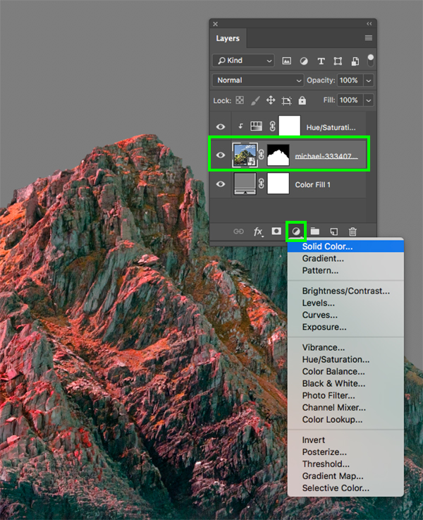
For the fill color enter the hex value ‘#2B47C3’ and then click ‘OK’ to apply the changes.

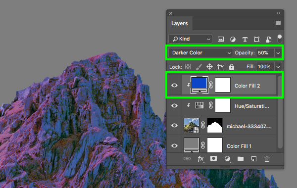
After adding the Solid Color Adjustment Layer it will be sandwiched between the Hue/Saturation Adjustment Layer and the mountain Smart Object. What we want to do here is press Command/Ctrl and the right bracket key on the keyboard to move it up one spot while retaining the Clipping Mask. Once you have done that, change the Blend Mode of the ‘Color Fill 2’ layer to ‘Darker Color’ and drop the opacity down to about ‘50%’ as shown here:
Step 7: Curves Adjustment
Select the mountain Smart Object and click the Adjustment Layer icon again and choose ‘Curves…’ from the list.

Let’s now press the Command/Ctrl key and the right bracket two times to move this Curves Adjustment above both of the previous Adjustment Layers while retaining the Clipping Mask once again. After that, create a point in the middle of the curves grid and move it down and to the right slightly so that the ‘Input’ is set to ‘153’ and the ‘Output’ is set to ‘105’ as shown in the image below:

Step 8: Black & White
Next, select the mountain Smart Object layer and then click on the Adjustment Layer icon to add a ‘Black & White…’ adjustment.
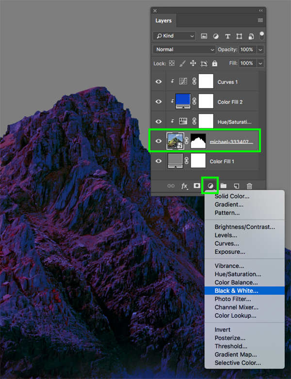
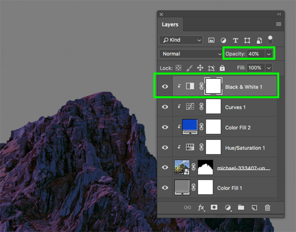
Move this Adjustment Layer to the top of the stack making sure that the Clipping Mask is still attached and then reduce the opacity of the layer to ‘40%’.
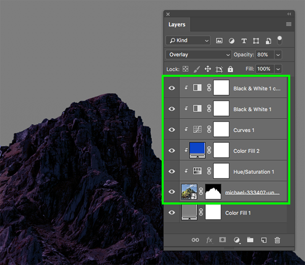
Let’s add one more Black & White Adjustment Layer and move this one to the top while retaining the Clipping Mask by once again using the keyboard shortcut Command/Ctrl and the right bracket. Once this new instance has been placed above the other Adjustment Layers we will change the Blend Mode to ‘Overlay’ and drop the opacity to about ‘80%’ as shown here:

Step 9: Adjustment Layer Stack
Now let’s select the very top Adjustment Layer, hold the Shift key, and then click the mountain Smart Object layer so that everything except the ‘Color Fill 1’ layer is selected.
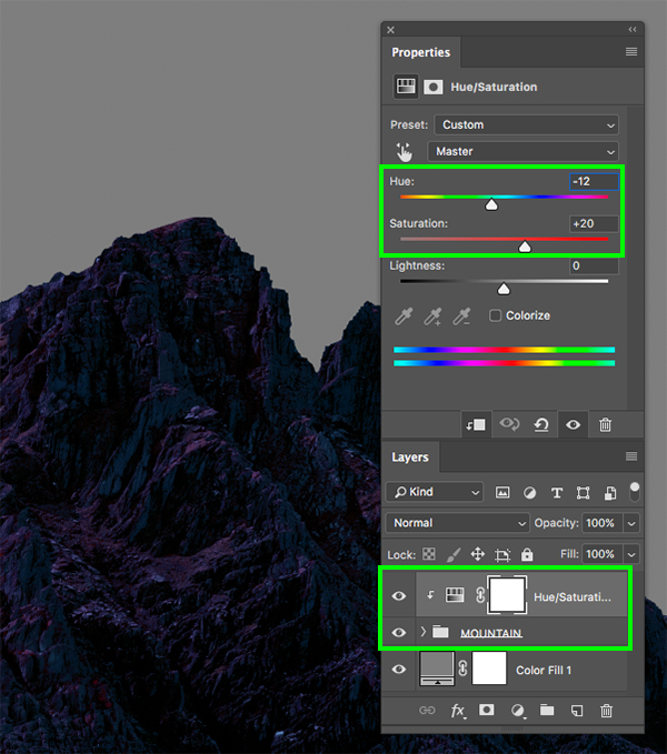
From here, press Command/Ctrl+G to place all of these layers into a new folder and then double click the ‘Group 1’ text to rename the folder ‘MOUNTAIN’. Once you have done that, select the folder, hold the Alt/Option key and click on the Adjustment Layer icon at the bottom of the Layers Palette and add one more ‘Hue/Saturation…’ adjustment.
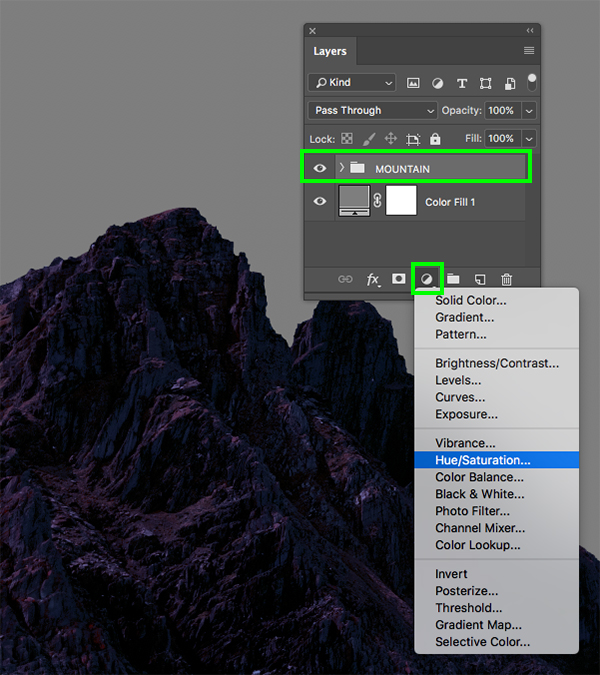
Check off the box that says ‘Use Previous Layer to Create Clipping Mask’ and then click ‘OK’ to continue.
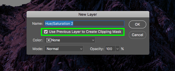
This time let’s change the ‘Hue’ to ‘-12’ and the ‘Saturation’ to ‘+20’ to tweak the colors of the entire folder just a bit more. We have now transformed our mountain image from a bright daytime shot into a deep, moody, night shot.
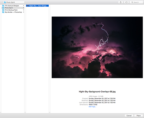
Step 10: The Storm Is Coming
Go to the File menu and choose ‘Place Embedded…’ from the dropdown.

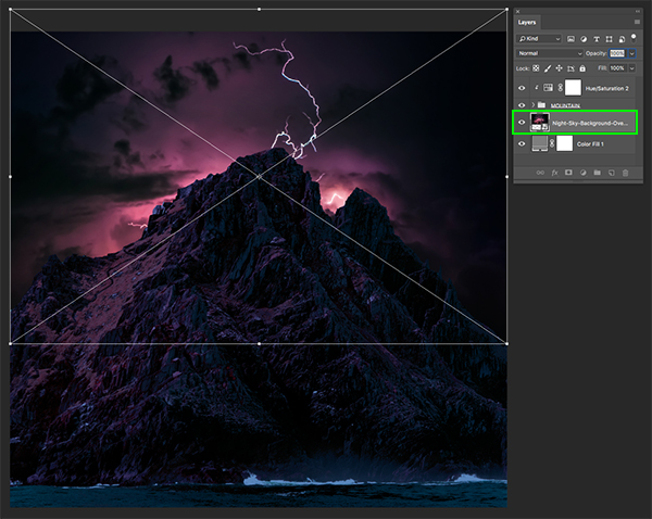
Navigate to the ‘Photo Spirit’ subfolder in the freebies for the tutorial, and then choose the night sky image and choose ‘Place’ from the bottom right.
Make sure that the image is just below the ‘MOUNTAIN’ folder and then move the image up so that it’s placed similarly to the example below:
Step 11: Warming Up
Next, go to the File menu and choose ‘Open…’ from the dropdown.

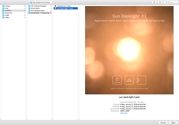
Go to the ‘Sky Builder…’ subfolder and open the ‘sun_back-light-1.psd’ file shown below:
Once you’ve opened the file, turn off all of the other layers except for the ‘sun_back-light-1’ folder and drag this into your working document.

Place the folder below the ‘MOUNTAIN’ folder and above the night sky image and then change the Blend Mode of the folder to ‘Multiply’.
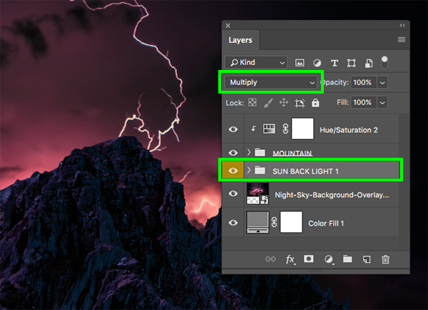
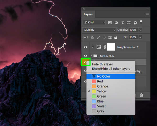
Here I have just renamed the folder and then we will remove the color label by holding the Control key and clicking on the yellow highlight before choosing ‘No Color’ from the dropdown.
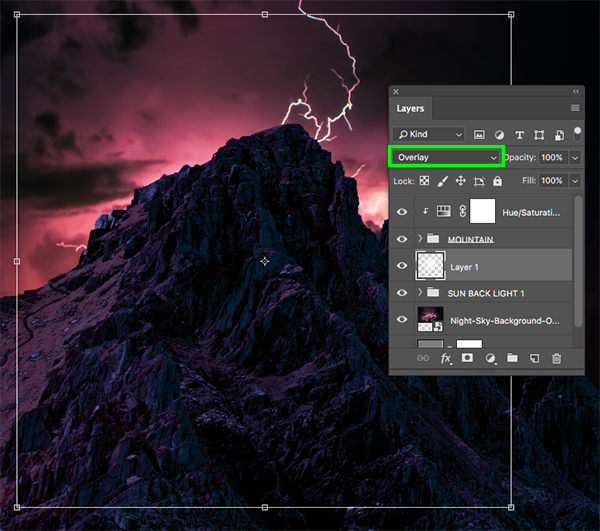
Step 12: Creating Emphasis
Create a new layer just below the ‘MOUNTAIN’ folder and then press ‘G’ on the keyboard to switch to the Gradient Tool. Press ‘D’ and make sure you have a white foreground color selected and then in the top toolbar select a white-to-transparent Radial Gradient as shown below:
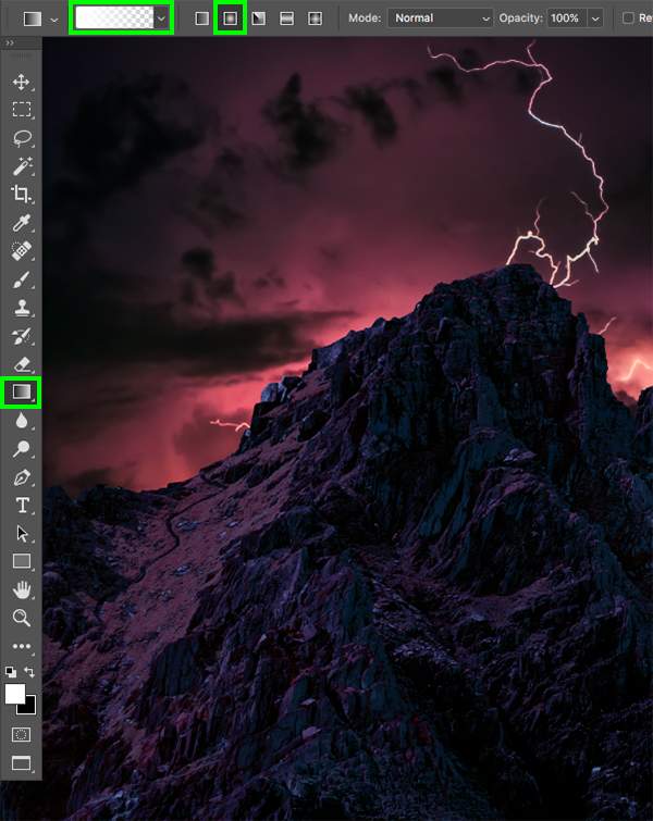
Click and drag outwards from the center of the image to create your gradient and then change the Blend Mode to ‘Overlay’. Doing this will intensify the brightness of the background so we want to place it behind the central peak of the mountains like this:
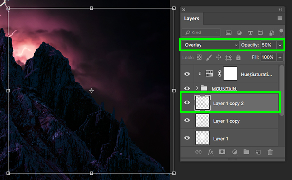
Press Command/Ctrl+J to duplicate the layer and then reduce the opacity to ‘50%’ and scale it down using a Free Transform (Command/Ctrl+T). For this copy we want to move place it behind the left portion of the mountains.

Create one more copy and place this highlight over the right side of the mountains as shown in the image below:
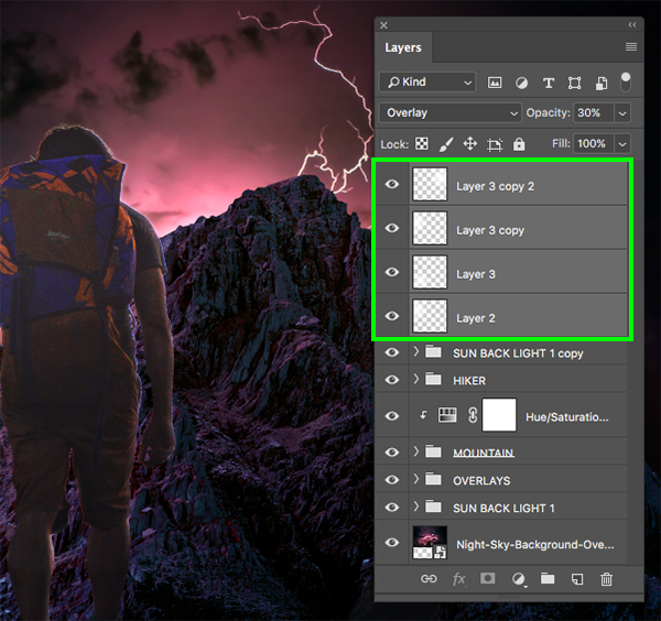
Next, select the first of the three highlights, hold the Shift key and then click on the bottom/original copy so all three are selected simultaneously.
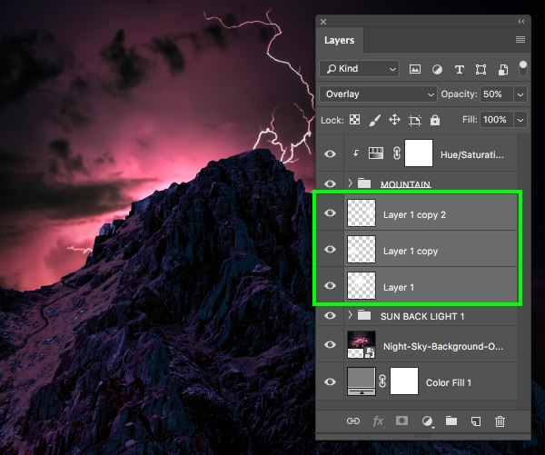
With your three highlight layers still selected, press Command/Ctrl+G to place them into a new folder and double click the ‘Group 1’ text to rename this folder ‘OVERLAYS’. We can now also go ahead and delete the original ‘Color Fill 1’ Adjustment Layer at the very bottom since we no longer need it.

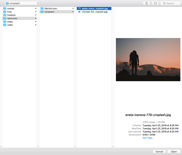
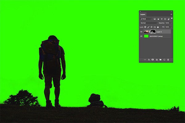
Step 13: The Hiker
Next, download the image of the hiker from Unsplash and save it with the other stock photo of the mountain that we used earlier on. Once you’ve done that, return to Photoshop, go to ‘File > Open…’ and then open the file.
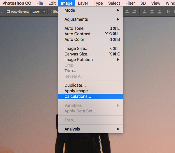
Once you’ve opened the file in Photoshop we can begin separating the subject from the background. While there are a plenitude of ways to do this, I will show you one of my personal favorites that should work fairly well as long as you have a good amount of contrast. To start, go to the Image menu and choose ‘Calculations…’ but don’t let this scare you – it has nothing to do with actual math!
After the next dialog box appears, let’s change the ‘Blending’ option to ‘Screen’ as highlighted below:

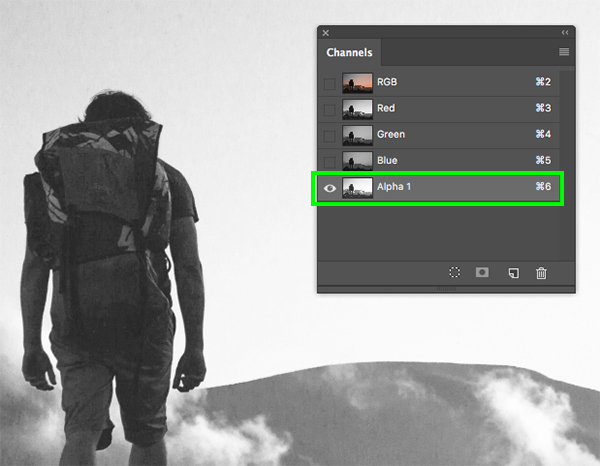
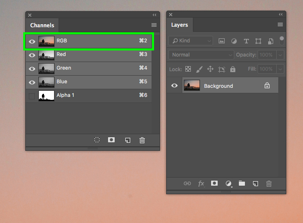
After pressing ‘Return’ or clicking ‘OK’ to continue pay attention to the Channels tab. Here you will see that a new ‘Alpha 1’ channel has been added and the other channels are all turned off. This is the new channel we will be working on to increase the contrast as much as possible.
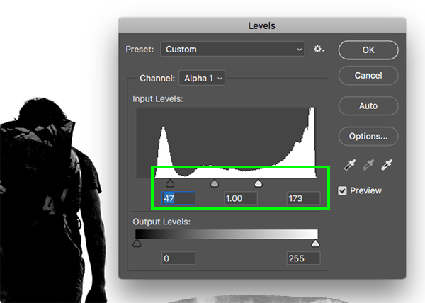
With the new ‘Alpha 1′ channel selected, press Command/Ctrl+L to bring up the Levels and then bring the handles in so the left, gray slider is set to ’47’ and the white slider is set to ‘173’ to crunch the black and white values. From here, press ‘OK’ to continue.
Step 14: Dodge & Burn
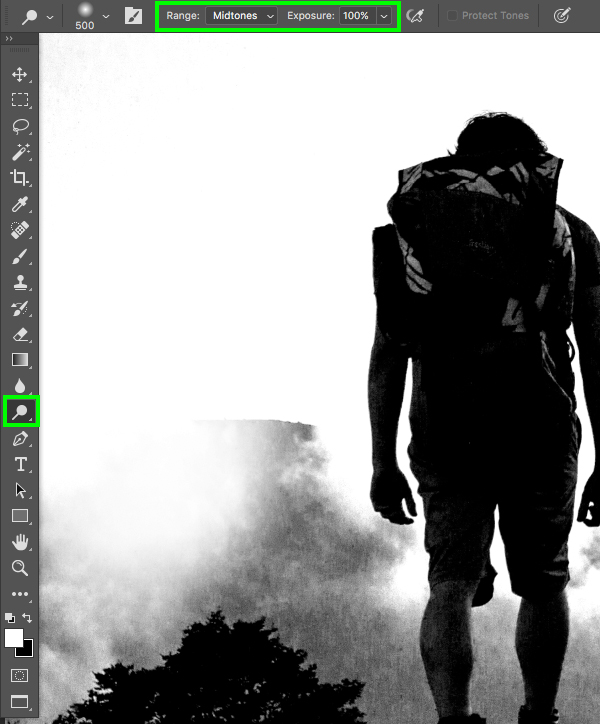
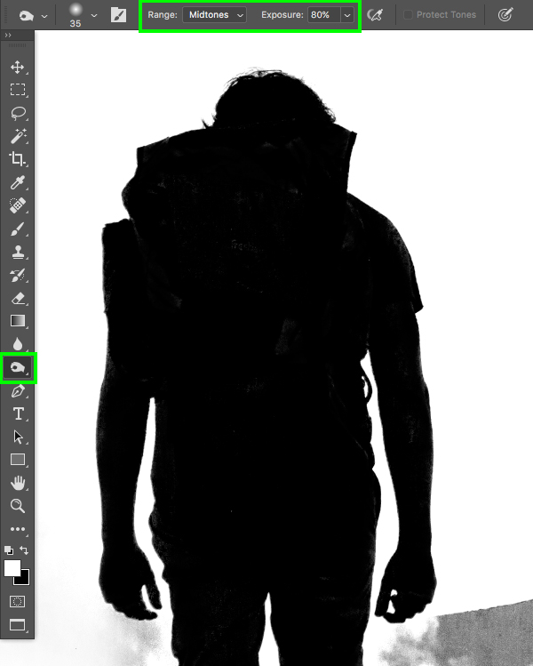
We will now switch over to the Dodge & Burn Tools by pressing ‘O’ on the keyboard. For this, we’ll start with the Dodge Tool which is what we will use to brush over the lighter parts of the image. Notice my settings in the top toolbar where the ‘Range’ is set to ‘Midtones’ and the ‘Exposure’ is all the way up. Once you’ve done that, begin brushing over the mountains, clouds, and everything except for the hiker and the ground.
After you’ve made a few passes and spent a few minutes getting as much of the background changed to solid white as possible, hold the Shift key and press ‘O’ again. This will switch you over to the Burn Tool which as you may have guessed is what we will use to brush over the darker parts of the image we want to turn to black. Use this tool with a ‘Range’ set to ‘Midtones’ and the ‘Exposure’ can be set to about ‘80%’. After that, begin brushing over the ground and the hiker to try and get as much of it as you can to solid black. It doesn’t need to be absolutely perfect at this step as we will still have an opportunity for refinement.
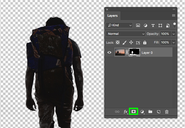
After working on the image for a few minutes you should have a pretty high contrast result with the hiker and ground nearly solid black, and the background mostly white. From here, hold the Command/Ctrl key and click the layer thumbnail for the ‘Alpha 1’ channel to make a selection.

Next, turn on the ‘RGB’ channel and the ‘Alpha 1’ channel should turn off automatically. If it doesn’t, just turn this channel off.
Now that you have a selection and the image is once again in full color, go to the Select menu and choose ‘Inverse’ as shown here:

Next, click on the ‘Add layer mask’ icon and you should now have your subject separate from your background.
Step 15: Refining The Layer Mask
What I like to do at this stage is add a bright colored background beneath the layer I want to refine – in this case I’ve just thrown a bright green layer below.
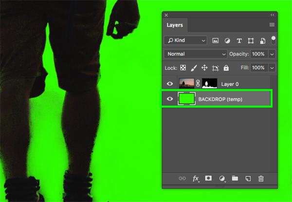
Switch to your Brush Tool (B) and with a solid, 100% opacity, hard round brush, begin refining the selection by painting over the image while the mask is selected in the Layers Palette. For this you will want to use solid black for any tiny bits or messy areas that you want to hide, and solid white to bring back any parts of the image in case anything gets messed up or brushed out by accident. Remember to use the hot key ‘X’ to quickly toggle back and forth between your black and white default colors. Once you have cleaned up the mask a bit more you should have something like this:
Once you are happy with the mask and the edges are looking good, hold the Control key and click on the layer before selecting ‘Convert to Smart Object’.
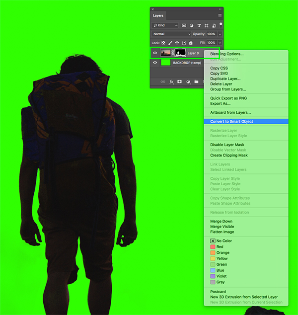
Let’s double click the layer name and rename this layer ‘HIKER’ or something to that effect.
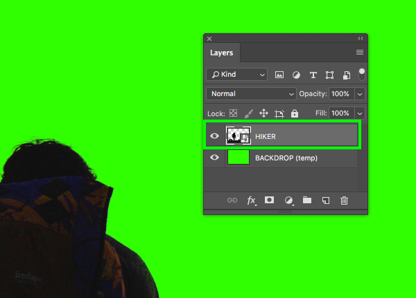
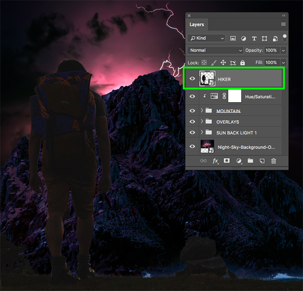
From here, simply click and drag this Smart Object into your working document and size/position it like the image shown here:
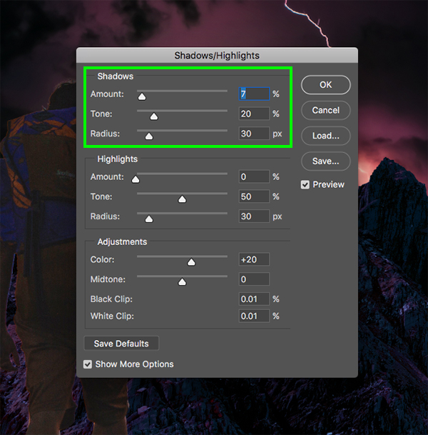
Step 16: Shadows/Highlights
With the ‘HIKER’ layer selected, go to the Image menu and choose ‘Adjustments > Shadows/Highlights…’ to bring out the details of the image.
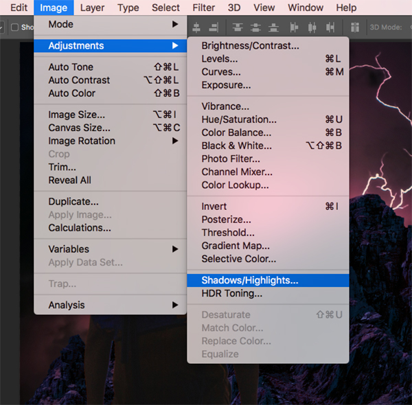
Here we just need to modify the first two or three sliders in the ‘Shadows’ section and then press ‘Return’ on the keyboard or click ‘OK’ to continue. This will help bring out the detail in the darker parts of the image so we can get a bit more clarity and sharpness.
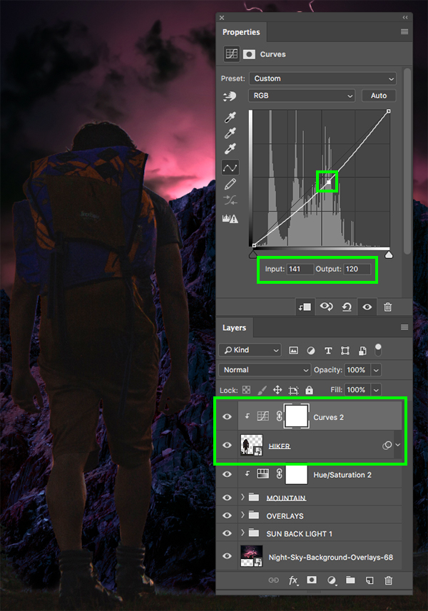
Step 17: Curves
Select the ‘HIKER’ Smart Object once again and then hold the Alt/Option key and click the Adjustment Layer icon at the bottom of the Layers Palette before choosing ‘Curves…’ from the dropdown that appears.
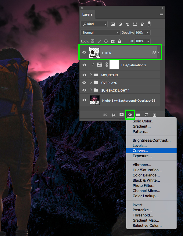
When prompted with the next dialog box, check off the ‘Use Previous Layer to Create Clipping Mask’ option and then click ‘OK’ to continue.
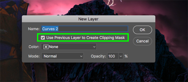
For the settings, create a point in the middle of the grid and change the ‘Input’ value to ‘141’ and the ‘Output’ to about ‘120’.
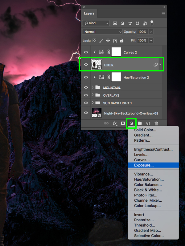
Step 18: Exposure
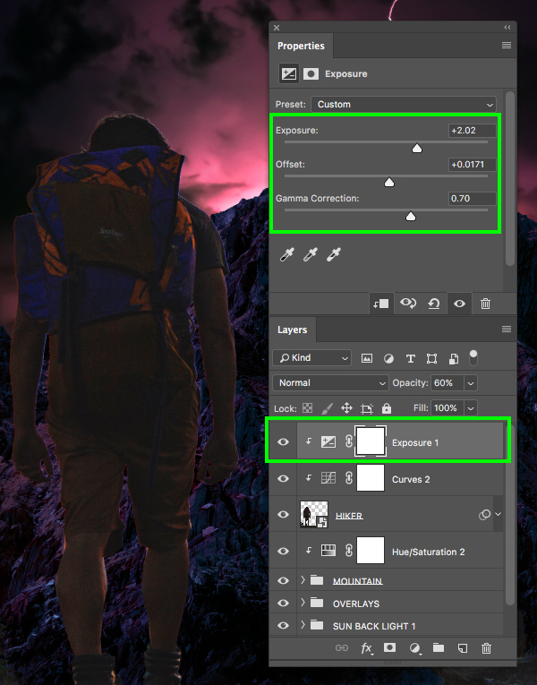
Select the ‘HIKER’ Smart Object again and then click the Adjustment Layer icon at the bottom and choose ‘Exposure…’ from the menu.
For this let’s change the ‘Exposure’ to ‘+2.02’, the ‘Offset’ to ‘+0.0171’ and the ‘Gamma Correction’ to ‘0.70’ to brighten this up and add some contrast. Let’s also move this Adjustment Layer up one spot by pressing Command/Ctrl and the right bracket so that it’s on top, above the Curves Adjustment Layer.
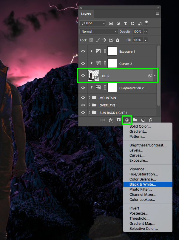
Step 19: Black & White
With the hiker selected return to the Adjustment Layer menu and this time we will choose ‘Black & White…’ from the list.
Press Command/Ctrl and the right bracket twice to move this layer up two places so that it’s above our previous two Adjustment Layers, and then change the Blend Mode to ‘Overlay’ and reduce the opacity to ‘20%’ as shown here:

Step 20: Blue Tint
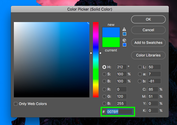
With the ‘HIKER’ selected, return to the Adjustment Layer icon once again and add a ‘Solid Color…’ Adjustment Layer.
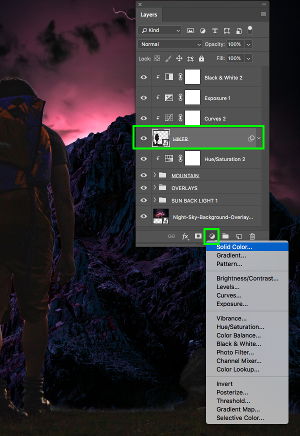
For the fill color use the hex value ‘#0078FF’ and then click ‘OK’ to apply the color changes.
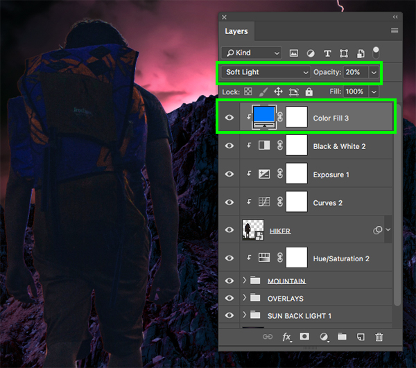
Move this Adjustment Layer above the others, ensuring that the Clipping Mask is still applied, and then change the ‘Blend Mode’ to ‘Soft Light’ and reduce the opacity to about ‘20%’ to add a subtle blue tint over the hiker. Doing this will help tie things together so he feels like he is in the scene.
Step 21: Exposure Fade
Next, select the mask that is attached to the ‘Exposure 1’ Adjustment Layer, and then press ‘G’ to switch to the Gradient Tool. Press ‘D’ to reset your default colors and make sure that you have a solid black foreground color. After that, select a black-to-transparent Linear Gradient in the top toolbar.
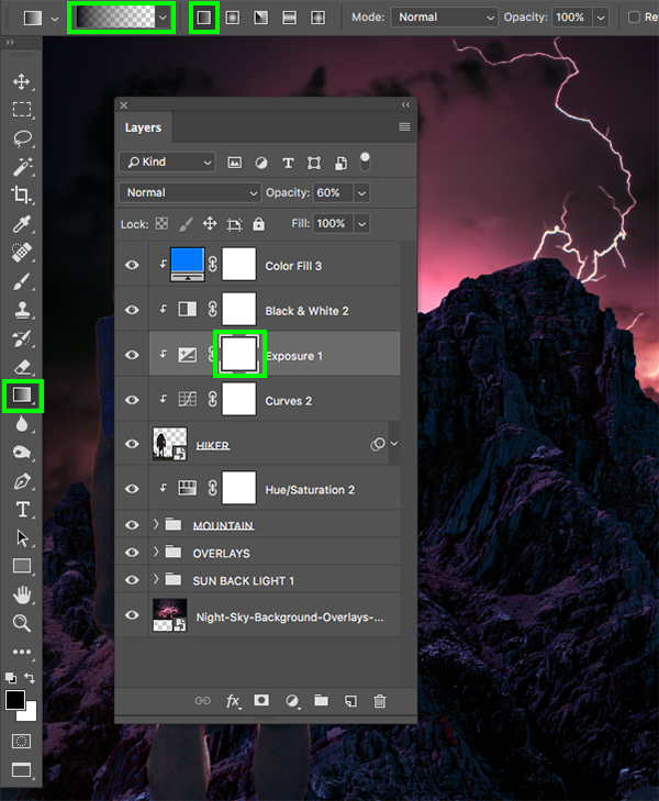
Click and drag from the bottom of the canvas upwards to fade out the exposure effect so that it only affects the top of the image.

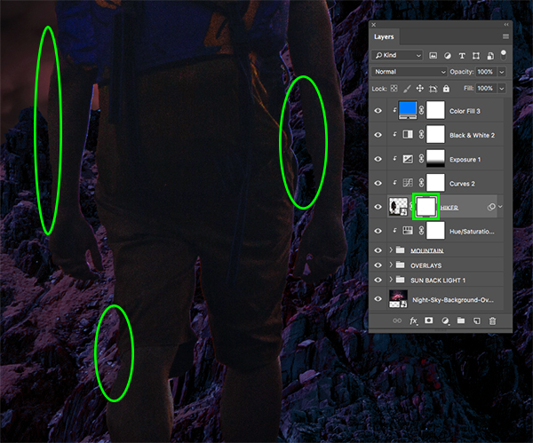
Step 22: Tidying Things Up
Next, select the ‘HIKER’ layer and add a mask. Using a hard round black brush at 100% opacity, zoom in and clean up some of the edges – particularly on the left side of the body. Since we’ve brightened the image up and applied several adjustments we are now seeing things that may not have been visible before, so we just want to brush out any lines or edges that shouldn’t be there.
Step 23: Hiker Group
Select the top ‘Color Fill 3’ Adjustment Layer, hold the Shift key, and then click on the ‘HIKER’ Smart Object so all of these layers are selected together.
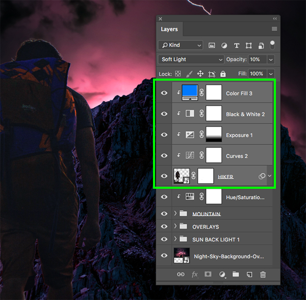
Press Command/Ctrl+G to place these layers into a new folder and then double click the ‘Group 1’ text to rename the folder ‘HIKER’ as shown below:
Step 24: Merged Selections
Select the ‘HIKER’ folder and then press Command/Ctrl+J to duplicate it. After that, press Command/Ctrl+E with the new copy of the folder selected to merge it all into a single layer.

Hold the Command/Ctrl key and click on the merged layer thumbnail icon to activate a selection around it.

With the selection still active, press ‘X’ to toggle your default colors, which should change your foreground color to solid white. From here, press Alt/Option+Delete on the keyboard to fill this merged layer with white.

Next, go to the Select menu and choose ‘Modify > Contract…’ as shown here:
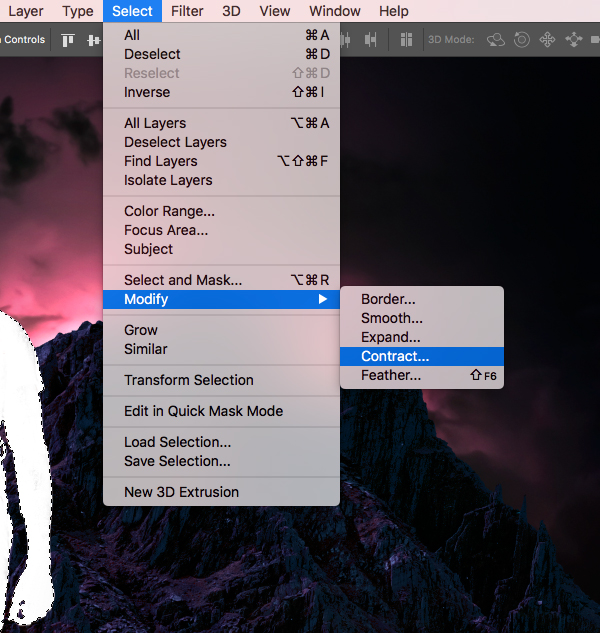
Enter a value of ’10’ and then click ‘OK’ to continue.
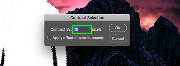
From here, simply press the ‘Delete’ key to delete everything except for the 10 pixels around our selection that we want to keep.

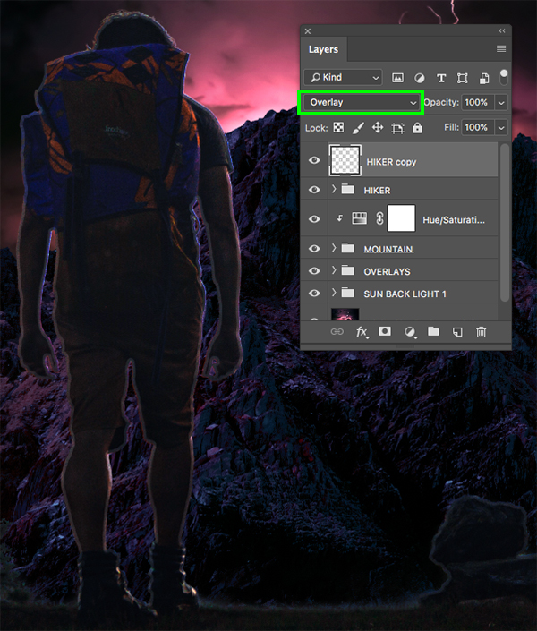
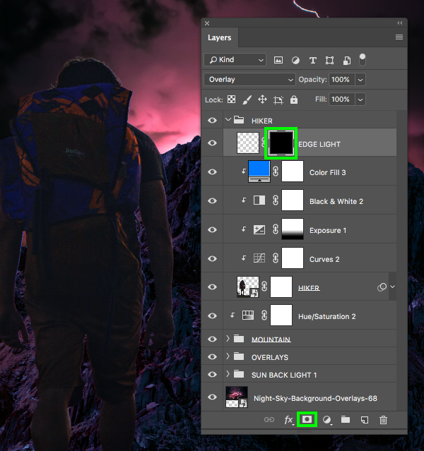
Step 25: Edge Lighting
Next, change the Blend Mode of the merged ‘HIKER copy’ layer to ‘Overlay.
Go to the Filter menu and then choose ‘Blur > Gaussian Blur…’ from the dropdown.
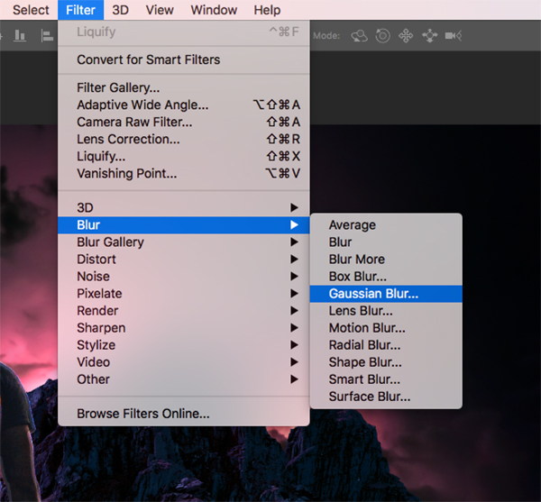
Let’s set the ‘Radius’ to ‘7.4’ and then press ‘Return’ or click ‘OK’ to apply the effect.

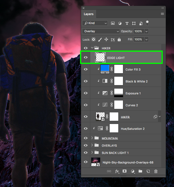
We now want to move this layer into the main ‘HIKER’ folder and place it above all of the other layers inside. Notice that this layer does not have a Clipping Mask attached to it because we want some of this light to spill outside of the selection to create a bit of a ‘fuzzy’ light effect. Let’s quickly rename this layer ‘EDGE LIGHT’ before moving on.
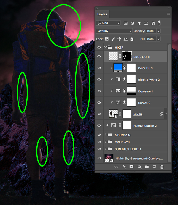
Step 26: Light Masking
With the ‘EDGE LIGHT’ layer selected, hold the Alt/Option key and click the ‘Add layer mask’ icon at the bottom of the Layers Palette to add an inverted mask.
Now with a soft round white brush, begin painting over the right edges of the man – specifically around the head, shoulder, arms, and legs. It can be very easy to overdo this effect so try not to go too crazy. It’s important to try and find a balance that looks natural and consistent with the light source to give the illusion that the right side of his body is catching some of the light from the top of the mountain.
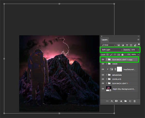
Step 27: Double The Sun
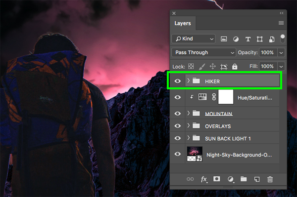
Next, select the ‘SUN BACK LIGHT 1’ folder just below the ‘OVERLAYS’ group and press Command/Ctrl+J to duplicate it. Move this copy to the top of the Layers Palette and make sure the Blend Mode is set to ‘Soft Light’ with an ‘opacity’ of ‘50%’. After that, scale it down a bit using the Free Transform (Command/Ctrl+T) and dragging inwards from any of the four corners of the bounding box while holding Alt/Option+Shift on the keyboard using the image below for reference.
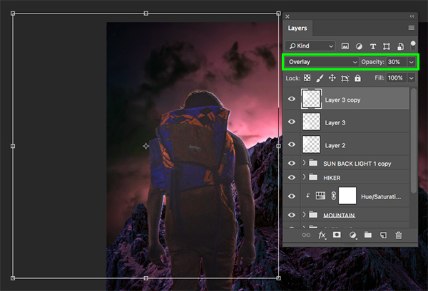
Step 28: Top Overlays
Create a new layer and then use the white-to-transparent Radial Gradient to add a gradient over the left side of the image, overlapping the hiker. Change the Blend Mode of this layer to ‘Overlay’ and drop the opacity to ‘40%’ or so to add some contrast and brightness to this area to help bring out some detail.

Add another new layer and a second gradient, but this time let’s reduce the opacity to ‘30%’. Place this copy over the legs and lower body of the hiker.

Duplicate the previous gradient layer and position it around the head and upper portion of the image leaving the same settings as before.
Make one last copy and place this one over the right side of the mountains and lightning background as shown below:

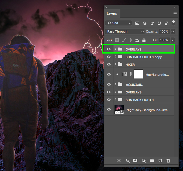
Select the top gradient, hold the Shift key, and then select the original one so all four are selected together.
With all four gradients still selected, press Command/Ctrl+G to place them into a folder and double click the ‘Group 1’ text to rename this folder ‘OVERLAYS’.
Step 29: Color Tint
With the top ‘OVERLAYS’ folder selected, click the Adjustment Layer icon at the bottom of the Layers Palette and choose ‘Solid Color…’ from the menu.

For the fill color enter the hex value ‘#AC6A91’ and then press ‘Return’ or click ‘OK’ to continue.

From here, change the Blend Mode of the layer to ‘Overlay’ and reduce the opacity to ‘50%’ to add a subtle magenta tint over the entire image.

Step 30: Hiker Contrast
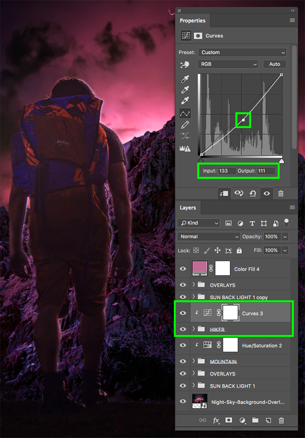
Next, select the main ‘HIKER’ folder and then hold the Alt/Option key and click the Adjustment Layer icon before choosing ‘Curves…’ from the menu.

Check off the ‘Use Previous Layer to Create Clipping Mask’ box and then click ‘OK’ to continue.
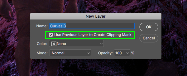
Create a point in the middle of the Curves grid and set the ‘Input’ to ‘133’ and the ‘Output’ to ‘111’ to create some additional contrast on the ‘HIKER’ folder.
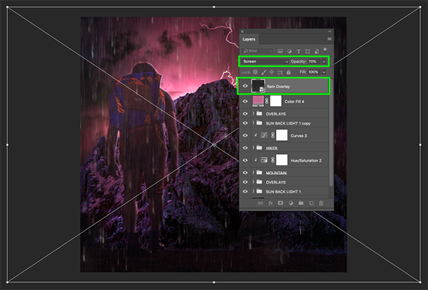
Step 31: Rainy Days
Go to the File menu and choose ‘Open…’ so we can open up the next freebie. From here, navigate to the ‘Sky Builder…’ subfolder and select the ‘overlay_rain-1.psd’ file before choosing ‘Open’.

Inside of the PSD file, we just want to take the ‘Rain Overlay’ Smart Object layer and click and drag it into our main document while holding the Shift key to drop it into place.
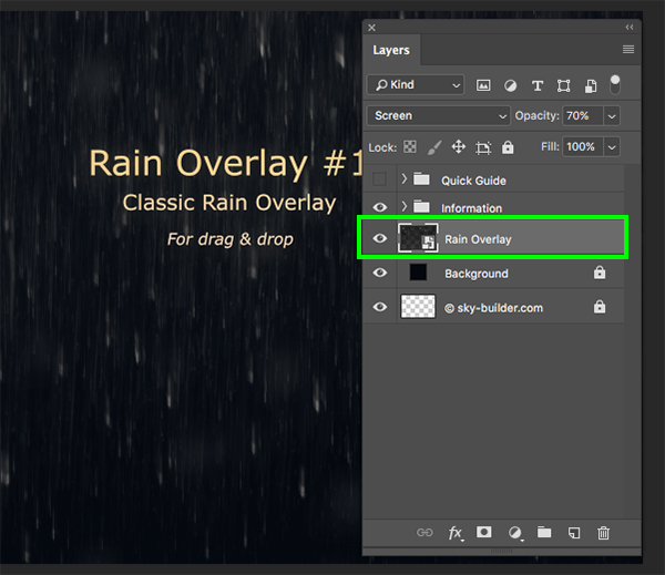
Once you’ve brought the rain overlay into the main file, place it at the top of the Layers Palette and then scale it down a bit before pressing ‘Return’ to apply the changes.
Step 32: Vignette
Create a new layer above the ‘Rain Overlay’ and rename it ‘VIGNETTE’. After that, press ‘G’ to switch to your Gradient Tool and select a black-to-transparent Radial Gradient. Let’s also make sure to check off the ‘Reverse’ box along the top toolbar as shown below:
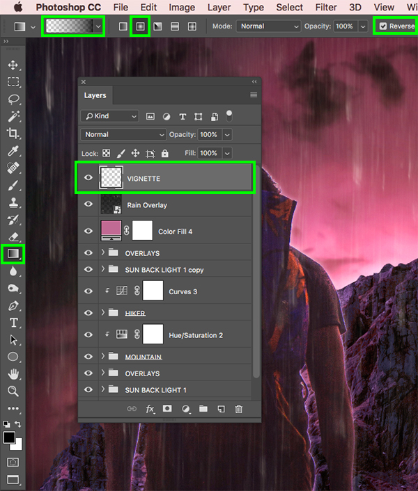
From here, click and drag outwards from the center of the canvas to create an inverted gradient layer that will serve as our vignette. Let’s change the Blend Mode of this layer to ‘Multiply’ and then drop the opacity to ‘40%’ to turn it down a bit.
Add a Layer Mask to the ‘VIGNETTE’ layer and then press ‘G’ again on the keyboard. Uncheck the ‘Reverse’ option and then switch to a Linear Gradient instead of a Radial Gradient.

With the Layer Mask selected, click and drag upwards from the bottom of the canvas to hide the vignette along the bottom. The bottom of the image is dark enough as it is so doing this will keep the vignette to the upper left and right corners where we want them.

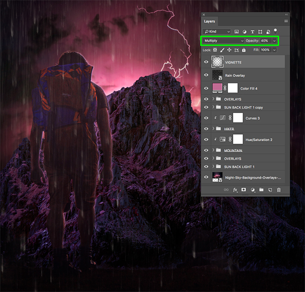
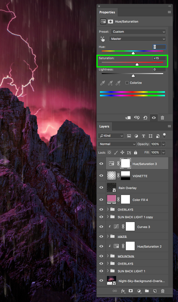
Step 33: Saturation Boost
With the ‘VIGNETTE’ layer selected, click the Adjustment Layer icon and add a ‘Hue/Saturation…’ Adjustment Layer to the very top of the Layers Palette.
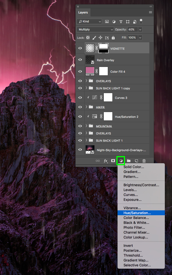
Let’s now just increase the ‘Saturation’ to about ‘+15’ to give our overall image a nice boost.
Step 34: Organizing Our Layers
Let’s now select each of the loose layers and place them into folders (Command/Ctrl+G) renaming each one accordingly.

Step 35: Adding Our Title
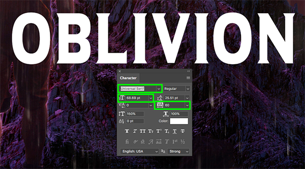
Create a new layer at the top of the Layers Palette, just below the Hue/Saturation Adjustment Layer from Step 33. Press ‘T’ to switch to the Type Tool and then type out the word ‘OBLIVION’ in all caps. For this we will be using one of three free typefaces from DaFont.com called ‘Universal Serif’ to follow along. Once you have placed your text, open the Character panel found under the Window menu and change the size to about ‘68.69 pt’ and the tracking setting to ’60’. Here we will be leaving the fill color set to solid white.
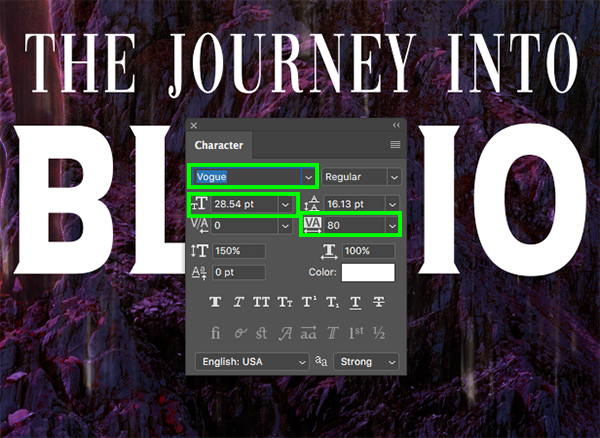
Add another new layer and with the type tool type out ‘THE JOURNEY INTO’ again in solid white and all caps and place this line centered above the ‘OBLIVION’ text. For this line of text we will be using the ‘Vogue’ typeface which is the second of three free typefaces from DaFont.com that you can download for this step. Let’s then use the Character panel once again to change the size of this text to ‘28.54 pt’ and the tracking can be set to ’80’ as shown below:
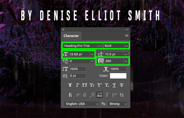
Let’s add a third new layer and type out the words ‘BY DENISE ELLIOT SMITH’ this time using the ‘Heading Pro Trial’ font in the ‘Bold’ style which you can download for free.
For this we will make the size of our text about ’14 pt’ and the tracking will be more spread out so let’s change that value to ‘360’ or so. Once you have done that, place this layer centered and below the ‘OBLIVION’ text.
After adding the three lines of text, select the top text layer, hold the Shift key, and then select the bottom of the three layers so all three are selected simultaneously.
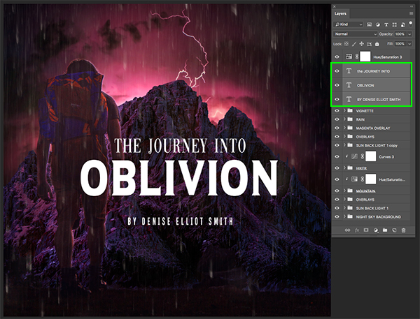
With your text layers still selected, press Command/Ctrl+G to place them into a new folder and double click the ‘Group 1’ text to rename this folder ‘TT’.

Step 36: Title Texture 1
Next, go to the File menu and choose ‘Place Embedded…’ from the dropdown.
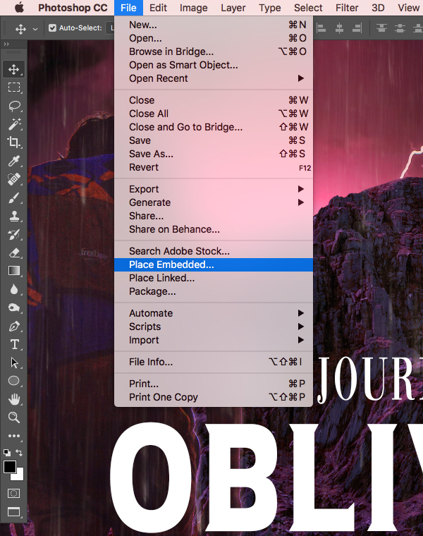
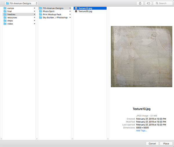
Navigate to the ‘7th-Avenue-Designs’ subfolder in the freebies and then choose the ‘Texture10.jpg’ file and click ‘Place’ from the lower right corner.
Please note: Unfortunately, we are unable to offer the ‘Texture10’ included with this tutorial, but there is an array of options available on the internet by searching for ‘vintage paper texture’. We hope you can find a suitable one!
Once you’ve brought the texture in, place it just above the ‘TT’ folder and then hold the Control key, click on the texture layer, and choose ‘Create Clipping Mask’ from the menu.
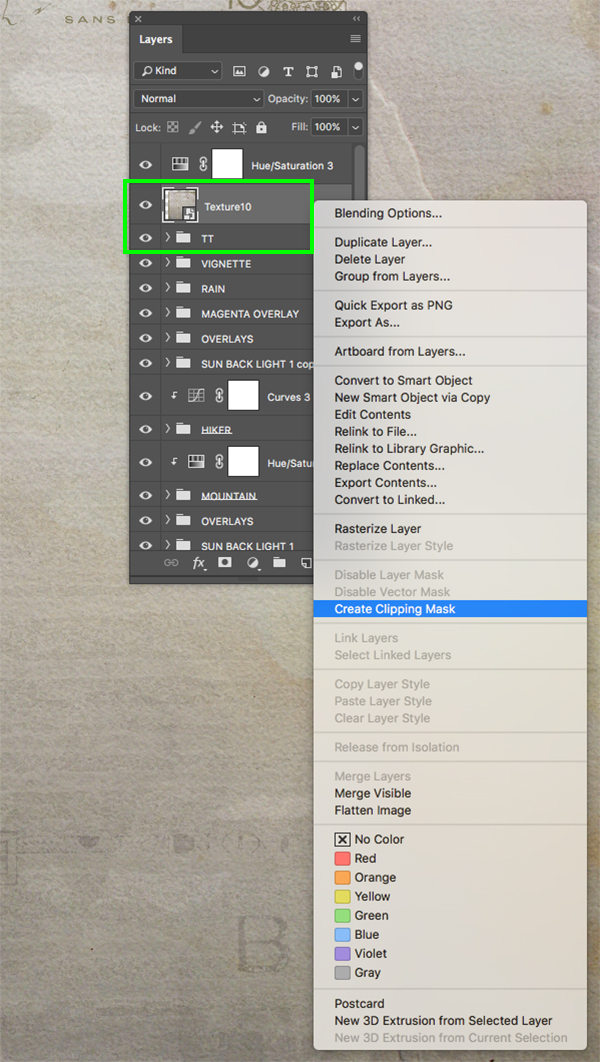
You should now see your texture only inside of the text layers and there will be a small downward pointing arrow icon on the texture layer indicating that a Clipping Mask has been applied.

Step 37: Title Texture 2
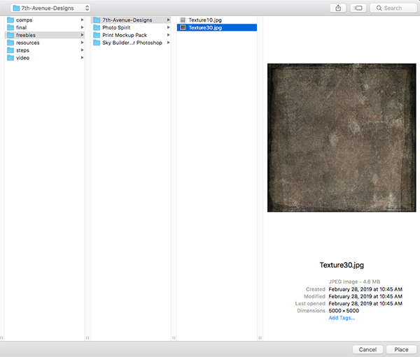
Go to the File menu and choose ‘Place Embedded…’ from the dropdown once again. Navigate to the ‘7th-Avenue-Designs’ subfolder in the freebies and this time choose the ‘Texture30.jpg’ file.
Please note: Unfortunately, we are unable to offer the ‘Texture30’ included with this tutorial, but there is an array of options available on the internet by searching for ‘daguerreotype brown paper texture’. We hope you can find a suitable one!
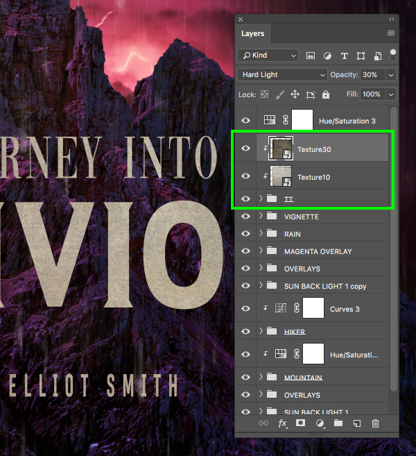
Place this texture above the previous texture with a Clipping Mask applied and then change the Blend Mode of the ‘Texture30’ layer to ‘Hard Light’ and reduce the opacity to ‘30%’ as shown here:
Step 38: Title Texture Levels
With the ‘TT’ folder selected, click the Adjustment Layer icon at the bottom of the Layers Palette and then choose ‘Levels…’ from the menu.
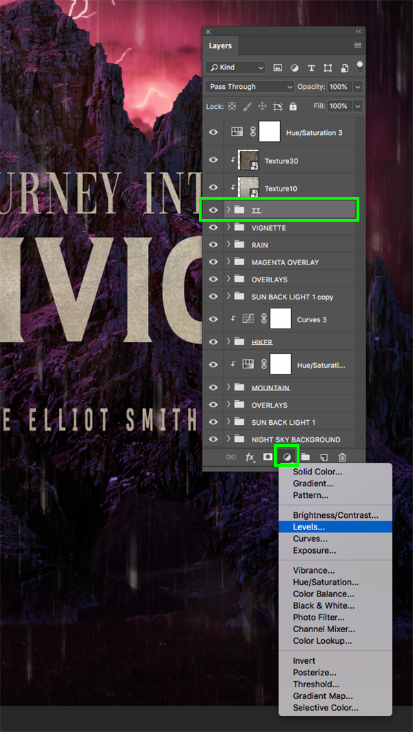
Move the left, gray slider in so that it’s set to ’45’ and move the right slider in towards the center so it’s set to ‘200’ and then press the Command/Ctrl and right bracket key twice so that it sits above both textures as shown here:

Step 39: Title Texture Desaturation
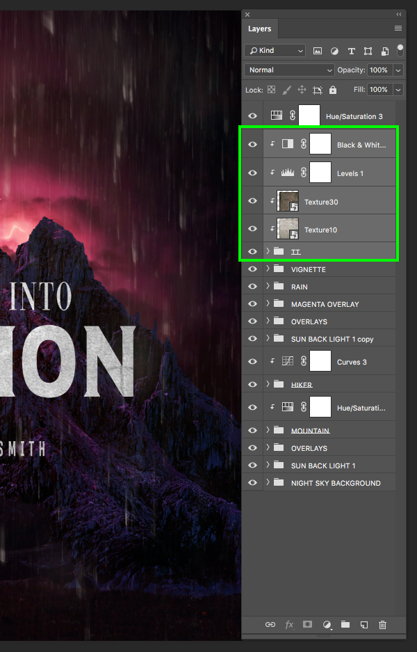
Select the ‘TT’ folder again and return to the Adjustment Layer icon, this time selecting ‘Black & White…’ from the dropdown menu.
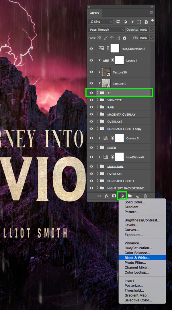
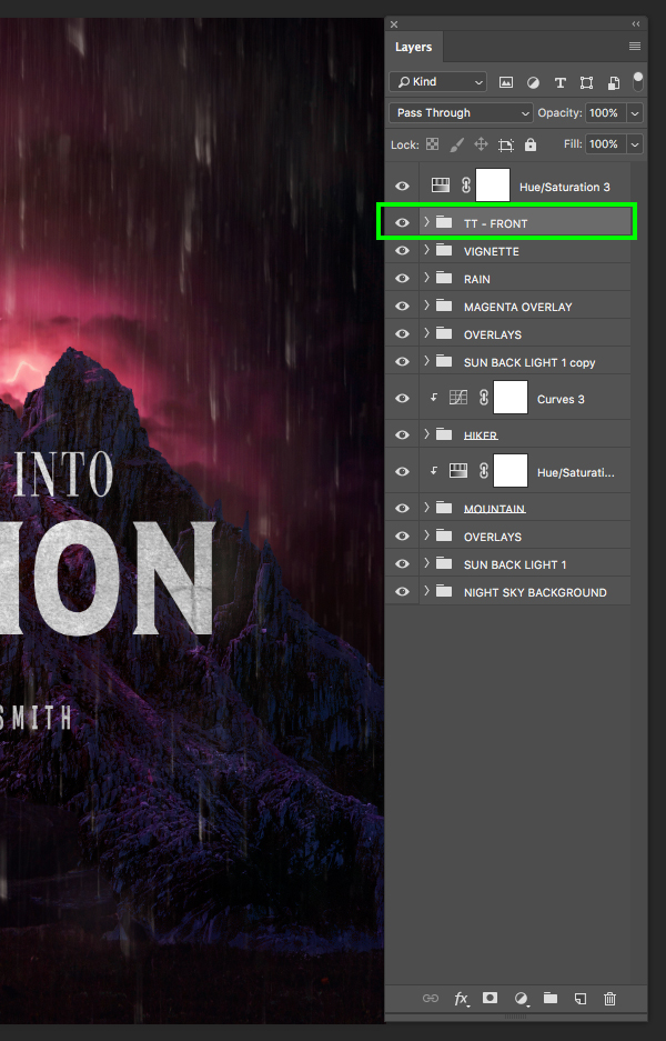
Once the Adjustment Layer has been added, press Command/Ctrl and the right bracket key about three times to place it above both textures as well as the Levels Adjustment Layer while still retaining the Clipping Mask. After that, select the ‘TT’ folder, hold the Shift key, and then select the top Black & White Adjustment Layer so all five of these layers/groups are selected together.
With everything still selected, press Command/Ctrl+G to place these elements into a new folder and double click the ‘Group 1’ text to rename the folder ‘TT-FRONT’ as shown in the image below:
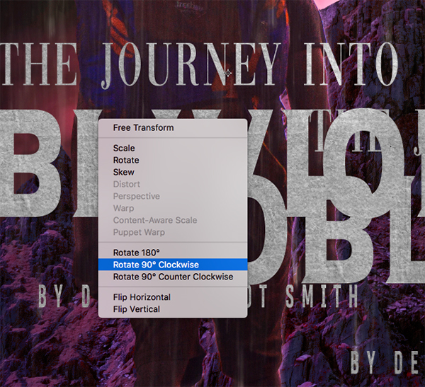
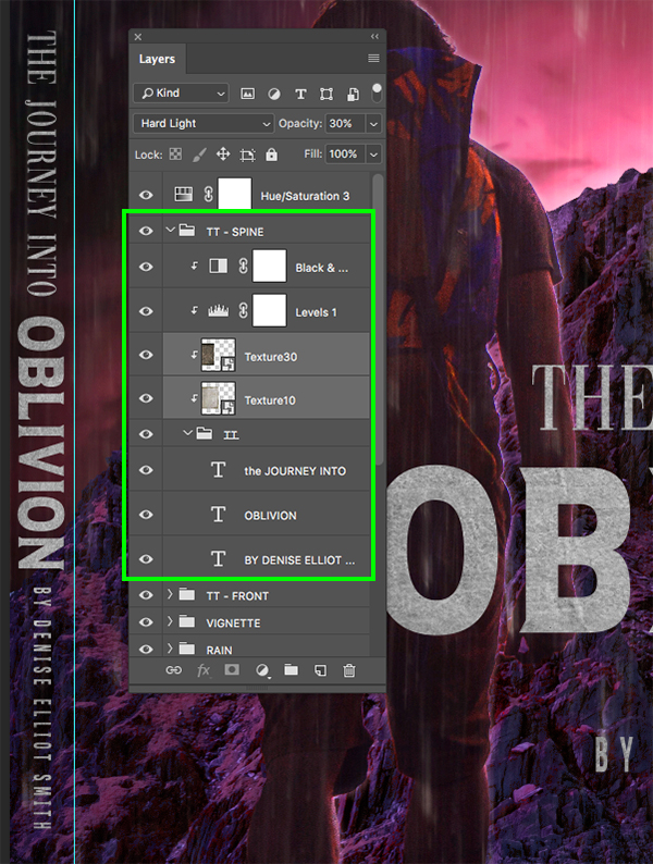
Step 40: Creating The Spine
Select the ‘TT-FRONT’ folder and press Command/Ctrl+J to duplicate it in it’s entirety. Double click the text of the duplicate layer and rename the folder ‘TT-SPINE’ as shown here:
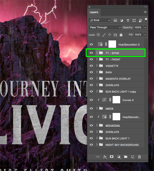
With the ‘TT-SPINE’ folder selected, press Command/Ctrl+T to do a Free Transform, and then hold the Control key and click anywhere on the layers to reveal a dropdown menu. From this menu, select the ‘Rotate 90º Clockwise’ option to turn all of the layers sideways.
Press Command/Ctrl+; on the keyboard to reveal the guides where you will notice a vertical line over towards the left side of the cover – this is where the spine will go. Here we will need to scale down the size of each of the three text layers using a Free Transform, and then place them stacked so they fit nicely along the left edge. You may also need to go inside of the ‘TT-SPINE’ folder and scale or reposition the textures to ensure that they are covering all of the text in the spine area. Since we need to take the spine into account, you may want to nudge the main ‘TT-FRONT’ folder over to the right so that it’s not perfectly centered as the far left side where the spine is will not be a part of the front cover of our book.
Now our cover design is complete so let’s press Command/Ctrl+S and then once it has saved press Command/Ctrl+W to close the tab and return to the previous Smart Object one level up in our mockup.
Step 41: Saving It Down
Once you are in the next level up in the mockup, press Command/Ctrl+S to save once again, and then Command/Ctrl+W once it has finished to close out of this tab and return to the previous Smart Object in the mockup.

Repeat this once more by saving and closing out on the next level.
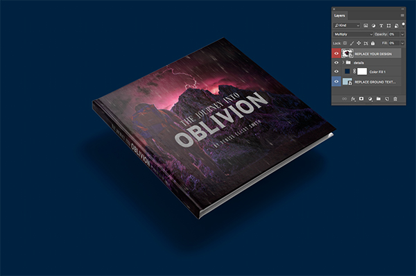
Step 42: Back In The Main Mockup
You should now be back in the main mockup file where we have one single Smart Object layer. Let’s select this layer, click the Adjustment Layer icon at the bottom and add a ‘Levels…’ from the dropdown.
Here we want to bring the left, gray slider in towards the middle so that it’s set to ‘8’ and bring the right slider in towards the center so that it’s set to ‘234’ to boost the contrast of the overall design and mockup.

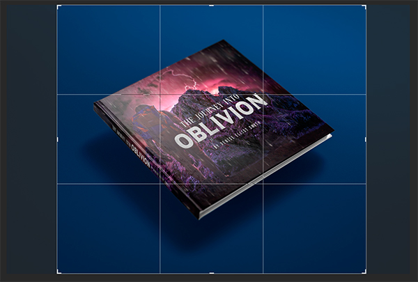
Step 43: Cropping The Mockup
Press ‘C’ on the keyboard to switch to the Crop Tool and then drag in both of the handles on the side to get a tighter crop on the book cover. Once you are happy with the size and placement, press ‘Return’ on the keyboard to apply the changes.
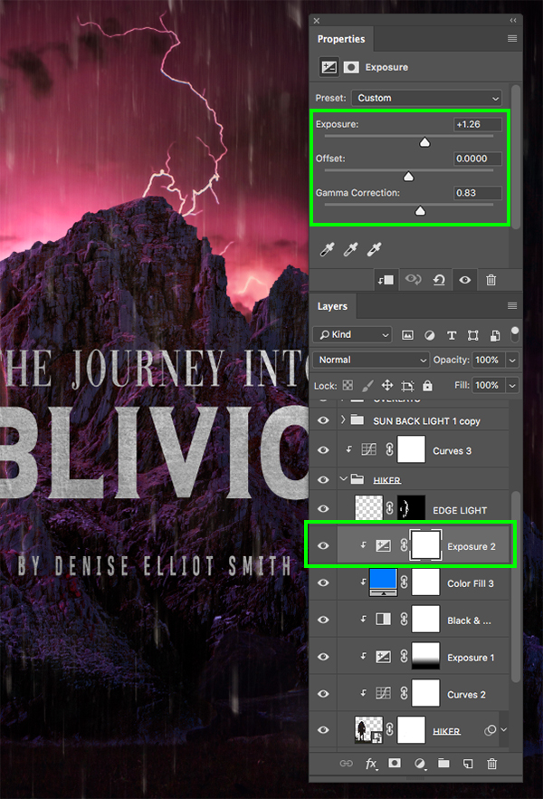
Step 44: Finishing Touches
At this point everything is looking good but I want to make the hiker stand out just a bit more so I will go back inside the Smart Objects into our main cover design and add one more Exposure Adjustment Layer inside of the main ‘HIKER’ folder. Make sure that this Adjustment Layer, or any others you may wish to add, are all contained within this group of adjustments and that they have the Clipping Mask applied. For the settings here I am going to boost the ‘Exposure’ up to ‘+1.26’ then move the ‘Gamma Correction’ slider so that it’s set to ‘0.83’. Once you have made this final adjustment, save and close each of the Smart Objects until you’ve returned to the main mockup file once again.
We have now completed our science fiction book cover design in Photoshop! To create our epic book cover we’ve used various high quality design resources from The Totally Eclectic Photography Bundle that we’ve combined with stock imagery, free typefaces, and an awesome hard cover book mockup from the Design Cuts Marketplace. Remember that the design resources we’ve used for our book cover are just a small sample of the time saving tools and photography that you will find in this jam packed design bundle! With resources from top designers such as Feingold, BeART, Twinbrush and Creative Presets to name a few, you are sure to find something for just about any type of design project that you are working on.
Remember that whether it’s your outcome for this tutorial or something new you’ve made, we’d love to see your designs on our Facebook page.
Please leave a comment if you have any questions or suggestions. I always look forward to hearing from you!
There’s still time to check out The Totally Eclectic Photography Bundle including best selling presets, overlays and masks as well as the amazing Photography video tutorials by Glyn Dewis all for an unbeatable price of just $29!
As always an added value, thank you so much.
Thank you so much for the love and support as always Ulrike! We super appreciate it!
Great, informative tut! Appreciate it!
That’s awesome to hear, we’re so glad you enjoyed it!
I always run through the tuts quickly to ‘collect’ what I will need, I would really like to do this tut but the 2 textures at the end from 7th Avenue were not included in the ‘free download’ that I got, did I misunderstand? Thanks for checking.
Thanks so much for commenting Judee and we are really sorry that these textures were not included as part of our tutorial freebies. We have included a note on the steps where these textures have been used to help you locate an alternative freebie, so I hope that these help.
The full texture pack where these have been taken from, is currently being featured in our Totally Eclectic Photography Bundle, and is also available in our Marketplace, so I hope that you can still enjoy checking out the Photography Texture – Artistic Vol. 1 pack if you find these textures are a must-have for your collection!
Thanks for the response, I’ll work something out :)
You’re so welcome Judee, and if you do get stuck picking up some alternatives as suggested by the designer, please do let me know and I can definitely help you further with this!
I will be revisiting this tutorial again as it’s filled with so many new techniques. Things I just didn’t know! Eric, your delivery is calm and comfortable and easy to follow and I truly thank you for that. Just need to grab some coffee and push play again!
Thanks so much
Hey Carol,
Thank you so much for taking the time to write such a lovely comment and for your super kind words! We know that Eric will be so happy to hear that you find this tutorial super easy to follow along with, and that it is filled with handy tips- we hope that you love putting these tips into action for your own creative projects!
Thanks Carol! I’m glad that you find my delivery to be calm and comfortable and easy to follow. I think it’s come in time but I find slowing down helps with being thorough so we can make sure to pack in as much useful and pertinent information as possible!
Really enjoy these tutorials that your providing, gives me a lot of inspiration for my own projects. Thanks
Woohoo we’re so happy to hear that you really enjoy our tutorials Ron, and I hope that you have picked up some super handy new tricks to use for your own creative products!