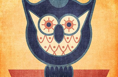
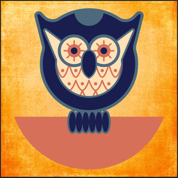
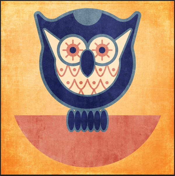
WHAT WE’RE CREATING:
Today’s tutorial is from Simon Hartmann, one of the partners and designers at Studio Ace of Spade, a small yet mighty design shop head-quartered in Goshen, IN.
Over to Simon!
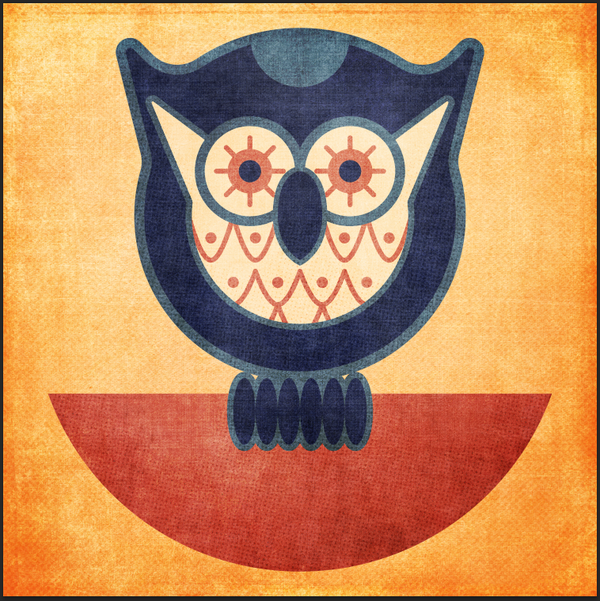
Today, I’m going to walk you through the process of vectorizing a cute little owl, and how to use the current Two Lil’ Owls texture collection to create a square print with depth and feeling. Remember, there’s just a few days left to grab the entire texture collection + bonuses for an incredible 91% off.
The process for creating today’s piece is quite simple, and is broken down in five phases:
- Drawing
- Vectorizing
- Colorizing
- Fine-tuning
- Texturing
We’ll use both Adobe Illustrator and Photoshop to execute the tutorial. I’m using the CC version of both of these softwares, but you should be able to follow along with CS3 and above. If you don’t own Illustrator then you should still be able to create your owl illustration in Photoshop using the pen tool, although ideally you want to use vector software for this.
STEP 1: DRAWING
This phase is where you have the opportunity to make the owl your own. My goal when drawing it was to use as many geometrical shapes as possible, in order to speed up the vector building phase. I’ve used a mechanical pencil with blue led, a compass, and a regular pencil to draw my shapes, block shading, etc.
Inspiration sources
Finding inspiration wasn’t hard, as there seems to be an “owl trend” going on. Also, I’ve already drawn quite a few owl myself (one, two, and three).
I actually went through quite a few variations before settling on this last specific design.
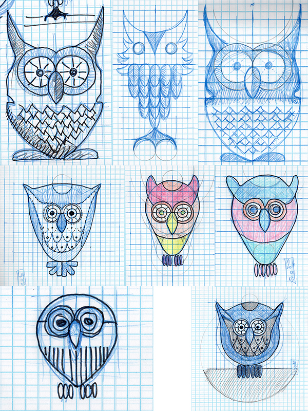
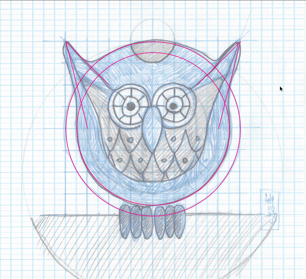
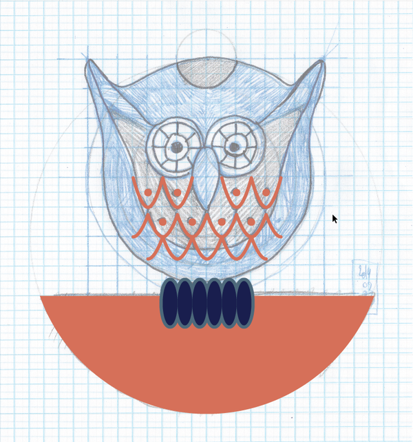
And here’s the final sketch:
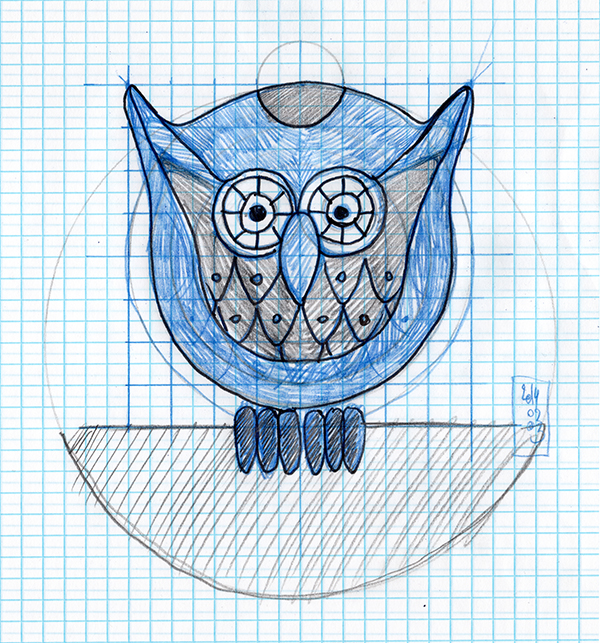
Once you’re happy with your owl design, it’s time to build the vector version.
STEP 2: VECTORIZING
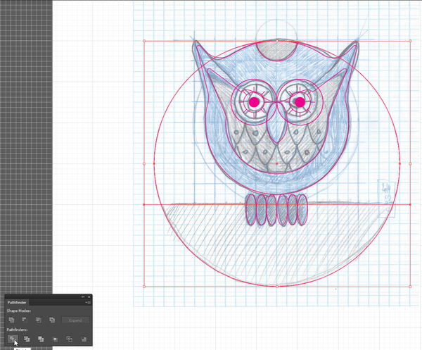
The vectorization process was fairly simple. Because my design was based on geometrical shapes, putting the foundation together was quick. The more time consuming aspects were due to the heavy use of the pathfinder to merge shapes together, and to the many copy-pasting of shapes it involved.
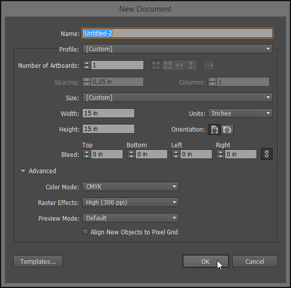
First, let’s create a new document in Ai. I often use a 15″x15″ square as a base.
I started by placing my scanned sketch in my document, into a locked Reference layer.

Body building
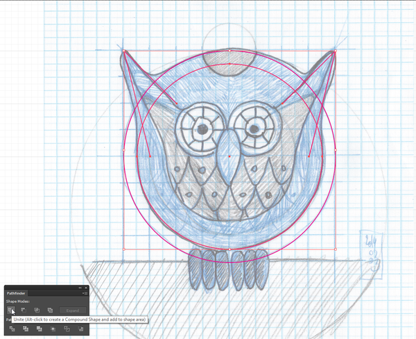
Let’s build the main body shape first. Let’s create a circle that fits the top curve of the owl.
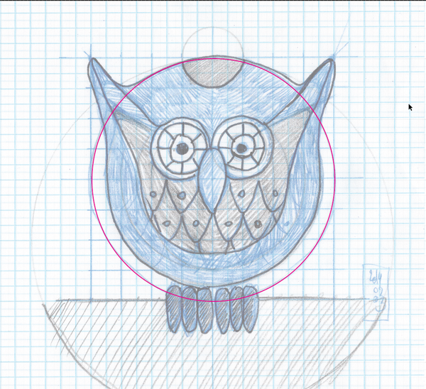
Then, let’s add the concentric circle that fits the bottom of the owl’s body.
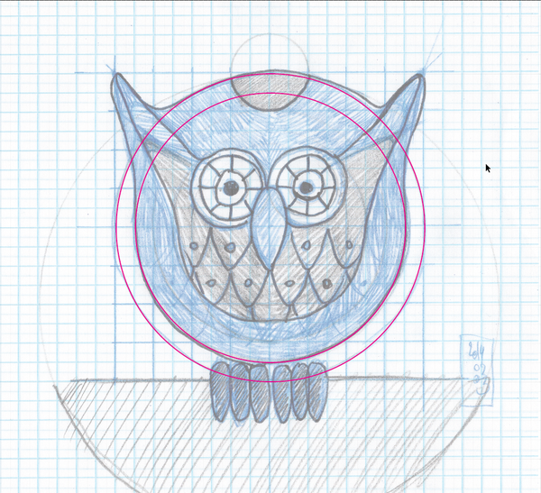
Once these are in place, let’s create the first horn. You should note that I have both the grid and Snap to grid turned on, so drawing angular shapes is quick and easy. Note also that I’m not bothering with curves and rounded angles quite yet. Ai CC has that nifty Corner radius feature that allows me to take care of these later. Finally, because we’ll use the pathfinder down the line to merge shapes together, there’s no need to close all the shapes here.
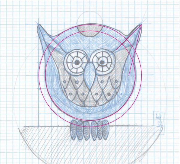
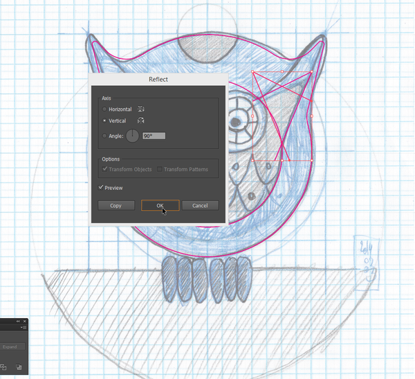
Duplicate the horn you’ve just drawn, paste it in place (CTRL/CMD+F), and reflect it (Right click > Transform > Reflect) so it’s in the right orientation.

Once that’s done, it’s time to combine all these shapes together to finally obtain the main body shape.
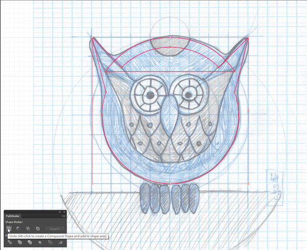
First, let’s join together the horns and the inner circle. Select them all three, and use the Unite function of the Pathfinder.
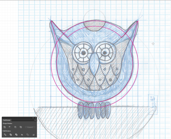
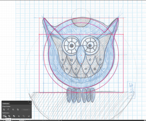
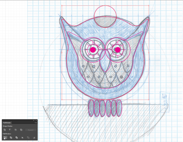
The next step is to combine the first circle we drew with the inner circle/horn combo. The only thing we need to do first is to cut the outer circle to only keep the part we’re interested in. I’m using a rectangle to do so, and another one of the Pathfinder‘s function, called Divide
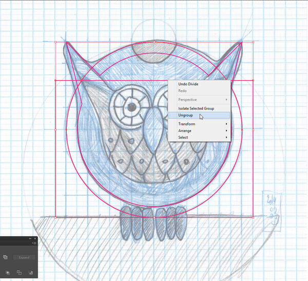
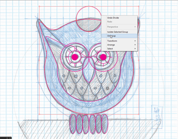
Once the rectangle is drawn, select it and the outer circle, and pathfinder away.
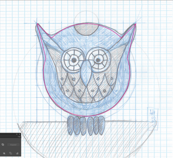
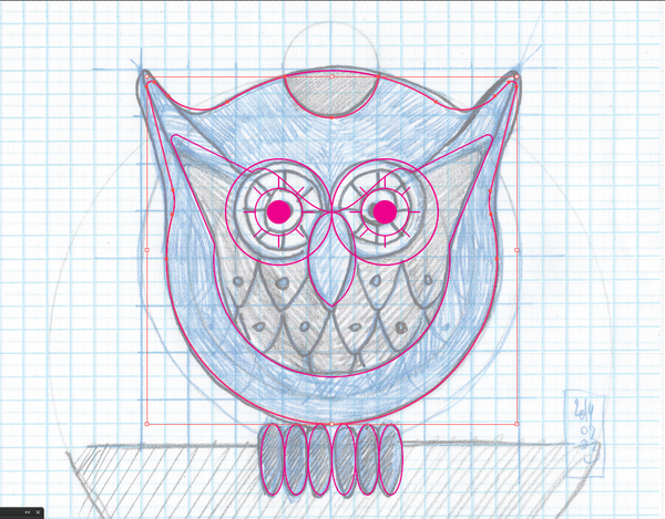
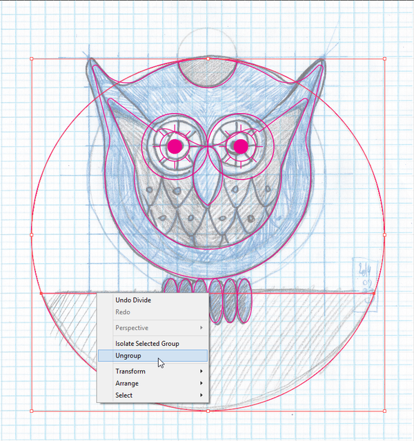
After ungrouping the result, it’s time to delete away the bits we don’t want to just keep the top curve.
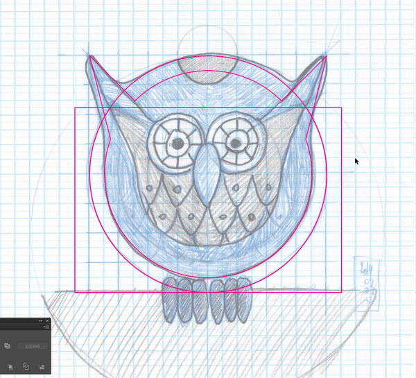
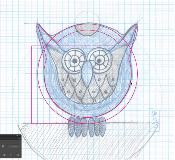

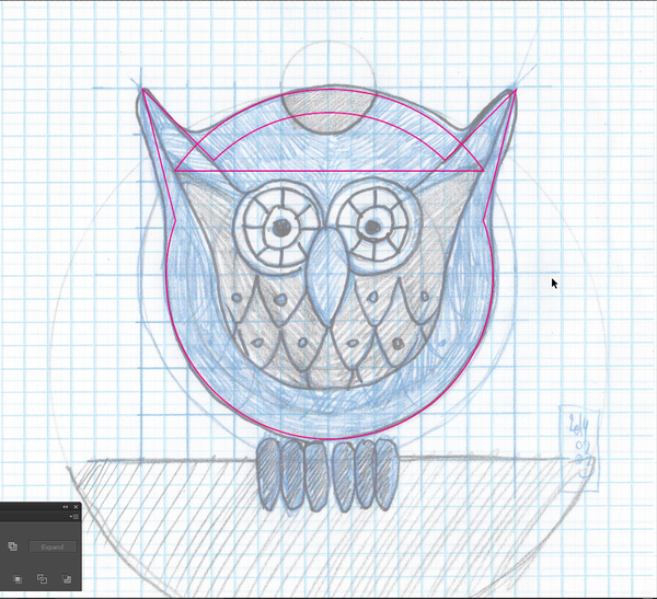
Once that pruning process is accomplished, we’ll be using the same trick than at the beginning (Unite) to get the full shape.
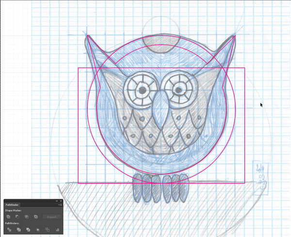
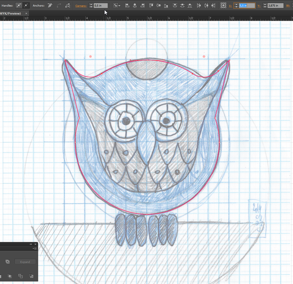
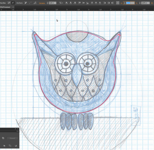
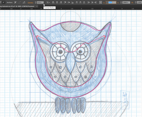
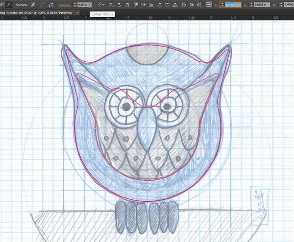
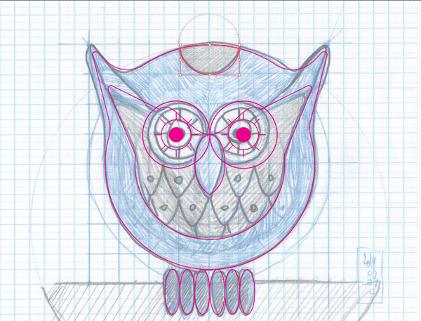
Time to quickly round the sharp corners of the body. The ones at the top, between the horns, have received a 0.5″ radius, the ones in the horns have received a 0.05″ radius, and the ones on the side of the body a radius of 0.25″.

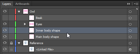
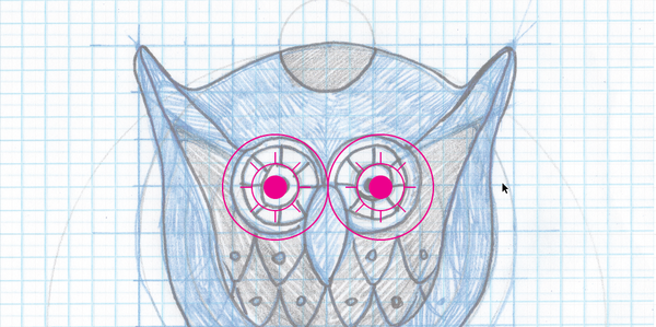
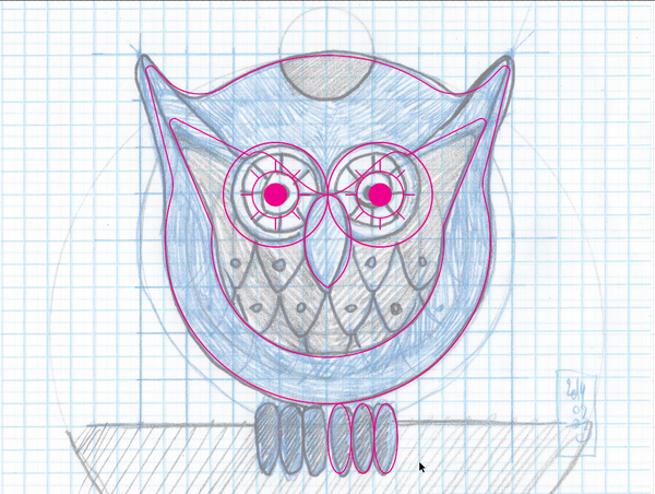
Owl eyes
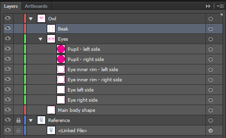
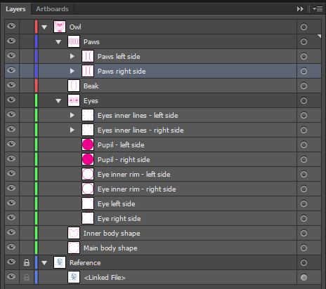
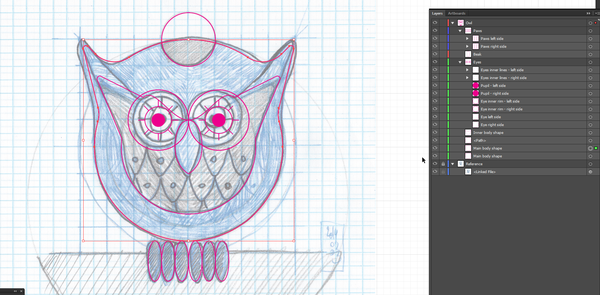
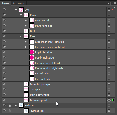
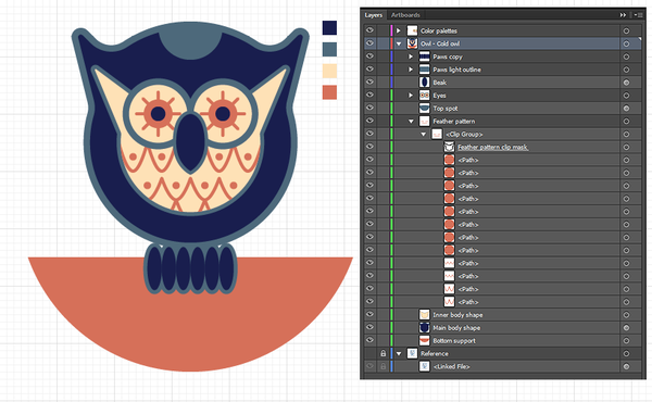
Time to build the eyes now. Here’s a quick look at how I’m organizing my layer palette, in order to keep my file neat and organized:
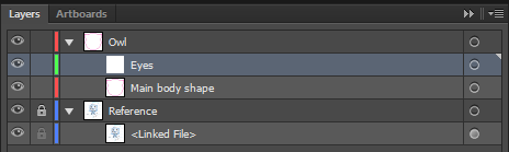
I have an Owl main layer, a sub-layer for the eyes, and finally the main body shape.
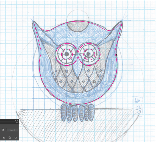
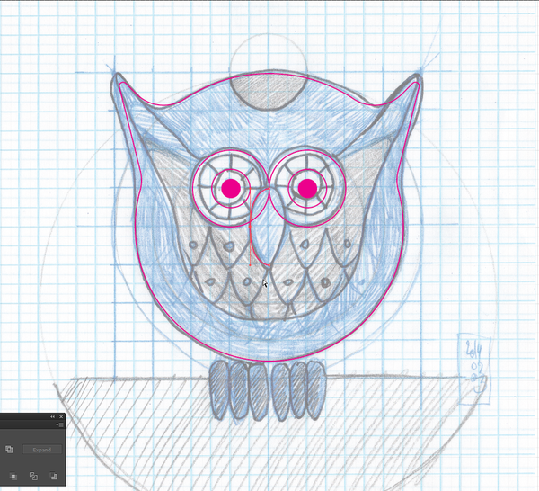
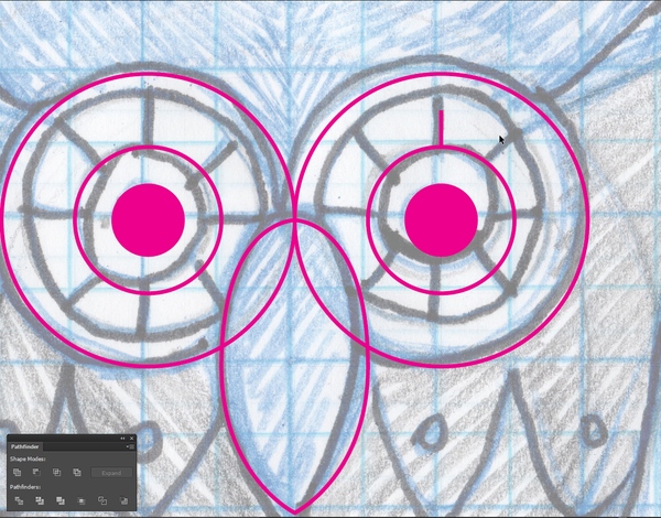
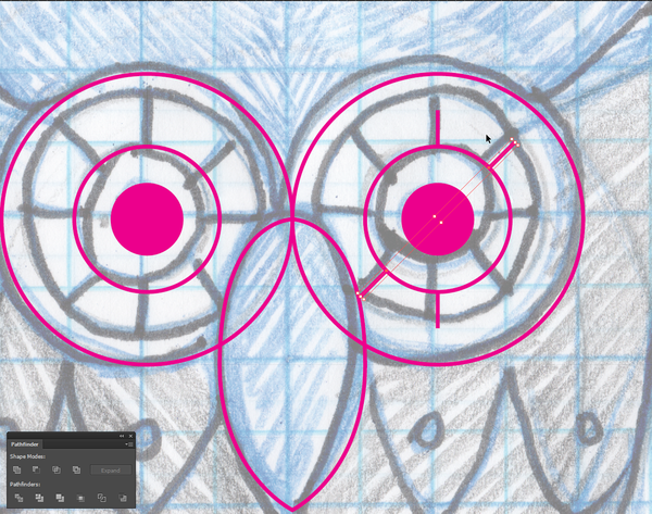
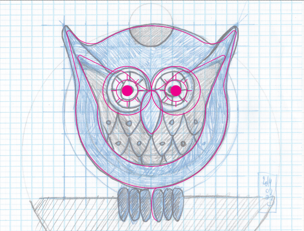
The obvious starting point for the eyes is the draw the various circles they’re made of, as well as the pupils.

Here’s a look at what the layer palette looks like now:
Beak interlude
Because the beak will be placed above the eyes in my layer organization, I decided to quickly draw it now, so I don’t have to think of it later.
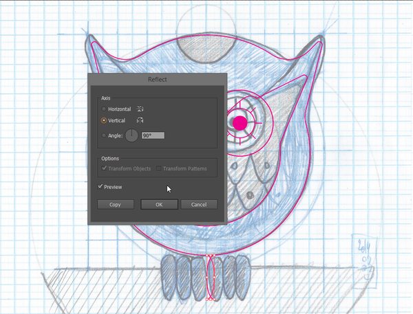
The process is simple: draw one half of the beak…
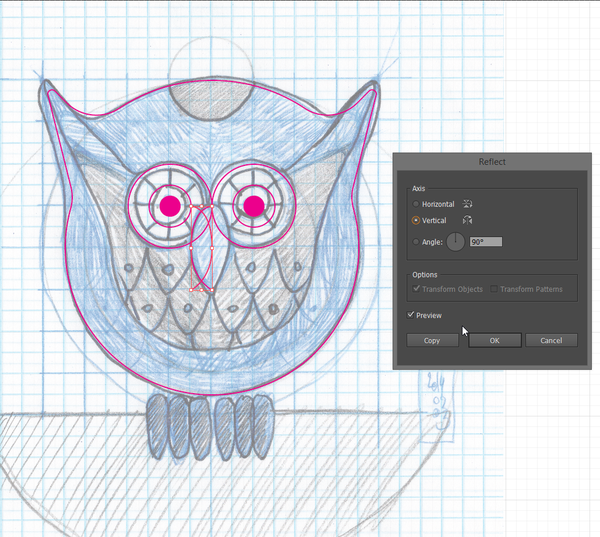
…duplicate it, paste it in front, and reflect it…
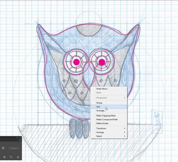
…and then select both halves, and join (Right click > Join them together.
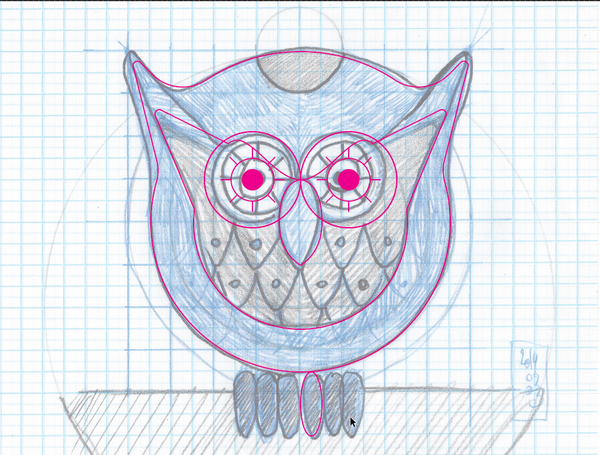
And this gives you a beautiful path, that you can rename beak, and place above the Eyes sub-layer:
You could even lock it for now, as it will remain untouched until we talk about color.
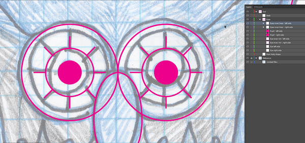
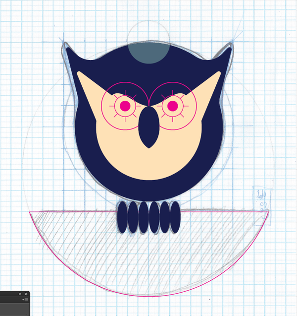
Finalizing the eyes
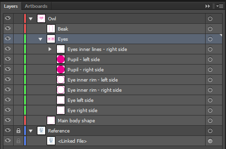
Now that the beak has been designed, time to wrap-up the eyes. The next step is to add the little dashes in them. It’s quite straight forward. Take note that I’m grouping them together for faster editing colorizing later on. The last image of the sequence gives you a glimpse at the layer palette’s state.


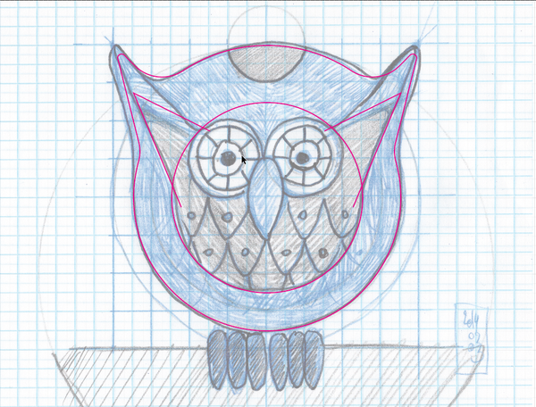
Inner shape
It’s now time to create the inner shape of the owl (in gray in the sketch). Let’s start by turning off all unnecessary distractions (the eyes and the beak).
The first steps are very similar to the ones we followed for the main body shape. First a circle, then the little horns, and a bit of Pathfinder magic.
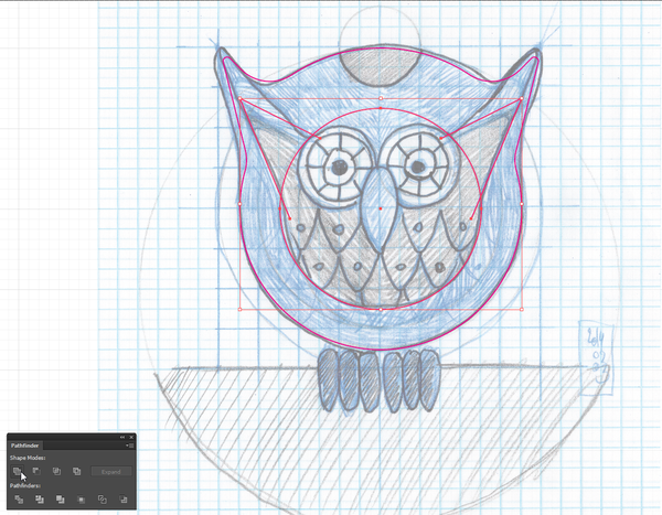
After turning the eyes on again, we can see that the top of the circle is above the eyes’ top line. This ruins the way the color would wrap around the eyes.

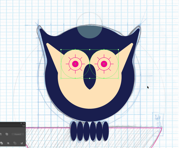
There are very simple solutions to this issue. First, let’s increase the diameter of the eyes.
Second, we’re going to bring the curve down. Just drag that center point a few notches, until it lines up with the top of the beak.

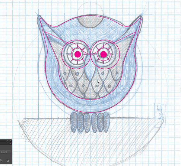
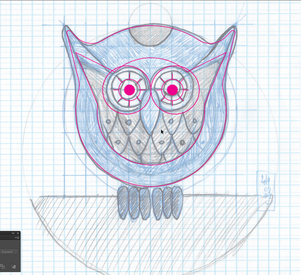
Make sure that the inner body shape is below the eyes in the layer palette, or you’ll have weird results when colorizing the owl.
And don’t forget to center vertically and horizontally the eyes’ inner rims and pupils again.
Now’s a good time to adjust the corner radius values. The horns and the points below them get a 0.05″ radius.
Phew, we’re getting close!

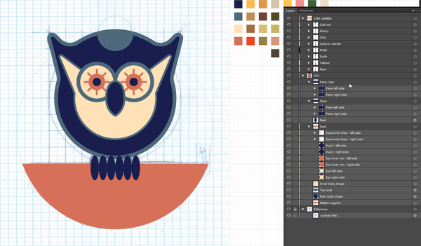
Paws
The next part of the vector building process is about the paws. It’s a process resembling the creation of the beak: trace one half, duplicate, join, duplicate to have enough copies of the ellipse, and group together.
And here is yet another proof that I’m a maniac when it comes down to organizing my file.
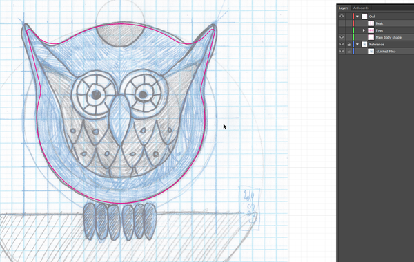
Wrap-up
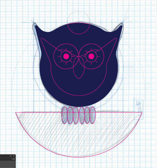
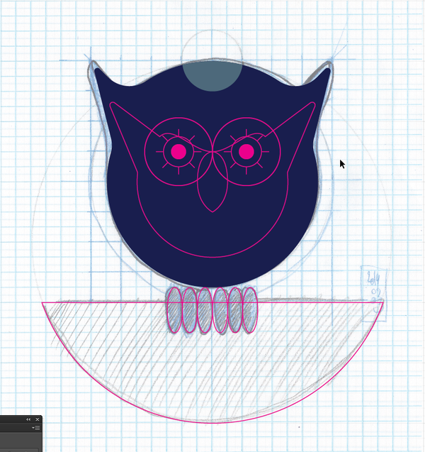
There are only two things we haven’t built yet: the top gray spot, and the half-circle that supports the owl.
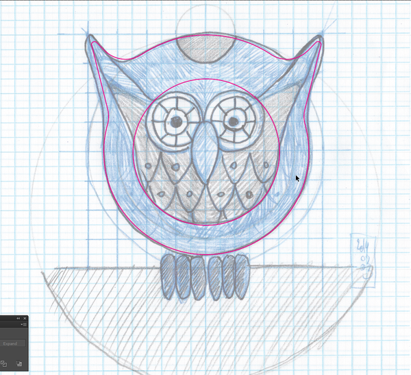
The top gray spot is yet another pathfinder session.
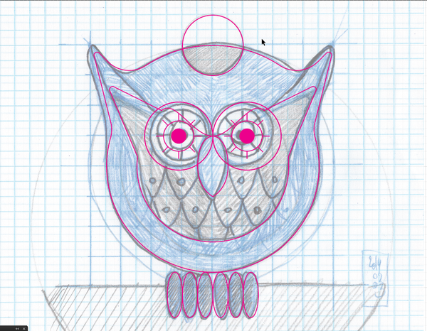
Note that it’s a copy of the main body shape that’s being used for the manipulation.
Once you’re done with the shape clean-up, slide the top shape down to between the inner and main body shapes.

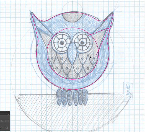
The supporting half-circle is also made with quick Pathfinder trickery. We start from a full circle, and use a line to cut it where deemed fitting.
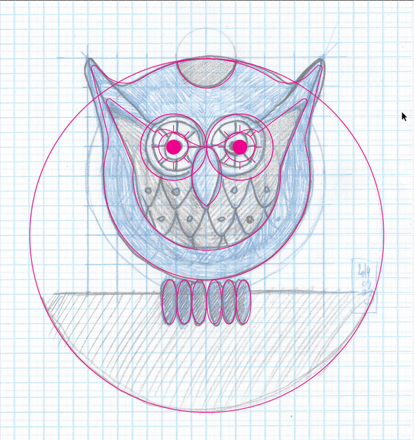
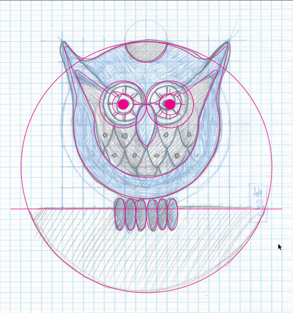
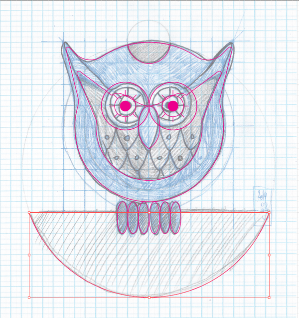
I placed it all the way at the bottom of my layer stack.
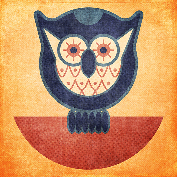
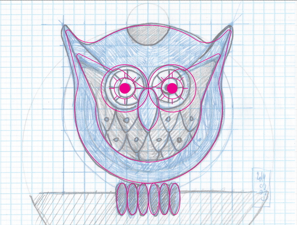
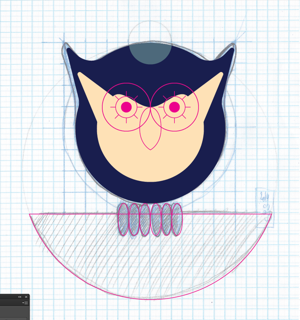
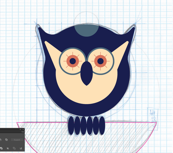
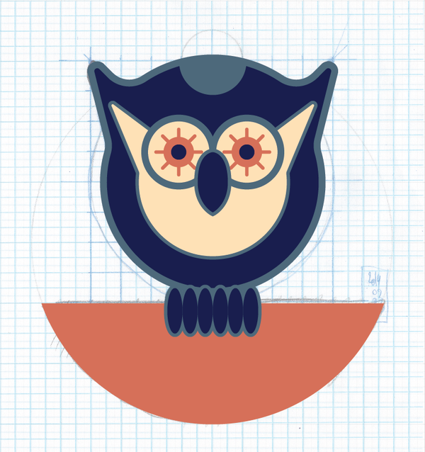
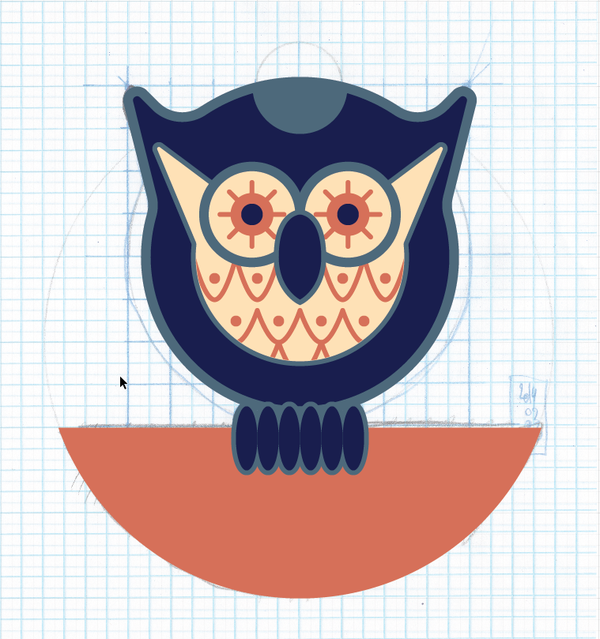
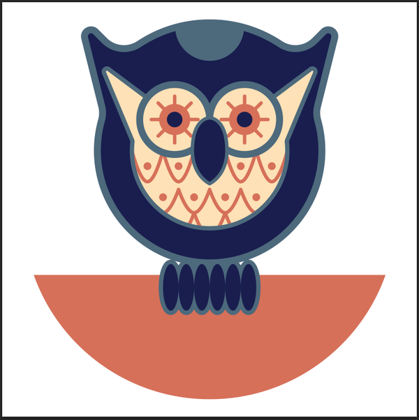
We got the owl all built! It’s now time to think about colors!
STEP 3: COLORS
As you can see on the image below, I have quite a few options in terms of color palettes. I’ve sampled my colors from real owls, seasonal palettes, owl jewellery, and more.
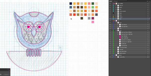
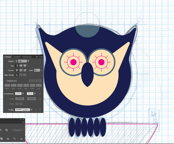
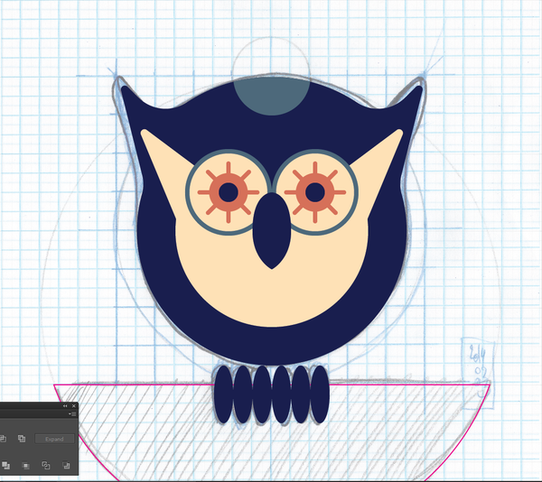
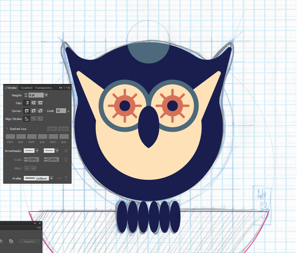
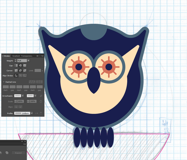
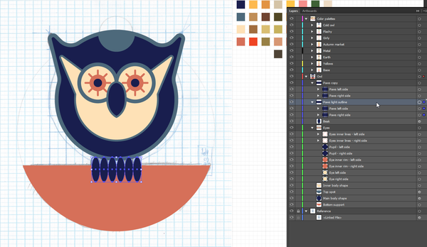
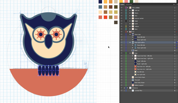
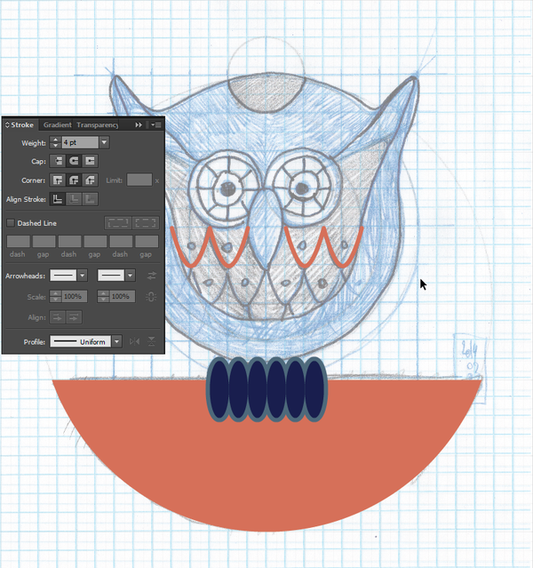
The coloring process is an obvious one, so I won’t bug you with comments every two images. Just note that the decision to have thick outlines came as the coloring progressed, in order to make the various shapes “pop” more.
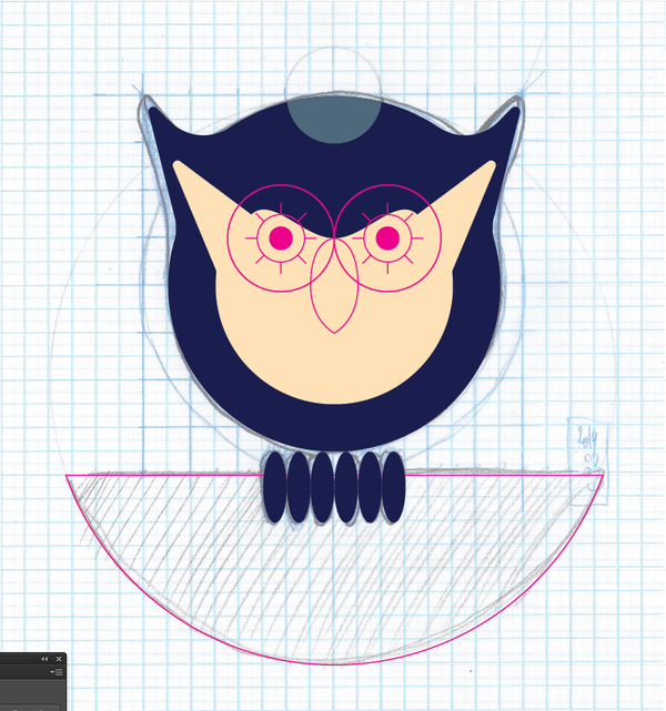
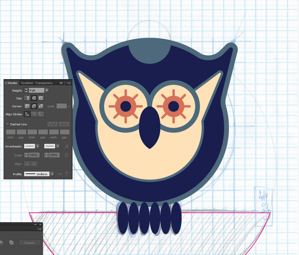
Take note of the little trick I’m using with the paws: I’m duplicating them, and using the background copies to add the stroke to them. This allows me to not have the outline get messed up with these ellipses being so close together.
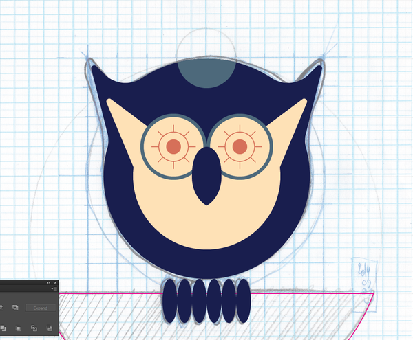
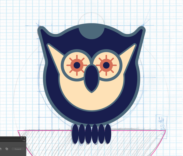
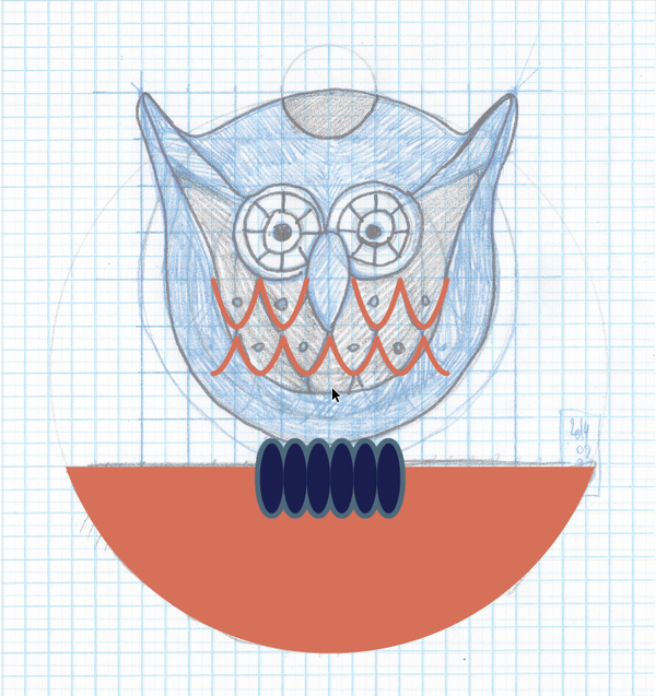
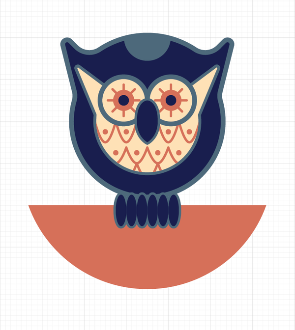
And all done!
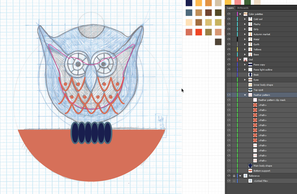
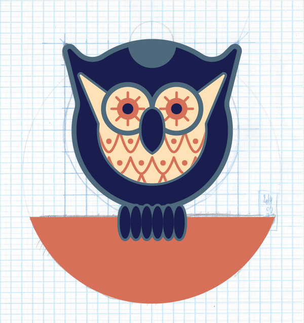
Actually, not quite. The last bit we need to put in place is the feather pattern within the inner body shape. Let’s start by turning everything but the paws and supporting half-circle off.
I’m just drawing the curly line with the pen tool, following the lines I made on the sketch. Note that I’m making sure that the stroke is with rounded joints and caps, to make sure the lines have that soft edge to them.
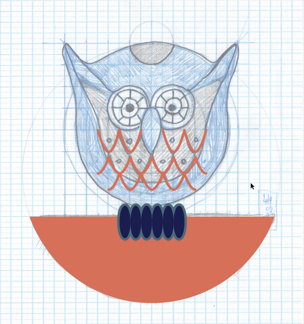
After the lines, the little dots.
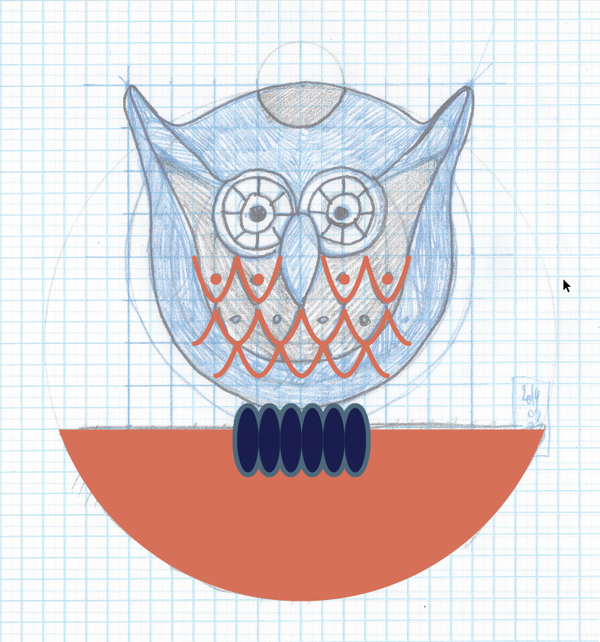
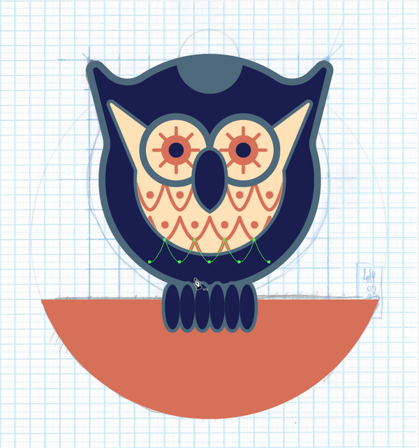
Once all the elements are there, we need to mask out the pieces that go out of the area of the inner body shape. We’re simply going to duplicate the inner body shape, and place that duplicate above everything in the sub-layer created for the feather pattern.
Once you have the copy properly positioned, just navigate to Object > Clipping Mask > Make (or use the CTRL/CMD+7 keyboard shortcut).
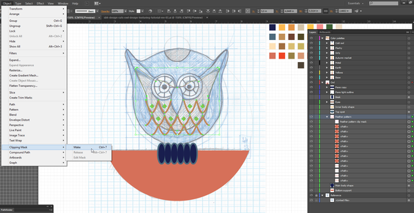
As a result, anything outside of the boundaries of that shape is now hidden.
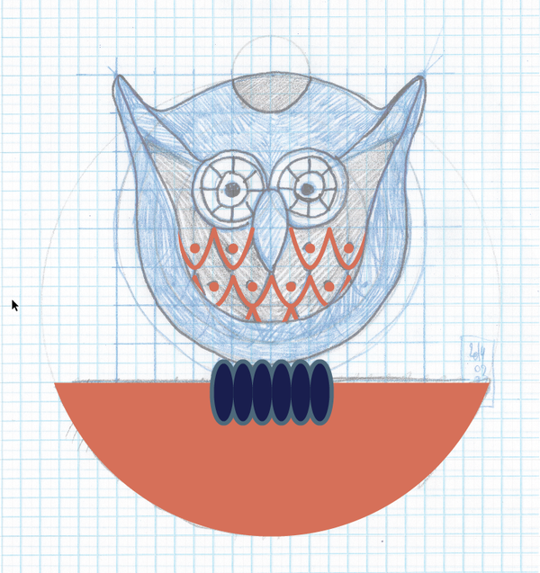
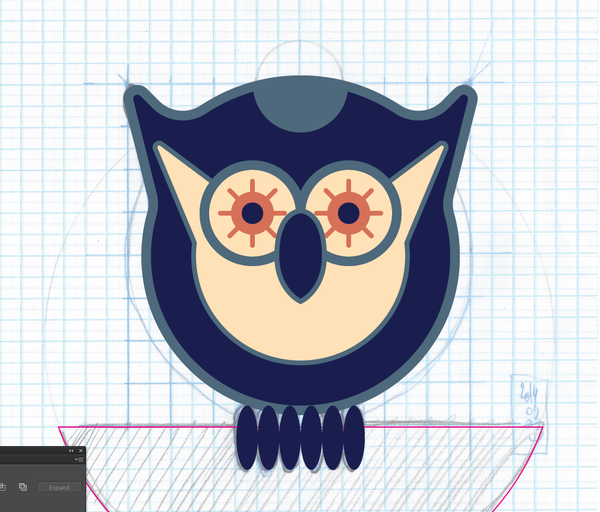
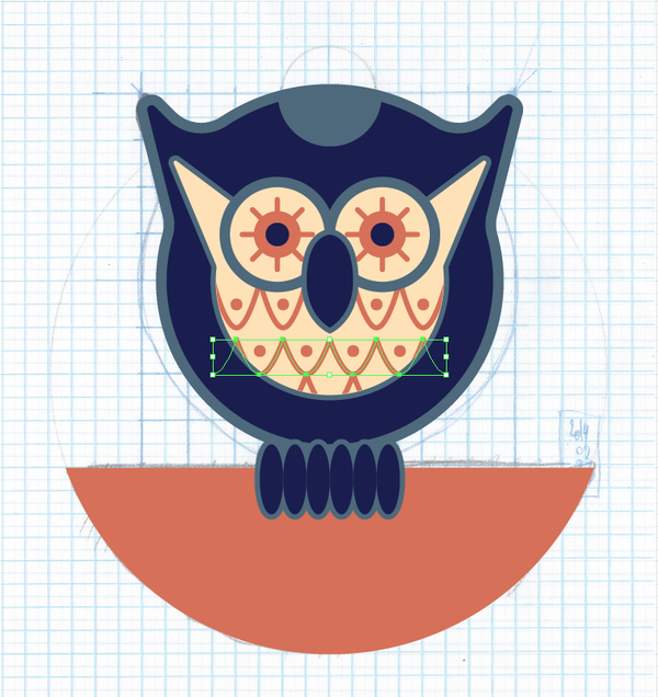
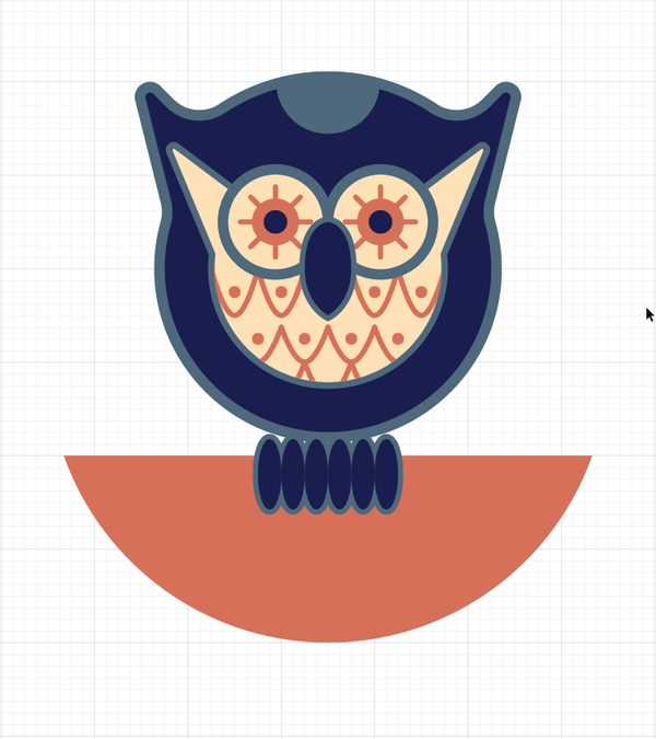
Turn everything back on again, and admire your hard work so far.
STEP 4: FINE-TUNING
The next steps are little details being corrected. For instance, I’ve deleted a bit of the feather pattern elements to ease some visual tensions at the edge of the clipping mask.
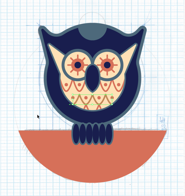
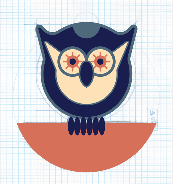
Finally, I’ve also moved down the paws, and slightly increased their stroke to remove some weird white gaps between the paws and the body.
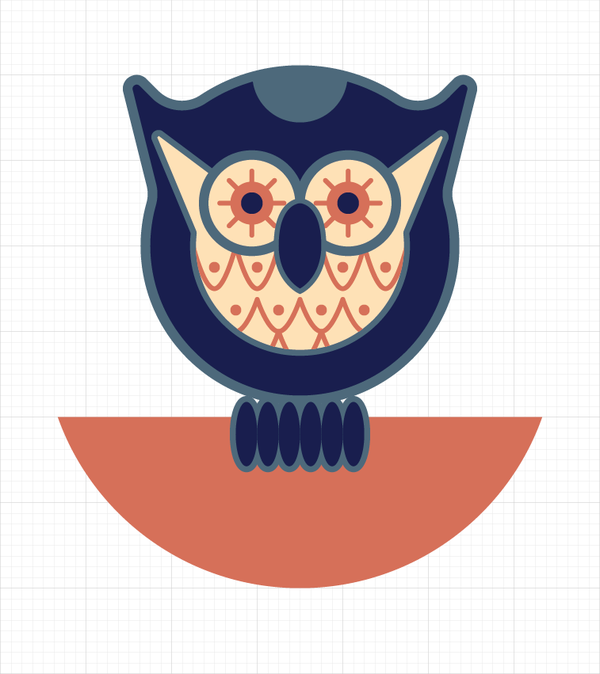
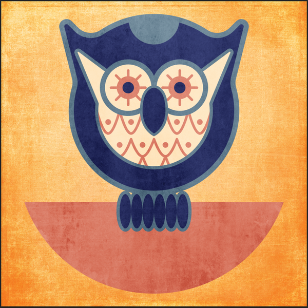
And here we are. All done, and ready for some texture work. Don’t forget to try multiple color palettes, just to see if one is stronger than the others to you.
STEP 5: TEXTURES
Time to talk textures. I personally love textures. My current collection weighs a whopping 37.2 Gb. That represents almost 6,300 files.
Textures allow you to add depth, presence, and personality to otherwise flat and soulless shapes. Used with restrain, they can add the icing on the cake, the little thing that will tie everything together. Used as layer masks, they can completely obliterate an element, or just give it that subtle worn look. Their uses and benefits are almost endless.
In what seems like an eternity ago, I co-wrote a piece over at Smashing Magazine about the use of textures in web design with Jon, my partner at Studio Ace of Spade. While the article focuses on the use of textures on the web, its considerations apply to print projects as well. There are also some other things I wrote about textures elsewhere (#1, #2), that showcase some of my tips and tricks about using textures for poster projects.
Anyways, moving on. Let’s come back to our owl.
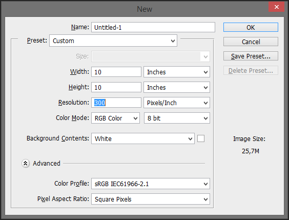
I’m going to use almost exclusively textures from the Two Lil’ Owls collection. These are super high resolution squares of goodness. Since they are in a square aspect ratio, my finished print will be square as well. Let’s start by creating a new 10″x10″ @300 dpi (RGB) document in Ps. You could argue that I should use CMYK just in case I’d like to get my final piece printed. I agree, but there are some of my tricks resting on some specific Ps filters that work only in RGB color mode, and besides, if you work with a printer that knows what he’s doing, his pre-press work will insure a correct restitution of your colors.
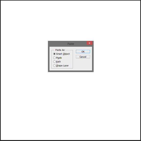
The next step is to bring in our owl. To do so, just select it all in Ai, and copy and past it in your Ps document. Choose Smart Object when prompted, as it allows you to keep the original vector art untouched (as long as you don’t rasterize the layer).
I’ve centered the owl within my workspace, and sized it at 150% so it occupies the space.
After renaming the smart object into Owl, let’s turn it off, and let’s focus on building an interesting background. Let’s stick to the owl’s color palette, and fill the background with the pastel yellow we’ve been using (#fde0b6).
The background
After looking through the content of the texture collection, I’ve spotted a few interesting characteristics. The first thing is that I’d like my background to feature a frame or vignette effect. Textures from the Haunting and Confetti packs will do admirably in that regard. Other than a frame, some subtle scratches and grain, like an old photo plaque, would give the perfect amount of stuff going on in the background without distracting from the main subject.
Let’s start with bringing in the 2LO Confetti 26.jpg texture. It feature what will certainly be the basis of our frame. You can either just drag and drop your texture in your Ps window, or use the File > Place command to accomplish this. Once placed, I’d suggest switching the layer’s blending mode to Soft light.
Soft light is a warm and subtle way to transform your image. It manipulates the contrast and saturation of the texture, and combines it with what’s below. Overlay is its brother, although often in a less subtle manner.

I like the result, but I feel that the color is shifting a tad too much towards an orange at this stage. In order to soften the result, I simply desaturated the texture (CTRL/CMD+SHIFT/OPTION+U – Don’t forget to rasterize your texture through the right-click menu if you placed it, as it’s considered as a smart object when going that route).
Now that we have a base, it’s time to build on it. The textures from the Haunting pack are a bit on the more intense side. They’ll help to darken the background a bit, and to bring in some more of the scratches I was mentioning earlier.
I’m bringing 2LO Haunting 10.jpg in next, still using Soft light. Its dirty blue color works wonders to darken the clean yellow we started with. There’s also some of these little things happening in the background that are much more visible.
In order to appreciate the contrast between the owl and the background, turning it back on every once in a while is a good thing to do. In this case, it shows me that I’d like my background to be darker.
I’m calling on to one of the strongest textures of the Haunting pack to do so. 2LO Haunting 15.jpg is dark overall, but also features these beautiful red stains. After placing it in the document, and switching its blending mode to Overlay, the result is much too strong (first image). The saturation of the lower half of the background in particular needs some dialing back. Soft light comes to the rescue once more (second image). The softer tones retain the strong backgrond activity, but the lower saturation avoids too strong of a clash with the owl’s color palette.
The owl needs some dressing up too!
Talking about the owl, it’s time to take care of it as well. Further browsing of the collection shows me some great grunge textures in the Distressed pack, and some sweet canvas things in the Luscious linen pack.
In order to retain the owl’s colors as intact as possible, I’m going to desaturate all of these textures once in place. Also, to make sure that the textures apply only to the owl, I’m clipping them (CTRL/CMD+ALT/OPTION+G) to its smart object.
The 2LO Distressed 28.jpg and 2LO Distressed 10.jpg textures are great “generic” grunge textures. They don’t feature any writing, and little to no frame effect. Just an overall piece of grungy goodness.
I’m starting by placing 2LO Distressed 28.jpg in my file, right above the owl. Soft light brings an interesting lighter tone to the owl.
In order to make the effect more intense, I simply manipulated the levels of the texture (CTRL/CMD+L). Note that these values are indicative only, and that you really should experiment with your own.
Following the motion, let’s place 2LO Distressed 10.jpg above the owl (. I’ve also tweaked the texture a bit with the levels, and used Overlay instead of soft light this time. The supporting half-circle in particular is benefiting from this addition.
The next step is to add the canvas effect I mentioned earlier. After browsing through the pack, 2LO Luscious Linen 23.jpg seemed like a good candidate. Not too light, not too dark, and its frame effect will nicely darken the top and bottom of the owl while leaving its central section neutral.
In order to accentuate the current textural effects on the owl, I decided to go ahead and add one more layer. After trying a few options, it’s 2LO Confetti 6.jpg that did the trick. I’ve severely manipulated the levels of that texture, and put it on Overlay The effect ended up to be a hair too strong, so I’ve brought the opacity of the texture layer to 50%.
In order to add an extra touch to the owl, I decided to add a halftone effect to it. I could just use the Ps halftone filters, but our buddy Chris Spooner has recently released a much better option. With this freebie pack of 12 distressed halftone patterns, I have more than enough choices to generate a convincing halftone effect that doesn’t look too digital.
The patterns are available as both a .PAT file and a PNG. I used the Fine-Halftone-Screen-Medium.png one, and placed it over my owl. In terms of blending modes, Overlay and Soft light weren’t satisfactory options, as the white background gave too intense of an effect. Multiply wasn’t a good choice either, because while it makes the white of the background transparent, it also muddies the colors too much. A good option ended up being Color burn, but at the low opacity of 25%.
In order to give the piece a bit of dynamism, I’ve rotated the pattern layer around 30° to the left .
I love the effect, but localizing it to let the shapes “breathe” would be good. After adding a layer mask to the pattern layer (Layer > Layer Mask > Reveal all), I hid the halftone effect from wherever I figured light would illuminate the subject, should the light source be atop the owl. You can see what my layer mask looks like below.


In order for the background to not feel too disconnected from the owl, I gave it its own halftone effect, by using the Dark-Halftone-Screen-Medium.png option from the pack. I’ve also rotated the layer a bit, but around 45° clockwise this time. I also used Soft light at 15% opacity.

In order to wrap things up, I just added two more textures atop of the whole piece. By applying everywhere in the design, they tie the various pieces (owl, background) together.
I’ve used 2LO Shabby Creek 8.jpg at 50% opacity for a slight underwater feel. It also lightens up the center of the piece.
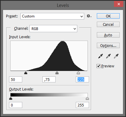
And finally, last but not least, I’ve tortured 2LO Sweet Musings 18.jpg into becoming a “noise” texture. Noise textures are often black files, with just a few speckles of white or gray. They’re used on the Screen blending mode, as it only shows what’s white or light, and displays black pixels as transparent ones. These textures serve to emulate film grain, or dust speckles. Some textures are designed to be this way, some can be turned into noise textures.
The level palette came back to use for this. I’ve simply pushed the black (left side slider below the histogram) very high (around 100, 150), reduced the mid-tones to 0.5, and reduced the white to 175 or 200. This dramatically darkens the texture, to only retain its brightest elements. After putting the blending mode on Screen and lowering the opacity at 25%, we have ourselves our final stage of the piece!

I think that’s it for me at this point. If you have any questions about either the vector building or the texturing process, fire away! I’ll be watching the comments over the next few days, but you can also tweet at me.
I hope you enjoyed reading and going along the tutorial as much as I’ve enjoyed writing it. Until next time, cheers!
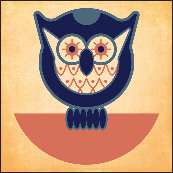
AND WE’RE DONE
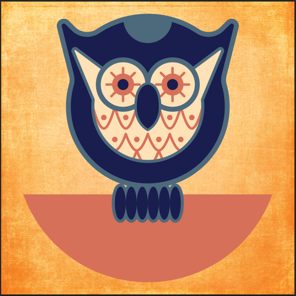
You can view your final outcome below. We hope that you enjoyed this tutorial and would love to hear your feedback on the techniques and outcome.
If you haven’t checked it out yet, be sure to take a look at this week’s deal. The texture you have just worked with is a tiny part of the huge texture bundle we’re currently running. Denise from 2 Lil Owls has offered 215 of her best textures, along with a fantastic bundle of bonus materials, giving you even more ideas for using your textures in your work. All this for just $24, and a massive 91% off the regular price!
I recommend reading some of the awesome comments below, as they give an idea of how much the Design Cuts community are loving their new textures.
You can preview everything included in the bundle via the link below, although the deal is ending soon, so you’ll need to act quickly to grab them at a 91% discount.
2 Lil Owls Ultimate Texture Collection (215 Textures + Bonus Bundle) – Just $24

Hey there, nice tutorial! Should this deal come back, I’m also interested. Many thanks!
Hey Michela,
Thanks for commenting- we are so pleased to hear you enjoyed the tutorial!
I have added you to the master list for this bundle and will email you if it comes live again!
I hope this helps, and please don’t hesitate to contact me should you have any other questions.
Oh, such a pity the deal expired :( … I was not fast enough … Will you offer it again – maybe? With some new tutorial? Is there a kind of archive with the old ones?
Hey Grazyna, This is one of our earliest 2 Lil Owls texture bundles, so we may not be able to re-run this. However should this come back I’ll be sure to drop you an email to let you know. :)
Wow! Thank you so much…I’m sharing this with my graphic design FB group. All the best.
Thanks so much, Brook! We really appreciate you sharing this tutorial.
This tutorial was very relevant, and the instructions were clear. I learned a lot! Thank you very much.
Thanks so much for commenting Angela! We’re really glad that you enjoyed this deal.
Thanks for your kind words!