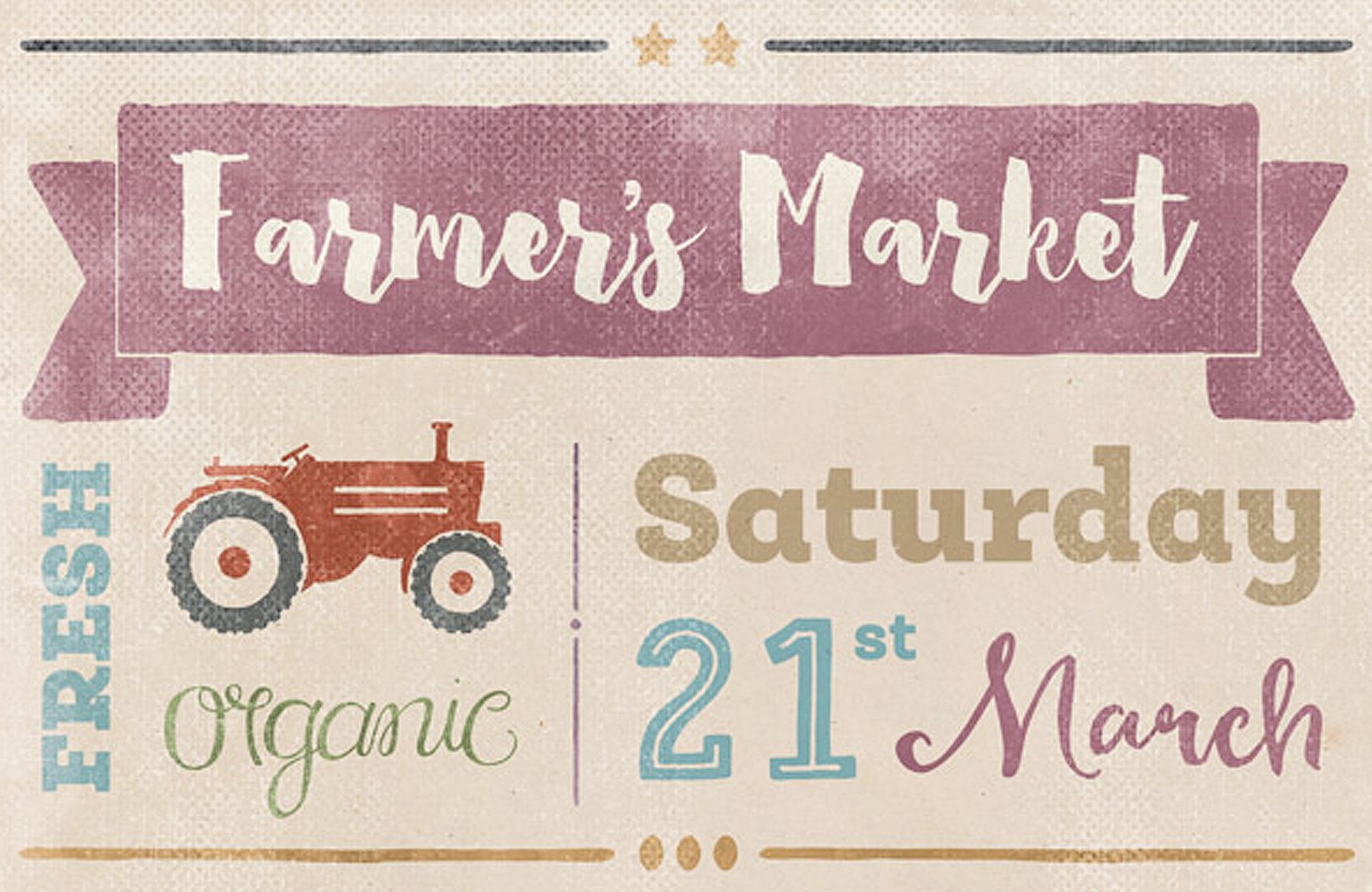
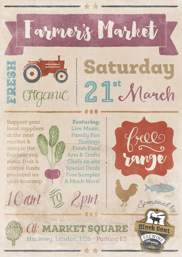
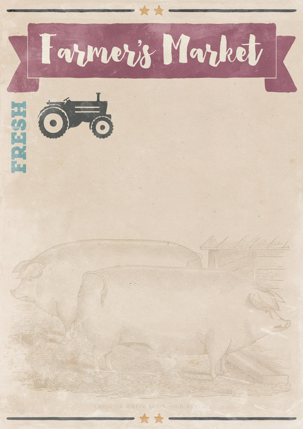
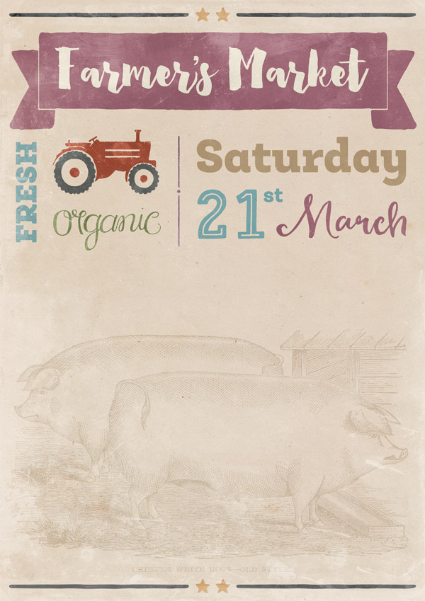
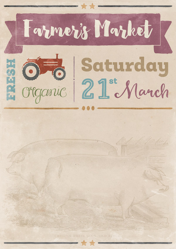
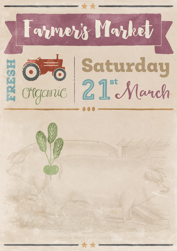
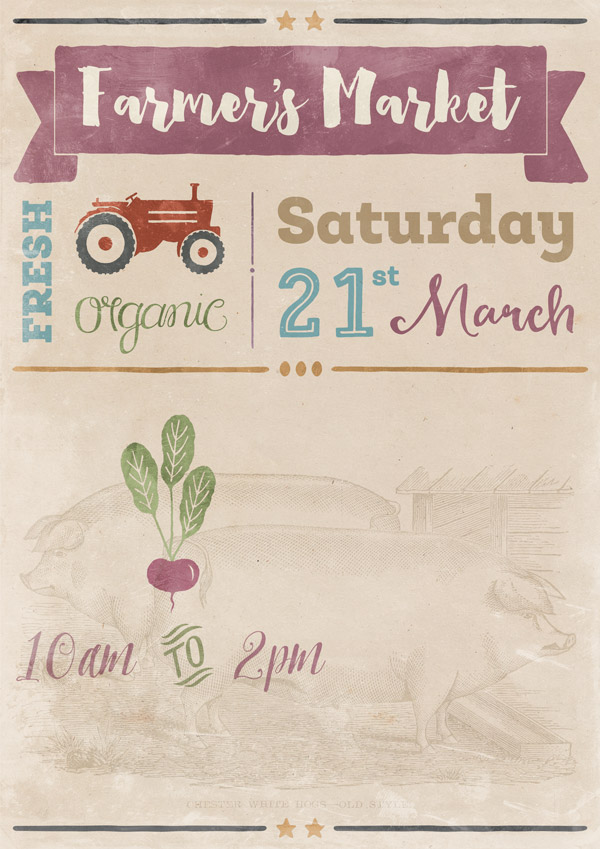
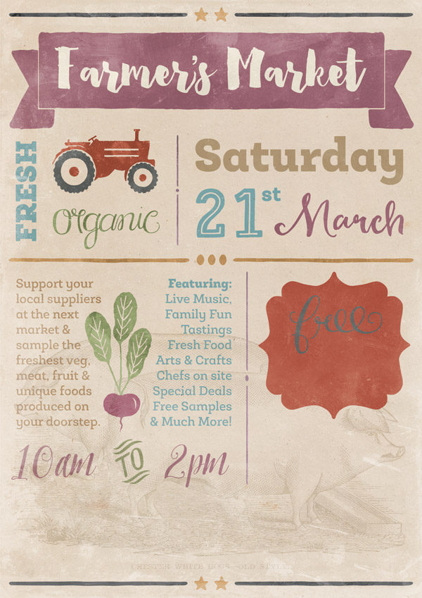
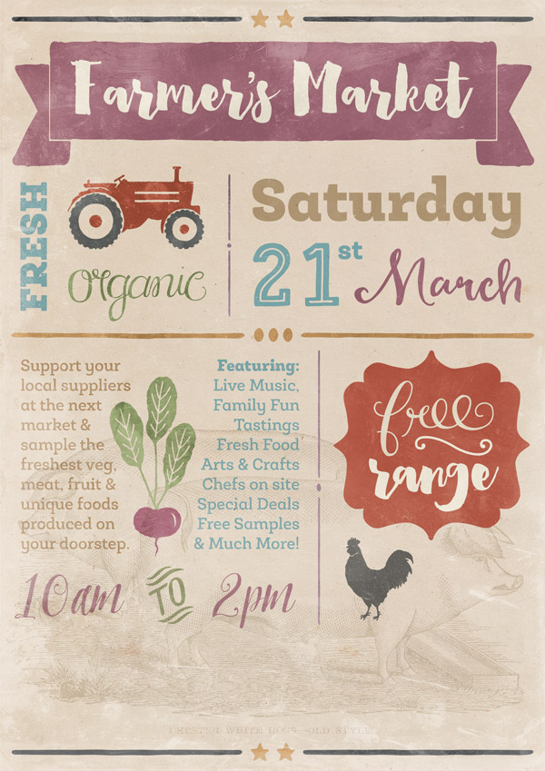
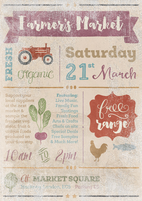
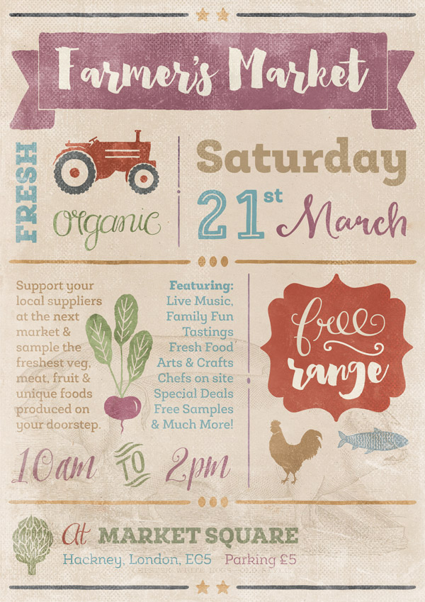
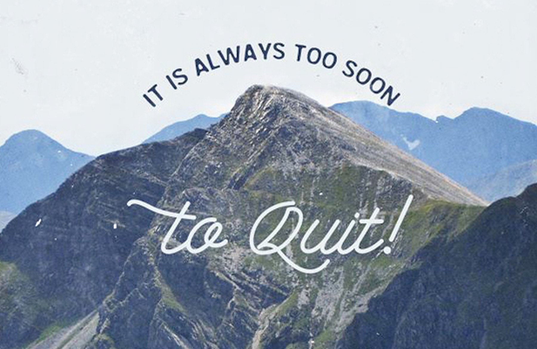
WHAT WE’RE CREATING:
Hey Design Cutters!
It’s Jo here for today’s tutorial, where we’ll be creating a bright and bold poster to advertise a local Farmer’s Market. This will let us try out some of the great fonts and extras that are included in the current bundle and hopefully give you some ideas on how versatile they can be.
Quick note: In this tutorial, the term “clipping” or “clipped layer” is used a few times. This means that the layer is only visible/applies to the layer directly below it. You can very quickly do this by holding ‘Alt’ down on your keyboard and clicking between the two layers. Here’s a quick demonstration.
Ok, let’s get started!
Follow along with this tutorial: Download the freebies
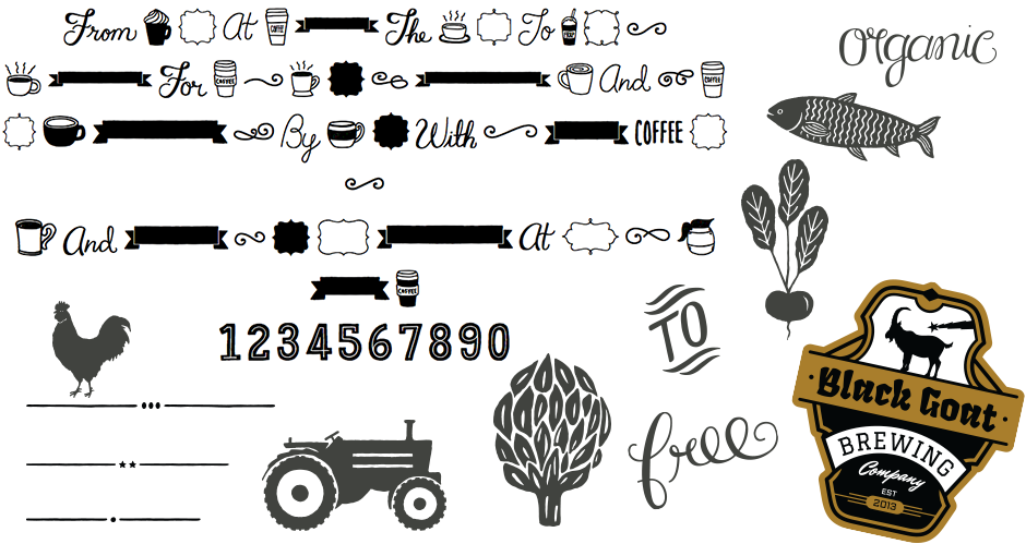
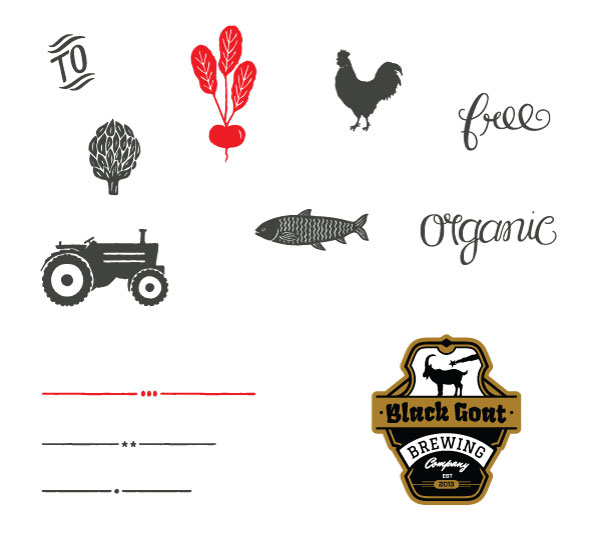
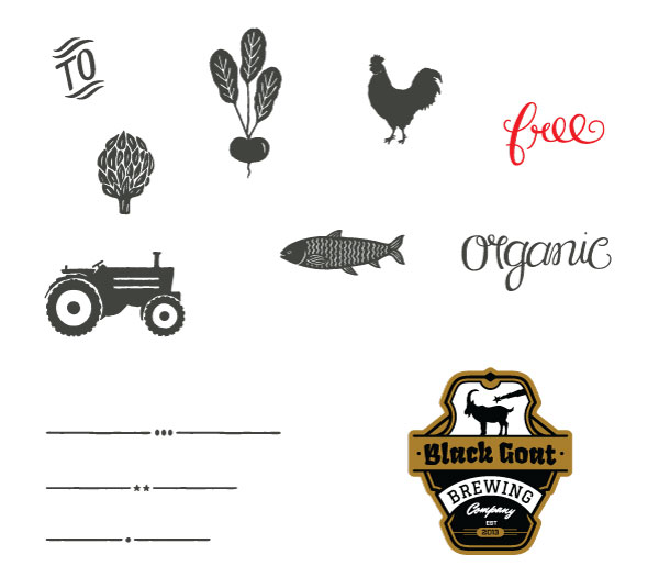
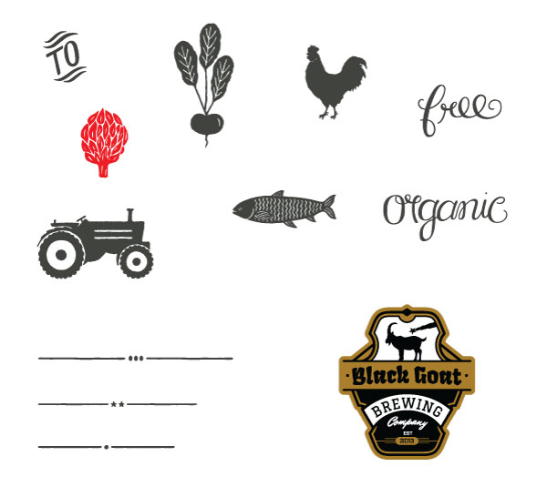
As always, we have another great freebie for you to enjoy. This time we’ve got a fantastic selection of bonus vectors, plus a full decorative ‘extras’ font set.
Remember, this freebie is just a tiny sample taken from this great bundle: 22 Best Selling Gorgeous Fonts (With Web Fonts and Extended Licensing) at just $29 (a whopping 98% Off). This is one of our biggest and most varied font bundles yet! The fonts vary from hand-drawn, corporate, logotypes, scripts… the list goes on. There’s also a whole bunch of extras included to pack in even more value and versatility.
Step 1:
We’ll start by downloading a few extra resources that we’ll be using during the course of this tutorial, so that they’re ready for when we need them:
Once you’ve downloaded the files, open up a new (A4) 2480px x 3508px Photoshop document. Next, we’ll set up some guides that’ll help us with our layout during the design process. To do this quickly and accurately, go to View > New Guide in the main menu and type the following settings individually:
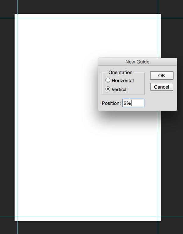
Vertical: 2%, 98%
Horizontal: 2%, 98%
Then, fill the background colour with #e5d4c0 for a warmer base to work from for our poster:
Right, that’s the prep work done, time to get creating!
Step 2:
From the free paper textures file we downloaded earlier, select paper_texture_04 and copy and paste on to your canvas, scaling to fit:
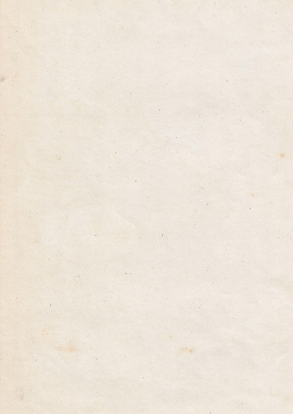
Set the blend mode to Multiply for a richer colour:
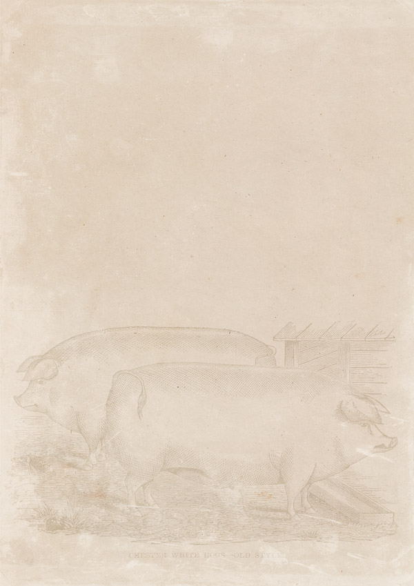
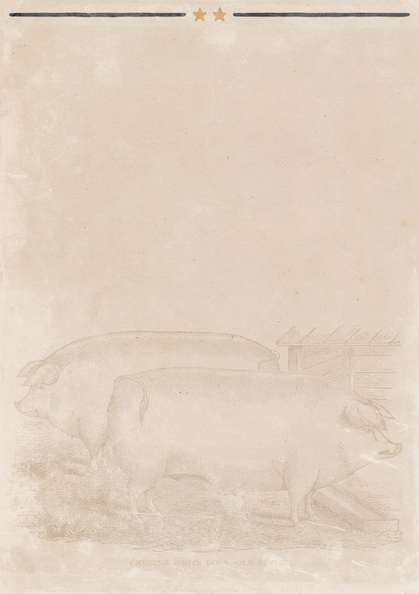
To set the rustic, farmer’s market feel, we’ll add a subtle background image to our texture. From the additional files, copy and paste the vintage pigs illustration on to the bottom part of your canvas:
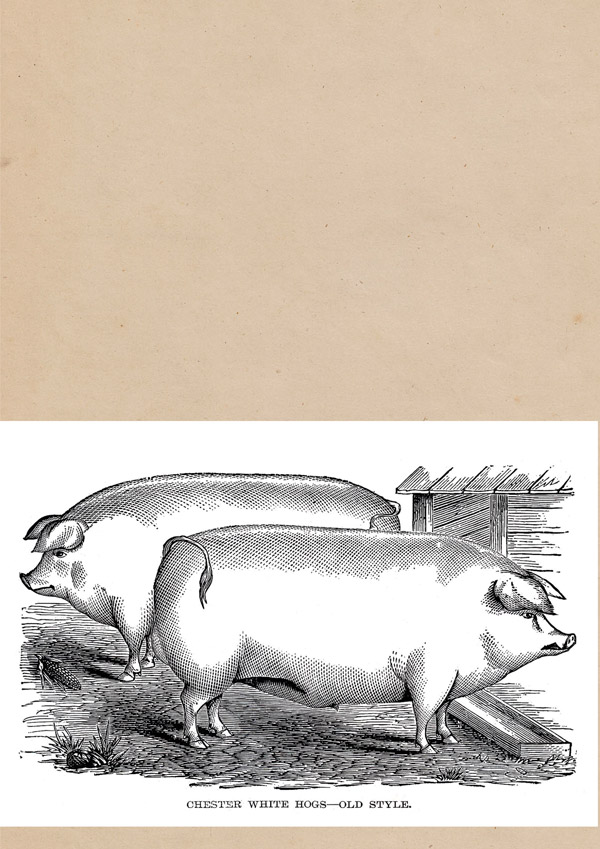
Drop the opacity to 30%, then change the blend mode to Color Burn for the desired effect:

Group all these layers together in to a floder called “Background” to keep things neat and easy to find. :)
Step 3:
Again from the additional files we download, from the screen textures copy and paste the Vintage_Film9 file on to your canvas, scaling to fit. Rotate it 180 degrees so that the large white patch sits in the lower left corner, as below:

As this is quite a strong screen texture, we’ll reduce the opacity to 65% so that we don’t lose all our image under it! Then, set the blend mode to Screen and lock the layer to the top:
By setting the screen texture at the start and working below it, we can take in to consideration the effect the screen texture will have on colours as we go through the design process. We can also make sure no key elements get obscured by particularly strong screen textures.
Step 4:
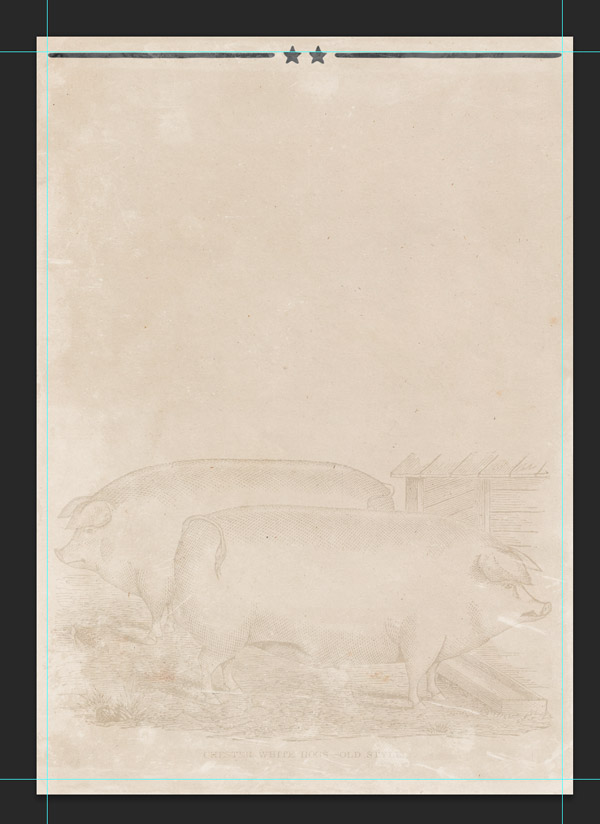
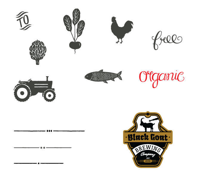
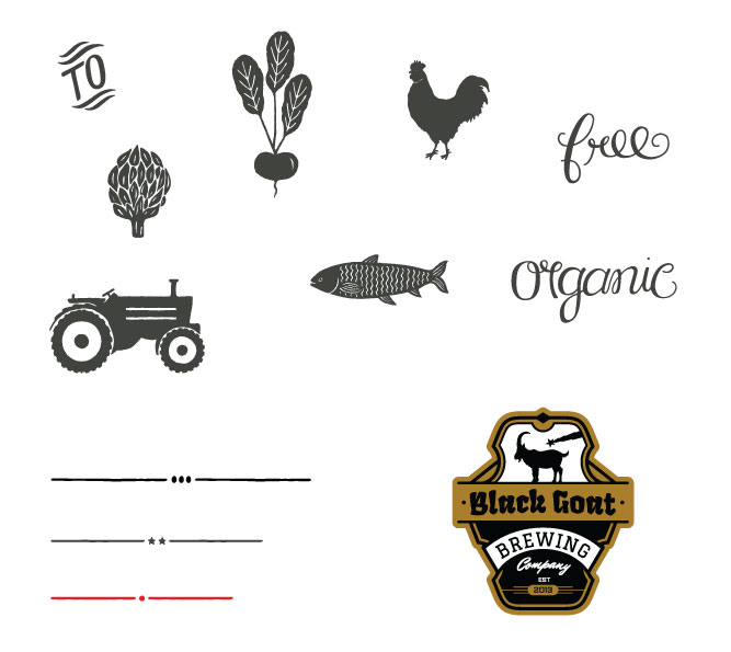
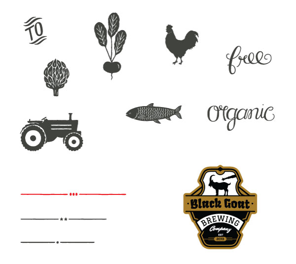
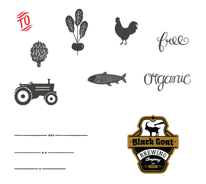
From the Freebie Vectors.ai file, select the following:
Copy and paste on to your Photoshop canvas, scaling so that it fits within the guides we set up at the start:
We want to give this a two-tone effect, so let’s duplicate the layer then apply a clipped hue/saturation mask with the following settings:
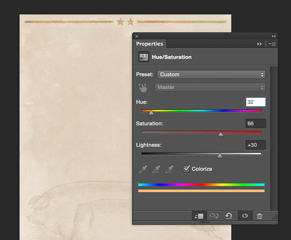
Hue/Saturation Settings:
Colourize: On
Hue: 32
Saturation: 66
Lightness: +30
Once the effect has been applied, create a Layer Mask on the duplicated layer and mask out the two lines so that only the dark layer below shows through, and only the stars remain gold:
Group these layers together and name the folder “Top Border”. Duplicate the group, then move to the bottom of the canvas within the guides, so that the design balances out. Rename the duplicated folder “Bottom Border” to avoid confusion. Simples! :)
Step 5:
Next, we’ll start to add the key content of our poster.
From the freebies, install the EspressoBeans-Extras font family:

Type a lower-case “t” with the following settings selected:
Font Settings:
Font: Espresso Beans Extras
Style: none
Colour: #90486b
Size: 222pt (approx)
Set the layer blend mode to Multiply and manually transform if necessary so that the width of the banner fits within our earlier guides.
Next, we’re going to type “Farmer’s Market” with the following settings:
Font Settings:
Font: Heartwell Regular
Style: none
Colour: #ddd5c1 (colour-picked from background)
Size: 70pt (approx)
Note: If you’re having trouble selecting the right text, temporarily hide the layer with the text you don’t want to select.
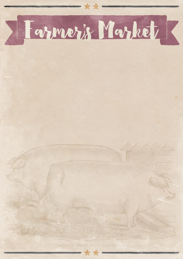
As you can see from the image above, it’s not exactly a perfect fit! We’ll fix this to suit our needs by going back to our banner glyph and manually stretching it so that it surrounds the text:
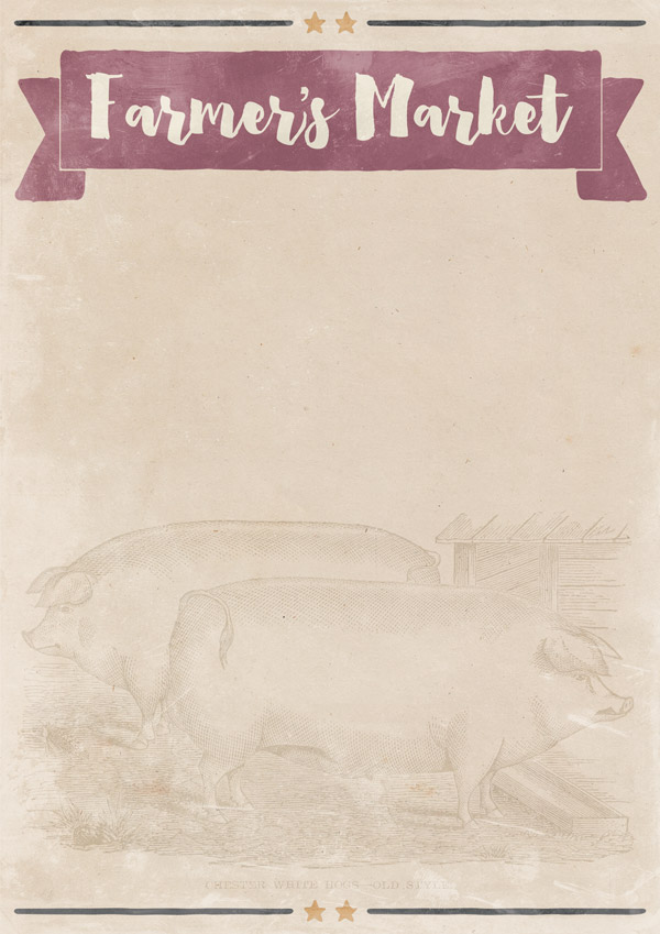
That looks much better now. :) Group these layers together in to a folder called “Header” (or whatever makes the most sense to you) to keep things tidy.
Step 6:
As we continue to build up the poster design, we’ll be using fonts that are part of the main bundle. If you dont have this, please feel free to substitute with similar ones from your own collection.
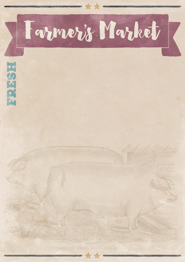
In the upper left corner below the banner, type “FRESH” with the following settings:
Font Settings:
Font: Roble Alt Black
Style: none
Colour: #4baac2
Size: 41pt (approx)
Make sure the blend mode for the layer is set to Multiply.

Then, manually rotate the text 90 degrees so that it acts as a vertical border:
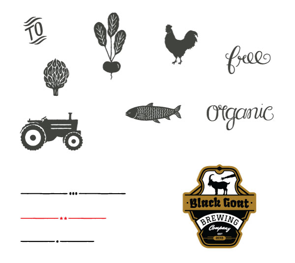
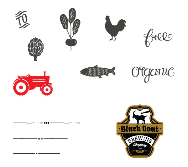
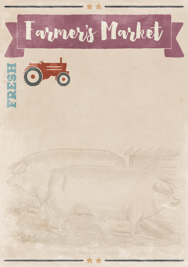
Going back to the freebie vectors, select the tractor design, copying and pasting on to your canvas next to the “FRESH” text:
As we did for the stars on the top and bottom borders, we want to give this image a two-tone effect. We’ll use the same technique of duplicating the layer, then applying a clipped hue/saturation Adjustment Layer with the following settings:
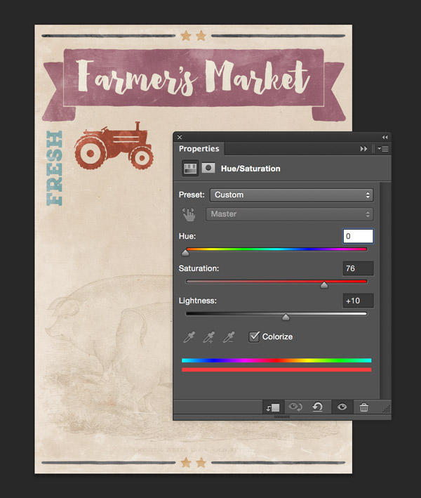
Hue/Saturation Settings:
Colourize: On
Hue: 0
Saturation: 76
Lightness: +10
Create a Layer Mask for the duplicated (red) layer and use a small round brush to carefully hide the tyres so that the darker colour below comes through:
From the freebie vectors, copy and paste the “organic” text below the tractor, scaling so that it’s a similar with:

We’ll give this a more ‘organic’ colour (ie: green ;)) by using a clipped hue/saturation Adjustment Layer with the following settings:
Hue/Saturation Settings:
Colourize: On
Hue: 80
Saturation: 55
Lightness: 0
Group these layers together in to a folder called something like “Top Left (tractor)” to help you locate the elements. We’ll be creating lots of little ‘sections’ in this design, so grouping them will make it much easier for us to find things should we need to come back to edit them.
From the freebie vectors file, select the following divider:
Copy and paste on to your Photoshop canvas, rotating 90 degrees so that it sits vertically to the right of the section we just created, acting as a border:
We’l soften the colour slightly to match the maroon shade in the main banner. We’ll do this with, you guessed it, a clipped hue/saturation Adjustment Layer. ;)
Here are the settings you’ll need to specify:
Hue/Saturation Settings:
Colourize: On
Hue: 299
Saturation: 25
Lightness: 20

Step 7:
Next up, we’re going to add the date using a selection of fonts from the main bundle to get the following effect:
These are the settings you’ll need for each word (in most cases, the sizes are approximate as the fonts have been manually resized to fit):
Font Settings:
Word: “Saturday”
Font: Roble Alt Black
Style: none
Colour: #b09461
Size: 67pt (approx)
Blend Mode: Multiply
Word: “21”
Font: Espresso Beans Extras
Style: none
Colour: #4baac2
Size: 100pt
Blend Mode: Multiply
Word: “st”
Font: Roble Alt Black
Style: Faux Bold*
Colour: #4baac2
Size: 100pt
Blend Mode: Multiply
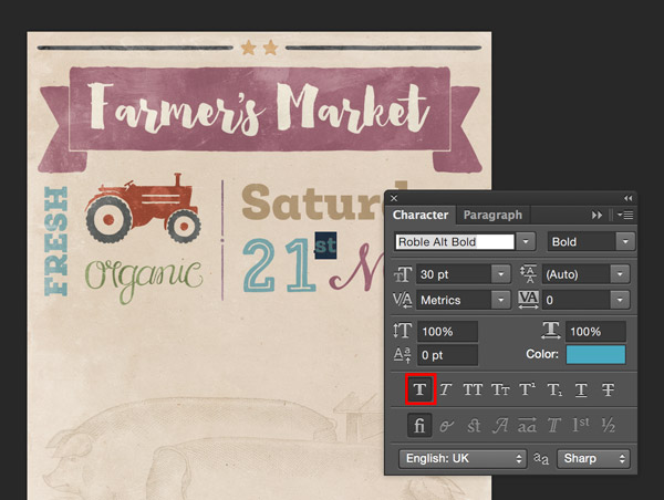
* To apply the Faux Bold effect, select the text you want it to apply to and open up the character panel in the Photoshop sidebar. Select the ‘Faux Bold’ option, highlighted below:
Word: “March”
Font: HeartAndSoul Regular
Style: Faux Bold
Colour: #90486b
Size: 70pt
Blend Mode: Multiply
Once you’re done, group all these together in to a folder called “Date”.
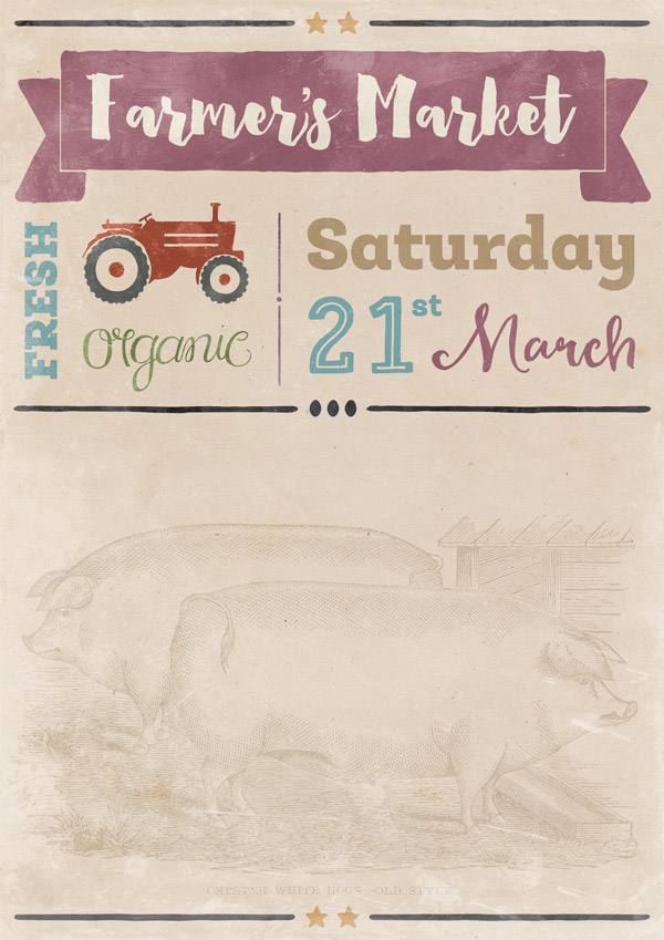
To round off this top section, go back to the freebie vectors file and select the following divider:
Copy and paste on to your canvas so that it fits the width within our guides:
Create a clipped hue/saturation Adjustment Layer with the following settings:
Hue/Saturation Settings:
Colourize: On
Hue: 32
Saturation: 66
Lightness: +30
Step 8:
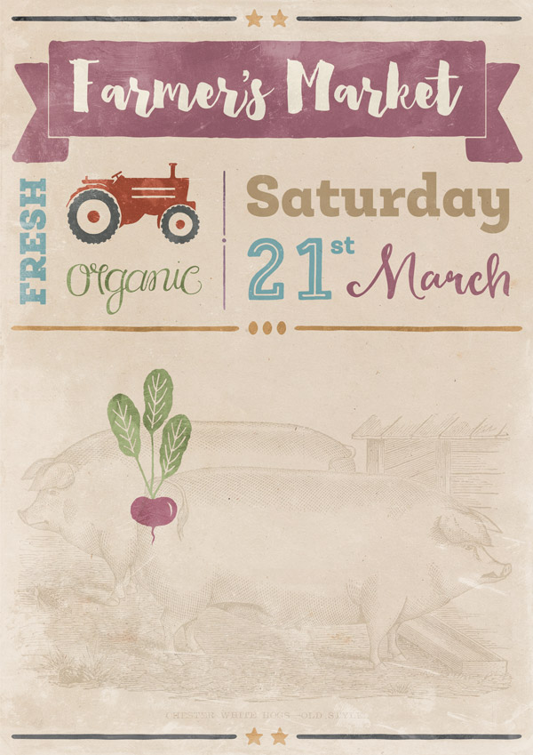
We’re going to continue building up the design, mixing our informative text with some context-setting graphics. Let’s use this juicy looking beetroot from the freebie vectors!
Copy and paste on to your canvas and set the layer blend mode to Multiply. Scale and position so that it’s similar to below:
It’s not looking particularly fresh or juicy in its current colour, so we’ll brighten this up a bit with a couple of clipped hue/saturation Adjustment Layers.
For the purple colour, use the following settings:
Hue/Saturation Settings:
Colourize: On
Hue: 300
Saturation: 79
Lightness: -6
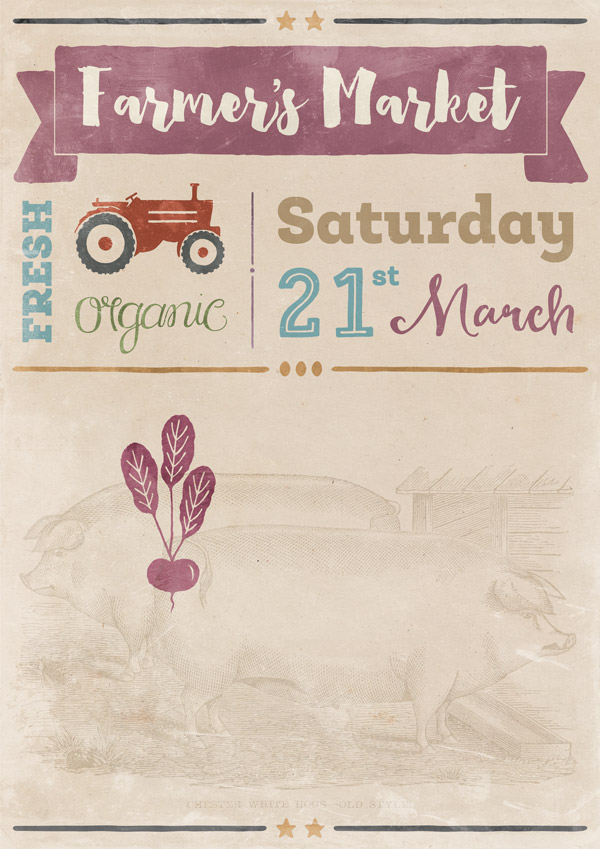
Duplicate both the image and adjustment layers, then change the hue saturation layers to the following:
Hue/Saturation Settings:
Colourize: On
Hue: 80
Saturation: 55
Lightness: 0
Create a Layer Mask for the duplicated layer, and carefully mask out the ‘main’ beetroot part so that the purple version from underneath is revealed:
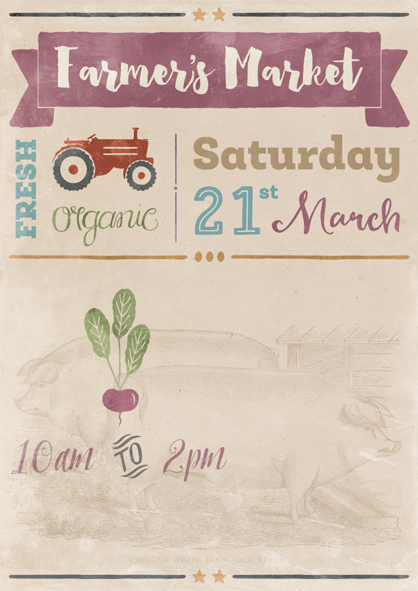
Step 9:
We now want to add some more details to the poster – in this case, the time.
Using the following settings type:
Word: “10am”
Font: Pretty Script Regular
Style: None
Colour: #90486b
Size: 75pt
Blend Mode: Multiply
Word: “2pm”
Font: Pretty Script Regular
Style: None
Colour: #90486b
Size: 75pt
Blend Mode: Multiply
Position the words so that they sit either side of the beetroot:

From the freebie vectors, select the “To” catchword:
Copy and paste this on to your Photoshop canvas between the two times, and set the blend mode to Multiply:
Let’s make the colour more in-keeping with a clipped hue/saturation Adjustment Layer using the following settings:
Hue/Saturation Settings:
Colourize: On
Hue: 80
Saturation: 55
Lightness: 0
Step 10:
We’ll add some more detail text using Roble Alt (which is fast becoming one of my favourites in this deal!)
Feel free to use your own words, getting them to frame the image as best as possible. Here’s the text that’s used in this tutorial:
“Support your local suppliers at the next market & sample the freshest veg, meat, fruit & unique foods produced on your doorstep.”
Font: Roble Alt Medium
Style: None
Colour: #a97938
Size: 18pt
Blend Mode: Multiply
Justification: Left
“Featuring:
Live Music
Family Fun
Tastings
Fresh Food
Arts & Crafts
Chefs on site
Special Deals
Free Samples
& Much More!”
Font: Roble Alt Medium
Style: None
Colour: #4baac2
Size: 18pt
Blend Mode: Multiply
Justification: Right
To frame this section, duplicate the side divider between the two top sections, stretching so that the height matches the content:
Step 11:
For the next section, we’ll balance out the red tractor with another bold, red graphic. We’ll do this using one of the creative glyphs from Espresso Beans Extras. Type a lowercase “r” and apply the following settings:
Font: Espresso Beans Extras
Style: None
Colour: #9a1c1f
Size: 303pt (approx)
Blend Mode: Normal
Next, we’ll add some text on top of this. From the freebie vectors, select then copy and paste the stylised “free” text on to your canvas:
Position so that it sits nicely within the red frame we just created:
It’s a little tricky to see at the moment, so we’ll modify the colour with a clipped hue/saturation Adjustment Layer with the following settings:
Hue/Saturation Settings:
Colourize: On
Hue: 50
Saturation: 25
Lightness: +62
Directly below, type “range” with the following settings:
Font: Heartwell Regular
Style: None
Colour: #ddd5c1
Size: 70pt
Blend Mode: Normal

Next, type “]” with the following settings and position in the space between the two words for a bit of an accent:
Font: Espresso Beans Extras
Style: None
Colour: #ddd5c1
Size: 90pt
Blend Mode: Normal
Step 12:
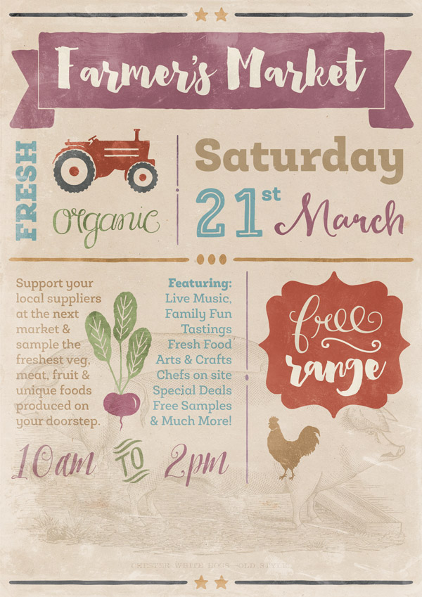
Next, we’ll add some free-range animal icons. :) From the freebie vectors, copy and paste the chicken on to your photoshop canvas, scaling and positioning so that it’s similar to below:
Create a clipped hue/saturation Adjustment Layer with the following settings to modify its colour:
Hue/Saturation Settings:
Colourize: On
Hue: 34
Saturation: 50
Lightness: +20
Now we have a nice, golden chicken, we’ll balance the colours a bit more with a bright, blue fish. Copy and paste the fish from the freebie vectors on to your photoshop canvas, changing the blend mode to Multiply. Flip the image horizontally so that it’s facing the opposite way by going through Edit > Transform > Flip Horizontal in the main menu.
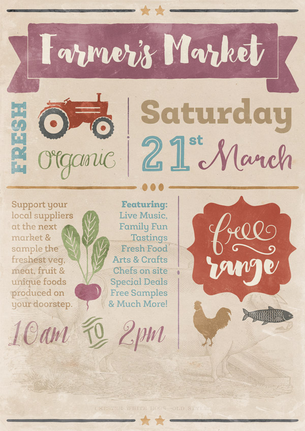
We’ll apply a more fishy colour using a clipped hue/saturation Adjustment Layer with the following settings:
Hue/Saturation Settings:
Colourize: On
Hue: 190
Saturation: 32
Lightness: +50

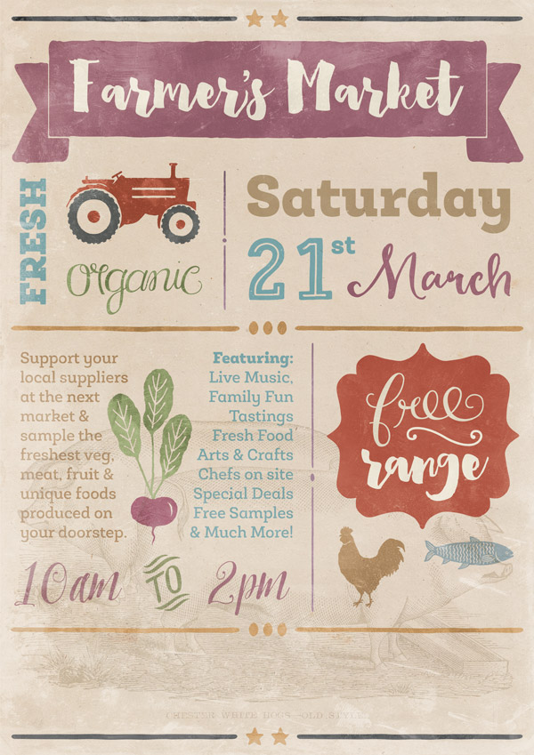
Group the text, chicken and fish in to a folder together called “Bottom Right” to keep things easy to find, then duplicate the central divider from earlier, and repositioning the copy so that it sits below the sections we’ve just created:
Step 13:
We’re now heading towards the home-straight! We’ll add the venue details in the footer, but let’s start by adding this rather lovely artichoke design from the freebie vectors:
Copy and paste on to your canvas so that it sits in the bottom left, similar to below, then set the blend mode to Multiply:
Then, create a clipped hue/saturation Adjustment Layer with the following settings to give it a much more accurate green colour:
Hue/Saturation Settings:
Colourize: On
Hue: 80
Saturation: 55
Lightness: 0
Next, we’ll add the event details. Here are the settings and phrases you’ll need:
Word: “at” (type a lowercase “u”)
Font: Espresso Beans Extras
Style: None
Colour: #9a1c1f
Size: 60pt
Blend Mode: Multiply
Word: “MARKET SQUARE”
Font: Roble Alt Black
Style: None
Colour: #727e49
Size: 32pt
Blend Mode: Multiply
Word: “Hackney, London, EC5”
Font: Roble Alt Book
Style: None
Colour: #4baac2
Size: 20pt
Blend Mode: Multiply
Note: Duplicate this layer to make the text stand out a little more.
Word: “Parking £5”
Font: Roble Alt Book
Style: None
Colour: #90486b
Size: 20pt
Blend Mode: Multiply
Check that the text is positioned towards the left, similar to below:
We’ll start to finish off by adding some texture from the halftone pack we downloaded at the beginning of the tutorial. In this instance, we’ve used Monotone1. Copy and paste this on to your canvas, scaling to fit:
The effect is a little distracting as it is, which we’ll fix by changing the blend mode to Soft Light:
We’re almost there now!
Step 14:
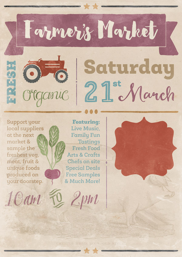
To finish off, we’ll add a fun sponsor logo for a touch of authenticity. From the freebie vectors, copy and paste the beer label on to your canvas in the bottom right, tilting it at a slight angle:

We’ll add a simple drop shadow for a 3D, ‘stuck on’ effect. To get to the layer effects, double click on the layer in the layers panel:
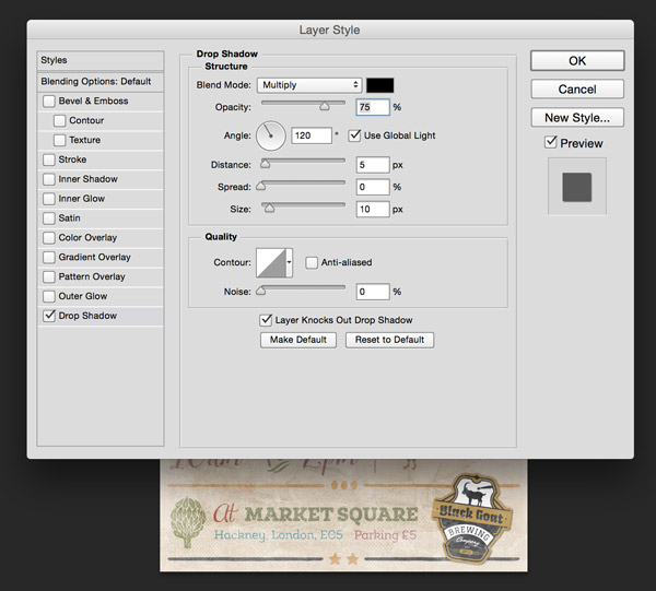
Apply the following settings for the drop shadow:
Drop Shadow Settings:
Blend Mode: Multiply
Color: #000001
Opacity: 75%
Angle: 120
Distance: 5
Spread: 0
Size: 10
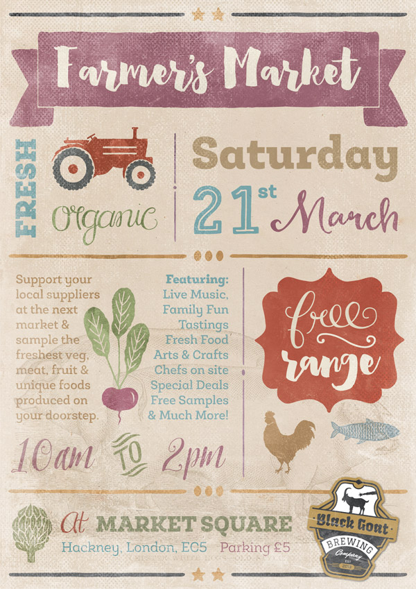
Directly above, type “Sponsored by” with the following settings:
Font: Smoothy Cursive
Style: None
Colour: #282828
Size: 18pt
Blend Mode: Multiply
We’ll bend the text round our beer label logo using the Warped Text feature in Photoshop. With the text selected, select the Warped Text feature from the top menu panel:

Select the style as Arc, the orientation as Horizontal, then type +40 for the bend percentage.
Once you’ve applied the effect, tilt the text slightly so that it follows the angle of the label:
And we’re done!

I hope you had fun with this tutorial and enjoyed trying out a small sample of the variety of fonts and extras available in the current deal. The great thing about these is that there are always so many extras and bonuses, you really can really get creative with something that may otherwise be heavily text-based. :)
Remember to share your designs on the Facebook page too, as we love being inspired by the way you make these tutorials your own!
Hopefully this tutorial showed you how to have fun with just some of the resources available in this quality bundle. Remember, you can get this great deal for a mega 98% off this week! Grab it below, while you still can:
22 Best Selling Gorgeous Fonts (With Web Fonts and Extended Licensing)
I’m confused – the first link for the graphics needed (Vintage Papers) takes me to another page, which takes me to another page, and another. . . . Is this really what I’m supposed to be doing? I thought the freebies used in these tutorials were all supposed to be in one place. ???
Hey Barbara,
Thanks for commenting!
I am really sorry that you are having an issue with downloading your freebie pack. Rest assured, i can help you with this.
I have emailed you about this with a direct link to the bundle.
I hope this helps, and please don’t hesitate to contact me should you have any other questions.
Another fun tutorial to work through but I did have to laugh at one point…free range ‘fish’? Never heard of that before. :)
Hey Joanne,
Thanks for the feedback on the tutorial! That made me chuckle too- i do love free range fish :).
Great and colorful piece, Jo! I really like how you managed to make all these type of typefaces coexist together.
In total agreement with you Simon! Great piece by Jo and i love the colours (but thats a given!)
Looks like another fun poster but the links for Vintage_Film9 are not working or I am looking in the wrong spot.
Thanks
Diana, here’s a link to the whole pack: http://lostandtaken.com/blog/2012/5/8/14-free-vintage-film-textures.html. Here’s a direct link to the image itself: http://www.unsigneddesign.com/14_Vintage_Film_Textures/Vintage_Film9.jpg.
Hope this helps!
Hey Simon,
Thanks for providing the links to help Diana! You are a star :).
Hey Diana,
Thanks for the comment.
I am really sorry that you having an issue with the links- I have sent you an email to help with this
I wish you had included your layers in the screen shots … I’ve only gotten to the top border and already am lost. I’m super fluent in Illustrator but Photoshop is foreign to me. So many different masks and layer intricacies here … what the heck is a Layer Mask to isolate the bars from the stars? How do you select them separately? And what order should those layers be in to work properly?
:( – confused.
Also – is Heartwell included in the freebies or do we need to purchase the full package to use it? Couldn’t find it in the files I downloaded.
Hey Lily,
Thanks for the comment.
Heartwell is not included in the freebies I am afraid. Everything that is included in the freebie is in the top graphic on the freebie page.
I hope this helps, and please don’t hesitate to contact me should you have any other questions.
Hey Lily,
Thanks for the comment.
I am really sorry to hear that you are having an issue creating your poster. I can definitely help you with that.
I have sent you an email about using the layer masks which should hopefully help you out :)
Please send me that email too. Thank You.
Hey Damon,
I have removed your email address from your comment as we wouldn’t want to share this with our community, but i’ve popped you over an email to get some more information from you, so that I can help :)
I hate to admit, but I got lost at the same spot.
Barbara
Hey Barbara,
Thanks for commenting and for letting me know! I can certainly help you with the layer masks :).
I have emailed you about this which should help you out.
If you have any queries, please let me know. I am always happy to help!